Transcripts
1. Intro to Vintage Floral Drawing in Ink using Procreate: Hi guys and welcome. My name is Dolores
Nazca and I'm coming to you from sunny,
Manitoba, Canada. Today's class I'm
bringing you in Procreate is to create a vintage flower. This is gonna be done with
a unique technique that mimics an engraving
or intaglio process. I'm going to be explaining
that as we get into the class. So the first thing
we'll do is create a contour drawing of the flower. We can do this by tracing
a photograph or you can draw one if
you're comfortable just doing the
drawing on your own. I'm going to explain
the process based on a tracing because
that's the way I did it. You'll be surprised at how
much fun this is to add all the detail in using this special brushes
that I've created. I'm going to be
including the brushes so you don't have to
start from scratch. You'll be able to find them
in the class resources and follow along exactly
with what I'm doing. I hope you enjoyed it
because it was actually a really therapeutic
kind of a project to do. There's lots of repetition
in adding the textures, but in the end, it's just a fun and
relaxing process. Now if you're interested
in my classes, I would suggest that you hit
that follow button up there. That way you're informed
as soon as I post the class and you get any of the other posts
that I send out. I'd also strongly
suggest that you add your name to my mailing
list on my website. That way you'll also get the postings that
I sent from there. For example, that's where I put all my artists resources and I often add free resources
for my students. So definitely add
your name there. Now, are you ready to
get into this process? Alright, let's get started. I'll meet you in lesson one.
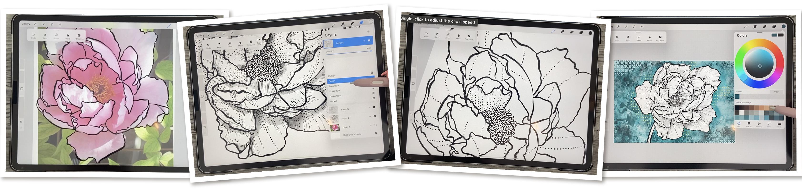
2. Lesson 1 Overview and Initial Contour Drawing: Hi guys, welcome to lesson one. Lesson one here I
want to give you an overview of that
intaglio printing process. It goes by a bunch
of different names and I'm going to cover
that in the lesson. Then we're gonna get
started by drawing the contour of our flower. Let's get into it. I wanted to start
today's class by showing you an
example of this style of line drawing that I am kind of fashioning
this project after. So this is a process
that was invented, I think back in the 1800s when printing presses were
just being developed, this type of
printing process was created where the
lines were scratched into a metal plate and then the metal plate was used to transfer the ink onto the paper. So in order to make
some areas look darker, you would have a
more dense pattern. And when you wanted
it to be lighter, you would have a less dense
pattern if that makes sense. So a lot of times this was achieved through
crosshatching. So when we talk
about crosshatching, we're talking about
the lines crossing over to create darker areas. So I've developed a few brushes. In fact, I'm just in the
process of getting a brush set together with this
particular end in mind. So you can see a lot of
examples of it here. And you can see how the lines, even though they covered
the entire image, where they're denser, makes the areas darker and
where they're spread out a little bit more or little
areas of white or left. That is how you get that sort of variation
between the values. So that's really important
because what I wanted to do is broken line kind of look to
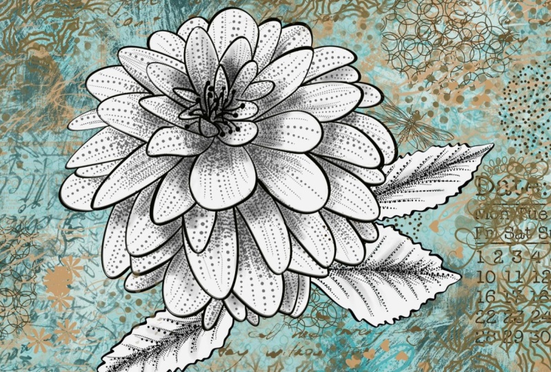
create my project today, which is going to be
an actual flower. We're gonna be starting
right from scratch. We're going to draw
the flower outline in Procreate and then
we're going to fill it. So here I'll show you
examples of the flowers. So here's one. And in this case I've used a dotted line and I've added a little bit of
a wash on that one. So if you look at it closely, this would have been the after this would have
been the middle and the original would've been just the contour drawing,
just the outlines. So what we've got here are dotted lines that end up
creating the shadow effect. So this is really close to the finish product that
we're going to make today. Here's another
example that I did. Now this one I was experimenting
with my crosshatching to just get different ideas of
brushes that I could create. Because yeah, Here's one
is a little bit crazy, but I'm creating a brush set. So that's why I've created this example because
it's going to show all the different ways that you can use the
brushes I've created. I'm gonna be giving you a few of those brushes for
you to work with, that you can do this
project really easily. So I've got a flower here. This is a picture of
a peony that I have. This is actually an
interesting story. This peony was my
grandma's originally. So she had this in her garden. I mean, it's gotta
be 60 years ago that I can remember it
60 or 70 years ago. And 60, I'm only 62, So let's say 50 years ago
just to be on the safe side, my mom and dad inherited
my grandparents farm and so they got the flower. And then when my mom and dad
moved to another location, they took the flower
with them and then eventually mom gave me
cuttings of the plant. So I have these beautiful
light pink peonies in my yard. Just lovely. I love
peonies so much. So we're going to use
this one as our base. You can use any
photo of any flour. Honestly, this particular
project is so forgiving and so ideal for drawing flowers that you just have to have a really
good close up. If you don't have any photos or garden flowers of your own, then I would check
out a site like Unsplash there you can get photos that you
can use for free. And if it's something that you're going to
use commercially, then you just have to
credit the photographer. You saw that I reduce
the opacity on that. And that's so that I can add another layer to do
my initial tracing. So this is the set that I've developed and
it's going to be just huge king, kind of a set. And I'm going to use my basic inker here that I've
created to do my outlining. So it's got a slight change in thickness when
you apply pressure. And I've got a couple
of other ones, maybe I'll use this inky
pinky that's my favorite. And there's this rough
incur a smooth inker. These are all just
different brush shapes, I guess you'd say. So. I've created this new layer. You'd know if you were
accidentally on that first layer, if this happens and you see it gray even though you got
the blocks selected. So that's one of the reasons
I reduce the opacity just so that I can
protect it from myself. So I'm gonna go
through and I'll show you basically what I'm doing
when I'm outlining here. And I'm going to switch
to the anchor like that. It's nice, thick line that responds a little bit to
pressure that I put down. So you can see here that if
I press a little bit harder, I'm getting a slightly
thicker line. I think that's gonna
be more interesting. Basically, just
go round and copy the contour of each
of the petals. If you're good at
hand drawing flowers, then you don't even
need to do the tracing. I just thought for class today, we'll just be
faster to show you. And then this way you don't feel intimidated with having to draw. You can just use
something like this to get your initial outline. So I'll probably speed this up, time-lapse it just
a little bit so you can just watch as I ink it. I'm trying to get as much
of this sort of curliness, worldliness, I
guess you'd say in the line to make it
look really natural. For this particular technique. I don't have my streamline
all the way up. I have a fairly high maybe I'll turn it
down a little bit. That'll be a bit more
responsive so it'll stop trying to
straighten up what I do. So try to catch all these
little extra folds that happened because
that's what ends up making your line drawing. The most interesting
is if you've got a lot of that laziness,
I guess you'd say. I'm actually going to
erase that line that I extended because I want these lines to be
those dotted lines. As I go through I correct any
mistakes that I have made. It would be really
interesting for you to go back and take a look online at some of those vintage
flowers and try to find some that are reproduced using that
intaglio printing process. Another word for
like a lot of times it's referred to as engravings. Because basically that's
what the artist was doing, was engraving the art onto a metal plate and they were
doing it just like I said, much like how liner
block is done, where it's carved out and the same sort of
process was used. Now, of course, in this day and age it's done
with photographic plates and they're exposed with a film positive or a film
negative, I should say. That has all the details already drawn from an ink drawing that's been made into the
negative that's going to be exposed
onto the plate. So the process has been
much simplified over time to obviously make it
more commercial, more viable. Now this center portion, I'm going to do with a specialty brushes
that I have created. So in the next lesson, what we'll do is take a look at that specialty brush will do
that centerpiece in there. And then we'll
start to talk about the shading and so on
that we're going to do with the special brush that I created specifically for
doing those broken lines. Alright, so I'll see
you in the next lesson.
3. Lesson 2 Adding the Details and More: Hi guys, welcome to lesson two. So I have a trick here for
making sure that we add all of our texturing
lines accurately. I'm gonna be showing you that. And then we're gonna
go through and use a specialty brush to create
the anthers and the stamens. So we've got a lot to do. So let's start by drawing
those little stamens in there. Now you don't need to
draw them all to have that suggestion of
stamens in there. I usually do maybe half half of the
amount that are there. And I use one of my
specialty brushes that I created specifically
for that purpose. It's called the anther stroke. So I guess those are
what they were called. There must have looked
it up at that point. This outline tapered might
work too way too big. Yeah, so this one could work. And this one could work. So they're similar. They just kind of draw a different sort
of line thickness. I think I'll use this
one. I don't mind it. It's also reactive to the amount of pressure
that I put on it. So I'm just going to draw a
bunch of random ones in here. And I'll include this
brush for you so that you don't have to
individually draw these. Not that it's that big
of a deal I guess, but something that I've drawn a bajillion times and I just don't think I need
to practice anymore. So I figured out a way to just
make it faster for myself. So I'm just going through
and I'm trying to be as random as possible to keep
it looking realistic. Now, I've kinda gotta technique for doing in-between ones. But I can't do them on the same layer like this because it's too much
work to erase them. So I make an additional layer. Then I go through and I overlap
a few of them like this. I'm going to have to erase the answer them
for example here. And so it's just easier when they're on their
own layer to do that. So let me just fill
a few spots here. What I do is I temporarily
lightened the one underneath. And then these, I
can quickly see where they are to
erase the n. So basically I'm just
going around and erasing any part that
kind of shows on another, another one of the anthers. Make your lines overlap into the other
one's a little bit, we're going to end
up collapsing that onto the same layer anyhow, like I took too much off there. So let's go back and draw
a couple more in here, in spots that look
a little bit empty. It's one of the things
I like to do when I am working on basically
any sort of project. Now here I made a
boo-boo because it's overlapping on one that's
already on this layer. So I'll have to fix that
one up a little bit. I really like to figure out
methods to be more efficient, especially when I'm having to produce a quantity
of anything. There's always a way that you can make
your process faster. So that's why I invented that brush so that I wouldn't have to go and
individually draw those. I'm going to go back
to my inker that I was using and let me just fix
this one up a little bit. And then I'm going to bring
this one back up to full. You just see a little bit here. Anything else I can probably
just picks up here, but now I can take
that and merge it down so it's back to being
part of the same layer. Fix that little spot there. And then I also go back in
just with my inker and just do a few more lines that fill in any open areas so that it
looks a little bit more dense. And then in the middle here, you can choose
what you wanna do. Maybe dots would be the fastest. If he didn't wanna do dots, you could probably do
lines of some sort. But I think the
thoughts worked well. And let me just take
another good look at my outline here. Fix up anything that
not happy with. And I think at this
point we're ready to start working on some of
those detailed lines. Now, I like to keep this
painting on the photo on the very first bit of this
because what I wanna do is get the direction for those
little interior lines. That's why working with a photograph helps speed
up the process for sure. So let me go into my inky and I'm going to grab
this stipple line anchor, which is what I'm
going to give you. And you can see that how
did I switch to pink again? I think when I go to move, I often just hit with
one finger before another and then I
get the color change. So it's kind of a pain. But anyhow, I want to kind of mimic the direction of
those lines so you might want to bring up your
visibility on that photo. So the opacity,
I've got it up to about 90% now because then I can really see
those lines there. I've even gone so far as
to while I'm on the photo, go into my curves
and then really darken and increase the contrast so that I can see those
lines a little bit more. So you can do that
if you'd like. Make sure that you're
on the correct layer. Because when you're almost at full percent percentage
here in opacity, that still looks black, even though I've put
it on the wrong layer. So make sure you are
on the right layer. You might even want to
make an additional layer and start your lines. So I'm fairly heavy
with this line for this first set of dots
that I'm putting down, I'm gonna be going in and
filling in a lot of this, but I want to be able to turn
off my photographs so that I then have to start judging for myself how I wanted
to fill stuff in. But having these
initial lines here that follow the contour, follow the original
direction of these lines, will end up having my flower looking a
lot more realistic. One of the things I
want to point out about this brush that's so cool is that It's a dotted line, but I can still apply pressure to get it thinner and thicker. So a lot of times
I'll go thin at the top and then
thicker at the bottom because that's going
to help to create a darker area where they're
supposed to be a darker area, so where they're
supposed to be shadow. And once I have these
particular lines that I've basically copied
from the photo itself. It helps me to get these lines realistic angles because it can be a
bit confusing when you first started to do this. Now, where's this line
is supposed to go? Most of the time they had
right to the middle here, but once in awhile they go at
a slightly different angle. Now that should have
been a solid line there. So I'm gonna go back
to my anchor and then here back to my stippled
lines so they can see it. So you can kinda see
what I've done here. I've got almost every
petal kinda figured out as far as the angle of the lines that are going
to be going on them. Just go through and
do all of them. I mean, you're going to
keep that photo there. So it's not like you're not
going to have the reference, but at this point, I'd like to turn it off. So you can see that
I've got the basic idea for how my lines are good to go. Of course, a lot of
times at the edges, It's just going to
follow the edge. And wherever I see a
wrinkled like this, I like to put emphasis on hit by adding additional
lines in there. So you can go through and
just do a few more of these. Now, whenever you see
a fold or a band, generally, once I start
doing this inking, I'm not moving my
drawing around too much. I'll stay in the same direction until I get each of the
petals kinda worked out. So one of these, like this center one here
would be darker just because it's covered
by this thing here. So that gives it a
bit of a shadow. And you can see that harder you press the
bigger your dots are. And there is how you kind of get this area looking a bit
darker than this area here. So then I can go in with very little pressure
to add detail. I think in the next
lesson what we'll do is we'll just continue adding some of that shading and contouring with
this stipple brush. And I'll give you any other pointers that I
can think of along the way. So I'll see you in
the next lesson.
4. Lesson 3 Filling in the Stippled Shading Lines: Guys, welcome to lesson three. So in less than three here
we're going to really make an effort to create value
in our illustration. Even though we're just
using black and white. I'm gonna be showing you
how I can create areas that are darker and leave
some areas lighter. I'll explain as I go along. So off-camera, I've done a little bit of filling
in here just so that I can really point out to you some of the techniques
that I'm using. So I'm on this basic
stippled inker and I'm going through and I'm following the lines that I put in
as guides for myself. In some cases, I'm going just on the edges to make
some shadow areas. In other areas, I'm doing
broken lines like this where I go partway and then I
create a break in the line. You can see I'm going
a little bit more dense in areas that
I want shadow. And I'm varying the thickness
of a line by either applying more pressure or
by changing the size here. So I've gone through and I've
done quite a bit of this, but I'm gonna go and do
the rest of it and show you what techniques I use in order to make
this all works. So turn it in the
direction that's easiest for you when
you're making your lines. I take a little drink there. I get really dry when I'm
talking on and on like this. I remember I used to use
a whole bottle of water in one hour class in school. But now you can see here
how I'm doing this. So I can go very light and put the lines closer together
to make deeper shadows. So I might have a deeper shadow running along underneath here. You could also
experiment with running your brush in that
opposite direction. You can stipple individual
dots on with this brush. So just remember that that's
a possibility as well. And then just go through
and experiment with distance between lines
with a length of lines with the amount
of pressure you put on. So I could go quite small here, and that allows me
to press pretty hard and still have
a very small dot. Or I could go larger
and put less pressure on and still end up with
that same size of dot. So this is something that you need to
experiment with to kind of get a feel for how much you
want to apply pressure. And I noticed that
everybody is different. And I remember even when we used to hand ink
a lot of this stuff that if you were
doing the inking with really fine paintbrush, of course, depending on how much pressure you
put on the brush, you can get some
really fine lines. A lot of times you could use a number one or number two brush and end up with
thicknesses that are like 0.5 and then work their way up to two or even three just by the amount of
pressure that you add. Now you notice too that I'm
following the contours of those original guides that
I had put down for myself. So between this
line and this line, you can see that
this curve would change until it's
kinda match that line. If that makes sense, you see how as I'm coming around
the bend here, I'm starting to straighten
it out a little bit more to look more like that angle. And you'll know if you do it wrong because it'll look weird, it'll just look off. So if I was to do
this one now in this direction,
doesn't look right. So those are initial
contour lines are very important in getting
this way you want it. Now also notice here
that sometimes what I do is I bring those lines in together so they kinda converge
at the bottom and you can go in and add even additional
little single dots. And that also helps to get a denser looking
area in there. So we see that area
how nicely it looks like it's really going
in and underneath. So that's something to try
this as experimentation. I develop these
brushes this week. So I'm just kind
of learning as I'm doing this to things that look good and things
that don't look good. Remember to take
direction and note of how these little jagged parts of the line work to make it look like the flower has a
bit of a wrinkle to it. An example of
breaking that line. Now, if you were to put
a bunch of lines in here and just keep that going. Where you've got this
highlighted area will look like it's brighter and it will make it look
like this middle part is a little bit forward and
these are a little bit back. It's also really fun to do this stippling with
the lines that I created in a case like this, if I wanted to use
the stipple line, I would use
selections like this, create a new layer, get this hatcher, sorry, I call it a stapler, but it's a hatcher
and I would draw lines also all aimed
towards the middle. Then I could go to a pure white and do the cross
hatching in this way. And I'm developing
the brushes at this point too because I
want to be able to have thinner and thicker lines
that you see where I could do that cross hatching
that would then give me the shadow
areas in there. So that's another really
cool technique and you could see it could really work
in conjunction with it. So once I have that brush
set fully developed, I might even consider doing another class like
this on my list. I've got so many class
ideas on my list right now, I don't think I'll
ever run out of ideas. So here's another way
to do it to where you do full lines and then go back and just fill
in between but only partway. So I'm definitely combining a bunch of different
techniques here, but it's when you're
looking at it close up, you don't really see
what's happening. But when you look
at it this way, you kind of get a better idea of how it's working and
that it is working. So just stick with
it and keep going. Make sure you get
these initial lines there for your own guidance. And you should be okay. I'm going to do those smaller. We can go with a finer line. You can put them
really close together. During I was doing
on the wrong layer. Now, when you do it on the
layer with the contour, then erasing something like
this as a little bit harder, you just have to be a
little bit more careful, but you can't do it
right on the contour, but I prefer doing it on a second layer that
I can then collapse. You can see how the density
of that line is what really made that area
look a lot darker. So I'm going to
definitely go through and do a lot of that at the end. Now, I've showed you how
to do this using a photo. If you're really confident
with your drawing, you could definitely
just go for it, do a drawing, and then
use the same techniques. And of course, if you're a really good artists and good drawer or you've
had lots of experience. You kind of have an
idea of the direction these lines would go in
order to make this work. So let's meet in
the next lesson, I'm going to have this finished so that
we can take a look at some other techniques that
we might want to add in here to continue making this
look really contouring. Alright, I'll meet you there.
5. Lesson 4 Adding A Wash Layer: Guys, welcome to lesson four. So you may be happy with the
results exactly as they are. Or you might want to
experiment a little bit with adding a wash
layer as well. Washes a black paint that goes on very much like watercolor. You can create deeper areas and wash them out to be
really light as well. I'm going to be explaining
the whole process and I'm going to show you just how much of that can add to
your finished illustration. This is definitely
optional and isn't done in a way that could be printed with that same printing process. But I thought it
was worth adding another possibility for you. Let's get started. I'm almost done here, but I want to point out a couple of things. One of the things
that you can do is also some lines going in
a different direction, like for these
little folded areas, they won't point towards
the center of the flower, but rather kind of
towards the outside. So it would look like the
curve goes around like that. In order to give the proper dimension and
the proper contouring. See what I mean. So it
brings it to look like that. I hope you're not looking
at this and thinking, oh my God, this is just
way too much work. I personally find it very soothing to do a
repetitive task like this. I mean, you've got
to really wanted, I guess I didn't reminds me something like embroidery where of course it's time-consuming, but the rewards are
there at the end. Somewhere like this where
I really want good shadow. I've got my brush
size really small, and I'm putting in the
lines really densely. Here's one of those that would be in the opposite direction, probably pointing
towards the side of the flower rather
than the middle. Some of these do fall
towards the middle. I guess. You just have to judge. You can always look back at your photo to kinda
figure it out. But I hadn't put any
directional lines in there. So I'm gonna kinda take
note of how these two are and then just
do a similar angle. And this would be
one that points to the center of the flower. And that finishes. For now, I can always
go back and darken up areas because I really liked those little dark areas
that are in there. But I wanted in this lesson to also show you
another alternative. I'm going to add
a new layer here. And I'm gonna go to one of my, they'll try this
Gliese buildup brush. And I'm going to take
it to 50% opacity, either that or let me
try this inky wash. I think I like that
first one better. Actually that that's
not bad either. The wishy, wishy-washy,
wishy-washy is, there is a built-in
texture in there. You can see there's a
couple of possibilities, but I think I liked
my first one, the best, which was the
buildup, the Gliese buildup. And I'm gonna go in
and add a little bit of shadow using the wash. Now the black and white wash is something that
wouldn't have been happening in the printing
world in the 1800s. But when I was in school, we still did a lot of black and white wash
drawings and they were the kind of thing
that were used in advertising a lot, for
example, newspapers. So I think I've mentioned it before in one of
my other classes, but my teacher had
spent two years, believe it or not, painting shoes and very specific shoes. I mean, they were
whatever was in the store at the
time and he would be making catalog or
newspaper paintings with black and white
wash of shoes. And he got really good at it, as you can imagine, if you're
doing a lot of repetition. But I'm going to stick
to a pure black. I've got it at
about 50% opacity. I've put a fairly large size there and I'm gonna go
in on the areas that I did want darker and just add a little bit of
this wash as well. So you can see that that's
also a really nice way to go in and add subtle
shading wherever you need it. So that would be in
places like this where one pedal would be casting
a shadow on another one. So areas like that, any areas that you
originally made darker, you can go in and darken more. And with this glacier buildup, It's really light, but you
can build it up like this. You can see that the
more you go over it, the darker your shading is. So that can work really well
to help you regulate it. So I could do an area like that and then just go over
it a little bit more. And the more layers I put on it, the darker that spot will be. Of course, I've got that
on another layer so it's not disturbing
my lines and I can turn it off or turn it on to test it to see
if it's working. So I would go through and put that simple shadow underneath here or anywhere that petals would cast a shadow
from one to another. Basically that's
under every petal. Areas you want even darker, then just make sure
you go back and add some additional layers of the
block here in the middle, for example, I might kinda
dot it to a little bit, try to go in-between
my little anthers. And I'm thinking that
these really bottom petals would have bigger areas of dark. Now in a case like this
where the buildup, choppy I've done, I've lifted
my brush too many times. You just get this out of here. You can select the area with your free hand selection tool
and use the Gaussian blur. And as I'm dragging, you can see the
percentage increase here. And you can also
see how that works. To get that nicely blended, I would go back again and
put another layer of it on there because I still want that texture
to look the same. And you can see that if
I don't lift my brush, I can blend quite nicely. Also, you can go in with white, so I could sample White and
I could go in over top here, especially like along the
edges to get it to blend. And you're probably
thinking to yourself, well, what about the fact that
it's blocking out those dots underneath and it's really wrecking my black
and white line. I would then go into
your blend modes here and put it on darken
or Linear Burn, and you'll see that disappears. So I'll continue with a
little bit of this off camera and I'll
come back to you in the next lesson and we'll
think of ways that we could really finish off our flower to make it look
absolutely gorgeous. I will meet you in
that next lesson.
6. Lesson 5 Finishing Touches and Background Ideas: Lesson five. So here we are adding
the finishing touches. I've got a few little tricks up my sleeve and I've supplied a few extra brushes for you
to have some fun width. Let's get into it. Okay, so I've gone through
and finished up my wash, adding a few lighter shadows here you can see
I've got my opacity, super low and a really
nice large brush. And that's helping me
to get in areas like, let's say like this, add even more shadow
to these base leaves. And yes, I am coloring
outside the lines and I'll show you what I can do
to fix that in a second. That helps me to get right on the very edge of
the inside there. And I think that's really helped to give it some dimension. So to get rid of
anything on the outside, I would go back to this layer, do an automatic
selection which is going to select everything
on the outside, go back to this layer, three finger swipe down and cut. And now we have that
nice and clean. I'm thinking for this
next part of the lesson, I want to add a stem here, so I'm gonna go
back to that layer. I guess it doesn't
matter. I could be even on a completely
different layer. What I wanna do is aim
from the center here. So just imagine your line
coming through like this. And I can go a little
bit thicker on the ends. And the fact that I have it on a separate layer now allows me to just go in and
erase the edges. And I know that that's kinda
aimed right to the middle. Don't really like that one, so I'll do it this way. And then that one I think I
would add just a tiny bit of stippling to
just to tie it in. So kinda dense at the top here. And then just maybe a line
or two towards the bottom. And I'm ready to start doing some fun
stuff in the background. So what I like to do is put
all this together in a group. I'm not going to flatten the
group until I duplicate it. I'm going to hide
that first one. And then I'm going to flatten
just before I do though, let me just take that
wash layer there and I think I'm going to just reduce the opacity of it
a little tiny bit. You can see that just made just a little bit less
of a shadow there, but I kinda like that. So you really have
the control here now to change this to
whatever you want. And that's one of
the reasons I keep it separate because you may go back and make those changes after you've
done the background. I'm going to flatten this group, but I know I've got this one as a backup just in case
that does happen and I want to change something
in the initial layers. So now also, I can use my automatic selection to
select that background. Then I can select
the inverse that allows me to add a layer
and fill it with white. And that's going to let me do whatever the heck I
want in the background. So I'm going to
add another layer here to be my background. And I don't have to worry about my flower or my background
infringing on my flower. So now we can do all
kinds of fun stuff. So in this set that
I'm developing, I've got some really nice background for
something like this. I could just turn them on the right layer somehow
I got rid of that. Okay. I can go in and just kinda paint a textural background
and you can see that I don't even have to worry
about the flower because that big white area behind
the flower is protecting it. So I can go in and I can
also build that up a little bit if I want
to have some shadow around the flower, and then I'm going to play with a bunch of mixed media stuff. So I'm going to
add a layer here. I'm going to go into my, this is a new set as well
that I'm developing. It's another mixed media set. I've got one massive mixed
media set that I already cell, which has all of
this stuff in it. So we may sample
from both of those, but I want to try some
of these new ones because I haven't even
used them myself. So let's try this one here and you can choose to stay
in the same color family. That might not be a bad
idea if you want to keep it really simple as far as
the color scheme goes, and I would add another layer, so I've done that here. And this is what's so fabulous about having these
mixed media brushes is like, immediately I've
got a background. I probably wouldn't have
to do anything else and it's almost decent
the way it is. But of course, I'm
not going to stop. I want to try some of
these other ones out to so I might go lighter, maybe that one doesn't show up. Very good life, but let's see what it looks
like when it's dark. So that's pretty cool. That just kinda grunge it up
a little bit, which is fun. You could do that on a separate
layer if you wanted to. Let's try that. The beauty of having it on
a separate layer is that then you can mess around
with blending modes. So you can go in here
and try all kinds of different blending
modes to see if you can make it even
more interesting. You can also reduce
the opacity of it. And we could do that without
other layer as well. So this one here, we
can reduce the opacity. Let's try putting in some. Really cool mixed media stuff. That's introduced
another color here too. So I'm gonna go with a soft yellow and I'm
gonna put that on its own layer so that
it's really pure soul. That comes out quite
nicely to this, just makes it so much
easier when you're, at that point where you're
doing the backgrounds. I'm actually going to
go into my other set and see what I can
grab from there. So that's pretty neat to just kind of
patterns and shapes. Not quite what I'm looking for. I think maybe I'll go
down and try some of these other things
out like the x's. That these are
always interesting. But those over a dark area. How about on its
own layer? Yeah. Okay. I see. I've got it below that block. Kind of grunge stuff.
Okay, there we go. So that's kinda neat. Just kinda adding a little
bit here and there. I mean, I suppose you could go too crazy in half too much, but that's part of the
learning process I think, is experimenting with this to just see what works
and what doesn't, and it is mixed media. So just imagine if you
were doing this as a collage in a sketchbook
or an art journal, what you would
actually put into it, you could start marketing
in a bunch of lines, adding these little
details with markers. I've got a lot of these swirls. I think I'll go
back to that color, add a new layer and you see
as long as their standard, that white layer there, it's completely hidden
from within the flower. So that's really neat. Let's see this. This is a kind of a
color mixing brush. Because every time I
lift it to go down, again, I get slightly different
blues, kinda like that. Let's try some of these dots. Mean people do that in white. So that's kinda nice too. So you can see how crazy
you can go with this. You know, at some
point you have to stop yourself from getting
it to crazy-looking. But let's try a
bright orangey color. Orange being the
complimentary of this. A teal blue. I think that would
look nice too. That's interesting. I'm gonna go even lighter here. So that's pretty cool. We can also experiment
with different palettes. Now, I've kept
everything really teal. So if I can find
another one with teal and it like this one, if I was to set
this as my default. Now when I go back to my disk, that's the one that's here. I'm going to clear
this and I'm going to get rid of this yellow here. Or actually I'll
just change it by going into hue and saturation. And I'm going to change
it to be more of a teal. I see, I'm on the
same layer as that, so I think I'll just clear
it and then we'll go again. So I've caught
those circles again and I'm going to pick
his brown color. I still got my x's
there. Okay. I see. I just deleted I think
the wrong layer, but I had deleted the swirls. So this is the one I
want to delete or clear. Clear. And then let's
try this brown on here. So that's interesting too. I think I would probably
have either or I wouldn't have the
swirls and the circles. And I think in this case I
liked the swirls better. So I'm going to clear, clear this again, and I'm
just going to switch brushes. I think I'm going to allow
myself to be satisfied, which is a little bit more and just kinda keep it
very monochromatic. So I'm really staying
in that family of fog, grays, blacks and teal. And I think that
that's really given me a very nice finished product. I would go in and do little
minor touch ups like going in here and I can see I've got a
little mistake here, some kind of a line. And I would probably take some
of the wash out of these. But these are all minor
things that can be done, especially if you still kept that layered file at the beginning or
that layered folder. So that's basically it. I've showed you all
the steps that I took and that was in
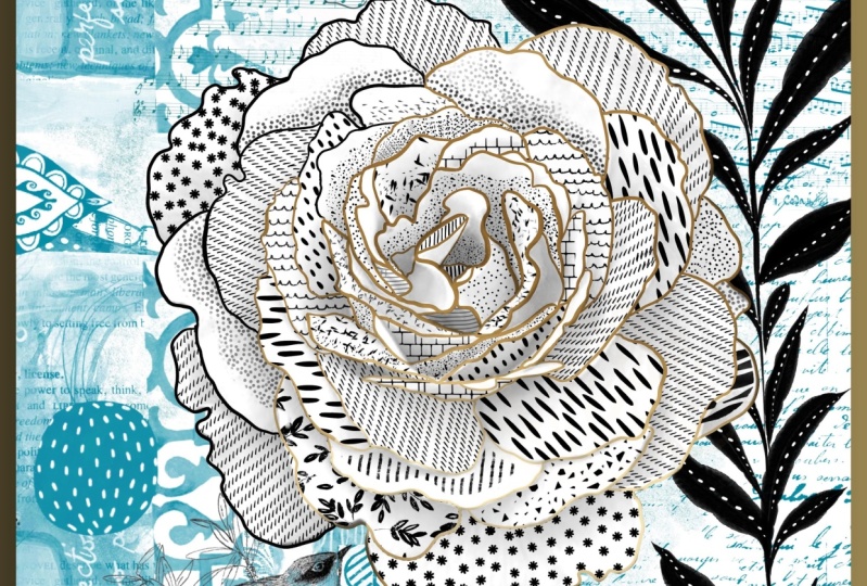
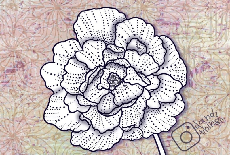
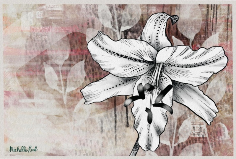
creating all of these. So this and this very similar
in the way they turned out. I had added more flowers in
the background of this one. This one has more
textures and things. But overall, I've accomplished what I
wanted for this class. And now I've got some really
nice samples that I can put with my brush set
when I complete it. These are all things
that I've done just to help sell my brush set. So these are using all those same brushes in that set that I was showing you. Alright, so I think that's it. I will meet you in
the wrap-up there. I'll show you a couple of really nice mockups
using these artworks, probably the artwork
that we created today. Possibly that one
too, we'll see. Anyways, I will see you there.
7. Lesson 6 Closing Thought and Wrap Up: Hey guys, welcome
to the wrap-up. Now I always wanted to show you all of the finished
art on mock-ups. That way you get a
better idea of what you can accomplish with
this art technique. It looks absolutely fabulous
on wall art, for example. Or you can use it
for small items like cell phone cases and
covers for books. These are just a few examples, so I hope you enjoy definitely
try that out yourself. And I really encourage
you to post them here. It really helps other
artists when they can take a look at what your finished
product looks like. I'm so glad that you
will hung out with me today to produce
this illustration. I thought it was
really fun and I think I'm going to
explore this far. I'm going to do a variety
just to check it out. I also have another
class that shows the process that's completely different than in
Adobe Illustrator. So make sure you
check that out if you are an Adobe Creative
Cloud subscriber. I did that on my iPad
and I ended up on the desktop and even in Procreate to do some experiments
with the background. So that class is quite
interesting as well. When you're on my website, make sure you check out
the artists resources there because I do
have discounted items that I sell normally on Creative Market and I sell
for less on my website. Check it out and there are some free items there that
you could download. Two. I'll also invite
you to check out my stores if you're interested. The biggest one is
that Sawzall.com. And I've got one at art of
where in Canada as well as fight flight societies
six and I Canvas. So you can get a look at some of the work that
I've done there. So I guess that's it for today. And I'm going to say bye-bye, and I'll see you next time.
 Delores Naskrent, Creative Explorer