Transcripts
1. Intro to Procreate Highly Textural Mixed Media Cactus Art: Hi guys and welcome. My name is Dolores
now sprint and I'm coming to you from
sunny, Manitoba, Canada a little bit late
in the evening here, so my lighting isn't great. But I thought I'd
go ahead and finish this class before
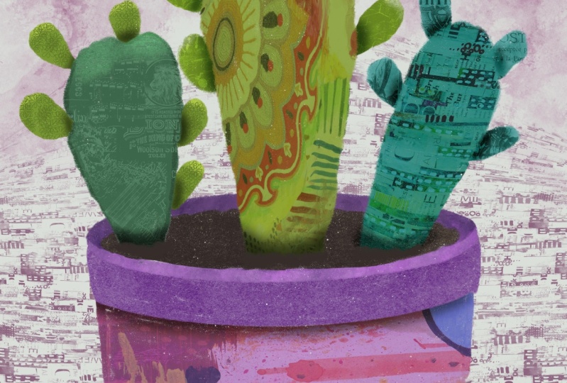
it got really dark. It's a very ambitious project. It's taken me all day. It's a mixed media, highly textural
cacti composition. While I'll try to
say that real fast, we're gonna be doing all
kinds of different things with my different cactus
plants that I've drawn. I've got three which
is very ambitious. You could definitely just stick with one to start out with. I have added tons of texture
and a lot of collage, all kinds of paint and come up with a very
interesting finish. I'm hoping that you'll enjoy it because there are a
lot of steps involved, but I think you'll find
it really fun to do. Overall, I think it's kind of surprising the way it
ends up at the end. This is one of the things
about this type of art. If you've ever done this
in real life and you've done all the cutting and pasting
and gluing and painting. You know that this can be
a very involved project one way or the
other. In Procreate. It's kind of the same
little bit less mass, but in the end, you end up with a really
interesting finished piece. I am really loving it and I think you're going
to really enjoy it too. Just make sure you set aside
a little bit of time because you're gonna get
really into it and it's going to take
longer than it looks. Now if you haven't
done so already, I'm going to invite you to hit that follow button up there. That way you'll be
informed of any of my classes and any of the
posts that I put out here. I'd also really
encourage you to get out to my website at
the loris art dot ca, add your name to my
mailing list there as well because that way you're informed of any of
the new classes I put out in my school of art. I also send out announcements anytime I post any
new artists assets, and sometimes they're free. So you want to be on that list. I guess without further ado, let's get into the project. I'll see you in lesson one.
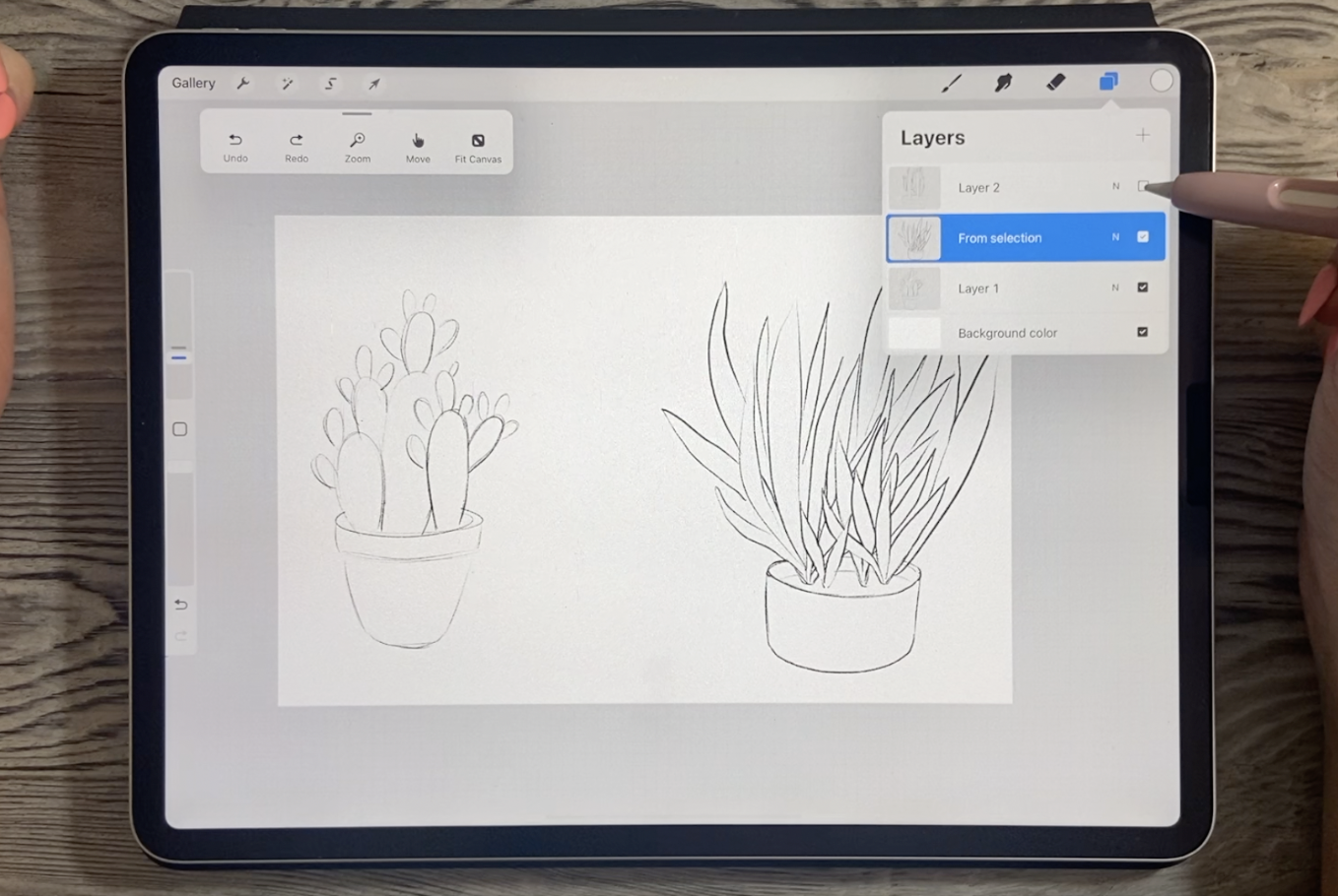
2. Lesson 1 Creating the lnitial Sketched Composition: Hi guys, welcome to lesson one. Lesson one here is
the sketching stage. I'm gonna be showing
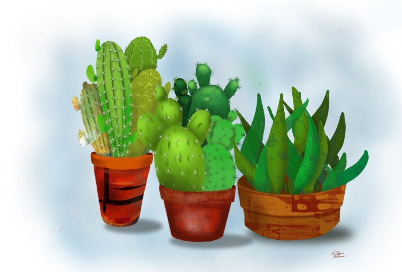
you how to draw three different types of cacti. You can definitely
choose to do just one of them if you'd like to for
your first attempt here, they can be very time-consuming
if you have all three. So that's something
to keep in mind. Let's get to it. All right, to do this project, I decided I would do a complete
sketch before starting. Now, cactus are
very easy to draw. I can walk you through
how I did each of these. I've got them on separate layers so that I could
move them around, which I did already and
resize them a little bit. I will make another layer here, just so that I can
demonstrate my process. I'm going to choose
just a black pencil. The pencil that I use
is just a six B pencil, which is part of this sketching
set here in Procreate. First of all, I want
to start with the pot. The pot itself is actually
pretty easy to draw. I've seen lots of
tutorials on this, but basically just need
to have your oval. So I'm just going to sketch a quick if I'm
in the worst angle. So I'm gonna have to change
this here to draw my oval. And at the end I'm
just going to hold so that I can make sure
that it's a perfect oval. You can also go in and edit
the shape if you need to. You can make the overall level bit more shallow
if you'd like. Kind of depends on the
perspective that you want, but I don't want
the pot to be super open or shallow over like
this will work just fine. Once I have that first oval, I'll duplicate it, move
it down a little bit. The distance that I
want the rim to be. And then I'll just
sketch in the sides. You'd see that
that's gonna give us that nice kind of a rim. I think I've just
gone back a step here because I'm gonna make it
ever so slightly smaller. You can make sure that
you've got them lined up to each other by
putting your snapping on. And you can see
that central line, we'll come on to show you that you've got it
positioned correctly and you can see this one is
now a little bit smaller. So then I can get that
kind of an angle there. Now because it's on
a separate layer, it makes it easy
for us to erase. What we really want is
just the bottom line here. So I'm erasing all of that out. So I've got the rim to my plot. If you wanted to have that
RAM also on the inside, you could definitely leave
it and just erase this part. I mean, it's almost at
the right height there where it could be the soil. It's up to you. I personally like it better
when it's like this. I'll draw my soil in there
separately if I need it after, then I will take
one of these ovals. Again. Probably that same
one will duplicate it. We can pull it down, be the bottom of the
container as well. The only thing is the
perspective we'll change here. So what you want to do
is get your work and you actually want that part of
the circle to be deeper. That's just the way it
is with a perspective. And you want to make it
a little bit smaller. So I'm gonna take this
snapping off for a second. I'm gonna make it a bit smaller, but the snapping back
on so that I can make sure it's lined up and
I'm gonna make a shallow pot. In this case. Really those sides were almost
perfect the way they were. So that makes a pretty good one. I would probably round
the corner out a little bit on that and
just erase that off. This one might be a
little bit too much, just want to round
it off a little bit. That's your basic flowerpot, kind of a bowl-shaped
one in this case. Now, like I said, you
could draw in your soil, you could just leave it
for now because the plant that I'm going to
draw here is going to really probably
fill up the space. You can grab all of these, put them into a group, and flatten them so
your pot is easy to move around and
it's all on one layer. Now, let's just move
this over a little bit. So we've got some
room to play here. Now, depending on the kind
of cactus that you want, this one here is a
very common one, very easy to make. These kind of rounded
shapes are very forgiving and then you can
add all of these little, I don't know what you
call them offshoots, flowers and I don't know. That's one style. This one. It's also very common
similar shapes, but in this case they
come off like branches. So this is kind of, I think it's called
a tree cactus. This first one was
a prickly pear, and then this one here is
basically like an aloe Vera. I have a crazy elevate her plant and it grows
all over the place. So depending on which
one you choose, you may want to do all three. I will demonstrate
the prickly pear. So let's go back
to our bowl here. And what I'm gonna do is just
continue with my sketching. I'm using my six B pencil and I'm drawing these
sort of paddle sheets. The kind of like a beaver tail. That's the shape that you want. You can't really do an oval. It just doesn't look right. It's a little bit too perfect. So you have to have it wider. And then it comes down
in a strange way. And you can put two or three
large forums in there. It's nice to vary the sizes
and no thickness of them. You can have one kind
of tucked in behind. She definitely the same
thing with this area here, folks, as if it was in
tucked in behind here. Once you have that general
form, the way you like it, you can erase any sort of extra lines that
you've got in there. And I should have done that on a separate
layer, silly me. I'm going to backtrack
here, add a new layer. Once you've got your
basic shapes in there, you can start adding
your little offshoots. And they're basically
the same shape. They're wider at the top. They kinda come down
to a point as they are added to the main stem. And they can vary in sizes. I've seen really small ones and then really big ones on
the same main stalk. That's the basic idea for
that prickly pear shaped. So you can go through and add as many of those little
offshoots as you want. Now, as far as the tree cactus, that one is more, I'm going to add a
new layer for that. That one is more tall shapes. So there are often
paddle shaped. This is just a rough sketch, so don't sweat that
too much because we're actually going to be redrawing
these when we paint them. So you've got your basic stocks and then you're going
to make offshoots. And I found that it was
easier to do this sort of thing and then go in and
join them with short stalks. Now, these were a little
bit too far away. You want them fairly
close to your main stem. And again, you can vary
the sizes of these. Sometimes you can even see
them on these tree cactus. This is literally growing
right out of the tip of them. You can make a
little branch first if that's easier for you. Those branches do have
a bit of a thickness, so make sure you show
that we definitely have some smaller ones
if you wanted to. So you've got good variety going on there as far as
the composition. So that's a very quick and
easy sketch of that type. And then there's the aloe Vera
and that one is just like a crazy lots of stems going
in all different directions. You can have some that
I do a new layer, yes. You can have some
tucking in behind. If it's gets a little
confusing for you, you can definitely
work in layers. So you could have
this base layer done, add a new layer. And you could do some of
the overlapping, this way. One here. And you could easily
go in here and reduce the opacity so you
know which one you're working with and you can go in. And if these are supposed
to be in the front, then you go on that
original layer now and you can erase all of these overlapping
lines more easily. See how that worked. Bring it back up to full, full opacity and just go
in and pretty much fill up your planter and
your composition of that particular plant by adding a ton of extra
little stalks here. And that's basically it
for how to draw these. When we get to the point
where we're going to be putting soil and
whatnot in there. Then we're gonna want to be
making some changes in here. And for each of these plants, I would duplicate the plot so that you could group all
of the aloe Vera together. So I would grab this, this and this and group it. So that would be one, then this one and
this ungroup it. If that was on,
turn off this one. Now you see that you've got that altogether with its own pot. And then this one and
this one group them. And now you see you've
got that complete pots. So then at this point, you could grab
each of the groups and make a pleasing arrangement. So what I would suggest
to is that you might want to make different pots so that you don't have
all of the same pots. I'm going to give
you a few of these little parts sketched out so that you can just
use it as a brush. And I've actually created
a few of them here in my, no, I don't have the plots in there yet, but
I've got prickles. I will fill out this
set and you'll have a whole bunch of different
brushes that you can choose from to help
you get through. It's a bit okay. And quickly, you know, at this point it would
be just to figure out a really nice arrangement and having them
separate like this. It's a lot easier because you can vary the sizes and so on. All right, so that's basically
the sketching stage. In the next lesson,
what we'll do is talk about the
arrangement a little bit more and then how to
get ready for the coloring, which will start in the
next lesson as well.
3. Lesson 2 Blocking in the Main Colors of the Cacti: Hi guys, welcome to lesson two. Lesson two here we're
gonna block in all of the color for the
plants and the plots. Let's get to it. I just duplicated
my file so that I could actually delete these. I want to keep them
so I haven't been my other file so that I can always go back to that
other idea or layout. And I probably will. But you can see here I've got
three different flower pots basically drawn with
the same technique. You know, some of it's
just very roughly done, but it'll be fine
for what I need. And at this point what
I wanted to do is start blocking in some of the color. So in order to do that, I'm going to be painting with a bunch of different brushes. Some of them I will
supply to you, but there's a lot of
them that are built right into Procreate here. And we can go down to
the inking brushes. And I'm going to use
this one called Inca. No, I think I'm going
to use dry ink. Actually, I liked this dry ink. I've used it quite a bit. It's very nice textural brush, so you can see it here. When I use it, it has a ton
of built-in texture already. I'm going to use that to block
in some of my colors here. Now, I'm also going to
be working in layers. And so I'm going to
want to keep each of these plants in their own folder so that it's less confusing. So I'm going to add a layer for each of these
at above each of them. And then I'm going to take
and group each of them. And I know you rarely
see me do this, but I'm going to rename them. I'm actually going to
deal with these guys. So this one is going
to be the tree cactus. This is the aloe. I'm just going to
scribble that out and print the word allo in here. And then this one here
is the prickly pear, rename purple and name
it. Okay, there we go. So now we can start blocking
in and I think I'll just hide whichever ones I am
not working on for now. So I'm gonna start with
this prickly pear. What I want to do is work
on that blank layer there. And I'm going to choose
in our scheme here, wants something with
bringing in it, but I want to have a
lot of other colors to play with as well. So where are we
going to use here? You know, you have
too many pallets when you went into trouble. I'm going to choose this one. Let me set it as my default. Go back to my desk, clear this and these
will be the colors that we'll use for this illustration. I can give you this palette. And what I should do is immediately share
it and stick it in the folder for this
class in media. And that way I will remember
to attach it to this class. So I'm gonna go with the
green that's in here. I worked with the palette,
but then I'll often just alter the colors a little
bit as I'm working, but I still try to stick
with the palate in general. So that's just that's
just the way I work. Now what I'm going to
also do here is I'm going to separate some of these
different levels out so that it'll be easier for me to do the texturizing
and shading or colorizing or whatever it is
I want to do I think I'll do this one all in one form
and I'll do this one. And then this
grouping, your three, I think I'll do on
a layer itself. So let's start with
the back most one. So for that I'm going to go with this color and I'm basically
just inking it in. I don't want to go
too small, But I don't want to go too big either. I want to be able to keep
some nice definition there. So I'm gonna basically draw
the shape as it cuts around. And you can choose to do
that differently too, if you would prefer to
draw the whole shape and just let the leering speak for itself. You
could do that too. So in that case,
what you would do is draw this all the way down, draw this entire
shape, and draw that. And you'll see that
it'll now be hidden by this one when we create
it in the foreground. So I'm just kind of going
through and I'm not being too critical
with my drawing. I'm trying to keep this a
very loose and casual style. I'm going to have
to close this shape here in order to be
able to fill it. I am going to use
this for filling. You can see that
there's a bit of a halo that is
produced at the edges. So you want to pull that
threshold up fairly high. So I'm going, I'm
well over 50% here. Can you see that
it's still leaving a bit of a line there. So what I would do is
go in and try to just get rid of some of it
so that it doesn't look like it's too much of an
outline and you know what, we're adding tons of
texture to this after. So I wouldn't worry about
it too terribly much, but I'm gonna go in now. And the threshold that I've
picked learned about 90% now, I can use it and it should do a pretty good job of
all of these student. A tiny little bit
of that touch-up. So now I can hide that one. I'm gonna go to a
slightly lighter color to do these new layer. And as I'm going through here, I can take the time to
make small changes. This maybe something I
noticed now that I'd like to add or take away. You have a right. You are the artists so you can do whatever you would like. So I'm just going to quickly
fill that one in mind. Some of these, it might
be just as fast or just do this to fill it in. And like I said, I'm not
worrying too much about this, these little halos that are formed at the edge
because like I said, I might be changing from a bit. Okay, so now we've
got this one left. So let's go a tiny
bit lighter again. That we have some difference that when we already did, right? And so you can see I've added a few extra little
bits here and there. And let's fill this
one. I don't know. Sometimes it's faster just
to color it in his neck. So let's show all of the layers now to see how they
look together. And you can see I've made
one mistake here where I've got this one on the
same layer as that. They don't touch
those. So I think I'm just going to
leave it for now. I think we'll be okay
and we can go through and do things like fix up
the shape at the bottom, anything like that
that you need doing. You can go ahead and
do, and you can see that it has turned
out just fine, nice and textural,
lots of depth. So I'm gonna go through and quickly do the other
two plants and I'll just fast
forward that for you so that you don't have
to sit and watch us. I do the whole thing. I think for this one
I'm going to switch to these sort of teal colors. So I'm going to, this one is going to take
a little bit more figuring because of the layering. So we've got to figure out
how we want to do this. And I think I will
make several layers. So I'll start by doing some of these bigger ones
in the background. And you can go all the way in. Threshold, had to bring it back a little bit so
that it would work. So you saw what I did there. I just dragged and
then I hold to get it to be not choosing to
much of the area to do. That's what I would
consider my first layer. I'm going to reduce the opacity of that so
I can see my lines. For my next layer, I'll add a layer and then switch to a slightly different color
and then do a bunch more. And basically what
I'm doing is I'm just trying to avoid
two that are together. I'll not do this one necessarily because
it's touching this one, but I could do this one. So I'm going to
now grab this one. And maybe this one in here. Here I've grabbed
it, hold it in, and then I'm pulling to reduce that threshold so that
it'll color in there. Okay. Maybe I'll do a couple
of these little ones. What would you say? That one? Maybe I'll go darker for
some of these new layer. Don't forget the worst for that. Now in this case,
I am stopping at one of the other
color areas too, because I'm not sure
that I want these necessarily all to be in front, like this one here. It might just be easier
for me to do this. I have a bit of separation. Actually. I'm going to switch that eraser to be the dry ink as well. So it erases with
the same texture. Then I can use it to
do things like this. Pointing, pointing
the tips of my leaves are my stocks, whatever
you want to call them. I don't know what to call
them when they are cactuses. So these would be tucked in
behind so I'm stopping them. But you could also
just use the power of the layering to help you
get some of those hidden. So I'm doing that one. Let me do this one, that one
I'm gonna do separately. So I'm gonna do a
couple of these on it, even another layer. But at this point I just want to show you that if I was to bring these up to full opacity, then I could do things like take that layer that I just did and slide it underneath so that is tucked behind some of those. So that means I could
have had some of these actually drawn all the way down and it would
have been fine. So I'm going to go slightly
different in color again, and I am going to draw it, this one in the back because
it needs to be behind all of these and I can still
follow my sketch easily. I had some of that line
on the other layers, so optical back
and take that out, which you see how nicely
that works to help put some of those in an order, right? So it looks like it's in
behind and you can see how really loosely I'm
drawing these. I'm not being overly careful to perfect
all of the shapes. And I think that that
is really important for this type of art
that I'm creating. A really needed to be quite casual and quite funky looking. So I'm going to go in with an eraser and do a
bit of touch-up. And then I will do
the third plant and I'll time-lapse it for you. And then we'll be ready to
go into the next lesson, which will help us to
do some of the work on the textures because
they'll have all of the plants drawn.
4. Lesson 3 Suggested Finsishing on the Flower Pots: Hi guys, welcome
to lesson three. Unless a three here
we're going to focus on doing
those flower pots. Let's get to it already. So we've got our three
basic cactus shapes here, and I need to just
fill out my pots here. I'm gonna do them within each of the layers that
they belong to. So let's start with
this one here. I am going to shut those off temporarily just to
make it less confusing. And I'm going to use these
kind of Terracotta colors, I think for most of the
plots, maybe these browns. So let me start with
this color here. Probably your quintessential
terracotta color. So here I'm going
to actually use the oval to draw the
shape and fill it. Then I can duplicate that. Of course I did on
the sketch layer. Of course, always try to
be good at this when I'm demonstrating and even then I still run into different
little issues. So we've got that first one. Let's duplicate it. Pull it down just like
we did with the sketch. Make it slightly smaller. I'm going to join sides here. Then I can go ahead and
fill and, you know, what I'll do is I'll fill
this area differently than this area so that we can get
the look of dimension here. So I must have a bit of an
opening here somewhere. It doesn't want to
just fill without me really dropping
the threshold. I don't know. I know why. I don't have them on
the same layer duck. So I've got a merge it down. Then I can fill that. Don't want to fill
that bit at the top. So I think that I will what I'm trying to do fill
this rim part here, so merge it down, so it's on the same layer. There we go. Now, I can bring that threshold up quite high and you can
see it fills it quite well. You see that little
bit of edging. Again, we're gonna be adding
a lot of texture to this, so I'm not too worried about it. I'm gonna go with a slightly
darker color to fill this part because it would
be shadowed anyways, I don't mind that
the rim is lighter because it's as if
there's light hitting it from the top there
and you can choose to fill that soil in. Maybe we'll do that last. Let's just finish
this part here. So I'm going to
turn mine this way so that I can draw a curve. I'm gonna do it in this color. If I've done this a little
bit differently than what I demonstrated to you in the
first lesson, but that's okay. There's always a lot of different ways you
can do anything. So now in this case I
want to go a little bit. I want to put this
color, but I'm gonna be doing some shading afterwards. So I'll maybe just
go a tiny little bit different just so that we can see the difference here. Okay? So that's just a little
bit lighter and we will be making some changes with the
texturing and the shadowing. Now for the soil, Let's just add
another layer here. Let's go with just a
really dark version of that same family. And I would just go on top of everything here and
then just draw. You can keep it could be smooth. You can have it texture
like I just did here, like as if the soil
is loose and bumpy. If you want a perfect curve
along the bottom there, you can even do it
with your eraser. And you can hold the eraser
just the same way as you do when you're drawing a line and
you want to smooth it out. So that has smooth
out the bottom line, you have to decide
whether or not you want the cactuses to be in
behind there or not. And I'm thinking
that it would be better if they were in French. And then you could also
go to the cactus itself, use your eraser
and then just also mimic the shape of those
little piles of dirt so that it looks
like the dirt is surrounding the bottom
of the plant like that. Make sure we're on
the right layer. So I'm just making it so that the bottom is not just
one straight line. Okay. Believe me that
little detail you're not going to really ever see. I can keep my sketch
off there for now. And let's go through
and do the other two. So I'm gonna shut
this one off for now. Let's go to the aloe. And in this case
you can see I did just a very plain
pot with no rim. I'm going to do that one, maybe more of this BG. This is going to make it
more beige by dragging it into this part
of my color picker, it will switch into
the yellow layer here. I'm going to add a layer, of course, this time I'm
not going to forget. I'm going to lose that color. Let's just go ahead and
draw the first oval. And it's nice when you can
move it around like this. And you can also
with an ellipse, you can edit the
shape of course, so we can make some slight adjustments
there to get it perfect. Maybe I'll bring that
up a little bit. Then I'm gonna duplicate it, pull it down here, and you see the perspective
of it has to be different. So in this case, I'm gonna use distort to allow me to do that. And you know, what
I could do here is actually just erase
this part of it here and then I could pull my straight
lines in like this. There are actually a
little bit curves tool. I think I'll not use my
straightening method. One thing about this dry ink is that quite often
you're left with little openings that allow the fill to flood your
whole background, which if that's
not what you want. Yeah, I don't know
why it's doing that, but I'll go around
the whole edge again. So I myself still had
a bit of an opening. They're going to quickly
get rid of that. And in this case, I can draw that slightly darker
part of the plot there. In fact, if need be, I can just hide all
of these layers, including, including this one if I wanted to, I
think I'll leave it. This one is still that oval. That's why I wasn't
able to fill because I wasn't I didn't hadn't silly me. I had not flattened
those two together. So of course it was filling
the whole background. Wow, I'm gonna duplicate that, pull it down to make that
shaded area there that I need. And I think in this
case it's touching. So I'd be able to
use it to fill. So I'm just going
to merge it down, which is what I should've
done the last time. And I'm gonna go with a slightly
darker color to fill in. That might be just a bit too dark and I think that
looks pretty good. So once we put all our
other layers back on, we can see that
worked out great. And then as far as
the soil again, we would on a
separate layer with something quite a bit darker
and you can just draw it in. Let's pull that up
too above that so we can kind of put a
bumpy layer of soil in there and fill it and then make any adjustments that you see
that are necessary here. Now that you've got
your pot in position, you can adjust any of these to make them look
like they're actually coming out of the dirt and I
think that's adequate there. So we've now got those two. So we just need to do the
pot on the prickly pear. And you know how I did that? Of course, this one maybe
we'll go quite a bit lighter. So we're gonna use this kind
of a creamy beige color. I'll go darker for
this initial oval will make sure that I have
the prickly pear layer, add a layer, draw my first oval. You can make it just a
little tiny bit bigger here, duplicate it, bring it down, make it a little bit smaller. This time I will
remember to merge it down so I can fill this one. I'm gonna have to
adjust a little bit on these plants,
but that's okay. Or maybe I can
just pull it down. I think it's gonna
be better if I cleaned that up separately. I'm going to make another layer for the bottom part of my plot. This one, I'm just going for it. I'm not, I'm not just dragging down the oval
to make the bottom. I think I can for
all this went in. Okay. Remember to close the top there and I thought I had the
lighter colors selected. Let me just fill out. Okay. I'm gonna move that
one underneath, so I think we're gonna
just erase these. Now I could've done
that also by selecting, grab that layer there, do an automatic selection
so that is selected and then you can go onto the layer that you're
trying to effect. So this layer here, and now it's protected
because of that selection. And so I can erase that
off really easily. The only thing I need to do
here is to fill that in. I'm going to do that
with a darker color. Sure. I'm on the right layer and that pot is basically
ready to go as well. I'm actually don't
really like the way that selection clear that edge. I'm gonna be doing
some highlights and stuff on these though, so I'm not going to
worry about it too much. And now I've got
my three pots of plants ready to go and we can
start doing the fun part, which is going to be the
texturing and adding the mixed media kind of stuff that we're
going to be doing. I can see here this little plant hasn't got a perfect edge. So there are some
little adjustments that I'll make and I'll
do that off camera so that I can come
back and be ready to start with that texturing.
In the next lesson. I'll see you there.
5. Lesson 4 Dimension and Definition of Cactus Forms: Hi guys, welcome to lesson four. Less than four here we're
going to focus on adding dimension to our three
different plants. There are different techniques. I'm going to show you all
the techniques that I used. Alright, let's get started. Here. I have hidden all of my other plants because
I want to focus on this prickly pear just
to show you how to do some of this work
with creating dimension. Can you guess how I did that? It's really not too bad. I will show you the steps. This is actually what
my shading looks like. Like probably doesn't
even tell you anything there at all either. So let me just walk
you through it. I'm going to delete
the one that I did. And while right away, can you not see the difference? You know, that little
bit of dimension gave us that real
sense of depth. Once you delete it, you can really see how
flat your platforms are. So let me show you how I did it now you can use
any other brushes. You could probably
stick with that income. You can use the posca. I think I'm gonna use the posca because I'm gonna show you, I'm gonna be also
using it as my eraser. I need an eraser
for this as well. But what you do first
is make a new layer, so it'll be just above
what you've got there. You're gonna take your marker and it can be nice and large. And what you want
to do is just add a line wherever you think you're going to
want that dimension. So I'm basically adding it wherever the
appendages would join. And then same with all of these little
appendages at the top. I think that's what I'm
gonna call them appendages. I'll get rid of that
little bit there. We will be doing
a lot of erasing. Here. I think I'll
just do short lines. And it looks super
weird right now. What we're gonna do next
is of course blur it. I'm going to blur it
to be quite soft. I think maybe about 6%, 5 percent would be good if you don't think that
that's wide enough. You could have gone with a thicker marker to
start out with, but I just wanted to, I'm
gonna see if this will work, so we'll leave it at that. And what I'll do here is
make this a clipping mask so it'll be stuck within
the platform itself. And then I still want
to make these into kind of harder lines here. So in order to do that, I'm gonna grab the eraser, which is a Posca and
that line there, I should have done a little bit overlapping into the main part. So I may go back and
change a couple of them. But you can see now
that using the eraser with a really hard brush
gives you a nice edge there. Let's try it with the dry ink as our eraser and see if
that's going to look okay too, because sometimes it's nice to just have a little
bit of texture. So I actually don't mind that that's still giving
us a nice line there and it matches the
texture of what we've got. So maybe I'll go through
and do that instead. These, I'll probably
have to move a little bit that I've done that. Now, a case like this
where you're I'm trying to stop this here, but I'm afraid of effecting that one a
little bit too much. You see how that's too
much of a hard line there. I could go in with
an eraser that is really soft like an airbrush. The soft brush
would be good there and just kind of inland a little bit back to the dry ink. So I'm basically
just going all the way around and doing that wherever I had one of those
lines and I forgot one here, I'll have to go back and
do that when you agree. Now that has really given that sense of depth for
this one that I forgot, I would have to do a new layer, go back to my
marker, brush it in, apply the blur and then go
back and add that, erase that. And of course this
one would have to be a clipping mask as well. And you can't go in and
of course merge it. So that's kind of a point there. I'll probably go back and fix, but you can see how
this all works together now to really make it look like we've got that dimension that we're looking
for in a case like this where I didn't have the line in exactly
the right shape. I can go a little bit higher. I just use my freehand selection and pull that down to position it where I need it
and erase anything that is not in the
right spot anymore. But yeah, I mean,
that really helps. I think it really makes
it look dimensional. Now let's throw our other
shaping behind here. Now with this one, in order
to make this look better, I think I would lighten
the whole thing. So I'm going to use my
hue and saturation. I'm going to brighten it and
maybe just slightly changed the color of I'm going up tiny
bit more to the teal side. And I'm gonna go through
and do all that shadowing. But I'm also going to do a
little bit of highlighting. The highlighting what
I'll do is add a layer. I can use the same
technique in a way or I could use an airbrush
for something like that. I could sample the color and go even a little
bit lighter and see I could just brush in a little bit of highlight into the middle of it like this, just to brighten it. And I can also do the same thing on the
tips of some of these. Now of course, we're
gonna make this into a clipping mask so that it's now enclosed within. You could add highlights. It stuff on this as well. So I've added another layer in-between the
shadow and plants. So that gives it also created
an automatic clipping mask. And I can go in and add a little bit of the
highlighting in there. Now we haven't started with
any of the other stuff like the texturing
that we wanted to do. I wouldn't go too crazy with
the highlights right now because we can do some of
that with our mixed media. But now we can go through, I can hide these three for now so we can work on this one. And I'll go through
the same steps. So I'm going to add a layer, get that Posca marker, darker, draw wherever I want that
shadow dimension to show up. And we're going on the top. So behind the big shape. Now let's blur it. And then we can go in and erase. Now the other thing
you could do is at this point you could
duplicate this one, hide it, go to that bottom
one, do the blurring. Then we could go back
to this layer here, use it as a selection. So use what we're
gonna do is select all the background
behind the lines here. So I'm going to use automatic selection and
see what's happening is it's leaving the
lines as what's open. And that will be what we can use to go to this layer again and use it to help us this erasing while
protecting that shape. But you don't want
to go anywhere on this side of the line, like on the outside of the line, but on the inside here. It'll help you to
get that hard line. You see how that is making a nice hard edge just based
on the results that I had. So I think that's good. I can get rid of this
layer and deselect. And you can see that helped
us to make that hard line. It's not perfect. I wasn't super careful
when I did that original. So I can take and adjust ever so slightly
wherever I need to. And then this will be a spot
where I would want to go to the soft air brush to just
soften this edge here. You can decide, I mean, is it, is it faster to have
done that selection or just as easy to go in with this. Maybe this gives us a
little bit more control. Actually, I wanted
that dry ink right. Now that one's got a lot of
dimension two and the other one back on and see how
that looks overall. We've got tons of
dimension here. This is great. We can make
adjustments always on our opacity and whatnot to make it blend in
a little bit better. I'm pretty sure that multiply is the blending mode I would want any of these burn ones can work, but you can also still
reduce the opacity. I'm going to leave it
maybe on multiply. And that's one that's completely
ready for the next step, which is gonna be the texturing. So I'm going to go through and do this sort of dimensioning
on each of the plants. Now, in a case like
this one where we've got these different layers
already worked out. In this case, what I want to
do is create a shadow behind this dark section that will
cast a shadow onto this one. So I think the easiest
way to do that it will be to duplicate this layer, a goal. On the lower layer here. It just hire the top one for now because I want
to show you this. I'm going to go on the shadow layer or what
will be the shadow? I'm going to darken it. So you see how I've
darkened it there. And we could even
desaturated a little bit and then go back
to the Gaussian blur. And let's just turn that
other layer back on. On this layer though, I'm
going to apply the blur. And then you'll see
what happens here where that you can see here has spread and will cast a shadow onto this one here
what we need to do though, is to actually
click it, this one. So we'll do a clipping
mask and then you can see that it has
cast that shadow. Now in my opinion,
that's not dark enough. So I'm gonna go into the
curves adjustment here. And I'm going to darken it. And you can see what's
happening here. As soon as I darken it, you can see that it really casts a nice shadow onto the branch, has more the stalks. I really need to find out
what the lingo is for this, but it casts a shadow on
this part of the plant. And I think that's great. You know, it's so easy and
we've done it so quickly. So that one to me has enough to mention I'm
not gonna go in and do any of these darker
ones because I think that these
because they're darker, you can tell that they're
in behind, right? So those two we've done and
they've worked out perfectly. Let's go to contestant
number three, which is the tree cactus. And you can guess the exact
method that I would use for this is same as I
would on this one here. Now, one thing I did do on
this one is draw some of those little appendages quite a bit lighter and on
their own layer. So in this case, doing the shadow on
them will be super, super easy because we can
just add a layer above, go in with the posca, we can sample the green, but we can go in
quite a bit darker. And we're just putting
a line at the base of each of these little
lighter green appendages. And I'm gonna show you
something That's really making this ideal way to do it. First of all, we'll apply the blur you want. I think
I'm gonna go bigger. Let's go, let's go
double the width. So let's go even wider. So I'm gonna go back to each of those spots and just
make it thicker. Now we'll apply the blur. Let's make it a clipping mask first and then that way when we apply the blurred
so you can see it now that they're
really solid. But if we go in and apply the blur when it's
a clipping mask, we can kind of see a
little bit better how that helps us to give
or get the dementia. In this case, I have
those in front, but I would grab
both of those and now slide them in behind
and pull this one. What am I doing? Slide this and this
behind this layer. So you can get the dimension
really easily like that for this back one
you know what to do, add a layer, go through. That color is probably
fine for this as well. Actually turned like
it's more like that. I'm going to go through and draw a line at the base of
each of the appendages. That one's not necessary. This one and this one blur them, make sure that they're a clipping mask and then
go in with my eraser, which is the dry ink. And just do a nice
edge on that and get the shadow off anywhere that
it's not supposed to be. I think now we've got the
dimension in there. Great. So we'll be able to start doing the texturing in
the next lesson. I wanted to show you that once you've got
the clipping mask, so that was this one here. You've got that clipping mask
That's shadowing in here. I can still go in
on this layer below and fixed something like this
that I've done incorrectly. So I'll go back to my
dry ink and I just hadn't fully drawn
that can go in anywhere else that I
see a glaring error and I have now given a lot of
dimension to this piece. I can see I'm missing
a couple here, so I'll make a couple
of corrections. But now we're ready to start doing what I consider
the really fun part, which is adding our
textures and making this into truly mixed media piece. All right, So I'll meet
you in the next lesson.
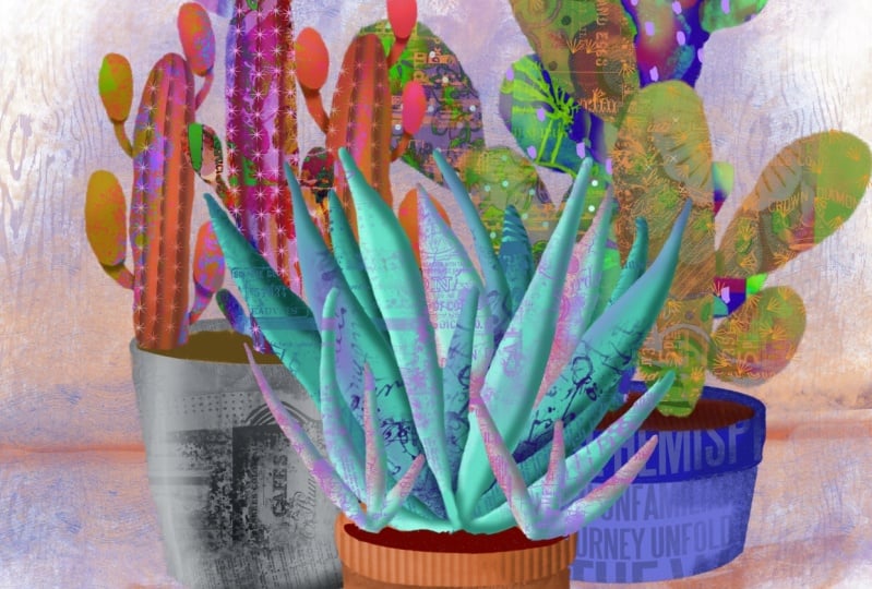
6. Lesson 5 Textures and Mixed Media Finish ldeas: Hi guys, welcome to lesson five. Less than five here I
want to start adding some of that texture in detail. We're gonna focus on the
aloe Vera for this lesson. Let's get started. I thought it would
be good to start this lesson by looking at
a little bit of reference. So this is my Pinterest site. I'm gonna go to my saved
arch or my boards. And I recently just put a whole bunch of
mixed media cactus art together into
a board that you could use as reference
for this next stage. So there's a ton of
wonderful examples here. And really all of these can be categorized as mixed media. So taking a look at something
like this, for example, you can see some of the different
textures that have been put in background elements. This area in the back looks
like it was done with a bubble wrap kind of finish that created
those little bubbles. Obviously some collage working here and just some
patterns have been added. Let's see if we can find
something quite different. This one was actually
a collage piece, but I thought that, that was a very interesting way to do some of the finishing. We can definitely add
some of that texture with mixed media brushes
that I've created. Which of course you
know how to do since you've taken some of my classes, I'll also checking once I've
found something that I like, there's always suggestions below that are very interesting. So here's a really
good example again, of collage that's been done to add texture and detail too, the different parts
of the cactus. So let's go back to
my main board again. Some of these,
it's just texture. That's the reason that I
would have pinned them. And in this case, it's just very simple textures. I've actually created some
brushes here for these spikes, which I will give you. So that'll be something fun
that you can play with. I love these little flowers
that have been added there. Very casual and they can
be drawn on at the end. This one is just gorgeous
with It's really modeling, kind of textured that's
been put on there. It looks like watercolor or
it could be Inc. and that's given so much life to each
of the different platforms. So you can go through my board, then look at all of these beautiful suggestions
that come up to give you some ideas of what you can do to really make your
piece interesting. Now here, this one I liked, I liked the dramatic
highlights and shadows. Unfortunately, there must
be a very small version of it because it's not
coming into focus. But take a look at some of
these and I just love how purples are being brought
into these and pinks, all kinds of different beautiful
highlights and things. So we're going to experiment with a whole bunch
of different stuff. We'll see how it
turns out in the end. So let's flip back
into Procreate now, the question ends
up being, just, what kind of a look are you interested in and
getting with it? And let's try starting
out just with textures. I'm going to work on my Aloe, so I'm going to just
shut these other ones off just to help us really isolate it and get a good idea of what
we could do here. I think I'm going to, with this one experimental
little bit with kind of texture plus collage
kind of finish to it. So remember that we've got each of these separate so we can add a clipping mask to each of them and add our texture in there. So I'm going to
make a new layer, and I've done a new layer there, I'm going to make it
into a clipping mask. And then I'm gonna go
into my texture sets here and I'm just going to grab something that
I think might work. I'm gonna grab one of these that has a bunch of
writing and stuff. So it's obviously like a collage finish that I'm
going to put on this. It's on its own layer. We could do it really
in any colors. I'm going to maybe flip
into more of a bright. I'm going to go right to
the very full brightness, but I want to go a little
bit more tuition in here. And you can see that it's
only going to apply to the layer that I
have it clipped to so I could stop
there and be happy. Honestly. Like that's the first step
and I just love it already. But I could also
go in now and add additional texture with
just a plain texture. So here are some of my plane textures I can go in and with something
like the recycled paper. And let's try something
really radical. I'm gonna go to the
pinkish hue there. I'm gonna go quite
a bit smaller, and I'm just going
to start adding a little bit of purple to these and maybe it could
just be on the top edges. You can decide on how you
want to affect your color, whether you want it
to be on the top and it fades into the
darker color at the bottom. Or if you want to go
the opposite way here, you could even switch
to a different texture. Let's go with something
like a charcoal. And I could go into a darker purple and go quite
a bit smaller and then just come in at the
edges here and just at the bottom mainly to
add further dimension. So this is giving you the sense of these pieces having
some thickness. And so there is your shadow. And of course you can go through and do the same thing
with highlights. So we could go to
a finer texture. Maybe I'll just do this
green ink wash and now go to a really bright
pink and white. All my brushes were so big. But you could do something
like this where you're adding some really bright highlights
on some of the edges. Once you start doing that, just keep in mind
that you want to be consistent with your
highlights and shadows. So you want to make sure
that you're gonna be doing the same thing on all of the different
parts of the plant. So in this case I've got
highlight here and shadow here. I should probably
pull the highlights down a little bit further. And then what I would
probably do is keep the shadow more on this
side in this case, or the bottom part of them. I already have fallen
in love with this. I think this is gonna be so
gorgeous when we're all done. There are lots of steps I know, and it is a little bit much, but if you remember to
just do it methodically, add the clipping mask, decide on your color, go in with your texture, and I'm going to sample that. Then go darker too. I can tell that the last piece I was working on must
have been really big because my brushes
are just humongous. So I'm going to take a look at that brush and I'm
probably gonna go in and reduce the green a
little bit to match the proportion of
this particular size of document I'm working on. So I'm going quite dark
in at the bottom here, but then I'm going
to switch it up, go kind of medium in the middle. And I'm going to go quite a bit lighter and maybe even a
completely different brush. I'll go back to that
recycled paper and I'm just adding some
brighter tops there. So this is what I mean by
it being the fun part. Now you can just
really go to town with all of these
different textures that you have that I've
either given you from other courses or you will
have here in your package, I'm gonna grab this
old handwriting for this part and adding
some texture in here. And you can see how this
is really starting to give depth all of my parts here. And I'm still keeping in mind that some of
these were lighter, some of them were darker,
so they should be in the back and darker. So this one here, which is those
darkest leaves there, I'm going to add
a clipping mask, but I'm gonna go in really
dark with my texture, especially at the bottom. I'll go a little bit
brighter towards the top and reduce migraine so that
my dots are a bit smaller. But I've added some real texture in the back parts there too. And I'll do the same
thing with this, which is really my
back most layer. So this one should
be the darkest. So I'll make that
into a clipping mask. I think this one
I'll do lettering, but I'm gonna go in and
make the grain quite small. I've gone quite
dark on that one. And what do you think? I mean, I think that's so fun and really fabulous
when you're done. I'm gonna go through and do some work on
the other plants. I'll come back and explain as I'm going through it so that
you know what I'm doing. And we'll work on the pots,
we'll work on all of it. I mean, we've got
lots left to do, but it's really going quite
quickly in my opinion. So that's the one plant. I'm gonna turn the other
one on just so we can see what a comparison like, how flat this looks in
comparison to this, how fun this looks. So that's what we're gonna
do on this one here. I'm gonna go to this
one for my next lesson. I will meet you there.
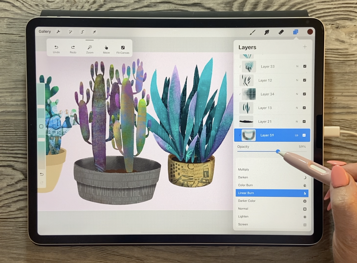
7. Lesson 6 Prickly Pear and Tree Cactus Details: Hi guys. In this lesson we're
going to focus on adding some dimensions
to the prickly pear. We're also going to be bringing
in some unique textures to make it really interesting and make
it really mixed media. Let's get to it. For this one, I wanted to try something
completely different. And I've gathered a few
little collage bits that I have done in the
past or have collected. And there's a couple of other
things and I've saved them into the Class
Assets folder here. So I'm going to go
to Insert a file. These are the images
that I have collected. This is one of them. It's not going to have let me
grab more than one at once, but I'm gonna bring two or 34. These are crazy collages
that I've done in the past and for
whatever purpose, can't even remember lots
of different things here. So this is actually a picture or a picture of
actually what it was, was a bunch of different
students work. I was putting this
altogether into an example, kind of a file that I had, examples of different things
we could do for this. I don't even remember
what the unit was about, but it was something that we did in our heart journals in class. Then I've got things like this. This is a picture of some beautiful lace
that my mom created. And she is quite the knitr, quite the crochet or for some reason I
had copies of these, so I'm gonna hide three of
those to start out with. And just with one here, I want to apply some
texture to my prickly pear. So these are all going to
be for the prickly pear. So I'm just going to drag
them into that layer. They're all become
clipping masks, which I guess it's
alright because I think that's what I wanted to
do with them anyways, but I'm gonna hide, Well, that's the one that I wanted
to work with first anyways. So here we have, and this is just like I said, collage that I created for
who knows what reason. I was probably doing a bunch
of artwork for my agent and I would have
incorporated this into one of the large artworks
that I had done. So, I mean, it's perfect
as a good example, I'm going to drag it down to be just above the layer
that I'm working with, but below the shadowing and stuff that we had
done around those. Now you can see already that my shadows are a
little bit lost, but not quite dark enough. So in a case like that, I would go into the
layer and adjust it. But let's first play around with the blending modes on this
layer because see what might look good to actually blend that layer
into the background. I really liked that.
That's overlay. Soft light. Hard Light is kinda cool. I mean, they're all really cool. You just have to
kinda go through them and then just make
a decision like something like this
is nice because it's all become monochromatic. But I think that
reminds me too much of my own brushes that are then
of course only one color. So I think I'm gonna go back
to one of these other ones where the color of the
collage still remains. And yet can kind
of show through. And I think I can just
play with the opacity a little bit. I like that. I think that's kinda neat. And the nice thing is, because it was a crazy collage that wasn't the same
all the way around. It really looks like
individually create a collage for this one and then another one for this side. And that works really great. And now what I can do is go
to the shadow layer here. I've got it on multiplying. Remember I had turned
it down so I could then bump it up a little
bit if I wanted to. Actually doesn't look that
bad at that 50 or 60%. I mean, I like that too. That's really fun. And I mean, it doesn't really match with
what I'm doing on this side, but there's so many different adjustments I could make here, like this layer itself. I could go in now and go to
hue and saturation and move that slider until
I do get a color that makes it work a little
bit better with that side. So right about there,
that looks pretty good. So there is a completely
different method. And how fun is that one too? I'm just in love with this. I think this is gonna be
so much fun for you guys. Of course you can also
still above that layer, add a layer which because it's
between two clipping mask, it automatically becomes a
clipping mask and you can go in and still additionally
add texture. So we could go in
with something like the splatter and grab
a color that works. And go in and just adds
additional color or texture. Let's go in and
reduce the grain. Their scale is a little
bit smaller and go in and still do all that same stuff that
we did on the other one, which was like adding dimension just with the
shadowing and blending. Oh, I love that. I think that's just great. So let's do the plant
that's behind it. So that would be this one here. And let's try my mom's daily. I mean, this is all about
experimenting, right. So I'll turn that on. And why is it not visible? Let me aperture. It's just not in position. Silly me. Of course it's way over here, so the pattern might be a
little bit too big for what? It kinda clashes with
those other ones. But remember, we can also still go in and do things like this, play with our blending mode. And we can still
reduce the opacity. And now it's looking
really cool. And that can just be
one of many layers. So we could go in and grab one of these
other ones like this, which I do have a
brush that I've created with this texture. But let's just do it in
this way just so that we can have the fun of
playing with it. So something like this
would be fun to colorize. So we'll go into the
human saturation and I'm going to bring
the brightness up a little bit and
fully saturated, which shouldn't really work
because it was a black image, but it does, it kind
of turns it purply. And then we can go in and move the saturation slider till we get to a color
that we lie on again, we can go in here and blend. Now I liked that difference. It is not the right color, but I do like the effect. We could also on this
layer invert it. So it's the opposite. And of course we can go in and change the color now that we've got the different blending mode. Now that doesn't seem to be
making much of a difference. Sometimes the layer order
makes a difference. So I'm gonna just move it above and I've got it on difference, but maybe I'll invert it or
leave it on color dodge, but I'm going to reduce
the opacity there. And that's an
interesting finish two, I'm going to bring
those write down though now one of the
things I want to do here too is to really make that front stand out
against the back one. So let's duplicate that layer. I'm gonna close
this for a second. We're going to grab
this one here. So that's no, actually I'm
going to grab this one. I'm gonna duplicate it. I'm going to fill
the bottom one. So select first and this
color will be fine. So we'll go back and we'll
fill it with that color. You can see it's block here. Let's go to the Gaussian blur, and we're going to blur
and you can see it creating a nice blend
that's bringing it up. Remember that we have to clip
this one, this back layer, so make sure that you slide it in-between some of
these clipping masks. So then it has clipped
to the plants and is therefore behind
the front plant. So I'm thinking still that this back plant has maybe just a little
bit too much going on. I'm going to reduce
the opacity on those. And I think maybe what
we can do is just go in and darken it itself. So we're going to
go to the layer. So that's the main color layer. We can go to the hue,
saturation and brightness. I kind of look neat. I didn't mean to do that, but I'm desaturating it
and I'm darkening it. But it did kind of look neat. Getting a little bit of
another color on there like that bluish Navy kind of shadow effect ties it in better with that
plant, Don't you think? So? Again, we've just added
so much interests to this one and let's just take a quick look
at the other ones. So we're gonna close
his prickly pear. We didn't use this one here, so I'm gonna grab that and put it into the tree cactus layer, and then maybe we can play
with it a little bit. So let's bring that to the top. Let's maybe just put it on
one of the stalks here. So we've got it Just on the one. We can move it around till we like what part of the
image is showing. I'm thinking right about
there would be good. And let's check out these blending modes to
see what might work. I'm not really loving any
of these in particular, and I think it's because
of the color of the image. So I'm gonna leave
it on overlay. We're gonna go to the
hue and saturation. And let's just move this
around until we find something a little
bit more appealing. So it could be, in this case, it's just not gonna be ideal for this particular
layout or this image. So I can take this and
really reduce the opacity. And then we can just start
playing with textures again. So I'm going to add a layer
and then I'm gonna go in with some of the other
things that I have. Let's say some nice handwriting. Again, the scale is
quite a bit too large, so I'm going in and
reducing the scale, adding some purple here. Here's that marker lines that we used in the
background here. This is the brush that
I had made out of it. You can keep them separate
so that way you can go in and make adjustments
individually. So something like
that might work. We could do another layer. And let's go in with just, this is kind of just
a grainy paper. And I'm going to
sample that green, go a little bit darker. And I'm just going to paint
some of that in here and they're mainly on the top
edges of all of these. Then I'm going to go darker. On the bottom edges. You can always go in
and darken up some of those shadows that
you had originally put on with the Gaussian Blur. And at any point, you can just take something
like an airbrush. So I've just got the it with a soft airbrush,
medium airbrush, and I can go in and just kind of airbrush
additional dimension on there if I would like. So I'm adding just a
little bit more darkness around the edge of it. Again, that helps to give that
impression of the curves. I'm going along that
outside edge bottom mainly. And then I can go back
with a good texture that recycled papers seemed to work nicely on
the other ones. So I'm gonna try that one again. And this time we're gonna go lighter and quite a bit smaller. And I'm just going to
add brighter highlights. I think I'll keep it
like that for now. And always go in
with other textures after I want to do this
1 first so that we get a better idea of the overall plant, how
it's going to look. So now we're gonna
switch to this. I'm going to add a layer, make it into a clipping mask. Since I've already got
that recycled paper, I'll go in and do. I'm highlighting and shadowing
a little bit bigger. And remember all these
little guys were separate. So that's this layer
here we're going to add, and I'm gonna highlight those a little bit too
so they really stand out and then start adding
some of our fun texture. So it will make sure
it's a clipping mask. If you add it to the
top of the pile, you have to make sure you designate it as a clipping mask. And I'm gonna go back to some of those other textures that I have in my massive
mixed media selection. So now I want to switch to somebody who's colors so
that we can tie it in. So right now I'm painting onto those little tiny appendages. So I'm gonna make my
green fairly small here. And this one is just crazy. It's got a little bit
of everything in it. And then I'm gonna
go somewhat lighter, make it into a clipping mask. Oh, I see. I'm on this one. I
thought it was on this one. See. No, I'll leave it
off of that one. Go to this one, add
a clipping mask, and I'm adding
mixed media kind of a finish to make it a little
bit more interesting. So this is what I'm doing. I'm going through on each of them and I'm going
to do this kind of texturing and adding detail. I'll do a bit of it
off camera and show it to you in a
time-lapse at the end. But then in the next lesson, we'll go through and
we'll do the plant plots. Alright, so I'll see
you in that next one.
8. Lesson 7 Additional Treatments on the Plant Pots: Well guys, welcome
to lesson seven. In this lesson we're going to focus on adding the texture and dimension to the plant
pots. Let's get started. Okay, so I started
to do a tiny bit of work here on the pots and I'm not sure I like
this one at all color wise. I don't think it works with
my overall color scheme now, so I'm going to find it here. I've added some shading to it. I'll turn that off
temporarily and let me just go into hue
and saturation. And let's just shift this
desaturated a little bit. Maybe make it a neutral
kind of a teal color. So I'm just I mean,
it's practically gray. I've reduced the move the hue so far over and reduce
the saturation to 7%. So that's kind of, I don't know, it makes it a little bit
more cohesive in my opinion. And let me turn on
that shadow again, which is not going to be
correct color wise either. So we'll go in and also shift that all the way down
and desaturate it. And even then it's not great. So I've sort of rough
color coming through here. Let me just erase that
right off of there. And now I can go in and
start using some texture. I'm gonna go back
into my textures here and just add a couple of things that might
be interesting. So I'm making a clipping mask. You can add switch to
that gray color and go a little bit darker and
add some of that in there. I'm also going to reduce
the opacity of it, so it's just barely there. And now I'm really losing that
shadow that made the rim. Also this handwriting is not
in the correct perspective. So what I'll do is
go into liquify, set my push really high and see if I can know
that's not going to work. What they are my
own layer liquify and push it to be in a curve
that can work that way. You can also do that by going into your selection
and going into warp. And you can warp to create
that correct perspective. Although I did find that
other one was a lot faster. This is a little bit more
picky, but it works. That's given us a little bit of something going on in here. And I think I'm going to
erase it on the inside because it would have to be going in the
opposite direction. And I'm just going to
erase the very top. And so that still remains
a little bit brighter. And I think I'm going to make a shadow
underneath here again. So I can do that
by adding a layer, making it a clipping mask. I'm going to just a basic brush. So I'm gonna go
back to my posca, going to drag that shape
across Gaussian Blur. And then we want to cut that
top section off by erasing. So make sure we have, I
guess a dry ink would work. Let's make a nice
straight line there. And we've got our
rim back so we can just reduce the opacity
there a little bit. And that worked. That's one thing you could
do for adding some interest. And one of the pots, I
would've been better off to have kept this
back section separate. You can still do
it by selecting. So you can go into
freehand selection here. Then Cut and Paste it separate. It's a clipping
mask at the moment, so I'm gonna pull it up and take it off of
Clipping Mask mode. And then this one we can
actually add a clipping mask to. Then use our texturing,
maybe one of these. And dark enough that we can
add some dimension to it. She would get in quite dark in the corners there
and you can see how that's really made a difference. So basically you go through and do that on
each of your pots. So let's go to one of
these other plots. This one here, I've already
got a clipping mask there. So that's this brown one here. We can go in and
add some texture, doesn't matter which
one you could still do. The same thing as I did before with those imported textures. Let's import something else. Oops, that's wrong. I want to go Insert a File. Let's insert this one
and that's just collage. I'll bring it to the top
so you can see that's just a bunch of lettering that's being caught
and put together. And then it looks
like I did some kind of a glaze over top just to sort of and
neutralize it a little bit. So let's bring that one down in to this layer right
above the plant pot, make it into a clipping
mask, what already is, and then reduce it right down so it fits
right onto the pot. And I don't know if
you could define mixed media anymore than this. I mean, we've got a lot of different things going on here. You can decide what you want, whether you want that
much going on or not. Let's try a different
blending modes here or something about
that difference that's really attractive. Overlay works nicely too, and we can just reduce
the opacity there. We can also still go in and let's use the Liquify this time to curve this a
little bit so that it matches the perspective
a little bit better. The anything that curves
within there just helps to suggest that shape that
would be in perspective. We could change the color
of that pot at some point to we can also not
sure if it would work, but we could try to alpha
lock that one and see if we can go in and paint
in some texture. Doesn't really work
because it doesn't, there wasn't enough white in there for the Alpha
Lock to work. So the alpha lock off, and I'll just put this on another layer and then
use a blend mode. I think I like this, add the bass and I'm going to
reduce it down a little bit. That's given it a
bit of texture. And I'm gonna do one more layer, make it into a clipping mask. And now we're just going to add a little bit of
darkness on the sides and decide what you think
is the best color for that based on your composition and
what you've got going on. And I don't mind that we've got some of this gold in here. It adds and ties in with some of these other bits of gold
that we've got going on. My color scheme has changed completely from what I
had at the beginning, but I don't mind that sometimes
it's just the way it is. It's one of those go with
the flow kind of projects. Of course, you can always
continue to add layers, continue to add clipping masks, and go in with other
little textures that you have like
some of these Marx. Let's grab some purple
here just to tie it in and reduce the
size of the grain. And I'm just adding these
little dots in here. And I think that also
makes it interesting. So I'll quickly do
this one as well. Time-lapse to show you. And then we'll probably be pretty much done what
we're doing at this stage, as far as adding our Mixed Media to each of the
plants and the pots. And then the last thing we'll be working on our background. So I'm going to quickly
do this one here. I wanted to show
you one brush that I had that was really cool. I think it's in my new set, this wooden Charles here. And I'm going to
sample the colors so that we're pretty
close to it and you can see how it just
instantly gives it that effect of actual wood. I'm going to add a clipping
mask to bottom part as well. Change my color slightly. And I mean, could you have done could you have done
anything faster than that? That is instant texture. Of course, I can
still go back and add some shading and
all that kind of stuff, which I probably will do. I'll do that off camera and then that way we
can come back in the next lesson and really start working
on the background. But this has been really
fun. I have to say. I'll meet you in
that last lesson.
9. Lesson 8 Finishing Touches and Final Details: In this lesson, we're
gonna be adding tons of texture and detail
to the background. I'm gonna be just giving
you a bunch of ideas and you're gonna take it
whichever way you want. Let's get to it. There are so many
different things we could do at this stage. I started adding some
little dots in here and those could be where some
of the needles come out. So I've done the one
just quick layer, just basically just adding
that kind of a blue. And I just stayed with
the dry ink brush and just kind of dotted
dotted them on all over. So it's a layer that's
above everything else in my prickly pear. I'm going through and just
doing some quick thoughts. You could go with a different
color on this one here, worth your design is gonna be completely different than mine, but I'm just showing you some
of the things I would do. Let's maybe go deeper. Other thing you could
do instead of dots is you could run lines. I don't have those clipped
currently so you can see how I'm going
over the edges. Then I could go in and actually make this
a clipping mask. And then of course it's going to cut off right at the edges. Now, I'm not sure why those
dots disappeared there. I guess I put them on this
layer. It doesn't matter. I can just cut it and
move it real quick. I'll just cut and paste. And then now that can be merged
with this layer instead, once you've got those lines, you could make the
clipping mask. And I have created
a quick brush, but you know, what I
discovered is the hut. It looked exactly like the
stitching brushes that I had done for the felt
application class. So you could definitely go
back and use those as well. But these are the
particles that I made. So I could go with
whatever color is going to work on the background
that I have at a layer. I'm surprised I haven't
run out of layers yet because wow, that's a lot. Actually, I don't need
a clipping mask in this case because I want
to go around the edge here and I definitely
need to not have Eclipse, so it shows you can't see it too well against
that background, but, um, you can make
your background darker. I've got just a soft pink here, but we are gonna be
working on the layer to add some interest in behind
these in this lesson. So let's just go and
put those particles on anyhow and then we'll go
through afterwards and decide. And so those particles
are very fine featured, let's just say you could
use these cross stitch brushes as well if you wanted to get to sort of really thick, kind of a funky looking stitch line or not stitch line,
story, prick-holes line. So there's that, that was the thickest crossed which
but then we had kind of an in-between one which
also could look quite nice to add that
sort of quickly. Look. So you know, I'm gonna
go back, of course, and perfect all this before
I show you my final, but I just wanted to show you a whole bunch
of different ideas. You could also just kind
of go through and add particles above those
are on those dots there. So let's go with a really bright blue and we can just go through and add the circles like this. So these are just ideas for you. You could do it whichever
way you'd like. Let's switch over to this one here for a second and we'll talk about other things you could do to make the cactus
more interesting. One of the things
I tried was doing a single line and you
can use any brush. I'm going to use a
Posca paint marker. I'm gonna go darker and I think I'm going to go
more into the purple family. You could draw, Let's
make a layer first. And you could draw, I'm going to go a
little bit smaller. You could draw a rib and
we'll just call it a rib, will go into the Gaussian blur
and blur that quite a bit. And then go in with an eraser. And we're gonna use just for
now the Posca paint marker, just so that I can show
you how that would look. So that's kind of a shadow. It makes it go deep
in on that spot. So that's something
that you could do. You could add a bunch of them or you could even take this one, duplicate it, and flip it horizontal and have
another ribbon here. And if you needed to
adjust the shape, you could either
use the warp or you could use that liquefy
trick that we did. Get your brush nice and big. And you could use that to help massage it into the
right position. And then along the edge
of that half a new layer, Let's collapse these into one. And on the new layer
you could go in and use your stitching or whatever
the particles brush. You could run a
line is on there. Now that's a very good job of lining it up and
you get the idea. So that is also very nice. It does give it that depth. You could do another
one in the middle here, infinite it up a lot, and then go in and
erase one side of it. You can make this one into a clipping mask or you
don't even have to worry about that erasing
like I was just doing. We could just pull it down and it would belong to
the other layer, which is the one down here. And that adds that
deeper shadow in there. I got it below all
my there we go. That's a little bit better. Maybe let it down a little bit or change the opacity of it. Then go back to the stitch, are going to keep
calling it the stitch, the prickles and add that
row in there as well. So I could do that all the
way along on all of these. And I think that would really
make it look like cactus. They're all going to look
a little bit different. This one, I wouldn't
do that to you at all because it's an aloe Vera. This one. If you really take a look at an
aloe Vera plant, has a lot of texture
along the edges that you could go in and research
and try to figure out. So I'll likely spend the evening adding the rest of
my details here, but I want to show
you real quick also what you can do
for a background. So I'm going to add a layer which I do want below
the prickly pear, and I want to keep it
fairly simple now I've got a background color
currently on there, so I'm gonna go in and go into
that and take it back out again to white so that we're working with a really
clean slate here. And I'm gonna take some of those great big texture brushes. Let's just try one of these. This one is called
building scott. What looks like buildings in the background that could work. The color may be
not the greatest because it's blends
a bit too much. So you might want to go
into sort of an opposite. So if you look at the
color wheel here, if you've got blues and
you're trying to make a contrasting
background than the best is to go to a
complimentary color. And that's going
to make plants or whatever it is you have in your foreground
really stand out. And the nice thing
about that one is because of that line there, it makes it look like you've
got sort of a table and then you've got an
upper part of it. So we can just keep that as is. We could go a little bit
darker if we wanted to in spots will get smaller with the brush that matches
that too much. So let's do like that
line across there. So that's something you
could do is add a line. Let's just do it with the
Posca pen and go right across. You can hold your one finger on the screen to make
it perfectly straight. Then I would blur it and
then take the eraser, which is probably still
the Posca marker, and go across again
and cut the bottom of that off so that that's
really smooth on the bottom, but it fades out at the top. And let's just move
it down to line up to that line that we
already had going on there. That's just a coincidence. So you, of course, are gonna have yours looking a little bit
different than this, but I think that works
nicely and you can definitely enlarge
it and put it on free form so I can increase
the height of it there. Remember that you can always
pull this out if you want to get really fine adjustment. That's given that real depth, like as if it's a table edge and there's some shading going
on in the background. And then let's just look at some of these other
textures that we might be able to add
to make it interesting. And I'm purposely not going right to the very
edges with this because I'm feeling like that's
kind of nicer for what we've got
going on here. If you feel the brushes too big or the texture is too big, you can go into the grain and reduce that
texture down a bit. Reduce your brush
size a little bit so that you've got
a bit more control. And I think we could use
some texture texture. So I'm going to go in and
grab something like this. Let's sample a little bit of blue or quite a
bit more neutral, and then just add little
bits here and there to keep it interesting and looking
like it's mixed media. So let's blend
that a little bit. I like that effect,
how it's giving that sort of stucco
texture there. This one's kind of neat
gotten vintage lettering. So let's add a layer here. Go kind of grayish. And I mean, I could
go on and on. And basically I'm just
wasting your time here because you're gonna come
up with some probably much better ideas than I have. And you don't, don't forget, experiment with your
blending modes, come up with some really
neat, interesting background. I'm sure once I go and
sit down and really relax and take a look at
what I've got going on here. I'm gonna make a lot of changes. Remember that going into human saturation at
this point is helpful. You can work on adjusting your colors that you've already got color there. So why not work on
experimenting in this way by just taking a
look at what you can do. Some like this
looks really good. I like that. It's brighter
yellow, that's kinda neat. So I might end up going
with something like that. So this is really the experimental
stage where we'll go through and do
a whole bunch of customizing to make
our artworks look individual and just as interesting as we can
possibly make them. So I know I'm gonna
do some more. I'll come back to you with
that time-lapse I promised. You can take a look at my
process with all of this. All right. I know for sure amoxicillin is I want to do is add
shadows and stuff underneath and beside each
of these to make them look a little bit more like
they're integrated with the background.
You can do that. And I think I've showed
you in so many classes, just duplicate
whatever it is that you are making a shadow from. I would duplicate this one, take this one that's
underneath and select it and let's fill
it with a darker color. Use your blur and
then adjust it. In a case like that, you can go quite a bit bigger
and if anything, erase some of it off with your soft airbrush to get
the shape that you need. I think I would do the
same thing with the plants in the background and
I would add a bit of a shadow behind them to make them look like there are
maybe a shadow side. I'll do all of that. I'll come back and debrief
with you in that final lesson.
10. Lesson 9 Time Lapse, Mock Ups and Conclusion for Skillshare: Well, we've put it in
all kinds of effort here and we've come up with some
really cool cactus forums. So this first part here is basically just all the
stuff that we did, all the steps that we took. So you'll see as I go
through the sketching stage, adding all of the little
appendages and so on. You'll see that
eventually I get to the point where I have
completely run out of layers. And that's when you'll
see me separate these into three different artworks. And that's coming up at the
end when all of this has colored and all the stuff that
we did together in class. So we're at the point
here where we're going to start doing the sketch that
I did actually with you. So that original sketch
was what I had when I was working with but this
is the one that I did together with you. I eventually go back to the original sketch to
do all of the painting, but I think I'm gonna go back to the one that we did
together as well. Because I think it's completely viable, very, very similar. And it would be kinda fun to get that feeling of
making a collection. So here I am adding
all of the color blocking for all of the
different ones that we created. And remember that
we went through and made sure some of them
were darker or lighter, trying to make it look
like something's, we're in the background
and some things were in the foreground. When you see it like this. It's kind of interesting and you know that you can
do this yourself. You can record any of
the things that you create before you
start a project. Just go to the Wrench
icon here and go to the video and set the time lapse recording
to the on position. And then at the end,
you'll be able to go into this bottom setting that says
Export time-lapse video. And then at the end of
every project that you do, you can go back and
take a look at all of the steps that you went through and all the
progress that you've made. So here of course, we're
showing all of the shadowing. We're trying to
create some depth. And in some of the
cases like with the, I think it was the
prickly pear and maybe the two texts as well, I ended up really bumping
up those shadows once I had added all of the texture
and mixed media elements. Sometimes I look back
at these time lapses and I almost can't remember
all the steps that I took. And it's quite
fascinating to look back at how I went
through and did it. So here I'm adding
that two dimensional. Now I don't think I did this, all of this in class. So you can see me experimenting and trying to figure
out what kind of a look I was after and also the effects that
I wanted to create. So we're getting closer to what ends up being
my finished pieces. But I think it's
right about here that are ran out of layers. Here. I switched into the aloe Vera and start adding some
of that background stuff. So some of this you didn't
necessarily see me do, but it's all stuff that
we went through in class. So bringing in the different
collage pieces here, I did use some in the
backgrounds instead. So I had started with just
doing the texture brushes, but then I thought that adding that collage and the
background really made it look mixed media and these little flowers
were quite easy to draw. So this is something
you could also consider adding to
one of your plants. So in this one here you sought, as I experimented a little bit with creating those shadows. And you can see me
going in here and putting them in a lot deeper. So I'm trying to make it darker and trying to just give it
a little bit more drama. I like the way this turned out. When you look at it real
close, you think, Hey, maybe those little
circles can be done differently or maybe the shadow could be
done differently. But when you look at the
overall finished pieces, it definitely looks
like it all worked. I want to show you the mockups I created and you can
tell me what you think. I've got a bunch of different
mockups here to show you. So there'll be the
greeting cards and also a few other pieces. I always feel like it's fun
to do it in this way so that you can see how that
might look once you finish it. How to work with backgrounds, how to add things
like lettering. There's so much that you can
do once you have your work. I'm so glad that you've
followed through with this project because it's a
really time-consuming one. I find. It's a kind of thing
that you really have to want to get to that end product. You can really go in so
many different directions. And I really feel
like the brushes helped a lot to
save a lot of time. But of course, incorporating all of your mixed
media elements, if you've got photographs of any of the work
that you have, you can definitely use
these as fillers and to add texture and to really make it look like a mixed media piece. Now if you haven't
done so already, I'll encourage you again to get that follow button up there or to add your name to the
mailing list on my website. That way you're
always informed of my new classes as I post them. Being on the mailing
list of my website, you will also get any information
I send out strictly for the School of Art or
my artists resources that I post there. Remember to check out
my two Pinterest sites, Dolores, Dolores NASTRAN, and
teach a divorce now script. I have that board that I
created for you for this class, but there's always
so much more to see. And you can check out boards like my artist's
inspiration board, where there are tons of ideas for different
illustrating techniques. Thanks so much for hanging
out with me today and I will see you in my next
class. Bye for now.
 Delores Naskrent, Creative Explorer