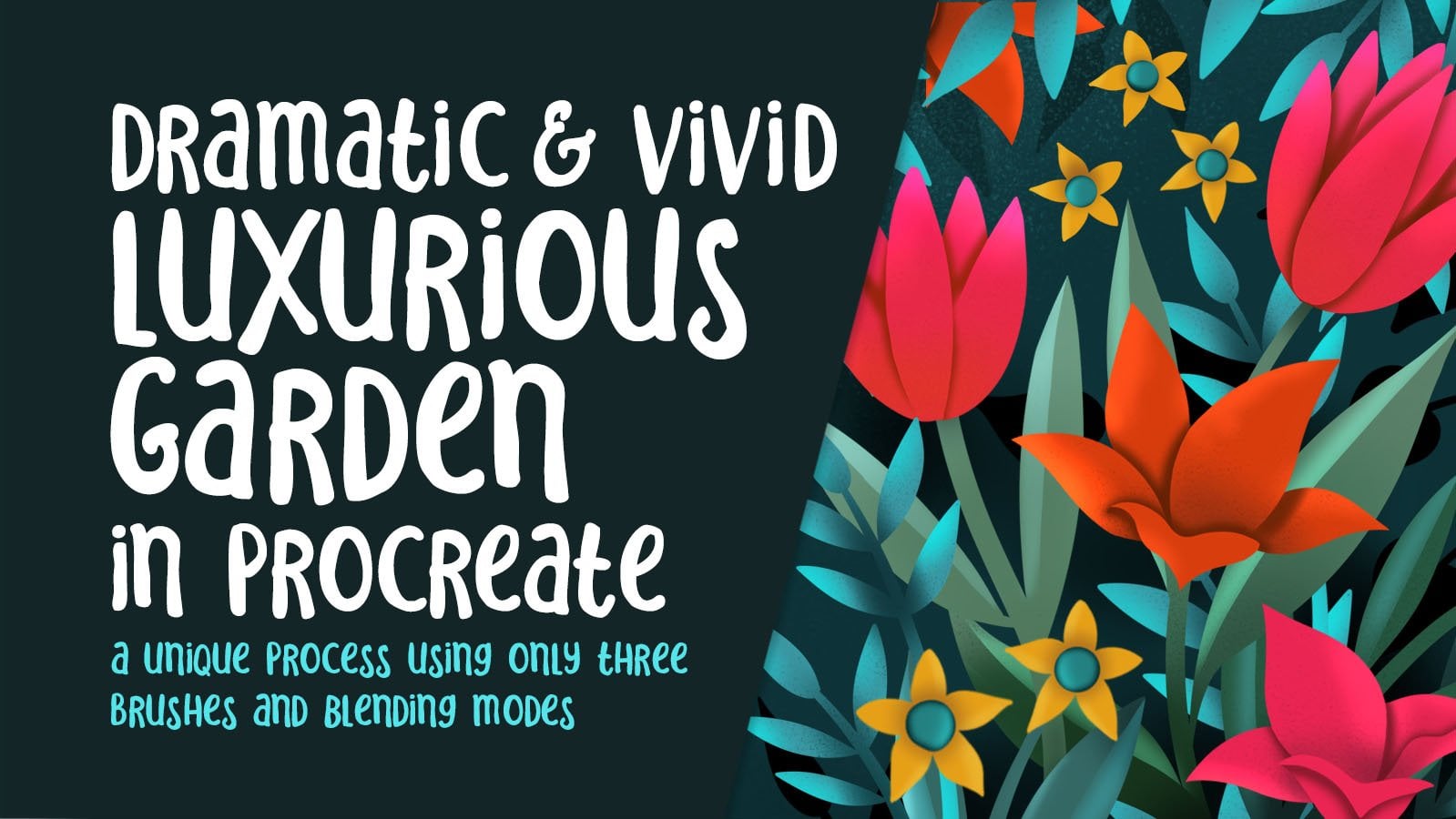
Transcripts
1. Intro to Peekaboo Mixed Media Using Easy Techniques: Hi guys and welcome. My name is Dolores Nas cringe, and I'm coming to you from sunny Manitoba, Canada. Unbelievable the weather we've been having. I even got a bit of sunburned yesterday. So in this class, I want to teach you a mixed media technique in Procreate. I call this the peekaboo technique because we're going to be working in a lot of layers. The base layer is what's really crazy and then review a foreground layer that kinda neutralizes everything, but has BAD mixed media background peeking through. It's a really fun and easy project. I'm really hoping that you'll enjoy. It kind of builds on that whole negative space technique that we've been using in the past. I always assume you've done my other classes, but you really don't need a prerequisite to get into this one. I'm going to be teaching you every single step along the way. Thank you so much for all of you who have been joining me in my classes and make it a weekly thing. I just love seeing your names on that list. It just gives me so much satisfaction and I really feel like I'm talking to you. I might just looking at you and talking to you. So that really makes it fun for me. If you haven't done so already though, I'll encourage you to hit that follow button up there. That way you will be informed of anything new that I have put out. I've been keeping up quite a steady pace and I'm really hoping to get a little bit ahead so that I can take some time off in the winter. We do plan to travel, so I'm really hoping the world doesn't explode before then. Winter seems so far away at this moment. When in the middle of October, we have such a gorgeous weather. Without further ado, then I guess we'll get started on the class. I'll meet you in less than one.
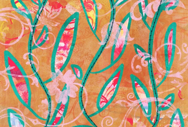
2. Inspiration to Spark Creativity: Hi guys, welcome to lesson 1. I want to start this class off with some inspiration. There are some gorgeous examples that I have found that have really inspired me. So I just want to share those with you. Let's get started already. So in the last couple of classes I did specifically the negative space painting classes. I have come this board again and again. And I guess it's just because subject wise, a lot of people choose to draw leaves and trees when they're doing their negative painting. So I have seen quite a few different ones here. This whole top row is actually really similar to the technique that I'm trying to achieve here in Procreate. So most of these are absolutely stunning examples the Rosetta sent to cheat. If you have a chance to check out her work, she has really taken this art form to the highest possible level of achievement. And if you check it though, if you actually search her out and find some of her work, she spent a lot of variety. So you want to really take a look at this one? I would say it's probably fairly new. It's a little bit different than a lot of the ones that she has here that I've seen. There's a lot less detail in the background. If you look at some of these earlier ones, you see that there is a lot more detail. So I don't know if she's gone from one extreme to the other or she, she's experimenting with new techniques. Either way, the work is gorgeous. This one I kind of wanted to take a look at it caught my eye because she's got all that negative space, sort of leaves and trees there. But she also added that really dark navy line all the way through. And that's quite different than most of the stuff that I've seen occurs. So that was quite an interesting different take on this particular project. This one here is student works. So I thought that was really cool to check out a student. I don't know from where or if it's a school or somebody who's teaching online. But basically this is the idea. So what we're going to be doing is I'm gonna be showing you a couple of different things, but definitely leaves and branches and that sort of thing. And yeah, just the background peeking through. That's got a lot of detail. In my case, the first one I'm showing you has a lot of color and then I'm showing you a couple of other ones throughout the class that have less color. I just wanted to experimental little bit with that. And by no means do you have to stick leaves and trees. This one I thought was pretty cute with birds perched on a branch. And in my last negative space painting class, I actually did a bird on a branch as my title. So definitely do a bunch of research, check out some of these really different ideas, different sort of subject matter, and checkout, the different techniques that you see. This artist's technique called her Kingston definitely posts a lot of work that is done in this style and her work is really distinct. If you check her out, you'll see that she's got a real knack for this. Her backgrounds are a little bit more planned out. You'll see once you check out her work. So here's that one by Rosetta said to me that I was showing you at the beginning. And what I like about going to Pinterest here in checking it out is that you'll get a bunch of related artworks. So this particular book of hers may not be what you're looking for, but it might lead you to something that is more in the ballpark of what you'd want to do. This is probably one of the closest example. What we're going to be doing today, this, or even this one here. So Siebel Peters, That's another artist. You could take a look at checkout her work. Some of this other stuff is so amazing. I could paint probably 10 thousand things in a decade. I had the time and the energy, but there's some really amazing work out there. One of the things I noticed with this one is really textural sermon via foreground that was done. So I've tried to capture that a little bit in what I've created for this class. And you'll see that with a different painting techniques that I will show you. So there's quite a few that are similar. So these must be the same. Artists turn deadly, I guess. This is what inspired me for that other class, that title slide that I did. So I'll show you that the other ones that really grabbed my attention are the ones that I see here done with collage and the background. See if I can find you an example here. This one isn't quite what I had in mind, but you get the idea here. This would be another great way to make your finished art very interesting. You can see that collage background bear would be fantastic for this peekaboo technique that we're doing. And here's one that's super simple, really is just one branch with a ton of really cool textures and stuff that had been put in in that original background layer. Here's a really lovely one and this one could be negative. It could be positive, painted. It really won't work either way. So you couldn't have that really cool background with the negative space leaves and then add some stuff to the foreground. So that's something we're going to experiment with a little bit. And we're going to be doing things like erasing our foreground to create some really neat effects. So stay tuned. We'll be doing that. Now look at this one here. What do you think about one? I really love this. This really kinda ties into the negative space trees class that I did. I love that the artist has gone back and added little tiny painted details in and around the antlers and the ears and so on. So these things had to have been added at the end to have worked out so perfect as far as positioning in every time I go to a new technique or a new artist and take a look at what comes up. I get really excited about this whole process because I think this is something that we can really work on and develop. This is something that you'll learn the basic technique, then you can go back and do some amazing work like this. For this one here, what I love is that it's been divided up. It's got these three sections. The middle section is, we're done with the same sort of peekaboo technique, but then these upper sections are the opposite. Almost everything is superimposed over that same mix media background. And you can tell with it's the same background because the branches and so on Connect from the middle section to the Ottoman top sections. Now this one really reminded me of one of the ones I had my art journal that I did over a mixed media background. Thing that really struck me about this is that multi-colored backgrounds. So it wasn't just one color, which is what I've done for examples for this class. This one has multiple colors, but it's still using that peekaboo technique and showing through to the background in the few minutes that we've taken to do this inspiration examples lesson, I've probably seen ten different ways that you could finish your artwork to make yours very unique. So if you take some of these ideas, you take one of these ideas, you do a combination of a bunch. Either way you're going to come up with something super original. So I can't wait to get started. I'll see you in the next lesson where we're just about to start right there.
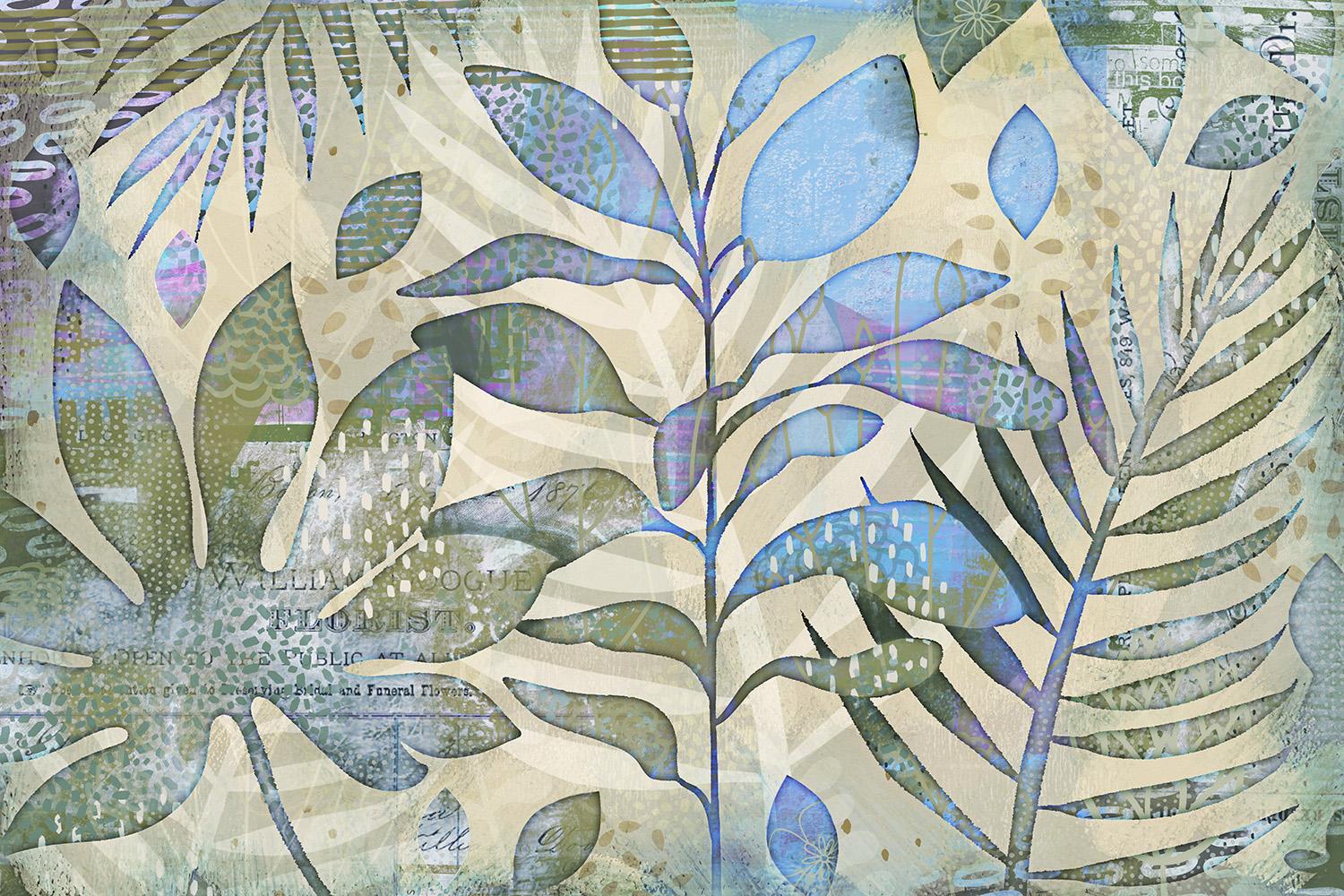
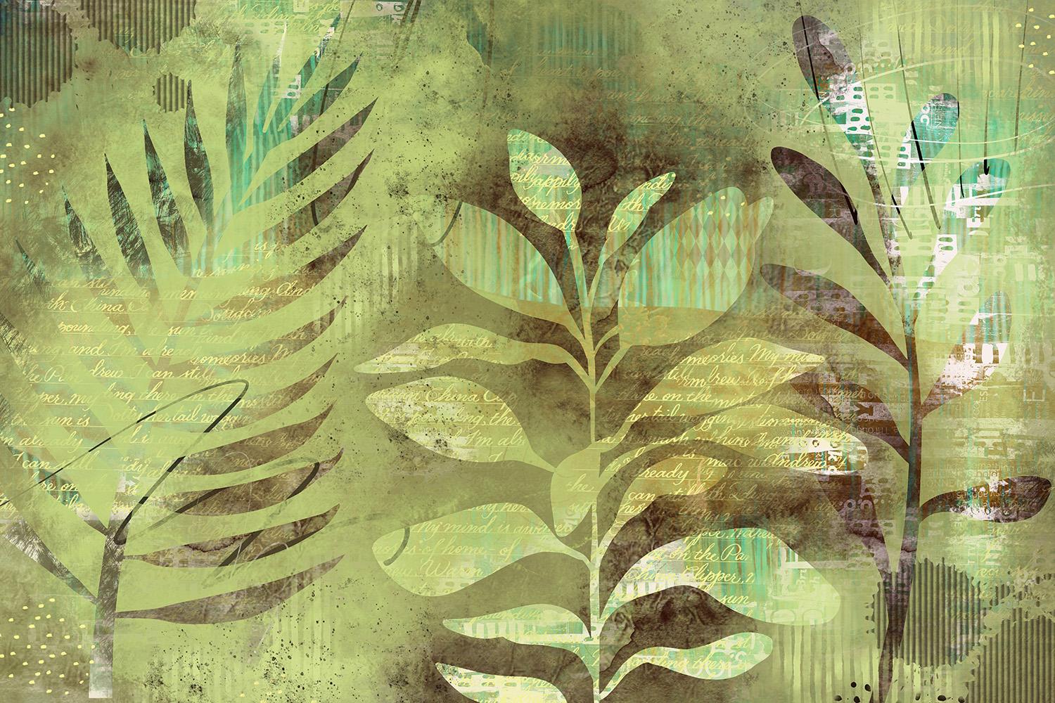
3. Setting Up lnteresting Base Layers: Hi guys, welcome to Lesson 2. So in this lesson we're just going to start setting up that base. I hope you have all those brushes handy that you've been creating. Let's get started. So I thought a good way to start this class would be to help you visualize some of the things that you could do with the background. I've done a bunch of practice stuff and a lot of it incorporates using brushes, but some of it doesn't. So this one here, I did these by hand. I just drew them out really quick with gouache brush. But the brushes I did use were for the background here. So you can see this corrugated kinda look at something that I added and then I did a bunch of these large shapes. I'll go through this and show you some of the layers in a minute. This one here is the one I did use or for the title for that last class, the clone brush class, that mixed media class that I was talking about. I'll give you the link for that one so that you can go to it specifically if you want. In that class, we experimented with doing a bunch of different brushes. And you can see here that I had a really busy background, which I will show you. And on the foreground, I added just some simple brushes to really give it that mixed media look. A lot of these kind of overlap for one class to the next. So that's why sometimes I bring them up in more than just the one class. This is that crazy busy background is, in this case, I have some adjustments to the color and added some foreground items which I will be showing you and I'll show you this document right away. Basically, it's this idea where we've got eaten leaves, a really nice blocked out background. And you can see here that mixed media peeking through. And I've done it here as well. Here I've also added a ton more brushes and details. So these are all things that we'll do throughout the class. So it's not necessarily just building up that background to start out with, but it's experimenting and adding some of the things that we think might look good. This was just a quick one. I'm not even nearly done on this one, but this used to some of my floral brush stamps that I had. And I basically did the same idea as the hand painted one with the leaves. So I've got that kinda as an outline and then I've still fill the background with a solid color. You can see that in the base layer, I've got a bunch of collage elements. You can see them back here. There's a little bit of advertising and then I've also found in a few of my flowers, this one is not nearly done. Those who don't judge, I would probably do a ton more work on this to really make it work. And then this one was just crazy one that I found actually not even related to this class. And I've done this a long time ago, but it's also the same idea where you've got the leaves in the foreground or the line art in the foreground, build the background it through here. And of course, the opacity on that background shows that marble kind of a pattern that I put in. So that one was just crazy experiment along time ago for something else but really fits into what we're doing. And some of those examples that I showed you in my Pinterest boards. This one is one that I'm actually preparing for art licensing. This is a color that I had just recently for V6 do with leaves, but mixed media kinda look is going to work for this call-out. I'm really hoping that this is something that I will sell, but it's got tons of clearing in the background. I'll show you this document as well. And then of course, I've used a brush here to do my foreground. And that peekaboo technique shows through all the layers that I have in the background. And then those layers themselves are interacting with each other with blending modes. So this one is close to finished on that same leaf kind of an illustration. Again with a really textural background. And in this case, I've got this already so that I can show you some of the other things I would do to this foreground. You can see back here that I've got some of my flower brushes. And I have used that same busy background that I've been showing you. And it's something I've used in more than one class, so you'll probably recognize it. And this one, same thing. It was just a bunch of brushes. So in this case, I used the brushes with a really cool technique using the eraser instead of using the paint. And so I just erased out of this foreground layer that I had done. So that foreground layer is also kinda mixed media. I've got a ton of texture and brushed tabs on it to make it more interesting. And it's still is that same idea of peeking through to whatever I had on my base layer. And that was just a totally experimental one that I did last night. So at this point, we can take a look at that base layer and let's do it in this document here. So with this one, I do have all of the foreground here. Now you can see the leaves are showing through because they have been cut out of that foreground. But two of that layer there, because I wanted a little bit darker once I started doing some of the items that I wanted in the foreground here. So I'm gonna be showing you that, but right now I want to concentrate on that background. So in this case, this was that background that I've been using for a lot of different classes and for a lot of different examples here. And I went and added a ton more texture then there was originally, so I did that all with brushes and originally I didn't have them on separate layers. But because I'm working so large, just in case I might use this for art licensing. I've got a limit to how many layers I can do on this one. I think it's about 15 layers, so I'm constantly having to collapse layers together, pinch and collapse two layers together or more. So even though I've added a bunch of that stuff after the fact, I have now collapse it onto one layer. And this is something that you can do in layers if you're doing a smaller document like 8.5 by 11 or nine by 12, then you're going to get a lot more layers. I just work with these really large documents because I'm planning on using these for art licensing as well. So in this case, what I did is I experimented with painting some additional elements on here. I was really inspired by that same Tucci design that I showed you. Where she had painted a bunch of leaves and branches kind of in a more bold way. I'm going to be experimenting a little bit with that. This is a look that I personally really like. You see how I've added. And I've used mainly brushes for this I think. And then just did some distorting on them to kind of help fill out the area. And then I went through and I added a blue kind of a leaf here as well, or leafy branch. And I duplicated that quite a few times and ended up with this amount here on my background. I can pinch those together now. And then of course there was my foreground. And I even added an outline here on this. So at this point I'm ready to go and start adding some stuff to my foreground. And let's go into another image here that I want to show you the background of. And that is this one here. Same foregrounds. Everything is the same, actually copied and pasted from the original document. And with this one, you can see that I have used that image in the background. So there's, there it is there. I've changed the color of it obviously, but then I added, let me just show that one. And then you can see as I worked my way up these layers here, all the different things that I've added in the foreground. So I added some leaves, some textures. These are all just brushes. I added a couple of flowers, that Part of my own collection of brushes. And I think I'm probably going to change that one. But you can see here how I build up the layers slowly and keep adding until I get what I need for my foreground. So that flower with this one here, and I'm thinking that it's a little bit too big. I don't know if I like this part peeking through here. So let's make that one a bit smaller and kinda want to hide that middle part as much as possible. The petals are great and not mine that I leave those there. But then what do I do too, is I go and grab one of my brushes that I have in this mixed media sampler, which you would've gotten in the other class, I will be giving you a bunch of brushes, bet, if you didn't take that makes me the class. All of them have brushes included so you can go and check that out. I've got this one called shape on a path vertical and then I've got one called sheep on a path sideways. And that way, if you wanted to make your own, you could use this as your master. So I'm going to make my leaf actually fairly big. So let's check what the size here, what Lear MI on. Let me just add a layer here. And let's make this a color that's going to stand out for you right now. You can see that it's very opaque and so we'll probably end up changing it. But just to show you that these are leaves on a path. So you could easily and quickly add leaves. That whole background layer. That's one of the ones that I found really easy to use for filling in that background. And then you'll find that a lot of these flowers that I did are the same thing where you can paint them very quickly because they're on a path. There is a repeat of the elements in my brushes. So if you take a look at the actual brush shape and go to Stroke Path, you can see here that I've got a bunch of them together, so I haven't caught them separated, but I've left them together so that you can use them in this way. You can just stamp them if you want. So that's something that you can definitely do to control where that is going, maybe a little bit more. But you can see if I hide this, I'm just adding a whole bunch more business to that background. If this is on a separate layer, in this case it is, I could also fill that background with something else. So I could go in and let's say just fill it with white. You can see what happens here. The hollow flowers will still show through in that peekaboo technique, but we can also reduce the opacity of it. So that will be a completely different effect once we reveal these two levels. So keep all those things in mind as you're doing this. You can do a bit of a background and build up as much as you can before you do the foreground. And then show the foreground so that you can go in and control where you're putting your new motifs. So in a case like this, I would maybe sample a color. I'm going to go a little bit lighter than you see how you can just go in really quick with your brushes and add a bunch of new elements. It's also works great for things like the textures. So here I'm just adding that little watercolor texture that I created in the other class. And even though this is behind that other layer, that layer is a little bit translucent. I've got to 79 percent. So it does kinda show some of those things that we would be putting in on that background. So this is one of the brushes that I also created for one of those other classes. So that's something you can do. Remember that you can also go in with any of your background textures that you created. So this was a painted background. Let me just hide these two. I'm going to put a new layer on here. And this was that background that I had created with credit cards scraping paint along. So that's something that you can completely start with. You could have nothing in the background justify yes, and then use that as your base layer. So as we're going through this, I'm definitely going to be showing you a bunch of different actual techniques for building all of this stuff up array. So I think that's enough for this lesson, and I will see you in the next one.
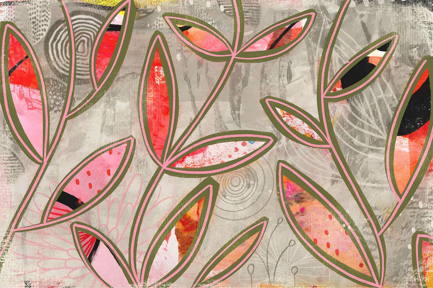
4. Strategies for Foreground Composition: Welcome to lesson 3. So in this lesson, we're going to set up that foreground composition. I'm going to show you some really good strategies. Let's get started. So we've got a blank canvas happening here and it's really up to you which way you want to start. Sometimes it's nice to have that background. They're just kind of as a means to guide you as to what you want to push on that foreground. But in this case, I'm just going to start as if I haven't got it background figured out yet or anything. So a lot of people find it difficult to work in the negative. And by that, I mean, if you had a, let's say a fully black background, and then on your foreground you would paint in white. So it's up to you. You can do it either way. You can go through and just create your foreground that way, or you can do it in black, whatever you're more comfortable with. So I think I'm going to start it in black and we'll go back into that background color and just set it at white. So I'm going to draw leaves similarly to those other layouts because that's something I can do really fast. And I want you to think about the brush that you're using. Now I've got this minor cut brush that I've created myself. And it's just a shape that resident here in Procreate. And I've added a green that is also a resident here in procreate. I wanted to have a bit of texture because I want to fill the background with a really textural paint that has a little bit of the background showing through. So I don't want to fill it absolutely solidly. If I did, I would just drag my black and here paint with white and be done with that. But that's not exactly the loci want. So Let's just start by drawing a couple of things here that we could use as our foreground. So I'm just going to draw a couple of really swoopy lines and then go through and add the leaves. So an easy way to add leaves would be to make sure shape like this. And that gives you the stem kinda prebuilt in. So you can make different sizes of leaves. You can have them at different angles. You don't want that to be necessarily exactly the same. So here you might want to do something like this. You don't have to have a stem on it. You could have your leaves literally attached to the stem. And maybe that's kinda fun to do to beat when you're varying the sizes and the look of them. I'm trying to kind of allow a lot of space in here. That's going to be what shows the background through it. So it's going to go through and quickly fill these. You can fill as much of the background as you'd like. You can leave some nice big areas that can be worked on leader. Now once I've got this, what I'd like to do is add another layer that will have that really textural paint on it. I want to have that kind of an outline just like I did with the other ones that have the yellow outline. So I'm going to do something here where I do with selections. So I'm going to my selections and I'm going to do an automatic selection. Now I'm going to drag so that I'm selecting and not leaving too much of a release around there. There's going to be a bit because it's a textured brush. And now I can just kinda tapped to add these additional areas here. I'm going to hide this one for now. So I've got this new layer. I'm going to grab another brush. And for this one I think I'm going to use a brush I just recently bought. And it's a thick layered wash and I like it because it does show through a bunch of the texture of the background. So it gives a lot of texture here. And let's go to, Let's check out a palette here. Why don't we think that one, or maybe this one because it gives me a lot of browns in there as well. And I'll just go to my disk and that's now my new palette. So let's grab this color here. I think that would be a good background. Course. All of these things like color can be changed later. So I'm going to go in and paint. Not sure if that's the brush I want. Let's go back to that sex that might be more interesting. See how it's got some really cool texture in there. And so I'm painting this super roughly as if I am actually using quash and working around all these different shapes. So you can see at times I leave a lot of the texture showing through, so I'm not putting it down super heavy. I'm definitely making sure that I have the leaves and the stems are there, completely blocked in. Now you can choose to go right to the edge or you can leave some little bits kinda showing there. I'm going to do that because I think it might be an interesting thing to see with our background. We might have some really nice framing happening if we do it that way, I'm going to do a little bit of erasing. So to erase with that same brush, I just hold down on my eraser here and you can see it says erase with current brush. So I'm just going to erase a little bit and go a little bit bigger point, adding a little bit of framing around the edge here. A completely up to you whether you want to do that. Back to painting. And you can see here too, is this particular brush was set up to have kind of a glaze effects. So you're building up your color a little bit when you're painting with it. So overlapping areas will have more pigment there. Okay. So I've got that all added. And if you want to see it with that outline, that's how it looks now this outline we can completely color, so we can go in and we'll make a clipping mask. So I'm going to add a layer, choose clipping mask. And let's just fill the clipping mask with that color and you see how it applies the color only to the leaves. This is something you could decide. You want to have that outline and then have your stuff showing through in these small areas or do you want to have it off completely so that believes are bigger. So that's something we can decide. Now another thing to think about here is that you could fill a layer. In fact, you could paint that in just the same as you did before. So you could have a roughly painted background. You can add different tones so you can grab just a slightly different color there. So you see here we're adding a little bit of extra color or additional color, different color. And then what you could do is go in, and this is what I was talking about with the eraser. We could go in and grab some of our leaves or whatever on the eraser tool. So what you see, I've got the race was selected and I'm going in here and grabbing it brush. And we could just erase what's there. So that's kind of a fun thing to do as well. So you could think about that if you've got some brushes that you'd like to use. So right now I'm erasing out of that background. Now the only thing that's a little bit difficult to deal with here is your positioning. So you might not find that this is the best way to do it because you can't enlarge them or reduce them, move them around or anything like that, you're literally erasing and that's the spot where it would be. So think about that, whether that's going to work for you. The other way would be to do another layer. Use your brush to paint these items on. Let's do it in black so you can see it a little bit better here. You're then able to enlarge and add another layer so that you'll have that flexibility of being able to move that item. Can we put in the middle here? Try this one. I'm only going to be using the outline or the shape of it. So what I do here is move these items around. You can duplicate and rearrange whatever it takes to get to that foreground to look the way you want it to for your next part of your project. Okay, so when you've gone all the way you want it, It's crunch all those guys together and do your election. Again, you can do an automatic selection. And we're going to add, just by tapping into the background areas, the areas around all of the leaves. I'm going to want to cut out these interior portions. So I'm going to do an inverter here. Then I'll go to this layer and then do three fingers swipe down. So now I've got what I need here as well for doing my negative painting. So either method works well. If you've got some brushes you'd love to use than I would suggest you do this method. And at this point we're ready to move on to the next lesson. I'll see you there.
5. Adding Interest to the Foreground: Guys, welcome to lesson 4. So like a lot of that inspiration that I showed you, I want to figure out some ways to add interests to our foreground. Let's get started. So this lesson will be all about getting our foreground more interesting. I'm not sure which one. I shouldn't be doing this with. This one. Or I think I want to explore this one actually, I won't throw that out yet, but I think this is the one I want to work on. It's just quite an interesting layout to me. The only problem is that I feel like the edges here are just a little bit too straight. If that makes sense, what I wanna do is rough or finish. So let me go back to that. I might use this brush here. I've got that as my eraser here. And let's just check out how this might work. It might be just too time-consuming to go through and do a bunch of erasing on the edges all the way. Do you want this outta here for sure? So I'm thinking that would be a bit too time-consuming to go through and do all of my edges. So I'm going to use my other technique that I like, which is the using the liquefy. And I've already got that sector crystals. You can tell how much I use that, so I use it quite often. And with this, I can go through and actually quite easily texturize that edge. So you see how much more texture this is now I'm going through and applying it to roughen it up. So let me just take a minute to do that. That one branch wasn't so bad, but this one's see how almost looks to Vector3 in my opinion. So I'll just do this real quick and time-lapse at Fourier. So keep that in mind as a really quick way to add texture on your edges. Like I said, if you've been in any of my other classes, you've probably seen some of this stuff already, but now I want to add some detail to my foreground here. So there's a number of different ways you can do that personally because I'm all about the brushes. I'm going to be using my brushes to do a little bit of that. So I'm going to add a new layer here that gives me a little bit more flexibility. And I'm going to grab a couple of my, I think maybe I'll grab something like this to add some detail to the top here. Now I don't want to go darker, I want to go a little bit lighter and we want to go quite large. I'm not sure that brushes the one I want. Let's try something a little bit more like this. So I'm going to go in here and I'm going to set my properties to make that a nice big version of it. And right now I'm painting it and it's overlapping into these areas, which is not what I want. I'm going to be having it just show on the painted areas now because of the angle of that, I want to put it on separate layers so I can flip some of them over horizontally. And I'm going to kinda strategically place these around. I'm going to duplicate it a couple times so that I can do this a little bit more quickly. Remember that if you do go over the outside, you will be effectively cropping it so you don't want to do that until you're ready. So I think that's enough of that one. I'm going to pinch those together and let's just try a blending mode. Something like screen or lightened will work. And you can see now that as soon as I put the blending mode on, it disappears from within my image. So in the negative part of my image, so a lot of these will work. They've got soft light works great. So maybe I'll even lighten it more so that it's really subtle. And then I can go through and do the same thing with some of my leaves. So here I can just drop in a few little leaves here and there. And remember that this one, you can also grab as an eraser. And you could actually use it to cut areas out of that original layer. So a little bit bigger here. So we could do something like that where we're cutting a little bit out. Now you can see that as I'm stamping, it's rotating in certain cases. And that's because of how I have the settings on the brush itself. So if you were to go to the brushes, the brush itself and check it out. If you go to shape, you can see here I've got it on full rotation. And if this is something that you think you could use, then duplicate that shape on a path brush and put your own shapes in here. And you can do the same thing with little flowers. So you could add a couple of those here in there. It's up to you, you know, don't really have to do every one of these techniques I'm showing you, but at least I want you to have the idea of how that works. So I'm gonna go back to the brush and I'm gonna go a little bit lighter and a little bit smaller and throw a couple of those in there. Actually, I think I want the leaf and I'm really liking the way this is looking so far. So another thing you could consider doing is adding some texture. I'm going to add a new layer here, and you can go in and add some additional texture. If you have this texture sampler that I've given you in past classes, I'll attach it here just so that you have that you could go in and grab any of these other textures here and add a little bit of texture. Now, again, I am currently not blending, so I don't have a blending mode on here. If I was to change this to something like overlay, you can see that it then disappears from within the leaves there. If you need to go in and change the size of the grain, you're going to go to Grain and scale it up. And so you've got a lot of texture coming in that way. Remember, this is still on its own layer, so we could definitely lightened it up just using the opacity slider. Nothing you could do here with both of these. You could make a clipping mask and that would then clip it to currently it's clipping to those little ferns. But if I was to move it in here, it's clipping to that layer and that way you get it just showing up. And remember to think a little bit with your opacity. And I think overall that's a great look at we could use for this project. Now if you've got, like in my case, because I've got the two on the same document, I could kinda just steal from one to put it on another. So let's just duplicate, actually, first of all, I'm going to group, that's the one group. Then I'm going to go in and group these two. Actually not that, Let's close with this group. And this goes with this one. Now I could duplicate this and take it up into this group. Will hide, Well, let's take that texture as well, duplicate that and bring it up into here. Hi, This whole thing. Show this one. And instantly I have that same effect with the foreground, additional textures and images showing up on that layer. So if you're like me and you're producing art for art licensing than sometimes this is a really good strategy for creating more than one version of an artwork. And you'll see in the end that if we carry through with this to the end, that will have two very usable artworks that we can change them so much by just changing the colors or by changing the collage stuff, mixed media stuff that we have going on in the background. In a case like that, what I would do is go into my gallery here. At this point, I would select it and duplicate it. And then go into the duplicate and just completely get rid of the stuff that is on the first one. So this is version one. And then we can go back into this one and delete this. And this is our version two. So we've got two documents on the goal right now for your first one, you know, definitely just practice doing it the way that you feel the most comfortable. And yeah, we'll meet next lesson for the next step. I'll see you there.
6. Interesting Details for the Background: Hi guys, welcome to lesson 5. So usually when I get to this stage, I also go back and add some interest to that multimedia background that we created. I'm going to show you a couple of things that I do that I think will be really fun for you. Let's get started. We're going to take a quick look at this document before we move into that one that I want to add the background too. So this one, I just want to show you because it was actually pretty interesting. This build-out, I started with a photograph. I guess I somehow was crippled a little bit. We're going to restart there. Then I added that kind of a 10 roller texture there and a bit of the brushstroke kind of a texture. Then I added a few of my sort of background pattern brushes that I had created than some of the handwriting. I don't think I had that in there. Then I added to some scribbles that I inserted this background that I had. And with something like this, you could reduce the opacity. So some of those other things can show through or definitely you could change the layer order. And then this was my one plant. And in this case I did the negative painting technique, but I only did it with the one clamp on this layer. And what I used instead of the regular gouache brush or something like that is I used one of my pattern brushes. So that's the collage kind of a brush that I had created in one of my previous classes. Then this is the next layer with a leaf cut out of it. So I tried this technique of doing two different layers with cutouts and I actually quite like how that turned out. And then this is the third one. So this is a little bit more like the negative painted trees that we did in one of my previous classes where we built up the negative paint. And of course you can mess around with your opacity. And yeah, it's just created a really interesting different look by putting these on separate layers. And I added a bunch of foreground detail that I showed you before. So that was one of the ways of doing it. I'm going to go into this document, but first let's steal that background. So that's this one here. And I've got to flatten this to copy it. So copy, I'm going to undo that flattening just in case I ever want to go back to that. And let's come down to the bottom of stack and paste. And wow, that is a little. So this would not work in my opinion. I don't like that at all. I would have to figure out a way to kinda neutralized things. So I did have that color overlay that I was adding in a couple of different documents. So that's a way that we could do it. We could also go in and adjust the hue, saturation and balance here. We could scroll through until we find something that we like and possibly desaturated to make it a little bit more cohesive with the rest of the layout. And of course, the other thing you can do is enlarge or reduce and move it around. So what this tells me or shows me is that having that background in the first place always necessarily work. It's almost like it's better to create that foreground and then start working on your background because then you can kinda make it work for what you find in the foreground. Either way works and I've used both, but that's just my opinion at this point. And that's after a lot of experimenting, amongst other things that we could do here is we could add some ephemera. And I did the ephemeral class so that you could have some ideas for this sort of thing. I'm going to go and add, and I'm going to insert a file. Actually have caught a couple of these saved here in my gallery. So maybe it would be faster for me to do that. Let's go and take a look at one of these. See for example, this one here. I like this handwriting stop. So let's take, and we'll just use a quick rectangle to select it. And I'm going to three finger swipe down and copy and then go back to my document. I don't know if that's it's faster is probably not as fast such as importing the picture. But what I like about it is just selecting only what I need. So here you can decide on how much of it you want to have in there. So what I would maybe to duplicate it so that I could have some of it here. And some of it here. Use my rectangle again to trim away some of it. And with this one here, you could select with the rectangle, invert and then three-finger swipe too. Border off. So there's a couple of things we could add. I'm gonna put them on the same layer because I'm probably going to be running out of layers pretty soon. And I'm going to slightly reduce the opacity there. And let's see what else we can bring in here. So I think something like this, a floral might look nice. So let's grab that. So I'm using my rectangle selection. Oops, copy back to my document and paste. And again, let's make some adjustments on this. I'm going to lighten it. And I'm also going to go into hue and saturation and just kind of neutralize it a bit by reducing the opacity and maybe making it a little bit darker. Now, these I've only got on normal. So one of the things you could also do it. Fermenting with your blending modes and see if there's something that might work for you. So maybe we'll just kind of leave it for now. But this one multiply a kind of like this. This is different than the other ones that I've done because this is going to be kind of a lot darker and a little bit more neutron. It's really getting to the point where I think it's kinda starting to work as far as the colors and the contents back to normal, but I am going to darken it a little bit. So it's just a possibility, It's just one thing you can do. And then of course, don't forget if you've got a bunch of brushes that you can go in and start adding some detail and texture with those. So let's go in with a darker color. I'm going to add a new layer here. And I'm going to just start putting in a little bit of this texture. So I'm gonna go with a bigger brain here so that my circles are a little bit bigger. And I'm going to just add those here in there. If it ever gets to the point where you're just a little bit too confused with it. This way, you can turn off your peekaboo layer or get into the habit of going back and forth and turning it off and on to check what you're doing. And I want to go with for that sort of Collage brush that I created for that other class. And I'm going to go bigger. And I'm going to get a bigger green. And let's see how that looks. I don't like that as much. Maybe we'll go for the other brush that's in positive form. And you can see it's really important for me that I am going in and making adjustments in the brush. The ones I mainly go for are the grain for changing the scale of the green. And then the other one is properties where I can go in and enlarge the size of the brush itself. I actually very much like that color that's peeking in through there. So I'm going to start introducing a little bit of that. We did have a color palette here. You can always go back and choose things from that palette, but I like that effect there, that color. So I'm going to start adding it here and there. I feel like some of it is trying to show through quite well, but some of it is still, it's just splitting it too much to have it in these perfect squares. So let's add another texture I'm going to put it in between. And let's try this color. And that might be a bit much. But you know what I think maybe with a blending mode or might be able to get it to work. So this one if you want to see, let me just put all these into a group so that I can turn these both off quite easily. I'm going to add a layer here just so that you see this background and it's thought to paint applied with a credit card into one of my journals. And there is some nice texture in there because of the paper that the original journal was made out of. I'm just thinking that maybe my foreground here could be lightened to make this show up a little bit better. So I'm going to go into hue and saturation for that one and brighten it up. And that immediately made a difference. So I really like that. So that's one of the things that you can always do is adjust and all of a sudden everything just really pops. So let's go into the background again. And I don't mind the blue there, but it's maybe not quite working for me. So I'm not gonna take it out, but I'm definitely adding a bunch of stuff over it. So let's go into my texture category and grab a couple of things that we might be able to get working to add a little bit of interests here. So I'm just dropping in a little bit of texture here and there. And in a case like this where you've got leaves that are overlapping, you might want to do a little bit of work to try to get them to look like once in front and one fin back. So in a case like this, one of the things I could do is just make a selection. So I'm going to use my freehand selection and I'm selecting this. What I want is to isolate those leaves in the background. So this is the area that selected. I can make a new layer here and he did on that layer. But what I wanna do is go in, I could use an airbrush, but I want to go back to my wash. And this is a nice bristly wash. I'm going to go with a darker shade here. And then because I've got that area selected, you can see what's happening here. The front leaves are being protected and this is going in, in the area in behind. So you'll find that that really gives that illusion of something being in front and something being behind. Let's do this one to this part of it too. So we're going to use the freehand selection. Doesn't matter how big you do it. Because really all you need is that hard line there. We'll go back with the brush and just brush that in and you can see how that leaf now B is the pop I can go through and do that for all of the items that you have that you want to have. Looking like they're behind. If you didn't wanna do it with a selection, you could just go in and brush it in as well. So something like this. You could just maybe go with a smaller brush and just dry the end or pain to the end. And you can see here I'm going dark at the very edge and then lighter as we come down away from that leaf. So you can see that those leaves have now really changed, whether they look like they're in the foreground or the background. So I'm going to continue adding a few more details here. I'm going to do that off camera and then I'll come back and I'm going to let you know what I did to really enhance this layout. See you in the next lesson.
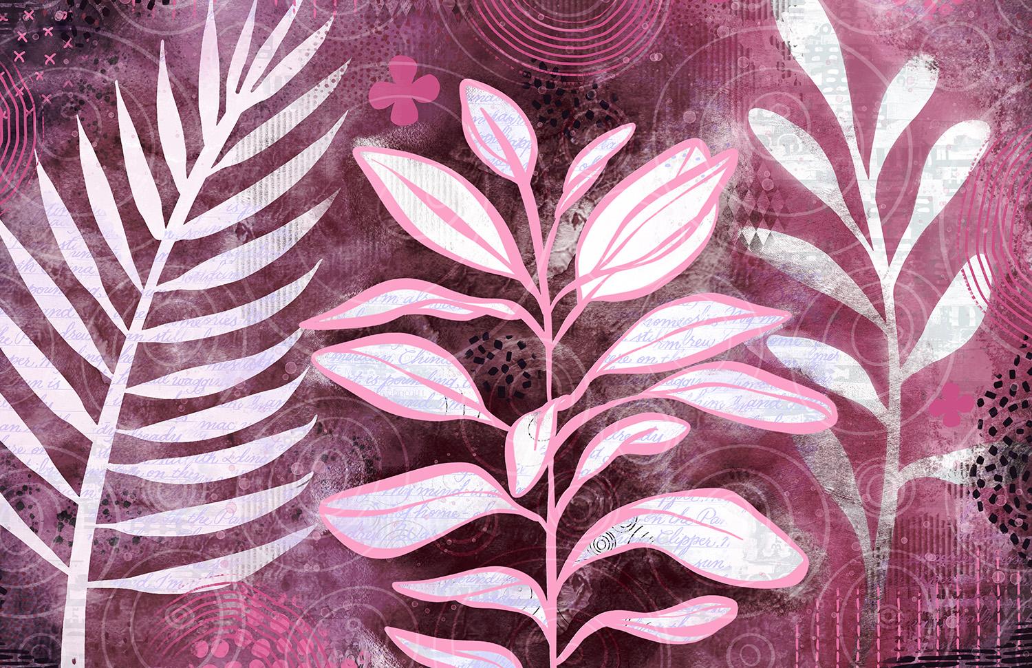
7. Experiments with Adjustments: Hi guys, welcome to lesson 6. So six here and let's do some experimenting with some of the settings. Maybe we'll do some work. We have color and blending mode stuff. Let's get started. All right, So I've gone in and added a whole bunch of additional detail here on if I was to hide this, you would see in my background here, I've added some textures. I've added some little flowers, some outline kinda leaves. And I feel like this is really nice and rich. So turn that back on. Now I'm going to add a little bit to this foreground. I think can add a new layer or have I run out? Yes, I can. Surprising because I've got a lot of layers here. So something like that could be added. Again, if you want it to only show on the foreground, you can make it a clipping mask and I want to clip it to this. So any of the clipped items, you know, only show up in this late kinda Beijing area. And let's maybe add a little bit of texture as well. So that's the little p. Remember this one, but I use it in my negative space trees class as snow kinda. And I've got this Flickr, Leighton, that one up a little bit. So this is just to make your foreground a little bit more interesting. You can take it or leave it. Some people prefer to not have that on the foreground layer, but I like it. You can have it not be too contrasty. I just sampled the color and I can slightly darken or lighten it so that it's not to contrast the year, anything. I think I'm good. I'm going to stop now. So we can close this layer off for now because most of the adjusting I wanted to do is going to be with the background. So I want to try a bunch of different things so that you can see some alternate ideas. I'm going to get rid of this because that was from that other document. And could we use this? No. So I'm going to delete that. Fell gives me a little bit more layers to work with, which is what I want. Now I would love to duplicate this, but I've reached my limit on layers. So let's just try to do it without. So this is just simply a layer filled with color. That is something you can use to help everything really unified. So that's one idea. Of course, you can experiment with the degree of opacity and you can also go in and experiment with different blending modes. So something like this, overlay works nicely to adjust the color if you want to see what it looked like before and then after, that worked really nicely. And this might be a good one to then go into hue and saturation and just experiment with what other colors might look like. Wow, that looks terrific. I love that. I mean, you can really get some nice, nice looks here. So I quite like that. That's something that I would consider. And again, you can really saturated or you can desaturate it, which can make a big difference. The same thing with darkening, enlightening to make a difference. That's a beautiful color scheme. I really liked that and I think that that's something that's really trending right now. So that's something and keep in mind when you're doing this is to figure out what the trends are that are happening. If you're going to be selling this on a POD site or you're going to be using it for art licensing. I'm always being sent call-outs for different manufacturers. And she'll be really specific with the color schemes that they want, are going to be doing a trend forecasting class for 2022. I've done trend forecasting for 2120. So you can go back and look at those classes. But the idea is to always be on trend with what is happening and what's most popular at this time. And I think that color scheme would really work for what's coming up in trends. So that's one of the ideas. Let's turn that one off because we can still go back here and experiment with a bunch of this other stuff. Again, you could go in and just make adjustments with some of your overlays. Opacity is your first thing to try and then go in with blending modes to see if there's something that is appealing. And this, you could have tried this blending mode in the first lesson or two and it didn't work. But then now that you've got a bunch of different textures added, it actually does work. So that's something to look for when you're doing this. Also experiment with changing the layer order. So we've done all of this work on top of this layer, but what about if we were to bring that backup to the top? Let's go right to the very top. And then we experimented with different blending modes with this one and see what other looks might work. So it seems like the darker the better, because this is something that you could do and then reduce the opacity so that you look at some of those other details that you put in and something like that could work quite nicely as well. And you could still go back and add that color layer to see how it would look. I'm going to go back to this and before I do anything else because I like that one, I'm going to select this one and duplicate so that I don't have to try to remember what I did, but I'll just have it at that stage. So we can go back into this and do a little bit more experimenting. And, you know, don't stop at what you've got here on this document. You can always go in and bind something else that you've done in the past and drop it in there. So for example, this one here, maybe one of these layers would work or a combination of them. So we could go in and let's grab a bunch of these. We'll put them together, actually will take anything that's on right now and in the background and merge those. So I've got an integral that makes it easier for me to flatten. I can three finger swipe copy and then go back to leave the document the way it was. And let's go into our file that we've been working on and we'll turn that one off, maybe a few of these. And then we'll paste this one in and just resize it. And there's a completely different look. I think this one would be totally acceptable as well. We could go into hue and saturation and experiment with different color schemes and different levels of tone. And there we've got another really great alternative. Don't forget too, that you can go back into your foreground layers here. And since this is a duplicate, what I'll do is I'll flatten this group. And what I can do here is also go in and experiment with the different colors just by sliding my hue slider here, different positions. So that can be very nice. And the other thing we could do is go really dark with the foreground and then go back to, let's see if we can duplicate this now. And we'll go back to this and, and really brightness. So this would take a little bit of work to figure out, but this is just a completely different alternative. And obviously we take a fair bit of effort to switch this all over, but it could also work. So that's something to take some time and do with your, especially your first project so that you can just get a good sense of the different things that you could accomplish. So I'm going to undo all that because I'd rather have it the other way where we've got the cream color as our foreground. And then all this stuff coming through as our background. And at any point here, you could duplicate the file and go in and just add any other sort of textures that you have. And like I said at the beginning here, It's always a great idea to do a bunch of experimenting too. Figure out what you like, what looks good, what works and what doesn't. What kind of patterns complement the design and what to do with your foreground and background. Whether it's something that you want to have very, very subtle or something that you want to have really, really intense clipping mask is definitely your friend. In a case like this where you're trying to do some work on the foreground here, we could get such a unique look, so different from that first one that we did just by adding a bunch of stuff on this foreground layer. Now, let's go back to those original ferns that we were using and see if we can add a couple of these on this foreground layer to add some interests. I'm going to delete this one for clear it actually. And I'm going to try a couple of those on there instead. So that's that exact same one. So I'm gonna do it and then clip it. And I like that look, that's super nice and I think it really hides it in. Well. Let's duplicate it. And we can't because we're running. Now you will probably run out of layers if you do your document smaller, I just worked this way because of the art licensing. I can add a layer, put that one in there, bring it down here and make it into a clipping mask, and then really reduce it. And I'm pretty happy with it. I think this is something I can definitely work with. This I could use for art licensing or for POD sites. I've worked on it nice and large so that I can have the freedom to do that. I could then, at this point, let's just put these two together. I could add a new layer above everything else and then go in and put in something like paper texture. So I'm just going to paint that. Maybe I'll do it with a different color so you can see a little bit more. So this is a sort of brushed concrete texture. And what I would do here, leave it big so you can see is go through and experiment with the blending modes. Usually I use something like color burn or Linear Burn. Color Burn works nicely. And now the whole document has that texture. It's slightly altered the color, and I would definitely go in and make adjustments if I didn't like it. Again, I can go to hue and saturation and be saturated, lighten it up, but that texture will still remain throughout my design. Okay, So I guess that's it for this lesson. And in the next lesson, I'm just going to show you a couple of other finishing touches that I do when I'm at the tail end of my design process. I'll see you in the next lesson.
8. Last Minute Polishing and Finishing: Guys, welcome to lesson 7. So we're at the stage here where we're going to be putting on our finishing touches. Let's get started. It doesn't hurt to revisit some of the inspiration that I had. So there's that beautiful piece by descent, Tucci. Some of these down here have different ideas for texturing and whatnot. For example, this one here, you can see that additional leaves were added to, just make it a little bit more interesting. So an additional leaf would be almost matched to the leaf above it, but just kinda smaller or kilter little bit. I guess this is more of a look that I kind of stumbled on in my process. So there is a lot of detail. One of the things I like on this one in particular is the blocking of color in-between some of the elements. So that's something we could try. This one was that really textural foreground that I like. Sometimes it doesn't hurt to scroll down a little bit to get some additional ideas. So for example, on this one, we have the background done exactly the way I did, but then some foreground items were added. So that's an interesting and different kind of a technique. And then this one, you know, either there's something about this one that just really made me interested. I really want to explore this a bit more and I do like that second color and really almost like a completely separate plant with the red outlines. So that's something I might experiment with a little bit. So let's get at it. At the end of the last lesson there I should have been plugged in. My battery has died, so my stylus is not going to work, but I think I can do a couple of these at the moment without the stylus while things tried to charge up a little bit. One of the things I thought I'd try was that changing color, big blocks of color being different from one side to the next. So I'm going to sample a couple of the colors that I have in the background here. So I'm thinking that light blue might be kinda nice. And I'm just going to drop it into this area. Go back to my main foreground layer here, and let's just drop some color in. So weird working with my finger when I am so used to working with my stylus, I've duplicated my document so that I still got the original if I do choose to go back to it. So that's really cool. I really like that. And let's sample this green over here. And we know that we're picking harmonious colors because these are colors that are already existing here. So that's such a different look. You can decide on how big of an area you want to do right now. I'm just kinda stopping between the objects here. Okay, I had to wait for that to charge up. I just couldn't continue with just my finger as the method filling or for doing anything for that matter. I'm just so used to my stylist now. I could continue on in this way to add more of the detail that would make this work. So probably something like, let's say this section over here, what might work would be for me to rush in and in a case like that, maybe what I would do is paint this foreground. Let's go back to that same quash brush that I was using and it was a quick wash. And here I could paint. I'm going to change that color a little bit. Like you go nice and large paint over here. But then, so it can't make a new layer here. I'm going to collapse those to add leader. Paint this in and built it up. If you want to, get it darker or lighter, you can even leave it fairly late. And here because it's a clipping mask into stays within that area. So you could continue on to separate or do a bunch of the areas in this way. Maybe experiment with different colors to see how it would work. So that's with Eclipse, so that it doesn't come into these leaves here in the background at all. In fact, that's probably easier than that other method I was using fulfilling. And yeah, you could continue to do it in this way. Now if you had the lighter background, if we had done this collage all really light, which we could also go back and do is, you know, lighten that whole background. Maybe what we could do is do darker for our foreground. So here with this blue, for example, I'll put it on this layer. I could go a lot darker with this blue so that my background has contrast. So I think I could go even darker here, but this is a really neat way that you could get a completely different look out of this. I'm going to go to this area and go darker now that we've got the lighter background and same with the green, let's go quite dark with the green. And you can get a completely different look by just blocking in some of these areas. Now, course, a lot of other things would have to be adjusted, but I'm just trying to give you some ideas here. Appoint you could do to add some different sort of finishing touches. Oh, that was one idea. This is another duplicate here. And if you wanted to explore that method of adding an outline, what you could do again is a clipping mask. So I'm going to, this one should be a clipping mask. I'm going to combine those, so collapse those. The shading is little bit different because they had all different blending modes. But for what I'm doing and illustrating, I think that that's fine. And I would add a new layer and get a nice brush. And this time I'm gonna go with my tapered and pressure brush. And then just ask yourself what color would be a really good contrast that would look like that. One sample that we saw with the red outline. And I mean, we can try it with red. Let's go a little bit of her rusty red. And then you could just go in. And again have this is a clipping mask which will allow you to kind of go in underneath, adjust your brush accordingly based on your size of document and whatnot. You can go through and trace this all out. And because you've got the clipping mask, it's not going to go into the area where the leaves are you. So maybe this is one that I'll finish off camera and then I'll come back and show you because that's going to be really time-consuming, but I liked that. So I'm going to experiment with that and a couple of other different looks. And then in the next lesson, I'll just show you my results. I think I've given you quite a few ideas here almost too much and I'm apologizing in advance for all these different ideas. And if I sounded like I was rambling at all, but I'm in the zone. I want to try different things. I will do that off camera so as to not waste your time and then I'll come back and let you know what I did. All right. See you.
9. Finished layout Examples and Timelapses: Hey guys, welcome to lesson 8. I'm so glad you've made it to the end here and we can now take some time to take a look at my finished products here, I decided to render the recordings that procreate does. So you'll see here all the steps that we've taken in the class and then you'll see how I went and finish those particular artworks. So this was that first one that we did. And remember our goal here was to go in and add outlines and whatnot. I had that really thick black outline that I changed to green and I figured that that was a really good way to finish this one off. And then I added the inline, so align within that dark green area. And I think that really set it off with really punctuated it nicely. Of course then I went in and added a bunch of mixed media details. So some of my brushes to add some flowers. And then I even imported a couple of cool backgrounds to work with. Now this one is that one that we were doing right at the end where we went in and added the outline. And of course it starts the same way. We see all of the steps that I took throughout. And I was even fascinated watching these honestly because kinda forget as you're going through this, you make so much progress that you forget all of the little steps that happened along the way. So here I am adding a ton of ephemera, some printed stuff, a bunch of different textures and backgrounds. And I used my brushes to add most of those. And then here creating the shadow underneath the leaves to make them look like they were either in front or behind. I wouldn't be fascinated to watch something like this that an artists that I really love does. So like somebody like St. McCloud, I would love to see all those steps she takes or that Rosetta San Tucci. I just would love to see their process because it changes all the time. You just really never know how you're going to proceed with this kind of thing. Now here I've added a bunch of those outlines. And you can see as I worked through the process here, I'm kind of figuring out as I go along, I did all of those edges like I said. But then there were those spots where the two leaves kind of overlap with each other. So I ended up having to make an additional layer to just go in and add or finish off the leaves properly lake right here, so that it's in the foreground. A kind of experimental little bit here with adding some additional lines in color. I thought that was just something a little bit different than everything else that I've been doing. And we still have that peekaboo technique happening. So it's not like I'm changing it completely, but this is just a different way of accomplishing the same goal. Now here I'm adding a little bit of that additional color just to get an idea of how that might look on this particular one, then you see me bringing in some of my own old mixed media backgrounds. So there's one completed. Okay, so you'll see that the beginnings are the same on a lot of these, of course, because we really use the same document. I duplicated it, remember, so that I could do some experimenting. I didn't want to lose the original that I had. So then I went through and after I made the duplicates, I changed the look on each of them just to experiment with this process. Now for myself, I'll often do this and it'll take me ten artworks before I really feel like I've got a rhythm or look going and then I'll do live of them, ten of them, whatever I need for my art licensing, then the luck for the grouping that's going is very consistent. So it's about here Where start to look a little bit different. Where I'm experimenting on that last one with color. So this is where I was blocking in the color. Remember when my stylus was dead? And then you see after when the stylus is back to o charge, then I was able to move along pretty quickly here and do some experimenting. One of the things I really liked about doing this in the darker color was seeing those sort of subtle light colored motifs and brushes fat, we're in that foreground layer. I think I'd probably alter my whole methods to accommodate this. This is something I might try again and see if I can be successful with it. And I think this one ends up being my favorite one. I really liked that sort of a watercolor edge that I ended up putting on it. Remember, in this foreground here I use my brushes to add those subtle details. But you could also do all of these hand painted and hearing course. You see me adding all that ephemera trying to make it work color wise. So you've seen this with all the other examples, but what's coming up? It's a little bit different. You'll see that I create a layer and then I put a blur audition, caution blurred. And then that blur, I cut out. Everything but that little in line, and that line ends up forming a bit of an inner shadow or darker line that makes it look a little bit like the pooling on watercolor. Here I'm adding a little bit of inner shadow just with a textured brush and a little bit of highlights here in there. Kind of trying to move it over in my mind, what am I going to do here? What am I gonna do next? And I kinda liked this, switching over to a little bit more of a teal colored background, then I make that really dark background that I blur cut out the whole background and I'm just left with a really tiny inner line here that I think really accents edge. Now here are those just mainly the biggest thing was the color change and then again that inner pooling. So the beginning part here is exactly the same. I'm going to really timelapse IS fast for you so you don't have to sit here watching all the same steps over again. So watching all these examples here you can see how much time I spend really experimenting. And like I said, the first few times you do this, you're going to do a lot of experimenting. And then in the end you're going, you figure out that one that turned out really good or that wine that really appeals to you and that you feel like you could do a series with. Then you can go ahead and create a collection. In the end, I absolutely loved this color scheme and I'm adding quite a bit more in the way of flowers and textures to this one. There's those big firms in the background, again, more experimenting with the color of the tones. This is where I create the Gaussian Blur again, for that outline or the inner line just goes to show you that you can take a single artwork and create so many different ones. Just by experimenting with how the layer order is, how the colors are at a more or less texture, just making gentle corrections. And last one I'm going to show you here is actually going to be quite different. You'll speed. So on this one here, the biggest thing you'll see is that I ended up putting the outline back on that middle plants, that middle branch with leaves. And this is that one that we had where the fern and the branch and the other frond, we're all on separate, completely separate layers. I loved it in the green, it was really nice and the green as well. And then what you're going to see me do here is change it absolutely completely. I just wanted to do one that was like way out there. A lot of times when I do get a call out for something specific for art licensing or wall art, there will be a specific color that is being requested, not necessarily a specific art or category, but they'll say We need a lot of stuff in this color. And so experimenting with color is actually a very big part of what I do want to daily basis when I'm working on my licensing. So this one is absolutely not. You'll see tons and tons of different textures and patterns that I have made in the past. You may have seen me do in other classes, and I've just gone crazy with adding a bunch of those just to see how totally crazy the mixed media could look and actually was pretty happy because one once I was done, so that's what the outline put on that middle leaf. And then I just added some really bold kind of Accents to this one. And like I said, I really quite like it. Then I decided to duplicate this one and try something a little bit different. And you'll see this one that I do this as kind of a when green to it as well. We do still get a lot of requests for wood, wood textures and so on. So that's something that I thought, well, I might as well try them. So because I actually just had to do a project that had a wood background. So I happened to have one handy. So for this one, I brought in a bit more about ephemera, so some different ones that I didn't use the first place. Then the main difference was adding this width grade here. Then you make one change and you end up having to change everything else. So this one took quite a bit of adjusting as far as light and brightness and tone. I ended up going back and adding a lot more intensity to everything so that it would really stand out and really deepening the shadow. So you can see here, these are quite contrasts. He's always start with a very deep color and then work their way up to a really bright highlight. And adding that little inline again, I find that that really finishes it off nicely. It's like adding jewelry, that one little touch that you really don't notice. But then if it's not there, that looks like something's missing. I didn't quite like this one when it was done. I think that's another one that the techniques definitely have a lot of possibilities. And adding this little bit of a glow around the plants with something that I hadn't done before. So that was done very much in the same way as adding the dark line, but instead of being on the inside of leaves on the outside. And then here's one that's really, really different. I wanted to really work with this background that has first a mixed media background that I did in a journal, and then I built up tons of different ephemera. I have tried to integrate it a little bit more by painting it in added paint kind of over the edges about ephemeral, which is kinda the way I work when I'm in my journals, some changing Lots of what was there, adding a lot of additional sort of I call it texture, you know, when you add the extra lines and extra little bits, and this is just to the background. I haven't even started the foreground here, but you'll see when you get partway into this video here that this is one of the ones that we did start at the beginning with a variety of different branches. So you've seen the foreground part, you'll see it in a second. So here's those leaves that I added in, experimenting a little bit with the eraser, erasing some of that background out. Then all kinds of different experiments with color, adding different motifs in the leaf itself. That's part of what we did in class there. So you'll have it a part of this artwork. Then here I am adding all those edges and inner lines and so on. So this one, I think it's very pretty, I like that really textural foreground. And here I just added another background from one of my journals. And then of course this is the title piece. You saw none of this being done in class. This is an older piece that I was working on when I first decided I was going to do this class as one, fit in just perfectly. So this is a lot of fun experimentation. This is kinda thing I do when I'm sitting and watching TV at night. I'll be just fiddling around and doing just a wild and crazy stuff that I'm not even sure how I'm going to use it. But then a month later I go back in and I think, Oh, that background can be used for something. So this was a crazy amount of experimenting and not till the very end that you see me add those leaves and figure out a way to make it a peekaboo technique. And yet pretty much wraps up what I wanted to show you in this lesson. I just thought if you got to look at the whole process and thought repeated a few times with different outcomes. That that would be a very informative way for you to review what we've done. So here's the finished artwork and that pretty much wraps up this lesson for you. So I'll meet you in the last lesson, which is basically just a wrap up. So I hope you liked the artwork and I'll see you in the next lesson.
10. Conclusion, Goodbye, and Next Steps: Well, you've got a finished composition. Not only that, you've learned how to do a ton of this stuff. And it's going to make it so much easier when you go in and produce some more. You could use that background over again. So don't get rid of it. Makes sure that you keep it because you can use it for any number of compositions just by making some changes to it, like I showed you. I think that this is one of the most valuable things about being able to do this stuff digitally, is that you can then use these backgrounds and things that you create over and over again. Thanks for attending all my classes too. I super appreciate it. I love seeing you in my classes here. And let's just keep that ball rolling. I'm going to be producing as many classes as I can before I go on holidays so that you guys will have lots of stuff that you could do when I'm gone. Not to say I won't be doing a little bit when I am gone. I always take my work with me wherever I go. So if you haven't done so already, make sure you hit that follow button up there that we don't be informed of all of my classes and any of the other information that I send out. And it's not too much, so don't worry, I won't be in your mailbox every single day. If you're looking for inspiration, don't forget to check out those boards that I showed you at these entries illustrated in photographs is just one of the boards I have. I would suggest you also check out art inspirations. There is a ton of stuff there that'll be great inspiration for this class. If you have time, check out my website at shop, dot dollar or a dossier and make sure you leave your name on that mailing list as well. I send different mail outs from both of those. So it's probably a good idea. If you have time also to check out my store is I have one on docile.com. I've got one at art of where here in Canada. And in a couple of different stories on Society 6, I've got my own store, starch or Dillard's masker into can't remember how I've got listed there. And I'm also under the umbrella of out of the blue, and that's one of my licensing agents. And we have a story there for all the artists that work without or the blue. So check it out. There's some really great work there. So I guess that's it. And I'm going to say goodbye for now and I'll see you next week. All right. Bye.
 Delores Naskrent, Creative Explorer