Transcripts
1. Intro to Dramatic and Vivid Luxurious Garden in Procreate: Hi guys and welcome. My name is Dolores aspirin. I'm coming to you from
sunny, Manitoba, Canada. So today's class I'm bringing
you is going to be based on the art of an artist I just
discovered named JP Patrick. Her work is super
vibrant, beautiful, and was definitely
an inspiration based on some of the stuff
that we've been doing lately. So a lot of what you've done in my classes in the past
will be applicable today. We're gonna be adding
a ton of dimension to some really vibrant flowers,
flowers and leaves. And then we're going to
layer those really densely, put them over a really
deep background. We're gonna be doing a
bit of experimenting. Most of the time. I do a project two or three
times before I even recorded. In this case, I'm going for it. In the class. We're going to resolve a whole
bunch of challenges. One of the challenges
is in using the Gaussian Blur to do
a bunch of blending. And the question
is whether that's faster or using the
airbrush tool is faster. We're going to experiment
with both of those. I specifically tried to keep the amount of tools
to a minimum here. So there's really only
two or three brushes that we use in class. I wanted to really
challenge myself to try these different ones out there, just basic brushes. So you're going to
have them there available in the Procreate app. And I want you to come along
for the ride as I experiment and try to really hit
that inspiration piece. And of course, we'll go through all the inspiration that
I had for the class. One of the first
things we'll do is visit Pinterest to take a look at some of the samples
that I have selected. And we'll look at
JP's portfolio. There are a ton of
steps involved, and we end up with tons
of clipping masks. It's a little bit
confusing at first. But once you get the hang of it, you're going to see that
this is a really great way to work to build
up that dimension. If you haven't done so already, I'm going to
encourage you to hit that follow button up there. That way you're informed of
any of my classes as I post them and any of the posts that I send
out to all my followers. I'd also encourage
you to get on over to my website at
Dolores Hart dot ca. On that site, I share tons of artists resources and any news that I have, you'll
get it there. Are you ready to get
into this project? I hope I haven't scared you off. Let's get started.
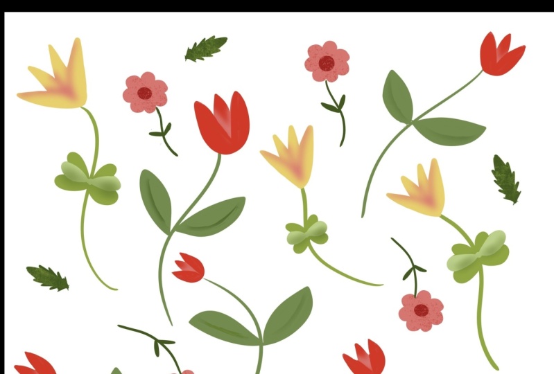
2. Lesson 1 Inspiration and Overview: Hi guys, welcome to lesson one. So as always, I want to
start the class with some inspiration and a bit of an overview as to what
we're going to be doing. Let's get to it. I wanted to start this
class by showing you a little bit of my
inspiration for this piece. And ironically, this
artwork, this girl here, she goes by JP, which is really great because I have no idea
how to pronounce this. I really love this girl's work, and I have pulled up this
sample that I've also got as my inspiration piece for a 3D lettering class
that I also do. So I did a bunch of research for that class and I ended up running across
this girl's work. And it ended up totally being the inspiration
for this class, which is more to do with
making these florals. Here is that piece and I found her portfolio
and it's on Dribble, the one that I found anyways, she may have other portfolios, but on Dribble, you can take
a look at all of her stuff. And she does a lot of
commercial work as well. But there are definitely
a ton of pieces that reflect her
love of florals. And what a beautiful job
she does on these florals. So that's kind of the
inspiration I had. And I loved this
deep rich background and this kind of a floral. Now, the ones that I end up doing in this class
are different. I don't have quite
as much detail. Of course, I did want to totally copy her
whole technique, but you know how it is when you get inspired by something, it takes you in all kinds
of different directions. And so in my case, it ended up being two separate classes for
me to separate projects. And one of the big 3D lettering, which obviously this
isn't 3D budge. Laurels here inspired me for the vivid florals that we are
going to do in this class. So I would suggest that
you get on Pinterest. And you can take a look
at my lettering board, which is where I came
across the artwork. But you could definitely
also take a look at all kinds of vivid florals
to find even more ideas. So here I just typed it in vivid florals on
dark background. What I'm looking for when I'm looking to get
inspired or when I am inspired to do
something is a bunch of different methods to do
a particular techniques. So I liked the sort
of dark backgrounds. There's a few examples here. This one's really lovely. Flowers aren't
super dimensional, but that could be inspiration. This piece is really great
in the way that it shows different dimensions on each of the flowers just by
doing some shading. And of course, because
this is a procreate class, I've got some great
tips and techniques to help you get started
on your first one. Now take a look at
something like this. I think this is really
striking as well. And this one is completely different than
what I did just simply because of the white outline that hasn't been added
around each of the flowers. And it's still on a
really dark background. And I liked the way
in the background. There's a lot of depth just by having some darker
flowers in there. So there's something
we're keeping the back of my mind as I'm setting out
to do my illustration. Wonder what would happen
if we typed in here. T, o, r, m, a e. I had to write that down. And it just comes up with the same examples
that we've found. So likely the website
or getting onto her Instagram account to be how we can get to look
at more of her work. Obviously, she's
extremely talented and what's actually went through a stage where
she did a lot of those florals on the
dark backgrounds. This one's really cool too. I did take a look at this
one and it reminds me a little bit of negative space
trees project that we did. Now if you take a look at
the individual leaves here, it also reminds me of The airbrushing 3D airbrushing
class that we did. So some of these
techniques you're already a little
bit familiar with. So I think that this is gonna be a fun class
because it's just like taking that set of
techniques instead of methods that you already know how to do and just taking them one step further or taking them in a slightly
different direction. I think we looked at this one already and this one,
I think we did that. Take it easy. I mean, some of these are
just so striking and really a lot of
them are quite simple. When you look at
this, I mean that pine cones are quite detailed, but everything else is
actually very simple, as well as in this one here. And it looks like this
flower is similar to one that she did
in another artwork. So maybe she has recycled
some of the elements, like these flowers look
exactly like these flowers. So I'm thinking that she
does sort of like what I suggest that you do
sometimes and that's to reuse some of the assets. And this is really
neat where she's actually showing
for design process. So going through
someone's Instagram is one of my favorite
things to do. And B is just a great way to just learn a little bit
more about technique and how a given artist goes through and develops
a piece of work. Now these are gorgeous
and you can see the original contour drawing and then adding some shading
and then hearing is tied into a technique
or an artwork. This one does have a little
bit of a 3D spin to it, that lettering, that
letter, which it's saying. So I think one of the things that is really
important for us to do in our development is
to do a lot of research. And this is exactly
what research I do. And what research really works when you're
first learning. It's something that's
going to get stored in your memory banks and you don't know when you're
going to pull from it. There'll be working on a piece
and you'll suddenly have an idea to do something
a certain way. You're not sure where
the idea came from. Botany could be from all of the research that you've done. While this one is just gorgeous, maybe we'll even do
some experimenting with adding a little
bit of texture because I think that texture
really adds to this piece. I would love to see
this girl in action. I would really love
to watch her go through her whole
process and see how she breaks down her methods or her old methodology for
doing something like this. Looking at it closely like this, I could definitely explain how to do a lot of these
because I can see right now and you could just
have a single circle here and use a
clipping mask to add these areas of color and
then another clipping mask to add the
texture and room. You've got that technique
kind of covered. Who I should also point
out here on the ribbon, how she's managed to get so
much dimension just by adding these areas dark and pretty
some texture behind there. So these are all things to file away in your memory banks. Who knows when they're
going to come up. But I think in this project
we're going to have fun and experiment a little bit with different techniques
for adding dimension. And just make our artwork super
vivid and see what we can come up with at the end for a finished use for our floral. Alright, I will meet
you in the next lesson.
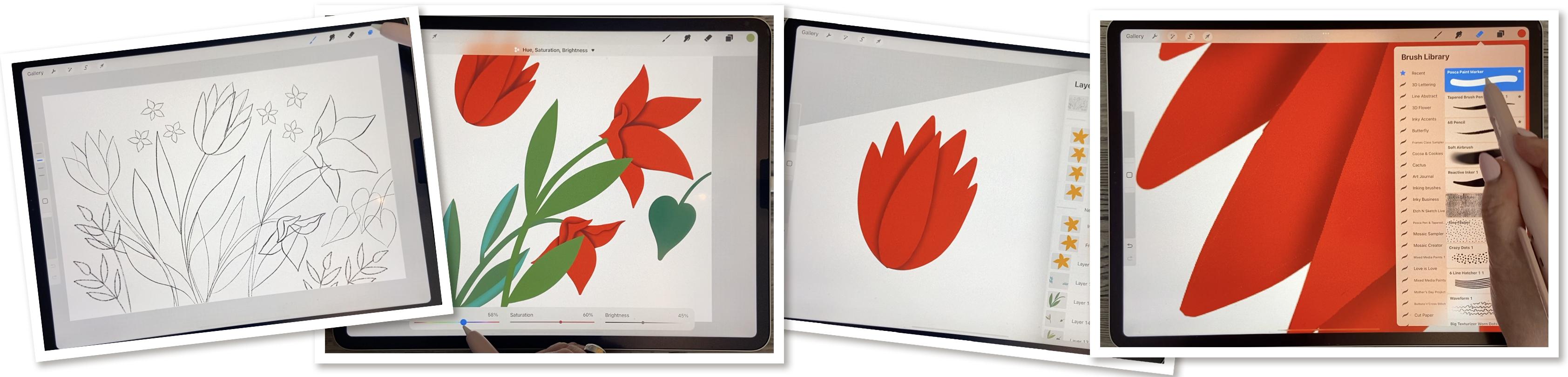
3. Lesson 2 Blocking in the lnitial Flower Shapes: Hi guys, welcome to lesson two. In this lesson I
want to block in the main shapes of the flowers. And I'm going to explain to you how I use the continue with the recolor tool to quickly fill additional
shapes that we have. I'll explain as I get there. Let's get to it.
So for this class, I decided I would do
the sketch and advance because I didn't want to spend too much time
on the sketch. I want to spend more
time on showing you how to create the effect
that I showed you. So what I'm trying
to do is create these flowers to be
super dimensional. And I've added a bunch
of little things here. These are all on separate
layers by the way. So when you are doing your
sketches, so you can see, for example, that I ended
up enlarging these a lot. That's why the line is thicker
and this is just a sketch, so it's just there as a guide. And you won't even see this
as part of your finished art. I've also got the flowers all separate so that they're
easy to move around, turn off magnetics and snapping. And I can even do things
like rotate them if I want, if I think that the composition would be better if I do that. And all of this, like I said, is on a completely
separate layer so I can move each of
them individually. What I did is I took the time to do that before class so that you would be able to
concentrate more on the overall of what
we're creating here. So I'm going to group
all of this together. I've got that all in one group. Then I can duplicate the
group and flatten it. And what you might want
to even go in and just duplicate your
document at this point so that you have your
sketch completely separate, if ever, you need to
make any changes to it. So I'll open it up this
version of the document. And for what I'm doing, I basically want to paint these all as solid shapes
to start out with. And then we're going to
create the shadow areas. I will generally do all of them on the same layer if
they're all the same color. So for example, if I have all of these flowers
the same color, they're gonna go
all on one layer. I'm thinking that what
I will do though, is keep all the stems in
a separate layer for each because I want this sort of overlap effect going on and I'm not quite sure how I'm
gonna do that yet. So let's start with
inking the flowers. So I'm going to add a layer
for the actual inking and I'm putting it beneath the
sketch and the sketch itself, I'm going to put to darken and I'm going to reduce
the opacity a little bit. What darken does
is it allows you to see the sketch on top of
everything that you're doing. So it will always be
there if you want it, you can turn it
off if you don't. But for now I think that's
what I'm going to use. And let's choose a color palette that would be really
sharp for this, I'm thinking really rich, rich teal and pink. Pink is for the florals, Let's call it actually might
be really nice for this. So let's choose this
as the default. And actually this is
one that is already on my website in my
artists resources. So it's one of the free
palettes that I have there. So you're welcome to
go and download it. And let's just start
inking in the flowers. Choose your favorite anchor. I'm going to use my tapered
pen pressure brush. That's my favorite, but
it's very similar to the one of the inking
brushes that's built right into Procreate here. So if you go to your Procreate, built-in brushes, go to inking. I think it's very similar
to like a syrup brush here, so you can definitely
choose that. I've just got my settings exactly the way I
want them here. So that's the one
I'm going to use. So now let's switch
to disk here. Clear this, this is the color palette that
I want to use and I think my goal with a
really nice rich red for the flowers. So I'm going to be
actually inking these all in one piece. So pretty much I'm just doing the contour
and filling it in. Because when we go
to separate out and do sort of special shading
to separate out the petals. It's easier to have it all
on one layer like this. I'm going to check my
stabilization here. Yeah, that's pretty good. I got that pretty high. So that should be giving me
a really nice smooth line. And remember that you can always stop and then use the power of the procreate tools here to get your lines even straighter
if you want them to be. I'm actually okay with this amount of state
stabilization. If you're more successful
making a line in this way with a curve which obviously
I am working backwards, is not working for me. So I switched the angle
and let me think, do we want these to
be the exact same? I'm thinking they look
like different flowers, so let's go to a
different color. I'm gonna go with that really
deep, rich reddish color. And normally I would
be telling you, keep all these petals separate, or at least the foreground
background separate, because that's really the
easiest way to deal with. Shading them differently, but I'm gonna be showing
you a technique that I've kinda worked out that just to me makes
it so much faster. So I just thought that
I'd want to share that technique with you because I think you're going to
actually really like it. The key is this sketch, and the sketch is going
to help us later on with doing the shading. Looks, what am I doing? Why am I doing
that all separate, silly me and I could hear my neighbor outside
whip or snipping, and usually that's followed
by loud lawnmower. So I'm hoping that he's not going to interrupt
my recording time today. I feel like putting
a sign outside my house that says recording. Please be quiet. I don't think that
would go over too well. So there's my sort
of main flowers. I've got them all on one layer. Normally I would be say, you know, put this all separate. I might be later on wanting
to separate them out. Maybe for now we'll do
these little flowers. I'm going to use
that yellow there. Now these were all
the exact same flower that I just ended up kind of rotating and repeating
in different shapes and slightly changing
the skew of them. So I, I'll show you
what I did here. This is a case where I'm
going to I'm glad I did it on a separate layer because I think that the way I hear it
comes with this more. I really hope that
doesn't pick up. I don't know why, but I've got two different colors
going on here. So I will just continue
with this one. And I will alpha lock it and then fill it just to be sure
it's all the same color. And then I will alpha lock it. And then let's just duplicate this one and I'll
show you what I did. Wait, what's going on? What else is on this layer? It's like something else
is down here. Oh, I see. There must have been
a little mark there. Maybe. Instead of
duplicating the layer, I will just duplicate
the flower by doing cut and paste,
copy and paste. And I see it like
that first one. Yeah, I know there's
something here. Now I can take this
layer, duplicate it, but I can also rotate it to make it look
slightly different. So now I can take
these to group them, duplicate the group, and move them into a
different location. Maybe another sort of a change there doesn't
matter that they're exactly the same
as the original. I can get them
approximately like that. And then remember that you
can also go down here and distort it by grabbing just one of the handles
and moving it. Or you can even warp it, which would give
it a little bit of a different feel to it as well. I'm going to duplicate
this one as well and then bring that
one back over here. And we made up using these little flower
somewhere else as well. And what I may end up doing when we get to
the shading stage is doing one or two of them and then repeating those so they have
the shading on them. But now let's go through and do some of the leaves and stuff. So I'm going to
add a layer here, and I'm gonna go with
the screen here. I think let's do this 1
first so I can my brush nice and big so that
I don't have to worry too much about the
thickness of the stem. And I like this brush because
it's really responsive to how much pressure I put on. So you can see here that
I'm doing it a lot more lightly here as
opposed to the stem. And so my thickness is
a little bit finer, and I like that. And here I am going to go with a different layer and slightly
change the color of it. For one of these, again, more pressure will give me
a thicker line or outline. And what I'm doing here too, is I am making sure that the leaves are
actually quite wide so that I get a really
good area that I can do that shading and
eighth, There's two. I've just changed
the color slightly, just so that right now I
can see the difference. See how I feel. I'm going to actually
do that again because I can see that there
was a bit of edge around it. So I'm pulling a little
bit more to the right to increase the color
drop threshold. And now I'm going to hit
continue filling with re-color. And then I can just
drag the cursor to the crosshairs there
into another section. I mean, it's not that big
of a deal to just fill it, I guess in this case
because I don't have a million spots to do, but sometimes it
makes a difference. And I'm going to go
to that mid green, but I'm going to go
a little bit too. The blue to do this
back one here. And having a darker will
definitely also make it look like there is a
little bit of depth. So we've got some things
that are in the background. Okay, so here's me filling with the recolor tool than hitting that continue with re-color, dragging the crosshairs in and then tapping on
the next section, I see on this one here, I forgot, I forgot one leaf. So I'm gonna go
back to this one, sample the color
and add this leaf. Whoops, this is the
color I want sampling. I could use that for
these leaves over here. So I'm going to, I think I can just do
them on that layer, honestly, I'm going to
grab that, that TV green. I'm going to do these. I'm just wondering,
am I going to regret having that
on the same layer? I might, so I'm going
to just do these two. You don't want, I
think I'm going to do these particular ones on separate layers just
because of how they overlap. So maybe I'll go a
little bit lighter or something just so that we
can see the difference here. I guess that's pretty subtle, but it is different. And then I can go to one of these other layers
and add these. So I'm going to go through,
and I'm going to do all these little ferns as well. And I'll come back to you
in the next lesson and then we can talk about how
are we gonna do that shading. Alright, I'll see you there.
4. Lesson 3 Touchups and Shading Techniques: Hi guys, welcome
to lesson three. Less than three here we're
gonna do some touch up and then I'm going to explain the whole method for using the Gaussian Blur to do some of our blending and
creating the gradients that we need to give
these leaves dimension. I'm just going to
really quickly show you about that
re-color tool again. So when you do continue filling
with re-color and you go to one of the sections that you want to color with
the crosshairs. Then it's so quick because
you can just go through and tap to fill all
the other sections. My $0.02 worth about that
particular function, and I still have that
little yellow bit there. What flower is that
on this one here? Erase that. And
there's a couple of little spots here
that I missed when I was first doing
that re-coloring. So that's this one here. I'm going to sample
the color and then just quickly fill in. I should have been
a little bit more careful there when I was first doing that feeling because I usually check
for stuff like this. The other thing you could do at this stage is just, you know, maybe little touch ups
on things like this. If you want your
leaves to all come to a really nice extreme point, then go through on all of your layers and
just fix them up. Then don't worry about the stem. For now. We can change the
layer order later on to deal with that or
touch them up later on. I think I've got
all my leaves and stems touched up
as much as I need. And at this point, I'm going to actually
shut off all of those. And we'll start with
these big flowers as our first attempt at this shading technique
that I want to show you. I'm flipping through that layer, making sure that
that one is active. And I'm leaving bye
sketch layer on for now because I think that
it will be helpful for us for when we're
doing this shading, I'm going to add a new
layer and I'm going to use the same tapered
pen pressure brush that I've been using. So whatever brush
you have been using, you don't have to
switch out of it. I guess if you want to, you can also go,
I didn't do this. I made it a goal, but
you can go in and fix the shape on some of
these if you want to. And then what we're gonna do, and I know it's going to
sound really strange, but on this empty layer here, we're going to choose
a different color. This is the red that we had. I'm gonna go with this one
which is quite a bit darker. Let's just try that 1 first. We might even end up going
to the really dark one. This, I could actually
shift over to this side. I kinda like my color
palettes like this where I can see the
colors and sequence, but I'm going to pick
that maroon color. And for now, I'm
just going to draw wherever I know that I want
shadow if that makes sense. So basically it's wherever I
see a Join line like that. So between the two, I want to have a line. So it's like going
through and looking at the contour of your flower
and putting in a line there. Then we're gonna go
to the Gaussian blur, and we're going to blur it, and we're going to try this. Let's try this one about
4% to start out with. And then what we're gonna
do is use the eraser with the same brush again, too, sharpen up the sections on this side that is
in the foreground. So what we want is that there's a shadow that
ends up showing up on both sides of these and a sharp line that sort
of finishes them. I know that sounds
really complicated. I think, sorry. The plug-in there. And I think that
with the sketch off, it might make more sense. So I'm going to shut this
catch off and I'm also going to make us into
a clipping mask. So you only see that Gaussian blur right there on that layer. And I think I might even
blur it a little bit more. And this might end
up being too small, so we might end up
having to go back. But what I wanna do
now is take the eraser and I can see that this
is going to be too small. So I'm going to
clear this layer. I'm gonna make my brush
quite a lot larger. I'm still on that layer. Let me put my sketch back on
temporarily and I'm going to run that same line
as I did before. Just always make
sure that you're on a blank layer above your flower. So I'm going quite a
bit bigger this time. And you see how I've got all
of those lines in there now, I'm probably going
to trim a bit off of that side of that flower. But for now what we
can do here is again, I'm going to shut
off my sketch and go into the Gaussian
blur and blur it. And I think that's a lot better
because what you wanna do is make a sharp line going
along the inside edge here. So basically what you're doing is you're erasing anything on the pedal so that all you're left with is the shadow
on both sides of it. So let me shut off the sketch and you see
what's happening here. So now this looks like
it's in the foreground because it's got such
a nice sharp edge. So let's go back to that layer. I can smooth that out
a little bit more. And you can see here, right in this spot, I've gone way too far. Oh, there's two ways to do that. You can either read you
what you've just done or you could also go
back to this layer, sample the color, and go in and just enlarge it so
that it actually fits. I can see there are two that
I also had that sort of inner line from not filling it correctly
in the first place. So you understand
what I am doing here. So here there's also a mistake because it's not lined up
to the edge of the petals. So in this case I'm
going to turn it around so I can get
a better line and make sure that I am on the blurred layer and
I'm on my eraser. And for my eraser I'm using, you could use a brush
that you were using. I'm using a Posca paint marker, which is my monoline brush, so you can get the
monoline also. This sets the inking brushes, I believe, or the calligraphy
brushes here in Procreate. And here let's just pull that line so that we
have more control. You can see, even
with the eraser, you can do this and then you
can line it up perfectly. So that's basically belong to the short of
what you have to do here in order to get your
petals to be shaded. Now the same thing
with this one. You would get right to that edge there and come all
the way down with it. Now, in this case, I think it would have
been better to have this, these two lines on
a separate layer. Because you can see here if I
go all the way across here, I'm disturbing that
part of the lines. So let's move over
to this flower here, and we'll do this one correctly. So I'm going to turn
my sketch back on. I'm going to, I think I'll
do it on a separate layer. I'm going to add that layer. It's also going to
be a clipping mask. So it'll go in on this one here. And let's first do this one. And we'll work our way
in doing one at a time. I'm gonna go back to
that darker color. I'm going to go with my
tapered pen pressure brush. Correct that one little
thing on this layer, I want to have the point
for this petal here. Do a little touch
up while I'm at it. And so this clipping mask is going to be the
one where I blur. So I gotta get my darker color. And I'm drawing basically
around that pedal there. Then I'm going to blur it. And let's keep track. That's about 7%. So once you decide on 7%, then that's what you're
gonna do for all of them. So now let's line right
up to that point. It was to where it overlaps. That's where you want to erase. Let me turn that sketch
off for a second. And you see that you're gonna
go right down from there. So I'm gonna do it like this. Her leg in a little bit more. And then you can go with
a bigger brush and you're basically erasing
anything within. And we've done our
first petal there. Okay. Now you can go back and
turn your sketch back on and go through and
do the next petals. So let's do that in
the next lesson, I want to show you how
that layering of work.
5. Lesson 4 Experiments with Overlaps: Hi guys, welcome to lesson four. So some of the shapes
are a little bit more complicated and we have to do a little bit
of overlapping. I have figured out a couple of different ways that we
can make this easier. So I'm gonna go through
those in this lesson. Let's get started. Okay, so for this next level, I want to add another layer. So I'm gonna go above that one, make it into a clipping mask. Go back to my regular brush, which is my tapered
pen pressure brush. And again, got the dark color. They're gonna go in
nice and dark here. Go to my Gaussian blur. Move to 7%. I think that's what
we decided on. And then now take my eraser and erase right along
the front edge. That makes sure you clean
off any of this over spray. So anything that's kinda beyond. Before I start doing that, I'm going to turn
off my sketch and then I can make sure
that I am perfectly lining up and cutting it
off right at the edge of that petal again k. So you started to get the
idea here, right? We're building it up
in layers so that we can really get
that depth happening. So now that we've got
those two under our belts, let's add another layer. Again. We're going to make
it into a clipping mask. We're going to go use that
same pen pressure brush and the same color. We're going to pull a line
along the edge of that pedal, make it nice and wide. In fact, ease in the
background can be quite wide in comparison because they are receiving their further behind and they've
got more shadow on them. So now we can take
this Gaussian Blur and really spread that. And so this is 7%. So let's go a little bit more. We'll go nine. And then we can now go in and
do our erasing. So I'm using
Procreate's power to straighten to help me
pull a nice line there. And then we're going to
erase everything within as well so that we're lining
up nicely to that pedal. You could experiment
here. You could try. If you were to use, let's say, an air brush as an eraser, Let's use a soft airbrush. And so when you get to that end stage where you've
just got the overlap, it's possible that using sort of a medium airbrush
that you can probably erase it without having
to be too exact. Because that's going to
give you a good amount of subtle transition there. So that's something
to think about. And also this one I did too big, so I'm going to erase that one a little
bit just to soften it. So you can see that it's really important how you
get the layering. And I'm thinking
that in this case, I may have done this
completely wrong, but these petals here should
have really been in front. So definitely take some time to experiment with that first, so I'm going to delete it. So instead of next time going with a straight
line this way, I'm gonna go with this
straight line this way. And let's see how
that looks instead. So let's just clear this layer. We're going to go back to our big brush and
our dark color. And you know, when you're
working with the colors too, you could be going
darker and darker as you get more into
the background. So let's grab, let's
make our lines here. So instead of going
along this way, what we're gonna do
is go along this way. So I'm going to put the
line this way and this way, and we'll do the blur, 7% or 8%. I could see I need to touch up that red in the
back a little bit. Get the eraser. And this time we're going to erase along this edge instead. Of course this edge. And what do you think?
Which one do you think looks better this way? Or this way? I think I like this one better. One of the things
I might do is go in and shorten
those a little bit. I do have to touch that. Read up a bit. So let's sample the color. And by enlarge here, I can see it as a rule, a good idea to go in
and enlarge anyways, because there's always
something that you see when you go a
little bit bigger, like things like this where I haven't done a very good job of lining that
particular shadow up. That was this one here. And you know, at this stage, you could go back to your read and do anything like this that you see like if you decide, okay, I don't really think that needs to be quite as high. Then you can go in and erase
them and make them smaller. Rounded that off just
a little bit too much. Making my brush a
little bit smaller. Yes, I have to go even smaller to be able to do little
things like this. So that's looking
super dimensional. I really liked that. And I think that
in the next lesson we'll work on these
flowers here. And one of the things we can
decide on is whether or not it makes sense to have them all in one solid shape like this, or whether in some cases it might be better to
have them separate. So let's decide that or take a look at that
in the next lesson.
6. Lesson 5 Multi Part Motif Issues: Hi guys, welcome to lesson five. So some of these
motifs are a little bit trickier because of the layering that
has to happen in order to make the
shadows work correctly. So we're gonna go through
that in this lesson and I will try to
walk you through it. I need to run into trouble. So it's just something
that happens as part of the process when you are doing
this kind of illustration. So I want to just go through
it step-by-step with you and you're going
to see exactly what happens and how I deal
with the problem. Okay, so for this
particular flower, I decided to put
this pedal separate. I'm thinking that will help us out when we're doing
this shadowing. So for now, let's just
work on this one here. I've added a layer
directly above it. And because it was within
this group of clipping masks, it made it into a clipping
mask immediately. So on that layer, we're going to use
that dark color. I'm gonna go back to my tapered pen pressure
brush and hold the lines that I need for the
shadows that I'm creating. Now, I'm going to want shadow around where that
petal is going to be. So let's just try
doing it this way. So this is an experiment
for all of us. So I'm going to go to the Gaussian blur now
and blur it to about that 7% mark seems to be pretty good from what I've
seen of what we've done. And I'm gonna get my eraser. And again I've got my
Posca paint marker, which is a mono line that
I'm doing, my erasing width. So what I wanna do is
continue that line on there. And what I want is for this pedal to be in the
foreground above that one. So I think this is the side
that I need to do it on. I've made my brush quite a bit smaller for doing the actual
pulling of these lines. And that's such a
nice curve that I think I could just
use procreates arc creation tool there just by holding down my
stylus at the end. And that's given us a really
nice clean line there. So think about this now. Do we want this one
to be the foreground? Or do we want that one
to be the foreground? So I'm thinking I want this
one to be the foreground. So this is the one that's
going to have the hard line. So I don t think that
that shadow that I was taking a boat for that is going to
work on this layer. So I'm just taking it right
off and try this again. I want it to really curve. I can get way over here. And I think it's just easier
for me to just get rid of that shadow there and we'll
deal with that later. So that one's going to appear
to be in the foreground. So I think that's
exactly what we need to do on this one here. So I think in this
direction would be the best way to pull and
erase all of this off. So that's worked
perfectly for that. Now let's turn on this petal here so you can see
what we need here. We need to have shadows
all the way around it. So let's add a layer here. We're still going to clip it. So it still clipping
to this grouping here. But now we can draw, so basically following the
outline of it here and you can see that it's just
going to sort of peek out from underneath
that one there. And we're going to
apply the alert 7%. And you know what, I liked that one, that was really easy. I don't have to do any
erasing at this point, right? So let's turn off the sketch layer and
you can see that work. So I think maybe in a case
like that is easier to have some of the
foreground petals off of the main flower. I wouldn't have wanted to
do that with all of it, but with one, it's okay. Now I do want to actually
add a little bit of shadow here to that part. So I'm going to add a
layer above this one. I'm gonna make it
into a clipping mask. And I'm going to
get a smaller pan here and pull a line like this. Again will blur it, can't see what's happening here. So maybe a little bit
less in this case. So maybe four or 5%. And then when we do the erasing, what we're doing is
continuing the line from the edge there so that
you get that dimension. So I think that's really cool. I think that we're
starting to get really lots of dimension
on these flowers. And next is this one here. So let's take a
good look at that one and see what we can do. So I'm gonna go
back to this layer, sample the color, go back
to my pen pressure brush. Make sure you've got
the right color. I can do a little bit
of touch up on that. I think I got most of it. And there's a little bit here, really annoying when
that happens, when you, you think you feel
something solidly and then you have
that little haze. And that's my own fault for
not checking that I had this threshold correct when I was doing my original
selecting to fill. Now, what I want
to do though with this one is separate
that front bit too slow. Let's go to the
sketch for a second and you see that pedal there is what I want
to have separate. So what I did last time
is I just erased it, raise that petal right off and I'm going to go
back to my pen here, redo that, and then
I'll add a layer. And I don't need this
to be a clipping mask. It rather than. Rather than do it there,
I'm going to do it up here. I'm going to add the layer. And that way it doesn't get mixed up in those
clipping masks. And if you want, you can hide this red layer underneath so that you can
get this trace properly. This shouldn't be
a clipping mask, so I'm going to move it above
that shading and unclip it. And then now I can
just draw this. And you can see right
away where we're going to need to be doing
that shading after. But for now, I'm
going to just draw this as one big solid shape. And this is where I should
have checked that thresholds. Why should go almost up
to the top to make sure that I don't get any
haze of an outline. Now let's just
turn this one off. Turn this one on, and think about what
we're gonna do here. Oh, you know what, this one has, this sort of a
folded pedal here. So I'm wondering if
we should even do that with that pedal. Let's try to get away
with not doing it. Maybe for now, I'll just
turn it off temporarily so that we can work on this
part of this flower here. So that's it down here, still on the same layer
as the other ones. I'm going to add a layer above. And you can see why I ended up not separating
all of these. Because can you imagine how many layers we're
going to end up with if they were all
separate as it is, I may run into an issue
with the amount of layers, so let's hope not for now, I'm going to switch to
the dark color here and make sure that I'm on
the layer that I want to be. And then pull those dark lines, which will be our shadow. So those two, and actually
I think this one, I'm going to have
to pull this way. And then the one that will
be the shadow this way. And this one, I'm going
to make sure that the end of it tucks
down into here. So I don't have to worry about
the erasing there as much. And we'll go in and do the blur. 7%, ish, grab the eraser and making
sure that it lines up there. I thought my eraser a
little bit smaller just to make it little bit
easier to deal with. And this one I want to
line right up to here. So maybe I'll pull
in this direction. It's a comfortable way and
I'm making sure I erase all of the over over
spray so to speak. Now I'm not sure that
this is okay Here. Let's just check it out. I'm going to turn that off and it's almost
like it's too big. I've got I've got
too much there. So in a case like that, I would just grab
the soft airbrush and take some of it away. Overall, I could do
this one better. So maybe I'll just clear this layer and
quickly do it again. So it seems to be best if
you bisect the line so that you get some of the shadow on both
sides once you blur it. I'm going to put my sketch back on so that I
can see that line. And you can see that I'm
doing it differently. I've just changed
my mind about how I want those different
layers to look. So instead of having
that one go over, I'm having this one be in the foreground and so the
shadow will be behind it. So let's see if
that looks better. Blur. Then erase brush, which wouldn't have been
a big deal back there. I'm wrong. Eraser, sorry. Eraser choice should
be your hard edge. For the most part, I only use the soft eraser when I was
trying to correct what I did, but it's just easier to
start over sometimes, so that's what I'm doing. And then here, I think
that looks alright, so let's check it
without the sketch. And yes, that works perfectly. So now let's turn on the
other little layer there. I'm going to show you
the sketch just so that you can see what I'm after. So a new layer above
clipped to this one, change it to the dark color. And this is a line
that I'm pulling. I gotta go bigger. So Blur and maybe
7% is still good. And now let's erase it. I'm going to go smaller with
my eraser so that I can get down into this point
here, nice and crisply. Can even go a
little bit smaller. I want somewhat
of a point there. I can now go bigger to just get rid of all
of the over spray. And you're thinking to yourself, yeah, but what about
this line around here? So let's turn off the sketch
and you are a 100%, right? We have nothing there showing
that we have a shadow. So I'm going to make
a new layer here. And on that layer, I don't want it to
be a clipping mask, so I want to put it
below this one here. We may end up clipping it to the big back part
of the flowers. So let's first draw that in. I guess we can go
down here as well. We'll blur it. And that's worked perfectly, but we do need it to be cut off. So I think in this case
it's just faster and just as effective to just
erase this over spray. So I think this is great. We're really getting there. We've got lots of dimension
on these flowers. And at this point, I think it would be fun to
start working on the leaves. So let's pull this
one down below, first of all, so that
it's hidden behind there. And let's just check
it nice and big. It looks a lot better
than the flowers were. It a little bit of
touch-up there. And let's go back and look
at those leaves that one of the artists had that we were
looking at on Pinterest. This one, in this case, she's just caught like dark
at the bottom of the leaves. Let's see what else
we can find here. In some cases, the
leaves are divided. So you can see that the
leaf itself is divided. I kinda like that. So maybe
let's experiment with that. We do have two different
plants going on here. So this plant and this
plant are different. So we could probably
have fun and do something a little bit
different for both of them. So let's go to that layer
and add a layer above. We're going to make it
into a clipping mask. And let's go. I like that effect that they
had with kind of a light, really light color, like a completely contrasting color and it go a bit brighter here. And let's think about this. We're gonna go through
the middle of leaves. I'm not a 100% sure how we're going to end the bottom there. Maybe I will stop sort of where it would be
the bottom of the leaves. And you know what, I'm going to go even wider
though I'm gonna go, I'm going to do something
like this because I want it to end up forming. A gradient is the one. Sometimes when the
curve is too subtle, it's not really going to
work to pull and hold. Let's see how this one
That's not too bad. Okay, let's blur it. And again, you can experiment, so maybe I should go
quite a bit wider. So in this case I'm going like 11% and then I'm gonna
go back with an eraser to give me that sharp line in the middle and doesn't
have to be a straight line. You really want to follow the contour of relief
to make it look good and make sure that you get rid of all
that over spray. And I think that
is super pretty. I think that would
be something that we could definitely work with. So let's do that with
this next set of leaves. So this one here, I think I'm going to change
to that green because it is the same blanch or maybe
just slightly change it. So again, you can see where
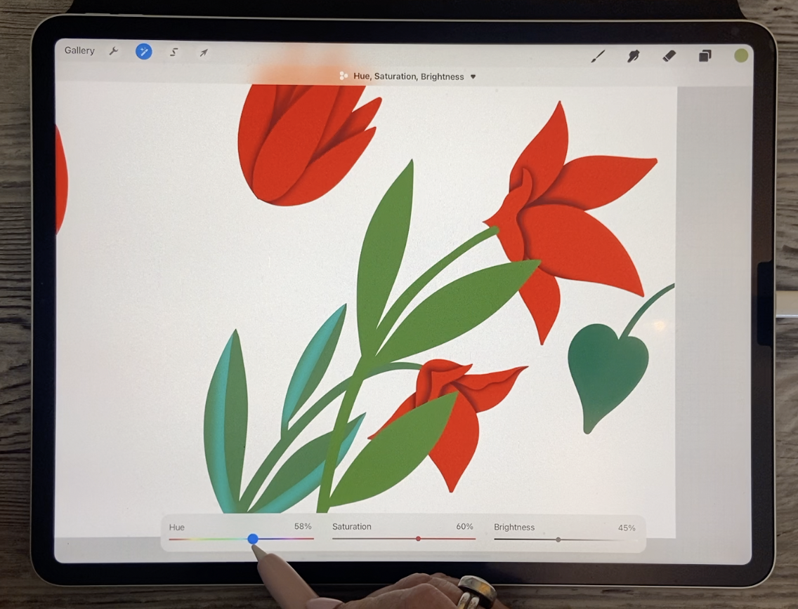
I had issues with that Phil. Silly me, not too bad. A couple of spots here. And I think I will use hue and saturation to get the color a little
bit closer to this. So I'm moving a little
bit to the right because that was kind of a mossy
green saturating it, darkening it so
it's getting close, maybe a little bit
bluer and maybe I'll just have it a little
bit darker anyways, because then I can
stick it behind and it'll look like
it's in the background. But again, I want to use
that bright blue that I use. So that was something like this. I'm going to add a layer and make it into a clipping mask. And let's pull some lines
through the leaves again. And it seemed to have
worked out. Okay. Stop at just before the end. Because once it was blurred, it looked alright, wow,
I'm getting shaky. So Gaussian blur, I may have needed to make those a bit bigger because these
leaves are bigger. Myself do it now. And I think we went to 9%
or something like this. Let's get 11% and through
and erase like that. I think in this
case I'm going to use that soft airbrush for an eraser to just soften the
end part of this one here. That turned out quite nicely. So what we'll do is
grab those two and move them way down so that we have
them below this plant here. And we do have
this leaf on here, so we can do that one as well. I'll do one of these
right now with you and then I
think I'm going to have to do that on a new layer just because I've already
blurred that other layers. So here the sample, this color, to fix, fix this up and switch back to the
proper brush, wrong layer. I'm gonna be back
here to do that. And on this one, I'm going to do basically
the same effect, but I'm going to use
a different color. So I'm going to use maybe a deep yellow and let's
see what that looks like. Pull it nice and wide. I'm not sure what we'll do here. Blur it. This time. That looks like I bought
13% and then erase. And I knew I was on that
airbrush switch back to the posca because
I really want to have a nice sharp line here. You see how far it blurs it a like when you go to erase it, you realize, wow, that
was, that was far. So not sure I'm going
to love that color, but I'll do the rest of
it first before I make that decision is so
easy at this point to go through and
experiment just by using your hue and saturation
to change the color. I think, I think I do
like this bluish tint, so maybe I'll leave it at that. And what I'll do off-camera is the other leaves
that are like this. And then we'll come back
and do these stems on these two flowers just to see what we could do that
would make a difference. Alright? So I'll see you in
the next lesson.
7. Lesson 6 Some of the Finishing Touches: Hi guys, welcome to lesson
six. Less than six. Here we add some
finishing touches. I want to show you some
of the things that I did to just kinda fill out the
space a little bit more. And then we'll talk
about next steps. Okay, just to make this move
along a little bit faster, Let's try faster technique
with these particular stems. So we've caught, these are the same layers as
these leaves here. So we're going to have to
make different clipping mask. I can't use the same clipping
mask that I did before. And so this will be this one that I'm
working on at the moment. And what I wanna do here
is have that gradual from the top to the
bottom sort of gradient. So to do that, I think in this case, the fastest method is probably
going to be to airbrush. So we're gonna go with
that soft airbrush and let's see how big it is. Makes sure that it
is nice and big. And it's, we're on that
correct layer here. So we can just suddenly darken the leaves
from top to bottom. So maybe about halfway Start and here I'm
barely pressing. And then as I get to the bottom, I'm going a little bit darker. So here I can also
switch to a darker color just to really get that
real depth of color there. And I'm going to
add a little bit of dark sort of
underneath the flower. We're going to pull this
layer and it's clipping masks here down to
be below the flower. And then you have
to in this case, tell it not to be
a clipping mask. So the actual layer itself
has to be below the flower, but it can't be a clipping mask. And let's go back and
grab that shading. I should have grabbed
that in the first place. Make sure you put
in the right spot. And there you have it. Now, it might've
been cool to have that leaf a little bit lighter in the first place here too. We can think about
that later when we put the background in
and decide whether we want them lighter or darker. So let's find the other stem. So that's this one here, and that's going to tuck
underneath as well. So let's grab the
two of them and bring them down and go
below the flower layer, makes sure that that isn't
clipped to the bottom there, does have to flip
back to the layer because that's the shading
for these particular leaves. And now we want to add
another layer and make it into a clipping mask to go
in and do our airbrushing. So we're currently at
the darkest color or add a jerk color, darker green. You can select the
green that you have in your palate there. And again, I'm pressing quite lightly and then heavier
as I go to the bottom. And again, I want to
go nice and dark. And you can decide, do you want this one to be the darkest or do you want that
one to be the darkest? And I'm thinking this
one because it's behind. So let's go to it's dark layer. Now this is getting complicated. So this is the layer here, that's the darkness
and going in darker, even go to a pure black. And I'll put that on very
lightly at the bottom. But I think that that's starting to give us
some depth there. So we've got these
kinda taken care of. We may end up changing
those a little bit at the top in the end. But now I think it's
time for us to start working on some of
these other things. So I think for now, it would be wise for us to group some of the flowers or leaves or whatever
stems altogether. So I'm gonna go ahead
and do that now. So I'm grouping. And you can see that
everything to do with that stem is together. And so we'll do the
same thing here. And then everything to
do with the flowers and does not make our layers palette just
so much more organized. I think we could
just grab all of these and have them
in the same group. So this can go into this group. So all of the yellow
flowers are now together. I'm going to turn them on, but then turn off
the entire group. And then what would be left are these little ferns
that I wanted to next. So let's take a quick
look again at some of the inspiration pieces and
see what we might want to do. So here's an example
of a branch, and in this case,
what the artist has done is a dark section in
the very middle of it. So that's something
that wouldn't be too difficult to do and would add a lot of
depth to each of those. So let's go into each of those groupings and
see what we can do. So we'll add one layer
for a clipping mask. And in this case, let's just grab a
really dark teal color. And right now I'm just using that same airbrush and just drawing towards the very
center of each of those. And in this case, because
we're not doing any changes in depth in the way
that we had to on the flowers and on
some of these leaves. I think that, that
looks just perfect. I think that's going to
be absolutely lovely. And so the last
thing to do would be the little flowers here and you can decide on how
you want to do those. I'm thinking that it might be faster at this point
for us to just take these and flatten them into one so they're
all in the group. You don't have to
individually select them. All you have to do
is hit flattened. And they're all in one group. And then you can add a layer
and make it a clipping mask. And I'm thinking that what
would be good here would be a darker center and then we'll maybe put something in
the foreground above it. So let's sample that yellow and we'll go
a little bit deeper. So it could be this color here. Again, I've just called
the soft airbrush. And so I'm gonna go
sort of mid-size there. And I'm just kind of lightly brushing in the
middle like this. And that's giving us quite
a lot of depth there. And then I think we can just
add another layer above. And let's go with
that mono line brush. So in my case it's the
Posca paint marker. And we'll use that to make
the dots for the inside. Depending on what
size you're thinking. You could go in and make
adjustments here to the size. And you should be able to
drop in just a single dot for the center of each of your circles and decide on what color you might
want to go with. I'm just hitting
it with red here, but it might be just
equally as interesting to do something like
a mid tone teal. I kinda like that, so I
think I'm gonna do that. And then I'm going to add a
clipping mask to this one. Whoops. What I want is a separate new
layer to clip to the dots. And I'm just going to move this one here is
really off-center. So this is where, oops, where that tapping to
move a point or two over is very helpful because you can make such
a fine adjustment there. And very quickly, we've
got all of those moved to where we want them and then on the clipping mask layer, but I want to do
there is go with a much darker teal,
a smaller pan. And I'm actually just going on the outside of the circle so you can't really
see it there. So just imagine you're
tracing like the outside of the circle itself if a little bit peaks
over, that's okay. Because I know that
you know what, the next move is
going to be here. And that's to go and
apply the Gaussian blur. See what happens is it just kind of leaks it into the
area that we want. I'm not sure why my screen
just suddenly darkens. So I hope that looks
alright to you. But I think here
we've got all of the flowers and all
of the petals done. This is a point at which you might start questioning
whether or not you like the colors and how you
could make things different. One of the things I
would likely do is go to this layer here
and select these two and go into my
hue and saturation and just change those two. Now, because these two
are the ones selected, they're the only ones that
are gonna change in color. And I'm just thinking I
might go a little bit more to a pinkish hue, so I'm not really
changing it a whole lot. I know 47% or
something would work. And overall, I feel like I'm really happy with the
colors of everything. And the last thing
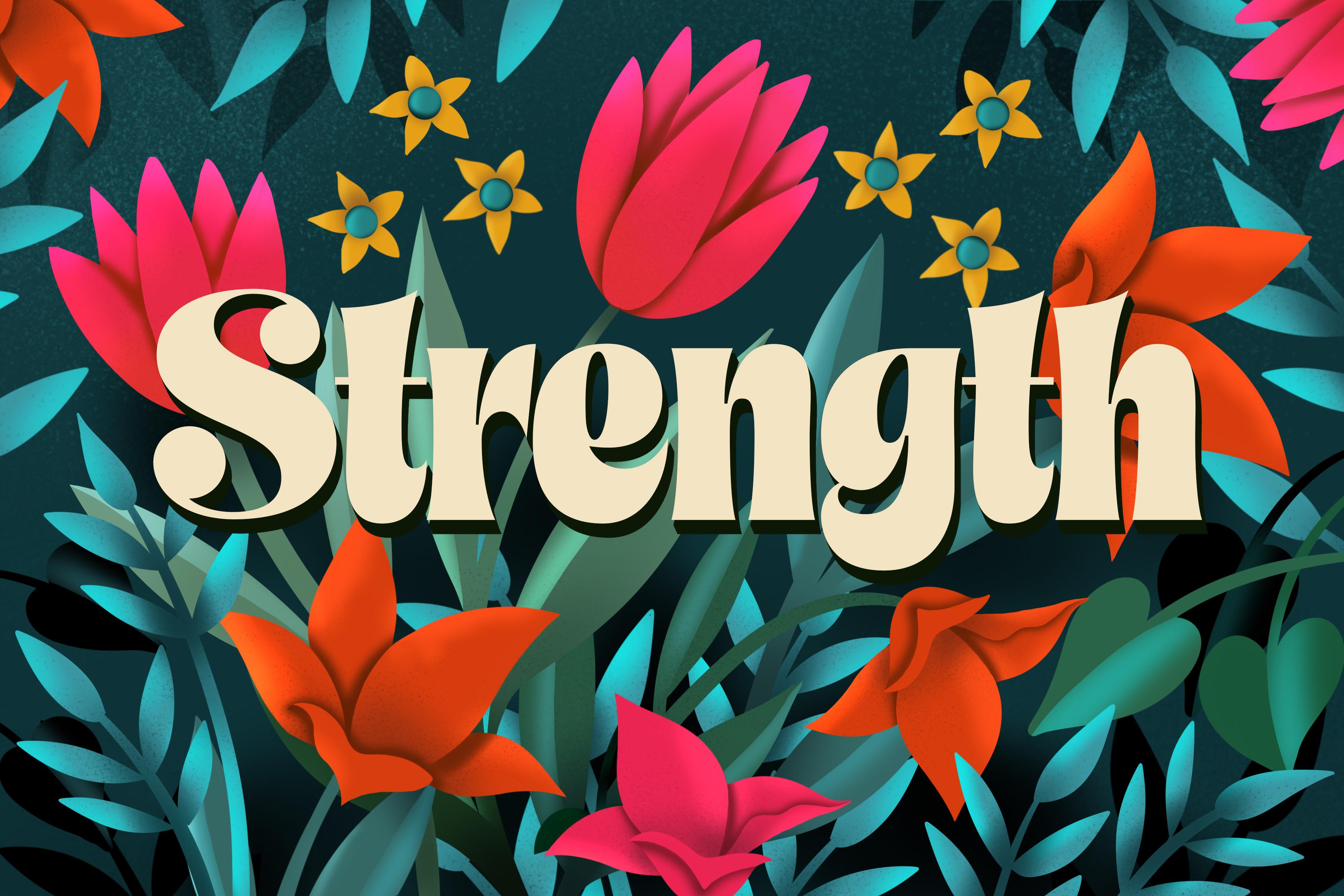
I want to do here, just to finish off this lesson, is to go into the
background here and fill it with a
really intense color. I think I like that heel
and right away you can see how dramatic everything
we've done locks because of all the shading
and the highlights and so on. So I think I'm really
close to what I can, what I would consider
my finished layout. I'm going to probably go in, add some lettering
and add some texture, but I think that I should probably do that
in a second class. So I'll do a follow-up class to this one where
we're gonna go in and add a ton of texture and stuff and we'll
do it together. I'm going to show you this was kind of an intermediate
one that I did. So I had made a few
little adjustments here. And then the final
one, I really, really filled in a lot
of the empty space. Once I had my word in there, I duplicated a bunch of
these firms to stick around in the outside edges
just to give it some depth. You can see here that I've got some really deep
versions of that one that really make it
look like there's a certain amount of
distance it all receipts. So I think that really builds up this sort of
gaps that I'm looking for. And I did that as well
with these leaves. So you can see that those
leaves are now also repeated in the background
here, nice and dark. And then, of course, duplication of these flowers and repositioning and
slight changes in color. And I've actually even
done more changes to this. I'm adding texture. I only just started it
on this layout here. But what we'll do in
the next class is we're going to do all of those things. So we're going to
duplicate what we can to put around in the
background. I don't know. We might even possibly
draw other motifs. We're going to duplicate some of these to fill in this space. And I'm going to
show you how to do all that dark stuff
in the background. And then we're gonna
do a bunch of texture. I think I'm going to spend
a couple of days over the weekend doing that sort of thing, adding that texture. And then we'll come up
with a second class. So hopefully that second-class
won't be quite as long, but it'll give you
a lot of ideas. I purchased this
font specifically, though we'll talk about that. I'll show you how to
do things like add the drop shadows and so on to give the lettering itself depth. So we'll talk about all of
that stuff in the next class. And I think that you will
find that you can really improve your layout with some of the things that I
end up suggesting. Alright, so I guess I'll
meet you in the windup and there we'll talk a little
bit more about next steps. I'll see you there.
8. Lesson 7 Conclusion and Closing Thoughts : Hey guys, welcome to the windup. I'm so glad that you stayed here till the end because I think that what I've
figured out is that this is a class that's
going to do follow up. I really want to spend a lot of time doing some
layering and filling in all of the spaces that I think will really
enhance the lettering. And the lettering is something that I want to explain fully. So I'm gonna do that
in a follow-up class. I think that's the easiest. And in that class then I'll be able to spend
a lot more time explaining some of the
intricacies of adding, shading and that sort of thing. So I'm going to practice
for a couple of days before we dig
right into it. So I really hope to see you
in that follow-up class. Thanks again for hanging
out with me today. And if you're interested in checking out any of my stores, you can find me on Google.com. And in Canada here at art or where I also have a
shop on societies six. And you can find
me on sites like Wayfair.com and I
Canvas as well. So I guess that's it
for today's class. I will see you next time
in the follow up fast. And thanks again for
being here with me. Bye for now.
 Delores Naskrent, Creative Explorer