Transcripts
1. Intro Gouache Paint in Procreate: Hi guys and welcome. My name is Dolores
masker and I'm coming to you from sunny,
Manitoba, Canada. The class I'm bringing you today is on gouache painting florals. I developed a whole brush set for this class because I was just having so much
fun and I just knew the exact look
that I wanted. And it took a little
bit of experimentation. I'm giving you a bunch
of these brushes so that you'll have
them for class. You can follow along and create this
illustration with me. We explore all kinds of
layering techniques, color mixing, and
believe it or not, everything is done in a
monochromatic palette. We'll be sticking with purple
throughout the whole class. And you'll see how
effective one color should be in creating a beautiful
layout like this. Now if you haven't
done so already, I'm going to suggest
that you hit that follow button up there. That way you'll be informed of any of the classes that I post, as well as get any of the post of followers
that I send out. You could also go
and add your name to my mailing list on my website
at Dolores art dot ca. From a site, I also send out all kinds of artists resources. So having your name on that
mailing list will really ensure that you get all of the information in
a timely manner. So are you ready to get into some gouache painted flowers? Alright, let's get into it.
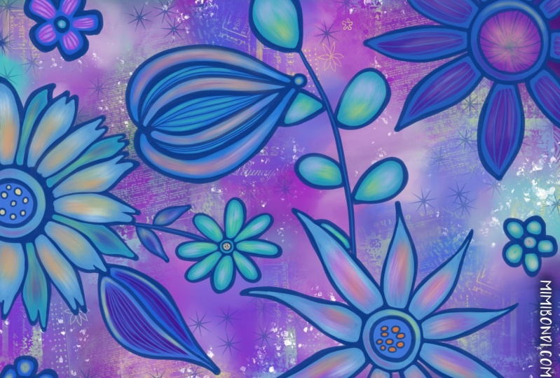
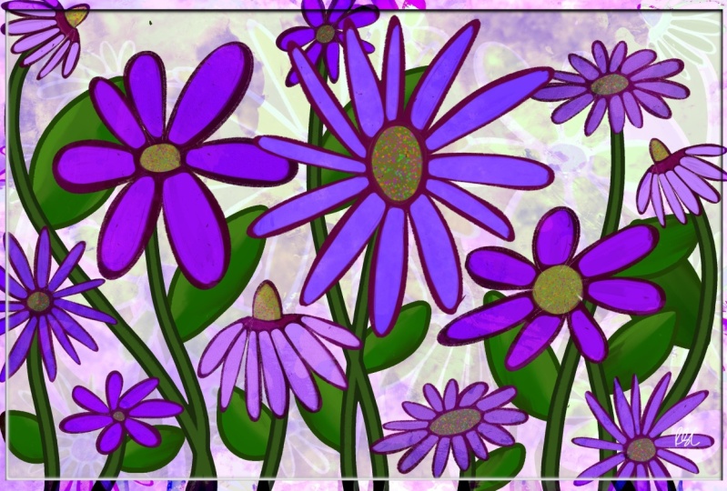
2. Lesson 1 Overview and Ideas to Spark Creativity: Hi guys, welcome to lesson one. Lesson one here we're
gonna take a look at some examples that I found. I like to give you
an overview of the class. Let's get started. I'm just going to do a quick
inspiration rundown for you. And I'll tell you what three
boards you should look at of mine that could give
you inspiration for this. Of course, because we are
doing a gouache floral, I would suggest you go into this gouache floral inspiration
category because here, there are a few that got me going in the
direction that I wanted to. Mainly it was this one here. So I'll show you that 1 first. So this is a style
that I was thinking. I want something with a
really chunky outlines. I want a little bit of
variety in the motifs. I'm going to be sticking
to one color myself, but I think that this
style is probably the closest representation
that you'll find here too, what I'm after in this class. So that was artwork by a
company called one can U2. And then here's another one. I pulled this one out
specifically because I had this calendar,
the 2016 calendar. I kept it and I've kept it
for so long that this year, the dates actually
match up to 2020 to 2016 June calendar is exactly the same as it
would be for this year. So believe it or not, I have recycled it and I'm using it daily
here in my studio. So this is really similar, same kind of style, I would say, with a thick outlines, the solid painted parts
to each of the flowers. So these are the looks
to me like gouache. I would presume that it's
gouache and it's very bold. So none of the flowers have
really intricate detail. Everything is kept very bowl. So that's the look
that I was going for. I don't know if I've got
anything else by them. I guess here's another one
from this calendar, the 2016. So this will give you a really good idea of
what I'm looking for. So you see this
simple flower shapes, they're not even close
to photographic detail. And that's what I'm really wanting you to do
in this project. Now another category you
could go into to probably get some other good ideas as far as your flowers themselves,
how to draw them? For example, you might want to check out this flowers
illustrated in photograph. You'll have to go through and
try to 0 in on that style. This would be, I guess
a fairly similar style. You don't really thick outlines. This one's super casual, very, very loosely done, but it
gives you the same idea. And then I just thought of another board that you could
go take a look at of mine, and that is in my
surface pattern design. And if you go to
the bold floral, bold leaves and
flowers, this category, even though I have here and
my surface pattern design, a lot of this isn't
repeat patterns, but I just like the look
of these chunky florals. So you could do those
looks that I was just showing you or you could do something that's a combination. This one is actually
really good inspiration. I kinda wish I had referred back to this when I was
working on mine, but I mean, this has that thick outline that
I'm talking about. Those red flowers have
that blue outline, which is kinda cool. And really, a lot of these have really, really
simplified shapes. So that's what I would like
you to try to aim for. Loosen up, stop
thinking in the way of detail and then just go for it. Here's a great example. So something like this. This is a look that I think you can easily
pull off in this class. Okay, so that's just to get you started and now let's get
right into the project. Now in order to get started on my composition
here I've got a blank document that
is 12 by eight inches. I've also got that at
300 pixels per inch to make it really nice quality. That's something
that you could use on smaller artworks
on POD sites, for example, could work bigger, but that will limit
the amount of layers. So I am, at least for this class just sticking to this size. Now, I personally
like to go ahead and draw a bunch
of my motifs in. So I'm preparing myself
for the inking stage. So I've chosen a
blue-green color. You can do it in
gray if you prefer. Like a graphite color,
It's up to you. And I've got this six B
pencil from this catching sat that I'm gonna be using
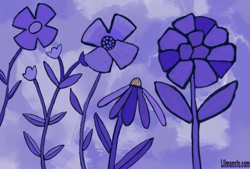
here to draw my motifs. So I'm going to draw some simple flowers to start out with. So I'm just going to be
sketching them quite scheduled. That makes sense. I'm not going to put a lot of detail
into the sketch here. This is just a guide for me
as I go through and I start inking so you can draw whatever types of
flowers that you'd like. I'm keeping my shapes and
flower is pretty simple. They're not going to
have a ton of detail. And I'm adding stems, roughing them in and leaves. Not really a 100% sure how it's going to
look in the long run. And a lot of times
what I do is I will keep these on
separate layers. So because I drew them
on the same layer here, I'm just going to cut and paste, which will make it
into a separate layer. And that gives me
a little bit more flexibility in moving things around and just trying to
get my composition right. So I'll add a new layer here and draw a different
type of flower, maybe a floppy, kind of
a cone flower shape. Usually these have
kind of a busy center. You can choose to keep all your leaves
looking the same or you can draw them differently
for different flowers. And I find that one of the best ways to get your
composition looking good is to really vary the heights
and styles of the flowers. Once you have a couple. Let's say for instance, this one here would be one that could be easily duplicated and then
moved into another location, or could be a part of the
same flower, for example, here we could flip
it horizontal, change the angle of it, and maybe cut this
bottom part out for now. I'm just going to
keep that separate, but then go back to this one and just kinda integrated
into the first one. So that's what I
do is I go through and I basically compose my entire design
like this first. And I find that that is
really the best way for me to ensure that I get a good layout, like a good full layout. I had already done that. I'm going to keep
this one anyways because I could use
that for another one. And I'll show you the finished sketch that
I've got going on here. So I've done basically exactly
like I just explained. I've got separate layers for all of these
things so that I can turn them off if I wanted
to or move them around. So I could definitely
mix and match. Or you can see here
like for example, this one here is the same as this one here and this one here. It makes for a faster
initial composition. And so that's how
I like to work at for preparing for my inking. Now another thing I
really like to do is to create my initial background. And I like doing that at the beginning
because I feel like everything else than makes
sense as I'm working on it, then I can make one of
the colors that I'm using and it just gives
me a starting off point. So I'll show you
how I created that. And I'm going to add a new
layer here to accidentally. So I'm actually going to
put this below the group because I want to hide
that group for now. I'm gonna be using only
brushes from my gouache set. And I'm going to be keeping it quite simple like this
initial background. I'm going to be creating
a set for you and I'm gonna be giving you a
couple of other brushes. I may not give them all to you, but you'll have enough
that can get you started. Actually, I think what
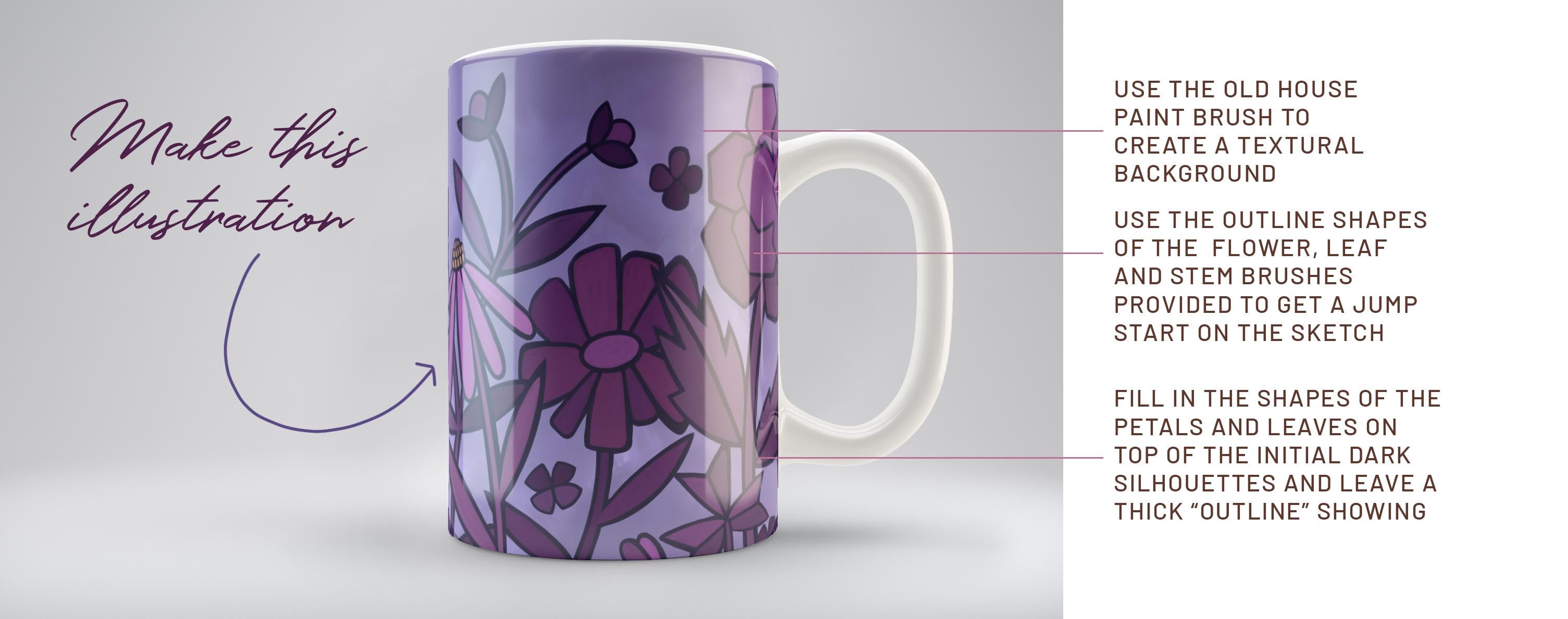
I'm gonna do is grab my old house paintbrush to use so I better make
your new set here. I'm going to duplicate these two and I'm going to throw
them into your set right away just so that I
have them in there and then don't forget to
give them to you. So I'm going to work with
a fairly I don't know, it just kind of a neutral blue. I'd say I want it to be a
little bit desaturated. And I'm going to just
simply start with that old house
paint brush first. And I'm going to make
my brush nice and big. And I'm going to
just kinda throw on a bit of the color and I'm gonna go a
little bit grayer. I think I prefer a gray finish. And I'm going to
showing you how to do a bunch of blending
and stuff with this. I'm putting a bunch of different areas of my color
that I can then blend. And we're going to
use the term dept, old house paint brush. And again, I'm going to
go a little bit grayer. And this a great brush for just blending so you can use a different color
like I just did. Or you could grab one of
the colors that you do have and then use
it to blend out. And my main goal here
is to just kinda create a background that's got some texture to it and
looks interesting. So this looks like kind
of thinned out gouache. So that's working quite
nicely and it's giving us that nice cloudiness. And I liked the blend. And if you take a look at
the stamp for this brush, let me stop at
White who see it's quite an interesting
brush as far as different degrees
of lightness and dark, right, built into the brush. So let's go back to the story, color there and just add a little bit of that
here and there. And when you put the first
tab of the color on, it goes in real dark. But if you keep working at, you see that it blends it out. So work with your
different shades. And I've intentionally got the outside a little bit darker. You're going to decide for yourself what sort of
look that you want, but that's what I'm
going for for now. So we've basically got the background ready
and the sketch ready. In the next lesson, what
we're going to do is all of our initial
gouache painting, which will be the dark outline
for each of our flowers. Alright, I'll see you
in the next lesson.
3. Lesson 2 Blocking in the Flower Shapes: Hi guys, welcome to lesson two. Lesson two here
we're going to start blocking in the
initial flower shapes. And I'm going to
show you how I use the eraser to do a
little touch ups. Let's get started. So I decided to change that
background to be purple. So I just use hue and
saturation to do that. I want to just bring
down for you how I went about creating
that first flower. What I've got is my, I am and my flower actually at this point
on separate layers. And it wouldn't
matter, you could have it all on one layer. And what I'm doing is I'm doing a complete solid of my motifs. So I'm actually going to be drawing a little bit wider
of a lion and white. My sketches and the paint
that I'm going to be using is my thick wash. I'll duplicate that and
throw that into your set. And this one is nice because it does have some texture to it. So it's not just a
big, solid line. It has what looks
like gouache texture. And I'm going to use
purple as my color. So I'm going to
sample that purple. This is the color scheme
that I want to use. So I'm going to set it as
my default. Right now. I'm gonna be doing pretty much
all just the dark purple. And you can ignore
the fact that I've got on a different
opacities of it there. It's not going to
make any difference because we're gonna be
covering that with color, as you can see here
in my example. So I've added some
additional detail over top, but you can see
that what we do is we leave part of that showing, and that's what ends up being
the outline for the flower. I want to do it so that
each of my flowers, it's on its own layer. So I will add a layer before
I start actually painting. And this one here, it's in perfect position now this layer below
this so that I can draw this one and it won't be blocking out any
of that flower. It'll be in behind, which
is exactly what I want. Now let's check
the thickness here and whoa, that's not the brush. I even want k. Yes,
That's the brush. And I want to remain pretty
consistent with my outlines. So I'm thinking about that thickness because
that's going to give me a lot more flexibility for what I do in the foreground
and all of these. So get your artwork
in a position that will make it easy for
you to do your tracing. And remember that something
like this you can do as a solid and you might as well carry through and just
color the inside. In this case, I
wouldn't recommend that you just fill your shapes. By that, I mean, you
wouldn't draw this. Just drag the color in
because that's where you get that sort of
change in the color. And what you really
want is to make this look like it's
been hand painted. Filling it in by hand, in this case is the best idea. And as you go through this, you can do little corrections
like I just did there, moving that leaf over. And you can see that
I'm keeping my style very loose and not worrying too much about getting really sharp corners
or anything like that. Those are things we can always
go back and change later. But for now I really
want to get this looking like it's just
been hand painted. And you can see
that as I do this, you could actually see
the strokes as if I'm laying down the paint and it's
not quite the same color. It gives a lot of
texture this way. So now I want to start
this flower here. So again, I'm going
to add a new layer. Now when we get
to the next stage where we're putting
some of the color in on these flowers. You're going to see how useful that light blue outline wise. So I'm just going to time-lapse the finishing of
these motifs here. If I think of anything along
the way, I will mention it. But otherwise you
just going to see a nice time-lapse of me
doing my painting here. I think with this one here, I can duplicate it and then flip it and use it in
this position here. I'm going to turn all
these back on and just see if I've got everything. I've missed a few of
these little ones here. That should be pretty
easy because I can do one and get myself a couple
of duplicates to move around, rotate them slightly or whatever you have to
do to make them look like they're not the exact
same one duplicated. And the beauty of having these
all on separate layers is that you could do a lot of moving things around afterwards. I'm going to add
another one here. And I want to add
that leaf in there. So that is this one here. So highlighting that
layer so that I make sure that I'm adding
it to the right one. And now we're essentially
done our illustration. So you can decide whether or
not you want to keep all of these rounded or whether you want them to be a
little bit sharper. And if you want them
to be a little bit sharper than I would choose that same brush and
use that as an eraser. Just go through,
try the size here. This is the one I have
selected at the moment. So just go through and then just sharpen up your
hands a little bit. So I'm going to go
through and just creates quite a lot of these. But I can do that off camera and I'll meet you in
the next lesson.
4. Lesson 3 Adding Color to the Motifs: Hi guys, welcome
to lesson three. Less than three here
we're going to start adding color to our motifs. I'm gonna be showing you
how I touch things up. And I really want to explain why being consistent is important when creating a
layout like this. Let's get started.
Okay, so what are the things I wanna do
here is to just work on each individual flower just
to keep this less confusing, I guess you'd say, I'm
going to hide all of these and we're gonna
work on this 1 first. So let's find that one
here in the sketch layer. And I'm going to drag that sketch layer to
be above the flower. So now I can see it as I
start to work on this flower, I showed you the palette
that I want to use. So we'll go back into here. This is the palette
I want to use. So I really want to make a point of sticking
to those colors. For the most part on this one, I want to keep almost all of them to be really monochromatic. So it's mainly going to
be purple that I use. It might be only purple, purple or maybe this rosy color here as I'm doing my flowers, but I'm going to be using the exact same brush so
that thick gouache brush. And I'm going to be mindful of my individual shapes that make up each of the flowers now, so you might want to go a
little bit smaller with your brush and choose
a lighter color. And then you're gonna go
in and you're going to paint your individual petals. But you want to
make sure that you leave a bunch of the purple
showing on the outside. So as I'm drawing this, you can see that I've left
what will end up looking like an outline once we have
all of our petals drawn, I think maybe I will draw
this central circle first. And you can see I'm
painting it right? And so I'm not stopping, not picking up my brush, and I'm just painting
the entire thing in, you can pick up your brush, but what you'll find
is you're going to have a little bit of a
stroke showing there. I mean, that's not
the worst thing because it does kinda
look like you've hand painted so you could
go through and do that. So some people will
go through and paint all the outlines on
their illustration, even in the natural media. And then go back in
and do the fill in, figure out for yourself what feels right and what
seems to work well. So I would go through and do the initial
drawing of these petals. We're still gonna go in
and do some touch up. But you can see here
that what I'll do is when I'm filling
in the next one, still leaving a gap between the petals to show
through that purple line. And so maddening when I do this, but I have painted all of those onto that
light blue layer. So I'm going to have to undo and go back and
make a new layer. I hate doing that, especially when I've got people watching. I guess I could just do a
bunch of clever editing and you would never know
that I make mistakes, but I'm only human and
I do make mistakes. I think sometimes just
because I like to work fast. And then when you worked fast, you have a tendency
to not pay as close attention to those details as you show it anyways,
as I was saying, is like now I'm drawing in this in-between pedal
and I'm making sure that I leave a gap and
that's what I wanted to show you as I turn off
my guides layer, you can see how that
gap is going to end up looking like the
outline of the flower. So I'm going to continue
with my painting. Make sure I'm on
the right layer. Actually, I'm going
to put my guide back on because that helps me to know which things are on top and which things are behind. So I'm gonna go through and paint the forward petals first. So that would be most
of these bigger ones. And I'm intentionally
leaving streaks in there which end up making it look
more like the natural, natural media, the
actual gouache. If I was painting it, gouache, you can gouache really, really flat, but you can also paint it to have a
bit of a streakiness. And that's kinda what
I'm going for in this particular look at anytime you can shut
your sketch off, if it's kind of
getting in the way. Sometimes it's easier to
be more accurate with your shapes when the sketch
is not in your way there. And you can see how little of our underneath flower
really shows through. And yet what is showing here definitely has hand
painted look to it, which is really
what I was after. So this isn't finished by any means because
what I wanna do now is show you how I go about
just kinda fixing it up. So let me just get these
leaves painted in first. What I wanna do now
is show you how I go around and really tighten
up my finished paintings. So I will use the eraser again and I'm
using that same eraser. Not sure of the size
here, that's too big. Let's go quite a bit smaller. And what I'm gonna
do is just kinda go through and do some touch up using a brush like this to do the erasing will help us
really sharpen it up, but it will also help us to get these thicknesses
consistent. So you can see here
how badly I did that, but how nicely this turns out as far as making those
thicknesses consistent now, so make sure it's the
eraser tool that you're on. And you can go through here
and do all your touch up. You can see how nicely that
sharpens everything up to. So I'm going to have to go in on my purple here and
do some touch up. Now if you switch
to the color here, I just tapped on it
to select the color. You can see that it switches to the brush tool right away. So that's good. You don't have to go
up here and switch. It'll just switched when
you sample the color. We'll go back to
the eraser here. And I think that's turning
out nice and consistent. And look how nice and sharp we're getting some
of these corners here. I definitely want to
go back and do some erasing on my underneath
layer as well. Sometimes when I go to
turn my illustration, I'll hit the color and then
it switches to the brush. So that's something I always
have to be watching out for that I'm not back on
the brush accidentally. So that's basically what
I go around and do. I'm going to do some touch
up on the flowers here. And I'm going to paint a few
off camera because I want to get us through to
the next stage here. Alright, I will meet
you in the next lesson.
5. Lesson 4 Completing the Full Coloring Process: Hi guys, welcome to lesson four. Less than four here
we're going to be finishing off the coloring. I've got a time-lapse
that I'm going to show you here on my process. Let's get started. One of
the things that I want to suggest to you to
that you could do is within the same color family, you could slightly
vary the shading. I'll go even a little
tiny bit darker there on different
parts of the flower. So we're keeping it really consistent as far as
the color family. So frustrating when I do that. A little bit brighter for this, a little bit darker and dollar with this
next set of petals. And I think I'm gonna go
even a tiny little bit darker for a couple of these, that might be just
a bit too dark. Sample that color again, and just go just a
tiny little bit over. Now you can see that underneath I didn't fully
finish that shapes. So that's something I would
have to go back and do my kinda like that slight
variation in the purples to, so that's something you
can decide on whether or not you like or don't like. And then this is always fun. That stem, I think I might
go back on the purple. Just go a little bit bigger. When, while I'm at
it, I might as well just finish up this leaf here, although it's mainly hidden. But just in case I decided to bring it
in front of that one, that gives me that option. So you can see the routine here. It's basically
exposing your purple or your darkest color. You don't have to have
it purple course, but exposing your darkest color. Then bringing your
sketch on top and going ahead and doing your
painting on a new layer. So I'm going to make
that new layer. And I think what this
flower, what I'll do is do half of it in one shade. So the top half, and then sample one of those other purples
that I had just used on that other flower and to the other half in
a different color. So we're adding some really
subtle changes in tone. We're still sticking with
that same color family, but you can see
how it's starting to really come together here. So I'm going to time-lapse the completion of this
coloring portion for you. And you can watch
as I go through and get it to the point that we need it to be
out for the next lesson. Alright. So one of the things I did with
this illustration was to have all of my petals really square. So that's an artistic choice. You can definitely make the flowers whichever
way that you like. I just kinda did it
this way for fun. As you can see, I pretty
much keep the same routine of going through and adding
all of the different shades. I pull the sketch above
and use that as a guide. And in general, I'm keeping
to that same purple group, although I've got that
little bit of pink on the daisy like flour and a
little bit of gold in there. And I've tried to be
quite consistent with the thickness of that outline
that is then remaining. But I am going to go back in
the next lesson and show you how to go through and then just really sharpen
up all those edges. Remember that the
technique that I'm trying to achieve here is a
really hand painted look. And you can see from
this that that's really coming through in
the way that I'm painting. I'm not using the
traditional you don't drag and fill method to
make the solid. I'm just painting it in just
as if I was working with gouache and outlining is filling each of these
areas individually. I think that's what keeps
that character consistent. Now here you can see I'm
just kinda going through and sharpening up some of
the details on the outlines. But like I said, we're
gonna do a little bit more of that in the next lesson. Sometimes I turn off the
background layer just so that I can really sharpen
up each of the petals. Now I'm going through and
sharpening up any of the lines, outlines, and making the shapes a little bit more refined. So I've gone through and
colorized most everything here. And I think I'm gonna be
doing some changes on this flower or maybe some of the other ones just to kinda
tie everything together. And I think right
now I can get rid of all of these drawing layers. So I'm going to group them. Then I'm going to just
simply delete that group. So now I've got a better idea of what I'm dealing with here. Let's meet in the next
lesson where we're going to really work on the outlines. See you there.
6. Lesson 5 Creating Consitent Spacing Around Flowers: Hi guys, welcome to lesson five. I want to show you in
this lesson how I go about creating a
consistent border around all of my motifs.
Let's get started. In this lesson, you're
going to see me going through and making that spacing between the colored areas
nice and consistent. Gonna be a time-lapse. I had forgotten to add
these leaf colors here. Now a little bit of work
on these smaller flowers. It's cleaning up that Phil. And anywhere that I am seeing that the
outline is a little bit fan or transparent. I'm trying to fix up
at this stage two, I can tell I drew the
daisy on another day. I did that the day before and then finish the rest
of the flowers. And to me anyways, how slight different look to it. So I wanted to make sure and touch that up and
make it consistent. But this is the stage I call finalizing and
finessing because I'm basically going through and just kinda double-checking
everything. When you first go through
something like this, it's pretty easy to I
have inconsistencies and those inconsistencies
are what I'm trying to rectify the moment. So sometimes I'm changing
the color ever so slightly, but mostly it's on getting that outline or what
looks like an outline. Solid shapes but getting
those all nice and even and just cleaning
up the interior shapes. I worked fast when
I'm doing that. So there's a lot of times
when little things, I'm pretty much always sure that I'm gonna
go back and change. So I'm not really being too precise and detailed
when I'm doing the initial laying down of the
color because I really like to get that stage done and capture that whole
feeling of hand painted or natural look. So some might argue that
that is double the work, but I find it just a
lot faster this way. And here I'm just going to
add a little bit of color in the middle of this flower and
just brighten this one up. And then I think
really at this point, I'm ready to take it
to the finish stage. And what I wanna do is
put this on mockups and also upload it
to society six, just so that you get an idea of what to do with an artwork
once you are done. Alright, so let's meet
in that next lesson.
7. Lesson 6 Uploading to Society 6 and Mockups: Hi guys, welcome to lesson six. Less than six here is all about what to do
with your artwork. Once you are done,
let's get started. After getting my art work done, What can I do with it? How can I make some
extra cash with it? And one of the main things
that I would suggest you do, especially at the
beginning when you've got art work and
you're just learning, why not open a shop
on society six? So on society six, I have a very full shop full of art works that
I've done over the years. I haven't really been working to increase my catalog
of artwork here because my agent also has me covered here on society six
with the denied designs. So most of my newer stuff has
now been loaded up there, but still get some sales here. And you can see I've got pretty much everything
that I've done, very many different styles. The most popular one,
if you can believe it, of course, is this one here. Friendship is like
peeing your pants. I have done this one in
several different color ways and it sells well here
it fails well on basil. It's just one of those artworks, I guess it just really
speaks to people. Now, as far as the first, initial setup of your store, that would be big
enough subject that it should be covered in
a different class. But generally what I do once
I get to my store here, I would go to manage my posts and then I would
add new artwork. So I've already added this
gouache here, as you can see, and I've applied it to all the products that would
fit that particular artwork. So this is the 12th by eight
at 300 pixels per inch. And you can see that there
are a lot of products here. That artwork was big enough for. Now the next size up that I would want to do and
that I would suggest is artwork that's
5500 pixels high. A lot of these
require 55 or higher. So I've created that art work. So I've got a larger ones. So here I would go into
the upload new artwork, go to the folder that
I've distorted in. And where did I put that? This one here. And you can see here
actually I've got it 6 thousand pixels by 4 thousand. I better change that. That can't be the one. Let's go back to, I've got an enforced shop here. You could do this
resizing in Procreate. I'm going to actually change it to 6 thousand pixels high. And you do need to
be careful here because when you do enlarge it, you're going to start to get more pixelation along the edges. I think this artwork
will be pretty forgiving and I'm still going to follow through with it here. You can see that this is the
new size, 90056 thousand. And when I upload this, it's going to work on a
lot of different products. So now that I have it here, I can hit Continue. Actually, I'm going to
have to name it here. I have to ensure that this
is my art work and that it contains no mature content before I get this,
continue here. And now you're going to
see that a lot more. One of my products here
have automatically been populated with the
newer, larger artwork. So you can go through here and decide what products
you want to have. Now, I probably wouldn't do something like
the wall tapestry because I know that that would be way too much of
an enlargement. I think the throw pillow
we could get away with. So I'm going to slide
that to the on position. I think we could do the pillows. I find that fabric pieces
are way more forgiving for any pixelation issues
that might have occurred. I'm going to try that clock. I don't know why it's taking
so long to load here. I obviously don't want a
repeat pattern wallpaper, for example, because it
wasn't a seamless repeat. I think the rug
we would be okay. Probably something like the
top this stool is going to be small enough so you can go
through you get the idea, a turn on whatever things
that you do want to sell. I'm going to avoid any of
these bigger products here. I think we'd get away
with the bath mat. I have ordered this bath mat in the past and it's really nice. It's got a memory foam and it absorbs
really, really well. I have one that matches the shower curtain that
I created here. And you just go through
and follow through on any of the items that you do want in your shop and look at
how many there are. So many, obviously any of the things like
cell phone cases, wallets, all of these would be perfectly sufficient
without artwork. In fact, that bigger artwork
that I ordered is being reduced in size to
fit these pieces. So it's gonna be a
really good quality. Once you go through
that whole process, I'm not going to add
any of the garments. Once you've gone through
that whole process, you are ready to fill out
all of the information here. So your name of your piece, the category it falls into. In this case, I think
I would put painting. There are some
suggested tags here. I would add things
like purple flowers, purple floral textured paint, anything that you can think of that if you were
searching for this piece, you would type in. Your search, then you'll
type in a description here. I am not going to
do that right now. I actually have standard
documents that I can open and get most of this
information to put in here, I would save the details. I would publish
the artwork here. I'm gonna go back later and change and add that information. You can go in here and you
can set your store markups. Generally, I leave
it here at this 10%. If I find that one product
is selling really, really well, I might bump
that up to 11 or 12%. And basically
that's the process. You will then have. Now at the moment,
it's set as a draft. I'm not going to publish it
because I'm not finished it, but you would set its
status as published or available and all of these products would
then populate your store. So that's one of the
things you could do with this artwork
and with any others. And I personally suggest
that when you are adding new products here
that you think in terms of having a collection, try not to have
it all piecemeal. When someone looks at your
wall art, for example, they should be able to find three or four different pieces that basically fit into the same category
or the same look. You can do up to 101 of the
things that is suggested by a lot of different
artists is to go through and make this into
a different colorway. I'm in Photoshop right now. You can do this. Of course, you know how to do this
in Procreate as well, but you're going to just
go in and adjust the hue. If you want to try to do
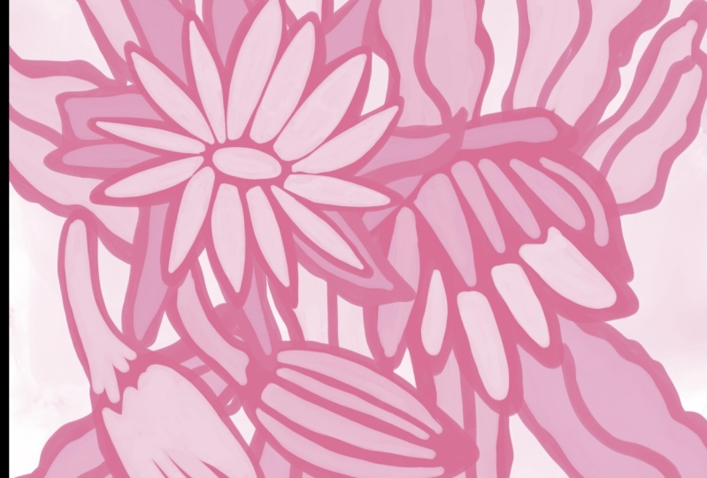
a different colorway, like for example, this
pink might be nice. Try to think in the way of what color trends are
popular right now. So you might want to try something turquoise IQ is that's very
popular right now. It's kind of hard
because I don't have it in layers at this point. So the colors are going
to be a little bit weird. You can change
colors in Procreate, in the individual layers. So that's what I would suggest that you do and not do it here, but then save those to other
colorways, upload them. That way you're going to have choices for anybody
that comes in. That is your final step here, is in adding this to your
store on society six, or to even take the time
now to create a store. Now the other thing
I have done is gone through and
created a few mock-ups. I've done that
here in Photoshop, but of course you can
do it in procreate. If you have Procreate mockups, there are starting to be more and more procreate
mockups available. So that's something to look
into if you're interested. If you don't want to
purchase a bunch of mockups, you can go to sites like place it and place your artwork
and do everything online. So keep that in mind. You don't have to
buy all the mockups, especially if you
can't get them for the programs that you use. But creating mockups is hands down my favorite way of testing
the look of the pattern. So that's it for this lesson. And I will meet you
in the last lesson, which is our wrap up. Alright, I'll see you there.
8. Lesson 7 Wrap Up, Next Steps and Mockups: Well guys, I hope
you're happy with your final illustration.
Welcome to the wrap-up. I always loved taking a look at my artwork on mock-ups
at this stage because it helps me to really figure
out whether or not it's effective using it
on different scales. For example, having this
picture on a wall shows you the scale of things like your outlines and helps you decide whether you've
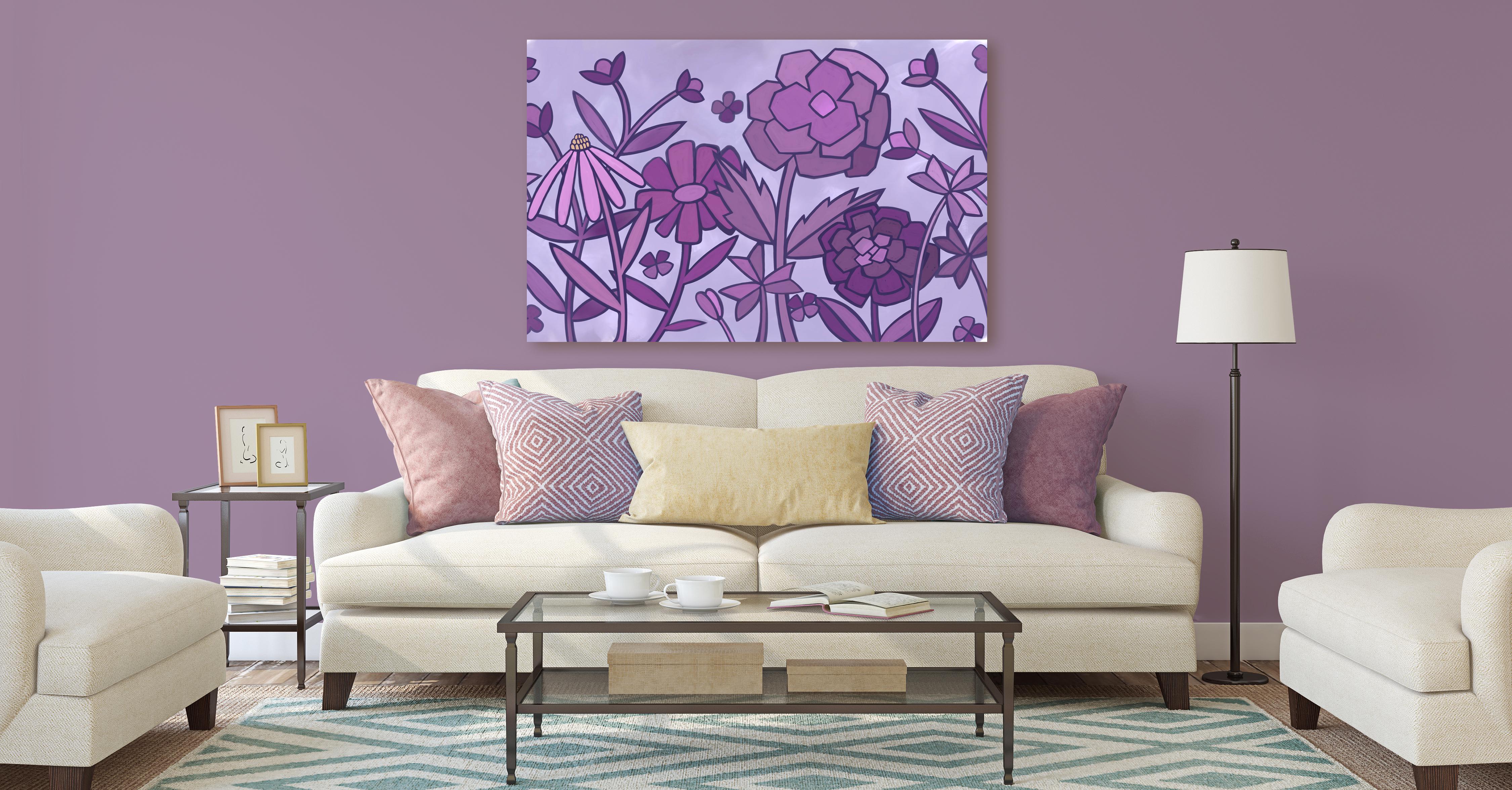
taught your color values. Okay? Looking at artwork
from a distance on a wall is completely different than looking
at it close up. I also always try the mock-up
on something really small. So between the two things, you really get well-rounded view of what those can look like
in different applications. It's all a part of the
process, in my opinion. Now that you know how to
produce an artwork like this, I would suggest that
you do a few of them. The repetition is
the best way to get efficient at creating
these sorts of layouts. I know that as I
went through this, I learned a lot and I think that I would do it slightly
differently next time. But there's always
that isn't there. Now if you haven't
done so already, I'm going to suggest you hit
that follow button up there. That way you'll be
informed of any of my new classes as I post them. And any of the post
to all followers that I send out with
other information. I also would suggest that
you get your name on my mailing list as
the loris art dot ca. From there I send different
bailouts and they can include things like
free ours resources, new brush sets, and alternate classes that I
don't necessarily post here. Don't worry, I won't overwhelm you with a
ton of information. I'm not a spammer. I know I really
hates found myself, so I tried to keep
it to a minimum so that you only get relevant
information from me. If you're curious about my work, I would definitely
suggest that you check me out on different websites like Sawzall.com where I have a full store or in Canada
here at our software. If you're looking for fresh sets and other assets
that you can use in your artwork and
definitely check out my artists resources
page on my website. I also sell on Creative Market so you can follow me there. I sell my large floral wall art and large abstract pieces. Many POD websites like I Canvas, pattern, and a few others. So you could probably
just searched me out and you can
find me there. I'm even on Wayfair.com. You can check me
out in their store. Thanks so much for
hanging out with me today and I hope that you enjoyed
it and learned a lot. Bye for now.
 Delores Naskrent, Creative Explorer