Transcripts
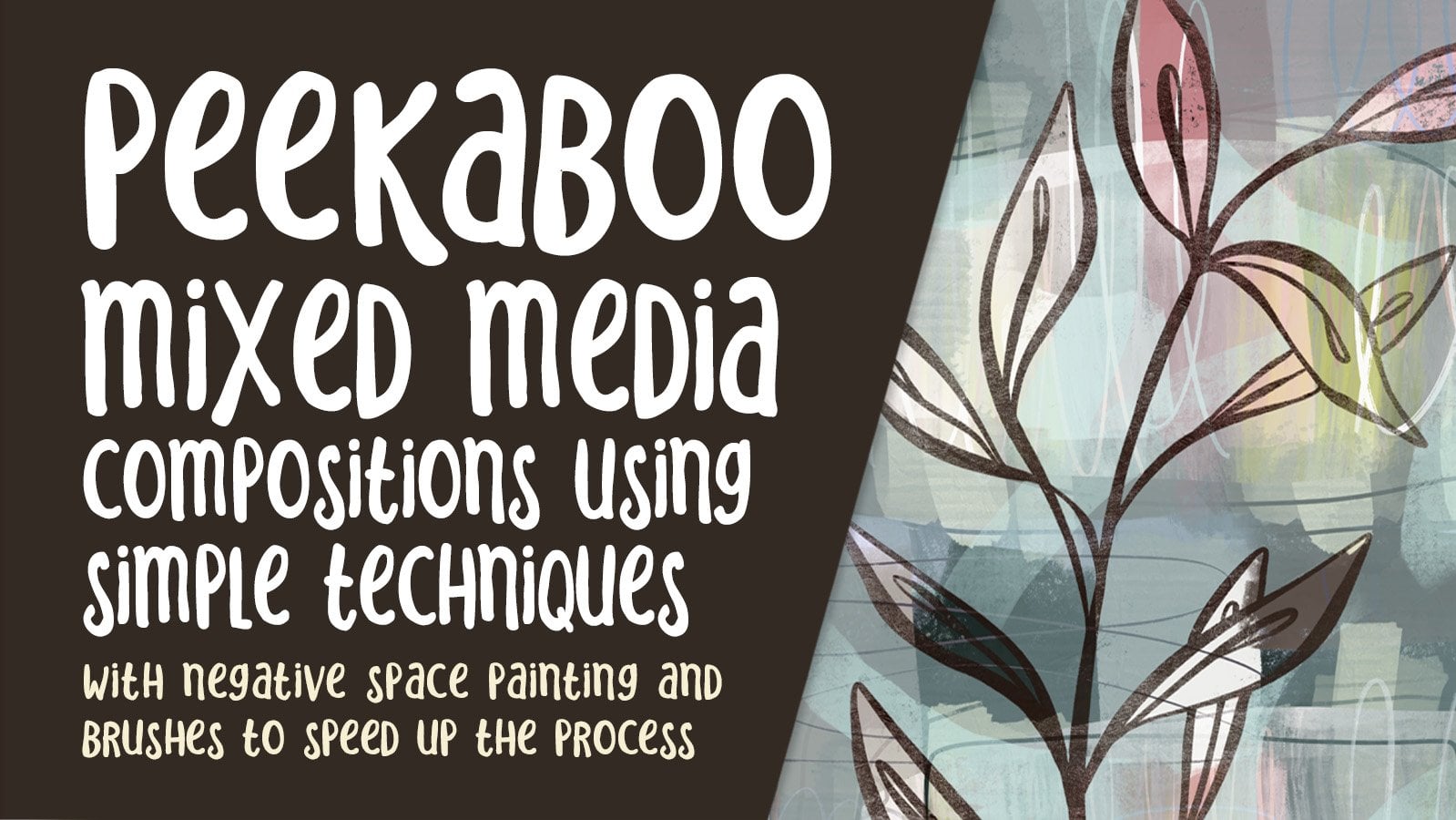
1. Intro Stencils for Procreate Mixed Media: Hi guys and welcome. My name is Dolores
Nazca and I'm coming to you from sunny,
Manitoba, Canada. We've returned from our trip to Florida and I'm
right back at it. I have surgery coming up
in a couple of weeks, but meantime, I'm trying to
record a bunch of classes. And so this is probably the last class before surgery
that you're gonna see. Now this class is all
based on mixed media art. Now, I've always been a lover of mixed media art and I love
working in my art journals. There's just something
so free and easy, working with paints and
working in actual media. And so I've got tons of
little journals like this filled with all sorts of different mixed media art
pieces that I've produced. I use these often in things like backgrounds and on work that
I do for art licensing. So that being said, I've decided that I want to
produce a bunch of classes that do the best I can
to mimic actual media. This class being a
mixed media class I wanted to work with stencils. Stencils are something
that are used extensively in mixed
media journal art. And you've probably seen
tons and tons of examples, lots of great products that you can buy off the top of my head. Tim Holtz is one
of the companies that I've bought stencils from. And stencil girl, there are so many stencils
available out there. What I want to do with
this class though, is show you ways to produce these stencils using Procreate. And we're going to produce a
couple of different types. We're going to import
artwork that we've created to use a stencil. And we're also going to be
creating stencils that we can make into brushes to make
the process go even faster. The beauty of that
is that you've got that brush and you can use
it in multiple art pieces. Then we're gonna take
and add a ton of texture to these stencils
that we've created. A lot of it is with spongy, but there's gonna be a
few other techniques that I'll teach
you along the way. Now if you haven't done
so already and you feel like you'd be interested
in more of my classes. Make sure you hit that
follow button up there. That way you'll be
informed whenever I post new class or if I send
out anything else. That's interesting and hopefully interesting to you as well
as interesting to be. Are you ready to produce some
mixed media stencil art? Alright, let's get right to it.
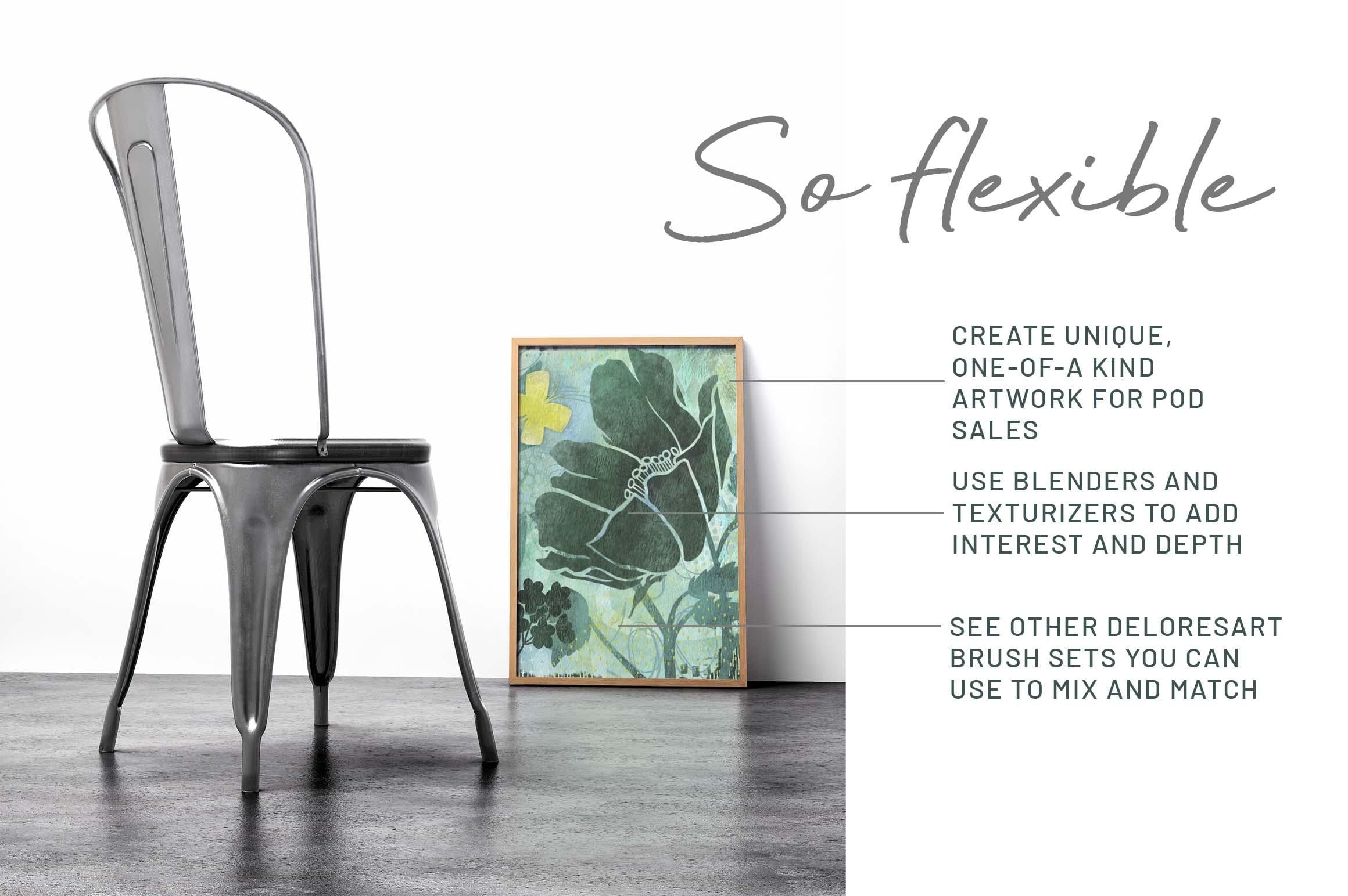
2. Lesson 1 Overview and Ideas to Spark Creativity: Hi guys, welcome to lesson one. In this lesson we're going
to do kind of an overview. And I'm gonna give
you some examples just so that you know
where I'm going with this project. Let's get started. I wanted to start this class
with just a little bit of a look at inspiration
and what kind of, I guess inspired me to look
at the idea of creating stencils for appropriate
that we could use to create mixed media arch. I have used techniques that will definitely worked for us
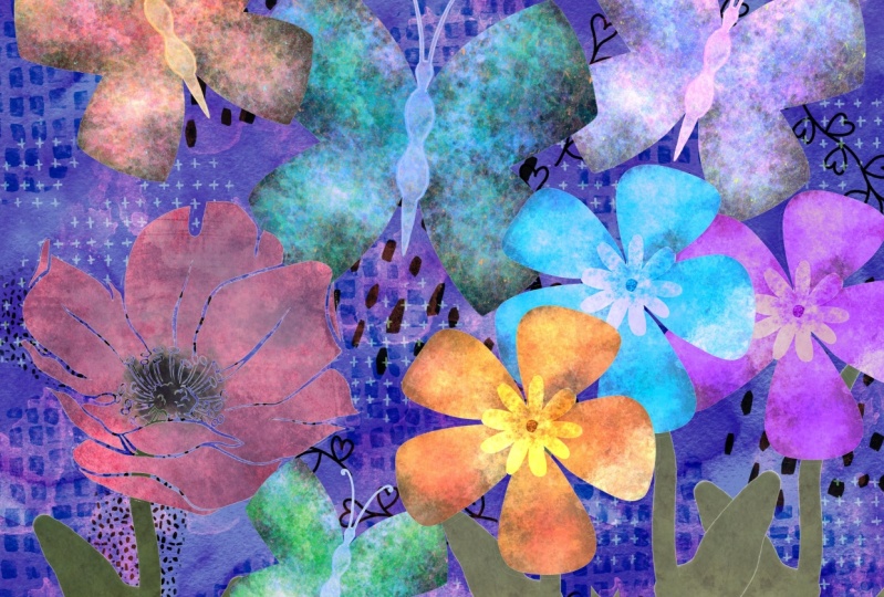
to create looks like this. So here's an example of
the use of a stencil. And I pulled this one
out because it's got the same stencil used twice. It appears that a lighter color was stamped here to create these lighter
flowers over top of a dark, darker background. Once I clicked on that one, then a whole bunch of
other ones came up. And it's really easy
to see that stencils. It's something that are used
a lot in mixed media art. I've watched a lot of
tutorials on using stencils. I taught my students in
high school how to use stencils and to
create stencil so they could use to
enhance their art. And sometimes we would
just be working in our art journal and we would use the stencils as a means to create really
interesting backgrounds. So you can see, for example, on the use of stencils here that it made a wonderful background for this beautiful mixed media
piece that was created. In this case, it's the
cover of an art journal, but it could definitely
be on the inside pages. The advantages, of course, one of the main advantages
that I've found, and especially for my students, was that it was a real
easy way to add interest to the backgrounds without
having to spend too much time. And I found that that
was really valuable because the worst thing basing a lot of people when
they go to start working in an art journal
is the blank page. If your page is not blank, You are a lot more inspired. You can get into
it a lot faster. And we would sometimes spend a few days just
creating backgrounds. So that by the time
I was assigning something really
specific for them to do in their journals, they would have these
background I'm ready to go. So there are definitely a lot of advantages to using stencils and creating simple
stencils is actually something that we can do in
Procreate really quickly. This class is going to be all about creating the
stencils and then using the stencils to create a really cool mixed
media art piece. Now, I've used one of
my art pieces here to create my title
support this class. Let me just give you a
better looking at it here. I'll hide this part of it. And you can see here you, stencils was quite extensive because flower is
even a stencil. So are these. And you can see that the color that stamped on or Spongebob on what ends up creating
the finished shape. And you can get a lot of
texture this way as well. So that's what we're
gonna do in this class. We're gonna go through
create some stamps. We're going to create a
bunch of different methods to add interests
to an art piece. And we will complete an
art piece in this class as I will meet you
in the next lesson.
3. Lesson 2 Methods to Create Stencils: Hi guys, welcome to lesson two. In this class, I'm going
to show you a couple of different methods for
creating the stencils. Let's get to it. So this is an example of one of the artworks
that I have completed using stencils to add detail
and interest to my pattern. These flowers are even stencils, but I'll let you in on
a little secret here. Basically, the stencil
is a clipping mask. And what makes it work is the use of the brushes
that I've developed. Those are, there's a
selection of them here. I'm gonna give you a bunch. I'm not necessarily
going to give you all the same that
I use in class, but I will give you some. One of the main things that
we'll be doing is using these different sponges
that I have developed. These are part of a big
mixed media paint set that I'm putting together. I just published a mixed
media kit that had just a ton of different
things that you could create some of these
mixed media backgrounds with. But this one is specifically
the paints that I have been developing in order to
do this artwork honestly, because once I got into it, I realized I needed and
wanted certain things. So I developed these sponges, not got everything
from buildup sort of a sponge to an
opaque, a sponge. And I will definitely
be explaining all of those different things as
we go through the class. But the long and the short
of it is if you want to be creating your own
stencils like this, there is a specific
method that I will use. I've got a bunch in here. And then as we go through this, I'm gonna be showing
you a bunch more. Alright, so the
process is exactly the same as if we were
building a brush. So I've got a document here that I call
my stencil master. I want to show you how
to create the stencils, and these are the ones that
I just showed you there. There was this little
star pattern or flower. I think this one was in there. This one was in that title slide that I showed you
from the first lesson, as well as this
one and this one. So let's just go through
the process of creating one most complicated one here would be something
like this star one. So why don't we
work on that one. All of the rest
will be quite easy once you know the method
for something like this, we're gonna do one like this. And just to make it really easy, we're gonna make a really
simple shape in here. So I'm going to add a
new layer and I want to have Drawing Assist here, make it easier for me to draw
a nice symmetrical shapes. So go into your Canvas, went to your drawing guide, and it's on, as you can
see here right now, I'm going to edit it and I've got symmetry
set here so that I've got document bisected or vertically and horizontally. That is done by
choosing quadrant here. So you could also have
the same kind of an idea, same effect if you used radio, maybe let's use radio
for this one just to be even more interesting. So we've got the guide setup. I'm going to hit done. And I know you can barely see my guide there because
it's really light. If you need to see your
guide a little bit better, go back to the drawing
guide here you can slide this to a darker color and you can make it more opaque. You can even make it thicker. It really stands out. I'm going to hit
Done. So we're ready to start our pattern here. So I'm gonna hide this one. We're on a new layer anyways, I'm going to grab just
a very basic brush. You can use a monoline
brush as Posca paint marker that I use all the time is basically just a monoline brush. So there's nothing
fancy about it aligned just doesn't change in thickness or have any
pressure sensitivity. It's just a really simple,
straight basic lines. So because it is going to do the reflection
for me automatically, I can start and draw
whatever I want. Now, you might want
to enlarge in order to be able to hit that line a
little bit more accurately. And of course, you can
do continuous shapes. You can do separate shapes. Just for showing you
what I'm doing here. This will be fine. I'm going to drag
the fill into there, so I've got a black fill. I think I'm going to
actually make it smaller. Let me put my snapping on so that I can be sure
to line it up. And I know that it's centered because those yellow
lines flashed up. So you can see that lines are kind of a yellow orange popping off the edges
of the page there. And I've got my first one drawn in order for this to work. I'm going to need a duplicate
of it so that I can use it for placing
into the corners. I am going to turn off the
Drawing Assist right now because I don't need it anymore and I'm going to duplicate. And on this particular element which is going to end
up being in the corner, I need a white background. So I can simply
select white here, drag white into the background
and you can see now it has a solid fill that's important for helping us to align
that onto the corners. So we're gonna need
four copies of this. I've got the four there. I'm gonna make
sure that snapping and magnetics is
still turned on. And again, we're going
to be watching for those yellow or orange lines to appear once you see them
in both directions. So make sure that you see them both yellow at the same time, then you know, you're done. I'm gonna actually temporary, temporarily turn this
layer off because sometimes that
affects the snapping. This should make it
a lot easier too, because I've now got
one that's lined up there and then the next two are usually pretty much foolproof. You can't do them wrong. They snap quite nicely. See the two yellow lines, they're simple as that. We've got the four
and the corner. We can now bring this
one on top and show it. And that's gonna be
our complete brush. We're calling it a stencil, but it's gonna be our
complete brush. And we can just merge all five of those
layers together by pinching. Miss that one. And you can see why I
kept that one without a background so that it
could be easily merged. It doesn't have a background, so it merges nicely with the
white background that's been already created by duplicating
those four corner pieces. So now we're ready to
create a brush from this. And that's basically what we're doing is creating a brush. So at this point it's
just a three-finger swipe down and copy. Let's go into my stencil
brushes that I've created. And I think I created
most of those into the pattern brush category. So I've got one here already that I'm just
going to duplicate. I'll be giving you
a couple of these so you'll be able to
do the same thing. Just duplicate one of
mine, click on it. You're gonna go to the
grain, not the shape. You're going to hit
Edit, Import and paste. Gonna hit Done here twice. So it's important that
you hit it twice. And we can see here that
that's worked just fine. It's created the brush. Okay, I'm going to
actually go into properties here and enlarge the actual brush shape that's
making up these patterns. So if you were to go into your shape here,
you could adjust. So that is the shape I've used. So you can see that when I leave the edges a
little bit rough, that's the edge that
you're seeing there. If you don't like that
and you want it to be a 100% solid. Go into your source library
and then just click on something that is solid
with nice straight lines. Hit Done. And basically it works
the same way anyhow, but you're gonna get
sharper lines on the edges. That's the only difference. So now we've created one of
the brushes that we need in order to get started with
the actual counseling. I think we can do that
in the next lesson. In the next lesson I'm going
to show you how to import and set up the clipping
mask for your stencil. We could either import
the shape that's finished shape or we
could use the brush. So in this case, because we're using the brush, is gonna be really simple. If you have an actual
finished pattern that you wanted to use and
bringing in as is, That's going to be slightly
different process, which I will explain as we work our way through
the lesson. Sorry. I will see you in
the next lesson.
4. Lesson 3 Stencils and Clipping Mask Set Up: Hi guys, welcome
to lesson three. Unless a three here I'm
gonna be showing you importing the basic art
file that we created. And also I'm gonna be showing
you the use of the brushes. We're going to create
clipping mask for both of these different
types of stencils. So I'm gonna walk you through
that whole process now. So before I actually
show you the use of the stencil and setting
it up into my document. I wanted to also show
you that besides creating really
symmetrical patterns, you can create just a very
basic pattern like this, just by simply drawing the
shapes that you'd like. And these stencils are
actually becoming more and more common in the
mixed media world. It's completely asymmetrical. Nothing repeats really, but it can make a really
interesting background. And now with the
cricket machines and the ability to cut
your own stencils, create your own stencils
from SVG graphics. This is probably gonna be something that is
going to be a lot more popular in the
future is creating these templates or artworks and then making
stencils out of them. So I'm gonna be showing you
also how to import this. And in order to do
that, we need to have this one saved
out as a JPEG. So let's go into the
Actions menu here. I'm going to go to Share
and then save it as a JPEG. And I'm going to put it into, in my assets for this class. I'll just leave the name as is. And then now we're
going to start a new document where
we're going to import both of these that we just produced and then will maybe
use a few others as well. But we're going to import this. So let's go right into the gallery to
create a new document. The size of that one, I'm gonna do 12 by eight
at 300 pixels per inch. To import that graphic
that we had just created. Let's do that first. We're
going to get the stencils in here before we start really
composing our document. So I'm going to go to
the Actions menu again. This time I'm gonna
go to Add File, go to my folder where
I'm storing those, which is in my class
assets down to the folder. And now we've got this
stencil imported. And of course you can
do everything that you are able to do normally. And that would be things
like resizing it, rotating it, doubling it up,
anything you want to do. So for example here
I could duplicate, move one of them down
if I wanted to create a nice long sort of continuous pattern to use
as a stencil somewhere. So let's just merge these together so that we have
that one stencil there. And then the other
way, of course, is to use that brush
that we created. So let's just take a
quick look at that. I've got that here. And I could just add a new layer and paint in as
many of the motifs as I want. If I wanted the
repeating pattern to be sort of like this. You can see because
it's well spaced, It's pretty easy
to add or subtract different motifs
here as desired. We've got now the basics
for our stencils, but let's start putting
together a bit of a background first so that we've got
something to work with. I'm going to actually insert a mixed media
background that I've scanned from one
of my sketchbooks, and it may be one that I've
used in another class. I'm gonna go to Insert a File. I'm going to go to
Procreate assets. And I've got textures
here that I've created or scanned in my own
mixed media and journals. Let's see what would work. Now let's just try
this one here. This one has a bit of
pattern already on it, but I don't think that's
going to be a problem. This is, after all, mixed media to have
it fit better, I'm going to go to free form here and just make
some adjustments. Now we have a background
that can be used as is, or we can insert another one. So let's go in and
insert a second file. Maybe this time
I'm going to grab a watercolor background, painted irregular
background, rotate it, also enlarge that one to fit. In this case, I could experiment with blending
modes or whatever. I want to just make that
ground more interesting. So I'm not gonna take too
much time to do that. I'm sure you get the picture. You could also for
the background, have painted your own. And that's one of the
reasons I was developing that brush set with
mixed media paints. Because here we
could just select a brush and I'm going
to add a new layer. And I could be brushing
on some detail. These different brushes
that I've created here are really eclectic. Let's just say there's a
little bit of everything. There's a lot of
streaky brushes and sort of rough finishes,
some scrapers. These are the kind
of things that I use in my art practice anyhow, so it's stuff that I'm
used to working with. And let's just say
this is what I wanted. I can actually
land this as well, going through and experimenting
with blending modes. And I think that's already
looking a lot like what regular mixed media
art piece would look like. I am going to pull
these two up to the top and I'm going to hide
that, that one temporarily. I'll turn this one on
and this is the one. Excuse for my first
sponging or stamping. And I'm going to get rid
of that white background. And that can be done really quickly and easily by going to the automatic selection mode here I'm selecting the white. And you could drag here if you've got
something that's got, let's say some tones in it. And you want to experiment with taking a little bit more
or a little bit less away, experiment with that threshold. I think it's good the way it is. Three fingers swipe down, I'm going to cut and I'm
left just with the pattern. Now for this, what
I want to do is start with a white base, not colored base like this. Sometimes it doesn't
matter because of the blending modes
that you're going to experiment with later. But for now I think
it'll be easier for you to visualize if
you start with white. So go to your hue and saturation and
brightness adjustments, and go all the way to white. So that's by sliding the
brightness slider to the max. Now we've got a blank
slate that we can use. And again, think about
your positioning, where you might want this to be, the size you might want to have. It might want to have
actually a smaller patterns. So I think I'm going to do this and I'm going
to duplicate it. And then you take that
duplicate and flip it vertically and then just
add it to the top here, so that I'm gonna get kind of a neat pattern along
this edge here. I'm going to merge those
two down because what I want now is a layer
above that one, and that's going to
be our clipping mask. The clipping mask is what's
going to allow us to do that effect that looks
like a sponge painting. I have been really working on these different sponges that I like and I've based them all on like natural sponges that I use like sea sponges.
Sponges them. So I don't know if
you've ever seen those in art supply stores. And there's just a regular
sink sponge, you know, the kind, the super cheap kind that you
buy at a dollar store. This is what we had to use
in school most of the time because we didn't have a
huge budget for supplies. The six Punjab became our standard sponge
that we had in class. So that's why I added it here. Now I just have to
choose a color. I'm gonna try something
a little bit darker. And here I'm going to go in
and sponge and you can see that it's only
applying to the areas. See if I do it over
here, you can't see it, but it's only applying to
the clipping mask area that I set up originally
with that base layer. That's how you would
work if you needed to import an actual image
that you had drawn. Now as far as the brushed image, it's pretty much
exactly the same thing. We add a layer above it. We create a clipping
mask. With that. I take that layer and
change the color of it. Now I could use the hue and
saturation and brightness. And I can go all
the way to white, or I could also use it
to somewhat colorized. So I'm going to leave it at this kind of a gray
color at the moment. I'm going to use my selection, the automatic selection again. And in this case I'm
going to invert it. And I'm gonna start with a
light blue color in this case. So I've selected it here, and now I can just go to this
layer and hit Fill Layer. The other way I could've
done that would be to just go to layer itself, hit Select, and then go
through and do the fill layer. And that way works in
exactly the same matter, just a different
method to do it. In this case, I
think I'm going to use a dense kind of
a yellow sponge. And this particular
sponge I created, I can see it's not being clipped because I
was on the wrong layer, so I got to go to the
right layer here. Sorry about that. And now when I'm painting it, it is only painting on the
layer where the color was. The clipping mask
ensures that nothing around the image or the
motifs being colored. You can do combinations
with the brushes. So I'm gonna go to a bit lighter of a yellow with
a more opaque sponge. And it's just like one-year
doing your mixed media art. You can do this kind of
experimenting on the fly. I don't like it. I can then
go in and brighten the color mixed a little bit
brighter gains and go in and sponge
another layer over top. And that's the essence of what I'm trying to achieve here, is that you're doing
this composition and doing the painting and the sponging and
whatnot intuitively, really similarly to if you were actually using a stencil
and sponges to paint on it. So that shows you how to work with the two different
types of stencils. In the next lesson, what we're gonna
do is talk about a couple of other
methods that I use to lighten or Brighton or make changes to the painted layer. Alright, I'll see you there.
5. Lesson 4 Sponging and Erasing: Hi guys, welcome to lesson
for this adolescent in which we start adding some
texture to our stencils, just as if we were doing it ourselves with a
sponge or a brush. Let's get started. We tried
two different methods there. One where we colored
the motifs and then added some sponge
painting to each of those. And then there was the original
one which we left it as white and added the sponge
kind of texture on it. So that has given us two
quite different effects. We're also going to be experimenting with
blending modes in. But now I want to also add a couple of really
big motifs here. So those are things that you
could just simply have that you've drawn and you can import them or you
can use brushes. And that's the way
I did it. I did it. I always say I'm lazy, but I did it in a way that for me makes sense because I
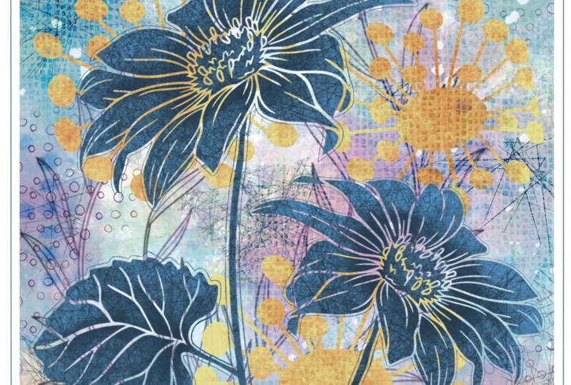
already have all these brushes. These are those flower
brushes that I've created and I think I've
given you quite a few in different classes. I'll throw a couple of them
in here today as well, and you can
experiment with them. And to me that's
just the fastest way I've already got them. So I don't have to do
that extra bit of works. Hope that's one of the reasons
I am doing it that way. So not necessarily lazy, but let's just say
certain deputies. I'm going to grab one
of those flowers. I'll just randomly go into
one of my flower sets here. And I want to grab
one that doesn't have a lot of extra detail, draw it in something
like this that has a fairly solid sort of petal
would be a good one to try. So I've selected that one. Technically, I could
paint it in any color. I'm going to stick to maybe the one of the colors that I have going on in my
background here. So I'm kind of going
in that direction now. So those are the colors
that we have here. I could select any
of these colors. And I'm going to
make a new layer. And this is a good habit
to get into anyhow, putting a new layers
allows you to manipulate that particular
motif more easily. I'm just going to drop it
right here in the middle. Now I can make adjustments. It maybe rotate it. And let's just add a
second one right now. This is another
poppy that I have. I'm going to add a
layer so that I can put it in a different position. Not gonna overthink
it too much here, because what I want is just
to give you a demonstration. And I'm going to merge these two together so that it'll make
it easier for this next step. And of course that's
adding a clipping mask. A good question might be, why a clipping mask, like why not do an alpha
lock on it which you can do. I mean, specifying an alpha lock will also protect that
background there. You can go in and do exactly
what we were doing before, which is to stamp our textures. Let's go with a color
that's gonna show up here. And so I can go in and stamp. And I've done exactly what
the clipping mask does. The only problem with that
is that's not editable. It is stuck right onto
that flower there. So if something were to
happen or if I decided that I really hated the
whole overall look of it, I would be stuck. I still have the shapes, but I would be stuck with
that texture that's on there. So that's one of the reasons I suggest that you do it
as a clipping mask. So I've got that blank layer. I'm gonna specify clipping
mask and then I'm gonna go and add the texture. I can use any number of different
sponges in combination. Imagine what I'm doing here
is that I've got a stencil, I've got it placed
on my artwork. Lot of times I used to
just put a couple of pieces of masking tape
to hold it in position, especially when it was
something like this. It was really nice and big. And then I would go in
and do my sponging. Now, some of the sponges I've created so that they
build up the color, so they basically darken. And then some of
them, I've made them opaque so that you could pick a color and it's going to cover whatever
is underneath it. That's probably adequately
sponge painted. I'm going to add
maybe a little bit of darkness here in the middle. These sponges I've created, you can tap to apply them or you can apply
them like a brush. I'm going to put a bit of darkness in the middle
here where there would be a crease or just the way the light would hit it would
make it a little bit darker. Overall, I'm liking that this
is working the way it is. But one of the biggest
problems I can see right away is the contrast is
not very good here. So at this point, I would be starting to
work on my background and on the blending with
these different stamps, I'm gonna say if
the blending and so on blending modes
for the next lesson. But let's, while we're in here, prepare a little bit of experimental little bit
with the background to see if we can get two. I don't just allow the stencils to stand
out a little bit more. I've gone to that layer
with the watercolor and reduce that watercolor
opacity a little bit. So my background is showing
through a little bit more. I'm going to add a little bit more detail
to the background itself. So remember I added a little
bit of paint detail here. I'm going to actually
go in and also add a little bit of sponging that is a little
bit more opaque. And I'm going to select
one of the greens. I can select it here or I just select it straight
from the background. I'm going to go a little bit lighter and then I'm going to sponge around beneath
that flower there. So that's the flowers up here. But the texture I'm putting
in is underneath rate. So I just wanted to
show you that and I'm gonna go a
little bit darker. And in this area will just
have a little bit of darkness. What I'm trying to do is have this flower stand out
a little bit more. And the problem is
that it is just too similar to what we've got
going on in the background. Another way you could
do that is to go back to that flower, make a selection around the flower texture that
you want to change. So I wanted to freehand and I'm only selecting this part of the layer that I can then controlled by using the hue
and saturation adjustments. And here I can desaturate
or really saturate. I can also darken. And I could change the
hue ever so slightly. So sometimes it's fun to kind of incorporate a slightly
different hue there. So I kinda like that. And because of the way
we've done it here, we can totally do changes to it after we've got some
of the blending mode setup, the next step for me would
be to go in and play with especially that
stencil that's up on the left-hand side and
just get some more. I don't know, it's
just a better blend or a better background happening behind my two sort
of main motifs. The other thing too, you
can do is you can select in both the clipping mask
and the regular layer. And if you select the
both at the same time, then you can do things like
repositioned and still have both parts move at the same time, if
that makes sense. So far so good, we've got a little bit of
sponging done here. And in the next lesson, what I want to do is really
start working on blending modes for some of these
stamps that we've put here, It's really important to make the foreground stand
out on the background. And that's something that
you'll see when you take a look at a bunch
of the examples like I showed you on Pinterest, that if there is something
in the foreground that it's always a little
bit brighter, deeper, darker,
something to make a contrast from that
mixed media background. Mixed media backgrounds
tend to be really busy. And so sometimes it's just
one of the strategies to use to make sure
that your values, so the light and the dark areas
work together to give you the contrast that
you need in order to have those foreground
items really stand out. Alright, I will meet you in the next lesson and we're
going to really start looking at blending modes
and how we can use them to make this a better design. I'll see you there.
6. Lesson 5 Blend Mode Experiments: Hi guys, welcome to lesson five. So I mentioned that we
were gonna be doing some experimenting with
the blending modes. So that's what we'll
do in this lesson. This is really where
we start finessing our overall design.
Let's get started. This stage now is where we start really
finessing the design. I am going to work with that stencil first because it's the one that's
bothering me the most. So there are a number of
different things we can do. First of all, we can
work on that base layer. And what we can do here is decide whether or not we want to affect the opacity of that white that we had
going on there. Or whether or not we want
to play with some of these blending modes
to see if something else might work
better in already. I like that overlay. So that's a contender. Soft light isn't bad, but it makes it a
little bit light. But the best way to do
it is to experiment by literally going through
each of the options. I think my favorite was
overly, what do you think? I'm not quite like that. And I think that I would
even lighten it further. And then another thing
you can do is go into your layer itself
after you've done that blend and then go into your hue and saturation
adjustments again and experiment with
possibly changing the color of that sponging. So here I've got the huge
shifted all the way to maximum. And you can see
what's happening is that because it's an overlay, is changing too yellow here and it's affecting the overall
look of the blend. And I liked that. And I think that it works
in well with what we've got going on that base
layer that we started with. You could also experiment with brightening
or darkening it. I think I would
leave it pretty much where it was in this case, because I think we can also
work with some other textures to put over top of that to
make it more interesting. You can also really saturated. Here I bought it at 100% and that makes it really intense. That yellow is much
brighter and I like that, that's turned out, well, it's
just a different option. And now let's play
with those flowers. So we're gonna go into
the flower layer. And again, we've got that
blue as the base for it. We can decide whether
we want to change that. And we can do some
blending here. Now that looks nice because
it's still a bit of color, but it's really soft. And so that's given
quite a bit of contrast. And I think what
we've done here on this half of the document is lightened it up enough that this flower stands
out a bit more. So you could continue
to experiment, checkout the different
blending modes, and think about that as if
you were changing colors, mixing different colors on a
palette or ADI rear palette. And I think I'm going
to leave it at that. What I want to do is show you
another one that I did in the sample that I used for the titles for each
of my lessons here, I really liked the way it
looked because it gave that real brayer texture. So I'm going to grab a
brush that I created. So I've got it in the
pattern brushes here. I mean, it could be
anyone, honestly, I will pick something that has a good surface area
so you can see it. So I'm going to go to a blank layer here or add
a layer just to be sure. And I'm going to brush
in some of that. Obviously we're gonna
make changes to it. Now, if you don't
like the scale of it, if you'd like to make
it smaller or bigger, you would go to the brush
and you would go to the Grain settings and
adjust the scale here, the shape of the same shape
as I used on that other one. You can use any shape. It's up to you, you can add it. The brushes that I
give you go in and choose a round brush
if you'd rather. All that does is
affect the very edges. If you go into the
properties here, That's how you affect the size of the actual brush
that's brushing this on. So I thought a really
large brush here now, but the scale of the
pattern is small, so let's go a little bit
bigger so you can really see what's happening
when I use the brayer. I'm going to just want to make
sure this layer is empty. Yeah, it says linear
empty up there. And I'm going to go to my texture brushes
that I have created. These texture brushes were
very simple to create. I used a resident shape pier from the source library you can use any
shape that you want. And the grain that I used
was also appropriate grain, and this one was a brayer texture that's
also in the source file. So you just go to Import
Source Library, not file. Travel down the list here until you find that
brayer texture. And I know it's quite far down. So its role one, this is going to give a
really cool texture to this particular pattern
that we've just laid down. Now if we were to just
start painting and go with a slightly
lighter color here, I'm painting everywhere and
that's not what I want. I want just this
area to be painted. So of course, the answer there, create a clipping mask. And now as I'm
painting that texture, It's only going on the diamonds. So let's grab both of those and move them down below my flowers. You see how they
automatically created a clipping mask there because I pulled it into
a clipping mask. Area, all you have
to do is go in here and de-selected as
a clipping mask. The texture that's on here, if it deselects or isn't
a clipping mask anymore, you just have to do the same
thing over here, select, and now you've got
a clipping mask that's created a
really nice texture. Now, I think I would want a
finer texture in this case. So I'm going to go into
this and go to Grain, make the texture a
little bit finer. And I want to lighten
my background here. So I'm gonna go into
human saturation and saturated a bit, brighten it a little bit. And then I'm gonna go
with a darker pattern. And you can see here I'm going
to go on that same layer. So even if there is a bit
of that texture left, you can see that that's added
a texture quite nicely. Then again, remember,
experiment with your opacity or blending mode to see what kind of different effects
you can get here. So that one's kind of
nice and vivid Light. I can lighten it a
little bit here. And you can see now the
process that I go through for creating tons of texture and adjusting the
sizes of that texture. Now the only other
thing I would also suggest to you is that
you might want to, at some point after you've
got a bunch of this done, you might want to be
doing a little bit of erasing to adjust the sizes or the positioning of some of your shapes that make
up your patterns. So in that case, I would choose an eraser that is fairly soft on the edges. So I've just gone to the basic
sketching category here. So the eraser is on sketching. I'm going to go to
oil pastel here. It might, eraser will be
kind of a textured eraser. Let's go nice and big here. I'm going to go on
this layer here and just erase
away some of that. So that transition, and
I'm lightly erasing. So the transition is gradual. There's no hard edge anymore. And I could do the same
thing on this layer here. And you'll note that if I
get rid of some of that, the texture that was on that white bit there
on the pattern. The texture now doesn't
show onto the back layer. Now personally, The only thing I see that I would
do differently here is maybe still dark and
my flowers a little bit. So I'm gonna go
back to that layer. And you could add any
texture at this point. So I thought that brayer
texture selected here. So let's just try. We're on the right layer adding just a bit of brayer texture there as if we've gone in and instead of using
a sponge here, we've used a roller and rolled on some
additional texture. And that's giving me a really nice dark
contrasting set of flowers. Again, I would select them both, both of those layers and maybe do some adjusting as
far as the size goes. And we've done
some great work in a very short amount of time
because we've used brushes to create our so-called
stencils and use clipping masks to achieve
the texture which we know we can adjust and have adjusted
many times in this class already to control and get what we want as
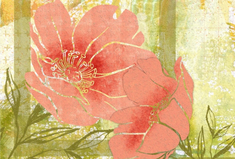
far as design goes. That's pretty much it.
I'm gonna do a little bit of other work on this
one to finish it up. I want it to look
polished and finished. This one did. On this one, I didn't
import a texture. So let me just show you this
was my first layer and I painted it with that paint
set that I just showed you, the mixed media paints. And I added another layer, which I then use the
overlay blending mode to just make the
two work together. And then added all
these little bits of texture and sponging and all the same techniques
as I just showed you. This one looks a little
bit more polished because I've had a
little bit more time and I added a little
bit of extra detail. I'm gonna go ahead and do
that and then I'm gonna meet you in the last
lesson for a wrap-up. See you there.
7. Lesson 6 Finishing and Finessing: Hi guys, welcome to lesson six. Unless a six here,
I'm just going to be doing some final finessing. Let's get started. Okay, so I've added a few
more details here. As you can see, you got
a little butterfly. I've added a bunch more textures
here in the background. These are part of my mixed
media set that I posted on my website and Creative
Market just last week. So it's just one of the
new things that I have. And in it I have a ton
of these textures and things that I'm using
and you've seen me use these before
in other classes. The other things I went
through and did was to add a little bit of detail, darkness to these flowers, to again make them a
little bit more contrasty. I reduce the size of
these flowers down and move them over and kind of blended them in by
doing some erasing on that base part
of the stencil. And I added these
different stems here. Basically, when you're
doing something like this, if you take a look at mixed media art,
almost anything goes. You are the judge of what makes it too busy or not busy enough. Overall, I think that
you could put this in amongst my journal
pages and you would have a hard time being
able to tell which one was real and which one was
created here in procreate. The cool thing is starting out with backgrounds that
you've created yourself. So if you are so inclined and you do have a sketchbook
practice than you may have pages like this
that you can scan or photograph and use as your base to start a
project like this. You can see how messy and
crazy some of these are, but they weren't great
when I'm looking for something to
just get started on. I've already got a background
kind of ready to go here and I could draw
anything on there. And that's basically
what the steps do is allow me to add these sort of feature items in the foreground really quickly
and easily in Procreate, you can still do all
kinds of things to this. I've gone through so
many different things in so many different classes. You could add a layer that you could put an overall texture on. So if you have brushes from
some of my earlier classes, I'm pretty sure that I've given
you some of these before, but an example would
be the recycled paper. I know I've given you that
in other classes that you could create an overlay that would go over
the entire piece. Now that's a crazy color. But what you can do
here is of course, play with the blending modes to see if there's anything
that appeals to you. And you might want to add
that texture overall, but just not to the flowers. And you could go in and pull that one down
below the flowers. And it affects the
background there, but not the flowers themselves. So as I'm applying these
different blending mode, you can see how that's
being affected. Now there it was still
as a clipping mask. So I'm going to take it off clipping mask and
try that again. So now you can see how you can easily go in and either change the color or add that extra
gnarly paper texture. You could also import
textures to put it in there just like I did with the
watercolor painted texture, I can go in and grab watercolor paper texture itself that I usually use
linear mode for. And you can see
that that's added even more texture
and you can see it in here everywhere.
So it's a zip. You've done this on an actual watercolor
that you had painted the background onto. Watercolor paper I
find is actually a very nice paper for
doing mixed media. And I recommend that if you do arguing this kind of
work in your journals that you do by what's specified
as a mixed media journal, that paper is usually
much better at blocking out anything from
bleeding between the pages. You could go in at
this point to and flatten everything so you could grab absolutely
everything you have, pinch it together or put it in a group and flatten
it and then you can apply textures overall
to the whole thing. There are so many
different things that you could do here, and I'd love to see
your creativity. I've taught you the
techniques and basically you are the artists
behind all of it. Your artistic flare is
going to add so much to it. And I actually really love seeing your projects
because it gives me ideas as much as it
gives you ideas that I'm giving you this information when I see what you've done, it gives me ideas. So it's a win-win situation. I think the only other
advice I can give you is to think outside the box. Don't be constrained by the
ideas that I've given you. Do some experimenting
of your own. Something like this
butterfly here. We could take the two
parts of it and pinch them together so the texture is
applied to the butterfly. And then I would experiment
with duplicating that butterfly and then
making it super dark. So the one underneath
is going to be quite black as
you can see here. Then take the Gaussian Blur, Gaussian Blur, Gaussian Blur and every know how
to pronounce that. And the more we spread it is the software the shadow
would be in behind there. And if you think
that the shadow has darkened the butterfly
too much CO2, the butterfly layer selected. We've got it selected. If we go to Shadow layer
now and we do a cut, you can see that I've
eliminated all of the block that was
within the butterfly. And so now that
black isn't there, affecting the look
of the color that we have here right now we've
got that one on normal, but if we had it on some
kind of a blending mode, we wouldn't want the block
to be underneath there, but it's still nice
to have that shadow. That's just another
quick little idea for some of your motifs. And of course you can
use that on any of the motifs that you've chosen
to add to your design. I'm going to leave
it at that for now because I really want you to be able to come up with
some ideas of your own. With this lock layer, you could still apply a blending mode or reduce
the opacity of it. So it's not too harsh. Yeah, I'd love to see what
you can do with this. And I'd love to see
that you post them. And if you have any
questions at all, don't forget to add that
in the discussions area. That way other
students can benefit from the answer that I give
you and everybody sees it. They're rather than in the
reviews where people don't necessarily get a chance to take a look at that when they're
looking at the course. Alright, yeah, that's
a wrap for this class. And I hope you liked the
projects that I produced. I'll put a couple
on mockups and I'll meet you in the
wrap-up. See you there.
8. Lesson 7 Closing Thoughts and Wrap Up: Guys, you've finished your mixed media
stencil art project. I hope you're happy
with the results. I always like testing
them out on mockups. And it's lovely to see your piece actually
hanging on a wall. That's one of the best ways
to really judge how it looks. So I would suggest that you do this maybe as part
of your project. If you're looking for
additional reference, make sure you check out my
journal art categories on Pinterest checkout my Dolores
art Dolores nascar at site. There's a couple of categories
there for mixed media art In journal urge
that will probably give you some
really great ideas. It's always good to
look at what's being done out there and how
people are using stencils. You can even just search it out. Google it as stencil art
since appropriate art. Or you can look at some
really great artists that have used
stencils in the past. One that comes to
mind is best cats, the famous graffiti artists. So you can check his work out. There's plenty of work out
there for inspiration. I mentioned at the beginning, if you haven't done so already, to please hit that
follow button up there. That way you'll be informed
of any of my classes as they're released them and
anything else that I sent out. I would also encourage
you to go to my website, the largest art dot ca and Azure named my
mailing list there. That way you'll find
out about any of the additional free resources
that I offered there. You'll also find all of my brush sets that I'm talking
about all the time. I'm always developing
brush sets. It's one of my favorite
things to do when I sit and watch TV with
my husband at night. Because technically
I'm not watching, but whatever I like, keeping my hands busy. I'm so glad that you've had time to hang out with me today. I really hope to see you
in my upcoming classes. I hope to be back as quickly as possible after my surgery. And I've got a couple
of classes here, prepared and ready
to go so that you won't miss too much time
while I am off sick. So I will see you
when I get back. I guess.
 Delores Naskrent, Creative Explorer