Transcripts
1. Intro to Foolproof Shading in Procreate Using Blend Modes: Hi guys and welcome. My name is Dolores ask
rent and I'm coming to you from sunny,
Manitoba, Canada. So today's class
I'm bringing you is my foolproof method
for doing shading. Shading and highlights. We're gonna be doing a highly
textural floral piece. And we're gonna be
using myMethod, which is probably
the easiest you'll ever see for doing your shading. I call this method
foolproof because you just can't go
wrong no matter what, you're going to get a
cohesive color palette by doing it this way. And the reason why is
that we're sampling the color that we're
using as the base. So if we have a
flower that's red, for example, we choose that red, then we add a blending mode
with a clipping mask and use that exact same color to create
all of the shaded areas. It is just so amazing, you just going to
blow your mind. I know that when I first realized that I could
do it this way, I was like, Well, how come I've been
doing it the other way? The other way being trying to figure out an exact color
scheme that would work. And just always kind of being unsure of whether or not the color was perfect
for a shadow. In this way, you'll
never be worried. It works out perfect
every single time. So as I mentioned,
we're gonna be doing a highly textural art piece. We're gonna do it
from start to finish. So right from scratch, I'm going to show you
every step of the way. I hope you enjoyed this
class because I sure had to find creating
this illustration. Now if you haven't
done so already, I'm going to suggest
that you hit that follow button up there. That way you'll be
informed of any of my classes as I post them and any of the post to
followers that I send out. I'd like to also
encourage you to get onto my mailing
list on my website. So go to Dolores art dot ca
and add your name there. That way you'll be
informed of any of my goings on that I
only share there. You're ready to get
started on this project? I sure am. Let's get to it.
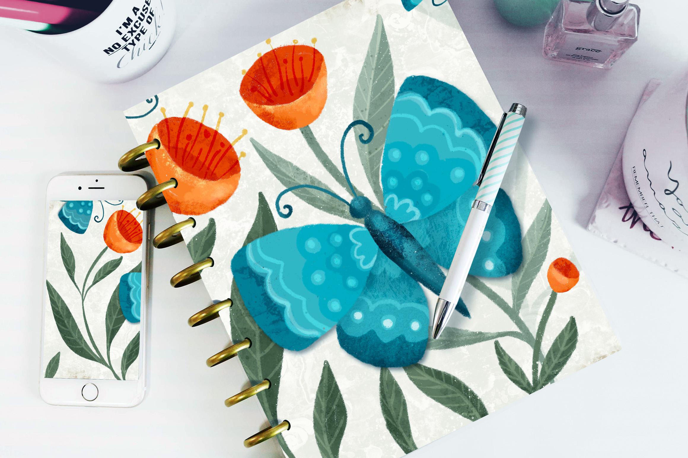
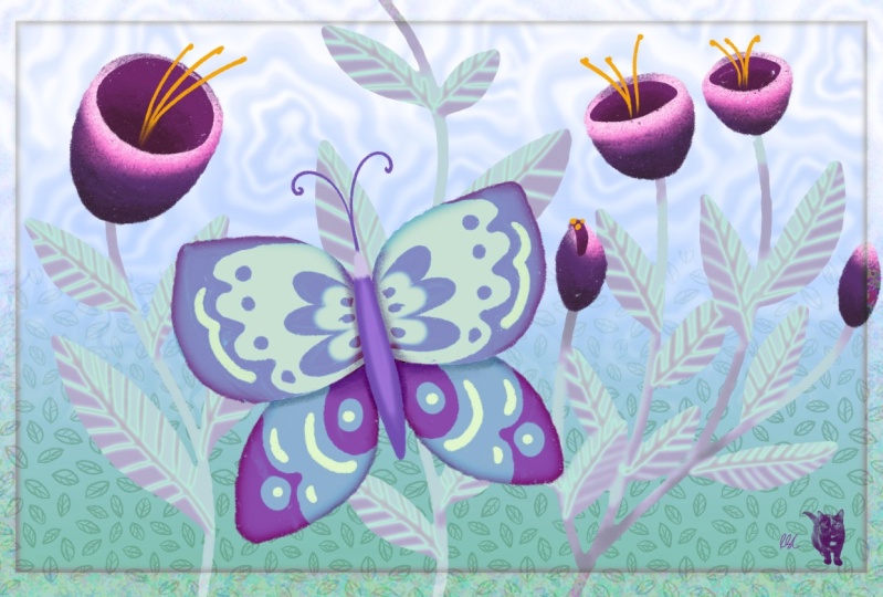
2. Lesson 1 Overview and a Look at My Document 1: Hi guys, welcome to lesson one. So in less than one
here I'm going to show you the document that I created. I'm going to break
it all down for you. We're going to start with
a sketch and then we're going to start blocking
in some of the colors. And I just want to show you the process that I go
through to do this. Let's get started. When I used to work on
projects like this, I would find it very time-consuming and
sometimes difficult to add shading to each of the different motifs
that I have in here. But I've figured out a way
that makes it a lot easier. And honestly I figured
this out by accident. As you know, I like using blending modes for
a lot of effects. And at some point I realized that I could just
use blending modes with the identical color and create the shading like I
have here on these leaves. For example, the color
that I did, the base leaf. And I guess I should just show you all this
so that it makes more sense and don't let this scare you all of these layers. It isn't as hard as it looks. So let's go to this layer
here so you can see now you, first of all notice
how loose and rough the style is and how
textural the brushes. And in this case, that's exactly what I wanted. I'm going to be explaining
all of the brushes. I'm gonna give you any
of the brushes that I use that aren't
procreate brushes, but you could do 90% of this with the procreate
brushes that you have. So I'll kind of give
you the breakdown as we're doing it so
that you know which brushes I have used. This was the base layer and
this is my shading layer. Now, I've got it on multiply, so you can't currently
see what it looks like. But if I go to normal and
bring this up to 100%, temporarily disabled
the clipping mask just so that you can see the shading is the
exact same color as the leaves underneath. And look how messy it is. It doesn't really
matter because you are using a clipping mask. So I'm gonna go back
to the point where it was a clipping mask
and then show you again that once I add the
blending mode of multiply, I've created my shadows
without even changing color. Now I also play
with the opacity, as you can see here, to get the exact
shade that I want, I'm gonna go back to clipping
masks here for these. So that was the first
layer, let's say, and that was just the exact
same green that I used to, to create the shadow. And that was on multiply mode. And then just kinda
screamed back to 56%. And I did the same thing
with adding details. And I'm going to explain
all of these as we go along because these are all
different blending modes. But I can tell you and you
can look here and see most of them are either
multiply or screen. There's one Linear Burn and that's just kind of with
texture on the overall. But for the most part, anything that I'm doing
on any of these layers here is going to be
in multiply or in. This is also a texture
on the leaves, but they're either
multiply or their screen. So we're gonna go through
this step-by-step. I'm going to be going back
to my other document that I have before I added the
shading kind of document. So let's just look
at that real quick. So this is my yes, so this is just my color blocks, like blocking in all my
basic shapes and colors. And we'll go through and
individually do each of the different highlight
and texture and shadow areas. So I will just actually
remove this shading and this. So we're left with just
the very flat paint, and that's how we start. Now, you probably
just want to know a little bit about
planning the document. I'm going to show you here that this was my initial sketch, really loose version
of what ends up being my sort of and copy. What I had done here
is just quickly blocked in some of the plants. I ended up adding some, but overall, it was just
a very quick sketch. So to do that sketch, I just grabbed a six B pencil. I usually have it in some
sort of shade of blue. I don't know, that's
just my preference. Some people just will do
it in black and white and then they'll just
reduce the opacity of it. But let me just add a layer
here so I can demonstrate. So I literally just went
through and just kind of decided on how my plants
would be blocked. And then I just roughly put
in leaves and a flower. With this flower,
if you can think, a crescent, so like a
quarter moon type of shape. And then whatever
you're left with for this curve here is
exactly what you're gonna do on the
other side to get that shape that isn't open. I don't know what
kind of flower. Maybe it could be a tool pick, could be a it could
be any flower. It's really a generic flower. So yeah, anyways, I went
through and I think this one, I had two stems on it. Again. I did those same little
flowers I think. And you can do that sort of crescent shape and then
an oval or a circle, the more circular it is, the more open it appears. So you're looking down into
the flower a little bit more. Just go through and kinda
rough in some leaves. It's just a rough guide. It does help to have it, so that's something
I would recommend. And then maybe your butterfly, you want to possibly do that on a separate layer so that if, if necessary you can move it
in relation to the plants. You might want to use your
drawing guide for this because then you could use the
vertical symmetry. So that's it there. And you know that
you can rotate that right here and move it
into position, hit Done, and then when you're here, and luckily this was the
layer that I was doing it on, so it's already assisted. Now you can easily draw both sides of your butterfly or moth or whatever
you wanna call it. I don't think I've put in a
lot of detail at this point, but just enough to sort of
guide me in the later stages. It's funny how you
do this so quick, but in the end it really does
end up being your guide. So then for this
one, the butterfly, you could now that
it's separate, you could enlarge it, move it around, flip it, do whatever it takes to
make your overall layout look good so I can turn
off the guide now. I think I had a couple severe
go back to my leaf layer. If I want to add some down here, I added a plant in
behind every member. So you basically are
just roughing it out so that you're ready
to do the painting. And let's do some of that
painting in the next lesson. I'll see you there.
3. Lesson 2 Blocking in the Inital Color: Hi guys, welcome to lesson two. We didn't get a chance
to block in the colors completely on that last,
in that last lesson. So let's do that now. I'll explain to you
the first stage, which for me was taking and colorizing all of
my components here. Now I wanted to keep them in separate layers
because I wasn't a 100% sure how I was
gonna do the shading, but I figured that I
can put all of the green like the leaves and stems, one layer and then I'll
probably colorize the bottom of the flower on a separate layer and then the top on another one. So I went through
and did that first. Now as far as the
color scheme goes, I use this palette here. So it is one that I've used frequently and you've probably
seen it in other classes. But for a floral, it's a really nice color scheme, but really has only three
or four main colors in it. So we've got the reds, a little bit of the
orange and gold colors, and then the TV blue, and then I guess just
kind of soft neutrals. So I'm going to stick with
the colors I have here. And this is the green
that I use for most of the blocking of the
leaves and stems. And then the brush that I used. And this is the set that
I'm putting together for you is my dry ink. And there is a dry ink also available in the inking
or calligraphy sets here. So it's just a really
textured brush with kind of a rough
outside edge to it. And then I just did some
very basic blocking in here. And of course, you
want to make sure that you are on a new layer. I'm going to go a little
bit bigger with my brush. And this brush is a little
bit pressure sensitive so you can get thicker lines by
just pressing harder. So I'll just leave it at that. But basically I went through
and did all my stems first. Now you can see
the texture that's just built into this
brush. I love it. This illustration, this
particular one I wanted to take and use a lot of my new texture brushes
that I'm creating. So I'm gonna give you a
couple of those just so that you have them to
experiment with. So basically just
went through and did all the outlines first
of these leaves, just blocking it in and you can see that I'm
being quite loose. I'm not being overly
perfectionist on this particular
one because I want that feeling of
sort of casualness. I just love all the texture that people are using nowadays. I think I sound
really old when I say things like nowadays. My mom starts almost every
sentence with years ago. So that's why it makes me
think of when I say that. Okay. So then once you have
your leaves blocked in, you can fill them like this. You can see that as you
increase the threshold, the hard line between the texture and the
color disappears. So that's what you
want. You want to be able to get rid of that. Look, I still want
it to be textured. So I don't want to
take all of it away. And of course you can just go
in and color them by hand. And in this case, with this brush and this
type of illustration, you could definitely
go through and do that on all of them. Do any corrections that
you see along the way. I'm feeling like this. I often pulled my
illustrations so it's closer to where I'm
dragging and dropping from. I should do a class. It's just on things I do
that because I'm lazy. All the pointers
I could give you because I want things
to be done fast. Here's one that I should
have mentioned many times. When you do fill
an area like this. Now I did too slowly, but if you feel the area, you see up here that
you can hit continue filling with the recolor tool. And the great thing
about that is then drag the little cross hairs
onto another open area. And after that, all you
have to do is click into any other space that you want to fill and it's instantly filled. So that's another real timesaver that I don't know if I've
mentioned ever before. So just like that, we've
got the leaves blocked in. Now, I went through
and I did that for each of my different
layer groups. So for the flowers, I wanted to have the
bottom of the flower is kind of all grouped together
on their own layer. So I added a new layer
and then went through and basically the same process
just go through and draw, draw each of your shapes, fill them in whichever
way you'd like, you can go in and color. Check that you've got a nice
sort of a connection there. And if you get something like this where you're just a little not sharp enough or you want
to go a little bit sharper. You can either do it
with a smaller brush. So you can go in here and bring it to a sharper end there. I have my dry ink also
specified for my eraser. So I can go in here
now and just use my eraser to sharpen up
anything that I don't like. This, for example, when I
really like this texture. So dry ink is something that I would recommend you use
for something like this. And if you don't
like the dry ink, I mean, it's all
personal tastes. So if you don't like
the dry ink look, you could go in for a charcoal or you could do this with no texture at all at this point, and then you could add that
texture all in at the end. So I went through
and did that when I was doing my butterfly, I did put my drawing
guide back on. I could just rotate slightly there to be back
on my guideline that I had. And then of course, make
sure you do a new layer. And with this one, I think I broke it down
like I did these top wings, the bottom wings, and then the body on three
separate layers. And for that, I used more of
sort of teal colors here. So the new layer, so this bottom part. Now let's make sure that
this is on drawing assist and that's going to give us
that painting on both sides. But I went through and did that slightly lighter color
maybe for the top wings, add a new layer, forgot to put Drawing Assist on. And I'm gonna make a new layer. I'm going to actually
duplicate this one, so it's already got
the assist on it. So this will be this
part of the wings. You have to close the
shape in order to fill it. And then I did a third
layer for the body, which I did a fair bit darker. So I'm gonna go to
that darkest one. And then that was it
for the butterfly. So I ended up taking the
parts for the butterfly and grouping them and
having those separate so that I'm going to take
it right out of there. So I have the
butterflies separate, then I've got the plants here. So they're in their own group. And you can choose to keep your sketch at this point
or you could eliminate it. We still have one layer to do here with the tops
of our flowers. So let's do that. And I think I took
just a deeper red. I think it's darker here. And again, a new layer now that's not
much different in color, might go a little
tiny bit darker here. So go to my disk. If you see any corrections, you might as well make them now. So I have this spot here that I want to correct
on that bottom layer. Go back on this one and just kinda smooth that out a little. But there we go. We've got a really rough but
quite nice base document and we're ready to
start adding shadows. So I think we're going to
wait till the next lesson. And there we're going
to start putting some dimension on
all of this stuff. Alright? So I'll see you in
that next lesson.
4. Lesson 3 Experimenting with Blend Modes: Hi guys, welcome
to lesson three. Less than three here we're gonna be doing all of the shading. So I'm gonna be showing you the multiplied blending
mode for doing that. Let's get started. Alright, so for this lesson, I want to show you the two blending
modes that I use for almost all of my shading. What I love about
this is that you don't have to be thinking
about your color. You just sample the color
that you've already used. You make a new layer, you set it to Multiply. You can change the percentage, but I usually wait
and do that after. And then I make this
into a clipping mask so that I'm only
affecting that layer. And the nice thing about a
clipping mask is you can be messy because you can go way outside the lines and
it's not going to show. So I've got the color selected, I've got my brush, and it's on multiply. Now, all I need to do is go
through and make shapes. And again, this is fulfilling. So I need to close the shape so you see
I come all the way around and I'll show you
what that looks like. So you can see
here on the layer, let me just unclip it and
you can see what happens. It's way beyond the edges, but because it's clipped, it will only show up on those parts of the
leaves that I want it to. So here I am dragging into
those shapes that I just drew. And that's, like I said, set to multiply mode, but right now it's at 100%. You can go in now and then just decide how much of
a shadow you want. So you could
definitely temperate, I think I'm going to
land at about 50%, honestly, maybe a
little bit less. And now that I've got that set, I can just continue with drawing those shapes
and filling them. You can do them as you
go along or you can draw all the shapes
and then go in and change them again
or fill them after. I'm gonna do it as I go
along just to be faster. You can see I'm basically just going through the middle
of the leaf per se. You know that you can
change that after. Now you saw I was a
little bit wobbly there. If you are, you can
also go in here to your stabilization and just set the streamline up
a little bit more. And that allows me to draw
a little bit more smoothly. Now for this one here, I'll leave that one to the end. But for this one here, I want this whole bottom
part to be shaded. This is the leaf that's
kinda folded over. And then I just want that
side of that top bit. And actually I
think I would bring this one over like this because it would be
going this would be the part that falls under, so it'd be about halfway
on that side there. So just like that, you have your shading and that's without even having to think
about it because you know, that color is going to
work perfectly well for a shadow and with
the Multiply blend mode. And then varying your opacity, it works out really well. Now if you wanted
some to be different, like for example,
if this one here, I wanted it to be darker. I could actually have taken and had this one on
a separate layer. So here I would cut and paste. I would make that into a
clipping mask as well. And I would put it on multiply. But that one I might choose
to have darker or lighter. It depends what kind of
an effect I'm going for. So I think that darker,
darker is pretty good. I think I'll go
maybe about there. Now the other thing you
can do here is take, now you've just got
your brush selected. You could do things
like darkening around. Like let's say just
directly under the flower top there
are the flower because that would be
an area that would be darker simply because it
is shadowed by the top. I also usually do
at least a few. Now I'm on this layer, so I got to remember
that I'm on this layer. Therefore, I'm getting
a darker shadow. And if I want to
go and do these, I would probably do them
on their own layers. So I would do the
ends of these leaves, possibly a little
bit at the bottom. And you can see how much
dimension that has really added. Now the other thing
that I've done is to go in and add some of the details. I'm gonna do a few
on this red flowers. So I'm gonna go
up to this layer, actually, this layer here. And I'm going to add a layer. I'm gonna make it
into a clipping mask, and I'm going to go in and
select that exact color. So this is the
exact same color as the fill here and it's clipped. So I'm ready to actually do
some darker areas in here. So with this, you could
reduce the opacity of your brush itself so that
when you are painting, no, I haven't to multiply yet. So let's do that. So that when you're painting, you can be also varying
the level of value there. So that's still pretty dark. You could go quite a bit less. Maybe that's not quite enough. Make sure it's
still on multiply. I'm going to erase some
of this away first. And then let's build that
up a little bit gradually. So we've got that. And I can get darker
here at this end. So you see, I can kind of build up the level of shadow in there. And I'm going quite a bit
darker here at the bottom because that gives the
illusion of real depth there. So you can go through that
process with each of them. And then at the very end, you can also go in and experiment
with the opacity there. So that's 67%. But you see how
that's really given depths to that area there. We can do the same
thing on this one here. And this would be at the
bottom of these flowers. So I'm going to
sample that color. Let's set it to multiply
right from the get-go. I've got it on a very low
setting for my opacity there. For this, along the
edges would be darker. And of course down at the
bottom here would be darker. You could increase to
do the very bottom and then reduce that
opacity to just sort of blend that up a little bit. You can kinda do all
around the edges there. And you see how every little
bit of shading that we add, how much it really adds to the overall look like if
I was to turn those two off right now and
then back on again, you can really see
the effect and how much depth that is giving us. So I think in the next
lesson I want to show you the addition of
highlights and details. So I will meet you there.
5. Lesson 4 Adding Screened Highlight Details: Hi guys, welcome to lesson four. Unless it for here we're going
to be adding highlights. And we're also going to be
using the screen blending mode for adding some details
onto each of our motifs. Let's get to it. So you've really gotten a
chance to see how that multiply it works so perfectly for doing
the shadowing. I want to show you also the use of the screen blending mode. And that's the one that
I use for doing most of the highlights and details. To sum on these
leaves, for example, I'm going to add
another layer above the leaves and I'm going to
put a clipping mask on it. Now, you can see
that we're starting to get a lot of
layers going on here, especially that I've added
this to my other document. So one of the things
you might want to do is in a case like this, take all of the
related layers here. These are all clipped
together so you can tell that they're related
and put them into a group. And then this one,
you might want to just rename it to something like stems and leaves. This one here is the flowers. So let's rename this to
the flower, flowers. And then this one here
we had already created and we will call that
one butterfly obviously. So that way you can turn off the ones that
you're not using, so it makes it a
little bit easier. Now the stems and
leaves appears to have been right inside
the flowers folder. So now I have it separated
and I'll pull that back below the flowers so
that it works out over here. That was in front
of the flowers and the ends of my stamps
were not perfect. Now I'm going to also hide
my sketches temporarily, but the sketches are also
something that you could group. And I'm going to
put them on top. You'll see later why I do that. So that one can be turned off. Butterfly, we can leave it on, but we're not going
to be working on that one at the moment. We're going to be
working on our leaves. So I'm gonna go back to
that layer that I made the clipping mask for the
highlights and whatnot. And this one, I want to make it into a screen blending mode. But again, I am just sampling that same green color that
I had in the first place. So you can see I've got
that selected here. So really that's what makes
this method so great. You don't have to think about what color to do is
just going to work. We've got that green selected. I'm going to bring
that to full opacity. That size looks really good. And you can see that with
the screen blending mode, what it does is gives us a nice soft version
of that color, nc. Now I can go through, now this one I
might want to do on its own layer because
that one was separate. But now we just go
through and we can put the highlights on
wherever we need them. Now, I also use this one for doing all of the small details. So here's where I
would draw all of these little additional details on things like the leaves. You can get those lines
really close together, or you can have them
fairly far apart. You get different effects
depending on how you do these. So you can see I've got
them fairly spaced out, but you could definitely do them closer together like
this if you wanted. You could also think about
the thickness of your line. Now, I'm doing them basically the same thickness
all the way through. But with this particular brush, you could actually
press a little bit harder to get thicker lines. You could go through and
decide on what look you like, what is it that you want, and then just be consistent, whatever you do, do the
same thing everywhere. That usually works to keep your whole
illustration cohesive. I wish I could think of
another word besides cohesive. I hear that you so much. I'm actually sick of hearing. I'm going to have
to look that up in the thesaurus or something. But you see how everything
just goes together so nicely because I've
been quite consistent. So that was those two
plants, not this one. I guess I could do
it all on this one, although I might want to do a different percentage
or opacity. So I guess maybe I will add
another layer and clip it. And then here I will
do these leaves. Now, that's without having
this screen blending mode on. And now you can see
it because I've put it onto the
screen blending mode. Again, because it's
a clipping mask, I don't have to be too careful
about where I start and end with my lines. You see I can go well past the end and it
doesn't matter because it's only going to show on the colored portions
of the leaves. And that might be a spot where
I would do thick and thin. So I've got it thicker, thicker at the bottom and then thinner as it gets to the top. And this is meant to be a fairly loose and
rough techniques. So try to resist the temptation to be a perfectionist on this
one. I know it's hard. Now on this one here, I might choose to
darken it quite a bit. So you can see that it makes it look like it's further away. And honestly on the other one, I think it's okay. Like I don't find
that that's too dark, but okay, I'll blend it
down to 65 nodes, 70%. And so it lightens it, but still show us our
detail really nicely. Now for the flowers,
I'm going to basically do the same thing. So I'm going to go into
the flowers layer here. I'm going to add
a clipping mask, and I probably should
have put that above the shadowing and I'm going
to sample that main color. Let's make sure we set that
to our screen blending mode. I think I'm just going
to add some striations, I guess you'd call
them on these flowers. Just to make them a little
bit more interesting. Now here I'm starting
the line partway down so that it's a little
bit faded at the top. That works really great. And then we can do the
inside part separately. So this one we can go above
that shading and then add a clipping mask and
sample that darker color. Now this one is not set
for anything and I'm thinking this one might be
better as multiply anyway. So I'm going to put
it as multiply. And you can see that line has showed up quite nicely there. So we're just going
to do the same idea. I know that for this one, I'm going to end up dialing back that
opacity a little bit. And I'm throwing mainly
in the darker area there. So I'm not really doing
as much at the top here. As a matter of fact,
I'm going to erase a couple of those down a bit just so that
the very top edge here is left without
too much detail because I still have
a bunch of stuff I want to add to those flowers. And I'm really loving this. I don't know about you,
but this looks like the kind of project that I
like to sink my teeth into, especially if I'm sitting around watching TV or something. Now this flower,
it kind of bugs me that that is not
perfectly centered. So here what I'm
gonna do is select all of the layers to
do with the flower. Then I'm gonna go to my freehand selection and just
slightly move that there. That makes me happy. So in the next lesson, we'll go in and do a
little bit more work on these little details that we're adding and especially
on the butterfly. Alright, I'll see you there.
6. Lesson 5 Final Details on Motifs: Hi guys, welcome to lesson five. Less than five
here, I want to add all of the finishing details. Let's hope I can get
that done in one lesson. Let's get started. Okay, Well, we can
add details now. I can start with a flower or I could start
with a butterfly, but I'm thinking I'm
going to start with the butterfly just so
that I can show you that. Now in this case, I'm going
to turn on my guides again. And you can see are not
my guide but my sketch. And you can see
some of the detail here if it's not dark enough, what I suggest is that you check your blending
modes here and maybe something like linear
burn would help for you to see your detailing. I'm still going to turn it
down a bit because I want to really have a good handle on what I'm drawing here
with my butterflies. So I'm going to close those flower and stem
layers here or groups. You don't have to turn them
off, but sometimes it helps. I will go into my butterfly
here and I'm going to add a clipping mask to
each of the layers. So let me just add
three right now, let's specify these
as clipping masks. I'm going to bring
this one up here. And the first thing
I'm gonna do is the shading or darker areas. So I'm going to set those to
multiply, I think for now. And we can do that now, but we can also reserve the right to change
it if we choose two. So I'm going to multiply. Each of these has
Multiply and you can always tell the
blending modes here by the letter that precedes
this little check mark. So M is for multiply, n is for normal. The ones that we use
were for screen. So all of them will have
a different setting. So like linear burn there'll
be LB just so you know, but as we go through here, I'll point those
out if I remember, we're going to select the
color of the main area. So that's this one here. And for that we can go through now and just add some
of this detailing. So I'm gonna go a
little bit bigger. I've got that color selected. It's now a little bit too big. And I'm going through and I'm making a full shape
that I can fill. And I guess I had something. They're already we'll
just fill that in. Basically, I'm doing
the same on this side, go all the way around
but a full shape there. You can feel it. Just as easy as that. And that's what the exact color
that we had there before. And the reason it works is because we've got it
set on multiplying. Decide on what you want as far as your dark
and light areas. I'm going to do these
areas here as well. So that and that and I've closed both of those shapes so I
can just fill them. And then now I can go in on that layer and just
reduce the opacity. But we've got a really
nice the field of dark, darker color for the next stage, which is gonna be to put the
lighter details on there. Now, I'm going to do the body. So I'm sampling the
color of the body there and make sure I'm
on the right layer. And now I can go through and add that shading,
decide where you want it. You might want it on all sides. Remember that you still have that control of changing
the opacity here, okay? And then let's do this one here. Sample that color,
the darker color. And that works so well for
then just allowing us to have this exact right match
for what we're doing. So you could have put the drawing assist back on
here if you want it to. I don't think we
moved our butterfly. Well, let's actually do that
on the highlight layer. I'm going to go through
and add another layer. Let's just work on
this top one here. I'm going to add another
layer and make it into a clipping mask because when
I'm gonna do as Screen Mode, sampling that same color, so we're back to that color, makes it so easy. And now we can go through
and add the details. Now this is where
you might want to go in and put your
drawing guard, drawing guide back on. So it's still in
the same position I didn't move my butterfly. So that's awesome
because now as long as I specify this as
Drawing Assist, it's going to do whatever
we do on the one side, over to the other side. We can do all kinds of other
details you can decide here. And, you know, there's,
there's tons of painted butterflies that
you can find online. And I think if you check my Pinterest board on
birds and butterflies, you'll see a lot
of examples there. But the neat thing about
that drawing assist is now we've caught this
happening on both sides. So that can save you
a lot of time too. That's how simple it is. And again, we're using the exact color that we had
there in the first place. We can then choose to brighten, or I'm going to keep
that at full opacity. I think I actually
really liked that. And I'm going to
go through and do the same thing on this
layer clipping mask, blending mode screen and go
in and add some of these. What I did wrong there,
Drawing Assist needs to be odd thing I make
all these mistakes. Hey, making mistakes
is how you learn and look how quickly
we've added detail here. And again, just using
the same base color, just set to a blending mode. And this one, I think I would
kind of dial back of it. Let's turn off that sketch
and you can see how cute that little
butterfly turned out and with very little effort. So let's turn our
other layers back on. And what have I
got going on here? That's not right. That's what you get for
combining two documents. So I really shouldn't
have done that. So maybe I'll take a couple
of minutes to divide this document up so that
I can get it organized. I'm going to actually
go into my gallery, select this one and duplicate
it, opened the duplicates. And I'm gonna go
in and get rid of everything that doesn't
belong on this new documents. I know I'm okay because the
other document has all of this stuff so I can get
rid of it and not worry. Okay, so our next
step here would be to add some of the detailing
on things like the flowers. But before I add a lot of
those things like the stamens, I want to create a
background layer. I'm going to turn that
drawing guide off now. And let's just go in below
all of this stuff here. So we've got our three layers. I'm going to add a layer which I'll drag
below this group. And I just want to put down
kind of neutral colors. So I think I will use
this light yellow, maybe even a tiny bit lighter, and I'm going to fill
that background. And then I'm also going to take and add some
texture to this layer. So I'm going to add a
layer just above it. And for this, you could use, there's so many
residents brushes here that you could use. I'm going to give
you a couple here. I've got this big texturize that looks like
rust and then I've got this crackly and
textural one with dots. I'm going to sample that
color there, that same color. We're on this other layer here, but we're going to
set this to multiply. And then I just want you
to see how nice and subtle that background is by just
sampling that same color. So that makes it
super easy to pick colors that work
well for this stage. You can also experiment with
different blending modes. So that was with multiply. I'm going to do
another one here. I'm going to try
that texture iser. I'm still on the same color and I'm going to go
into the corners, kind of the edges. And then I'm going
to try this one as something like
darken or linear burn. If they aren't dark
enough for you, keep scrolling down until
you find one that works. Actually kinda like
that, how it's given us a lighter edge here. But I think probably multiply is okay
with that one there. You could actually
make it darker by also going into
your curves here. So we'll go into the adjustments menu
here and go to Curves. Pulling down on this right side, you can actually affect
the line anywhere. But what this does
is it allows you to continue to use that same color. You could also just sample a
slightly darker color here. So in this case, blending
mode can be circumvented. There are rules and then
you can break the rules. So I'm kinda doing darker
and just kinda choice areas. But you can see that that's really turned out quite nicely. I'm gonna put a little
bit darker around the back of these flowers. Now that was with the
brushes that I've given you. But you could go
into some of these, like maybe the
painting set here. I think this Nikko rule
has a really nice texture. When I'm looking for so many
sets that I've purchased, I don't even know
where to look anymore. These are just some
of the basic textures in the program here. And that kinda works. Okay? Charcoals are actually very nice to like
this burnt tree here. That can give some
really nice shading. Just subtle, but just enough to make that background
stand out a little bit more. So now that gives us
enough darkness that we could go in and add some of those highlights
to the flowers. So let's go in here. I'm going to add a layer here. I'm going to make it full
screen blending mode. And I'm going to sample
one of the reds here. And let's just see how that looks now I'm
going to go back to that dry ink brush and that looks like it's
going to work just great. So we're gonna go a
little bit bigger. And then here I would draw
some of these details in here. So these will be the stamens. And you see how the screen
blending mode works, both on the deep color and
then on that background. I know in some cases that
looks really subtle, but that can be really effective for adding
this kind of detail. So I make some
that are long that come right past the edge of the flower and then some
short ones that just show up within the flower. And yeah, I could've done a
better job of that one there. Let's kinda lop-sided,
but you get the drift. Anyways. That's how I go about adding some
of those details. And I could go on
and on with this. I'm going to show
you my finished one again and we're
going to talk about other things that
you can do to help fill in that background and
make it more interesting. Okay, so I'll see you
in that next lesson.
7. Lesson 6 Final Texturing and Finishing 1: Hey guys, welcome to lesson six. So now we're on
the home stretch. I wanted to just show you how I go about
finishing everything, adding a bunch of texture, especially in the shadow
and the highlight areas. Let's get started. Okay, so one of the things
I wanted to show you here is one of the
things you can do in order to kind of fill
in some of the background. If you feel like it's
a little bit empty, what I would do is go to one of the plants that you
might want to duplicate. So I'm going to choose to duplicate this one
in the center here. And I'm only on the one layer. I'm selecting. I'm going to copy, three-finger swipe down
to copy and then paste. So I now have a
duplicate here or do I? Yes, but it is on a clipping
mask or as a clipping mask want to put it right
to the top here and release the clipping mask. Now I have that duplicate. You can re-size it according
to whatever needs you have. And I'm going to flip
it horizontally. Now, going to drag it
underneath everything. And then what I'll do here, and I hate that that's
perfectly duplicated there. It's too obvious, so I'm
gonna make it bigger and I'm going to go to the different blending
modes and see what works for giving me a
subtle copy of it. You know, it might end
up being multiply, but then I reduce the
opacity down a lot. And I feel like that
really just kind of improves the overall
composition. The one that I did, I used screen and I loved
that effect as well. So it really depends
on how you've done your background and overall how you want that fill to look. So I think in this case with this document,
multiply looked best. You can duplicate more than one. You could go back
in and grab, well, this one might be fun to do because it's got so much detail. So I'm going to select it three-finger swipe down
to Copy and then to paste. And I want to pull that out. Clipping mask anymore. Let's try that one onscreen. It's still in behind,
so it's hard to see, but that could work
out really nicely to, and I've caught
that these two are, they should be pulled down
to be below the flowers. So I'm doing that now. But again, it's whatever you've got going on in
the background that's going to dictate what
blending mode you use here. I'm going to actually go
back to screen, are two. Multiply it with this one, and then reduce the
opacity of it as well. And if you have problems like you've got some
bits that are cut off or whatever like this one
here had that stem just going into nothingness because it was joining to the flower. And this one here is cut off
because it was at the edge. So this one I might just choose, Erase right out of there. So there we've added now some
detail into the background, going to duplicate that
one, flip it again. And in this case I'm going to
bring it over to this side. So it's like a watermark, I guess you'd say just
subtle. And it gives it down. You can decide on how
dark you want it. Maybe this middle one here. You might want that to
be a little bit lighter. It's at this point
your composition and you're going to be doing
whatever you can to perfect it. Now the next step that I do is adding texture to
each of my motifs. Let's start with
this flower here, and you can see the stem
actually right now is in front of my flowers. I got discombobulated when I had to change everything
over on another document. So note to self, do not combine documents
when demonstrating. Okay, So let us try this flower here so we know
that that's this layer. And I'm going to add a layer
and it's going to make it automatically a clipping
mask because it's within these other
clipping masks. Now I'm going to grab
a texture brush. You could use one of these. I'm going to add a couple more. And I think I've
given you a bunch of texture brushes in the past, I think from this set here. And these were the ones that
were made basically from textures that were already
resident here in procreate. I'll throw this one in here too, because this one's actually
really nice one for this. That's kind of a dry brush look. So that's going to really help
us add even more texture. We're on that layer. We want to sample
that color again. So we're sampling that
main orangey color. We're going to make this into multiply as
a blending mode. You could change this
afterwards, but I mean, look at how absolutely
gorgeous leaf fantastic, that little bit of texture
is for our flowers. I just, I just love this technique and it's
so fun to do this, to play around with this stuff. It's so easy to make it look
super textural and with so little effort because you're sampling the main color
that you already had. You don't even have to
think about the shading. You're adding a layer
and then you're simply going in and eating. And of course. I don't have this multiply yet. But you might want to experiment like there, that's multiplied, but maybe darken would
work or linear burn, they all do something a
little bit different. I'm going to stick with multiply and add another one here, set it to multiply. And then I can add that deep
texture to different parts. And you can see here
how that having done these wings a little bit darker and having the darker
shadow running underneath it really
gives us that DHAP. And I'm going to put
some here in the middle. If your grain is too big, if you're looking at that
and you're thinking, oh, that should be finer
than go into the brush, go to Grain and reduce the size of the
actual grain itself. I've thought my document here at 12 inches by eight inches. So that definitely makes
a difference when you're doing your grain sizes and
your brush sizes and whatnot. So what this is for the body, set that to multiply and
you'll something like that. You might want to actually
try a contrast and texture. So not the same texture that you've used
for the rest of it. I might want to go in
here and use, let's say, this roller texture to add detail just so that it looks
a little bit different. But then on Multiply, you'll see the difference. So you see that green. And actually if I
wanted the grain to match the angle perfectly, this is what I would want to do, is to angle my artwork so that the grain can go straight
up and down because that's the way it is on
that particular brush. You can see how fun this is
and how easy it was for me to create that at original,
highly detailed pattern. But that was my original. And there's some
things I like about it and some things I like
about the other one better. Just to show you a
few of the things I did hear that turned out
a little bit different. I also duplicated my
butterfly who add in the corner or the top on the top here to fill
up some of that space. You can see that one leaf or branch in the
background that I added just to also give that background a little
bit more depth. And also with my
texturing on this one, I have added some
highlights along the edges so you can go so
many different ways with this. I don't want to
over influence you, just that you have a chance to really put your
own spin on it. But I think all in all, all of these little
details and things that I've added in have really strengthened that whole idea of just a super textural and
dimensional finished art piece. So I hope you've enjoyed that and really
learned a lot about the blending modes for
shading and highlights. Because I think it's
just one of those things that if you've ever struggled with figuring out colors for shading or highlights
or anything like that. This is pretty much foolproof. There's no way you can go wrong. You just use the color that
was the original venue, make it into a clipping mask
and add a blending mode, and it's going to work out. There's just no
way that it can't. I guess that's it
for today's class. I will meet you in the wrap-up. I like showing you these
on mock-ups or some other finished east so that you can really see how
effective they are. I will meet you there.
8. Lesson 7 Closing Thoughts and Mock Ups: Hey guys, walked to the wrap-up. Of course, I can't go
through an entire class and have a finished piece
of artwork that I don't show you on mockups. Here are a few that
I hope you really like when I'm testing
with a mock-up, I always try to do a variety
of different products. So I'll try it on
something like wall art, but then I'll also do it on
a fabric piece of some sort. I think this gives
me a better idea of what works and
what doesn't work. This was a really fun project. I found that it was really
freeing to work so loosely. And two, be able
to add the shadows and highlights in this
easy way is just amazing. It really speeds up my process. I think I probably
would've spend double the amount
of time if I was individually mixing
colors and trying to get everything to match up
with the blending modes. It just works automatically. So I think you're
going to really enjoy playing around with that. While you're warmed up, you
might as well do a bunch. I always feel like if I'm working on a
particular technique, that it's best to repeat
it a few times just to really get that into my head. I just find that I will
remember or retain that information a lot better if I've actually practiced
with it a few times. You can also use completely
different subject matters. So I would suggest
that you go through a process of experimenting with a bunch of different ideas. Now if you didn't do
so at the beginning of class and you're not
currently following me, then I would suggest that you hit the Follow button up there. Especially if you
liked this kind of material and you
like my teaching. Some people gravitate
towards certain types of teachers and we all
learn in different ways. So sometimes finding
just the right teacher is really important. The other thing, just
don't forget to go to my website and add your
name to my mailing lists. They're having your name
on my mailing list. We'll give you any of
the information I send out is strictly
for my followers. They're also don't forget to check out my artists
resources when you're there. I have two or three new
brush sets on the goal that I just plan to add at some
point I haven't done it. I haven't done it yet, but it's on my list of
things to do, believe me. And that list is long. Having your name on the list, you're probably
more likely to hear about my new releases
before anyone else. If you wanted to check out any
of the stores that I have, my biggest one is on dazzle.com. I do cards on card aisle
and you can find me on all kinds of different
POD sites like Society six, I Canvas, multiverse pattern. There's a few more I can't remember off the top of my head, but if you just Google my name
or even go to a site like Wayfair.com and type my name and you'll find a bunch
of examples there. So I guess that's it. I'm going to say bye for
now and get creating. See you soon.
 Delores Naskrent, Creative Explorer