Transcripts
1. Intro to Dimensional Flower in Procreate: Hey there, welcome. My name is Dolores
masker and I'm coming to you from sunny,
Manitoba, Canada. The class I'm bringing
you today was inspired by a poster that I saw
hanging in a store window. It was a one-color
monochromatic poster of a paper cut flower. I'm not sure if it was something that was photographed are real paper cut flower
that was photographed or whether it was just
a simulated apricot. Either way, It was
really dramatic and I thought that would be a
great idea for class. It kind of reminds me
of the class that we did with the negative
space painting. A lot of the same
techniques will be used, but there'll be used
in different ways. It took me a few tries honestly, to figure out the
best steps for this, but I think I've
thought it all worked out and I want to share
that with you today. By the end of the class, you're going to have a
really pretty flower that you can use in patterns
or in posters, really anywhere, social media. It's very dramatic. I'm sure you took a
look at the ones that I have is my class title here. Now if you haven't
done so already, I want to encourage
you to hit that follow button up there. That's the best way
to be informative my classes as I post them. And I'd also like to encourage
you to go to my website at Dolores art dot ca and add your name to my
mailing list there. That way you'll be informed
of the classes that I post in my learned
with me section. And of course, there's always those artists resources that I'm trying to add to all the time. There are some
free products they are already, so check it out. That's where I also list my
brush sets that I create. Any of the other assets
and artists resources. I hope to see you
coming up on my list. Are you ready to get
into this project? All right, let's
get right to it. I'll see you in lesson one.
2. Lesson 1 Overview and Document Set Up: Hi guys, welcome to lesson one. Lesson one here I'm
going to show you some of that inspiration
I was talking about. And then we're gonna get started
setting up our document. I've also enclose a
drawing guide that you can open up in Procreate to help guide you drawing
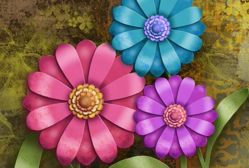
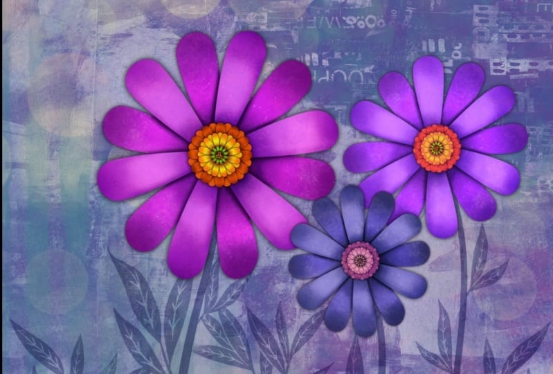
that first one. Let's get to it. I wanted to start this class with some inspiration pieces. And like I said, I had seen this flower kind of a poster in a
window in the mall. And what struck me about it is that I couldn't
really tell whether it was actually a flower that was a three-dimensional
paper cut that had been photographed or whether
it was done digitally. And the reason I
thought that of course, was because we had
just recently done that course on cut paper and looking at the
shadows and stuff. I mean, it's really possible
that a lot of these are just really
well done graphics, just very well-planned
out shadows. So I decided I would try to
create that as a project. So it took a couple of tries. Let's just say my brain was hurting when I was
trying to figure it out. But I think I've figured
out a method which is surprisingly very similar to the negative space classes
that we've been doing. Both classes relate. So I went through until I found a really nice
inspiration piece. Can't remember which one I ended up grabbing here
and I will see it. But let's say just
similar to that one. You'll see it anyways, I have
I haven't saved and I've got it in as my
reference in Procreate. So let's just hop into
Procreate right now. And yes, so here's the image
that I had decided to base my idea on in this class
right now this first lesson, I'm going to just help you
setting up the document. So what I did here
is I thought, well, I'll just work with
a ten by ten and it's at 300 pixels per inch. So you may not have that
as one of your presets. I'll just show you
the information here, but what we've got is
a ten by ten document, 300 pixels per inch. And I also showed
my drawing guides. So in the drawing
guide section here, you want to go into
symmetry for now. And we're gonna do
radial symmetry. And I'm actually not going
to draw it with this. As my only guide. I've created another set
of guides because I really wanted to have more
petals than this. So I did it manually, but I can give you
this particular, this is the guide
I'm talking about. So it's actually split
in half even more than you see that
radial symmetry guide. So let's just actually copy this one and we'll put it
into the other documents. So I'm gonna copy and
then go into the gallery. You're gonna be
able to just open the document that I sent you
and we'll have this one, it on the right layer. This is what happens
when I am talking at the same time there was me
because it's locked. Okay. So let's unlock unlock this one. I might copy this one too. I guess. I'm gonna select both. I'm not
sure if that works. Let's see if it does. We're gonna copy and then
we'll go into this and paste. It only copied the one
layer, which is no big deal. What we'll do here is we'll
just duplicate this one. And I'm going to turn on
the symmetry for a second and see if it'll snap at
the angle that I wanted to. I'm gonna grab that and
see what happens here. It's not dividing
it right in half. That's what my diets had done. So I'm gonna go back and
grab this other layer. This is, this is layer
that I got that I copied, and this is the one
I want to copy now. So I'm going to three
finger swipe down, go into the gallery, opened
my document and paste. This now is divided. It's not when you
do this snapping, it doesn't snap right at
that percentage there. So that's why I wanted
to make my own guide, because I want to
make more petals, my flower, the flower
you're gonna make. You can make any amount
of petals that you want. But if you want to
use this guide, this one will help you to make that initial drawing
of your wedge. One of the things
that I did when I was making the wedge
is make use of the curve feature or this feature where you can hold your line and
an arc is created. So we'll do that. And then I also used a circle selection or
circular selection, elliptical to make
the end of it. So we'll do that. So those are a couple of
things that we'll do. We'll join it altogether
to make a nice petal. And then we'll repeat that
petal all the way around. One of the problems
with the duplication, like I showed you when
we when I was using the snapping tools is that it
doesn't snap at the degree, the percentage that I wanted to. And also it doesn't rotate at the point
where I want it to. One of the limitations of Procreate's rotation tool is that it always pivots
from the very center. In programs like Photoshop
and Illustrator, you can set the pivot
point of the rotation. And that is actually
very valuable. And when you don't
have it in here, in Procreate, we don't have it. I really noticed
that difference. So it's times like that where I am really
tempted to go in and draw the vector in the program that I'm
comfortable using. But for now, we'll
work around it. We'll do it in procreate here. And let's do that petal. In the next lesson.
3. Lesson 2 Set Up and Adjust the First Petal: Hi guys, welcome from
lesson to lesson two. Here we're gonna talk
about the setup. And I'm going to be
helping you work through drawing that
very first petal. We're gonna be
using draw serious, so don't worry. Let's get to it. I'm going to clear
these bits that I did here so we can
start from scratch. I see I had actually been drawing right on my guide there. So I'm going to definitely
make a new layer here. I'm going to pull an
ellipse that I can use for the end tip of my petal. So it doesn't have to
be a perfect circle, but if you want it to be, you can hold your
single a figure on there to make it
into a perfect circle. I'm going to fill
it with this color here and make sure that's on
its own later in yes, it is. I'm gonna switch to
my monoline pen, so I've got that as a posca pen, but you can grab that
from your tools, your regular Procreate tools. So I'm going to
have that fit quite nicely in that one
single wedge there. And then we're going to start drawing the sides of the petals. So I want another layer for that because the
other one that I did, I kind of had to street of a line there I felt so this one, I'm gonna make it quite a bit
more rounded because I just want something a little bit
different for myself here. I'm holding down my star was tip so that it
makes a nice curve. If it's not curved enough, you'll probably have
something like this happening where it'll
try to straighten it up, move it around until I
haven't lining up and you can't do that if it's
already connected to that layer because
it's separate now, I can rotate it and like I said, it will rotate from
the middle point. Make sure you're snapping
and stuff is on. And you'll see here that
no matter what I do, it'll be rotating from
the center point. And I got a little bit
of an extra line there. And I think that was from
one of my false to skirts. So I'm going to switch to a Posca eraser so that I can
take that little notch off. Let's rotate it until we get
it lined up really nicely. Well, I think that's
pretty close. I'm not quite on
the center here, so I can use my tapping
to get it a little bit closer and maybe I'll
rotate it a tiny bit more. And I believe I could get away with just taking
the tip off of this, rotating it just a touch more. So what I'm trying to do is have a really clean join right there. And I think I have
achieved that. And I'm going to duplicate this. I'm going to flip it horizontal. And then I'm going
to rotate it as well and move it into position. So that gives me a nicer petal I think than what I had before. It's just more flower-like
if that makes sense. Enough here, I'm not
going to worry about, I'm going to actually
make sure that the two of them will join and
make a closed shape. So I am merging all of these, put them into a group to
make the merge easier. And then flattened is
what you should do there. And then you can fill the shape. So we've got a really
nice pebble there, filling the shape just nicely. And in a perfect world, if I was using
Illustrator or Photoshop, I would just have to duplicate
it once and then I could duplicate it automatically
all the way around. This program doesn't
work that way. So what I'm gonna do is
use the yellow and of that handle lineup the yellow right to the
middle of the petal. So right to the
point of the petal, and then you can rotate it
based on this direction here. You're still not going to get it rotating from the pivot point, but it's a lot easier
to see whether you got it straight up
and down or not. So I think I pretty close
here, looks close enough. This part ends up
all kind of masked into one bit of
the shape anyways, because they're going to overlap probably right about here. So now I can duplicate this one. This time I'm going to flip
it vertical and I'm going to pull it down and line
that up as well. When you get to
this point, you can enlarge and grab them both. If you're really bent on having them perfectly
lined up in the middle, this is sort of an organic
shape that we're drawing. A flower doesn't have to
be absolutely perfect. But if you are looking to do that, That's
how you would do it. Just enlarge it
really nice and big. And now these two I'm
going to group so that I can flatten them into one. And now this will be
easier to rotate because my rotation point will be
right here in the middle. So again, we're going to move. What we're gonna do
is duplicate it. I'm going to duplicate
it just once for now. And let's just see what the
rotation and the snapping on whether it'll rotate and snap to where we
want it and that's, I think it'd be decent this
point all we needed to do is repeat enough times around
to look like a flower. So I'm going to just turn off
my guides now because it's going to be an even amount of distance that it is rotating. It can see here that this
will be evenly spaced. So I'm just going to keep
going here. Duplicate. See how the snapping is helping us to get that
perfectly spaced. I can tell you that to
me that as much clunkier than what I can do in
Illustrator or Photoshop. But nonetheless, we've
achieved what we wanted to, which was to duplicate all
of the petals evenly around. Now what we need to do is some helpful layering
and labeling. So it's really important in this case to get the
labeling correct. What I'm gonna do
here is I'm going to take every second one and
I'm going to group them. The other grouping of three, ten-minute take an also
put them into a group. So we've got two
distinct groups here. And the reason for that being, we need some of them to be
looking as if they're behind. So let's rename
this one to be two, and rename this one to be one. Let's just flatten
these actually will combine them or flatten them down so that we've got just
two complete sets here. And if we were to
lighten them here, you would see that
they're separated. And I can already imagine
what this is going to look like with the shadowing
and so on, put on it. So this is going to be
quite different from the original sample
that I showed you. I'm going to take a
look at that again just to have my memory refreshed. But you can see here that
just like I did now, I've got all of these petals in behind that or
the darker tone. And then I have a
lighter tone over top, and then a ton of shadowing in here to make this look
three-dimensional. These have eight petals
that are spaced apart. The one that I did with
you today has only six. So either way you're going to
end up with the same thing. I think we can move on
into the next lesson. And then we're going to
start doing our layering. All right, I will see you there.
4. Lesson 3 Set Up Flower Layers and Clipping Masks: Hi guys, welcome
to lesson three. And less than three
here it's all about setting up the layers. And I want to encourage
you to get into a good practice for labeling. Labeling is going
to really help you out in the next couple of steps. The figure now is as good
a time as any to actually work out our little
middle section as well. So let's just hide
these two and we'll set up a little center of our
flower before we go on. So basically I would
use the same steps. Let's try an
alternate color here. And we'll start with
drawing the circle. Now let's bring in that
inspiration that I had so that we've got
that to take a look at. I'm not gonna make the inside
exactly the same as that. But what I want to do
here is go to Canvas. I want to go to reference, so you can bring up your
reference in this same way. I have the image
saved in my photos. So there it is, there. And you can see here
that the center, It's basically the same idea. It's just layered
with a whole bunch of smaller petals
kind of a thing. So let's do that
right now so that we can just have
all of our layers ready for when we start doing the shadowing and highlights, you can do it instead of doing what Elliptical selection you could also start
by doing a circle. So just draw, let's make a new layer and we
could draw the circle, hold down your stylus until you get that choice to
make it into a circle. And then let's do
the curved line. So I want to do that on
another layer so that I can just repeat it or flip it. I'm going to do it not quite as curved as I did
the other ones, so I'm bringing it down. And in this case, I didn't use my Drawing Assist. I just did it myself. So duplicate it, take it,
flip it horizontally. Of course, drag
it into position. I got to temporarily
turn off the snapping here. Line that up. You may have to rotate it slightly whenever
you have to do. And don't worry that it's
not perfectly symmetrical, It's going to look fine
once you have that, combine all of those layers
into a group so that you can flatten the group and then just colorize both of the parts. It's not perfect there I can see I've got a little bit
of a notch there, but it's really not
going to be a problem. I'm going to duplicate this
one, flip it vertically. And the reason for
doing this is twofold. We can rotate from a
central point if the two of them are joined like this. But also we have a lot less to repeat if
we do it this way. So it's partly out of laziness
that I do the duplicate. So let's now duplicate this one. We're going to turn snapping on again so that we can
start rotating it now you can extend the length of that so that you can
turn it more easily, although the snapping
definitely helps. I think we could do it pretty
much the same way where we just snapped to that
rotation of 30 degrees. So let's just continue with
that now to make it faster, you duplicate both of these
and grab two of them and rotate them so that I've got a double set
that I've done here. And let's do that
again one more time. So these could be combined
even at this point. I could put those together, merge this down, and then
I could do my duplicate. I won't merge them
with these yet because then I'll have too many, but I hit Duplicate here, use my rotation tool, and there we have it. There's a good copy and you
can see what I mean about the center not having
any gaps there. So it's easy to
combine them into one. So there's two different
ways of doing it. We could flattening or we
could keep them separate. Now if we had kept
them separate, we could have had every
other petal lighter, but I think what I
want to do is have the whole group and then
have that lightened. So it's up to you which
way you want to do it. I'm going to flatten it and
then I can duplicate this. And I think I'm
gonna have to turn off the snapping because
it's going to want to snap. Oh no, it's snapped to the
15 degrees, which is great. So just to keep it
clear in our heads, let's just lighten this
one so that we can see, and you can tell here that it's quite similar to what's there. And we could continue on. We could have more
and more layers. I'm not gonna do that
little middle part that's kind of folded upwards. This is gonna be enough
of a challenge so we could take the two of them and group them, duplicate
this group. Let's slightly change
the color here. So I'm selecting
that same color, but I'm gonna change it
a little bit lighter. Just this is more taken up as
keep it clear in our heads. And I'm gonna take
that whole group and I'm going to reduce it down. So that's slightly smaller
than the other one. Maybe before I do it though, I will recolor them so that
you can see the difference. So I'm going to drag
that into this one and I'll go a little bit
different for the other one. Now we've got two that are different in color
from these two. So this group here, I'm going to make smaller, so left it on the snapping so that I can make sure I
position it properly. And so now we've got our center
and let's move this down. I can get rid of these guides and let's pop those
back on again. So now you can see the
beginnings of the flower. There's no dimension
to it whatsoever. It's just flat. But what we'll start doing in the next lesson is
adding the shadows. And for sure that is going
to make it look dimensional, even just with a shadow and we won't even have
highlights yet. But I'll meet you
in the next lesson there where we'll start
working on the shadows.
5. Lesson 4 Adjusting the Shadows: Guys, welcome to lesson four. Now that we have
that all set up, we can start working on that first clipping mask
with the shadowing. Let's get to it. So before we start that, I would suggest that you take a really good look
at the flowers, but you have as your
reference here. One of the things that made
it look really natural Was that a lot of the shading
was not consistent. In other words, there isn't the same size of shadow
everywhere you can see here there's a bigger
shadow and that makes that pedal looked
like it's higher up. There's barely any
shadow over here. So it looks to me like the light source is
from this direction. And that's how you get these highlights on
these race pedals on this side and on the inside
of the flower center here. So because of that, I don't want to use
the usual trick that I have of using the Gaussian blur, by the way, I
looked at it up and let me just do the pronunciation on my computer so
you can hear it. You're hearing is I'm
going to turn it right up. Gaseon Garcia. Now I know how to pronounce it, Let's hope I remember that. So it sounds like cow. So Gaussian. That's
how you pronounce it. But normally I
would just do that. I would duplicate
one of these layers. Let's say this one here,
but let's do the top one. Gonna duplicate it. I would take the lower one
and I would select it, then I would choose
black or whatever I want my shadow would it be
maybe won't go pure black, just kind of a really deep
color and we'd fill it. That's underneath this one here. Let's bring that back up to full because this
is where you start seeing the real effect
of that Gaussian blur. We're going to grab that layer, go into the blur here. And you'll see that as we slide, just like when we were doing
the cut paper illustrations, we're creating this shadow. And I mean, it's
not that gets bad. We could keep that
and just add to it. So that's maybe one of the
things you could consider doing is do the blur. But then we're looking
at go in and make some changes as far as the size of the
shadow in some cases. So for that, what I'm going
to do is use an airbrush. I like using this soft
air brush here and I'm going to stick to that
same color and so on, that same layer, I can go in and add more shadow in spots. So that's what I'm
doing and I'm gonna actually this color to be kind of a magenta based color
since my flower is magenta. So I'm adding a
little bit extra. I'm definitely putting more on this side then I
will on this side. And if you think about the way the light is coming
in and hitting this, if it's coming from
this direction here, of course it's gonna throw
bigger shadows over here, then it will over here
because there's enough light here that it's going to make
a tiny bit of a shadow, but also underneath
this centerpiece is going to be a lot darker. So you can choose to have
that centerpiece showing or you can turn it off if you feel that
would be a better way. I kind of like having it
on because then I have a better sense of where I
can throw in those shadows. So something like this one
here would be similar to that, where you've got extra shadow, which would make this one look like it's coming up even more. And right now the petal
itself still looks flat. But when we do the highlights
and stuff on the petals, you'll see that we'll be able to make it look dimensional. And so that big shadow there will really
make a lot of sense. And I think there'd
be a fair bit of shadow on this side as well. And looking at this
one here, There's, there's just spots
where those petals, paper petals were a little
bit higher than others. So that's the first layer
to give you the dimension. And I would
definitely go through and do the same
thing with this one. So let's try that
technique again. We'll have the
duplicate and take the one that's below
will select it. Then we'll go back. And now it's in black, will go to the blur and
blur that a little bit. So you can see it starting
to peek through here. And again, we can go
in and share brush. Some darker areas. Definitely where the pedals are meeting here
would be darker. Even if the light is coming
from this direction. You know, it's got to
be above the flower, so it was still throw a
little bit of shadow in here. And I think overall
there's gonna be a lot more shadow
on that side. So, so far, so good. I think we're already building up real good dimension here. One of the things
I'm gonna do is hide my guides because I'm just not gonna need them anymore and it just easier to
see what I'm doing, what a difference
that makes I find. Shutting off that guide. It's really a better way to see your whole sort of big
picture and change your sizes here and there
where you can go in and do a little bit of
shading with a smaller brush. Here, I would do the same thing. Let me too much it up gradually. And if you're uncomfortable
with the full strength of it, you can definitely pull down and just built it
up super gradually. It's whatever you're
comfortable with doing. And I find that soft air
brush is pretty good. If you don't press too hard, you can definitely get a really
soft look to your shadow. Now we want to
actually work a little bit on this part as well. So let's take a look here. So these are the bottom
ones as you can see. So let's just go with the technique that we've
already experimented with. We'll duplicate that one. Then we're going to
select it and fill it. So that's the duplicate, not the actual colored center. And then we're going to, oops. Grabbed the blur again. And in this case I'm gonna
keep it pretty small, so I'm not spreading
it too much. And the reason for that is we're going to do all of these layers. So before I do those any bigger, I want to go through and
do all of the layers. So we'll do it with this one. We'll do it with this one. Remember that we had lowered
the opacity on that one, so I've brought it
back up to 100. And then I'm going to
grab that blur again, spread that just a little bit. It's just magical when you
just start applying that blur. And it's so cool to see it sort of
materialized in dimension. As you do that. We've got those two done. We can now go in
and do these two. Are either of them. Yeah, this one is
reduced in opacities, are bringing it back up to full and we're going to duplicate. And we'll do that
for both of them. Will take the lower
one, will select it, go back and fill it, then grab the blur. I just, I just loved
seeing that like to me that just really, it really is like magic. This one will again select. So as we do, this is becoming more routine and it seems to be much easier to do because your brain doesn't have to
question everything. It just does. That makes sense. We've created so much
dimension already. I'm really impressed with that. And I think that we could do
some really fun stuff with a warping and try to
emulate that a little bit. Why don't we just
try that with just this top one, just
for the fun of it. I'm going to go in and select
it and I'm gonna go to work and I'm on the shadow. Let's switch to
the flower itself. Select warp. And if I wanted an area that was a
little bit more lifted, you can see here
that as I'm pulling the warp controls
are the nodes that, that makes the shadow
underneath appear bigger. And what that does
is it makes it look like it's more dimensional. When we do some of the
highlighting and stuff, I think it'll really
start to stand out. You can also get
advanced controls here. So if you hit the advanced mesh, you can even do further sort of distortions with quite
a lot more control because those little handles
are sort of coming away from the intersection
of the grid. But if we were to
go through and do that on all of these layers, I think it would really work. And so let's just go ahead
and do this one as well. And you can also poet to
be a little bit wider or a little bit less
symmetrical looking, which I think is in
the long-run going to help us to make it
look more realistic. Now that shadow is needing
to be pulled a little bit? I think on this one, I would definitely go
in with a little bit of airbrushing because we're almost losing the shadow around it. There. You go with a smaller brush if you
think that would be easier. And now I can just
kind of brush around the shape of the petal
too, which is helpful. But I think we're
well on our way here to really producing a three-dimensional looking
cut paper illustrations. So let's meet in the next lesson where we're
going to do an addition of some highlights just to see how that works for getting
the dimension for us. All right, I'll see you there.
6. Lesson 5 Adding the Highlights: We're already seeing some
dimension here in our flower, but I think adding highlights is also going to
really make it pop. Let's get at it. Okay, Are you ready to start trying out some of these
highlights as well? So for this, what we're going
to use is clipping masks. Let me just reduce this
a little bit in size so that I have my whole
flower showing here. We're gonna grab that top one. So that's the one that we
see here in the foreground. It's gonna be the
one that probably has the most highlights. You're definitely more
than the one below it, but both of them will
have highlights. So I'm going to add a clipping
mask to both of them. Leader here, make it
into a clipping mask. Layer here, make it
into a clipping mask. We'll go back and
do these later on, but let's just start
with these first. And I'm gonna continue with that same brush that
I have been using, that soft air brush because I think that that
works quite well. So we're gonna make
that one nice and big. Because what we're
gonna do is aim for the middle of the
petals on this side. So we're really
softly building up, kind of in the middle here, a section which would
be as if it was coming forward as we move
closer to this side, what I want to do is move closer to the end of the petals. If you were looking at
it and it was a circle, the circle would be offset and a little bit more to the outside. Once it gets to these petals. Remember that we've got
curve on the petals. And what we're trying to
do is with this highlight, we're lighting this side of it. I think that I could even
go bigger with that brush. So I've got it set
here at the maximum, but if I go into the
properties here, I can make it even bigger. So let's do that. Now it's going to be gigantic. But I can now
control it with this and still get a really
nice large brush. So I'm just kinda like I said, aiming for the outside of
those particular petals. You can see right away that, that kind of pops
those petals up in the middle and it gives
this side kind of a fold. And we could definitely darken this part of the petal,
as you can see it here. It is darker on that side. Let's take dark purple. We're not going to go black. I think that would be too much, but this way we can build it up a little bit more gradually. So I've picked quite
dark purple there. And I'm going to just lightly brush in a
little bit of darkness, just like you see here on the inside of these
petals here that would also extend to the tips of
the petals on this side. And can you believe
that last lesson, the lesson before, this was
completely flat looking and now you can definitely
see the dimension. I mean, it's just crazy how
much of a difference that makes you could go
quite dark and smaller, right in around the central
piece there if you wanted to. And I guess we could
do a little bit on this side as well, because we definitely
want that to look like It's really going in. And you could really
emphasize these as being curved under by darkening
the tips of those. And really there's
no reason why you couldn't darken the
tips a little bit on this side as well so that
it really looks like there's a curve happening
on the outside there. And this one I'm kinda, you've
been adding a little bit on just the very beginnings
of the side of it. I mean, I can't believe
that how different it is, especially if you take a look at this one compared
to this one here. So what we need to do now is try to kind of create that
on this petal as well. But it's going to be different because we are also dealing with the shadow that's cast onto
it from the top petal. So in this case, we're definitely going to
have a little bit of darkness in this center area. And you can go a
little bit darker than what you did with
that blur before, just to give it some depth, I think we're gonna
have a little bit more on that side just the way some of these are
lifted a bit higher. You've got a little bit more
of a shadow on that side. And just kind of on the tips of these along the side maybe. And while I'm doing this, I'm referring back and looking
at this the whole time. That really helps me to
keep everything straight in my head as to where the
shadows are supposed to be. And if you don't
have this reference, you find a different one. Your shadows are gonna
be completely different. So this is a really
great exercise in learning to see
values and highlights. That's what I liked about
projects like this. It's not necessarily
the finished product. It's the knowledge
that you gain, the concepts that you learn when you're doing
something like this. I'm going to grab, instead
of going a pure white, I'm going to sample that pink. And then I'm gonna go and
get kind of a pinkish hue. It's still a lot
brighter than what was there in this case. Instead of going
straight across, I'm kind of doing circles of highlight there
because I don't want to disturb the shadow stuff that I've got going on there. And these two or three
on this side are also going to be lighter than the ones they correspond
with on the other side. And that's simply because
of the direction that we see our light
source coming from. And if you've ever seen
beautiful silk ribbon that's been illustrated, this is basically the idea, like if you wanted to make
this look really shiny, you could go to a white. Let's go to the top layer. And you could go with
a smaller highlight and then you could see that that makes it look
actually quite shiny. It especially if you
were to contrast that with really dark on the edges. Let's maybe too dark. But you can see
that one now looks like it's shiny rather
than just dimensional. And then take that
off because that's not the look I'm after today, but I'm really happy with that. The only thing that I don't like about it personally is that I would prefer to have it
looking a lot less symmetrical. I would want the petals to be a little bit more
organic and shape. And at this point I can
actually still accomplish that. So I could go into, but say this top one here, I could go into liquefy and use the push tool to make
some sort of alterations, I guess you'd say
distortions on the petals to make them look a little
bit less symmetrical, so they are strong to look
a little bit more organic. I've got my brush at about 50%. If you wanted to really
pull out the shape, you could definitely do it
like that using Liquify. I mean, that just makes
a slight difference, but I think it's
overall makes it look like a more realistic
flower, in my opinion. So we could do that on
both of the layers. I'll go quite large
against that. I can pull out the
sides a bit more. You don't want to overdo
this because it will cause the edges of some of your motifs to get
a little bit fuzzy. But definitely, I mean, I liked this so much better even than the first
one that I did, should have done it like
this for my my titles. I always go through
the project first and then that is the
one that I end up using for my titles
because they get all my titles setup on my
software for video editing. And then that way when
I shoot a left arrow, one segment like this lesson, then I'll immediately upload
it and put it in position. But by then I've already
got all my titles done just to save time, just
to make it faster. But I mean, I'm really
happy with this. I hope that you are
with yours too, because I think really
simply we have created a super three-dimensional flower not on similar to this one, a little bit more exaggerated and a different style obviously, but I think it's
really attractive. I think what we'll do in
the next lesson is look at other ways that we can make
it a little bit more organic. We'll put some spit
and polish on it and add a little bit of
texturing in detail. And then we probably
can call it a wrap. So I will see you
in the next lesson.
7. Lesson 6 Spit and Polish to Finish Up: Guys, welcome to lesson six. So unless there's six here, we're gonna be just doing
some of that spit and polish that makes our fish
products look awesome. Let's get at it. I wanted to start out this lesson just showing you
all of the things that I did on my artwork that
I used for my titles. Now usually this is chopped
off right about here. So that's why I've got
all of the artwork, kind of the main
focus on this side. One of the things I did was
to add a whole bunch of mixed media background
stuff that I have in a set that I sell. And it's really useful for
doing things like this, like a quick background. Then I also went through
and added a clipping mask. I flattened the flower here, as you can see, these are all flattened versions
of the flower. And I've added a clipping
mask with some of this sort of highlighting
and texture details, even in the leaves here. So that's something
that you can do to really flesh out
your complete design. So let's go back to our
example piece here. And one of the things I
wanted to show you real quick is how to do this set of, I guess would be statements, but the inside part
that kinda curls in instead of being flat
out like open petals. I find that the easiest
way to do something like that is to draw the full circle. Now I'm doing a pretty
thick line here. You probably not going to want to have that
thick of a line. In fact, maybe let me just
go down a little bit here. So draw a circle. You can edit it to
be a perfect circle. Take a good close up of it, and then you're going to paint or draw in your
petals like this. They're facing inwards and you can vary the size
of them for sure. Like you don't have
to keep them really consistent because you can see here that these are folded, they're all a little
bit different. And you can see
that go ahead and do two or three layers of
that if you really wanted. But that's what gives you that, that inwards facing
kind of layer. And now what I want to do here is fill the inside bits here, but I'm gonna do that
on a separate layer. So, oh darn, I did it on this
layer, which is not good. So I would of course
have to backtrack here, add a new layer. I'll do that really quick. Make sure you overlap
when you get to this point here, edit, mixed circle, draw
your inside bits here. For the most part, I
didn't go all the way down to the very edge here. You can, it doesn't
really matter. It just will affect the way
you do your selection now. So we can do the
automatic selection here. Select the inside. You can see that I've just got the outline there as a
guide for selecting. I have to add that one to it and then I could do a new layer. And let's just sample, let's say that medium tone
color and fill that one. And we can now get rid
of this interior ones. So now we've created that. And of course it looks
a 100% flat because we haven't done any of the shading that we would want
to do on there. I would duplicate it, hit the underneath
one and select it, change my fill to black and
then go back here and fill. We know that that's underneath and that's what we'll use to do our first level of shading. So that's just with
the Gaussian Blur. Gaussian Blur. And we've
got the start of it. We would still go back and add a clipping mask to this one. So add a layer specified
as a clipping mask and then go in and
do some airbrushing. You're gonna go in quite small. This side is going
to have a lot of shading right on the petals that somebody might
sample a bit of orange there and beautiful back and just go a little bit darker. I know that on the
layer beneath that, we're going to have
to have more shading. You're going to go
through and whatever you observe in this part
of the drawing here, I think overall I
would rather have had a little bit of yellowness
to the shading, so I'm just changing
it a little bit and we would have a little bit
of shading come out on that side and go a little
bit darker and a little bit smaller and then highlights
probably on the very tips. So we'll go really light there. Now my airbrush is way too big, so I'm going back in here and
I'm going to reduce that. And let's go back to this layer, to the clipping mask and add
a little bit of dimension. You can see the tips of this
side are all that get it. On this side, you'll get
a little bit more on sort of the main
part of the stamen. I don't know what
else to call it, but this steam and things
grouping, the stamen grouping. I think I'm gonna take
some of that shadow out and see the big
mistake I made here. I didn't make a clipping mask. So now this is painted
right onto that layer. So I have to use this color
in order to cancel it out. And I'm gonna go onto the shadow layer that
I made with the Blur. And I'm going to grab the soft air brush as an
eraser and go smaller. And I'm going to
kind of get rid of some of it on this side here. You look at it overall. I mean, if it isn't
exactly like this one, this one has a couple
of different layers, but that gives you an idea, the idea of what to do
in order to create that. We could select all of them
and alter it and size. I'm gonna go a
uniform off snapping. I think that's worked
out pretty good. We could definitely
add a little bit more shadow on this one here. And now I am going to make the proper clipping mask so that I can do the shading a
little bit better there. And the tips of these would
have some highlights too. So I would probably go white, go in nice and close. And putting a
little bit of light on the tips of those
brings them up for sure. So we could do the
same thing here. And you would go through and do that on each of the layers. So here I would add
a clipping mask, go through and not specify it. I've got now highlights
happening on the set and I could also
use this one, the shadows. So I can go and you can work your way down
through the layers. And you can see how
that always ends up making the top ones
look a lot more, a little bit further like
lot more of a distance, so they cast more of a shadow. And remember that we've got all of the ones
in this as well. So add a clipping mask, go through and put
some shadow over here. Some highlights on some of
these masks, highlights. And I'm basically just doing
the very tips on this side. And then I'm gonna
switch to know, kind of going almost black, but I never really
go pure block. I guess in a case like this, these are the deepest ones, so maybe I should go quite deep. And you can see that that's
just kept that just so much. It's looking like a palm, palm. It's so dimensional. So those are the things
that you would do to give all of your petals
and so on dimension, we could have these
all in a group. And I'm positive that
I'm not gonna be able to duplicate these all in order to make a flattened
version of this. So what I would do is go into my gallery, select
and duplicate. Then I'll go into my duplicates. This I would flatten, so I would grab
absolutely everything here in group it
and then flattened. And now I've got my
flower all on one layer. We can close that reference. That's basically
what you do and you can definitely at this point, start working on a composition
you could duplicate, have more than one. Maybe that one I would
make a little bit smaller. Grab this one and
move it on top. I can show you how to do a bunch of mixed media stuff that I do. I've got this mixed media set with everything from backgrounds
to texture is lettering, all kinds of stuff
in it and says, My biggest step
that I ever made as far as amount of brushes, these I've done, It's taken
me years and believe me, I've got tons of
backgrounds that I can use in my journals. I could continue to make
more and more of these, but this is the beauty of it. You can create a
background so quickly. So I would make a layer there. And I'm going to start with, let us see this colored
drip brush here. Pretty dark, put in
that whole layer, then I could start printing some of these
other textures on top. It's as if I'm doing a
mixed media illustration in one of my journals. I can go in and really
quickly add a ton of details. And I should be working
in layers here, which is what I generally do, but adding just some drops
into the background. I like this one here
because it's got some really interesting sort
of textures and things. Let's go a little bit yellow. I can go in on any of these
and increase the size of the grain because the grain
is actually the printed part. So I'm going to undo those
last two or three that I did. And you can see how versatile a set like this
would be to have an a course. You can add just some
regular painting over top and I can go and grab
one of my watercolor, really nice watercolor brushes
and do the same thing. And it really captures the essence of mixed
media painting. I think these two
I'm gonna put into a group and I'm going
to duplicate the group. I'm going to flatten
this one, the lower one. Then I'm going to
select the layer, so that selects everything and then I'm going to
fill it with the black. And you probably guess
what's coming next. And that's making a shadow
underneath the flowers. So that will make a really
nice release that will help it really stand out and it doesn't
have to be blocked. You can definitely
go in after you've created it and go to
Hue and Saturation and Brightness and experiment
maybe white would be a more interesting kind of
a color to have in there. You can select it and
fill it with a color. We could go to a
deep reddish color depending on what
your color scheme is. Fill it. It's more of a maroon
color in behind there. You could also now
to your flowers, add layers that are
clipping masks. And then those you
could add texture to. So I would go into my
texture sat and possibly add something like spatter
so we could go in with a lighter colored spatter. I was thinking it
was this flower, but it's this one here. I'm just adding a little
bit of interest to that. Flower. Do the same
thing on this one here. At this point, it's
all about you, about what you're gonna do to really make your design
look interesting. And I think it's not the most beautiful
thing I've ever created. I would definitely do
a lot more on stuff on the background to make
it more polished. But I'm just giving you the ideas so that you can
go and make this your own. Alright, I think
that's it for this. You've learned all
the techniques that you need in order
to make it work. I'd love to see you do
this and I'm sure you can blow my InDesign out of
the water with yours. I can't wait to see your staff and I will
meet you in the wrap-up. See you there.
8. Lesson 7 Wrap Up and Closing Thoughts 1: Hey guys, welcome
to lesson seven. So of course I take a final
class to show you use or how I've used this particular
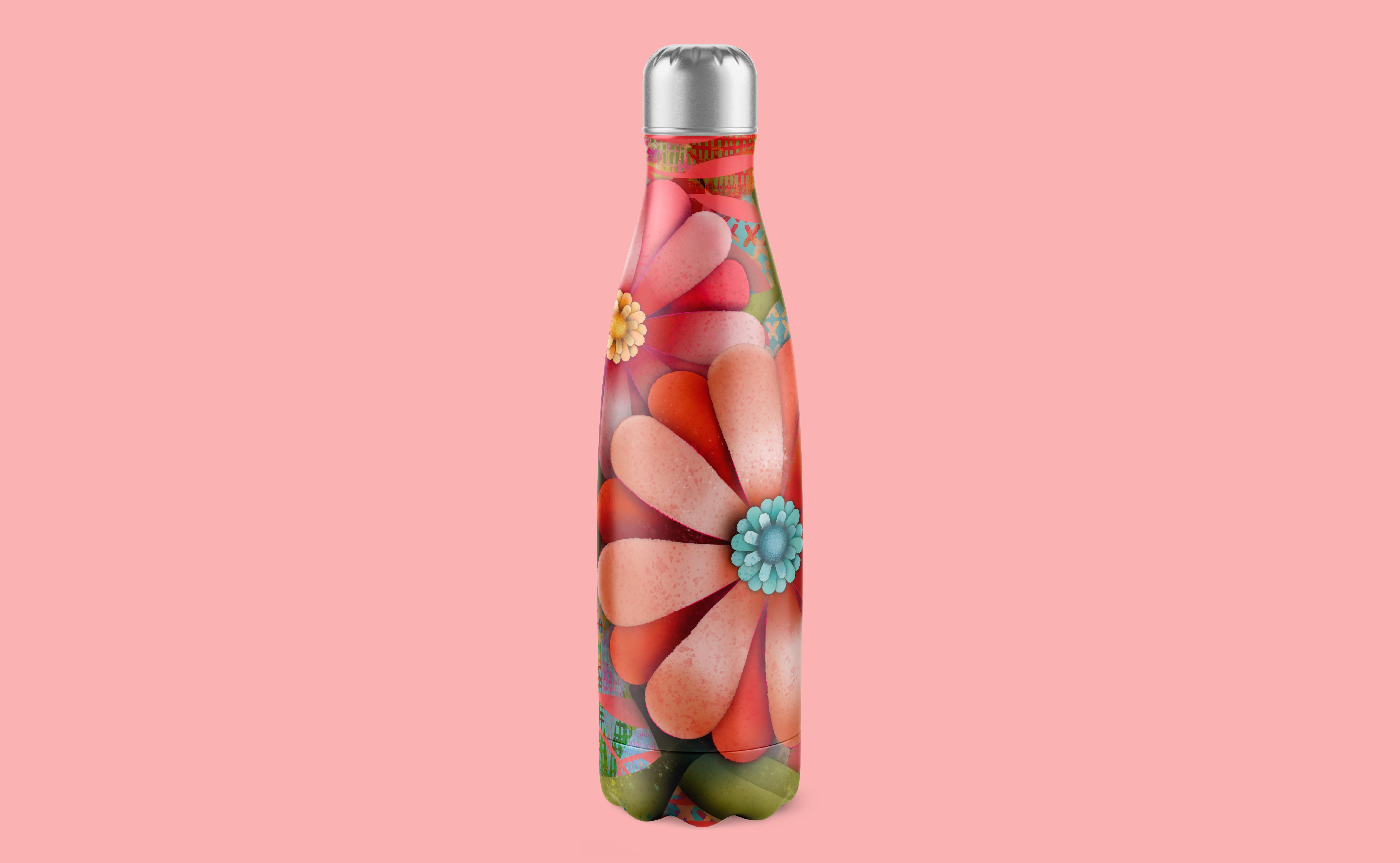
cut paper illustration. It has a lot of possibilities. You could definitely create
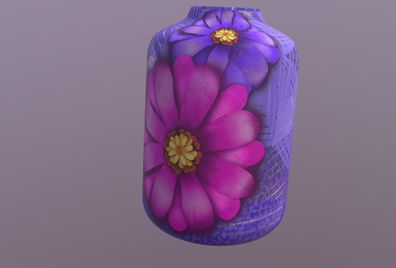
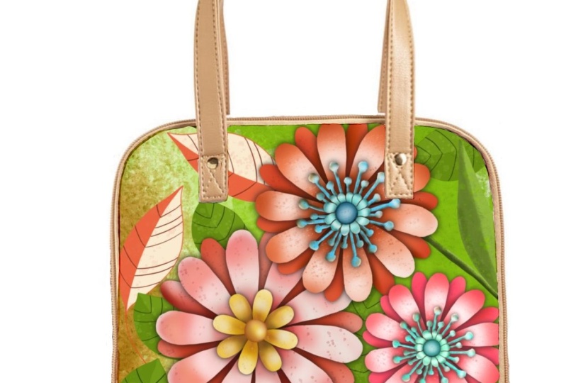
a whole pattern with this. You could use it to create amazing products
like key chains. I'm sure you're going
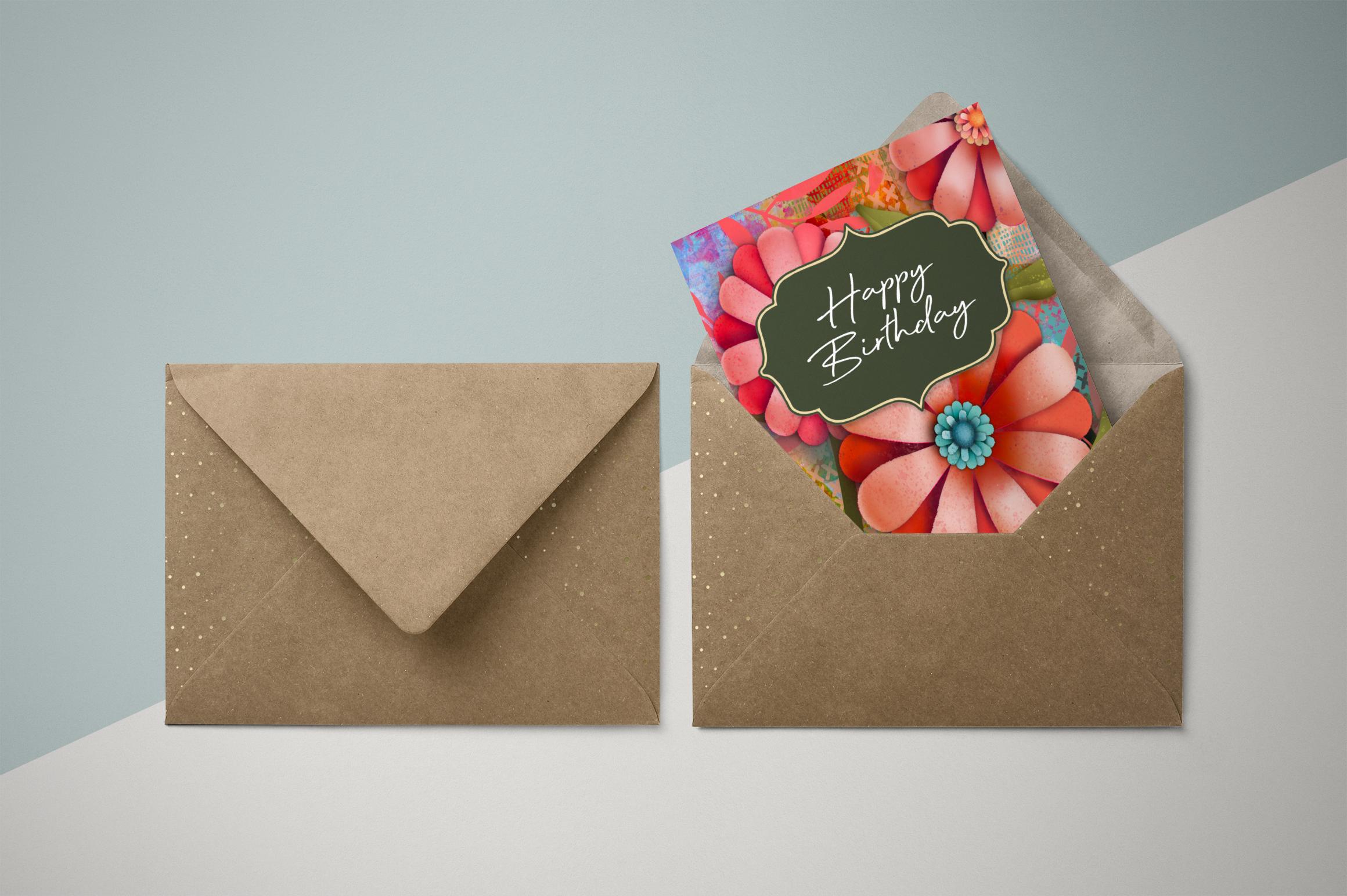
to come up with some amazing ideas as well. Even just a single flower on the front of a card
would look lovely. Thanks again for hanging
out with me today. And I'm really hoping
that you're gonna be in all of my other classes. You can find them
all on my profile, but also encourage you to put your name on
my mailing list. The Loris start dot ca
because I'm going to be actually posting
alternate classes there. I'd love to see you on the list. I've also got a bunch of
artists resources there. Some of them are free, so
definitely check that out. Anyhow. Bye for now. See you next time.
 Delores Naskrent, Creative Explorer