Transcripts
1. Intro to Abstract Continuous Line Art Journal Page: Hi guys and welcome. My name is Dolores
aspirants and I'm coming to you from
sunny, Manitoba, Canada. So today's class that I'm
bringing you is gonna be just a fun and freeing kind
of an exercise in Procreate. We're going to produce a
completely abstract piece of art with one
continuous block line. Yep, one continuous line. Seems crazy, but I've used this technique more
than whites to create really excellent
backgrounds for things like greeting cards or
to put on apparel, or even something like a
backpack or a makeup pouch. One of those exercises
that you can do without even having
to think too much. In this class, we're
going to actually experiment a lot with
adding textures. I've got several
different techniques that I think you're going to
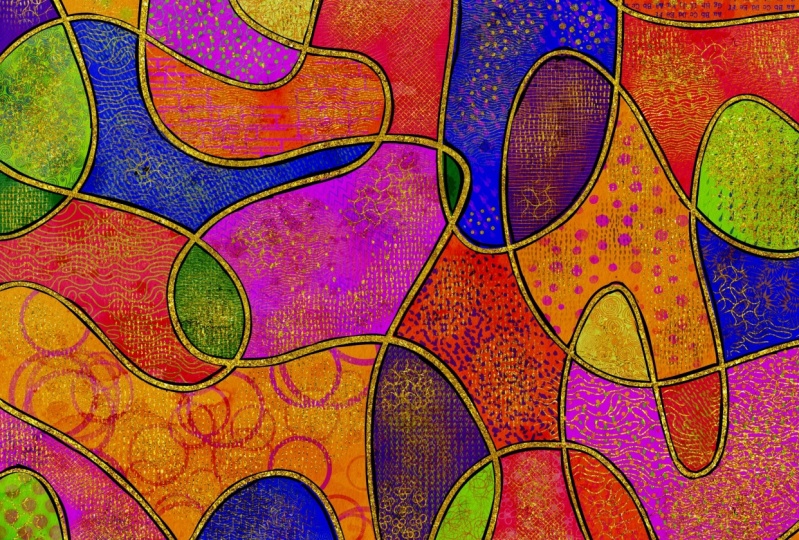
find really interesting. In the end, you end up with this super colorful and
really intricate design. Now if you haven't
done so already, I'm going to suggest
that you hit that follow button up there. That way you'll be
informed of any of my new classes
as I post them. And you'll get any of
my discussion posts that I said down
here on Skillshare. Now I'd also suggest you get your name on my mailing list on my website because I offer a lot of different
things from there, including things like
free artists resources. You definitely want
to be on that list. So without further ado, let's get into the class. I'll meet you in lesson one.
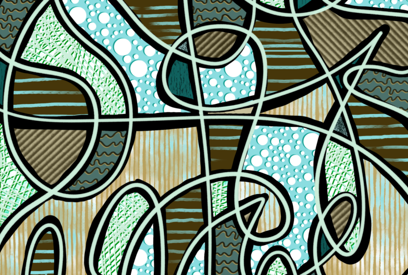
2. Lesson 1 Inspiration and Initial Line Work: Hi guys, welcome to lesson one. So I couldn't find
inspiration that was directly examples of this work, but I want to give
you some ideas. Anyhow, I'm going to show you
some Pinterest examples of really textural art that
I think will inspire you despite the fact
that they aren't exactly what we're gonna
be doing in class. I think at the end of this
lesson will have also the long continuous line
ready for the following work. In the other lessons. Let's get started. So to start our project today, I thought we quickly look at a couple of inspiration pieces. And really I couldn't
find anything that was really exactly like what
I wanna do with you. But there are a lot of
things that you can look at to get ideas for this and something like this
as a really good example. Because what I want you to think about is the texture that is kind of put in or created within an
abstract art piece. So even this one
is a good example. You've got tons of dots. This is one thing that we're
definitely putting in there because I've already
created the brush for this. And I'm going to be showing
you how to make the brush, I guess the color here,
because I really do like the way the color has
been put together. This is not at all like what
we're going to be doing, but the lines kind of remind me of what we're going
to be laying out. We're gonna be doing
that continuous line. And I do like this,
this is really cool. This is maybe something we
could explore another time, but I really just want to do something really free and fun. And there's no way
that you can't do this project even
if you can't draw. So this is one of the
things I wanted to do is to have a class that makes art feel really
spontaneous and relaxing. So I personally spend a lot of time just sitting and doing these abstract things
to just get me motivated for a project
or get me warmed up. And a lot of times they
end up being really great. So I'm going to show you the examples of what
I'm talking about. So I guess this is the main example that
I want to show you. And like I said, we have textures here
added with rushes. So that's something I'm
going to show you how to do is create a brush like this. You can see here that I was just kinda messing around with a bunch of different
methods for adding texture. And there's
definitely dimension, light and dark areas. Just crazy lines
going on everywhere. And so this is one great big thick continuous
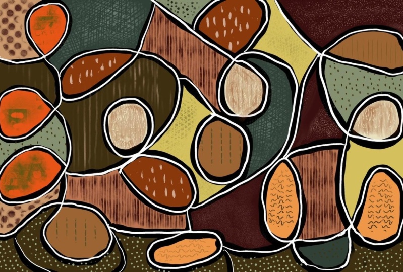
line that I did. I did this one here also
in preparation for class. And while I like it, I don't like it quite as much. What I do like about it
is the color schemes. So that's one of the palettes that I've given you recently, but I will also add
to the class assets. So you're gonna get this color
palette that you can use. You can see at that before
I was using the reds, which is what I used in
that at other projects. So I think I had a red
palette here somewhere. I can include that one as well. I'm not gonna look
for it now, but I can definitely include it. I liked the fact that it's
a nice homogenous pallets. So this is something to also think about
before you start. I think that I'm
going to try to do something a little bit
between those two. So it'll be crazy. I think like this
a lot more lines. I think that makes it a lot
more fun than you can tell that the whole
technique here is a lot looser like the white
line on this one does not necessarily bisect
as perfectly as this one. So it depends what your
look is and what you want. I really don't know how
it's gonna turn out now because I'm torn
between the two. So I'm going to
experiment a little bit and you're going to be a
part of those experiments. You're going to see all the
different things that I do to do a project like this. Now, you're going to look at this Layers palette and think, oh my goodness, that
is a lot of layers. And I think what's fun
is learning also how to manipulate the layers to have them look
interesting like this. So what I had done here
is I had selected each of the areas individually and made separate layer on
which to add the texture. So if I were to turn
off all my layers, you would see that this
is what I started with. So when you break
it down like that, it definitely looks doable. So let's start that right away. I think we can do that
right here in this lesson. The size of the document
that I'm using is a 12 by eight and it's at
300 pixels per inch. I find that that's
a really good size. That can be then enlarged a little bit to be
used on POD items, or can be reduced quite small and have
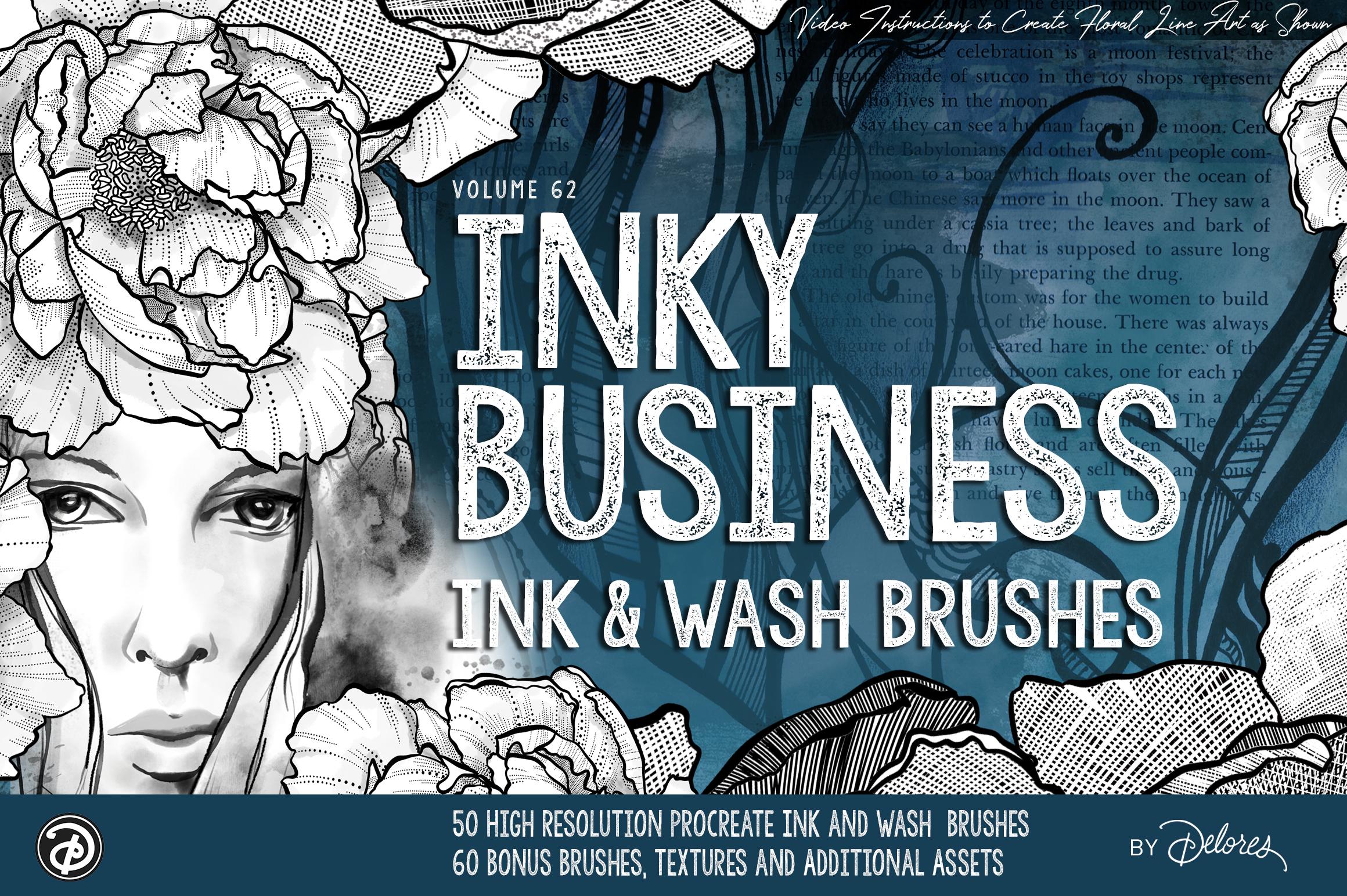
excellent qualities. I've been using this new, except that I've been creating, which is my inky ink brushes. I said No, that's not it. I'm inking brushes right here. So I've developed this, isn't it either
anti-business rate, okay. This is the brush set, so you can see it's
super extensive. And I will have this available
on my website and on Creative Market and
possibly on Etsy because I'm just opening
an Etsy store as well. So those are a bunch of the brushes that
I've put together. I'm not gonna be giving you
all the brushes obviously, but I have been
starting a set here, which as we go
through the project, we will add brushes
to it so that you have sort of
the main brushes that you need to do the project. Pinky, pinky is actually my favorite of the
anchors in here. Let me just that block
and I'm going to just temporarily turn down
the stabilization and so on. And you can see that it's a really nice responsive
brush that you can get thin and thick lines and it has a little bit of
texture on the edges, so it makes it
quite interesting. And it's definitely
different than the brush that I used
in this project. This one, I think is
the variable anchor. And on this one, it's more of that textural. Look. I don't think I didn't
like about this was that little white edge
that it was showing here. But I also didn't do this
one in proper layers. I would have done the
block on a separate layer. And I learned as I went through, this one was actually
a better way to do it. So I think that's what
we'll aim towards. So with this, I'm going to just clear this layer with
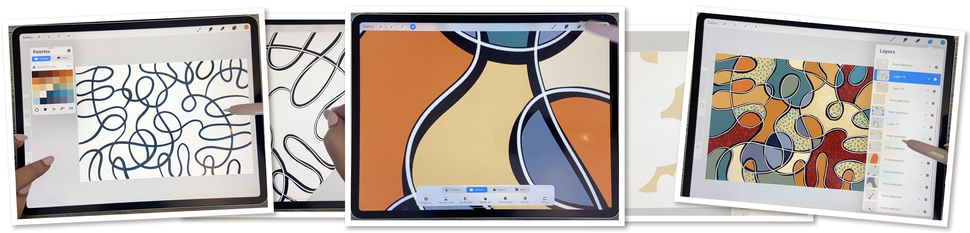
this continuous line. Now, what you wanna do is fill your page and you can
do this quite quickly. The one I had used was
the reactive anchor, which is also thick and thin, but it just doesn't have quite as much of
a textured edge. So it's really up to you whether you want
to use this one, I'm going to duplicate
it or this one. And then I'll take
those duplicates and slide them into
your set here. Abstract. And I'll put those
two on the top so you can decide which one
you want to use. So what I'm doing when
I'm how did they switch? So when I'm doing the line, I'm not lifting necessarily
making a continuous line. I'm trying to bisect some of the lines so that I've got these interesting
little areas to fill, but I don't have to continue
the whole thing in one shot. So remember that you
don't have to feel like you can't pick up your pen. You can in this case, I know we've done
continuous line stuff in the past and I've encouraged you to not lift up
your pen and just continue. But in this case I think
it would be alright. So I'm trying to create lots of little areas there
that I can change. And Phil, I don't like
that one quite as much. So I think what looks good to you is varying the
thickness of your pan. You know, sometimes it
takes a couple of tries to get exactly what you want. I think the variety
of sizes with these areas is good as
well. Something like this. I've got this giant area
that is not separated. It's not in separate pieces. So that's something to ask yourself whether
you want some of these really big areas or do you want them to be
somewhat broken up? So in a case like
that, if you want to, you could even
pull another line. Let's see what would work here. Maybe something
like this so that, that area will be
broken in half. And maybe on this side
we'll do the same idea. You could do
something like that. You could definitely
just putting a circle or something to connect
those areas. Remember that you can hold down your stylus to make a perfect circle if
that's what you want, that actually kinda
looks out of place. So I'm not going to
use that technique, something like that
could work like that. And so I thought the
blog is basically done. I mean, you can always go
in and make corrections, alterations, or additions. So something like that. If you feel like some of the areas are just a
little bit too big, definitely go in
and divide them. And once you have this part, you're ready to
start adding colors. So we're going to do that, we're going to start
that in the next lesson.
3. Lesson 2 Filling in the Colored Sections: Hi guys, welcome to lesson two. Unless it's Junior
was showing you the technique I use for filling in all of the
little areas of color. I do it in a specific
way so that it's easy to add texture to
the individual areas. Let's get started. Okay,
so every did my line work. The other one was okay, but
I want to do it a little bit less busy so that it would be a little bit faster
for me to do in class. So this is my result. And what I wanna do here
is choose a palette. Now these palettes,
you'll see I've got, well obviously dozens
and dozens and dozens. I will choose one of the
ones that I do have on my website so you can go and find it in the artist's
resources there. I think this is the
one I want to go with, so I'm going to choose
share it now so that I can put it into a
folder for this class. And what I'm gonna
do here as well is to dislodge this palette
and put it over here. Once you do that, you
can click on the pallets and then just your colors
are going to show there. So now we can start filling our image with the
colors that we want. So I'm going to just grab
maybe a middle of the road, kind of a rust color there. And I'm going to click on that. That allows me to continue to refill with that same color. So that's a lot faster
because you can just click in and very quickly fail without
having to drag the swatch. So you don't have to stress
too much about this. The way I'm gonna
do it is, you know, like maybe groupings like this, I would do the same. But like I said, I'm not going to stress about it too much. Worried my colors
go, here we go. So I had to hold and tap on
here to get the palette back. The next color I
think I'm going to do is this kind of a teal color. Drag it in here, continue refilling
with the recolor tool. And you see you have
to drag that cross hairs to another
section and then you can use it to
tap your colors in. Now, to me it looks like my
black line isn't pure black. So maybe I will
take a second here to fill my black line again. It would probably be just fine, but I see that
this one's darker, so I want it all to be the same. Close that off for a second. And then I'm going to
grab from the disk, makes sure that I have
it on pure black, and then I can drag that onto the line and that'll darken
all of the lines everywhere. And I do want to dislodge
this again and put it here. I find that just a
lot more efficient. Okay, So what do we
got going on here? Let's try some of
this gold, a color, and we'll put that in and
continue filling with re-color, but drag it to another section. Put few sections
here in this color. Now I've kinda like see how I've got to light sections of gold. I think what I'll
do is a little bit darker and fill the area
in-between with that. And maybe this area. So I'm kinda doing
adjacent areas, but you don't have
to really do that. Just a thought,
just something that you could do that's different. Remember that you can
long hold on here to bring your palette back
if it disappears on you. And I think I want
to introduce some of these really deep
Rooney kind of a color. Now in this case, I've separated them almost like a triangle. And that is nice for getting your balance and composition
looking interesting. And I think I'm going
to bring in some of this lighter color here. Now back to some of
this darker one. And the one thing I am
trying to avoid doing is having too many areas the same. So this color might be, might be enough of this
color here that I might choose to actually change
the color in that corner. Now, so maybe here I
would introduce a green. And why have I not used? I have really haven't used
any of these blues here. So maybe we'll drag a
couple of those in. And I'm thinking I would do the light
blue right next to it. Av. And now we're completely ready. So the next stage
of this is going to be to add this white, the crazy white line like
we looked at in these two. So this is kind of
fun and loose line. That one's a little bit
more free than this one. On this one, I was a lot more careful about the
positioning of it. Basically two different
styles that you can experiment with and
it's your aesthetics. So whatever you decide is best, and I would suggest
that you maybe even try both and see which one
appeals to you the most. Now the one thing that I think
I want to do here before I continue is just
this one spot here. I feel like it needs to be
a little bit darker there. I know it's not much, but sometimes little things
like that really stand out. You just figure it out. Even these two right here looked like something
that I could change to be a little bit more
orange or maybe this darker gold would be more. To me, makes it look like
a better composition. So of course, that's
all up to you. You can just, at this point, take the time to really look at what you've
got as a result here and whether or not you really liked the way it looks. So I think for myself, I'm happy with this and
I'm going to meet you in the next lesson
where we're going to start doing that white line. Alright, I'll see you there.
4. Lesson 3 Highlight or Decorative White Line: Hi guys, welcome
to lesson three. In lesson three here, I'm gonna be showing
you how to add that white highlight line that I showed you in
the example piece. Let's get started. Okay, so for the
next stage here, we're going to do
the white lines. So make sure you
go to your disk. And depending on where your
little circle here is, that's gonna be the
color that you pick. If you want it to be pure white, Double-click on it and it'll go to the absolute purest white. Now, as far as the
choice of pan here, I know I would
experimental fiber you, I kinda want fairly
steady thickness. I like this studio fine liner, but it can also work just
fine with inky pinky if you're okay with
just a little bit of variation with
your line thickness. And I think that's gonna be, alright, I think
that would work. I definitely want to put
this on a new layer. So I'm going to add
that layer now. And if we take a look at
the ones that I did here, you can decide which
technique you like better. This one didn't necessarily
always match up. I mean, I did this
one super quick. I don't know if that's really
the look that you want, but if you want it to be
a little bit more formal, I guess you'd say you're going to be a little
bit more careful about having that line
basically bisect the block. There are ways of
getting around it afterwards if we want to make sure that it looks
consistent here, e.g. can't really see the black. What I ended up doing
was adding a layer here, and I'll show you how to make
this layer if that's what you wanna do and you want to
make sure it's consistent. So let's go back to the one
that we're working on now. For this one, I would also
suggest that you go in and go into the stabilization and
bring this up fairly high, you're going to be doing this
one a little bit slower. So you want
stabilization to help you get your lines basically in the
position that you want. And I'm thinking I'm a
little bit thick on that. Want to make sure I'm
still on the other layer. What I'm doing is I'm going
through and fairly carefully dividing the black line
with the white line. So don't worry about
being too perfect, but kinda go through and just get that white
line everywhere. So in a case like that, I didn't do the
greatest job I could undo and then go back and make sure you do move
your canvas around to the angle that's
most comfortable. And a lot of times it's really the same direction as you drew these lines in
the first place. So I'm not super patients, so I will probably
go through this fairly quickly and my lines are not going to be
absolutely perfect. But hey, I kinda like
that personally, I think it adds to the
character and I'm not really varying the
thickness very much. So I'm keeping a
fairly even pressure. If you wanted to have
the thin and thick, then of course like I could do this and press a little bit harder and get a
thicker line in spots. Actually don't mind the hash. You know, I kinda wish
I did it that way, but I'm going to continue with the technique that I chose, which was keeping it
fairly consistent. I'm doing a terrible
job on that one, so I'm going to
turn it around and sometimes I don't even start
right at the very end. Like I'll just start where
it feels comfortable and see I can swing my wrist
really easily this way. Somehow switch colors here. And I mean, that is kind
of a thing to note, like I'm doing this with white, That's kind of the look that I'm emulating from the original
that I showed you. But it might preach
this tool to do this in a bright blue or
a bright yellow, e.g. do a couple of
little experiments, maybe do the document smaller, do three or four quick
ones to try to decide what your look that
you're after is and then stick to that and
be consistent though. I'm sticking to this white line and I'm doing that everywhere. But this is one of those sort of concept classes where you're
learning the concept, but you can do it whichever way you want your style to be. Okay if I got it
all, I think I do. So I wanted to show you just in case you aren't happy with this kind of thickness or not dividing perfectly
into the center. And if you want to actually
have it look like it's more consistent than what you can do is duplicate this layer. Go to the bottom one, select Alpha Lock,
switch to black, and I'm double-clicking so
that I get the pure black going back to the layer here
and I'm filling the layer. So what that's done is it's made this white line into a
duplicate black line. I'm going to turn the Alpha
Lock off of this right now. And then I'm gonna go here into the Gaussian blur and
slide to adjust it. And I'm only gonna
go to maybe 3% here. So it's really hard to tell
that it's doing anything. If I move it, you
can see here that it is out-of-focus, right? Well, I'm going to undo that
and then I'm going to go into my layer here and I'm
going to duplicate it. And every time I duplicate it, I'm actually making that blurred line appear
to be darker. So I've done it about
ten times here. So I'm going to drag over
and I'm going to group it. And then I'm going
to flatten that. And you'll see that if
I move this line that it's gotten a lot heavier looking than the original
that I showed you. I can still do a
little bit on that. So what I'll do is duplicate
it again a few times. And fast way to
do it would be to actually grab all of
them and group them, and then duplicate the group. You've got double
the amount and then put both of those into
a group and flatten it. And now it's getting to be
much thicker and bolder, okay? And you can see
here now that it is actually helping us to bisect that line because see that not have any
black on that side. And now it does appear to
have black on that side. So the other thing
here we can do is we can select the layer
and then fill it. And I'll do that again. Select Fill and one
last time, select Fill. And now I've managed to add block to both
sides of my lines. So if I was to move this
now you can see that has added a thin line
all the way around. So if I turn it off, you can see that something
like this right there. Just watch that spot. When I turn it off,
it's not there. And when I turn it
back on it is there. Then the other thing
you could do is you can duplicate your white
to make it even brighter and then just merge it down so that the two layers
of the wider together. So we've really darkened
in boldened our lines. And I think that at this stage, or it looks like I
missed one here, that one's gonna look on a dull in comparison
to that one there. So I'm gonna go over it twice, but I think I've got everything here and we're
ready. Oh, one more. We're ready to now go into that next lesson
where we're going to start thinking about and adding texture to
our color areas. Okay, So our goal will be
to do something like this, where all of our
little areas are going to be texture and you can go absolutely nuts to and get
something like that going on. So we're going to meet
in the next lesson. And that lesson, I'm also going to be showing
you how you can create your own
little patterns to use for adding that texture. Okay, I'll meet you there.
5. Lesson 4 Create Patterns for Use as Texture: Hi guys, welcome to lesson four. Unless I, for here I was
just going to use a bunch of existing textures that I have. But I thought we could
do a really quick lesson on creating some of
those textures herself. I know you've probably created textures in many classes before, but it never hurts to have all of your
knowledge reinforced. Again. Let's get to it. So before doing the
actual separating of these colors to
add texture to them, I want to make that
little document that we can use for
making a brush. This one, I did ten by ten, but I think we can do almost the exact same thing with a really small documents. So we're going to add one here at we're doing it in inches. It's just easier for
me to visualize. So 2 " wide and 2 " high. And I'm going to hit Create. So we've got this nice
little document and I want to switch to black here
for my making the brush. And I'm going to just use
my Posca paint marker. With the Posca paint marker, you can make a perfect dots. So that's what I'm
gonna be doing here. If you don't have my
Posca paint marker, well actually let me
just duplicate it. Put it into your set right now. So with this, depending on the size of the
dots you want to meet and you had switched because it wasn't making
a perfect circle. So I want to go back to that. So you can see that as I tap, I'm making a perfect circle. I want to really vary the sizes. So I'm going to switch
this up several times now, remember that this
is only two-by-two. So when we make the brush, a dot like that is going to
be really, really small. So I'm actually going to go and do a few really
big ones as well. We're doing this really random, but we're going to follow the same practices we always do when we're
creating a pattern. Because right now
what will happen is because I loved all
these edges white. It's going to be super obvious. So first thing I'm gonna
do here to make the brush, make the repeat so
that I can make the brush repeat properly. I'm going to just colorize
the four corners like that. I'm going to go into my Canvas
and into drawing guide. I'm going to edit
the Drawing Guide and then make the
grid size full size. So we have four
here and hit Done. And then I'm going to
duplicate this four times or three times so
that I have four in total. Put my snapping
on and magnetics. And now I can pull each of these into the corners and make
sure that when you do that, you are seeing the gold line or deep yellow line
that shows up there. You can see the yellow line
here that makes certain that you are positioning them correctly so that in the end, this half of this dot is repeated here with
absolutely no gaps. If you don't see
the yellow line, it wouldn't match up perfectly, you'd get a little
bit of a gap there. So now we can take
all of these and group them and
flatten this group and we want to erase that
little registration mark. Can, we can go back to our brush here and we can start lasing more dots so that these joints
also have dots in them. So this is gonna be
a really busy one. You go right up to that edge. You don't have to worry now because you do have
this join here, that will look okay. And we can even test this
before we make it into a brush. And if anything,
we can add more. So another way to test it would be two and I'm okay, Good. Because I've got
things along the edges everywhere I can
take and duplicate this layer and then just slide it halfway to double-check
my joints there. And I'm going to
merge this down. And while I'm at it here,
I might as well add. Now I can see spots where
there is a little bit missing. And then I can do that
same thing again, but do it vertically. So this time I'm going
to slide this one. Make sure you always
see the gold line. And then I can merge this one
down and fill anything that I see that looks pretty obvious and I think it looks
actually pretty good. And I think I'm going
to leave it at that. The next thing we need
to do to make this into a brush is we need to add, add a layer beneath it. So I just added it and I'm switching it so that
the inked part of it is on top and then
I'm filling that layer. So make sure you see
that it's white here. Now you can merge it down. And then three fingers
swipe to copy it. And it's taken us like
five-minutes to do this. Now we're gonna go
into the brushes here. Let me just grab
something like this. That's in your set
already, the crazy dots. So I'm going to duplicate
it and go into that one and go into the grain. So it's important you
don't go to the shape, you're going to the Grain, Edit, Import and paste. Now this is in reverse
of what we need, so we didn't need to
two-finger tap it to get the black background,
then we hit done. And this is what our
new pattern looks like. You can go in here
and change your, whether you want it to
be intense blending or whether you want it
to be a light glaze. I think I want intense. And I'm also going to
check the shape here. And I do have a heart shape, which is what I want. I want to make any
other changes here, go back to the green
and I'm going to bring the brightness and the
contrast to the middle here, which gives me that solid. If I have it like this, you can see how it affects the way the brush
is going to look. But I want it to be 100%, which is different than
the other one I made. Crazy dots will be different. Let's call this crazy dots too, so that you'll be able to discern it, you'll get this one, but you can definitely make your own because that's a
super easy one to do. And now we've got
two different ones. We've got the one with
a variety of dogs. So let's go back to our
document now and just test it. So we've got this
kind of a look now. We can use this one. And you can see the
difference, right? Those are two completely
different looks. So you decide on which
one you want to use. I'm going to go into
this crazy thoughts of mine and make sure
that's also set at 100%. And you can check any of your pattern brushes that
you've got made here. If they are light like this, you might want to check out the different settings
that we have going on and whether or
not you want that to be looking a little bit
different when you go to use it. Okay, So let's start with using this new crazy dots
that we just created. So what I do when I want to colorize a certain
section of it, I go in and I make a selection
of that each other colors. So let's just say I'm
going to be doing this, these three sort of
maroon colored sections. I'm going to grab the
automatic selection here. I'm going to select
those three areas that I'm going to go over here. And I'm going to
make a new layer. You can make it above the color, but below the lines
that you have there. And you can make
a new layer here. Or what you can do is now that
you've got this selected, you could choose to cut
it and then paste it. It aligns right to
where it was before. And now you have
it here separate. The good thing about having a separate is that you can then take that blank layer and
make a clipping mask with it. That way, you're not
affecting anything else. You're not running over
one side to the other. So I noticed that with mine
when I did this original one, that with the texture, I often run into other
areas like this. So having it separate like this and having a clipping mask, mask ensures that I'm coloring only on that particular section. I think in this
case, what I wanna do is I want to
sample that color, so that's the color here. And then I want to go
just a little wee bit lighter and then color it in. So I'm going to also go in here and slightly
enlarged migraine. So this is where you do it. You go into the grain and
scale is what's gonna make the grain or the size of your pattern look a
little bit bigger. You can also get a
bigger brush size, which will help you fill
that in much more quickly. So I really do like that. I like that kind
of tone on tone. You can also go in here to hue and saturation
at this point. And you could brighten
it or darken it. And you could
experiment with doing a completely different
color or hue. So those are a few of the different things
that you can do with it. Now one of the
things you can see that I went over
the black lines. So eventually when we have all of these
sections separated out, we're going to end up with
that black line by itself. And then we'll move that
to the top of the stack. And that will eliminate
that little problem. Okay? So now you know the concept, you know exactly what
you need to do in order to do that kind of a fill. And in the next
couple of lessons, what we're gonna do is just
experiment with a couple of the different techniques
that I have in different brushes that I
have in that inky set. I really want to show
you the cross hatching, so let's do that in
the next lesson.
6. Lesson 5 Methods for Adding More Textures: Hi guys, welcome to lesson five. Less than five here, I'm
going to just be showing you some more methods
for adding texture. Let's get to it. I'm thinking a good use
of our time before doing all the texturing
would be to go through now and just select
these areas of color. So what would have worked
really well would have been to use the black to make those separate pieces of space at the beginning and
put them on separate layers. But then we probably
wouldn't have been able to use the recolor tool. So six of one half
dozen of the other. So I'm gonna go
through and I'm going to use the automatic selection. And I'm going to select anything
that is the same color. So all of these three fingers swipe down and cut and paste. And you see that? Oops, what did I do? Oh my goodness. So three fingers swipe down and I've done the cut and paste and that's put it
on a separate layer. And I think I accidentally took this little bit right here, so I'm going to have
to separate that out. So that would be my next step. I'm going to just do that one first to fix that
problem, cut and paste. So that's what a separate layer. Then I'll go back to
my main layer and I'm going to pick anything
that's the same color. So that would be this one. This one, this one, this, this, this, and this. I think maybe these
two cut and paste. And I know that I can put
that with this one here. So I'm going to put that
on top and then just hit Merge Down and that's
on its separate layer. What we could do
is turn these off temporarily so that we know
what we're working with. So let's do this next. So anywhere that I
have that cream color, I see one more and cut
and paste this one. So I'll just quickly go
through and do this. I don't need to narrate
this whole thing for you. I see I've missed this one, which should have been
added to this section here. So those weren't the same color, but I'm going to put them
on the same layer anyways. And these three aren't
exactly the same. So I think what I'll do is
just sample that color. Now they are all the same. And so you can see now that
we've got that all separated out and that makes our black
line completely separate. So we can take that block
line now and move it to the top to where that
other black outline is. Chemically clipping mask. So I undid that. And it's like we're
pretty good here. I see that here. For some reason there was
a bit of my black line. You got off and put
in with a color. So I'm going to just make sure I'm on the right
layer and ink that in. This is a really great way to
tell where you might think your lines are a little bit too thin and just thicken them up. I wouldn't be surprised if
one of my colored layers actually has a little bit of a black line on it somewhere, but it will be hidden behind these black lines that
I'm putting in now. So I think it's
going to work out. Okay, so now we've got all of these separate layers which
we can turn back on again. And you can kinda see where the thickness of
my black line is. Leaving a bit of a space, which in itself can be a
really interesting look. But now when I turn
on that black line, you'll see everything
is back to normal. Now, I'm missing section here. I have no idea what
happened there. So I'm just gonna go in and
use my automatic selection. I know it was this lighter, kind of a gold color, so I'm just going to
make a new layer. And I think it was this one
here and just fill the layer. So we're back to square one. Okay, So now we're
ready to start adding more of that texture. And the first one
I do want to show you is the crosshatch texture. Now the great thing
is that I can just select whichever
layer I want, add a layer above it, make it into a clipping mask. And then I can go into my
inky business brushes. And I'm going to go down
to my cross hatches here. I'm gonna do the 11 line
hatcher and I'm going to sample the color that I'm gonna be working on so that you can
see that sat creamy color, but I'm going to
darken it slightly. And then you can see that
with the cross hatching, of course it's going to
just appear on that. Even if I'm going way over, it's only going to appear on that particular section because I've got this as
a clipping mask. And you can see how cool
this brushes because you can do a really authentic
crosshatching here with it. And it's putting down
11 lines at a time. So it's pretty cool. You can go a little bit
darker if you want, if you want to darken up some of these sections are the edges. So that's one of the
brushes that I really like. I'm gonna give you
one of those brushes. I'm not going to get
them all to you, but I'm gonna give you at least one that you
can experiment with. Alright, so in the next lesson, let's go through and
add texture to a bunch more of these sections.
I'll meet you there.
7. Lesson 6 Filling in More Details: Hi guys, welcome to lesson six. Less than six here
I want to just continue adding more
of those fine details. Let's get started. So I keep going back
to this one just to look at some of
the things that I had tried and I wanted
to make sure that I cover quite a few of the
different things that I did. One of the things I do like on this one is the same color being used to do whatever the decor is on that
particular section. And I think in this one, I did the same thing
with that red. Let's take a look at this one. And on this 11 of the
things that I did is I did combinations. So with this one, this section here you
can see that I've got a crosshatching going on in the background and then I've put that additional little
bit of texture on it. So let's try one of those. Let's go to our
main document here. And which section
should we do this on? Maybe this kind of a gold here. I think that's this one. Yeah. So we'll add actually
will add two layers, will make them both
clipping masks. And then let's use the hackers. Now let's try one of
these dotted ones. Might be a nice one to use. And one of the things I liked doing is taking one
of the colors from the other section
and using it to add detail to maybe a lighter
section or a darker section. So I'm going to sample this
color which is darker. And you can see that with this dotted hatcher that you can do the same
thing where you can build up layers of
the dots and going in different directions to make areas that are
lighter or darker. And this particular one, you probably don't see
it very clearly there, but let me do it
here for a second. You can see that depending
on the weight that I put on, I'm going to have to add
another layer to show you. But depending on how
hard I push down, I can get different thicknesses or different sizes of dots. So this is at full pressure. I can get it super big. And you can see how the line varies even from
start to finish. So that's one of the things to keep in mind about
how these work. I think I'll even go
in with a slightly darker one here and just see how I'm just making the edges a
little bit darker. And then of course I would go
through and do all of them. So that'll be all of
these in this area. And you know, if
you've heard not sure which area you're working on, you can hold down
and only that area will show the whole down
on this little check mark. And then if you check
it back on again, if you hold back down again, all of them will come back on. Showed me that I
needed to do these. And I'm going to switch back to the original color I was using. And again, I'm just
kinda doing the edges. And you know, if
people really lightly, you get the small dots, but you can really build
them up nicely like that. So it almost looks like
pointillism when you're done, I think I'm going to
really enjoy using this set that I've just created. So now that I've got
that first layer, I'm going to switch to
see what I did there. I added it onto the wrong layer. So I should have been on
my clipping mask layer here to be adding it
to the right layer. Man, It's good thing I
make these mistakes right? Then you know exactly
what not to do. I'm going to claim
that I am just too distracted when I'm
teaching to do everything. Absolutely right. Really when I'm working
on this and I'm focusing, I don't make nearly
as many mistakes. It seems like my brain
just waits until I have an audience and
then I do all of the mistakes to be
really embarrassed. So that's a fair bit
of texture there. I'm actually going to
move that one down. I want this layer to be on top. And now I'm going
to switch to one of my really big chunky. I don't think it's
even in this set. This is not in this set. In my, I think a massive texture set which included,
maybe it's this one. Here it is. I'm going to
use this busy blocks. That's the one I want. And I think in this
case I'm going to change the color
that I'm using. I want it to be a
little bit more orange and I'm just going
to test it out here, make sure I'm on the correct layer so as
to not embarrass myself, I'm coloring in the
completely wrong area. So this would be nice in
the sense that it's on a RED textured background.
So I like that. So I'm going to and what do you think
about the color? Do you think that's good? Or should we even attempt
something like this, like a super contrasty?
And you know what? I don't mind that
because I think that that really pulls in and ties in with the other
sections of the same color. I'm going to go into
slightly brighter. I think. Actually I really
quite like that. So that's kind of
a fun thing to do. I think that when you
do something like this. And so there's no rules really. I think it's a great
way to experiment and learn about texture because you're doing some
really different things that you probably wouldn't
think of doing otherwise. And we haven't even touched on blending modes or
anything like that, which is something we can
definitely do at some point. If I don't run out of time here. And I'm thinking that
what would be really neat would be to use that
exact same texture, but on a color that almost
matches this one here, I'm going to add a
clipping mask to, so I'm going to add a layer and make it into
a clipping mask. And so that's those
dark sections and let's see what
that would look like. And I like that a lot. I think that's
really interesting. And I think all of this stuff is really helping to
unify the design. So why don't we also go in
here on this particular one. And you can make these
brushes so easily. Check it out is just a bunch of little squares and a repeat. So definitely experiment with doing different
shapes like this. I wanted to go into
the green here and make it just a
little bit smaller. So there's a little
bit of contrast there. And maybe will this time
del this down a little bit. Let me sample this
color and then we're gonna go just a
little bit different, not too much of a contrast. So it's got a lot less contrast than those original ones that we did. And I like this. You know what, that
one was a section that I obviously put the wrong color into or I included in this layer when it wasn't
the exact same color. So I should probably
sample that color, go into the layer here, and then just bring this in
so that it is the same color and then go back to the
mask or to the well, I guess that wasn't
the right color. I just do this again. Oh, it's this one
that's different. So select the color, drag it in here. That makes it the same. I
think that works better than having that one
little isolated section. And then I need to sample the lighter color
and put that on there. And I think that's really fun. And I think now we
can just move on to doing these last few areas. And I'll try to think of a couple of different
things that we can do. And I think maybe for these, we'll try something like
putting a texture on and then using a blending mode just to see how fine we could make it. Just a different technique. Alright, so let's do
that in the next lesson.
8. Lesson 7 Pointillism and Blending Modes: Hi guys, welcome
to lesson seven. Unless it's 70 here I want to experimental little
bit with pointillism. I'm going to talk to you about the origins of pointillism. And then I think we
can do a little bit of experimenting with blending
modes in this lesson. Let's get at it. I think this next layer
that will work on is this section of orange. There's a ***** in a couple
of different places. So we've got some down
here, here and here and add the layer that I'm gonna
make it clipping mask. And now I'm gonna go back to my new inky set.
Thank you business. And this time I
want to show you, we talked about pointillism just a little bit
in the last lesson. So I want to show you
the specialist brushes. So pointillism is a
type of technique that was used for showing light and dark areas
on inked pieces and was developed way back when printing presses were
just being developed. So it's a technique
that is still used to this day for doing
really good shading. I'm going to grab a darker version of the color and I'm going to
show you how that works. So we've got dots and I've got it set up so the brush goes
from light to dark. But then if you go
in and you add more, you can really darken
up the areas nicely. And especially if
you reduce down your brush size and go into it and just really darken up
the sections by overlapping. And I've caught one
where the dots are very close together and one where they're
really spread out. So they're really spread
out ones would obviously be kind of a lighter tone overall. I'm going to reduce the grain
here so that it's pretty much the same as the first part. So let me show you again
exactly how that would work. So you would have your
really light section. I'm going to go even a
little bit smaller on that green because this
particular section I'm working on is small, so I would go in and
lay that down first. And then if I was to keep
moving and going over and over, you can see how I'm starting to really fill it in a lot more. And then if I was to go
to the really tight dots, then I can even make it darker. And it's hard when you're
looking at it close up, you're thinking, well
that's a big deal. It's just a bunch of dots. But when you look at
it from far away, you can see how nice
that texture is, how really gradually
you can make it. So we'll start with the spread
out one and then you go in and you don't do
the darker sections. I really building it up so that it never got them all.
It looks like I did. And so really I like
how that looks overall. How you're getting some
now changes in tone. So we're getting some
really neat shading going on for this. You might want to experiment as well with your blending modes. So here you could awhile,
that's kinda cool. That's the opposite of what I'm thinking because it's actually
making a bright area, but that's Color Dodge overlay
makes it really blend in, but brightly, soft,
light, hard light. I mean, all of these give a really neat and
different effect. So you could definitely go
in here and use this to your advantage for really
blending your colors nicely. Like the burns are nice
to blend in really well. And you can of course go in and reduce the
opacity as well. So think about how you
might want that to look. And I actually
really liked that. I'm going to stick
to linear burn because I really like how
intense that made it. So that's something that
you can experiment with. And of course, never hesitate to put
another layer on top. Now that you've got
your shading going on, you could add another layer and I hit the wrong thing there, add a layer, make it
into a clipping mask. And there you can now choose a different thing to
put over top of it. Now, you don't need to stick to this kind of look that I'm
getting going on here. You can also go into some of these other texture
brushes I've given you in the past and
possibly add some of this texture like something
like that throughout. I'm pretty sure I've
given you this brush. So that's a good way to
fill in a lot of the space. And very quickly two, because it's one of those big texturize your brushes
that I've given you. So you could, I don't know, maybe stick to a bunch
of different types of canvas texture is or
something like that. Spatter effects can
be really neat. So let's try something
a little bit lighter and spatter
some of this on. So that's very subtle, but it's definitely
making that interesting. And don't hesitate
to also change the order of what you've got going on to see what
you like better. Let's go back and take a
look at this one here. And I do like these stripy
sections that I've done and I know that
those were done with that one of those
hatcher brushes. I could also try
something like this, which is a watercolor
kind of a look. And let's decide
on this section. Let's go to this
blue section here. Add a layer, make it
into a clipping mask. And I'm going to sample
with a darker blue. And I'm also gonna go in
here and reduce the grain. So at this point, I'm
going through and just using a bunch of random
brushes that I have. And that's a very
nice effect as well. That's one way to
get the stripes. And then the other
way would be to use one of those cross hatches. I haven't put one
in your set yet, so let's go grab one of those. I'll give you the seven line, and this is a textured one. I can give you this
one, I'll duplicate it. And now you've got
this one as well, so I can still keep
that same color. I'm going to go bigger. I think actually that in this case you have to
go into the grain. It is, it is the shape, okay. You can just enlarge it here and you're gonna
get a wider stripe. If that's not wide enough, you can also go in and change
it in the properties here. So we can go a
little bit bigger. And I want it to be not
quite that contrast. So I'm going to sample
the color that I have and then go just
a little bit darker. I believe that's it. So we really only got a couple
of sections left to go. So let's grab one of these. Let's say this one here, add a layer into a clipping
mask, switched brushes. This one I'm gonna
give, this one is in your set already
warned off, I really, really liked this one, and I'm going to sample the color and go a
little bit darker. I think I'll go in and also reduce the
grain a little bit. And what I like
about it is it's got texture in the foreground and the background of the brush. So it's like, I
know just gives you that feeling of sort
of worn-out Fabric. Andrew, good. All over. But it's really only
in those sections. I just didn't know which
ones I had selected. So that section is done and we've got this
section to do so, let's add a layer here, make it into a clipping mask, and let's try this waveform. And that's kind of a
cool pattern, isn't it? So that's just got wiggly lines created in the same way as I
showed you at the beginning. I think we've got
this light section here to go, this one. And we had started with
the hatching there. So I'm gonna go back
to the hatcher, sample the color, make sure
we've got correct layer. If you feel like you've
done too much of a fill in, you can still sample
your color and also add lines contrasting with the original lines
that you put on so you can build up in a variety
of different ways. I've got the texture
way bigger than there. So maybe I'll undo all
this, goes smaller. And this is another one that I have a certain amount of
pressure sensitivity to it, so it can be really thin or you can press
hard and go wider. So experiment with that
as you're using it. This blue section here
is the last of it. So if we can find
that at a layer, make it a clipping mask, get one of our sets
of dots possibly. Okay, so I'm on the
green actually, I'm going to sample and
go darker in this case. And the more I fill in
is the more I like this. I think this is the blue section and just selected
the wrong layer. There's that dark blue. So let's do that
one. I'm going to go into one of my texture sets. Maybe we'll try this fine
Flickr, sample, the blue. I'm going to go a
little bit lighter. And I'm just adding that
fine flicker in there. I could go in and do some green. So I think last time I was
using all of these brushes, I was definitely working
on a bigger documents. Now the last thing I want
to show you is adding an overall texture to
the entire document. That'll also help
me with some of these little sections
that I'm just not locating at the moment. So in the next section, let's work on adding
that overall texture. Alright, I will meet you there.
9. Lesson 8 Adding an Overall Texture: Hi guys, welcome
to lesson eight. So I talked about adding an overall texture and I
think that's going to help us out in definitely filling out areas that we didn't
add texture to. And then also just kind of
unifying the whole piece. Let's get to it. Okay, So for this one, I want to experiment with adding a
texture on everything. You would do that for
a number of reasons. And one of the main ones
that I can think of is that give the
whole piece a unity. So I've made the layer
above everything else. And I'm, we're going to
use this roller texture. So this is like texture that's been done with an
inking rollers. So if you've seen
for lineup block, you use a roller to add the ink. That's what this one is. So I'm gonna go with just
a fairly neutral color, fairly light at the moment, and I'm going to just brush
over the whole thing. So I'm making my
brush nice and big. And I'm brushing over the
entire illustration here. And what we're gonna do is a
blend mode that will blend in all of the layers because
it's above everything else. It's going to be giving texture to any of the layers
that are beneath it. So we're gonna go into the layer and go into
the blending modes here. One that I liked the
best here is soft light. So you can see as
soon as I hit that, it's like the color
almost disappears. It's very light, but
that texture is now within every single one
of our colored areas. So I mean, that's
a really cool way to add unity to the piece. The other thing that
you can do with this layer is that you can go and do some slightly darker
areas around the edge. Actually let's do that on a
separate layer because we might be able to use a
different blending mode. So I've got slightly darker. I'm on a different
layer and I'm going to go around the edges here. And then I'm gonna
go even darker. I'm going to go smaller. I can go quite dark here. And so I'm on just
the edges of it. And I mean, even without
doing the blending, you can see what that
does is it gives you a nice sort of a framing
of your entire piece. So let's experiment here
with the blending modes. I didn't figure out
which one was the best yet because I wanted
to do this together. So overlay is kinda cool, hard light is neat and you
know, it changes everything. It changes the entire layer. So you have to decide what kind of a look
that you're going for. But I think that we would
stick into these sort of burn, which are usually the
top five here, multiply, darken color burn, linear
burn, or darker color. And so I think Color Burn
changes it too much. Linear Burn, It's not bad. Darker color is nice because it figures out what's darker, but it doesn't do anything
to the rest of the image, like where there's no
color on our layer. So you can see here in the layer that in fact let me just
hide everything else. You can see that
the outside edges darker but this
inside part is empty. In fact, let me just use the roller texture
and just actually even erase a little bit
more in the center here. But now you can see how the
edges are just affected here. And I liked that darker color. I'm not sure about
the color itself. So I think I would go into
hue and saturation and maybe experimental little bit here, maybe desaturating it. So there's very
little color in it. I think that works. That's about 60% on the hue, so that has changed it to
be more of a neutral color. I'm going to desaturate it
and I've got it darker. Maybe I'll go a little
bit lighter, 45%. And then remember that
you can also go in here and you can
reduce the opacity. And I think I like it
quite subtle like that. So the edges are darker
but not too much darker. If I turn it off, you can
see I've turned it back on. You can just see
how much that has just kinda changed overall. And basically at this
point we're done. We've got all of the areas
have texture now because even the ones like this one
here didn't have a texture. And then once I added
the overall texture, it gave it enough texture
to make it interesting. And now's your chance to just go through and
double-check everything. So I see a bit of a
problem here and I'm not sure where that's happening
or what's happening there. Okay, So this texture is
showing up on that line, which tells me that the
block line is on that layer. So I think that I would just go into my block line layer here, switch to pure black. And somehow when I did my
Selecting at the beginning, I ended up putting that black
line on the wrong layer. So here I can just, this will be the fastest way
is to just re inc that area. And that gives me the
opportunity to check a little bit everywhere and decide whether I
want to fix that up. And then, you know,
like like how in some areas I've got
that thicker lines. So I might choose to go in there and thicken some of
these a little bit more, just to have that as a
consistent look throughout. Looks like there I had that
on that same layer two, So on that dark reddish layer, when I did my Selecting, I must have not noticed that it was selecting the
black line as well. So my threshold was
the set correctly, but you can always
fix things, right? And that's part of
this whole game, is learning how to deal with. And solve your own
troubleshooting issues. So I'm quite happy with the
way this has turned out. I'm going to check
this other red section because it's happened
here as well. And yeah, I really like how
this is all ended up looking. There are so many things you
can experiment with now. You could go through and maybe experiment with changing
the color of not, does not look great actually without the, without the white. I like that too. So, I mean, you could
experiment also with changing the color of this. So if you went into
hue and saturation, I'm not sure if we can change
it because it's white. No, I think what we
have to do is make it into a color, so
let's duplicate it. So we do have the
white layer there. If we want it, then we'll take that white layer but
an Alpha lock on it. And then let's just
choose one of our colors. Let's say one of
the teal colors and go in and fill the layer
with teal and sad. And you know what? I love that too. So mad. I mean, you could go so
many different directions with something like this. That's what's fun about it. And I could see this being a great background
for cartilage. Look at it like this. If you had this as
a greeting card, your lettering in a text frame, I think that would
look really cool. You could do. If you're skilled at
doing pattern repeats. You could have figured this
out in the first place as a pattern repeat and done this same sort of look
to create a pattern. This is one of those things
that just kind of opens up your brain and makes you
think completely differently. And really with a line
like this, I mean, it would be fun to
take and just move your white line a
little bit so that it shows partially
through there. You could duplicate this
line and take the alpha, alpha lock off of it and do that duplication thing
with the Gaussian Blur. Blur it first. Let's do about 5%
so it goes faster. Duplicate a whole
bunch of times, put them in a group,
duplicate the group. But that in the first one, flatten it, and then
this one will be wider. You can see it already. If I turn it off,
That's so much wider. And this one, you could then go into your hue saturation
and brightness and change the color of it so that you see what
we've done there now is we have a glow on
the outside of our line. And last but not least, I'm just going to
delete that layer. We could go into this one again. I'm going to turn
Alpha Lock off of it. And with that now, you can experiment
with your hue and saturation because
it is a color. You'll be able to
see the changes. And you see that how you
can quickly scroll through here and decide on
what color suits best. And I liked that
deep rusk color, but I can't really decide. So I mean, there's so much, so much that you could do now, I would also love to see
this in just monotone, like all shades of gold
are all shades of blue. That would be kind of fun. And you can go in at any point to an experiment
with blending modes. So those lines will unblock. It's not gonna make
much of a difference, but you could go in on any of these other
sections here and change the blending modes
or change the opacity. So that's just scrolling
through blending modes to see what you could
do to affect it. And that's kinda nice,
nice and subtle. And of course, there's also the opacity that you
can experiment with. So I hope I've given you a
lot of food for thought. I'd love to see you use these now in maybe a mock-up or two to see how they look and to ask yourself how
successful they were. But I guess that's a wrap
and I will see you in the last lesson where
I will show you a few mock-ups that I've done
with this pattern. Alright? Alright. I will see you there.
10. Lesson 9 Debrief and Conclusion: Hi guys, welcome to Lesson nine. This is the wrap-up, and I
wanted to say thanks for hanging out with me today and
going through this class. Sometimes classes like
this can be just so fun because you
really don't have to work too hard at drawing or figuring out
specific details. It's literally just
something that you do on the spur of the moment
and you do for fun. And you do to experiment
with textures and brushes that you probably
just don't use otherwise, I would suggest
that you go through and find all kinds of
brushes from sets that you've purchased
and experiment with them as textures to just see
what you can come up with. I've seen beautiful
pieces like this that use the same
texture throughout e.g. and it's just the colors
that make it different. So try it a couple
of different things. Since your line is
isolated on its own layer, why not just take that line and use it for two or three
different experiments. Some can have more colors, I'm going to have less colors. You can have specific
monochromatic one like the red one
that I showed you. Just do some experimenting and just see what you
can come up with. I want to show you what I did. And one of the things I like
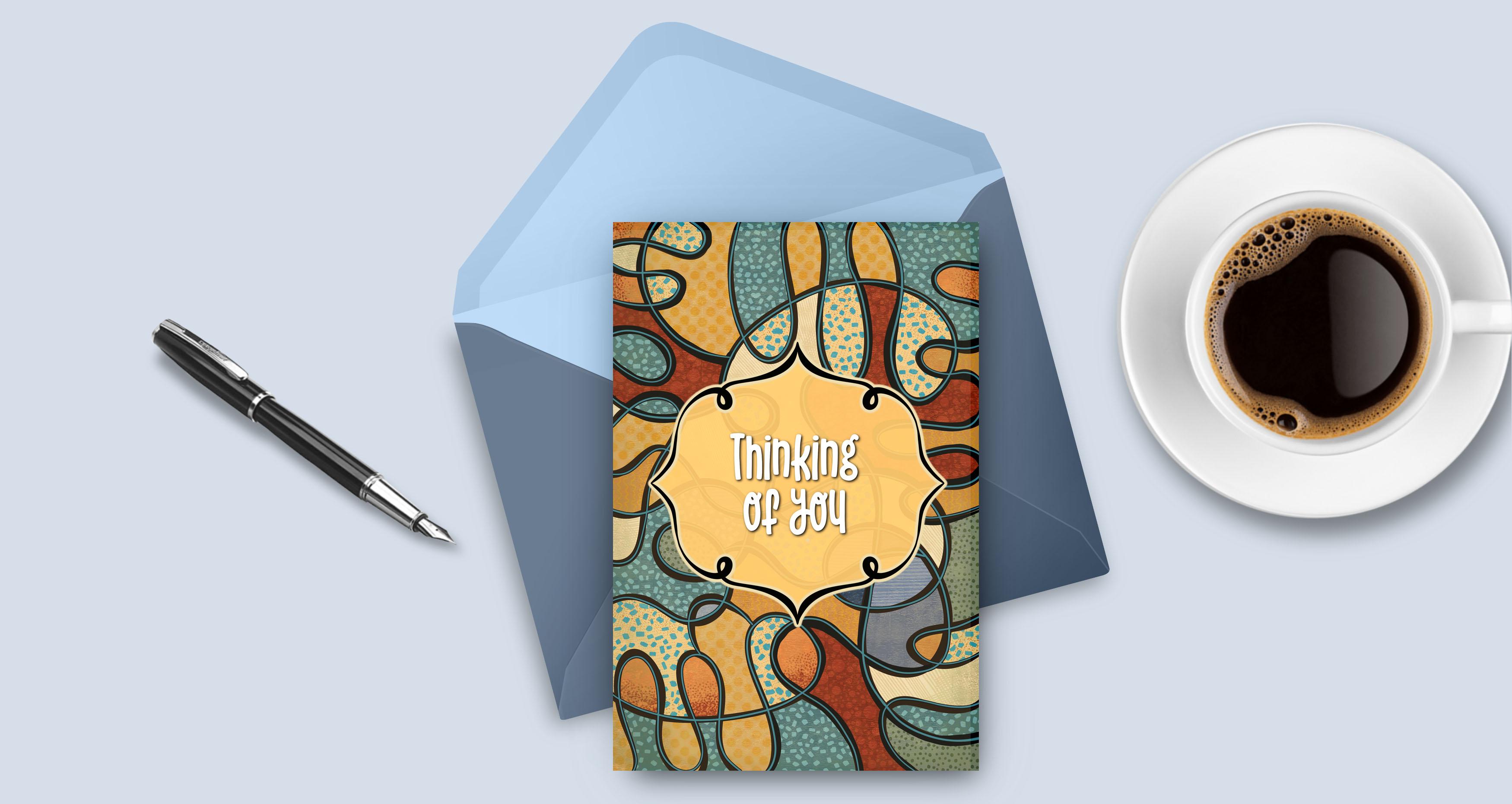
using a background like this for is in greeting cards. This is so generic. It can be used for
cards for him, for her, for just
general everyday cards. It's just a cool background. And once you add a frame
and some lettering to it, it can make a really
dynamic card. I just really hope that
you had fun with it. Now if you haven't
done so already, I'm going to suggest you hit
that follow button up there. That way you'll be informed
of any of my new classes as I post them in any
of the posts that I send out to all my followers. I would also suggest you get your name on the mailing list on my website so that you can get the alternate posts that
I sent out from there. That's where I generally
post things like the class, resources and free products, artists, resources of all kinds. Just get your name on that
list so that you're always in the null when it comes to
those things that I send out. I'm so glad that we had this
time here today and I really hope that this is something that you'll
have some fun with. Please post your projects. I love seeing your
finished work. If you have any questions, definitely post them in
the discussions area. That way, everyone benefits from the answers
that I can give you. So I guess that's it for today's class. It
was so much fun. I almost wish that
they hadn't ended. Take care, and I'll see you
in Wi-Fi following clauses. Buh-bye.
 Delores Naskrent, Creative Explorer