Transcripts
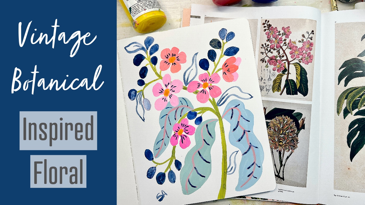
1. Vintage Botanical Intro : Do you ever struggle
with needing just a fresh source of
inspiration for florals. We love painting florals, and flowers themselves
are great inspiration, but sometimes it's just fun to find something a
little different. And if you've never discovered vintage botanical
illustration or really used it as an inspiration
source, it's wonderful. These are images that were
painted 100 or more years ago. And we've got this
source book to use that I'm going to
pull an image from. But you can find these images online on Pinterest
and other places. And what's great is
they're copyright free. So we have freedom
in choosing elements and growing heavily upon them for inspiration since
they're copyright free. And this is an
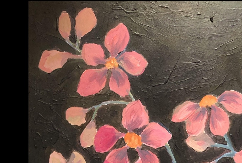
example of one that I did based on a
vintage botanical, and then we'll do another
one in the class, which is this one. And what's fun is they you know, I just used the vintage drawing as a jump off point
because, you know, they can be a little dark
or they're just not, you know, they're not my style, you know, but there are elements I really love about
some of them. And so what I'll do is pull that element
or that texture or that pattern and then just
take that artistic license. So I'll show you how to do that, how to make those decisions. You also have to simplify
these quite a bit because we're not trying to create
a botanical illustration. So I don't need this
level of detail. And fine detail and meticulousness
in this type of work. I just want it as a
source of inspiration. I'm going to show
you how to do that. This painting can be done in any paint you want as long as
it's a good quality paint, I'm going to use acrylic for it, and we're going to
have fun creating this basically I can end up being a print that you
hang up in your home, practice it in the
sketchbook or you can paint it on paper in the class,
either way is fine. But you're going to learn
how to take these images and just pull out what you want, simplify, and create
something beautiful. Hi. I'm Suzanne Allard, and if you haven't taken my
online classes before, welcome, and if you
have welcome back. I didn't start painting till
I was about 52 years old. I'd always done creative things, but I was just too
scared of painting. I thought, you know,
that's for real artists. I hadn't gone to art school, and I just got tired of
feeling that sense of regret. And I got tired of
making excuses. So here I am and now I have an art business and I'm
well acquainted with dealing with the fears and the doubts and the
impostor syndrome and all those things that we artists learn to have a
relationship with. And so now I sell prints and
originals on my website. I sell products, I license my work on various
products around the world, and I teach classes. I love teaching as much
as I love painting. I think it's because I want
I want everyone to realize that they have this creative
source inside them, and to not let the fear win, basically, like I did
for so many years. I think of myself
as an encourager, My style is I hope very much
what I needed at the time, which is a very encouraging
gentle style of teaching. We learn a lot, we have fun, and most importantly,
I want to keep you going because
if you keep going, you will get better if too many people
are shut down too early in the process or
shut themselves down, that being said, welcome to the class and
let's get started.
2. Vintage Project and Supply: For this vintage botanical
illustration project, we are going to pull inspiration from let's
see, this image. I flip through here
with you and choose it while in the class, but I end up choosing this one, and it is need the glasses. Something funny happens in
the class where I think I'm choosing one and I'm
actually choosing another, but this is the Pride of India Queen flower, it's beautiful. Then in the class,
I end up saying, well, why Look at that. That fake plant is gorgeous. Maybe that's another caning. Anyway, we'll take that painting and any paint that you
have that's good quality, and we'll use a sketchbook
or a piece of paper, whatever you like to create our own take on that
vintage illustration. We're just going to
pull a few things, leave some things behind and make something that
speaks to you. Let's look at the supplies that we're going to
use in this class. We're going to start
with a cup of coffee. Let's see here. Let me
talk about this book. Again, you can get this book, or you can get these images by searching
Pinterest or Google, put in copyright free vintage
botanical illustration. There are websites too
that are dedicated to it. And in fact, I'll put one of
those in the supply list. But they're just endless. The reason I went ahead
and purchased this book is because it wasn't
that expensive. It comes with a
digital download, although I don't think
I've done that yet, but that's nice if you
want to modify it. And I just like it
as a starting point. I just pick an image
or two or three that are just call out to me, or even when I'm doing larger pieces that
have more elements, just to get a reminder
of a texture of a leaf because these artists
did such detailed work. And what I like about the
book is a lot of times you can't When you get
these images online. You can't read this script down here that says what it is. But this one tells you what
it says, topical orchid. Anyway, I think I'm
going to have to do a class on just all the
things you can do with these images because
the possibilities are endless, patterns, prints. Anyway, we won't get
too carried away. We're going to have
fun using it as inspiration. You
don't need this book. I'm going to provide you
the image that we're using. Or you could find your
own image online, but I just want to
show it to you. Then I like to use
palette paper. That's my go to.
There's all kinds of things you can
use for a palette. Anything that's nonporous will do and that you don't
mind getting paint on, so you can use a ceramic plate. I just like the palette paper because you use it
like this and then once I'll probably use this
again for another project and it dry then you just take
the page and throw it away. There's all different
kinds of brands. I think I gave you a brand on the supply sheet that I like. But this one is also good. This is an inexpensive brand from Michael's here
in the United States. And then for the let's see here. Sketchbook for the vintage. I'm using this Stillman
and burn Zeta series, and you can use any
sketchbook you want. I'm not saying you
have to use this one. I just wanted to show it to you. It's mixed media paper. So it's smooth, it's
not watercolor paper. Watercolor paper
has that texture what's called tooth
if you can see that, but this is watercolor paper and has a bit of texture
and I love that. But sometimes it's really fun to just work on smooth
paper. It's really thick. I like it because it lays flat
and I like the size of it. We're going to use
this sketchbook for the vintage botanical. Then for the paint on this one, where
you can use acrylic. Now, I'm using Nova
color acrylics for this. Just because I worked with Nova color to
develop my own bundle. I mean, not my own colors. They're not custom color,
they're just collected in a bundle that is called the
Suzanne Alar design bundle, but you do not need
to get these paints. I would say though
just make sure you have at least a student
grade quality acrylic paint, or you could use
for this project. You could absolutely use acyl
gash you could use guash. You could do it in watercolor. You can do it in any
paint you want, actually, but just make sure please that it's at least a
good student grade. It doesn't have
to be all the way up into the artist grade, but you will just not you know, when people buy the
cheapest paints and then they try to paint it, it's just so
disappointing because the pigment load and cheap paints is just not
going to get you there. So In terms of colors,
that'll depend on what colors you
choose for the piece, but I'll show you what I use. When I sketch this design, a lot of times I'll use either a water soluble pencil or also called a watercolor
pencil sometimes. This is a brand by
super Color by Cara. It's a Swiss brand. These are called
super coolor twos. But I also just
will use sometimes a plain prismacolor
color pencil. You can also use to use a
regular old pencil pencil. Just consider for your sketch
what paint you're going to use because if you're going
to use high coverage paint, high opacity paint
like uh or acrylic, then you don't have to worry about your
pencil marks as much. If you're going
with water color, then you either want to go very lightly with a regular pencil or go ahead and get
one of these water soluble pencil so
that it disappears. Then in terms of color, I just choose a color
that's going to be the color of most
of my painting. I don't mind though if
let's say I've used a pink pencil and I'm going to paint green over
that if it's water soluble, I'll just around the edges, pick up a little bit
of that pink maybe and it has a nice it's a
fun thing to play with. I've also done this where I just took a bright
colored pencil and I wanted some of it
to show through or peek out into the edges. These are all ways
you can experiment It really is about you
deciding what you enjoy. Do you enjoy a little
bit of color like that, is that something
that you like, or would you rather have just a really clean flat
coverage and no edges. These are all things
that we discover about ourselves as
we're painting, and that's really how you
end up creating your voice. Your artistic voice and style is honing in on, I like that. No I don't like that,
like this. I don't like this and it's
just a process. That's why we always
say the more you paint, the better you get the closer you get to what you
like to do in your style? So that's for sketching. Brush wise on this project, I used. Where did you go? I had you out here. I have
a round. Oh, here it is. Around, Okay. Well, two brushes I
used on this project. So this is a brush from the set of Suzanne
Allard design brushes. I'll just show you
a few of them. What I did is I put together ten brushes, different sizes, different shapes, the
ones I use the most and, you know, put branded
them and had them made. And we sell them
about twice a year. There's a waiting
list on my website where you can sign up
for the next release, but you do not need
these brushes. Basically, I just look for a good quality synthetic brush. Synthetic is softer and we'll just give you
more give than, some of the stiffer
brushes or you don't need a natural fiber brush. I used to filbert. I
like this Filbert. This is a number four Filbert
for this kind of work because If I'm doing
leaves and flowers, it gives me that
rounded edge, you know, to be able to like
this is the sample painting kind of that I've done based on another
vintage botanical, but it'll allow me to get those nice petals because
it's rounded at the end. Not to say you
have to have this, not to say you can't use a flat regular flat
brush like this. No, that's a round
brush. Let me show. These are my three go to probably this is
what's called a flat. So I'll just flat across
the top. Let me get closer. Okay. So you've got flat
and then this is a filbert. Probably might be hard to tell, but this is rounded at the end. Anyway, That really
helps with that kind of thing gives a nice softness. But I've seen people that
becomes part of their style. They like the edgier way that the flat works.
Play with it off. Then I use a smaller brush. This is a number four
Blick golden Taclon brush, and I like these little brushes. In fact, I've got
a art supply page where you put the link in the supplies and you can get these or how they're
really inexpensive, but I like these for smaller
details, I even have. I have some really bitty ones. This is a two. So those help
with the smaller details. But really, I only used
two brushes for this for the painting that we end
up doing. And let's see. I wanted to I talked
about brushes, I talked about sketch pencils and palette and inspiration, and that's going to cover it for the vintage botanical
painting. It's so much fun.
3. Gathering Inspiration & Sketching: All right. Let's do a
updated vintage botanical or our own
interpretation of one. So one of my favorite
resources and sources of inspiration is vintage botanical
illustrations, and they they have always I just thought
they were always so beautiful and detailed but not the kind of painting
that I wanted to do. I know I love it, but it's just not my thing. I don't have the patience and other people do it really,
really well and love it. So I love getting
inspired by these, and the thing is that I
don't know if you know this, but these vintage ones
that are old like this, there's no copyright on them, so you can use them
anyway you want. They're copyright free
because they're so old. So you can actually I don't recommend this because
it's not it is creative, but you could literally
copy one of these exactly and sell it. I like to use it as a jumping off point for
creating forgetting ideas, for textures, shapes,
all kind of things. I'll put this book. There are lots of
them out there, references like this, but
I really like this one. I've referred to at the most and I've returned
some of the others. Just the image
quality wasn't great. Then it says here, that there's a download page for
these images as well. So I just like using the book. This is one that I created
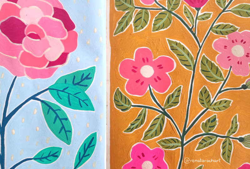
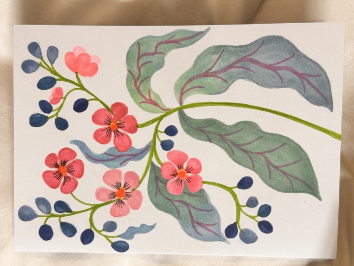
that was inspired by this. And since I love
really curvy stems, I went further with
that and, you know, did my own color scheme and
my own interpretation of it. So I thought we would do that. And when I was looking through P went out for us to do today, I like this fig. The other thing I
like about this book is if you see these
images online, you really can't read. Sometimes it's in another
language, what it is. You can see, it says
the breadfruit tree, but you can't really see what it is, and
they tell you below. This is a fig plant. You
can see the little figs. But I like it because
I like these shapes, and then the stems are curvy. I think the leaves
are beautiful. So I'm going to use that
as an inspiration and I will put it both a link to the book if you'd
like to get it, and then I will also
put a picture of this image in class resources. So for now, I'm going
to put that over here. You can print it out and
have it to refer to. And then This sketchbook
is not watercolor paper. It's mixed media. It's Stillman and burn is the
brand right here, and I'll put that in
the class applies list. Is smooth paper. It's
just something different. It's not necessarily actually
this is from my last class, my one brush three colors class. It's not better or worse, it's just different and I
thought we would use this one. Let's go to a new
page and at there. My upside down paintings and start with a
brand new clean page. Get this little reference in my mind and start
sketching something. I think I'll use that
light pencil again. I could use a light
pink as well. Maybe I will since I probably will end
up using pink here. I want to make sure
you can see it though. Let's see. I will
include my sketch. We'll take a picture
of it. Yeah. I'll just draw hard so that
you can see that. And the picture goes kind of to, you know, this way. I might curl it even
more. This one curls up. I just like they never like
to start these in the middle. So let's see. Let's just take kind of
a line up like this. This just gives me kind
of a place to start. This is going to be thicker now. Okay. You don't have to sketch it. You could just paint it in or pain or sketch
a paintbrush, too. But I'm going to try to do this one without
too much fussing. A big leaf. Okay. Another big leaf over here. You'll notice a lot of these botanical
illustrations they'll end at the end of the
paper. So I just change it. Oh, look at that.
That is so fun. It just caught my eye. That is figure eight.
That's the fig plant. I was going to say this didn't seem big enough
to be the figs. That's the fig plant. I
was reading it wrong. This is Croton Pride of India, Queen flower, Queen
flower, Pride of India. Okay. That's what
we're painting. But now, I'm going
to have to paint those figs another time
because those are beautiful. Maybe it gives me an idea. Maybe we'll do this
striped thing on these because I was going
to make these bigger anyway because I
thought they were figs. Let's go back to the leaves. This one cuts off in
the illustration, but I'm going to put
the whole leaf there. Then I want a third leaf, which I'm going to put somewhere else because there's no
room down here for one, but I'm going to wait to
add it until I get some of these buds and
flowers in here. So You have a lot of
these bud shapes just coming off randomly in
multiple directions. And then these flowers, which have very
pronounced petals with the space in between them. So if I imagine, say, the center of one here, and I would do
something like this. I'm trying not to
make it too uniform. That came out pretty uniform. So the next ones I will
make a little bit less. And let's put one here and make the
center going this way, which will force me to
think of it differently. Okay. And going to make this branch
a little thicker, which I can do with paint. But just to remind me I do
it with the pencil too. Let's see. I'm thinking about where things might
run into each other. This do some things here
because this has the buds. I put a flower here
that's going sideways. Maybe it looks like
that. We'll see how it comes out with the paint. So see tighter your sketches, the tighter you're painting. That's what I'm
thinking about as I'll put this one
flower up here. Sing don't get with
this drawing. Okay. And I'm varying shorter
petals on one side, create the illusion that it's facing in a
different direction. So I'm just creating
some variety with that. Okay. I want to make sure I have room
for that third big leaf. So I think I'm going to bring
it up here behind here. Something like that,
maybe more like that. Okay. And do some buds down here. And a flower looking this way. It's probably enough. You know, something maybe some bods here. All right. Let's
get the paint and see if you want to
make any changes. Actually, I'm going
to pause here and take a picture of
this so that you have it. Then we'll start painting.
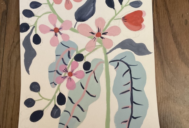
4. Beginning First Layer: All right. I've got
some paints out. I'm sorry, that's my chair
rolling on the floor. But I got them out. I'm going to use acrylic. Let's use the va color. I've got the cadmium
yellow, cadmium red light, alt Marine blue, and my
coveted fluorescent magenta. I didn't get the blue green out. Let's see that's
the other color I use a lot. Let's just
see what happens. You can make an amazing
amount of colors with these four, even
just three of them. That's the other way that I make these my own and the
course personal preference Use any colors you want to
do any part of it you want. I'm not going to make
it crazy bright, but I am going to make it more interesting to me than that one. For brushes, I have
the number four round and then a smaller number
four rounds funny, even though it's a four,
it's tiny, a three, and then this filbert can be really handy
for things like this. You can use round or if
you've got, let's see, yeah filbert that
comes in my set is actually the perfect probably better, a little bit larger. Color wise. Let's think what we want to do. Color inspiration can
come from so many places. I generally start by either
find a picture that I like or literally just start making one color
and go from there. Let's do it that way.
I've been loving lately a periwinkle blue. Which this ultramarine blue
and white make really easily. And what might be fun is to do something different
than we normally do and do the leaves in a blue or maybe had a touch
of who that's pretty. I like that. Let's see. That's a really soft blue green I'm not going to fuss because I like that you can see
the brush strokes. Yeah. This number four
Filbert is perfect for these. It's my favorite brush. I like the flat too,
but it's so versatile. I can go this way or I can go
on the edge to make a line. But you can make
this a very water colory type painting just
playing with texture. But I'm going for those
thick brush strokes. Just because I'm in that mood. Sometimes I want it flat
and water colory and sometimes I don't
make a little more. I don't mind that next batch I make might be a
little different. I'm not worried about matching colors and
something like this. In fact, I'd rather be just
a little bit different. I will say this smooth paper because it doesn't have texture. Paint goes on really easily. Let me do that last one. Take it back in the
blue direction. Okay. Really pretty. Now I'm debating if I
want to paint the stem. Next, I think I do because
then I can put the flowers on top and push out any of the stem that I get
that passes over. So I'm going to do I was
going to say a darker green, but I like that right there. A little more limey
green because that will make the eye follow
along on this stem. For the stem, though,
I am going to go with a smaller brush. Except the main stem here, I can do that with this one. I just go on on its side. Long as I don't
have too much pain on there and it'll
make it too fat. Nice. Okay, now I'm
gonna switch. Okay. I am trying to stay in
the lines that I made. But again, if I
go over anywhere, I can go over it with whatever
we put on the flowers. And I'm trying to
do just one stroke. See how I've got my right pinky, like a kick stand on
the paper that helps me stay and then just don't drink coffee
before you paint like this. It makes my hand shake. Maybe it doesn't do yours. A, don't worry about trying
to be perfect either because your style part of your style is
your brush stroke. It's like your handwriting.
It's your signature. So if it goes a certain way, if you look at artists There's a definite distinction
in their brush strokes, and that becomes
part of your style. Okay. I like that. I also like that the pink pencil is
showing through the line. Now, I'm going to make
the flowers one color and the buds variation
of another color. I think a soft pink
would be pretty. Let's see if we can make one that I like the magenta
with white is beautiful, but it's a little too cool
for what I want here. I'm going to add a
little bit of yellow. And what I'll do
sometimes is not mix the colors all the way so that there's a little variation. I want some variation. So I'll put some little patches around that are a
combination of these. That way I've got some
different colors. I add some water, so I have plenty of paint on
my brush. Okay. Watch that drop of water. That has gotten me more times. When you rinse your brush, you'll think you've
got the water out of the bristles
and you will, but they'll be a
drop of water on the handle that'll drop down. So I've learned, you know, go like that, dry the handle. So I'm just moving
around so that I get a slightly different color. Try not to overwork
either because I like how the brush strokes can
look like part of the veins. If you paint each petal going out in the direction that it
would naturally go, then you'll get some nice
brush stroke texture. And color variation. You can either go
inward or outward, but definitely paint in the
direction of the petal. I should say definitely. When it comes to art,
there's no definitely. If you want it to look
like veins, I would say. I want a little bit
brighter one here. I'm really putting
the paint on thick. Because that's the look
I'm going for here. Okay. Now, maybe one that's really pale and
a little more red. We can put the back petals of these light and something on
the forward petals. Okay.
5. Completing First Layer: Back to that idea of your brush stroke is like
your signature. Let's say that you do shake. Maybe you even have a condition that makes
your hand shake. Well, that broken line in
your stroke or that movement, that mark that you make is
part of your signature then. There are artists who
do that on purpose. These are really. I'm going to just add a touch of yellow and really
warm up one of these. You know, we're not doing a precision botanical
illustration. So we don't need
precision and we don't actually want that because it'll kind of take the
character out of it. This would be pretty on top
here. Maybe a little darker. Just keep playing with the
paint consistency till you get enough viscosity that you can get the coverage you want but also control
it to some extent. One of the things we
love about pain is how does in some ways
does what it wants. The buds. What do we want
to do with the buds? We could either go yellowy. I don't know. But while
I'm thinking about that, and this color is still wet. These leaves keep telling me, put some marks on me with that color. So I'm
going to do that. Okay. With veins, all you really do start
at the beginning. I like them to move around, I like them to not be in
the center of the leaf. And then you can take it
as far as you want with, you know, lines
going off of that. You can do them on
one side, both sides. If you look at nature, it's the possibilities are endless. Can you even make them
lighter on one side. Maybe that side of the
leaf is in the light. Okay. Let's see. I'm going to make a
really pale yellow and see what I think
about that for the bud. Kind of leaves me flat.
Well, we can try one. We can paint over it. It's not doing anything for me. Let's play with a type of green. Maybe a dark color
for some contrast. Let's see what that looks like
a little tester card out. That's okay. But I'm
not excited about it. What if we do, like, a
real dog see if I can get This is the t Marin
blue with a little red and yellow. I like that. I think we found it. I'm
going to let that yellow one dry. I do love indigo. It's pretty dark though
compared to the rest of it. But I won't put
that much white in. I've done that to
Indigo so many times. Too much white.
We'll start over. So what this indigo will be nice for is some details on the center of the flowers
and maybe elsewhere. I can more yellow in that. Just a bit. I'm picky about my indigo. All right. Now, let's
try just a bit of white. It's still changed it a lot. I think what I'd rather
do is just water it down. Let's try the water down indigo. Yeah, that's pretty. It'll be some variation. That's a bit of a warmer
indigo and a cooler one. So we can mix it up. This is how I use my
sketchbook just experimenting. I don't plan it all out beforehand because that's
what my sketchbook is for this creating and trying
different things. I've never painted
this painting before. I've never used this exact
color palette before. Okay. Then you'll have all
these paintings to refer to when you want to make a larger painting
or try combining two or three of the things in different paintings
in the sketchbook. I'm just going back
and forth between the warmer and the cooler
indigo for some variety. Okay. This is going to be funny
because yeah, it's not dry yet. It's going to have that
yellow underneath it. We'll have to do
two coats on it. That is just going to end up
looking like a little bit of texture and might discover
something and say, Oh, that looks really cool. I want to do that on
the future painting. I guess I don't need to
hold onto that anymore. I'll show you something else
you may know about this, but if you wanted to
play with texture, you take a clean paper towel and blot and we'll leave those two like that just so
we have an example of them. I can give you I'm going
to put a couple somewhere else because that's. See that. I like that. I have to work in three. Okay. I smeared it. That's okay. Sketchbook. And if I did decide
that I wanted to scan this in and make
prints of it or something, I could just clean
that up and photoshop. I can also just make it
a bigger one right here. What? Okay. Now, the center of those flowers. In the reference
photo, they're yellow, but that doesn't mean
we have to do that. I do think an orange
would be pretty. Let's see if we can
make an orange that I like a yellowy orange. Yellows got mucked
up in the green. Let's try that. No, like that.
6. Finishing and Adding Details: I'm looking for something else. I think what I want to
do is take the end to go and do some little
lines on the flowers. So just grabbing my scrap to make sure I'm getting
the right size line. Making sure the flowers. There is a piece of fuzz there I guess it's a stray
hair. That's okay. You just do a little test on your paper to
make sure you're getting you don't have too much water or you have enough the kind of the
look that you want. Still see some
water on there that wants to drop off the handle. It there was Okay. I just really lightly
barely touching the paper. I know that's the outside of
that, but it doesn't matter. It adds a nice bit of contrast. I. I also think I need I want
some variation in the stem. I'm going to grab a
little bit of the indigo, really water my brush
down and just add a bit of it on one
side of the stem, just to give a little dimension. It's a little flat. I'm almost giving it a glaze. Okay. I'm wondering what
some of the indigo would look like on a
leave on this part. I'm going to try it. I like that. It just shows up better. But it's drying because I
watered it down so much. So it's drying not showing
someone to hit it again, and then I can always do a
colored pencil when it dries. I I rut more definition. Just dropping the color in All right. The only other thing
I'm thinking about is some smaller leaves up here. But we could even do those
with an outline way like this, just kind of create
some leaves like this with a really
watered down indigo. It might be. Let's try
it. It's a sketchbook. I'm thinking coming
here like this. It's whatever your
imagination wants to do. I'm just looking, do I want another one somewhere,
stepping back. I do like what that did. Maybe one up here. Okay. But of course, I work in odd numbers, so I put a fourth in that
means I want to find a fifth. I like how they move
the eye around. I'm thinking about
one down here. There we go. Take whatever color
we want and sign it. And looking at over
one last time. Now that the yellow
centers of dried, I'm going to put in just a
bit brighter orange on top. We yellowy. Yes. That was fun. So
you might look at this reference photo and
says there's no similarity, but it was enough that it gave me a place
to jump off from. And I want to show you
something cool that acrylic does when you do da over. So if you look at the stem and you may or may
not like this, but See how when they took that watery
indigo and dabbed it in, I made these cool bits with almost like a
little outlined shapes that you would see in a branch. That's pretty fun. So just something you learn every time you play
in your sketchbook. Every time. It's amazing.
7. Wrap up and Resources: Thank you so much for
joining me in this class. I hope it gave you
some ideas on using fresh inspiration
sources and how if we just view an image or something we photograph or something that's a
completely different genre like rugs or fabric or
the texture on the wall. Really if we start to
think like artists and really see like artists, everything becomes an
inspiration source. It can be a little overwhelming. Just ask my family
because anywhere I go, I'm taking pictures of
just about everything, but I love having that sort of filter and
looking at the world, and it didn't just happen. It developed over time,
and it takes practice. So I hope this gave you
some ideas on how to do that and how to think about everything you look at
as potential inspiration. Remember that I have
a Facebook student only group and you can either sign up through that through the e
mail you got when you register for this course or if you're a skill
share student, then you just use
your e mail that you just say that you're a skill share student when you
try to get into the group. And I have lots of resources
on my website, San com. I have a blog where
I really speak to a lot of the fear and just how to how to continue creating and deal with the
different obstacles that come up emotionally. I also have an e
mail newsletter, we're pretty much right
to the same thing, and I have a YouTube channel
trying to make sure, of course, my Instagram
and Facebook. I do a lot of time lapses and
just things to continue to hopefully inspire and give
you ideas and encourage you. Thanks again for
joining and I'll see you in the next
class, keep creating. It's good for you. It's good for your soul and that means
it's good for the world.
 Suzanne Allard, Landscape, Floral, Abstract Painting Teacher