Transcripts
1. Intro: Hey there beautiful
creative person. Want to really expand your
Art skills and hone in on your style while simplifying the whole process as well. Or maybe you're new
to painting and intimidated by all the supplies
and nine, where to start. Maybe you're all over
the map creatively. And want to learn how
to simplify and be looser and expressive
and your painting. Or you could be struggling with a lack of cohesion
in your paintings. Like maybe they just don't
seem unified or hang together. Even if you're an
experienced artist, limiting your supplies, this way will really stretch you and help you grow
in unexpected ways. I know it didn't
need. We will explore all the possibilities of marks
made with just one brush. You might also be in a creative slump or retina
that know how to get out. These are all the reasons
this class is for you. You're gonna be amazed at
some of the paintings we create with one brush and
three colors plus white. Of course. What are your
annuli or a seasoned painter? This class is going to
ignite your creativity. I'm Suzanne Allard and my passion because
creating ART that exudes joy and encouraging others to express
their creative spirit, which I believe we all have. I didn't start painting
and tell us about 52. And I've learned just
about everything I know in online
classes just like this. Now, licensed my
Art for products, sell originals brands, various products on my website as well as teaching online. In fact, I now have about 40,000 online students
across the world. I love reading notes about how your rediscovering
your creative selves. I used to be terrified though. It's a thought of
learning to paint. I always done
something creative, like knitting or faulting,
needle point quilting. But I thought painting was for real artists and I just
didn't see myself that way. And so that's why
I'm on this mission. I becomes a teacher
that I needed super encouraging and
real relaxed phon. I hope that overly technical
arisen. This class. We're pairing things down to
the essentials to help us expand our confidence and
our knowledge of color, as well as inspiration sources. We're gonna be very creative
with our limited resources. This class has over 4 h of instruction for every
step of the way. It's essentially seven
mini classes in one. This is one of my projects. Be sure to download the class
resources and references. And while you don't need many supplies or this class,
That's the whole point. You can always find my recommended supplies links on my website at suzanneallard.com. We'll start with a supply and Color Wheel video
and then learn about the three main brush shapes and them and what they can do. Then I'll select
three specific colors to achieve the goals I
want for each painting. And then we'll paint them. We
paint a couple of florals, one loose and one bouquet,
a simple landscape. We do a Matisse portrait,
very simplified, an abstract, inspired by
my recent trip to Italy. And another bright
happy abstract and a still life
abstract with pots. This is a wide variety
of subjects so that you can experience a wide
range of possibilities. I am so excited to see the discoveries you make and what you create
in this class. So let's just get to it.
2. Supplies and Color: Let's talk supplies. So let's see you are to restart. Alright, let's talk about, I did this class in my sketchbooks because
if you've taken any of my other
classes or follow me, I'm a sketchbook looking around, looking at the five
or six that are just within view and I'm
a little obsessed. I just love the freedom
that they give you. So I used to sketchbooks
in this class. This is a mixed media one. And I put links to both of these in the class notes,
class supplies. This is Stillman and burn, and it's a mixed media paper so it's smooth but really thick, holds moisture well, if you want that smooth paper and then this is a
watercolor sketchbook. I just wanted to
give you a couple of options which has that
they call it tooth. It has that texture to it. So just a personal preference. And this is a really inexpensive one by Artesia and
I get it on Amazon. I like the size and it's
very nice for the money. So, but you do not need to
go out and get a sketchbook. If you don't have
one, you please. A variety of papers that
are perfectly adequate. Strathmore is a good brand. Kansan is a good brand, is canceled, makes all kinds. These are both Watercolor paper. Then there's a mixed
media, rough or smooth. And then there's this
Canson watercolor paper. I would just say if
you're looking for paper, try to get 140 pound or heavier. Now this one is only
114 pound because I was looking for something a
little sooner because I might make a sketchbook
out of this paper. But generally the rest of these, the ones in these books, or at least 140 pound. And it just gives you more, more to work with, kinda
holds up better. In general. That's papers and sketchbooks. And Let's talk a little bit about this whole premise of this class is one
Brush three Colors. And the reason I
created is I wanted, I want people to want to
simplify creating with paint. I didn't want people to
not be intimidated and think they need lots
and lots of supplies. So I thought I would bring
it down to its essentials. And at least show
you what you can do with just one brush
and three colors. So paint, I use a variety of paints I use in the
class, Apple Gouache. And that's these over here holding and Turner brand
than regular gouache. I'll explain the difference in a minute. And then Acrylic. Am I going to go in a lot
of detail on the paint, but you can use any
paint you have. You can use watercolors,
you can use acrylics. You probably, if you're
new to painting, don't have Gouache,
don't worry about it. It's an opaque watercolor. What I would do if I were
putting these on them in the order of how
they are created, you have acrylics and
I use the Nova mostly. But I wanted to show
you that you can create with inexpensive
student grade paints as well. Then you have Apple Gouache, which is really a
combination of these two. And then the Gouache, which like I said, there's
a visit opaque watercolor. What they've done though would it creates is a really high. Let me see if I got some flesh. Yeah. It's very
opaque and chalky. You can see here the
texture is really opaque and chalky.
I just love it. It was my first love. Then
I discovered agro Gouache, which kinda takes the properties of boats and combines them. The difference is that this cannot be disturbed
with water once it's dry, just like Acrylic.
This one can be. So this Painting, if it's hot, it's all actual Gouache, not a combination
at Apple Gouache. If I were to take water
and disturb this, I could get it to move again. So those are properties that
you may or may not want. I think for, um, it's just, it's just
really up to you. So Acrylic, agro
Gouache, Gouache. Those are the three things
I'm using the class. Again, you can use
whatever you paint, you have Watercolor
with the acrylics. I do have a collection list, Nova Color in California. Those Suzanne Allard collection
this on their website. I love these paints
because they are a artist grade paint at
a student grade color. If you're in the US,
there are a great deal. Unfortunately, if
you're out of the US, the shipping make some
cost-prohibitive. I also did just some
basic student grade. I did one painting with
these because I want you to see that you can create
with whatever you have. I used one brush
and each painting. So you can literally just do the whole
class with one brush. I think the two that he
used the most worthies, the flat and the round. The round is a number
6.5 that I used, I think ended up being a
number for mostly edits, bare core, you need three
colors and you can even mix. You can have one Watercolor when Acrylic one,
see what happens. One brush and some paper
that's at the base has Bottom lines, that's
all you need now, at the end of this class and the details
in a bonus video, I do take some colored
pencil on paint markers and gold pounds and add
some details to the paintings just to
show you that option. But here's another
sketchbook I love. This is by handbook and it's a really nice
watercolor sketchbook, holds up really
well to everything. So I don't think we do a painting or in this
class on this buzzy look, that one was one color. Maybe that should
be my next class. One color, one color, one brush. Alright, let's talk about
color a little bit. So the thing is in a
color wheel is helpful. I have a link to this
one in my supplies, suzanneallard.com with
pretty much a link to everything that I use and all my favorite
books and all that stuff. But what's nice
about this one is there's just so much
information on it. You can flip it over
and immediately see the triangle and move it to. You're gonna get your most
variety of color mixes from going in a triangle
across the color wheel. So if you can pick any
triangle you want, you know, people consider the primaries yellow,
blue, and red. But people also say that the
modern primaries are more of a magenta, yellow,
and turquoise. Sort of in-between
here and here, and then between here and here. But it can help you to think about the three colors that
you want to play with. And I would start with
using the triangle. So turned around and say, Okay, I'm gonna do something with a blue or yellow and red orange. Or I'm gonna do something
with a red, violet, turquoise and a yellow orange. Or you can move a little bit, but then play with them. We'll do this on the class. Some more analogous colors, which means on the warm side closer together and
the color wheel, or on the cool side
closer together, those can be pretty
more monochromatic, meaning the colors are more similar because they're next to each other on
the color wheel. So these triangle colors
are called triadic, which is really easy to
remember. It's a triad. And I do, even though I've been playing
with color for years, I still refer to the
color wheel when I, when I want to think, okay, if I want to do a yellow orange, what was, what were the, these makes some three makes
some beautiful yellow, orange, blue, green and
red violet combinations. So the color wheel is helpful. You can also, you
don't have to buy one, you can look at it online. And a lot of people do an exercise
where you paint your own, which is found to do to, it won't turn out quite the way. But they do, you'll find, but it'll allow you at least to see what
the paints you have. If you take your
blue, your yellow, and your red, and you start
mixing toward the middle. How to get the rest of these colors and
only show you what, what colors your particular
paint will produce. I do think a fawn color to throw into the mix is a
fluorescent pink. We'll use that in one or
two of the paintings. So yeah, color wheel is helpful. I wonder if I can put a
picture of this. I guess. Yeah, there's there's
pictures online. I was gonna say if I
could put a picture of this in the Class Resources. Yeah, I think it's
easier for users to Google or color wheel
if you don't have one, you'll see that with
just three colors. This was page two of just three colors
that we did in one of the modules and in
another module. Let's see. And get some
this be in the sketchbook. We came up with some
beautiful colors. Where did you go? Oh, I know where it is.
It's hint this one. See, that's the problem of
having to Italy sketchbooks. There's no such thing as
too many sketchbooks. Here we go. These colors, I love that we came up with
for one of the modules. So beautiful. Love it. So anyway, alright,
grab whatever you have, start there, and don't feel like you have to have
a certain thing. If you can at least
recommend you get a good quality paper and as good quality
paint as you can. Even if you just get three
colors and six colors. If you're choosing
six colors, most, most paints come in a primary
sets so you're ready, read out the gate. But if you were choosing
only six colors, I would say you'd want a yellow, turquoise, blue, or
red, and a magenta. That's five actually, of
course you need white. Because you can make, you
can make an orange. Yeah. Alright, let's get to it.
3. Brushes Practice 1: Alright, let's look
at some brushes. So there are three main shapes of brushes that I'm
using in this class. The bright or would I call, it's a square or rectangle
shape at the end. And they come in different
sizes, of course. And I end up using this
quite a bit in the class. I really love this brush. This turquoise set is a set
of brushes that I designed. They're sold out. But
if you're interested, you can go the waitlist
on my Website, but any good quality
brushes will do. Don't feel like you
have to have these. Do try though, to not buy
the cheapest brushes. See if I can show you a cheapy. I mean, I've used this. This is the hardest loft brand
from Michael's and the US. And they're fine if
for color mixing or to use as tools to
do different effects. But for our class like this where we're not really
scrubbing with the brush, we're trying to
get it to perform. In fact, in one of the modules, I'll show you where
I'm using one that's trade and give some
interesting effects. So you have your bright, also called flat shape. Sometimes the bright
is a shorter. You see if I can show you. True. This might
be a true bright. Because sometimes the flat means that this part is longer. And on the bright, it's kinda bit
shorter like that. So maybe more. Think of it as, I guess the way I think of
it as the bright is more of a square and the flat
is more of a rectangle. In any case, we're just
using these, the flats. And then I use a filbert, this a different brand
of it, CATAlyst. I'll show you that in
one of the modules. Then the next shape that I
use a lot of is a filbert and it's like a flat except that his rounded,
really versatile. We'll see what that can do. There's another one, those are my filbert and then
of course round. Sure. Using the shapes, but they come in
different sizes as well. This is a foreign a six, you really end up
using mostly 4-8. Yeah, this is an
eight in my work. And if for unless I'm gonna
do some real detailed stuff. But for this class, since we're using one brush, we don't want to use, say for example, a
brush like this. Although I guess that could
be an interesting experiment, I'm not going to say, don't
try it. This is a liner. But you can see that if we were to try to create
a whole painting now, now I'm thinking that
could be phone to try. You would just marks, that's what you could do this. That would be a
creative exercise. And then another, I don't use this in the
class, but a fan brush, you could challenge yourself to do an entire painting
with a fan brush. But since we're trying
to see what we can create that is more, less abstract, those
would be pretty abstract. Then we're using
these basic shapes. So let's just grab one of them each and kinda see
what they can do. So that we have a sense of that. Start with, I'll just use this. I ended up using
this bright a lot. So I'll use that, I'll use around and
I'll use a filbert, but the rest, one of each. And we'll just get
some color out. I'm not doing color
mixing per say right now. Really just want to show you
what the brushes can do, especially when you add, depending on how
much water you add. So I'm just kinda pull out
some fluorescent magenta because it's so pretty. And get a paper towel handy. Favorite house,
really important for controlling what
happens on your brush. I'll give you an example. Let's say I wet my brush. And I have, okay, That's a good
example right there. I've just wet my brush.
There's water all over here. There's water in the bristles,
but there's also water all over the handle because
I stuck it in there. If I don't blot that and
I go and get some paint, the droplets are gonna
go down into my paint. And I'm going to get a
real watery situation now, if that's what I'm
looking for, great. If I want, this is
Acrylic, but if I want, kind of got Watercolor
paper here, if I want a watercolor
effect, great. But you'll see me often. Because I want to control
is, I'll go like this. Even if I want water
and the bristles, call at least try this,
I'm not adding to it. Now the opposite of that
would be a dry bristle effect So that I just dried
out the bristles and see that good scumbling. It's called, especially
on a watercolor paper, you get that lovely texture. That's look at the
difference, just water. I mean, same paint, same brush. That the difference is we
can get and of course, you can go somewhere in between what your brush a little bit, get some paint, and we can
get a nice thick effect. So you're seeing one of the reasons I love
the filbert shape. I mean, it's so,
especially for florals, it's so naturally Floral. And what is great about it
is lots of meltwater out. If I'm painting this way, then I get these effects. But if I want a line, I just hold it on his hand
and I can make a stem, make an outline, and
you can practice just getting a piece of paper. And this is the one that's
a little bit frayed. You can see the end of it. But I have not taken
good care of it. And so it's gotten afraid if
you take the care of them. I have some others. And it helps when you wash
them to flatten them out with a paper towel and so that they bristles dry, nice and flat. Also when you're drying, after you wash your brushes, don't put them back in your jar. Here's my jar of brushes. Don't put them like
that when they're wet because the water
just goes down into the Pharaoh and
water lily damages everything pretty much so. Once I've rinsed them,
I just lay them flat. Once they're dry,
they go in the jar. Just a little bit
of brush care tips. You can use a condition or two. You can use shampoo on your brushes to think
of them as hair. You can use a conditioner,
hair conditioner to. So, alright, so that's what
we can do with a line. We can also control things that we're going to
play with this in the class. How we hold our brush. So tighter work tends to be holding the brush like a pencil. So if I wanna do very
controlled precise leaves, Let's say I want to do
something like this. A little bit more paint. Then you see that i'm,
I'm going slower. I'm holding the brush so
that I can really control. It. Just depends
what you're doing. But if you want to be loose, so let's just do a similar
leaf thing but loose, you can either hold it
further up like that where you can hold it like this since the latter
artists do that. And Lynn, I want to
be really playful. Like just I want a flower shape, but I don't want it to be over tight and I want it to
be just kind of organic. How I'll hold my
brush like that. Because like that and
some leaves like that. I'll just get some
you'll see them. One of the paintings we
just something like that. So that's the filbert
and really versatile. The only thing that
I would say it's a little harder to do is, let's say you were
doing a geometric shape with a filbert because
of that rounded edge. Let us know. Okay, let's
get to do an example. I've noticed. Let's say
I'm doing a building. Maybe it's a little house. And we'll just make
it really simple. Can be challenging to
get a good corner. See that? Because it's round. So you can kinda go
like that anatomy. You can do it for sure. See I did it. You just dab
and control like that. But you'll see with
the filbert or with the bright and flats,
That's easy peasy. But again, if you're not doing really precise
work and you want the looser painterly effect than you might not be worried
about a perfect corner. This is all stuff you learn. You just play, play
with your brushes. It's a great thing to do on
a day that maybe you don't have a lot of time
or you're just not feeling super inspired. And so you just get out a brush and one color like this
and see what you can do. Alright, so that's filbert. You can even like in your sketchbook or on a
piece of paper like this. Make notes. This is a filbert
and it was a number six
4. Brushes Practice 2: Okay, I'll put this
class resources too, just so you have a reference. Alright, maybe we
should change color, which would help
us keep organized with the different brushes. This is nova color
paint, by the way, and Acrylic paint that is available online
but not in stores. But just get yourself a good student grade
or artist grade paint. Alright, now, I'm not
using this Hilbert. We're done with you.
Over here. You dry. Let's do the flattened next. So I'm waving my flatten out. If I want See that's
what I was meaning, but get it to dry that way. If if I'm wanting really
precise line with my flat, then I could do that first
before I put paint in it. Just a little tip.
Alright, let's take some of this
beautiful blue-green. And let's do something similar. Just make a loose floral. You'll see that the petals have a square style
and allow us. One of the things this
class is great for is help me you zero in or hone
in on your style. I've seen an artist I can tell immediately chooses
a flat brush. I'll her florals look like this. They all have that
edge versus this edge. There's a Watercolor
Floral Artist wholesale who flowers all have fat. So you know, she's using a filbert and that's
what she loves. So you might love this look. And so remember
styles about what you love and just doing more
of that and noticing that. So if I were to do
a daisy with those, it would end up
looking like that. Of course, I can manipulate
the brush and do something like this so
it doesn't have to. The flat really is
incredibly versatile. We can also use its line, its side, just like
with the other one. And do, especially if you get a little more control and
haven't had too much coffee, which I guess I have
because I've made a blob. But anyway, that
looks more natural. But you can get very, if you practice paper, you can get a very, especially if you use
less water thin line. And if you're brush
is not to frayed. In fact, a FUN thing
to do with a flat is to take us down like this. I know I keep showing florals, but we're going to
do all kinds of subjects and the class. And then just look at those. Just take it like
that and you'll make such a pretty fern. Or you can see how I started each stroke from the outside. And so it's darker
on the outside. You can do it the opposite way. Let's do the opposite over here. Darker at the center, which is probably
more natural because leaves tend to be darker where they're attached
to their stone. But who cares? Do it whatever way you want it. We're not doing realistic
botanical painting here anyway. So you can just do so much
with a break pushed down in. That's something that
somebody would think was done with a round brush, right? Let's see. So we
can paint loose. We can paint a little bit more. Let's just do like a quick
little landscape here. I'm just going to make a border. And let's say we have this. Then we can I'm going to make some hills and
do that scumbling again. So I'm going to
dry out my brush. Pretty much. The
paper towel really absorbs the water.
I'm going to wet it. And then let's say I want
it to look more like grass here in the foreground. I can get that
effect with a light. I'm just lightly dragging on the watercolor paper that happen there because
I had too much paint. So it's a good idea to you can if you're if I were
making sure I had it right, I would take a scrap piece
of paper and say, okay, that's where I want to, before
I put it on my Painting. So that and then you can do
super, super, super watery. So rinsed almost
all the paint out, check it with your paper towel. Now, veterans at more. The white paper towel
isn't a magical tool. Say I still have a
tiny bit of color. Just grab a tiny bit and do a real watery
wash for this guy. Hall with the flat brush. And now let's say I could
do some texture in here. Look at these cute little
leafy or maybe they're trees Since they're far away, I can even take, and we'll do this
in the class to, it can take my flat, just use the corner and make
some little dot type marks. The end up looking like a
little bit of a you know, they look like I just realized, almost like a little pot shape. And that'll vary too, depending on how much water
you have in your brush. So that's a lot of fund that we can have
with just the flat. And this is flat number four. So much for and write. Course. Like, I
don't want to leave that empty space on
our little sheet. So I'll show you.
What else can we do? Can do oh, we could do where? You press and lift up like that. And that'll make an interesting, almost looks like a
cactus, doesn't it? So much variation you can
get with pressing and water direction of the
brush to lots to play with. We'll set this one
is fine. Let it dry. And let's pick a third
color and our round brush, this is gonna be
around number six. Wash out my rinsing out
my flat really well, I'm gonna go ahead and dry it. Analytic. Try laying
down like I said, No. Did you see I just
press those bristles. That'll help them dry
well and not nice. Okay, let's pick another
color about this. Cadmium, cadmium red light. Look at all the
things we can do. We're going to do some other
similar things, you know, doing the, the loose
versus the tight. So loose would be, remember holding or
brush like this. Let's do loose flower. This is using the acrylic, pretty much like
watercolor because we have the Watercolor paper. And I just, in my imagination, think about how a flower, just, the feeling that it
gives me is really about, I'm thinking about here, the joy, the exuberance. If I'm feeling really exuberant, I'll put some things
around here like that. Because that just to me makes
the flower dance Almost. Okay. Then for the stem, I'm switching to this, holding it this way. Of course. One of the advantages the
round is that amazing point. So we can get a really
nice thin line. I made it overlays
and just to show you, will make it a little
sicker for this flower. And we can do, it is the easiest one
to do lines with. And that precise work. Let's do a more because I
like to work in odd numbers. Okay? So the round can
do amazing leaves. If we do something like
this coming down here, we can push down and lift up, down and lift up. So we'll do these on this side and then we'll do some dry brush leaves on the other side. Let's see what that does. This is just something
you just practice. It doesn't come naturally. You see me dry off some of that. Let's try the bristles. I don't I'm not rough with it. I just give them a squeeze. Let's see what a dry brush
leaf looks like or here. I have to do to strokes to get a wider leaf because it's
not bleeding at all. But it gives us another texture. And again, this is
something that helps you hone in on your style
because you're saying, oh, I do not like
those dry ones at all, or I love those dry ones. Love that texture. You know, then of course, you can
always do the dry over let, let's see if that's dry. Might not work because
it's not quite dry. But if we wanted to
have some texture over, you could go like that. Yeah, that was drying up. There's really endless
possibilities. Let's see here. The round
is the best one to do. Things like this. Because it's hard to take the filbert you to be twisting and turning
it same with the flat. So this one, if you like, this kinda funny thing, is much, It's easier
to make sure you have enough water on your brush and you're not pushing too hard. I have in the love
Vineet things. I like to make them
coming out of florals. I showed you how
you can make a dot with the corner of the flat. Here's making a dot with
a round is also easy, depends on the size
of the dot though. So if you want
the, the very end, make sure you have a
good bit of paint, paint and water in there. It won't work if it's dry, then as how hard
you press down to get your size variation. So if I press harder, it starts to become
more of a brush mark. And maybe I like irregular dots, but it's maybe too irregular
like something like that. That's not really a dot. So then I would just go
around it like that. Now, you can also
do all kinds of things like this that are
very, I think interesting. I love lines. So you can take this
and roll it like this. Gets a nice texture. Alright, so that's
some play with the what did I say number
was round number six. Yeah. And watch blotting
your paper, done that many, many times. Round. Number six. Okay, so now I've played
with some brushes and it's time to get working
on our first project.
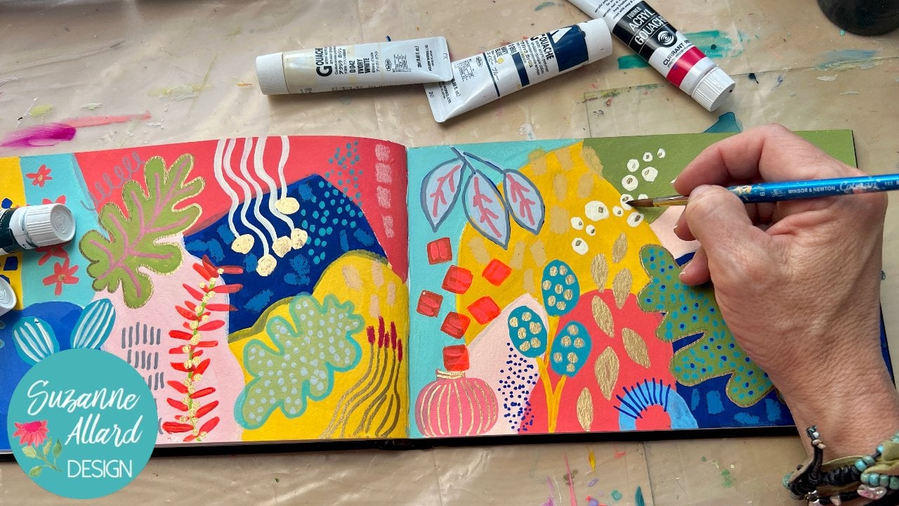
5. Bright, Happy Abstract 1: Alright, this, I want to do this exercise for a couple
of reasons to show, to just show us that we can
get inspiration anywhere. You've probably heard
people say that. But I thought I would use this module to show
you that and also to take three super bright colors
and see what that does. So you've got to
fluorescent pink here, a, basically a turquoise. This is the blue-green
by another color. And this is a hansa
yellow light, sometimes also
called yellow light, but yellow is generally come in a later version and then
usually a cadmium yellow. So just picking a lighter
version, lemony yellow. Then got my sketchbook. I was just a background that
I played with one of my, I like this watercolor
square one. But you can use just a piece of paper or any
sketchbook you have. Inspiration. This is
the Williams Sonoma. The cover ago recent catalog, the catalog that we have
here in the States. And I looked at some of
these layouts and I thought, How about that for some shape inspiration for an abstract just as a place to start and
get us mixing color. I thought it might be fun
just to show you that we can get inspiration
anywhere and play. So let's get out some colors. Some of the paint, Let's
get some white because we know we use white
more than anything. Put some weight out.
Get my palette knife and get these colors out. It's probably too much. Sorry. I do love this. Blue-green by Nova. Really. Dark turquoise. Trying to empty the
palate might off. Palette, knife. Hand for the brush on this one, I'm going to again use a break, but it's a little bit
different, right? Size number six. And the bristles are more stiff. And that way we can experiment
with what does that do? The brushstrokes show more because the bristles
are more stiff? I'll show you here in a second. The other bright
that I was using was the ones that
did I designed. And let's see how the
bristles are soft. This is the one I want
to try using today. It's just stiffer. Can probably see. I have to put more pressure. And this is called a
Princeton catalyst poly tip. The other difference
with it is that the end of each little hair, it's synthetic, but the end of each little synthetic
hair is, has a split end. So it's, it's kinda designed
to show brushstrokes more. So anyway, you can use
any brush you want, but I'm just trying to
like to show you things. So let's sketch again, I'm using the new
color, the same color. And I thought we'd just, I like how they
believe it or not. Magazines like this
are looking at composition on a page like this. They want to make
it pleasing to us, interesting to us so that we look at it and maybe want
to buy their products. So a lot of thought goes
into something like this. So then I say, well, why not take advantage of that and play with the
same kind of thing? We might change it. I do like all these
cupcakes, circles. We'll, we'll put
those right now. I just want to paint in
the mean, how lemons. And I kinda like this. Apple out here by itself. And then there's a
little yogurt cup right here. It's interesting, right? This is a little bit
further this side, trying to make sure
nothing is in the center. And this one's a bit
taller. I'm just one. Or maybe it's just higher up, but I like the way that
came off of there. Alright, let's put some paint
down. Good enough sketch. When I think of it,
which isn't always, and I'm doing
something like this, it makes sense to paint the lowest shape first, the shapes. That's the thing about
this image in layers. This is the bottom of the layers because it's
underneath that tray, it's underneath this,
it's underneath that. So I'm gonna go ahead
and make a color. Let's start blending some of these and see what
we can come up with. Let's see what happens
when you put a little bit of very interesting palette. We can keep it super
bright. Or weekend. You saw how I just
took some of the AI, primarily the turquoise
in the yellow and I added just a touch of the pink to
tone this down a little bit. So you can take really
bright colors and by using something opposite the color wheel, you
can turn it down. I'm gonna go around this shape since they know it's there. But again, I'm keeping
my brush strokes. You probably noticed
that I don't worry about matching too much colors. I don't I don't want
it to be that exact. So if I've run out a little bit, I can match something
close and put it in there. And I liked the way that looks. If you want it to be more
uniform than you would want to mix more so that
you had plenty. I'm just dabbing and adding, tone it down a little bit more. Okay. Here's our
first cookie sheet. Nobody's seen this painting. We'll ever, whatever I imagine
we got the inspiration from a page of cookie sheets would be okay. Next, in the order of
things is this tray. So I'm going to
clean my brush and go with because I think I want to make the
focal point here. I could either make
the tray a bright pink or I could make these
circles are bright pink. You can really go either way. Let's try. I have an idea. Let's try making the
tray the bright pink. And maybe the
circles will be like a pink mixed with the
yellow, we'll see. Okay, So this is
underneath that one. You can see there's a
little bit of green left in my brush because I didn't
thoroughly wash it out. And I don't mind
that It's given me some interesting sort
of texture in there. I often have accidents happened by I've gotten to where
I do it on purpose now. Usually usually don't quash
my brush all the way out. For that reason, I just like the actually harmonizes
your colors a little bit, meaning that they all have a little bit of
the other one in them. Okay. And that concept of leading some of the
color and I'm going to, I had some yellow. I've still got a bunch
of other colors in here. I've got the sum of the green, the pink. Let's do this. Oops, I hit the
green by accident. So we're gonna be
varying the color. Okay. Just cleaning off my brush so don't waste it because we can use
it somewhere else, like maybe up here. And probably maybe I'll use
it as a outline for these. You know, it might be interesting
to leave those white, kinda cool looking that way
and put some lines in them. I like that idea. Okay? That
means that if I want to outline them with this brush, I'm gonna get my paint
on the corner of it. Let's see this one. This one is underneath. I don't need them to
be perfectly circular. I kinda like things
to look handmade. Meet let me Very that color
on the top one a little bit. It didn't change the color
much, but that's fine. Okay, and now we could see
those checkmarks here. You could do something like
that here with our brush. But I'm thinking I want to use, I want to make an orange. I don't know what I
wanna do with it yet. Maybe I'll make an orange and do a he's kinda circle
things down here. Again, I didn't clean
out my brush completely. Do I want to fill them in
or leave them like that? Let's see what we think. I'm not going to align line
up the way they are there because
I'm just not align. I'm a more of a random girl. You do whatever works for you. Vary the color a little bit. Add a little bit more
pink and some of them. I like the color. And now I'm thinking
I might wanna do is, let's, let me show you
some dry brush technique. So we're going to read it. I didn't let the brush, but
we're just drawing it off. You might want to test
piece of paper to see if you're getting
the effect you want. But you see that scumbling,
the technical term, but just looks dry and texture and try some of that on this
6. Bright, Happy Abstract 2: And I feel like something
wants to come off of this. So just to see here, we'll see then something here. I think I'm done with my inspiration from
here at this point, I'm looking at this and
this is too uniform for me. So I'm, I want to make a blend of some of these
other colors and let's see what can
come up with you. There's a lavender,
a neutral That's pretty I just took what was on my brush and it's
like a mint color. And we could if we took
some lines out here. What if we made it leaves a lot of what I do
when I create what if, you know, like I put
my last newsletter, catch the stem kinda wants
to go to this circle doesn't make a plan that release my brain
didn't plan it and maybe my maybe my hand
and arm knew what was going to happen all along. But in my last
newsletter which I wrote about strategies for
overcoming fear of painting, it's also a blog on my
website at suzanneallard.com. So if you're struggling
with that, may be helpful. But one of them was how
the body sometimes can, does things that the mind, basically your, your,
your brush in your hand, has a wisdom to it. Is that the general idea? I'm feeling like I want
some of this down here and we hope this little
circle here we made, make it a little bigger. And I want some of that
really bright pink down here. So everything I'm
going to put it, feel like it right now. I'm trying to bring
the composition together because it feels
like separate parts to me. So I can do that with color shape that I'm going to bring some of
those pink down here. The same pink we meet for the background of
this cookie sheet. And put it in here. Just so that the eye doesn't get stuck in one part
of the painting. We can do that with pencil tool. We might take some
similar color pencils and do some stuff over this. Starting to come together. Bring that green somewhere
else and it dried. See if we were using gouache just to point out a difference. We we could reconstitute it
with water, but that's okay. We'll just mix a
little bit more. I'm not even sure what I'm
going to do with it yet, but I want it somewhere. Where do I want it? I
keep looking down here, but I don't want to clutter this up and make everything
two square. I like the shape of this, but I feel like I know where
I could do hello lines. And when you have
a bright brush, you can make nice
little lines like this. So dark in that
color a little bit. I'm just going to
come down here, do this like that line. So such energy. Got
some paint on there. But just to sketchbook,
Let's see here. I could take a little bit of this and just bring it around. So I'm ending up less three
instances of these colors, the yellow 123, the
green 123, the pink 123. Most scumbling orangey color That's the men is kinda
just two elements, but this is, could be counted. This just kind of a trick that helps
balance out a Painting. Thinking about using the color throughout to keep the
viewer interested. And at this point I think I might want to switch to pencil, except that I want to give that another
coat on that leaves. Sometimes with Acrylic. Woo am glad she need to coats
to get the lots of layers, sometimes three, to get
the effect that you want and let them
dry in-between. This case, I don't
mind that some of these are transparent, so I'll just hit some of them again so
that there's a variety, some more opaque than others. Okay, let's see if
we can find various. Here's a fluorescent
need sharpening. And Lisa can find some of
these colors and a pencil. Although we do need to
let this dry completely, it just won't go over pencil. If it doesn't dry. It's
pretty close on the yellow. Doesn't have to be rams trying to stick to
the three colors. That's kinda close to that pink. Then this kinda greenie
turquoise color. I have different
kinds of pencils. I have pastels,
watercolor pencils, but most of these are just
the Prismacolor color pencil. Let's see if I have anything
like that, minty green. That would be pretty to
put him as this is a no, that's a warm gray, but it might keep it up. I'm going to look for see if I have anything that is
closer to that green. I definitely I might
have it in foil past. Looking at this, Look
at that. Pretty close. Right? We're going past
the the brush stage. But I wanted to
show you what can be done with some pencil. See if you're try
that one feels dry. So I can do all kinds of marks single, she'll
better than others. It also depends on the pencil and hot dry the pain is. So if you're finding you're not getting a whole lot of color, let the let the paint dry
past the dry to touch stage. I do like that. I'll
just have to combine when everything is really dry. And I do like that. We left those circles plane. Still feel like this big block of green need some toning down. So we'll see if this warm gray, amazing what just
a few lines over paint will do to soften it, either push it back, we'll bring it forward. You may be fairly be
able to see that, but it is softening. Yeah, I like that. Is just taking the edge off that
green a little bit. Not sure. I want to
do a whole lot more. I do want some dots. I would love for the
dots to be in this kind of orangey quarterly
color we made. Not bright enough. I want it to really pop. This is the fluorescent
which I can put over it. Yeah, that's more like it. So we could also use oil pastel
but for Neil color cram. But I'm just going
to stick with this like a pin cushion flower. And then I'll go over it with the fluorescent. Okay. I think there's a cute little abstract and you can take a little bit more with
pencil if you wanted. I can erase this. Council is inside the circle because I use my
watercolor pencil. Just my wedding, I
like that and dabbing. Same here. And since
we used Acrylic, I don't have to worry about
it getting disturbed. Since it's dries permanently. Yeah, that's fine. Who would've thought
we'd do that? What if I'm experiments? Thanks for joining me.
7. Blooming Garden 1: Now, for this really FUN
spread in the sketchbook, I'm gathering together
the Nova color paints. That's the paint company
that's based in California. They do a nice
artist grade paint for a student grade price. But I would say if
you're not in the US than it becomes a higher price. But as a great paint. And I've got three colors here. The, this is the Indian yellow, which is a really
translucent orangey yellow. And I've got the getting some paper towel
and getting myself setup. And then I've got
the cobalt blue, which is just a classic
versatile blue, and then the
quinacridone magenta. So you could consider these
as your primary colors are, are kind of a variation
of your primary colors. Primary colors, red,
blue, and yellow. These are variations. The yellows of variation and the magenta is a
variation of the red. But of course the
cobalt is just blue. And I'm getting,
getting them out. And then for white
I'm just using a juseyo, which is gesso, is a basically a primer
for canvas or paper. When you're gonna be paying
less Acrylic, you don't. I'm not going to use
that on this paper, but I just like the
texture that it adds. It's a very matte, meaning not shiny white. And I like my
paintings to be matte, so I often use the
JSR has a light so that the end result is a little more matte and
it's also really inexpensive. And it also adds that layer of primer like consistency
onto the paper. Sorry about the hair filming. In this particular video. I have the camera I just got. I just you can see
me turning my head. I'm like having a ballet
dance here and painting. I got really into it and bend my head into the
camera too much. So here you see me
grabbing some of the white and mixing it with the other the three colors to get us to just
making a background. I don't have a particular plan except to do a loose floral. And I end up making this
background pretty past Ellie, just taking some of the blue and you'll see that I've
not clean my brush. I'm not sure I clean it. This whole background. You can get away with that. If you're just careful two, not mix across the the
color wheel too much. Meaning, if I were to mix all three of those and
then not put in white, then lead get mud. But I'm adding a lot of white and I'm going for that texture. So you can see me using quite a bit of paint,
quite a bit of gel, so and really just
covering the spread. I like that sort of okay here I cleaned my brush
and wiped because it maybe it was too thick
and also wiping is a really FUN effect
on this bread. I'm not going to the edge, so I don't have to worry about, like in Psalm my classes, you'll see me put a piece
of palette paper or really any paper
behind each page. And that keeps the other
pages from getting mocked up. Another solution
to that is should just not paint to the edge. So since this is a
pretty large sketchbook, this is the Stillman and burn. I think I put the name of it in the class notes, supplies. It's got a really nice
mixed media, smooth paper. It's a new or sketchbook
that I've found. Alright, so I just
made some marks with the back of my brush
just going for that texture again and just
kind of going all over. Now this video is
sped up a little bit. I did want to not
speed it up too much because I wanted you
to be able to see yes, I'm working quickly on this, but I'm not working so fast that I want you to understand
how fast I'm working. So this is sped up
just a little bit so that I don't oriented tears, but it's also not real-time. Now you saw me
just dry my brush. I've learned to do that over Just over the years,
over the months, really recently because
even if you've you rinse off your brush and even if the end of it is not too wet, the handle can get
water on it and then it all drips down and
really waters down your paint. So you'll see me do
that occasionally. And now I'm just making a color which I took
the quinacridone, magenta, and some of
the Indian yellow. I'm just making
these loose leafy. They could be leaves, it
could be Flowers. Who knows? When I do this kind of thing, I'm really, especially when I'm working with a
limited palette, I'm really just seeing what colors can I make
that I really love. The shapes are almost
secondary to me. I'm really interested in color. And so you'll see me throughout,
something like this. Discover a color that I've
just made and say, Oh, well, that is going
to have to get used because it's luscious. And I will say, I find this combination of a yellow for an orange and this is an orangey yellow
mixed with a magenta. And then various
shades of white to just yield all kinds
of deliciousness. From a, from a pinky peach color like this one I've just made and decided to
take it in more of a purple magenta
Iy direction and doing a row loose
sort of peony shape. Or it could be a dahlia. I usually add something when I use the color
somewhere else. That's just seems to
be something I do is I want more colors. So it's not that I won't use the exact same color from
parts of a painting. But I guess I do like to
vary it a little bit. Now, will you saw me
introduce do there is I didn't rinse my brush, but I wiped a paint
out of it that gives me some of the color that was in the brush
is still in there. It it's not sopping
full of paint. And so I get that little
bit of color that was in it without having to rinse it
and start over if you will, because sometimes I want the color in it,
sometimes I don't. So that's just something
you'll get to by practicing. Even the amount of water
that you have in your brush, it makes such a
difference in the result. If you want a real
transparent glaze almost and use more
water or a medium, mediums or additives
that are added to paint to get them to
behave in different ways. And you can add mediums
that I'll send your paint, that'll make it thicker, that'll make it
textured, my gosh, they will do all kinds of
things that'll make it dry slower, dry faster. That's the mediums to do
with just about everything. So this quinacridone magenta is just so beautiful that I'm, I always have to make some, and that's just the the
magenta with white. And that's why I cleaned
my brush because it's, I wanted it to be pure. So sometimes when
I do these sort of Garden one paintings, I'll start with the leaves. Sometimes I start
with a Bloom's. It just really varies. Sometimes I'll have references
in front of me. A book. I'll put some of the
books, my favorite, favorite flower books in
the class supply list. But sometimes I just
looked through my phone at flowers that I've I
take pictures constantly. Flowers, farmers markets, my name on my
neighborhood walks. I mean, just constantly. So I think that they're
always in my mind. And so sometimes I just take those memories are images
and create from imagination. I also tried to think about how colors you don't
have to stay realistic. Lot of the master
painters didn't. And so I tell myself, you don't have to
make the flowers a certain color and the
stems of certain color. And That's something that I have to continually
remind myself because it's just a habit. It seems like to make
flowers pink and red and make the stems green. And so I do tell myself, okay, try something different. I think a really
good exercise would be to do the exact opposite. Just, just
intentionally for Fun. Make green and blue, maybe purple plumbing
flowers and then make the stems pink and
yellow and the leaves, you know, just, just
flip it. Be funded. Play with that. You're seeing the incredible range
of colors I'm getting. We just scratched the surface. With these three colors. We can get some dark. So there I'm needing
some darker values. And you can get darks by just mixing your
two dark as colors. And I've just really been
loving this Palette lately. The other great
advantage to using a limited palette like this
is that by definition, your painting will be more, have more color harmony. Meaning that the color scheme, the palette will work. And that's because
there's a little bit of every color and every other
color that you're using. So it will, the composition
color wise will have harmony. Just by the way
your painting it. Let's continue in
the next video.
8. Blooming Garden 2: All right, so here
we are continuing. My palette paper
is getting full. Palette paper is a paper
that's slick on one side. Specifically for this purpose. I have links to it with Paul supplies really on my
website at suzanneallard.com. But you can also use
a ceramic plate. You can pick one up at Goodwill that makes a great palette. You can use, gosh, I've used so many
things over the years. A piece of plastic. You can use a paper
plate if it's coded, it'll last a little while. But then the coating will disintegrate and then
it won't work so well. I've used those in the past. Palette paper is just
nice because it's, I don't know, it's inexpensive,
it's made for that. And then you just tear it off
the sheet and throw it out. Although sometimes I have
one on my wall right now I'm looking at
it was so pretty, but I just tore it out and stuck it on my wall in my studio. Just because if, especially
if the colors come out, I guess that's an advantage
or palette paper, you can have a page of
the colors that you made. A few really liked some of them. So here I'm mixing a
yummy green with using the cobalt blue and the
Indian yellow and just getting this vibrant green, I will say the Nova
Color colors just, I don't know, they just
have a depth and richness. I would say. Whatever
the opposite of flat is. If you mix colors sometimes
when you just like, it's just flat and you can't
seem to live in that app. If that happens to you though, if you're using a paint, that's just if you've gotten any fluorescent in
that same shape, that will definitely
live in a top. It's a great way to
brighten up a color. Speaking of which,
I don't know if you have already taken
my color mixing class, but I have a free class
that you can find on my website called
color mixing success. I think that's what I called it. Yeah. And it goes into a lot
of this comes with an e-book and I recommend it
if you want to know more about just Color and
learning about color. So here I'm taking a
variety of techniques. Other way, I don't know
if I said that I'm using a number for bright brush. Here is the name or flat for basically a square at the end or a rectangle,
the underbrush. That's how the
bristles are shaped. I probably use this brush
more than any other. It's so versatile
because you can do edges by turning it outside. You saw that. And yeah,
it's just amazing. I think I ended up using it more than anything in this class. So I'm looking for
where to add green, but I also wanted to point
out that I'm also letting in some cases the brush be a little more dry to get some texture. Meaning that there's color
on the brush, some paint. But I can use the paper towel and stay away from the
water and let the, the brush dry out a bit
and you get a textured. You can see it on the right, belief on the right, all the way to the right, a little bit of
texture behind it. Now I'm playing with
something a little different. Usually I do a dark center, but I'm mixing up a blue with the greens and just go
almost a turquoise and Color. Just playing with
that for a center. Acrylics really need to be
layered for full effect. So in this painting we're doing one layer and it
turns out pretty well. We'll do some details in the minor details in the
bonus video at the end. But for the most part, I haven't messed
with this painting since I did it this way, but you and I'll just
keep that in mind, that acrylics layer really well and can be painted
over completely I'm also thinking
about and trying to use minimal strokes.
You'll see me. I'm trying to this is something I've been working
on last few months, not messing too much. So put them pick your color, put it down and stop. Don't. Because those brush
strokes are so beautiful. And it can make the
painting look less well, not overworked and more organic to just leave those strokes. Now if you make a color and put it down,
you don't like it, then let it dry and do fresh
brush strokes over it. But thinking about
minimal brush strokes as well as minimal colors. Sort of a minimalist class. Right? Now, I've just made, as I was talking
about the lovely, where you make a quarterly color with a yellow and the
magenta and a bit of white. You can take it in the
yellow to orange direction, or you can take it more in the magenta direction is
just such a beautiful range. And then you add white and
it just gets even more and more complex and interesting. You see that I probably dry my brush with a paper towel more than I wash it out with water. That also allows if you
look at your brush, like if I stopped right now and looked at my
brush, there would be, you can probably see there's
bits of a lot of the colors. Just have to watch that
so it doesn't turn muddy. But you'll see, I mean, if it starts turning money
than you wash it out, but it allows me to have even if I'm washing
it like I just did, I'm not washing it completely thoroughly unless I want
a really pure color. And then you do need
to wash it thoroughly. But I'm usually washing just to get some of the paint out and I want to leave a little
bit of the other. And that also helps
your color harmony because there's nothing
on this page right now, No color that doesn't have a bit of at least one other
color on there. That helps the whole
thing harmonize. Sometimes. And they talk about this in my color mixing class, but some people call
it a mother color, where you take a
painting and you make sure that one
of the color is, let's say in this one that it
would be the Indian yellow. That there's at least
a tiny bit of it in every other color you're using. And that is an automatic way to harmonize your painting
from a color point of view. In this case, I wasn't
that intentional about it, but I know from the
way that I don't clean out my brush completely and the way that I mixed colors, that in fact I can
see right there in that purple that there's
a bit of yellow in it. You could just tell
it's a bit warmer. So I know that these colors
are her are well blended. Not to the point of mud, but to the point of they share. Or United. A community of colors that have
something in common. Not just kinda looking around,
thinking about, again, guided by color, making a color, thinking, oh, that's pretty, I'm going to put
that somewhere else. So it's a combination of that. And it's also a
combination of looking around and saying
what needs to be, where is there
something that's a bit lack some depths or
needs another layer? And the great thing about
acrylic is it dries so fast. Watercolor to Watercolor, you have to be careful
just because if it's, if you're trying to layer. And same with gouache, which is an opaque watercolor
and it has not dried, then you can disturb those lower layers more
easily than with Acrylic. If I'm light with my brush on this and use plenty of
paint on my next layer. I'm probably not
going to disturb the lower layers even if
it's not completely dry. Again, these are
all just things. But I hope that you I was gonna say these are things
you learn when you play. And I hope that this class
really encourages you to play. Learn. There's
nothing like learning these things by just doing them. Time in the saddle is my
writing teacher is to say, there's nothing like
time in the saddle. So in this case, it
would be nothing like the brush and your hand
on a piece of paper. But I love how I can see those bits of blue that are showing through
the background. And I just think this
particular piece has a real energy and
movement and flow to it. And I think in part because
I'm working quickly. Again, not as quickly
as this video. It is sped up, but
pretty quickly. I think the whole thing. Before I got to
come back to that, I want to talk about
what I just did because you'll see them putting, I wanted some lighter
pops over there. But there are two translucence, so that's what I
meant by layering. You have to then add, add more, let that dry, add more to get
more of an opaque. What I'm looking for,
they're also just grabbed a lot more paint and mixed
more and that helped. Yeah, now, I'm taking this
lighter color around. Anyway, I hope this get
you playing and gaining confidence is you develop muscle memory and
just learn by doing. I know I interrupted
myself, but that's okay. Now I'm just taking that
pretty color again. I'm guided by that peachy color and working at around because I've realized
I really like it. And I think it makes
a nice backdrop for some of these
sort of hitting the background with a
little bit. And that's it.
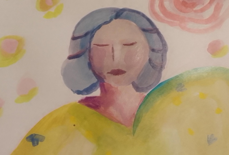
9. Matisse Lady 1: Alright, for this module, let's take some
inspiration from matisse. And using our color wheel, I pulled out some Gouache. This time. Gouache is
an opaque watercolor, so it can be
reconstituted with water. But it has a really
chalky finish that I like, a matte finish. I do a lot of my
working Gouache. So for this one, I thought we'd choose pretty
close to the primaries. But I've got a blue
and ultramarine light. And then I've got an
orange matter read, just changing it up a little
bit and then a yellow. We're in a triangle area. And I thought it'd
be fine to take. I love how Matisse
said. I do not insist upon the
details of the face. And so I thought we'd do
maybe a lady like this and do some FUN things on her
clothing that are from this is all a couple of
books I have about matisse. This one, the artist
speaks and matisse the, this is a series. I've got a few of them
cold, great modern masters. I don't know if they're
in print anymore. But I think I got them used. But if I can find links to them, I will put them in
the supplies. Anyway. So I loose Lady like this and some botanical themes on her dress using only
these three colors. This is a great exercise. I wanted to show you
where you can take in as just a piece of scrap
mixed media paper. And you take one
color at the one end. And this is the
ultramarine light. And then I really
needed space for the pure orange here
because you can see that this still has
some of the blue in it. Then you just go
mixing a little bit of orange in each one. And this shows you one
of my favorite darks is a navy or indigo. And sometimes I buy indigo, but it's never quite
the one that I want. I really like this
kind of indigo, so I make my indigo this way. Then I can control, do I want it to be more along
this way or more like this. But when you buy in and ago, a lot of times it's just
a really dark royal blue, which isn't the tone
that I'm going for, which is more in here. So this is something you
could do with any two colors. You could take these two, you could take these
two, any two colors. It's really useful to do
this kind of progression. So I wanted to show you that. Alright, let's get to sketching this this lady that does not have details of
the face insisted upon. Well, let's see,
space for all this. Let me put this pencil
bookmark over here. And this is the same sketchbook. I'm going to very loosely and not being fussy and
we're not trying to have perfect drawing. I'm just going to grab
a colored pencil. And kind of her face turned
up really big. That's okay. Maybe it'll be mostly
actually I don't want her face that I'm going to
tell the different colors. I can see it and make
it much smaller. It's more like it
is her hairline. Trying to figure out how I
can put this so you can see it the same time
and draw with me. Chris, I'll put it in the
class resources so you can have it there. I'm just making loose shapes. Her hair. Make it any way. I'm using his photo
is inspiration. I want to move her neck. Since we're gonna be Painting
all this and I'm not worried about being exact. And then her shoulders, her next really thick we'll
do some big shoulders. And he's kinda come down. And I'm not going to worry about doing perfect hands
because we're, this is for us to play with. Play with three Colors and
an interesting composition. See here, would be
more like here. See when you're painting over, it doesn't matter.
You can if you want. I don't think this is oh, yeah, this is my watercolor
pencil so I can erase it. You use a watercolor when you can erase it with some water. Since we're going to
paint over it anyway and then just blot it dry She's a little too skinny. Let's do her like that.
And let's just go. No, it's big but it's a little
too big. I erase the more. You can use a regular pencil, which you can erase
with an eraser or water-soluble when like this. Yeah. First pencil
wasn't water-soluble. Okay. That's enough
to have FUN with it. And we'll work on her
facial facial features. Going to change her face
angle a little bit because it's kinda to straight on. I think that's one of the
interesting things is that he does the other
faces to the side. The body is moving this way. She's not just staring at us. Face on my hands are a little post together, but again, I'm not going
to fuss with that. Okay, so let's start
with color mixing. But one brush that we will
use on this one, Let's see. Be I think a filbert. So filbert means that
it's rounded like this. But I want a bit
smaller one just because this drawing
isn't that big. Let's look at this one. It's not really any smaller, is it? Where's my smaller
filbert is hiding. Here's one, but it's too small. I feel like Goldilocks
just write. Here's a just write filter. Right? Now. I'm going to just mix a color, probably an off-white like this. Why not get some white gouache? And I'm not going to
copy his colors exactly, but let's make sort
of a yellowy weight. And do her dress. Was going to have that outline
those arms afterwards. Okay. Too much yellow. Tone down this yellow with just a bit of orange. Yeah. I have some of my other
classes and Gouache. Go deeper into the
my love of Gouache. And that's pretty get some really nice neutrals by mixing the three colors
together with white. I'm going to, just so
we have the outline, I'm going to paint
the brush strokes. Remember minimum brush strokes. And I'm going to paint
them in the shape of the fabric of her dress
so that it's part of the texture we get In her whole dress does not
need to be same exact shade. I'm going to apply the Gouache. Basically. It's just a choice. Doesn't can kinda do
it anyway you want. And I'm going to make the body of the dress
just a little bit later. Just for some variation. Neck line can dry. It does dry very fast. So it does kind of force
you to work quickly. Of course, you can
always add water. Okay. I'm going to just make a little bit of a
difference here so we can kinda see the shade. Her sleeve. Those are
some puffy sleeves. Fine. Alright. Since I have this yellow made, I'm gonna go ahead and
make an orangey skin tone. We're not going to go for
realistic just like he did. So she's going to
have orange face and maybe a bit darker orange with a tiny bit of blue to tone it down
underneath here. Give us a little bit of contrast and the neck is
usually in the shade. And I darken that even more and come down to
her wrist and hand, which I'm just gonna do,
something like that. Keep it simple. We can cut in around for some
fingers if we went. Alright, that's good. Now let's move into making some blue will make I'm gonna make her hair
kind of a blue shade too. I didn't wash my brush
all the way out. I want some of that in
there because I'm going to make this software
blue her hair
10. Matisse Lady 2: So again, thinking about not making
too many brushstrokes. Oops, yellow guy in there. So now there's some green
in her hair. That's okay. But someone the other side. All right. Now we're
going down to the blue, so I'm just adding
more of the blue. What want that to be a
really deep blue and darker. So the way we're going
to make it darker is to add a bit of
its complement. So we're going to grab some
of the orange, do even more. So I'm turning this
brush different ways, which gives me some
interesting brush strokes. Does brushes a
little bit frayed? Which depending on
what you're going for, could be a good
thing or bad thing. Maybe it will cut in a
little bit here on my hand. So here's where
I'm intentionally not pressing the brush strokes, just put them down
and leave him. I want them all going
in this direction. I'm just covering. Okay. While the cheese drying, let's make a background color because I don't want
to paint over her. Will take the orange. Let's see what
happens if we just add a tiny bit of the blue, toned it down in this
card that I made. Just when you need to
take it down a notch. We could use some white. Let's see what that there's
white, cools colors down. So which is fine if
that's what you want it. If it isn't, you'll have to add a little bit of yellow
to warm it back up. I just wanted to make
sure that's not too close to her face color. So just a little more blue. Alright, let's see
what that's like. Remember we can vary was
making it more watery. And you can see the brush
strokes more and it'll be a little bit brighter because the white
paper will show through Okay. Now I realized, since
this filbert is frayed, which means I've abused it, it's going to make the details that I wanna do
more challenging. So we'll try it, but they may need to get the same brush but a newer
one that's not as grade. See how the bristles are
afraid that's from me using an improperly and my abstracts when doing
texture and scrubbing it. You can help a brush if
you've got one like this by I'm putting a condition
or even a hair conditioner, human hair conditioner and
wrapping it in plastic. But I can tell these
are just afraid. So it will say I may
need to change to a different a newer number six, but we'll work with it
and see what we think. Alright, so now you do
some little details. So he's got the little
details on the dress. But there's other little
details we can use anything botanical,
anything we want. We can depart from her inspiration at any
point course at this point, we've actually copied
this painting. Just so we're clear. You would never go with this and
pass it off with your own. Because if it's recognizable, which at obviously is, then you have to say, you know, you have copied Matisse, but we learned by copying. Just don't want to pass it
off as your own painting. Okay, so let's take some. Even if we change
everything from here and it's still recognizable. Let's take a, make a bit of a green
because we haven't used much green with the
blue and yellow. Greenish kind of like
what's in the hair. Maybe one brighter. Now let's just make some little
things on her. Just taking the side of
the brush and, you know, sort of imitating what a
fabric might look like. It's going to have
phone, so it's gonna be imprecise and
different directions. We could, since
we've got that made, get some of the blue
and orange and just go for a darker
maker, darker color. That can be the hotline. Those things, maybe
some face marks. I'm kinda mixing them
all a little bit. Gives us dark shade below more water just
to get it fluid. We're getting kind
of a dark dark gray. Get my paper towel
because I don't want my brush too saturated. I'm going to take
the side of it and hopefully it'll work with the frayed edges and very
lightly bring it around. Trying to do one stroke. You can see my little fuzzy
hairs from the free brush. So if you're getting
those which, you know, that's personal preference,
if you do feel like it fine, if you don't, then check your
brush and maybe for aid. Just bring these
down a little bit. Have to come in the hallway. Her face. Here. Just think about the mark you're gonna make
an make it without, without, without fear boldly. I think I'm going to continue maybe the line just on
this side of the address. And this is gonna be tricky
with this free brush, but let's do a weekend. Guys. Simple knows. Eyebrow, eyebrow, high Well, if reading is adding actual interests almost
looks like eyelashes. Not bad. Right now we can go back and make a color for some other, I think I think a pretty little logistic bit of a line pattern In her her dress. Maybe with a yellowy orange. See what that gives us? Think it's a little too bright for the rest of the Palette. So I think I'm going
to add some yellow. Make it more of a yellow
tone down, yellow, mustard. I do that by having
just a touch of blue. We're getting to see
the challenges in the kinda cool effects
of a frayed brush. All right. We could go a
little crazy and do some circle things
on her on her skirt. Why not? Let's do some, actually, let's just
do some flowers. The silver is amazing. That because each stroke
is a, like a pedal. We can vary these by, add a little white, just
bury them a little bit. I'm turning the brush a
little bit just so that they don't all look
perfectly uniform. Personal preference. So you can either have
it flat like this. We're turning it like this. To look so serious,
but she looks very like deepen thought. It's funny that
you can get that. Convey that with one for a
brush and a couple of strokes. All right, I think I'm
gonna make a really pale, peachy color for this centers. That's gonna be tricky
with this brush. Better to just make a stroke in each direction
and be done with it. It is mixing a little bit
with the color underneath. I could have also
left them blue. Just have to be a little more careful and use multiple coats. Okay. There is our
exercise and matisse Lady. She was phon I'm
glad she is here.
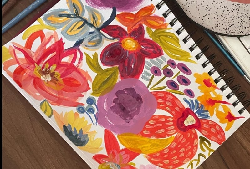
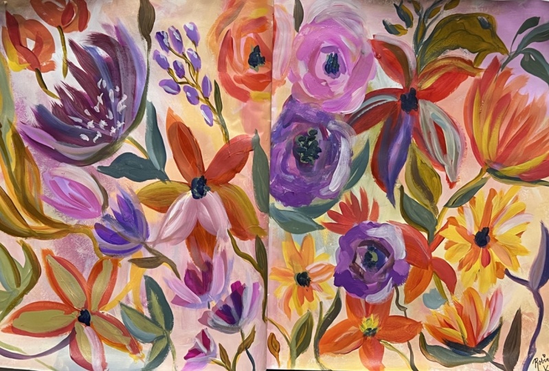
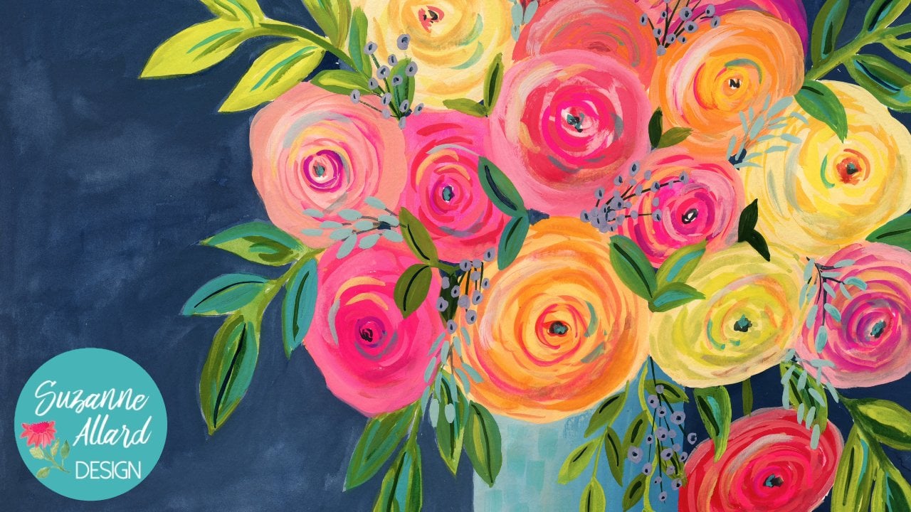
11. Peony Bouquet: For this sweet little bouquet in the watercolor sketchbook, I provided the sketch
in the class resources. And you can transfer it
to Watercolor paper, tracing paper, transfer
paper or carbon paper. But a really simple way is to take a sheet of paper
and take a graphite pencil. And we didn't as kids did
this as kids shade it with your pencil and then
flip it over and trace it right onto
your watercolor paper. That's one of my favorite
ways because it's a very light touch and
you don't get too much. You don't get a bunch of
carbon on your paper. So I've got my three colors
here and I'm using gouache. One regular gouache, I think in one or a couple of
actual Gouache it, but I've got an orange on
olive green and a rose. And I'm just starting
with the large peony. That's really the focal point. This is, this is a
bulky that's just, I think, really lovely
and its simplicity. And one of the things that
I've noticed and worked on is that we tend to make the
flowers in bouquets too small. And when you really
look at about K, the ones that I love, that you see in
different places. They'll have flowers
that are almost as big if they're
open as the vase. Just playing with
that concept here, making a really
large focal point. Maybe it's a peony, maybe it's something
else. I don't know. It started a peony, but I do a lot from
my imagination. For the sketch, I looked
at some bouquets of pictures I had taken and
then kinda combined it with maybe some other ideas. And that's what I'll do is
get the inspiration from different places like the
little onion bulbs on the back that you'll see
are from one picture. And then this central
flowers from another. And then just kinda make
it up as I go along. But we're doing the one brush, which is the number for
bright or flat again. And again, trying to concentrate on not too
many brushstrokes. I did the speed this up. It's about twice the speed, just so that you don't fall asleep while you're
watching this. But even so, the whole thing, I think took 25 min, 20, maybe 26, 28 min. Worked really quickly,
again to try to keep myself from overthinking
and overworking. And you're seeing
me blot the brush. Now with this color palette, I've got the rows, which
is a nice bright pink. But I've got the olive green, which is a more of a sort of I don't want
to say it's drab, but it's not the slimy
green that I love. And without any yellow
to make it that way, I had to just deal with it. And that's what's funny
about this exercise is how I remember as
I was painting this. I want my line, my one. I wanted some yellow
to add to that green. I didn't have it. There you go. I do have what's dulling it down a little
bit is I do have a little bit still of the
pink arrows and my brush. But as we've talked about, that's a good way to
have color harmonies, to have just a little
bit of the color other, the other pillars in the
Painting in each color. This one really does end
up with some harmony. I'm darkening to get it dark, I'm adding a touch of the rows, which is where I'm
getting my dark from. And the olive green I'm using is the Turner
acrylic gouache. And I've got a mix here. I just grabbed colors. And then the orange is the
whole Bain acro Gouache. But the rose is a
regular gouache. So this shows you you can
mix them, No problem. You can mix watercolor. You can use watercolor in a
painting that has acrylics, you can use Gouache and a
painting that has Watercolor. You can use acrylics
in anything. You'll find what doesn't work. Obviously. Watercolor can't
be layered on top of. Well, let's put it this way. You can't paint a light
color on top of acrylic, on top of watercolor
with watercolor. But you can lose squash. So you can see there
that I just layered that stem across those leaves. Onion nice stems that
just go every which way, which I really love. You can see even in the
painting on the other side, I just have a thing for
Vineet, windy lines. I think they, in a Painting, they help your eye
move around it They would just to
me are interesting. And so whenever I
see an example like that in nature, I really, really enjoy putting those
into my compositions, whether they're abstract
or Floral, like this one. Here I've made a really high, it ends up being just
a beautiful neutral by using a little bit of all the three
colors and then white. Gouache tends to dry.
It's funny paint. It'll dry lighter. The lighter colors dry, lighter than they look in the
darker colors dry, darker. So it'll dry a little
bit lighter than that. And then I'll do something
for texture that you'll see. But I'm going through and just adding a bit
of dark that I made. So I made the dark by
taking the green, the rows. And there's probably still a bit of the orange on my brush. But he basically, when you're working
with just three colors, you can make a dark by mixing the two darkest
colors. Makes sense, right? You need, you need
some darks so that you have some value differences. In I usually you have
some lights and darks. That's what's meant by values. You, as long as you have lights and darks in your painting, will be mid pounds. But you'll find if you paint something and
it just seems blah, check your lights and darks, you may not have enough of them. So here I'm just being
guided by color. I'm using this brush, both Painting with its flat
side and its edge sign. And I also trying to be
a little bit light with my touch and almost painting more like you'd
paint a watercolor Painting, which you can do whether you're using acrylic gouache
or watercolor. I'm not trying not to
overwork those blooms. And I decided to try
to play with making a dark plum background and
also not over Painting it. So if there's lovely
brush strokes are dry spots letting those
be to add texture. I love walls, painted
walls that have texture. So I don't mind letting that color variation
in the background be there and be kind of
almost like a textured wall. And you can do that by letting your brush just dry out a bit and use the paper
towel or whatever. And I also don't mind that
my color is going to start to run out and very as
I paint the background, so some of it will be darker, some of it will be more watered down or
maybe I'll have to mix more and it'll be
a little bit varied. That doesn't bother me either. I'm cutting in here. I'm not going
necessarily all the way to the edge of the painting. In some cases. Now, in that
case there I did because that stem came up kinda fat
and I wanted it thinner. So I cut in a little
bit more on that one. But then on others I'm leaving a bit of this white
around which I think is nice with
this dark background. I think if, especially with those little stems
that look disappear, if I didn't have a bit
of white around them. I can always go
in afterwards to, with another coat on those stems and make a really opaque white, green by adding white to it. But this worked out pretty well. You can see that my
background color is getting center because I'm adding more water to it,
which is changing. Naturally changes
kinda how it appears, which I liked, I
liked that variation. Maybe the light's
coming from that side. And so you get some
nice variation. Now, when you go
to the anterior, you can just choose how much. I could have loved that
part white in the interior. But I felt like it needed
just some of those spots. And that's what I'm
deciding there. I'm saying, well,
how much do I want? It brea, It helps it breeze
to have some white in there. People talk about whitespace and breathing and
I really love how, um, I did not overwork
that large peony. I just did one last night
when I was messing around and I overworked that thing. It was usually what I'll do with that as learn from
it and just keep working on it and
more layers of paint. And I just rare for
me to just go Now, this one's going in the trash. But on this one, I just kept it very, very loose and love
how it turned out. Now here I'm trying to get in. It's taking me some time to get, I want a light color for
some texture in that vase, but I want it to pop. And so I'm having to work with how much weight
do I want in there? How much? I don't
want it to be white, so I'm making an off-white
with these colors. And you'll see that I'll end up adding a couple of
coats to make sure that I'm getting the coverage
that I want because I want these marks to show up and I know that they're
going to dry. Not as pronounced as
they are right now. I also love the
variation in them. I don't need them
all to be uniform, both in shape and then color. But you can see
here that I'm going through and getting
just a little more. Sometimes I'll do a second
coat on just some of the marks so that you know how
pottery light hits it. And you may see that that
variation is natural. So that's what I'm
going for here. And then I thought, since I've
done all this work to make this beautiful
color and the vase. Let me take the
corner of my brush and it shows you that
even with a flat brush, you can make that little marks. And so that's what I'm
doing in the leaves. I just loved that how the
texture comes out of there, and I love how these leaves
bring you into the painting. They can literally point
you right into it. And then the green balls kinda take you around
and you've got the focal plane
just ended up being a very successful
a little study. And we'll probably end up being something I do
in a larger scale. I might even paint
over the background and a different
color. Who knows? We'll see there it is one Brush, three Colors, a piece of paper. So enjoy and do this one
in different colors.
12. Simple Landscape 1: Let's do for this
lesson, a round brush. This is a round number
six, I believe. But you can do for an eight
to ten, whatever you got. And this is in the
class resources. A photo I took nearby here. It's a golf course,
but we're going to ignore that and just use it as a reference photo for
really simple Landscape. I hope the saturation and contrast so we can
see some darks. And we'll just
kinda make a path. And we're going to keep it simple because we're
learning about color. And then pay attention
to the values in this, meaning the darks and lights. So we see dark hair, dark skin here, and then lights are kind
of leading our way in. Alright, so again, that'll
be in the reference photos. Colors. I wanted to
show you that we can do something where we're
not just using like, let's say how you have
are student grade paints. So I thought I would
do that here and show you these are this
is Liquitex basics. This is the Winsor
Newton Galleria, which is the cheaper
student grade. And then this is another
inexpensive student grade, Grumbacher Academy. So those just kinda mix
of what I have here. I have a white turquoise. So going back to our color
wheel for these three, Let's try a turquoise
and then drop over here to read right
here, and then a yellow. Okay, So those are three colors. And this is our brush. And I'll just sketch
out my sketchbook here. I'm just gonna make a,
we're very loose, square, rectangle rather kinda
coming across here to kinda give me a
boundary for this one. And we can always use this space to put
our color swatches. When we make an
interesting color that can be a lot of colors or just made by accidents and
most of my colors. So that's all I'm
doing there than just a sketch this briefly, I'm looking at these
mountains started about maybe a third in. And I'm not copying exactly because there's just a
reference, something like that. I have this tree line coming. I don't know if you can see
this with the pink pencil, but I'm just using
a watercolor pencil and I'm not going to I'm
just tracing shapes. I'm not this is not a
full landscape class, so I don't, I'm not going
to go into a lot of detail, but this is a sampler class
on modified Color Palette. So I want to keep it a really simple just kinda making
our paths coming in. And then this a grove of trees
here, something like that. So I've got the
big rubber trees, this big green area
here, the light area. And then it kinda leads into this focal point through here. And there's a clump
of trees over here. We are going to worry
about that house. Just getting an overall, you can see how loosely I'm
sketching my mountains here. Yeah, drama a little darker. This way I like about this
compact trees here is it guides our in and
so does this one. And gets us to. I just wanna be
clear about where my focal point is here,
the lighter stuff. It's kinda, we're going to
paint over it so you can see, I can draw arrows
coming in this way. Alright, so I kinda got composition. Let's
play with color. So I'm going to start at
the back and work forward. So I'm just gonna do probably a, we can make this
any color we want. Let's not, let's
depart from nature and forgive, you know, green. Well, that's what I'm gonna do. You can do whatever
you want, obviously. So let me grab some light. I guess I need to set the timer on this so it
doesn't keep going asleep. On this photo. Let's see. Times out too much. Your iPad or your phone has
settings that you can change, do not make it timeout so much where it saves
battery. Basically. I'm just gonna do this. Turquoise back here. Again, we're going
to make this just a really quick study. I'm varying the amount
of weight in this Wholesale, if you tell
yourself you're doing a study instead of a painting, you can seem less intimidating. And we do our best work
when we're feeling relaxed. That's why I love
sketchbook so much. They just seem to instantly, working in a sketchbook
seems to instantly relax. You can see by varying and
not overly fussing with them. Brush strokes. I'm getting some hormones,
cloud-like textures. And if we were
developing this fully, we could come back in and do that kinda thing and make
more of a finished painting. But these are studies. Okay, a little bit
more water. Alright. Now I'm going to move
into the mountain range. So I'm going to continue
with the turquoise. Let's see if we can. What happens when
we add bit of red? Just a bit. Let's see what happens. We're going to get a dark, purply grayish and it
isn't a background. So I do want it to
be less saturated. So I think that colors nice. You always come back
and change it right? Especially with mountain ranges. Limited brush strokes are great. Because you will get
some natural mountain you're looking marks. By not being overly fussy
with the brush. More white. We can go past our boundary. You may like the dry brush look that you
can see where I'm getting that texture over here. You may want that in
certain places and others. You may want to take a
color that's a little more intense like this and
then put it over that. Or you may want to add
more water and have it be more watery, more transparent. Right? So, so far
we have this color. I forgot to make a
turquoise swatch. We also made a
little bit darker. One more reading it, this go back and add
that took place. See you then you can
take in your page, in your notebook like this,
your sketchbook rather. And make notes which
paint you used, which colors you used, which brush you used. Will do that.
Here's a turquoise. We got. Okay. Now let's start
introducing the yellow. So this is the other
grove of trees here. And I just wanted to clearly mark so I don't get confused. My part where it's light, it's drawing us in. Because I did meet a
lot of sketches there. This is that other
tree thing there. So that means you got
to think in terms of limited means of this
is one color in here. Limited shapes. Our job is to simplify. So let's start
introducing the yellow. You don't want to open do yellow with I'm going to
tone down Greenville. I'm going to grab some
of that turquoise. I'm going to add more saturation as we get closer to the front. I am using a green here. I'm going to darker, so I'm
gonna add some more red, more turquoise, more yellow. All three of them.
To get a dark. Let's see what we think of that. Be a little bit more paint. So I'm doing all three again. Just depending how
much you add of each one you'll get a
little bit different shade And I've got these to my dark. My darkest values are up in
here and this spot here. But we may leave that
out because again, we're just keeping it simple. I think what I might do is make this more of a turquoise green. My face down. I'm going up and down
here because this is the shapes of the trees here. And since we're closer
or it's closer to us, I want to represent the trees a little bit
more even though this is a bottom layer. I'm letting the brush do
the work. A little more. Saturation. Can even grab some
of the turquoise pretty pure out of the
tube. I need more paint. I'm doing it right now. Something that I want
to teach you not to do, which is using too little paint. And it's something that is still clearly forget to not do. Because when you have
too little paint, you can't get juiciness
that you want. And the you'll end up
fussing with it more. So let's make sure we've
got lots of paint. Hitting some highlights here. You go back and make
some of this darker. I'm a little too brown. Query. I'm going to take the darkest, dark and run it in here. All along here.
Red. That's plenty. That's a lot. And I'm using the turquoise and the
red to make some darks. I'm just going to take dark, darker the whole way here. Some dark up there, a little bit over here. Just playing. Maybe a little white brings somebody's
forward a little bit. There's some light there. Again. Not looking for
a finished painting. Okay, so over here I'm going
to just desaturate this aerosol little so that it looks like it's a
little further back, but not quite as far
back is this part. So it's a little
tricky. I needed a little brighter than that. But not as bright as this
13. Simple Landscape 2: Okay. And there's
a couple of darks in their dark. Okay. Now, we'll do this front part that we're just going to make
light and bright for that, I probably will wash my
brush. Have I watched it yet? Yeah, I did after the turquoise. So I'm gonna come
in with the yellow, still some red on my brush. If you start getting
like a muddy, little bit muddy color, that means that there's still the complimentary
color on your brush, which is a cross,
the color wheel in this case there was some red. So it was he was
killing my yellow vibe, my bright green vibe, which I'm gonna get by, get close, get a lot of pain
out, like we talked about. And let's make some
turquoise with some yellow. A nice bright variety
of greens here. I'll have to be that bright. But we want that. I going like it doesn't have photo straight,
straight into there. But you see all the different
textures in the photo. We can have a very simple
level just represent with these strokes getting a
little more saturated. And then the rolling hills two, because we come forward. Remember, unless
we're trying to work quickly and not
overthink too much. I don't even mind bits
of white in this part because if you look at the lips, if you
look at the photo, there's kinda where
the sand traps because it's a golf
course but also where the light is hitting.
It looks almost white. So I don't mind for this dry
brush effect here in front. I like that. Okay, three colors. Now, I want to do a
couple of things. One of the things is
bothering me is that this turquoise
feels disconnected from the rest of the painting. So I also kinda want to
put some just neural nets, but some texture back here. Like that. Maybe some darks to the dry brush.
Just a little bit. And I'm gonna show
you something though. If you do something
like that and you say, I really like it was Acrylic. If you work quickly,
you can tone it down or remove it completely.
With a bit of water. I'm going to try just
a slight green wash on this turquoise suggest. Especially down
near the horizon. And if you're paper
towels dirty, get even more texture. Actually kinda like that. It did comment
down a little bit. It just wasn't warm enough, it wasn't connecting
with the rest of it. And the other thing we can do is just grab a little bit of the light turquoise and put
bits of that town in here, which is kind of
videos down here. Highlights, maybe. Alright, I'm going
to stop passing. But you can see how we could have made
so many more colors. We could have just kept going. We could still keep grinding, could take some other colors
and outline some things. I really want to keep it simple. And just show you which you
can do with three colors. One brush, simple
landscape photo, and just do a quick study how we didn't put our other colors
in here. Let's do that. We had sort of a darker that
was one of her films are dark and we get
all these greens. He's lighter greens
in the almost yellow We have mean that they're
making lots of greens here. Different shades of them. Really turquoise, green two. That's right in there.
Mortar crazy fan. We have this super late
kinda highlights that I did was just a little bit there
in their later than that. So what's helpful
here, as, you know, take a pencil or pen, colored pencil, anything.
What do I have here? Work and list you or you
could list your brands. So in this case I
use the Winsor and Newton, white and yellow. This was cadmium yellow. Cad yellow. And I used the Liquitex basics,
bright aqua green. And I used the crane Bucher, cad red. And then I used the ground
brush. We could even draw. Who was the I could draw. I couldn't if I wanted to
have these kinda notes, I could put the
breast that it was, this happens to be the
brush from my brand. So I'll put Suzanne
Allard, brush number six. And these sold out. But you can go on my website
if you're interested in, get on the waiting
list for the next, the next run of them. But anyway, so now we've got in this bread little sketch
showing three colors. You know, what they didn't do,
as you think we should do, is put the three
primaries we used. Let's do that. So we have the turquoise thread in the yellow. Might have been good
to put those next to the name of them. Suzanne, right? Let's do that. Aqua. Very bare. The cad red. So I don't know if you saw that. Didn't do it enough there that I take my brush
out of the water. I often do this
on a paper towel, otherwise you'll find
there's just too much water in it and mix up your like that
too much water. Okay. Here we go. Simple landscape sketch
with three colors. I wanted to take the color
mixing a little further with these three because I wanted to get some
more colors to do just a little bit of
details on this landscape, just to know not
fully finished it, but just make it a
little more FUN. So I started with the red
and white and did some pink, so just plain red and white. And you have to be
careful when you want these more pure colors
to not have a dirty brush. So that was a clean brush. And then I just started
adding a little bit a yellow to get this
nice orange and pH, which we don't have
in the painting yet. So we can add some of that. Then this, these
lovely peachy pink. So I just started
adding white to the, what was on my brush. And then I added some yellow. And when that direction, then I added a bit of the
turquoise and came down here. It's kinda like for me this way I can kinda
see what I added next. And then some turquoise
and then a bit of red, which paint in some white which brought it to these tones. And then I went back to, okay, let's just clean up brush
and do yellow and white. And then add some
turquoise and get these minty grains and
added some yellow. Then I clean the brush again, and this is a watered-down red with a little bit of yellow. Then all three of them there. So I thought we'd
make some of these and just add a few little
details and bring this, like I think adding
some of this peach and some of those colors
in there could be pretty, because we never mixed here. We never mixed the
yellow and the orange. Then there's just so
many possibilities. I mean, this page that I did, you could just keep filling pages and go in
different directions. And it's really
funny thing to do. But that's the brush I was using for mixing. Let's use our Number six, right there. And I'm gonna make
up some of this. This is the red with a little bit of white
and a little bit of yellow. You do have a clean
brush. For now. Wait. So I started
with just a pure pink, which is just the white and red. And I'm just going to hit the touch of
yellow and maybe do some. Sometime. Could be light
highlights if you look at light, now that we have to be
realistic with this painting. But if you do look at
light hitting trees, sometimes it can have
a pinky glow to it. And then we can have some
pretty pink plants here, which would be larger
in the foreground. Smaller as they receive this plan. And we could also
play with pencil, but I just wanted
to add a little more the PG tones to this, especially maybe a little bit
sun is hitting back there. Maybe if sometimes I just imagine the sun from
one direction or another. And if I'm imagining
it this way, hitting these trees, then it's hitting that
side of that mountain. Maybe it's hitting this ridge. You put some grasses here. Just taking some yellow. That's fine. Just a
little bit of Samsung. They just didn't want
it to be a little bit boring. Can have that. Let me make this. Sometimes it's just the
color that I want to use. So then I have to
find a place to use it like this color here. Peachy. It's got white and then it's
got the red and the yellow. So pretty we could, I could go crazy
and start adding a big tree that's here
in the foreground. But I want, because
I'm trying to keep this to be simple,
quick Landscape. Stop playing,
Suzanne know, yeah, those colors are much
more yummy. All right. I'm stopping. But anyway, I just wanted to show
you how you can take these warmer colors and
then come in and just gave the whole thing
more life. I think
14. Pots Party 1: Right, So for this painting, I thought were sketch, I
guess we'll call them. I wanted to take some
inspiration from. I took this photo at
home goods store. I just want to show you how you can find inspiration everywhere. And I just loved all the
shapes and patterns on these. Well, they're vases are
just decorative vessels. And I took a few pictures
of the different displays. So we can use some
of these pictures, maybe these two, and pick
some shapes for Color. I wanted to try a little bit, little bit of subdued,
sort of subdued. But I thought we'd try, I think going to change
this row to row. So these are not quite
across the triangle. So let's put this
one about here. Then this one's here. Greens, especially because
it's an olivine green. And then the rows is here, I would say between
the red and violet. So I wanted to show you that we won't get
as dark or dark. So are the variety of colors won't be as
great the range in terms of darks and lights. But we'll be still be
able to make it dark enough dark to have
some contrast. And I just wanted to show you
how you can play with this. You can take colors right
here next to each other. Analogous colors. You'll just have
again less contrast. But there are artists who use that kind of color palette a lot and
then maybe just one thing, one color for dark. So if we would play
with that first, just as a quick sketch, Let's see what kinda
colors we can get. Do that on this page before we, Let's practice on this
page doing some of these sketches and
then also some colors. So maybe picking up the
shapes we want to use. I kinda like this one that looks like it has
holes. So let's see. Again, I'm just these are loose sketches.
Don't overthink it. In fact, you might
find it helpful to hold your pencil like this, her pen or whatever you're
using just so you don't get too tight or
something like that. And then this one would
have the little diamonds, but we can just make shapes. Okay, get that one. You see that on this one's
interesting with the flat, a flat top on it right there. And really fat. They so probably be more like this number,
something like this. We can put any pattern
we want on it. It doesn't need to
be those squigglies. See what kind of pattern. I like these, this up here. So maybe this one
will have things like this going in
different directions. I might even just
not do any pattern. We could just make them solid and play with the
colors that way. In fact, this is kinda cool
way to do that with it. This one is just two colors. Yeah, maybe we won't
do any of those wheel. You can choose how many
time to any of those. Especially since I'm
sticking with one brush. So we can have one
that's just something like that to colors. Let's see what else? This is an interesting shape. I only have the top
of it, but, you know, it's kind of a classic
rounded hello pots. And let's see what color
inspiration we could give. Um, that we could do. Was thinking of some stripes. These are almost striped. Well, there's just
brushstroke looking. The pottery is so we could use brush strokes to make a texture
there that would be fine. And then this one's a
pretty she comes down. I've been feeling like
if you've found to take a pottery class
around at the bottom. Something like that. Alright,
that's enough shapes Now let's see what colors we can do with these. It's
gonna be fine. Got a rose, olive green. And I'm using a Gouache again, this is the royal talents
in the yellow ocher. This is not. So
this is gonna be, this is going to tell
them things down. This palette is going
to be a little more, except for the rows. The rows gonna be
bright. We know we use more weight
than anything. Now, the brush we could use, I think we could use the round. Please just use the round again. I've already used gonna
show you a bright around trying to
think of filbert. All the brushes that you
might come across or have. The round is seems like the most common around
and the bright, which is sometimes called
the flat, like this. And a lot of people
prefer the flat because they feel like it makes
their painting more loose, less rigid and structured. So let's try that and get
that kind of painterly look. This is a number for flat.
So I'm gonna do that. Start with what's going to
be my most exciting color, which is this gonna be a
whole range of magenta, is by just adding and
taking away white. We can darken lot more. All the way to a
pretty solid magenta. Her rows. I've still
got white on my brush. Okay, Now let's see what happens when we take that same
brush and add some ocher. Look at that gorgeous
coral color. Now, would you live
thought you could get a coral from Hooker and rows? This is why I love
colors so much. Let's go back later. Let's go. You can pick, you
can probably see that you can literally fill up pages with
just these three colors. Have a little more ocher
and warms it up even more. Ok. Or is one of
those colors that I used to not buy because I
felt a little well, once. That shows you what I know, it's not one of my
favorites for mixing. I think you're seeing why. We can keep going in
the ocher direction, just adding a little bit more. We get all these wonderful tans and peaches by
adding more water. If you want it to go more peach, you add a little
more of the rows. We can just make a palette,
really what these two? Beautiful, beautiful, beautiful. Alright, let's introduce
some greenbelt, since we don't want it to
feel lonely, stuck out there. I'm just going to keep with
what I have on my brush, which we now know is a
little bit of magenta and a little bit of ocher. Now some of this
olive is olive green, yellow, ocher, white, and rose. A little bit more. And
then we'll just move away from it with
different colors. So there's our
modified green olive. Let's add just some straight
rows and you'll see it. Subdue it, kinda make it
more doll and darker. So that's probably gonna
be our dark, right? Because you need darks and
lights and every composition. And then I add a little bit of white and we're getting
towards a brown. Brown can be useful. You just don't want
too much of it or you end up with
a muddy color. So I'm washing my brush. I still have though, some pink and pilgrim on top of the brush. But I'm gonna go
back to my green and just make some
ocher with it. Let's see what that does.
That really brightens it up. Even more. Olive green. And the way you can make sure if you
don't want to go muddy, we're into the shades. Although we needed
to, to establish a dark is to really clean up like for these
to really clean all the rows out of the brush. And then start with, which is why I use
the paper towel. See, I'm still
getting some pink. Honestly, it probably needs
to be washed out with the St. Louis on brush cleaner
to really get it all out. But it's pretty good. Now I take some of my green, some of the ocher
without the pink in it, get a more accurate
representation of just those two. Alright, now we can
add some white, green, get some really
beautiful shades of green. We haven't even
done the old girl just plain ocher
with the weight. You're getting the
idea. Look at that. My beautiful adding
more white. So pretty. I could fill three
more pages because we haven't mixed too much. Maybe we could go
and infinite shades, but I think these
are the basics. We didn't add those
just green with way. So we have a lot
more we could do, but this is enough
to get us started. And how pretty is that? I like it just like that. Okay, so let's, I'm gonna really try to
make us bread that is just loosely defined
by these and kind of pots here and their background
that we can paint. You can paint it
before you could paint after just letting this dry a little bit before
I flip the page. If you ever in that situation, you can take a piece
of palette paper, by the way, which is paper. It's shiny on one side
and it won't stick. And it'll wouldn't do it a completely
wet paint but with something like this
that's almost dry. I'm in love with
those colors. Look
15. Pots Party 2: All right. I say we just take somebody's colors and start making someone
who's part shapes. I already have this kind
of greenish in my brush, so it's a good place to start. And I can refer back to my Let's not put, I'm
gonna do this brands. So let's not put the focal
point right in the center. Let's put it sort of hope here. Make this maybe the
largest pot might not be that big one I liked. And again, we're
going to be quick. We're not going to
first to match. You could sketch on
first if you want. I just once I kinda
have an idea, I know I can paint and
fix anything I want to. So I don't. And
something like this is meant to be loose and
quick and phon and not. See you look at
that texture we're getting with the brush. So I don't want to
overly mess with it. But I am going to
bring the brush down here to get rid
of that outline in a very, in the color. Okay. Let's see that top. So I think I do. It would have like,
uh, hoping like this. I'm just making the
brush stroke where I might bring another color
and to show the top of it. We all see. Okay. Let's do this long or longer, narrow to tone one. And I think I'm gonna
go in that pink. I loved the colors
when we took this, the rows with the ocher. But I got up, make sure that
the green in this case, because it's a complimentary
meaning across the color wheel is out of
my brush or I will get, it'll tone it down and we
might want that effect, but in this case I don't. So I'm going to take
some of my rows. So beautiful. Some of my
white. In a more paint. I say more paint. The beauty of this working with this Gouache is if you're
working quickly like this, I don't have to worry about I was gonna say putting the tops on the
tubes, you really should. But I know if I'm
using it a lot, if I'm going to be done
here is not going to dry. That's not a best
practice though. So probably ignore me. Just telling you
realistically what I do when I'm working like this. Okay. And let's do this. One was the long
and half one color. And you know, you can
do a sketch like this, Tsetse a few even like the concept and then
come and work on a more finished version
of this and say, Okay, I liked how
this turned out. I didn't like how
this turned out. I mean, painting the same
composition several times. I was going to put a
light pink down here. Now I'm thinking I want it
to have a little bit of a peachy pick up
some of the Auger. Okay, so now this is the same
part that's in two colors. Brush dries, darker than
it looks when it's wet. Just something to keep in mind. Okay. What next? Stood at fat pumpkin,
you're looking one. We shouldn't make that
something really pale. How about where's my
way? There you are. About really pale magenta. Remembering that it's
going to dry darker. And I kinda want some of these, I definitely want some
of these overlapping. So I'm going to To this, being careful not to
rub too hard on the paint. I've already got
there because Gouache will can be reconstitute
with water. It's not permanent like Acrylic. So if you're using Acrylic, you don't have to
worry if it's dry, it's not going anywhere. One of the benefits of Acrylic. Maybe we make the texture, this one different.
The brush strokes. This is something you may
not even be able to see. But later on I can add
interests with it or something. Maybe take that same color and
do another part over here. Please just fill
this page with pots. Maybe even paler pink. And that one shape that
was where do I wanted? Let's just do it here. The
shape that was like this one, kind of long and then
came out pretty wide. Pretty bad. Pr colors. I'm going to add some of that. We can look back at our
picture to see if there's, you don't have a
tall skinny thing. Let's do that pretty little bit to what I had of the Holger. And let me see. Thinking color wise, it
was going to put it here. I will we can always,
we can always. What I was thinking is well, let me paint it and I'll tell
you what I was thinking. Whoops, my finger twisted. Worries, we're
just changing now. We're going to
change the shape of that part. And one
will ever know. What I was thinking was
that it was going to be too many light colors
next to each other. But the great thing
about that as we can come back afterwards if we want, that turns out to
be the case and add a detail in a darker color. But we might decide that
it's just fine that way. So I'm just going to like that. We'll put another color
in the center there. And it's already a
mixed another colors. So I'm getting some color
variation which I love. I don't worry about. It all has to be
Maggi. Maggi because late hip things hits
things differently. Need something dark over here. So let's brush some
of that weight out. Let's see here, there's
any more shapes. Didn't do that one with the top. The one that hand to hold on it. I'm gonna grab the green pretty straight out of the to and
just add a bit of ocher. And I want to make their
kinda go over this one. So let's see here. I'm for both of
these, you know what, in this case, since it's
getting a little more complex, I'm going to go ahead
and draw it in. So it comes like this and it's
little dome is like that. I've got a wet spot
of paint there, so I'm going around it. Let it dry. Goods stop
recording but there's no Fine. Okay. And you don't need
to worry so much if you're saying off and
I've got all these lines, because you can
paint the background while we're here and let's
maybe draw in a few more. So I'm looking for some variety. Maybe something low. I don't see it there, but
what about one of these low? I don't want it to be centered, so I'm gonna put the base there. Something like that. Right here. You can draw
right over the Gouache. So 1234567. I kinda like the way they go. I don't think I'll
anymore, I have an odd number,
which is important. Important because
the eye tries to, it makes it more interesting. I'm not going to
say it's important. The eye tends to want to match. And so we look for pairs
of things and then we kinda get done with something
when we've made pairs. So by making it hard numbers, it just makes it a little
more visually interesting. At least that's the theory. It feels that way to me. So it's just a
habit at this point
16. Pots Party 3: I'm going to make the top of
it's just a little later. Just to make a distinction. Remember, when you're
doing something like this. No one knows what we started
out with for inspiration. So it's not about making
it look like that, right? It's kinda whatever we wanna do. Now I'm going to put in, you know, what would
be the inside of it. And same thing here. But I want to, I want to
use opposing color there. I can use the green here. And I will use it up here. Hello, yeah, because I don't
want the pink to be equal. They're in there like that. Now we've got this little cutie. Oh, I know it could be found. I really pure much and we're going to clean
out her brush really well. Stop dripping on your
painting, Suzanne. Okay. So this is a little more water down which gives us a little
bit different texture, can be done with gouache
acrylic, rarely any paint. Just loving these colors. Don't fast with
the brush strokes. That's what I'm telling
myself. I'm going to take the same pink and
put it up here. And I want to put it
in some details here, but this isn't quite dry. So how clean off my brush
and do the top of this, which could be, let's
look at our Colors. Is there anyone that I really
loved that I haven't used? We could see what Let's try it. Let's take the green and
a little bit of a rose. It's even get a color
that's not too much mud. I mean, those complimentary
colors will make mud. But let's see if we can
get a color that we like. Can always paint over it. Kinda like that.
Even though it's, I'm gonna leave it
loose like that. Another technique
you can do to be kinda phone is just a
little bit of lighting. They gave it some texture. I want to use that
somewhere else. Okay, So let's take, let's start some
texture. I'm having FUN. I hope you guys are to hope
your painting along with me. Let's take the brush gutter and let's do some mixing
a little bit. Her oh, I did is take that
brown and add some white. And let's just make some marks like that. Really pretty. I'm not worrying about these
all being the same color. I'm adding more weight
as I go or more. Whatever, doesn't
matter. I can go back, make it darker up here. So pretty that pink with
the brown. Really pretty. I don't want to
overdo this painting. I really like its simplicity. I may only do it of marks. One or two of the piano, or three, maybe
three of the pots. Let's do odd numbers and
leave the other ones plane. I do love this color, so I'm gonna go back to it here or make some version of it, which was a little
bit of the ocher, a little bit of the
rows and then white. With the Gouache. I could just reconstitute what I
have left with water. But with Acrylic, you
just make it again? Know too much. Okay. Look at the picture, See you then get
ideas for her though. There were those triangles but maybe just some
fat stripes like they're can do that on
the top of this one. Just got the brush by its, and that's one reason I
love these flat brushes. A little thicker. The I'm not worried about that. The top of that
one looks strange because I didn't bring
the color. We can fix it. I didn't bring that phase
color up high enough. I'll have to do several coats. But that can be fixed. Okay. She, you know, might be phone to take the
rows, the bright rose. Well, actually this color. Yeah, let's go ahead and make
the rows with the ocher. That may that quarterly read. My brush got too wet. So what happens is just depends
on what you're going for. I was going for a thicker paint. So when you've added
too much water, then you have to go back and have more pain and
they becomes like an a. So that's why it's
good to block. And I should have plotted
my brush more with paper towel then to come back. But I'm thinking of this color over here and using just
the corner of this, making some the whole way. But to some little. That's a pretty and intentionally not trying to make them symmetrical or
the same size lineup. I am finding or following
a little bit of a round apart shape. I really like that. Maybe for here we just do something
simple like that. I'm happy with this
cute little thing. So from here, you could Details with
pencil if you wanted. I know those classes three
or one Brush three colors. But you could take your
same colors and pencil, for example, and do
some little details. This is a Watercolor. Well, not really Watercolor, kind of it's water-soluble, super color too soft
by Qur'an dash. I love these pencils. Let's see if I have any
of these other colors. This is not really a pretty
close to the green thing. Does. These are
the unit Pascals. They see if it'll work. We haven't been great on top of what might be better
on top of Acrylic, Nancy, it's hardly shows. I can see it but
you probably can't. But I just wanted to show you a little bit of how you could take pencil and do that without overdoing
this little thing. Because I like, I liked
that some of the vase is like I don't wanna do
anything on that one. I could just take some lines
on this one just at the top. We can also of course start drawing plants
coming out of these. So there's lots of options. You can also paint
the background. You could choose one of
these colors are a few, and paint something
going this way, something this way,
all in the background, just outlining what
you've got here. And then you could paint
the flowers or plants. You could just come out
of here, What's leaves? But anyway, you can
just skim idea of how much beauty you can create
with these three colors. With any paint, acrylic,
watercolor, Gouache, wash, I think foil, but we're not using oil. I don't use oil. Have FUN
making these beautiful. These are kind of earthy but, but not dead because
of that rose color
17. Italy Trip Inspired 1: Alright, for this module, I thought we would try. Since I just got
back from Italy, went to the Amalfi Coast, got all kinds of photos
for inspiration. And I'm gonna do some
specific classes, some Italy, but
that's down the line. I took this picture
at a farmer's market, and I'll put it in
the class resources of the amazing
array of tomatoes. And I thought it would give
us just a little bit of geometrical shapes to practice
these warm Italy colors. This combination of
three that I feel like can give us some
really beautiful warrants. So I thought we flip
the page, by the way, I went in and did a little bit of peach that I made because
I just wanted that white, but it was too much way. It was all all my I could see. And when I would pass
this in the studio, so I knew something had to be done and now I'm happy with it. So just took a little
bit of the where the fluorescent and the big yellow that we made
me, It's impeach. Okay. Moving on. So again, this will be like
a color exercise, but we may end up really liking the composition
to, and it just, I just wanted to show you how so many things can
be in inspiration. So I thought I would
really loosely, you see these containers and they're smaller in
the background. So I'm just gonna do
some really light look. I'll lose some
holding this pencil. Sketches. Maybe even going off the page to show a little bit of interest of not having them smack
dab in the middle. They don't need to
be perfect squares. In fact, they change
shape as they get closer. If you look, they
become more like they're more rectangle
and narrow back here and then they become
more squarish here. And then of course,
here's some of the actual tomatoes leave on me. It was just think
of them as shapes. Yeah, maybe something
like this and just play, Let's see how we like it. If nothing else, we'll
make some pretty colors and maybe an interesting
composition. Okay, I'll see you there. So the three colors, and I
just grabbed another brand of Acrylic just to
give you some variety. These are fluid acrylics, I guess I have to brands here, hope direct and golden. But I was choosing colors. And they're all fluid,
which means they're just more liquidy,
pigmented intensity. But you can use any
Acrylic Gouache, Watercolor, anything you want. The three colors I've picked
our quinacridone, violet, yellow ocher, and a
Hansa yellow medium. We'll see if yeah, This is the one that I want it because we're gonna get those. Italy has so many of these warm. So the color inspiration is just coming from
these buildings. And like this isn't around, the buildings are all
these warms and peaches, like here in the street. See those beautiful
terracotta colors. So that's kinda the
color inspiration. I'll put this one in
the resources as well. Alright, so we don't really
need that because we are, well, we'll leave
the colors are, and then we'll start playing. Get some late. As far as the brush. Since I am doing a
smaller thing here, I probably will go with I think I've small celebrate or a
bright wish you good. We'll just use this one
for filling the shapes. Because I remember that great
thing about the flat or the bright as you
can do outlines two, if we decided to do
any decorating on her, on her shapes, I'm white out. This is just the Nova
white that I put in this to make it easy to get
at the quinacridone. Violet. If you have
a quinacridone red, that's fine and magenta is fine. Anything in that
purply pink family. The ogre is a really
versatile color that I've actually been doing
more with lately. Blends and make some of
the most beautiful lips. Doesn't paint on the already, some of those beautiful shades. Especially if you want warps. So I'll show you just with
some just some white in it. We're almost getting that
building code right there. So let's go ahead
and you can water. I'm going to show you
how you can make Acrylic watery and it'll
almost behave well Won't be here like Watercolor in the sense that
it won't believe. But if you use watercolor paper, you can get that little bit of translucent effect
if you want it. You can also not do that and make it very opaque and
thick. Really versatile. Paint is think since I'm using this as inspiration
and these buildings have that texture in them that I'll go ahead and make
it a little more watery. So I'm just kinda
color these in. It couldn't be easier, right? A great thing to do when
you see my pencil marks, but I'm not worried about
that for this exercise. If you didn't want them to show, you could use more opaque paint. Or you could, honestly, we could a sketch
this in another page and then just painted. And once we had our idea, that's pretty yellow, I'm
going to add in a little bit of a pink, get Cs. So we're making this more monochromatic than
our other paintings, meaning the colors
match each other more. They're closer to each other. They're more analogous
on the color wheel, if you look at what
we're choosing, we have a yellow and think of a, this is sort of an Hooker. And then we're over here, but they're all warm colors, not using any of these. So we won't have as much
contrast or as much variety. But it can be a really
beautiful thing to do. Will still need to find ways to make things that are
a little bit darker. And I'm making sure I'm
putting a little bit of all of them. I mean, that'll all
of them a little bit of something of the
other in each one. In other words, I'm not
using anything straight up the tube because I want this to kinda have that
warm, glowy, unified feel. And if I, if I want
to afterwards, I can do maybe a bit of
decoration on these. But even then I wouldn't use
it straight out of the tube. I would have bit of probably the Holger on an agenda or
something like that. And I'm going to
just keep changing colors because we can do this. We can make an infinite
number of colors, but I want to show
you the variety. Make that a little more yellow. That's a beautiful terracotta. And I'm letting my address, my brush have some dry
strokes a year at the edge. Because that is also what we're having here
in the texture. Now we can add white and get a really pale version of that. I can leave that like that with a brush stroke in it and a
little bit of color variation. Why not even more white? I don't think I've
washed my brush yet. Let's make this one
looks really visible. Brushstrokes, pretty
really liked that. Had even more white. Put
it down, lift it up. That's intense. Clump
of paint there. This is also good exercise for your strokes and that's just
what can your brush do. So I'm putting in, Let's
do a lot of ocher, a little bit of quinacridone,
get something darker. Let's use a lot.
Quinacridone. Now. You still haven't
washed my brush, so my colors are gonna be
unified just by the fact that there's some in the
brush I've everything. And it's also more
difficult to make mud when you do this kind of more analogous
color palette because we're not doing any
complimentary or was that true? That wasn't say weren't doing
any complimentary colors, which are colors
directly across from the from the color wheel. When you mix more than two of those, they
can turn to mud. So we really can't because
this is not quite across. We're here, we're hearing
that I would say any here. So we be eating a
green to make mud. So even if I mix
all these together, I'm probably going to
get a shade like this. Let's do another one of
those really pale pinks. Maybe even more pale. Now I want to squeeze
some of this out, maybe with a paper towel because
I don't need to wash it, but I want a more
pale and want to get some and pick up just
some white list. What's in my brush. I can get that later. And same thing, Let's do
a really pale yellow. I picked it too much yellow. These fluid acrylics or so. There's so much color
around, so much pigment that you a little goes
a really long way. That's pretty good. Even more white
18. Italy Trip Inspired 2: Pan for a round
shapes down here. See what happens if we do
what we talked about earlier. Put all three in there. We're going to get this
beautiful rust color. So you can't make mud unless you go across
the color wheel. But that doesn't mean
you should avoid that. I want to leave those those pale up there because
I want the eye, it kind of travel around. And I have enough
brilliance up there. I think what I wanna do now
is get a heavy magenta. I love leaving those
brush strokes in there. And you know, be found to
kinda illustrate this. No sketchbook is,
but the yellow. So we kinda have chiton down. Yellow is the third here.
That's really vibrant. It's toned down. Meaning is subdued a little
bit with the magenta, but it's still okay. Now, got that one shape there. I want to go really pale with then I think we
should do some decoration. It's like putting jewelry on. Don't have to do it.
You may not want it. But how many show
you some ways in case you do super pale pink. Maybe there's, Let's see if
that even shows bit too pale. Maybe a little bit of
yellow in it. Okay. This really jumps
out. It doesn't then we just kinda cool. So my, I kinda jumps at that
and then looks around here. But I think it was
some decorations. And I think I want
more of these guys. I'm going to get
all more yellow. And maybe a super pill on there. Have to do an odd number, right? We're really liked that pink. Okay, so while
they're pink is made, use it some stuff.
Who knows what? So you can see the
bristles of the brush. We're a little bit
clumped. But I kept going because I
thought that was cool. The way that it drops off
at the end. See there. You can even make a
little gradient by putting half of the
pink on the bottom, half of the magenta on my brush, and the lighter pink on the top. And make a little
gradient if we want. That's pretty excuse me. Here are the more we can
do a little more contrast on our declarations. Let's see if there's
any, Let's look at that. That to see if there's
any inspiration. I do see some inspiration. Look at those bricks, the way they're going
around that doorway. I like that idea.
I'm going to take these and just kinda
go around like this. Then there is, you see these shutters have
really tiny, tiny lines. So for that to be really
delicate, what are the brush? Make it kinda wet so
that it pulls better. There's less friction and Let's just go like this. Right here. It's going to end
up being, maybe you're happy accidentally Bob Ross talked about yeah, it is because I have
too much water, so I'm getting this
texture instead, but I show it to you. I don't know if you can
see it. It's really cool. I like that wasn't what I was going for it,
but that's okay. It's a yellow somewhere. Sometime down because
this stuff has bright man. Being stubborn. You go. Let's see. Here's the cobblestones
and around our amazing see those cobblestones. They're not like
you would think. Bricks, brick shapes. They're actually
kind of squares. So I think they make
a good shape and they fit to gather more randomly. Then R6 would they do
have a fan pattern? A lot of streets.
They're incredible. Not great. And not that I would wear heels
walking around Rome anyway, but you definitely
wouldn't want to. I don't want to
decorate all of these. Might be enough. I think another code
of the yellow there, and let's see, something is wanting me
to do something here. I'm feeling pulled over here. We could just go like
this to represent the see those arches in
stone over that restaurant. Well, it's definitely
interesting. Definitely has me
going, What's that? Do I want another one somewhere? Where do I want to close
it and make it a circle? It's found to play.
And you know, that's, the thing is, our job. Has artist is to play because that's where we discover things
and it's hard. I mean, it sounds silly,
but kids are good at that, but it's hard to suspend that. God beliefs and just play. That really is her first job. I like it. But it's making
me feel like I need more. Not necessarily a circle. There's no, It's
okay to have one. But more of this
color somewhere. Let's look to here
for inspiration. Look at these windows. Could just do larger
windows shapes like that. I think I'm a do some appear to move, we can just keep going. It's fine. Making
a little brighter. And then I'll stop because we did make a lot of
beautiful colors. With just these three. We used a couple pictures
for inspiration, color and texture, and shape. And we have FUN. That's the kind of thing.
The two that you walk away from and come
back a couple of days later or like just
leave it out and it'll say something to you if it wants
more or something different. This is wanting
something right here. Okay. Putting the brush down. But that was FUN. Italy. Amalfi Coast colors while in Rome and texture. See that dry brush. I love that scene and what we can do with just
these three colors. We could have gone even further
with the colors, right? We could've gone
across this bread. Okay, Thanks for joining me.
19. Bonus: Adding Details: I thought only
Fine is a bonus to take our paintings
that we created with one brush and three colors. And just go through
some of them and see if we wanted to add some details with others that
humans I just sense it's kinda one of my
things I thought I would at least explore that with you and play
with these a little bit. And I've got various
colored pencils, pens on paint markers, and just thought we'd play. Let's see what picked up
some of my favorite colors. And obviously this is
personal preference. You can leave all of these
paintings as they are. And maybe for some
of them we should. But I just wanted to
play a little bit and do show you a little bit about how I
like to play with Details. This one I really
liked the way it is. I just thought it take some metallic gold
and do something. Not quite sure what maybe some loose outlining
in which you can do if you have a scanner is if you're not sure that you want to do these
things and then you think, Oh, I ruined it. I liked it better before or not, I ruined it but I liked
it better before. Then you can scan it beforehand and then you have a version
of it or photograph it. But we're just playing. It's a sketchbook and we're seeing what we
like and don't like. So Let's play. These are my metallic
gold favorite. I did a Youtube and all the
varieties of metallic pens. And these have one out as
just being consistently. Just good over time there. The pilot, gold marker, medium and the smile,
who I really like that. And I've got the link to them it with everything else at suzanneallard.com
under supplies. Yeah. That's a little bit
of metallic gold baleen. I don't really think
too much about this. I just kinda look
around and play. And when you do this kind
of thing in the sketchbook, that way you have
these reference, say becomes a book
of references. So if you're working
on a piece of paper and in on something that you need ideas,
you flip open. I flip over my sketch with
all the time and get, yeah, I liked the way
that looked like, the way these gold
dots looked on that shade of pink
or whatever it is. I think that's all I wanna do. That one. It'd be one more. This is kind of like what I did. Kind of me that I travel
around a little bit. Maybe one more thing because
there's a lot going on here. And I don't mind that
it's quieter here, but something unexpected,
like a branch. Now I'll leave it back follow
up with just got them. Okay. So there's thin
this is the pens. This is the pen towel and also
the best then liner phone. Then the pilots ended up being my go-to for the
medium and relate. Alright, that was fine. Now let's look at this. One. Might not normally
want to do with this. I might take, I've got
some paint markers I use to brands basically pasta, which are Japanese. See this? I think they're made in
France sometimes though. But then these are made
here in the States. I think they are made in the US. And they're much cheaper
and a lot big Color Range, but you have to shake them more. That's the only to get that
true color that you want. So I'm just thinking of accentuating some
of these dark areas with this darker plum. Just a little more
contrast in there. I really like how this
little Bouquet turned out. It's not my normal thing, has a limited color range
and I just like it. I might change the background
color at some point, I might play with painting
over it to something lighter. This little later, green pop is really I adding
some life to these, I think those little
onion bulb plants. Maybe I'll do that
along the stem. I love how that fat gray
that we made in the vase, how that turned out
really like that. Here's a peach marker. I don't want to fuss
with this too much, but it's not wanting
to come out. So I'm shaking priming it. Got a sample page
here. There you go. Sometimes they leak like that, so you definitely want to get them worked out on
your sample paper. And this one's just
clogged, I can tell, which means I'll have to pull up the nib and turn it around, which I need to put
gloves on for that. So must not be meant to be used. Just a little bit of songs on signature and x2. This
one a little bit. I really liked how this is, so I don't really
want to do much, but I thought I'd take the Navy, which is my favorite dark. See, It's working fine. The policies do down to
perform a little better. Although it looks like
it's a little leaky to and just maybe put in a little bit of dark along some
of these centers. Could throw in some
blinky gold or some green along some
of these leaves. We wanted to. If you want the market and
look more painterly, you can go with that
with your finger. Here's a fluorescent pencil. Just I don't want
to overdo that, but I want to show it to you. This is just a
Prismacolor pencil. But when I saw the
fluorescent, I said, Well, I have to have you
guys talk about adding some jewelry
to your painting. Yeah, that's fine. I'll show you these puzzles
to these Darwin colors, soft, they're less expensive than
the the luminance ones. They're still very nice and
soft to go on top of Acrylic. So let's see here. I'm just going to find a color that's pretty close to the color there because
I just want to show you, you know, you can, you can, let's say you want it a little
more shading and an area. You can do texture with a colored pencil on
top of acrylic gouache. I dislike showing you guys, you know, when you experiment, just the things he discovered. I am taking classes. I take a lot of
classes. Barclays might not have a little turquoise pop. Sometimes just to turquoise
pop and each element is, has a bit of highlight. Okay? You play with that. I've shown you colored pencils, I've shown you paint markers. Let's see. Wait, I think there's that still has to
try those ink dots. I don't know that I'd
wanna do a lot with her. Oh, you know, you could do it. Just decorate her dress
a little bit more. Loose, some gold because
it kinda goes with her. Yeah, that's fine. She actually is wearing jewelry,
so maybe we'll Just to have a little FUN and put a pretty cool
necklace on her. Sorry Matisse. If you didn't want her
to have a necklace. I don't know. Maybe
he'd like it. And maybe just going
over some of those. Metallic gold is interesting. It can look like a gray or brown until the light
hits it, right? So just keep that in mind. What else could we do? I don't want to, I'm
looking at these little, this pattern here, but I wanted
to stay with the colors. Picking out a colored pencil
that is this rust color. And thinking about what
might we do to these, just to make it a
little more playful. So there's paintings name is, I'm calling it matisse
Lady for the class, but it's I think woman
and the Romanian blouse. I put it in the class notes. And I also put the
link to this book. I liked the book.
It's got paintings. Mostly features
the Paintings and then quotes or a
Matisse himself, which are really
encouraging because he was very untraditional, took risks. Very avant-garde, and kinda makes some fingers.
There may be. Alright. Or Landscape woodsy, are you dry it quite could we do here? Okay, that's almost dry.
All kinds of things really. We could take paint markers and accentuate or do you know
something here with trees? The ones that are
more in the sun, we could do little
plants and things here. You get the idea. Get your, you know, other things,
a pencil or pen. Set this up so I can dry. And, you know, you can
take your painting, you know, add some details
and have some FUN with it. So that you're adding to your experience of seeing what you can learn with different materials
after you've used the, the three colors
and the one brush. Incidentally, I
did these studies with three colors on one brush. So you can do a little
color study like this. Just take one of the colors
you made and make a square, and then take the other
colors and just go around. And here I wrote the colors
that I used to make. The base color, like Boker
DPO and orange for this one. This was just magenta and
vermilion for that base. Because this olive green
ocher and Naples yellow. This is just playing rosy
magenta with some light. There's white and all of these, this was Naples,
yellow with red. So I put the brand here. This was the Royal
talons Gouache. And it looks like I put here the reference
that I used for color, the flower color theory book. I'll put that link in the
class notes. The page number. I'm not usually not
this organized, but I'm working on
it because when I want to be able
to refer to things, this was also done with
a very limited palette. This would have been
the primaries though, to get that big of a range
would have been the, you're gonna get the biggest
range with a magenta, a turquoise, and I'll probably
a cad, yellow or Michelle. This is what happens when
you grab your sketchbook and you start and
you don't check to see if it's right-side-up. Okay, we'll get to
keep going on that. But alright, have FUN
experiment and just keep playing with colors and see what you can create with
a limited color palette. Keep creating no matter what
20. Wrap Up: I had so much sun in
this class and just exploring all the different
things and being forced. And I remember in this one
being forced to come up with a background color that
Navy guy wouldn't have. And how much how much
I really like it. Just the color range
that we came up with, the brushes, exploring brushes. And then of course
it was found to put Details on at the end, I would encourage
you to just get a sketchbook or a pad of paper and keep doing
these exercises. Pick your, take
your color wheel, pick your three colors, and play even if you don't do. But you just want
to do some practice like this, making colors. We'll even if you just do
color swatches like we did this so many great
exercises you can do. So make sure to stay in touch. I have the Instagram, I have the Facebook
business page, but I also have a student
only Facebook group, which you can either
find an invite to in the class resources
or in your class email. You can't find it.
Just send me an email at Art at Suzanne allard.com. Make sure you get
included in that group. I think it's about 18,000 people now, but very supportive. Very clear that all work
there to do is support our journey and discovering
our creative selves. So that's a resource. Keep playing with
color, texture, shape. And if you have a lot of fear around starting
or creating, please check out the
blogs that I've got, several blogs on that subject, my Website and
Suzanne allard.com. I also have a Youtube channel. And of course, I have
lots of online classes. And my goal is to just
get your creating. And he creating even
if you hit a slump. And I've got a recent email
newsletter about that, which you can sign up for
it my Website as well. Because I just went through
that myself where I just I don't know if it
was burnout or what, but I was just having
trouble creating. And so I came up with all
these strategies and use them and got past that and every
artist's experiences this. But anyway, there's a
lot of resources on my Website and
just keep learning
 Suzanne Allard, Landscape, Floral, Abstract Painting Teacher