Transcripts
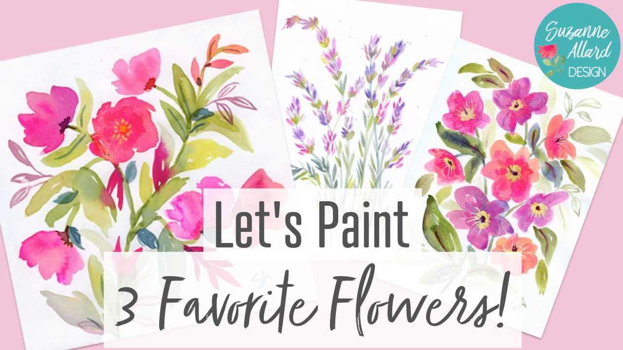
1. 3 Favorite Flowers Intro: Hello, friends, I
am excited about. Well, I'm always
excited about flowers. But I picked out three of my
favorites, which is hard. I have lots of favorites. I mean, let's face
it, they're flowers. If you look at them closely
enough or long enough, there's something
amazing about every one of them. But I picked three. Maybe I'll do a series
of these, you know, maybe three favorites,
number two, because I have so
many that I love. But in this class we're
going to do Hellebore, which is looking at it
actually in my yard. I'm going to take
some footage so you can see they come
in different colors. I think I love the
flower itself, but I also love that they bloom when other flowers
don't bloom here in Virginia. They bloom basically
in the winter. I very late winter or really, really early spring, like
February, even in January. I just love them for that. When we want some
color in the yard, in the garden, there they are. But also I'm just learning
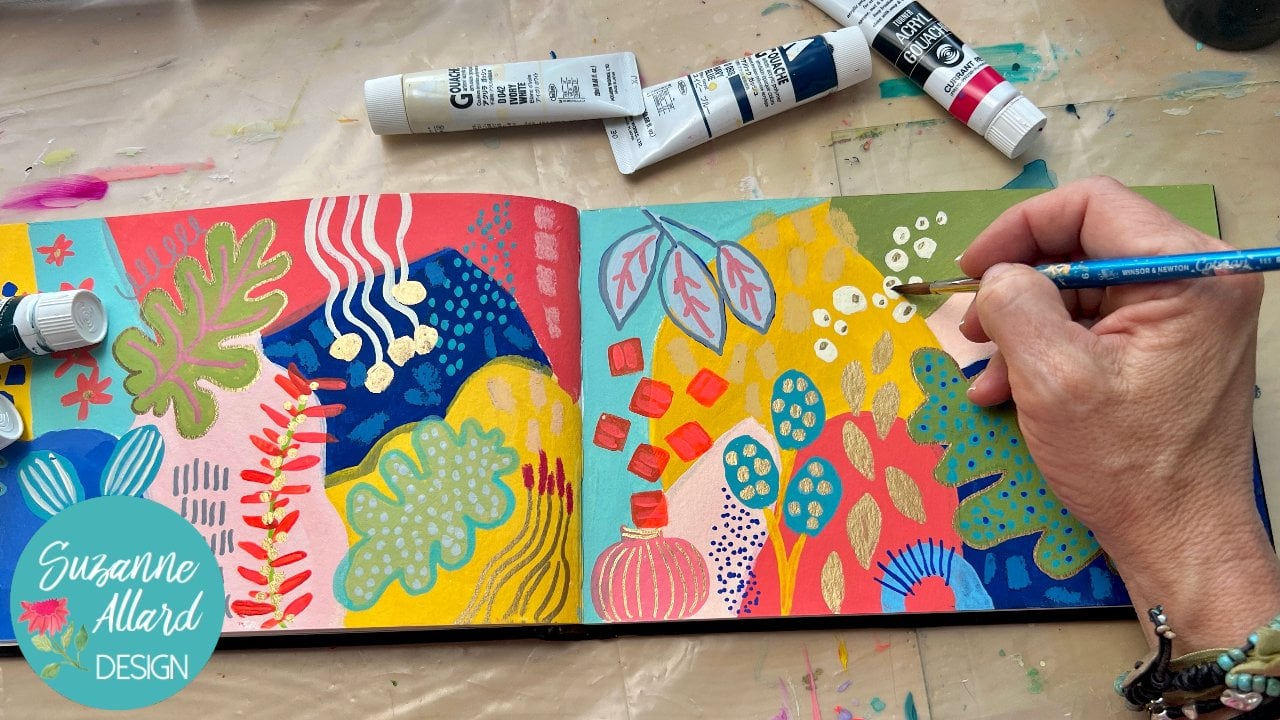
about the varieties of them. We're going to paint hellab, We're going to use gash apple, gah, watercolor, acrylic,
whatever you've got. I'm doing these in a sketchbook, but you can feel free
to do them on paper. I've got two sketchbooks
I'm using in this class. One is I'll put links to both of them
in the class supplies. One is this large, it's got a linen cover
and it's like nine by, maybe nine by 12, Not quite. And we're going to paint
the hell bore in that. The RT square one is where we'll do another one
of my favorite flowers, the Mandavilla or as it's said in the
states, the Mandavill. Then the third one is lavender because I can paint
lavender and smell it. It's funny because I didn't used to like the smell of lavender. And we went to a lavender
farm up in Michigan and got some of the essential
oil fresh from that farm. And I've been in love
with it ever since. I think I was just
smelling the wrong oils. But we're going to
be loose with these. We're going to do a
couple of layers, the layering process and
then finish with details. This should be very relaxing
as much as you can, not thinking about what
looks like that flower. Remember, these flowers and plants are just a
starting point. You can really think of
painting imagination flowers. If you decide that you want, you start and you think, oh, I want these petals to
do this, then do it. Or I want these
stems to do this, or I want this to be
this color, then do it. I'm all about
creative liberation. I, re, I use it different ways, but sometimes I use it to
really just study the flower and find what I maybe haven't
noticed in it before. But I also use it to just jump off and get me started and then who
knows where it'll go. Just at least be conscious of how you're
using your reference. And I would say shy
away from directly copying and trying to make
it look like the photo. What's the point of that? You have a photo that looks like the photo. That's my opinion. Anyway, I hope you join me
and here are tidbits of my creative philosophy
along with my creating. I create these
three from scratch. I do it in a relaxed and fun way if you haven't taken
my classes before. My name is Suzanne Allard, and I started
painting at about 51, 52, 50, somewhere in there. And then started my business. Not long after that, I sell
Prince and I teach classes. Obviously, I think there's about 40,000 students
worldwide at this point. I do have a student
Facebook group you can e mail me to
get an invite to that. I also license my work. In fact, I'm very
excited that one of my paintings just
got picked up by Robinsberger puzzle for a
puzzle coming out in 2025. Just love that because I love puzzles and I love
that brand of puzzles. Let's see, what else can
I tell you about myself? I really philosophy, my philosophy is that I don't believe in the
concept of talent, I believe in determination
in tenacity. We can get more into that, but I just don't think there are some people who are creative
and some people who aren't. I think what it is is
there are people who really want to create
in a certain way. There are many ways to
create. There are people. It's not compelling. I think that's what
ends up leading to skill more than anything. I guess I'm in a
philosophical mood, but I hope you join me in
this class and along with me, make sure you watch
the last video where I go more into depth on resources and some wrap up. Okay, see in class.
2. 3 Favorite Flowers Project: Just to review the project for this class, it's
three paintings, three florals, done in the
water covered sketchbook, but again, you can use paper. And we're going to do Mandavia, then we're going to do Hellbo. I did it in the same sketchbook which became a little confusing. And some lavender.
Can you smell it? I can smell it, yeah. We're
going to do these three. We're going to do them quickly, but also thoughtfully
and in layers. You might find that you start with one of them
and let that dry. And if you want
to keep painting, then go to the, the beginning
of the next flower. You could do that, or you
can just let them dry. Watercolor, None of these
take very long to dry. You could use a hair dryer too, if you're really impatient. Anyway, that's the project. Using paint of your choice. I'll show you in supplies, a whole variety of things. I'd like to just throw the
net wide just to show you and then I try to keep it simple when I'm actually creating
All right, in class.
3. Supplies: Inspiration, Sketchbooks, Tools: All right. Well, if you've
taken my close before, you know that I'd
love to just show you all a variety of things. But that I always want
you to know that. I am not saying you need to buy all this. That
you need to get. Just I don't want it to be overwhelming because
you could do these florals with just one of the types of paint I'm
showing you, of course. And just one of one or
two of the brushes. And just keep things really
simple and one sketchbook. But I would just
like to show you all these things so that you
can say, oh, I like that, I want that, or I like this, that's why there's a lot
of variety in the class. But I never wanted to overwhelm anyone or have them think, oh my gosh, I have to get three Sketchbooks and
three types of pain. Okay. So that's my
big disclaimer. Don't let anything keep
you from creating. All right, let's start with some of the
references that I use. I have a few floral books that
are my absolute favorite. I will put links
to those and notes about all of this in the
class supplies and download. Make sure you look
at that as well. One of my favorite references is this flower color guide book. It's small, it's handy. And what's fantastic is that the flowers are all with
a white background. You can and they're just
photographed beautifully. You can very easily see flowers. And just like look at that, that right there is
inspiring me because I like meandering
buds and flowers. It's organized by color. We may not use it by color. If I say I'm in the mood
to paint something pink, then I can go into the pinks. But of course, when
you're painting, you can make anything
any color you want more. Use it as a reference for if I really want to paint a aculos like there and
there's a bunch of different colored
Rnaculus in here. Look at those poppies. Okay, I could spend this whole video
looking at this book. You Get the Idea.
Flower Color Guide. Flower Recipe Book
is another one that I like for similar reasons. It's a book that shows how to put together bouquets like a
recipe and like in cooking, there's pretty bouquet
pictures that are inspiring and we can lift from. But also it has these spreads
like this where it'll toss the flowers out like
a table here, there. This just helps you really
closely see and say, I might pick the way that that is curved and the way those buds are coming off that thing. That's that one. All right. Yeah, I love my books. I also use my own photos as
reference in this class, which I will share
with you, of course. For pallet paper, really, I have not found a palette
paper that didn't work, so you do not need to spend
a lot of money on it. I've gotten a cheaper brand at a store called
Michael's here in the US, and it worked just fine. This is a brand new one, sorry. But what's nice about the
Strathmore that you care, and not that it's
really expensive, is that it's
attached to the pad. You can just use this pad piece of paper and then throw it away. I tend to just have a piece of paper next to me
when I'm working. You can use other things
for a palette though. You can use a glass cutting
table use that I used to. I started out using paper plates as long as they were waxed. That worked basically
any non porous surface. Because otherwise if you say the paper plates that are not don't have like a
wax covering on them, then it just paint
just soaks right in. The other thing, palette
wise I want to show you, because I use it in a
couple of the paintings, is this quash, airtight palette, which people get
very interested in. And I did a Youtube video on how I fill it and how it works. But briefly it has
these vessels. I have kept these colors in here now for
probably two months. A couple of them I see here are starting to
dry a little bit. I just use a pet like this or a slitle spray bottle.
I get all that. All of these
supplies, by the way, if you do want any of them are I have links to
them on my Amazon, on my website, and
my Amazon links. I also use these little make up spritzers and do it that way, but the point is
that it's air tight. If I seal it and I don't do
anything with it for a week, it does really well. I will say that the paints stay better longer if
I use distilled water. This is actually
distilled water in here. Yeah, I've learned
that one the hard way. Otherwise, they can go get your paints out and
there's mold in the O. We don't need moldy
paints. All right? Let's talk precious. So
again, use what you have. I'll say what I say in
every supply video, which is when it
comes to supplies, you don't need to get
the most expensive. But please don't
get the cheapest, the bottom of the barrel. Because whether it's
paper brushes or paint, you're going to be disappointed. I would rather you get
less of a decent quality. And I just mean
like student grade, you don't have to go out and get the most expensive arches. Watercolor paper,
real sable brushes, not just stay away from
the cheapest brush wise. Let's talk about that first. This is my Suzanne all designed, It's a set of ten brushes
that we release twice a year. If you want to get on the
waiting list for those, just go to my website under supplies and you'll
see it there, a link to it and you can
get on the waiting list. They're synthetic brush. I just picked all
the shapes and sizes that I use a lot in my classes. Don't feel like you
need to get those. The other two brands
that I really like are the **** Black brand and
the Princeton Velvet Touch. But I will say there's also, silver is a great brand.
They're all synthetic. I don't use really much real
animal hair in my brushes. Just a solid, at least student
grade synthetic brushes. All you need sizes. I use a variety in my class. It's amazing how handy and
versatile a filbert brush is. That's the one with
the shape like this. This is a size seven, you could use a 468 around. Obviously those are the go to
thicker is often better for florals as long as you
have something for the details when you want to do the smaller stuff and that's
what this little guy is, this is a number four, then flats are really nice
to have to sometimes, depending on what your I use
this number four flat a lot. So those are brushes, pencils, sometimes I
use them for details. I don't think I used any of these pens, intallic gold pens, in this class, but I do, sometimes I often just sketch
with watered down paint. But sometimes I'll sketch with a light colored colored pencil, either a prisma color or a water soluble pencil
that's not water soluble. But the nice thing about the super color and you
can use the crans too. The brand is Card, it's Swiss. Whether it's the
pencil or the crayons, they make ones that dissolve is your painting marks dissolve
in the paint and go away. All right, let's
talk sketchbooks. I used and tested some that are a good
price and a good quality. I wanted watercolor paper for this class because we were
doing those style of florals. I did, I do have a mole skin
watercolor sketch book, but I don't like the
shape of it for this. I like square and I like this portrait shape
for this class. I, I love this
little sketch book. This is the handbook. It's made by speed ball, but what I like about it
is the nice lemon cover. I also like that you
can choose to get it in either 90 pounds or
140 pound paper. That just refers to the
thickness of the paper. I always talk about using at least 140 pound paper when you're doing your artwork that you're going to put
on the wall or sell, but in a sketch book it
can get really thick. I love the option that
this handbook gives you of ordering it with 95
pound paper, I think it is. It's just a little
bit lighter but plenty thick for a sketch book. Love that one. Comes
with a little, they'll come with a
little string and then this is really nice. Before you know you've
painted it, it's dry. But you can see this
sketchbook is half full and there are some flattening
that needs to take place. What I'll do is take this out
and then bind it like that, and then put heavy
books on it overnight. These little clips, by
the way, are great. I got those on Amazon. I think I have a link
to them and my list. This is one of the
florals we'll paint. I like this now. These next two are
the Artisa brand. I have not loved or been
impressed with their paints, but these sketchbooks
I think are really good quality
for the money. This is a nice size, the paper is good quality.
Nice linen cover. It looks honestly, doesn't it, like they imitated handbook? Actually, I think they did. Now I see the little
pocket in the back. Yeah, very similar. Very similar strap.
Similar linen cover. Anyway, it nicely
bound, it lays flat. I do use the clips
when because I've got paint on these and it helps
train the spread to open it. This is the eight and a quarter
by eight and a quarter, and I use this quite
a bit in class, mostly that then this is the
larger one that is new to me and I've been experimenting with
different things with it, but I use it class as well. And it's like eight something by 11 and something,
same brand arts. All right, that's sketch books.
4. Supplies: Paint Options: All right, let's talk, Pat, I've got some paints
out here to try not to confuse you because
it can be confusing. I have acrylic,
which I did use was surprising success in
the toss florals module. It's all acrylic. It's amazing. And it's in the
Artis sketchbook. I think if you use good
paper and a paint that flow, which the nova color
acrylics flow, we almost indistinguishable
from watercolor. When you work with them, you can see some small differences. But anyway, the nova color paint is a paint that you have to
buy via mail order. And I have a, a
bundle with them, a Suzanne Allard artist bundle. They're in California. They're a really nice
artist grade paint at a student grade price
if you live in the US, because the shipping
overseas makes it too expensive for US people. If you don't already have
acrylic, you might like that. But you might also
like these probably. I encourage you to
use what you have now before you start
adding. Listen to me. I have so many types of paint, I don't even want you to see what's on the rest
of this table. Okay, so acrylic here, I just want to help because
this gets confusing for people who aren't familiar with these and it
was confusing to me. Then there's Acyl, which is
acrylic paint and G combined. This is regular. The original type of
G was used in France. Think at least 200 now. It's more than that, years ago. It used to be used to do those beautiful wallpaper and
interior design patterns. And it's just opaque
and scans really well. It's just beautiful. It's the first paint
that I started with. I don't know why most people
don't start with wash, but somehow I did and
fell in love with it. Then I discovered Acroh, which has all those properties, that nice chalky matt finish
high intensity pigment, but it has acrylic in it. When it dries, you can't
disturb the layers. There's nothing good
or bad about that. It's just knowing depending on what you want to achieve with a particular surface and what your goal is
for that painting. But you'll see in the class, I use these three interchangeably. I will say that. Remember that this is
the only one of these three that can be
reconstituted with water. The regular guash, these two, once they dry, they are stuck. I've got a palette now that
I got into the moment and I'm mixing and throw some guash in there and
some macro and acrylic. And now I've got to
clean this palette that it can't just
be rinsed out. That's why I like
the palette paper. Anyway, I use all
three of these. They are interchangeable. Don't worry about mixing them. You'll learn what does, what you experiment with them. Now, color wise, I, for the most part, you can make your colors or use the
colors you've got. I will point out some
colors that are my go to colors that are harder to
make or more challenging. I always have a
turquoise on hand. Then Opera pink is what it's called in the gas world
and watercolor world, but it's basically
a fluorescent. It's, I think it's richer
than a fluorescent acrylic, but it's a very bright pink
and I use it rarely straight, but it mixes and
makes everything pop in the pink and
red and yellow family. All right, let's
talk about brand. We talked about the acrylics. My two favorite acrylic
brands are a whole in that's these two Turner I
guess goes that way. Then my favorite
gash brands are, well, I've got to
get some Turner because I like that one too. Well, it looks like
well, let me get you in. It's called Turner Design Wash, and I think it's the first
paint I started out with. I think it is. These are my favorite brands of
regular guash Turner, which also the Acyl, then hole bin which also
makes an acrylic quash. Even though these
don't look like the packaging and then Linds or Newton designers
guash is lovely, these are a little
more expensive. The turner is really a great
paint at a good price point. If you're starting, you've
never tried Guash or Aqua. Don't feel like you have
to do anything more than to have some
success. All right. We did the sketchbooks. And by the way, if you want
to paint these paintings on paper nine by 12 paper
or eight by ten, paper, 11 by 14, feel free. I just love what sketch books do for you mentally
and creatively. I feel like when I
open up a sketchbook, it feels like it's inviting the pressure to produce
a painting is gone. I also like the whole
spread part of it. You'll see in this class, we'll do some paintings that are across both
sheets in the spread. Then we'll do another
painting where we turn to the book and
paint it this way. And then we'll do some where we just do one side
of the spread. But it's almost like
when I do one side, the other side is beckoning
to me to do something that, that compliments the
one I already did. Some people just use one side and leave the other side
blank, which is fine too. I just have found that
sketch books for me have really help my heart blossom. And that's because I think
the fear is lessened, the approachability
is increased. It's just so much
more, I don't know. They're like my friends miss sketch books call to
me and say, hey, hey. That's why I don't even
want to count how many, because then I try
the little ones and the big ones in this
paper and that paper. But anyway, you paint
on whatever you want. I'm just glad you're here. So let's get started.
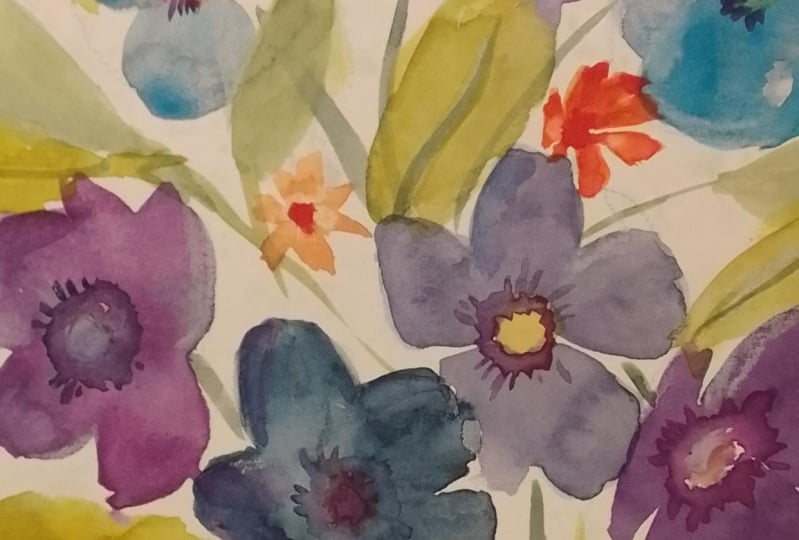
5. Hellebore Happiness Getting Started: Hellbre is another one
of my favorite flowers. I think I like that in this
part of the United States, on the eastern side, they
bloom almost in the winter. They're those treats that you get when the rest of
the flowers are gone. Just a variety of
colors, they come in. Let's paint some hellbore. We can take the colors
any way we want. We're just going to do this similar to the other paintings, floral painting,
some blues greens. If you don't have greens,
then some yellows to make your greens. This is interesting
color of the stem here. We may or may not
make it that way, but we'll look at the
variety of the sizes. Here's a really big bloom. This one's about half that size, Some are facing away. I'm not going to try
to paint this exactly, I just like to observe
details like that. I may or may not
put a detail in. For example, you see the leaves
have these little ridges, but I probably won't do that. What I do like is how the
stems are meandering, the variety of the
size of the blooms, even the centers, how they
vary is really pretty. I'm going to start with stems. This is a mob color. It might be a pretty
color to have a stem, which would be some rows. I've got a mix of paints here. This is acrylic. There's
some regular Gua here. I've got some water colors. I don't think I
could use acrylic, but really use what
you have for colors. If you want to make it similar or in the
pink purple family, then pick some pinks or magenta with the amount
of water we're using. We can vary the color a lot by just adding more
or less water. I've got a little
ultramarine blue out here. I've got some greens. It might be fun to add a yellow. So that may I like to
take my flowers and have a bit of variety
in the color of them. I just love how it makes
them really come alive. I've got the opera rose
here or opera pink, that's really bright, basically,
almost a fluorescent. This is just a regular rose,
they're pretty similar. We'll see if we add
anything else as we go. But I think for the
stem maybe make it, I think I want to make the
stem more green or even blue because the stem is too similar to the color
of the flowers. So I want to make the
flower stand out. I think I might make the
stem like a bluish green, a test strip so that we can see, these are just strips of
paper mixed media paper or watercolor paper
that I've cut up to be able to do this with. See if I've got the
color I'm interested in, maybe something like
that we could do. Let's see if we think it would be fun to add
a just a bit of turquoise. Let me
see what that does. It's going to make it a cool blue that's kind of pretty
to contrast with the. That didn't really me
out a little more. I don't want to go that
far, somewhere in here. Look at all those colors. I think that's the winner. A bluish, slightly
turquoise, greenish. All right. I'm going
to bring this. I'm not going to take it off
the page the way it is here. You can do that. I'm just
going to bring these stems up as if maybe we were going to put them into
an arrangement or something. I see that. I guess I did bring it
down after saying that. I think I forgot
what I was doing. I'm going to bring on a lot of the stem will get covered up. This divides here. I want to leave room,
Learn that the hard way. Just practice, leave
room for the bloom. If you take the
stem too high up, like if I had kept going, then my blooms are
going to be crowded. Something coming off of here, maybe. Well, let's see here. Well, let me put some flowers. Because I want to allow, I want another stem going either this way or that way,
but I don't know where yet. Let's just get some
flowers in now. For the flowers, for
this kind of shape, I think it's best
to use a Filbert. I've got this number seven, but number 86 would work. I'm going to, for
the first color, just to get something down, I'm going to make a
shade of pink that I'm letting some of
that green go into. But just toning it down, we'll use water and I'll grab some of this yellow over here. So I get some variety. I've got lots of different
colors right there, enough to play and just start maybe this one I'm holding
the brush on its side. This one is more
like that facing, so then I can come
up here with this. I'm going to leave some space at the center to put in
my yellowy green. I'm going to dab a
little more color into the center of this just
for some interest. But I am leaving that it there. It'll just make my
yellow pop more. It's no big deal if you
end up not doing that. I'm going to try not to
mess with my edges because the edges start drying and they're really pretty that way. Again, I've learned that if you do it quickly
before they dry, then you can change the edges. But if you start
mucking with them, then you get the second edge and it starts
looking overworked. Been there, done
that many times. I just added a bit of
the ultramarine blue. Let's see. All I'm deciding is which way do I want a flower here to go? I'm not saying, well, this is over here, it has to be. I'm looking at all the
flowers saying which one can inspire this
flower that goes there. I think this on the way
it's facing, is pretty. I'm working with watercolor and so it may or may not
turn out quite that way, but it's actually already not
turning up that way. It's turning up
more like that one. Just go with it. I'm trying not to dab too much or overwork. Go ahead and put some
color in the center, remembering that these
fade quite a bit. And I want that pigment, especially because this squash, yeah, this one is guash. But if it's water color, I don't want that
much water though. The pigment is not as intense. My brush is a little too wet. I can go back through
this too. It's not dry. And dab want to get rid
of some of the water though that dabbing with a paper towel is a
great way to create a light effect if you
want to lighten an area. I've got a little
bit of purple here. I'm just going to dab it on the edge of the
petals just for some interest when that
got really orange. All right. There's a darkish, I just want to be
careful that's not too brown, I think it is. Yeah. So let's get more rose. I want a darker one, but I don't want it too brown. So I added blue. And a little bit of
orange. There we go. Maybe a little more blue. Okay, we're getting
a nice plum color.
6. Hellebore Happiness First Layer: There we go. So what I did is I took the
rose and the ulta marine. And that gave me this purple. But it's too purpo, so a bit of orange calms
it down to more of a plum. You just dabbing and
you're not really, if you look at these,
they're all kinds of shapes. We're not trying to, in this one, create
those symmetrical. I want to put more pink there. I wanted that one a little. I'm just going to
my ultramarine blue mixed with discolor. Let's make one that's
quite a bit more orange because why not? Maybe the light's hitting it, going to add some
pink to it so that it does relate to
the other flowers. When you do that and
change of color, you just want to make
sure that you have a bit of the colors blended in. Like there's some
orange in this one. Just so that it's not a
complete outlier in terms of color besides I really like that orange one, so I'm
going to make another one. We need one just right
here on top of things that's working too fast or just not looking at my
palette. But that's okay. It'll be a happy accident, as Bob Ross used to say. Sometimes that ends up
being my favorite flower, the one where
something unexpected happens a bit of
orange into here. I'm starting to really
like the orange direction. Okay, let's go back and keep
holding my, my sample paper. I don't need to
hold you anymore. Another one that's
facing that way. I didn't leave the center
blank. That's okay. Well, we can do this, we
can go back in and do that. And then it'll be a little bit, maybe perhaps more ready for the center we're
going to put in. And I didn't leave
that on that one, but they don't all
show the center. So that can be one that's
not showing a center. I'm just looking all over. I have six blooms. I can't do that because that's an even number.
It doesn't work for me. I think I want to make a, another large one down here. Maybe it'll be one
of the biggest and I'll go in and
put out some center. So let's, what I don't like right now is it's a little too compact and round. I can do something with leaves, but I also want the blooms
to be less compact, so I'm going to grab another stem and put
a flower down here. It's going to be. The yellowy, pinky one. You know, some people like
to start with the leaves. I've done it both ways. Yeah, That helps if not
feels so compact. All right. Leaves have some fun
mixtures with these greens. To me, I think of leaves as
I just love leaves color. The colors balance
out the flowers. I want them bleeding and I'm going to make these
leaves really loose. I'm just the brush
down and moving. Maybe there's a
bit of leaf there, some of these leaves are darker. If I want to make
a leaf go behind, I can just do
something like that. A little too much water. As long as I don't touch
the flower, it'll be fine. It won't bleed. But you can make it bleed if
you want to bleed. That I like a variety. Yeah. I like that
one touched and it's pretty the purples
going into the green. Let's see, varying
my shape, size, color, something
coming out of here and over here a little bit orange
got in that green. That's good. Again, we don't have to make
these leaves touch. We are making a suggestion
that the leaves are there. Going over some of
these stems a bit more, just to give them a little
more where they're visible. Does the whole
thing work for me? One of my favorite
leaves is this one, just the way it ended there, with the points there. I'm wondering if I want
something else here, but then it might
feel too compact again because I like that I
have this going off here. In fact, maybe I'll just do
that to take it further. Same thing here. Make sure
we're not to compact. You can also take,
this is just I'm going to show you personal
preference. I've done this. I think one of my
favorite paintings and paintings that
sold lots of prints. I did this, I took
really watered down. Okay, Not that much
water background leaves, but just really faded throughout and it added
a nice bit of interest. You could just barely see them, so they almost feel like
they're in the background and they can help with
the really white. If it feels too stark, just try not to
overcontrol your leaves. You really let the
brush do what it wants, and sometimes really
lovely things happen. And at this point, I haven't really looked
at the reference much. At certain point, you
get in a painting, the painting takes over
from that, which I like. Okay, I think that's good. Now, we need to let
this layer dry, we can look at where we want to add a
little more pigment. I really like some of the
bleed patterns that are happening and we can
add the centers.
7. Hellebore Happiness Layer Two: All right. Alibors have dried. And just looking
at it and thinking about what I want to do with it. I could leave the flowers as they are and just
do the centers, but I thought I'd
play with a bit more pigment in a few places. Personal preference,
I just thought it's me taking the risk
of going too far. Then at least I can
show you something. What I thought I'd do is add a I really love some
of the bits in here, so I'm not going to mess
around with all of them. But I just thought
I'd see if I add another layer of some
of these pigments. Is this where you're
saying? No, don't Suzanne, you have to experiment. Let's see, I want
someone rose color. I'm picking up the
filber brush again. Some of these leaves in the
reference photo have like a darker side sort of
pointing out the petal. I thought it'd be fun
to just softly do that. In some of these I don't want to hard line so I'm just
softening that inner edge. It's trying a little
bit too, a hard line. Let me make it a little more purpo then on some of the leaves petals, well actually all
of them, there's a line going down the middle. Just might do that. On some
of them it's almost a fold. Just ever so faint. That's too much is so when you when you do the
second layer like this, you dab lightly so that you're not altering the layer below too much. Here's where I think
I'll bring in a bit of this purple movie color and
do a little bit of veining. I like it helps the
composition to bring a bit of bloom color into the
leaves and vice versa. The leaf color into the
blooms. Not all of them. A just adding a bit more pink to
this one because it was pretty cool uniform. No, I have to let this dry
before I can do centers to see if I can get this one
to where I like it better. It's looking a bit locked up, which means I probably should
have just left it alone. But we'll see if
we can salvage it. Okay, let's let things dry. Really interesting
colors forming.
8. Hellebore Happiness Final Details: All right, This is nice and dry. Make sure when you do
the layer that it's dry, your page will wrinkle. That's one of the things
I like about working in a sketchbook. I'll close this. When it's dry, the weight put the heavier side
of the book on top, so I will put it this
way and then even put some other books on it
for a night overnight. It will flatten out. A trick if you decide to do one of these on a
sheet of paper to use as a print and artwork
in your home is you can take the sheet and
then take your artwork. Let's say it was this. Let's say this was your artwork. You would put it something
on both of this, all right? Well, pretend there's
nothing here. You would put the artwork side down on on a surface,
a clean surface. And then you would take
paper towels, three of them. Usually it takes to fit or two wet them but then ring them
out to they're just damp. Put them on the back
of the artwork where there's no image
like this sheet, and then put books
on top of that. What will happen is
very damp, wet at all. Paper towel will
moisten the back of the paper enough
and then the weight of the books will flatten it. Sometimes I'll take a big
cutting board and put it on the back with the paper towel underneath and
then books anyway, that's just a little tip. All right, back to the centers. I want to mix up some
yellows and whites. I've got some now. Here's where gash or
acrylic is helpful. Trying to do this
with water color. You can do yellow actually, you can whitewash or off whitewash with your water color if you're using water color. But you won't get, if it's
just yellow water color, with no white in it, no gash in it,
then you won't get the opacity that we
want in this bit. You could also use
like a paint marker or a bit of oil pastel
if you want it. This has a, centers are some
of the prettiest parts, both for me, both
color and texture. We're going to vary
those a little bit. I have some really
bright leaf green, it's called from holding. This is acrylic wash. But again, you could use acrylic or even
water color as long as you're adding an opaque
light colored paint. I like how some of these from the side look like
little square bits. In fact, that's
making me want to use my flat brush instead of my round brush so that
I can make some of those. This may end up needing
layers as well. But we're, again,
not doing an exact, I'm not trying to copy
exactly what's there more, the suggestion of these centers and embracing the
colors that we like. I'm going around looking
at how they vary. Some are darker green. Getting inspiration from
the photo for color shape, but not really copying a
particular center or flower. And some are quite
a bit more white. This one I think I
want to save and just do the little lines that are built off
of these little, but it's a line shape. Yeah. And then do you
see in the center, they have, I don't know
if it's another stamen, but it's a bit of plum. I could actually put
that in some of them, but probably would have to
let those dry a little bit. Let's go with the
really small brush. This is a number three,
round two would work. Even a one would work
for something small. See if we can make some of
these sweet little lines. I want those to show up more, so want to make them more white. Just really lightly. Something you could
practice on another sheet of paper if you wanted. Some of them have lots
of them probably, depending on where they
are in their process and just a few and some have none. Like that flower has none. I guess they've fallen out. I'll leave that with none. Because like that one is the thing is when you
really observe nature, you see that it's
really imperfect. That's such a good thing
to remember when we're painting because I know I have to fight the
impulse to make every, I don't know, just things
be uniform or shaped. What I think is the right shape. Then you look at nature and you see leaves are all
kinds of shapes. They're lopsided,
they could be torn. All right? I think I'll
see if I can get some of those plum colored
centers going. But you know, that's going
to be, need to be, again, a more opaque paint. I want to be on the darker side, which will give us
some nice contrast. I'm thinking of
like a dark blue, actually, actually a plum. That plum color we made before. That's what
I'm thinking of. Let me try the indigo just to
get things a little darker. Can need a little bit of
orange to warm that up. Let's see if we've
got a nice plum getting there may be
a little more pink. I want a little more
orange in it. There we go. That's kind of what
was what I had in mind and that's going to
bleed with those things, which is fine in some places. It just looks like a dad like that. It gives
a little definition, doesn't it? To the center. Pretty. It's funny
how a little dark something will make
everything else pop. We just making me want to take the same dark color and just do a little bit of again but a little bit darker us. So when I was looking
at it as it was drying, the only thing that I remember thinking that
I went this way and, you know, to make it lopsided, but it's also going
this way here a lot. And then here to me, there's just too
much going that way. For something very
faint but light I was going to
faint and light do something over here of foes bristle to balance it out. All right. Time to stop. I say that and then
I take another. Then you can also, I think it's got
enough going on, but you can do the flower. I'll just show you the leaves
that are just outlined. So something like this can be
another nice effect to add. That is, I feel like I want
to do one to show you, but there's really
no space for it. Well, let's just throw one in. Something like that.
Can be pretty. Now we're at the almost
point of overcrowding it, so we might as well just put a couple more ends to show you. If we make the color
really subtle, they just add such a
pretty soft touch I think. Okay. I don't think
that's too overdone. All right, signing And the signatures should look hand done and imperfect
like everything else. Well, good. I like
how these turned out. Make sure you let
them dry completely. Of course, close the book and I hope you enjoy
painting them.
9. Lake Michigan Mandevilla Beginning: For this module, we're going to do more realistic watercolory. Although this is, it can be
water color, can be acrylic, but something that's a little
more representational, but not too representational. Still, a little bit in your style or however
you like to do it. For inspiration, I thought
I'd use this photo that I took at my friend Sarah's
beach house on Lake Michigan. And she has these
beautiful three of these Mandavia plants in these big pots going
down the stairs. I want to make sure the glare is not ruining the
photo for you. Anyway, I will put this
in the class resources, but this will be your
inspiration photo. You can print it off
and follow along. And I'll put it here
next to the sketchbook. And then I'll also put a picture of this
just so you have it. Now. For brushes, paints, I'm going to do, we're doing a variety of
paints in this class. I'm going to do some
something just there, well, it's going to be
part of the painting. This is regular blah. I just thought I'd use it to change things up a little bit. I've got a selection
of basically, I usually grab some pinks. You don't need a red because you can use yellow to get these, any tones like in here. Then you don't need a green because you can make
that with blues. I've got a couple blues here at an Alt Marine and an indigo. I've got a yellow and
then I've got a white. Although I doubt we'll use it. I just wanted to have
it on hand brush wise. I've got some rounds here. I also have the big Filbert that I like to use with florals. We'll see probably
start with big and then use the number
four round to do some of the smaller leaves and details and
things like that. I'm going to prop this up little bit because the
glare is hitting me. Move my light a little bit, Get us all situated. Okay. I don't sketch these out, I just make them a
bit free flowing. I'm going to, the Manda Villa is a very tender type of plant. I don't think you can see that here a
little bit in there, we'll do some tendrils,
but you can see also, I love all of these
buds that come up here. See these sharp
buds? Let me see. I've got to close
up in here too. Yeah, okay, here you
can see the tendrils. I'll include this one
too because that gives you such a beautiful plant. Maybe that's a better close up. All right, so we're just
get at the spirit of that and come up with a stem and some blooms and see
what happens for my stems. I'm going to get just a bit
of this indigo a tiniest bit because it's dark
and some yellow. I also grab this whole
in yellow to play with. It's a green, limey green. I was going to say mustardy,
but it's cooler than that. It's really interesting color, which you can make of course, by a lemon, lemon yellow. See, it's because
it's a cooler color. But since I have it, I thought
I'd throw it in the mix. You need so little paint
for this painting. We see how dark. Alright,
he went too dark. Throw a little of that in there. I like variety in my greens. I'll be keeping that in mind. I'm envisioning
something coming up and the mona is
unusual like this. And then go in that direction, we'll do some of that can appear and maybe maybe a
little silk of this way. I just realized
that this piece of pallet paper upside down. And that's what happens
when it's when you don't use the glossy side. I think it's because I
was using it to take pictures and I didn't
want the glossy. So now the paint is soaking
right in. That's no problem. We'll just move it
to another piece. See how that sits on top. So there is a right and a wrong direction to pallet paper. Who knew find these
things out? Right? Okay. Just adding
little bit of texture. Let's make this one
just go off like that. This one come around here and maybe something
else down there. It just gives us
a place to start. We'll put in some blooms and
see where we go from there. Now this is a color that I
recommend buying Opera Pink. It's very intense. You don't want to use a lot. This is the
Quinacridone magento, but any magento will work. Or red, I just like
the pinks more than the reds.
They're both intense. You want to have your
paper towel and be able to add a bit of yellow. I'm thinking about
making a variety of blooms that will face
some that won't, but they almost have a windmill. Look these flowers. So I'm turning this on its side and I do love to
vary the color in the petals. Maybe over here there's
a little more yellow, yellow boss to my
other sheet gas is basically an
opaque watercolor, meaning that it behaves
a lot like water color. Because it is a water color. It's just opaque and much
more highly pigmented. That's how you can get
the intense coverage. You want to put one here
facing us as a center. Thinking about how
they're kind of win milly and I try not to put, my center is right in the
middle of the flower, although that one kind of
did come out that way. And I like to tab a little
bit of color in the center, the way you can make
sure you're not getting too fussy and is by doing what I just did
vary the shape of it. Here's one on its side and then it added
more water to that. Too much yellow there. Maybe we'll have one going off this way. Remember, nobody
is going to say, oh that doesn't look
like I'm on via. You're just using that
as inspiration point. You can take these in any
direction you want them to go. I don't know if you saw that a little bit of splatter there, but I love that
when that happens and probably will do that
intentionally to this one. Let's see, we can make a few more and then
I usually transition to leaves and then go back to
flowers and play that way. I'm just letting that
brush dance on the paper. It's just, you're almost dabbing, this one's getting
bigger, which is fine. Let's transition to some leaves. You saw, I left a little
bit of pink in my brush. These leaves are pretty
standard leaf shape, but of course they're going
to go every direction. And we can change how
they look by just being really light
with our brush. Some have more water,
some have less. A little more color
shift in them. They're going every direction. Sometimes they're
thin, sometimes too much water thick
gets more into go out, you can use any blue, you've got to make your greens. You can make so many greens that just a bit of yellow depending on the
yellow, some orange. To tone things down,
I'm going to put, you'll see these have
multiple leaves in one place. Let's give a sense of that. Be really light about it. Remember, we don't mind
if things are bleeding. We want that flowers
bleeding into each other. Try to work quickly so you
don't over work things. We can bring something
down here if we want to have something in that part of the page. Dabbing in a little
bit of color. If I take that indigo with the green yellow and then
put a little bit of orange, I can really tone it down nicely just to get
some value contrast. And I can dab it into
places before it dries completely. Pretty
things are happening. Sometimes the really
faintest leaves can be the prettiest too, like taking just a tiny
bit of color like this. Now I'm going to do, remember
those beautiful buds. I'm just going to put those in here and let them
bleed and appear, Let's see in various places.
10. Lake Michigan Mandevilla Layers and Details: I was going to do a bud there, but then it started looking like it was
part of the flower, so I just decided to make it. But I love how, see, there's tiny bits there
that came through. I just love the things
that can happen. I take, I could go up here
and do a couple more buds. It doesn't really need it, but I'll show you because why not? So we could take something
like out of here and maybe gets a little bit
more orange to the butt here. That's pretty, I might take some of the orange and
put it in the center here. I think we're done. I'm
going to clamp this down. Sometimes I'll take my brush like this on the parts
that don't have paint, just to get it nice and flat and then clamp it
and they let it dry. That's a pretty monde villa. When it, if I think it
needs more layering, then I'll film some
more and touch it up. Guh is better at
this in watercolor, but sometimes it
much less pigmented. And we loved how it
looked wet and then it dries and we're like,
oh, what happened? What's great is that you
save this just like it is, because these can all be
reconstituted with water. If they're quashed
or water color, then we can come back in and just add a little more color. We'll see how it
looks when it's dry. Okay. Our Mandavia is dry. I'm happy with the amount of
pigment that came through. That's like I said, when
you're using a good, you won't have as
much of the fade as you'll have with water color. Now if you really good water
color and use a lot of it, then you can get
something similar. You don't need the G. I just wanted to point out
some of the differences. I do want some subtle
bits here to bring a little bit more life
to it or interest. If we look back at
this reference piece, I came back in and I did
these little purple bits. I might have even added
some smaller flowers. This you can tell I went back into the leaves
and added a bit more. But let's just see what we
feel like doing with this one. Not a lot. I think it's very sweet and balanced and pretty. I don't want to
muck it up a lot, but maybe just a
few little details. I'm going to grab some
white and play with some pale yellow bits in the
center of that one flower. I'm just going to take,
this is our same palette. I'm just reconstituting
these colors. But I thought maybe just
a little bit like this, not making it uniform, Taking the indigo, mixing it a little bit with the
green and getting something. I just want a little definition, but I don't think I want
to put it on the flowers, something soft here and there. As I always say, it's
about personal preference. You may like it the way it is and not want to
do a thing to it. You can layer, you know, this way with water
coloring glog as long as you
really let it dry. I'm just playing. Seeing what adding that
bit of darker value does. Usually when you put a
little more contrast, it can bring things
to life a little bit. Remembering to keep this one loose. When you go
back and forth. Like I do between more controlled painting
and loose painting, I have to literally
remind myself, okay, this one's a loose one. And I don't want all of these little blue things to
be the same size either. Now I think I want to
maybe take a bit of a dark on the base of
a couple of these. Doesn't need to be a big deal, even a bit of green.
Because if you look at where I got muddy, because I had purple, purple, and green will make mud. Okay. Unbeknownst to me, my camera stopped recording
this last little bit, so I wanted to tell you what I did after adding the
little blue things I was talking about. I was talking to you,
you just weren't there. How you can take a
color and just add these little outline leaves for another just dimension
that I liked where it was. I've added some little bits of dark at the base of the flowers and then I talked about
how you can take a color. I really like taking a color to do your signature of
the paint you're using. It is part of the painting. I do think about, okay, what color would be nice
a bit of it down here, and I actually think
of it as part of the painting and get it done. That's something
that I've learned in the last couple years. Don't save it for later
and have to redo it. Now I'm back on camera. I'm wondering if I
want to take some of this just to make
this even more of a focal point and put
a little bit more of this hopper pink with
gold yumminess in here. Not all the way around.
Just a bit in the center. Maybe a bit of dark at
the base of this flower. Yeah, I think that's nice. I think it's really balanced. You could keep going
and you put in more of these little sketch
branches here, but were wanted to
leave some white space and leave it fresh and
pretty and not overworked. Going to put the brush
down and consider it done. This is actually a really nice motif that could lend itself to a pattern that's a whole
other thing, repeat patterns. But what helps it is that there's the shape of it and that we're not going off the edge
of the paint of the paper. I may use this one in a future class for a
repeat pattern. All.
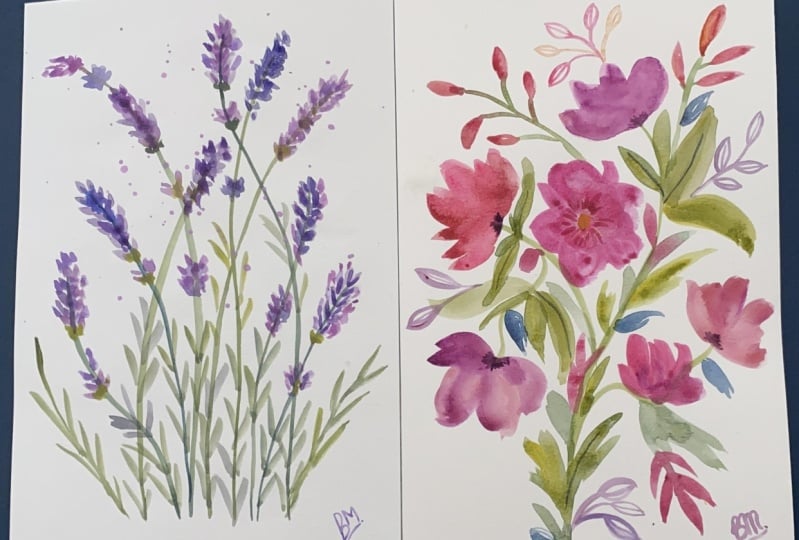
11. Lavender Dreams Beginning: One of my favorite
books to use for just a single flower inspiration is this flower color guide. I will put it in
the supplies list. One of my favorite flowers. The smell of it and
painting them is lavender. I thought we would make a, this is the larger sketchbook. This one's 88 and something
by 11 and something. I think this will be a good practice to see
if we want to make, this could be a
print for your home. Just get those sprigs, those lavender sprigs going up here in the beautiful delicate
way with color variation. I've got a variety of
colors and paints here. You can use any, you can use the acrylic. You can use the acrylic,
can water color. You can use regular
As long as you, if you're doing a watery style, which I'm going to do here, then you just add more water. If you are doing more of a, maybe that would be
fun to try to do another module doing
the same thing but in that more flat opaque style. Anyway, I've got a variety of, well I guess I've just
got one blue out, but I can always grab
more if I want one to go, might, might want that. I've got an ultramarine. I've got a lavender, but I'll probably end up
making my own lavenders. Then I've got some pinks, the opera rose, and just
a rose and some greens. You can make your own greens, of course, with
blues and yellows. But I have some, we'll
just start with the stems. And this will be relatively fast because we want the colors to bleed together and we
want that magic happening. We're going to be fast
and light with the brush. Have got the large
round number eight, but anything I would go larger even though if it
has a good tip for stems that'll allow
you to stay more lose. You don't have to use an eight. If you have a six, that's okay. Use what you have. You could try this also with a filbert. You would just hold it a little differently if you
have a filbert. All right, let's make a green. Just mixing. I never rarely use a color
out of the two out of the tube because it's
just 21 dimensional. I'm going to maybe put some, actually I'm going to get some
of this ultramarine down. You know, I do need
a bit of orange to tone those
greens tiniest bit. This is a apple rush. Just orange, it's called. And I'll use my
little test strip. If you just use this
green out of the tube, it's just too intense. We had a little ultramarine. We can get a nice
shade like that. I'm not necessarily trying to match the colors
in the picture, but I'm just going for
colors that I like that are semi realistic. If I were to put a
tiny bit of orange, you get closer to brown. That's why it has to
be a really tiny bit. But it can really do
lovely things for greens. Let me show you. It's just
with a tiny bit of orange. The green from the tube
that was like that is now just a lot richer. They need a new strip. Yeah, see, it just really helps. It brings it to life, doesn't it? All right. I'm just continuing to
add, make sure I've got, that's too dark, I'm going to have to
be a little more blue. I'm going to make this is, I love the way
that the stems go, so I'm just going to
be really playful and loose and take some lines up here and see where they go. I like varying the color
of the stems a little bit. Maybe we want a tad of this. It's a brill. It's a yellow
green basically, Or lime. I've had this to forever. This is local sennelier, grand, you know, maybe a
couple of darker stems. And you just to give
some thought to, you can take this all
the way off the page. You can frame it this way, maybe more in the center. It's completely up to you, try a lot of different ways. That one, I started out
here and went down. You'll notice that they're
darker where they start. So that can be another
way to vary the stems. Maybe just one more. I'll do it that way as well. Okay, so now I'm going to start a make some
purples and lavenders. And start dabbing them. And in these petal shapes, petals and leaves, and
kind of go back and forth. Because I like the petals to Is this the one
that's dried out? No. Okay. I like the petals to bleed with the leaves and create that yummy stuff
we were talking about. I'm talking through this obviously because
I'm teaching it. But these are great to do just quickly and lots of them
and just see what happens. I've just got a rose there. I've got my Alta Marine here, and that's going to give me
so many different shades of lavender. And then when I want some
that are a bit toned down, I can grab some of this green. It'll give me lots of variety. I'm just going to dab, you can do them in clusters. Change colors when, you know, bits of more
pigmented paint hit. I like that we're
touching the brush down. We're not overly, we can even do the brush this way. Some make, some
larger, some smaller.
12. Lavender Dreams Final Layer: I'm doing the brush both ways, and I think I like the effect
of holding it this way. But they're both interesting. They give a little
different look there. You get some variety by just changing how you're
holding your brush. I'm going to come through
with some darker ones. And some of them I'm
clustering the stems or you see there's little clumps and
some of them I'm not. I'm going to quickly, I'm going to actually, I'm trying to work quickly
and explain and talk. But the reason I want to work quickly is
I want to get some of these greens at the
base of some of these before the purples dry. There's just a little
bit of almost like a little green cup at the
base of these lavender. I don't need to do
it at all of them. I don't need to do it at all. But I think it's pretty and I think the yellowy
green is nice there. You could take the greens and blues in more of a turquoise
direction if you wanted. I love a pop of lime
here and there. Okay, so now I can pause
because I'm getting that the petals didn't dry too much and I'm getting some of
that nice green bleed Go, come down and start some
of these leaves down here. Again, you can vary the color, the direction, the
amount of water. It's amazing what you can
create with just a couple of colors and some water and paper. I'm going to make sure I get some of that
lime green down here too, not overlapping a lot
yet on the leaves. Just because I can go
back in with a layer, I'm just looking and making sure there's some balance
and variety of color. I'm going to add a
stem of just leaves. There's one here and I just
think it's a nice touch that was a little
bit too much blue. What you do there is dad get
your paper towel perfect, remembering that
the watery pigments can fade quite a
bit when they dry. Probably have to come in
and do some layering. Really try to just
make that one mark. And don't worry about
it if it's not perfect, especially in something
like this where there's so many leaves then
to come through. Now maybe add a little more
intensity to some of these. What it does is it
makes the leaves we already did almost look like
they're in the background. Some of these petals I'm
putting right on top of my other petals, and then I'm adding new petals. But we're just getting a few
more dark values in there. I can almost smell the lavender. We could, oh, that
gives me an idea. We could get some lavender oil and try a dab of
it in the paint. That would be fun.
You never know. This is personal preference. You can make as much
color as you want, as little color as you want. I do want to make one of these, more of a focal point. Maybe I'll do this
one that ends up being larger and the
stem a bit longer. Let's see if I can add that in. Now at the tip, they
are more green. But we don't have to do that s also don't feel like all the petals have to touch so we can do
stuff like this. Where is giving again
that suggestion. They can just be around, you can give a sense of movement
and I don't know energy. Dad's gonna bleed pretty. Maybe had a little
more brightness here, maybe not that much. Got over exuberant
with the water. I think that's enough. Less is more with
something like this, I don't want to work it and remember to come down
with one of your colors, maybe this color,
and do a signature. You could also do the
spray with where you take the brush and let's do it. I'm just going to get some pink and watery pink in my brush. Pinky purple. Oh, that's nice. So pretty. It's a little scary, I admit, when you do it. But the result, if
you just practice on another sheet of paper to get the idea of how much water
should be in your brush. But I think our lavender spray
turned out really pretty. Now, I did go back in a layer and I can see
places it's drying. I don't think I'm going to
feel like it's too faded. But if I did, I
would just go back with the same colors,
save this palette. And then dab some of the more pigmented colors
in here and there. If I feel like it
loses life as it dries, there's our lavender.
13. 3 Favorite Flowers Wrap Up & Resources: Okay. Wrap up and resources. The student Facebook group just e mail me just
to get a link to it. Or if you find it on Facebook, it's going to ask
you for the e mail that you use to
sign up for class. And you can just use the skill, the e mail you use for skillshare
and that doesn't work. You can email me at
Suzanne at Heart. Wait Art at Suzanne Allard.com I'll write
that here in the video Art at Suzanne Allard.com
I made it really easy. We'll get you part of that
group. It's a great group. I think it might be 20 something
thousand at this point. But obviously not
all those people are always participating. But my whole vibe in that group is to
encourage us to create. It's not a critique group
unless somebody asked for that. And even then, it's just about getting us
to create because our biggest obstacle to
creating is usually fear. I don't need to pile onto that. We all have plenty of
that inside ourselves. My attitude is let's
just keep you going. And if we keep you going, you're going to start getting better and liking what
you're doing more. And keeping my approach
is to keep you creating. Whatever I can do to do that. Be relaxed, have fun, play with color or anything
to take the pressure off, which keeps you creating. That's basically how
operated and how I've improved along with taking lots of online
classes like this. Let's see, a couple of
questions sometimes I get is, what do I do if the pages are
buckling in my sketchbook? Honestly, I don't mind that. I think it adds
to the character. But if it's really
bothering you, you can take the book and
put some books on top of it. I have noticed that
this large or Tiza, can you see that? Has
been doing that more. But then like some of my
others that are more full, like this is the moleskine. They're still wrinkling
a little bit, but they, there's a lot in here. All kinds of collage even. It just depends on
the sketchbook. These pages of the
watercolor paper is thicker, but if it really
bothers you, you could put something heavy on it. I don't really varnish in the sketchbooks unless I'm
using a lot of boil pastel. Then I'll use the workable fixed by Crylon or
the Spectra fix. As far as let's see, people also asked me about paints and things
and why I love, uh, and I think I have
a Youtube on that, but check out my Youtube
channel for a lot of resources. I do paint and chats on there. I also have an e mail newsletter
that I try to get out. I just Sara philosophy in it used to be every other week and
then it was every month. And now I think I just sent
one in the last three months. But I do love connecting with you and just sharing
what's going on in the studio. And insights that I think might help you keep creating like
we were talking about. You can sign up
for that at Susan Aller.com if you're interested. Yeah, I think that
that covers it. Just remember that the
creative process is a journey as much as you can try to enjoy the
process of creating. If it's a tough day and the
inner critics really loud, play with color, get
three colors out, and see what happens
when you mix them. And then you add water
and just make splotches. And then another day you might pull out that and you
might add some details. And who knows? I think the
important thing is to create on a consistent basis even
if it's color splotches. In fact, there are
branded designers that their whole look
is color splotches. Don't dismiss anything and just try to continue to
have fun and keep at it. All right, happy creating.
 Suzanne Allard, Landscape, Floral, Abstract Painting Teacher