Transcripts
1. Intro - You can paint this!: Hi, I'm Susanna Other. And I'm so glad you're here. Because by the time we're done, I'm gonna prove to you Well, actually, you gonna prove it to yourself that you can say OK like this, you are creative and you can do it. I'm gonna help you every step of the way. You leave the heinous in your home and paint another one or two to use his gifts and at the end of the added bonus video, showing you how you can actually haven't made into cards and use them for your own use, like I do which people love. So what I really want to hear is you can do this. I'll be there with you every step of the way. And I believe in you. Even if you don't hear, we'll start with a little top mindset just because the right mindset, when you approach anything new, anything you're learning makes such a difference, then we'll go for supplies and I'm gonna keep it really simple guys. I'm gonna use limited materials and gonna provide different costs points because I don't want any obstacles for you too. Trying this, Then we'll go over inspiration where I look for inspiration. How I do it, what I'm looking for in terms of color composition, the flowers themselves, thieves bases and we'll get into color is howling, mixed them. Practice the individual blossoms and foliage a little bit before we put them into a composition to give you some confidence. Then we'll start laying out our basic composition. Sometimes I don't even sketch what we'll do. A really loose sketch where we're putting what and the vase. And then we'll start adding layers. We'll start with lonelier flowers, leads and just keep building until we like what we see. So then will finish up the base and we'll take a step back and look at the whole painting and think about what's missing. What does it need? We'll give it what it means. Finish it and you will have a beautiful bouquet that you've been hanging your home or shares a gift. Now, really fun way to approach this class is to do it with some friends. You can virtually get some friends across the country or even the world to take it with you , and then you can share. You look with each other. Were you gonna invite friends and neighbors over a couple of them and do it like a painting party. Either way, it will help you stay on track if you're doing it with a friend and you'll have a lot of fun, was it? I cannot wait to see what you make in your class project.
2. Mindset: Setting yourself up for success: okay. The reason I wanted to talk about my inside just a little bit is that it has been huge and helping me grow as an artist and really is person. Because when I realized that I was operating out of the fear of mindset versus the learning mindset, to some extent it was a huge how for me. So this work is from Harold Wet, who wrote the book mindset. And when you think about these mindsets, it's not as if you know we're born with one mindset or the other, But we do, she says, have a tendency toward one or the other. It's helpful to learn when we're operating out of that fear mindset, so that we can make a shift more to learning mindset. And this applies in all of life. Not just heart, but especially, is a person trying to learn a skill that you have no idea if you're gonna be able to do will be any good, and you face that doubt and fear on a daily basis. This is really helpful. So in a fear mindset, when we're in this place, we come from a place off, thinking I don't know you're the creative or you're not have had people say to me, I don't have a creative bone in my body. I always smile and say I don't believe that because it may not be painting. You may do something else creatively, but you have a creative bone in your body. Everybody does. So as much as we can get away from those time, either this or I'm that, uh, that's that's part of being in the learning mindset. Also, when we're in the few minds that were concerned about how will be judged and then that really hampers our ability to learn, people in the learning mindset will get are more concerned with improving when you have a fear mindset. And this one was big for me. You can, as Carol deck loads that have a loss of sense of sense itself to failure. In other words, when you make a mistake or when you have a failure, which you know if you're gonna learn anything, you're gonna have a lot of those. You take it personally, you feel that it's somehow connected to the self, where is with a learning mindset. They don't think that way. They think okay, I need to improve something. There's something here I need to learn. Maybe I need a different way toe learn this or a different teacher or a different approach . But they don't take it deeply internally and think I'm just not good at this. So that was again baked for me to realize. The other thing that Carroll Jack timed out when she studied the fear mindset is that it creates tension. So when you're approaching something, you're learning that tension that's not conducive to learning. And it was also late to higher levels of depression. So that's another reason to move toward the learning myself. So let's talk about that. So when we have learning minds that we believe that everything is learn herbal with effort , that there's no, you know, predisposed, you're good at those you're not good at this is that if we put any effort, we can learn something Now. Whether we want to or not is a different thing. But they believe that everything is learn herbal, able to be figured out somehow with effort kind about where there's a will, there's a way approach when we are in a learning my incessantly thrive on challenge and stretching, so we actually look for the more difficult things to do. We want that because we genuinely enjoy learning and stretching Now. In the beginning, I had to kind of fake it to make it on this one, because stretching men's more values and if failures made me feel badly than I didn't really want to stretch too much. So learning to really thrive on challenge and stretching is super helpful. And when we're coming from a learning mindset, we see failure is an opportunity to learn. We don't take it as a negative hit himself. We say, Okay, I can learn here. There's something there's clearly room to grow on this one. So you know, learning minds that we have this determined approach. We want challenges, we want to improve and we're more relaxed as we're learning. So this sets up is you can imagine a whole kind of perfect storm that's helpful for learning anything, and I just wanted to help you with this. Hopefully, it's helpful the way it was with me and that way if you find that you're having some kind of a fear mindset thoughts, you can pull this out and say, um, I having a learning lines out here is this Is this the best place for me to be to approach this, whether it's this class or any class, anything you're learning or some big endeavor in your life?
3. Supplies and Tools - Keeping it simple : okay, We're gonna keep supplies. Simple, because I don't want any obstacles to getting started. I have a couple of options for paint and for paper. Of course, if you already have clashed, chain and watercolor paper, by all means usually do that. Okay, let's go over the supplies. The Turner designed wash is what I recommend for paint. It's a high to middle range. It's not Windsor Newton, but it also doesn't break the bank. This set of 18 through Jerry's Arte Rama and I don't have any special arrangement with them , but they're just I find I'm really reasonable and fast shipping. I think they have this on sale for $43 which is fantastic for the quality, the size and the range of color. And so that's my recommended. My also found an option that is less and this one. I did test it. This is Marie's, and I'll put where I got it in the notes. I can't remember if I got it on Amazon or on Jerry's, but it was really inexpensive. I did test it. It's fine. It was, I think, around $12 to the set and brushes these are It's not super expensive girls are not cheapies , but they really make a difference. I like the Princeton Velvet touch. You only need three sizes 10 uh, four or five and a one or two. And if you have sizes already but a close to these, please use them. Do not feel like you need to get these exact sizes. This I use a lot. It's just a little eye dropper thing. You can use leftover eyedropper from a medicine bottle or whatever. It just allows me to put water into these little containers, And that brings me to these things I love keeping my paints and containers that I found on Amazon. They really work well. It allows me to keep my favorite colors all made up and ready to go. Um, and then I also use plates easier. The cheapie ones that are they have foot about waxy finish on them so that the paint doesn't soak in. So when we mix colors, they'll just dry on here, and all we do to use them is get some water and there they are, all ready to go. Couldn't be easier from the paper friend. There are a variety of qualities Skansen is a very fine. It's a fine brand. It's available that Michael's or most art supply stores, and sometimes you can get a coupon for half off. So that's at the lower end, then their stress more, which is very nice. Paper has a nice tooth to it. We call it, and then if you want to get fancy, you can go for some of the expensive ones. But honestly, for what we're doing, you don't really need it. You really don't. So I would get again. If you already have paper, use what you have, as long as it's a watercolor paper and that covers supplies. I told you I was gonna keep it simple.
4. Gorgeous Inspiration - My favorite sources: Okay, let's talk about inspiration. There are so many places to look for inspiration. You have to be careful not to get lost down the inspiration. Rabbit holes. I will show you my favorite books and resource is, and we're gonna have fun with it. Just make sure that as you get into it and you create on your Pinterest Florence and have funneled it that you actually get paid out. When I'm looking at images, pictures, scenes, objects in my life, I'm looking for expression and about six different areas coarsely overlap and you'll find this is easy to do. So I'm looking at color. I'm looking at the shape of the bow. Okay, I'm looking at the flowers themselves. The blossoms I look a fully inch sticks and other things that are enough. Okay, I'm looking at bases base shape or these patterns, and I'm also looking at backgrounds. You just some of the things I look for and we're gonna look at online resources and offering. Okay, let's talk about inspirations. One of my favorite topics. So what I'll do is I'll pull pages out of catalogues or magazines that come to the house Really Doesn't matter. if it's something that appeals to you. This came from an Anthropologie catalog. It's a clothing and homeware store, and I just love their colors and their artistic sense. So I use that kind of a lot. But in this picture, for example, I you know, I don't even know why I will pull something. But if I pull it, if I like that a bullet. So I might like the pattern here. The color scheme. Um, just something about the composition in terms of color, who knows? But then I'll pull it, and it might inspire me on this one. I thought that this pattern on this lamp was interesting. Maybe ideas in a vase. This is a quieter color palette, which I keep telling myself I need Teoh do, Um, I have yet to really stick to it, but, you know, we'll see. And then this is, um, another anthropology spread just really interesting colors and patterns that I might pull into something I also use pay Phipps from stores. So, you know, I got into the greens recently. We went to the store, but I love when they put these collections together. And you probably recognize a lot of these colors and my works. This'll is a good one. Flee and them even a piece of fabric. I saw this somewhere, and I really like the colors in it. So I grab that. I also print out pages from Instagram or Pinterest of my extra special pins and pictures because, you know, they're amazing that I just kind of have to have him. And so a lot of these came from two Latinos, which I'll show you her book in a little bit. What I'll do in a composition is just pull from all of these sources. You know, I might I might like the vase shape in this one, but change the color and then I use you know, the way this is falling down here is inspiration, or I think I actually have used these apples and something on then I know I've used the's dropped down dark leaves and another thing in the way that this is following on the table, Um, or the way this is just kind of winding up on going out or this is cascading down Aleta and I'll just mix it in. When I was putting something together, OK, So my favorite book is, uh, Color Me Flora by Kiana Underwood. She's to Latina on Instagram, and she's just a really creative floral designer. I like her a C McKay symmetrical flower arrangements. You'll notice that there's nothing that mound or ball shaped like I think of a hospital bouquet, and it was just all there. There's spaces, and there's things cascading down there very artistic and interesting, and I want my bouquets to be that way. It's interesting that when you're painting that, you do find that you want to make them. You know, they put something in that space and not leave it with graph. But I'm working on that anyway. You can see are just beautiful inspiration I might look at, You know, the way that flower looks and use that or look at thes. They're not silver dollars, but they look similar to it, or even the color or something else. You never know. This is a beautiful both. I also like the bar recipe book. More for the arrangements are pretty, but more because their pictures of the individual blossoms that go into each into each okay so she'll take like ingredients. That's why it's called the recipe book. And I like that because you can see closely, you know, just how that Leavis and sometimes I need to feel Put something up, okay? And I'm kind of out of ideas in my imagination. So flip through something like this and say, Well, look at that color. And then, um, what's a purple here and the kind of minty green here? So use that. And last but not least, this is just call the fire book and it has enlarged luscious photos. Of course, you can get all this on the Internet, really? But sometimes it's fun to just under 40 years. I've collected some of these Vesey very large, um, images and have definitely used Allah Boris in, uh, bouquets. And so anyway, basically, I'm a flower arranger with paint and want to teach you to do the same thing. Okay, so that's inspiration. Out of books, can we looks paint, ships and fabric. I'll also take pictures of my own garden nurseries, friends, gardens, basically anywhere I can find flowers or anything that appeals to me doesn't just have to be flowers. I've even taken pictures of textures, walls. When I was traveling that I thought would make a really interesting texture. The world becomes a source of inspiration. If you see a color scheme you like, you snap a photo of it. If you see a texture or of a shape of something flowers of your life, you take pictures. So let's talk about Pinterest. My gosh isn't it's fun to get lost in Pinterest. So over the use I have made quite collection of images, particularly flowers and faces and bulls. And then, you know, other Earth. I would really encourage you to create a folder called Heart Inspiration. You can see I have 630 pins in there. That's a great way to start to figure out your style, just collecting what you love. And it's different for all of us. So but what I'm gonna show you here is how I get inspiration from images. So let's pull out my flowers. By the way, you can goto Suzanne our design and follow this, you know, create your own. But you're welcome to follow it. Obviously, here's an interesting thing. So let me show you this piece because I did a piece called glass Table OK and All I did from it is the vase. I changed everything else. So that's kind of how it works. I might pick out a face like this base is so beautiful. Great. And so you could do This is a space in the different flowers or different composition from another. Okay. And remember, everybody talked about Filipino. My favorite floral designers. Probably my favorite. Uh, you look at this Amazing this It seems like every time I click, um, men in the image of a book, it makes my heart go pitter patter ends up being to subpoenas every instagram because it's , ah, Filipina design. And well, there is that there is no one that was on I'm interest pants Just photographed beautifully there, composed beautifully and then another one is from Hamster Dam and the instagram account local back to interest a minute though his cake hotelier Amsterdam And so she her signature is kind of these darkish backgrounds. Let's open one up so you can see in more detail and you'll see that I've tried that in a couple of my paintings was glockner. She could actually do that. You can create this color over a dark background That's one of the things I love about wash many things I love, but that's one of them. And she hasn't great shots that allow you to see the actual structure of our I don't do botanical paintings. You know that if you see my work, it's sort of ah, suggestive of flowers, not literal, but it really helps to understand the extraction flower. OK, so back to the pin dress board, I'm collecting all kinds of things. I'm collecting color that might be colors that attracted me to a particular image. It might be the way that okay is shaped. It might be the individual flowers and it might be the background, you know, Look at this background. It's just less in texture and texture. So I'm looking for really anything that draws my eye is an interesting one where the flowers, you know, look at that cosmos that is bent, you know, and lots of these flowers air floppy and I love that. So that's the kind of thing I look for that in my another board that I collect hiss a base or vessel board. And that's because, you know, we're obviously not copying anyone work so we're taking provincial from one image, and they've even combining it with another. Like I've done the couple's paintings with bases like this. But then I changed the shape or the design on and look at some of these beautiful vessels. Great. So that's right. And here you can see in some of my work where I've then what I was talking about, you know, taking a vessel from one place and then used it for another piece, like I just mentioned that glass table. Okay, here it iss So Cuban probably recognized that that glass table in the reflection in the base and similar to that other piece, but everything else is different. Okay. All right. So we won't spend too much time more time on that interest, even though we could spend days, right? It's so wonderful. I wanted you to see how I use the boards hand what I'm looking for when I'm looking for inspiration. And I would recommend you create your own flower board of vessel board and court inspiration Will favorite cars as another board. I have. You know, Peter, one get you closer to you knowing what you like. And that's what it starts with when something kind of moves you deep inside and you don't even know why. But you just say, I love that. Don't worry about why stick it in a board called Heart Expiration in spring and somewhere. I love to take flowers out of my garden or other people's gardens or whatever I find in the woods, and I have even snipped at, like commercial parking lots where you know, they didn't care what was it and it was blooming. But anyway, I put together these arrangements and have fun with it. I think I try to create something that I might like to paint. He did not need to do this. There are so many beautiful images out there that it's just something I enjoy doing. Okay, I hope I'm getting you enough sources for inspiration. There are so many out there from the books that we looked at Pinterest boards, pictures of your garden, your friends gardens and nurseries on, and I did, by the way, at a Pinterest board off my flower arrangements that I just do for fun. So maybe that will help Anyway. There is so much out there. I hope you start to think like an artist when you're out with your phone and Sam pictures of colors that you like textures that you like compositions, just anything you like and put it in an album and pull it out when you need some inspiration and I hope you have fun with it.
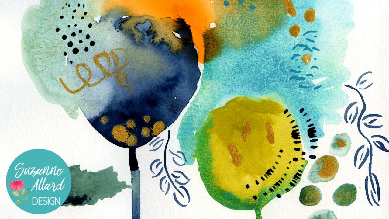
5. It's a Color Party! - How I mix my color palette: Let's talk about paints and colors. I do have my favorite colors every time I challenge myself to not use, only end up fighting their way into a pain, but I'll show you my colors. Uh, but I want you to feel free to make your own colors. Everybody likes something different, because when you look at nature, everything pretty much everything goes. You'll see black or dark burgundy leaves and red leads, and then you'll see green flowers and see Berries and stems of just about any color. So let loose and have fun. People ask me a lot about the difference between Washington watercolor and why I like wash . I'm not sure how it happened. I started out with watercolor. I love work. It's beautiful, It's translucent, It's delicate. I get it. It's just I think that for me, wanting those rich pigments, one of the flexibility I get with squash, I can layer it. If I do say a dark flower dark leaf and then decide I want a white flower or something over it, then I can do that. I can't do that with wire color. Everything I can do is quash. Is pain it over acrylic, which I did in this piece right here. This was acrylic. And then I just didn't like the shiny plastic A look of acrylic. So I went over a lot of it in wash. That was an experiment, but it worked. So I left the trans solution. The opaqueness. Rather a wash. I live the pigments. I like that. It's forgiving Aiken later. I can also remove it easily the way watercolor iss, but it gives me more ability. Toe layer. So those are all the reasons I love squash. All right, let's make some color. Now, I'm gonna work with the Turner Wash because I think that's what most of you are gonna end up getting. And so what we're gonna do is we're only gonna make certain colors that that are not here or obviously not gonna make the colors that we're here. We can make endless combinations with these colors, but I'm just gonna show you some of my favorite colors that are in all of my paintings. And you may have your own, so play as much as you want. So get yourself your paints, uh, some of your little containers. And if you don't have these. It's not a big deal. Actually, there's also these is all kinds of these look kind of containers of hands on. Or if you have a palate, Andi, if you don't have any of those and a paper plate will do because as we talked about these will drive. But they're there for our use. It doesn't matter, all right, so that you can do that as well. I just do these because I love these colors. And that way they're always ready for me to work with. When I'm one of pain, I don't have to mix him. Although I use my paper plates a lot too. Right. So the first color we're gonna mix that is not in the present hands of set is a really warm green. And so I already could, uh, some of the permanent yelling permanent green in here, but it's still a little bit you don't know. It's not warm enough for me again. You're going to do what you want, Dio. Um so play. And so I'm gonna put some of it in there. Also, when I'm mixing pain, I use a cheapie brush. You know, this thing is good for just mixing. You can also use Popsicle sticks. Thanks, Chief. Your brushes work really well. So let's see if that's getting warmer. Yeah, that's nice color. And then when we're painting, see this permanent yellow deep we might add a little bit of that You lost to get a teeny bit of hop. See how that's getting that. That sort of pale orange brings it home. That's gonna be pretty. Okay, so that is our warm bring will call that the other color that is not here is Well, there's a turquoise, but it's not quite, but we're like my Turk ways. So grab your turquoise blue and you're gonna put some of that. And with some of this Veridian Hugh, a tiny bit of the radium. I put too much in here and it's just too radium. So has changed all of it. I had some of the qualities and see what we get. I also like these Turner paints because there not super thick, but they do have pigment good pigment theme. Windsor Newton is very thick and requires a lot of mixing. Has amazing pregnant, but you don't need that. That's really pretty, you know, and then see if I think it's still a bit too Brady and me, which I think it iss when it when we're using it. I can put some more of this turquoise and get closer to the color I'm looking for. And then I don't know how much experience you have with paint next thing. But the beautiful thing is, we take some white. We get all kinds of shades. Who you, me, that's a beautiful sea glass color. And if you wanted to go more in a blue direction todo yummy colors so we can take these turquoise, teal, whatever you wanna call him and lots of different directions. We can even take some of the green chan ticket in that direction much just a little bit with some weight. It's kind of a green, and now one of the colors you'll see me use that I love was a warm, pale green so we can get there from here. This, by grabbing are you and see how that turned. That's a brighter hail. So if I want it to not be so brave, I'm gonna go. I'm gonna look in the direction of a red or orange to bring that greatness down and bring So we've got this permanent yellow deep. We could also add, Let's try a teeny tiny bit of the orange Any time you want something to go on a warmer, darker directions you can do read orange, yellow. The reason this yellow is this brighter. Yo, it's a very brace, lemon yellow. That's why it's working against that idea, going darker. But anyway, that's a really pretty color. I could play with colors all day long. Okay, so we made our Turk, Elise and all of its variations. We made our warm green and all of its variations. Let's move to the quarrels because we use a lot of corals we use. I got pale light, medium and dark Course you don't have to mix all these and containers. Like I said, you can just put him on your plate. But let's start with the basic coral, and the way I get coral is to make some of the permanent Scarlett this some orange. We'll see where that it takes us. What's that was a bubble. It's still to read, So I had more orange hand, some white. Uh, okay, now we're getting up pretty coral color and I could pull him read in I'm going for right now is the dark world. And then we'll just had varying amounts of weight to bring it up. That's really pretty. Yeah, that's a nice dark coral. All right, so then I would either leave it on the plate on then we cannot. Our weight later were making containers depending on how much you want to get into the paint mixing. But then I would just to a little bit darker me a little bit later and then even lighter burden than that. And we're not being exact. So when we get that, this is all Dr of the Family start painting. That's okay. We just keep having a mixing. Okay, so there's our corals. You could do this. Obviously, looked any fuel that you like the rose that I like. Let's let's see what the Turner roses weight, because I use that a lot. I like a really bright rose, which is already is, and then I like to have. This is a super pale pink feel that IHS pretty much wait with a tiny dot Here's a directions. Looks a lot like that. I just look for a range pace Reds, oranges and not a little need to be premixed, but I just want to show you. So that Rose that is in the right attitudes a beautiful, bright poppy rose. Well, little pop, I don't mean like the flower pots And then I'll show you how we can take turn it into a really big just a Tom. A way to a dot of that when we have super, super pale pink. If we wanted to warm that up because this is kind of a cool pink, we get had dot of this. This is a warmer red. This is cooler pink, so we could just keep playing until we liked what we have there. So those are your reds pink kind of family, and you can keep going and hope. And in between one, if you do this on a paper plate like this thes colors a ready to use. There's not a lot of quantity here, but that's okay. We can always makes more if we need it. Okay, so let's talk about another really pale color that I like and then my really dark colors. So the pale is gonna be taking our warm green hand, adding White, we're going for something like this. Just is very Hail. Hail Green. I really love other Green is coming out and you could do the same thing with a yellow either yellow because you know, flowers, of course, have infinite ranges of color. And if you're color holic like I am, you like to take full advantage of that. That's pretty, isn't it? I like this permanent yellow deep. It's got a hint of orange, really warm Looks like some flowers, isn't it? I don't play these dark darks. I haven't been ableto find just color, so I make and it's basically Navy s. So what I do is I take Let's try this Prussian blue. It was pretty close, but it's not backing up. You'll see when I spread it out. It's still very blue pretty, but what I do is I add a little bit of black. Pretty simple right. Paints are new, some liquid at the at the top. When I bought a brand new set because I wanted to have the same thing you guys had, like I said, Are you Mary? It's really an end ago, luv whose color and the thing is your numbers. When we're painting, you have to have a contrast. I learned that at some point in the process that if if you have all these beautiful colors but no light said no darks, no contrast, it just doesn't pop. So that's our navy dark, dark navy. And then I also in the same way make a dark, dark, clean. So do that. Yes, the fund agree? Yeah, a touch of black. Still have some black right here. So we've been when we need a lot more than that, comparing some of the blue in there too. We're just trying to get a dark so we need more black. Here we go. So I don't know how that works on camera. Might just looked black, but it is a really dark, dark green. Okay, so those are the darks and lights and I think that we have mixed all the colors that I use besides the ones that are here. I'm always mixing, you know, like any of these colors. Here's the violent. You could do the same thing we did from dark to light was every one of these colors and have fun with it. But, you know, we'll also will be mixing as the paint. I just want to give you a sense of start and then also So you had some of these colors made up that I use a lot. Okay, so I just want to quickly review the colors that I've next on again. You're gonna do your own variations, which is awesome. But these were just just as a quick overview. So the green, the warm bringing may looks like this. Yeah, I'll do is I'll put this coming sheet in the downloads so that you can see the colors close up in download that here's a pale turquoise which I maybe just by adding weight to the darker turquoise that we made Hey, than this is just so much fun. Okay, The dark colors, the dark blue, which probably looks black to you. But I promise it's not and are super dark green, Theun Actually the brown I did mix. It's just out of the out of the two, but I like to have it handy. This'll purple IHS meet with red and blue and then a little bit of white. But any purple we do because we're just gonna use it as an accent. In fact, I'll probably dark in that in peace, and then we move into the calls. We are dark coral. He had a little bit more weight to get medium dark, medium white, very light. E think I had a little bit of yellow to to that to get it kind of that. You see how it's a little bit warmer again? You may. You may choose completely different colors. I don't have a red in here you make. That's the rose right out of the tube. It's called Rose Violet. Very great, then is this is the Rose violet with a whole lot of light to get a very pale thistles, the orange that came right out of tune. And then there's two yellows in the tubes. These I didn't change these either, but I just like to have him handy with water in my little containers. So warmer, yellow, lemony, cooler, yellow and then a super super pale yellow. And this is white with a little bit of each of these. Take it in any direction you work, and these are just gonna get us started, you know? Well will mix as we go a swell, but these are kind of my staple colors
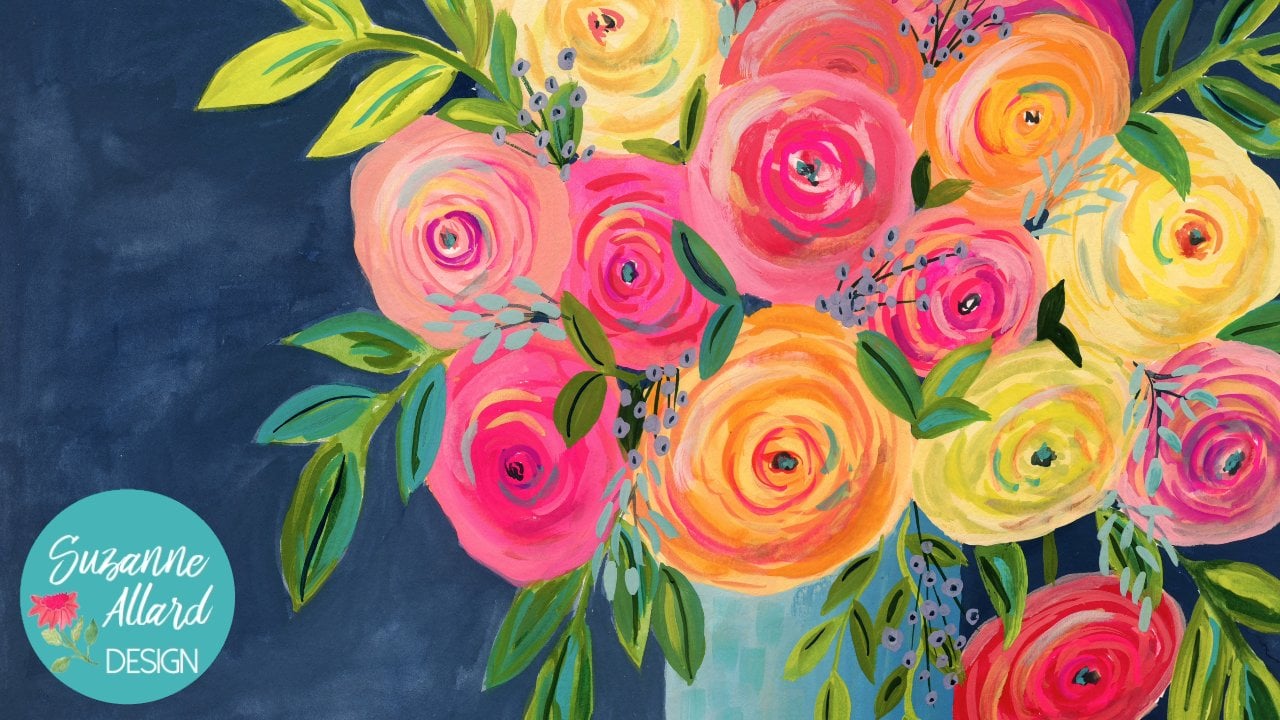
6. Flowers and Foliage Part 1: All right, So now let's learn how to paint the individual flowers, him and Foley's that we're gonna put in this piece. That way you'll have a little more confidence when you put it all together. All right, So let's talk about some of the flowers were gonna paint it be painting ago. Peonies. And I like this little book because it gives me the image of the flower. If I want a reference, it and, um, number are also paint. I do a lot of rain Oculus, Um, and I'll show you how to paint those. Those were probably hated those This could even be that. Sometimes it's hard to tell between the rows and ran echoes. Some two lets you get on hope until the Peter and then one semi open there, Um and then Rose is sometimes I'll do traditional looking Rose like this. And then how do a more, uh, English looking Rose where it's kind of crinkled in here so we might play with that. We might turn that one end of an English rose scabby else. That is probably what this is. I made these up, but, you know, they look more like a scabby. Also, we're carnation and then Magnolia leaves coming out here and here again. You can see there enough. Look, going for the literal flower. I'm just going for the feel of the flower and the exuberance of the flower. That's really what I love to capture. Okay, so now let's practice painting some of these beautiful flowers. Okay, beautiful creative people. Now we're gonna practice these flowers we're gonna get how I need you to get is a piece of paper. And then some of the colors that we mixed We're gonna use our super pale, greenish yellow her orange And then are we got the shades of coral. So we got a light shade a little bit darker medium, and then the dark coral. We've got a couple of these roses or violence. Woman. It's kind of really bright and one that's got a little bit blue in it to soften it. And them are pale pink, our navy dark navy blue, that will use for centers. And I don't know if we'll need this or not, but we might home these scabby also trouble. Okay, so we get those together and get your glass of water. Get your brushes. I don't think we'll need the tiny one of flowers, but you never know. And let's get started. Okay, so let's do they're in a gillis first. Um, people ask me a lot of the flower. It's so easy to do. You start with one still, Corwin, you start with really an oval or around, So the whole is if it's gonna face this way and around is if it's gonna be straight on and so we just could make a shape. Now, you know, if you look at a flower, of course, it's not exactly around. So we make it honey than and a little bit messy, something like that. And I was like that dry somewhat. You're gonna put in some of the lines as it dries, and you can either go in, go either way with the Quran Oculus. You could make yours your highlights darker or lighter. You'll see here these Well, this is a pani, but still same thing here. I went darker, lighter, actually left a little bit of paper in this one, so we can show that to some of the white paper. You know, you might like that style so In that case, you would sort of build. We're gonna give us this way. Let's say he's facing us. Good. What you have to decide is where the center is gonna be. So this center is gonna be right here, kind of looking this way, can't greet of plays to make a ridiculous and then a far is the color that goes in it. It's a your decision. You could take orange, because if you look that ridiculous, you'll see that they just come in all kinds of, uh, colors, shades. And of course, the color in the middle is not Seems clear on the outside, so you can see them just taking the point of my brush and actually using the biggest one. But you could use now because we didn't know the center is a smaller one. You could then so that was orange. You could then take some of this herbal. I'm gonna do the center more because centers of darker and you could bring it out a little bit on the outside. But those colors blend so that's the effect you get if you don't let it dry completely. And, you know, like here, I like that sometimes I want a more illustrated look and I let it dry completely and then do the highlights on this one over here. And let's go later, just to show what that looks like. This is what I love. One of the many things I love about quash right is is that we'll be able to see this lighter color on top of here. So this this one, you have the center be right there cause it's facing to the side, presented to the same thing. Bring your color and Little West's around. Thank kind of this one. Let's see, we can fill and let's go with the rose just to show that on this. So we said our center was gonna be about there and I would start their cause in that orients me and then I build from there and you can build with thicker so you press down more. But I love color. So I end up using a huge variety of colors, and I can go back to this one, which is dried a little bit and do something else. Maybe some of this dark to see if that shows up. Not too much, because We already had a dark on there, but it does give it some texture. I love texture. So I might do There is use read just to get this is a dark red, but we could see the tiny bit justice looking Get a little more definition. Yeah. Okay, so these were just a couple of ways, and you could go back in and, you know, put in another color over here too. I don't really have a formula just kind of going for that. Look, I do like to put a dark center. I think it just makes up our pop, So I do something sort of sketchy, like That's never a perfect circle. Uh, this is pretty wet here, so if I do that, I'll show you might be too much, but maybe not. So do us. All right. Let's do Rose, which is very similar. It just less with B and more pieces of the flower. So let's do a pink rose. Uh, let's do like this one here that's facing that way. So I'm going a little bit fatter in my strokes hand again. Keeping in by the center is gonna be more on this under the flower Something build around this side. That's what they look like. A beginning there. Just kind of blobs of color. So that's my rose. We Notley Um, this is a goes down here. We're here. So this one be more face on, so kind of like this. And I like the glass to because you'll see, you can see the chunks of paint kind of around. Am I like that? So then when that dries and I do roses pretty much like that, um, I'm trying to think if there's another way Oh, I know. When I weighed two euros, it's a little bit here, but I'll deal closed, Rose. So might look more like this. And then there's a circle here where will be something darker. This and then I couldn't bring that Hello. Run like that and keep it loose, you know, in a composition and then play with it. Is it is. It is. It develops. So then, on this one, I want him put those titles in. Got my Denver center, which we're gonna dealing with something darker, buddy. Bringing those lights and darks playfully not exert again. We can switch clothes any time. Could save. You. Want more cruise? I'm gonna start with his paint based of the matter center there. I just play with them until I like what I see. Sometimes I play with bigger chunks, bigger strokes and then smaller ones. Okay, so no, this again, we're gonna put in her dark centers. They don't always have to be this navy. Of course, you can do, like purple or even a brownish color. Um, this is just kind of my thing. Same city. But you could do a darker red. Take that one. So this would be more pronounced if I let it dry. Little do you know when we're painting? I just want to give you an idea. Hinder what's to stop ours?
7. Flowers and Foliage Part 2: All right, let's look at the tulip. So this tulip is sort of a Coralie orangey something. Uh, we'll start with some orange and you're using your fat brush and just kind of So this is the open one that we have here. So we're gonna make a big, you know, leave that way. Couple more leaves. That way. That's it. Let that dry. We'll have more color than them for this one down here. A little bit more closed. So it's just kind of again using the brash We're gonna brush, do the work. And that's the first version of car. Uh, let's see here. I also want to show you thes Panies. We're gonna use this really pale uh, and then this one Were you making a first? Just some big shapes. Think of a pan either just so big and full. So I'm literally I'm take my again keeping in mind the center But take my big Russian really makes the marks for his layer is just giving the suggestion of a flower for this one Down here it's kind of facing more this lace or a center. What do you say? Let's say there and I mean, build more on the top. If it's phasing down just like that, that's the first layer. Have a flowers very light, and there's not much to it. And we let it dry list of the first layer of these magnolias. I just can't do a big something like that. Yeah, this one, I just sort of I got really playable with. Did something like this from water Rick. Playful light. Not for us. Um, the other thing I want to show you is while those dry will do this because I'm going to show you how you can get that bleed effect if you painted any water clear. You know, it's the same kind of thing, but so you're doing this color and then so enlightened that which just means water, right? And I don't need to do any different color for out here. And then the stem is what will actually add that color. So we put our stuff on it, and then a little bit of our dark blue. We get that to bleed in, he's poking around America. And then I say, When I let's to Mr Bloom, I want more of the light green that is dark, the way that's coming up. But I actually really like it. So from the letter B, if I didn't like it that way, but that was too dark. I could blot it in the paper toe, do it all the time on. And then the similar technique with this one, you know, we're really blending. There were doing a little bit of this purple of the beginning 30 lately, transitioning to green, taking a green around the outside. I thought that maybe here in the center, some water bringing it home. Okay, so there you can see. I'm glad that happened. Because there's too much water someone blood and show you how you although, you know that what might look really interesting, Dr. But I do want I want to show you anyway, how two blocks and you're gonna You're gonna make things here and have things you want to get rid of. So let that be like that. And then we're gonna let that dry and we'll come back and add some of those colors back in . Okay, so that's that for these guys. They're pretty simple. We'll just do those on the composition. This one over here is very similar to this. Just I think I use a little bit of pink to soften the orange, and I did again. It's all about that center. So even if you don't market market in your mind, so for me, I know it's going to be right up there and you can tell from this center the paint was dry before I edited because it's not bleeding. Okay, so that's that. Last one is the scabby. Osa is a really easy to use either brush. Probably this one's better. The smaller one, the four or five. And then you can see there's a mix of lavender and the rose in there. So do you. You're just taking the brush and making all these little little marks on what I love is it is the paint wears out you're getting later and later and later, so you don't even have to change the cover. The cover just changes on its own. It's a little bit of this violent in here. We're just We're making all point in that one direction. This flower is facing down. It's just wondering here and then through a couple of the darker things up in here and just because no flowers completely uniform and that's it. And that's schedules. Okay, These little guys are easy. You're doing something like, you know, this you can sort of think of it as a tiny little flower that's open. But when you were doing on, you'll see, they're not always uniform. Of course, when you look at a a stem with flowers like this, they're gonna be some small and open small like this, and some larger and open. So just make sure you really variety. All right, this is drying off for us to go back into December things. So in these we went through them her with a little bit different shade, and I just literally went like that. There's some playful strokes, Same here we're gonna incorporate when we're actually painting. It will incorporate the stem into this. So then you'll see a little bit of it lead, which I like. You're not gonna see that here because we let it try. It was a little bit for going back to the peonies. I just got to take a slightly darker cause. These air really like cover Penis, so I don't want to go on with something too dark. I might take a little bit of bread and mix it with tiny, tiny but a blue to get this kind of. So I don't know what's even call their color dark peach and playfully come in here with some sense of movement. Because, remember, the peonies got all those leaves inside. So I want to be playful with what's going on that leaves pedals, and they don't have to be the same, right, because they're indifferently. So this one might be my colleagues on this one might be more written. Same thing here. It really starts to come to life. Get some personally and you can change like, don't feel like have to stay with that color. Maybe you want to go back to the the peach that we use, but that make it darker sections. You're gonna have flowers when you're working that you know, you like someone you don't like. Uh, but then that's when we'll finalize. I will make sure we like everything. Okay, those are the flowers. Courage to practice on as much as you want. But don't get too fussy, because the great thing about wash and probably watercolor to You don't wanna be fussing with you want to lose and light and so I wouldn't over practice. It's kind of like you could over rehearse, like right now doing this video, I could over rehearsed. Okay, So for practicing leaves, we just need her Gilo to mix with the green are warm green that we made some brown which, you know, kind enough to make that just take it up A tube. Ah, dark brain. And then there same navy that we used on the flowers and her turquoise. And those are based colors and will mix as we go. If we want to change the colors. I change colors constantly. I, uh, because I feel like when you look at flowers or in a book, a in the leaf is the same color. No pedal is even the same color, so I'm constantly taking my brush and grabbing a little bit of another color to get a lot of color. Variety definitely don't have a limited color palette. Maybe someday I'll try that. So let's just pick any color right now. It will tell practice this kind of leave in stem, and it's just very simple. Can pick up and then leaves can either come right out of the stem like this, your just your biggest brush and you just really gently touching and pulling away. This is so fun to practice. And then I always keep in mind that, you know, leaves there never all going the same direction. Sometimes they're drooping, and sometimes they're fouling. You know, if you want to look natural, I don't even need them to come off of the same part of the stem. I can take one over here and I'm going to do in this composition is you know, I don't want to stem the same color so I might start this damn look. You know, my dark green where I can go back over it and do something a little different with it. It's easier to start with a different color because you don't have have it's less fussy. So let's try that with Beasley's come out here. And then I would show you another way. Leaves attach. Of course, it's a little step. Never leave. Comes comes on. You do away on boundless. I don't even clean my breast completely because I want some. That trip was in there, and I dip it in like my green hand practice. A different kind of leave here, a fat one. And see, that little bit of drink was in there. I love that move up here again. This one could be drippy. And I could even grab a doubt brown and stick it in there. I actually did mix on the paper sometimes. Um and if I do something I don't like like, there might be two brown when it drives going to just go over it. That's what I love about wash. Nothing's prominent. And I could even sticks and yellow in this one. Okay, so then I'm gonna come over here, seem already getting a nice, warm green love, that kind of warm green. Uh huh. And if I want something lighter, remember, all we do is had more wires. I just dipped my freshen in the water. I didn't pick up any pain, and it's just what's in there already. And we could go up here to this one, make that a little bit smaller, and then pick up some of this too heavy and dark. But it's some of in here. Spread it around and maybe come over here and grab a little bit Fat leaves late around. You know, we might do a line on him like that. Might not When you want to take a leave, took like a natural leave would kind of come down over those leave. But you would want to do that after this. Dries otherwise will just blend together. Although they could look good to it just depends. All right, what other leaves do we have here? We have some small ones that come down here like this, and then we have these that come out here like that. But I'm always using the fat brush unless I'm making tiny leaves. Here's some long, thin leaves, and it's just practicing your strokes. So along suddenly, if my you just keep that brush on their longer a little bit more pain. And again you're looking for every leaf. Ideally, for me, the way I work, every leaf shaped differently. Pan has different colors on it with a brownstone, because that's just even though I'm not trying to be literal, Uh, was my work. I guess I wanted to look natural, as in nature, you know, as I said, no leaves are the same. So what you what I'm doing here is just touching. That's down. And then coming off and my brushes a mix of the two boys and the green, I could even grab its tiny bit of the navy and go darker one. Now, let's try just crossing this one over so you can see in that case because I didn't have a super let brush worked, I didn't get them. And this colors or somewhere that's really helpful not to. So you can see that you can just tell a lot from playing with eggs. And let's look at this up here. We've got a really loose yellowy leave there. So the death to take some of our yellow when you do it. And I had a tiny bit of green in that, and then some brown. That's what you're seeing with that Warm sits in it. What was the green? And then I used a lot of water because you can see how translucent thumbs there and I and that in that one. I wanted this damn good. My fingers, if you don't have pain on your hands, is not a good day, and I wanted that stem to bleed into those leaves. So let's let's practice what that just means that I'm putting the reef in while the stem is wet. So did me stand and then the leaves stems. Hey, let's do that. When I grabbed my paint on, I touched it so that it would believe and he isn't lose. So I'm not. I'm just kind of taking my brush. And playfully, I don't even mind that in fact, I wanted an awesome caps of white. She's always try another one a little more yellow, cause I want some variety play with shape and is kind of now you'll see that it's not bleeding. Lock watch does that sometimes because this gets a little bit sick. So what I can do is help it a little bit and get that effect that I want with water and a little more paint. All that means is that I waited too long between when I put the stem down and I put the leave down and drive fast, and it can have it can have to do with how dry it is in the room. You're painting all kinds of factors, but interesting things happen regardless. So, like since I've been talking, this is not dried. So let's go ahead with us just so you can see. Look, look it, Thank you leading down into there so fun to watch rate. And then over here, we just had some more water there. So that's the kind of lose thing that will do over here. So there's of the leaves.
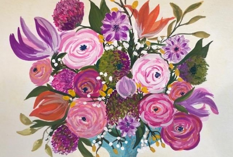
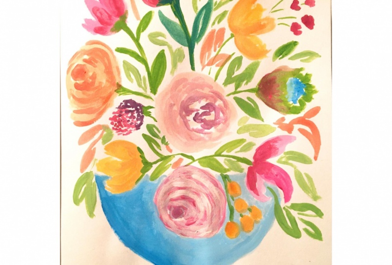
8. Sketching out the Bouquet - with paint!: Sometimes I don't even sketch out the pieces. When I started to start putting things places and work it out, we're gonna do a light sketch on this, But we'll do it with paint, a very faint color paint, and that won't even show when we're done. And I like that because I don't have to deal with pencil marks. And it also has a little bit of texture, like my pieces kind of messy. And so let's get started. We're gonna start with is just some of these background softer flowers and a really light sketch of the of the face. So when I sketch, if I sketch it all, sometimes I just start painting. I just take a super light, a version of color that I think I'm gonna be having and this basis kind of a teal ish blue . So we'll just make a really life like, almost invisible by having water. And I do like this one does kind of look at it in the center, but I do like my face is a little off center. Um, you could do it any way you want, but we'll just kind of skilled jobs shape. You can actually change the shape. If you like, you can dio just a straight Oh, which is probably easier then. That's so we're just gonna go down like this and you can see how it's barely visible. That way I want to change it. I can figure out a way to change. It will come down like this, and for now, we're just gonna make square or rectangle. Either one. Well, you have to do is you know, you don't have to be exact about this because if you look at pictures of aces, they're viewed from different angles, so it's not gonna be perfectly symmetrical. We'll touch it up later, too. Basically, when you're painting, you know you're trying to be losing playful and not get too tight or chance about any of it , because that takes the fun out of it. All right, so we're not gonna color much because you will fill this in later. I'm just gonna come up here and do kind of like that so that I have a room to put these flowers. But it gives me an idea where we're that basis. Now we're gonna do the same thing. This this is our still our sketch. So with a really late color that's gonna began to being covered, we're gonna figure out some basic outlines of flowers. OK, so, you know, we can see the government here. Love how these dropped home. Right now, we're literally just gonna put circles in. We're not gonna worry about anything else Over here is kind of Ah, different shape. Go on. Mormon pain. Yeah. Let's go back to this one and put this guy in. Or maybe it's a girl. She's a little bit bigger. Then we have this one going out to the side, and then we have a really big one here. So you have just capturing shapes, then this little one down here, we have some local like that. Kind of that one, Len, that just because if you see the kind of flower it iss I don't want this out. Lehner this, you know, a way to show within this. So what kind of messed that up a little bit, So there's no stiff lying around it. Okay, then we have this one over here. Just kind of a sheep like that. All right, so we're back to here. We have to put this one in was getting a little bit of pink hair. Doesn't matter. Whatever it is, that's light colored. I want sitting worried about here also pretty large. Did you know that we're in? We can adjust it. All right. And then you see this blasting over here. It kind of goes. So I'm not gonna turn that one into a circle because it's unopened and that kind of flower . Then we're gonna go over here into this guy, and that brings us down to this. Okay, with a real loose idea of of this started one, because again, I don't want that line showing Now I can go up and do this one. Yeah, barely. See, if I remember, is just to give us an idea. When we heard when we start painting, this one comes up here like this. And then there's some paddles coming up here. Different flower. That's behind that. And then there's this orange guy. How here, Getting kind of squished. But that will happen. So, you know, no worries. All right, now I need a little bit more color because I do have to be able to see your a little bit. We're gonna come out of how to here with this With this one kind of like this Because we have space in here ever. We talked about how Oh, casar nice that are not completely round space. And what I like about this book A is until we have that space there a little bit meaner still leaves, but there's no bunch flowers, and then it cascades down here and here, and then it goes up here. So I have a balanced with this in this. But then I didn't put something here as well. Okay, so we did this blossom. This is all gonna be leaves here. But up here we have how blossom will just kind of go like this for now to indicate where that's gonna be and fastly use this one, which you can iss more open take of. Plus, um Okay, so now we have the basic structure we have. We don't We didn't put the little details and because we don't need those yet where those later we didn't put the leaves in, We can see where these leaves go, but we have a general idea where the blossoms are and the base
9. First Layer: The big blooms: Now we're going to start adding layers of flowers and greenery and some flowers is more greenery. Relative things dry in between. And if you can wait and you want to keep going and then get a hair dryer, I do that often, especially if I have multiple pieces going. This is so exciting. Okay, so but I think I'm gonna start with some of these payoff blossoms back here. It's easier to paint. Even the glass can go light on top of dark. It's easier to do Jack and up on top of late. So let's start with those. Let's do this guy right here. So we're gonna get some of this hail coral place and get that color stand with some water. And then we've already got our outline there. So we're just gonna kind of nick the center. Remember, we talked about centers of flowers a little darker, so we start with that center there and then I always started the center because then I kind of know where the rest of the floor is going. I'm just lifting him, dropping pain, trying to be loose. Not too fussy, using my number 10. By the way, I networks. Best lift from the blossoms, especially the parents. Okay, so we're gonna let that dry What? We move onto the next? Because it's all a matter of layering. Will come home to do this one, and you see how the center of this one is down here. So I'm gonna make my center first. I love it when flowers air point of downward in all different directions. And the center I just makes a marks and a kind of a loose circle around it, I guess trying not to get too fussy. Thinker brush drugs with Cem narrower winds. You can see him already covering up a little bit of our her outline. So we'll leave that for now, and those are gonna have to dry. So let's come up here and do this blossom right here. That's that pale green. Take some of our super pale yellow. And I don't mind that this is in here because we're gonna probably incorporate that the title Big Green. Yeah, we're just kind of kind of. This is one of those flowers that I can't even tell you what it is. I just started painting it and put the center in it can can be whatever you want it to be. Maybe it's, uh, really greenish pale yellow pne. I put some of the peach in the center here. You again trying to not be too fussy. I'm going a little more green on there. Situation. What I did is I took the green right out of here, him parrot out of the container and put it on the paper. I do that sometimes when I get going, and then we're gonna take our very little tiny bit of our dark blue and put it in the center. But not quite yet, because this is really wet. And if I drop it in, which can also be pretty, it's gonna really spread. So I'm gonna give it a couple of seconds here, talk to you. And you can also do one of my tricks because I don't want to dry. I do want to spread some, but I just don't want it to completely bleed into the whole flower. Now, if I didn't want to bleed at all, I would let it dry completely, see what that does. Okay, that's good. It's bleeding a little bit, but it's not going crazy. all right. No. Let's move down to this flower right here. This is gonna be really I convict any of these corals to start with. Gonna go light, though, and then moved to dark. And this is really more of circle because this one's facing us. The centers will be right there. So, you know, it's not perfectly circular, but it's sort of circular. I believe that, like that Let her drive just a little bit. I'm gonna come back and put these other accents in. But I'll let that Ted come over here to this this one here, and do the same color, maybe a little darker. Which course just means I use less water, right? This blossom is underneath at one. This when we did here, and I want to be careful, although it's sometimes really pretty if they believe Friendly to plead. If it touched this, that would believe in do it. And sometimes I could be really pretty, so your discretion. But right now I want to keep them apart. So again, just playfully for shirts this blossoms also looking down tan. You can come up here and do this one over here. We're gonna get the darkest coral. For that, that one is also facing forward. You know, we have to make the center exactly in the middle. You do see bouquets like that, but I only perfect cemetery. Alright, so I've got this darker coral on my brush. Here's where I could get playful and pan I can come back to get some of the starker stuff that we So we're gonna put in here and you'll see that I'm just going around touching down carefully, but not not overly fuzzy. And this one, we can do that too, even though it hasn't dried. What we're doing is giving it depths dimension character. Look at that center. Got blood. That's really pretty. Um Okay, so I don't think I'm gonna do anything darker in those right now. Good. Might bring a little purple rose. Tend to this one, but not that great. So even add some blue and come in here a little bit. Well, it's still wet when I do these flowers. Sometimes I go from with more reds, sometimes just a darker shade of the same color. I just I just like to bury him. They don't like any of them. The same. Now what I'm gonna do with this center of this flower, his poor little more dark in there because they do want that center, and it should be bleeding less for their way. I could get there kind of intense darkness. Okay, now we can go back to our coral, maybe a little bit of purple to it to get kind of a rosy color. This one I want really like is just gonna come in here to this flower and had some dimension. Same here. And I also when I you know these air similar flowers. But I don't like to use the exact same color in any to blossoms. So how I wanted to clean my brush. I'll just grab a little bit of something else or even add water. That's I have to change the color. Okay, so let's did this blossom here. It's in this really liking. Get my paper plate. I think my paper plays like a security blanket. E. I hope I'm not every painting too much, but it just isn't a place toe. Mix the color inside. Like what I see. I'm just gonna do some thick bakish strokes, keeping up behind this green flower. Somebody brought me up okay, yesterday. And it had I should take a picture to show you guys that had black, almost black skivvy Elsa flowers the darkest burgundy I've ever seen. And I thought who I'm gonna have to put those and. Okay. All right. So I kind of like that. Like the way it is. I'm not gonna do a lot more to that. Let's see. Yeah, let's pause here and let things dry.
10. Layer 2: The smaller blooms: Okay, so this is dried and I can see a couple areas that I want dark in a little bit. Well, I put in some darker pieces to this flower. Just felt like it didn't have enough contrast in it. I could make dark a lot of ways. I could use some brown, a little bit of throws. Especially gonna be darker towards the middle. No. One of that dark Newsome thinker. Brushstrokes. So I want to show you what happens when you do something you don't like, because it happens a lot when you pay. I don't like that kind of came out, so I'm just kind of get a little bit later color and smooth it and, you know, let it dry and see if I want to fix it more later. We'll do something else with it. Okay, so let's get some color down on this blossom. So it's mostly the rose, but this rose is super bright number. Look at that. A little bit to break. So we're in a tone it down with. Believe it or not, a tiny bit of green told it down too much. I'm an I'm gonna go back. I've been stirring with my number five brush, But I'm gonna get my Big South 10. Go back to this and this one again is facing us. So my center is gonna be right about there. I'm gonna do some biggest drugs on this one, going back and forth between the greater and the one way ahead of the greens. So it's a little bit darker. Just add dimension. Even where I added some of brown this morning and then I could come in and have even a little bit of this. Violent. Gives me some dark. Okay? Trying to make things perfectly round still make it looks all right. So let's go out here and play with He's since I got the Rose out The's called Magnolia. Who knows what they actually are. Great. Yeah, Just Liza. Really lose. Remember how we didn't before? So we're just getting some color. Kind of just coming out like this, something like that, and set up here as well and go bigger, smaller, whatever you like. You're kind of coming up from behind the slower, but I don't need toe necessarily Make him touch. Because this is Dr O. You can take it all the way to the edge. Um, all right, so we let the first layer of that dry and then let's do some of these orange blossoms. So give laying this down here and then disappear. It might orange little bit off and trying to see. Okay, so we're gonna probably we'll bring in the stem on this one. So right here, you can see the stem comes right into here. I don't want to do that yet because I got a blossom to do here. So I'm gonna do the flower and the will and the stem later. And the way I get some my colors, you'll notice this is just kind of flat. Right now, it's just orange, even though there's dark and hope light orange next in. But I like the variation. So that's why I take a little bit of green. I like to get some dimension to that orange. Maybe even Rose. Yeah, that gives me a little bit of color fun. Um, okay. Now well, that's doing some drying. I'm going to sneak in CS history of No, we'll wait till that strike before we do this. Let's go up here and dio this This blossom up here. It's kind of this is brighter again, being playful, thinking of a two Lipsitz opening hasam darker in there, maybe a little bit of the coral. I grab something that just a and if I decide that that's too dark, I can just take some orange over it. Crime and the mako over here to this blossom since we have our orange Oh, now this might bleed into the pink a little bit if I get too close, which is fine, and I might decide that I want to add just a little yellow to this orange because, remember, I don't like the same color anywhere. I feel it's so great. There's really sparingly, so you can't see in my center on this, but we'll paint it in afterwards. I know that it's about right there. Okay, let's see there anymore orange that we want to dio before we move on. I don't think so. I don't want to do any of those leaves any of these year because those are done over the blossoms when they're dry. Let's see if this is drying out. It's so we can go in here and do this one and This one is kind of a dark Rosie Corley something. So let's have a tiny bit of green. Green has a greatly that warm up tone down How really great color. But I don't want it to be too much like this one, so we'll see how it looks. This one is one where the center is right there. That turned out to be kind of ah, you know, pill rest color. So when you're making these decisions about what blossoms in front of which Boston behind, I'm gonna go ahead and put this one anti is it just works better. And then I'm also going to I had some different color to that Sinclair, I'll add IHS. Let's had a tiny bit. May sound crazy, but we take our Navy. We'll see what that does dance because this flower is a little bit in the background. That's on the dark side. And then I'm gonna go with some of my rose with the orange and get some of the highlights in there. That's pretty Okay, we'll leave that. Let it dry. We're gonna come over to this one and have another layer of richness to it. This one right here. So my some of the rose, but I'm gonna mix it. This is not a quarrel, so I can get something that just can't pops a little bit. Fill in that center later with her dark color. Okay. Oops. Let's see. What else do you want to do this? Go round. We need some darkness here, but I really want that to be more of a They're peach. So I'm gonna take that peach. You can see how. I mean, I keep mixing. I may even mixing in some of the blue on my paper plate, and that's okay. Getting a little bit some darker stuff here and here again, this one's gonna need some dirt as well. Maybe mixing a little bit of a color just made with some of the rose and coming in here. I want to take your brush drugs on this one so that it looks a little bit different and some of the others Okay, well, let that drying. Okay. Now, let's do this blossom down here for that, we're gonna get the smaller brush san. We're gonna get a little bit of our purple, lavender, whatever you have made up in that family. And I'm just gonna start making little marks gonna randomly that make it feel like teeny tiny little pedals or angles of panels of I will move to some rose and I want these to blend a little bit so you'll see that they do start doing that. Take me to get some water and some of this kind of pale, peachy color and get that to blend in with some of these. Get a little bit what might feel kind of messy, but I wanted them to blend. Sometimes you just washed the paint out with water and that gives you all you need. Okay, What is the same thing over here? Take my brush, pick up some of these colors. And if you ever I'll just do this to show you even though I like the way that's planning. But if you ever don't like something that you don't dig Creteil and blot it a little bit and then you go back to us. I thought that the way that was blending was nice, but I just want to show you there and to show you how forgiving this medium is. Okay, Let that dry. I'm not So we have this one, this one. Then we're gonna move up here, do this right there. That one there. So that's some ruse, and that we were gonna let bleed down into the green. I know what this one pretty intense. So the front half of it is gonna be intense that I'm gonna wash my brush and get some of this stuff behind it. Pan this one. We're gonna go ahead and do for a stem. I take my warm green and mix it with a little bit of something else. Maybe some purple or some blue so that I could get I'm over kind of realistic color. And then I'm gonna connect the flour, and I do want to believe there's a tiny bit of a dark blue and there this leading up into the paint. Too much a little of that, as you want with these kind of white flowers. We don't want over for us. See what we didn't next. This will be ready to bring the stem in soon, but it's still, but I don't mind that because it will come into the back. So let's get that stomach, you know, take some of the warm green and makes it with a little bit of darker green. So we have a different green going, and I'm just gonna bring this stem into here. Kind of like that doesn't have to go exactly anywhere. But I'm gonna go and let that be a little bit. It won't believe much, cause it's mostly dry. And I think while we're at it, it's okay to put a few of these leaves in. So this leaf is very kind of on structure leaf. I just touch the green again. I'm gonna change the green. They'll always changing colors. Since leader that so doesn't believe too much. We'll come back, maybe playing a little bit. Okay, this can also get us down. So you what that's going to come maybe like this you can also gonna leave. This will be a fatter relief. We'll come back and dark in that so that it goes over that flower. You can do that later. I'm also going to wait to put those darker parts in here because I don't have to bleed too much and we'll move down to this flower, which is another flower. It similar that one wanted to believe this is pain when we're gonna be just really loose with it. It's got some pink here they saw the warm green and then, well, more rows down here getting lost so I could put some of it dark blue in here. It's kind of touching on some of this green, and we'll let this stuff touch without blending it completely. It's pretty to see how the colors play, isn't it? And move. So leave out on there. Can this And they ended up going so big with this and this that there's not have a lot of room for this, but we're still gonna put it in by I'll show you how I do that. I take flowers off the page all the time, So that's kind of a quarrel again. You know, we're just gonna to right here. It's got a warmer yoli center like that. Would that dry kind of like? Sometimes I'll just finish with a color and something like what we just made there, and I want to go to another blossom and had some of that. So from just indicating the center there and then maybe some pedals coming down, we can put some red, which we could use a lot of into this blessing. And you can see how things slowly start building and coming to live. I'm going to use this medium coral and do a little bit more in this one. I said, I'm gonna go back. But this are really light my baby blades getting full page 10 over some of this cause I don't like how the brown I don't want that much brown in it. We'll take it. Will take layers to cover that. That's a very okay, just let that dry.
11. Layer 3: Stems, details and vase: All right, let's adds more layers. I've got my tea and my studio. Kitty, huh? She loves being in here and sitting on my chair, which I love. Except when she gets cat hair in my pants. They were painting. OK, let's hope that my neighbor who's chain sawing some trees doesn't start up. Um, okay, well, you know, it's amazing. I don't know if you do this, but I have to fight pretty much every instinct to do something else. I was in the paint. Sometimes, even though I love it, I'll sit there and go. Well, you know, I I should clean out the sink, or I should throw in a load of laundry heart. You know, I don't know what it is. It's just like it's. I think it's what Stephen Crossfield talks about in his book The War of Art. He calls it resistance like it's just pain. Take, I makes it this thing that, uh, that happens that takes over, stops us from doing what we really should be doing or what's with something that will take us to our closer to our potential anyway, So we're gonna just come in here. We're doing this flower. We're gonna do another layer of details and we'll start having some leagues. I also decided this flower is too small. So minute fix that, I think. And this I'm going to throw in a little origin of this because I just don't want it to be too one dimensional. Yeah, I like that. You know, a lot of this is just plain, um, help that you find a way. It's funny. The longer you paint, the more you learn to play. Strangely, you would think they he was big. It would go the other way around. I'm just fixing this stem. No, like how it was going into that. It's a flower too much, and I'm going to take a little bit. That's something Dirk probably might maybe put it in the center. Here, get some believe. Yeah, that's pretty. Uh, let's see what else to fix. Okay. Come down here and makes this flower just a little bit there. No, a lot. You can also come in and do those great rose marks through here. Now, here also. One add more dimension and darkness to these two lips. A little bit of the dark blue, and you know, if you don't want to do. If you don't want to add this, don't. I could make a case. Either way, we'll go ahead. Him get a stem going here on this one. Funny thing. Deciding when to do the stones and leaves some paintings. I do more leaves. Uh, when I start, then I'm like this one. We really hardly have any leads yet. And then some. I do one towards the end. Sometimes I start with leaves a lot in the beginning. So remember, it's just changing color, so So that nothing. He's quite the same and will bring some of this green up in here. And then we will, uh, a little more dimension to this flower. Listen, darkness around center here, and the same with a few of these. Actually, darkness can be either dark green or blue. I wouldn't use black blacks so you can mix black with things, but black is just too intense. Sometimes I use a little bit so you can see me putting centers in, uh, slightly with the blue and and we made when those windows drive, we might darken them a little bit. You gotta have contrast in a painting. I when I first started it into really get there And could you just have, like, even if they're beautiful colors, if there's no pop of dark? So that's what I'm going around doing now, sad ing in someone's darker tones, maybe even with such one of the things I do, too. And a lot of my paintings, his take some of the star turquoise and use it to I had to mention t two flowers. It seems strange that would sick turquoise in the middle of a flower. But it does. Something kind of wonderful. Doesn't have to be in everyone hand again. You don't like it, Tom, to it. I really love how we all love different things. All right? Wouldn't the world be boring if we well, like the same things? Okay, so that's a little bit of the turquoise something, a little bit of darkness and local queen. We're not gonna do that to this one because I'll do a little bit because it's a really white flour. Jealous of that dry and minimal started having into leaves. Okay, so before we get for the leaves, I want to go into a later on the base and you'll notice that I've put some clips. My people were starting to work, so these clips work great for that. And let's see, as far as the days goes, you go with any color you want. I actually, the first layer of this was a really light blue kind of like this. And then I just did it for her layer over it. So we might do that. We might change it, you know, a little bit down the road. But let's just get something down. That's a little bit darker than this, because this is pretty much nothing. All right, so let's take I'm gonna do a circle is gonna mix it with. I was just splatter the paint actually did. So I just blended turquoise on there. But the beautiful thing is, it doesn't matter. Good zone. Right. Okay, so I'm a sort of a truck lazy blue, and then water it down quite a bit. I use my big brush, my number 10 because I don't want it to be too dark. So when I'm putting this down, though, I am going to start paying attention to light source. So on this one, you can see I made this side lighter for some reason. I think because this is so big and bright, I think this should be the light source on this one. So that just means that I'm gonna put my paint down. It's a little bit darker on this side, which just means less water in the brush. So I'm just gonna go around these flowers again, trying not to be super fussy and fill in these areas. Keeping in mind the schools are gonna be dark right underneath these flowers. Right? The latest part of this base will actually be That's what we need. A paper towel, actually. Be ready here so I can pull some color away from there by waiting migration pulling upward . You can move the paint around on these papers. These watercolor papers Pretty well, Interestingly, when I have painted with, really, you know, nice, sick papers like origins. Really heavy texture is harder to move it around, which once you put down, it's kind of stuck. So one of things I don't like about those Coulson more painfully from here making this side over here. I'm gonna wait too much about detailed shading here yet just gonna fill in the shape just thinking about dirt on this side later on the other side. That's kind of what I'm thinking about right now. If I look for if I see an opportunity to make it look like you know the basis kind of stopping here and then going flat, I could do that. And I think I said earlier, Do you want to just make a street bowl? And then who's becomes a lot simpler just making dark over here? For now, it's light over here with water. It's kind of just delicately massaging the pain, but then also stopping because it starts to dry. Damn get weird. Them changes what you're doing. So then, But then you have to make us all stop, let it dry and come back and touch it up. And that's where I am now by muscle. That anymore. I'm just gonna pull this pain away
12. Layer 4: Foliage and details: okay. I just love leaves. I feel like I don't know there. Why was it pretty? But look at this book A now and then Look at it on the pad leaves. It just has so much dimension Conference color. So here we're just gonna play with if our colors different types of leaves. I do try to make the stems different, then the leaves eso If I come in here and do something like this, I might get my smaller brush. We haven't even used the tiny Russia. I really don't use that much. And maybe make something kind of dark is here to pull that color down and then come up here this time Maybe over here. In fact, my trickle is I really have, uh, set method for my leaves and stems. Sometimes I started with the leaf. Sometimes they put the stems in first. Sometimes I'm careful with them like I am being right now and then. Sometimes I'm just really lose. Thanks. Yeah, Essentially got the turquoise out. Let's come over here and get some in here. And this is where I love with trash does because well, we're gonna go over, please. Flowers. Christian you'd see that I'm okay, Ray. You would see the I just had a little bit of green to turquoise just to change it a little bit. You're not gonna see leaves all tucked in neatly, Okay, They're gonna come out from a little place. I'm gonna do this. Find anything down here. Cap started just lissome coming out of here with some really just wind the random lines. But you're actually fun to dio. I couldn't tell you what that says. They're coming. I made it up. I love it. I saw something similar. Probably in a photo somewhere. You don't do this one because it's gonna run over those leaves but will come back. And then there's another one over here, but I want some leaves underneath the first. So let's dio go back to my big brush gift. One of my greens do a nice vaguely right there. And if it's not, if it's, you know, showing up like water color and not covering you just need more big men. Just be careful. Not to older fast. So that's thicker repair. So that will be good for usually is here. And you can add these wherever you like we're not gonna I'm not gonna based ones till I'm done with the base, but I can put him so See how they're from yellow E. Coli coming out of here. So funny. Goldie Green will take the green over the yellow. Yes. Produced victory brushes and paint. I guess it's not that big a deal. One that more gold. I do like to make my lease Curly, just different shapes. Maybe something coming out of here that could be basically on the stem. Just adjusting to stand back there to this flower. How's it come back through leather leaves and put highlights. That's a golden. So let's do this pretty thing up here that's very loosely painted, uh, kind of a brown stem. So E just makes him brown here with some red green, a little bit of blue. I'll give you a war around. I'll and some actual from and get sort of warmish color. Okay, so I'm just gonna come out of here in a really playful way. Was a good amount of water on my brush and we'll say that this it's coming out this way. So that will take again. A good amount that the yoli and pulling. I'm gonna be pulling from the brown stem cell. In this case, I do want that a little bit wet and just being really lose with ease. Okay. Different shapes. And I would like the brown bleeding and belief. So I'm gonna take a little bit more hand. Just do this at the base. It feels like, you know, there would be a stomach kind of going out this way and to hear, so I'm gonna go put one there. Practical Omar Brown there so that, please, I also feel like something should be here. That's what happens sometimes. I just don't know. It'll just something feels like it should happen. You. I usually like what I come up with, but the beauty of glasses, if I don't to a certain extent, it's recoverable. Put it up smaller ones here. Okay, Now we can come through into this really dark one, because again, we need that contrast. I did that with the dark. Okay, Sam kind of has brought it out. I think in this one, I'm gonna bring it more here, maybe make it sort of playful, See? So sometimes I'll do leaves that are just very lose. But then, sometimes I like him to be I still lose. But I in this in this them I'm really trying to capture that Leaves can be different shapes in different directions. I'm not gonna put one down there because I think what we need there is I different colored larger leave coming out here. And, you know, when I'm painting, I don't worry about how too much. Well, I do find myself thinking about the where did that leave come from and doesn't understand stuff like that. But I try to let that go because you look at it, okay? Things are coming out from all over the place. The more important thing is to have a variety of sizes, colors, textures, um, looser, see, throughly used along with kind of solid, dark leaves. Get this, Stam. And it's a short stunned, but we'll get it in. We can also do a couple leads down here. She go back to my larger brush. Maybe I'll make this pretty your Lily Greene have a couple of years coming out of here. Do what? Their stuff hanging down to make this Okay. Irregular. If you don't like that, you can do less of it.
13. Layer 5: Adding interesting elements: regular coffee, tea, glass Align Whatever you like to bring with you to start painting, grab a friend and let's add some more layers to this yummy painting. OK, we're back, Teoh Thes beautiful flowers. So I don't know if I talked about this earlier that there's always a point and a painting where I think Oh, this one's just not gonna be good. I don't really like it. Um, we're past this from for me on this one, but I should have mentioned it was probably a couple of years ago. And it's just an interesting thing. Don't be surprised when that happens, because it happens every time and you just have to keep going People in working with it, um, between Unless it you know, you've done something that you can't find a way out of. But most times I even then I keep going because I'm gonna learn something even if I end up not liking it. So what I want to do here is bring a little bit more contrast to this in here in here, I'm using a little bit of the Navy just a little bit. I want Teoh make this pop a little more so I'm gonna take some of our that really bright rose pan. Puts him strokes around there. Just a little bit randomly. Bring it to life a little bit. Let's see what counts Do I want Teoh? I think this center needs to be a little bit darker. You're getting kind of an idea of the way work play I know. Well, had some of these stems. That's where dry. Here, get some dark greens and have some of these wiggly things come out of here. Remember, it's OK if they come in front of a flower and see how that change color. That's that's what I like. Grab another color any time you want. Like for these things sometimes to come down as well. Gonna make this a little Attackers that shows up better and come over here and one here seeing maybe something like this. I think I want another one coming down like this. Okay, those find me kind of orange. Ah, no, no, no room in some very green. So we'll take but orange from yellow again. Always mixing it up. Grab a little miss lemon yellow just to make some later spots on the light side of our late sources coming this way. So I'm starting to think about making things on that side later. The very least puts much yellow. Nona's you want bright orange is really pops, doesn't it? He feels to me like there should be something here, too. I'm really excited to see you put here. Projects look like kind of hope that you don't think so. This one's not good. I'm not gonna put it in the project. I have a class project, but the thing is, it's still okay. And there's so much to learn from it and something to be really proud of. So I hope that you do. I think that I feel like I'm missing is a little bit of variation up here is just really orange. And I think I'd like to I don't want to put to break of Rose in there, but maybe just a little bit. Let's see what helps you need, I think was going to ready now to start putting secondly, on the base, and that will do that. Well, this is drying maybe a little bit really soft green into here. You know, that had some nice depth and dimension. So our base again You can take it in any direction you want in terms of color. I'm just gonna take a watery because really close to the same shade I was using Blue. It's basically this blue that came with the set Next with hope. I just put my hand in that c It's okay, okay. Because I didn't put it back down and make. But if I had have done this before, if I had made his spot there and it wasn't removable that I just wouldn't need another split them and another Lawson, Marbury or whatever those are. So we're starting here in the dark side. That sounds kind of strange. No painting, joyful flowers, no dark side. Okay, come down here. Washout my brush because then I could blend blindness, continuing to kind of, you know, I don't really want a line here. You know, the way that it is right now. So play with a little bit may be great going like this, breaking it up a little bit, and that will come down here. And this My dark side very wasn't my lights. I am just touching up a little bit. Pair just really going over it. I can even to show the light here. I can take my brush and just live it and then use paper toe to remove pain. It'll just make it later and later. See, that's getting lighter. And now, because I've got a late Harry here on a darker here, starting to look click a shape, a nominee, I go across here to kind of make it look like an hedge, the front edge of the space. We'll probably have to let that try and do it again. All right, let's have a little bit to this. I mean, I actually really like it. So this is where those decisions are Hard and Thorn Do I want to add something or did I want to leave it? But I think that I want to add a little something so kind of in between. And what I want to do is I didn't like the way this pain just coming. It didn't really look like that flower was over there. And then I also want a little bit of another color in there, just a little bit more something. But, you know, you could say it was finally Waas Either way, I can't like that. It was getting lost a little bit right now we're gonna adds more leaves, really? On the home stretch on this one. I'm not gonna put leaves here yet because that's not dry. Basically, I look for places that leave my poke out, um, and then always changing the color of it. Sometimes I use leaves honestly for an area that of a flower that I don't particularly like . So then I stick up believes there it takes just looking around and seeing what makes sense . Now here we have these long, thin leaves which we can do now because those stem started a long time ago. And for those who just come out, drag the brush longer. So that was a really translucent leave that just went down right there. Will Will, Dio, since the variety's good will do a darker one. And when that comes over this clever a little bit then they all ended up a little bit Too much skin color, some Adan some wars here So a bit of just a little bit yellow over the green is all I did Now this one so look washed it does, it can cover up. But sometimes you have to do it several several coats. So that one it you can still see the flower a lot underneath. So sometimes I have to come in and do layers to get the look that I want. Sometimes I don't mind if it shows through. Sometimes I come back and do it like 1/2 on a leaf, something like that. Little so that I don't put my head in the way of the camera. Something like that I am could have a stone. I would like to get a little turquoise over here because we have it there, there and there. And I like numbers. So I guess I haven't talked about that yet. But when I'm doing something, I'm looking at threes and thighs. Uh, I mean, it's not a rule that I won't break, but I don't like it when say, there just the two sides of T. O. So now I have that there and you'll see the little three of these little orange things and flowers. You know, I don't want any to get a look alike, but especially won't want to just two of something or four or something. It's just I'm not sure why, but it just feels like the right thing to do. And there's I'm looking at this. I want to put another one of these kind of coming down here into that spot. Grab orange. Just that one up. A little bit of yellow to it. Okay, so we'll let that dry.
14. Final Layer: Your beautiful bouquet!: I think this is the home stretch of this painting. Very exciting, kiddies. Very excited to Yeah, he is. He's a good girl, even though she doesn't get here on my paintings. All right, let's get started. Let's put some of these now, but this basis, dry Let's put some of these flowers down here. We have a couple of stems we can bring. Kind of just anyway, we want really down. This is where pictures air helpful. You know, looking at the way leaves actually behave and okay, I have It's pretty surprising when you actually do that because they were all over the place. They they don't look. Tell me. Obviously these air started lies leave some flowers, not mental. Look, he's act, but I want to capture kind of feel of the way they are. Comes I'll take some dark, have the shadow side of belief like that. Let's bring something something could be kind of coming out of really have here and okay for this really warm green, you can take her, but we wanted a bright warm. You take the lemon yellow with the grain and we'll get that. That's pretty great that I have here. That's what Bush painting over things and go on a little something here, too. In that color, it really makes thanks, Pop. For now. First Turkel and put some of that here and even here, why not? Right, You can have leaves coming up, Dinos Going off the page and touch of the sun here. That's Dimension. Okay, so let's get something. We have a medium Turkish. I think these leaves a different shape. He's gonna be more around if playful. Now, if I to leave on the other side of the stem, it's gonna hit the leaf that we, uh we just did Emily, which is fine. If I look business, I'm going for right here. So no, do something else. I didn't come back to that. I'm really entering the stage of this painting where I'm looking over a sink, thinking about what I don't like and fixing fixing the little things. Overall, I think it's pretty balanced. I don't like how big this dark center was so much will we do with that? Just wet it uneven. Dab it magic. We'll put a center back in there, but a little bit more color in there. Him looked after a little bit before it in the center. What else? I wish you guys could talk to me and you could tell me what you don't like. I think this is not a stark in here, is I wanted someone's gonna put a touch of my Dirk communities that are green or that her Hello? Get like the blue better in this. It's more intensely good. And then at this point, I also look at and think about the light source again. Do I want to put anything in that The lake might be hitting, so I want to say, for example, a little bit of this white pink like might be coming right there. Now that looks bright. But wash dries, uh, less unless I guess lighter than it looks. So I might hit all of these with a little bit of of light has something that you don't really notice individually on the flowers. But then you notice it. Overall, I'm thinking about how the light might hit thes loans and that'll dry and be hardly noticeable. It's hard to not go in and lucky with things. Isn't it just panel that more than this one There's a little bit too much weight space, which I think is making it Kip completely lost. I'm just feeling a little of that. Maybe it was a little bit with the Koran just so it doesn't get lost. But I don't want to. Over. Do it. Do it. All right, let's a bit dry and little compassion. Do something she touches. All right, let's go in and finished these leaves up one there, man. One. I'm going up like that, you know, put a Starfleet get in here because we have some dark, their dark there. And then the stem wound up there. But I just want to make sure there's enough contrasts. I'm just going to stick one in here using the dark green, but small enough to the side of it. We'll go back in to the center that I decided, was too big and put a little something there will swirl. I was thinking that we'd add another one or two of these orange things. I think that would be nice of one kind of came down. Maybe here. I just felt like that needed to happen. All right. So you'll see sometimes I do this kind of detail. That's what that little little brushes for. I do it if I do is at all I do it randomly, then I don't do it on. All the leaves are all the kinds of Even if you don't understand, I might not do all the things on that stem. And as always, if you don't like it, don't do it. Okay? So if we look at this flower, it's kind of floating, so we can just carry this up and make it system. You know, maybe nobody would notice is its floating? What kind of thing bothers me a little bit? You can make that stem Dirk too handsome. Dark perks to it and they will come through with that. Remember, that was really great. Just still some spots of color down here just for a little pop here in there. Like a really light green like this can also, uh, be put on leaves for a light to show where the latest hitting him. So we'll do a little bit of that home, Miss Light side. He then our dark leaves can have a late side. You all right? Now the face We're just gonna finish that up and then I think this is done. Uh, I When I looked at this, I decided this was too fat for for what I have going on here is I want to show you how we can just that I can just bring this out a little larger. Same thing over here. Okay? And people in this him I can take that friend hand across. Then we'll see when it dries. It should look like that even Almost does already the latest hitting this outer edge that I had it. So it almost looks like we did on purpose. Have the accident because a little later here, do that by remove trainer. Okay, so I think this is done. You know, this is the kind of thing you could play with and keep tweaking and keep adding to it. But sometimes that's not everything to Dio. Well, we have fun, and we made At least I made a mess on my table. I hope you did. And we made a full, lively bouquet that looks pretty close to the other one. But you know, it has its own character. And now you have something that you can hang in your home or give us a gift or pain another one and change it. I've really enjoyed doing this with you.
15. Final tips and goodies: just to recap. What we learned in this class is how to take inspiration from all kinds of sources. Pull that into some ideas, sketch out those ideas loosely with paint, and then start placing elements in a okay, using the inspirational photos and images. And again, you can place them any way you want. I hope you have experiment and have found with different types of okays and different compositions. And take what you've learned here too, who knows, Right? Who knows where it could go but have fun and keep that learning mindset through this and any other things that you learn. Please do put your progress in the class project. I'd love to see pictures of where you're painting your partners of the peace inspiration ideas that you can share with other students. I think the more that we create a community around this, the more fun we'll have live it. So I'm super excited to launch a Facebook group called the Paint Joyful Flowers with the launch of this class so that we can support each other, encourage each other and, you know, maybe I'll do some little contests or I don't know, some digital downloads of my work, but I just think it will be fun to hang out there in the group and share our progress. Please do comment below in the discussion section. I check all the time. I love encouraging people. I would love to see it work, and I look forward to seeing what you come up with.
16. Bonus: Printing Cards!: Okay, So for the bonus video, I promise I show you how I do this. There are probably lots of companies that print cards. I have trouble finding one, though. That put it on really good card stock. I wanted a watercolor paper, and that was more challenging. Defines. I found one. I don't have any sort of association with them. I don't make any money from them, but I'm gonna show you how I use them to get my cards printed. And then I really just use them for personal use sent into friends. And so for us, the people love him. So yeah, maybe you'll want to make a card out of your heart. Okay, so here's how you create the card and finer works dot com. I do have an account. So when you go, you'll need to sign up for an account, and, um then it will take you to this page where you can click start quarter, and what that will do is pull up. In my case, it's gonna pull up all of the pieces of art that I've already loaded. Uh, because I've made cards, but then you go to add files and we're gonna add the piece from this class, which is the jewel of summer, and that will need to be in a JPEG file. And luckily, I have some fast Internet right now, so this is gonna load pretty quickly. I think it's about a 10 Meg, uh, file. So once that loads, then you'll see it there. There it is in the first spot, and then you click create print. And there are so many products that you can do with this company. I just took the cards. Ah, for this company. And then I choose the watercolor felt I have tried the fine art linen paper, but it it had sort of a cross hatch that I wasn't happy with. So go with the watercolor fell and then hoops. No, I don't want to click. Yeah. Then you want to click the type folded or flat? Uh, I've done both, and then the size I typically click signed by seven. Okay, so we're gonna add that to the card, and it will give you a nice graphic there. What? It's gonna look like so pretty. Oh, my gosh. I'm definitely gonna order some of these. So then when you get to the cart, it will show you the price for just one. You know, it'll Definitely. If the price goes down, the more you order. But anyway, I hope you have a lot of fun making cards out of your art.
 Suzanne Allard, Landscape, Floral, Abstract Painting Teacher