Transcripts
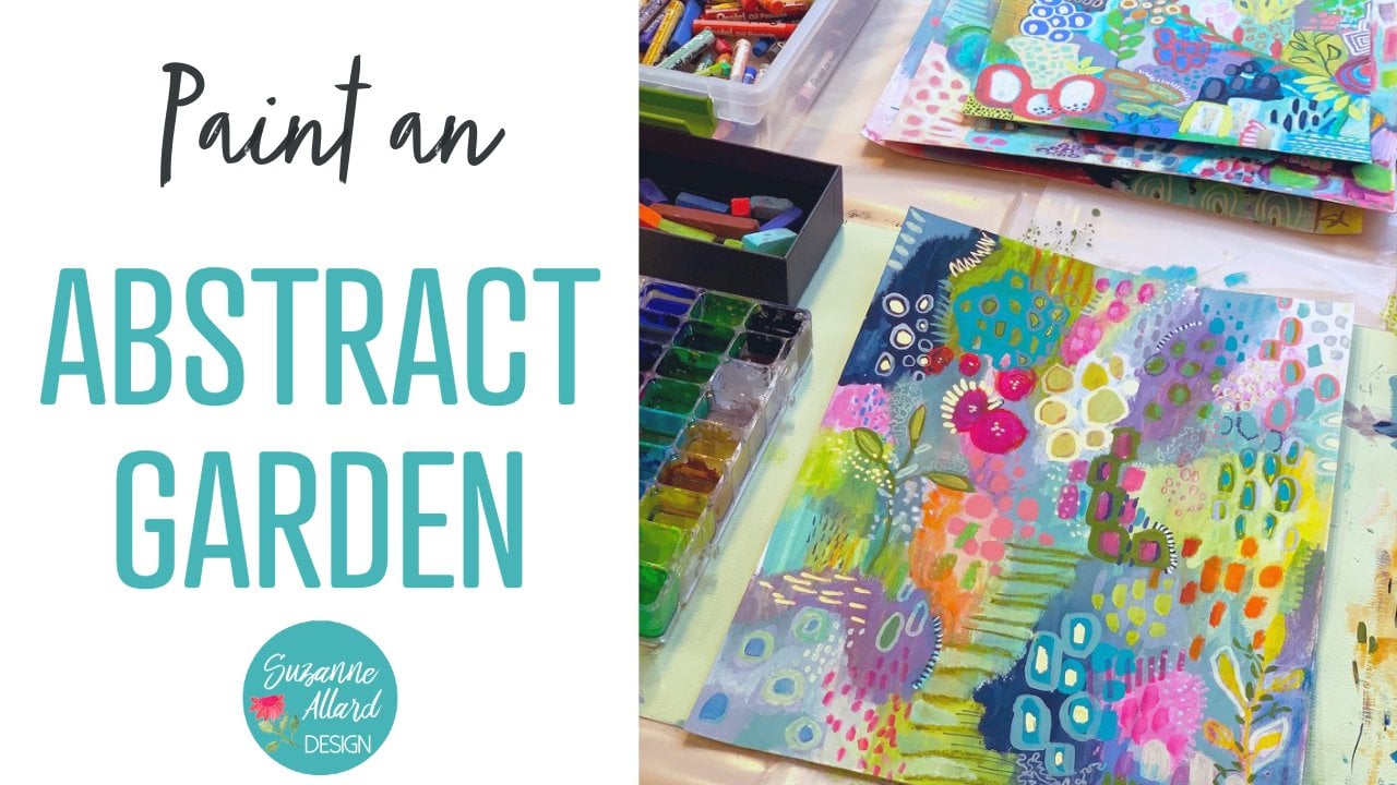
1. Introduction: it's time for another class. I'm abstracts. This is going to be the chance to free your creative spirit without judgment in a loving environment. And we just do our best to take that judgy voice and push it aside for this class because we don't know what we can create until the experiment. So we're gonna take various tools, household tools and some brushes and some colors and experiment we're going to mark making , which allows us to see what kinds of marks different tools make that we might want to incorporate into our composition. And we're gonna do two different types of abstract. One is kind of a botanical ish abstracts like this. This is the peace that's named orange lobster buoys on them. This one is the one we create the class using. This is a reference. So we're gonna funnel. Bet you can see we have a variety of into the metallic gold there. We have some mechanical elements. We have different types of Marx, and we just aren't going to be very free and allow ourselves to discover, explore and have fun. That's the idea, right? And then we're gonna create a piece that is more what I call like the crumbled wall, a bit quieter and you can see some silver there. We're looking at different tools that will allow you to do this kind of texture. And, of course, there's peace can be any way you want it and also a lot of sun and a little bit quieter color palette. So join me. Let's have fun.
2. Mark Making : mark making has to be one of the most freeing things to do ever. In fact, if I'm having a day where I'm not feeling well, we're just energetic or inspired. Sometimes I'll just get paper out in one or two colors and different objects and see what I can make. And then those air great reference sheets. You can even put notes on the back about how you made the marks. So that's what we're gonna do is makes three reverend sheets with different types of Marx, and I will show you the tools I'm using. But by all means, grab whatever you've got handy and take it wherever you want to take it. And there's just no pressure, which is why I love this as a warm up and also as a thing to do on days that I'm just not feeling super inspired. Okay, so what we're gonna do is play with just a couple of colors. And mostly it wasn tools to see what kinds of marks we can make with various tools to get texture, and just so that when we go to do our abstract, we have practiced a little bit and have an idea of the kinds of marks that we can make. So I just take a couple colors. This, um, wash marigold yellow from India, Newton and this Kingman green. Uh, Daniel Smith watercolor. So watercolor wash Doesn't matter. Even acrylic. If you've added water, you just want it to be pretty liquidy. I've mixed up these two here. There is the orange, and there is the green kind of extend with what already had. This is actually really I really like this as a palate. It's the top to the last Turner Operagoers just said that I bought, and I want to throw it out my thought. Wait a minute. This is a perfect palette. So that's what I'm using because I need to be able to I can't use my little containers as much for this because I need to be able to, you know, drag tools in the color. So all right, so let's start with, Of course, we have a variety of brushes rate. We can use something big like this that's going to give us when we're filling in a big area . Um, you know that we want, you know, just a lot of coverage. Love to throw out of water in there. We wanted to just kind of taken organic shape. Then we'd use something like this. This is a number 10 rounds. When I want something smaller, I'm gonna use smaller round, you know, if I want to just pull something out or maybe even take, you know, do some lines, that sort of thing. And then if we brought somethin lines, I have this guy, Windsor Newton has a name to it. Rigour. That's what it is. And it wouldn't allow it. Since the brushes, the bristles air so long it holds a lot of payments. So you can go a really long way with a line and it stays really nice and states getting smaller and smaller. But it doesn't look at that still going still going, and I probably could have put even more pain on it. It's really fun, tool. I'm just gonna go. Well, it's my math. Then you. So you get the idea a lot to find work with that, and you can probably also do some. Let's try something with the side of it. Well, that's lovely. Well, it'll almost looks like a wall texture. You see, that you know one of those concrete walls. So a lot of times you just take your tools and then try using them in different ways. Of course, we have flat brushes they're great for. Well, let's pick up some of the green for you know, neither little marks like this many rectangles or I can take the tip of it and do little shapes like that. I could take the edge of it and do lines like, so it doesn't work as well. If I want to fill in area, so we'll show you. I take my square one and I want that kind of organic. Feel it because it gives me hard lines. You see, it doesn't work as well as around. But if that's the look I want, you know that's interesting, too. So it's just knowing your tools and what you can do with them. Okay, so that's the flats, and then this have been having so much fun with this. This is a fan, and I'll put this the specific one because a lot of fans are different. They have a lot more bristles, and I like that. These air space to part it's a simply Simmons fan, even tail. But I like the different things. I've been able to do that. So of course you could take your pain and good. Just go across the page, like so, which is super cool. Hold something. Having a lot of fun. It is in green with just taking it like this, you know, Or like so he can take the edge of it. And me little sketch marks pretty much anything. You know, you try holding it a different angle. You get sort of these. Harry looks unsure. There's all kind of other ways to use this. So I encourage you. Just take whatever tools you have and play with them. All right, So those airbrush is now is some sort of Matt traditional metric making tools. Well, the palette knife, Yes, but typically more for garlic and heavier paint. But I have been having fun. Um, I think I'm gonna get a clean sheet so you can really see the marks. I've been having fun with the palette knife in creating texture. So you get some orange and I'm just kind of scraping a little bit on my on the underside of my talent and then coming across like that. I'm experimenting with you know who else? What else can I make? And I love the sort of again it runs me of a crinkle wall. Or he might see, like the Caribbean or in the city, you know, paint this shift away. So I just think you could make some really interesting marks with silent nice again you can do scrape the things. I just putting a little on the edge So you can just put a little bit on the end like that and do things like this. So it's kind of finally pick up each to lose a home. What else can I do with this? It's a great thing to do if you're just feeling sort of uninspired or maybe physically not very well or, you know, mentally or emotionally, whatever. And you just say I'm gonna just go make some marks because it's just no pressure and you learn something, Here's a Popsicle stick would does some interesting things. So when it's you know, I went at first, and then when I put some pain on it again, I can get different effects by rubbing. If onto the paper, you can hear that second, put the pain on the edge and make heavier lines. I can just sort of dip it in like a brush and then do things like this and you can use a brush for some of this. But there's something different about, you know, not having bristles like, especially for a mark like this. I don't have to worry about the bristles, making the shape less uniform. If I want a uniform shape. I see okay, another great tool is kicked up, so the Q tip works great. Get the cotton on it. I'll just especially for dots. I just put a little bit of paint on there, and what I like about the Q tip is you can vary the size by your pressure. So if I'm block a consistent sized uh, then I try to keep the pressure the same like there. But if I want varied with just more often, the case with me here wanted to look organic. I can change my pressure that I'm using and get a variety of dot sizes, and then I love how they change in color intensity to write, because this planet dip, just like with a brush when I first did, but it's nice and orange, but then when I keep going, it's gonna be less and less. You can also do my work with Q two. Be kind of fun just to do an entire painting with a Q tip and see what happens right? And then you can take the car off on a Q tip and have a much more you know, so much smaller, too old to make that's with and lines with, because then you're just down to the I guess it's cardboard paper board that's underneath all this cotton, probably better to take it off when it's dry. So there's my little stick and I'll show you what that does so I could make smaller dots pretty uniform. I can also draw live it, get some cream declines with it. I'm really liking this idea of doing a painting with a Q tip. It would be a fun challenge. Kids, that painting. Okay, my last one. That's kind of interesting, and I don't know. Sometimes I think it's worth posing with. Sometimes I don't take a string. It's actually tiny piece of yarn, and, um, I went it and then I'm sure you have this My work. If you wanted to try it, take some pain. This would be like an area that you've, you know, saturated a little bit lissome paint water like so. And then you can take this and get some interesting kind of organic lines coming out of that. I want to go this way so you can see it better. And you could do that with a brush to. But there's something that ends up being a little bit playful about how these lines come out of that shape because the string is moving animals. Really? Naturally. It's fun. Yeah. So now you have something to do next time you're just stuck. You just get held some various tools and a couple of colors and have fun. See, I could just sit here and do this on entire painting of those. That would be fun. I'm not fun. Yeah, I like that. Okay, so that's just a few tools you can see if you use your imagination and look around your house, your kitchen, you can come up with all kinds of ways to play with color and tools, so that should be enough to get us started on something. We won't use all of these marks, obviously. But it's just showing you if you expand your horizons. Oh, I forgot my chopstick. Got a shame. A chopstick. I love them. A chopstick. Okay, so I went it again. So the chopstick has the small land in the begin, and it's great for dots so we can do where does smaller dad's where you can use the other end and do bigger dots. But I also love this for texture. Let me quit the side of it here, that kind of angled side that trumps the cast. And let's do this here. Pull again that kind off paint and furniture look organic look that you can get. I don't know. I really love that. So, yeah, that's the chopstick You could also draw with a chopstick. It's blend. So if you win it, it'll hold a little bit of pigment and you can use a skewer to the skewers just more pointed. So you have the cut off? I do. Anyway, if you use a scary of the cut off the and a little bit to get more blood Okay, now I'm showing you May tools
3. Choosing the Color Palette: supplies wise. What I did is I picked my favorite colors. I didn't worry about what types of paint they were. I just grabbed colors that I was in the mood for and made a hodgepodge. So I will list all of the colors that I used in the brands. But my message here is to pick whatever you've got that you like or mixed colors to get what you like. Eso Let's get playing with these beautiful colors and see what we like and what we want to draw in out of the palette to use in our piece. Okay, So when he started project like this and I'm trying to decide on colors, I pick a range of. In this case, I'm in the kind of blues and greens phase with either a pink and orange, uh, sort of something different. So I grabbed several blues and I'm several greens and we'll just get him out on the palate and put paper and see what we think of him. And I like doing that because it makes it forces me to look at maybe colors I haven't looked at in a while. We'll combinations. I haven't thought of so these are a mix of watercolors. There's caution here, and there's pack rogue wash so it doesn't really matter. It's more in this case about. And if you've got acrylic favorite colors, throw those into its OK, Um, I just grabbed these three types because it's kind of what I'm usually I use most and is more about color. So pick out your favorite colors and then let's see what they look like. I don't see what we want. Oh, what we think those went together. And so I always use and love indigo, so I don't even need to test that. But I'll show you just This is a a Senate, the a watercolor in there and ago. But, um, any indigo is just a amazing. So I will be using that. And if I use it, I can get it pretty dark by using it heavily. Um, so I used that is my dark in a lot of paintings, and if I wanted a little darker, I'll add just a touch of black. And then along with the blues, I have these a few of these Daniel Smith pearlescent and I thought I would see we'd see what we think of those, Um, well, that's really for lessons. That might be too intense, but it might be a fun little something somewhere. It's got a little luminescent to it. Damn again. It's a color even using a long time. This is, I think, this is very similar to the Indigo. I just want to put him side by side and see if we could even tell the difference. It's Daniel Smith from my in the Blue Genuine Oh yeah, that's that is different. It's I guess it's got a little more black in it and the textures really creamy. So it's not significantly different, though it just goes on. There's maybe a tan Ted more yellow in it may be more black, and if I'm thinking on, then this is to ash blue pack Rogue wash from whole Bain. Let's see what we think of this. I think it kind of purple e dark. I'm not sure that's the direction I want to go on in this piece because it's at the purple pieces to it. But see, that's where this exercise is good. And then this is the green we were using when we did our mark making. That's Kingman Green from Daniel Smith, which I guess it is more of a green than a blue. Sorry. And then course I have my stand by. You can tell how much I love this color. I did have to order a new one because look, this is the Windsor Newton designer. Quash cobalt, turquoise light, maybe my favorite color on the planet. So see, this allows me the look, and I don't do a whole lot of color planning, but I want to show you my process for doing that when I do. Because I can already see here that if I take this out, actually these two in the middle, what can I cover him up with? I just cover up. Let's will amuse this. I cover these two. I think these go better, and I think these middle one's throat throw it off. There's too much just greatness in the wrong way and that for me. And then this is two Purple E. But let's keep going and we might change our minds. This is a warm green. Actually, this problem is really break. This is the olive from Kobane. It's a macro quash. You can see. It's basically like a green gold or really reminds me of golden acrylics green, gold color. Then I got I don't I think this is gonna be to break for us for this one. This is the Wizard Blush Lyndon Green, but that's just I don't know. It might be pretty highlight. We'll see. And here's another luminescent here doesn't Topaz Daniel Smith So we think of that. That's pretty kind of reminds me of the color of like in in the Woods, and it's definitely shimmery, so we'll have to consider the shimmer to, but I think that might be a winner then. Another one is the duo Chrome Oceanic from Daniel Smith, another luminescent, and I've already used us a lot. I'm in love with it. It might be hard to see you hold them up minute when they dry so you can see the shimmers, a couple of colors that I discovered that I'm getting obsessed with our This is the aggro blush and holding, and this is the misty green and ash green, a list on these and many sources, but this misty green is just a really organic color again, sort of like like him. Um, earthy, rich? I don't know. I think of a sandy beach on a cold day. I don't know why, and then the other is these past green from Kobane. I have been using this as well. It's beautiful, of course. So the other color that I had pulled when I was grabbing blues and greens was this, uh, I think there's a Senate A No, it's not. It's like grow. You notice anything? Okay, It's the hollow green. I think it's gonna be very similar to this whole Bain Allah, but more green. So it splits throat on there so we can evaluate it. Oh, yeah, it's a lot of murdering. This is more mustardy. I love this color. Okay, so that's the collection of blues and greens that I grabbed out of my boxes. And I always try to grab a few things that seeing difference, uh, that I haven't used in a while. And course you can mix all these two right and create some really cool stuff so that no, let's throw down the colors that I guess I'm calling my pop colors. We can choose which of these to use, or we could keep the whole thing and blues and greens. There's certainly enough pop colors within that family. This would be one, and that would be one. But let's throw down these and see how we feel about Have a look. This is that marigold yellow, which is really orange. And I mean orange and turquoise lately have to just singing to me. I made me when copper oxidizes, I guess. And then I thought, of course, my standby Turner Coral gratis. Always amazing. So I thought I'd throw We throw that in there and see what we think. Really pretty. What? These is not. And then I grabbed. I haven't seen this in a while, so I grabbed this Daniel Smith. Quit Noppadon pink and see what we think of that to Turk, who is great. I remember you now. Beautiful. So now we can say, Ok, I can definitely eliminate this for me. I just This is that Pearl. I just think that out because it's just too sky blue or something. It to me, it throws things off. I don't think I need those of these, and I'm not liking the way this my and I've noticed this before. this kind of a weird texture, and I'm not sure what's going on with that. I mean, maybe it's an effect that we like, so I guess I'll keep it in. This is just looking to flat, although these two to get these three together with beautiful women and properly so I'm not sure I'll use that, but I won't throw it out. Yeah, and yeah, I'm not gonna over think it at this point. I'm gonna say, OK, let's get in there and know what these colors look like. No, they're fresh in my mind, and I can decide what to do with them. And I also want to say that you know, papers like this when we're done with this piece can be painted over using the technique in my pain and abstract for a certain class where you just start with colors and marks and the same can be said for, you know, the mark making cheese we made. They don't need to be thrown out. They can be just background for another piece, not this kind of bees, because we're gonna leave white space and they wouldn't work for that. But for the other type of style of abstract where you're covering the whole figure job. These are all these are not wasted. Okay, let's move on.
4. Botanical Abstract, part 1: way. So let's talk about this the way that this piece developed and, you know, the one that we do may or may not be somewhere. Just come and ever know. But you can see that I have lose colors here in the background. So they just blended. This was the turkey ways and not an orange orange, I think going to try and orange orange today. This was kind of a reddish red sienna, and I let some of these bland that some of these didn't I let thes drip down. So then it is they started happening. I thought, Well, these kind of looked like flowery things And then I thought, literally did these leaves. And I had fun with that. Then I through in a few kind of organic or botanical looking elements. I did some ink. This is some black ink who are really actually, it's a really, really intense in to go, I think, with maybe some black in it. And then and then I got the Golding Would you love? This is any kind of this is Amsterdam Gold Inc. But you can use any brand of ink. There are even watercolor paints that are mechanical, so it doesn't have to be ink, but I just like the intensity that it gives. And then I did some dots and had it spread in some of these areas, some of it after dry and some of it, not so much. Then I went through after it was dry and put some other marks along here some again. Organic shapes, some dots. So we'll just play and see what what we get for me combined these colors and maybe some of the marks and some kink and see what happens. Okay, so I took a few of the color is the he picked and mixed them with a little bit of water. This is just a paper plate with a case of painters plastic because the problem was Aberg wash or acrylic is you know, it'll, uh, dry and then not you can reconstituted with water. So, um, I use things that are disposable, and these three are APRA brush with watercolor. Of course, you can use any pedal it like this, and it won't be were lined with layers of paint. But when I'm using some happily, use something that is not chorus and his disposable. So that's what I'm using. And I didn't take them all. And because we'll see, we'll just see as we go, Um, if we want to add some more, But we're gonna just start with making some of the larger shapes that you see in the background and letting those colors kind of draw down into into these I don't know where to come. Flowers? Well, just common botanicals. And then I already have my orange mixed up is well on this pallet. Got a little bit of water to them. You do want to make sure that the paints that you start in some water because when you're working, you want them to be fluid. So whether you're using acrylic, you know, if you want to use fluid acrylics, you certainly can. You might have some of these on hand. Um, for if you have regular acrylic just had border and make sure whatever you're working with is fluid. All right, so let's start with my large brush on. I'm gonna grow my end ago and start with something I don't I'm certainly not looking for a perfect, uh, circle. I'm gonna have a lot of water to this one so that I can get this was the drips. And sometimes I give it a little bit of a cheat, depending on your paper. Sometimes it needs quite a bit of of encouragement. I do like when they kind of meander a little bit. Okay, let's go ahead and jump into this call, live and do something else here we've got They also want to bring in some turquoise to see what Pappa's. Can I have some water and maybe give it an idea of where I wanted to start. Sometimes you want to block those drops so they don't wreck your whole pad. Okay, clean my brush and maybe come up here with some turquoise shapes. You will know how much I love me turquoise. And as far as letting it touch or not touched, you know, that's Curtis Discretion. Uh, you could keep a boundary. I've done some like that on this one. I think I'm gonna just go ahead and live things. Touch them to make this really late out here. Remember? You have water, Ugo. He get a variety of things happening. You give control the lightness or darkness of the pigment about how much water. You an I'm just liking these kind of lose lines. You could go more solid. I'm gonna pick up some of this Vanessa over here to see what? How that looks with the planning with the orange. Okay. And then I really like a bubble luminous. That's very pale, but they try to do a leaf with that. So I've been just coming out and then touching. And as long as you don't wait too long, the, um the pain is this is the gua sh sticking in there that has Greenglass. I might want to come over here with that, too. He contended look heavy, which I feel like that contrast. But I don't wanna I'm adding some water to it, and I probably come through with some accents, but it really like what's happening here with the blending of the colors, this texture coming in here. I want to make sure that I'm not losing my contrast here. So bring it somewhere and to go there, let that work its way through, and then I'll probably bring some in here after the strives. I don't want to do it now because little next, but you can see how the texture is coming in there, and I'm gonna bring some of the orange down here to the leaves. I generally think in terms of composition, of trying to use ah, color in three places, huh? I haven't followed hard and fast, but I did follow it. So, for example, I've got the three oranges and I may add more this hash green that's here, I probably will. Come on, this is a dry and do some, you know, some of these elements in it to bring it together. This green ended up being because I mixed. I put turquoise here, which mixed with the olive and made the screen. And it's not really the green that I wanted in here, but we'll see if we can let it be a surprise color. And but and, you know, be okay when I can always put some gold here to tone it down. So if we think about the threes, I got some turquoise here here and brings him over here. I think fixing to Turkey's with this luminescent would be really pretty when you're blending water, calorie, hogwash, anything like those in your wanting blending. You do have to work a little more quickly. It's probably having to see the subtle luminescence of those that effect that's coming on. But I think I'm gonna make some of this luminescence with this Spanish green and see what that does. I'm feeling like I need something here, so maybe a Maybe it will be so we can do a wet on let take my brush and just makes, um, What circles with my dirty water, which allows me to see a little bit. I do work in hard numbers, so going to do five and then take this passion mixed with a luminous and see what we think of that luminescent is creamy him Cool it hard to make sometimes. So that's why I'm having a work it a little bit that one came out. Really? Quashie So it's kind of interesting. The texture difference is I'm getting between the goulash on the luminous of watercolor I want is also a little too perfectly round for me. So I'm just gonna mess it up a little bit. I'm liking this for some of these elements out here. Maybe so I think I might This is my big brush, but it does have a fine point on it, and it's already got the color long other ways. For this, I would use the small around just trying very loosely. Yeah, I like that. This is still damp, so I'm not going to touch it yet because I want those elements sitting on top of it. But I think I might greater the end to go over here on my smaller brush and do Who is Levi thing there? I mean, I think, and I think what, we'll let it dry and then come back and see we wanna have. But there's some really nice things happening here. We'll just have to see how it settles. Ultimately, when starting my papers, buckling a little bit, which is okay, you can do something like this, sometimes get that full back down certain places. So they have hoped so that it doesn't keep spilling that way, so we'll let it dry and see where we are.
5. Botanical Abstract, part 2: I realized that before it drives completely, I want to a little bit of another color in these take a little bit into go. It has dried some, but I think I could get a little bit of bleed going just a couple of spots for interest in those leaves to bring a dark element down in some dimension. Saying that these I see a little bit of moisture and even if I don't, then I could do this. So either way, whether it's dried and afraid, if it's tried that I can get what I was going for this way, event hasn't Then I can get a ble going, if that's what I want. E trade a little bit here, see what that does. Okay, well, let that dry and see. Well, yeah. Okay, so it's dry a little bit so that things won't travel too much. But there some things I want to do with the ink of oratory is completely so. I love navy or into go and gold. And if I do this now, the gold will still pop. This is my ink, but I will get a little bit of bleed of the ink and I just used the dropper because it's acrylic. And if it is a British, then I get a watch the brush. And I really like what the dropper does from the very the size a little bit more on some of these and go for the number. And then I think some gold may look really pretty inside. These got a bubble where the other thing that I think is kind of fun is when I painted the way a painted, I ended up with these little white spaces, which are great, but I think it's kind of fun to go in there and use those as a an idea of where I could put the cold. You can leave in white to This is just something I discovered playing in my sketchbook. You could just put the the gold anywhere on there. I don't think I'd like some gold shots down here so we could use their Q tip. But since this has a dropper, it works really well. If I wanted to make sure that my thoughts were completely uniform and shape, then I would use a Q tip. Let's see, I'm thinking about some sort of lying work here, but I'm not sure. And my dropper is not so great at lines. So if I do want to do that, I think that probably would use to keep Let's see how that would work. I let my kids up with gold and then program have scrap paper and see if we like that works because it works well, pain. But I want to see if it will do what I want with ink as much. All right, so let's try the chopstick. Okay? Just guys that because Zinke So we'll go. We'll try the brush. That is easy to use because the bristles fight against you. But I think it's our best option. We put plenty of ink. Yeah, started control. But luckily in this kind of thing, it's not that important that it be precise, but it is harder to control. I also have gold markers a day You sometimes Okay, well, we go now. Come back to anybody
6. Adding Delicious Details : Okay, so this has dried. And I wanna show you where you can see the shimmery gold the pink that we did here and here down here on then. I don't know if you can see the luminescent, that luminous and green that showed up here hoping it in the hope of the name of it. But anyway, he can see some of that happening here and here. And so now I'm looking at it and thinking about I mean, I could just leave it this way, but there's a few little things I liked in this one. Some of the details that I came up with, some of the line work and just some of the marks. So I think I'm going to do I'm feeling like I would like to do some navy, some dark dots in here, just a little bit and maybe some dots of some color here. Some bto Not sure yet, So we'll just start and see where what ends up feeling like it makes sense. I'm gonna re with my Maybe I can re wet it because it is the indigo watercolor. My I broke colors have dried and they're gone forever. It was just a disadvantage of using anything was acrylic. I'm gonna test out from this to make sure it's giving me kind of what I want, which it iss can. I wanted those to get smaller as they go up. I like my dots and things to look sort of organic and not super controlled. Ah, a little bit random. So I like that. I kind of think it brought the I up this way. And I feel like some dark would be good in here. So it was a few different things I could do. I could make more dots. I could make little sort of levi brushstrokes like this do lines. I could do any of the marks that we talked about her Mark making. In fact, now that I look at that, it might be nice to do some of this right in here. So let's trade get my fan brush. I have. I went and practice here and make sure it's doing what I want. I want it dark, so I'm actually gonna get a little more pain because I'm not sure that's dark enough. I'm not going ahead as much water cause that will make it less dark. OK, that's good. And I won't. I think I want these coming this way. So do this. So, yeah, I like that. Just wanted a little bit of dark over there and like how it feels like it's kind of moving it out. This is a good time to grab those sheets and say, Okay, what else would be interesting in here? Always trying to not overdo it, right? It's a channel is always a challenge for all of us. I do feel like I was something here. Um, then I could do what I did here, where it did see sort of breast stroke. He leaves. I could do one of those there which would tie and lift. Believes here I was. Think about what else we could dio thinking about a cue to believe. Let's see what that would look like. It was Just try, woman. That's what That's what I mean about this kind of thing. You're just always experimenting and thinking about, you know, do I want to introduce something like that, or do I want to Just two something with brush strokes? I do like how that looks, but I think what I feel like is that it's introducing too many different elements, and I really don't want this place, this piece to get Clary. So I'm thinking I'm going to use the bread. He's a brush and do kind of a one of these brushstroke e leaves here. I like that. Do we put one down here too? I think it adds in these energy, Maybe a small one down here. I'm gonna move my papers so that I can pull away the way leave would actually grow just to give me the right. I feel okay. And I like to do Teela and have appeal. You'll see that in this one. Here's some some texture with a teal here and then this is actually some Pasto, which we can think about. But for now I'm going to grab my teal, which since it's a glass, I can reconstitute with water. And I'm feeling like Cem, that's her. Some small shapes up here would be nice, but I think it might make him Q tip ones. We're getting what we want. The way these things, um, shape is a little different than these, and they are more uniform. I'm gonna take the side of the Q tip and just Makesem jerk was on turquoise. Very small dots found. Here I am. I think over here. But maybe in a little bit of her when better the way you might see on a leave. Okay, so I'm looking at the balance of Cohen's Took a teal, teal, Teoh some navy and to go I've got my gold metallic throw. I got a variety lying the texture and I'm thinking about Is there anything missing? Does anything feel incomplete? Does anything need to be added And, um, thinking, maybe not really liking? Um, I found myself wondering if I wanted to go over the gold so that it was more right there where it kind of where the brush kind of it faded out. That's the only thing I'm thinking about. At this point. I'm looking at these orange leaves. They feel like they're a little bit plane, but I don't want to pop more orange into them. The only thing I'm thinking about is what might look pretty is kind of a rest color in there, a little bit of a little bit of something and kind of an Indian red or Red Sienna if you have any of those kind of like I used here, but it's introducing another color. Um, I don't know if I want to do that very critical. So actually put in? No, I think, actually, I think I like a little bit of the the glean the luminous and green mixed with that quash. Remember that color we came up with? Remixed a little bit of this with the luminescent, and I still got both of my palette. And since they're quash, no, actually, this one back row Glashow, it's not reconstituted. It's all use a little more. The luminescent is watercolor, so I could be constitute that. And so now I just have to think about what am I doing in there? My doing dots. I feel like I have enough dots. I don't want to do any more doubts so I could do some gentle lines were just some other kind of shape. I think what I want to do is maybe some wet on lit. So once I get this reconstituted, I'll do a little circle of water, even though it's on the orange and we'll drop a little doubt of this in it and see what it does is gonna end up being a doctor but will be her. Won't be perfectly formed way just a little wet shapes. Let's see what happens. Seeing that being a little more organic than a dive because they're gonna bleed just a really bad. I don't want three on each other because it's too matchy so in a to five on this one, I'm just looking to the side to see where my water is. So I like this. I like the texture that came through when used to mixed. And in that turquoise here, this would happen here is really beautiful. I think I have my height is traveling around it nicely. I like my gold highlights, so I'd say this one's done.
7. "Old Wall" Abstract: way are going to do this peace, peace that is more humbled, Wall and not really a botanical, But it does have a really organic you. So let's see how we can create this kind of peace. All right, so now what I'd like to try is again referencing are marking pages and picking out the things that I like most, which, for you is gonna be different. Eso picking maybe three elements and just doing an exercise to see what happens when we take elements that we that we came up with here and put them just expand and explore them from their own and see what we come up with. And I really liked this. This palette knife with those colors. I love the these were, I think the Q tip dots with the cotton on. Um, I do like the palette knife here. This was kind of fun to, wasn't it? With the stream on this one. I always love these with the fan brush. Probably All I really loved on there it was just a lot going on here. Keep their I keep going back to those palette knife things, so but I want you to do is take your mark making pieces and pick two or three things that you just want to expand them. And we'll try to make a weight space abstractly, just those elements. So I'm gonna start with this. I've got my reminiscent mixed with that Paris green to get a little more substance because the limits on its own is pretty transparent. I don't see what this does sometimes with these have toe, actually paint some pain home with a palette knife. We need more than that screaming. It gives a more paint there, which is what I like. Yeah, that's pretty. Just two peas on here. That time we just took it flam I got a little sicker. I'd like to try the technique with the indigo. This is a great little tool. These pipettes. I have a link to it on my website. Uh, Susie, another dot com. They make your life easier for distributing water wherever you need it. Okay, that's nice and thick, which I like told me did before, and we got that affected the chopsticks. So let's see what we can do here. I don't want a dripping, although maybe I do. You never know, right? That might yield something interesting. That's cool. Building too much of a square here. Someone a depart so that it doesn't look just square. I love so kind of you can hear that, but the stick starts vibrating and making these little Mars. Now, I'm gonna go back to our original colors and say what would be interesting in here? You know, I put these out, but I just I'm just very much right now on sort of this blue green, but that would be pretty. That was the Mr Green. And I'm gonna think about what? Marx, How might have to do the fan brush. I'm going back and forth between a paper plate where I'm putting my admiral wash because I can throw it out because it's can't be reconstituted. And then I have a plastic plate for the watercolor because I can. I think if I use my plastic for the acrylic them, it's ruined. I'm just gonna have a little hard to this. Hes on the mix it up. I could also use my families to make some stripey things. So you see, that's why I love working on paper toe. Because when I need it. It's right there. Okay? Feeling like a lot of just go. Like this figure. I like how it picked up. Could you see? I picked up the Navy there Pretty yummy. And then, uh, I'm feeling like I want have a larger bit of this done in a shape here with water and that maybe we'll do something over it. I like to take my brush lightly here and just kind of almost let it go where it wants to go having more water. So this is really earthy. I am. I want to do something appear in this green. So let's go back to our reference sheets. And I'm thinking something like this would be good with either. You could do either with a brush who are This kind of thing is actually easier with the Q tip Tennessee if I'm gonna get what I want here. Yeah, that works. So I'm gonna get him not enough paint on there. Get a visa. Let next bring that element on here. I don't know why I like scribbles, but I do. I must be a good place to pick up the pain and dio Sometimes things still using like you, too. Pull. That's pretty that I got blood into. See, that was a happy accident. If I didn't want to make sure that didn't happen, I would have let it dry completely. But honestly, I forgot. And I like it. That's gonna being beautiful. And maybe one of my favorite cards, huh? So I think I want to do some. It's wet on wet circles here. I just don't know if I don't want to do in the green or hand the indigo Time to go for the green. Because you know what? If I decided I wanted him an indigo, I can do the theme the medical on top of So I'm just making I don't want to be perfectly ground grips. You just blocked up carefully. Okay, Now I'm gonna take my cream mixture and do those. And when you just keep doing, you end up because you're using up the pigment on your on your brush. The ones that you do later will be less intense. And then I always like to bury them a little bit. So put double the pigment and some so that they come out varied. Okay, This is drying with some really lovely texture in here. I'm thinking about what else might I might want in here. Okay, I decided that I am not gonna overdo this, but there is one small thing I'd like to do. I would like to have some teeny tiny indigo dots over here. I like these, and I just wanted to add a couple more so crabbing that pain before it dries. So this is a different type of ab strategy. Still have a lot of weight spaces. I narrowed it to three colors somewhere mixed, but and I put a variety of color placements shapes and enough to bring it together. And it's just a very kind of organic walls are like that crumbled wall, but also some botanical elements and kind of relaxing and pleasing toe. Look at. I think there's enough interest to cite my high wants to kind of go, What's this about? And then over here and over here it is a quiet peace, especially for me. But I think that's always a good exercise to Dio. So I hope you enjoy doing both of these very different types of ab sex. Okay, so, you know, I always like to experiment and push the envelope. So I started thinking about the metallic gold that we used in our other abstract and what a what a metallic would be like on this. But then I thought gold wasn't right. So I found my silver. This is just be ball Inc. You know that I picked up from those where, and I put someone a Q tip. And I just thought I would see what happens when he turned out to be Not a good idea, but you never know. Do you try, right. It just felt like it might kind of give, like, a stone feeling or a stone color and something kind of interesting. And then I want to put some circles with this. So I'm just gonna use my already saturated Q tip with a little bit of water and see what that does to some bits of silver. I wanna have anything there. I don't think maybe something here. Okay. I just thought that would be fun to show you it's gonna be a little bit shimmery but not take away from it. No, I can't stop. Of course. This is where you say you're here. You're yelling at me through the video. You're going to fire Suzanne. Time to stop. They don't want to. And this is how I discovered things. I mean, it was a discovery that could go to fire, but all right, now I will stop.
8. Metallics and Wrap Up: I just want to be able to show you the shimmers in that luminescent that Daniel Smith luminous um green, That's fair. And then also so that you could see the metallic and healthy shows up. It's just hard for that. Convey in a photograph, of course. That wonderful water color texture. When the show you he can't there you can see the silver better. I do like how it turned out. You don't have to use pink, though. I actually have some silver water color that would have worked as well. But I just want to show you where that Schumer's and had I think a really nice I like about it is that this angle add sort of a dark gray, and then when you move it, you get the So actually don't think I went too far. I like this over. So I really hope you had a much fun painting this with me as I did with you and our crumbled wall. And I would love to see them in the project section. I always comment on projects and, um, I just I encourage you to just keep playing with this, you know, if you're feeling like you're good to go and you can go play and don't need to do the class again. Great. If you feel like you wanna watch a certain section and get out a different color palette than do that, too. But whatever you do, just keep creating, keep exploring and see what it is that comes forth when you allow yourself to be in a judgment free zone.
 Suzanne Allard, Landscape, Floral, Abstract Painting Teacher