Transcripts
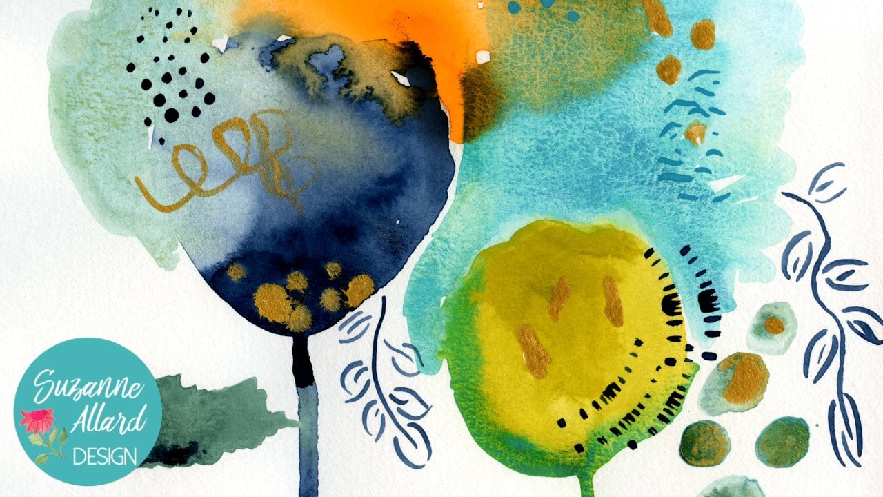
1. 1. Introduction: Do you like color? Do you like pieces that stop you in your tracks? That's what we're gonna create in this class on my show. You step by step, how to create this stunning? Okay. The combination of the look at me colors and the dark dramatic background in this relatively simple composition combine to make this a great piece to do in the class. And it ends up being stunning but also beautiful and sweet and looks good just about anywhere in my other two classes on still share paint a joyful bouquet and paint an abstract garden. We definitely look use a lot of color, but this one is a color party. Look at the inspiration for these beautiful blooms, colors and composition. We'll cover a simple supply list, and then we'll look at color mixing and sourcing to make sure that you get these colors thes, vibrant colors. Then I'll coach you every step of the way and will create this little beauty. I get a lot of questions from students about adding backgrounds. Do I do before do it. Do it after a Sobel cover all that when I show you how to put in this delicious navy dish background at the end of this class, you are gonna have okay like this that you can't believe you paint it and you'll be able to hang in your home for use it as a gift. I cannot wait to see you in class.
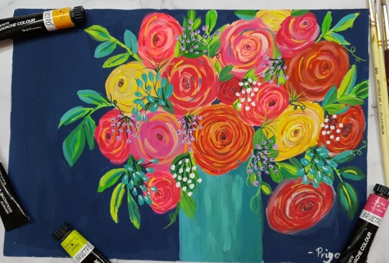
2. 2. Supplies and Tools: right, So let's talk about the supplies we'll need for this room. It's pretty basic that there's not a lot of parks to this eso you get paper. I do love the Kansan. It's a great paper from a price, and this is actually 11 by 15. Um, so sometimes I cut it. I think, for this piece, I did cut it to 11 by 14. But any paper that size or similar will work and brushes I got the My favorite brand is the Princeton Bell, that touch kind of a number 10 round. And then you don't need both of these. You can, either. This is a five round in the foreground, but one of the other is fine, and the flat is nice toe have it's an eight Princeton, but any flat, you know that's not huge will work. It just helps some of a some things and then something for the detail work. This is a Cotman Windsor Newton. Come in size one, but you could use the to, and in fact, if you're experienced and practice, you can actually probably get the detail from just being gentle with your number four. Yes, precious, it is nice to have either, really, even a regular pencil or colored pencil or a pen for you might want to use on the sounds at the end, I'll show you, but you can also use the fine Depression paint. And then for paints, you can use the same set that he probably got in my pain of joyful Book a class or in the abstract garden class, which is the glass, the turn of wash and or any wash, and I'll show you in color, mixing how to either make the colors that use or find them. A few exceptions on the Turner colors that I want to talk about operable pink or red is what gives you this amazing, you know, just poppy pink in fits in here. And that is so. It's either called copper pain for opera Red turn of Washington. I couldn't find it, and they don't have it, but they have it in their acro clash, which is a combination of a curl, aching wash. And no, I do A you know, I don't know. I like it. I don't love it as much a squash, but anyway, if you want that color, you can get in this. This is like about $6 out in the marketplace. Um, if you want to get the really good one for eight is the Winder Newton Opera Pink Wash. The other color. That is a complete splurge. Um, I use a lot of turquoise in my work so you'll see the Turner that comes with a co Belcher place. And it's nice. It's fine. It's perfectly fine. If you wanted to go get something just amazingly delicious but also expensive, you could get the Windsor Newton quash this color. It's Kerr Pits, um, Cobalt, Turquoise Lake, and for some reason, it's expensive. Think about $15 but that's what I'm using, you know, to get that we delicious turquoise all right again. You don't need it. You can just Turner, and I'll show you how I'm color mixing. Okay, so let's just talk about a couple of a few different ways. You can keep your paint. You can just use the pain and a palate like this or this, or even a paper plate. For a year or so Before I bought pallets, I would use these code people place, and I'd have you know, one plate with the blues and one plate with the pinks and reds, and he would just dry on there and they revive it. But so these are just some options. Then I went Teoh, I like these because my colors are mixed and they stay wet. And then I found this, which is an airtight palette. I do have the link to these and this on my website. Suzanne, our dot com And what I like about this is that the color is that, like, next mom, my favorites air in here. They stay nice and wet, and I can paint really quickly. I don't even have to revive him with water. I can sit in front of the TV at night with my husband and, you know, have this out. Which I do often some paper and and have some fun. Just just a nice thing to happen. Wasn't bad. Expensive. I want to say it was $16. Um, so I really like it. But again, these are other options that work. And, uh, you can even use a plate from your kitchen as long as you're not gonna eat on it. Okay, Those are some options for you.
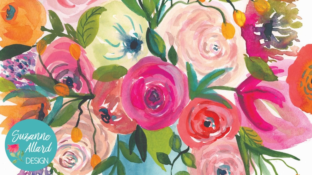
3. 3. Inspiration!: ready for a visual flower show. Get your creative juices flowing. We're gonna look at some photographs for composition of a okay, design of a flower color. Inspiration. All of it. So come along with me as we take a lot through this flower show. Okay, let's take a look at some visual inspiration. Look at the colors in these Ramon Kilis that I took a picture of at the grocery store. We'll see those colors now. Okay, there's been these here. Look at the structure of the flower and the texture in these blooms. The center is sometimes dark, sometimes not. And then this just smarter sport of color and beauty love these colors. Here is that bright pink, the opera pink that we're gonna be using and a p any. And this is a good photo for looking at the structure of the flower and just those soft lines we're gonna make to represent flowers. And then this photo really shows us You know, those light lines that we're gonna make that go in a sort of a circular motion, and then the back center to represent these beauties. This is a David Austin roses and I love how they're kind of tucked in so early on the inside. And then here's some inspiration for just the color variety and of Okay, I thought this was lovely. And then this one is well, showing a variety of Laurel's and colors kind of jumbled altogether. And then my favor, probably my favorite broke a pic of all time is just by Tila Pena. I love how everything cascades down. We're gonna do a little bit of that in our piece, but no out of it. But I love these Cascades. I recommend you create your own Laurel Inspiration board either on Pinterest or by saving your images and instagram. I use both that way if I'm stuck with color or composition or just feeling uninspired. I looked through those pictures. I don't get very far before I get an idea and I get excited
4. 4. Color Mixing Part One: Okay, so let's look at how we make or find the colors that are in this piece. Of course, I always encourage you to it colors that you like. You may hate someone who's colors. Um, so make sure you're picking colors that speak to you, but for those who want these colors and love these colors, let's talk about how dio either find them or make them alright. So I've got the colors here and there. There are more colors than that in this piece, but we can make what we need from these colors. Okay, so let's talk about what just kind of go down the list. Some of them are right out of the tube, and then some will make and then make again, depending on what we need When work, we're painting our peace. OK, so this sort of pale yellow blue, her yellow Wait, It also has some teen amid a green in. But what we'll do is we'll take just a yellow you probably if you got the Turner set for my last class from a job. Okay, class, you've got your lemon yellow and your deep yellow, but any medium yellow will work Let's try the medium first, and we're just adding a white to this. I'm just using inexpensive light. What is what I go through? We need a lot more weight than that. I go through more white than anything. So, you know, stop when you like it. This is a really where that yellow was intense, wasn't it? Okay, so don't use as much of those. I did say hello. So this is a really pretty color to I mean, I don't I'm not really exact with color, so I like this. This is ah more of a sunny yellow, and this is a little bit. Has a lot more green in it. So I'll just show you how you can get to that if you want to. But I'm gonna go ahead and got one on there, cause it's very pretty. So what we would do is take the tiniest amount was green so tiny You always have more. You almost did it. Just getting to where you like it. So now it's a little bit more of a I like that color. Okay. And you can make an infinity of color, so when you like it and it'll change when they put it on a piece anyway. But when you like it, so stop. Okay, so then the yellow this yellow is just your any brand kind of a medium yellow, cadmium, yellow. That's different. Things like that that they're called this one that I love, love, love This kind of a lion green, um, is mixed. It's a little tricky, but you can buy it, Of course, by it and a variety of brands. Turner doesn't have it, but you can make it. If so, if you have the Turner set or any other pain, if you don't have a lime green, let's look at how we can get there. Strangely, it works better. You would think it would just be green and yellow and that I can get there. But it doesn't have that pop that it does. If you take a turquoise. Turner has the cobalt green, which is there kind of turquoise. And if you take some of that and then either, well, actually, just take some of this and see some yellow. I mean a lot more, you thoughtless turquoise. We'll take the permanent yellow light or it's a lemon yellow, probably enough in my brush. Yeah. See, that's pretty darn close to this. And if you want to save later, you could have more of the yellow. But if you want to just tone it down a little bit, you look more deeper yellow. We're getting there very pretty of that color.
5. 5. Color Mixing Part Two: right, But the other color this green that I like a lot. You can Sometimes it's called green Gold, and that is requires a few more things to mix. Basically, will end up taking a green. Actually, we'll use some of the colors that around here, but we'll have to darken it up. Ham, believed or not, will probably have some ready to make that. So we'll get some green. Let's try a little bit of red. Just attach. Put it over there. So I don't too much Moreland. This is why I premix my favorite colors and put him in my in my power, because that way they're there. And every time I paint, um, we don't have to go find them. E won't grab a little bit. You need a warm this up and then dark enough because I want I love that you see, actually, I like this color right there. Have you pretty leave? See? Pretty close to that. We can darken up with a little bit black. So red is the color that when you add it, green takes it in that direction of dark. But also less break. You can see that pen, Liss amounts of greens that you you can make. I just having either more red. We could have more blacks. It's a really dark. Then we could have yellow to that. I don't do this sometimes, right on the peace just because I like a lot of variety. If you look at the leaves in this, there is how come through with a bit of something else just to have a lot of variety of color in those leaves. All right, so that's how it makes a variety of greens from just a kind of a yucky green. Which is this one here? I mean, how did I don't really want to use that. So I use it to mix. Okay, so that's that. If you got the Turner said, it's but it's just a basic green, all right, turquoise, that is that the color that sort of comes with the turners up the cobalt blue, you may have a mother set to turquoise. Um, I will tell you that my favorite tour Kravis on the planet is the winds are new designer Wash cobalt, turquoise late. That's what that is. And it just you can see it right here and here. It just has a pop. That is hard to be. I'll show you the Turner one and how, like how you could alter it to get that. Because unfortunately, this little tube, um, is like $15. But it's the only one of a few colors I buy Owens or him. Uh, it's just pretty special. Okay, so you can take the Turner COBOL Green on. You'll see that it's pretty. It's really pretty. And it's close. It just he lacks that they're pop that. I want pretty damn close, though me, especially if you already have it. But you can brighten it up a little bit. List, either. A little bit of green, I think. Uh, let's see. Yeah, a little, very little bit of green can get you. It was almost too much. And you can add more water to thing is that we want it to be thick. And so when I end up using this turquoise, it ends up being. If I just used straight, it ends up being I'll show you just a little too dark, so I lighten it up with either the green. We're Tampa, the yellow. Okay, let's say you get your turquoise. This is just any are violent that comes with your said or any purple. If you're purple is too dark, you can add some red to get this. Um, but any pinks and purples this basically here, just choose colors that you love that are in the sort of flour family, pinks, purples, reds. The one color that I would say is really special and just challenging to make you can was red little bit of orange and some weight is a coral red. So let's make that one and I'll show you If I didn't have it. What I how I would what recipe I would use. I would get some kind of red reddish orange, geo. I don't want to turn it to orangey, get some weight in there to start to go in the coral direction. And then maybe a deeper red. Yeah, that's pretty close. You just the white really gets tipped to create that, so you can. But it just is his a really yummy Cohen Turner. Coral Red. This is just a standard orange standard. Red. This 10 you can't make this is opera pink. It is available in a variety of brands. I didn't see it in the Turner, but it is in the Windsor Newton, and it's not. It's not nearly as expensive seven or $8. Holbein also has it. But if you just look if you want, you don't have to. But if you want that pink but right in here is just kind of making those colors come alive is a little bit here. That's what that is. Is that operate pink? And, um, yeah is just so intense you can't make it. This is a pale. Panguitch is in, uh, is really just either. Coral were red, white and a little bit of yellow mixed in. So you're in white, of course, So you can get that lighter version of this. And now we'll look at some dark colors. Okay, so I want to show you the base for the background of this. It's it's not quite a navy. Of course. Again, you take it in any color direction you want. Um, the idea here is a darker background, but I didn't want it to be completely navy, which is a color I make. So let's make the navy first, and that's made with any dark blue that you have. He might oppression blue. That's a general color that comes with a set and down some black. And that's how we get to the Navy, and then I'll show you. Mostly it's white that I added to get to that sort of what you would call that background on that piece service. Smokey Navy. Almost a warm Navy. So I get my Navy any more blacks in that. So where? Yeah, that's still too blue. It's a lot more black. This is pilot paper, by the way. I'm kind of new to it. Some things I like about it and some things I don't I like it more for acrylic from no from this. Okay, that's a pretty Navy. So that's kind of my standard Navy. And then I added a little bit of wait and what's giving this? You'll see when we paint it. The depth is that there are two coats, so the 1st 1 looked kind of like this kind of washy. And then I went over again. But you can see that's pretty close. All right, so that's that This little lavender I used on the Berries and see little Berries That's really easy to make. You're gonna make take a purple, have or make a purple by doing, um, some ribbon and blue So let's just try to do that right here. Okay? So you don't have one and then white. So this is a pretty red purple, so at a little more blue, it's so we get it kind of Ah, lavon dory. Pretty close. Maybe a little more white. Yeah, so could even be a little more blue. Isn't color mixing fund go in so many directions? And I've had a lot of fun lately with having a lot of weight. Two colors. Here we go. OK, this is what I used in some of these little leaves. Um, and also sometimes his highlights out of flour. So that is really just your voice mixed with some weight. So that's easy. This is just depression blue to show you out of the two. And this is black and white. So those are the colors that I used to make this piece. So have fun mixing your colors. Use whichever ones of these you like, and then make sure mix others that you don't worry. Mexico, Mexico, ones that you do, like so that you make sure that what you have in here, at least as a base is gonna make you happy. But again, we can change just about anything in the peace. But by layering so underneath some of these air colors that probably I didn't like starting out and some places. And you just kind of work with him until you do like him. Oh, right onto the next step.
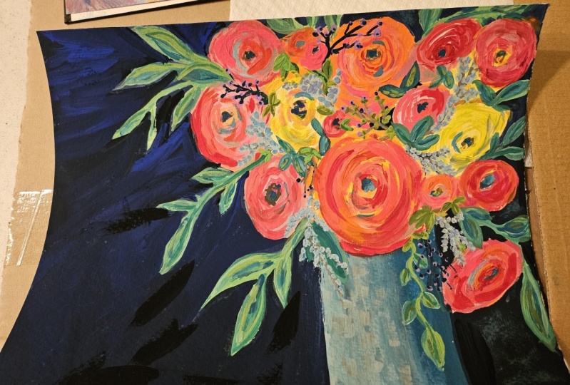
6. 6. Sketching the Composition: we're just gonna come jump in on that composition and start adding the flowers. We're gonna look at the different layers or details, but in this one in this class, I'm not gonna do a lot of practice of the flowers beforehand. If you want more practice on flowers and leaves before we put him in the composition Couple to the pain of joyful, both physical acts on Still share and you'll see we'll do some practices there, and then you can come back here. All right, so now we're gonna talk a little bit about composition and decide how we want to lay out this piece. Um, we don't have to do it just like this one, and we can do pretty much anything you want, but we're trying to recreate this so we'll stay close to it. You can dio you can flip it. You can have the okay. Coming over here and cascading this way. Um, you could center it. I'm not a big fan of centering. I just think it's more interesting if it's off to one side or the other. But I have done centric bouquets to So I got my brushes, uh, got the number five, number four round in the Princeton Velvet touch and then for later on, uh, number 10. And we may use the flat. This is a number eight, but six would be fine too. And then something for the details that you see here that will be using later. So the way that I sketch out the composition is just to make sure that I'm not that nothing is too symmetrical and that I have something coming down on one side or the other, you know? So these blooms air coming down this way. That could have gone this way. And the other thing to think about is I do have a little darker background, this side and the late is coming here and hitting the base here and the flowers. It's hitting a little bit. We'll do that later, but it's just something to think about this point. Which way am I orienting my bouquet and which way is the late gonna come? So let's and I also I did this on a nine by 12 piece, but I thought we do ours from the 11 14 so that we have a larger a larger peace wandered up So when im sketching, I'm using a color. And really, you can use a dark color. You can use a light color. Um, I chose for this one. I think I'm gonna do it. You can see a little bit here. It says pale orange. Hello. Dark, flesh colored. You could use orange you could use red. Just know that whatever you use, it's gonna show through a little bit in the background, which is kind of the effect. That's what we want. So, um, I use pinks before yellow. I guess I do normally use lighter colors, but you don't need Teoh. One time I used turquoise, and that was pretty too. So pick whatever color and this is just gonna be are loose sketch. It's all gonna get painted over, and so it doesn't matter all that much, and we're going to start with You might want to have this printed out so that you can, um it's in the research of section so that you can refer to it like I gotta here, but we're in a home. Start with a base just a little bit off lions for base, outlining, getting some water, and I can't even decide, You know, like I just did that. I think this is too far over the sleeve. I'll show you we're gonna end up painting over this anyway. So, what do you like any race with partially raised with quash, Just like you can with watercolor so that you don't know we're gonna pin You're with us this way or no, it will be mostly gone. I want to move it more like here to here. Okay. And then I'm going to start with you can come up with ways. I'm gonna start with my blooms. I want to put one kind of like how we have that one always like having one that's kind of falling down or reaching down, and then usually kind of a focal point. Really big one right there. And be careful not to make the blossoms too small, cause we want that kind of how factor we have on this one and then maybe one over here there. And I was also thinking about not making them all perfectly circular. Because if you look out blooms and okay, they're facing different ways. Some are kind of looking right at you, but most of the time they're facing, you know, one way or another, maybe a smaller one there, Andi. Large one there. You see how loose these are? He comes over this way. Yeah, and we'll make the centres of these flowers and different places to so that'll help the idea that they're looking elsewhere. Maybe another one. Kind of. I'm doing that same effect that it kind of cascades down. And I think I might want to come with this one more and then have a little one in here. So the now I'm looking and saying, OK, do I like this? Um, compared to this one and this one courses a smaller piece of paper, but the whole thing is going up here, so I want to build more height. I can do that by making some of these. These guys is bigger. I can also add one. I want to be careful not to put the top of this and a in a line. You know, if I if I put a big one here, it's just gonna look like kind of square. So everything I'm gonna do, what will end up being kind of one behind here and we were coming down here moving for a flow where that leaves coming around here. So that's fine. And I may do another kind of top picking out flower there. All right, that's good. For now, we can always add, you know, we might might. Part of me wants to put one there, so we'll see, because I feel like I want it to be bigger, but we'll start painting and this is just a sketch. And we can make choices and decisions a long way because the backgrounds gonna be painted anyway. So everything that you're looking at is getting covered up and sometimes and putting it together and painting out the blooms. It changes a little bit, and that's perfectly OK. So we have our basic composition and we can start with laying out some of the some of the leaves that we're gonna be having here. We're gonna we're gonna put the leaves that are coming. Hope here first and then we'll go in. We'll be adding more of the end, so I'm gonna take kind of a leafy color just because I'd rather start with that because I picked sort of a flummery color for the sketch of the blooms and I'm gonna take a leafy color for the sketch of the leads Makes sense, right? And but again, I would have water it pounds just gonna take a green It could even be what it could even be The the lemony green of the line green could be a darker green I'm gonna start with a kind of a medium green and keep it kind of water down And I'm just gonna try to think about how leaves might be cascading down. Get away from this GM was your sketching these? We'll be going back and doing details and changing possibly shapes. But I'm thinking about how these these guys might be coming out of here. I try not to always, always do three leaves, you know, try to mix it up, trying to change the direction that leaves air going in. Actually, this is where the bigger brush is better cause I can just kind of make a quick mark like that and, you know, it's okay to change the background color to, because that will change our thief effect that we end up having He wanted very the some thickness to if you can so because that makes it more realistic to again. We're still just catching, trying to keep the movement of the leaves playful. And here there could just be a couple leaves. Not so much a stem. Maybe going back to the darker sketch here. Free. This comes down here like that. We'll come back over that because we can bring the clash over the flower afterwards and then see when we're here. Maybe. And even if I remember, I was talking about in my at a flower up here, even if I do that, I've just sketched this in, so I could still do that if I decide to. I see making sure you're making your stuff is curved, huh? What's a while? You'll steal straits down. But not that often. All right, so the other, that's a good sketch, because we're gonna add and the rest on the interior after we're done. So that's a good place. Does to stop and let this dry
7. 7. First Layer of Blooms: All right, So now that this is dry, we're gonna go in and just pick a color, a variety of colors to paint the flowers. I saw the color, and we're gonna come back and change those. But let's say, you know, I want I want feel them to be yellow. They're gonna be pinks, oranges just like we have here. So that's what we're doing here. We're gonna paint on top of these layers, So this is just the bottom layer. And so I'm gonna pick my pale yellow and do a couple, probably three, and the color and they could be right next to each other the same color or they can be scattered around the okay. Doesn't matter. I'm just gonna We're just gonna simply go around and make sure you're using circular. You know, even though there's gonna be painted over, we like Teoh start having the motion. Uh, that would be the brushstrokes. And so, for that would be an flower. Um, we don't have to choose centers yet, but I kind of did there just by doing it this way. And let's see you take my pale. I guess I'm over here. I am I go bigger than the than I sketched a man because I started feeling like I wanted them bigger. So you can do there. Maybe I want this one spilling out over here. Just giving the clear down. I think I actually want this one to be that same color or at least a base. And it doesn't even matter if you mix up the colors at this point. Like if I were to grab some yellow yellow here, it doesn't matter. Variety is good. Um, unless you're going for kind of a uniform. Look, I don't even need to clean out my brush cause I'm gonna go on foot, pick this one orange kind of the center in the middle, mixing with the Gilo. And that's just fine, because, remember, this is just our bottom base. Sometimes I leave the centers like this and then I'll be darker when I put in it a color. That's fine. Let's go over here again. I'm not gonna clean my brush in the pick up. Probably something just kind of getting that. I'm thinking about a little bit about what flowers look like and let's do it or something. Somewhere down here the fact that I'm not cleaning up brushes, giving me some parading color too. And then this one. So the center of it is toward this edge because it's looking down. So I'm just thinking about that is I put that layer and later read lier here. Meaning I had more water, Too much water. So you just set that up with your fresh. And for this, I'm using the bigger brush, the number 10 because I don't You know, I'm just trying to get the pain down. All right, let's move to this. This is that fleshy pink color. I'm gonna put that in here. These flowers are gonna get layered. Don't be in a layers until we're happy with him trying to make sure I'm not making them round perfectly round. Um, even that one has mostly. That's mostly around Kind of dips to the side. This was probably the most around one, but as we had layers, we probably change that. So I'm gonna go for another really intense, amusing up opera mixed with the rose. Just a get the base of this one down. You can leave the center like I did here. Recon color, then doesn't matter either way. Well, you know, sometimes I meant ideo variety. No real ram a reason to it. All right, let's do warned. You get up here the bigger than I had, and I'm gonna think about the centre being hoped. Help? They're a little bit. Sometimes I just leave it like this because then I remember where it iss My press strokes aren't telling me I kind of, like thistle off pink direction for down here because who knows what I'll end up doing By the time I finish layering, Sometimes I start with a soft color. In fact, I can tell it this corner will be too soft because that these two colors air soft and then this one is so probably in the This will start now. They're getting that revelry paint. I'm just going And circular hands dams. Sometimes you can tell right away that flower is just gonna be pretty. Like I think that one will be and any another of the really bright pink here. I could have just literally painted this base color all the same. I really could have I could have picked um no, except for the yellow flowers cause then, you know, leaving them because it squash, you can paint over it. But I could have picked one of these colors. Maybe not the opera pink to be as a base. But I could have picked one of the other colors and then all of them, and they'll be just fine. I just like to start at this layer thinking about the color composition, and you know how I want them to be. He then I might change him, and I think we'll put another orange one here. This is the one that I said was kind of peeking out from behind. So I'm just gonna color that in for unpalatable. Well, think that its center is probably somewhere there. I'll just try to show that with my brush strokes, but we might change that. And we only have one rib guy, but, you know, we might have another sort of rose, but here, we'll see what happens. So I'm gonna go up here and do a light. Well, this one's red to it just doesn't read. Read yet. Um, but I think I'll end up mourning some kind of pinkish reddish something, so I'll put that here. Has a reminder. I'm just painting in who were the base of more that bloom will be maybe going bigger. Yeah, it's center would be kind of behind here. So I think that leader and then I think just to remind me, I think I'm gonna one. There's gonna be coral throughout a lot of these. But just so that I remember that I wanted coral there used water for all. It was a base on that one. That way, it kind of marks it. We'll be mixing in coral in a lot of places. It's so pretty, isn't it? All right, so now it comes back and say, Does this overall composition feel feel of curry? And I think it does. For now, um white, we might We might change it up as we go, but for now, it's a good place to stop. Let it dry, and then we'll do the first coat of the background.
8. 8. Adding Background Color: All right, so now we're ready to go in and paint the background, or at least the first layer of it. So I'm gonna set that aside and forgotten, mix our navy, and since I'm gonna use a little bit more of it, I thought I'd do it in here, and it'll still be there. When I go to do the second coach, it's just dry up. And that's what I love about quash. He le be able to be revived with water. I use so much of this color anyway that I can always use full extra. So first I'm getting my navy kind of where we want it. I need more black. That's still really blue. You can use black. You could use a Payne's gray if you have it. Now, once we get the kind of shade that we're looking for, we can have some weight. I do makes my palate, but I don't think I'll go. They will put a breast full of navy right into my white, even though I've done that kind of thing before. So this is personal choice. You know, this is whatever color you want in that background. However duct you want it. You may not even want that are blue. You may want something else entirely, but I would say to get the pot for this piece to do something dark, a dark plum would be really pretty, too. That's a color it like a lot. So I just started a little more black. I'm kind of going for this. It's almost like a smokey Navy, right? I think that's good. So now we're painting ends up in the background. Uh, we don't have to go right up to the edge of the blooms. We can get close, but don't feel like you gotta go right up. It's It's okay, because we can kind of get closer in our second coat. Having water helps to. We're just gonna go around behind everything. I asked a big brush because if you hold it closer, you can get the point, and it goes faster than trying to use a little brush. But there may be small areas where you're more comfortable with one of the smaller round brushes, and I'm not being too fussy because I'll be taking another layer of leaves over this anyway , I am thinking about at this point though my shading because, uh, just just kind of in the back of my mind, because this side is gonna be my dark side slightly. And so I want to make sure that course you could fix this with a second coat if you didn't . But I'm thinking about making sure I have a lot of big men on my brush pin on the other side. I'll use more water, and that will automatically Camille later. Look over there over there. This allows me to also put a good boundary on my face, since it was kind of messy when I'm not worrying about it being perfectly straight, this is kind of a loose piece anyway, and I don't need to know what they slipped color baseball. And that was we'll probably go with their teal. A lot of people ask me about backgrounds, so I really wanted to get this. This one don't PP. I've done backgrounds. It's only answer some of those questions. He can do a background first but was quashed even though you can paint over it. If I were to do the stock of a background first, you would definitely have done it. But it definitely makes the flowers darker. You have to do more layers to chemical it. A light color for a flower. So is just a different look. But with this one, I really was going for them great pop feeling. And I knew that if I painted the blowers on top of a dark back room, I wouldn't get that. He would be more subdued. If you're gonna do a light background, though, love my pieces especially. So I guess my for a ones I have had textured backgrounds and those I do build before I mean , look OK, like if I want I love the way old walls or cracked paint look. So those I would build beforehand and then came a bookie on top. In that case, the Okay, well, just for the finish, I give the paper the texture will just pad to detection and flowers. So it just depends on what you want to do or what you're hoping for. Try both ways. We're gonna go through and two in between these little pieces loosely where you know, there would be some background that man, but getting covered up. Some of these probably will get up getting covered up by leas. But I just want something in there now, the cover of the light Because, no, it wouldn't be there. And it just doesn't I don't think it works, so I'm just kind of getting something in there for now. You could even use a dark green, because that's more likely What would be in these spots if you look at it. Okay. Where the shade is is just sort of dark green in there for Brown. I'm not going to do that yet because, you know, I might do some small flower there. I don't know yet. We can come back tomorrow. Okay, so it's gonna look all patchy, Um, which actually like, so that's you could leave it that way. Uh, but what I'm gonna do later, after it drives me, come back for a second. Close to a little more. This turned out to be a really deep, rich blue, and this turned out to be really light. So if afterwards I think that that's too much of a contrast, then I can darken this a little bit and we'll just see what you see once. Once it's done what we think about that For now, we're gonna let this dry and they will come in for some second wears. Hey, it's getting there. So pretty hope you're having fun.
9. 9. Second Layer on Flowers: Okay, well, let's continue on this little beauty. Uh, we're gonna look at the blooms now and believes, and I've been looking at this and thinking about what I already like and don't like. Well, I don't know, there's anything I don't like. It is too early for that. But I really like this break lime green here that I just did as a backdrop. So I may not cover it much. May just put some detail in it, and then I'm just I'm just kind of liking how the flowers air flowing. I don't think we need at another flower here will add another element, their plea for some Berries or something. And, um okay, with its it's reaching out. But it feels balanced and we'll add some more leaves. But right now, what we're gonna do is go in and had a little bit more detail, and I may like here I can see that I had drawn in a little flower, so I may decide to have it him Don't know yet. So I'm gonna get my big brush because I want those to be like pedals on some of these flowers, and I'm gonna add the layering That gets us to the kind of textured look that you see here where we start to have more color. And that's a personal preference thing. If you want a flower or two to be softer or the whole thing them, you may not want to add much layering. Uh, all right, so let's see, I'm going to start. I think with some of these yellow blooms get a little bit deeper, Gilo, then they've got there. But I don't want toe overpower the softer yellow. I kind of like how some of those air that's dark yellow. So I'm gonna just be careful not to get too much of my golden you and make it to incense, so I might have a little bit of weight to it. Make sure you can see that. Yeah. Here we go. You can see that yellow. Have you ever noticed some of the yellow blooms are almost greenish? Uh, I don't I don't mind that coming through sometimes. Take the yellow blooms, Can you to be warm or cool. I've noticed. So I'm just going to kind of come in here with a little more detail around the center like that and then kind of go with these little banana shapes. That's a good description. That kind of looked like bananas. And some of these will be run Oculus. Some, you know, by the pedals will end up being more like a PNE or even a David Austin Rose. And I always like to have a ready of color changed. I'm gonna put a little bit greater yellow here in the center of this one. Yeah, like that pop of color. And if I'm you know, when I do these layers, I do a little bit. I'm gonna come back a little bit more. I don't I don't keep going too long in love, Bloom, because then I might over work it and I'm gonna go with a little warmer yellow on this one . We'll let this one was kind of lemony with 1/10 of pre minute uh, someone a warm this one up Clean my brush, get some of the yellow, but tone it down a little bit. And I'm also looking at where I had put the center on the previous blossom. And I can always move it because, you know, we're painting over. But I think this center should be read right about here. And I start there so that it gives me an idea. And also, I mix up color, so I might want little bit orange in there. That play, Neil, I was looking to to to to out of the bottle. You know, I mean, to I try not to use colors directly out of the bottle. So in this way, by making the swirlies there and then kind of coming around with the lines, we can make it look more like a but David Austin. Roses love those kind of sleepily inside, and then they kind of have the almost aerin Oculus. Uh ho on the outside. You think I need a working up that center come through and are in centers and different points? I don't know if I don't have a referee's. I just make sure that I did at some point, so I might even come in with a doctor club. Okay, so that's that one. And up here, I'm feeling like I want to actually take sort of a white, really pale tail, pale yellow and with some weight. And take this one and more that really light direction you know, it's just nothing quite like a beautiful white dish Rose or, well, ridiculous, for that matter. I need a center in there. And I think of pinks under would be nice grips on my coral. Just tried him not, you know, I don't make a circle in the center. Try to just make some marks and then leave it and I always come back. Okay, so Well, I've got that coral on here. I can come over here and do something here. I think I might go for a We're not Gillis on this. So you can either switch brushes or just make sure using just the tip and to really faint lines around this really light touches. Definitely easier to go with your liner brush because you don't have that concentrate so much. I'm not pressing down. Uh, but I'm used to this. So sometimes I end up just using this brush and let's look, I really like the way this one looks, but I want so I don't want over do anything to it. But I do want to put a little bit more pedal stuff going on. And I think we used some proper in that. So grab some copper and maybe mix it with this pale yellow and get kind of a later hopper. Let's see what that does just to give a little more pedal definition and also to give a little more coverage around this, please. There. Yeah, I give a little bit more shape. We'll see if it sometimes wash drives and then you can't even see what you did. So we'll see. We'll see how that dries. Um, Now I'm gonna move to this country alone. I shot the brush and probably pick up some maybe some orangey coral. So try to get some orange here and I grab a little bit. Coral. Yeah, let's see. And we'll just do the so rules on this one. This one is one of the few blooms. It's looking great as, but even blooms that do that are not perfectly circular. So I want to make sure that I kind of take it wider on one hand, you know, so that it's not looking too symmetrical, can feel like I mean, you gotta read middle, going to come back to the center and put in blue. But that'll work for now. He and we can get a little more run or paint. You can use pink at this point. Of course. Long as it's not to to break, because I don't. Well, you do want it on some, but I don't want the whole thing break, so that's pretty great. So I'm gonna use that here. Just don't get little strokes.
10. 10. More Flower Layering: I like that color we made, but I wanted a little, uh, more pales. I'm gonna have some weight to it and come over and do this one. Basically, I try to make sure I'm not using the same color twice. That doesn't show up much, so probably come back and do something else for different lier. All right, I'm gonna bring some of this red that we had here up into this bloom. So just gonna grab some bread, mix it with something else on my palette, So maybe a little yellow so that it isn't quite so intense Hand on this one, I think press down to make the puzzle of the bigger still still doing those kind of banana shapes. Maybe a little play as I go out. Some flowers are ducker in the center, and some are later, So just depends pan on a little more loyal on the outside. I want to make sure this doesn't feel too symmetrical. You can even bring it down into here, right? Cause I haven't spot. I'm not thinking too much about shading yet will come through and do that after, But if I am gonna put something light I'm gonna put it more in this direction. Uh, so I maybe I'm thinking about it a little bit, but not very actively. Look at this. It's so pretty. What happened on the talent? You see how that yellow bled into this and made like, a little tree? So pretty. All right, so I got some orange, and I don't want to put more orange on that. So I think I'll actually come over here with the orange and take care of this. This one is sort of behind here, so we're only gonna see part of it. Probably not even the center. And then, um thanks thing light, there would be pretty. So come craft, take the orange. I had its weight. I'm always thinking, like, in the pictures we looked at, you know where these okay is there looking, facing, showing off the way they do, and we love them for it. I can definitely tell we're gonna come back and put some more color and one of those and I didn't use, you know, purple so much in this. So we can come in now with some but a purple and had turned this one to do it, so the center would be about there. So in this one I made start back here just so that I could make sense to where the center ends up being. That's a little tricky, but you know what? It's not. This is kind of a loose, playful Okay, so it's not about being perfect. And then it might bring some of that purple down into here. It's pretty lavender. Yeah, like that. Now what to do on the red to keep bread, but also is, you know, not make it so intense is some of this coral does really nicely on that grid when you think they will make this one more of a foreign Oculus. So in her strokes, like so And I'm feeling like I want to bring some of that right up here, So I'm gonna get red, red, dark in it a little bit because that's just to fire engineer ID. I keep lending until I get kind of the red. I'm looking for mixing with other colors on my palette. Okay, that's a red that's not obnoxious. And then we'll put our center right about here, So this one's kind of looking at us too. It makes a little bit whiter. How partly decide that that's too dark. So we'll come back. I don't know. It was like a drive, but it feels a little dark to me now. Feels like I need something Tucker here to show up better. And I think I'll add a couple of dark centers. I do use the Navy a laugh for dark centers, but I mix it with something you can see it just mixed it with a little bit of orange there . So it's actually more of a dark green, and I just come in and make a few marks, little sort of half circle things, sometimes just a little bit of a a dot, and I changed. I can change the color of it, especially as the bloom changes. Yes, it's something you don't really notice, but you notice that the flowers don't have depth without it. Okay, so that's a good secondly, or on the flowers, it was to a second layer on the base. Now you can make this base any color you want. I'm gonna do something like this just because this is the piece for this class. But this pale orange looks really pretty dio it. Just think it blends too much in with this particular bloom. But you should definitely make your base any color you want. And I started with just a basic light blue a little bit of white in it, and we're just kind of covered at this point because we're gonna be going over it with some layers for shading. I'm actually just mixing the white rate and toe on the paper here because this this is just a coverage later doesn't much matter. You're just gonna paint right over whatever you have there. Even on my under layer, I can be thinking about it being lighter. Over here were my light sources. So I'm putting more white with the blue here because the more you think about those things when you're layering, the less work you have to do at the end to get that shaded effect. I'm also keeping my births strokes up and down because that's kind of what it this oh mimic , sort of like Katya glass. It almost looks like a painted glass. It's not being glass stainless like colored glass. The way that that I can also influence the shape of this blossom here cause I don't want it to be perfect. The reason that I don't take my paper down is because I like to move it around. I have seen people and I've done this before. You can get like a board a, uh wouldn't frame essentially and like an IRA board and tape it to it and then you can still move it around. But then I don't like the tape Mark. I don't like the paper being take down. I like the paint to the edge of the paper. What I'm trying to say, So that doesn't let me do that. So that's why I straighten it out with the method I showed you and I don't mind, you know, doing that just got to find what works for you. So I don't know if you can see, but that orange the orange strokes underneath that we, you know, we made the base and just kind of slapped it on. There are adding some really interesting dimension already underneath there, so they live about under painting. So that's a good first coat will leave that base. Leitess
11. 11. Filling out the Leaves: So now that this is dry, we're gonna come in and have some detail to these leaves. We're gonna add some war depth to the flowers and then we'll add some interior flowers. So let's get started. I like, as I said before and like that line there, think I might just take some. I started my turquoise on, do some different. It's here, in there. Hunger could be adding more green, too, because I want a little bit of especially over here. I might want the leaves a little bit darker. So just some little accents like that. Yeah, And then grab a little bit of my darker green, mix it up a little bit, get a little bit of a darker green, so I'm gonna be cramping. So my dark green mixing it with my medium green so they like what I got And maybe coming down in here for some creation. Hi. He probably noticed, like like a lot of different colors. And my leaves would be like, please, her That way they're not uniform. So and I don't like, you know, already too much. Anyway, Just some details in there, then. I love that warm green So I use that a lot. I think some of that in here just having a little more steps of these leaves. A little bit more structure, too. Because remember, we just we just kind of through him in there. Sometimes that's really pretty. Sometimes you don't have to do anything more than that. That's why I don't want to over paint these lime ones, cause I really like how they turned out. But I also feel like I need to bring some of that line, uh, down here, you know, just so that there's a little bit of balance. So I'll grab some that just even some little bits of it is enough. And I also want to bring. I didn't going all the way out because we were doing the background there were there. Maybe we'll come in. We'll have to see where this is when it dries and we're gonna add even more, and I want to bring down something here will probably take two coats because we're covering the base, but and I like toe take leaves can. Also you don't make the the stone curved, so do something like that. Mix up the colors this is the smallest. Em like that. A little brown in there, a little bit of lime. So probably a drug wise leader and do the same thing coming out here. And I just look for places where you might see a a leaf coming out and and I can go around from circle is it's the lime green that green. But you got to use whatever colors you like. And I try to vary the size of the leave too. So I might go from huh dark one arrestable, one large one. Think we need some over here and sometimes it's like that. I know you're gonna pain on top of that flower, but it's okay. You can still see the flower grab a little miniature glaze, some kind of mixing the color. As I'm painting, 10 girls are gonna add some Berries and some small leaves so we don't have to fill in every space you notice. I'm also making believes curved. I think. I think I want another one here. See how there's when I'm adding on top of the background and it actually gives a different effect, which I like just covering in some of these, um You know what this stone little tiger and I feel like I could actually have. Let's try this. Got to take risks, right? Let's try something coming out of here that's in this color, because what's the worst that can happen? I always say you paint over it. Yeah, I kind of like that hand. Probably a fancy. Another place for one. You feel some turquoise coming out of here? Maybe something coming down under this layer a little bit looking for a mix of where the leaves might come out? Uh, you know, until flour over a flower, just trying to mix it up at the same time, mixing up size and color. Another trick with leaves is if there's a part of a flower you just don't like, you can just put it leave over it. I think I want to bring that leave over there. Flowers ums. Could you pain? Just bring it on over and there would probably be more spilling down here leaves. Let's see. Maybe make that one a little darker are a little different. Something something different. Make it curved. It's coming up from underneath there. Plan might have the same thing over here actually tiene omni grabs on my turquoise and pop that in a few places. It just had such a I don't know, excitement, interest, dimension. And I don't You know, I have some of these white parts left over from painting around the background, so I'm just kind of you could leave those. That's a personal preference thing there. I kind of like it. It's kind of interesting there. So how does that make a decision? Because I go along about where I want to keep it and where I don't and I can fix that. There something I wanted there with More than that. We did the second quarter background. Okay, I'm gonna stop with the leaves there because I do too many. I won't have room for the Berries and the small steps. We can always that more later, right?
12. 12. Small Leaves, Flower Details and Berries: Okay, So now I'm gonna have the standing to this flower that that is cascading down here. So just gonna think about how I'm light come out of the vase. And you like this. Just a simple little playing like that just to suggest that it's not floating in here. And then I'm gonna add a couple just little leaves here and there. Maybe a darker one down here because this is machine is you're not the dark. This is no real shade in this book, is there? It's very sunny, but it could puts enhances. Um, Dr Limits down here. Simple details. Okay, let's go in and touch up these flowers. Um, is I thought I don't like how stark that is up there, so I'm just gonna wet my brush. I'll try that first and move the paint around just a little bit and see if I like it better on let that dry and maybe come back with something else. Sometimes. Just adding a little bit of water. It's softens things. So that's how you fix that. I think I saw an artist on instagram. She said she posted like the painting who was It was just getting started and said, Well, I have to fix problems, but I have to create them first. And I love that because you create the Browns when you start putting paint on the canvas and then the rest of it is really figuring out how to solve the problems in the pace and and, uh and that's where if you can approach it that way, then you don't feel is no pressure about it or you don't think I shouldn't have problems to be in this? No, that's what it is is creating and then solving problems. So I feel like I want a little pink in there. My red flower turned pink. I can tell. It's just it just wants to be my problem. Tout and then what have had happened is the one flower that I just, uh, what's wrong with you? Turned out to be my favorite. Pretty funny. So let that one dry and decide if we want to do anything else else. I wanted to bring a little more color into this one. Think of bringing some yellow just a little bit and my water down brush. Try not so overpower it, but just Ted more color there. I do like that. It's coming out to be kind of a white his flower But I don't want to completely lost. And I take the way I get that layer Look is when I have a color on my brush like this pale yellow I start looking around and say Okay, we're Mike the ports Could that go? And now I'm starting. Think about light and light is looks great with a Yeah, a light yellow can do light So lights coming from here So I can put just a dab of this on every are almost every flower It starts toe somewhere interest kind of where I think the lates come here all right And I want to vary some color in these, So grabbing some of the opera pain can I'm just doing well, Been in here because remember we wanted that It's okay. Is is supposed to be stunning, so we need those pops of color in it. So I'm doing this around the center's not in all of them and not always around the center, but just throwing in a bit mystery in some of these blossoms, seeing what it does and then deciding if I I like that I do the same thing with turquoise, even turquoise in the flowers. But if you look at my work, most of it has some turkeys. This is such an intense turquoise at him, being careful to put a lot of water on my brush. That's too much, too much water down. I do like a pop of the break. Turkle is, um, every flower doesn't have to be everyone but high end up doing it. I just like it. It does something and I can take the even more intense turquoise. And just again, that happened. Some of the middle's just brings a life to him, doesn't have to be all of them, but that's good. So I started these white spots that I think what I've decided to do is, well, we'll see if they're still there at the end. If they're covered up by smaller leaves or something else, then I don't need to worry about. If not, I can t let me do the second coat of background. I can feel it. You know, I'm just using the doctor a little bit of contrast. You can either sometimes used the dark reading Where the dark, maybe. And I'm just putting a little element of something. Maybe a line. How much money would just be a little almost like a dash. And I switched around so it might be this color. It might be the turquoise mix that light turquoise to do these little stems. I'm gonna take my liner brush, which is gonna be for the liner, Probably my dark green. And then I'm gonna just come out of these places, like, let's say, here, Pan, make these really light stone movements like that and do that. Maybe up here, they can have so great just coming off a one I know where else feels like think we can do some here. Feels like a nice place. Just looking to kind of get room for out. And then I think I want some because this just feels, too by itself down here brings with that down here. Um, see, 1234 like out numbers. So let's compare new if it's one up here. So once I've done that, I can take my late purple and come in here. We're gonna lavender and really talked about earlier and just almost drop it around those stones. So, like this trying to very, you know, the size I can tell. Now I'm gonna regret that filling that in sooner. I will, though. That's probably gonna get filled in now with Berries. But then I'll have to go in after the Berries. So in the background, okay. And some more kind of scattered around. They don't all have to correspond with a branch. It's just a suggestion there. They're somehow related to the branch. I need to make some bigger ones down here. That one right there. Now it's covered. See, It would make problems when we saw him. I love this color for for I call Berries. But they could be really anything. Little bits that air, how in nature it could even be Daniel buds. And I'm trying to make some of a bigger now to make sure they got a good already of size. Anything you can do is Leighton, the lavender, and so that you get it's, um, duration of color. You do that by adding a little bit of weight, and that just adds to mention Are you gonna even even darker you do a different color altogether. Okay, I think I have a good variety of size, a little color variation, but we're gonna come back and put like, a little center and some of these
13. 13. Finish Berries, Tiny Leaves and Vase: Okay, so you added the Berries and I've got the navy blue on my brush, and I'm just gonna go through and do these little It's a little tiny. Either Think of it is like if the berry has that part of it sticks out, you know, on it is just so it's gonna be a different size of the Berries and some Berries won't even have. It just gives a little dimension, just a little mark. And make sure you rotate where they are in the very so that it looks like there going in different directions. Only real Berries do. Do you kind of go around the piece like so we're gonna do the same technique for these little turkey is a B leaves. We're just gonna look for places now. This is where you can use a pen or pencil to draw your little lines. I'm gonna choose a little bit different color, but it's still gonna be something I that is noticeable who are barely possible river. So could be light or dark. I think last time I did their green so and you'll go with kind of a Navy ish and I can really light can make these look a little different because it's a different plant. You could make them look curved. And this is where the liner brush is really nice, because it's teeny tiny. When was your too much water in your brush and looking for places that thes pretty little leaves can be coming out of? They can go on top of flowers. I think it would be nice. Maybe even have some coming up here on top of these flowers and leaves. I don't You know, sometimes I I put the leaves or Berries and first and then at this time. But I think for teaching purposes, this is easier. Whatever works for you. All right, so 12345 Let's see how we like that. I'm gonna mix up. I've already got my life goes mixed up some to use that and will probably putting dabs of darker turquoise. And these are just little bitty leaves. - Okay , so now we're just gonna put finishing touches, crown debase and actually like the way it turned out. I think I worked on this one more because you do. You just never know what's how things were gonna dry and how it works. But I like that. This has to mention to it. I did had another leaf there because I felt like that one was too lonely. But I'm just gonna come in here with a little bit later turquoise and, you know, some white in the turquoise. Just make kind of some little with this flat brush. See how these it's over there. I just like the texture that that gives. So I get some turquoise on my brush. Hopefully, that won't be too dark and dry out my brush and I can get that effect just barely. I mean, so little pigment and water on my brush and to do the same thing was, huh, hero? Just a tiny bit of weight. We're a pale grey to give that feeling of late hitting the base just like can't adds texture to So let that dry and see how we like it. Next is the second coat in the background and we're getting close to dump. I see. I can do a little more highlighting. I'm a flowers actually interested in now since we got the flat brush or you can use a round brush, but taking either a really pale yellow or some way and coming along. And just like we did before, maybe what's a little bit more weight than we did before hitting the outside of these? This optional, of course. And sometimes I'm so solid with it that I can't even tell when I come back and do it again . Can you don't back this quarter brushes in the best of us? Because it gives that hard edge. So the round brush is probably better. Excuse me. Finger to. Yeah. So just hit those areas with a little bit of flight. And don't worry if it looks like I want My God, what have I done because one wash dry as we probably will hardly see this. You know, we cannot more if we want. Okay, Background is next.
14. 14. Finishing Touches!: okay, We're ready to do the finishing touches. So I looked at my booms, and I just think that I need a tiny bit of shading on highlighting ever so slight because I want, you know, say that the bottom of this to look a little bit different than the top of it. And so what I'm gonna do is just take a little bit of really water dome green. It even has a little bit of purple in it. I mean, this is settled, so I'm having my brush. Do not overdo it. Um, you know, I could even have more water and just make sure I have barely have any color in my brush and then just come down here and just touch a little bit. So there it's just it's not all the same. And at the bottom of some of these, the lights coming from here in the shade might be in this direction, just a few little spots. And then remember when we did that highlighting before and he said some of this won't even show. It's not showing it. So I'm gonna come back with more way and just touch on mad as well I could Even he was a really pale turquoise with weight and to the little highlight here and there. Okay, that's I just felt that that was needed. Hurry, let's go to the background. Now, remember that the lights coming from here, So I want this side of the background to be lighter. This is already a really deep blue that I'm fine with, um, actually like, and so what I'm gonna do what I did is I took the color that we used here, and I've just had a little bit of white toe lighting it up. I'm gonna make sure more water on my brush so that it doesn't go on too heavy. Um, enough. You know, if it comes out too dark or it is dark and that no big deal, but I just want to see if we can get it a little bit later. So I'm gonna go around, and I don't need to do anything here, but, I mean, he hit a couple spots here. I'm gonna go around and filling, Okay. So you can see this should, uh this is what's so will lighten up a little bit. Want to drive the science definitely darker. And my flowers look good to me. My little details look good. And so I'm pretty happy with this. I will let it dry. I will flatten it. I'll show you how in the last video, um, tan, I will protect it and course, sign it. Sign your work. Um, And then we will have a beautiful, finished, stunning and dramatic. Okay, I cannot wait to see what years looks like and And make sure you put it in the class projects.
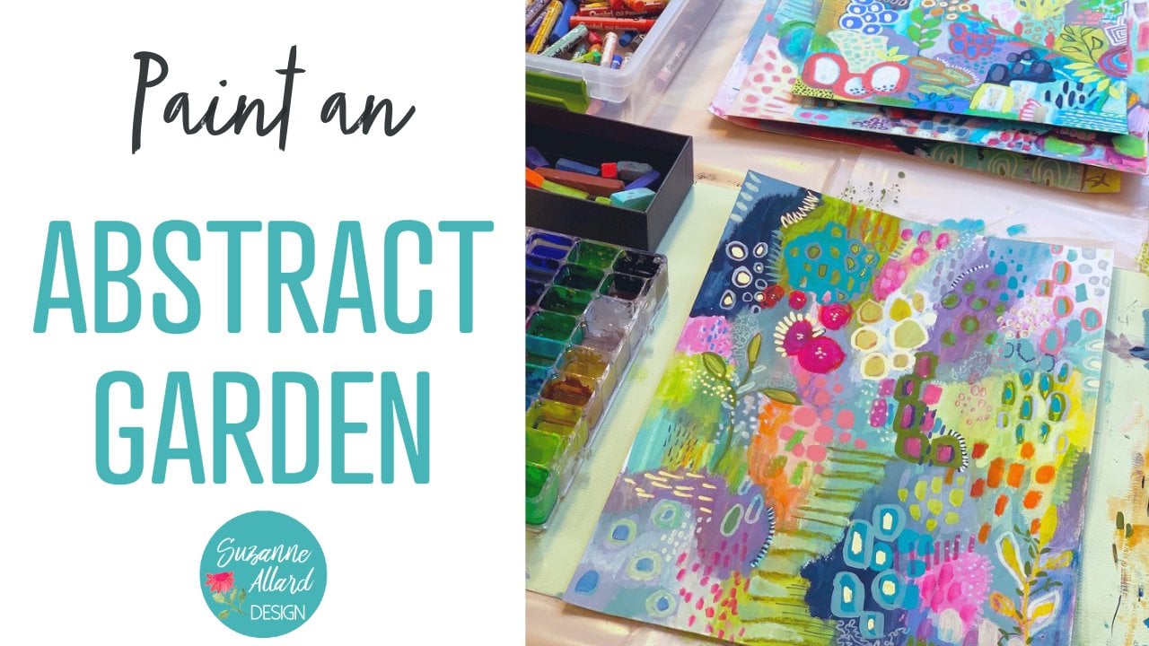
15. 15. Flattening and Protecting Your Artwork: I hope you have as much fun painting this OK as I did. Make sure you take my other classes on skill share. I have painting a joyful okay and painting an abstract garden, and I'll be adding more because I am loving teaching. In fact, I'll be adding more classes regularly. So follow me here of skill share and sign up for my email list on my website. Suzanne halard dot com Now, I wanted to show you a trick for flattening heart work so that when it's worked from painting, you can flatten it safely and have it be ready to bring. All right, I want to show you a quick tip that I use for flattening out our work. Since the pate pain sometimes makes the paperwork. So you take your artwork and then this is this plastic on here. But you could put it like that in my kitchen, on aluminum foil or whatever. Then you take some paper towel and you let it. But if you squeeze all the water out of it that you can. So it's just slightly damp, and then you look it over. Yeah, we're like, so flooding it out and then you're just gonna put something on top of it. Used in my kitchen, the cutting board. It was big and flat. But since we're in the studio, I'm just gonna use a canvas. That's, uh, you know, not been used yet, and then I'm gonna put something heavy. You can put books, what have you got? And you leave it like that. And when you come back hours later, then it will be nice and flat. I've done that with all of these pieces whenever, whenever it's needed. And the thing is, though, just make sure you get the pieces dry. You know, before you do this, don't put a piece down That's not dry, obviously. Or it'll it'll, you know, ruined. So that's the trick. Never protecting your ice brain. Mind with pay spray varnish. I like this. You ve archival a listed in the supply list. I have not found any of these that smell good. So make sure you do it outside, and I just lay it on a piece of cardboard and sprayed it. Or if it's windy outside, I have a big plastic box and I put the artwork down in the bottom of it. And then spray dries nicely in there. So I want you to remember and keep. Keep creating. Remember that just a couple of years ago I was too scared to even paint. So hang in there. Keep at it. Keep creating. Don't give up.
 Suzanne Allard, Landscape, Floral, Abstract Painting Teacher