Transcripts
1. Course Intro: Hi, I'm Suzanne
Allard and I started Suzanne L or design
about three years ago. I'm a self-taught artist. Well, I say that
I learned online. I didn't go to art school. In fact, I learned
pretty much everything. I know our y's from
online classes. So that's why I'm
such a big believer in them and I love teaching. And I hope to reach
people like I was who had this craving to
create, but we're terrified. So I tried to be the
teacher that I wanted, that I needed somebody
very encouraging and positive and not overly
technical or rigid. That kind of
describes my teaching philosophy and encourage her. And I also license my work and
sell prints and originals. What else do I do sell products? Have a YouTube channel, all of the things I
think I do at all, and I love every bit of it. For the most part. This class is all about creating abstracts
in the sketchbook. And we have a big sketchbook
user or practicer. I have another class just on. It's a four-hour class on sketchbooks with
florals and abstracts. But this one is more targeted to abstracts using
getting inspiration from some master painters. So we're gonna do a
few different styles. We're gonna do things like this. Whichever just really fun,
colorful, and lively. I like to do spreads like this with similar color palette. This one is a simple
colorful to them. We're going to also do in this Strathmore
watercolor sketchbook. I had been doing these
kinds of compositions. You've probably been
seeing them on Instagram. People are loving
them, I love them. We're going to do Let's see. It's right here. No, here it is. This one is inspired by
a Kandinsky painting. You'll see how I take inspiration
with shape and color. And then this was inspired
by Andre Duran painting. That is so much fun to use these masters as inspiration
because they did so many. It gets you, first
of all to study the painting and learn from it. And by doing this
on the sketch book, you really practice
the things that you can see that they
did in those paintings. And then they become part of your repertoire going forward. So join me in this class. It's gonna be lots
of fun and I'm gonna give you a color
palettes for all of these. Will have fun. What color? You'll be encouraged. What's not to like.
2. Supplies Part 1: All right, Let's
talk supplies now. If you've taken
my other classes, you know that I always encourage you to start with what you have. I don't want the lack of these exact supplies to
keep you from creating. Because I have had
students create with their kids tempera
paint to start with. Their kids crayons,
colored pencils, what they found
at a garage sale. For me, the emphasis
is on creating and then as you get
into it, yield, yield, fall in love
with, you'll say, Oh, I really want to get some
of these oil pastels. I really want to try this
acral gouache or whatever. So I just want to have a big disclaimer on this
supply video to say, the importance is
that you create. You definitely will get
better results with quality. When you do buy something by
the best quality you can. I put on my website
supplies tab with links. The best products at the
best prices that I found. More Amazon, but
some of them are not because they just
didn't have the best price. But anyway, I'll
have like better, best, good starter,
I think I call it. So for paint, for example, the Reeves Gouache is adequate, especially for starting and
it's really inexpensive. Then my next would be
the Turner gouache, and then at the top end would
be the Winsor and Newton. I use mostly Turner in this class and some
Holbein gouache. But as far as the other things, I've acquired this overtime, you just start where you are and create and add to your stash. You go through the process. All right, let's talk about supplies and look at
what they can do. Okay. Let's talk about paper. I use a variety of papers. I just try one and
then try another. So you could pick for
what we're painting here. You could pick any one of
these and it would work. There's watercolor paper. This is a good quality. Canton is also fine. Neither of them are expensive. A lot of times in the
States you can find them at Michaels or hobby
her hobby Lobby. Probably more
Michael's this one. And they'll happen like I have
price off sale sometimes. Then lately I've been
experimenting with acrylic paper, will use it in a couple
of the paintings. But what I like about this one for the full
matte painting were doing is it's got almost
like a linen texture to it. So it looks pretty
when it's exposed. When we take off the painting. I picked up this 12 by
12 watercolor tablet at Hobby Lobby and it
was half off. Not bad. I mean, as long
as just make sure whatever paper you
get that it's £140. It's not gonna work to use thin paper unless you
put a couple of layers, adjust so on it,
which you could do. Then mixed media
paper works well too. This is a £184, so quite thick. Now this doesn't have
any texture to it. So just keep that in mind. If you want that
really textured look, then you would want either watercolor or
the acrylic papers. All right, Now
let's talk brushes. Brushes are interesting to me because I can tell you sizes and in one brand are
different in another brand. For the detail work like
when we're doing leaves and things I do like these
Princeton velvet touch. The other favorite of mine. And neither of these
are really expensive. They're not the cheapest, but is the Winsor Newton
Cotman round. Both of these brushes are
great with the detail. I find that it just takes, it just takes practice
to get the control that you want for some of
the details that we do. This one is obviously
well loved. The paint is correct
all off of it. So I don't even know
what size it is, but it's I know
it's one of these. This is just a funky little
shader by Creative Mark, but I don't use it that often, sometimes to make leaves. Then I use these quite a bit. These square-shaped brushes,
which are called brights. And actually this one's
called a chisel blender. But The larger sizes are
usually called brights. When we're doing, just
depends on what we're doing. If you're doing those
first layers where you're, you're kind of
rubbing the paint in. You don't want to use a
good nice brush like this. You'll record. You want to use
your oldest brush like something like this that is really chunky is just
kind of go like that. Just keep in mind
how you're using the brush before you grab it so that you preserve
your little bit nicer ones. What I've done is I've got a blue jar which has
my better brushes. And of course I didn't
when I started, I didn't have so many. Didn't hide. Everything fit in one jar. But now I have my junk
brushes and another gender. If I'm in the throes of
creating and I want to grab, scrubbed some something in. I can grab an old brush
and I use my new ones. The other thing that
is nice to have is some kind of very
small sand brush. This is a Princeton
velvet touch liner. I can just make a nice line. I'll show you. You don't have to get this. Winsor Newton makes one to this, they call it the, it
says scepter gold, but it's referred to as a rigor. And it's a little thicker
so that it works too. You can also just
get a small brush. This is like a one, just something to allow
you to do details. See if there's anything
else I want to tell you about brushes. There are acrylic
brushes and then there are multipurpose brushes, and then there are
watercolor brushes. So when I'm doing, again, it just depends on the
layer and what I'm doing. If I'm doing a bottom layer, I'll use hardier
brush. For example. I'm not going to take nice
watercolor brush like this. This is the Princeton
velvet touch number ten. And scrub in my acrylic or gouache background
because I just did wrong use for this brush. This brush is great for making a big,
something like this. Watercolor paper. Just taking the, letting
the brush do it's thing that I'm not abusing the brush and I'm
using it, what it's good for. If I want to scrub
something into a background that's more say like what's a
good background? Scrubbed in. I've got a whole stack
of paintings that are not done or beginnings, but this is a perfect sample. These are just some layers. This has this who knows what this I'll end up turning into. But this is the kind of
brush I would use this or not a real quality brush. Even this, I can
use it, make sense. That's brushes. Let's talk about paint now. I generally use either acrylic. I grab either nova color. I've got some Liquitex colors, just stuff that I've
collected over time. You go into an art store
and you see what's on sale, you might see me use a
couple of other things, but in the category of acrylic, it's generally either for
this kind of work is it's either the Nova
color because it's a good paint at a
good price point. In fact, the approach
me recently to do create a bundle with them. So I've got a bunch of colors because I'm testing
out which colors I want to be in the they want to make us
Suzanne Allard bundle. Got two. I know this blue-green is going to be in it.
It's incredible. But yeah, just get on my mailing
list and so that you can be here about that. Yeah, I do like them. I also like I said, I liked the liquid texts. I like the containers for these because you can just
squeeze a little bit out. You don't get two
ounces of paint. I'd say that's probably twice the price of
the ANOVA color. I think these are four ounces. So it's not as economical, but it's nice to have a few
colors to just squeeze out. The black top means it's
gouache acrylic wash. And that's the same as this. Let me show you how
electric acrylic brushes that I ended. I play with these three brands, mostly, which are here. I'll do it this way. So it's not confusing. Liquitex, which
is the black top, the Turner and the whole vein. Now, acral gouache means that. They have added the properties that acrylic paint
has to the wash. Meaning for us that all that really means
is it's permanent. So when we paint it dries, I'm not gonna be able to add
water and reconstitute it. Whereas regular gouache,
which I use as well. Just make it even
more confusing. Turner has a regular gouache. It's called Turner design wash. And then the one
that I use the most when I'm two that I use when
I'm using regular gouache. Let's move these over here. These are actual gouache. And these are the
regular gouache. This is the whole vein. Just strange. It doesn't look at all
like this branding to me. But same brand just
in regular gouache, Winsor Newton, then the
Turner design gouache. And they call this one
designers gouache too. When you're going to want, I don't use much of
this in this class. But if you have it, it's fine. You just are going
to want to make sure that if you're layering, you either spray a
workable fixative on your first layer so you don't disturb it or just don't. You can definitely
layer with gouache. I have painted full
florals with gouache. It just, you can't scrub and disturbed because of the
underlayer will come up. That's that. I talked about the acrylic. Occasionally I'll
use not necessary, but I have some inks and some favorite colors
that I sometimes use. Indigo, fluorescent, pink. These are just a
couple of brands, liquid techs and daily Ronnie, It doesn't you don't
have to get this brand, you don't have to get ink. I just wanted to show you
everything that I've got. Sometimes you may see me
in a class, use this Mr. I got it on Amazon. I think it's a cosmetic
facial mister. I should use it on my face. Sometimes it
probably feels good, but it helps to. Two, Let's say I'm, I'm painting and I get
interrupted or something. I really want to continue with the colors that I have here and I don't
want them to dry. I can miss this. It will keep them wet
for at least an hour. And I also use those
to miss here and then scrape up my palette and I'll talk about the
palette in a second. I'll demonstrate actually,
since there's paint on it, I think I've covered the only a couple of
other things that mediums wise that I may occasionally use
that I'll show you. That is, this is a Winsor
Newton blending medium. I've just been playing
with it recently. It especially ACO gouache
can dry really fast. So if you're finding that means sometimes literally
I'll get somehow. And I'm just going like this. My studio here is pretty warm, but I'll just doing this and adding water and it just starts drying
pretty darn quickly. So I have just used this
occasionally and I'll just dip my brush right in it and
then swirl up the paint. And it definitely makes
it Premier and slows. It's drying, which you may or may not want depending
on what you're doing. Then this is a map
ultra matte medium I've been playing with more. Just to let you know what it is. It claims that it
creates a matte finish, which is what I like. And then it but it also
maintains the opacity. I found it's pretty good if
you do have acrylics and you don't want to start going the
actual gouache direction. You don't want to
make that investment that you have acrylics. But you like that
opaque chalky map. Look, the gouache halves,
which is what I love. Then you can use
this medium with your acrylics and kind
of get closer to that. So that's why I've been
playing with that. For our fellow matte
paintings in general, for using tape with
paintings and paper. This is my favorite tape I've
tried many tapes are tape. Those works better than that. Usually comes on
container like this. And it's just called frog tape and it comes
in different colors. So the key is to get
the yellow because the green and blue has
more, is more sticky. So this will say somewhere
around here it says light, trying to see where
it says, but it's the latest stickiness of
them, the yellow one. And so that's what I recommend. I use it on my
pretty much anytime I'm using whether
I'm using a piece of wood or whatever I'm using to get use what
you have if it works. The other thing I've heard
people say is that if you don't have this tape
and you're having issues with the tape sticking. The paper is using a heat gun or even a blow dryer or
something warm helps it come up easier. Okay.
3. Supplies Part 2: The other inks that I
like to use sometimes is this Liquitex here doesn't break gold if you
love metallic gold, this is a beautiful,
I've tried different, different cleanse and this
one's really vibrant, delicious look to it. Now let's talk about
mediums other than paint. So you will see me
sometimes I'm not a lot, but sometimes I'll use
these neo color to crayons. They are a water-soluble
wax pastel. What they do is you can either leave
them like that for texture almost like
an oil pastel. Or you can take a brush and wet it and it'll water-soluble, so it'll turn into watercolor. I have taken these, I've
been a YouTube video on taking these to travel. And like if you just
even on an airplane, if you have a few crayons and little sketch book and
a brush and you bring, they bring you some water. That's all you really need, which is kind of fun. See, you can blend them too. I do have links to all
these on my website under the supplies tab. Yeah. They're fun. I use those occasionally. Very creamy. They're definitely not
the crayons we grew up with. Not the same price either. Okay, then oil pastels, I do use these quite
a bit for texture. I put them on the top
layers of things. This brand is this among you? There's a link to
it on my website. It's I think for the money,
really nice quality. I have compared
it to peristyles, can be very expensive. Sometimes five or $6 a piece. I think this whole set, which I can't remember
how many colors it is, gonna be, at least 48, but I
think it was like $42 maybe. Anyway, I put them on top
layers and they'll just give me that chunky layer that I was at, that shape or color that pop it just so
opaque and so juicy. You can see which my
favorite when I have my poor turquoise
is getting short. But I've had these, I've had these at least a
year and really lasted. So that's good. Posca pens. You know, I love posca pens. If you've taken
any of my classes. What I love about
Pascal's is their paint, their permanent, they're opaque. Paint markers in
general are fuzzy. I'll just tell you
that right out of the gate, they can misbehave. They can perform inconsistently, they can clog up and just be sometimes
quite annoying there. So worth it to me. I put up with it. I got let's talk about the past because and
then we'll do the metallics. The way they work is
you have to shake them before each use because there's a little fall
in there, you can hear it. Then for the first time this tip will be white and
you have to prime it and you do that by pumping just like that and see
the hank has come out. But what's great about these is they're especially
wonderful for dots. So much easier than painting.
4. Element Practice: All right, so when you're trying to create certain elements, as I said, certain brushes work better for other,
for certain things. Like around when you're doing leaves for something like this is one of my
favorite colors. It's just it's
called black blue. I use a lot of
indigo for my dark so you can make it by just taking Payne's gray
is also a black blue. You can take a blue
and add some lactose. It pretty easy, right? But for leaves,
your, you're really, when we're coming down
here and say doing a leaf, coming into the page. Really practice. You can practice brush control so that you can get your
stem nice and thin. And then learn how to
put the brush down, apply pressure which makes it
faster and then lift it up. This is so meditative. I mean, I could do
this and have done this for just relaxation. I think first of all,
I think leaves are beautiful and it's
just fun to see how the paint moves and soaks in or it doesn't soak in and where when you lift up your tip, you get that little dark thing. Just in each brush is
gonna be different. So this is the Winsor
Newton cotton men brush. Let's see if I switch to around. Similar size. Princeton velvet touch. What effect we get. It'll probably be
pretty similar, but that's what's fun
about practicing. And I encourage
you to spend time getting to know your supplies, your materials, your
brushes, your papers. Feeling similar. Not quite a smooth though
is the Windsor noon? I'm feeling like I'm having to It's not like I'm
having to pull it more, which is kind of
interesting. You could try. A shader to. One of these angled brushes with leaves would be
something like this. It needs a lot more paint
and it's not feeling like I don't like how
it feels as much. But it makes an
interesting and the leaf, anyway, you get the idea. We could do this forever. Kind of makes it more
feathered or if at the end leaves practice leaves
and all types of practice with your brushes
and see what you like. Then for using a liner. This, these are long bristles. So you really want to
load it up with paint. And they'll allow you to
take your line a long way because the bristles so
long it's holding paint. You can play with these. Now obviously it does not go on is smoothly when you're
putting it on top of layers of acrylic paint and pastels and everything
else like I usually am. But you can get, and you can also get just
some lines like that. I've tried leaves with this. And as long as you
have plenty of paint, it can begin to
fund to start it. A little pressure, but
it's hard to control. Now leaves this one's
a little thicker. The Winsor Newton, let us see what kind
of leaf it can do. Make sure you have enough
paint in your brush. It's square. This is more, I use this
more for shapes like this. If you wanted to make
a long leaf like that, I would work all the different
tools available to us. All right, Let's talk a little
bit about the dots because that's painting dots you would think would
be really easy. I mean, it isn't hard. But I find that it can be frustrating if
you've got the wrong brush. So for example, if I
tried to take this round, number five, let's just
get some paint on it. Now it's really watery, so they they might work. The tiny ones are working
because I'm only doing the tip. But if I want a bigger one, it's really load the brush. I can get some decent dots. That's the key with dots is
your brush has to be really full of paint and water so that you're
just going like that. Otherwise you'll get these kind of dry it off a little bit. Scratchy, things like that, that are really not
what we're going for. That's what around
brush often does. So you're sitting there
going, Why can't I get that? So that you end up
painting about this, which is really time-consuming
if you're doing a bunch and even that
shape is not that good. That's why I said really loaded
up or keep experimenting. Because whatever reason,
some of these Winsor Newton rounds that I've
found make better dots. Something about the
end of the shape at the end seems to work better. Let's try a different color. Let's try some currant red. But it may seem crazy, but I would practice your dots. Get them fully loaded, brush with some water in there. See how I'm not getting
adopt with this one. So I could either more or
I could just move and say, Well, I'm not going to go for it doesn't have to
be a perfect God, I can like this shape. Just a mark. It just depends on what
you're trying to do. The point is to experiment because it depends on the paint, amount of water at the
materials and everything else. That's why I said the posca
pens are so great if, if the color works for dots. All right, I wanted to think if there's anything
else I wanted to show you about practicing lines. I would I would practice lines to whether you use if
you don't have a liner. Just because you might want some really thin lines and you just want to practice
that brush control. You're barely
touching the paper. There were times where I really
want a thin line and I I don't think about it and then I end up doing something
that I didn't want. Of course, you can use
your pens to thin lines. But even that is
worth practicing. I would just do a
few pages like this. Kind of get your self warmed up, gets, helps you get to
know your materials to. We already talked about how the pastels work, the crayons. I'll use them sometimes to highlight over things like this. We could even take if
we wanted to pass, go over this, do
something like that. There's just endless
possibilities. Sometimes I'll take
the gold pan and make leaves like this. Or I'll use it to do minds. Leaves like that. Circles, lines, squigglies. You get the idea. Alright? Practice these things until you feel like you've got
a sense of them. And of course, we practice
every time we paint. All right, let's get creative.
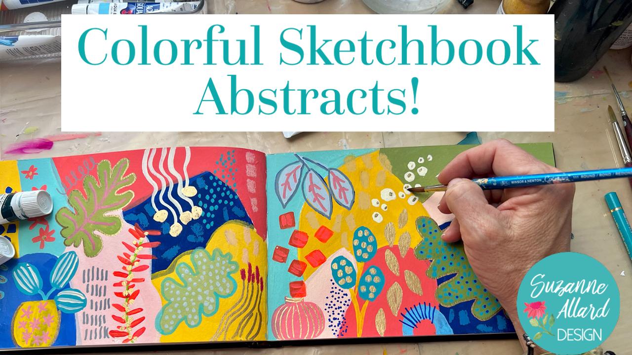
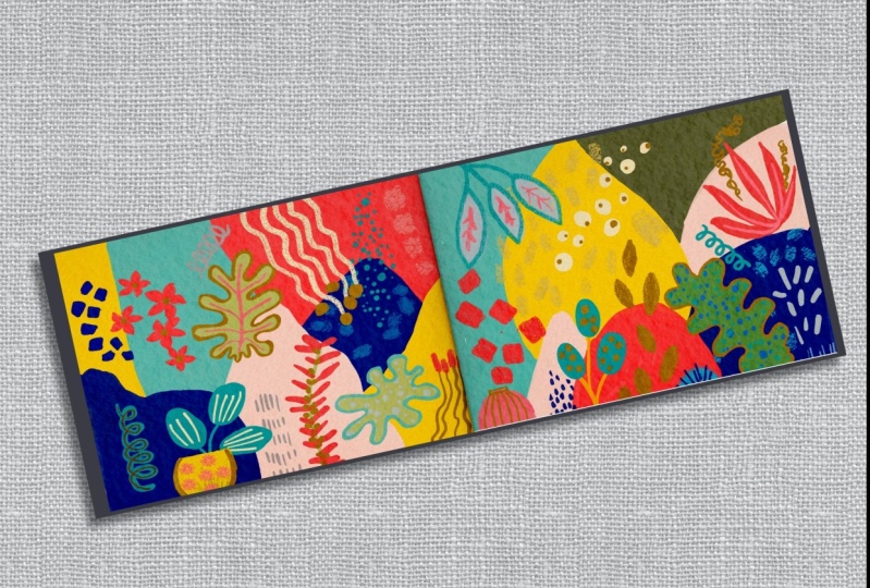
5. Bold, Simple Abstract 1: Hello, I'm Suzanne Allard, and this is a module in class on creating a bold,
simple abstract. You all really liked this on Instagram and it's
such fun to paint. And so we're going to go create this exact painting
in the sketchbook. So join me on this one. This is going to be fun. This is a watercolor
sketch book by Strathmore. Let's got back panorama. Shape, which is fun
to do spreads in. And we're going to do a bold, simple composition, abstract. I'm getting out some
Liquitex acrylics and Liquitex gouache. Gouache. A black pop bottles are the gouache and the white
top bottles are the acrylic. So I mix them just using
whatever color I want. I'm getting out some red,
white, fluorescent pink, some lemon yellow, some blue. And I don't really have
a plan except to make bold shapes and colors that
I like to keep it simple. To resist the
temptation to do a lot, which is a good exercise. I'm using a bright brush. You can use any size you want. I wanted a good size mark, so this is an eight size. I'll change the brush a little
bit later, but for now, I made sort of Corelli. I took red and white. Very, very dark
pink or light red. I'm just thinking about a variety of shapes
in this style. I'm keeping the
shapes pretty clean. You wouldn't meet,
you don't have to, of course, you could
leave them out. That's why you see
me playing with it. I'm cleaning up the edges. I'm not making them perfect, but I'm trying to
put a lot of paint down for that bold,
intense look. Keep it opaque. That use a lot of water because that's just going to make
it more translucent. I'm putting down
my palette paper, but scrap paper
works great just to protect the other pages in case I want to
go over the edge. These pages. Here's gonna see me use just as
little water as I need to to keep
the paint moving. It's really satisfying
to paint this way. I'm going to speed
things up a little bit and talk you through
some of my decisions. You'll see that I won't. I'm not really rinsing my brush. This is a good exercise. I did wipe it with a paper towel to get some of the red out, but some of the red
still in there. Then I'm adding yellow. I think it's a kind of a
fun way to make colors is to leave a little bit of
the color in your brush. You just, you just have to be careful what
you mix it with. But now I'm grabbing some blue and you'll get
colors that you wouldn't normally get because I'm
mixing that orangey color. Click the blue and you just keep adding until you
like what you see. So I've added some light
and then some more blue. And I'm just kinda, you can see the orange is still
at the top of my brush. But I liked painting this way without cleaning out
the brush too much. I think it really helps. Creating colors. It was like, let's say
I was thinking, Oh, let's make a gray,
green, blue color. This is well, I
might not get there. Well, I definitely wouldn't
get there as easily as I just did by just
taking what was on my brush and then adding another color and seeing
if I liked it and keep adding white or whatever
color until I liked them. If you don't like it, you don't want to wash your brush
and you can do that too. But I think I only wash my brush a couple of times
through those whole process. When I go to the paint,
I definitely do. Unless I just wanted to go
in the purple direction and then I could use
what's on my brush. What you can do is humane not wash it because you don't
want all the paint out of it, but you can take a
paper towel and wipe, squeeze most of the paint, the color out of it, and
then go to your next color. That's how you can control how much paint is on
your brush with how rinsing it and getting it wet and then making it more watery, which in this case
I don't want to do because I want an opaque look. Now I'm taking the blue and
just added some white to it, which has made it
a lighter blue, is a great exercise in learning how your
brush works in the marks. Learning how to paint flows with how much paint do you need in the brush fibers to
get what you want? Making shapes,
playing with opacity. Just very relaxing. And then color discovery, I just added a little bit of yellow and got this
fantastic green. That again, if I
wanted to start out saying making this
green would be tough, but it just comes as
part of the process. This is my favorite way
to make colors and work. Whether I'm doing a floral or an abstract or anything really. This way you make all the
colors your own to grabbing a bit more of the lemon yellow
to brighten this green up. Thinking about where, where should that go?
What kind of mark? So then I got an
idea and I thought, let's make some lines
with the script liner. You really have water up the paint a little more
for that script liner and get it to saturate
the brush fibers. That's why I'm going
to go back and grab more paint to get
that look opaque, look on the brush that I wanted. Then I think about
doing a leaf branch, but I don't I can tell that doing it with a liner is
gonna be more difficult. So I grabbed my number
two round brush, my Winsor Newton number two, which is great for making
very small branches. And then I'm just carefully, this is a great
thing to practice, to actually have a YouTube
video about making leaves. But you're, you're
using pressure. You're starting gently at the tip and then you press
down and then lift up. Your biggest pressure is
at the middle of the leaf. And just do what I did. Get us sketchbook and just do
pages or a piece of paper, watercolor paper and do pages of leaves and you'll,
you'll get it. It will start to come much
easier after you practice. Then I like I like to do, I'm going over to the other side and making some marks in
the same color there. Now I'm thinking about I want my I want my bright brush again. And I cleaned the valve
mostly because I'm going to this pink and I don't want to
muddy up the pink too much, but the pink that
I've mixed there with the fluorescent light
is just a little too. It's not warm enough for this composition because
these colors are pretty warm. Even the blues, at least the darker blue is
on the warm side. I've just added a
touch of yellow to warm that pink up just a tad. Just felt wrong to leave it. The way it was. Warm and cool colors basically mean that the warm has
a touch of yellow. It just, it has a warmth to it. The cool colors would feel more like they
had a touch of blue. So I'm taking this warmish pink and making some
shapes and marks. It's funny how these little
shapes just, I don't know. I find them delightful. Now I'm picking
up a warm yellow. So not the lemon
yellow. This is warmer. We'll play with that
and finish this up. In the next video. Make some dots.
6. Bold, Simple Abstract 2: Let's finish this up. I'm going to do some. I just felt like I wanted a
little bit of yellow in this. And so I'm doing some formula, just lightening it up a tiny bit with some white and I've got a little brush because I'm going to make little marks. This is another great exercise. It may seem silly,
but practicing making small marks
because you'll find that sometimes you may want them opaque or you may
want them translucent or you may want them kind of organized and
going in the same direction. Or you may want them random and going in
different directions. You may want them to be round or you may want them to
be more rectangular. Just practicing how to
get in your sketch book. Fits very relaxing. It's fun. You can do it in front
of the TV at night. You can do it. My husband
and I usually watch shows like naive and this is, I often have some
paint and a sketchbook or markers or doing
something playing around. Now I'm feeling like I want
to do some metallic gold. And you definitely want to shake your marker with a top on. I learned that the hard way, they always need to be
shaken and then primed. That's why I always
have a scrap piece of watercolor paper nearby. I'm looking for places
to put variety of, I guess, chunks or marks. This metallic gold. I did three on the right, that kind of move
your eye around. And then I'm doing this on
the left and the palate gold. So it doesn't photograph well, because it looks like brown. See how it looks like brown on the left side and
then on the right, you can see the gold coupled. If you're photographing
your work, like if you're trying to
show it on Instagram. I have found that photographing
it at an angle is helpful for outside where
you can get some sun on it. These marks up here
I just made I liked making marks that go off the shape a little
bit like that. Now I want some more
gold on the left, but I'm going with the
thinner pilot gold marker to make some squigglies. I just love what metallic
gold does to a composition. Now looking at it, thinking
about grabbing some of this pink before it
completely dries so that I can make those areas
a little more opaque. The only thing about
acrylic gouache is how quickly they've dry. If you do want to
use a color again, you kind of have to think
about that or you can also spray spray a bit of water. Now I'm standing back, forcing myself to stand back. And I got this idea that
I wanted to try some, some white posca pen on top of those shapes and you'll
see what happens. I'm, I'm glad this happened
because I wanted to show you how you can what you can do. I put it on there. Then I stood back and
I didn't like it. I felt like the solid
shapes, we're just better. I didn't wait too long to make the decision because
it didn't really dry. I said, I don't really like it. So I got some paper
towel. Quickly. I wet the paper
towel a little bit. Since my dirt my paint
underneath goes dry. I was able to remove most of it. This is something that
I'll do. I do often. I mean, if you if you
feel like you need to take a look at how
it works, try it. Once I rubbed it off, you can still see a
little bit of a mark. But I was able to get
some paint before it dried completely
and go over those. I'm trying to do it quickly
before I make color drives, although it doesn't
really matter if you end up putting a little bit different blue on there. In fact, it does end
up a little different because it's been sitting there and mixed with some green. And I end up liking that, that there's a little bit of variation in the
color that I added. And so I got, I think the
interest I was looking for, the white was just too much and the same thing
happened on this site. And so yeah, as soon as I
painted those back over, I just liked the whole
composition better. Interesting, isn't it? This is why sketchbook and
practice is great. I decided that it's done
and to leave it alone.
7. Kandinsky-Inspired: Beginning: Hello everyone. I'm Suzanne Allard, and this is gonna be a
class where we paint a Kandinsky inspired abstract,
very loosely inspired. You'll see it just gives us some reference for
color and shape. But it gives us a
starting point. And I have been obsessed with
these colorful in modern, just fun abstracts
in this sketch book. And this is the style that
we're going to do in this one. And we're just going to
use candidacies work as a starting point for
shape and design. So we're going to
create this one. Gonna be fun. I'm gonna give you a color
palette, lots of inspiration, photos, references for the
elements that we put on top. And you are going to find
what you like and don't like. And I'll show you every step
of the way how to create it. Joined. It was gonna be fun. This is the sketchbook where we did this book, the bold simple. And it's the Strathmore
watercolor paper. I think it's a nine by
five nice thick paper. And so when I did this then I kind of grew out of
there and I started doing, I don't really know
what the column, they're sort of
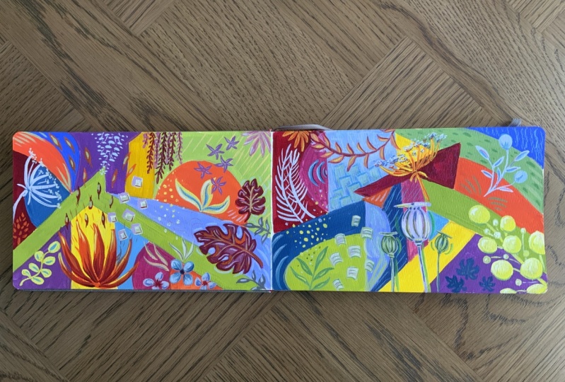
tropical from there. Definitely contemporary, bold colors, shapes,
botanical elements. And I just decided I'm going to keep the sketchbook for these kinds of abstracts. Or who knows, I've done that before and I end up changing. I'm really enjoying
these and they're evolving and it's kind of
fun to see the progression. This one I haven't yet, usually I come through
with some metallic gold. I haven't done that yet
on this one, I might not. It's pretty active as it is. Same thing here though. This one, I definitely
want to come through with some gold and some
highlighting things. And this one I worked on last night and played
with some drawing, a gold drawings of different things that
I thought were pretty. So we're going to
do one of these, we're gonna do one of these
spreads and his inspiration. We have different things
here we might flip through. But I also think
it's fun to take a painting from a master in either pull colors
from it or shapes. These are, I just went on
and googled Kandinsky. But in particular
this painting called, well, it sounds like
there's two of them. There's church more
now with church and the church and we're now and
then landscape with church. There are similar
and you can see the similar color palettes. And you can also see that when
you Google Images, people, people can use older art, art images and
without copyright. These, I think he
painted these in 1910. You'll see a lot of
these things for sale, but you'll see that they modify the colors from the original, which you can do with your
phone and your filters. And you can see because this is much brighter than the original. Like I said, we could do that if we wanted. I'll show you. These are really bright,
but I thought we would just go off of at least four colors. This this is Marino
with a church 1910. I'll go ahead and
screenshot that. Then. Like I said, your phone
will do the same thing. Then for shapes though, I thought we'd get
inspired by this painting, which is church ATM or no. I'll screenshot that as well. Now if I go to photos, interest also has these photos. But let me get down
here in my photos. If I wanted to
change these colors by adjusting them, first, I'm going to crop
so that we have just the photograph of the painting and not the
stuff that I screenshot. If you don't know how to
screenshot on your phone, it's going to be, gosh, now that I'm doing on my iPad, I'm trying to remember is on
the iPad is here and here. Screenshot. I think it's
just the right button. But if each phone is different, so you might have to Google it, but like I said, I
like these colors. But your phone should
have colour editor here. You just go to
edit, delete, edit. And I could enhance just that
automatically enhanced it. Or I could go in myself
manually to all these things. And I could increase saturation. The vibrance is very
similar to saturation. Warmth is interesting. You can take it cooler. This is warmer,
warmer or cooler? If you say, well, I
like those colors, but I wanted to be a
little bit cooler. Warmer. I'm leaving at
about where it was. Tenth goes from red to green. You can play around with it. I like the colors that
are in there. Now. I'm not going to do
a lot of editing, but I just want to show
you there's our photo for colors and then we can
go ahead and crop just, just so we have a cleaner image. The photo for the shapes. I'll put both of these
photos in class resources. All right, so we're
gonna start with shapes and we're gonna be
thinking of color. Let's pick out the colors. We're going to have some
kind of bright blue, cobalt blue we're
going to add to it because I like to
add to my colors. I don't use them straight
out of the tube, even if I'm just adding a
little bit of something. And I'll show you
one of my favorite little bit somethings to add, which is the burnt umber. We'll just kind of change paintings a
bit and warm them up. So I'll have that out. And then let's collect just the basics that we're
going to start with. We're obviously
going to need a red. This is a currant red that's
too much of a purply red. I just need a basic red
like a cadmium red. This is probably poppy red, that's actually good.
It's a bright red. But cadmium, just your
basic red will be fine because we're
going to mix anyway. Then we're going
to need a yellow and it's going to
be a warm yellow. Yellows tend to come in like
a lemon or what I call, it's really a cooler yellow or warmer yellow like a cadmium. This is going to have pain on. I can't even read that anymore, but it's it's kind of in-between
actually this yellow. But pick out a warmer yellow, turquoise, turquoise
there, of course white. Whereas these lots of white, then there's a dark in
here that we'll use. This looks like a dark green. We can play with the dark
green I might go to dark, tends to be like a navy, but I think it'll be good for me to stretch and do a dark green. And we'll be mixing. We're just using
this as inspiration. We don't have to
follow it exactly. Alright, so we've
got a loose idea of our colors and then
the shapes are, this is obviously he did
an abstract landscape. We're just going to kind of take some shapes like this
on these two pages. With these colors. We'll use ivory or
make an off white, which will end up if
you don't have one, we can make one with a little bit of all
these colors and white. And we'll use that in
the shapes as well. Yeah, that's, that's
our setup for this. Let's get to it. Alright, so I've got my
sketchbook, my water, my brushes, some paints, palate, piece of glass here. For these designs,
I've been really using the bright shape. This is ten, this is eight, and these are not
expensive brushes. And then sometimes
for an effect, this is, this is kind of
an unusual brush, but any, any angled shader, we'll
do what kind of leaf, but you don't even
really need that. You can just use
around to make leaves. We'll get into that
when we see what we actually put on
top of the shapes. Something small that you
can use for the details. And then just around,
this is a five. This is a one. Or also you can use your liner. This is my Princeton
velvet touch liner. I like the fat little handle. All right, let's start first with the idea of
shapes across here. We've got our photo. We can, if it's easier for you
to draw in with something, you can use a number
of things to draw. We're going to cover
it with paint so you could use a regular pencil. Just in case I use
a light color, probably going to just use a soft gray neo color crayon so that I know
that it dissolves. There are also a
number of pencils that are water-soluble. Great to draw with
whatever color you want. We're just making
a light sketch, but maybe do something muted. These are Qur'an dash, super color, but any
water-soluble pencil will work. And actually in this case, if it ends up showing
through an outline, you just use a regular pencil. That's okay. Alright, so I'm
just gonna do some, again using this photo. Some shapes. Pretty, pretty basic. Not worrying about. We're not, we're not, we're
just using it as a backdrop, but it just gives us
something to work with. That's probably enough. And I'll do all those different
things in different colors. And over here, maybe
something like this. I try to make the two
spreads not be identical. Maybe look to another feeling
of a hill and the back. Then we can go up with this. This is something like that. Just giving us, like I said, a sense of just not it helps
sometimes to not just these, I just did random shapes, but I thought I'd help you. If you had some kind of
reference. And then color. In these designs, you have
your underneath colors, which we're going
to paint these. And then you have your
colors that you're gonna put on top with your elements. So I do think a little bit about I don't need to have all of these colors
and in the lower layer. But I can, I can also then
take like if you look at, for example, just trying
to think where I yeah, I think it's this
one where I took the same colors
in the background and use them in the
foreground except for the turquoise. Which
was kind of fun. So I played with it both ways. I did the same thing here. Here's the gold that was in
the background on this shape, but it's in the foreground. Those shapes. Same with this coral color, background,
background, foreground. The pink I only used
in the foreground. You can just play with a
lot of different things. But I thought we would
definitely do a blue, one of these bright
blues in the background. Some of this pale
pinkish white, whoops. Maybe a version of turquoise
in the background, and then another version on the foreground and some yellow. So let's start with the blue. I mentioned mixing things
with colors that are in the tube so that we don't
just use color out of a, straight out of the tube. So it's more
interesting. And one of the things I like to mix just to warm colors up a tiny
bit is burnt umber. I've got ultramarine blue here. I'm just going to add a
little bit of burnt Humbert. That's gonna be too
much, but I'll use it that allows me to warm up and then paint probably one
or two shapes on this side. We've got a couple on this side. Maybe I'll make
another line here. I have another block of color. Okay, let's start painting. All right, so let's just talk
about a couple of things. One is that I'm trying
to be careful of not getting paint on my
other spreads. That happens. I have a magic eraser, which is a product we
have here in the States. I don't know if you have
it overseas. Anyway. Hi use if I hadn't
moved my paper or my back ground paper,
that wouldn't happen, but just something to
keep the other pages from getting mocked up because I did go to the edge on this
one. But you don't need to. In fact, you'll notice
a lot of these. I don't I think only one spread. This one here. Did I go all the
way to the edge? If you don't want to fuss around with worrying about the
edge, you could do. Just stop before you
get to the blue. I, what I did is what we mixed up and then
I just add a little bit of white to this one because when I was looking at the photo, obviously there's a lot
of shades of blue here. So just for variety, as far as the way
that it fills in, if you like a little
bit of texture, then you could
leave it like this. If you wanted it to look really, really super opaque and flat, you could do another code. But we're going to stop there at that and then go on
to another color. Go to the yellow next. I'll probably add
some white to this. It increases the opacity. White always does that. It's got my white gouache here. And I might, I might
add a touch of it. Umber, just already
a warm, warm yellow, but just to give it a little
bit of a slight change, that's my BYOL that
I do right there. Waiting it up. Of course you
do this any way you want. I'm just showing you how
these skip how I do these. As far as where to put it
put it wherever you want. I just don't I don't put them
right next to each other. Are those similar colors? If there are similar, I don't mind them
being next to each other as long as there's
enough contrast. Let me mention this is
kinda fun to overlap them because you get an additional color with the
overlap. It'll be a green. I've done somewhere I
do and somewhere down. All right, I think
I'm gonna make this red kind of
a corollary read. Actually have a coral. But if you don't, you're
going to take red, bit of yellow,
basically a dark orange and then probably
add some white. I'm going to darken
my core elbow. This is and even more red in it. This is ending up looking
very primary colors so far. But that'll, that'll
shift already. Let's do this light pink now, you saw that I use
a scrap paper. Does it just scrap paper? To help the Agile have
to do that here too. When this dries. Now I want to make a
pink lots of white. Already got the
coral and my brush. Dry it but not wash it completely and that'll
probably be enough pink. So what I'm doing right now is it's easier to
paint the elements over if you don't have a lot
of creases in your paint. So I'm just some of the things, some of those crisis,
that's all I like texture. But if I end up with
big ridges of pain and makes it more challenging
to paint the elements over. I think it might be nice
to have our last color. Well, I'm gonna need to, I think I'm gonna do
two more colors here. I could just do the
coral, a player. But I was thinking
on light turquoise. We have variety of
turquoise is here, but we could go with
one of the lighter ones and save the darker
for the foreground. I think I might do a
light turquoise here. Then maybe here because that'll look pretty against this pink. And then I figure
out what to do here. One of the ways
that I mixed colors and get some interesting
colors is I don't necessarily wash my
brush depending on what I'm going from
and what I'm going to. I have some pink on here, quite a bit of coral stone in the deeper part of the brush. Just gonna wipe a
little bit of that off and see what it
does to the coral. I wanted to lay coral Anyway. Pink, we'll just add a
different dimension to it. Yeah, that's nice. Also saves on paint.
8. Kandinsky-Inspired 2: Adding elements: This often happens
where you have a spot left and say,
Oh, what do I do there? Number of things I can do.
I can do another color. I can do something
that's not touching. So I could do this one. I could take the
turquoise over there. I just maybe I don't have that
much turquoise over there. I could do a variation of what I've got looking
at our picture, there's greens, of
course in here. I've already got
blue and yellow out, so let's make a green. Keep the turquoise on the brush. So now we're at a stage
where we're just gonna, we're gonna make sure
this is nice and dry. Before we put our elements In. Give it a good sacral
gouache address pretty fast. A good half hour should be
completely dry and same with acrylic. See you in a bit. All right, the next stage is
to put our elements on top. Now, for inspiration for this, these elements, I really
the world is your oyster. Take pictures everywhere I go. I like pots, pottery and
flower pots invasive. So you'll see some of that. Here's a pot. Obviously, leaves,
shapes, colored dots, little flowers, leaves,
more leaves or pots. And it just, I get ideas
from all kinds of places. So it might be element that I see usually in my day to day. So I'll show you, let's
say go to my photos. I just went out in the
yard and got some ideas. I do live in Florida,
which is nice material, but I thought we could
do a leaf like this. And I'll put these in resources. Then I just grabbed a
stem of a plant out there and maybe we'll
do something like that. I thought this was interesting. It's a little succulent. And just the way the leaves come off the stem I thought was pretty then this
part is pretty too. I think I did
something like that. No, I guess it was
another painting, sort of star looking. And then here's an allo that's
maybe something like that. Just loosely
interpreting what you see and I'll even take pictures. So there's my dog sleeping. Look at her lip. We're
not going to paint that. Here's another
flower I my husband. He doesn't mind, but literally everywhere we go, I'm
like, wait, wait, I see something and I'll take a picture without these
are really pretty, they're like an umbrella. These, I mean, I'm
obsessed with these. I put them in my Facebook
group and I said, What are these in
some kind of mimosa. But look there,
if you could have touched on there just like the softest thing with
all these little dots. But also when I go out
and about here was a pretty display at a
store here in Tampa. And I think I used that shape, that little basket there. I drew it right here and gold, you can't hardly see it, probably for the camera, but it was just a pretty little
I liked the shape of it. What else did I say then
it took a broader picture, but you could pick up any one of these shapes or textures
and do something. There's really, when
you start thinking like this, There's
inspiration everywhere. It's literally everywhere. Here's a different store. This is a West own
furniture store. And I loved the
shapes of these pots. Even these, they don't have to even be pots
in your painting. They can just be shapes,
but it gives you ideas of how to create shapes. Because, you know, we, we see them everywhere
in our lives, but we don't think about it. Here's just a display of
issues because same store, I felt these were
interesting shapes. Let's see. I liked those. Yeah, I did something
like that here. These were inspired
by a poppy seed pods. I have a hole in my, my my phone or my basically
my photo. I have. Hello, 739 in here, flowers and leaves from it
doesn't matter where I am. I think this was
the dermatologist. They had a flower arrangement, so of course I was grabbing
it and taking pictures of it. I don't really care if anybody thinks that's weird
because I love it. And then I have so
much inspiration for literally anything
I wanted to create. Of course, you can
just go on Pinterest, but I think when you capture
things that speak to you, this was outside of Atlanta. We're walking and I just love
again, pots and flowers. Leaves, even, even just
flowers at the grocery store. Can inspire something. You know, maybe it'll swirl ease, or maybe it's the color ballot, or who knows, it doesn't cost anything to
take a picture of it. Look at those textures there. I could go crazy just
talking about this. Maybe I should do
a separate class on just where to
get inspiration, but you get the idea.
Take pictures everywhere. Look for a little bits and
pieces that seem interesting. And then when it comes
to something like this, you flip through and say, oh, let's just do that. And you're simplifying all this, all these images,
you're just getting inspiration from them. Let's go back to our
color palette picture, which is right here. I just noticed my colors
on this one that I did are pretty similar. Interesting. Okay. Maybe that's what I'm
drawn to these days. I think it would be good to
maybe start with a green, some sort of green
shade in here. Let's do that.
Let's do that leaf. We'll do a couple. I don't know if I'll do one
or two of these. Again, if we're just we're not we don't have to make
it look exactly like that. That's just the idea of it. It's a starting point. I think that's the
best way to look at photos like that because
it's the starting point. And then you let your
imagination take it from there. Let's make a sense in
our color palette, we have pretty bright green. This Kelly green, which
really isn't my favorite. So it'll be interesting
to put it in there and see if
we like it high. I tend to like my
greens more Olivine. Let's grab some ultramarine blue to make run the hair so
that you can see my palette, my sketchbook, which is long, and my iPad, but I don't
think it can all fit. That's okay. You can print
off or have in front of you, maybe on a laptop. The color palette. We'll do it that way. Let's see if that works. Green, green. To get a little
different shade green, I'm going to mix
my blue with lemon yellow rather than
my golden yellow. Start there and
see if like that, I know I'm going to need white. Always need a bunch of white. I am using acral gouache here. You could do this with acrylic. You could do it with
regular gouache. You would just make sure that your layers are
completely dry and that when you're layering
over regular gouache, you're not fussing too much, real disturbed the
layers underneath. The other thing you
could do is if you have only gouache and you don't
want to worry about that. You could paint this first layer and then you could spray it with workable fixative by cry loan, which seals that layer unless
you continue painting. So those are just a few options. So you can tell I'm doing it, I'm taking it more olivine
because I just don't like Achille green. That's okay. All right. Let's do a leaf. That's funny. When
I mixed color, I mix it until it excites me, until I feel something. Sometimes it takes me a bit going that every
color has to excite, of course, but I do
want to like the color. Well, that's not kelly,
but we're going with it because I like it. Artist's discretion. Then our leaf.
Let's pull that up. Let's make kind of crossover. If you feel more
comfortable drawing, grab something in
the similar color, it is easier to draw. Shape even though this is
a very basic shape or not. Being very precise. Here it just goes smaller. Clearly not exactly
what's in here because this petal
is really fat, but I don't care who I like that green
on top of the blue. So a couple of things I did
switch to my round brush. It's really about what you
feel gives you the control for something more precise and
kinda turns like this. It depends on the shape,
but if it's more leafy, I tend to reach for
my round brush. If it's more squarish, then I use the
square shape brush. I'm just painting over
my crayon marks now. So that's probably all I'm
going to need sometimes I'll do two coats if I want it to
really pop and be opaque, but we'll see how it dries. Let's do one over
here will change. Since I do think of these spreads kind
of one composition. This is a finished
painting, this as well it is, but
it's in a sketchbook. I don't worry about
too much of that, but I do give it some thought because it's
good practice to think about the way that it
lays out as a whole, both individually
and as a spread. To take it though, yeah, I
got the permanent yellow. That's fine. It'll be a little
different. Yeah, green. Yellowy, that's gonna be pretty. You might notice with
Apple gouache that it can, it dries really fast even while you're still
painting with it, if that bothers you and you want to do something about it. Blending medium
for watercolor by Winsor Newton is really lovely. It can make. I'll show you
just the night like this. I just grabbed some out of those straight out
of the bottle. And it's really intended
for helping blend colors, but it just makes it more
creamy and easy to move around. Whereas my crayon, I'm gonna
make this one different. I don't want it to be the same. Maybe I'll bring it up here
and go this direction. I don't know if you've ever seen Matisse paintings, but he has, he has a pretty famous wound
with leaves just like this. Very similar. It's kind of funny how
it's just a simple shape can be really interesting. The blending medium does
make it more watery. Makes sense. Other alternatives for
making the aqua brush. Perhaps not dry quite
as fast is the medium. You could use a matte medium, but it doesn't make it shiny. But sometimes you
just need to coats. Probably will end up
with two coats on that. We'll see. Alright. I like those. I think we
might have to do another one. We'll change the color a little bit and maybe we'll
go with a really light green down here. Thinking angle wise, I don't want to make it
the same as this one, but obviously I want it
different than that one, so I'll just straighten it or I can make
it go upside down. Maybe I'll do that.
Let's go upside down. Ended up kind of wonky. That's the great thing
about these crayons as you can overpaying it. Anywhere you want.
Or just a guideline. People asked me,
why do I like wash? Why would they understand that when they see my
paintings and say, colors are so crisp and it looks so pigmented and intense. Because if you use acrylic, you can get the
same effect if you, especially if you use a
matte medium with it, but he'll probably have to do
two or even three coats to get the color intensity. You definitely have to use
high-quality acrylics. Do not frustrate yourself
with cheap ones. They just never give you
the coverage. The pigment. I love that. Hello guys. This one is
drawing a bit translucent. So later on we'll
be starting slowly. So that's one of, because
of the blending medium. That's one of the
downsides of that. Alright. I could just honestly probably keep painting these leaves.
I love them so much. But let's move on to another
color in another element. So let's pick up a turquoise, but let's do a darker turquoise, like there isn't this right
here in the painting. As far as the element. I think it'd be fun
to do some of these. We're just gonna do a turquoise blob and
then after it dries, we'll do lots, a
little white late. I'm going to take the turquoise and then
add some blue and mix until it becomes
the color that I Payne's gray is a
great way to darken. It took all the turquoise out. That's not really the turquoise. It's more like a viridian. See what I've got here. Let's try this. Viridian. We're getting there. I think I'll do three
of these little guys. Just got him an idea. You can put those in a pot. Trying to think where
they'd fit here. We've fed over here,
but the color won't show up much less blue. That's okay. I really
like that color. Try it. You can always paint over it. I want to make these
little differently. So kind of put them this way. While we're thinking
about a pot, decide what color to do it in. I think the goal would
be pretty here and here. I'm going to put that
brush in the water and mix up some gold. Although you know what? That color dries because
I really like it. I'm going to make some
thoughts with it. Dots are interesting. You would think they'd
be just really easy, but it takes some practice
and the right brush. And so you want to practice with different brushes to get good. That's and you want to
really load the brush. And I use a round brush, but not one that's super pointy because then I end up
with this kind of weird. But you put a little
more liquid than normal, really load the brush. And I actually think that
that's great over here.
9. Kandinsky-Inspired 3: More elements: All right, Back to the hub. I've forgotten what we sit down. It's gonna be with
you. Oh my gosh. It's so funny. Oh, the pot. Okay. Yeah, you have to go where the color of a
color speak to you. We're gonna make a pot. Going to put it underneath those guys. I'm not gonna make
them the same. I think the goal pout, go well, here. Let me get my room. Protect her. She now what if I wake up just doing stamps
there instead of a pot? Go back to her
inspiration photos. Let's do this allo
type thing somewhere. And for color. Let's see. Got this really bright orange, that would be kind of fun. It's almost a fluorescent not we're just learning
and having fun. Do have a fluorescent
orange here somewhere. It you can use. You can just make it bright
orange or if you wanted. But I thought since
I have it and I also have opera red or pink. Let's see what happens. We could use the fluorescent
red fluorescent work. I've got a fluorescent
red, fluorescent pink. I don't have a
florescent orange. Who? That is bright. We're going to tone
it down. My eyes. Tone it down. Otherwise it'll completely dominate everything. Wash out my brush. It's already some blue in it, so I will leave
that someone left her glaze because I
don't help tone it down. See what else we can
do to tone it down. Complimentary colors,
meaning opposite on the color wheel,
tone things down. Pretty much anything we added, this is going to tone it down. I'm going a little
bit of yellow, which is going to take it
in the orange direction. Maybe a bit of blue, of course, we could also do the
burnt umber would really toned it down.
Maybe too much. Yeah, When you're doing
complimentary colors to tone down go very tiny bit because it'll turn it
down real fast, real quick. Okay, I was going to scrap paper and seeing what we
think of that color. To tone down. I'm up. Here we go. It's still bright. All right. Let's make our power plant. I'll
put it over here. On this one. Looks brighter on the paper on
here, it doesn't it? Because it's more translucent. I don't think I don't want to do the same thing over
here, something else, maybe that spiky thing that succulent could do
that over here. So for that I'll need a
smaller brush because those leaves are really small. So I'm just number one round. And I'll come over here and do the stem and pass
the marker just because it's pretty
easy to draw. And then I can
take that. Even if I decide I don't like the color, I can paint over it, but it'll give me
I place to start. And I'm just gonna take
these off right here. Like that. This is such
a front brake color that I think we need to
do some little squares. One of the things I like doing, I can show you what mucking
up the painting is, taking my square brush and
doing these little squares. So I think this will be
pretty in that color. This is my square. I have some of that. It
is very translucent, so you might end
up needing to go. I just go this way. And this way. You do
it anyway you want, but you might want the
brushstrokes showing more. This is not about
right or wrong. This is personal preference. That's about experimenting
and seeing what you like. I think when we create
things that make our heart sing in our best
possible creative self. What makes your heart sing is probably different than
what makes my exam. So, what else can
we do over here? Let's do some of
those little sort of Daisy looking at flowers. Small brush for that. I'm going to add a
little weight to this. It'll help make it more opaque. Yeah, that's pretty this is my little number one. I'm gonna do, I either
do three or five things, adds numbers seven. I'm going to do five here. Now that I have
this opaque color, make some little marks on these. Let's think about what's next. We haven't used
much of the early any of the off white
shades in here, a lot of light colors. So let's bring some of that in. And I took a picture of I used to be under
fiber ART and felt in and things and I had some
nice little beads and I saw that be kind of fun. Just shapes like this and him a little bit of a meandering
way and varying in size. So let's do that with
an ivory colored paint. You can make ivory actually, I'll just show you
how since I've got some white already out. Good mixing brush. Just use this small one. Already got some
yellow going here. I raised just a little
bit of a couple of few different colors
until you like the shade. So there is some yellow, maybe a tiny bit
of that, orange. Whatever you got on your palate. If you just put a
tiny bit and it'll take it in different directions until you like what you see. That's a nice color.
I'm going to put these. Maybe somebody's here. Just looking for where
else I want this. I think, I think I want
to do some larger leaves. Were a branch of
leaves coming in. But I don't think I want
it that light of a color. I'm thinking about
something coming here, but maybe a variation
of this color. And I can look at the painting and see if
there's anything that I like or I can just think about
what might be not here. This pretty lighter blue, cobalt blue. We could try that. Coming down here,
trying to picture that. I want to stay really light. I'm gonna try a
super light blue, just a little bit of
this ultramarine. Yeah, that's kinda interesting. I think we could do something like that. Try something like that. Another element I like to do, or these kind of like
long rectangle things going every which way. But you'll find the things
that you like doing. Shapes it speak to you, you might see a shape and another artist's
work on Instagram. And it's not copying to take one shape from one person.
Experiment with it. It is copying to take
an entire design or most of the
design and copy it. But if you see shape like these that I'm using and
you use them, That's fine. Fine line. I mean, you wouldn't
want to have somebody has a particular mark that's like their signature
mark, but I don't know. You just combine it
in different ways and get your inspiration. To me, these look like little
seed pods are little seeds. Lance can be really powerful. Okay, so let's take a break from the paint for a little
bit and pull out some classical markers and see if we can add some
details with these. I use the ivory a lot. Let's see what
other colors would fit into our color scheme here. Not many of them because the posca is pretty
traditional colors. But maybe this light blue, we'll see you if it's too. We'll see it might not look
like the top one would work. Also use, Let's see what
this blue looks like. My work. It's not really an underpainting leaking tiny to work on that one. I
always give that one. I think the tip needs
to be turned over. I'll just show you how to
do that here while we're in class because a lot of people
didn't don't know the best. My handy buyers hold this
often fixes leaking, you pull it out, reverse it, and if this doesn't fix it, then you can soak the whole
thing and I'm trying not to drip on the painting and
the whole thing in water. Let's see if I have mine out. Since I fixed it, I think
we should use that. Just do something like this. Just some interest
and maybe over here, I don't think I want
to in this color. Kinda went around with
this marker. The coral. This is the coral paint
that's called the ivory. Do the same thing, just
making little marks. Kind of like these circles with a little look like eyeballs. Then we'll just keep decorating. Just fun to decorate, isn't it? Let's take the gold pen now. What do we want to do? Well
first let's take the fat one, makes them larger chunks. Leaves, maybe some leaves. That was the chunky
marker and the image is really spreading the
color is around. Bringing it together, experimenting to see what
you like and don't like.
10. Kandinsky-Inspired 4: Finishing up!: Continuing the decorating
with some pens. And also maybe someone WHO
pastels are some crayons, just continuing to
add the texture. This is the blue pasco, so I will play with
the all of these. All right. So that's
just a process of me playing with what
seems on it's still wet. Like it would be fun
and interesting. Going around, looking at where I could put an interesting element or color and experimenting. Thank you know, it's
pretty well done. I like to put some like
these kind of things. Yeah. I think I'd
like some lines, but I don't want them
in that darker blue. Let's see what this grade is. Well, I think it's done.
This is a fun process. You can see that
you could take it all kinds of places with
all kinds of elements. And you can also go over, and I don't know if
you knew this, but you can go over posca. If it's wet still,
you can blend it. You can just keep going,
Just keep playing. It goes. And you can play with other
mediums if you want to put some oil pastel in here, we could play out. We'll put a little
bit of oil pastel. I'm, I don't want
to do, let's see. This is that gold color, kind of mustard color. Sometimes I like to
just put a color. Let's leave it shows up on top of a color
that's very similar, adds another dimension
that's not too close. So let's try
something like this. If you've already
put oil pastel down, the oil pastel won't adhere so you can
just scrape it off. Then put the color you want. I can just add some interest without
adding a lot of contrast. Do the same thing on the blue
because blue is so dark. That's more of a purple. Let's see here.
Let's try this one. Now that the blue is dark, it's intense. This is helping. I think. We'll stop there. So much fun. I hope you enjoyed it. You create a lot of these. You can spray them with
a workable fixative, as I said earlier,
for if you're done, you can just bring
them with I like to use a couple of different ones. I like the pylon
map spray varnish and also the liquid
tax Matt spray. You might brush off
these chunks once you're sure everything's
dry of oil pastel, but if you spray it back and forth and back and
forth and let her try, that's all you'll need to do. Go forth and create.
11. Derain Inspired Beginning: Next I thought we would do a painting or use this
painting as inspiration. I just loved the farthest
movement and their use of color and how it freed the world
of saying no, no, no. Trees have to be green and mountains have to be
whatever is anyway. This is a painting from 1905 and I'll put it in
the class downloads. But I thought we could use as inspiration for
some of the shapes. And then maybe even some of the brushstrokes and
some of the colors. Again, kind of a loose idea
of what to start with. His underpainting, you
can tell is an off-white. It's underneath everything. Our papers off white. So we don't really
need to do that. But maybe it would be fun and
add some texture on these. Just do frame within the page. We won't go to the edge. I'll start with painting
that in an ivory color. All right, Let's let that dry and think about just
look at the colors, look at the brushstrokes. Thinking about, I mean, obviously the
painting I'm gonna do is more than not
this style at all. We're just getting kind
of taking what we can. And sometimes I'll do that
with multiple paintings. I'll take the colors from one or something
interesting in another. But I'm just fascinated with
these brushstrokes here. I think it'd be fun
to make some shapes that are similar
to these kind of meandering and then fill
in some of them with different colored
brushstrokes like this. To make these kind of
brushstrokes there, they're flat at the end, meaning, I think probably a square brush,
small square brush. Since we have such a little
piece of paper here. Something maybe like this. We can go this way and see
what kind of effect we get. Let's try it. If you want
to scrap piece of paper. While this is drying, kind
of a good thing to do. And just see if we can
mimic those brushstrokes. Or what kind of what kind
of brush it's going to take. See if that doesn't. Yeah, that's the right thing, but it's going to have to go
lighter because it's heavy, it's gonna be too
big. That'll work. That's number six. Round brush. I don't think it's gonna
work because it'll do something point in
which we could do. Of course, I'm just
being a bit fussy. I want to tie this
really small round because it seems kind
of square headed. Liao might be the one. I need them to be really small because we're just
working on a little. I think this is the best one. It's the number one round. But it's the way the tip of
it as it's not super pointy, so it's giving me a
nice Mark. All right. So we've got that wet
and Reddy. Color wise. We've got some blues, we've got some teal, some greens, old
coral, this brick red. And then look at this pretty
lavender through here. I think for this one it'll be, let's do the opposite, since it's fun to mix things up. Let's do the
background colors in soft shades rather
than go right ones. Then do the foreground
and the brighter colors. So I'm going to look
at doing some shapes. So let's do those. I'll just use this. It'll, it'll mix into
whatever. Let's see. I'm just looking
at these shapes. It really doesn't
matter. Just getting us our starting point. That's probably good. Over here. Make this one a
little different. There's sort of a hill
coming down like that. Will work. I'm gonna start
painting pale colors. Pale pale turquoise,
pale yellow, maybe a pale blue belt. I agree. See how
that starts to look. I just wanted to talk
a little bit about color and both of these out of the tube
are pretty bright, turquoise in this blue. So I knocked it back with a little bit of
this peach color. But you could use anything that's opposite on
the color wheel. So that's the best way
to tone down a color. It's also unify a composition. If you put a tiny bit
of a color like that one in every color
on your painting. And that's just a
little technique. All right, let's do
some more colors here. Let's do a pale green and
then maybe a pale yellow. I'm going to do the same thing
when you put a tiny bit of that orange in each one. I'm going to leave these to
the colors that they are. Which is that halfway
that we painted, make this mustard yellow. I did some permanent yellow, basically a medium yellow, then added a little
bit of coral, which is just a darker
version of this. So all of these colors have a
tiny bit of a peachy color. Now we've got to let this dry and start playing with elements.
12. Derain Inspired 2: Adding Elements: Now that this is dry, I've got my little
shapes sketch book. Might be kind of fun in there. Got some old stuff in here. Like some of these. Maybe
something like that. I love seed pods. I definitely want to
keep some spaces to do this impressionist
brushstroke stuff. It will start with
leaf elements. You can pull from
whatever you like. Maybe that would be fun
to start with coming. Yeah, let's do that.
Once, something like this coming in from outside. Color wise, right here, code-wise, let's see here. Let's do a coral because that's definitely inspiration
painting corollary pink. Why not make a leaf
correlate painful? You don't have to follow
rules actually here in Florida there are pink. I have one. It's called a tie plant. Ti it's beautiful. I'm going to grab a round brush. I'm taking some coral and mixing some opera pink with it just
to give a little more pop. Draw it with a crayon first
hand was coming in large right here. One more. Something like that. Let's make this one
kinda coming up here. I made this one too long. We'll see everything works out. If you just play with a
painting long enough, you can make it work. That's good. All right. Now I'm
going to pick those. You probably noticed that I am delaying a second
coat on some of these, not just personal preference, I wanted to really pop
off the background. That's why I did that. Totally up to you. I did have a fun idea while
I was painting these, which is, since these
leaves are big enough, we can do some of
those impression of strokes right in the leaf. And I live a similar
color for effect. But those really have
to derive for that. All right, Let's
see what's next. Don't go to sleep
on me. Let's see. I'm just refreshing my
mind was color or with the colors and shapes, textures. Now I'm gonna go back to my little notebook and see if anything else
is speaking to me. Those are kind of fun. Magnolia. They're speaking to me. It's kind of like a
magnolia seed pod thing. By the way, this is just
just so white gesso. I use it as my wife a lot. Just interchangeably, simply
because I have a lot of it and it's a nice matt white. So it seems to be more white
than the white gouache. Anyway, that's that. What color do we want
to make that in? Maybe a yellow, a gold, some different
colors we could do. Let's draw it first. Have maybe coming up here. Draw the base first. Something like that. I'm going to paint those. I'm gonna need
something more orangey than this because it won't show. We'll do kind of importante, maybe kind of an
orangey PG direction. Whereas that color, yeah, this might work, by the way. And just in case
you wanted to know this color of this coral
has a beautiful color. It's the whole beam, gouache, gouache, coral red. But turn are also
has a beautiful one. It's called, it's called
coral red as well. Maybe had a bit of yellow to let that dry and
think of the next, In the next element, Let's realized, I don't
normally do this. Take the bread, take the same color with the same
element like I did here. I think I just got into a zone. But normally like in this one, I'll take we did we
use that bright orange here and then did a different element with
ID here just because I don't want them to look
like copycats of each other, but it's all good. I'm really liking
some of these here. And I thought we'd do
sound with the Posca pen. Maybe some flowers. I like that one, and maybe some things like
this on this side. See here where do I want this? Let's just do something like trying to be
intentionally loose. Which is kind of a
funny thing to say. I don't work really
hard at getting loose. It doesn't make sense, right? It's true. Pumped it right on the paper. Which I know better than to do when I do that because it's definitely not
the first time, probably not the last. I just use it as my ink source for the rest of the marker and then you can
just block the rest. Can you use it like going
back and getting paint? I like these. Now there it goes. Going over. Anything else? Go two times. I could go out with
paint if I wanted to do spring when we
had this color out, we'll do some dots. Let that dry and
maybe hit it with a second coat. At some point. In our sketch book. We might be ready to do
some of those brushstrokes. Back in gold leaf. I'm easily distracted, okay? Whereas that little brush, this is the one that
we said would be a good For the strokes. And I'm going to grab
a like I don't want to make sort of a dark
bluish turquoise. I've already got
some of this out. So all I need is maybe
a bit of either a navy, maybe it'll work
or Payne's gray. I went to a darker than
that. Here's my black blue. Yeah, that's a good
color. I'm just going to mimic the rounds. Strokes, blue section.
Because why not? You vary the color a lot. If you look right here, you see all kinds of shades of the turquoise
is in the green. We can do that by just
grabbing a tiny bit of whatever is on the
palate and making it as we go. We'll change it. I like the texture of it. Let's do some more fun to do. I like the look at the
tree trunk lines in here. Let's do some meandering. Lines. Would be easiest
to draw them first. I liked the color, it's sort of a dark.
Let's see here. Hello. Let's see what happens if
we use a couple of pascals. So this is a bronze color if you use past because whenever
you can blend them, so let just see
still a little test here with this bronze
and then the orange. The orange overpowers
at too much. I'm just going to use the
bronze Private Jacob prime it, I'll do it on a piece of
paper, not on your painting. Then they're going to blend anybody with my crayon
so it gives it unique look. And the great thing about bias goes as you have that control, because we're all
used to writing much more so than we
were used to painting. And you can still make it look painterly if you feel like
it's not painterly enough. By taking a brush and
just going over the ink. I'll show you here in a second. Actually, I like how it looks, but let's say I didn't
and I wanted it to look more like
I painted it on, then I could just go like that. I have this out. I'm going to do some
lines somewhere, fun. Then I'm going to stop and
let some things dry because it's getting I can feel the
dampness and the paper.
13. Derain Inspired 3: Finishing Up!: All right. I did do a little bit of a
second coat on this. Just seeing how you
have to do that with the past because sometimes,
well, let's paint too. Okay, now, I was thinking
it would be fun to take, make some of those
brush marks with oil pastels and maybe
some pencils pens. I was thinking of picking up this off this
pretty ivory color. I've got to oil pastel. It's sorted pale
yellow and just try to make some of those brush
mark looking things. Maybe in some different colors. Take a pill, green over here. Even use some pencil. These are the what is this one? You have a superscalar soft. I like these creamy, subtle and what you
probably may not even be able to see what I'm doing. Just some subtleties
and the colors. Let's try this pale
blue over here. Yeah, That's pretty subtle. Adds interest on these leaves. I was thinking we could
do either more of those marks for that
might be too much. During that aside. We'll do something like this. Let's be different than the
usual kinda leafy lines. Beauty of this process is that I can always
paint over it. This is paint pan and we can just take our CTO if it dries and we don't like it and paint over it. I'm trying to decide
if I liked it. Without anything. I really like it both ways. I might we might do something different
than the other one, just so that they
aren't the same. We could do, we could try
the coral or even the pink. Let's see here. Let's see if I have
a coral Pascal. Let's see if it just varies. It might just vary the
color a little bit and be a more subtle effect. Probably doesn't
show up for you. This process is one
of discovery layers. Seeing what you like. I do want it to go over
primus, get my working. I wanted to come in here and do a little bit
of outlining on these just to kind
of separate out. I did leave intentionally
some of the blue coming through to create otherwise I would just look like one pill. Orange blob. This defines each
little paddle better. Come in here with
a white center. Same thing here. Be careful enough to put
my hand in wet Oscar. Many, many times will
show up more this way. I think it'd be fun to have
a little bit of yellow. And these some of these, or at least on this
side, just more color. This is a pretty color. Maybe we should put
it somewhere else. I'm trying to keep this
one a little bit simple. I don't want to overwork it. I really like how it is fighting the temptation to overdo it. I'm going to put a couple of turquoise dots in the
center of these guys. Thinking about where else
I might want to do that. I'm just kind of going
over some of the paints, painted ones with the turquoise. I don't know why I liked these lines going
every which way. From the email they have
poem by Mary Oliver, love what you love. Actually it's called Wild Geese, but the line that I love in it is basically love what you love. You don't have to, we
don't have to defend or justify what we love. What else would be fun to do?
So many things we could do. Even still getting inspiration from here to see how he's taken the dark blue around
these shapes. We could do that
around these leaves. We could take it around
some of the shapes. The best thing that I
know to do is let things sit and come back to them. Because you might
have ideas with, you know, with a
fresh perspective. This one. Since we're kind of mimicking
those brush strokes, is getting a lot of these
kinds of marks, which is fun. That's how you can add
texture and interest. Looking across. Thing you can do is
have it at a distance. You can also take
a picture of it. It's really helpful to do that. Take a photograph with your
phone and then look at it from some perspective. I think I would like to just do some gold on a little
bit, some goods of gold. This pan, these imagined
the pilot markers. Favorite gold pan
come into sizes, although this one, I
think I didn't get to. We'll pass down on
it. There it goes. I can only abuse my
supplies so much. Now I'm feeling like I
really want to outline. It'll work if it's dry, so that's pretty easy.
I think this one needs delicious things out. Can never have too
many delicious things, but they can't get in your way. I'm going to come over here and just do some loose outlines
on some of these leaves. Doesn't have to be all of them. Like I want something here and I'll color that I really love. Haven't used much, is
kind of a lime green. We could do oil pastel. Let's do, let's do some
different oil pastel colors the way that he cheated here. See there's some
peach in there and some a couple of
different greens. Let's have fun with that. Let's start with these three.
I love these oil pastels. Also love imitating. Now learning from
amazing artists because you'll take that learning with you will be
some element of what you did. Yoga. It'll be part of your
repertoire going forward. I think these pink flowers
are telling me they want to be outlined and gold. My painting. We talk, we talk paintings and I
talked to each other. What do you need? Helps me decide when the
painting is done. I think we're there. I don't think I want to do more to it. Well, thanks for
joining me on this. I think we did pretty
well in terms of color. We've got some of those marks. And we borrowed very
loosely from it. It was really fun. Isn't it? Nice that you're not
starting with nothing. You have some ideas
to start with. I find it very comforting. That was fun.
14. Blossoming Abstracts 1: You guys know how much I love working in this sketch
book or if you don't, it is one of my
favorite things to do. And in fact, I have
a whole class about working in the sketchbook
and how they can really grow your
creative practice. I've got here my watercolor
mole skin, sketchbook. It's an interesting
shape and kind of makes for some good panorama
type explorations. The background is
just brush cleaning and just so mixed with paint. Then I didn't know what direction I was
going in with this. So I had some little
like leaves and things and then I thought, let me just try this direction, this kind of blooming abstracts and I guess I'll call them. I started picking up some paint using mostly agro
gouache here just because I'm working small
and they're in little tubes, so it's easy to just squeeze out a little bit and have a
quick sketch book sessions. So I definitely encourage you, if you don't already, to develop a
sketchbook practice. I really never got the whole concept of using a sketchbook
because I just thought, well, what's the point of
painting on sketchbook? Why wouldn't you just paint on a larger piece of paper that can actually turn
into a painting. I realized that there's just something less intimidating
about a sketchbook him, there's something really
wonderful about being able to flip through the paintings that you've created and go
back to them and develop them. Develop the paintings and add
things. I've started with. What I like to do
in the sketch is kind of dueling compositions
and on the spread, same colors, same style here, the different focal points. And it lets me Explorer
taking one color on one side and doing things with
it and then taking that same color or a similar
color on the other side. And it's basically
like creating, Well, it is creating
two paintings at once. You'll see I have a piece
of scrap paper between the two just behind the sheet that's just
to keep paint from getting through to
the other pages until the edges of
the other images. I think it's just really
instructive to be able to take colors and do this kind of practice to paintings at once next
to each other and be able to think about and develop the intuition
is really what it is. Because there's not the
beginning, there's no thinking. I mean, there's just
applying stuff to make the background and
then as you get further, you are making more decisions about what do I want to do here? On the left now with
that pale green, thinking about where do I
want to put this color here? What are some pieces
that needed over here? And going back and forth, you learn to let the piece
kind of speak to you. Like I can see that I
needed a larger mark on this one on the left and that's bad or that's
what I wanted to do, then you can make those decisions by
going back and forth. I just think it's a
really creative process. It's a great way to learn. And I'm using a variety
of brushes from a bright around the liner
brand of gouache. I use most in the
sketchbook anyway, and probably just most
overall is Turner. That's what I'm using here. Acral just means that it is, it has acrylic in it, so it once it dries, it dries, it does not, it cannot be
reconstituted with water. The way that regular
gouache Kim. You can use regular gouache
in this kind of process. You can just, you can't scrub things in because you're going to disturb
the layers below. But if you let them dry though, you can layer on top. The other thing you
can do is if you have gouache and you want to make
it a little more permanent, because you can use white, you can add JSR to it, whereas you're white or
even you use white paint, gray to white acrylic paint. I'm doing the same thing
that I described in previous videos where I'm
mixing colors as I go. All right, I'm sticking to a little bit of a color
palette in this one, compared to some of the others. I don't have any hot pink and they're sticking to
some greens and blues. And then the red and red
is fabulous for knocking back a green just in case
you didn't know that when you have a green that's
maybe too bright, whereas just too saturated, red, we'll just the best way I can think of it as knock
it back or subdue it. Just a little bit, little
bit goes a long way. Sometimes when I'm painting like this and this is where
the practice comes in, you find a color, you really, really like this one right now. For this one, I mean,
I just love color. Then. I think, well,
in the future, if I want to use that, you can't recreate the exact
same color, but that's me. You could, I guess if you've
got scientific the product, but that's what I love about it, is that it becomes a
color discovery process. Each time you paint. You do learn over time that lime green and
ultramarine blue. We'll give you a turquoise. Learn things like that
provincially by just playing. This is a great thing to do. If you have a painting, let's say you started
a background and you really don't know
what to do with it, you don't know where it's going. Anything can be a background to these pieces as I think I've made abundantly clear by the different ones that we've
worked on in this class. If it's something that has got too much color or definition
to it in the background. Then take a layer of
gouache and add some water, make kind of a
wash or a layer of gesso and go over some of it so that you still have
some of it showing through. That makes a nice background. Kind of adjust a wash.
You can do that. Now I'm taking the liner, mixing some different colors and making some of those long, these long thin
lines really do draw the eye and they
get her attention. Which is why I use them. Those leaves that you see on the left side of each
page are showing through. But I like to me they look like probably look to you like they were part of the original plan. They're not just a background. Well, they didn't know
what they were gonna be. I'll work on a
spread like this and then I might come
back and I'm week or two or a few
days or something and add some more details. But this is a great
way to practice. Also, just really fun and
freeing and therapeutic. It's all about giving your creative spirit a chance to play and see where it
wants to take you. I hope you get the sketchbook
out and try one of these.
15. Blossoming Abstracts 2: More playing in the sketchbook. Now this background
is what I call a paintbrush
cleaning background, meaning I flipped
to a blank page. And whenever I have extra
paint and I cleaned my brush on the paper over time, you get some nice texture. And then I took some orange
over the whole thing, and that's in some pink and
that became a background. So highly recommend is a
way to use extra paint. You can even take your palate. I think that's what
I did on this one, the wet palette and
put it right on the page and then peel it off and sort of get like
a stamped effect. The paint on there and you
get some nice textures. Now, I am thinking of making the center focal
point on this one. I'm taking some of
my oil pastels and my neo color crayons, making those marks that
go out from the middle. I don't normally like a
center of focal point, but I was the sketchbook
and doing a spread. So I, I tried to make it to the left center. You see there? It ends up being the center, but it is a sketchbook. It's there for play. But look at the color of that turquoise oil pastel
on top of the orange. One of my favorite
color combinations is orange, him turquoise. It's incredible. I'm bringing in, I'm
using my aqua gouache. Since it's the sketchbook. And I always tried to take the same attitude I have in a
sketchbook onto a painting, which is that we're
playing here. And the free and intuitive and not overthink
or get too serious. Because as I always say, everything can be painted over. And as far as I know, painting is not
killed anyone yet. For some reason though, it feels scary to us and
makes us feel vulnerable and we don't want to be judged by ourselves or
others what we create. So sometimes that just keeps
us in this paralysis place. I'm doing my best to help you break out of that
if you're there because it's just I believe if we have
the desire to create them, we have the capacity to create. That's just what I believe. So if you have the desire and you're willing
to put in the time, you can get there and
get an intuitive feel. I'm bouncing back and forth
between bright colors. This one I just thought, let's just go for it
and lots of colors. Not worry about
limiting it at all. I like to go both ways. But I would say I feel more free when I'm not trying to
hold back on color. I do think forcing myself to work in a
limited palette has helps me grow and learn
about color mixing two, it's definitely worthwhile. I recommend it. I just loved when I'm
creating unrestrained. I've got my liner here and doing some circles around some of the marks and moving
outward with them. Mint green is so
pretty, isn't it? Macro gouache dries really fast. I would say even
faster than acrylic. Those forests you
to work quickly. I'm going to be experimenting
with some medium, some dry extending mediums. Here's my 3D liner and
adds that fun pop. You really have to
squeeze that hired. You see the muscles
bulging out on. That. It's not the
easiest thing to apply, but it's well worth it. Does take a while to dry, so it's definitely
something you want to let you do toward the end
of your painting session. Because it's, it's chunky and it's
thick and so you're not going to be painting over it
or around it anytime soon. I usually do that at the
end of a painting session. I did that and now we're
back to it and it's dry. I'm looking at it. Here is I'm experimenting
with this supply. I don't think you need
to run out and get it. I didn't think it was. It's okay. It's a creamy
cram by Mirabeau. And it just, it's almost
like applying lipstick. I mean, they're interesting, but they didn't give
me much color. Here. I'm experimenting with
some so you can see them. I mean, look, I'm not going to discourage you
from getting an art supply. I'm just saying that compared to the Neo colors or the woods, I just don't think
they're that exciting. The pigment isn't that strong. I think they could be great. Maybe to help make a background. That's what I might try
with them next time. Like I said, going for broke
on this one color wise, I thought I'd had
some more details. Since the colors. I'm pretty much done. I like Chem with color. This is a Jelly Roll pen
if I'm trying a micron, but it doesn't work real
well over oil pastels. It gets all gummed up. As you can see. Misbehaves. The passcodes are
better for going over. But just depends. It depends on if you can get it over acrylic,
they work great. Like so. If you choose
a spotlight there where it's acrylic and
a good old pencil. Those pretty good job as well. I'm getting to the finishing
touches on this one. Then I have another one that
I started with a background. Here it is. This was
a fun background. Basically, I just wrote things, you can kind of see
them back in the bag. I just wrote words like love
winds and some other things. And then I painted over with acrylic and blotches and
just made a big old mess. And then started with some
of these red how shapes. Then I thought I'd
pick up here and record the rest and
share it with you. That my Turner paints out. I got my oil pastels. Just bringing in some marks to This is the mole skin
art journal sketchbook, which is what the
previous bread was. And also, I generally use two different sketchbooks
from moles skin. I use other brands too, but this art journal one is
a mixed media type paper. It's not a watercolor paper, but it's fine and it handles
everything I throw at it. I do often just so
the page first, I'll mix paint with Gesso. First layer. I think that helps just
give them the page, the paper, some strength. But then the other one I use
is the watercolor one that I showed in the previous module. Here again, just mixing, I love that color. I just mixed. It's a super pale bluish green. Grabbing my getting the
paint off my oil pastel, getting it to make some marks. While this isn't
intuitive process, I do, I do. The darks. I orient the darks more
toward the center. Most of these, and I have
shapes and Marx radiating out. I'm thinking always
about larger shapes and brushstrokes like those
big rectangles you see in these big
lines I'm making now. Smaller marks and shapes. Whether they're
circles or a little, little rectangles or maybe their lines like I'm making now. That script liner from Princeton
is what I'm using here. It has a nice little fat handle. It it's just fun to work with. This type of painting. You do not need nice brushes. I think these are that one. There is some
Artists Loft, very, very entry-level type
brush because you're not really using the
brush to be precise. Isn't that a pretty color? I love how my palate ends up looking after these paintings. That's the palette I've made with taking a piece
of cardboard and then using that Glad,
sticky plastic. I forgot what it's called.
It's not the clean rap, It's the one that's
really sticky. I put that over the
white cardboard. Use it as a palette. It's got a nice texture to it. And then I have even taken the plastic off with
all the paint on it and cut, cut shapes out and
used it for collage, which has been fun. Here I'm playing with a neutral. Neutrals can really help all
of the stars of the show, the colors, show
off and show more. I do. I do try to think about let me put some
neutrals in here. Suzanna, You can't all
be color extravaganza. But I do have quiet, quieter spots around the
outside of this, especially where I've
left the background. The way it is. Just adding in some green. I'm getting towards
the end of this one. Again, personal preference on when you feel like it's dumb. And as I said, what I
love about to sketch book or really any painting, but the sketchbooks form the
flip through and say, Okay, what do I want to have to today? I could come back in here
with this and add details, but I'm liking where it is. Now. I'm just tidying up maybe some parts
of the background. I don't I'm not gonna
do this the hallway just hearing their
softening some of it. Seeing if I like that, it's all about trial and error. I hope you try one.
16. Varnishing and wrap up: I hope you loved learning
in the sketchbook with me. Take a look at my other classes. I've got many classes, sketchbook and also on paper and larger florals abstracts, all of the things, all with the same
teaching styles, step-by-step, and lots
of encouragement. I also wanted to show
you how you can protect your paintings either on
paper or in the sketchbook. Few different options
I like if you want to completely nontoxic one, this they got a
fixative is odor free. It smells like nothing. You can do it right here in
the house and no problem. I will it does take time to dry and it's since
it's not an aerosol, spray, it it'll appear
wet and then you just let it dry and then do
another coat and so forth. But I had used it on
top of dry pastels, oil pastels, all pin it holds everything
was with a few coats. It doesn't protect it. You can actually rub and
cannot disturb the pastel. Sorry. It's a good non-toxic, but it takes a little more time. So I also use workable, fixative by cry one. I think I have a link
I do not believe to some of these on my
website, the supplies tab. This is great. If you have one
layer or two layers, you want to kind of set it, but you still want to continue
to paint the painting. I'll use this. And then I also will
finish off with this liquid tax and matte
varnish, like a matte finish. I don't like a glossy finish. This is my go-to for that. Protect your painting. Keep creating. Be gentle with yourself and I'll see you
in the next class.
 Suzanne Allard, Landscape, Floral, Abstract Painting Teacher