Transcripts
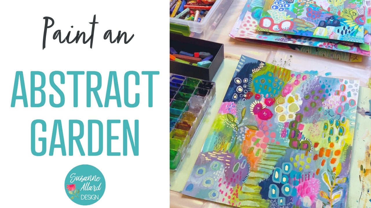
1. Class Intro: Hi, I'm excited to bring
you this class on color. I have been told for, I guess, since I started
painting four or five years ago, that I have such a
color sensor knack for color and I didn't really know what that meant or
if it was even true. I just knew I loved color. And so I've put together
this class to simplify it and debunk the myths
surround it's complex. You have to use a color
wheel and you have rules. Now, There's a few guidelines, but mostly learning about color and getting
confident with color is about exploring and playing and figuring out what you love, what color
combinations you love, what Kohut would colors
themselves that you love, how they play together, and how to be bold
with color and not feel like you have to follow
a bunch of rules does you'll know when it works
and when it doesn't. And that's what you develop over time, playing and practicing. So I'm not shy about color. This is a typical painting. I've just got a few here
that show you that the color is just something that
I love a lot with. And for me as a real challenge to do a quieter color palette. But everything, every
color can't be a star. You know, when, when a painting
is that way or when it, because it'll be in
that stage sometimes. Then you have to massage some neutrals
and things like that. But I have to go along with
this class, the e-book. And we're going to
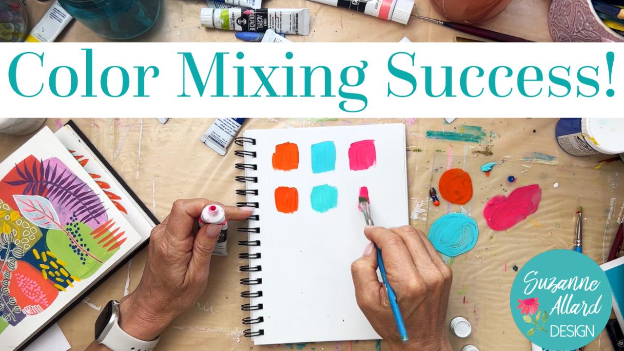
look at color mixing. We're going to
look at this chart that I created to help you discover a range of
colors within one q. And then we're going
to look at tips and tricks and some of my favorite
colors and how I mix them, or the ones that you just
can't mix and that you have to buy colored parties. So join me.
2. Color Tips Part 1: Let's look at some of
my favorite tips and tricks that I've just learned
by experimenting a lot. And you'll learn your own
tips and tricks and add them to your memory. It's like, it's like when
you learn anything new, you start out really
starts really awkwardly, like say learning to drive. Do you remember when you
learned to drive and you have to think about every little thing and now we drive and never
gave it a thought. Well, that same muscle memory and knowledge and intuition
will develop over time. And you'll, you'll be able
to make your own list. And I'm sure you
have some already. But these are the ones that I've captured in
them in the book. And so I wanted to share them with you and just
demonstrate a little bit. Number one is using a mother colored or main color
to create harmony. And this is something
that helps with composition and also harmony, just keeping everything together and you don't need a lot of it. So, for example, in this bread, I used a tiny bit
of burnt umber, a tiny bit in every
color in here. So I used mix the color I wanted and then added a tiny
bit of something. So it can be really tiny bit
of anything. You could pick. Experiment, you could pick a
coral red, you could pick a, you just don't want
to pick anything that's super highly pigmented, overpowering and burnt
umber can be that way. So just the teeniest
little bit gave everything a sense that even
though these colors are quite different, they harmonize. So that is something
I recommend. And you're, like I said, it's just you're talking
about a tiny bit. So let's say you're going to
paint with an orange, okay? And then you're going to use, let's say an aqua
in your painting. Well, if I say, I'm just going to take a
tiny bit of this sky blue. Then it's going to alter both colors and
every other color use. My orange seems
to be here it is. Dry, it a little bit. So here's my orange
straight out of the tube. And if I just had a
tiniest little bit, and this is a
compliment to orange. Blue is so it'll subdue
it a little bit. So there is my orange
with a tiny bit of blue. And let's take the turquoise and have a teeny
tiny bit of blue. Start with a clean brush. Just so that I can show you
a tiny bit of that blue. This turquoise, I can add little more of the blue because
they're in the same family. So I'm not introducing
a complement which is, could, you know, take
it to mud quickly. And so here's a turquoise
with a little bit of blue. And let's pick a third color. Let's say we wanted to use. I'm trying to think it's
something that's not, let's say an opera red, which is a really bright fluorescent color
that I use a lot. And it often needs toning down, which would mean
adding a compliment. But if we're saying we're
going to add a little bit of this blue there, every color. There's our Hombre
teeny bit of blue. If I add too much, I alter it. So just going to
grab there we go. Just wanted a little bit. And there it is
with a little bit. So if we take each of these colors just
straight from the tube, Let's see if you can tell the difference
between the ones that have the mother color
and the ones that don't. So here's the orange. Blue and my orange that
won't work at all. How did that happen? Remember? There's the orange
can see it's much brighter. Oh, I know what happened. I picked the wrong top on their goodness lesson
learned, right? And then I'll take
the turquoise. When I get a really clean brush, let me just get a new
one so that I don't. I'll do the experiment by using a brush with
some color in it. Here's the turquoise. And let's get the pink. So I hope you can
see the difference, which is that these
are all brighter, but they don't blend as well. They don't think
they pop and they, they kinda get to one of my next tips and tricks which
is creating for the brain. They are more jarring if
you'd look at it this way. Which is these three. They're a bit more jarring than when they've
been harmonized. So that is the mother
color concept. Let's look at the, keeping a bit of
color in the brush. Alright, so that creates
something similar in the sense that I will often paint and not wash out
my brush completely. I'll have a paper towel handy. And it depends what direction I'm going because if I'm doing say warm colors or reds, reds, yellows, oranges, I don't need to
wash the brush as much. And even if I'm
going into a blue, I can harmonize by just keeping a bit of
paint on my brush. So let's look at this one. Let's see what's the paper
towel gives it away because it's been sitting in
water while we Talked. And you can see there's
some pinky orange in there. What I'll do is leave
that and often I'll pain if you watch me paint
or take my classes, I'll just go from one
color to you via other. Over time you'll develop
that sense to not get mud. You'll know that you can't have a bunch of blue on your brush and then go into
orange, for example. So when you do a
complement colors, which are colors on the opposite
end of the color wheel. You have to make sure there's just a very little bit of that
compliment in your brush. Otherwise, it will turn to MC. So I'll be painting
along and let's say I'm painting some leaves
with this pink. I want to vary the
color a little bit. I know that I can
go into the orange. I still got pink and my brush and I can come back in here and the care and bringing
that together. Now, if I were to try to, with all this pink and orange on my brush,
grab some turquoise. Turquoise is not bad in
terms of because it, it will still be a color, but it's going to neutralize it, which it did turn it to a gray. But there's a lot of white and turquoise in this
turquoise anyway. So it didn't go brown. But if I were to have orange, now I've got a few different
things on my brush, right? I've got some
turquoise and pink. And if I were to get some
orange and then get too much of this blue
switch to that. You can see that it
goes pretty quickly. Now, you may want to
neutral like this. There's nothing wrong with that. Just knowing, I
don't want it here. Maybe I want it in the stem. Just knowing what
direction you're going. But I really don't wash
my brush that much. And that's developed over time. Now what I will
do though is say, Okay, I've got
orange in here now, right now I've got
mud and they're not going to watch it,
but I'm going to blot it. And I'll take my paper towel and I will get most
of the color out. Then let's see if I've taken enough color out that
I can do a turquoise or a blue and still get
a little bit of that bit of color
effect in my brush. Yeah, so here's blue, which is the sky blue, which is a much brighter color. Because I've got a little bit. Can you see that? A little bit of orange and
pink still left in there. It's altering it to
make it a nice blue, kind of a tone down blue. So that's just something
you learn by experimenting. But you don't always, I used to, when I started wash the brush
every time completely out, I realized that what that does is it can it can, first of all, a waste paint and it can create more of a
disjointed composition. Whereas if you just leave
a little bit in there, depending on what
you got and what direction you're
going color wise, which again, you just
develop over time, then you can harmonize better. So I've got a little
bit of yellow. I mean, I've got still got
blue and my brush see. So I know now since I know about color that
if I want a green, there's no sense in Washington that that blue ray that makes no sense because I'm gonna
be needing blue make green. And greens are usually almost always make rather than buy. So it's perfect to grab that yellow with the blue that's already in there
and make my green. And then I can tone down my green if I want by
adding a little bit of orange, which is a compliment, I could brighten it back up
by adding more yellow. And the sky is the limit. But don't necessarily think that you always want to
wash out your brush. Let's try it again. A
blot out without rinsing. So let's see, I've got some
green in there. Mostly. Green is a complement to orange. So if I string the page, if I were to grab
orange right now, I'm gonna get a
more muddy color. But it could be a pretty orange. See how it's a
little more muddy. And that's because I
had green on my brush. So it's just knowing and knowing
an experiment in really, because that's how you
develop that sense. You can get to where you're not really using as much pain. You're not rinsing as much. Here's I'm getting
some of that pink, but I've still got that
orange on my brush. But I plotted most of it out, so I'm getting the pink, but I'm getting some bits of orange in there, which
is a nice color. So that's the idea,
that's number two, the idea of keeping a bit
of color in your brush.
3. Color Tips Part 2: Now let's talk about
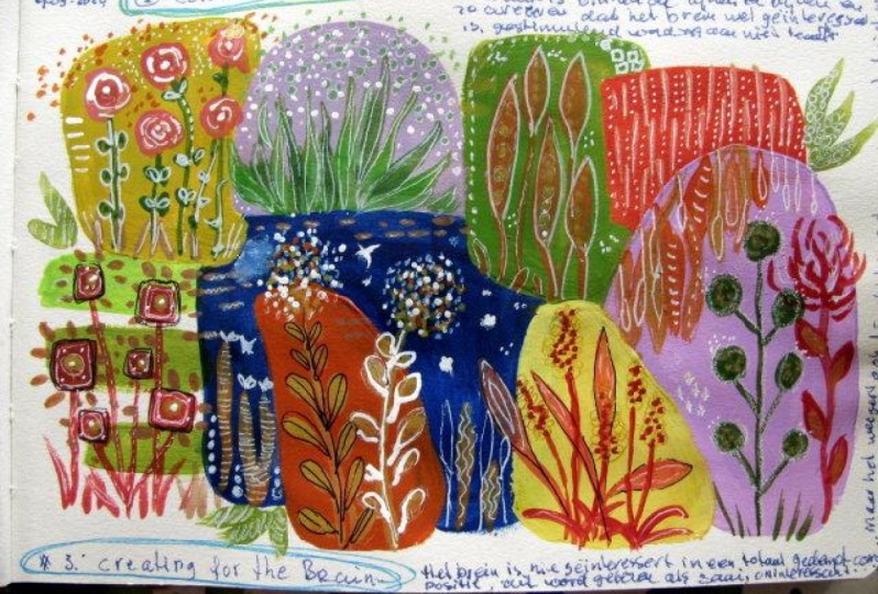
creating for the brain. So this is personal
preference as well. But we like to be stimulated when we look at something but not
overstimulated. And again, it's
personal preference or people who look at my work and it's
overstimulating for them. Like maybe not this one, but say that one because
it's very lots of color. That is something
that just overtime. Yes, this is stimulating. But it still works. And I think it works because there's enough to look
at those interests. It's not I don't know that there's a
place necessarily for the eye to rest. There are a couple of
places you can rest here. And this pot is kinda restful. But I definitely, my work definitely goes on
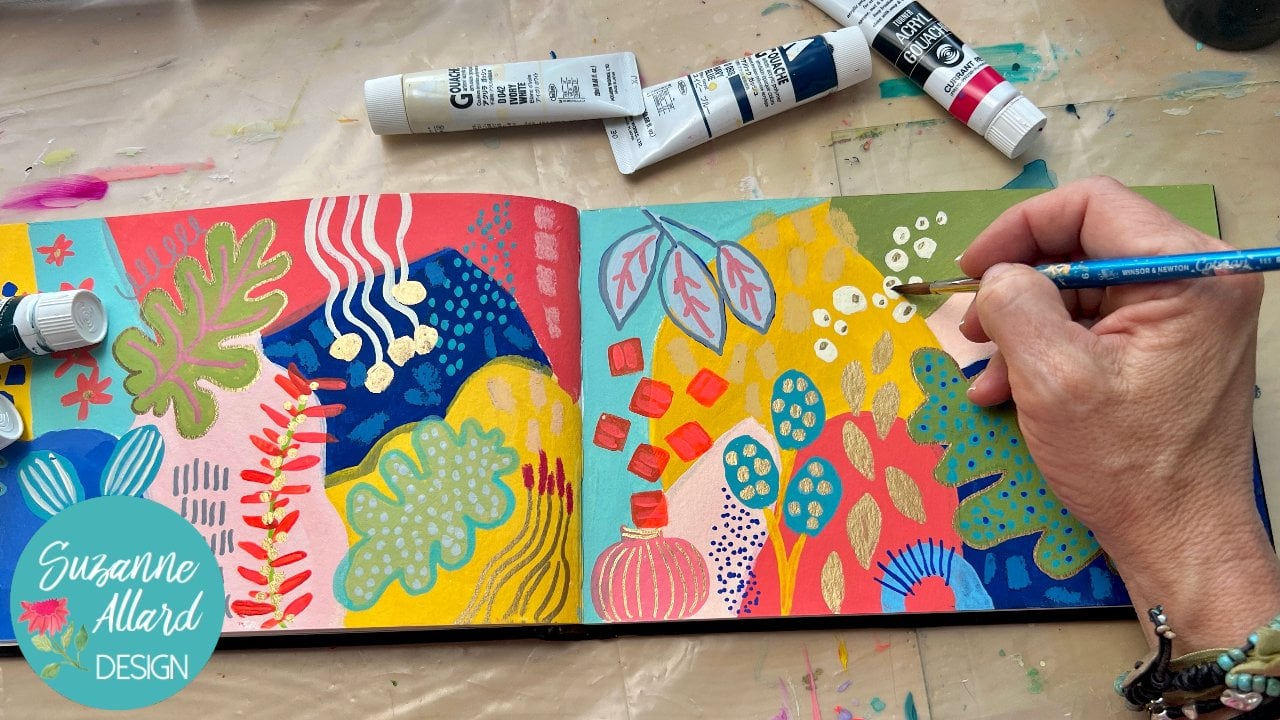
the side of stimulating. So a couple of examples. This is a painting in process which some might find
stimulating enough. They just might say there's
enough color in here, there's enough interests,
there's texture. There is, there's
plenty going on. There are much quieter paintings
that are sold every day. But for me this lack
something, it's not done. It lacks some kind of interest. I just think it's
a little boring. That has an opposite. Here's one that I did some
finishing details on. And what I'm thinking now is that I'm going to probably find some
ways to tone it down. Not necessarily the colors, but it is theirs. I don't feel like a place
to really rest at all. So I may even just
come through here with some get rid of
these green marks. So there's just some
plain blue there. I don't need much because I
really liked this painting. But just even along the
edge or somewhere here, a little bit of quiet space
will make a difference. So just think about creating for the brain enough
stimulation, not too much. Another example is,
this is actually a painting in process in
the class I'm filming now. And it's at the
overstimulating stage. So it's just, you know, what I know it needs is some neutrals to be
brought in like this one. And to just calm things down
because it's just too much. I've got the bright
background colors in the foreground colors
and it is lots of fun and there's nothing like if this feels good to you and
this is what you want. I just think it's too much. So that's a little
bit about that. Let's look at the
next tip and trick, Whoa, off white here, that's one of my favorites. Off wake. You can make off white and I'll show you in the color mixing
video how to do that. But it's a bit of a pain. So I usually buy it. Comes. Every company has a version. This is the whole
being ivory white. Turner gouache has
a high ivory white, I think they call it. This is just a map flow
acrylic that I picked up because the price is right
and it's a good quality. I'm actually going to do a
review on these soon on my, in my, my YouTube channel
because I like them. There are Matt flow acrylic. This is an bleached titanium. That's what it's
called sometimes I've seen it called phage, but basically an off-white. Now what I love about mixing
with offline versus white, and I'm not saying one is
better than the other, I'm just saying that it's a good tool to have in your
tool bag, is that light? We don't realize it, but when we mix white with something, and this is my white, actually I grabbed this way. That's my Jessica, which
I use this quite a lot, but I'm going to grab
this white gouache and show you the difference. White actually
cools colors down. And that's something that you just realize and
learn over time. So if you want a
warmer, lighter color, that's where an ivory
or beige comes in. Let's look at the difference. When we lighten with these two. Let's take our pink again. I'm going to make sure my
brush is nice and clean. And let's take this bright pink and lighten it with the white. Okay, there it is.
Beautiful color. Nothing wrong again,
I'm not saying that warm moist is
better than cool. Wait, I just wanted
to show you how it has given another dimension
to my color mixing. And now let's take the pink. We have ambit of the ivory. There's just a richness. I feel like that shows up. I think it's because you're
not just adding light, you're adding a little bit of all the colors that go
into making an ivory. And I'll show you a
color I'm mixing. It really is a lot
of different colors that go into making an ivory. So that's why I think
you get the richness. This just looks a bit more
flat, but it is brighter. So it depends on the
effect that you want. You could use the
warm light when you're working in
the background, let's say of a floral. And your brighter, your
whites in the foreground. To bring them up. As an idea, Let's
do one more color. Let's do the blue. So I'll take some
of those blue and add some white, beautiful color. With a warm white. You can see the difference. It almost has a
turquoise you feeling. Because in the warm white, there's probably some
green and some blue. And so you're
getting that depth. And that's just from
mixing it with warm way. I feel like I get a complex
color with a warm way. I think maybe that's the
best way to think of it. This is a more simple color and this is a more
complex color. There are times when you
want one or the other. Let's do one more color
because it's so fun. Let's try just a straight red. This is a poppy red
mixed with white. And you can play with this in my color discovery chart to okay, there's just a white with red. Shall go brush. I wonder if I had some ivory still on my brush
because that looks a little more high brioche. And we'll see the
difference here. Okay, so yeah, you can
see that creamy or child. So anyway, just another
idea for you to play with. The next tip is on
making colors your own. And what I simply mean by
that is sometimes, you know, you get creating and
you're just grabbing colors and you're putting
them on and that's all good. And if you're layering, they're
going to change anyway. But as much as you can try to refrain from using a color
straight from the tube. Because then I feel like
it's not your color. It's the color that the
company made, right? And if you want to
make it your own, just add something,
anything to it. Take it in one direction or the other in the color
discovery charts. Really good for
this, but like this, poppy red is really
pretty very, very bright. But if I add a little
bit of orange, I change it and are a little bit of the warm white or a
little bit of the yellow. I change it and it doesn't
need to be that much. I can still get a red and add just a tiny bit of something else
and make it my own. So here's the red, the tiniest little
bit of yellow in it, and the littlest
bit of white in it. And it just makes it my own, gives it depth and
all that to say, do your best to not use colors
straight from the tube. Now, I will say when I'm
highlighting with ivory, I often do use it. Well, there might
be something in my brush to whatever's
on my brush. I might have to the ivory. But usually I will add a little
something to each color. You'll get a sense of
that over time as well. All right, next is excuse me, developing the habit or
playing with the habit of using a bright turquoise or fluorescent pink or red
or orange underpainting. Before you even start.
These are wood panels and I have these bright colors
already painted on them. So that when I paint something,
little pops without, it'll probably be 99
or 98% covered up, but something will show through. Here's an example. This whole background, you can see some of it peeking through was a mixture of bright
oranges and fluorescence. And not much of it ended
up in the finished piece. I had some elements that I kept the negative space painting
here and here I kept up part. And the rest got covered
with either elements or this off-white ivory. So then here I scraped away the leaf lines in the background came through. So it's really fun to
experiment with bright colors. There is no right
or wrong color. Some people say it's good to use a complement as your background. So for example, if you're,
if you're going to paint a floral with
a lot of greenery, doing a red background. Or I have. But I've seen
landscape stone with a background that was hot
pink like this, or turquoise. And it looks beautiful. So just experiment with that. Bottom line is to play. Don't be afraid of color. It's a great thing
to play with on a day that maybe you have some time to play with creating, but you don't feel inspired to create any particular thing. Maybe you're not feeling well. Hi, I have Lyme
disease, chronic Lyme. So there are days are
parts of days where I am just sitting there going,
I don't know what to paint. So that's a great time
to just play with color. Do some color discovery charts. Think about moving a color in one direction or another
by adding other colors. And you will overtime develop
a sense of what you like, which will lead into
your color signature. So be playful,
experiment and have fun.
4. Color Discovery Chart 1: Let's do this color
discovery chart with red. And so we'll see
how it turns out. You can use any paint you have. I'm just sticking
with these acrylics and the main colors just to illustrate how the chart helps us learn how to
manipulate colors. So I've got some
cadmium red here. I just squeezed some golden, just basic cadmium red. And I've got it on
my palette paper. So I'm going to put
my starting color right here in the center. And I just printed
this on printer paper. It's a good heavy paper, but it's not the cheapest paper. But I think if you use just a
good quality printer paper, you should be fine. Or you can, of course, just take this the way this chart looks and just use watercolor paper or another community
and mixed media paper. Actually, I feel like
mixed media paper or Bristol paper is better for this exercise because
the watercolor soaks right into the, the paint itself, right into
watercolor paper and you can't mix it as well to
kinda get assumption. Alright, so now we're
going to take some red and add a cool dark in it. So we're going to add
some Payne's gray, which I have right here. And boy, do you only need a teeny bit of Payne's
gray to to do this. I mean, in fact, I'm just gonna go
like that because you'll turn it Black
pretty quickly. Payne's gray is a cool dark. So I can see just look at that even though
I grab just a tiny bit. So there's my cool
dark and color. Now I'm going to try the
burnt umber and do a warm, the same thing here,
just a teeny bit. Get some of my red. I can even put it
on here first and then grab a little
of my bird number. Smidge more. I want to make it the same amount of darkness
that I have over here. Just so you can really
see the difference between a warm dark
in a cool dark. Yeah. So we darkened it with the burnt umber which
made it a warm, dark look at the difference. It's the same color here. I think it's fascinating. Alright, now we're
going to lighten it. That's pretty easy. We just add a little
bit of white. I've got two
titanium white here. Obviously, depending
on your weight, your shape will be different. Sometimes I lighten
with a above white. I can show you that here
as well, just for kicks. Here's the regular way.
A little bit of red. And we knew what would
happen there, right. We know what it looks
like to add weight. But I don't know if you
didn't know that adding white mix colors
much more opaque. So sometimes I'll do it just
to increase the opacity. Because I love opaque paint. That's why I like wash. But you can see how
much more opaque this looks than the thick any of
these because of the weight. Now, let me grab my buff way
just for fun to show you. Because I do use a lot of
colors like this and golden, It's called Titan Buff, but usually it's called ivory. Like if I'm using my gouache
here it is in ivory white. This is a whole Bain aqua brush. You can make an awful way, but it's one of
those colors that I use enough that I just buy it. So they don't have to keep
mixing and mixing it, but I use it to mix. So let's kinda fun
to see what it does. Let's see what it does with the red compared to just
the regular way. It'll be subtle if we
see any change at all. And I'll just put
that down here. A little event bus. It's
almost like it my experiences, it's kinda like a worm. I guess it is a warm
white so it ends up lightening it in
a bit warmer way. Almost as if I added
teeny-weeny yellow, which of course is probably
what's in the buff. So that's what buff light. Alright, now let's go
over here to Brighton. Brighton, remember we're adding either a fluorescent or a
brighter shade of that color. So if I've got this red, and let's say this
is my cadmium red, but let's say I have this
quinacridone red light. And it, let's say it's
a little brighter or any red that's a
little brighter. I could add it to that
to brighten it up. But we're really
brightens it up. You can imagine because
the fluorescent and I have gotten more
into fluorescence lately. I usually turn them down. But they can do, they can really make things pop, even if you just add a
little bit, goes a long way. So there we have
brightened to the red. And of course you
can add as much or as little of it as you want. So now we're going to
subdue it, tone it down, create something that could
become a natural gray. And so we'll refer
to our color wheel. And all we do is go to red, which is right here, and look
opposite the red, green. Red orange is a blue-green. I just need to mix
it with green. I could also use the TOO
to that just for time. I'm going to grab
this oxide green. It doesn't really
matter what green. And then we'll see just
for fun the difference between the blue-green
but the red. So I'm going to take it again. It's only going to
take the tiniest bit. That's our red. Need to make sure I'm
using clean read, not read that they've
mixed with something else. So you're going to see how the complimentary color opposite on the color wheel will
turn down a color. Take the intensity of
it down every time. And if you keep going with it, adding more of it, you'll get, you can get, you can make
these beautiful neutrals. So when I'm thinking
about a color, Let's say if you
know my work at all, you know that it
gets pretty darn colorful and sometimes
I'm like, okay, Suzanne needed to throw in some neutrals here and calm
this whole thing down. Not every color has to be
a show of the painting. So I'll do this and
then had some white, which I'm not going
to do it here because I just wanted you
to see it this way, but I'll take the compliment and then I'd wait and
just get a really, I guess I can show you that. Let's go grab a piece of paper and show you what happens
if you add the red. Let me get a little more
red. And the green. I guess I need a little bit more and then a bit of weight so
we can get a pretty gray. Okay. Excuse you up here. Here's my white. It'll either be so you
can work toward a gray or a neutral, basically. Maybe a little more green. You can take it as
far as you want, but you're going to end up
with a nice neutral color. Same. That's red with its complement. And a little bit of why
you get what's what they call natural grace. Because you could
take your color, your main color, in this
case red and add some gray. But they end up looking flat, the back, the back gray just, it's just not as unique
and interesting, is a gray made this way. And doing that down here with the compliment will always
give you a muted color. All right, now let's
just for kicks, try the red with the
TO the blue-green because it is close
to it on the go. Opposite. These colors are interesting
to add it to the compliment. Anything in here, it's
gonna be interesting. So let's see what it looks like. I need to get more red here. And because my reds gotten
all mucked up here. When you're doing this exercise, we do need to clean out
your brush in between obviously to get a
true sense of it. Or you'll just end up mixing it all together and
they'll all look the same. So here's my red, cadmium red. I'm just going to add
tiny little bit of this TO they call it to you. It's beautiful color
by the way, the, the, my two favorite
turquoise is, are the Winsor and Newton gouache, cobalt,
turquoise light. Then if our acrylic,
it's this one, the Teal Blue Lagoon. Alright, let's add a
little bit of that. So that turns it down
and it's a bit cooler. Can you see the difference? That's because green
is warmer than TO, so we get a cooled
down version here. Anyway, you can see that
you could go on forever. You could keep adding
different things to alter it. And we haven't even
mixed like a color, a primary with a primary, this is just variations on red. So we'll do a couple
more of these, but I just love this exercise to be able
to see on one page. If I've got my red and I
want to warm it, darken it. I do the part number
one, a cool dark in it. I do the Payne's gray
lighten Brighton and subdue. I hope that's helpful.
5. Color Discovery Chart 2: Let's do another
color discovery chart and we're going to
do green this time. So I've got this just
kind of a basic green. I don't normally buy
greens, like to make them. But I thought I'd
see what this color was like and it's so, but we're going to see
how we can make it more interesting by
adding some things. Alright, so this
is our main color. It's called chromium
oxide green. So I'm going to paint
it here in the middle. These are nova acrylics, which are really nice
quality acrylics for the, for the price effect. I'm working with them now to do a bundle as Suzanne tailored
bundle for students. But I won't be choosing this green because there's
just no reason to buy a green like this, you can make it so easily. But for the purposes of this, I just wanted to show you. Remember when you're
doing this exercise, don't use a nice brush because you're just grabbing
paint on there. This is a cheapy, alright, so now let's lighten this. We're going to add some white. And I'm using acrylic,
but I grabbed a gouache hyper wash,
right, that's fine. Or I could use gesso
because my white. It doesn't matter for
this purposes of this. Just going to add a little
bit of weight to this. It's pretty predictable, right? What's going to
happen when we add some white square
brush might be better. This is just pallet
paper I have here. I like to fold the
sheets and half. So of course we can
add as much white. Actually, that really
makes a pretty color with just the white. Okay, and now let's see what happens when
we do a cool dark. So we're going to add
the Payne's gray. And I'm just using a
bit of water and then I'm loading my brush with a paper towel because
I don't have I don't really need to get
all of the green out. So here is the green
with some Payne's gray. I'm painting you
always want a dark. You want a difference in values, so you want the
lights and darks. And one of my favorite darks is a dark navy, dark, dark blue. I also like this kind
of a dark, dark green. Let's try a warm dark. And now I've got burnt umber on here and
I have the burnt umber, but I wanted to show you
also that this came in a kid sepia and
it's a dark brown. So how we're trying to do is
darken it with a warm dark. So if you have something like
this that came in your kit, that will work just fine. So I just thought I'd
show you any dark brown. We'll get you that warm dark. Here's our green. And add a bit of
that. Just a bit. Otherwise it'll turn to mud. And then, you know,
Chris, you can take this so many directions you
could have wait to these, and you could put those here and here and just keep playing. Alright, so we've
got our warm dark or cool, dark or light. Now let's do a brightened. I do have fluorescent yellow, but you probably don't. So let's use a light yellow. So the key to brightening it is, at least if you're trying to
go in the right direction, has a light yellow like
this as opposed to a golden yellow like usually called permanent
yellow or cad yellow. It's going to have more of a
golden tone to it like this. So if you have a lemony yellow
battle, brighten it up, you don't need to
have a fluorescent paper towel blot off the brush. Get some green. A bit of
this hansa yellow light. This is a great color. This will definitely
be in my bundle. So when we brighten it up, we can choose how
much we want to brighten it up by how much? Hello. Yeah. Yeah. So it's quite a bit
brighter than that. And then to get out the
complement to the green, we look at the color wheel, green here we go straight
across and we see that we can use red to tone it down. So we're going to grab some red. Just got a cadmium red here. My brush. Get some green. And just a teeny bit of red. It takes so little. And this green is already, in my opinion, very toned down. Which is probably why
I don't like it much. But we're going to turn it down even
further with some red. Just watch those
complimentary colors. A tiny bit goes such a long way. Okay, there is our toned
down, subdued green. So I would do this as
much as you want with different colors as you want to get yourself more
familiar with them. And like I said, you can keep adding. You can lighten
every one of these. You could brighten each one. You could take some yellow
and add it to these. And just have fun
exploring color.
6. Favorite Color Mixing 1: Alright, let's take a look
at my favorite colors. Now. There are colors that
I love, that I buy. I know I talk about having
a minimal number of colors, but over time,
look what happens. But you don't need
all these colors. But there are some that
if you like these colors, do you need to buy
him a turquoise is one of those for me. You can make it. But then we'll go through that. But I use it so
much that I like, and I just love collecting
turquoise in various forums. So that's one of them. And sometimes it's called turquoise Turner
calls at aqua green. Sometimes it's
called blue-green, I think nova colors. Blue green is more
turquoise than the color that they
called turquoise, which is right here. To me, this is more turquoise
and we'll play with this and I'll show you then. So turquoise is one of them, Payne's gray or dark blue, which comes in various brands. The Payne's gray are going
to be a little different. So for example, well,
I'll just show you this. I'll show you the Liquitex
basics, Payne's gray, but Payne's gray is really a blue black and navy
indigo type color, and that's what it's sometimes
referred to as well. Then Turner has this black blue, but it's my favorite dark. So that's why I like
to have it on hand. And then coral is
a color I love. And I particularly like
this coral the Turner, either in the regular
gouache or acrylic gouache. Again, you can make it
and I'll show you how, but I'm just showing you the ones that I go
ahead and buy now a color that a couple of colors
that you just can't make. Unless you have, if
you had a fluorescent, you codes that magenta. I know people. General knowledge is
the primary colors are red, yellow, and blue. And you can make all colors
from just those three colors. But if you've ever
tried to make magenta, I'm mixing red and blue. You can get a purple, but you don't get the magenta. So I buy magenta, especially if you
want really break. This is gonna be in
my Nova Color bundle. By the way, I'm finalizing the bundle colors, but that'll, I'll announce that
when I get to put together some magenta
is one of those. The other one that you'd
have to buy as fluorescent, fluorescent pink and
Nova Color or acrylics, or sometimes it's called
Opera read or opera pink, either any of those are fine. You can also get an inks. This is liquid Texas
fluorescent pink ink. And you can't make
these from red, blue, or from the
primary colors. So that's that. And then the last
one is the ivory, which I'll show you that I make. But I also buy because it's time-consuming
and I use a lot of it. Alright, so let's get to
mixing some of my favorites. Let's start with turquoise. And I've given you in
the, in the e-book, the, a bit of a recipe
for these colors, the ones that are
possible to make. So we will start with turquoise, which cerulean blue, and
a hansa yellow light, or any lemon light. In other words, it could be C. This one's called
permanent lemon. It's a cooler yellow
that you want. Not a warm yellow. Hello if you added a little bit, if you'd probably still work, but it'll, it'll take you
more towards the green. So if we take a little
bit of cerulean blue and we add
our lemon yellow. Let's see, I'm gonna
do this this way. I'm not mixing too
much. You can eat it. My brush a little bit. It's got some water because
I just watched them. And let's just try a tiny bit. So that was too much blue. Still too much. Wait a minute. I'm on the wrong direction. I got them. I get go backwards. It was not enough. I was thinking, Wait, I'm going
the wrong direction here. Where we're getting
her turquoise shades. And then of course, weight is in the little recipe. That's when it really
turns turquoise. Turquoise with like every
color is, has its variations. That's almost a jade. And you had a little more
of the cerulean and get a little more blue, turquoise. And you can just see
that you can take it. You can take a whole range
of turquoise colors. Lighten, lighten it even more. You can keep lightening.
But I'll show you. So that's a really
pretty turquoise. But I'm not discouraging
color mixing. I think it's a
great thing to do. But if I just go and
use my aqua green, this one definitely
has more weight in it. Let's see if we can get
close to it just for fun. Here's the one from Turner. We're pretty close. I think
we can get there if we just add more more weight. So I'm just going to blot out my brush, leave what's in it. I plotted it too much. Pretty close. Yeah. So that's the turquoise I
mixed and that's the Turner. But this is even brighter. So it just depends
on what you like. So those are the
two colors to get you there and there's
a whole range. Sometimes it's fun to just get a piece of paper
out like this and see how many shades of
one color you can make. How many tints? Tints
being with weight. Alright, so that's turquoise. Let's look at dark indigo. Dark indigo or Payne's gray. As I said, I did mix
this for a long time, is black and blue. So you can let me show you what the
Payne's gray looks like. First. Black in the jar, doesn't it? Let's get a clean
brush because that is going to have some
turquoise on it. That one is so stiff. This is for my junky brush jar. You know, because you don't use you don't want to use
your good brushes. Brushes for this
kind of activity. So here's the Nova Color. Let me lighten that up
because it looks black. But you can start to
see the color of it. You get a little light. You can see it's got
some blue tones to it. Okay, so that's the Nova Color. Just play. Let's just get this liquid
texts one out for fun. This is Liquitex
basics. Payne's gray. This one is less blue, so it's not when I
use it, I have to. I just use nova now, but I had already had this from before. And it's also not
as good a quality. You can see how much
more transparent this is, but less pigmented. But if I went, I was using this, I would add some blue
to it to get any blue. But a failure blue, dark blue. And you can still get
sort of a blue black by adding the Payne's gray touch, just a touch of yellow, blue and give kind of a dark
blue, indigo blue. Now it matches the Nova Color. Know what color is my favorite? Payne's gray so far. And the gouache, I, there is a color called black blue and
there's also blue black, which is funny
because I've gotten them both and I can't
tell the difference so that you can just do that. Or as I said, you can take
black and mix a bit of dark blue with it and
get yourself there. So that's Payne's gray. Let me get some black and blue and we'll mix
that and see if we can get close to the the tube colors for
the Payne's gray.
7. Favorite Color Mixing 2: I so seldom use black that
I don't have much of it. And actually I
really don't use it. And I had to figure out
where it was hiding. Okay. You can see it's like a brand new tube from
the original set. So let's take a bit of black. Before I found Payne's gray, I was mixing a blue like this. And let's say you had
a sudden it came with a Prussian blue or a
little blue and dark blue. Then you just, you can
experiment with how much of each color you want
to give to a navy. So there's a little bit of that. Too blue. I said more black. That's closer to white. Now it looks pretty
close to that. So that's how you can make
a Payne's gray is just to color as well, unless
you're going to add weight. Were indigo I call him
indigo Payne's gray. Navy. It's a bit darker
than a navy though. And let's talk about
how to make coral. Something bled through
their coral is, like I said, it
color that I buy. But if you don't have it
and you want to make it, you're gonna get a
magenta of some kind. Or, you know. Let's see. You can use a
quinacridone magenta, quinacridone red, or
just a plain magenta. So here's like a
primary magenta. We'll use this one and
then some cadmium red. Let's try. Let's see. Let's do you know how to
experiment with your read? Some reds will work, and some reds might not
lose a cadmium red light. It's a little more
on the orangey side. Let's see what that does. Because sometimes
there's a cad red, sometimes they can
be just dark and dreary and take it too
much in that direction. The wash out this brush makes
sure it's nice and clean. If you have a red like this, that's also going to be
in the bundle of an app. So crimson, that will also
produce a nice coral. All right, so and of course
we're going to have weight, so let me get some
lighter, right? So I'm going to grab a bit of this magenta and some
of this cad red. And this is just mixing two, you get the right
level of correlate. You want more white, darker coral, maybe
a lighter coral. You go. And I'll show you how that
compares to the tube coral. This one by Turner. I think it's got a
bit more white in it. Yeah. It's definitely
lighter than this one. But you could you
could get there just adding some more weight. So that's plural. Half
white, ivory or flight. All of that stuff. That one is interesting. You mix that by a little bit
of the three primary colors. Now there's so many shades
of ivory that you could, you could make something that's a variation,
It's a neutral. I don't want that
brush. It's got some Payne's gray in it. Let's get this nice clean brush. We're going to use
white of course. And then we're going to
use a tiny bit of red. Let's put some, they're
tiny bit of blue. A tiny bit of each on
my color, on my brush. It's going to look,
this got red, blue and then a
tiny bit of yellow. Got all three there. And it's gonna be too much. This is what happens
why I buy ivory because it's so hard to
just get a tiny bit. So then you end up
mixing more and more. Clearly, got way too much blue. So I'm showing you exactly
why I buy over here, although that's a really
pretty color in it. That's what's fun
about color discovery. So now I've added some yellow and went too far
on the Yellow Sea. Why you do another
pretty Kosovo. You could discover library
colors on the way. Let's add a tiny bit of red without trial,
without overdoing it. And lots of white. And we're finally
getting an ivory. There it is. So you see that it's white with teeny tiny bit of
the three primary colors. To get a nice ivory. Then to compare it with that whole vein I read,
I'll just show it to you. This brush. It's not clean yet, and I
really do need a clean, so I'm gonna get a
different brush just so I can show you the
color accurately. There's her home and I re I
liked this ivory just fine. That we made is just that, you know, by the
time you get there. Anyway, you can
certainly make it. So the last color that I
will show you how to mix, if you don't want
that to one of my favorites that if you
don't want to buy it, is a lime green, also called by
Turner fresh green. This one is the
Japanese lime colors of Turner called J light green. Turner's version is yellow, green, but this is to green. So I always add a little
bit of Hansa yellow to it, or a lemon yellow. But you can get a lime green by actually mixing
the same colors we mix to get the turquoise. But we're going to go
in the other direction, the direction I started out in, which is just a more
yellow and less blue. So that might even
work with what we have right here from earlier. Yeah, there it is.
So you're just doing lemony yellow again. Don't go with a
yellow of dark gold. I'll show you. So this is a very dark coat
on a candidate. Demonstrate this
a warmer yellow, but if you take
the warmer yellow, you'll get a nice
green is just not that lime green that I was
that I'm trying to show you. So I just want to show
you what happens. This is not a super warm
yellow, but it is warmer. And let's get our
tiny bit of blue. That should be enough. Let's see what happens. Yeah, so it's a pretty green
is definitely in the line, but just a little more subdued is all so you
can play with that. If you can change
your lime green from a cooler lime green to a warmer one by the yellow that you use. Whether you use a light lemon, they're called lemon
or hand side or light, sometimes to a warm
light hairs that okay, I'll show you an
example of a warmer yellow that's gonna
be in the bundle, the cad yellow medium. So let's mix that up. Get something that
is much warmer, get some of the blue. And we get Miami, but almost all of E2. So those are the
ranges you can see. I hope you can tell how that's a cooler lime yellow
and a warmer one. And you can play with
the color in there. Okay, so that's
how to either buy or identify or mix some
of my favorite colors. You'll have your own
favorite colors and that becomes part of your color
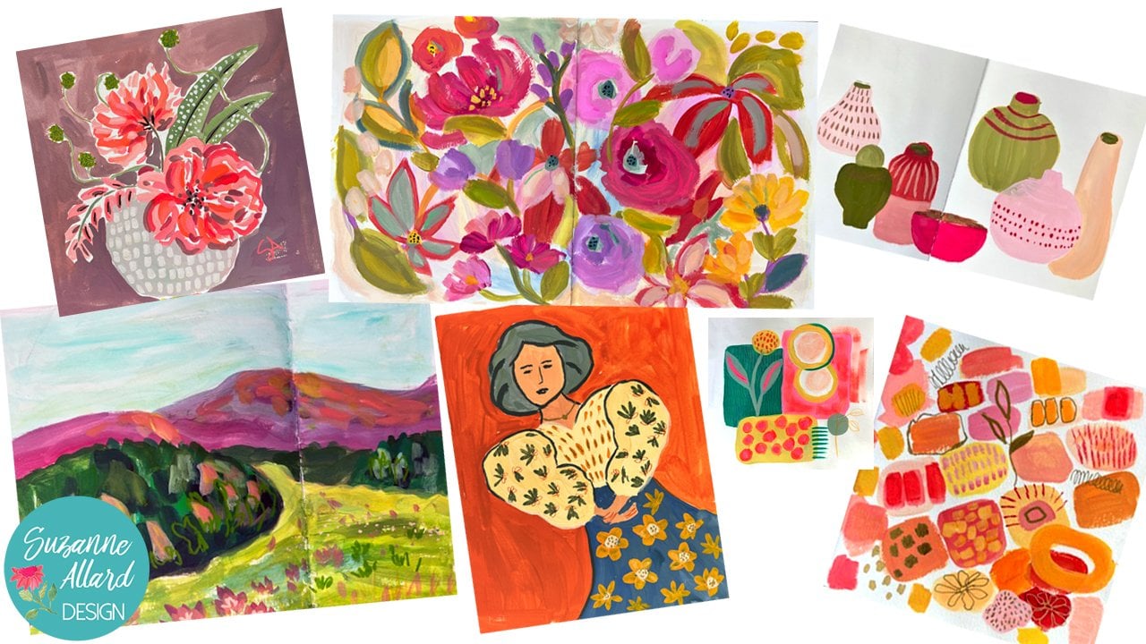
signature in your work. Sometimes I think that colors
the only thing that is unifying my work
because the styles, I change it, I liked it, do all kinds of different work, but I do have my
favorite colors. So over time, it's fun to play with
that and develop that. And I'm looking at this going, isn't that a pretty
little palette? So anyway, enjoy and play. So some most important advice
when it comes to color.
8. Final Tips and Resources: So I hope that you learn
some things and mostly, but I hope that you take
away from this class is that it's about playing with color and it's
a great activity. You know how you want to
progress and your painting, but you don't feel necessarily super creative
everyday or inspired every day or maybe you're
ill and recovering or tired. There's all kinds of
reasons that you might not feel inspired to
create a painting. Well, those are great
days to play with color. Literally take three colors and see how many colors can
you make with those three. And just get a sketch book like doesn't need to be
watercolor paper or sketchbook. It can be one that's
just drawing paper. Fans, long as you don't
use a lot of water, it'll work and you can just flipped or that
are just cheap paper. It doesn't matter if you're
just playing with color. And it can have to feel any pressure about
creating something, masterpiece or anything at all. Just like a color journal. And another great exercise is to look at color in a
magazine or in any object. And try to make that
color say, okay, this is a red, but it's not red. Reds are all different, right? So what is in this red? And it can help train your
mind to think warmer, cooler, brighter, more subdued. Is it orange in this? Now, I went the wrong direction. Let's see, You know what I mean? So that's a great
exercise to do. And also identifying
colors you love. Fat can happen when
you're looking at art work or anything. And you say, Oh, I
love that so much. Then ask yourself, why.
What do I love about it? Are there colors that I love, other color combinations
that I love? Are there? Like for
whatever reason. This is pretty common because
you see it in clothing, but pink and green just
really look great together. Now certain shades
of pink and green. So play with it, have fun, and keep learning, but don't let yourself get stuck in any particular
color rules. Is my teenage daughter
used to say, Yeah, Mom, you can wear
orange, pink together. I'm going to share
with you some of my favorite books
on color as well. And I have links to these in my, Most of them in the
supplies tab on my website. If you go to my website
and go to resources, it'll say supplies and books. And I have all my favorite
supplies links to those and look for the best prices
on those supplies. And then the books
are there as well. So one of my favorite books that doesn't seem like it
would be about color, is color me floral
by Kiana underwood. And these are listed
in the book as well. And what she does is she makes, in this book
monochromatic bouquets. And of course, my bouquets
are not really monochromatic, but I think it's just
really helpful to see some of the ways that
she combines florals. When she's trying to stick
with yellows or whites or pinks and even the shades
of pink and so forth. And her work is
lovely and inspiring. And so if you feel like florals, I think is a great color
slash floral book. And then this one
was also floral. Even though I've probably do, I don't know if I do more
abstract and florals or which way it is. But this is the
flower color guide. And it is this little book
that has a single stem, usually are two or three map
many organized by color. So sometimes I'll choose, I'll just use this as
a color reference. I'll just say, I
want to color idea. Nothing's coming to
me and I'll flip it, just literally
flip it up and go, That's pretty and
then make that color. So that'd be a good
exercise as well. And it also shows you these beautiful flowers if
you'd like to paint florals. And then a book, I'm
just pure color on that subject matter is the
secret lives of color. It's just interesting. There's a lot of history in it about and some quotes
that are great. But history related to color
and how will they were developed and how their origins. So just some fun facts
and stories about color. There are many other
references out there. But I'll also show you, even though I'm not, you know, I have this around,
I don't use it much. I do like this
particular color wheel just because you can turn it. And I think for our beginner, it's helpful to up
to see that when you mix yellow with a green, you've got a yellow
green and it's just kind of a, a nice tool. But you can also just
pull up a picture of a color wheel
on the internet or I gave you one in
the e-book as well. I just don't I don't
use cogwheel much, but I think it's a good
reference for beginners. Used it more in
the beginning once you know the
complimentary colors, That's really what I use it for. So I know that yellow is
a compliment of violet. Then I know that
those two colors, if they're next to each other, ordinary each other will make each other pop and that they
will subdue each other. So if I want to soften a yellow, I will add a little bit
of violet and soften it and so on and so forth,
all the way across. That's mainly what
you use it for in the beginning is just
once you memorize these, blue and orange are
complements and you'll know. But then you learn that really
anything on this side in the red to yellow will subdue anything on this
side and vice versa. Well, you could do it this way. So anyway, it's just a
fun tool to play with. It. Don't get attached
to it though, and don't feel like you
need to follow rules. I want to encourage you to play and enjoy and develop
your own color signature, which is gonna be what you love. It's not going to
be what I love. And you may be drawn to
my work because of color. But there's gonna be something, somethings that you
uniquely want to develop in your color signature. So keep exploring. Remember to stay loose. Have fun, and try to keep that judgy voice out
of your studio space, which by the way, can
just be a kitchen table. Studio space doesn't
mean a room like this. Wherever you pain is
your studio space, even if it's on a bench, outside, hits your space, meaning you get to
make the rules, you get to play, and nobody else gets
to tell you what to do. Isn't that great? Okay, Have fun.
 Suzanne Allard, Landscape, Floral, Abstract Painting Teacher