Transcripts
1. Gardenscape Intro: Hello, lovelies. Welcome
to another class. I'm Suzanne Allard, your guide, and my goal is to, in all my classes, you know, show you a variety
of techniques, paint a painting
or two or three, but really encourage you to pick out and look
at what you like so that you can develop your style and what really
makes your heart sing. And that way, your art comes
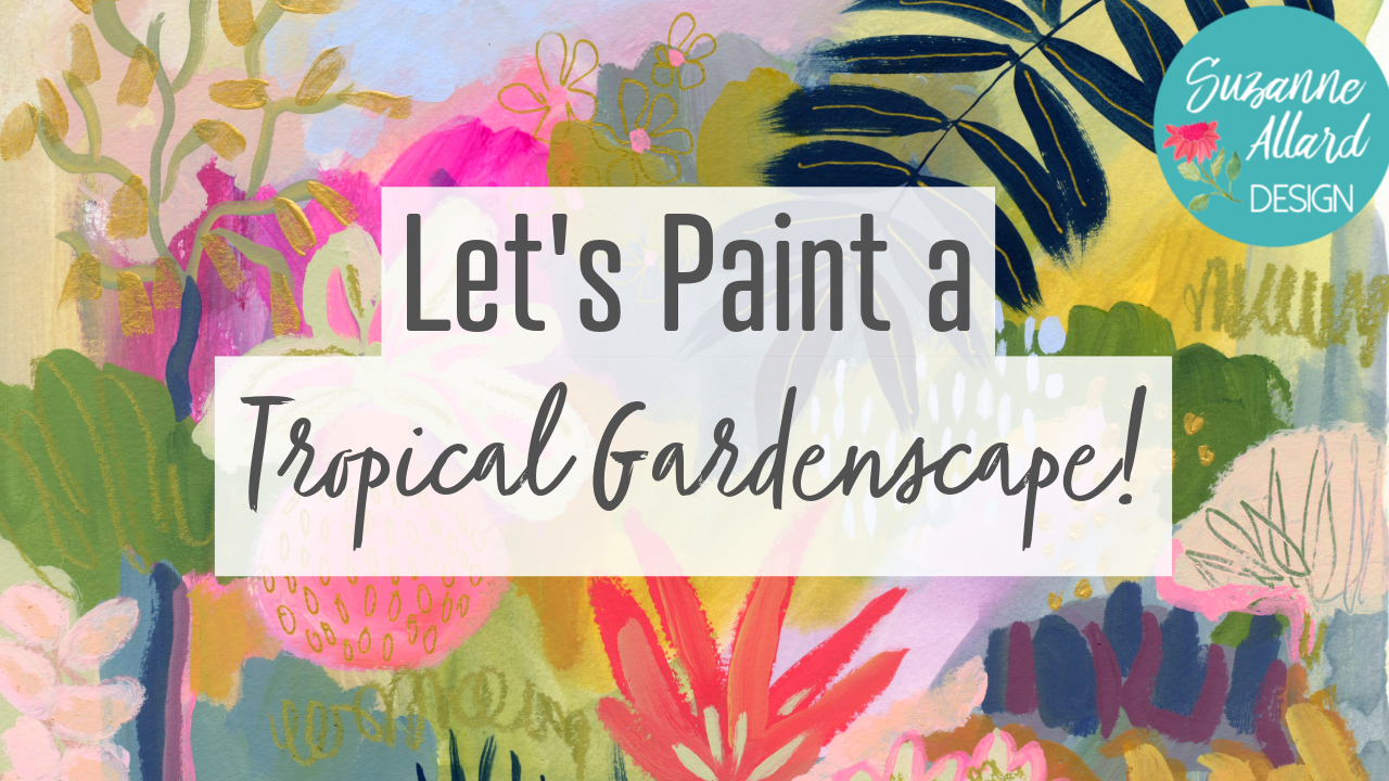
from an authentic place. So today, we're going to work
on a tropical gardenscape. I love creating
these garden scapes. We're actually going
to do one that I'm going to do with you
from start to finish. And then I've got
a time lapse of the recorded one I did that I'm going
to talk you through. So you can see that
there's multiple options, many options, endless options for creating these
garden scapes. You can choos different colors. You can choose
different elements, and you'll see it's so much
fun. You're so creative. You can use whatever
art supplies you have, keep it minimalist, or, you know, go maximalist, whatever you're in the
mood for. So welcome. I'm Suzanne Allard,
and I have been teaching now for
about five years. I started painting about
six or seven years ago. I think that's right. I started later in life
because I was too scared. I did creative things
like felting and needlepoint and spinning
and really cool fun stuff. It's just that painting
was this thing that felt like I had
missed the boat on. If you can believe,
I believe that. And so now I love showing people that
it's never too late, and that creating is good for the soul, which
is good for the world. And by the way,
we're all creative. Every single person is creative. There's so much creativity
that lives and kind of runs as a river underneath us that we never need to worry about
if we're creative enough. It's more about listening and giving some space to
that creative energy. So I hope you'll join me in creating this tropical
landscape or gardenscape, where we're going to play, talk about supplies, have
fun, and inspire ourselves. Okay. See you in class.
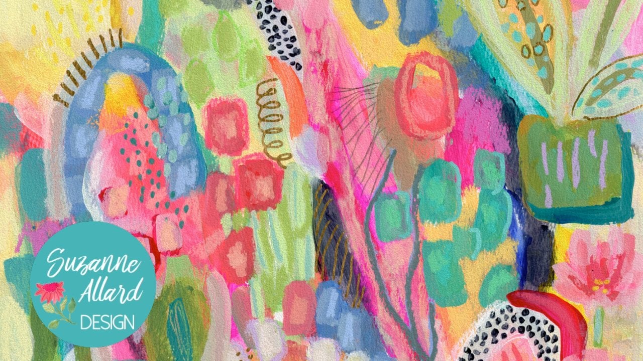
2. Gardenscape Project Video: So as I mentioned,
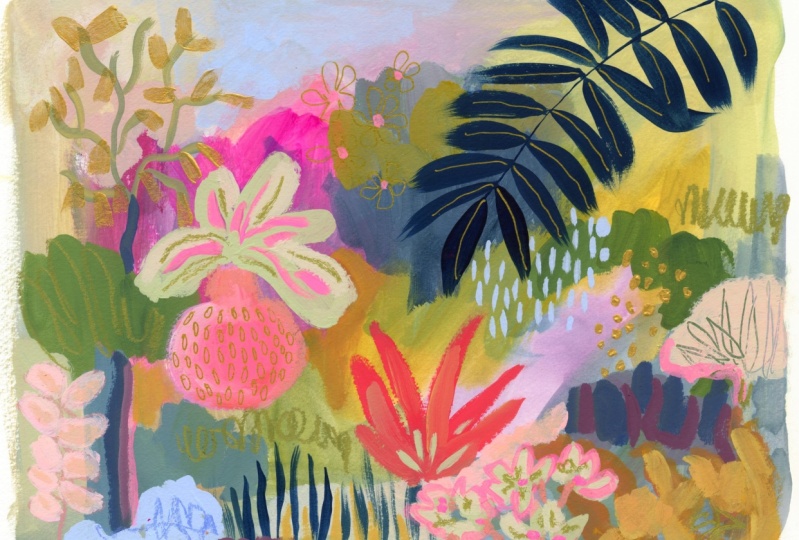
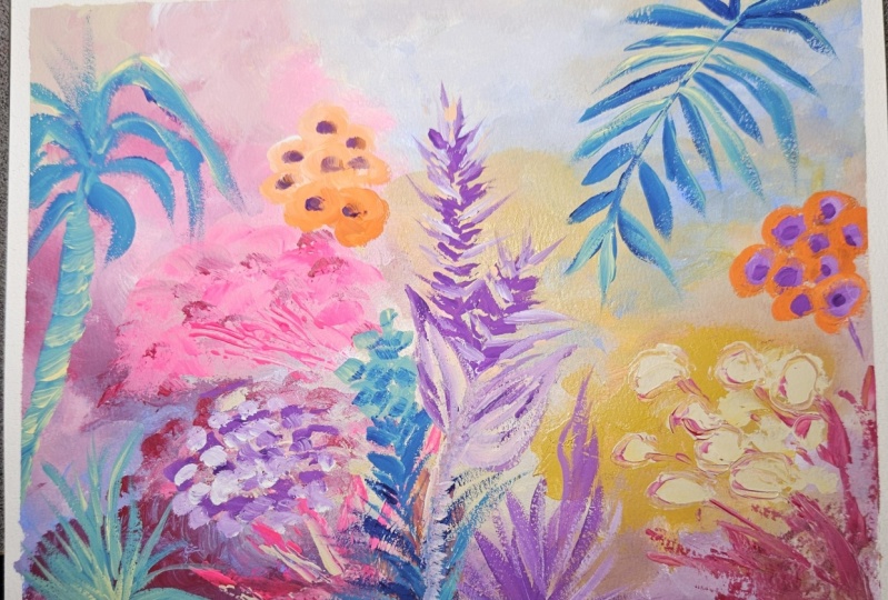
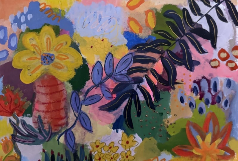
for this class, the project is a gardenscape. Now, I've got a couple of
examples that I'm going to give you in the class
resources as examples. This was one of the first
ones that I did that I loved. I did many I didn't love. But I loved how this
one came out and all of the different
bits and pieces. And then for this class, I started making more with
some of the similar elements, but also much different ones. And then the one that we're going to do in class, of course, we're going to create and it's going to look
different than these. But I'll include these. S examples of how you can
vary so many elements from the background colors to the elements that
you put in them, and then the little details
that we had on top. And so your project is to
create a garden scape. And to please put it in the
project part of the class, so we can all take a look at
what direction you went in, how you created
your garden scape. You can use any colors you want, any elements from your
own part of the world. I'm always envious of the people living in Australia who have these really exotic
looking flowers and bits, but of course, we can take any inspiration from
anywhere we want for these. So please do post your projects. I look at every
single one of them. I love seeing what you create, and let's get into the supplies
needed for this class.
3. Supplies Overview: Okay. So for supplies, I feel like I say this
in all my classes, but it bears repeating. I'm going to show you a bunch
of stuff that by no means, means that you I'm going
to move a little closer, that you need to get
all of these things. Please, no, don't feel that way. I just like to show them to
you because over the years, I've added them to my toolkit, and you might want to add some. So that's why I
show them to you. You could do this
project with just pain. You know, and an ink pen, and a pencil, maybe for details to keep it
really minimalist. So that's my supply disclaimer. Now, let me show you
all this yummy stuff. For paper, you can just
use a watercolor paper and I've put together
a supply list in the class downloads that has detailed descriptions
of all this, and This time, I made the supply links clickable to either my Amazon list
or my **** Blick list. That way, it's easier
for you to find. But you can just use
watercolor paper. This is Strathmore watercolor
paper. I like that brand. It's a good brand
at a good price. You don't really
need to go crazy. If you are going if you have something really
nice like arches, this is a good project
to use arches, because you're going to see
that texture of the paper. This is not a project you want to use cheap
watercolor paper for. I mean, you can for
practice, of course. But I'm just saying that you won't like you might not get, like the lovely texture. You know, a lot of my classes, we just so over the watercolor paper or
something like that for acrylic, and you don't need to the
paper almost doesn't matter. In this class, it does, because you're getting that
lovely texture. Another paper I like
to use sometimes is this decled edge
handmade paper. And I did put a link
to that also on the supply list. It's just fun. It almost feels like
fabric in a way, and it's just a
little different. It's just a fun
tactile experience. All right, so that's paper. For a palette, there's
so many options. This is, you know, what
you're mixing your colors on. I've really gravitated
to the palette paper. There are different
brands, but this again is a good one for really
good price on Amazon. But you can also use
just some glass. Make sure it's ideally
tempered glass. This is left over
from a photo frame, but it's got sharp edges, so I don't recommend that unless you put masking tape around it. You can also use a paper
plate that's got wax on it. You don't want to use
anything porous or your pate we'll just
soak into the plate. Of course, there are
plastic palettes that you can buy. All right. For paint. In this class, I'm using mostly acro gloch, which is a combination of
acrylic paint and Gach. Gach is a lovely paint that
has a very opaque pigment. That's what gets you
things like this just pop of color that looks really
opaque. So I love gh. Acro goch is just a
relatively new invention, and what they've done is they've added acrylic
properties to it. That means that once it dries, it cannot be
reconstitute with water. That just helps us
when we're layering. You can do this bottom layer
that's underneath all this. Then as soon as it's dry, you're ready to go and you're
not going to disturb it. You can do the same thing
with regular guash. You just have to let it dry
thoroughly and then not fuss too much with the brush
and disturb the layer below. You can also do this
class with water color. Your layers are going to
be a little more watery, and you wouldn't get
these pops of color. You can also do it
with just acrylic. And I use Nova color paint. I have a I guess it's
called a bundle with them. But a golden is a good brand. Liquitex is a good brand. Especially you can do the
lower layers with acrylic, and then if you
have a few tubes of goch to get that opacity, you could do that at
the upper layers. Okay. I also like
whole bin acro goch. I just wanted to show you
a couple of tubes of that. So these are my two
favorite brands of aca. And then I do it is
fun to have a gold. This is the turner. But you don't need
this because I'm going to show you
some gold pens, but if you like metallic
gold, I happen to like it. Then in terms of
brushes, I have here, I use one of my brushes from Suzanne R design set that I release
about twice a year. You can go on my
website at Suzanne and go into supplies and get on the wait list
for the next release. They're just, you know, I
need them the color I want, but the gold fare, of course. But none of that's important. It's just nice and soft. So as long as you have, these are a couple of
others that would work, I like these Princeton
aspirin brushes. They're not quite as soft,
but they definitely give you some play there. And then this is
relatively inexpensive, but I like it from a store called Michael's
we have here in the US, the Ferens, and that's
a nice brush, too. And then for your we'll see me work the smaller details
in something like this. These are two good ones.
Blick also Blick rt makes, and I have a supply list there. They make their brand
of brush is very nice. This is a three, this is a four. This is the Windsor
Newton Cottan. And actually, I found a link to a nice Windsor Newton
Cotman set that I put in the supply list that's got this, I've got a flat one, so it's kind of all you would really
need for this project. Use what you have, just
make sure or unless you don't have
anything and then you can get what I just suggested, but just make sure you have something for details like this, and then I like flat brushes. You could use a round brush. If you have you already
have a brush like this, that's fine. I don't
know what it is. You just find what you
like, and I really like painting with the side
of a flat brush and then being able to turn it this way and then this way
to get different marks. All right. Then when we
get to the higher layers, the upper layers,
we've added paint, we're ready for details. I like to pull out
some of my paint pens. These are acrylic ink and really just
acrylic paint markers. Posca is a really nice
brand. I put a link to them. You only need a few colors or you know how
these things are, the set ends up being the
same price as a few colors. Then the other brand I
like is this Tule brand. What I like about them is they have a much larger
color range than Posca. But I do find Poscas a
little bit more reliable. Like they all can get clogged. But I will tell you,
and by the way, I have a YouTube Canel with
all kinds of supply reviews, and I think I have
a specific one on Tule Markers and Poscas, and I show you how you can clean out the little thing
Majii if it gets clogged. What's that called?
The end of the thing. So it happens to all of them, but these brands, I find
it happens to less. And then I do use for
highlights and details, the neo coolor two crans. These are water soluble crans. They're just very, let's
see. You'll see me use them. I believe I will use
them, but I usually do. You can just add some
nice bits of texture. You know, I haven't added a
lot of details to this one. So let's just play,
and I'll show you. I tend to really like
this metallic gold one, but you can just do
things like this. And it doesn't ever
look metallic gold. It just kind of has a
color, that green color. And then might take
gold pen through that. So speaking of gold pen. I am a gold pen nerd
because I love gold, and so I did a YouTube. I don't know how many gold
pens and showed you them all, but this is what I've landed with for the best performing. Again, they're not perfect. They will occasionally clog, but they're much better than
the rest, in my opinion. So I've got the Pentel, and then these are both pilot a extra fine point and medium. Again, I have everything
in the supply list. Occasionally, I will
use oil pastels for putting some like yummy
gooey texture on top, just of something, like, say, let's say I wanted to put just a little bit
of olive color. You just get that
yummy pigment there, and then you can rub it too. I like this brand. This is from Amazon, and I
think it's on Blick two. And what I like about
it is they're pretty hard and they're
not super greasy like some oil pastels
that I've played with. And then you can also
scratch away at them. You know, if you say, I didn't want that much or whatever. But they are more permanent than the neo coolor toes because
these are water soluble. So if you don't like
a mark you make, you can just get some
water and get rid of it. The oils, it's not
quite that easy, so it's more of a commitment. But they give you that
really rich pigment. Okay. Well, let's see. I think I've covered supplies. Of course, you need
a jar of water. My favorite is this peanut old peanut butter
jar because it's plastic, and that just makes less
noise than the glass. All right. Let's get painting.
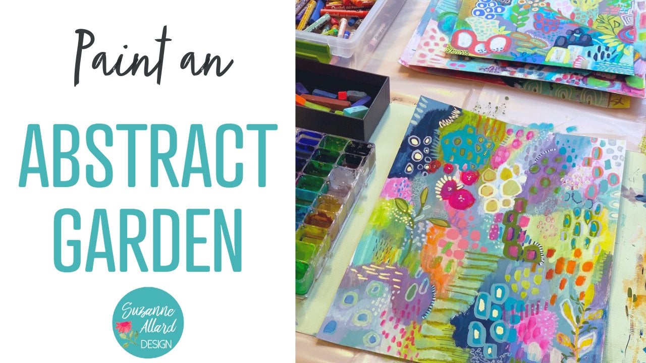
4. Gardenscape First Layers: All right, everybody.
Well, let's get started. What we're going to paint is
one of these garden scapes. I love painting basically
an imaginary garden. You know, I do have a real garden that I'm trying to keep alive right
now with this heat. But in these gardens,
once they're done, they look beautiful all the
time and I don't have to keep watering them and weeding
them or anything. So there are a lot of different styles and ways
that these can look. What we're going to do
today is you can use different color palettes
is work on one like this. You'll notice that I have also this decled edge
paper, and by the way, all supplies that I'm using are available links to them
rather on my website, sz.com and then on
the Supplies tab. But this is handmade
decled edge paper, it's lovely to work with. But today I'm going to
use this fluid block. Block is basically a pad of
watercolor paper that has adhesive several edges
and it just keeps it nice and flat when you're dealing with
anything that has moisture. It's not necessary.
It's just nice to have. I also have here
some palette paper. There's different brands of
this. This is Strathmore. It's just handy because once you're done with
it, you toss it. Or sometimes they make really
interesting collage pieces. What we're going to do first
is paint the background. I'm going to use a combination
of nova color acrylics, and a couple brands of
acyl gouache that I use. We'll talk about those
differences later. I have here a turner
brand and Holbein brand. Those are my two
favorite acche brands. Then I have a collection of brushes and some
mark making tools, pencils, and crans, and we'll play with those
a little bit later. For now, what we're
going to do is we're going to get
this background done. Then while it dries, which
just take a few minutes, then we're going to look
at the reference photos and I'll talk to you about
how I use reference photos. All right. What I want to do is if you look at the
background of these, it's really a mixture of primary colors that I'm blending right on the paper
and right on the palette. I've got some white out here. I grab some pines gray, which is a lovely, really like an indigo blackish blue color. I've got a little
bit of thalo blue. Ultramarine is fine,
really any blue you have, maybe a little bit of yellow. I'm going to get this
Indian yellow out that's so yummy and also
stuck. Which happens. I've got also a little bit
of quinacridone red ready. It doesn't matter what
brand you're using. I do advocate a
good quality brand, whatever you're using
because you'll just like the pigment results and much more if you're working
with a quality paint. But just pull out a yellow
or orange and some magenta, and a blue and your white
and we're going to use those primaries to blend and get a background that is just
loose and intuitive. I'm getting out some This is quinacridone red or
you could use magenta, and maybe put a little pop
but this is very intense. This is the fluorescent
magenta, which I love. Okay. My paint table
is always too crowded. All right. I think I'm
going to start with some of the paints and I like how I've
mixed it with white. On this first layer
of the background, I don't mind using a
little bit of water and making it a little
more translucent. And then I just dipped my
brush in the quinacridone red. I'm really just trying to
cover this white piece of paper with these colors and letting them blend
right on the paper. I'm going to go ahead
and do this border like I did here where I don't
go all the way to the edge. There's something
I like about that. I do tend to want the more intense and saturated
colors toward the center. Because I don't want someone the viewer who's looking
at this to be drawn off the page by a really
bright color, say over here. But other than that, I'm
just kind of putting down color and playfully blending. Letting bits show that I like maybe a yellow with the I haven't I haven't
rinsed my bruh. I have gotten water, but I haven't rinsed
it every color I've used so far as in
here, and I like that. It allows for the
colors to play. And did then you get some
nice neutral tones like that or is it a little
bit of lending? Then you get these colors
that just come out like this because there's every color of us so far as in this brush. Sometimes I find myself
in these thinking, well, this is the sky, it needs to be a sky color. Not necessarily. I just grab a little
more yellow just to get some variation there and
maybe a bit more here. This will be the first layer. Okay. That shouldn't
take too long to dry. I did not use a lot of
water, and that helps. So while that's drying, let's look at these
reference photos.
5. Gardenscape Inspiration: That you can download or hopefully did download
with the supplies, and you can take a look at
them. You don't need to. The way I work with references, it's not necessary
to print them out. And you'll see why when
I talk about them. Let me make sure I want to make sure that you can see these. Okay. Good. Turn the sideways. What I do is I take pictures of really
anything that I think is beautiful or inspiring or just captures my interest
when I'm out and about, whether it's botanical
garden visits, but even more simply somebody's
yard or a plant nursery, I've stopped in parking lots and taken pictures of just
anything that catches my eye. And here you can
see how the light I'm really fascinated with light and how it's
hitting these plants. This was the Naples, botanical garden, both of these. I loved how the light hit
these and the yellow in here. Then you have this pond
here with some blue. What I do is I just look
through this kind of thing. I might have it out to
give me an idea for a shape of an element in
one of these like here. Those yellow ones
have this shape. I might pick out something. This is from my mom's garden. She is a big gardener
and uses pots. These are just a few pots. Pots usually show up in my
paintings that just happened and I just love creating pots with plants or
even if just by themselves, this is also from her garden. And so you know this is a hosta. Maybe we'll do
something like that, or even the way this hosta is, the edge of those
plants, shapes. This is a tie plant
in Florida that I took incredible color. Another plant in Florida. This was in Michigan,
Northern Michigan. So I just encourage you to
capture photos like this. They'll be special to you where you see a
texture, a shape, a color, a grouping, anything that calls to you. This was from a recent trip my husband took to
hike the south of Portugal and I just loved the different fuzzy and textures. These leaves go up.
Sometimes you'll see I might do something
like that here. It just gives me ideas. But I don't take all these
out and say to myself, I have to create from these photos. I
don't work that way. I more get inspired by them and then start creating and just let the inspiration show up if that's why I'm saying you don't need
to print them out. You can flip through them. But if you rather
print them out, then of course,
you're welcome to. This is almost dry. I can dab it here because it's the background and maybe
that'll be interesting. Then the next layer, which I'm going to I'll probably use some of
these acrylics since I already have them out and probably mix in some
of the acro gash, which is an acrylic. It's just really opaque
and highly pigmented. I like it for these upper layers because it'll show through
in that way and be really just chalky and juicy
and chunky, but not thick. I don't know. I'm into it. I also love using It's often called opera
pink or opera red, and it's another paints is
probably a fluorescent, but it just seems to have more going for it than a
typical fluorescent, which they can be watery. So this is really
pigmented. All right. The next decision is
this next layer would be the shapes behind here. I'm just thinking about shape, color and I'm getting probably a little bit
smaller brush than I had. The big one that I did.
The background with was, I think it's painted over, but I think it's a ten,
and then this is a six. But it doesn't matter. If you
have filberts are nice two, this is what a
filbert looks like. Round. We might play with that. It can make the very natural
looking bush type shapes. But I'm really not
thinking about things yet. I'm thinking about The feel of what say that
photo from Portugal was like, but I'm not thinking, Oh, I need to make a shrub. Not at this point. All right. So let me mix up some of this hookers green
with some other stuff. I really never use
anything out of the tube. It's just much more
interesting when you play with adding colors, toning it down, brightening
it up, It's much more fun. I love the part,
the color piece. And even if you buy all kinds of
beautiful colors in the tube, you want
to play with them. You want to modify them because that's how
you make it your own. The minute that you make a color yourself, it's now yours. Let's see here. I'm just
putting in some bits of things. Maybe I'll do some ultramarine. J. It seems like that's
getting a bit dry. I still haven't washed
my brush this go around. I'm not a big brush
washer, apparently. I do like you have to pay attention to what you're mixing when you do that. You have to stay away from
going across the color wheel. Because then, you know, if I were to take this
and then go over to orange and go and if I wanted to just tone this
down, that would be good. But if I went and got too much, then then I turned into brown. But I like keeping seeing
what's on my brush. If it starts to get too muted or not what
I'm looking for, then I'll clean out my brush, but often I'll wipe it. I'll just wipe it and see if I can squeeze most
of the paint out of it. I'm thinking about what else. I don't have any thing
really, any light shapes. This might be a time
when I have to wash the brush just because
if I'm going to try to put some a
light color down and I've got paint in my brush
that's not going to work. I think I will put that down, get some white and
a bit of yellow. But I really want a very light. I love working with off white, which I often buy
just because you can mix it by mixing all the
primaries together in white, but it takes a while. I usually start with a ivory
or something like that, and then I customize it. A little bit more white. I'm mixing there's no
problem, as you can see, with mixing the acrylic
and the acro gah. They are both
technically acrylic. So but I've also mixed them
with regular, water color. No oil. Oil is just different. I just wanted a
bit of lightness. Maybe here two. So I call this layer two. It has a little bit
more color definition. Can you see that what that
fluorescent magenta does? It's beautiful and then you go a little bit
of yellow and you just can't stand it. I think that's probably
all I want to add for this and I can always come back and put
like here, on this one. It was after I added some of these more detailed
elements that I came back in and did these things to the background that I
felt that it needed. So you know, the background
is just a starting place. And so is this layer. So now I'm thinking about what elements since I
have this pink made, why not just put
a pot somewhere. I never want to put composition wise a main element
in the center. I'm always thinking of you
may know the rule of thirds, if you divide your painting
this way and then this way. Let's see how see if I can I feel like I'm playing
Lincoln logs. All right. If you divide it this way and this way, technically, your focal point should be around where these are meeting. One, two, three, four ish. Now, then you'll find someone who says, just forget all that. But I just when I take
pictures in general, I like to put something the focal point
somewhere in this area. I just doesn't look right
sitting right in the middle. I'm going to stick a pot
there and I encourage you to let go of any ideas about where something should be in terms of the element
that it is in your painting. If you want to put a pot in what looks like
the middle of a hill, we don't know what it is yet,
so don't worry about it. Try to free yourself
from all that. It's a lot more fun
and you end up with really wonderful
unexpected things.
6. Gardenscape Building Layers: I good. Dark in that. I might come back and make
that pop a little more. Let's see. I'm thinking about something that's got longer. Do I want to put this in here? I I like doing this palm
leaf in an indigo color. I think I'm going to use the
acro guage for that because it is more pigmented. What I'm doing is you can
take any dark blue you have. This is a prussian blue,
but you can take a halo or even an ultimate marine, you can maybe get
it a little darker, you can use a little
bit of black if you need to to make an indigo. Then I don't like a
really blue indigo. I'm getting water dripping. That's something to
watch, by the way. Because too much water will just water down what
you're trying to do, and when we rinse our brush, they'll be water here on
the feral and handle. And having something handy
to catch those drops, there's been many times where I'm doing this and the
textures just right, the consistency of the paint and then a big drop of
water lands on it. And it's not a big
deal with this kind of painting because you smish
it around and move on. But it's nice if
it doesn't happen. See how this is just too blue. You can take a
little bit of orange or or an orange or yellow
like this Indian yellow. And just warm it up
a tad, tone it down. That's using a
complimentary color to just take away some of
that blue intensity. That's just my something I like. I like the blue to
be a little less. A little more interesting
than just a straight blue. Okay. It's like a blue black. All right. Now I'm getting the right consistency because this element that I'm doing, I need a little bit
more watery paint. I need a round brush
where I can do details, and I need a light hand. And this is these
are really fun to practice just one evening
in front of the TV. You're not trying to
make this perfect because we know that
nature is not perfect. It does help if you haven't
had a lot of coffee, which I'm too sensitive
to coffee anyway, so I can't really enjoy it, but it will make your hand shake less if that's an issue for you. I'm putting down the tip of the brush at the stem and
I'm just pulling away. Again, don't get f even
where you start the leaf. If you look at a palm leaf, you will see they
go every which way and Don't get into that trap we can all get into of trying to make something look too symmetrical. Make a leaf go up like that or make one thinner
because it's facing away, things like that that you can make a couple of
them overlap like that. In this brush, the ends are all I'll show you
a different brush. These are feathered at the end and then this
came to a point. Part of that is the brush, but part of it's also that I'm just pulling away
and letting go. If I wanted more of a point, I would just pull away and
then more slowly pull up. But I thought it would be
fun to try this today. Okay. That represents one of the dark color is probably the main dark color that
I'm going to be using. You always want contrast
in your paintings? You want them to be
have value differences. If you find that a painting of yours is boring or is
just feeling flat, it's probably a value issue. There's probably
not enough lights and darks. There's ranges. You don't have to go this dark, but you just want to look at, do I have enough differences in value to make
this interesting? Let's see. Let's make some of those
little grassy things coming up here since I have the color all made
and ready to go. Can throw in a little bit of
white or just sometimes I'll des grab whatever else is on the palette that hasn't dried. You can also sprit
your palette paper with a little spray bottle
to keep things from drying. Here you're getting a
dry brush technique. You know, we can play with that. These little gardens
are a way for you to experiment, learn, have fun, and try not to get
too hung up on, is it going to be
a masterpiece that you will love and hang on the wall
forever because that's a creativity killer. Just move to the next thing and think about what
might be fun to look at. The next color. I
don't think I want any more of that magenta. It's so pretty, but you
have to balance that. Not everything can be No
every color can be a star. We need in acting. I've heard people say, you
need some supporting actors. Those would be your
more tone down colors. Sometimes I'll look
at the shapes I've made and say, well,
that's interesting. This right here almost looks like a tree trunk and
this could be the tree. It might be fun to embrace
that a little bit. Sometimes things show
up in the painting that you say, I'm going
to run with that. We need a little more
weight. Come down here. Yeah, that's kind of fun. And I'm just sing the white
out of the top. The only reason
these paints look good is they're relatively new. I'm a big double dipper. All right, I'm
going to switch to the acro gloch
because the acrylic is soaking into the paper. I didn't go this, but it's fine. It gives me the more
subdued and look, but it is soaking in and I want things now to
start sitting on top. And so since I did in your
paper helps a little bit, quite a lot, actually, but
you can also just use layers. And so I'm going to
I'm going to let this dry and then
we'll come back and we'll get some macro gross out and we'll do some
more elements on top. It's a good time to pause, let it dry, walk away, think about what you
might want to add to it.
7. Gardenscape Adding Elements: All right. I'm going
to get some of these acroch colors out. I'm just picking.
I've got the pink. I've got this pastel marine. It's just one of my favorites ultramarine blue. We'll
see what happens. I'm trying not to use every
color under the rainbow, which is a bit of a
challenge for me. So I'm going to t not
to pick up any hone, and I will be blending these.
We'll see what happens. This is a red brown. It's an interesting color. On the duller side, but I'm just going to get some primaries out so
I can do some mixing. This is just a red poppy red, and let's grab a Naples yellow. I've got some white. Let
me get a little more. All right, Let's
see what element? We've got this little tree here. Maybe we'll do kind of Well, I'm not even going to try to name what the plant would be. With some of this This
pink, this fluorescent, this opera red,
whatever it's called, and it brightens up any color. I like to use it as to
highlight something. I'm just going to
do a shape here. Don't be afraid to use a good quantity of
paint when you're using the to get that n opacity. It's going tone it down a bit. I'm just thinking of Remember that tie plant that I
showed you in Florida. I'm liking how the
edges of this are being the dry brush at the edge. Sometimes I like
things the opposite, really clean edges
and sometimes not. I'm going to vary
each of these a bit. I'm just throwing
in a bit of yellow, maybe ale bit of green. Okay. And boy, that was almost in the middle.
Got to be careful. Don't want to do that.
Let's see what else? You know, I think it'd be fun to pull something coming down. But I don't want
to imitate that. Maybe I'll just bring
something coming out of here. So I'll need a little
bit smaller brush. This is a four cotan. I like these Windsor Newton
Cottan for the details. There is so many beautiful
greens you can make without ever buying a green. Let's see here. Just have fun with this going
different ways. Now I can take probably, Let's see a little
bit brighter yellow. Or sometimes I love to get
into the metallic gold. Let's do that. This is,
and it's beautiful. So I did wash my brush for that. And I try to put this on when I use it pretty thickly so that, you know, it has more oomph. When I'm making
these gardens and plants and botanical elements. I'm really not thinking of or at least I'm
trying not to think, well, that doesn't
look like, you know, maybe that's not what
a plant looks like because if you looked
at plants and trees, there's really anything you could imagine and
I'm always amazed. I don't think
you're going to put something that
couldn't somewhere and probably doesn't exist. I wouldn't worry about that. I was going to darken
this stem a little bit. I love what that gold did. Gold is fun. It, it doesn't
photograph super well. Scanning it's a bit
of a challenge. There's a few things you can do. I'm just going to come
down the side of this. It's almost like maybe a shadow. And maybe a bit here
too. Just some shapes. When I introduce gold like that, I usually will put it
somewhere else as well. One way to do gold
dots is to take the back air brush
and the gold paint. You can also use a paint
marker, but this works. As long as it's thick, you can use the brush part too. I like these things
to be irregular. This forces that. I'm very obsessed with little
bits of metallic gold. I did a YouTube video
on just gold pens. We'll get to one of
those. We'll be using a gold pen here at some point. All right. I want
this to a more, I'm going to take a
bit of this pink. Maybe mix it with some agenta. Or let me see if I had
some whitish yellow to it. There's still a little
bit of green in my brush, which is toning it down nicely. Okay. That brought it
up a little bit more. We can think about what might be coming out of it.
Maybe something. Maybe something in this
pale green. Let's see. I like that. And I'm going to take this
green somewhere else. Maybe some little
flowers down here. I do think in terms
of odd numbers. I try not to make things too
symmetrical or too matchy. I think about just making sure there's a little
bit of randomness to things. I do like how that pot turned
out. Feeling like I want. Let's take Let's grab some cra. So if we can add some texture. This is the neo color
two metallic gold, and even though it doesn't show up as gold, it's one
of my favorites, which is why it's
smaller because it's just a nice greenish is the way it will look
on camera and in a scan, but it's just know,
something I like about it. Let's see. I'm going to let those dry and I can put centers in those. I feel like I need
something here. The thing I like about
neo colors is, you know, if I decide I like that, but I'd rather paint over it. Again, just paint
right over them. Feeling like I want a
little bit of Let me see. The other thing you go do
sometimes is step back and look at what it is and think about
what you might like to add. I think I'd like to
add some of this pen. This is the pilot. No, Let's say these two
are the pilot cold. This one is the Gn ball. These are my three
favorite cold pens I like them for line shape, I use them in all kinds of ways. So making some flower
outlines up here. And while you have it out, it's a good time to sign. Maybe a little bit of
pattern on this. Let's see. I do love pattern when
I do still lives. I have pattern on the pots and then a pattern on the wall
behind it for wallpaper. And then some places
without that. Otherwise, it's just too much. You could even
come down here and look how beautiful that gold
pen looks on top of that. Gold and indigo. Yummy. You can see I'm not
being fussy about these lines. I'm not trying to
make them perfectly straight or in the middle. Exactly. I do want to
keep them on the leaf, but other than that, I put this on pretty
thick so it's not, but I want to come back through. And then I feel like I
need something here. I'm going to get this brush off. Maybe a little. And bring
a bit of this down here. See what I mean by
how the pigment of the acro glass will just pop.
8. Gardenscape Details and Finishing: Okay, I like that. Maybe
a little bit of it here. Maybe more watered down. If you ever put something
down, you think, Oh, that was too much
or I don't like it. I Gach does dry darker. But you can just
dab it like that. The whole acrylic family
is very forgiving. Fingers work, too. Okay,
this is getting to dry. You go to put some bits
with the pink in there. And maybe some
pink centers here. Just some to have a bit
of color over there. I do think I want to paint this. See if I've got a really,
really pale pink. See what that looks
like. Maybe just tone it down with
a lively yellow, that's a little bit more peachy. The idea is that this is you're having a
playfulness to this, a looseness. You're
experimenting. There are going
to be things that you do in them that
you don't like. And then they'll be things that happen by accident
that you really like. Those are the
things that you can notice and play with
more next time. I'm liking that pink there, so I'm trying to figure out
where else I can put it. Maybe down here. I didn't mind this
side being dark, but I felt like I don't know. I wanted to experiment
with something over there. My turn out to be a
good idea, I may not. I just wanted these leaves
to have a little more shape. And sometimes I find things are really helped
by a second coat, especially if it's just feeling like it helps to
bring things out. At this point, the
process is really about deciding what needs to be brought forward or added and what needs to
be pushed back. Sometimes you need to walk
away often, actually. You shouldn't expect to do something that you love that's
complete and one sitting. That's just too much pressure. I often walk away, I walk away sometimes for
especially my sketch books. I might not look at
that spread for months. And a good time to walk away is if you start
feeling frustrated. I'm not saying that I'm
feeling that right now. I'm just saying that
that's what I've learned. Because if you start
getting frustrated, then first of all, then you're
not having fun anymore. And you probably won't
have the best ideas. I just turned that around and used the end of
my brush for a to kind of get cut through
that paint because it was too I wanted
more texture there. So now I'm going to hold it up. This is getting
close to being done. And decide if there's anything
else that I want to do. I think see if sometimes I
just pull out of my stop, like these oil pastels and see if there's anything
that wants to happen. I can go over something gives a little bit
different texture to it. By the way, if you
do oil pastel, like that was too yellow. You can just do this. People have asked me, how do
you get rid of oil pastel? Once you put it on, you
just scrape it off. For the most part,
it'll come on. Someone else so T you know, oil likes oil, so you can take. And I've done that. Let's see here. I feel
like I want some bit of This is Coral. Then I think it'd
be nice to have some Let's see what
we think of it. We put some of these
centers here in these flowers and
see if we like that. A trick is to do something
like this where it's not as pigmented and that
way you can decide, that's enough, leave it or add more pigment
to a second coat. Sometimes I just like to
outline things a little bit with a bright color. And we're getting to the point where I'm definitely going to, you know, wrap up walk away. It feels moly done. There might, you
know, that gives us time to come back and say, Okay. Is there anything I did
that I want to change? Is there anything missing? How are the values looking? Do I have enough
lights and darks? Do I have enough variety? Do I have some small elements
and some larger elements? When I look at the painting with a fresh eye, where
does my eye go? Don't forget you're a viewer. So you can test that out. And but I recommend walking away and even an
hour later looking and then asking yourself that and become aware of where is your eye
going on the painting? And if it's stuck in one place, what do you need to do to
get it to move around more? So I can get stuck in one place because it
really likes looking at something or I can get stuck in place because it doesn't
like what it's seeing. Both of those are
great information that you can then work with and it's a process of just continuing
to play with that. Until people ask me,
when's the painting done? That's hard to answer.
That's a personal thing. But generally, I for me, if I walk away and come back another day and
nothing is talking to me. Nothing saying, this right here. No, or something's missing here. Basically if it's quiet, it's hard to It's
like the painting is quiet and happy and it's
not talking to me anymore, then then I feel like I'm done. And that can take more than one pass,
more than one sitting. All right. I'm going to put down the brush after
what I just said. Right after I fix this. And walk away. But this is certainly
mostly done. I might not do
anything else to it because you can do
a little too much. Even I can decide that there's
too much of something. I might not seem like
it, but All right. Well, I think that
we are going to walk away and sit with this one. I'm really glad you join me and I hope that you
play a lot with these, that you try different
color palettes, that you try more
watery backgrounds, and then maybe more
opaque backgrounds. You could try one with no
background color or a very, very transparent, loose
one, almost water color. Then you can play with using
different reference photos, different materials,
different supplies, different ways of
conveying texture. You can I help you do a whole
series of gardens capes. Thank you so much
for joining me. And I can't wait to
see what you create.
9. Bonus Time Lapse Gardenscape : So in this time lapse, this was a recording
and via Zoom. And so the recording quality is a little you can see a little bit kind of comes in and out. But I wanted to at least show it to you and talk
you through it so you can see just how flexible this kind of
gardenscape idea is. You can see that I started with, you know, different
color background. You know, somewhat different, again, very letting the
colors blend into each other. And then now I've let that
dry, that background layer. Now I'm coming in with
some greens and thinking about these are still
the backgrounds, but they're starting to come
more forward and I'm really just intuitively
thinking about if I were looking at a garden and
using my other piece, the ones I'm including for inspiration or at least
a couple of them. That way, you can see
just the variety, and you can grab any
inspiration photos you have. Of course, I've given
you plenty, but, you know, your own garden
or your own plants. Maybe there are plant
shapes that you like, that you just like seed
pods, for example, I think are just amazing, like a poppy seed pod. And then you can
see that I threw in some squiggles really
kind of on top of that pod. And, you know, not really
thinking about oh, is that going to be
coming out of the pot? I mean, maybe it will. Maybe
it'll be something else. And trying to keep playful, but each layer that
we go up higher, we're adding more
and more detail. Here I'm looking at how
to keep that brush flat, depending on what
you're about to paint. Sometimes it gets so loaded
down with paint, it gets fat, and you just feel like you have a big glob
at the end of your brush, and so I'll scrape it against the end of the palette or take a paper towel and
squeeze it out. I don't really rinse
my brush a whole lot. I'm looking for ideas, your sketch books are good ideas because I'm trying not
to make this look. You can't make them exactly
like another one anyway, but I'm trying to vary this one and sometimes
colors inspire me, just getting out a different
color and mixing a color and will give me an idea of
something I want to create. So shape nature. Here I'm putting in that indigo. Leaf, which here I use
the smaller brush for, and it's just so
fun to create that. That's something
you just practice, take a sheet of paper and
just make these long fronds, you know, several of them, and you'll get that that control in terms of
pressing down and lifting up. I love making indigo. I take usually either
a prussian blue or sometimes you
can buy an indigo, but even the digos you buy, I tend to need to add a
little bit of orange to just to soften them a little bit. They're more of a rich indigo. For you, it's about figuring out what are your colors that make your heart go pitter patter. What are the shapes and color combinations that just kind of take your breath away. And you can find that by experimenting with
lots of color shapes. You can also find it by looking
at other people's work. And notice what really
gets you excited. You saw I put seven
leaves on that. I always do odd numbers. Using the same materials here. I may use a few more
posca pens at the end. Got my gold pens, of course. And just thinking about, where do I want to
put more things? And what color will they be? Can I mix a color
that gets me excited? And it shows up.
I decided there, I needed to darken that a little bit to
get it to show up. And I think about that too. Do I want it to show up in a very bright way or
just more subdued way? These pedals are showing
up a little more subdued. That's contrast. The navy frond is
high contrast, right? So trying to balance
how much high contrast, low contrast areas you want. I'm just playing with the opera pink here and figuring out, do I want it anywhere else? But I decide to get out
this pale marine blue, I think it's called
that I love so much. You can see how you
could do one of these in any color scheme you wanted
to match any room you wanted. The worst that happens is
you don't like something. Let's say I had
painted that pale blue bit and I decided
I didn't like it. Just let it dry completely and either make some
marks over it with a neo colored cran or a paint in some other color or cover
it completely with paint. I've learned over
the years that I can change how much something comes forward or backward by
A putting marks on it. And there's more ways than one to cover to bring some something
forward or take it back. You don't just have
to put paint over it. You could take, for example, using that again, that blue. I could take the thin golden pen and just make lines through it. Just that would push
it back a little bit and give it some
interesting texture. Here I'm taking a mustard color and it feels mom painting. I mean, I know this is sped up, so it looks even
more like dancing. But it gives you an idea. It's interesting to watch
it sped up because you can see how I do dance
around the painting. I mix a color I like. Now I'm saying, Okay, I want to put that
navy somewhere else. I want a bit of that high contrast color so that it's not too weighted
toward the one day leaf. I'm finding things
to do with it. Inspired by nature. Can you be surprised how much
just a few little lines and dots of contrast I'm
always surprised, can sort of unify something. There in my little
reddish plant, I felt like it needed
more leaves and like the more definition. So I went in with
some darker red. And then as I was saying, I've mixed the color, so
what else can I do with it? There's an example of, I did that and I didn't
really like it. So I covered it back up with the pink and I'll move elsewhere while it dries and then come back and think of something
else I might want to do. Now I'm pulling
out The big guns, my favorite metallic pens, which I'll put in
the supply list. I use two weights. Actually I have three gold pens, a thin, a medium, but the medium and the
large are the same brand. Then the thin one
is another brand. I've just tested so
many over the years, and these are none
of them are perfect. I'm not saying they
don't occasionally clog, but they perform better than anything else
I've played with. I just love the pop they give. Now I'm taking some
colored pencil and I use either a prisma color or if you want to spring for
something more expensive, the luminance by Caran dash. Here I'm taking my
fluorescent posca and just doing some little bits. I was thinking about, do I want to do anything on that pot? I go back and forth on that. I love how it's just that color. And then some things
should be left alone. Not every single thing
should be covered. I like also what I'm doing now, which is very subtle
with an ivory colored. Actually, it's a
really, really pale green paint marker and
that one's by Tule. T OLI. I will put, like I said, links to these
things in the supply list. The Tulee markers have a much better color
range than Posca, but I think the Posca is overall a better marker.
I end up using both. Here I'm taking some
neo color pencil. I mean, it's Karen dash. Super color, I
think it's called. I just colored in a
bit of turquoise, but I didn't want
to use every color, so I kept turquoise out. Now there's an example where I did that with Posca marker, but then it was too bright, so I just dabbed
some of it away. As long as it's still wet, you can pick some
of that color up and I got the effect
I was looking for. Then I pick up my
gold marker again. And take the thin one
and do some outlining. There's nothing like line dot outlining to just kind of
I'm still thinking about, do I want to do
something on that pot? So again, no harm done even now, I will say the metallic pen is a little harder
to paint over, but you can still paint it. But I went ahead
and did little bits of flower outlines on the pot, which I ended up really liking. You can paint over the metallic, it is that you might
need a couple of coats because it's pretty intense. You saw me spray
my paints there to keep them going and Isn't it fun to look at the palette
and then the colors. Then it's good to also look
at your palette and say, what can I mix that's
already on there? That helps keeps things
unified as well so that you're not you're not bringing another new color and another new color and another new color. You're forcing yourself to mix from what's already
on the palette, and that can help with things being a little
bit more unified. At this point, I
could stop anytime. At this point, I'm tinkering and giving things time to dry, looking at it, looking
at the composition, does it feel balanced? Is there anything that
feels like it's missing? And I'm feeling like It's
pretty much looking at, do I have any ideas in that one that I want
to use in this one. And this is personal
preference totally. At this point here you can say, Okay, I guess I decided, that I wasn't thrilled with
all that purple over there, and so I held my hand over it. I do that sometimes. Then I can say, h. Yeah, I think that
would be better with that. It was drawing my eye
too to that side. This is that point
where I'm thinking I can't remember the famous
artist who said that most of your creating is done
by just looking and feeling responding
to what you've created and deciding if
you want to keep going. I think I'm looking at
my iPad to see if there are more reference photos ideas, but I ended up being
really happy with it. I just wanted to show you this and hope it shows you that you can take this
in a lot of directions.
10. Wrap Up & Resources: I hope you enjoyed that
and saw the possibilities and how much fun it is to
create these garden scapes. I'll probably be
doing some more. This was the tropical one. Maybe I'll do we go to
Michigan in the summer. Maybe I'll do that, or
maybe We do we'll get some inspiration from
Australia and do an Australian gardenscape.
I love that idea. Anyway, I have a
couple of links to two different varnishes
that if you choose to do something to
protect the painting, one is the crylon
workable fixative, spray it per
directions on the can. And then another
one that I like is the spectra fix that is
completely non toxic. I could sit here and do it
right here in my studio. It takes longer to dry. And you may need a
couple layers of it, and it's a little pricier. But it's nice to
have, if you don't have a way to get outside or
if you're really sensitive. And I want to make sure
you know about resources. I mentioned the YouTube
channel at the beginning. I also have a newsletter
that I try to send out once a month
with studio updates and just essays on
the creative life, and maybe some of my travels. It seems like it's slipped to
more like every two months, but anyway, I have different announcements
on there and pictures and so
forth, inspiration. So, I have many other
classes here on Skillshare, so I hope you check them out. I'm thrilled to have been made a top teacher
here on Skillshare, which I worked for really
hard for over five years. So I want to thank you, my students for
helping me get there and just can't wait to see what kind of
gardenscape you create. Remember that creating
is good for your soul, which is good for the world, so never feel guilty about it. Okay. Bye.
 Suzanne Allard, Landscape, Floral, Abstract Painting Teacher