Transcripts
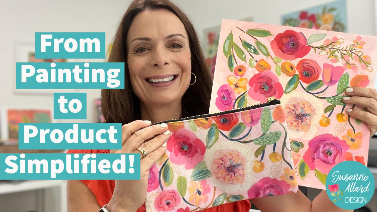
1. Course Introduction: Have you ever dreamed of
seeing your art on products? It is so much fun to
make this happen. The challenge has
always been to be able to do this
without having to buy expensive equipment
and software and learn how to make technical
repeat patterns. It's a lot. I've worked on that for you
and simplify the process. Yeah. I'll show you a variety
of ways for both capturing that high
resolution image and preparing it for printing. But first, we're going to create a floral patterns specifically
designed for products. I'll show you how to
go from this to this. This pouch is just one of the many products you've been
ordered with your artwork, there are dozens and it's so exciting to where your artwork or have it on items that you use every day around the house. Hi, I'm Susanna alert and my passion is creating
art that exudes joy and encouraging you to
express your creative spirit, which I believe we all possess. I didn't start painting
and tell us about 52. And I've learned just about everything and online classes. Just like this. I now licensed my
art for products. I sell originals, prints and various products
on my website, as well as teaching online. In fact, I now have over 34,000 students online
around the world, which just blows my mind
and it makes me so happy. I used to be terrified though, at the thought of even
learning to paint. Not that many years ago. I had always done
something creative, like knitting and
crocheting some clothing. But I thought painting was for real artists and I didn't
think that was me. So that's why I've become
the teacher that I needed. A super encouraging
and real person, relaxed, fun, supportive,
not overly technical. As a teacher, I pay attention
to the mental and fears, struggles and creating because that's what helped
me back for years. Of course, I also
teach a technique and composition and what
different media can do and how to tap into your own creative
spirit and style, because that's what I'm about. This class is packed with over 4 h of instruction
for every step along the way and all of the options that I researched
that were the best ones. The way we design this
floral pattern and capture the high resolution
image allows us to have it printed on products
in a way that doesn't require knowing how to create
a technical repeat pattern. I've included lot of, a lot of reference images
from the gorgeous books that I use in the class. There'll be sure to download
the class resources. So we'll start with
a supply video and a couple of inspiration
videos at the beginning. And then we'll start
creating this artwork step-by-step with some
practice beforehand. Once we finished the artwork, then I'll walk you through
the different ways, three ways to get your
high resolution image, and then two ways for editing. You will see how I use my
scanner and edit in Photoshop, but we'll look at other options because most of you won't
have that equipment. Alright, I am thrilled
to have you here. So let's get started and get your artwork
on some products. It's so fun.
2. About this Project: Let's dive into this project
and a little more detail. We're going to
design a floral that because of the way it's created, will allow us to use
it for products as is without having to create a
technical repeat pattern. That's kinda one of my hex. And this class, we'll paint
the design step-by-step. Then I'll show you
how to scan it and clean it up to be
printed on products. I'll also show you ways
that you can get that done without expensive
equipment or software. So we'll start with supply videos that cover
much more than you need. And then we'll look at gorgeous
sources of inspiration. And I'm going to put a lot
of those in the downloads. So make sure you check that we'll practice
drawing the elements. And after we're done
with our painting, I'll walk you through
everything to do to get ready, get ready to be
printed on products. I'm so excited to see your
own work on products. For you to wear a dress or scar For have a pouch with
your art is a great feeling. Please post your projects
to the project galleries. Easy to do. Just snap a
photo with your phone. And when you're in the class, just select Projects
and Resources tab, and then click the neon
green button that says Create Project to
upload your photo. You can also ask
questions or start a conversation in
the discussions tab, I love interacting with you. I read all of my comp, all the comments
and reply myself. And don't forget,
there's a lot of resources including a supply
list for you to download. There's links to
these downloads in the class description and also in the project description. Under projects and resources, lots of places you just see
download resources here. I can't wait to see your designs and the products you
create with them. Tag me on social at
Suzanne allergy so I can see what you made or at Suzanne our design, either one. Alright, let's get
creating Woohoo.
3. Let's Look at Supplies: Okay, so for supplies, I just want to give you my
little supply of speech, which is that I really
want to encourage you to use what you have and look through the
video and don't think you have to have
everything that I show you because I'd
rather you create. Then let the idea of not
having the right supply, which doesn't even exist, keep you on, hold you back. So he may look, look at this and say, Oh, I really want to get
those acrylics or really want to get those
grams or whatever. And that's great. I
mean, that's what I do. Right. But I just don't want you
to feel like you have to have these things to do this. So that's just my
supply of disclaimer. So let's take a look at
supplies in the class. So we have paint, of course. So we're going to start with, I did the bottom layers
and acrylic paint. And the acrylic paint that I'm using is the Nova Color Paint, which is a paint that is
not available in stores, but it is available online. And I have a baton
bundle with them. The Suzanne, our
bundle that link along with everything else
is on my supply list. But these are good-quality, hardest Grade acrylics, but you can use whatever
acrylics you have. And then I also use gouache, either regular gouache
or agro guage. Depends on what I'm
doing in this class. I went for the acral
and that just really means that it's an
acrylic paint with gouache like consistency and look and all of the wonderful
qualities that quash has. And if you're not
familiar with gouache, it's a, if this not this version because this has
got acrylic in it, but the regular wash is
a water-based paint that is chalky and Matt and really considered
an opaque watercolor. So when they started making, these are two brands that
started making acro gouache. It was using adding
acrylic gouache. So this is a whole Bain brand
and this is a Turner brand. And this one's a
little bit cheaper. This one that can
be pretty pricey. But sometimes I'll
grab a color of this. The point is that if
you like the look, sometimes I'll use it
on an upper layer. You don't even need that
stuff for this project. You do not need a
gouache or alcohol wash. I'm just showing it to you. Then sometimes I
use oil pastels. I think I ended up just using the Kranz and in this class, the neo color to grams
because we didn't need, we use one to draw and then maybe for a couple
of little axons. So you certainly don't
need this many colors. And again, you don't
need these at all. You could do this whole
project with just paint. I'm just showing
you the fun things. Posca markers can be fun. I ended up using very little
of them in this project, but I just wanted to show
you these are ink markers and they use them in
a lot of my classes, but in this one I was really trying to simplify it for you the idea of the the project. Now for brushes, I used for the first time the brush
set that is going to be, these are the samples, the Suzanne Allard
custom brush set that I've designed
and so excited about, actually have a
picture of him here. But I have the color, they're going to be n, which
of course is my turquoise. And then I have the, you know, how much, if
you've taken my classes, how I love gold. And so I made a, this is what they look like. I made the handle,
the turquoise, and then with my logo
and then the feral, which this part is called
the feral is brushed gold. And then these are the,
these are the same brushes. So anyway, you'll see
me using these brushes. They're great for
florals and acrylics. But again, you can go with any brush, brushes
that you have. I will say about brushes though. Don't go for the cheapest because it'll just
frustrate you. You can't get what
you're, you know, you have this idea of what
you want to be able to create and then you
can't execute it. And it's very frustrating
and I don't want you to give up out of frustration, so just give some
good-quality brushes. And then paper. Let's talk about the paper. I'm going to get to where
I'm using his acrylic paper. Let me grab it. It is a twelv by 12 pad. You don't need
acrylic paper is just nice and heavy and I've
really been enjoying it. So I wanted to show it to you. You can absolutely
use watercolor paper. And then just so
it just saw what the cell does is this
is a good basic brand. Got a link to it on my website. But just a little seal the watercolor paper
because watercolor paper is designed to absorb and
draw in the paint. So if you start just putting your acrylic on
watercolor paper, you'll notice that we're getting absorbed and you just won't it'll you'll
use more pain. And it just doesn't it doesn't look it's triad
and play with it. I'm not saying it's wrong or
it's going to hurt anything. It's just that you'll
feel like you just keep putting paint on it
and it doesn't get that. Doesn't sit on the surface, the weight and it will when
you just saw the paper. So you can use that. The acrylic paper is
this really heavy paper. As I said, it's 240 pounds. I will say if you'd
get watercolor, make sure it's at
least 140 pounds. Heaviness, don't
get the thin stuff. Then this particular paper, because it's so heavy
and it's already got this finished, you
don't need to adjust. So that's the appellate paper. And then there's a
couple of different ways I show you to actually create the flowers on the
piece of paper that we do. One is free hand. Then I'll show you
how I do that with a CRAN and then the
other is a tracing. If you're just could be that you don't want
to do it free hand. You'd feel like you don't
have the confidence yet, or maybe you're just not in
the moon, you want to trace. They know that there's
no right or wrong here. Sometimes I traced because
it actually refreshes my mind about what flowers really look like and
how their shapes are. So retracing, you can just
grab some carbon paper. And then this is
parchment paper. If you have it in the kitchen, this my kitchen parchment paper. You don't need to
buy a tracing paper. So that's what gets
know on a pencil, of course, those are
supplies for that. And then I'll just show you
what I use for palettes. I have two of my favorites
lately or make my share. My iPad doesn't fall. One is pallet paper, which is just these thin sheets and they're really slippery on this side so that you can mix your pain and then you
just throw it out. Here's one on the
trash, I'll show you. You know, it's done and kinda turned out pretty late and they just throw it out. The other thing I like to do
when I'm painting bigger, or maybe I just run out of room. You know, my palette is, I put the paint on
the palette and it's fall and I want to keep mixing. I use this glass palette and I've actually got
some paint on it. So I'll show you how I, alright, so this is, this is my
hack for a glass palette. I've got a link to this
one on my website, but rather than spending the money that a
glass palette costs, I just bought a kitchen
cutting board and I found one that was the right
size and that was the nice, temperate edge and soft. So I wasn't going to cut myself. And then when it's time
to remove the paint, I'll just do this now
while we're talking, I just spray it with water
and it doesn't take too long. Then you take a paper
towel and a blade knife, which you can see he's
really poor thing, probably need to clean that. But I'm just scrape off. Usually let it sit for another minute or two
and it just comes right off because
I just sprayed it. But you get the idea, then that will be all clean
and ready to go. So I think I've covered
everything and let's get started.
4. Let's Get Inspired 1: Hello there, Let's
talk inspiration, one of my favorite topics. So inspiration for
something like this comes from all
over the place. When I'm out in nature
walking or just looking, I might even be in the
car and I will see the shape of a tree and
the way the branches are and just note it or get my phone out
and take a picture. But I'm constantly scanning
and I don't feel like I mean, I don't feel like it's a
distraction because it's just the way that I
look at the world. My family knows this
out with me that I may stop and
decide to take lots of pictures of a particular
way this mosses on a tree or something that
I think is fascinating. I especially love the way
light hits certain things. Sometimes I'll just take
a picture of the light hitting part of a leaf and it's not hitting
the other part. And I just think that it
illuminates that live part. And so you can see
that I could just walk around with my phone and
take pictures all day. I do put them in
albums on my phone. I'll show you how
I organize them. So I'll use pictures
that I take. I think I've got over 1,000 in my garden and
leaves and flowers. How album? I've had to sub-divide
it because then I have okay albums on my phone and then I have small
bouquets for other things. But that's one way
I organize them. Also, pinterest is a
great resource for photos and there are other
apps like Tumblr and Flickr, and there's nothing wrong at all with using photos
for inspiration, especially for this class. We're not copying a composition. We're looking at photographs
of flowers just to get us, just to get some inspiration
for some variety. And the shape and the way
that they're constructed. Loosely and ideas, that's all, and even for colors, so we're not, there's no danger of copying anything in
something like this. The other thing I'll do is
sometimes grab an actual, if you have a flower or
something that you've purchased or in your yard like this little
Monday via bloom, I just pulled off a pot in
the backyard and just kidding yourself to pause and look like the fact that it has five
petals is interesting. The fact that it is
orange in sight. I mean, who knew kind
of yellowy orange. And then I know
there's things like see how these petals
overlap one another. And these are very symmetrical, but most flowers aren't. But even in this one, this
petal is not doing so well and it doesn't look
perfect and we don't really want our flowers
to look perfect. And then it has an
interesting tubular shape. So something like that. And here I just have a sage plant and I
literally just picked it. Poor guy, you need some water. But I love that. You can just look at the
texture of a flower. And I might, I might do something like this
and not even use that texture by just think
it's beautiful and inspiring. And every time you
look at nature, you learn something too. Like in this particular plant, the stems come off. The leaves stems coming directly off evenly here,
right here, right? But many plants
are not like that. One will be here,
I want to be here. And so just noticing the difference is this
one's pretty symmetrical. And noticing things
like the leaves are smaller here at this end and
they're bigger at this end. And that doesn't mean we
have to do it that way because I can show you another plant where it's the opposite. But it just gives you ideas. These are all the ways that
I think that gives you ideas and thinking about what to
create and some variety. So I also use books. So how let me show you some of my favorite books and
then let me show you the albums that I use on my phone and how
I organize those. Okay. So we have, let's do the books first. So these are some of
my favorite books. And if you've taken my classes, you've seen probably
all three of these. This flower color
guide has flowers by color and it has just so many, let's see how many pages. Because it's a fat little book. And what's nice is, let me get my glasses on. So it's almost 500 pages. It'll also tell you what
they're all called. So it's just fun for learning, but it's organized
them by color. And I don't necessarily
use it that way because of course I make flowers any color
I want to make. But it's great because they're all is photographed on
a white background. It just allows you to really see the structure of a flower. And I'm just like look at this lovely way that
these tulips stems go. And just to remember that Stems. Look at these. This is a French
marigold. The thing. These go every
which way and then sometimes I forget to paint. Seed pods are poor buds. And buds are so interesting. So even flipping through something like this
can get you inspired, my goodness, look at those. This is the onion stem and I have definitely saw
my squigglies and my abstracts or even on my florals are kind of
a knockoff to this. This little book packs
a lot of inspiration. Look at the Coxcomb, the way that we can do this. Then. So that's the
flower color guide. And I will I think I have links. I'll make sure because I know
I have a link to this one and my favorite
books, my website, I have my website,
I have a supplies, tablets, links to all the
supplies I use pretty much. And then also books. And I know I have two of these, but I'll make sure that
I've put the third one in. If I don't. Then the
flower recipe book, which is designed to really help you put
together bouquets, which who doesn't
want to do that. But besides that, it's got
some great photography. Just flipping through here.
And the way it lays it out is it'll have sort of the ingredients on
a page like this of a particular bot k.
This is wonderful. I mean, you can literally
just open to this page and pick these and I'm gonna do this and I'm gonna do
a shape like this and put together a combination of
this or something like this. Look at these masters
and leaves and binds. So this is making me
want to just paint. Remember, from my style we're not doing botanical
illustration. So you want to approach this with a lot of
artists will squint, okay, Don't laugh at me,
but that makes wrinkles. I know, I know, I know. Too vain. But also squinting is just
kinda makes my eyes tired. So I'll either just
get some distance from a photo or I think
I've just trained myself. What was let's say one other thing you can do
is you can take a picture of the photo and you can go into your settings and
blur the photo. Like if you're too worried
that you're going to be, try to be very meticulous and detail and paint it
just the way it is. And that's a struggle for you. Then I would go in
and blur the photo and you can squint or
hold it at a distance, but just keep
telling your brain, we're not copying this exactly. We're just trying to get
a sense of the shape, the form, and then
let go of all that. Alright, my third book that
I love is color me floral. And this is a book by my favorite floral
designer, Kiana Underwood. So if you don't follow
her on Instagram, get ready to fall over when
you see what she does. This book is monochromatic. So what she did is she, I don't need that for this, but it's just the
way her book is. She made flower arrangements
that are all in one shade, in one kind of hue. So these are the whites and then these pinks and so forth. So I don't really
use it that way. I just use it because I love the way she cascades
her arrangements. There never just a ball like what I call a
funeral arrangement. They're just look at
these, the cascade there, the way that I paint my heart, I try to paint my bouquets. And so, but you can just see, so she'll shows some of the ingredients here and
the smaller pictures, but we'll use this
book is inspiration. I'll show you how
you can just use pictures like this and pick out a balloon that
you really love. So that's books. And next we'll look at how I organize my photos on my phone.
5. Let's Get Inspired 2: Okay, let me show you
how I save my photos to my phone and create
albums so that I can access them whenever
I want inspiration. I'm going to show you
my iPad since my phone is being used to film this
and it's the same thing. Besides, the phone would be
too small for you to see. So you have your photos app, which is this little flower. And that's where
all your photos go. They just go into the library and you probably have
thousands of Unlike I do. But then I create albums, all kinds of albums. And the biggest one
would be my garden and flower inspirations I have in here within
this different albums. So like I have a tropical
and I've tried to be better about the housekeeping in here because I used to just, I mean, you can see this
flowers and leaves. One is 1,146 photos and I'll take photos at
nurseries at oh, my gosh. At somebody's house. I mean, walking somewhere. Parking lot suddenly
doesn't really matter. If I see something
interesting like the shape of this filler Mandarin leaf. I think that was at a nursery. This was this all these I took, I went to a spy and they
had a flower arrangement. I don't care about people
are thinking about me. Man, I wanted to hold the
flower and certain way to get the petals of
this in such a way. And so I took a bunch
of photos of close-up of the structure
of these photos. This is all the same
arrangement at the spot. So you can see that this will be just a grocery
store thing of roses because I wanted to see beautiful structure
of these roses and the colors somebody's garden. This is more grocery
store flowers that PNR, I love stock. I didn't hold still
enough though you can tell because
it's blurry. Blurry helps us not
paint to to carefully. This was somebody whose wedding. No, I think that Oh, yeah, when I had my surgery and some friends sent
me an arrangement. Then gardens, botanical
garden visits. But weddings, yeah. I went to a wedding
last summer and I snapped every boat
k because they had different bouquets
on every table. So I went when
people are dancing, I didn't interrupt their dire. And I took pictures turning the bouquet and
getting the light just right. This was at a restaurant. You can see the
hand sanitizer in the sign there and
I just sat there and you're at the
bar and I moved it around different angles
and took pictures of that. So yeah, if there's
something botanically, these are from restaurants. I do that all the time. The
little centerpiece hopes. Wow. That was from That's the
botanical garden and Sarah, subtle look at that tree. Credible. So you get the idea. And then within this, I have made these
different albums. So this is the big blooms
album where I'm trying to capture the large close-up, gorgeous mess like this. If you just hold really still and you have a decent phone, you can take some
great pictures. So I was kinda trying to
make this oblong about, about pictures that were
like one single flower, but it kinda grew from there. And then I have like flowers
from my St. Bart's trip. And then from my mother's
beautiful garden, which is incredibly inspiring. These are mostly
garden pictures. But she has so much beauty
and paths and so forth. So I was photographing there. So yeah, you just want to create an album and then you can
create different albums. So I've got like small
bouquets here and try, and try to organize these. But I'll just take like,
here's an example. I just I don't even know
where this was held. It was a does tell me it was
at the Dallas Arboretum. I loved the way the
leaves were hitting these flowers down on the
ground and took a picture. And just whatever
strikes your fancy, I was in Texas and I thought that was a cool looking cactus. This was I was passing this
place and Naples and it had, I think it was a coffee
shop and then it had some plants hanging outside. And I think if nothing else, it gets your eye
trained to looking for interesting shapes and
things and botanicals So, well we could spend
all day on this, but I think you get the idea. This is how I
capture inspiration. And then on Pinterest, they also have albums. So you can have your own albums, which I have been, you're welcome to follow me. It's Susanna or design like
it is everywhere else. And I've pinned some big
blooms there as well. And then I've panned. Let's see, I have
plants in pots. I have flowers. These are more
individual flowers. Then I'll have
flower arrangements. But you can really go down
a rabbit hole on Pinterest, I have color inspiration, all kinds of things in here. Some stunning arrangements. Let's see where am I
sitting arrangements? I think I named one board stunning flower
arrangements because they were just moreover, the top heavier than regular arrangements
are stunning to me. So there was something that
I felt was stunning to me. Oh, look at these. I mean, he's just I
can't I can't take it. All right. So you got for inspiration, you've got photos you can take, put in albums, got books. You've got actual
plants that you can bring in and look at. You've got Pinterest and
other photo resources. And really what it is though mostly is your eye, your eye, when you start just getting it used to looking at textures, taking pictures of things, and seeing in a different way. That's when it really
starts to get fun.
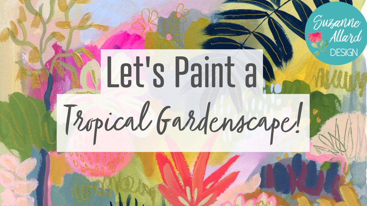
6. Painting the Background: So the first thing we're gonna
do is we're going to paint the background of
our piece together. Just a nice sort of pretty pink color and you can paint it
any color you want. I would just stick with a
lighter background for this. And let's get started
on the background. At large from a two-by-two
piece of acrylic paper here. And this is the
Strathmore acrylic paper. 12 by 12. I just loved this size. You do not have to
use acrylic paper. You could use watercolor paper. And just so it, since we're using acrylic paint, we want the paper seals. Now this acrylic paper is already sealed and
what I love about it is the linen finish and
also it's super thick. I think it's CO2
hundred and 46 pound. Most watercolor
papers, 140 pounds. But again, I use
watercolor all the time. I just wanted to show you this. So first thing we're
gonna do is make a super pale pink and just
paint the whole thing. A method to my madness. And I'm using my Nova color, paints, the bundle that
I have with Nova Color. You can use any acrylic
paint you want. But I'll tell you about these since people
are always curious. Nova Color is a brand
that you have to buy online and it's not in stores. So I have a bundle
that I picked out of colors and you can go to know what color and to go
under artists bundles, or I'll put a link to
it in the supply list. So this is using those paints. So I'm taking the quinacridone red and just making a pink, but I want to warm the
pink up just a tad. So I'm going to get some
cadmium yellow to get too much, a little warmer.
I turn to yellow. I kid, I always forget that cad yellow was really intense. Okay. This is just my
little jar of gesso that I'm trying to use up. I have filled it up for travel. Quinacridone rose is
really intense too. Okay. That's a worm. Here we go. That's what
I was looking for. And I'm just using a brigade. So super excited about this. This is actually a
sample because I'm having some branded paint
brushes made with the Suzanne, our design logo on them and
brushes that I selected. I'm gonna do two sets. One in the one for florals, I'm one for abstracts. Hello it again. Good thing. I don't mind if we
have variation. And anyway, so that's why, that's what these brushes are. They they're gonna be my logo
color, which is turquoise. But these were samples so
I could try and work with them and testimony and so forth. You can see I'm not making
this really uniform. Just grabbed a
little bit of water. When using some water, I just don't want
it super watery. You could use a
bigger brush tool here when this, this
is pretty basic, but depending on the people you have just loved
playing with color. Sometimes if I'm feeling inspired or I just don't
have any ideas happens. Or actually I'm
never out of ideas. But sometimes I don't I don't know what I'm
going to I just don't know what to execute. Does that make sense? So what
if I'm feeling that way? I will just trying
to get a tiny video. Just play with color. Put it. Different colors, make
different colors. Too great exercise
that I do with these paints will of
any paint really is. See how many colors I can make that I like from
just three colors. Particularly the, the colors that are
what we call primaries. For modern primaries. Fact, I just did a
YouTube video on that. The primaries we
learned about in elementary school were
red, blue, and yellow. And we were taught I was
taught that that would make all the other colors seem like such a
cool thing. Done it. But it really doesn't, doesn't say won't make a turquoise. So they came up with, I guess, I don't
know who they are, but now the modern
primary colors are cyan, magenta, and yellow. I like to take those three and just see how many
colors I can come up with. I'm using gesso just because it's I have plenty of it or
use more white than anything. I do have white paint and know what color set
and if I'm if I'm doing something where I need kind
of a more lightweight, you know, a more opaque white. Then I'll, I'll get that out. But for something like this, the Joseph's gray, it's
giving us a good base anyway. And when we go to
do our flowers, we're going to just look
at some flower pictures. Literally. Just,
it doesn't matter what pictures you use because we're not
going to copy them. So you don't have to
worry about having somebody's permission,
which is mucking. I'm going to go
ahead and take this. So I don't think so. I don't get paint on
the shape below it. Okay. That was an
interesting thing to have happened.
Well, that's good. I can show you how to fix that. So don't tear that paper
the way I just did. But we're just going
to paint over that. And this will probably
end up being a print. And I can take care of that. If it even shows by the time
we're done in Photoshop, to many disasters that
you can't come back from. I've used struggle with
like the word style. If you experience pain or
fear when you're painting. Where if that's comes up the inner critic and
fear and just all that. I was at my last
email newsletter. I think it was I wrote about that because as someone
who's dealt with it, I spend doing research
and I'm just, I'm just interested
in because I am interested in the
creative process and what can help us be creative in
how I can encourage people. And whenever I ask, like in my student
Facebook group about what holds people
back, It's always fear. So I think I called it
putting fear in its place. Just a different way
to look at fear. You might want to
check that out. You can subscribe to my
newsletter on my website. But it's also on the
blog and website.
7. Sketching Flowers Practice: Okay, let's do a little bit of practice keeping in mind
that we're not going for really super realistic botanical
representation on this. We are looking to capture the essence of what
we're looking at. The shape, the feel. To me, flowers evoke emotion, joy for me, and soda leaves. And so I'm just looking to
capture that joyful, light, luscious feel without getting hung up on botanical
illustration, which by the way, I do love
botanical illustration. It's just not, not what I do. So, alright, let's
get to practicing. So for practice, let's use
this book and then we'll use another buck for
for the painting. I'm just going to grab one
of these Neil color plans. You could grab a pencil,
we're just practicing. But it might give you a feel. You could even use a paintbrush. So what I'm trying to do though, when I'm looking at something
like this flower e.g. as, I'm just wanting to get a sense of how I'm
going to zoom you in because I want you to see the little bit of
the sense of how we're going into
the flower more, but just the shape is
what we're going for. So if I'm trying to
capture the shape of this, I'm literally just
kinda go on like this and something like this. And then these petals
come out here. Looks like there's
another big piece there. You can see that my
drawing is not perfect, but when we paint it doesn't matter because we can adjust it. And then the stem
comes out of here. I think this time
would look better for what we're doing
coming out of here. But you know, so you
just make your decision. But the point is that it's
certainly not just a circle. And then you do want to mark your center because
that'll give you a sense of where this
particular bloom is gonna go. So let's flip again and just see what else
we might want to. Just notice how flowers
are at different angles. So here's one, this is an
M&E that is popping up. And the shape of it, if we just did, the shape is
something like this. If I just literally forced my, my IDA to draw the outline, start there and then here's your center and then
it has another center, right? And then you could
add a few petals. And that gives you all
you need to paint it. And then let's see what
else would be fun. Look at those. I love this texture, but for this composition, this stem is just too fat and of course we can invent
anything they want. So if we took this texture and we wanted to make the flower
or something like this, which we would probably paint
and then do afterwards. But just giving an idea, then you can make your stem
any way you want it to be. Same with leaves.
Don't feel like a leaf has to be the leaf
that goes with that. I could do that style leaf here, I could do more this style,
something like this. Then there's, of course
buds don't remember those, don't remember him,
Don't forget them. There. They're more round generally than flowers, but not always. Let's see leaves. So let's look at leaves
because when we paint leaves and we're not doing
a whole lot and this one, but just remember
that leaves or not. You can do them
any way you want. You can do them very uniform so that they end up
looking like that. That's a very pretty
stylized look. And I think I ended up
doing that in this piece. Something like that is fine, but you can also
play with it and get these variety of leaf
shapes like that. And then it will make
it a bit fatter. And then maybe this
one you're only seeing the side of it
looks really thin. And then in this
little leaf stem, you see that at the top of it. So it comes up like this. And then one leaf
comes down like that, and then another
one goes over here. And then these two sweet little baby leaves come
up here like this. So that's pretty to
look at the dog one. We've lived mostly in Virginia and the dog lives in the
spring are so beautiful. Makes me want to
paint some dog lids. But they're very simple
because they're just for, you know, kinda fat leaves. And the only thing
that they really have that's different is that, and then they have this
little tip at the end. Then remember, here
are the artists. So if you want to change an
inventor flower invent that. You don't even need to look at these pictures if you just want to play around with something, I'll look at that peony. Oh my goodness. I could do this forever. We could just do a whole class of looking at pretty
flowers and tracing them. Here's a loop. Pine could do
something like that. And you're just going
to give a sense of it. You're, everyone's
going to know what you're trying to convey
here so you don't need to get into
all of the details. You could even just make
it very simple like this, getting larger and
larger at the bottom. So have a little practice
if you like, drawing them. And then then we'll
get to painting them.
8. Sketching Pattern Freehand: In this video, we're going to draw the flowers like
we practiced and draw them free hand and put them in a composition on
our, on our background. In the next video, I'm showing you how you
can trace the flowers. So you could try both and then pick the
one that you like. If you feel confident drawing and give that a
go, then do this. If you want to skip
right to tracing, you can go to the next video. But I would encourage you, I think it's a great
exercise to do both. In fact, you could mix those
up in the same composition. You could trace a couple
and then draw a couple. So I just wanted to give
you a couple of options on getting that composition and
the way that you like it. Alright, now that we have this all painted
thread pretty quickly, I think it's pretty already. Let's get inspired by flowers. So as I said, we're not going to
copy any necessarily. We're not going to use
one single reference. So you can go to Pinterest and just put
in flowers literally. If you want to avoid. Eventually might show
you flower paintings. So you can just put photograph,
flower photographs. And I'm just going to pick, I mean, who does
not like puppies. Look at that. I'm going to have to
save it to my bouquets. You should see how many
you can follow me on. Let's see, I have so many different boards
related to flowers. I'm going to call that one a
stunning flower arrangement. But what we're gonna do is
pick a flower toward liking. So you might want this or you
might pick something else. And then we're
going to take the, you could use, if you don't have these Neil color twos that
are water-soluble, soluble. I would invest in a couple. But you could use
anything you have that his light you could use a light pencil because we're
going to paint over it. I just like these because
they kinda add a dimension to the flower anyway, taller wise. So we're just going
to be random here. So I'm just going
to really loosely, I mean, really loosely. Pick up this. No, I
don't want to go there. Poppy puppies are pretty round like that and just
and just start drawing, pick up another one over here. Could even put this dome
in if it helps you. And I'm just doing
this one here that is coming down and just
getting the shape. Don't even worry about
anything but the shape. Buds look nice with pair. And the cool thing
about poppies is this action where the stem is really irregular.
I like that. So I'm gonna do a
couple over here. And maybe one more flower. I'm going to try
to vary the angle. So we'll do this one. And I'm just start
with the center. It might help. But we're being so loose here
that I don't really care. We're going to do the
suggestion of flowers. We're not, we're not
after literal shape, the pedals and all that. So then I'm gonna look
and see what else I love about this is you just
let your eye, you know, pick whether it's excited
about what's interesting to, you know, these, these balls
are always kinda cool. So what if we want to
make sure you can see, let me make sure you can
see the iPad and you can't. So let's just move some things. For now. Move the pallet paper over. That way. You can see I'll hold it up so
you won't see the glare. Okay. So let's take some of these. I'm going to take some
of these. What are the names of those pain before and I don't remember. Okay, let's see what else was. I mean, these are gorgeous, but it's a little more
complicated than I wanted to draw something like
this. What about here? We could do something like
these. That's a video. So let's say those
cherry blossoms. Let's see what this one has. Who I follow this
kind Instagram. Oh my gosh, Tim. My graph. Let's see. Those aren't all
hands, but let me show you. It's definitely worth
following TJ McGrath design. Yeah, does beautiful.
Look at that. So pretty. Okay. I can't go down
the rabbit hole to fire, but it can actually that's prior to what
we're doing here is the flower rabbit hole. But I'm thinking of we get these little
it's not a Snapdragon. It's a stock. Okay. I love those. So let's come up
here and just do when they're maybe this
one has three parts to it. We can come up here and
kind of see how I'm just lightly trying not to over
how even all holding. It helps if you hold
this The you're drawing tool like this
instead of like this, like we did in school. Let's see what's here. I love David Austin roses. Okay, let's put one in. Maybe it can be like a
focal point over here. So I'm just gonna do a circle. And then some sort of outdoor,
outdoor outside petals. Try not to make them round. Then this is like dark in here. If you look at this, it's a
David Austin rows right here. And there's just lines. This is all gonna
get painted over, but then there's more here and there's kind of the
wrinkly inside. So that's a good one
there. Let's go back. Poppies. Here's a nice image because it's showing
us a lot of, you know, the
front-facing angle. And I love her and ankylosis. So I'm gonna do a couple of
those so I can come here and just something like this. Again, it's gonna
get painted over, but really they're oval. And then it just depends
where you paint the center. Let's do a few more of those. Printed. Decide if
I wanted to stem coming out or just a flower. I think I'll just do a couple of flowers and these will
be more front-facing. The lines are just
there to remind me when I'm painting that
they're renown countless. They're always just
think about this. The center not being in the center, not
being in the center. Try to put it off because if you look at like this flower, you see how there's more distance from
the center to here, then there's from
there to there. So it just doesn't look natural if you always put that
center in the middle. So I always have
to remind myself it's just a habit that we want
to put things symmetrical. Now, these little sort of, I don't know if they're daisies, but that's sort of idea. Let's do something. With that. You don't have anything. And again, let's not make
the petals all the same. Maybe there's one coming off
of here that's half there. And we could even do
a stem of sum here. And maybe not
everyone here that's half-open or facing sideways. We can turn this around to
to get us staying playful. Else. You know what,
we can just do. Something that this amine,
what made me think of it? No, I don't want to go
shopping and Amazon. Oh good Lord. Basically. Yeah. It's like I
can hit it again, but it's. It's got a lot of little things. So you want to think in this, we will paint this. Who knows, who knows how much of this will end
up in the final, but we're just getting
started, starting point. And it's good to
vary your sizes. So small elements,
large elements. Remember, just thinking in
terms of shape, size, variety. Stem may not stay. Okay, What other kind of genus? **** we get that. That's pretty there's some I don't know. I can't remember
what it's called. Maybe I don't even know. But it almost looks for in
life except that it's flowers. So we're just going to kind of get the petals get
bigger as it goes down. It's trying to think of
your mind somewhere else. I want another flower here
that's just kinda random. Yeah, maybe it's time to put the iPad aside now
I'm kinda just use imagination who
basically was to get us excited and inspired. So now we can fill
in wherever we like. We can do. Leaves. The stems, maybe grab some
different shaped leaves. Make this flower
a little bigger. Let's see here. I'm looking around, I'm looking at the empty spaces. I'm thinking about things. But this is enough of a
starting point, really. Probably more than enough. Maybe a leaf here. We don't have any leaves, so we'll be adding those, you know, as we paint. You can do them off of
a flower like that. But all of this is
subject to change, right? I'm just bringing that out. So it's kinda, we have
coverage and it's a little, not much happening here. So we could, we could just add some
leaves like this on these, bring this term down. Okay, I think that's a really
good sketch to start with.
9. Tracing Flower Shapes 1: All right, So I showed
you how you can sketch these flowers
out free hand. Now, let's show, let's
look at tracing. It's a really fun option. Don't feel like it's cheating or somehow it's less
artistic or anything like that because they
can help remind you of just entrain year
that muscle memory on shapes of flowers and parts of flowers and the
way they face and, and there's nothing
wrong with it. So well, I'll show you. We just basically
use carbon paper and I used parchment paper. You can if you have
tracing paper, great, but parchment paper,
if you have that in the kitchen, works great. You might even be able
to try wax paper, but you would have to draw
on the not waxy side. But anyway, let's
try some tracing. Right? I wanted to show you a tracing
option in case the sort of free hand flower
drawing just like it, or you maybe don't feel
comfortable with it. I'm confident in it, although I encourage you to try. But this is a, this is actually a really good way to learn
about flower shapes. So there's nothing
wrong with doing this. And so what we're gonna do is pick
probably not this page. I love that. Okay. Am I correct? Can you stay on that? Can
you just give me a call? I can't stand this blooms
or maybe a bit small, but this is a good one to trace. And so I'm going to do
supplies wise is I have a piece of carbon
paper like from Staples about this
package a long time ago. And then I have some
parchment paper. I know I have tracing paper. I cannot remember where it is. I can't find it. And I've used, I like parchment because
it gives you a big square. But either one, the whole point is just something that
you can see through. So this may see, then you can see
the outline of this is really not round at all. And if you want a little more help and
your flower shapes, you can come to this and even put the other center and you can take it a
little further if you want. For some of the lines,
I wouldn't know. I was gonna say I
wouldn't go too far, but you may like a more
precise looking thing, so it's really up to you. But we could also do
this peony the way that the stem is here and then
drops down like this. And then like that, you could show a couple
of the petal shapes. We could even go, It's got some more petals here. So you know what,
that's like his family, because stem is over here
and say that's a puddle. But the stem is here.
So it makes more sense. So let's see what else can we try looking for the just
a variety. Look at bat. I honestly do not know what
that is. Just incredible. Shape of it would be. You know, I'm not
gonna be precise. I'm just illustrates what
I've been saying that these these flowers or not round and then
the center is here, some stuff like that
and maybe a couple of pedal lines just so before. We want to simplify. So we don't want a whole lot. Even the way those are coming
out of is kinda pretty. I need them a little
bit more to the side. Well, actually we
could do that one. Just ignore the
one on top of it. So stemless there. And then it opens up like this. Yeah, and then the
center is right here. So kinda goes out that way. We can extrapolate from that. This other one is like that. You know, basically there's
two on that stem. Let's see. I've marked some other
pages that rather large enough so you can use
you can, you know, you, if you don't have this book, you can look at another Florida, go to a library and
get a flower book. Just want them a
little bit larger. Because if it's a
teeny tiny picture, obviously that's not going
to help you can also. Find all kinds of images on Pinterest and print them
out and trace them. Let's see. Here's kinda
wanted to give you an idea. This one does kinda have
the center in the middle. It's also giving us a
variety of types of flowers. Isn't boom, here's a good one. I love this fuchsia plant. Got us down, and then I don't
need to draw all of this. I'm just going to pick. Part of what you wanna do
when you're creating is simplify everything you
see because it's too much. And then, and then
nothing stands out. There's just little
bits that come out. Yeah, that's probably
all I need to give me the idea that these are
all coming from there. I love the way that
one is sideways. We'll just ignore that. And we'll make the stem longer. Maybe put them feel the power
lines still get covered up. But again, mostly
helps our brain get that muscle memory around
what the shapes of flowers. Then they have this sheet can be a reference for
other I like this. It's not a puppy
litters called methyl. Look it up. She's
got it in here. Maybe there's a
type of quantity. The recipe is here, anemone. That's what it is. There it is. Look at that. Gorgeous. But here's one to this side. It's nice and large. Petal lines. Just so yummy. Now almost looks
like the petals on the outside or her torn. I'm just going to put the
suggestion of This is kinda that David Austin
feeling inside there. So yeah, these are not precise. Gotta do that wonder we
could just do an outline. Make sure that's a different
flower back there. And look at that
outline and see, and then the center is
really somewhere in here. But I'm gonna just mimic
these kinds of lines. And maybe a couple pedal lines. I need one more line
just to show me that basically it's
centered in here. Okay. Let's look for something
that's maybe more meandering. Not know if this
will be big enough. Maybe it's pretty small, but this is pulling via. Try to trace it. I'm going to ignore
that one flower. I'm going to trace it
a little bit larger, just kinda getting the idea. See what else I've got my chair. Oh, okay, Yeah, I thought
we could try this. It's not a daisy cosmos. This one. Just so we have some variety. Just using a regular pencil. Okay? So we know this paper
is making lot of noise. One way to get a
shape of a flower, a flower variety with
without having a wing. So now let's do some tracing.
10. Tracing Flower Shapes 2: I just grabbed something I've already got a
background on because I wanted it to be similar to
show you what this was. Painting that didn't like. I just said it over
and scratched over it and now it has some
yummy texture to it. Song the same kind of way. I'm just going to playfully put these around you
starting with this guy. I do think it's
easier to trace with something colored so you
can see where you been. I've got these Jelly Roll pens, but sometimes they
don't want to work. Let's see if this one's
going to want to work. Not really, especially
on parchment sometimes. So sometimes I end up
using a colored pencil. Let's do that. All right, so that
wants to pass them. It was like it was
resisting too much. So I'm going to just trace the outline of this and hold it down and then we'll check and
see if it's transferring. Okay. Again, since the
whole thing is not precise, I do not need to precisely
trace my outline. There it is. Maybe I don't need
to write so hard. Just got some lines in here. You don't need to be
exact couple of petals. We could. If you say, Oh, I like this flower, but it's too big, then you can just
make it smaller. One right next to it. You could just trace everything
a little bit smaller. I guess this is yeah,
this is tracing. I was gonna say
maybe those parts called this is
transferring, I guess. The main thing you want is
the shape in the center. Let's throw this one in here. You know, this helps
you, like I said, with the muscle memory, you learned flower shapes. I could put a couple of these daisies and I don't need to stick
with the sheet, right? I mean, if I wanted to
just go create a daisy for Cosmos over here, I want to create
another one here. My hand just did it. So I just need to remember
to be not too fussy. Not make the petals
all the same. Don't worry about like, you know, that's
overlapping there. You can erase or you can
paint over a big deal. Then you could take one of these meandering ones where
I want it close enough, I think you get the idea. I'm not gonna do the whole sheet because we're going to
paint the other one. But I just wanted you
to see how that works. Now, the thing is that you wanna do before
you start painting, because this is graphite, so you can see on my, my hands. So it will make
your colors gray, which we don't
want gray flowers. So you want to set this somehow. You want to set it with paint. Or if you have ink markers, like a Posca marker, you can set it look that you are going to get a little
graphite on your, on your person needs to be
a color that can show up. Obviously, what's the point? Great. Otherwise,
what's the point? So we can do like a color that won't
matter if it's under. In fact, it's kinda cool
when it peaks through. So you can take like
this coral posca, which is a paint marker. I have a link to these also. I guess I have a link to
everything on my website. Just about can we can do that. Which becomes part of
basically our first painting. In a way, all I'm trying to do is cover up most
of that pencil mark. If you don't have a Posca, you can just take
a bit of paint. Again, we can make
it a pink color. But anything was ink or acrylic will set the seal that graphite. So let's see, naps all crimson that always
makes it really nice pink. And in fact, this look is a
little bit more painterly, so don't feel like you have to run out and
get a Posca marker. A little bit darker, you
won't be able to see it. I'm just painting
over the small brush. You can use the
liner for those two. And making my and then when
that dries that graph, cannot, you know, it's
not going to disturb and mixing dear paints. You can see it kinda
mixing in with this paint, but then it'll be seal. You could use white
where adjust. So but then you'd have this lake white bit of underpinning. I'd rather use it in a
color that I think of it, if any of it's poking through, would be just fine. So you can see this is just
as fast as using the posca. So here we can say, okay, that's some didn't
work there and let's, let's put it here. You can erase that
out, rub it out, or just probably in the
painting over it with a leaf. How they think about it, it's
probably better to just not trace in the stems because
those are really easy to add. And then you can decide
what direction they should go in After Effects, after you, you know,
at this stage. Now, if you were to paint over the dry
graphite, no worries. The dry paint that's
over the graphite. This, if you'd like
doing it this way, then, then you can use those
flowers is the ones that we traced as reference
if you want to look at back at them when
you're painting them. So that I just wanted to
show you that there's an option for getting
your flowers down. So why did you choose which way you want to go and get your flowers down? We'll start painting them.
11. Underpainting Darks: Okay, so what we're
gonna do with the nav, we've got the flowers on our background,
the sketched out. We're going to come in with a little bit of an underpainting to get some instant
depth into the flowers. We're gonna be
covering it up mostly. But it will, there'll
be, It's just, it's a layering process
and it allows the flowers to have some depths before we even really
start painting up. And it's really quick and easy. In this stage, we're
gonna do a bit of an underpainting some
of these florals just to give a
little bit of depth. So I'm going to mix up a I know how to describe it. It's a tone down. Sort of brown maybe. But let's just make it and then having
trouble describing it. And it doesn't have
to be like brown, brown like so I'm taking
a little bit of you. If you've got some reds out, some agendas, and then we're gonna put a little
bit of yellow. I would say a warmer yellow. I'm using the Indian
yellow or cad yellow deep. And then I'm going to
use a bit of blue, probably a warm blue, cerulean blue
versus ultramarine. And then I mean, he's mostly white and
just keep playing until I get I'm just looking
for a dark neutral. A darker neutral that
is on the warm side. So I'm going to keep mixing until I get
something like that. Warmed it up too much. Indian yellow is
so intense. Okay. Something like that. So I don't know what
do you call that? I guess it is a brown, but I want it to lean towards red or magenta and they don't
all have to be the same, but I'm just going to I don't
want it quite that dark. Just going to wash
in the centers. I don't actually
don't want to cover that center because once
you lose the center, he can mark it like that. It's kinda hard to build the
structure of the flower. And I'm just going to dab that. And because darks are through
the center and then out. Same thing here. So I'm holding
the brush really lightly. And maybe I'll hit a little bit out here because, you know, flowers are going to
have some dark areas and some lighter areas
where their creasing the petals and so forth,
light's catching them. I do hit the center is more
than I can dance around. Can you see I'm not worrying about covering
it completely. You can kinda see
the canvas texture, the linen texture
showing through. You can vary it to like if you
want to grab a little more magenta and take some of
them different direction, just trying to get the value darker at the bottom
of some of these shapes. Even some of these little guys, some of them can be darker side. We're going to be
painting over this. So this is just like a bit of underpinning for some
depths. Here and there. Some of it may not even show. See here a little bit
here in this dark. Just kinda dabbing some and
even some of the leaves. I'm going around the Centers. And there's no magic color to what you put in this
kind of an under wash, except that the value
should be a little darker. Some people use
complimentary colors. So let's say if your, if your flower is
going to be red, then you do a green under wash.
Or true leaves are green, then you do a red, orange, red ones. You can experiment. It's something to
experiment with. Forgotten what that is, I guess it's another
one of those user. More yellow. Okay. That's good. Just a little something. And we'll let that dry. And then we'll start
adding some color.
12. Adding Color to Flowers 1: Okay, let's start adding
some my favorite things, some color to the flowers, and start beginning our
layers of doing colors. And then the next video
leaves and details, and this is where it all
starts to build and get juicy. Okay, that's almost dry, but I just wanted
to talk a little bit about kind of how I get some of this inspiration
and images in my mind. And then maybe have
a picture like this. Even though I'm not trying to create precise looking
flowers like this, I am. I feel like if I
stare at this and just make some mental notes about look how that's opening
and how it's not a circle. If we just trace the outline of this flower, it goes like this. Then it goes out here and n, and then out again. And then it's really tempting. It's something about us when
we start making flowers, we want to make them round. And so looking at real flowers like this
are actual real flowers. If you've got a
flower market near you or even in the
grocery store, just stop when you're
going in and looking. Although I will say some of those grocery store flowers are so artificially colored in shape that they may
all look around. Maybe look more in a garden. But then noticing
that the centers, if we, if we trace this, see how the center
of this is much closer to this side
than this side. And look at this one. Here's the center. And it's much closer to
this side and this side. And then look at if you
trace the shape of this one, it goes this way. So thinking about
shape and center. Now, this one is facing us, but look at its edges that goes out like this and then I'm a big piece out like that.
Let's see what else here. Let me just move this
while it's drying, trying to not get the
book in the paint and everything else in my
studio have paint on it. So I don't know why the books should be any different, right? But let's look at some power, some more flower
shapes to just get in our mind that by the way, if this pipe probably use
this in every floral class, this is colorway floral
by Kiana Underwood. Who is, I would say my
favorite floral designer. Her work is so creative. And I have a link to this book under
supplies on my website. But it's none of her
stuff is traditional. Round arrangements. So whenever I paint larger
floral bouquets, this is, I think about her work and
her shapes and how they just meandering and creative
and not symmetrical. So that's more of a bouquets. But for this class
we're looking at just individual flower
composition and how flowers look in the sense
that we're not going again, we're not creating, trying
to create them exactly, but we want to pay
attention to enough. So we don't just end up with
a bunch of round circles. So let's see, let me
find a good picture. Look at this. Her work is just amazing. It also gives us ideas
for different types of flowers and different
types of centers. Like if you look at a poppy, like the puppy has a much larger center and
it's dark. In general. We can suggest things about
flowers without painting every petal or literals
part of a flower. And again, when you look at, if you imagine this
piece of paper is this painting that
we're doing is somebody took these flowers
and just kinda tossed them on our paper. Then some of them are gonna
be sideways like this. And we drew some
of them that way. Some are going to be, even if we didn't draw them that way. Remember our drawing
is just a guide. We can change it and
I'll do that often. Then some are little. And then some are sort of have the daisy petal field too long and some are more
round like a rose. In this book, she's doing
monochromatic arrangements, meaning of hall of a similar
color in one arrangement, which has a challenge because
you tried to look at this. You're trying to like, this is her peach. I don't want to make sure
you can really see that. I'll include a couple
of these pictures in the class downloads. These are dahlias Mosley. But even dahlias which
are pretty round, have some variety and there's some ridiculous renin keyless. And you can see that sometimes
they're cascading down. And ran Oculus also
have a wavy stem. It'll have a stem that
doesn't just go straight. And that's the other thing
to just be mindful of. Never make a straight stem. And leaves to look at. We're gonna be really playful
and loose with our leaves because they go every which way. It's really just green pops of green that we're looking for. And you can always do,
don't forget buds. Like, I love poppy. I think those are Papi, yeah, those are poppy beds. Beautiful. So there are another
flower that the stem can meander and go kinda
have a mind of its own. So the spread is a really good one for thinking about
the meandering bits. Like look at this
coming down here. And so I'm gonna kinda
keep this in front of me. And I will include at least these two
pictures so that you can. But there's so much chloro
inspiration out there. First of all, you can
go to Kiana Instagram, which is amazing or just
put in floral arrangements. But I would put in, I
find it works better if I do a search on creative floral arrangements
or floral designer, or create a floral design
because otherwise you get dozens of images of what
I call funeral arrangements, which are just a dome and
all the flowers stuck in. That's how I feel about those. Okay, let me set this up
here for inspiration. And let's see. I'm going to put it
over here. We will start playing with
some of these. Again. The downside of
looking at pictures as you can start to get really fussy and try to be painting
petals and all that. So we're not going to really, really try not to do that. I'm going to move this light
so that it holds this book. There we go. Okay. I get a little bit of that. So as far as color, I kinda make them up as I go, but I'm going to be
primarily doing pinks, maybe some yellows, reds, oranges, peaches, kind
of flowery colors. But we kinda see what
the composition needs. And then I usually put in the contrast in colors on either the background
or the leaves. So I've got some white here and I am using
the Nova paints, but you can use any
acrylics that you have or the acrylic wash
or even gouache. Just if you're using
regular gouache, will actually, you could
do this with watercolor to this same thing works. You would just not just lay your paper and use
watercolor paper. But anyway, I think I was
saying that you can use a variety of paints, but grab your flowery
colors or don't, if you don't want to
make flower colors, don't got some cadmium
red light here. And I've got some white. I'm going to grab some red. I'm gonna be good and not stick my brush in there
like I have been. And I also love this fluorescent
magenta pops of color. Fluorescent pink is good too, or it's usually called
the gouache family or the watercolor
painting is called opera pink or opera read, I don't know why I'd
have to look that up. Let's go a little
bit of that out. It really helps to
live and up colors. You only need a
little bit though. See whatever do I have? Okay, let's get them
absolute crimson out. Just get your reds
and you're pink and yellow out is
what I would say. Even though we're
going to be using mostly white really, well, mix it up and get a
nice warm yellow. I don't know that we'll
need a cool yellow. Let's stay with
the warm and see. The cool yellow would
be if you wanted to do, actually, this picture
is a good example. If you wanted to do a
lemony flower like this, that you would use
a cool yellow to get the formula.
You would use this. Alright. Got some white, got
some various reds. And now I'm taking, you could use a flat
or round, flat, meaning bright, bright
shape like this. I'll probably mix it up. Changing brushes can
sometimes help you change how things look. So it's kinda fun
to change them. This is a six, but you could use for probably a
little bigger 78. And I'm going to start
with going around and I'll put one color down and then look for another
color where it can go. In a way I want it balanced, but in a way I also don't
want it super balanced. So like if I put a color
here and here and here, I might put it once over here, but I don't want to put up here, here and here. Does
that make sense? Because I want the I
don't want it looking too much like a pattern. I want it to be not
too synergistic. So let me start with some, let's just make a dark. The quinacridone
red with magenta. Let's see, mix up a
little bit some cad red and just get a
darkish by the way, if I want a dark
and I should have gotten a little blue because that's gonna be my
darkening agent. I just grabbed this
cerulean blue, but you could grab any blue. You're only going
to use a tiny bit. And it's going to make
it a purply color. And if I don't want
it as purpley, I just add it had yellow. Just a tad. It will warm it up a little
bit, kind of a plum. So I'm just going
to come in again, try to be really loose.
13. Adding Color to Flowers 2: See here, I do think
in threes and fives. So it's just a habit to
not get too much symmetry. I'm going to bring
this around here, so this color may
not even show much. So now I'm just going
to start playing, lightening up, making colors
that excite me basically. So this is at run ankylosis. I'm just hitting it. Remember how those had
this kind of seed? We have one here. Here's one hiding. But let me find you. One of my favorite flowers, so I paint them a lot.
Here's a good one. See how they have this. Dozens and dozens of those layers will obviously
we can't get that. And if I'm painting it from
the side like this one, I'm just going to hit some, some of that and then
fill in the stem. And let's see where else
can we put the color? And I do vary, so I just grabbed a
little bit of yellow. I'm going to use some white. I don't like to put the same
color in too many places. I'm just kinda
coming out of this. This was our David Austin Rose. And I'm really kind of
grouping up the brush. A lot of times we tend to
not have enough paint. So let me show you what I mean. So it's it's pretty fall. It could be more careful. But it's It's not like I'm
being sparse with the paint. I want to be able to lay it
on one or two brushstrokes. I don't want to fuss. And so I need to
make sure there's enough paint on there to
do what I'm looking to do. Just touching it on. And if it's too watery
and then i then I'm going to feel like I have to go back and festival
that some more. So as I'm going, I'm just
adding different colors. I think I wanna
make those yellow. It's okay, I'll come back to it. A beauty about pain is you
can always paint over it. And I really am trying
just to hit it. Can be done. And doing some darker. Then every now and then,
just take the brush and make it longer
stroke like that. Don't, you know. Don't don't try to pay attention to your strokes
not being all the same. Let's see. More light. In a bit of a yellow. Come over here and do this guy. He's Shi, I guess if it's a
flower, it's probably a girl. These, I wanted to
start getting to go like a nice yellow
will come back. But you can see how
I already have, I still have some
of that magenta on my brush, which I like. I have not washed my brush yet. Make those a little
brighter yellow. You see how the dark is
showing through underneath. That way, we have just a
little bit of dimension. Let's grab some white and some
yellow and make a weight. Something for these
daisy things. Getting more, my brush
wasn't good enough. So I'm getting it more goopy. And I'm thinking about
not making all of those petals the same or the same links
because we know are, we already looked at how
flowers are and that they don't face all
different directions. So it's, it's an
interesting combination. We're being loose, right? But we're also
trying to make sure that they represent that
are looseness represents. At least the field of flowers. Okay. I think I'm gonna go
and the more red, red direction or peach, which is going to blend
in with their background. That's okay. That was
my cad red light, which I need more of. Holding the brush loosely. I like the way that looks. Let's come over here
and hits this one. I'm gonna do one of
those where I make myself do one stroke right here. And I'm going to highlight, you'll see me grab some white. And I'm just because
there's gonna be a highlight somewhere
on every flower. So I do something light on one side and if I
don't do it in this pass, I can do it in the next
pass. No big deal. Making sure, trying to
make sure this guy is not super round and I have to catch myself even though I'm not going
in and saying, okay, well, this
guy is two around. Let's stick a pedal out there. This one is still growing, but we'll go like that
and get something. Not maybe highlight here. Not round. I haven't
started on this one. Let's play over here. This is the nabs. All crimson is to have red
that has more pink in it. Well, I guess the name
gives it away crimson. So when you add white to it, it gets like this. You can get a nice pink. I'm gonna throw in just a
bit of a fluorescent here. Just to brighten this pedal, have maybe the light's
hitting it and see. The light's hitting
the top of this one to get that fluorescent on here. So it could be hitting here. Taking that fluorescence since
I made it and looking for places where it might show
a bit of a highlight. Right? Now I'm looking at
this one and deciding. And by the way, this
kinda thing you could turn around if it helps. Deciding what direction. I think maybe going and
orange would be nice. So I am going to wash
out because I got that pinky purply color. I'm going to grab
some of my yellow and my cadmium red light, which makes a nice orange. I've seen these were
the David Austin roses are one color in the center and another color
on the outside. So pretty lighten that
up for those side. One thing I this is just
personal preference, but I don't like that. I was just fixing is sometimes I work so fast that the
color isn't mixed. So get like a bit of the
pure white on the painting. And I don't know, I just I want the color to be mixed
Even though I'm going fast. I like the way that turned out. Let's take some of this
really light yellow and just hit some of these guys. Maybe mix up some of the
pH in their various shades of the same stuff we were using. A lot of this is just you
discover a color that you say, Oh, I like that. Okay, let's put some of that. At least that's how I love. I love to discover
the colors as I go. You saw my only
plan was related to use the colors that we
talked about starting with. And now I'm thinking, let's see here too. I want these to be really wake up that can readily looked. So let's go over here, even though I have some here. And I'm going to bring more
here. Little bit brighter. Let's see what this
looks like if we use the cad red and it's a
whole bunch of weight, do we get a nice look a
lot like the background, but it's really pretty
so that's okay. We will do something about that. Link. I just painted a
leaf pink, No worries. Even more white. Just hitting it with some white. White mixed with the cad red. I'm going to say
both of those are. Now I will say that one's a leaf and this one is a flower. Not that there's any right
or wrong way to do that. You've got some softness here. A little bit of softness
here in terms of color. There's a little flower there. Okay, and that would be a
good one to do for the grader cad red because everything
is soft over here. A little flower there to mix a little
quinacridone with that. I don't like anything
straight out of the jar. Is just too boring. So you're always going
to see me mixing something that got too big. We can fix it for a week. Maybe we want me to this
his leaf, leaf, leaf, leaf. I go back and forth. So I mean, if I miss a leaf now, do it or a flower,
I'll come back. But I think that's
a good first step in getting some flowers
and we'll let it dry.
14. Adding Color to Leaves 1: Alright, that's dry, and
let's switch it up with a different brush just to get a little bit different
sentence, something going on. I think maybe I was
going to say a six, but I'm going to
use the for bright. And I also want to use
some liner for stems. I don't like fat stems. I think they just make
the work look clunky. So I'm gonna go in and do
leaves and stems before i, and then see what I
think of flowers and decide if I want to
make any changes. So for my leaves, I'm going to make some greens. I need my blues and my yellows. I've already got some yellow. Let's get some of this. Will do this cerulean, but also the halter marines, a warm and a cool blue. Hi. Now some people say that
the ultramarine is warmed, but I don't, I don't see it. It's cool to me. And then let's do, let's do some this
Indian yellow. And we've got the already go for regular yellow with cadmium. I'm going to get the
hansa yellow out and I'll show you why one of
my favorite greens, really great, vibrant green. It's pretty much
in all of my work. And you need a bot
that to make it. I also have in my Nova color, the yellow, green, which
basically I just pad. It's the only green
in the in the bundle. But you can get the other reason I added it is because you can just get to that lime green faster, but you don't need it. You can make it lime green
with a lemony yellow, usually called Hansa or light. Then, hey, my palettes running out of room and I
have to give a clean sheet. So to make the lemon
yellow, you will, you will use a lemony yellow
and then try various greens. That's just depends. It may be blue that maybe you could
try it with a worm. But if it's like so
really and it will start going toward turquoise. So try a, maybe an ultra
marine or a cooler blue. Let me move the sheet so
that I can have room to mix. Let's see here. We'll see the colors though. Make sure you can see those. Barely. That's good. Alright. So same thing with the leaves. I'm just going to start
putting some of those color. One. Please. Probably starting
with a darker shade and then going from
there and changing it. And without getting over fussy, I do like olivine grains. So they do tend to go in the holiday shade. I'm just throwing in some white. So what I just got was
a little bit of a limp, the Indian yellow,
the lime green. And I'm getting a nice
warm and I just added some white fat, fats. The co-edit just makes me happy. Again, try not to
over brushstroke it. A bit more weight.
I love greens. I just think there's so
many beautiful greens. Something dark in their skin, a little bit about
ultramarine blue. To get a bit of dark shade, I'll try and blues and
amazing color can morph. So many other colors, I'm going to put these greens are all getting
a little too similar. So I'm going to grab a little
bit of the cadmium red. Knock that back a
little because I just don't want them to
be all somewhere. Whoops. That was the one that I said I was going to make a flower. It's funny. I guess it wants to be a leaf. And I'm gonna come down
here and make these leaves. I'm going to grab some
of my blue-green, which is like a turquoise. Let's see. I still have
the green in my brush, so it's still want to
make it more turquoise, but not noxious turquoise. So I'm adding a little
more white in there. And I'm just going to come down, make these relief and that's a little noxious either bowler. But it felt that way to me. I want it to scream. Look at me, is when I say, hi, nice to look
at I'm different. Yes, my colors talked to me. Whose are a little
too straight to? I'm using the break
with the side. I'm just going to
fatten up some side of them so they don't look too straight and lighten up along the edge of them. That color will need
to be somewhere else. It could be a flower too. Why not? So good? Sometimes flowers that
are just starting there. Kind of greenish. We can add pink to that. And that's getting to minty. There's that beautiful lime. So when I, you know, make a color that I like, It's spread it around. I still want to knock
back this turquoise, so I grabbed a little
bit of magenta. It's still reading too strong
from where I'm sitting. Okay, they've toned
it down a little bit. Let's switch to the liner. So this is a number two liner. I like this one. This is part of my brush set that is not going to be out
for a couple of months, but you can get you probably have or if you
have a small number two. But I just liked the
way that this moves. So for my stems, I'm just grabbing a
combination stems. If you really look at nature
are all kinds of colors. They're not, they're not just
brown or dark green there. They can be reddish. And I'm just going to start with something
that I mixed up. This is I grabbed
some red and stuck it in the green that I
already had made. I do think it's a
nice way to add a dark to a composition. Flips that much. That was the civilian
blue. That's no Bueno. Not for darkening, it just gets really turquoise
really fast. So it's a nice way to add line. And in fact, let's get some Payne's gray and really
make like a navy. Now I love navy. So Payne's gray
is almost a Navy. It's a dark bluish black. Then I add a little
ultramarine blue to it. And maybe a white. Know how much. And keep working until I get
this sort of nice. Let's see how that looks. I just broke my own rule there. Do you see how
straight that stem is? So I won't break it here. Bring this around here. To make a line of work. It does have to either
have a lot of paint in it for it has to have water
just to get it to flow rate. And then he probably
I wanted her glasses. I'm like I didn't. So this you can see it
when fat On Me too fast. Maybe we'll fix that with. If it bothers me, it was
painting in the background. I'm gonna go back to
that brownish color now. Just go back and forth.
15. Adding Color to Leaves 2: Your nose. I would change the stem color all the
time so it doesn't. I'm not looking even
within the same flower. It can be a different stem because the light might be
hitting it differently. This time could be lighter too. I just like them and
things like this because they give that a
little bit of contrast. Let's see what's kinda
magenta stem here. So just took that same green and adding some magenta in
it. Change the color. The same color over here. Your stems don't have
to go all the way, see how they're broken, which looks more
natural and organic. And often la, have
the darks out. How to make sort of either the blue
like that and hit those centers where it
might be a purply shade. Just kinda hit in there. Let me get a little
more magenta, make that a little more purpley. Just kinda reminding
myself of aware of those centers are giving
them a little bit of pop. I often use the Navy is center. I did again, I grabbed
this cerulean blue. Let's get back Payne's
gray back out. I love civilian
blue is just that. It's not going to make that
cool dark that I like. I'm trying to not make
like a perfect circle. Because you'll, you'll see
if you look at flowers, they don't have that
either. Just dabbing. Okay. We're going to let those dry. And I'm looking
around, you know, and I'm thinking you can do some more smaller leaves
that we didn't draw in. Because remember,
we're in charge. Nobody knows what we drew, nobody really cares. We drew. So I can take my liner and I can add more weight and make me go really
nice soft leaf. For something like this. I'm Dan to try not to
be too precise about your leaves and keep mixing
and darkening and lightening. Vary the size, the direction. Because some leaves are
gonna be laying flat, some are gonna be not. I want to outline
something funny. I'm just determined to cover that turquoise RNA and sea routes. These were really leaves. Here. I mean, that could be either one,
leaves or flowers. It could be a colorful feel like I have enough pink
and I want more green. So let's make a high
need more white, make kind of a light. Let's try to make another
light, turquoise. That's not too much. That's pretty see
how that looks. Soften it a little bit with a little bit of yellow or
the green that I had made. And you know, it's
funny on the palette. It looks very mild. But when you put it against
the pink, on this pink, it starts looking
much more vibrant. And that's because they're
complimentary colors, so they excite each other. And I'm not really
worrying at this point about the crown that's
showing up underneath. Sometimes it just leaves a
cool effect that I like. So I don't worry
about it at all. I want to make some, let's see, a larger leaf in that color. All right, so you
get a larger brush. This is a six filbert who
would have covered if Albert, you're all wet so I can't tell. So Britain is, this is
the end that's rounded. Which can't tell because
as things all wet. But I'll show you in a bit. So let's see, let's
grab a little bit of a civilian blue and warm yellow and see a little bit of that turquoise and
see if we can make a color that's nice. Let's see how that looks. Like. Something like this. I'm looking for my cad
red to tone that down. Okay, there it is. Just a bit more magenta. I mean, either one would
kinda tone it down. It's still too bright. It's that pink under
painting. That's okay. We'll let it dry and
play with it. Okay. What else do I want to do? Maybe some leaves up here. They just grabbed some of
that Indian yellow and some weight. Bmi, isn't it? This way my head going on here. Here's some stems. I feel like this guy needs a little bit darker
leaf coming out of it. I'm just dabbing
in green where I feel like I need it this point and I don't even need it attached to his ****
Really I crave good. Deviate from that. I could just put
a leaf somewhere. Kinda just turning
it around, going. Now one thing I'm feeling
like is there's not enough darkness and the leaves. So I'm going to grab some
of the ultramarine blue with all these
green mixtures and just good old, some dark going. Just hearing their
needs, some contrast. Stop ended up
paying later. Yeah. Okay. Let those leaves dry.
16. Refining Elements: All right, let's look
at the flowers and see if we want to
do anything else. One thing I thought of is that there is just a
little bit of lighter, this Indian yellow mixed
with a little bit of pink, just to give some
interests there. And this, this one, I know it was fading
into the background. I want to make it all the same. This, what's making
this color pop is the bit of fluorescent in it. You kinda live in
is anything up. So just take that up like that. Maybe hit some of these. We need to darken that a bit late in some new and
more and more weight. Some of those we
may make pop more with actually enter
will make them pop. Let's add more of
the fluorescent. Here we go. You don't need
much fluorescent deployed. Is it pack a punch? These guys over here need a
little bit of that punch. Just maybe on one side. I'm looking around. I think it's just a few
places that I want to maybe make a flower
a little larger. Maybe give it a little
bit more definition. I love to. Let's see
here it's the this. There are some magenta mixed
with the cad red light. Makes a nice, lively coral. Girls can be exciting
or they can be dull. And, you know, just depends on what you're going for
because it's in the background, you probably want it to be good. But that's what I'm using
here. A little bit more. Magenta, Let's see here. Now, I don't have as much
paint on my brush because I'm being a little more deliberate. See this virus kinda strange. Let's see if we can help you. Usually if a flower is
looking strange to me, it's that I don't have maybe
enough dark in the center. And so as lacking some depths. And then we don't
have a variety, enough variety of contrast
within the flower, like not enough light. Petals. Petals because I'm not
painting problems but parts. Yeah, Let's talk
in terms of parts. For its looking to
round like this one. That's okay, but it's
just to monochromatic. All the petals are
too much the same. Let's just throw a little
fluorescent in there. Change it up. Okay, this guy, this guy, we're going to
need some need some help. It's a little all over the map. You remember I was gone for
that David Austin Rose. Look, and they're
all wrinkled inside. So I'm gonna go in with
some darks and some lights. Make some of those wrinkles. I need to get lighter. Piano done, flowers,
maybe one of them where I keep messing with it and I don't get
what I'm going for. So I just changed the flower completely to a different
kind of flower. Right now, I'm
dealing in wet paint, but let's see if I can kinda
what I'm going for here. A little better. Just adding some yellow around it. I need to let you I'm
talking to this flower. He needs to rest a bit because they haven't
got too much wet paint. Let's see. What else
do I want to do? Maybe nothing else with paint. I mean, when I come in
here with some pastels, pastels had amazing texture. Really quickly. Just tabbing some
bit of dimension. That was some of the fluorescent
pink with some yellow. Maybe good here
actually more weight. Here's an example
where it didn't mix the way, all the way. Now I'm really making it up. My goodness, Let's
just see what ends up happening. That's
better actually. I'm going to put a little
bit of that somewhere else. So it's not just there. He's Superman. Leaves are distracting me. So I'm just going to
come along with some of that same color and just do a bit of a
line in the middle. Right, standing back. I think that's good. We'll let it dry and
see if we want to use anything else to add texture.
17. Adding Details: One more thing I wanted to do with the paint before
I cleaned it up. And that is take some of this
Indian yellow that's here and just do a
little bit of that. And then looking for
another couple of very, just some hints of it here. And there are two things I wanna do actually,
that's one of them. I could do it with a pastel. I don't have to do it.
Obviously with paint, but just some little
small details. I'm using R for round here. I want to just have a few pops. Let me just add a little weight to it and we're elsewhere else, maybe some little bits
over on these guys. Some of them the ones that
weren't showing up as much. Yeah. Okay. Now, that always happens. You stop. And that's why I recommend stopping
anytime you feel stuck. Because you get an idea
and give it some distance. So let me take, but let's
get the oil pastels. See, this is my favorite
set from Mongo. I have a link to it on my
website under supplies. It's just the best pastels for
the money that I've found. I bought a few that are
much more expensive ones, the Sennelier and
just not I mean, they're good, but they're no better in my opinion than these. These have really lasted two and you can tell my
favorite colors. I'm just play with
some of these. I'm just hitting maybe a
flower here and there. I feel like they add something
a little bit of Pinterest. Maybe there's a spot that they didn't care for
and I can cover it up. Or an edge that needs
to be stronger. This is a peach color, is pretty much going to blend
in with the background. Let's see. This might be
a little bit lighter. Help us define that guy. Still got some of
that paint there, but you brought it
out a little bit. Got some pink here that
might be nice over here. Doesn't show, Let's
do a darker one. The thing about pastels, you always want to do them
last because you don't, you don't want to put
paint on top of them. Now I'm just using
them to define some of these vernacular pedals. Really loosely.
Maybe dark center. Let's see me, That's good. Let's do a pastels.
Next thing we can do. Well, I got some options. We can do some pen, we could do some pencil, we can do some gold. I'm going get my gold pans out, season my favorite pens. You could do some darker. Let's just, let's see, see what we feel like doing. Grab some of these colors
that tend to be My though to the pounds and this is gonna be the
color of the background, so we probably won't use that. Let's get the whole box. One of my favorite things to
do is hit things with it. Just a bit of Turkey. The past, a great
way to do that. Here's my favorite goal Barker. My favorite. I use the
offline. Play with that. Maybe. Here's the Navy just in case that started when do you think we could also
do something with the CRAN? We've got these crayons, much like the pastel
at this stage. You can put in a bit
of color somewhere. In fact, they're good for it. Let's just do, Let's
grab the turquoise. Turquoise is broken and do a bit of turquoise on
the leaves with the CRAN. Just so I can show you. Just
to add a little highlight. And I do love a little bit
of turquoise and my flowers. It does something to them. Usually I do it
around the center, but it can be along a pedal. I try not to be too
precise about it because I think about it the way light my head and I don't want it to be too fussy. Yeah, that's good. Let's see. One of the things I was
thinking we could do is we have these big flowers. I would say on a chunky side. Sometimes it's
nice to do is take your same goal pan and
hi there My nails. This is the Pentel sunburst, metallic medium Joe, I
have a link to that. And then these two on my website because they are
my favorite pens. I've tested so many and
they're not perfect. They still sometimes will
leak or get clogged, but they perform better than the others and the
gold is yummy. So I'm just going to play with some drawing in some
leaves here and there. I think the juxtaposition
of the chunkier painted leaves with the more delicate drawn
loans is interesting. Sometimes I'll just
outline a leaf. Not precisely. Doodle within a leaf, like draw leaves inside it. And you can also do that
with white or off-white. Let's do one of those
so I can show you. This is a strange white beiges. It really is. But I think
it's less than the ivory. My favorite lights in the
flask is because there are not too stark the
way a lightweight is. Let's see. I'm thinking about
maybe the students on task. So right here, just looking for some
bits of texture. We might come back to that. Who knows? Now these, these little
guys would show up better if they were, some of them were aligned which can count
look like a shadow. They just kinda say, Hey, it looks, Don't forget about me. I'm pretty same with these. We can just kinda come on
loosely over the edge of them. I'm looking around thinking, Okay, what needs are
more definition. We're interest or something. This is my Hi everyone. Make sure it's coming out. Okay. It's making more squiggly
lines to represent those. David, I've seen Rose Hill, so I was feeling too
dark inside there. It's kinda feeling too dark. So let's take some of this. I want it dark in
there but not black. That's something
to try this one. You can rub this cause go around with your finger
and is paying basically. Let's see, do I want Let's say I did this and
I didn't like it. When I'm doing here. I could just rub it off. In fact, I will at
the top because I don't want to have
all the way around. Sometimes I'll just
read them like that to make them look softer. This is the eye of
the beholder stuff. It's just playing until you feel like you're
done playing. Like it doesn't
want anything else. Which is just going to be
dependent on the person. I'm going to have to lighten this flower outside
still disappearing. Let's go ahead and
get the white. And we can always turn it down. I've got my pasta, but I'm staying away from that oil pastel just
because I don't want to get all pass
all over my posca. I speak from experience. It doesn't help it. But what I could do is
go outside the lines, which I might do here
with a little bit of white just to soften it. And I can use my
finger to dab it over there to Chris. Now that I have that
white in there, it's making me feel
like I need some put a bit of that in
just a little bit. A few a couple of other places. Other way is just falls
right in the center. So we could do here. Just here and there. Just make some little bits where, where, where would be
good to put some dots. I'm thinking about maybe here. Basically now I'm
using it as paint. I should get my white
paint back out, which I still might
end up doing. Because this is much thinner. But I just wanted to show
you how you can do that. Tapping with my finger. And see do I want any more gold? Maybe just something
a little here. Just going for a
small and delicate. You already have
enough, you know, sort of bold, chunky stuff. Well, I'm going to leave it, but I'm telling you right
now that I'm feeling like, I like this a lot, except for that flower. But I've learned to do is. And it seems like there's
always one flower is, give it those dense
and come back and either think of how to make
it so I like it better, or I'll paint over it and
turn it into something else. So I'm not gonna do it now. I'm going to resist the impulse to do
something with it now. And I'm going to walk away. Alright, we'll see you when
I'm, when I come back.
18. Fixing and Finishing: Well, I gave it distance
and I'm so glad I didn't mess with it because
I do like to flower. It's just the issue
is you can't see, you can't see the edge of it. So I decided I'm going to add a little
bit and make a really pale yellow and get
it to show up better. So instead of trying to use
the posca white marker, I'm gonna go with paint, get it. Showing up better. Penn things always dry. A little bit more
subdued than they look. So I'm not going
to mess with that, but that already looks better
than I can see it better. So I'm going to bring
that same super pill over here and then maybe here. The other thing is
I feel like there was for I wanted another leaf. She was here. Yeah. That's just easy. Let me show you a fun
way to make a leaf. Let's see if you have the Neil color, the
water-soluble ones. You can take the Cram and draw it and then actually
put more Creon in it. And then take some paint
and then just basically mix the paint with the
gram. Weight pain. If you've already put
your paints away. The tops are on and it's
a pretty color, isn't it? Now I'm going to have to do
that somewhere else too. You just a bit of
highlight there. That's good. I mean, you could play
with this forever, right? Mess with it forever. But we didn't put any gold dots. Let's do that. Why not? Everything is better with gold. Alright, so I have those dots over there, which by the way, probably need to be retouched
because there pretty faded. They're just not
showing that much. So let's do another coat
on those. The ivory. I think I am getting
near the end of this, since it's my favorite color and size of those, this ivory. Let's see, where would
you be over here? Life is just vary
the size of these. Kinda like them to meander. Need anymore. To need a
whole lot in this way. It's pretty fun the way it is. Just thinking, do I want
to keep adding bullying? Sometimes we think it can
look really pretty to outline the painted shapes that
you've made within a flower. Let me put some dots in here
and then I think we can let this a couple of dots
in the center here. And then we will let this dry. Just add little Samsung. Again, not being too precise, not trying to make
perfect dots are in a perfect round shape. And I don't need to do them all. Okay, really you dry. I'm happy with that flower. And I think it adds,
it's different.
19. High Resolution and DPI Explained: Okay, So I just want to
explain a little bit about resolution because I
don't want to assume that, you know it and it's, it can be a little
confusing at the beginning, but it's really simple. Images come in a
variety of resolution, which means basically the
quality of the image. So if you take our painting
here is at the top, just a picture I
took with my iPhone. And you can see that it is
size-wise, only 6.4 mb. That tells you that
it's low resolution. Here's the image that
we scanned and cleaned, ready for printing,
and it's 81.6 mb. So you know that it's a
much higher resolution. But let's take a look at both
of these within Photoshop. And I'll show you
the differences. So megabyte is the
size of the file. We're going to learn about DPI, which is the resolution
of the file. So now they're both opening. You can even see that the
higher resolution ones taking a bit longer to
load because it's larger. Alright, so here they
both are side-by-side, side-by-side up here,
but he can't see them both at the same time because they're two
different files. We already talked about how one doesn't look nearly as good, but let's just talk about size. If I go over it
here, image size on the one that I took
with my phone. You can see here under
resolution that it says 72 pixels per inch. Now, that's known as PPI, but most people say
DPI or dots per inch. And that's because when
the image is created, it's literally, I'm
going to zoom way in. Dots per inch is what
it's telling you. See these little pixels
there like that same thing. We keep going even further. You can really see them. So this one is at 72 dpi. That's what we're
going to call it, which means there are 72
dots or pixels per inch. The more pixels
or dots per inch, the higher the quality
of the image and the larger you can blow
it up on products. That's why we want to go through the trouble of getting a
high resolution image, because this one
here on my phone, it might look okay on a very small product
like a phone case. But even so, it's just not
going to look as good. It certainly won't
be able to escalate to a scarf very well. It'll start looking
blur really and actually pixelated like that. Compare that to our
larger image here. Let's go over here
and look at the size of that image size. Here you can see that this
one is 1,000 pixels per inch. Dpi, same thing, PPI and
DPI or the same thing. Okay. So when I zoom in on this one, I'll still get to a point
where there's pixels, but I'll have to
go a lot further. Like the pixel started
to show up about here. And the other one,
I have to keep going and going and going. And really going way deep
to even see these pixels. Because it's such a
high resolution image. That means we could
blow it up that big. That was just the leaf. Not even a very big leaf. But I could pull it
up that big and it's still not see pixels. So that's just a
quick understanding. But really all you really need
to know about resolution, you can certainly Google more. But when you look at image size, there is the actual, it'll tell you how
large this images, this one's almost 12 by 12 ", but it's really high resolution. If I wanted to. And for printing, it's
perfectly fine to be at 300 resolution once
you've scanned it. And then I could make
the size of this bigger. That's getting a little more
complicated than I want to. I don't want to overwhelm
you in this class. So just know that if you've got a high resolution image and you'll know again by
looking at that file size, even if you don't
have Photoshop. I'm like I just showed
you and merchandise. If you look at your file
size and it's down in the I would say anything
less than 30 or 40 mb. Roughly speaking. It's probably not very,
very high-quality image. The size gives you a clue, and then the DPI
gives you a clue. But if you either
scan it at 1,200, likely do ***** you 1,200 DPI or you take
it to a shop and say, I want 1,200 DPI, then you're gonna get this nice, wonderful high-resolution image. Okay? So again, you can take
this pretty deeply and do that whole world and you're welcome
to Google for more, but that's all you really
need to know to be able to produce these high-quality
images for these products.
20. Scanning Your Artwork: We want our image
to be crisp and clean and scanned at
a high resolution or capture it somehow and a high resolution
because that will make our product look so
good and professional. And just it just, it just makes all the
difference in the world. And so I'm going to show you three ways that you can
capture that image. I can only show you two. I'll tell you about
the other one. Um, that you can get that
image and our high resolution. I'm going to scan, show
you how I use my scanner, my Epson, the 600, which is right over here. And so we will scan that
and I'll show you that. So my process is, I scan with that and
I edit in Photoshop. So I am showing you that
even though I realize most of you won't have either pieces of the equipment or software. That's why I wanted to create this class to show
you other ways. Option two is that
there are stores, shops all over the world, printers, office
supply stores that will scan a high
resolution image for you. You take in your artwork. And they may ask you
for a thumb drive. That's just a little
tiny storage device. And there's in the States, we have FedEx does it UPS, does it Office Depot,
Staples can goes, all kinds of stories and
I know I've heard from my students in other countries, there are other types of stores that will scan a high
resolution image for you, and then they'll give
you your thumbdrive back with that image on there. So that's method number two. And number three
is a DSLR camera. And I realize most people
won't have one of those. I just got one myself. But there are a surprising
number of people who know someone who
has a DSLR camera. So you may know someone and all you would
need to do is borrow it literally for an hour at
the most or better yet, since they probably know how to use it better than you do. And certainly better than I do. You could pop over and ask them if you can use their camera
or how they can help you. Just photograph the art. It's not, there's not
a lot of instruction, but I'll show you on my
camera that I just learned some simple settings that are recommended for
photographing artwork. And I'll include a link to the article that I
found most helpful. Shooting your artwork
with a DSLR camera. I'm not an expert at it. I'm really a beginner at it. I managed to learn
enough to be able to shoot some higher
resolution photos of say, larger artwork like this
painting here called juicy. It's just too big to
get on the scanner. And I used to piecemeal stitch it together
on the scanner, but photographing has
been much easier. So those are your three
options and there may be more, but those are the
three options that I'm going to cover in the class, the scanning with a scanner, they're taking it
to a shop that can scan it for you or photographing it with a high-quality,
high resolution camera. Don't just use any camera. And I'll show you in
one of the lessons what it looks like when
I take a picture of the image with my iPhone, which is an iPhone 13, really, really nice camera. But you'll see, I'll show
you side-by-side the scanned image versus
the iPhone image, and it's not pretty. Alright, so let's get to
these, Let's get to it. Let's do scanning. And then I'll show you my
little tips on the camera. And then we'll have our
high resolution image. Okay, so let's look at
how I scan my artwork. I've got this pepsin be 600. And it has a good size bed, but it's still not big enough
to do this whole thing. I think it's nine by 12 and this is of course
taught by 12th. So what I do is I put it in here and I'm going
to do two scans. So I'm just going to put it
somewhat over from the edge. So halfway up
against here, flush. Because it fits exactly there. You mean it's 12
but it's 12 " long. So I'll put it in there and
then I close the cover. I like to put
something on there. I don't have to be really heavy. Usually I'll take a book or sometimes they just
use my stapler here. It's heavy to something to make sure that
it's laying flat. You don't have to do that. Then let's go to
our skin settings. I've got my scanner selected and every software is different, so you'll just have to set up your scanner per instructions. But I, I don't mess with
most of these settings. I'll just show you a few things. So they do that I
did find in here, I think improves things. Let me just scooch
down here to settings. This was something that
was hidden and general, which I leave alone,
Preview, leave alone. But understand, there's this little thing you
could tick, show texture. And I feel like it makes a really nice
difference in my scans. So alright, back to
the main window. This will all be defaulted. It's the scanner glass is
your documents source. You're there is no other
document type here, so that'll be just
the way it is. I use 48 bit color. I've googled the differences and I can't really
get any clear answer. I like what I'm getting
with this resolution. If you're doing it, if
your scanner can go up to 1,200 for this because we
want to get it on some, we want to see how
big we can get it to get it on more
larger products. Go for it. If your scanner only goes up to, go up, go whatever your
scanner goes up to, or if you take it
to a print shop, see what they can go
through and go to 1,200. You don't have to go
any higher than that. For this demo though,
I'm not going to, I'm just going to
do 300 because if I show you, if I
sit here and wait, while it goes high-res, I've already scanned it in
a high-res and I'll use for obviously for getting
it printed on products. But just to show
you the process, we're going to do it at 300. We're going to save it. I don't mess with this
color management stuff. Every now and then, I can show you my settings
because every now and then I might go in and tweak something. I think I did tweak
this awhile ago and had the auto exposure in the middle. And things were
just, I felt like too bright and not Trudeau, the actual artwork and that
was under cooling control. Colors think I don t think
I did anything but yeah. Standard settings and it
came was so that's that. And then thumbnail options,
that's basically shut. It's showing you I don't
even use them necessarily. As you can go away. That's much better. It's been up there for weeks. I just didn't think to close it. But image format,
this is a boring. So your most important
things here on the scanner or the ear scanners
and photo mode, not document mode,
because you don't want to scan a document,
it's a photo. Think of it that way. Your resolution,
which as I said, should be higher than this size, you can go up to 1,200. And then your image
format, JPEG is fine. You do not need to do a tiff, which is a much larger file. For this, your JPEG is fine. It's going to be high-quality
and then you're going to tell your scanner
where to save this. Okay? So this is going to save
in a folder of mine here. Then we'll scan the other side
and we'll have Paul scans. Eric goes. Here,
we see our image. Just look at it. There's half of it there. Let's go ahead and
scan the other half. I'm going to remove my stabler. And I will say it's important
to just move the scan over. Don't flip it around because lighting will
be a little different and it's just best to keep
everything at the same angle, facing the same way and
just slide it over. That's it. It's trying to
straighten it out here. It is easier to
stitch them together. But if you have Photoshop, I'm going to show
you the easiest way to stitch them together. We're gonna go back
towards Hannah. Hands Canvas, same settings. And what we'll end up with
is two pieces of this. And then I'll show you how to stitch them
together in Photoshop. But if you take them
to his canny shop, a FedEx or Kinko's
or any of those, then they'll give you ones. Can you won't have to do this. You're paying fair.
Popped in there. So there are the two
scans side-by-side. Alright, so that is scanning
with the epsilon 600.
21. DSLR Camera Tips: Alright, so let's look
at the settings that I using this camera. And I just want to make
a huge disclaimer here. I know very little
about photography. I've literally learned the very minimal that I've had,
that I've learned. Just to be able to photograph my large artwork by
doing some research. So you probably know more than I do about
DSLR or you know, someone who does, but I just wanted to show you what
I, in case you don't. The three or four things
that are important. The most important
thing is lighting. So some people have success
photographing outside. And then some people
say, I've read articles. Some people say, Do not
put it in the bright sun. And then I saw another
article where they've had great success
putting their images and the bright sun and
photographing them. I've stuck to my studio just because I can control
the lighting here. But that's that. Then I you can try the
auto mode on the camera. I have found it. It's not bad. So depends on what you're doing. But the perez, I mean, real photographers
say never use auto. But I will say that they
almost all agree to get the highest resolution to change the image
quality to draw. So this is a cannon and that
setting is found under this, this little camera icon. And I've got it on
automatic right now, just so I can show you that. And then under number one, so there's 234 and the
number one is image quality. And then you just, on this camera, you just
touch what you want. So I've got the large I had to look up
what all this meant. This is the large rock. I want the biggest file I
can get on this camera. It's 32 mb, so that's big. And that's the biggest
option there is here. So that's what I've done. And then the other setting would be a little
bit further here. Let's see here. Hunter, looking for my ISO because they like you
to have your ISO 100. I think I have to turn it back
to manual to get to that. Well, I'm actually now let's do the f-stop
because that's right. They're slimy. Change it there. Okay. Got it at eight. But it would be 8-11 is where you'd set it and you can play
around with that setting. That's to let in as
much light as possible. Alright. And then the last,
so there's ISO, there's F-stop, there
is the image quality, and then there's lighting. So those are the four things. There's my ISO speed settings. It's set on Auto right now. And I've played with 100. And depends on what I'm doing. I'm using the camera for
filming this class right now, so I've got it on auto, but 100 is what's recommended. And again, I'll enclosed article which is by a real expert who uses the DSLR to photograph artwork
to use for prints, which you need an
even higher quality than we do for print on-demand. But I just wanted to show
you is another option. And these cameras can
be so intimidating. So I just wanted to find out the least amount of knowledge you have to be effective
and share that with you. The other piece though
that I learned, and you can tell
what a beginner I am because I bought the
wrong lens at first. I did not buy a wide angle lens and I'm not using
this camera to fill, to photograph things
are far away. So I did change that lens
out for a cannon to 16. So this is a short lens that's wide angle so I can get
really close to the artwork. I can get 2 ft away because
you want to fill your screen. Let me just show you. You want to be able to, this is too close
to actually show you the way I'm filming this, but you get the idea that I
want to make sure I'm filling is much of the screen
with the artwork. So I want to get, actually that's about right, right there. It takes the whole
image into that screen. And from there, you want
to be really careful. You could have a tripod
so that you're not moving because
movement causes blur. But if you're lighting is good
and you hold your breath, you can get it in focus. You can get a good, This will autofocus for me and get
a nice quality image. Okay, so that's the
little baby one out one. I'm using a DSLR camera to capture your high
resolution image. Once you've captured the
image, then I've got, I'm sure you would
too, and your camera, these little memory cards
and these come out. And luckily if that's right
into the back of my computer, and then I just upload
the image from there. There are other ways
to get it on there. But if you've got one, you probably know how
to do that already. You can also use via Wi-Fi
with some of these cameras. Alright.
22. 2 Ways to Clean/Edit: So I'm going to show you
the two ways to edit. I'm sure there are lots
and lots of ways to edit or clean up your image, but I've narrowed it down. I'm trying to
simplify it for you. I am going to show you the kind of designer a way
with Photoshop, but I've even simplified
that the Photoshop changes. There are free trials all the time right now at seven days, but it has been as
much as 30 days. So whenever you're
taking this class, if you don't have Photoshop and you want to give it a try, I am going to show
you how I edit and clean up my images in Photoshop. And you could grab
the free trial, even if it's seven days, you could kinda
tobacco in your class, start the trial and
give it a shot. Especially if you're
just looking to make one or two products and have
fun with this and that's it. Then you don't
need to subscribe. So that's one option, but I wanted to have a free option that was
simpler and I just want, I want to make
this whole process accessible to more people. So I researched a bunch of apps and there are a lot
of editing apps out there, photo editing apps,
tons of them. But a lot of them. When you edit, you take your high resolution
image that we've, we've gone through
a process to get. And you put it into the foot
these photo editing apps, it reduces the and then you
do your edits and save it. Well, it saves it as a
low resolution photo. It doesn't save it as the original high
resolution image that you put in
that you imported. So that defeats
the whole purpose. And I found out about
that by accident. So I have found an app that
does what we needed to do. And I found a way to save the
image that's pretty simple so that it retains its high resolution that we need it to have
for the products. So that app is
Photoshop Express, and I'll show you
what that looks like. And so I'm going to show
you both let me show you the Photoshop software, which I'm realizing
it they probably sound the same to Photoshop
in Photoshop Express, but just think of Photoshop as the software designers use. It goes with Adobe
Illustrator or a simple version called
Photoshop Express, which is an app on
your phone or iPad. Okay, let's explore these.
23. Cleaning Artwork in Photoshop: Image files are
here on my desktop. Way over here, It's
a big desktop. So there were there but I
pulled them out of Dropbox, which is where I store a file so that it'll be easier
to show you how to edit them and grab them
and edit them in Photoshop. So we're going to grab on by selecting it and hold the Shift key down and select the second one which
gets them together, see other book together. And then without lifting, I'm still dragging them
with my finger down. I'm going to drag them into Photoshop and they'll
open in Photoshop. So you see here There's one of them and
appear as the other one. Both images are there, but they're not together and
we need them to be together. So get ready for some magic because this is
just mind-blowing. And I still see some designers
teaching the old way where you try to match up the images and this is so much better. So you go up in
the file, up here, you have all of your
options here in Photoshop. You go down to Automate. And then you go over here
and all the way down to photo merge. Alright? And then, you know, it's, it's looking for the
source files to merge. And so you say open
files and both of those files automatically
populate there they are. And you don't have to, you know, I've got
blend images together. You don't have to do any of this other stuff because
these aren't that big. And you click Okay. And while I just let it see
the little circle here, it's thinking working,
working magic. Look at that. Amazing. So it's
stitched it together, but we still have work to do. So you can see that it's not
perfect and out stitches it, you can see up here, there's some bits that didn't quite get translated
the same way. We're going to fix that. But before we do that
over here on the right, you're going to
see here that it's showing it's still two separate documents
and they are selected. That's what the dark
gray shading means. So before I do anything, I'm going to right-click
layer and merge layers so that now
it's one document. I don't, you know, you may not
know much about Photoshop, but everything's done in layers. And the way we had it before, it was showing us a
stitch together version, but it was still actually two different pages if you
think of layers as pages. So now we've made it one
page and there it is. Now you'll also see that you
see on the side here are the bits of the scanner bed because it's scanned everything. It's the first thing
we're gonna do is crop this image
to the right size. We're gonna go over
here to the crop tool which looks like this, this little sort of crap. They look like
little crop images. And when you click that and you know it's selected
because it turns dark gray, then you're going to see these
little handles that appear here and on the corners
are all around. So that's what I'm gonna do is grab a hold
of those handles. Just crop in and some of the size will
be easier than others. These two are pretty clean. I'm cropping just a little bit. And then down here and up here, that's where we have to
do a little bit of work. But I am going to crop a
little bit because I can see there's a possibility
for a little bit there. Yeah, I grab that and then we can get that down here
just a little bit now, it's wanting to snap. So sometimes that means that it's low in
wants me to select. So I'm gonna go ahead and
hit Enter and grab those. That means I accepted the
crop lines that I made, so it's now cropped and cleaned. But I was gonna say sometimes
the crop lines can be jumpy and snappy and for
just not very precise. So what you can do is zoom in. Let me show you how
you zoom in and out. You hold down your
Z on your keyboard. Just hold it down and
then lift your mouse. You're going to click and drag. The shortcuts literally
become second-hand. And if you know Photoshop
and you know those, but I'm just going to assume
that you may be a beginner. So zooming you'll need to know are the two main things you'll
need to know are zooming. So practice that zoom
in and out just by you hold the Z button key down. And the other one
is just moving, which mean which is holding your space bar down and
then the little hand appears that allows you to
move your canvas around. So if your crop tool is not
getting as close as you want, it can help to zoom in. So press your Z key and then
grab that little handle. And if you can get a
little more precise. Okay. We're going to zoom back out and we can see some cleanup that we have to do on the image. So we're going to zoom in. And I like to just go
back-and-forth between the Space bar and
the key that is a z, so that I can navigate around. So I've navigated to this
corner where you can see down here. Do you see that? Let me zoom in more
so you can see that it's showing transparent. That means the image groups. Never mind that. I just I hit the
Crop tool again. Okay, let's go back to magnify. And then I move the whole image. So I'm glad that happened because I want to show
you what to do if you do something and something
happens and you go, What just happened? I did just to Command Z, Command button and Z will
undo the last thing you did. I use that one a lot too tight. Back to zooming in here. I'm going to show you how
you fix that because we need this image going
all the way to the edge. For a nice clean image. We're working on
the edges first. And then we're going to work on the rest of it and
do editing and just get it looking very pretty
and ready for printing. Alright, so let's
zoom in a little bit. I'm gonna show you
a couple of tools. There are up here,
your various tools. The one that I use to clean up is this spot healing brush. It looks like a band-aid. You click it. It should be the top one. If it's on one of these
other ones that is under. If you click that and then
right-click these others, come up, make sure it's on
that spot healing brush. Another shortcut or a
shortcut for that is j. So you can hit the
J key and get that. And you'll know it's selected because
you'll see it's great. Alright. Now, do you see this big circle? It's my brush size and it's
too big because I want to work down here along this
edge and that's just too big. So I'm going to reduce it by clicking the bracket
key on my keyboard. So not parentheses, but you'll look and you'll see
there's these brackets. And the one on the
left makes your brush smaller and the one on the
right makes it bigger. I'm clicking them now, so I'm going to kick on it smaller. So I'm going to click
that left bracket tool. Alright, pause the
video and rewind. If I'm going too fast, when I'm trying to
strike a balance between not going too
fast and not too slow. And what we're gonna do
is heal this by literally just clicking a mouse. You can probably hear
my mouse and dragging. So I'm putting the brush, the spot healer over the spot. I'm clicking with my mouse and dragging and it just disappears. It's content aware. So it knows like that that this little
pink spiders coming up, so watch it'll just
add it doesn't. And if you want to redo it, I didn't like the
way it did that. I just clicked on top
and get a different, a little bit of a different mix. You're going to use
this tool a lot. This is what you can
use to remove dust and spots and make corrections. And I kinda go
around the document, around the outside
first and then on the remedy inside and make
sure it's nice and clean. So here's a couple of spots
and this kind of peas, we do not need to remove every little thing that's
part of its character. But if it's dust or
something that wasn't on the original or cat hair. Sometimes my cat gets
in here and it'll be a cat hair on their than
we do want to remove that. So over here you can see on this edge and I
just clicked on it. That's all I did. I positioned the circle over the spot
and clicked and it's gone. Now, there should be default, but I just wanted to show
you these settings up here. If you're healing brush
tool is acting funny. It might have somehow gotten on one of
these other options. So just make sure
it's on content aware and the mode
should be normal. Other than that, he shouldn't
need to do anything. And you can also reduce your brush size up
here, just so you know. Alright, then I'm
going to take it back off a little bit because I'm just going to bring
the brush along here and clean up that. I don't know if you can
see, but the paper, there's a bit of where I'll
just zoom in so you can see a bit of this gray or the paper did not go to the end. And don't get overly fussy. The thing that problem
with Zoom is it sort of like looking at a
magnifying mirror. You start seeing every
little thing and thinking that has to go, that has to go like these little spots or
that spider, that's fine. I don't know. If you clean it up too much, it'll start looking like a computer-generated
piece of artwork. So just be, you know, don't don't don't
go crazy with them. Dm me with the cleanup. Alright, now here this is, let me show you how
to handle this. So it's probably going to
take the orange all the way. Yeah, I usually does, so that's fine in this case. Why didn't like that
last one than it did. So what I'm gonna do is is reduced my brush
and just come in here and keep clicking until I get a lot of
this is trial and error. You navigating with
your space bar, clicking and dragging. If you don't like the
way it healed it, then you can undo or
you can just click again and see if it gives
you a better option. Let me zoom back because
this is way too big. Let's just, I'm looking
at the edge now. Okay, Here's another
bit of edge that got left out and scan. So I'm going to take that
all in one big stroke. Scout one's gone. I think this whole
edge was fine, but always good idea
to take a look. This is along the bottom, so let's clean that up and there's a little
bit down there, I see my skin to
clean that up so that now all the edges
are edges are done. Now show you how to
clean up the inside. We'll do that next.
24. Editing Artwork in Photoshop 1: The image edges all cleaned. We've got it stitched together. Now we're just going
to use our Zoom and our little hand tool and
move around the document. You want to make
sure it's clicked so that you could use these tools. See this layer over here. Sometimes when I just came
in at the sea like that, it's not selected, it's not
going to let me do anything. So just click it. That's telling the program that I'm
working on this right now. I want to work on this. And I'm going to zoom in. Not terribly like I said, we don't want to before horrified looking in
the magnifying mirror. But I see a few little
things I could clean up, like maybe some of these brushstrokes right
here that came out. And I'll just kinda
come in there. Not too much. Some dots. I like just the way
that something like this which is a bit of paint
that was underneath there. We can take that out because
it's a little lumpy looking. I'm I'm mostly looking
for a piece of dust or cat hair that shouldn't be there and I'm holding
down, oh, good. Is if I planted it,
here's my hair. Looks like the cat
hair dog here. So you just drag and do it in pieces because
it's so long to start with. You've got underneath
and it's gone. That looks like it wasn't
supposed to be there. Here's a couple of
other paint chunks and things that we
can get rid of. Isn't it amazing this tool? So I'm just using
my space bar again. So hold down when I
want to drag like this. And I'm using right now, basically three
tools as I do this, my space bar to move
around like this, my zoom tool if I need it. And then my spot healing brush. There's another pink chunk. I don't see anymore. Here's here. And so you can go around the
document any way you like, Oh, there's a little bit
of piece of dust or hair. I kinda go over and then back and back and forth horizontally. But if you want to go
up and down, It's just, you're just trying
to take a look at the whole image and see where
it needs to be cleaned. So I'm going down
this whole time. I'm doing this, I'm
moving like this. I've got my around
the space bar, which is hoping you drag. Might be the spread that
seems kinda raised. Take that out and this black dot seems a bit out of place. Person. None of
this is something we'd ever really even noticed. But when we are blowing this up, remember we want to blow
this up pretty big. Those things will
be more noticeable. So you don't want that
Pam going cross here. The bottom has a bit of
turquoise paint that right? Alright, so that is the
cleaning part of the editing. Now we know it's clean,
edges are crisp. Now let's play with
some adjustments. This can get really fun. And I'm like, You didn't get
on a real rabbit hole here. So I'm not going to do too much, but I'll show you some of the
usual ones that I look at. So that's up here in
the adjustments layers, you click Adjustments
and you'll see these little icons that Paul Stanford different things and you can play with them all. Some of them I never use, but make sure your
layers click again. And by the way, we
can name this up. We want to, if we want to name the just cut
that image name, we just double-click it
and say pink artwork. It doesn't. You don't need to, but just so you know
that you can do that. Alright. So let's just go through a few of these brightness
and contrast. So what is going to do
since I click that, it's going to put this
on top of my image. And it's basically saying, Okay, I'm going to do these
things to your image, but I'm not going to
actually change your image. It's like a an adjustment
layer mask that will think of it as this image is your eyeballs and then these
are gonna be eyeglasses. Maybe not the best metaphor, but It's not actually changing your image
because all I have to do is take this eyeball
off and whatever I do. So let me show you a
Bezier if you see it. So let's say I turn
the brightness way up like that and like,
Oh, that's horrible. I've just ruined my document. No. Just take off, click the eyeball
here and you turn off that filter or Adjustment Layer, Mask, whatever you
wanna call it, whatever works for
you to understand it, and then it's gone. So let's take that
brightness back down I just wanted to show
you can also darken it. Contrast is an interesting one. I often will turn the
contrast down because. Really high can
be kinda jarring, but it just depends on the
image this scanned in. I thought a little bit fuzzy. I think we should
turn the contrast up, pop just a little bit. So I just turned it up to three and you just play
with these sliders. Again at anytime. You want to see what
it looked like before, after you click that off, click it on and you can
hardly tell the difference. I'm sitting here looking at it, not through a camera. And I can barely
tell a difference, but it live ended
up a little bit. Alright, now the levels
is what I use the most. So click that. And these are various
sliders along here. And you can slide them in
and you'll see how much more intense and clear and
just vibrant it becomes. But I don't want it in there and that's it's personal preference. You might not adjust
this one much. The middle one will
do the similar thing. So you just move it
around and say, Okay, I like that or no, I like it softer or
whatever you like. Then there's one at the end. We'll lighten it and brightness. So you just play with them. I do not know or need to know technically what
all of these do an arc. That's just not I'm not going
to take that kind of time. But I play with them
and I know what I like and I played with them and
learn about them that way. Alright, So then we don't
need these exposure, play with all of
them if you want. But vibrance is a good one. We definitely don't need
this more saturated, but let's just play with if
we did Ouch, my eyes hurt. Okay. If we wanted it less saturated. And sometimes I will bring
down the saturation. A couple. Just depends on how it scans. So that's that's minus three and I think that
looks pretty good. It also looked good at zero. So vibrance is a little
different than saturation. It's hard to tell the
difference sometimes, but it's less intense. So you might find
that it works to turn the saturation down of it and
then the vibrance up a bit. So there's just so many
things to play with in here. Let me think if
there's anything else, I don't want to overwhelm you, but a fun one, I will just do this
one because it's fun, is the hue saturation. So that looks like this. It's like a little color chart. Let me go back so
you can see it. Make sure you saw it right here. Hue saturation. Click it. And it is first it'll
have the master, meaning it's going to
change all of these colors. And again, remember
we're not doing anything permanent
to our artwork. In fact, if we're
worried about that, we can come down
here to our artwork. And locket. See that little
lock button here. And that will make sure that
we don't do anything to it.
25. Editing Artwork in Photoshop 2: Let's play a little bit with
this hue saturation layer. Basically it's a
color changing layer. Hue means color. So if we keep it on master, we can drag the
slider and you'll see it'll change dramatically. Goes into the purples
and blues and yellows and go this way. And then we can go back to
our original and this way. And most of these
options are not attractive because
it's just too extreme. It's changing all of the
colors and it's too much. So I'm just going to take
it back to the middle. But what I wanted to show you, of course you can do
saturation and lightness, but we've already done those with other adjustment layers. But here under master, what I use sometimes just to get the artwork looking
more like the original. This one really
does at this point. But let's say that yours didn't. Let say that the
reds were to read sometimes the resole
scan and really bright. So you can go to the
reds and just take the saturation of the red
only I'll take it down a lot. So you see there's a lot of
randomness brings down a lot. But if I just wanted to
tone down the reds a tad, I could take it down minus
four or five or so like there. And or I could make
them lighter or darker, darker later that I'm
going to leave alone. There's this fun to play with. Or I can take the reds and
another color direction, shake them more to a
magenta like this. I just slid it to the left. And sometimes I'll get my
artwork in here and say, Wow, I like this better. I want to have two versions. I want to have this version
and the original version. So you can go really perfectly with the reds sensor
is so much reading this, it is changing
almost everything. And then we can go
really yellowy parents. So let's take that back. I want to show you the let's see what else
we have green on this. So let's try
modifying the greens. So you select greens and drag those notes to
see them start to turn. Variety of shades they went and kind of a more
olivine and purply. And then if I go to the right, they're gonna get
brighter, bluer. And I like them where they were. So I'm going to
leave that there. But I just wanted
to show you this. These are a lot of fun and sometimes I'll come
in here and play like this and then turn
them all off and say, Well, did I even
change this much? Let's do that. And we did it. It has more pop. Now let's see. That's what all of them off. Let's turn them back on. Yeah, That levels layer
more than anything. I don't think the vibrance
layer done anything. And the hue, the hue
took out a little more, just a tad more purpley. So that's kinda pretty. But since the vibrance
didn't do anything, I'm going to delete
it because there's no reason for it. So
I'm going to select it. Come down here to the soul
trash can and delete. And delete again. Alright, so there's
my artwork now. From here. If I'm done saving it and you're saying I'm never
coming in this file again. I don't need this file for
editing or I don't want to. I don't care about
these different layers. In other words, if we
save it as a JPEG, then it will save with
these changes we made. And it will alter the original. And so we can save it that way. But if we want to
save it just as it is with these layers here, still there for us to
be able to turn on and turn off and modify and not change the original than
we would want to also save it as a PSD file.
So let me show you. We'll pair File, Save a Copy. We'll go ahead and
save it as a JPEG. So that's right here. We are going to embed
the color profile. That just means keep it
the same colors it is. I'm going to just put
it on the desktop here. And I'm just going to
call it pink blooms. I didn't name this pattern. Let's go ahead and call it what I named it pink delicious. I named it that in red bubble. I'll show you that when
we get to that stage. Pink Delicious. All right, I'm going
to save it as a JPEG, and that's going to be our file that we use for red bubble. It's gonna be a high
resolution file. Save. Save it to maximum quality. Oh, you know what? Before I do that, I want to show you something more thing. Appear in image. Let's check the actual size of the vacuum image, image size. This is where we want
to see how big is this and see this one is not quite right because
remember I told you, I I scanned it smaller
so it would go faster. So it's gonna be yours is
going to be much larger. It's going to say the
1,200 or 800 or 600 or whatever you whatever
you scanned it in. And my my one that we're
going to use is also large. But I just wanted
to show you how to check the image size. Let's just kind
of an interesting thing to do is say, okay, so It's this size
at this resolution. Okay? So file, save a copy and you
go back to do that again. Jpeg and bad color
profile and delicious. I'm going to say
think delicious, small because I
don't want to get it confused with my larger file, although I'll be able to see the file size and I'll know
and I'm gonna save it. And yes, you want your quality all the way to the
right maximum. Say Okay, that's going to save
right here on my desktop. There it is, in Delicious
small. It's still saving. There it goes. Now that's
going to be on my computer, already edited and ready
to send off to red bubble. Now let's look at
if you don't have Photoshop and if you are using you're starting from your
scan that you got at a shop or through your camera. And your scan would look
more like this one looked. I'm going to take it back. I'm going to show you
how you can go back in history to see if it'll let us go all the
way back to the beginning. So you go to you go to what
I just did as good a view, humming window, sorry, window. And then history. And this little guy
will pop up right here. And then you can see
everything you've done. It will only let
you depending on the amount and your program
saved to a certain point. So it didn't unless
we undo all of this, but not everything we did. Which is fine. I'm
going to prepare a file that would look
like something you got back from a shot from a scanner or something
you photographed. But the other thing
I wanted to show you is we have a nice
high resolution file. And if you have taken I
wanted to show you a few, just taken it with your phone. Here's an image I did that. I'm going to open in Photoshop so you can see the difference. I want to show you why you want to get a higher
resolution image. Well, first of all,
the qualia that is, and I have a nice phone. I have an iPhone 13. So let me just crop
it in so we can just see that the difference in the colors and then the
quality of the scan. Now we could alter this with our adjustment layers and get
it looking better for sure. But what I want to show you
is if we zoom in on it, you're going to start to
see pixelate really quickly compared to our file
here that we scanned. So let me go back
and I'll show you. Let's just pick. Doesn't really matter
where we pick. Let's just pick this area
here and zoom in on that. So you can compare the two. If you start to zoom in and remember when your
product, your artworks, not a product is
gonna get expanded, then you start to
see this pixelation. Sorry about that. The same thing I did before. My fingers are just so you see this pixelation here and you're going to see it
on the other one too, because it's not I
always candidate at 300. You know what I should do? Let me, let me just pull in my mind really high resolution, one pink delicious
painting because that's the one that's my
Dropbox folder. I want to make sure
that the right yeah. Okay. I know where it is. I put it in my artwork file because that way you can
be ready to meet reprints. You very much So you're,
you're gonna be in here. Delicious. Okay. See that's 81 mg
milligrams, megabytes. Oh my God, those funny. I'm going to bring it
into Photoshop. This way. We'll be comparing
apples to oranges, which is what I'm
trying to show you. Oh my God. I'm hungry or something. Alright. Here's my large file. It's called pink delicious
pod for print-on-demand. This one I scanned at 1,200, so it's really high resolution. And then here's our photograph. Remember this. Okay, so let's zoom in there,
that same flower. Let's go find that
same flower over here. It's right there. And you see the difference. I mean, I'm still not
at the pixelated. There are some pics. I can
see pixels if I go really, really, really see
that some pixels. But do you see how
far I have to go in to even see the pixels? Whereas this one's
pixelated here. So the color, the quality, the lusciousness of
the image, texture. All of it is just night and day. So I just wanted to show you
that if you compare the two. So it's well-worth.
Look at that. It looks like two completely different art works, doesn't it? Alright, so we've
got our File Save. I will prepare a file that
would look like something. You might go back and get
back from the scanner. And then we will edit
it on Photoshop, Express the app, and show you how if you don't want
to mess with Photoshop, you don't have it or you don't want to get the free trial, then you can look at this option and I'll see you
in the next video. Oh, one more thing
I wanted to show you because I promised
you that I'd show you how if you do want
to save this file so that all these layers are here and you haven't
changed the original. You just do the same thing. File, Save As, save a copy, but you're going
to select here and it should be
automatic Photoshop, which is a PSD file. That means the last
three letter would be PSD instead of JPEG. So same thing,
we're going to name it pink delicious, small. And I know them that
it's the PSD file, meaning it has all
those layers in it. And I have not
change the original. And I can come back
in anytime and make another colorway or really
do whatever I want to it. That means I have
two files over here. My pink delicious small JPEG and then my pink
delicious small PSD. Okay. Just wanted to show you that. Now we will get into editing
with Photoshop Express.
26. Editing with Photoshop Express 1: Alright, let's talk about how to edit your artwork
without Photoshop. As I mentioned, Photoshop
is a great option. It's got a lot of abilities. I feel like I've dabbled in it and worked
with it for years. And maybe you've
scratched the surface, but it's not necessary. And you can do the
free trial and see if you want to continue
to learn it. Or you can use this option, which is an app called
Photoshop Express. And it was free when
I downloaded it. Sometimes these things change, but if anything is
probably a very low price. So we're going to look at how
you can edit your artwork. It does the job and yet you
don't really need Photoshop. Does a lot of the same things
because we're not doing massive editing like
some of these programs. And I also figured out a way
with this half that retains your high resolution image because the problem
with a lot of these photo editing apps is you bring your
image into them. You do your editing
and then you save it. And you don't realize it,
but it has just saved a much lower resolution image
than what you imported, which defeats the entire
purpose of everything they've done to capture
a high resolution image. So I've got a little
bit of a hack at the end of this
that's really easy to make sure that it saves as the same high resolution
file that you put in. Alright, so let's
take a look how this Photoshop Express works. Alright, I just wanted to show you in case you're not sure how to download the app
from the app store. So again, pretend
this is my phone. It's just a large
phone. Basically. You're gonna go to the App Store and you're going to type in, there's a lot of
different Photoshop app. So that's why I wanted to show you because
it can be confusing. Photoshop Express. And it's the one with
this icon that looks. It says open on my own
because I already have it, but I wanted to
show you the icon. It's a POS, but then it has
a diamond shape around it. That's different than Photoshop, which is a more it's more like the
Photoshop on the desktop. And I've got that too, but I believe that that I know that you have
to pay for that. So the one we're looking
at is the one that says Photoshop Express photo editor. So download that and then we'll get started
with the editing. Alright, so what you're
gonna do is you've got your, you've already got your
image on your phone. Rid of pretend this
is a phone because it's the same exact setup. And my phone is too small to
show you this adequately, but just pretend
this is your phone. You've gotten your image
onto your phone. Either. The best hide, the best way
that I do it that I think is to AirDrop it from
your computer. Or if you got your image
scanned at a shop, they're gonna give
you a thumb drive and you put that
on your computer. Once you see the image on your
computer, you can AirDrop. Airdrop is a really easy
like I could AirDrop this right now by hitting that arrow up, see this AirDrop. Airdrop. And then the
two things that are open right now they're
mine are gonna come up. My iMac, which is my
desktop or my MacBook Air, which was my laptop. Just make sure that
whatever you're trying to AirDrop to is awake. My phone is not showing up because it's being used
to film overhead here. But that's what you're going
to look for is your phone. And then you're going to
have your image there. This is the image that what I did is I recorded or captured an image that's probably about what the scanner the
shop will give you. They will probably still
have an edge on it. It's not edited of all, not cropped and so forth. So that's what I got here. So I'm going to go out of that, go into Photoshop Express, which is this one here. And I'm going to select, Edit. My turn it this way. Maybe leap bigger
for you to see. And I'm going to find
my file there it is. Alright, so we have my heart work that
needs to be edited. The first thing we're gonna do, just like we did on Photoshop
is we're going to crop it. We're going to take
care of the edges. We're going to clean up whatever needs to be cleaned up there. So I've selected
crop right here, all of your commands in this app or down
here on the bottom. You've got crop right ear. And I can zoom in just a
little bit more for you. So you can see. Let's see, There we go. Okay, so then you're going to just take
these little guys, these little corner things and crop to where it looks
like it makes sense. Alright. And then you just hit
any, any other button, makes that crop permanent. Then I'm going to
look at the edges. Gosh, this one doesn't
really, okay, there is, I was going to say a little bit of piece up there
that needs to be fixed. So there's a little bit of area just right up here where there's like a
white showing through. Now there's two ways
I could fix that. The easiest way is just
to crop it a little bit more and bring it down. But I'm going to show
you another way in case. In case you don't have room to crop it and you really
just want to fix that. And that's what we're
going to start using, which mostly what we're going to use here is the healing brush, just like in Photoshop. So healing helps us get rid of little bits
that we don't like. The area we want to
work on is up here. No, I don't wanna do that. Anytime you need to undo
because you're touching and doing things
that you may not want to do is just
hit the Undo button. I'm going to bring
this down here. The area. And you can see it's
just a little bit of white edge here
that we don't want. So I've got my heel tool open. The first thing
you're gonna do when you open the heal tool though, is turn off blend. Because this little
blends thing, you'll be frustrated
because you'll be saying where, what's going on, because it blends two
different colors together, the color you're
trying to get rid of, and then the color you're on and that's not
we're trying to do. We want to replace them. Alright? So we've got that de-selected, so it should look
like that black. And then we can use our
finger or an Apple Pencil. And now when I touch there, It's telling me that
it's borrowing. Can you see that? Zoom in is where I attached
and then it's telling me the bit that is borrowing to
replace two, which works? It works just fine. So I'm tapping
because that worked. And then I'll do it up here. Borrowed from right
below, That's fine. There's a little
bit left though. There we go. There's a little spot there
on the corner. There we go. Now what if, let's say it did this but it pulled the
sample from down here. You can see that
what it's saying is, do you want me to put this
bit of orange right there? And I would say no, and I
would just drag this up here. And while it's finished this
here, it pulled perfectly. That works. Tap to accept it. Tap again. Business amazing. Tap. I'm just cleaning up this
whole edge because there's that same white bit
of white there. Now, look how smart it is. It could have pulled
from right below here, which would not have worked. And then what if
it had done that? Then I would have
moved it to their tap. So you can see how that can be a lot of fun because
you can do things like, let's say you want
to create some, let's say I wanted to
add more dots here. See those dots? Well, if
I want to add more dots, then I can tap and then take my arrow to the one that's telling me what it's gonna
do and put it on a die. And I've just added a dot. Let's say I want to add
another dot right there, but I want a
different shape dot. Let's see, Let's use this one. Tap. Fun. So you can actually, technically, if you increased your brush shape, you could add. Let's try adding. I haven't tried this with this, you can do it with Photoshop. Let's try it. See what happens. You could add maybe a
whole, whole flower. So there's that. Now I want to reverse these. I want yeah, look at that. I could at all other
flower somewhere else. That's fine. But we're going to undo that. Undo. I've done to a few stages there. Okay, That's the
beauty of undue. Alright, so now we're going to look through
our document and just see if there's any
places to clean up. Again, we're not going
to be overly fussy. This should be pink here. I'm just going to grab touch my need to make
it a bit smaller. Let's see. Come down here. Actually, I think I'll just rub there and it's going to ask
me, do you want the green? I'm going to say note,
whoops, that was too big. Let's do that again. Make a smaller brush. That's what this bar is. I'm just going to rub right there where I want
that green gone. Oh, and it got
smart and said, oh, this is what you want, sort of except there's a
bit of green there. So I'm just going to move this
over a little bit and tap. There we go. Let's see what else. If I just use one finger
to try to move it, it it starts doing the patch, the healing tool
which we don't want. I'll just get rid of that little that little red dot there. And like we've talked
about, we don't, we're not looking for
perfection because that's the whole point of a
hand painted piece. Just mostly anything that looks like it doesn't
belong like that. Dog or cat hair right there. Alright, well, that took care
of that part in the middle. That took care of
that part, fair? Now we need this part.
27. Editing with Photoshop Express 2: No, not quite there. I guess I can do that and then clean that up
and clean that up? Yep. I always forget to
tap to say Yes. Yes. Thank you. Here's a bit that's like
some kind of pink chunk. Cite another one there. I take those out for this kind of thing because while they look great in the
painting on the wall, they're part of its character. If they're on a,
say, a bedspread, just sort of look strange. A 3D chunk of something. Let's see here. I'm just looking through, there's another one
of those 3D paint. The paint hardened or something. And I wouldn't phosphate this, but I just wanted to show you
for demonstration purposes. I guess I need to
make my brush bigger. So it pulled from up there. I can pull if you need it to
pull from somewhere else. Where you can have a lot
of fun with this tool. Okay, So got it cleaned up. Now we're gonna go into these, some of these others. The first few are useful
really the first one or two. These things over here, I wouldn't mess with the mean. You can play with
them of course. But you're adding text here and themes and borders and stuff you're just not going to use. But let's go into adjustments, which will then give you light. Color affects details and you won't need any
of these at the end, but light is important. So there's all these
presets that you can do with light and
you can play with those. And then you just
toggle up or down. How much you want to do
that particular effect. This takes it almost to a white background,
which I don't want. Here's a here's a black. So if you want to darken it, It's really like what we
would call black point. And here's some weights. And then you can
do temperatures. So you can make it show it shows yellow here and blue here. You can make it
cooler or warmer. And I'll use this
sometimes when I painted something and I want it
to be a tad more pink. See how that changed. I'll go toward The cools. If I wanted to be
a tad more red. Go in that direction. So that's fun to play with. Then you got your vibrance, which is similar to saturation, but not as intense. So I can turn the
vibrance up in this. I wanted to saturation. I don't wanna go too far with
that because little, right. And then these are the
ones I probably wouldn't get into because
texture clarity, I mean, it's already here. I don't want to make it fuzzy. If you go too high and clarity, it can get really sharp looking, but actually it does
look a little better, a little more clear. So we'll do clarity. Let's see if there's anything
else I wanted to show you. A contrast is important. That's the first one. If you, if you have too much contrast, it can look garish, but that's just a
different look. If you have too little, it can just look sort of blah. So it really just
depends on the artwork. You play around with
all these here. Color options, tint blacks, whites, and get that
the way you like it. And I'll just show
you this looks, It's just kinda fun. What they've done
is they've made these dozens of presets. Here. Let's see here,
What did I found? One that was kinda funny? 90s aesthetic. I don't know why that's
90s aesthetic, but, but it, it, it's
kinda cool looking, but it made it
really kinda grainy. And so I wouldn't use
these just because I don't know what they're doing to
the integrity of the image. That they're just kinda
fun to play with. There's lots and lots of
them Lighten and let's see. Lot of them are for human photographs because it
says things like skin on it, food, different kind of
filters essentially. So I'm going to
turn all that off. You can try one, just make sure that if it saves
it, if you save it, it's still saving in that
high resolution image. And I'll show you
how to check that. Alright, so I undid
those were done. And this is an, you can also save a couple of
versions because I noticed sometimes I'll save an
artwork and then I'll look at it a couple of
days later and say, no, I really liked the
softer version of this. Now here's where you save it to make sure it's saved
in high resolution. You go right here. This is not see, your photo has been saved. That's not what you
wanna do. You can do it. It'll just save it to your
photo album in your phone. But it has saved it as
a low-resolution image, which you want to do
is go to the up arrow. And then you're just
going to scroll down with your finger two more. And then this is where you just AirDrop it to your computer. Back to your computer.
So I would hit AirDrop and it's going to appear over there
on my computer. And it's going to be
in the same resolution that I put it in
when I entered it. Alright, so that is how you add it with
Photoshop Express. So we've covered, let me
flip you back to me here. We've covered now three
ways to edit your right. I mean, three ways to
capture your scan. Sorry. We've captured
the using the scanner, using a taking it to a shop, and then using a
couple of settings on a DSLR, DSLR camera. And then two ways to edit, either with Photoshop
or Photoshop Express. I'm sure there are
other apps out there. I played with several before I chose the one for this class. I just chose the one that I felt was most effective
and easiest to use. And don't forget, if
you use another app to check that it did retain
that high resolution. I want to show you let me
actually, before we go, let's show you how to make sure that an image is
high resolution. So when you look at an image, so here it is on my on my phone. Let's say if my
phone, any image, you can go up here to I for info and you'll see how
big the file is. So you can see this
is just 3.5 mb. So that's a version of
this that's very small. Then if you look at
the one we just saved, it's not as high resolution
as what we're gonna go with, but that's 4.6 mb. And then when you do your, Let's see if this is my high
res super high resolution. Yeah, here's my
artwork ready to go. And you can name these
different things, but you can see this
one is 81.6 mb. That's the size I want. I want that big size. So this is the one that's but that's how
you can tell. You. Just go up here at any photo, will have that information
for you. All right. Let's get on to the
next part of the class.
28. Creating Your Redbubble Products: Okay, so once that loads, it will automatically
take you to this page where it
shows your hard work, your title, and then the
description if you added one. And then this is where
it's really fun. You can see what these look like on a person or they're fun
to put on social media. And you can download these
images right here by clicking the three dots below. And that way you can have, you can even let, yeah, you
can share them on social. Look at liquid. You can say to your friends, look what I just made. There'll be surprised if
they want to order it. Let's see few product page that gives you more
details of how it looks. And as an artist, of course, you're gonna
get a discount to. So it'll show a line dress and then it shows it in my
other designs as well. But what's really fun is just
to look at these pictures. The way that they're
going to show you, the sea, the pillow. I liked the way they
display the pillows. There's the throw blanket
here, the pillows. Well, that's a pretty long
but I liked the throat, the throw pillow. Maybe they changed it here. Yeah. So if you Okay. That's where that's what I was
trying to remember. Where you see the
rest of the images. If you click download images, right there, isn't
that same three dot. It'll give you the
close-up, which isn't it? Beautiful, and I don't
know how they do this. I mean, I know how
to do mock-ups, but to me is to
take this pattern and automatically put it on these things like
this is just crazy. So this gives you an idea. You need to look
through and say, Oh my gosh, I want
this, I want that. Red mobile has
sales. Pretty often. They're actually
having one this week, but obviously we'll pass by the time this
class goes live. But just once you're
on their email list, you'll get an email and the things that you make
and it makes great guest. You can you can order things for your family and friends at
Christmas and so forth. It's just fun. And I have not found the
quality pretty good. I have the phone case, I have the makeup pouches. I mentioned the yoga
leggings, scarves, mouse pad. I think I've tried my my I got my mom's and
mugs these mugs here. And I've gotten the, the, I've gotten this travel coffee
mug in different designs. So anyway, once you, once you you just go
to, whoops, not here. Thank you. Just I'm just going to show
you how you go to your shop. Yeah, here's your shop with you. It'll just have the one
design in it so far. This one. And then you
can select what you want. It was a little confusing
because it'll pick one product, but all you have to do
is go down and say, also available on view this
design on 67 products, then you can decide
what you want. I've been thinking about
this laptop sleeve, but you'll see that you're
gonna get a discount. I think you get a discount for signing up, being a new artists, but also anytime
you buy anything, since it's your design, you don't pay full price. So anyway, it's a lot of fun. And I can't wait to
see your designs. We'll talk more about that in the last video because
I want to see them. Okay, happy creating.
29. Unboxing the Product!: Alright, even though you've
already seen the pouch, the glimpses of the pouch so that I ordered
with our design. I wanted to show
you how it comes in from Red bubble comes usually
a red type of package. It came I think it
was less than a week, maybe a week from
when I'm in Florida. But from when I ordered
two when I received it and it's lovely. Probably use it
for a makeup bag, although it could be fun
for travel art supplies. But look at it next to the
man that look amazing. They do a great job. And I just love this
experience because when you have something that
you've created and you're using it like this and you're
seeing it in your life, whether it's a scarf
that you're wearing or a dress or because
now I'm thinking I might want to order the dress or I don't know, some notebooks. I'm not sure. But anyway, the point is that
you then you have all of the memories that
went along with creating it. The time that you
kinda persevered through the white
flower like we did or I'm just the memories
of how you cleaned it up and how you put a little
bit of paint on that flower. And just, it just adds so much richness to the
experience of creating. I feel like I'm putting it on
the wall is beautiful too, of course, but this is just a reminder of how
fantastic you are. So please keep going. Make sure you create your
design and get a product made so that you can have that
feeling of yeah, I did it.
30. Wrap Up and Resources: I'm so glad you joined
me in this class and I'm looking forward to
seeing what you create. I have lots of resources
and inspiration for you in my e-mail newsletter that I tried to do once a week or so. And you can subscribe to
that Suzanne our.com. And I have a large
student Facebook group. I think it's about
13,000 right now. It's a very loving and
supportive and not judgmental. And if you wanted to invite, just email me at art at Suzanne allen.com and I'll get
an invite sent to you. I also have a YouTube channel
that I'm pretty good about posting paint and chats
on land, I go live. And of course I have many
other online classes. If you liked this class, you may like my other floral
classes where we work on bouquets and
florals for wall art. And in this sketch book,
please keep creating. It's good for your soul and that's good for you
and for the world. See you in the next class.
 Suzanne Allard, Landscape, Floral, Abstract Painting Teacher