Transcripts
1. Intro: Have you ever wanted to create those calming and interesting
abstracts that have different elements and media and an organic field but didn't
know where to start. We're gonna do that in five different paintings
in this class, I'll show you how
trusting yourself, experimenting with
different media, exploring nature's
inspiration and learning to enjoy the process of
discovery will yield results. You'll be pleasantly
surprised with, hi, I'm Suzanne Allard and
my passion is creating art. It exudes joy and
encouraging others to express the creative spirit which I believe we all possess. Did you know that I didn't start painting until I turned 52? I've learned just
about everything I know in online
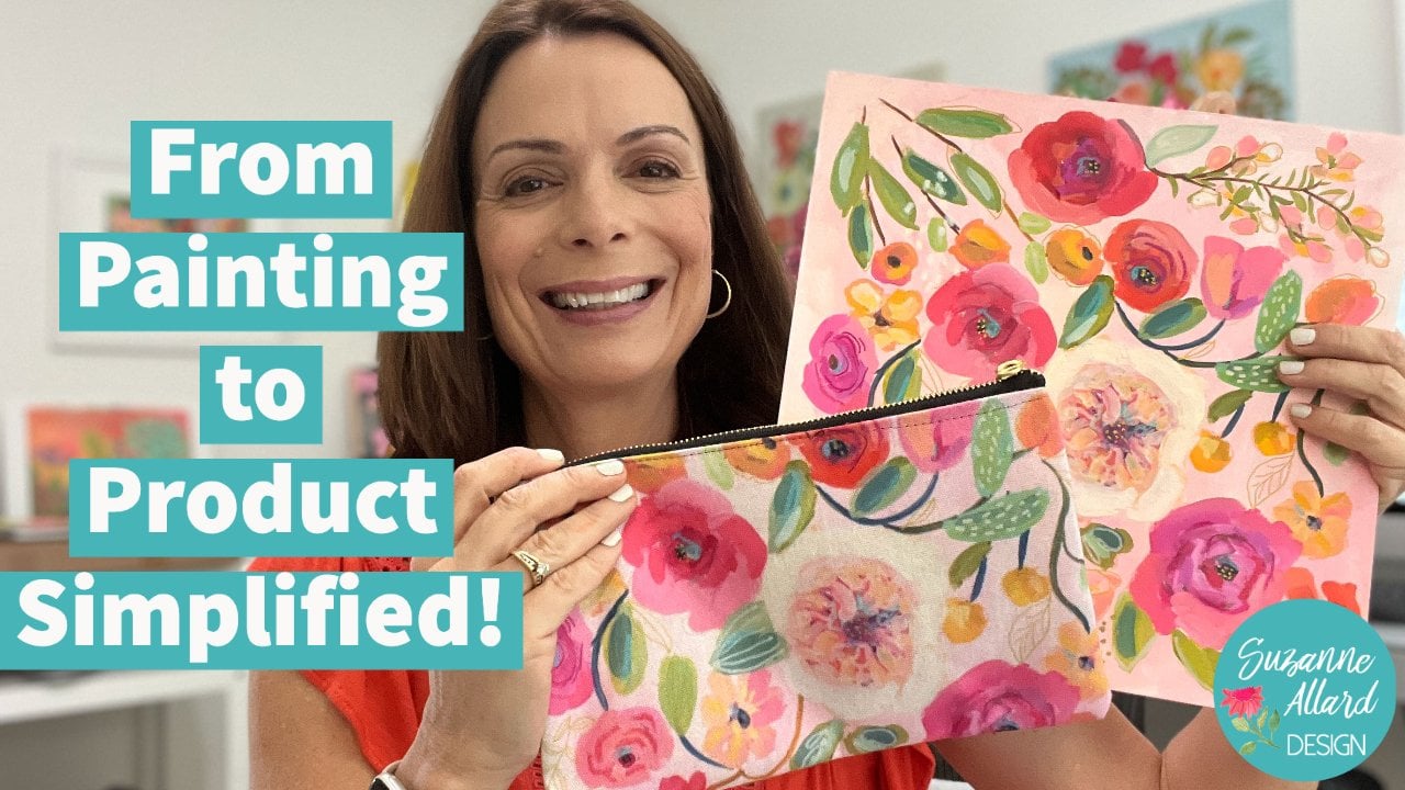
classes like this. And now I license my art for
products, celebrate genomes, prints and various
products on my website, as well as teaching online. In fact, I now have 30,000 timeline students across the world on
different platforms. I want you to know
though, that I was terrified at the thought
of even learning to paint. I have always done
something creative like knitting and faulting
and quilting. But I thought painting
was for real artists. And I did not think that was me. So that's why I became the
teacher that I needed. Super encouraging, real dry, relaxed, fun, supportive,
and not overly technical. As a teacher, I pay attention
to the mental and fears, struggles and creating
because I know that's what helped
me back for years. Of course, I also teach you
a technique composition, what different media
can do and how to tap into your own creative
spirit and style. This class is designed
to really help you relax and be playful so that
you can bring that loose, intuitive feel deal work. Whether you're just
beginning or you want some new ideas and inspiration
to shake things up a bit, you'll get value
out of this class. When I create classes,
I taught throughout. What I'm creating is
my thought process. When I'm looking for what I'm, what I'm trying to fix. And students tell me they
really find value in that. In fact, I get no
slip this one from Alyssa that touched my heart,
so I wanted to share it. Melissa says, I
can't put into words how much joy is giving me to learn to paint by
following your classes. I'm a mental health therapist. I love my job, but
it's very stressful. Learning to paint
with your kind of companionship and
just the right level of challenges and tips is making a huge difference in
my life right now. Thank you. From the
bottom of my heart. Wow. Thank you, Melissa. I've organized this class to get you in the organic inspiration. Make sure you watch
all the videos. We will start with
a project video, supply of video,
inspiration video, and then there are all of the modules for
starting and completing five organic tab striped
mixed media paintings. We'll finish up with
lessons learned and a discussion wrap up. The class is organized to get you in the flow of gathering organic natural images and patterns and then playing with some of those
in the paintings. Don't be surprised
if you start seeing patterns and shapes everywhere
after taking this class. Alright, I'm thrilled
to have you here, so let's get started.
2. Project Overview: Okay, let's dive into this project and a
little more detail. We're going to use a variety of media to create five
different paintings. I chose this type
of painting CH, because it is so freeing
and logistics, flooring, having fun and
learning a lot will create five different
compositions in different color palettes
with a variety of mark making that draws
inspiration from nature. Nature is the best inspiration. I show you how I source
pictures as inspiration. But of course, you can
find bark or bits of moss or leaves and all kinds of things
when you're outside. I'm endlessly taking pictures of interesting textures
and patterns in nature. Does my husband crazy? We will start with supply videos that cover much
more than you need. I use supplies that I have and I enjoy and I show
you all of them, but I don't want you to feel overwhelmed with my supplies. Dash, remember, I'm a
professional artist. I have acquired these
over a few years. The last thing I want you to
feel is that you can't do this kind of painting without all the supplies I
show you in fact, what I love about this style of exploratory abstract
mixed media is that you can do it with very
few supplies and colors. The reason I show you a
lot of options is just to educate you and make you aware of what's out there
and what I like. Case you fall in love
with a medium or an effect and want to
add it to your stash. So please use what you have. You will find things
to add along the way. After supplies. We'll look at the
sources of inspiration. What I'm looking for that
has an organic feel. And next we'll start
and finish five, complete eight by
eight paintings. Of course, you can use
any size paper you want. Please post your projects
to the project gallery. It's easy to do and
I love seeing them. Just snap a photo
with your phone. And then when you're
in the class, just select the projects
and resources tab. And then click the neon
green button that says Create Project to
upload your photo. You can also ask
questions or start a conversation in
the discussions tab. I love interacting
with you and read and respond to all
comments and questions. I've included some resources, including a supply list
for you to download. There are links to download
these resources in the class description and also in the project description. Under projects and resources. I hope you create lots of
these mixed media abstracts. I can't wait to see what
you create posted Even if you don't like it or
you don't think it's done. I guarantee you'll
learn and have fun if you embrace the process
rather than the result. So download the resources, get the supply list, inspiration videos, and
let's get creative.
3. Gathering Inspiration: Inspiration can come from just about anywhere for
this kind of piece. So let's take a look at some
of my favorite sources. Pinterest, of course. And if you just put in
patterns in nature, you will get kinda see that one. So many evenings. Also go to my Pinterest board and see the ones
I've already saved. But I've got, I made a board
called natural patterns. So let's go there. But you can search
yourself and make your own Pinterest board by
just putting in patterns in nature and flipping
through mushrooms bark. That's a beautiful bark. And you just save it
to your board like so. It's where you can really
get lost in this look at this macro photography
of a butterfly wing. Amazing. You can see how you could spend an entire afternoon doing this. You do have to be careful though a lot of Pinterest throws in a lot of junk
advertising and things. But also though, you'll see
like somebody's artwork. And sometimes it's hard to tell. Sometimes the botanicals
look like a painting. You just want to
make sure you're not copying somebody's painting, but Let me see if
I can find one. Well, that's a pretty
obvious example of a, somebody's painting, but this is somebody's
RUG based on a pattern, but you just want to watch that. Let's see. Mushrooms are
amazing, aren't they? Bark mushrooms? And so many beautiful patterns
in nature look about one. So let's go back to my board. I will show you what I've got. I view things, I have a natural patterns
for botanical cells. Then I just do a
pattern inspiration. But hopefully you can
get inspiration from gardens, bases and bowls. So let's take a look
at some of these and then we'll look through
some of my books. Natural patterns. There's just so
much inspiration. In fact, there's one in here. I thought this one
we could use is a loose kind of
composition for this one. And we don't need to
make perfect circles, but we can play with that. And then look at these
barks, mushrooms, look at that twisted
Yummy, notice right there. Plants. So that's
a natural patterns then I've got a botanical cells. I mean, that is a rapeseed leaf with the light hitting
the specimen from behind. I'm going to incredible. And again here, when you're searching for botanical cells, you do have to dig deep and make sure that's not a painting
that someone created. Because people are doing that. Because it's so inspiring. All right, Let's see. Horus, flowers and gardens
always provide inspiration. Look at those. Even though
I'm not planning on doing any flowers
per se in this, I'm keeping it more abstract. Look at those stamen the way
they're coming out there. And then seed pods, seed pods are fabulous. I think in this kind
of composition. Bases on bowls might seem a strange place to look for you, but I love people design really interesting
patterns on these things. So you might get an
inspiration from a beautiful vessel because they think they are also
inspired by nature. I generally work to, like matisse used to say, or it was quoted as
saying something about using nature as your inspiration even though you depart from it. Look at the texture
in this photograph. Let's see. Here's a close-up here. Yeah, this one. It's incredible. That's beautiful. Patterning. You can make a
board I'm foliage. Let's see if there's anything
else here that applies. I mean, I can almost
see inspiration and any one of my boards, but we'll keep it to the
ones that I showed you, the natural patterns
and botanical cells. So that's pictures. You can also get
inspiration from. You may have a seed catalog or this is one of
my favorite books. You can tell by all the
places that I've marked. It's intended to be a flower
or a recipe book where you learn how to put
a bouquet together. And I've never
followed it for that. But I like the way they do these individual photos here because I liked the spread here because there's
some beautiful bark. This leaf pattern is beautiful. For each recipe. They kinda lay it out
like that on this, even the background they've
used with the wood. I love. So I use it for that. Sometimes. I also use it to inspire
painting bouquets. But like here's some artichokes, beautiful flower recipe book. And I do have links. I'll make sure I do have
a link to this under supplies from my website,
Suzanne our.com. I have a whole bunch
of supply links, both on Amazon and on Blick Art supplies so that
you can find these things. Even my grass, look at
that pompous grass. And then this is just
the indoor jungle. For, again, I'm not thinking
of particular leaf shapes, but there might be some
inspiration in here. They don't do a
lot of close-ups. They're more, it's
more about how to create an indoor
jungle in your home. But there's just something
about the photography in this and the plants
everywhere that I love. The way they are draping down. It helps. When you start a
composition like this to just look through, you don't necessarily have to pick a photo like just getting this in
your eye and your brain. It might show up later like
those holes and those leaves. Maybe that'll show up later. The dots here. Sometimes it's just
like an almost like a pre painting sponge session
with your brain, you know, putting some pictures
like we just did, inspiration into your
brain before you start playing so that you
can see what shows up. Alright, so let's begin.
4. Supplies: Paint Types: Alright, I thought it
would be easiest since there's so many
potential supplies to use in something like this. And also I don't
want you thinking that you have to have
all of this stuff. You don't, but I just want to show it to you that way you can decide what you want to get
and what you really love. And it kinda potentially expands once you get
into artistically. Let's talk about paint first. Paint generally is in, well, aside from oils, We're not
going to talk about oils, but in the abstract
and watercolor. Watercolor that you're used to, that you hear about all the
time That's translucent. And you use paint
with water and you, your colors go on. There's no white watercolor. If you want white in a
watercolor painting, then you just use more water. I'm just doing a real basic watercolor properties
lesson here. And so this is watercolor. So if I wanted it to
be intense color, I would use a lot of pigment and if I want
to lighten that, I would just keep adding water. Occasionally blotting
it with a paper towel. If you using really good
watercolors like these, There's so much pigment in
them that you have to use quite a bit of water
to get it to fade. I'm trying to make a graduated
fading little more water. And you can see that that's how you lighten with watercolor because it doesn't
come with a white. Now, having said that, you can, if you've got watercolor, this is just a tip. If you've already got
watercolors you need, don't want to buy any gouache. You can purchase just some
white gouache like this. This is a whole Bain gouache. And you take a little bit of that and mix it
with your watercolor. And you can get
that opaque color. Using your watercolors. You can get it darker by just
using, again more pigment. I can get some pigments
straight out of here, mix it here, and get a
using the white gouache. So that is one way
to experiment with the properties of gouache by only buying a
bottle of whitewash. I'm just, it's not
the same as gouache, but it's a fun thing to
play with if you just, if you have watercolors already and you want
to play with that. Alright, so watercolor is
reconstitute with water. That means that if
this dries on here, I can come back tomorrow
and just get some water and revive it and use it. That's the same property
that regular gouache has. So in this class I'm going
to talk about when I say, how many either say regular
gouache or acrylic gouache, at least I hope that I
remember to say that each time regular gouache means, is that it has those
properties of watercolor. There is no acrylic in it and it can be reconstituted
with bladder. And that's the first
paint I started with. I started my florals with that. And I just love it. So that means that if
I take this color, which is just a yummy color, this cell it on, and I leave it just like that with no It dries
to a hard thing. I'll be able to come tomorrow
with water and revive it. That's it. That's why regular gouache
is considered a watercolor, is just an opaque watercolor. So you might say. So here's some, see, there's a little kid who has been in the studio
that was a cat hair. So this is more opaque
than watercolor. You can see that even though
I used a lot of pigment, that bit of watercolor,
It's still translucent. This is opaque. And of course, if
I want it to be even more opaque, I add white. And white just levels up
the choppiness of it. I happen to love that. Just intense pigment. I also, I will also tell you
just as a tidbit, It scans really well. The opacity without
the shininess makes quash paintings
scan really well. I think the shininess
that's can be an acrylic. Shows up in the scan. Sometimes it just makes
a sheen on the scan. You may or may not be
scanning your paintings, but I just throw that out there. Gouache is also what
was used in the 1800s. It's a French word but by
the French and others. And painting, wallpaper,
designs and things like that. It has a really interesting
background and I love it. Now to confuse you even more, most brands make both. So here's Turner's
design, gouache, which is regular
gouache, know acrylic. And here's their acro gouache. Alright, so whole Bain
does the same thing. Let's see if I've got a tube. Here's whole veins,
acro gouache. Their regular gouache tube doesn't look anything like this. Let me get one to show you. It looks completely different. Even though they're
both holding. This is their Apple Watch. And you kinda have to read closely because it just says
gouache right there, right. And then you read it, it says
hardest acrylic polymer. This is whole veins,
regular gouache. Then you got Winsor Newton. I love their regular gouache. And I am not sure if they
make an acrylic wash. Actually, I think I
might have just seen it, but I don't have any and I
don't need anymore brands. So I'm fine. I love their regular
gouache though. Then you can find
other brands are glad. I mean, I've collected
over the years variety. This is a decent brand. I couldn't even pronounce it. Lucas is a decent. Just don't buy if
you're buying gouache, well this goes for any paint. Don't buy the cheapest. You'll just, you'll
just be frustrated. They don't have the
same pigment load and you just won't get that. You'll say, why am I not
getting those juicy colors? Because you've got cheap paint. This is another brand, Martha Graham, that's decent. That's artists gouache. I've talked about watercolor. Let me write this down here. No, watercolor. Then this is watercolor
with white gouache. And then this is just
regular gouache. Then let's do acrylic gouache. Alright, so it's a
relatively new invention. All of a sudden, I can't
spell Akron. It is. Some people think, I
guess I'm one of them in a way that it's the
best of both worlds. The best of the caudate
qualities of gouache, along with acrylic paint. Acrylic paint dries quickly and it cannot, and
it's permanent. It can not be reconstituted,
reconstitute with water. So that's the same
with acrylic gouache. But you still get that chalky opaque
paint look that I love. And that intense
pigment is just, there's more pigment and
gouache than acrylic. So if I do say, because go bright, Here's
whole beans, opera. And one of my favorite colors
that I use is an opera, which is really just a fluorescent or opera
pink, opera red. And this is gonna give me that opaque
because it's so bright, it's hard to see that let
me choose another color. It just makes your eye go what? I usually use it, mix it with something. I'll just mix it with this. Or I paid a blend it with something
or use it in very, very tiny quantities. Let's see, this is gonna
be kind of a muted green. So of course I mixed
it with a solid down, which is regular gouache. Okay. Let's get some alcohol wash
of color that you can see. The sacral gouache is very, has the same
properties of acrylic. What Z The sense that you will not be able to
reconstitute it once it's dry. So there's pluses and
minuses to that, right? If I have it here on my palette, I think that's what this was. It's not coming back
to life tomorrow. I cannot reuse that. It is not gone. But I really like it for
lower layers of something. So let me see if I have an
example of a painting here. I do use them both. I really do. I don't feel like you can only use
one or the other. I ended up because I
want to do layers. Let me just use
this as an example. These lower layers are
probably acro gouache because then they
don't have to worry about them getting disturbed
when I do the top layers. Even though gouache,
if you're careful, you can paint over it. I've done many, many paintings
with just regular gouache. And if you just let it dry, this is almost dry and
I could show you that we could paint
something over it. Let's get this and get another regular gouache color and just show you that
you can paint over it. It's just it's not permanent. So it's just, it's just
another tool you don't need. Let's see what color
will show up for you. Maybe some red. If you already have gouache, you do not need to go buy Apple. Gosh, if you're a hacker, gosh, she did not need to go
buy regular gouache. I guess that's what
I'm trying to say. Use what you have. But I just wanted you to know the
various properties so you can decide. So I'll show you, you can
paint very easily right over. The regular wash. Doesn't get disturbed at all. If I were to work
at a lot though. Here I'll mess this
one up to show you if I use too much water. So let's use a lot of water. Come in here and say we're going to start
painting, you see that? You mess it up pretty quickly. So if you're going
to be layering, I'll go back to this one. Keep the water minimal and
don't floss, don't scrub. Now, by contrast,
this one is dry. I'll take white so
you can see it. If it's completely dry, I can come on top of this
acrylic gouache and do things just like I could on
acrylic and it won't disturb. So I can layer. I could also make
clean up my brush. I just don't have to
be as careful to not disturb it the way I
did with that one. If it's completely dry, I've done this before
where it's not completely dry and
it'll disturb. So if I keep working at
it, I'm gonna disturb it. But it just gives a little
it's a little more permanent. It is permanent, especially
after you let it drive away. So I just wanted to cover
the different types of paint and I'm not using them. Then the next one
would be acrylic. Just a regular acrylic. When I use acrylic, I use mostly Nova, which is a brand that is available only online
and Nova Color. And there's if
you're interested, there's Suzanne Allard
bundle on their website. I'm the colors that I've
picked out an artist bundle. But that is going to
be playing acrylic. It's not going to be
chalky and opaque the way acro galoshes and
it is permanent. Of course. I do find that their
colors are pretty, a lot of them are pretty opaque, which is why one of the
reasons I went with them, like this, cobalt
blue is very opaque. So if you've got acrylics,
you can use them. In this class. I just
wanted to introduce you and kind of do a little primer on these different
types of paint. Alright, now let's talk about all the other kinds
of fun supplies.
5. Supplies: Other Media: Hi, I just painted some
actual gloss on there. So that week I can show you how some of these work
on top of that. I also want to mention that on my website
under the supply, which is Suzanne allard.com, there's a supplies
tab and I have links to all my
favorite supplies. Pretty much all of these
are almost all of these. There's Amazon links
and then there's also Blick Art Supply links. If you'd rather shop
through public. I think I might
need to add these. I think I did actually. You can find links to all that, all this stuff there. Although I need to probably have the Daniel Smith do a Chrome. And this is a color that you're going to
fall in love with. Its one other
luminescent colors. But it's got a, you'll
see you in the class. It's got this soft metallic. So there's a few specific
colors that you might like of these Daniel
Smith watercolors. Alright, so there are various other tools that
I use besides paint. And these are just
kinda grown over the years to be a lot of fun. And for Marx and
texture and interests, oil pastels or one
of my favorite. The thing about oil pastels
is you want to use these. Think of them as one
of the last things to use or, or at least not, you're not painting
on top of them too much or really at all, because oil needs to
be sitting on top, you can put them over things. But think of them is either by themselves, like you can come. I love sometimes
just taking one of my favorite colors and just
making marks like this. You could paint around them. I have painted over them with a really translucent color just to play, I'll
show you this. It's just that
with a watercolor. I think it's fine, but if
you're thinking that it's going to adhere, it's not. So you could do
something like this. And that's okay if you want
that effect around it. Like whack with complex resist. Okay. So that's oil pastels. I use them all kinds of marks
on top of paint like this. I just love them. They're juicy, yummy. And then the other thing I
like to use are two types of Neil color crayons are
made by Qur'an dash. I don't even know if I'm saying that right, because it's Swiss. But we just call, it seems like we're just
calling Neil colors. There's 2s and 1s. So you'll see this
in the class too, but the ones are resistant. Think of them as like a wax
crayon that we had as kids. And so they behave this way, but they're a little more
interesting to paint over. And you'll see that
one of her paintings. And then I'll show you
just the Neil colors are water-soluble so they can
be reconstitute with water. So let's get a
brush and show you. If I wanted to paint, I've even done some
sketchbook paintings with just the neo color crayons. As almost like my watercolor. See how you can just add water and move them around so you can have texture
underneath like that. Where if I kept scrubbing, it would completely disappear, especially if I use
a stronger brush. And by contrast, the neo
color ones, the wax pastels. If I take, let's take this
pretty luminescent green over, look pretty over the orange. It's kind of a green, even
though it's called oceanic. It's got a little tiny
gold particles in it. It's delicious. See how I'm gonna get that. Resist feeling. They're completely
different behavior than the neo color two's. Okay. Alright, let's see what
else I want to show you. There are also these
woody 3M ones, and I don't even remember if
I use these in this class. This is a bold one
that's pretty, these are three and
ones because they are sort of a hybrid
of these things. The, you can move them around
with water if you like. But they also feel like a crayon and then
a colored pencil. Sort of waxy in a way
like an oil pastel. And you can get different color. You can get some really
bright pops of color with them on top of paint like
that and then just leave it. Okay, Let's talk about gold pens because I
use a lot of them. I have links to all these
on my website, as I said. And I use this
brand for my well, it's called they
call it extra fine, but I think of this
as extra fine. Like a paint. That's alright. Pilot gold marker. And this gives me a nice
demonstrate it for you. You have to find these and
pumping. Hopefully I haven't. Sometimes they stick them in. Oil pass narrow
means, rely on them. Let's see. Let me get you one that works. In the meantime, let me
show you the Finland. I use this a lot in the class. Alright, let me give you
one of these. It works and we'll talk about it. Okay? So this is actually my favorite thin gold pen that just the color of the goal. Amazingly, there's, some of
them are kind of greenish. This is a Pentel sunburst. And it just gives a really
nice line and color. So I like that link to it on my website. Look
with all this stuff. And then the pilot gold, this is the thinner one. So it'll give, like on top
of I'll show you close up. It really gives a lovely gold. I show you the larger one
and then you can make, I loved making sometimes baby latches with these truly dry, you know, that
metallic gold finish, which I'm kind of obsessed with. You may hate it, but
I just wanted to show you in case you like it. Then I use, I did
use one of these, introduced them
in the class, but I'll just show you
how they work there, the abstract 3D liner, you do not need this. I just thought I'd
show it to you. And you squeeze and it
will make a 3D line. You can do dots. I'll just use it
sometimes for an accent. Here's the thing about supplies. When I really want
you to hear me, you could literally
have none of this. Find some crayons from
your kids or grandkids, grab a couple of magic markers, a few tubes of paint. You'll see how few colors
we use in the class. And some brushes or
a palette knife or even a fork from your
kitchen and make marks and make this
kind of painting. I'll show you how we use. We're going to use a
really cheap chip brush that ends up creating one
of my favorite paintings. So the brushes themselves don't really matter too
much in this class, the only thing that you'll
see me specifically use is a couple of this one
that I just showed you. And then a really fat brush
sometimes, but you could, again use you can take a household paintbrush and
use the edge of it like that. I think I used one of these fat, wants to get those
big chunks of color. But you could use this again. And then sometimes I use
what's called a bright, which is really just a square
brush to do very like. Another just sort of signature thing of mine are just
think something I enjoy is taking that I'm painting with a bright
and making these sort of square shapes on
top of other colors. So that might be hard to do with with a round brush because you're
sitting there trying, but who cares if
you want to make if you have a round brush
and that's all you have, something like this, then you make the shape
a little different. You just go like this. You just kind of draw
in your square and fill it in or do another shape. So I just don't want you
to feel like, Oh my gosh, I have to go buy
all the supplies or it can't create the C,
that's perfectly fine. In fact, you might like it
better because it's a little more Boulez rigid looking. You can make little marks
with a round brush. I would rather you start with whatever you have than not starting at all.
Or that Thank you. Can't start, don't be a
supply in class collector. Well, it's great to sign up for classes and have supplies as
long as you're using them. Look at this, look how
yummy that oil pastel is. You just caught my eye. I just love how creamy they are. And the other thing that I use in the class
is a bit of ink. Again, you could just use acrylic paint or if you
don't have any gold, or if you don't have
any liquid gold, then you could get
the gold marker. I will say this is a really fun thing and not too expensive. This is Liquitex acrylic ink. Iridescent, bright gold. And I'll use it
either I'll mix it right in with wet paint
and let it spread around. Or sometimes they'll just
use it to make shapes. I should have shaken
this a little bit more as getting chunky. I need to shake it. But I'll do dot drops like that and they dry really beautifully. And then it goes one
of my favorite darks. So I do use some of
this organic ink. Organic. It's not organic. Indigo ink. And you can do just
with the droppers and really sort of loose lines. And then you can come
in with your brush and move that around. Even. Got some yellow
paint on there but get it to bleed anyway. Now I'm getting into the class, but I just wanted to show you. This is so much fun,
just playing with your supplies and seeing
what they can do. You'll learn something
almost every time. Something about
the way something interacts works doesn't work. There's not many rules that
I know of that I follow, except that trying to
paint to cover over these oil pastels is
not a great idea. You can over the goodies because they're
just not as oily. Okay. If you have any questions
about supplies or comments, just put them in the
comment section. Let's get to it. Let's
give these things out, get whatever you've
got and let's start. I forgot to discuss paper. Well, I do mention
it in the modules, but I wanted to just put
a little bit of time. Lately I've been really enjoying these eight by eight sheets. I do like Square and
I have 12 by 122. You could use that. Of course you can use
any size you want. You don't need to use square or a block by block.
Here's what I need. This is a really inexpensive
brand by Hobby Lobby. Sometimes it's 50% off and put the sheets are
individual sheets. They're not attached in any way. When you see something
is a block is bound at sometimes
all the edges. But in this case
it's just two edges. And then when you're
done, you just take your palette knife or even a kitchen knife and slice sender and go
across and remove it. There's really, it's
personal preference. Some people like the
black because it allows it to drive more flat. But you can easily
flatten your artwork. After the fact. With a little trick. I'll show you in
the wrap-up video. You can also use, I'm showing you a variety
of brands here. It doesn't really matter. I wouldn't get the cheapest. This is a studio watercolor. This is a watercolor as well. Cold press. Cold press simply means that it
has texture to it. So you want that for
this kind of painting, the hot press is very smooth. For it's for a different
style of painting. You want that texture, so you want to make sure
it's cold press and then you want to make
sure it's 140 pounds or more. Thin watercolor paper is no fun. So those are my only tips. This is just Pilate paper. I use different brands. I have a link to one on my website with
the paper as well. You don't need palette paper. It's just a nice
tool to have because you can use your paint. Then throw out, you're just throw it out
and get a new sheet. But you can use a
ceramic dish as well, because unless you're using acrylic and then you
might not want to. Okay, So those are
the paper basics.
6. Creating Intuitively: So this type of creating
can feel very freeing, but also in a strange way. It can feel intimidating
because there's no direct path. So we're nothing we're copying. When we paint something
more representational, like a bouquet or a
landscape or a flower, we may do it in an
abstract style, but we're still painting
something that is familiar to us and looks real, at least to some extent. That's why I wanted to chat about this process
and how important it is to approach it as an
exploration or an experiment. This takes the pressure off, which is a creativity killer. If you can think of yourself as an explorer and
embrace this process, I guarantee you will have fun and learn so
much about yourself. And what you enjoy
creating and expressing. Creating is like a dance
between cognitive thinking, kinds of decisions and
intuitive feeling experiences. We go back and forth. And this is a skill actually, it's helpful to become aware of how much
time you spend in either place and when you're in either
one in the process. For me, I tend to
give a little think about what direction
I want to go in. I gather some references,
usually photos, and then I think of a color
palette very loosely. I may choose blues and greens are limited palette
or I go crazy palette. I won't spend much time
in this initial stage. I just want some loose ideas
because I don't want to be boxed in and shut
off the intuition. Then I may think a
little bit about composition and then start
playing with materials, as you'll see in this class. At this point, do your best to shut off the thinking
and just play. Then you can pause
along the way as you see me do to think
about what's happening. That's what the process is. Think, feel, think, feel. Sometimes I switch back
and forth within minutes. It takes getting used to. So be gentle with yourself. When you feel like
you're getting tight, you are probably
thinking too much. So go off, scribble aggressively
on a piece of paper and newspaper with
a black marker that always reliefs
tend to inform me. Take some deep
breaths, take a break. But on some music,
refresh your tea, go for a walk or
anything like that, and then come back to that
feeling intuitive place. It's almost as if the
intuitions always there, but absent the thanking, you don't really have
to create intuition. It's more that you
want to move past the thinking voice in your
head and get to the intuition. This is where the play and
experimentation come in. I tell students to channel
their inner five-year-old. If you've ever seen a four
or five-year-old create, they do it without inhibition, usually was complete freedom. This is how we learn about
what we'd like to express, what our materials
can do and what we often get happy accidents that we can use in the future. So rule number one,
be kind to yourself. Your own encourager role number
to focus on the process, not the result.
Explore and play. And rule number three, Have fun.
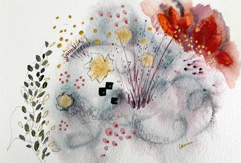
7. Painting #1, Part 1: So this is the one that
I've already done. And we may, we may do something similar
or we may pick up like this I really loved. But we'll do for this one, let's do, maybe we'll call this one the
mushroom abstract. And I'm going to start
playing with ink. I do not have my paper coated is just the
watercolor paper on a block. And I'm going to just be playful and let everything that we
just looked at. I'm letting my drop
would just now I think I'm going to
take my spray bottle. Let's see what happens when
we spray it after the fact. Oh, okay. You got to see that close-up. How fun is that? Where
it's dried a little more. It's not moving the
line which is fine. Let's just get a little bit of something, something going. It's really pretty interesting. We're going to have
to let it dry. Well, we can do a couple
of things before it dries. We can take, one of my favorite
things to do is to take metallic gold into something
like this because it dries, sort of spreading like this. So let's get some
golden there before. And then we'll let it normalcy. Use a dropper again. This is my liquid techs,
iridescent, bright gold. Getting kinda chunky,
which will be interesting. Right? Thinking if there's anything I wanted
to before it dries, because anything I want to add maybe a bit of turquoise over here and it kinda
blend with this. I've got my cobalt turquoise
light Winsor Newton. I'm just going to take a little
straight out of the two. Mix it with some water
here on my palette paper. Maybe I'll do it some dragging. Holding this brush
really loosely. You can hold it like
this is to keep me from getting too tight
and overworking and to keep the movement
and shapes from being more organic
and less rigid. Right? I think that's a good
place to we just have to see this could take an
hour or more to dry. So I will remove it from the
block with my palette knife. In this block is connected at just the top and the bottom, just two sides, which is nice, It's enough to hold it down. And I've ordered another block so that I don't have to I
could leave it on here. Well, it dries, which would
help it from buckling. But for the purposes
of this class, I want to start another one. While this dries, we can always flatten it
after the fact. I had a couple of ideas. This was the first
one we started. It is dry now and
a little bit bent, but we can straighten, flatten that out at the end. And I thought it would be, I want to add like a
botanical is small, the panel Goleman has a drawing kinda just
coming off of this. I don't know which way. Maybe kinda coming
around like this. So I'm just going
to use my Pentel. This is my favorite
thing. Gold pen. I have these on my website, Suzanne our.com under supplies. And then for the
little bit thicker, I like this brand, the pilot I've tested so
many times over the years. This is where I've landed for consistency and what I want. So I'm just going to kind
of look at this and draw, actually going to
drop the other way. So I'm just going like this.
So I have it to look at. Kinda come up here with some little delicate
branching things. I'm just going to
continue this way trying to keep it loose. And I'm looking at the
photo for inspiration, but I'm not copying it exactly. Once you get the idea, you
don't even need the photo. Photos though of
nature can help you from trying to give
two symmetrical. And we have a habit of thinking that nature
is very symmetrical. And so when you have a
real reference photo or a little branch or live
flowers and foliage, then you can keep from
getting to linear and two, matching, matching because
nature is just not that way. I want some of this
over the blue. I'm serious. Type B vaccine if that's about what I want.
You didn't want them. Another little surprised
going up this way. I don't mind that this
is a broken line. Gets soft. Yeah, I like that. It just brought a little
elegance to it, didn't it? I like surprises. The unexpected. You could also do
something like that. You know, right there or see if there's anything
else that is inspiring. I got my book upside down now. Okay. They're just shapes. In general when I'm
doing something like this or really any piece of art, I'm thinking about a variety
so small and delicate, with larger and bolder. And something needs
to happen here. It could just be
a color surprise. I was thinking about
grabbing this pink. I'm just literally doing a few shapes like
this. Right here. Let me go do orange,
we get to green. And then maybe do some
drawing on top of it. I think I'll do that. I think I want to try this opaque gouache with
bright shade brush, which is a rectangle. Let's see what we
think of just a bit of water because I don't
want it to water down. You don't want it to
be an exact rectangle. They do want the edges
a little bit rounded. So that's why I'm fussing
with it a little bit. That's just, you know,
no right or wrong. The third one down
here or up here. So you can kind of just see
what feels more balanced. This is already coming down here. I think I'm gonna go up. Just making sure
it's really opaque. I went back super chalky
pigment and feel, which I think contrasts nicely with the more
transparent watercolor. Like that. It's a
little surprise. And your eye it comes
to kinda looks at this. Or maybe it comes here first and then kinda travels along
this line over here. Some of the gold.
To think about, if we want to add anything else. Got the oil pastel, got gold ink, we've
got turquoise. Woody. He could just intensify
a little bit here. Sometimes I like to
do the same color, the same color,
but in that case, I don't feel like it did match. So let's see if we come up
with a little bit later. What that does. This
is the oil pastel. Like a little bit better,
but now I want to sort of under paint some of the
other and take it out. So there's a couple
of ways I can do that. I can use paint. I can also use cream colored
posca. Sometimes I do both. I'll start with the positive as the first layer and then
go over it with pain. Sometimes I mess around so
long that I don't like it. That happens. Learning is how you figure out what you
like. What you don't like. Experimenting is what I
meant to say. Like this. I want to make bigger works. I can go like this. And it makes the line, you know, go backward
because I've covered it. All right, Let's let that dry. Just a process of layers
because once this dries, I might want to do something
with those, or it might not. It might come back
with oil pastel on top of that and might not. It's a matter of deciding what I what I like and want
to keep and what I want to play with covering
up. We're changing.
8. Painting #1, Part 2: Okay, so this is dry
and as I look at it, when you do this sort
of free form stuff, things happen and some of them are good and some are not good. And what is bothering me from a composition point
on this is this here, because you always want to
keep the viewer's eye on your, on your piece of
paper, on your art, on your picture claim is
it's called anything. So when you were making marks, you do want to think about
guiding the viewer in. And I do that kind of
instinctively now, but this keeps guiding
me out right here. Even if in the way to tell is
if you cover up something, look how much better that looks. Just it's just it's drawing knee down here and then
I'm kinda getting lost. So I might just use your own. You can take it
away and then bring it back and go where does man, I go immediately for me on
this one, my icons here. And then it comes down here. And then even though I know
there's more to look at, I fall off the page. So that's something to watch when you put
things together. And this was experimental
and playing. So I'm not worried about it, but I want, I just wanted
to point out the learning. But we're going to,
we're going to, I'm going to paint over
that just so that we can continue and keep
going with this. And at least for our purposes, we're going to
so-called fix that. Because even with that done, It's still doesn't
feel like I love it. So what I was going to show you a couple of ways and
it probably won't fix it, fix it because that's Inc. and it's gonna be
hard to cover up and then it's going to look
like we covered it up in a lot of times. I'll do that in a painting and it'll become
part of the painting. But when it's something
like this which is off the page, It's hard to fix. Now what you could
do is let's say you really loved it except for
that, you could matter. And your mat could
come like that. You could, this is
an eight by eight. You could do like
a six-by-six or 7-by-7, probably 7-by-7 mat. And just have it would look like white would be coming
there, which would be fine. I guess you could even cut, cut some of it off and frame it. But since we're
just playing here, I'm going to show you
a couple of ways. But what I've done this before, you find out that paper
isn't actually white, white, do you think it is but
when you compare it to white paint, it isn't his white. So I'm going to try first
some regular blush, meaning no acrylic in it. We know that this is ink, so this is permanent. And I'm just going to
take a really clean brush and clean water obviously. I've probably added too
much water on my brush. Yeah, this is too watery. Let me plot it. Sort of try to hide that a
little bit and then see what else we
want to do on this. I've got a few ideas. Some of the ideas
are coming from me wanting to show you some, just some different materials. So we might end up crowding
this painting a little bit, but I want to show you
some different things. So actually that's
covering it pretty well. But still it would show. I'm just going to come in here and kinda imitates
organic shape that it is. All right, Let's let that dry. See what happens. Alright,
aside from that though, I wanted to come in here
and do another coat of the Posca marker. On this side. See how I have
to prime that, pump it. And why did I want to do that? I just wanted to cover up
that line a little bit more. A call tie in with
the rest of this. Professionally that's
covering surprising a while the regular gouache. Now, just to show you, one of the things
I like to do with oil pastels is Come on top
of a color that I painted. Remember this was
the, the gouache and I think it was Apple Watch. And with a very similar
color on top of it. I just liked the way that adds a texture and interest
without being overwhelming. So we can first try that color. Doesn't really show it up. I've got a few peaches here. See, this one's a little darker. Yeah, that's kinda interesting. Yeah, I dislike that bit of
texture on top like that. So don't remember that mark. Maybe it was there. The other thing I'm thinking
about just because again, I want to show you some new
some variety materials. I think probably I
would stop on this one. Because there's a lot of interests in the way this
kink traveled around. And so I think there's
enough going on here, but I do want to show you
little things that you can do. These, I found these
abstract center. Liners. I started with just, I
think these two colors, which are I think this is ochre and rows fluorescent when
I recently picked up. Here doesn't go
because who doesn't even more gold, right? I picked up the turquoise
for the same reason. I also just picked up silver. So I think that if we went
with that concept of same, same, same, we could take this ocher and
just do some bits. Now, what else to tell
you about these may get a sample and show
you is their 3D. So that's, it'll stick up, but I don't let me show you and you have to
squeeze them pretty hard. So you can make lines and you just practice
with it because if you push it and you're
gonna get that groove. But if you just kinda go along the top, squeeze some down. Squeeze so hard that you can
kinda get a line like that. Sometimes I'll just
use them for dots. Almost like if you've
ever made a cake, frosting squeezed or things. It's very similar. You can do these little dots. So I always do these last because they take a while to dry because you can
imagine it as 3D. Chunky. See. So just
keep that in mind. I'm put it over
here so I don't sit another piece of paper on it. And just to show you, I think I'll keep it
minimal and maybe do some dots on top of these. Kind of flatten them out. Yeah, that adds a
little something without maybe
making it too busy. And by the way, this technique with white, you can come in afterwards
and let's say you decided, gosh, I think if there's
anything I want to take away, well, I'll just do this for
demonstration purposes. Let's say that you didn't want
this coming down this far. You can push it back. Art is about bringing
forward and pushing back. So let's say you
wanted that to fade. You could do a couple of coats
of white and push it back, and then you can bring
other things out. So that also helps
with composition. If you're finding
that there's too much going on and it's beer, there's too much
competition for your eye. Then you can push some
things back. I've done that. Let's say, let's say I had painted these with fluorescent
and they were just, you know, which I love. You'll see I use that. But sometimes it's
depending on where it is. If it's over here, it'd be
too intense because all your I would do is just
keep looking at this, which it does a little bit because there are different
color than anything else, but it's not to
me so dominating, overdraw that, that I don't enjoy the
rest of the painting. But if it were, you
can just come with either an off-white like this in paint or you can be in paint or ink and just cover it
and it'll just soften it. So see, that's drying. This actually
worked pretty well. It really did kinda soften it. I'm just kinda
blending in the edges. What's nice about
gouache is it'll dry with the texture
of the paper. It won't it won't feel like it's sitting on top of the paper the
way acrylic night. All right, so looking at this, I think it's interesting. I don't, I'm not in love
with it the way some of the others that we
have in the class. But it is very interesting
and we learned a lot. And I particularly
like, I also like to, when I do this kind of exercise, say what did I like most about this one and
what don't I like? So if I were to review this one and I liked
this branch a lot, I like the way the ink
is behaving in here. This just really lovely. I like these three
things over here. I like the gold. I really
don't like this in here. That's really instructive to do because especially
when you work, if I were working
in a sketchbook, then you have the
sketchbook filled with all kinds of things that
you like and didn't like. And in fact, I will show that
at the end of the class, just flipping
through a sketchbook and being able to
learn from that. So at this point, Let's see if this one's writing. I'll go ahead and sign it. And we will call
painting number one. Done.
9. Painting #2, Part 1: So for this one, let's try a completely different
way to start. Let's take a large
watercolor brush. Doesn't have to be this big. This is 16, but you may
have this is a ten. We can use that. It's more
likely what you have. And I do want to start with
some ink, but this time, let's put it on the palette
and get a little water into it. And we'll do that. They will just sprinting. It kind of spreads
here and here, not in the whole page. And I wet my brush
and I'm just going to touch that indigo ink. This is prayers is
Brits isn't a kind of a half-moon instead
of a circle which is actually giving us a
jellyfish look, isn't it? Kinda go with what shows up? That's what I love
about this process, is hard to over control it. Those are actually
really lovely. Okay, now, let's think about something else
that might be fun to do. Let's bring in some
of this orange. This is, I'm going to see how orange this is because
this is a Quinacridone. Sienna. Sienna tends to
be sort of brown, coppery side, but this
is a brighter one. So let's see how it works. Use that same large brush. And we'll make a sort of circular thing like these mushrooms and see what happens. It's really red. I'm going to make some of the deep yellow gouache with it. It's going to change the the watery mess of it because it's
washes more pigmented. So that'll be interesting. And again, I'm using this
brush really loosely. I don't really want
a perfect circle. I loved the way
that's blending in. And we could do
another one here. It's blending in with the then see how that's
more pigment it, I added more water
to my brush here. I can add even more here. Just touching down, thinking
about natural shapes we saw. This is almost like
some of the bark. And then I think the
turquoise really wants to be there next to some orange. That's what they
told me. This is one of the most amazing colors. It's not cheap, but it
little goes a long way. It's the Winsor Newton designers gouache, cobalt,
turquoise light. Since it's gouache, I'm not
wasting any of those here because it can be
reconstituted with water. I want some of this to touch the orange and beautiful
greens that happen. I have more water
like in general, to reduce the intensity is
the painting goes outward. So more watery stuff would
be on the exterior here. That doesn't always
happen because you can see that the pigment here is moving that
way, which is fine. My darks though got
lost a little bit. So I'm going to add some of the just dab a little bit more. Well, I guess let's see. We could do the ink or we could
do the indigo watercolor. Let's just do some ink. The ink is more intense. So it just depends on
the effect you want. I was losing contrast. They were just
getting that happens. But I don't know if you can
see what this is doing now. Bring it up. The
beautiful texture is this bleeds into that. And let's see. I'm going to show you a
little bit of ink here. But it'll be okay
because it's kinda that. In fact, it happens sometimes what I'll
do is take the ink and throw some brush better so that it
looks like part of it. So let's just do that so
I can show you in a dip your brush in the inking brush
already has water on it. You can practice on another one. You want first, so we
can set this aside. Here's a scrap piece of paper and practice, just like that. Hitting your brush. Make a little more water. Will do it on this one. We're just playing. So I'm not worried
about ruining this. That's the thing with
these you don't want to get too attached to is if you start getting wrapped around, oh, I'm going to relate to them. It's going to cut down on your
experimentation and your, your freedom, your play. The goal of these is to explore, experiment, learn, Have fun. So you don't want to
get too caught up. And I'm just adding a little more Turkers there
because I've lost some of that intensity that I love. There. You know what I'm thinking now? Composition wise. It needs something here, but it doesn't mean a lot. It could be some dots
which I could do. I could do more of
the indigo ink dots. I could also do some gold
dots. I could do both. Well, that was a blob. My ink is getting
hold and thick. But once it's dry,
it doesn't matter. So I just take from that one and I don't want it to be too
much on the circle shapes. So I'm going to make these a little more
irregular looking. Then the gold on top of the
indigo always looks amazing. Let's get a little bit here. Let me shake it up better. This is a new one actually, so it shouldn't be I think I
just didn't shake it enough. Sometimes you have
to have it again. You could use a
brush if you want. I just find the
dropper is easier. You don't have to
clean off my brush and we'll get this ink brush, which is not the
best name for it. Alright, I think that's
at a place where we should stop and
let that one dry. This is just a series
of playing with these, letting them dry,
coming back to them, seeing what other
media we want to add and having fun and
learning along the way.
10. Painting #2, Part 2: Alright, so this is
dry and let's figure out what to do next. We've got, I'm just kinda straightening a little
bit without some gold here. Some really interesting
textures and bleeds there. I'm thinking of something
with the gold pen. Just to center it a little
bit more in the paper. The composition needs
something here. So I was pulling out
this plant book. And it could be lines. It literally could be something
really, really simple. This is kinda pretty what about something that kinda
comes along the side? Tenderly? I'm actually even
like the lines. I'm going to try not
to overdo it because there's a lot already
going on in this. Nice leaves. It's always hard to not let them
look like hearts. So it helps when you
put in the veins. I want to talk too much
and I'm trying like that because it will
make my pen move. But we need one more here. I think. We can just do the tenderly thing
like we have here. Just a little bit of
surprise of something. Then. Just botanically fan of organic. Some of the pictures were
looking at patterns. I'm just kinda centering. It. Doesn't have
to be perfectly, but if you were to frame this, it would feel off
kilter tonight. Have balance. Your signature or
believe it or not, can help do that too. I can just do that
while I'm here. Let's see what else. I think I might want to bring
some of the gold and do some little patterns
through here. Like that part
that we looked at. We can also take
metallic gold pen and do some larger number those
leaves that have the dots. I don't want to
cover too much of this bleed because it's lovely. But the dots and nature are a variety of shapes and sizes. So just make sure you don't
make them too uniform. So that they have
that organic feel. Really liked that gold
on the turquoise. Just doing some of the main
stem without heavier pen. Colors came out like
almost a tree and here is where I'm
looking and going. Do I stop? There, anything else I
want to do to it though? Maybe just a few more here. I always make these kind
of go off in a direction. I want them to look almost like they're floating on a breeze. I mean, this is really
interesting through here. I don't think I want to do a lot more and nothing's
calling me now and saying, you shouldn't really do more. So I'm going to
call this one down.
11. Painting #3, Part 1: All right, Let's
play it some more. I'm thinking I want to try
some of these chalky or washes and get some of that texture in there and see what happens. So maybe these pinks
with the turquoise. But I want to show
you a couple of different ways we can
use different media. So let's pull out the
neo color crayons. These are the ones that
are water-soluble. There are also wax ones, which are not water-soluble. So you can play with both. But for this one I'm going
to use the water-soluble. Well, we can so that you
can see what they're like. I'm just going to throw
one of these into. I just got these and I use
the oil pastels a lot, but I wanted to try these. So I've been playing
with them a little bit. We'll go ahead and make some
marks so that we can see how they react
underneath the paint. So let's do you have an indigo because
I'm obsessed with indigo. These here it is. And I'm going to do some
of those Salt Lake shapes. Loose organic field. Then we can take a similar
color with the wax. Neil color, one. That's
how they calculate. Actually, this is this is my
two. This belongs down here. Get this one. I think I mixed them up. Good thing they're labeled. Let's take a different color. If we're gonna do the
pinks, Let's see. Well, let's just use a
little bit of this and see, so they call this
one new color ones that permanent wax pastel. And then Neil color twos are water-soluble
wax passed out. It doesn't seem like wax
could be water-soluble, but that's what these are. And let's just do a lineup. Let's do something like we saw the mushroom sort of pattern. Maybe a little bit of that. Something like that.
Let's see what that does. And thinking about what
else I went to play with. We can take a little bit of this peach colored
oil pastel and do things like coral, doesn't it? I'm kind of like these colors. Right? You haven't
used paint yet. But I'm thinking I want like a turquoise
large shape here. So I'm going to wet my brush. This is my same
turquoise gouache that I can reconstitute with water because
it's regular gouache, not acrylic wash.
And I'm just going to drag this up here
really loosely. You can use you don't
see a drop fell there, which I'm fine
with because we're just Could be happy accident. We can also take
my favorite tools, which is a fan brush and maybe
do some things like this. I like the simplicity of this. And I really liked the peach. I'm thinking about what might
be pretty inside these. I wonder if a bit of this
orange would be pretty. Keep going back to the orange. This was actually my turquoise
and my brush though. So it's mixing to make a green. I'm deciding if I want that. Let's see what that looks like. On a scrap piece that's
sort of a brown rust color. It's pretty I think
I'll leave it. I think I'm just
going to dab in here, which will activate
some of the new color. Gram, because
remember this one is water-soluble, so
it's going to mix. Just wouldn't get more water. We should get kind of a
interesting organic feel to it as these blend. I'm not going to put
water everywhere. But they weren't
enough touching. I want them touching
so they can bleed. And then we can come
out here a little bit. Maybe incorporate that. Just adding more water to my
brush and coming out here. Hello, but it's getting
bigger and bigger, isn't it? I can dab color into that water. It's very interesting. Definitely a focal point. And let's take this is
the wax pastel, remember, so it's going to be permanent. So I'm going to take
a little bit of this Quinacridone sienna that
we had here on the paper. And bring it over this and
get some wax resist going. You can see it bubbling over. Even though I'm using
a similar color, I'm going to have
a little bit to change it so it shows up better. It's pretty cool. I have that
shows through, doesn't it? So this is a way you
can see the difference between the new color one and twos and how you might
want to use each one. Very cool. Makes me
want to use it again. But I wanted to
keep these simple. So I'm not going to overdo. I'm thinking about I
really liked those. So that's what happens in
this process is you might finish four or five of these and then find one or
two things that you learned or discovered
or like in each one. And then you can take that and, you know, do more with them. So I think our next one,
we should use the wax more and do more of
this to play with it. Now, I want to let this
dry because I want it, I might want to come back. I was thinking that
some that some of this shell pink because
it when this is dry, would be pretty on there. So the others are
not quite dry yet. The gold, it takes the longest, But they're really interesting. Let's take a look at this one. The first one we did,
I used a lot of water. Then take a while to dry. Yeah, there's still water there. So look at this wax resist there and then look at the bleeding that's happening
on that little shape. All right. Let's keep playing.
12. Painting #3, Part 2: Alright, painting
number three is dry. And I thought we would pull the Pinterest board backup
and this is my leaf board. So if you go on to
Pinterest and you follow me, look for leaves. Of course you can make your own. And I'm just kinda looking to see what feels inspiring
to do. Like over here. Something not super heavy. I'm a light side because we have some chunky stuff here
and this is substantial. I think something
on a finer sign, like very tiny leaf or even just something wispy
maybe like this. It'd be nice if we could
do it in gold pen, which is what I've been doing. You can also try. Let's see. I loved the Micron pens, but let's see how
this one's doing because I've gotten them
in. This is a newer one. I've gotten them into the
pastels too many times, so sometimes they get mocked up. But this one seems good. I wonder which way it
went this to face. He's lying. So you could
come down this way. They could actually
come up that way. I think I went back and I'm going to try really
hard to make it wispy. Like good practice like
this a little bit. It's how you hold this lightly so that I'm
not doing that, which is fine, just not
what I'm looking for here. Let's do a few
more, longer ones. Then. I want to take
the same pen and maybe do some just shapes. And I can ink, but I can add water to
this pretty quickly. You can get before it dries too much and get
something happening there. Just because I don't
want the lines to be too to what what am
I trying to say? Too much, they're barely see it, but I'm doing those loopy things so that there'll be some space. They're just looking for it, looking at it for What
else I might want to do. I'm feeling like I
want to take that, pick up that orange
that's in there. But we use the wax pastel
and get the oil pastel on that color and just maybe make some marks here in
that same orange. So I'm starting to tie
things in a little bit. And you have got
the Navy in pairs from Navy there and bear indigo. And then the orange. Then this pink and turquoise might be fun to do
those square shapes again, but maybe make the
smaller and more square. So I'm going to take that
same great shape brush. And to get these opaque, probably have to do
a couple of coats. And then maybe I'll put
some gold on top of them. I love when my workspace
gets overtaken by supplies. That's a good thing. I'm trying to make these really chunky. I'm laying or clearing the
pain on pretty heavily. Feeling like I didn't like
the way those were empty. So I'm just dabbing
in a little color, leaving some of the outline
showing some of them. Whenever you've got an element out that you can go
ahead and sign with. Just sign while you're
there with that element. So it could be a color of paint in your brush. It
could be a pen. I think this is
done. I'm just going to let that dry and do really another thick coat of the gouache to
make it really pop. It won't take long to dry. That's the beauty of gouache,
especially acrylic wash. Which of this is?
That just means that they've added
some acrylic to it. So it cannot be
reconstituted with water. Once it dries, it's dry. It does dry very fast. While that's drying.
I had this thought. Might not be a good thought,
but it'll be fun to try of taking the
pen and just making the base of some of
these a little bit heavier so that they're more pronounced and also
less the same length. Can you give it more movement in a way? I have another idea. Yes, I know I can't
not do the gold pen. It seems like I just
wanna go around. Some of these is a
really fun thing to do. You take that organic shape
that showed up with the, with the watercolor, you know, which was really unplanned. And then you go around, around some of it with a pen, following the outline in it. It can be really interesting. And I just felt like these
guys needed a little bit of something to bring
them into the picture. He's just me thinking about
what I want to play with. Based on some of the
pictures we've seen. The shapes and patterns. The fact that I
love metallic gold. Alright, I think we're ready for how often go the
opposite direction then. If I did it this way, then when it's dry, I'll go the other way. Dr. And just that
amount of time. Okay. I think it's done, but if I look at it later and
when I do something else, I will come back. What I think is really sweet. It's got some interesting bits.
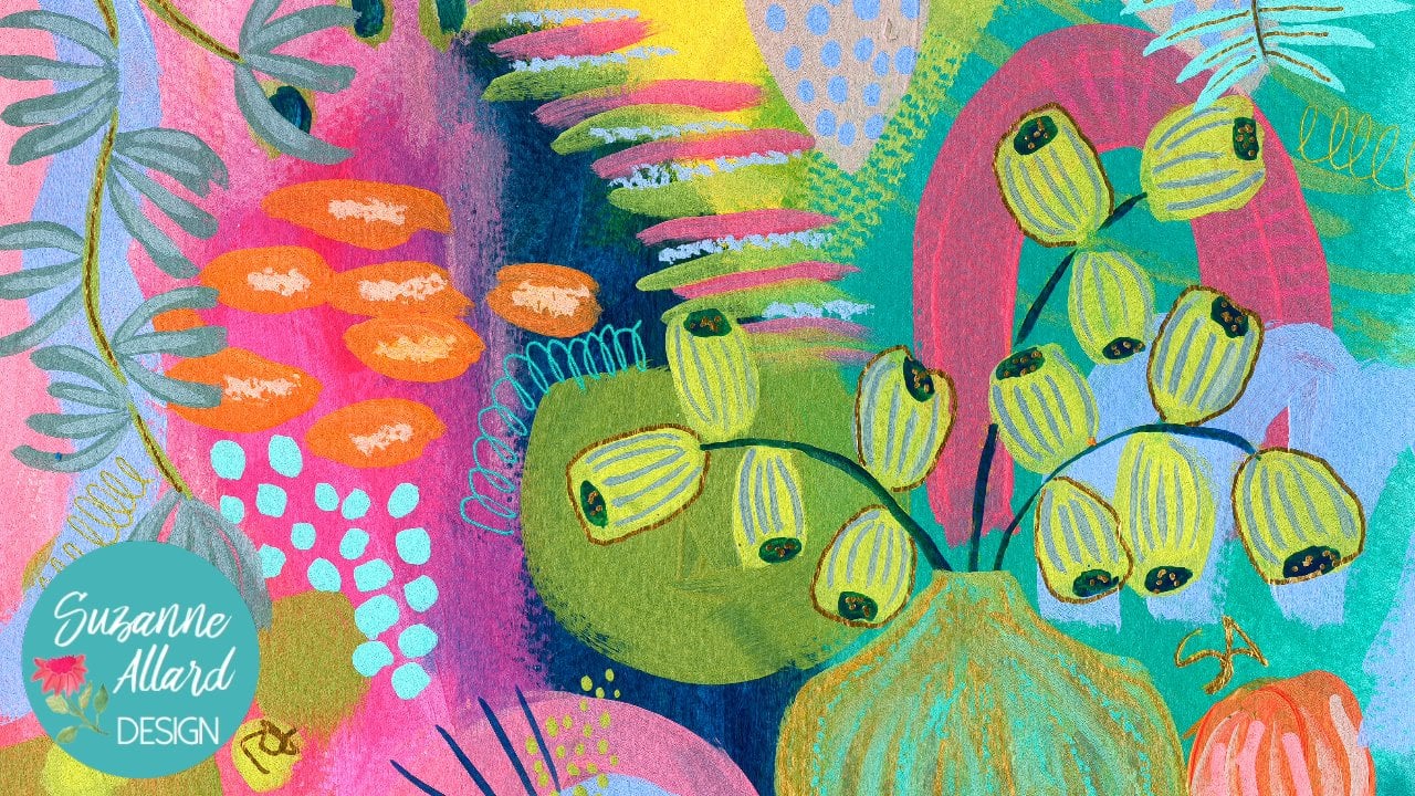
13. Painting #4, Part 1: All right, so for
painting number four, Let's go in a different
color directions. Let's play with the
pinks and greens. You find obsessed with
the turquoise and orange. Let's change it up. And of course, I want you to use any combinations
of colors that you love. Piece of glass here I'm
going to use as a palette, another palette
situation I like, and I do want to use
more of these wax. So let's do, let's start
with some shapes that are, Let's pick something
specific from this book. Look at those. You
can just open it up and those are kinda interesting. Seed heads. I'm not making them as
precise as they are. They're kinda
octagon, let's see, 123 pentagon shapes that I'm not taking it quite literally. Remember to stay playful. And I think it was also Matisse. Might have been
somebody else with one of the masters said that our job is not necessarily to create what we see in nature. I mean, people do botanical drawings and very
precise and that's great. There's nothing wrong with that. That's just not of
interest to me. I liked when he said, Our job is to create
the feeling of it. The feeling. Rather than an
exact literal representation. Look at that solo. See, oh my gosh, so beautiful. I'm going to make it touch. I have no idea where
this is going. You guys asked me all the time, do you have a plan
when you start? A lot of times now? I do not. These are cool though. Okay. What if we did just
coming up like this? And then a larger one. And then maybe a fat one. Little. They have green dots, they have green and I'm the base of each of
the little thingies, so we could put some of that. And these are the wax pastels that you could also
use, oil pastel. The ideas that they're
going to resist. The paint that we put over m. Let's take which they broke. So I'm gonna take my little since it's pointed foot a
little bit of green in there. It's looking like
amoebas now, isn't it? Let's see what
other inspiration. That's pretty. Maybe
I don't need anymore. Well, I know it will do. We
will put some stems on here. Sort of be suggestive of stems. I love geranium leaf. Look at the shape of that leaf. Let's get some paint out now. Try for that shape. Well, very loosely. I want to get this olive, this is the olive
green Winsor Newton. A little bit of that. Actually, I can use my other
side of my palette paper, the pallet paper for gouache
I like because I can reconstitute with water and it's just easier
to keep track of. If I use my glass
palette for that, then I might forget
that it's there. And just see if we
can make using this. Maybe add a little
bit of this to him. This is that oceanic
Duo Chrome with the parole quality to it. It'll just give it a
subtle like luminescence. Got it all stirred up. And I'm just going
to very loosely, I'm using this fan brush because
it You can keep you from getting too tight and precise. Pretty. We're going
to do another one, but I need a little more green. Right now. This feels like a very disjointed separate
elements type of creation, but that's okay at this stage. We can address that. See how this brush kind of makes you be a
little more playful. Living dangerously
trying to do align with this thing. While laughing. Man, you can, you don't
need the fan brush. Of course, I just
wanted to show you. And then you can smooth out
any fetuses you don't want. My oceanic watercolor
is gotten pretty dry. It's years old, but it's fine. It's watercolor. My aunt used watercolors
and she would have them for 1015 years and
just reconstitute them. All right, let's see
what happens now. If we take some of
this chalky gouache, which is put on top of the resist because
it's not remember, it's not gonna be transparent
the way watercolor is. It's going to be more opaque. So the resist might
show up differently. And I'm going to let
these things bleed. Yeah. It does behave a little more differently compared
to reuse the water. These still resisting. It almost looks like
we painted on top. And if I see, it does allow me. I go a little thicker. I can cover up bits of
it. That's kinda fun. Make me get a little
more opaque and places. An interesting effect. That's
what I loved about quiet. She can layer. That's interesting.
We'll let that dry. And let's try some
of this opera rose. This is a really bright, if it says opera is bright,
think homeless, fluorescent. And there's a red over pink. But they pop, will
always be a focal point. Notice that I'm holding
the brush very lightly. Just allows for a
little more freedom. I'm just playing. That dangerous to play. Sometimes it feels scary. But if you check
in with yourself, there's no actual danger. Now what to do with these? I think we take that. I have some here. Yeah, I do some of that wash and had a
bit of green to it. So we get that resist. It's more of a lemony feel. And add more water to this one. So it's a little later. Maybe not that late. Maybe take my gosh isn't dry. So it's not blending a
little bit, but that's okay. We'll see what happens. Pretty teeny tiny dots are kind of fun. I could also just spatter
my brush down here. Let's do that. Be more
of a organic field. So remember when I said
we'll work on unifying. What I did is I brought some
of the green over here, the pink from here to here. The opera pink, the
yellow throughout. The composition is still need something here just
to balance this. So I'm thinking about maybe another green
leaf structure here. The other thing that's
bothering me composition wise is that these leaves
are the same size. And I usually don't
like, I want variety. So I can make one
of them larger. And if I did that, it's gonna be this one. And I would just do it very lightly around the outside here. Maybe bringing
some more of this. You know, what I think I'll
do just to balance it out is just some simple strokes like
we did on that scrap paper. Whereas the scrap paper, sometimes the things
you're doing that are not thinking of looking at them and going
really like that. Like the way these came out. And all that was was this big brush and his
sideways like that. At them warm Senate? Yes, I do. Okay. Let's lit painting number four.
14. Painting #4, Part 2: Okay, a little painting
number four cell. There's some really things that are really
making me happy here. The colors. I don't know if
you can see that the soft, metallic golden hear
a little bit in here. These dots are just so fun. I feel like these almost. I think what we were doing, these leaves were doing
geranium leaves and now these feel like uranium flowers. And I just really like it. There are a couple of
things that I'm feeling. One is that It's not
quite in the center. There's it's pretty close. It's just that this is
coming up high over here and maybe not as much over
here and it doesn't listen. I'm not trying to suggest that a successful painting has to be right in the center. You can find, I'm
sure you've seen abstract paintings where there's just some color over here and then something white space, but there'll be
something out there, something to balance. It might be the
tiniest little mark. So we'll practice that
maybe just some tiny marks here to balance
that having us here. Then I thought it also be
fun to maybe play with color on color with these
geraniums and do some. This is fairly translucent. It's watercolor. So I thought it might
be interesting to take some lighter gouache shapes and just put them in
here. Not too many. Then maybe we'll take
the gold pen over here. I'm not sure. So let's do the shapes first. And these are just, there's no one right idea. That's what's fun
about this process. We're, we're playing and we're learning about what
we like and don't like. I'm just taking a
little bit of this. I love this color, this solid on Turner gouache, regular wash. And I'm going to add
a little white to it. I'm gonna get a nice shaped bright Mason
with a good edge on it. I probably will you add a
little yellow to get solid on. I just want kind of
an opaque color, but I need a little
more yellow and mix and match the aggregation of the collage all the time. Just being aware that
if I'm doing that care, if it's reconstituted
with bladder or not. I think I'm gonna go
a little lighter. This might also help balance
out the heaviness here. Who's named the
contrast will be nice. We shall see right here, am I putting these
in any particular harder? Yeah, I kinda like that at
ties in its hoping drama, I see this similar color here. Maybe that's why
I thought of it. I don't know. It seems to help
the balance a little bit. Right now about
those gold lines. We can do another
little branch ie thing. We could just do lines. Lines might be a nice contrast. Let's try some of those.
Sometimes just sort of almost like here. I'll do them on a scrap. You can tell the scraps are
a big part of the process. When you do something
like this and almost like a fence fence post and I don't do them
exactly symmetrical. Something like that can be
just really interesting. So what I'm thinking
about now still wet here. You can kind of overlap here. Or do I want it more up here? Well, let's start and see. And try not to be overly fussy when you're
doing something like this because it will look
like it was overly fussy. Instead of just looking
more spontaneous, even though we did
put thought into it. We want it to look spontaneous. Bring it out further. Sometimes I'll do lines
and they end up being my favorite thing
about a painting. That's fine. Now I'm just looking
at it saying, Does that help the issue
that I was noticing? And I think it does. The other thing that
might help it is just a kind of whimsical set of leaves
coming off of here. I always like to make my leaves. If you look at nature, they go in every direction. They're not symmetrical. I do think in terms
of odd numbers. I think this is fun. I wanted to maybe come up here
and be a little more. Coming out there a little bit. Little ones since they
wanna do add numbers. I'm just compositionally,
it keeps that. I guess naturally we
like to look for pairs and it keeps the eye from compartmentalizing
and putting him pairs. I'm going to go over these
with a little more of the white color we made
and warm it up just a tad. Which means add a
little more yellow, lighten it up and try
to get it sick here. I think this one will be done. Whatever that means, right? It will feel complete to me. That's what done means. That
it feels complete to you. That it doesn't see, feel like something's
missing or that. And by the way, I'm
going in brushstrokes, the opposite way, just to
kind of get good coverage. It's really some artists, some of the masters of
painting should look finished. Leave something to
the imagination. I like it. I think that's gonna be a good place
to stop and think about your signature
in these kinds of paintings as part
of the composition. So like if I'm thinking
about this rather than always going to the
right bottom corner, I think it needs a little
something right here. Since I'm going to use gold pen, It's going to be part of it. And I think that that's you can even sign
in anywhere in here, anywhere in the
painting you want. So now I feel like
it's balanced. I feel like it's interesting. It has contrast. It is on a lighter shade. There's not a lot of dark here, but we have some
dark on the stems. We have a little bit of
dark in here in this data, bits of dark in the crown. But there's so much yummy
stuff happening here that I don't want to keep
adding and messing with it. And sometimes to
coats is enough. But I may look at this
and say like These are looking really opaque and nice, but I might want to
add more to those. I don't know. It's probably enough. All right. You are done.
15. Painting #5, Part 1: So for painting number five, I thought we would
use in a very, very expensive art supply. Just kidding. These are bristle brushes from the hardware store and I think they're like
$0.50, maybe valor. And they make just great marks. And so we'll just make maybe more like tree bark
situation on this one. Color wise, let's stay
with the pinks and greens. Since they are so pretty. And I'm going to wet this brush. And I've got, if you
can see on my palette, I've got the olive green
at this end of the brush, in the oceanic at this end. So I'm going to get some
interesting variation. I can go like this. We saw some park
that was like this. Maybe grab a little
bit more orange. Here. I did center mostly the I guess we
can go a little further this way. I love that. You said we were gonna do pinks or we're going to add some pink and because, why not? A chip brush and I'm going
to have a little less water. And at this time, he can control a lot of what happens
with the amount of water. So I plotted it out
with a paper towel. I do want intent
more intense color, but I'm trying not to overwork, so I don't want to dip the brush into much that make sense. I love the way that pink
mixed with the orange. These are two, even
though Look, I have 1234. So I need to mix it
up a little bit. Now that was a big chunk of
the pink I had to work at, but try not to
disturb it too much. You try to let the
things settle. Okay. Because
enough of the pink. Now I think I'm
going to come back in and dabble a little
bit with a small fan. You could also use just the
edge of the chip brush. Something that gives you, I'm basically just dropping in a little bit more
color where I wanted. You could use the edge
of any brush actually. Because as it disappeared and we lose some of the
intensity, that's all. That's all I'm doing is
bringing some of that back in. Same with the pink.
Before it dries too much. Not in all places. I just want to not lose it. And then same with the green. Some of the greens
really faded in watercolor is trade as they dry. So if you do that, I create, I try to think about making it. This doesn't want
to come out, making it more intense when it's wet because I know
it's going to fade. This is already dry, but I can get in here and get a little bit
of movement going. Like I said, you could
do this with any brush. And I do love a
little bit of that. Let's just get the tiniest
bit of turquoise just to get some of the bluer
tones that we're here. There's some blue that
was coming through there. It's lovely. Little bit there. Delegate little painting. I think it's, you can't
see the luminescence, but it's there from
that Oceana color. I'm going to dab a
little bit of that up. You can dab up watercolor paint really using a brush
just so it doesn't. But let's leave that
and come back to it. I was thinking about
doing a spray on it. But we can always
do that afterwards. So let's wait and see how
we like it after it dries. Me. Show you a close-up though, the fun things that
are happening in it. I mean, honestly,
you could just take it just like this and frame it. And it would be a
lovely little bit of color and interest in your home.
16. Painting #5, Part 2: Okay guys, this is so exciting. I'm so happy this happened in
this class because this is exactly why I loved
this type of painting. Remember, we did this with
the GP hardware store brush. And I don't know
if you can see it. I know you're all going to
want to run out and buy that. That ready to go. My watercolor, the one
with the metallic in it. But here is the dual
Chrome oceanic, because whatever
you add it to, it, just get the softest,
most beautiful sheen. Okay, let's see and make
sure you can see this. Alright, so this is why I
love this happy accidents. So we did this and it's
really cool the way it is. But if you turn it this
way, look what it is. It turns into the landscape. And these look like trees, and these look like trees
behind those trees. Then these look like trees
and maybe rows of we were just an upper
Michigan and the summer with the with the
vineyards and you know, through reminds me of
rows of vineyards and maybe these are fall trees
down here or something. Who knows? Anyway,
I just love that. I honestly think I'm not sure I want to
do anything with it. The only thing I thought of
was so let's say you want, let's say you didn't like
the whole landscape thing and you wanted to
leave it this way. Well, then you could come in
with our botanical cells. And I thought this
would be cool in there, just drawing in a very
faint cold pan along here, or even in here, these little types of things. And I might do that anyway, just because I want to
experiment with you, even though I liked the
pain and the way it is. But let me look at that. So yummy. So you could do a lot of things to just come in here with a
little bit of detail. But if I turn it this way, then my brain starts to say,
Well, it's a landscape. So you'd have to do
landscaping type markings. Maybe come in here and put a tree trunk and some branches. And then think about, well, what would you
do here if anything? But I just really
loved the way it is. So I think to make, so this is already
a focal point. The I kinda comes here. He either here or here, and it comes down
here to these colors. And then you could make a case that you could do
some other things down here. But this is like drumroll. Do. I add some little goal tree
trunk and some branches? I wish you could all vote
right now. That would be fun. You'll have to let me
know in the comments, WE should have shouldn't have added them or yes, you should. But since we're in the class, I'm going to just something subtle and
we'll see what we think. It shouldn't show up much. So I don't think it has the
capability to ruin this. And I think it might
bring it a little bit, a little bit of
structure and not too much. That's pretty. I just did three
little tree shapes to kind of go behind
that foliage. And I do feel like
something's missing, something really subtle
as missing down here. So maybe we'll just
come in with something really delicate since
this whole painting is pretty delicate, Isn't it? We don't want to come
into something like this. When you have a really
sensitive, delicate painting, soft painting, come in with dark black ink or
anything like that. We want to keep in
this subtle place. We could come over
here and just do some little organic shapes. And sometimes people will talk about how much, how
much of creating. This is a sort of cognitive
thinking process. And then how much
is intuitive where you don't want the
cognitive there? And it's a great question. I go back-and-forth and I
think you just saw me do it. I talked about
cognitive cognitively, composition, what what
might need or want. And then I just started
as I was talking to you and this idea came
to me intuitively. I like it because
it was a little, it needed a little something
here. Not too much. On this one. Making the signature
part of the composition. I'm going to, this is the other place that
it's a little bit light. So I'm going to sign it now so I can see if
that gives it enough. And I'm going to put
sometimes I signed with just my my my
initials like that, but sometimes I do my
whole name if I want more of that on the painting. So this one though, I just want to keep it simple since we talked about
it being simple. So that gives a little, something there, kind of a little bit of gold
here about GoBear. Maybe we could come in
these almost seemed like tree trunks and just come
through them like that. Let's see. The other place that I
was thinking might need something is over here, but I want to make
it really subtle. So that's airways. And I also don't quite like this green part is
much the teal here. It's just the way
I remember I did that afterwards and it
didn't blend really well. So I'm going to
try to accomplish two things by using dots, which are fantastic
way to push something back and also add interest. I think that's all I'm gonna do. I just think it's so sweet. I'm I'm gonna be
framing this one. It's perfect for a bathroom. And look how easy it was. We literally took that
brush when this way, dab a little bit of coloring, let the color bleed. This is just very rewarding. Alright. That is painting number five.
17. Review and Flattening Tip: Let's review these and
see what we learn. So this is the one that I used as an example that
I had made before. And you can see here the ink, the gold ink is here
and here, some lines. These sort of, this is
probably my favorite part. These little
cell-like structures. This is pretty cool
and organic there. Family went to
painting number one. And remember those 3D bumps
are really sticking up. You can see them and they're,
they're finally added. They almost look like spores in nature or little barnacles. I really liked adding
this little detail. I think it'd be
really interesting in abstract art to add
with all of this. That's not representational. The contrast of adding something quite representational is nice, meaning that its
representational meaning that it looks like something
that we recognize. And we played with pastel
on top of paint here, ink, ink below with the indigo and then ANC
above with the gold. And then some posca pen here. And more oil pastel. This is the one that we
covered up the bottom here. And I thought of another way that I've fixed the painting
in the past where something like this has
happened because you can see the gouache
there, the contrast. So what I did is I
just took the goulash all the way around and made
it part of the painting. Kind of almost like
painted in the background, but not the El Nino, not every little bit. And it really was a, it was a good solution. It
worked in that painting. Then we did this one, which is just either I
love all the bleeds here, the turquoise with the
orange and the ink. You can tell the ink
behaves differently when it bleeds than
the watercolor does. And I just like that. The variety. We also did some
representational details there. And a little bit of sort of, I don't know, maybe
mushroom me thing here. Some gold dots. This really looks like
a tree, doesn't it? Or a mushroom, see the stem. Then this painting, of course
we can hold these anyway, we want this was a fun edition to get inspired
by that bit of grass. We did the resist wax
here and oil pastel here. Some sort of organic
looking elements here. And pen and paint and that
this was the fan brush. So much fun. Then we
switch color palettes and just kinda went from, I don't know, the organic walk in the woods field to
spring is here, a field. And we worked on
composition with this one, giving it some
balanced down here. And it's just a happy
little painting. And then, you know how
I feel about this. I just love the simplicity of it and the little bits that we did. I don't think I'll be
adding more to it. So now I'm going to show you
how you flattening these, see how they're just all
a little bit warped. And when you go to frame them,
some of them would work. This one, I think I
already flattened, but it will work better for
you if you flatten them. So I'm going to
show you that next. I'm so glad that you
joined me in this class. I had a bunch of fun
creating along with you. And I wanted to remind
you again to please put your projects in the project section
so I can see them. And if you feel so inclined, review always helps our classes on Skillshare get
more visibility. And I wanted to show you how
to flatten these artworks. It's super easy So you take
your artwork and maybe it's a little bit worked like this one. And you take a paper towel, you're going to wet,
but you're going to squeeze almost all
the water out of it. So it'll end up being really
just a damp paper towel. And then you're going
to lay your cards on a clean surface. That's important. Sometimes I'll use
the kitchen counter or I've got some tables
here in the studio. They are clean. And if you don't like, here's a book from the library, so you could even
put it on that. But let's just pretend that because I want to
show you how to use the book as a way that this
says you are a clean surface. And then you're gonna take your damp paper
towel and you're going to put it on top of
the back of the painting. Remember it's the back, but the painting itself
is on the underside. So here's my wet
paper towel or damp. Damp. And then you're
going to take books that cover the whole makes sure they cover the
whole surface area. I sometimes will stack two or three books and
leave it overnight. And you will wake up to the flattest part work you may have ever
seen is really nice. Now if you wake up and you go to check it and it's
still a little bit damp. You'll take off your bug
in your paper towel. And if you're still
a little bit damp, can you can take
a dry paper towel and do the same thing and
leave it another night, and that will
absorb any moisture left while still keeping
it completely flat. So that's a little tip for you. Happy creating.
 Suzanne Allard, Landscape, Floral, Abstract Painting Teacher