Transcripts
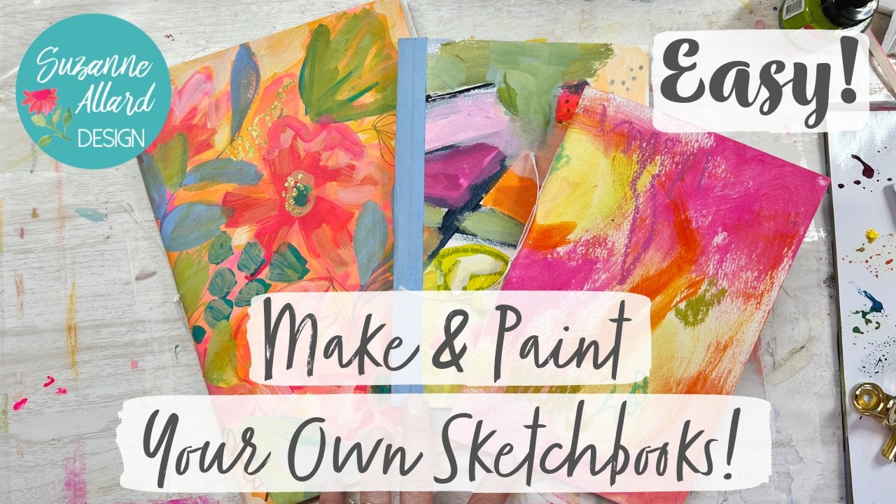
1. Stunning Abstract Intro: Are you ready to create
a showstopper abstract? Well, but this one,
maybe the winter, it just has such a
vibrant color palettes so much going on. But I don't think too much. And I think it just has a lot of
elements that we'll talk about to bring your
eye into the painting, to keep your viewer and the painting and
fascinated with it, which is what we
wanna do is artists. And so I called it the seed
pod painting because it's, one of its main features
is a seed pod design. And I'm gonna give you
a color palette for this and show you step-by-step
how to create it.
2. Supplies: Alright, let's chat about supply is that I used in this class. I do describe these in
the supply list download, but I wanted to show
them to you as well. So I used, I don't normally use, but I use acrylic paper. I've just been experimenting. So this is a £140. I recommend whatever you use. Don't use anything
thinner than £140. It just doesn't give
you that feeling. So this looks very similar
to watercolor paper. It's got a texture to it, like what they call too. But don't go out and feel they can either
buy acrylic paper. Watercolor paper is just fine. I like Strathmore. Hansen is good. Just don't buy the cheapest and make sure
that it's a £140. I did use 11 by 14 to give me more space to put
this one together. So if you want it
to look similar, I would use this size. But again, watercolor
paper is just fine. And then I did most of the
painting with acrylic paint. I used Nova Color. Nova Color is a brand that
you don't buy in stores. You order it from California, but do not feel like
you have to do that. I just wanted to
tell you about it, but if you have a decent
grade acrylic paint, it'll be just fine. Liquid taxes, good. Liquitex comes in, these kind of soft body
acrylics or the tubes. And you get some of
those and show you. There's also the
tubes look like this, but there's a cheaper one called Liquitex basics that for, especially for the first
layer, works fine. Just a good-quality. Don't get the cheapest. It's just, you're not
gonna get the pigment. The way when they make paint. The expensive parts
are the pigment. And so what they do is they put less of it and cheaper paint. So you end up having
a layer more. So you're really not saving. Another good brand is golden. And there's this fluids
which are more liquidy. And then the tubes. I'm trying to think, Oh, I want to show you a couple of student grade brands that are decent and get a cleaner tube. And i've, I've used
this Grumbacher before. These are a little bit cheaper. The Galleria Winsor Newton, just like a student grade. And then this
Grumbacher is cheaper. That was great about
the novel color is the price for the money. For so far, it's the best pain. It's not the best paint overall, but for the price it is. So you get a very good paint
for a very good price. Alright, so that's
the acrylic side. Now, I want to show you what
I ended up finishing with, which was after I did the background and most
of the elements with acrylic, I switched to acrylic gouache. And I do that because
this paint is opaque. So you get that nice. Let me just show you my
sketchbook because we're going to look at the
sketchbook anyway. You get this nice
opaque finish on this, just very chalky and
highly pigmented. And I just love gouache. It was my first
paint to learn with, and it's still my favorite. The acrylic gouache is a
relatively new invention. And to be honest, it's really an acrylic paint. It has acrylic in it. So it's an acrylic paint. What they've done is
retained the chalky Matt, kinda consistency and
finish of gouache. So you don't get any Shane. You get that intense pop
of pigment and color. And I love it. So you can use regular gouache, meaning let me
grab some of that. It's usually called well, it's just called wash. It's Turner, the Turner brand, which here's the arco gouache. And then here is the
regular gouache. This is truly a watercolor, meaning does not have
any acrylic in it. If I paint, let's say these leaves with regular
gouache and then I let it dry. And then I come back and say, I really wanted to darken that, then I can put paint
on it and it's going to disturb that the layer underneath it, it's
not permanent. That's not bad or good. It's just something
to be aware of. What I generally do is I
do my underground layer in the alcohol wash. And then the stuff on
top in this sketchbook, which we're not doing
this in this class, but I'm just trying
to teach you. And then the top layers. I can do with regular gouache. But then more and more
I'm just ending up using agro gouache because I don't have to worry
about disturbing it. There are times though, when I love to use regular gouache. So I'm telling you this
so that if you just, if you don't have
the acrylic gouache, but you have some
regular gouache and you have acrylic paint, then you don't need to buy this. It will work just fine. Okay. Let's talk about brushes. I generally use for
the background, you'll see me use
a larger, bright. This square shape is
called bright pam. The size on this as long
gone, it's painted over it. So I think it is probably
since this is a four, this is probably an eight. But anyway, when I'm
doing the larger shapes, a larger brushes easier. If you don't have one, just take more time with
the smaller one. Then when I'm doing
the elements on top, I'm using this brush
at for bright as well. And as far as brand and
this one's nothing special. This is just Creative Mark, which is barely a student grade, that these two are a bit nicer. This is a Princeton Dakota, and this is a silver
bracelet and they're both number for brights,
both decent brushes. Then when I start doing
more detailed like leaves and things that I
want more control over. I switched to one of
two brushes, generally, the Princeton velvet touch for the Winsor and
Newton Cotman. Neither are super expensive, but they're definitely
I take care of them. I don't scrub them
away like the GPS. And they're different. So I use either a four or
five or six round Princeton to do some of the more
detailed work depending on the size that I, the element. Here's a two, It's
also I used to have. And then this is a script liner for
fine lines and things. And then once I've finished o, and these are a couple
of colors I used. Some of my go-to is
this aqua green. You'll notice it's just really pops for the Turner
acrylic gouache. I love as my dark, basically a navy, which you can make with a dark
blue and black. But they have a color
like that, black blue. It's still I still alter it. Sometimes. I mute it a little
bit with some orange just to kinda take
some of the blue out. This is the whole
vein acrylic wash is what they look like. And there are lots of really pretty colors to play
with their beautiful paint. And then yellow. But you'll see your
you don't need these. And I just put I
just I like to show you what I used so
you know what it is. I do a lot of detailing
with gold pens. The way I have links
to almost all of this. Well, a lot of this,
I guess not the, not the Nova Color, but certainly the
different galoshes and some of the brushes. These on my website. If you go to Suzanne tyler.com and then
look under supplies, you'll see pictures with
paint, paper and links. A lot Martin, Amazon, but a lot of them are juries are to Rama or just wherever else I can find the
best price for you. So let's see here. My favorite gold pens these days are these
pilot gold markers. There's two sizes that
just consistently good. They don't seem to clog up. The paint markers in
general are problematic. Then. For the thinner gold pen, I like the Pentel actually this is when
I was using this one. The Pentel sunburst
metallic medium has a really nice
flow and color to it. It's amazing because gold
pins are not all the same. Some are kind of greenish, which I also use oil pastels. I add texture and pops of color. And this is a set that I have
a link to on my website. It's Mongo brand. It for what tried and I've tried a lot of different
brands that cost a lot more. This is phenomenal. The quality and the color
on these and the price. So I've got the link to that. And I did do some drawing on this painting with
Neil color crayons. You do not have to buy these, but I'll just tell
you about them. You can use a very light pencil
or you can even draw with a smaller brush and
just a little bit of paint to give you your
idea of what you're, what you're going to pay after you draw it
is just these are nice because they're easy to
hold and draw your shape. And then. There are water-soluble,
so you paint right over them and
they disappear. And I choose a color that's similar to what I'm
gonna be using. So that's how sometimes
how I use these guys. These look like they've been I think a couple of these
were in the sun too much. Let's see. Palate wise. I like to use a
variety of things. You can use pallet paper
depending on the setup you have. It's so easy to, I think I have a link to
this on my website too. But it's just a sheet
of paper that's shiny and then you use it
and throw it away. That's pretty easy. I also sometimes use a
glass cutting board. And then when I've got my paint, that's what
I've got right here. This is actually
my cutting boards somewhere else but
over by my easel, but this is just
a piece of glass. And then you can see I was
painting here and all I do is spray it with
water like that. Give it a few minutes. I'll let it sit forward
talking and then I take this heavily painted razor blade and scrape it up and then
I've got a clean palette. It's just easier than the
paper plates I used to use. Let's see if there's anything
else I wanted to show you that I don't think I've covered
everything that I'm using. This. I do just so often, just so the paper for, for paintings and USO
is just a primer. And you can use any
gesso you want, but you don't even need to on a painting like
this necessarily. The point of it is that you can decide whether you
want to use it or not, is that it seals the
paper so it keeps the paint from soaking into the paper and has the
paint sit on the paper. Just a little bit different
as a little bit of texture. It's totally personal preference in this case it's not necessary. All right, Let's
scrape this off so I can show you how that works. All the time it takes usually. And that if we don't
spray it with water, it ends up taking a lot
being allowed heart, and then I just
take a paper towel. My palette is clean. I don't have to go through
paper towels and other things, but I did put this. This is a great little sprayer
for wedding paint to it. I think a cosmetic sprayer. I guess if you're really
hot, you can hit your face to put that on my website too. Alright, I think we
are ready to create.
3. Collecting Inspiration: Alright, let's talk
about inspiration. The world is filled
with inspiration. Hit comes in so many forums that once you start
seeing like this, you can't unsee inspiration. I take pictures everywhere. But before we get to that, let me talk about some of the other ways that I get inspiration and
then how I capture it. So catalogs are fantastic, particularly the
anthropology catalogs. But really anything
that draws your eye, I mean, just look at
the cover of this, look at that shape. That's a great, a very
interesting shape that, you know, maybe we could put an a in a painting and that
shape, this shape. Even those who are interested. You can take catalogs and cut, cut out pictures and paste them into little
sketch book like this. You know, the shape of things, the texture of things, colors. The anthropology
catalog is very artful, but wherever you live, there are catalogs
and they're free. You just order them online and flip through when they
come for inspiration. There's another
interesting shape. Look at that lamb. That might be an interesting
color palette there. So heart's already types
of catalogs, of course, floral catalogs that
great inspiration for shapes of
botanical elements. Cars were doing abstract. So we're not worried about making it look
exactly like this, but we can give ideas
even here for shapes, something like that,
going up and down. Or maybe something
loose like this. You know, not an exact
interpretation is just good ideas just so that you're not
you racking your brain, wants you, oh, look at that. That Primrose, the
bleeding heart. So these are wonderful as well. This one is particularly
good Spring Hill nurseries. Here's another
catalog, Sundance. Sometimes their jewelry will
inspire me to just even have maybe an element
in there that looks like a bead or a color palette. They have, their prices are ridiculous and I
don't shop there. But where's the jewelry section? That's what I wanted
to show you because here I don t know, sometimes I'll just
think that these, there's some shapes
here like, like that. That might be interesting to put into and do an abstract or a color palette that would
be pretty so catalogs. And then also, I'll go
so this is my little, this is just a little
sketch, paper, book and thin paper
and not for painting. And I'm Kyle put in, I'll just grab a pencil and sometimes goes through
a catalog like that, or pictures and just make
little notes about designs, this background, and
that's what that means. Bg, I thought this might, this, these were leaves by five. It might make a good background
coloring and same here. This is really the leaf
and ginkgo leaves. And you can see these are
not technical sketches. These are not
botanical drawings. They're literally me taking something like this and saying, you know, that's an
interesting shape leaf. Let's see here. Look at this and then grabbing a pencil and saying something
that comes like this. These little buds
that are like that, you know, could be an element. Fact. I probably will use it
because it's interesting. So when I'm capturing
it like this, a few things happen. I've practiced it at least once, and I kind of commit it to memory a little
bit better by drawing it. So I might think about it. Next time I'm thinking
you're wanting an element. Look at these. I mean, just the way the veins
are in those two. I'm not trying to capture
the whole flower. I might just kinda dry it. And then just draw the details
of one of these veins. Just to show and remind, remind me, I might end up using in a composition
just the veining. I think the veining
is fascinating. Right. See, I'm getting inspired, just showing you all this. So I have a little notebook. And then I have two places
really on my phone, but I'm going to use this
to show you two places are my photos where I have an album called
flowers and leaves. And I think I have
one called shapes. Or maybe I just made a
Pinterest board on shapes. I think that's what I did. So my flowers and leaves
are just something is 762 pictures by now. These are all ones
that I've taken. Every time I see something interesting and I
want to capture it. It goes in here. So that's one another resource. And then of course,
Pinterest. Where are you? You are. And I have
course heart inspiration. Here's my shapes. I'm just, it could be shapes from another
piece of artwork. It could be things
that I think Could, could have shapes on them,
could inspire shapes. See here, trying to get to my Pinterest is confusing. Sometimes trying to get because I've got the
business account. Here's my shapes board. That was what it was
telling me to look at. So I thought these were
interesting shapes. I think these flowers
are interesting. These rocks looked
at these colors. I'm sure this has
a filter on it, but still, Here's
some shell shapes. And then I have my
tropical foliage. I have one called vessels. Let's see here and you can follow me on Instagram and then you will see all this stuff. Leaves, flowers, trends, vintage patterns,
vases and bowls. So these will be shapes that I just think are patterns that I think are interesting that
sometimes I'll incorporate. Look at those. So this is the reason
I like these tools is particularly with this. And then catalogs and then go from here and sketch to like, here's my Latin design. While I could come through here. And I could sketch
this little motif. In fact, that's a great idea. And it's a great thing
to do when you're, you, you wanna do something toward your creative practice, but you're not necessarily
feeling like painting. You can just work
on inspiration. You can get your notebook
out and you can make some really rough sketches
of things that you like. And Pinterest is good in the way that once they see the
kind of stuff you like, they will show you more of it. So here. So anytime you
spend time on here, you will, it'll, it'll will. You know, you can get lost in
the dark hole of Pinterest. But those are the ways that
I capture inspiration and they really do work when I'm going and getting
ready to create. Okay, there are apps. I'll come on. You know, there's an
app for everything. There are apps that
can capture colors. And I've tried out
some different ones. And my favorite at this point
is this Adobe Capture CA. When you open it. And by the way, it'll ask you for if you have
an Adobe account, which I do, but you
probably don't. But you can use your Adobe
account if you have one. If not, you can sign up with
Facebook or something else. They give you the
options, but it's free. And you go in. And I don't use the
audio or the shapes, but you know, that could be fun. I go to Colors, click Create. And then I'm always
taking photos of colors and things that I see that have colors I
might want to create. In fact, I have an album that is called
color inspiration. So let's go there. And you can see that
some of these are images from just a
display at stores. You know, people who do displays at higher-end stores
know what they're doing, they know what trends are, they know what looks good because their job is
to catch our eye. So I'm taking pictures all the time of something that looks interesting
to me in a store. So once you select a photo, it'll grab some colors for you. But you can change them
and that's what I like. So there's too much
yellow in green here. So I'm going to. Take this, I just grabbed the dot of the one I
want to change and I'm gonna go over and
get this navy there. And actually that's a pretty
color palette right there. I was going to change
something else, but I'll just show you so
you can take this green. Let's say it was too dark and there's a lighter
version of it. Or if you wanted to change a completely and
figured over here, or maybe you wanted the
turquoise. That's pretty too. Now I don t. Okay. Now I think I'm gonna take my navy and go down to here
and see how that looks. That's a pretty palette. And this is dark
enough to be a dark. So I'm done. I click the check mark. It goes to here. If I click Save, it's going to save
into my Adobe account. But you don't even
need to do that. You don't. If you don't want to, you can click Image. And there it is. And then I just like
to screenshot it, which is these two buttons
if you don't know how. And then when you leave, just go out of the
app to your photos. Go to your photo library,
and there it is. So it's a lot of
fun to play with. And it'll get you,
if nothing else, it'll get you thinking when
you see beautiful things. Let me go back to my
color inspiration album. It'll get you learning
to think in terms of what you like that you're
out there that you see. These are all photos I've taken because I thought the color
palette was interesting. Now this one is simple, but you've got sort of a light blue, the teal, the coral, pink, and even this light cream. Plenty of colors to make something packaging that I
thought was pretty here is, I don't know if this
was fabric or I thought these scarves and anthropology
made a nice color palette. This was a purse somewhere. This was a whole display
of these types of bags that store I went
crazy taking pictures. And this was in Austin, Texas. I think. This is the Chihuly
exhibit in Nashville. I thought it'd be fun to
pull some colors from there. This is another store
display table setting. If you go into these beautiful
stores where they're designing these display
windows and just displays. They know what they're doing. They see the trend colors. They now how to make things look like something
you'd want to buy. They know how to appeal to us, so I pay attention in the
public at this couch. I mean, are you kidding me? That reminds me
of South America. And here I, this was
a classic painting. I don't remember the artist, but I thought those would
be fun colors to pull from. So you get the idea. There's color palette here. So let's find Adobe Capture. I can get lost in it.
4. Element Practice: All right, so when you're trying to create certain elements, as I said, you know,
certain brushes work better for other,
for certain things. So like the round
when you're doing leaves for something like this is one of my
favorite colors. It's just a, it's
called black blue. I use a lot of
indigo for my dark so you can make it by just taking Payne's gray
is also a black blue. Or you can take a blue
and adds lactose. Pretty easy, right? But for leaves,
you're, you're really, when you're coming down
here and say doing a leaf, coming into the page
is really practice. You can practice brush control so that you can get your
stem nice and thin. And then learn how to
put the brush down, apply pressure which makes it
faster and then lift it up. And this is so meditative. I mean, I could do
this and have done this for just relaxation. Hi, depth-first a lot
Franklin leaves are beautiful and it's
just fun to see how the paint moves and soaks in or doesn't
soak in and where it, you know, when you
lift up your tip, you get that little dark thing. In each brush is
gonna be different. So this is the Winsor
Newton Cotman brush. Let's see if I switch to around similar sized
Princeton velvet touch. You know, what effect we get, it'll probably be
pretty similar, but that's what's fun
about practicing. And I encourage
you to spend time getting to know your supplies, your materials, your
brushes, your papers. So it's feeling similar. Not quite as smooth though
is the Windsor noon. I'm feeling like I'm having to It's not like I'm
having to pull anymore, which is kinda interesting. You could try a shader to. One of these angled
brushes with leaves. Would be something like this. Needs a lot more paint and
it's not feeling like yeah, I don't, I don't like
how it feels as much. But it makes an interesting
and of the leaf. So anyway, you get the idea. We could do this forever. Kinda makes it more
feathered or at the end. So leaves, practice, leaves and all types of practice
with your brushes. Let's see what you like. And then for using a liner, this, these are long bristles. So you really want to
load it up with pain. And they'll allow you
to take your line along way because the bristles
along its holding paint. So you can play with these. And now obviously
it does not go on as smoothly when
you're putting it on top of layers of acrylic paint and pastels and everything
else like I usually am. But you can get, and you can also get just
some lines like that. I've tried leaves with this. And as long as you
have plenty of paint, it can begin to fun to start it. Too little pressure, but
it's hard to control. Now, for leaves, this one's a little sicker.
The Winsor Newton. Let's see what kind
of leaf it can do. Make sure you have enough
paint in your brush. Yeah, it's kinda square. So this is more, I use this more for
shapes like this. If you wanted to make a long, you know, leave like that,
it would work right? So all the different
tools available to us. Alright, let's talk a little
bit about dots because that's painting dots you would think would
be really easy. And I mean, it isn't hard. But I find that it can be frustrating if
you've got the wrong brush. So for example, if I
tried to take this round, number five, let's just
get some paint on it. Now it's really watery, so they might they might work. Yeah, the tiny ones are working because I'm
only doing the tip. But if I want a
bigger one, hits, if I really load the brush, I can get some decent dots. That's the key with
dots is your brush has to be really full
of paint or water. So you're just going like that. Otherwise you'll get these kind of me dry it off a little bit. Scratchy, things like that that are really not what
we're going for. And that's what a round
brush often does. So you're sitting there
going, Why can't I get that? So that you end up
painting like this, which is really time-consuming
if you're doing a bunch and even that
shape is not that good. So that's why I
said really loaded up or keep experimenting. Because whatever reason,
some of these Winsor Newton rounds that I've
found make better dots. Something about the
end of the shape at the end seems to work better. Let's try a different color. Let's try some current read. But it may seem crazy, but I would practice
your dots and make, you know, get them fully loaded. Brush with some water in there. And see how I'm not getting
a dot with this one. So I can either add more or
I could just move and say, Well, I'm not going to go frame. You know, it doesn't have
to be a perfect God, I can like the shape. Just a mark. So it just depends on
what you're trying to do. The point is that to experiment because it depends
on your paint, amount of water, the materials,
and everything else. That's why I said the
posca pens are so great if the color works for dots. All right, I wanted to
think if there's anything else I wanted to show
you about practicing. So lines, I would have
firewood practice lines to whether you use if
you don't have a liner. Just because you might want some really thin lines and you just want to practice
that brush control. You're barely
touching the paper. And there were times where I
really want a thin line and I I don t think about it and then I end up doing something
that I didn't want. Of course, you can use
your pens to thin lines. But even that is
worth practicing. I would just do pay a
few pages like this. Kinda get your
solvent warmed up, gets, helps you get to
know your materials to. We already talked about
how the pastels work. The crayons use them sometimes to highlight
over things like this. We could even take, if we wanted to
pass out over this. Do something like that. There's just kinda
endless possibilities. Sometimes I'll take
the gold pan and make leaves like this. Or I'll use it to do minds
on leaves like that. Circles, thin lines, squigglies. You get the idea. Alright? So practice these
things until you feel like you've got
a sense of them. And of course, we practice
every time we paint, right? So all right, let's
get creative.
5. Underpainting: Alright, I've got a
piece of acrylic paper, 11 by 14, and watercolor
paper is fine. I've just been
experimenting with mixed media paper,
watercolor paper. Just always experimenting,
always learning. But no need to go and
buy acrylic paper. Anyway. We're going to paint. Color on the background
is the first layer. It's just gets us
past that blank page. Then we can move on from there. So I'm going to I like to have a turquoise
in the background. And you don't have a turquoise, you can take a blue
and a lemony yellow, medium cad yellow
little turn it green. But sometimes a
cerulean blue and a lemony yellow will make a
turquoise and Nova color. Which is my favorite
like mid-price point. Acrylic paint, has a has
what they call a turquoise. I'll show it to you. They loved turquoise. But
it's not his turquoise. He is, I like to me more like a It's a little turquoise you but
I'll show you what I mean. I'm, I'm just going to add a
touch of this yellow light and I've just reordered the yellow light and ANOVA color because
I used it all up. Let's see how I've done. It's just really
becomes a yummy, what I call turquoise
beautiful colors. So that's how I get the total
of his underneath here. Using the other side, there's
some dried paint there. And I'm just going to paint
some sections loosely. Remember, we're just actually want a bigger brush for this. Let's just get a big
one so we don't, we go more quickly. And I'm going to really just paint the background
and pieces like this. I'm not hung up
here about shape, goods completely
random, we're just getting color on the paper. Let's see. Now they're added too much and it turned it green. Is just the tiniest
bit, is all you need. A little bit of a
more of a jade color now, hasn't color fascinating. That's probably
enough turquoise. And I'm not using any sort
of fine quality brush. This is a off-brand. It's called Creative Mark, but it's an art
student grade brand. So I'm going to do some of that. I will take it over to the edge. Just so I don't end up with
another color over here. I can just take up some water and take a light
version to the edge. You can see you can
most of these papers, you can scrub to some extent
without creating problems. And I'm going to grab a yellow. I'm going to just clean my brush a little
bit so that I don't end up with too much
of the turquoise. And I'm using a paper towel, it just helps get the water out. And then some of the
last bits of paint. I didn't do a thorough
brush cleaning. I just did a quick rinse. And I don't like using
colors straight out of the bottle because
they're so sometimes, so I'm going to knock
this back with a tad. The tiniest little bit
of you can use a read. Anything in the red family. Knock back really bright color. So I'm really just mixing
right here on the paper. White is also a great way to calm things
down, alter things. Okay. Just getting getting a cupboard. And let's see. I do like to have, if there's any rhyme or reason
to the first layer here, it would be to have something on the dark side in the middle. Basically, not on the edge, just to try to bring the eye. And so here's a really
intense fellow, blue deep by Nova. And how do their Payne's gray, but I have this Payne's
gray by Liquitex. Just going to mix that
to kind of soften this fellow is just
super intense. Payne's gray is a
great dark inner, lives, a cool dark enough, so it will cool your
colors and dark in them. If you want to darken
them in a warm way, you would use burnt umber. And I am, I've got a mini
class on color and developing. So look for that. I'll bring this down to here. Ended up being
more Payne's gray. If you find that it's not
getting into the paper, you can just grab
a bit of water, bring this over here, and use the water to
get it to spread. Try not to get everything
to work just because, you know, then it's
just going to take longer for that layer to dry. And of course I
don't want to wait. All right, so now
I'm gonna do this. Who could do a magenta pink? This is a quinacridone, red, which is very much
on the pink side. I'm taking out my I'm
washing my brush a little again so
that it's not mine. Some paint left in
it a little bit, but I don't want it too much or it'll turn this red purple. Again. It's needs to
be altered somewhat. I'll try the white just to I don't know if this funny pay paint straight out of the jar,
just have a look. If we just look, maybe artificial is the
word I'm looking for. I'm not sure. Until I add something
and I can add anything, I'm going to have
his grab a bit of yellow to this,
some more weight. But until you add something, That's what makes colors
theorem is adding something. You got to love these
these Nova Color colors. You know, they just, they really come to life when you mix. They don't look like
much in the bottle, but look at that, look at
that color right there. You know, it's the quinacridone, red with some of the
yellow and some white, making me very happy. I think I'll just continue to go lighter here
and take what's on my brush and I'm just
dipping it in my way, which is mucking up my way. But I'm careful. White is the color you use most. You can see I'm mixing
brands. This is an acrylic. So flat matte. And so when I add it
to acrylics just helps make the acrylic paint more
matt rather than glossy. Probably paints not philosophy, but it's definitely, I would
say like a satin finish. And it's just I would
rather have a matte finish. So sometimes I use
white gouache, which is Matt, or a
white matte acrylic. I'm also experimenting
with mediums, Matt mediums to find
one that I think I might have found that
having success with the Liquitex ultra matte medium, because the problem with
mediums is they tend to reduce opacity. And
I don't want that. I want highly opaque
color that is met, which is why I use gouache. Gouache. It's crazy. It comes
in little tubes. So I'm experimenting with ways
to make the Nova Color and other acrylics have
more of a matte finish. Okay, so this layer
is done. It's wet. I can feel it, so
we're going to let it just kinda let it dry before we continue with nice and dry. And we'll come back to it.
6. First Layer of Shapes: This is drying out. And so for the water that
had scribbled on it. And so now this is
again just continuing the color exploration
and inspiration exercise and adding some shapes. Summary sheet, inspiration
and shape library, building up color and shapes. And so then we'll get to
details and textures. So I think I'm going to, in terms of like what
color I choose Next. I think about a color that's different than these
because I want it to show, but not radically different. So I think I'm gonna do maybe some shapes in a green
for, to start with. I'm going to take
some cobalt blue or any blue and some yellow. And always white.
I'll get my other, I want to show you the
other way that I use weight a lot over
here. By the easel. I keep this white in. And this is nothing
special way to manage it the way I think Liquitex basics. And I just use so much weight that it's easier for
me to keep it in this. I got this on Amazon and
then I don't have to, you know, be opening. Sounds ridiculous what I
say at opening the jaw, closing the door,
opening the dark. But I use so much weight
that it's easier to do that. Okay, That's just not
unexciting green. Not everything has
to be exciting. I realized that we have a lot of exciting
colors already on here. But I just wanted something
a little more pizzazz. And yeah, just fun to
I think I'll just do like some start with. I call those my pots. Some shapes. And I just think about 3s and
5s when I'm adding color, can make some marks over here. So that's three
sets of the color. And that's enough. But I could go for some small appear just because
pink and green is so pretty. And I can alter the color
anytime I want a bit of weight. And then maybe helped do get a different brush and do some
some lines on this color. And that would complete my five. We're just adding interest at this point, building
up interest. Okay, So now maybe I'll
do these colors here. So pretty and go
get like a white. Get my white. With the green in
it, which is fine, little bit of green sign. And add some red to
see what that does. To give me a really pale pink. Okay. I'm going to add like
a C here, maybe here. These arches is funny. I grew up in South America and I just loved purchase a home. But I just think they're
inviting their tummy. They said Come on in. And I was lucky when we
moved here to Florida. We have we have one
arch in the house and it's kinda the amine
arch which I really love. I don't know, for
me, they sort of say commodity in
to the paintings. Come on M, and then
we'll make marks that invite the viewer to stay. Because we got to get them in and then we want them to stay. That's basically the bottom
line of composition. I also think that lines that can look like a
garden walkway like here's a kind of a natural
place maybe to do what could be
another kind of way in So the colors I'm
putting on top, since the ones below are so
vibrant colors on top or, you know, not dog, but a little bit toned down. Just because everything
can't be a star of the show. Let's grab some orange.
Orange you can make. I just happened to
have something here. But of course, I will be
using my dirty brush, which mixes immediately and
gets me a better color. I think I'll just do something. I love, orange
against turquoise. I think I'll just do some kind
of rounded shapes in here. Adding just even
a touch of white will give you a lot more opacity and just something to the color. Now, if you if it feels like it's too like it about
almost got to pass Delhi, then I can get a bit of
randomness and take it back. Maybe I'll do kind of a
almost like a rock sculpture. You see those? We can do
the same thing over here. You see one of the shapes
I put in my Pinterest was water lilies floating around in the pond and they
kinda look like this. Also, pebbles and sand. I mean in the rocks actually in a beach or at a creek bed or a riverbed can just be
kind of shapes like this, but in different directions. I like to do things
like that too. So maybe I'll put some in the bright brush
that I'm using now, which is the square,
is really good for making that kind of mark. I think it's time for
a big leaf somewhere. So I have to decide where and I have to decide what
color I want it in. And I'm wondering about a lavender color
like a periwinkle. But let's just see what
happens when we mix the blue here because I do
like the discovery. Oh, look at that
pretty soft gray. The discovery of
color that comes when you're mixing like this. That's really pretty and I could use some quieter colors, right? So let's go ahead and
make this the big leaf. Not a periwinkle,
but if it's too dull or if it's not exciting
me and we can, I can always paint over it and it is showing up
a little more purple. So I'm gonna do a branch
coming out the top here. It's not funny as soon as I put it on
the yellow because yellow and purple
are complimentary, meaning they are opposite
on the color wheel, we're close to opposite. When you put it on yellow, it
starts to look more purple. Here. It just
looked like a very, a very pale mob here it
looks more lavender. And I love that,
that activity of color discovery because I could set out to try
to make that color. Now I might be able to if I wrote it down, but of
course they never do. So. But I have if I said, well, I want to make
a car like this. First of all, I
wouldn't have really thought of a color like this, but then when it
appears like this, and it's such a fun discovery, and you say, oh yeah, I
want to use that color. That's what makes each
painting unique to. Alright, I'm looking for
a third place to put this color because I love it. I'm not ready to start
doing dots and things, you know, the decorating. So I'm looking for a place
I can put some shapes. And also letting that
dry because I'd like to do a second coat so that
it's nice and opaque. Let's see here. I wonder I could, I
know what I'll do. I'll take a really small brush and just do a couple of things. Here. It really helps to have, you know, that shape
pattern library to think about and
referred to write, gonna go for the
second coat on these. That's the nice thing
about acrylic is how quickly it dries, right? I think we're going to let
these various parts dry.
7. Second Layer of Marks: This is dry and I was thinking about
what color I want next. And there is a balloon that is going to pull
that oil pastel. It's kinda like this. And then I'm going to do a
little darker than that. And it's just the cobalt
blue mixed with white. So let's see how we like that in terms of what to do with it. I'm still thinking about that. So you can see that I dip my
brush right into the vein. But I tried to be
careful to not follow. When I'm working
with larger pieces, I put some of the
paint on the palette. That's the kind of periwinkle I was thinking about before. So maybe it's just
didn't want to go away. And I think I wanna
do like some, something larger
over here with it. And so I may just kinda
come down here like this. That's still pretty
against the colors. Now I'm just kind of making loser bids of this color just to have
some of it in there. Really pops, doesn't it? So pretty I think I'm going to have to
grab some while it's made and do some dots
on these leaves. Dots, well, dots
are interesting. You would think
they'd be so easy. But they actually take some
practice and the right brush. So these are gonna
make pretty big ones. Those brushes, look at it. The pain has come off it, but
I think it's a size eight. Could be a sex. Let's see
if that's a good size dot. Okay? So the key with that is
lots of paint on the brush. And not one of these
brushes that has that really sharp
tip because then you just keep hitting the tip. But this is a round brush,
Winsor Newton brush. And it just doesn't have a
super pronounce tip on it. So if I really fill it up with paint and I make
sure my pain is not too dry. It's going to give
me a nice dot. You can use, you can use all kinds of
things to make dots. People use the back of the
brush but just a piece, basically a piece
of wood like this. But then you're having death. He doesn't hold any paints, so you're having to
go back and forth a lot with the dots. I'm just trying to look random
or fight the urge to line them all up and make
it more natural. If I wanted to swallow
her that I would just use my smaller brush. Can also use a Posca marker
if it's a color and we will, if it's a color that you want
for another paint marker, is giving me fits. This is why it's good
idea to do that practice. I want random sizes and I'm getting the paint, keeping the paint
nice and moist. This is this one's going faster because I added more water. I've got a whole page
that I want to do as a background for a pattern. And I started out, it's I want to scan it in. So I've got the whole page that I'm working on
doing doubts on. And then my gosh, I'm only
like a third of the way done, but I think it'll be a
really cool background for a fabric print. Once I get all those dots
and if I get them in, I'm having to just continually get that
paint on the brush. You know, get it to drain down. So I have to keep water on it. You can vary the
shape a little bit by turning your brush too. I'm not looking here for
perfectly round dots. I am looking though for
them not to be scraggly. And that's what
happens when there's not enough paint on
the end of the brush? I want them to be full looking. They don't have to be circular. But I don't want like scraggly
stopped coming off them. Who knew you could do a
whole lesson on dots. Okay. So that's really
pretty. I like that color. If I want a second
coat anywhere, maybe a little bit
there. What next? I think a pill, warmer green like a lime
green would be pretty. So actually I might be
able to work with this. I like to try to build
colors off my last color. Sometimes it works,
sometimes it doesn't. But let's see what
happens if we add some of the light yellow to this. Then do I want a great brush? For? Which shape do I want? Depends on what I do.
So I don't know. Yeah. Yeah. That's a nice bright green, greenish yellow, yellow, green. I think I'll make
some circles over here and then maybe put in a leaf or a branch or
something like this. I'm going to switch to a different brush
because I want to make something coming
out of this pot. So one of the ways to
do this is to draw it in with a similar color
crayon for colored pencil. So that you kinda have a sense of what it's going to
end up looking like. And I think I'm going to
make it kinda turn over this way and go into that pot. And then maybe
another branch this way. Something up here. And I'm just going to, I
think I'm going to do is do like a oval leaf. So I can kinda sketch
this in with this cram. You probably can't see
it, but you get the idea. This will end up being
pretty good focal point because it's going to be large. So I'll paint that
in probably with a round brush because it's
too many either round. Well, two different things. The stem, I'll end up changing because I
like my stems to be a different color
than the leaves. So I can either
paint the stem in now or I can wait till I
finish painting the leaves. I've done it either way. So
since I've got this brush, I'll just go ahead and
paint the leaves and then we'll go back and
figure this demo. Alright, so you can see that with certain colors
with acrylic, you really have to
do multiple coats. And luckily it drives files
so I can just move from one to the other. Yeah. It's the color. I want it now, but it took several coats and then
I can change the shape of these as I was
painting on because I thought I want to make
them more like a seed pod. One of the images that I
captured in my shape library that those poppy seed pods
of them. Just so cool. So it's going to play with that. And now I'm thinking about where else I want
to use this color. So I think I might
bring it up here to these peachy things that
you can't see much. And do an outline around these.
8. Adding more Elements: Best thing that I find to use to do an outline is
some sort of liner brush. This is the Princeton
velvet touch number one. There are others,
or if it's not, you don't have to have a liner. It just hold more
paint than say, just a regular small brush
with a shorter bristles. So it makes it a bit easier
to get the lining effect. It just means that you can make a longer line before having to put more paint in your brush. I don't need to be
exact with these. It's just a bit of color so that these become
more noticeable. And you'd have to have
quite a bit of this. Another great thing to
practice, put the paint on your brush and
have it be watery. Add more water to get a
little more fluidity. I don't have to do them all. I actually usually don't just think it's kind
of I don't know. There's something
about not making a predictable and I
don't I don't know, there's like having
one or a few. Reminds me of groups of people and clicks and how
sometimes people, we all feel like we're on
the outside of something. I don't know. I don't want to read
too much into it, but all right. I like what that lime green did. I'm looking around
and I'm thinking that once something here, I don't have to
fill every space. I have to tell me that myself
that all the time, right? I do not have to
fill every space. And we were gonna do stems. The stems I think will
be really nice to do in the same dark blue
that's back here. Which is really what
is really an indigo. So we can make more
with I will the Payne's gray and the blue horse, since I haven't handy, I can grab my black blue gouache and we could get
those stems down. I'm not going to use
the liner for that glow because it doesn't
give me the control that that I want for
that kind of thing. It's harder to control. So I'm just going to
get just a small brush. This is a two, but you can even use
a four and just, you know, just gently
use the tip of it. Some of this like blue, this is my Turner. I use it all the time for axons. Then I think I'll use it to make the seed pod things though. Just the whole circle
here at the end. But I'm going to add
water so that it's a little more fluid. Is just a suggestion
of those seed pods. I kinda look like.
I'm not gonna say it. Well, okay, I will say after now we're going to
start looking like eyeballs because I
said it, oh my gosh. Okay. Just put that
out of our mind. And so they've got this
little brush out in the Navy. I'm going to play around with
some hexanes, other places. There's too much
pink here, you know? So I think this would be a
great place to do. Some lines. Maybe come up here. I don't really like the
way those guys look. I didn't like those
splotches of late. I don't know why.
So we'll do that. Yeah. I like it better. Still don't have
anything down here. I'm thinking about what can I do down here and
what color would it be in? So my turquoise, which I've
gotten the background, I could bring down here. And we'd have like
a lot of turquoise on this side and
nothing on this side. I think what would look
really cool though, is some dirt turquoise
dots in here. So I think we'll do that since that's what his
coming to me now. And then we'll figure
out this part later. Kind of got to go with what, what idea comes up
when it comes up. This is a turquoise I'm
using is the aqua green by Turner acrylic wash. And I like to use the
glass for accents. You can use acrylic, of course. And I'm using this little brush because I want to
make a almost like a, you know, it's not quite a dot, just little shapes of color. Think of them as maybe pebbles because they want
them irregular. You know, those
riverbed pebbles maybe. But I knew that this
turquoise would really pop here, which would be fun. Had it a bit more water, which is making this flow better. Watch it can get really sticky and derive fast almost as soon as you put
it on the palate. So don't be afraid to. It is a watercolor, just an opaque watercolor. So don't be afraid. You don't want to
add too much water unless you don't mind
losing the opacity. But you can always
do another coat to I'm trying to make
these just kinda meander. You know, I've got that
turquoise out and you know, that I'm going to want to
do something else with it. That is so pretty
what we could do. We could do, I'm gonna need
a bigger brush around, brushed some some tropical he
had this little do you know those tropical plants
that kinda come off from the bottom and jungle plants
will do something like that. It's going to need a few coats. But I love how they meander. Actually have one. I don't know the name of it on the side of my house except the
deer keep eating it. So it doesn't really look
like this right now. I'm not going to paint
what it looks like. Wow, my gosh. I love to paint little
chunk taken out. Oh my gosh. Yeah, I like that. Happy, happy. Right now I'm thinking that there
was like this area here. And I'm wondering if
I want any of this up here at all or do I want to me? Because it's a little
quieter up there. I mean, you might
not be my thing. Nothing about this as quiet and you would probably be right. But relatively speaking,
it's quieter here than here, and there's nothing
wrong with that. So I'm debating was myself, do I want to bring this? Because this is a very, you know, Look at me color. Do I want to have that up there? If I do, would it be it would definitely
be a small thing. I'm thinking that it might be fun to try
something that kind of combs meandering
down like this. Well, let's try it. You can always decide you don't like it. But I'm going to look for
an angled brush because it, I'm gonna make some
thin leaves with us. So again, we can draw
it in with the CRAN. These are the neo
color to grams. I'll grab the turquoise. And I'm just thinking that
it comes in kinda like this. It's going to overlap a little
bit and have been leaves. I'm not gonna actually
draw them all. I don't think maybe I wanted on extra thin
because that way, if I don't cover the whole
thing almost like a palm leaf, they don't cover the
whole thing with paint. I don't, I don't have to worry
about the Cranmer showing. Although since it's Neil color, water-soluble and
everything I've used here is acrylic or AgCl gouache. If I wanted to, if I did
have some of this remaining, I could let the whole
thing dry really well and then take
a bit of water and rub out those green marks. So here's where you
can make a decision. Really a design decision. I could take this palm
leaf behind this, this leave or on top. So what I'm gonna do
is turn it around, take a look and
kind of just a mad, I'm trying to imagine that
palm leaf coming down here versus behind it. I think I want to
bring it on top. Personal preference, so
I'm gonna go for it. I'm going to stop painting. They're stopped coloring there because I want to
do it with paint. Okay, I really liked that. I'm glad I went
over the other leaf and it's going to need a
second coat because it just, you know, it's a
little translucent. So I will do that here
in a sec when it dries. But these are things that bring your eye
into the painting. So your AI comes in,
comes down here. This almost keeps
you from going out. I think, or I guess you could argue that you follow
it out as a painting, but then you come up and you see that and you're drawn back in. Maybe you come down these
stairs, something like that. So that's how I loosely think
about composition and about keeping my viewer
inside the painting. I'm going to, Yeah, I can start on the second
code is already trying. Also the way that it's
hard for a treat. I appreciate the
time it takes to do these leaves when
it's on time-lapse. But you can see that to get
the shape of practice a lot and lifting the
brush, the pressure. And I'm going moving the brush
the other way so I get up, point your toe mean case
you can see on time-lapse. So if I go this way, I get a nice point on that side. But then I have to clean it up on this side
going this direction. So you'll see me doing that. That's if this is the lucky one, I wanted a really clean look for this obviously doesn't
need to be that way. Again, personal preference.
I've just had people say, gosh, leaves are
harder than they look. And I now talk about
how they have. They do require
practice. Brush control. And it's learning the brush
and each brushes different, even if from one round to
another one brand to another, one size to another. Okay? We're going to let this dry completely and
then come back to it.
9. Adding Interest: Alright, let's get
some inspiration for taking this painting
to the next step. So here's one that I
did earlier this week. And so here's the one
we're working on. And I like to get
inspiration from. As we've talked about,
nature, pictures, shapes, just you start seeing the
world differently and then your work ends up
becoming a catalogue. So I have this one and then the ones that I've
gotten the sketchbook. As long as I just keep exploring and keep
adding new elements. Then there's so much
to look at and say, oh, let's try some
of the header, our member, how
much I liked those, those white ink squigglies
or I remember how much I liked doing these gold
lines on those leaves. Referring to these, this, and anything else we want
to use for reference. I started to think about wanting to do I really
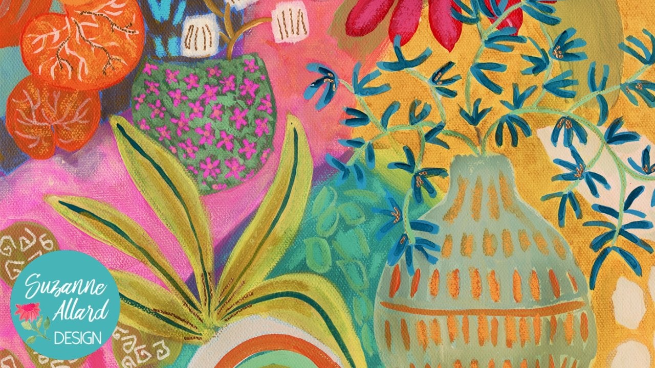
love this leaf here. And I thought that
might look really pretty kinda coming off of here. The other thing, I also really love the
shape of this pot. So I could either I could do a small one
down here potentially, or potentially, I
could just paint over this one and reshape it. That's an idea that I do
save the finer line work. You can call it decorating or you can call
it adding jewelry to your art for accessorizing. It's like you have an outfit
and then doesn't quite look put together until you
quit your accessories on. But I save that for
last because then I just That's just the way that I do like the gold pan
and stuff like that. So we'll do that towards
the end and the finer pens, but we're not ready for
that stage yet on this, I'm thinking I want to
do the leaf thing here. And I also like these
little leaves in here. So I want something in here. But I don't know what.
Yeah. So let's start with the leaf branch in
this kind of style. And I even like that
color because it's soft. It's not going to call
attention to itself a lot, but it's a little bit muted. It's sort of a blue gray. I've been taking hash blue
Holbein acrylic wash, and then hello and
then darkening at it and then adding
a touch of green. But you can also make it, well, let me just
make it with you and that way we'll
make it together. Basically, it's a blue-gray
with a touch of green. And it's really pretty. I just watched all my brushes and so now they're all sitting
here in front of me. I finally divided up my brushes. This is just a
little tip because I have my not great brushes and then my brushes and I try not to abuse
the better ones. So what I did is I clicked
the better ones in a separate color jar way. That's not hold,
that is wet. Okay. Alright, so let's do
to make this color. If you don't have this, which most of you
are not going to, then we're going to
start with a dark, which can be, I think it would
be a black, payne's gray. And then we'll add a
little bit of green, a little bit of blue
and some white. My Payne's gray goal was
here when we were working. Just working nearly disappeared. Liquid objects, Payne's
gray, we will use that little bit of blue. I'm just trying to stick
with colors that I think you'll have that kind of blue-gray and look fresh for that kind of leave as
a smaller round brush. This is a size four.
That should be good. We're gonna get some
blue and mix it with the Payne's gray. I'm just going to
need some white and a touch of green here. I really like having
my wife that way. So my PC to access it. So it's just a blue-gray and I'll get just a smudge of green. The only trouble
with these, I love these little Liquitex bottles, but they do that
even though it's just stopped out and
then they get flagged. And I just grabbed
my Nova color green. That's the benefit
of these jars. They don't they
don't get clogged. So this is just a
color that, you know, obviously you can make
any color you want, but I just wanted to show
you how you can get a color that's I don't know,
isn't neutral. It's pretty and
I'm trying to say, I think I want it a bit lighter so that it shows up
against that periwinkle. Maybe a bit more green. Everyone's read in
a book on color. I think it's called
The Secret Lives of color that I have. And it's fascinating, but there was someone
quoted in there the same, the best colors are the ones
that you cannot describe, that you cannot use,
can't eat them. You can't just say it's green. This is kinda
reminded me of that because it's sort of grades, sort of blue, green. Alright, that's
good to start with. Let's see. What do you think
I'm going to do? I'm going to add some of
this blending medium. This is for watercolor. You can add it to gouache. But I've also tried
to use acrylic. And it works fine
and it just kind of keeps things more moist. It makes it a little
easier to work with. But the matte medium, that's probably what
would be a better way. I wouldn't buy this
unless you're going to use gouache and
watercolor a lot. Okay, let me take this other
blue paint off my brush. And I'm going to kind of draw this out
like we have before. A gray Neil color Cram. I'm gonna have this kinda coming in sort of on this purple thing. But it'll branch
off a little there and maybe have a branch
coming out here. And then this particular plant just has these leaves
that come out. And I've got usually five, but 35 once in awhile
if four of those. So I'm going to just
sketch those in here. So I don't have
to be exact with, I'm just kinda getting,
getting an output. I'll add more with paint, but I'm just getting
the location of them. Can have them turning
different ways. I can have them
varying in length. Let's paint those in
and see what we think. This again is a little more. Take some practice just to get the believes the
way I want them, I like them a little
thicker at the end. I'll show you what that thick. So here's what happens for, here's what you can
do when that happens. Wipe it off. And don't paint in that spot again till
it dries that brush. Once I put all my pain on, it was way too big. And I really kinda
wanna delicate leaf. So I'm going Wait,
I'm going down to the three round. We'll
see how that works. We're in let that dry them. So we'll start somewhere else. Yeah, that's much better.
So I can get the end of the leaf thicker by pushing
down and then lifting up. And I'm me, I'm trying not to I'm trying to make
them an organic shape, not not, not live. I'm trying to avoid
straight lines. That's what I'm trying to say. Sometimes when I'm
painting my brain, the words words don't
come out right. Two parts of the brain
engaged, I guess. Okay. So I like that. I'm thinking that I could bring that color down into
here with something. So I think I like
these kinds of marks. They look like seeds almost, you know, that maybe
fallen from a plant. So I'm gonna just going to
lighten it up a little bit and do some of those inside here. I like this color. I'm thinking it
might be nice for the lines on my seat paths, so I'm going to add a little
more white to lighten it up more and get my liner. Liner brush likes to hide
because it's so small. But every time.
10. We are Getting There!: I actually decided to use, this is a newer brush
and I really like it. This brand, this
Winsor, Newton Cotman, they're not expensive
designer brand. But I'm really liked
these brushes. I have several. What's weird is, okay, so this is a
size one, size two. What I like about
their round brushes, they are they're not
extremely pointy at the end. I think it'll be fine to
make these lines will see. And if it's too
thick, will adjust. Cloud of it is just having the right pressure. Okay. So you saw me start and then
I want to put that color on. It was just too
light, so I darken to pack up with some
more blue and some more gray and went over those
areas. So I really like that. Those pods are
pretty, let's see, not quite ready to get
the oil pastels out. Still thinking about anything else I want to do
with this color. Before I move on, we have that stem to do to
maybe just come over these, define them a little bit. Not that made me think. I feel nice coming down
the center of these. Just I'm pressing down
because I get to the end of the leaf to make it
wider at the base. Oh, and I know we need
to stand up here. So now that we have
this color out, it's come up here
and do this stuff. So one of the
things I like to do is the same color variation, same color, calm,
the same color. So I've got the darker
gray that we did these in. And now I'm going to
come over since it's dry and do a little bit
later, it's mostly dry. Just hit badly you some of the leaves with a
little bit later being careful not to put my hand
and my already painted parts. This just gives
depth and interest. You could use a
different color to, you. You know, you don't have
to use the same color. You could go over
these with a light green or something darker. Just a change in value. So darker or lighter
or changing color? No, I don't know what I wanna
do that stem and yet so I'm not going to mess with it. I want something on
the top of this. This, and I keep thinking about that jug shape coming up here and doing
something like that. But I don't want
that in this color. So let's make another color
and turn that into a jug. See how that works out. A lot of experimenting when
you don't know, you know, when you paint and
you're not coming at it with a very specific plan. That's what I I like. I mean, just you get used to the anxiety that
comes with that. So I don't have to stay with
that color. I don't mind it. It's a little it's not bad. It's actually a pretty
green. Let's see though. If I just mix some yellow
and with this gray color, if we can get close to it, probably need more blue. Document a bit. Too much dark. A little bit of
Payne's gray goes a long way. Pretty close. Okay. I don't like Nepal. You can always go over it
and if you don't like it. So I'm going to look at
my little Jones and I made a little different shape. But who cares? Please? Jugs. Always remind me of my upbringing
in South America. The markets, you know, the pottery was a
long, long time ago. Sometimes it even carry
them on their heads. You and I are gonna be the only ones who know that this wasn't this way
from the beginning. Oh, that's a cute, cute little pod drug, Pratt. And when it dries,
we'll decorate. It. Might be a nice
color for our stem. What would be, where's
my little stem brush? I think it's already got
that colorblindness, got the gray in any way. I'm going to brighten it
up a little just because I think a little touch of bright
over there would be nice. So something little like
that, like a little stem, a little mark can
be quite dramatic. I think it's the
Florida influence. I see leaves like
that all the time. What else needs a little
touch of lime green? Let's look here for
some inspiration. These teeny tiny dots are
pretty. Mr. some of those. I keep wanting to do
something to stem up here. See if I like this. No worries. Wipe it, dry it. Right now I'm at the
stage where I'm going. Okay, what do I like and
what's bothering me? These orange things need another something
on top of them, but we can do that
with oil pastel. I would love some little
pattern in here on this vase. So I'd probably go look at my, we could either
do something like this, you know, with lines, but we have a lot of lines
with lines layer and here, these are kinda lines. I mean, it would be fine. I
could do a fine line there, but they don't
want to because of the lines already
in the seed pods. So I'm going to think
of something else. Some other insult probably go
on into Pinterest and look at some patterns on vessels
and see what I think they're. That sounds interesting. Then we'll do some oil pastel
stuff and some gold pen, and we're getting
close to being done.
11. Finishing Touches: Okay, I've found an extremely exciting
vessel on Pinterest. Look at my gosh, recoup pottery by
Stephen forums. Incredible. So obviously, that's a
lot to try to do here, but I want to use it
as an inspiration. So see that really
light turquoise. Maybe do some dots of that and then come
in with the metallic. And what we can do here, That's this inspires is
that it's really irregular. You know, you have
teeny tiny gold dots and then some larger ones. So between the turquoise and a gold will do
something like that here. Alright. This is a piece of black paper which you can see
is well used on one side. It just it's mixed media paper. You can even use something that comes in the
mail that's dark, but it just helps to, when you're working with pins to seek to prime them,
to get them to work. Even pencils, you
know, to say, okay, is this making the mark
I want it to make. It just shows up better
on black or gray. So I'm going to show you that because paint pens often
need to be primed. So but for the
turquoise bits of this, I think I want to, you know, maybe the oil pastel would give us more
of that texture. That was in that picture. But it's a lighter, it's a variety of
pastels, I mean, colors. So we can just kind of
put some of these n and then go over with the gold. This is a different brand. And boy, do you
notice a difference? I hope, grabbed it because
I liked the color. This is crepe Hi,
but it's just not, it's not anywhere close to
the quality of the Mongo. You see like see how that's
just sitting on top. This is much cream year. Maybe. I can feel the difference
in the coverage is better. Nothing about this sort of
exploration is, you know, if I don't like how this face looks when I'm done,
I can paint over it. I can scrape a little bit of
pastel off or wipe it off, rub it off and just paint
over it with acrylic. So remembering that the shapes varied in color and random. And let's do some cold now. By priming is called
priming, you shake it. And then if you've
used it ready Three, suddenly it'll come right out. But if you haven't,
you'll have to pump it to get the ink out. So I'm just gonna make
some random shapes, marks. I feel like it needs home late. We're going to try something. This will be too dark. But if I take the ink, the color from this and use
a brush to de, intensify it. Watered down basically. Can you get some of
this color in here? Then I take my wet brush. Basically I'm treating
the pen like paint. So a cool idea. But I don't think
it goes with this. I think I need a
more I don't know. I just don't like it. So I'm going to remove it
before it gets too dry. And you'll see what's involved with redoing
something like this. Especially after you
put oil pastels on it. That's when it gets a
little more tricky. So I've dried, I've gotten
the ink best I could, and now I'm basically rubbing
to get that oil pastel. This is real life art. This is what it is. It's, you know,
playing, experimenting. I think that it was
just too complex of a, an effect at trying to get I think it would have been
fun to do if you were doing the whole face of the whole composition was a
vase or a bigger part of it. But it's hidden back here. So those kind of marks
kinda look interesting, don't they? Kind of like that. I'm not funny. I rubbed it off and
now I kinda like it. Maybe a few more of those. But the gold pen derived into kind of a coppery that,
oh, that reminds me. I have a copper posca pen
but I hardly ever use. So if we did
something like that, might have to just rub
it in if it's too. You know, I kinda just wanted
some interest on this pot. I don't really want it
to be a main feature. So I'm just kinda making
some sweetly lines. And I think I'll let
them dry a little bit. Rub them so that they're
an interesting texture. Now I'm wanting some of that
turquoise back in there. Now we're getting a benefit
of the paper texture, picking up the, the
turquoise, which is nice. I think we're getting there. Interesting. Well, that's the kinda thing
that I will leave and see, you know, how I feel
about it tomorrow. I'm kind of liking it from here. I think I would
have liked just a clean goal detail
as much though. So we'll say, we'll
leave it alone. Whenever you're not sure about something you've played
with it on a wire, like we have their walk away, um, give it space. And so I know I wanted to add some dimension
to these orange thing. So let's put it in another color in there and
get some, something going on. These are just that made
them more interesting and then these are need
to be brought, just brought up a little bit. I don't know if this is
kinda do it. Not really. You need a little
bit lighter color. So I love about this set. There's so many colors. It's 48. I can't remember. It's been awhile.
It's really lasted. I have a link to
it on my website. Among your oil pastels, I have a link to pretty much
all my favorite supplies. Let's see. I want to lighten that up more. What else do we have here? We know you can blend oil
pastels with each other. Alright, let's get in there
with the gold pattern. So I've got a number of, of writing things here. I've got my favorite
white and gold pen, which I talked
about in supplies. And then these are a
little bit heavier pen and a much heavier pen. Sometimes I use
these jelly rolls. Sometimes I use fluorescent
pencil, it shows up. Sometimes, sometimes it doesn't. Just depends on what
you have it on. Let's see if it shows up here. So interesting though. And then I've got the
fluorescent Posca marker, which I don't know
if I'm going to use. I haven't used fluorescent
on this painting yet. Definitely want to
bring this stem out. So I'm just kind of
going down on top of the paint to kinda make
it pop a little bit. See it makes a big difference. And I think it might be fun to, let's see about
outlining some of these. You don't have to do them all. But they can just
make some fun pop. Especially if you've
got something overlapping like
this line like this can help to find that
it's on top or below. I think some little dots and nice seed pods would be good. Sometimes I just like to
make like a little swirly. It reminds me of like I've
got to Amanda via plant, which is a vein and
it likes to climb. So I'll do this sort of Mark doesn't have to be an
album speaking of binds, I like to take
veins on the leaves sometimes and do something
like this, like a tendril. Maybe go around some of these. These are kind of interesting. Just ignore them the whole
time. They need something. I just don't know what yet. I want to do this. When you do paint on top of, I mean pen and other paint, you just try not to press too hard and just have
a light touch. Just think of yourself
putting the paint on top, not pressing it in. So good to kinda stand back. Thinking about what
I wanna do here. Anything. I didn't really want to introduce too
many more colors. This color is already in here. So I could make some. I could do nothing.
They're fine. Maybe I'll just go like that. So in-between some of these users still not showing up. So I'm going to do
something like this. So I kinda doing the posca on the edge
of the oil pastel it, it will go on top. You just go really lightly. See right there I
went on top of it. We'll pass it off. Just
have to tread carefully. Looking at it, thinking
about if it's done, looking at sometimes it gives me ideas is to, like I said, look at other pieces
for inspiration, but also look at my materials. I might say, oh, you know, this pen
or this pencil, Let's try some of that. I don't have any white on this. I don't have any
fluorescent pink. That doesn't mean I need to. But I'm just noticing that. And I do like my kinda
squiggly lines like these. So maybe I'll just
do a few of those, but not in a way that's
going to jump out too much. This is a jelly roll. I just like that.
It's a small element in the midst of
these larger ones. Kind of a surprise. You know, just a little bit of
maybe the same thing with this thin gold
because it gets much. And so basically you have
three sizes of gold. Now, I'm going to look
for a place to sign it. Sometimes I signed my whole
name and sometimes I'm one like this where
there's not much room. I will just find a space like
this. And put the essay. I think I'm going to do it in
this panel shows up there. So at this point I'm
going to say it's done. And if I decide to make
change here or anywhere, after giving it a day or two, I will be back. Otherwise, we'll
call this one done.
12. Varnishing and Wrap Up : Okay, I wanted to show you my three favorite products
for protecting paintings, whether they're in
the sketchbook or on paper or even on Canvas. If I want to do with
him here in the house, and I want to completely
non-toxic product with no smell. I use this fixative
and I do have links to all three of these in the supplies tab of my website. This is I don't really know
what it's made out of, but it's amazing saying. So anyway, the only downside to this
is it takes a bit longer. You spray it. It's not aerosol,
so you spray it. Further directions
on your peace, let it dry and then
you might need a couple more coats just
because of the spray is not doesn't give you
the best coverage. However, I have used
it on regular pastels, the real powdery kind where you can just
rub that stuff off. Oil pastel paintings with
all of those things on it. And it, It's sealed it. So I really like it. If I want to do something quicker and I want
to keep working on a piece, particularly in the sketchbook, will use this workable,
fixative I cry lawn. And it allows you to seal
what you've done so far, but continue layering
if you want. That can be helpful even if you, let's say used gouache
or watercolor, things that can be
reconstitute with water. You could spray a layer of this and it would
make it permanent. And then you could layer on top. Then when I'm all done, I like the Liquitex
matte varnish. It just it does get
clogged in the tip here. And they do tell you right on the instructions that every time you use it,
when you're done, turn it down and spray and kinda empty out the
nozzle will of course, I ignore that and
paid for it and had to soak the tip and
hot water and yada, yada. So Philip, they say,
alright, have fun. I hope you had as much
fun taking this class. If I had putting it together, I love exploring all of
these different styles, using color as our guide and
shape and self-expression. And I love how you put together
your inspiration library. You're really becomes your work because you're pulling from things that you're attracted to. Highlight pots and plants. You might like. Textures,
you might like, you know, just
whatever you like. You might like little, sometimes architecture so
interesting, right? The little house,
the house is done, or buildings or hills,
wherever it is, you make it your own by following what you
love and then you see how that manifests
in your work. And so I encourage you to
keep collecting inspiration. Sometimes if I'm not
feeling inspired, or even sort of like where am I going in
my heart right now? I'll pull out those
are a look at the Pinterest page or I'll look at my photos
and go and just, just get all excited. So it doesn't, it's
just a great resource to have and I hope
you keep creating, check out my other classes, there are a lot of them and
everything from abstracts, the florals and more is coming. So thanks for joining
me. Keep creating. Remember that the
purpose of creating his to express yourself and to enjoy it and creative
fulfillment, if you will. It's not necessarily to
produce a masterpiece, and it's about nurturing
your creative soul. So I hope you do that and we'll see you
in the next class.
 Suzanne Allard, Landscape, Floral, Abstract Painting Teacher