Transcripts
1. 1. Course Intro: I'm Suzanne Allard and I
created this class so you can take your paintings
to the next level and work on a canvas. This is a step-by-step
full painting starting with a
blank white canvas. Beginners and seasoned
artists alike will enjoy this colorful adventure where we take
inspiration from nature. I've got some great inspiration
photos to get us going. I hear from students that
they're afraid to use bright saturated colors or they want to learn how
to get those colors and their paintings without them
taking over the composition. We're going to
head straight into that territory with this class. We'll use acrylics, but
also gouache paint pens and oil pastels to get that interest
in texture that I love. I have some tips
and tricks to share with you about layering these. That is a bit unusual
but fantastic. Sometimes starting and finishing a painting are the stages
that are the most fun. But the middle is
where we're not sure where to go and
that's a challenge. This is where we really
grow though as artists, it's important to
develop and practice the practice of pushing through
that uncomfortable stage. We'll take you
along each step of the way, my thought process, how we get past those stages in a painting where you're not happy and how to resolve compositional
issues that always come up. Have you heard that painting
is problem-solving? Well, you have to
create the problems in order to solve them. And we do that in this class. We stay with it until
all the issues are addressed and we have a successful painting that
you can hang on your wall. Join me in this relaxing, joyful painting,
adventure on Canvas.
2. 2. A Little About Me: You love painting on paper, but wonder about translating
that to a Canvas. I know I did because a canvas just feels different
than paper in many ways. Then do you sometimes get halfway through a
painting and think, I do not like this and they don't know what
to do about it. We'll tackle both
of those issues in this colorful abstract
on Canvas class. I'm so excited about this class. Hi, I'm Susanna Allard and my passion is creating
art that exudes joy and encouraging you to
express your creative spirit, which I believe we all have. Did you know that I didn't start painting until I turned 52? I have learned to just
about everything I know in online classes,
just like this. Now I license my art for
products, sell originals, prints and various
products on my website, as well as teaching online. In fact, I now have
over 30,000 online students across something
like 34 countries. I want you to know though
that just a few years ago I was terrified at the thought
of even learning to paint. I'd always been
creative things like knitting and faulting
and quilting. But I thought painting was for real artists and I didn't
think I was one of those. So that's why I became the
kind of teacher that I need. Super encouraging, real relaxed, fun, supportive, not
overly technical or rigid. As a teacher, I addressed
the mental and fears, struggles and creating
because I know that's what helped
me back for years. Of course, I also teach you
a technique composition, what different media can do, how to tap into your own
creative spirit and style, and just how to get a
sense of exploration. Whether or not you're just
beginning or you want some new ideas and inspiration
to shake things up a bit. I think you'll get value
out of this class. When I create classes, I talk through out about what I'm thinking
as I'm painting, as it evolves, what
I'm looking for, what my thought process is. And my students tell me they
find real value in that. I always feel like we're
just kinda hanging out painting and
chatting together. So I hope you feel that too. Make sure you watch
all the videos because I have some bonus at the end. And please post your projects and questions in
the project space. I know other students loved seeing your journey
as much as I do. It doesn't matter if
it's finished or not. And please download all
the class resources and check out my website
supplies and resources tab for even more. Alright, I'm thrilled to have you here, so
let's get started.
3. 3. All About Supplies: Alright, let's talk
about supplies, which I always say this, but it bears repeating. If you haven't taken
my other classes, I don't I'll show
you what I have, but I've collected all of this
over three or four years, so don't feel like you
have to have all this. There are other tools
you could use to, I try to keep things simple, but I just want to
show you what I'm using so that you can add it to your
wishlist if you like. If you like it. I figure why not show you
everything and then let you pick and choose the
essentials that you need. Her course, some paint and
a canvas and some brushes. After that, it's really up to you to decide what you like. So first thing that you need for the class as a canvas and you don't need
the most expensive. This is sought a
brain-in-a-vat of Michael's. They number two brand. So it's a step up from
the lowest level, but it's not the highest level. It is Gallery raft, meaning that the canvas comes around here instead of just being folded over and stapled. I just think that
looks kind of sloppy, but it's the back of the canvas. And if that's what you
have, don't worry about it. There are different
thicknesses of Canvas. This is the three-quarter inch. You can use the one-and-a-half
inch if you like. It doesn't really matter. For the purposes of this class, we are going to paint
the sides but Canvas. So if you get a decent
quality canvas, then you don't need to deselect because it's already just sowed. Alright, that's the canvas. For palettes. I generally use lightly in both use different
things over the years, but two different things. I'll use pallet paper, which there are links to pretty much all of these
supplies on my website. If you go to my website
and go to Resources, there are two drop-downs there. One is books and all my
favorite books related to the art related life
and then supplies. And I tried to find the best prices for those
supplies that I use. Anyway, palette paper is this kind of shiny for
most plastic surface. And sometimes it's really nice to use because
you put your colors, you do your mixing, and then
you just throw it away. And it's really inexpensive. So I tend to use this
when I'm painting. Now. Usually when I'm
traveling for sure I use it and when I'm painting, maybe in the living
room, in front of the TV, in the studio. I've been using this
glass, I'll show you. So this was actually
from the class. So there's paint on there. And I'm just going to show
you how you can spray it. While we're talking here. It'll soften very quickly. This is a sprayer
I got from Amazon. I think it's a face, Mr. but it works
really well for this. And then this scraper I stole from my
husband's in the garage. But he had a few of
them and he did. It, hasn't missed it. This is probably already
softened yet and it's amazing if you
don't spray it, you think just a little
bit of water gonna do. But it's completely different. It makes it you have
to really scrape, whereas just a
little bit of water and it comes right up
because you can see. Then I take a paper towel and I got a clean piece of glass. The I have several of
these glass pieces. The better one than this. That is, it doesn't have the sharp edges is
actually a cutting board. I found the smooth
surface good price, well-priced One on Amazon. I put that and supplies as well. And so everything is there that you would
need, even the scraper, there's only two that, alright, so that's palettes. Then. Let's talk about paint
I use in this class, acrylic for most of the base and the elements
of the painting. And I'm using the
Nova Color brand. This is a company
out of California. They make these there and they
don't sell them in stores, So you just order by mail. I've done some comparisons with similar price point paints. And this so far, by far is a better
quality with the opacity. I just did a comparison with the Sennelier abstracts that
are about the same price. And the, they were just much more transparent and I
like strong pigment. I want that intense pigment. So actually working
with Nova and now they asked me
to do a bundle. So probably by the
end of June 2022, when you go to their website and click on artists bundles, you'll see that Susanna tailored bundle and I've been working on selecting the colors that
I think will yield you the most fun and colors
that I use in my work. Anyway. That's acrylic. You don't have to go
out and buy Nova. If you've already have acrylics,
you use what you have. All I will say is. Don't get the cheapest thing. You don't need to buy
the most expensive, but you want the best quality
pigment for the money. And that's why you can pay, you can pay more for paints
like golden or Liquitex. But Liquitex basics
is another brand. That is let me get a tube
whether it's a decent quality, I would say the price
is so just to compare. I would say the quality
is similar to ANOVA, but what I would
say Nova is better. And the price is, well, once you pay shipping for Nova is probably about
the same because the paint containers
are actually less. But it's also an option that is, I would say don't go any
lower than this quality. Alright? Now, then I also use, which is a little different, but it works is I'll use
gouache on top of the acrylic. And the reason I do that is acrylic gives me
a certain field. But it's fine for the base
layers and some of the, some of the elements that
I put into paintings. But it doesn't give me the, the opacity and chalky texture
that I like in a painting. I'll put on the top layers. Some things in either acral
goulash or sometimes regular gouache are the only
color I used in this class of regular
brushes, this yellow ocher. And I'll talk more about
that in the class. But hypoglossal, the
difference between these two, just to review, is, first of all, let me
talk about gouache. Gouache is an opaque watercolor. Regular blush. Think of it as
like a watercolor, meaning it's, can be
reconstituted with water. It's not permanent,
but it's much more opaque and chalky than
watercolor, which is translucent. Now. Apple gouache, which there
are many brands over here. It's a whole day and brand
and here's a Turner brand. Our gouache paints that have that same opacity
and chocking us, but they have been, they've added some acrylic properties
to make them permanent. So it's kinda the
best of both worlds. The reason I don't use this for everything is it's pricey. These are little tubes. And you can imagine something little like
this is maybe $6. Whereas that, which is, let's see, how many millimeter
milliliters is this poem. Eyeglasses, 20 ml versus a thing of acrylic is 4
oz for about four or $5. You could, it would be
pretty tough to me. You can buy these bigger ones, but you don't really need to. So a little bit of
this goes a long way and I use it
where I need it. So that kind of explains
and you'll see as we do it in the class,
how that works. I also use oil pastels
and they just had a pop of color and texture
that is so delicious, I couldn't be without them. So in this class I do use these. This is among you brand. I have a link to it on my
website and have these, I would say two years, you can see some of the
colors are wearing down and they've held up really well and the pigment intensities. Very nice. Sometimes I draw on the canvas just some shapes
of the elements. And when I do that, I might use these
neo color grams. They're water-soluble
trans, they also can add texture
to a painting, but you, this is
completely optional. You could use, if
you want to draw, you could use something,
something water-soluble. You'd want to use either
water-soluble pencil or even a bit of
watercolor on your brush. You could sketch out with that, something so that
you're not married to the sketch if you
decide to change it, that's why I want it
to be water-soluble. I do use passcodes. I think I only used a couple
of colors in this painting. But Posca markers are
my favorite paint pens. Just show you my dog. Don't make fun of my
collection that's grown. The way I think of these
posca pens is like the robot, the cost of a nice
cup of coffee and I just have a coffee at home and not get
the fancy Starbucks. And then I have the *****,
my posca collection. But I've tried
cheaper paint pens and my students will try
them every now and then, and it's always disappointing. I'm paint pens though
can be tricky. Just a quick, I'd actually
have a YouTube all about Pascal's on how to prime them and how to change the nib or a flip them around
if it's giving you trouble. And just in general,
how do you use on a YouTube channel has a
lot of supply resources. I think I have a
video on Nova Color. I have one on the oil pastels. I think it's all in there. So make sure you check that out. And let's see. So we did posca pens are
a big part of my work. I've linked to the,
my three favorites. These are in three
different thicknesses, so I have a very thin pen, and this is the Pentel pen. It will give me a
line like that. And I have bought so many gold pins over the
years and leaves right now. I have just the best
I've found in terms of being durable and
consistent and so forth. And so these are my
three thicknesses that I have on hand. And then let's see, we talked about the palette. Then you just need
a jar of water, container of water
and paper towel. And that's all you really need. I will show you these,
these blending mediums. Sometimes if you're finding
it depends on your climate, but sometimes when you're
working with paint, especially acrylic
gouache, it can feel like if you put it down. I noticed this a lot
with the whole band, acro gosh, I love them, but put a little
bit down and I'm painting and it's already
feeling like it's drying. And you can add
water, of course. But these blending mediums, this is an ultra matte medium by Liquitex and I like Matt. So I like using this. Another blending medium
that you can use, It's Winsor Newton
blending medium. And you could use
this for gouache or alcohol gouache as well. I haven't tried it with acrylic, but it's worth to try and
think, maybe I have tried it. Sometimes they'll just take
my brush and stick it in. Like I said, you
don't need those, but I've learned that it's helpful if things are
getting really sticky. So yeah, that's, those
are the supplies. Let's talk about inspiration and how to get inspired next.
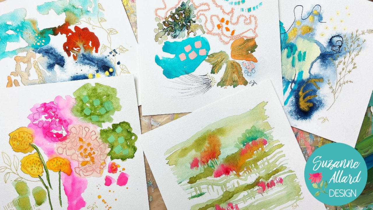
4. 3. Gathering Inspiration: When it comes to inspiration, we're so lucky to have
these apps and tools now. Maybe we're lucky
and maybe workers, because the masters had to
go out and stand in a field and I couldn't pull up their
iPad with Pinterest boards. But I do love it. I love having so
much inspiration. And I encouraged you to use some kind of tool to collect
what you love because it really will help
you narrow in on your style and allow you to
collect things that you love. And then you ask yourself,
why do I love that? What do I love about it? So one of the things I'm
inspired by a made-up board, and by the way, you're
welcome to follow me in any of my boards. It Suzanne, our design
is vases and bowls. I just think that the shape
of them is so interesting. They come in so many different shapes and you look at those. And I just think they make interesting elements
in a painting. Or I'll go through and collect flowers and
leaves or gardens. Let's see here I've got
flowers in this one. I've got landscapes,
tropical foliage. Let's see. Pattern inspiration. I mean, you know,
leaves, leaf shapes. It can just a fun thing
to do when maybe you're not feeling quite energetic enough to paint
something that day. But you want to do something
toward your art practice. That's how I think of this. I take care of. I do
this kind of thing when when I'm having
some downtime. So then the other thing
I do is I take lots of pictures and I collect those
pictures and two albums. So in your photos app, you can create an album. And here are some pictures that we're going to use in
this class for inspiration. It doesn't mean that I use every single thing
that I've collected. I'll just collect
a few that I've taken and then draw from
that for that piece. I may only draw from
three of the photos, but I'll just put them in an album for what is kinda
calling to me right now. This was a plant at the Marisa Lee botanical
gardens in Sarasota, Florida. And the same with this tree. I just thought the shape of
these routes was incredible. And I have put all the photos in the Student Download section along with the
class supply list. I thought these were lovely. So these are hope this
was in the Naples garden. And sometimes it's just a shape that I think is interesting. We use the shape
and the painting. This will inspire apart a piece, an element in the painting. This was right here near my, actually I have one
of my front yard. It's called a tie plant TI. And then look at those
leaves in those lines. It's great to study
nature because we can get in the habit of
doing like a leaf, let's say some leaf
painting and think that it has to be perfect, one matching the other, and just get these
ideas in our head. When we look at nature and say, Oh, I get that. That one doesn't
even go all the way. And on this side it's
missing one and look at that little thing and
look at that dot. I mean, it's not uniform. So I find, I have
to remind myself of that and not make
everything symmetrical. This was a succulent, but I took a picture
of an Austin, Texas and I'm nursery,
a succulent nursery. My daughter to look
at this, this, this, these thick waves and then the orange and the
pink and the green. I mean, this, this
little one picture to me just inspires a whole painting the way the light's
hitting there. And then this was
actually at a I just went to to get a massage and they had a
bouquet in the waiting room. And I just thought the shapes
of these were interesting. They've inspired, they've shown up in different paintings. Same thing, this
was the same book. A was a monochromatic bouquet. And just looking
something like this, can, you can pull this
part right here and do these shapes
just like this, very loosely copying it. Here's a restaurant in Tampa, and I thought the shapes
were really interesting. They're all, they're a little
different from each other. And I took a picture. Same with these little blooms. This is called a Firefly. Firefly, fire bush,
something like that. I took at the
nursery and then of course I bought three
and put them in my yard. So where the deer have
been trying to eat them. So I use those are
my two primary. Well, I also use catalogs. I was gonna say catalogs
that come in the mail. They can be floral catalogs, but they can also be like
clothing catalogs for color. But these kinds of nursery catalogs that come
in the mail or you could order them if you're not getting any new threats that are free. Spring Hill is one of the nicer The ones I think they're up
and now they're in Ohio. Okay. I have that wrong. And there's all kinds
of inspiration here. Sometimes when I'm at that
element stage of a painting, I'll just flip through and
say, let's make some of these dog was or what gets bows. And I'll just grab something
and put it in to a painting. Inspiration is really
all around you. You can become a real habit of looking at the world
that way forever. The one, if anybody's walking with me or
really anywhere with me, I might see the way that
light is hitting something. Or it could be a painting at a restaurant on the wall and
I like the color palette. Or I'm actually, I've been
in, I took a painting. Where was I met him in the
bathroom at a restaurant, hot places and I was
wallpaper at a yes, it was in Austin and it was
a wallpaper in the bathroom. And I said, I have to
take a picture of this. Colors were amazing. So yeah, it gets everywhere,
just get obsessed. It's a good, healthy obsession. And like I said, these pictures, I did, I did that I took
for this class. I've got in the class downloads. Alright, let's get painting.
5. 4. Background Layer: So for this canvas, I've got the 12
by 12 and Canvas. I would just at least
get the quality that is called gallery wrapped. It's wrapped like this. It's not just the
cheapest which is, it looks like the fabric
just stapled along here. It's not much more and I I
just think it's much better. But if you just if you
haven't hold Canvas, so you could even
just go over it and, and paying on that too. First we're going to start by Yomi to prepare this anymore. It's already got comes
with jostle on it. You can if you like, but you don't need to do anything to it. We're going to just
take some colors and do some big swatches of
color all over it. And I'm going to
paint the sides too. And that'll be our first coat, so to speak, our first layer. Color wise, we're gonna
do like a magenta, a yellowy color,
maybe some turquoise, some blue, and modify
them a little bit. So I'm gonna get some
cobalt blue out. And of course white.
This is my guess. I don't know that I just put
in here and use those white. So I'm going to grab
some of that here. This is not a fuzzy process. Get some glue down. I've got all my brush to like the color to
vary a little bit. So I'm mixing more
weight in perfectly. Wait for always
increases opacity. I like opacity. So I usually ask, if you move just a little
bit of white to color, make sure you get those little
seams painting done that before you've finished the
painting and then you can't match the color
person my paintings, it wouldn't really matter. But better to get it. The first time. I'm seeing them being loose with
my brushstrokes. Want it to look not too rigid. I'm not sure what
I'm trying to say. Want it to look loose. Okay. Here, I think what I'll do rather than
clean my brush out his way, but it gets a lot
of the pain out, but still leaves me
some of it so that I can get some interesting colors. And I'm going to pick up
that was the cobalt blue. Cobalt blue with some white. Now I'm picking up
the blue-green. This is a fabulous color. Hair with that, nearly mixing it right on my canvas. Just grabbed a
little bit of white. Sounds like the neighbors
decided to mother-in-law. And I hope you can hear that in that pretty colored love, this blue-green by Nova. Okay. Now, I will have to probably watch
because I'm going to go with yellow and I can leave a little tiny bit
of that in there. But if I leave all
that pain in there, I won't get too much of a green. See how much I use the
paper towels a lot because I can see how much
pain is left on my brush. Home islands and they
just absorbed so well. So there's a little
bit in there. Let's see how that
is. And I'm going to grab a cold, warm yellow. My cadmium yellow is almost gone. Again with some white. And you can see the bits
of green in there. So I'm getting some
good variation, like blending together,
overlapping for good. Excuse me, my seem like that color variation there. So I don't want to over blend. I don't think I want
to parent lining up, so I don't want this line here. So I'm just going
to go with that. My paper towel again. Let's do, uh, let's
grab some magenta, going to clean out. Mostly yellow but just
with paper towel. Because this is the
fluorescent magenta and it needs toning down. So having a little bit of paint in my brush
will help tone it down. So we'll wait. It
is really bright. I'm pretty let's see
that sort of yellow. The bathroom it one of
my favorite things to do is see what colors emerge by just leaving a
bit of paint in your brush. Is quite a bit of
a yellow coming out from the brush,
which I like. You can see, you can see it. Fair to see how that's
a bit more orangey. Okay. Now, at least gray colors. I'm going to, I'm going
to rinse my brush. Now. Let's do a cool color, which is going to work really well because we have
a bit of pink and a brush and this
naps all crimson. It makes a nice coral when
you mix it with white. Sometimes a bit of pink, just the outcomes out. And would it be odd? So let's see what's
in my brush gets us, they're pretty nice coral. You don't see that yellow
is coming out and my brush. And maybe go later. Okay. Wait. Do want to add a bit of your time already dry. You can see that there's no real rigidity to this
part of the process. Hopefully you not to any
part of the process. This is just getting
color onto the canvas. Just the first layer. You
could do five colors, six colors for colors. You can make them bright.
You can make more subdued. But we will let
that dry and then come back and start adding
our first layer of elements.
6. 5. First Elements: For this next layer, I'm going to create some shapes. Just shapes that I like. Maybe a little pots or things that like
sort of a half-moon. Just kind of you'll see, it's just hard to describe it. Shapes that I liked,
that I get inspired by. I take pictures all the
time and place things where I'm you know, these kinds of shapes. This was a restaurant, pots and like in a nursery. And then I've got the
botanical elements, but I like to look for vessels. I look on Pinterest and then it also the pictures
that I take. So I suggest you keep a Pinterest board
with things like shapes. And that way you pick up the kinds of
things, speak to you. You know, not everyone
loves vessels, but I do. Whoops, that's not a vessel. Vessels and pots and
pans and that pans, but things like this basis. The different kinds of
shapes and textures that are on vessels like this. So I end up painting things like that and in colors that are going to contrast. So we're gonna go
with a lighter, more opaque colors and start painting some
interesting shapes to be. Circles could be. There's so much right? I
mean, look at that one, that one's pretty there might be other shapes
that you like, but this just kind of gets
us to put something down. These are pretty as
our second layer. Alright, here we go. Make some lighter colored. Actually think I'm going
to use white and make some colors that are a little more complex
and later than these. So get some light. Grab a bit of this. Getting that to be really
light. Minty green. I'm going to knock it
back with a tiny bit of red and maybe some yellow. I'm just looking for an
interesting neutral. Yeah, there we go. Start
with something here. Maybe I'll darken this
a little bit and bring in just for some variation. Bring in grandma's blue-green
kind of a shape over here. I'm doing this layer
is scanning and dressed and breaking up
these really bright colors. And so it really, you can use any type
of shape you want. Right? So let's see here. So many pretty lines, right? Let's just do a big C. We're
gonna go in pink directions. Let me get over to change that. Let me go with some
fluorescent pink which will get knocked
back a lot with this. But for those in pink is so bright that we can
bring it back. Good. That sort of soft pink that I want without having to clean out the brush because the
colors that were in there already, her altering. Let's do maybe
something like this. She had to that hello. I love how pink and
green lock together. So I'm just thinking about
places to put color. These colors are a
little more subdued than the bright colors
we started with. Feeling like I want
to glue the color. Here. Hey, another pot. Like that, pink underneath. And I'm going to
grab a clean brush. And before this paint here, dress, make a second coat. So it's a little
less translucent. Wasn't quite dry, but it's good. Okay. Something quite a bit lighter. Here. I'm taking some weight. I just grab a teeny
bit of something. It's really going to end up
being like an off-white. Just grab a few
colors and go for a large leaf shape like that color. That's what happens
in this process. You find a color you
like and you say, Oh, I want to put
that somewhere else. Just go ahead and
put some little at pressure, so torn up. And I want these to
kind of look neater. That's just personal preference. I can get that with
that scrubby brush. Ms. premium rate for that, for this first layer. Let me just take
another look and think if there's
anything and so you want to do something cool, let it dry so we can come back
in with some other stuff.
7. 6. More Elements: I just wanted to say
that these elements, if there are certain elements that I don't mind being
semi translucent like this. And then there are
others that I want to be on the surface that
I want more opaque. So what I do with those is I do a second coat or I do gouache on top of the acrylic gouache. Either one will do that. So the only element here, I feel like that I
don't want that, I want another codon is this, so I'll do that at sampling. But now I'm looking through some of the inspiration photos, thinking about elements
that I want to bring in. I like these leaves. I thought we could bring
one coming in this way. These roots are amazing. So I don't know if we'll just
do some lines somewhere. I don't know yet. I like the shape of these two. Maybe these will be up here. I just like these little
criss-cross lines. Those leaves are amazing. Then this is just some detail on the leaves that is pretty. These are all pictures
I've taken here and there. I thought this succulent had the most beautiful
wavy lines and colors. So I just kinda look through
a set of pictures and collect them for a
painting like this, and then decide what I want to, what excites me most basically
as I'm looking through. So that's what I
encourage you to do. You can obviously
follow along here, but as you do more of this, you'll develop your
own inspiration, sources and things
that excite you. I think my start with
one of these leaves and have it come in here. And one of my
favorite ways to draw leaves as either with
a water-soluble pencil or any old color crayon because it just dissolves
into the paint. And I like how this one
is curling like this. So I won't make it green though because it's
going to blend in with that. So let's, let's follow one of
my favorite art movements, which is fauvism, harvest and make things any color
we want them to be.
8. 7. Adding Interest 1: Alright, so this has been
sitting in the video for a few days just because
we went out of town. But I've got my glass palette. I've got my iPad with my
inspiration pictures. And at this point I'm going to switch to
acro gouache because it gives me that pigment intensity that I want on the upper
layers to make things pop. And it just adds another
dimension that I really like. So you could have
regular gouache, you could use that
just to understand that it will
reconstitute with water. And Apple Watch is like
a very matte acrylic. So it has the properties of acrylic and also the
properties of wash, which is that chalky, opaque consistency
that I really like. And I always recommend
giving things some distance here because as I walk into the studio
or walk by this, I I I liked it and I thought about what it needed
and it just kinda sat there. And I just think that's a
really helpful thing to do, especially if you reach a point in a piece and you
don't know where to go. The best thing to do is to
walk away, give it some time, and perspective will settle in and just give you some ideas. So with all that, I think there are
enough elements here. But I do want to do
something coming out of this pot in here. And I might do some little bits here and there with the gouache
or wisp pastels, even maybe the Kranz, the neo color crayons,
posca pens, pencil. If you don't know,
until we get into it. I'm going to look
for some inspiration for something
coming out of here. And I start with pictures. But it doesn't always, you know, I might deviate from
that or something I saw in a garden or
somewhere else. I just give you a
starting point, but I am fascinated with
these petals on this. And I'm thinking I can make something that comes out of
here with stems and then has these types of petals. So let's start there. I'm going to color wise. I think it should be a lighter
color and I'm being drawn to the cobalt blue maybe to
bring out some of this blue. So I'm gonna take metal crayon
and start with some stems. Yeah, so then this is
just giving you an idea. And remember this
is water-soluble. So if I decide I don't like
any of it as I'm painting, I just wipe it away. So now I'm going to
make a cobalt blue, which is really just a, I don't know, it's
a medium, light. Royal blue, I guess
you could think of it. But I blew that. I like just the blue that
I think is pretty what I'm going for. I like that. Maybe I want it to be just a
little more cobalt to you. So and I do this all the time. We're going to mix a
little bit of acrylic with metrical blush. No problem doing that. Okay, I'm gonna
get a better brush for making these small lines. It might take some experimentation
to see what kind of, you know, do I want
the great brush. Let's try that either, right? One. If not, you can always look if you don't want to
grab your scrap paper, I always have scrap
paper close by and see if that's giving
me what I want. The only thing I don't
like about it is it's all dry at the end. So meaning it's all bristly
and I don't want that. So I think actually
I'm going to switch to a small round, maybe a one. Because once you
get paint on there, it does make quite a bit of a thicker line than you think. And one of the things you're
always learning, right? Hopefully, one of the things I've learned recently is that acrylic dries darker than
you think it's going to. So just keeping that in mind, if this is the color I want, It's going to dry darker, which is fine because it'll
be maybe closer to that. All right. Let's get started with these. This also will start drawing. Another thing I can do, I love using this
blend BM mediums worked for acrylic
or watercolor. I've used this Winsor
Newton blending, meet him for gouache. Then for acrylic,
I sometimes use this whole dramatic
medium because I like my paints to be Matt anyway. So this helps kind of increase the quality of my acrylics. And I just, I don't use too much though because then
it will reduce the opacity, but it does make it easier
to do stuff like this. See how fat of a line I'm
getting with just one brush. But it's still nice and opaque. You'll notice that I'm
bleeding on the stem. I'll come back and fill that in. You can take some of
these off the edge. I'm just kinda clustering these. Some of them, some of them not. I can vary the color, grab a little bit
of a darker blue, even grab more Unlike cobalt. And you can use,
if you don't have a medium, you don't need one. I mean, you can use water, just a little bit of water. If you use too much water, it'll just get too
translucent and the pigment won't be as intense. But also the eventually if you have too much
water to acrylic, it kind of doesn't. It keeps the binders
when working. I'm just going to go
through and paint these, varying the color and
the shape a little bit. Okay. I like what they added. It did get big, which I saw when I drew it. But I was watching that to see if it was too much,
but I think it's okay. And this seems like a good color to go
ahead and sign list. So I'm gonna do that a little more water or make it more fluid
to be able to assign? I like to make the signature
part of the painting. So I just keep their pickup a
color or use metallic gold. Okay. Now I'm going to take a
step back and think of, I want to do
something with these. I think maybe another
coat of the off-white. And I can actually
easily do that. I get my ivory posca pen.
I could do it either way. I could take my halfway color. Do you think this size
pen is running out my 5M. I did a YouTube video on posca pen and just call
about the sizes and how to. Use them and take care of them. Quite a few supply videos on my YouTube channel and also
all my favorite supplies. I have links to
them on my website. And I tried to find the
best prices for students. Okay. I think I'm going to want to add a little
bit more ivory down here. So I'm looking for my next size. I agree. You have to prime Nice. They're just really,
they're just acrylic paint in a pen shape, but for certain things they were just give you more control. And yeah, they're just
they're a nice tool to have. Since I haven't out. I am going to do something. I don't know if I
want this color. This is beige or just
a little more Beijing. I think it's rather has halfway. It's called ivory. And I'm going to do some stems here
are some details here. And what's cool about past, because as you know, you
can leave it like this. Or if you want it to look
more like a brushstroke, of course you could use pain, but you could also
take your brush and go over the posca just so that if you
want it to do that, if you wanted it to look
more like a stroke, a brushstroke thing is, you'll notice there's
a dot at the end. So see the dot at the
end of the marker. So I can think about, do I want that dot at the
end or that end in variant? Where are you paint?
The more you, the better you learn,
the more you create. The more you learn about
all the different materials and ways to use them. And I just encourage
lots of experimentation. Don't be afraid to mix
types of paints and see what happens to mix colors. I turned it around
and then I OK, I'm glad I did that
because I can show you how to turn it around and made the the little stem, what are these leaf mark
going the wrong way. So yeah, you just let it was easier with a
brush and then let it dry because if you go back in there with
your pasco on the wet, it'll just run a
little bit. Again. My neck from experience. I don't have to do all
of these the same. I can have some just be lines, just kinda suggestion of a stem. Now that I said that though, those couple of without
anything with naked to me, it just depends on
the composition. Okay, now I'm gonna
show you something. What's happening now is there's lots of
little detail here. I've got this little blue
leaves and then I've put that in and it's too much, it's too much right there. So I'm going to continue
with my details. But the great thing about creating is that,
you know, I'll, I'll do details here if
that's still feeling like too much little
stuff after we've finished the rest of
it and after we put these stems and then
I can just paint over these white marks and
subdue them a little bit so that I just wanted
to observe that right now, but that's, that's too busy. Okay. Maybe while I've
got the ivory out, I think it could be fun to do
the center marks and knees. This part of the painting, which is like you could
fill a decorating. Sometimes I think of
it as adding jewelry. Your outfit,
accessorizing, details, interest to a lot of
things you can call it. But this is personal
preference as far as how much you want to do. That helps the detail
having us over here, it's still I think
it's still too much, but I'm looking I'm
going to ignore that for now and look around and see
what else I want to do. I'd like to make this, these
orange pop a little more. So I'm gonna make some
orange with the glass. The glass will be more
opaque and will help. That, so let's get that on
there and see what we think. We're gonna get some
to make some orange, I'm gonna get some warm yellow. And a bit of work got some
orange here actually. But you could take a bit of red. I always recommend
making your own colors, mixing your own colors. Even if it's just a tiny
bit of something that you're adding to make it yours and not use it
straight out of the tube. Make sure I'm not putting my arm and something that's wet. I've lost track of how
many times I've done that. Is going to vary the color a
little bit and do this one. Hello with that one
a little later. I'm just using this
number eight flat shader. Well, sometimes also
called a bright. Let's see how those
are coming forward. So I couldn't leave just those
three in the foreground. And these two, by
just looking faded, kind of recede to
the background. Again, personal preference, I
think I'll do that for now. I can always come back through. And I think I'll brighten
up some of these guys, especially the ones toward
the middle of the vase. So they kinda pop out
a little bit more, maybe give it some dimension. I was just considering if I want to do the stem and orange. But I don't think so. I might come through with the ivory posca pen to just
make it a little less busy. In fact, let's just do that now. And the, what that's gonna do is it's going to mix
with this blue strand. Well, let me let
this dry completely. It's almost dry, but
we'll do that first.
9. 8. Adding Interest 2: Okay, so this is dry. I'm going to come through,
it's going to mix and it's going to
make a light blue. Which is fine. We might
decide that we like that. And if we don't, once
the posca dries, it's it's like putting
acrylic paint over. I mean, it is acrylic paint. So if you let it dry completely, you can come through with
another code or the Posca pen. And it'll be high rate because that light
blue will have dried. Does that make sense?
It's almost like it seals that watercolor CRAN. And you can go on top, but very well-made
like the late blue. So we just will see course. I will have to clean off my my posca nib because it's
going to be light blue. But the great thing
about Pascal's, they can be cleaned
off with water. They're water-soluble. So I could just wipe
it on a piece of paper or good dividend water or both? This one is definitely
drying out. What's on his last
I have to order another one that goes I
use this color a lot. I just find the weight
to be too stark. And I also find black
to be to start. So that's why I think I end up using February and Payne's gray. Well, I think it's
officially out, so we'll go with this size. I kinda like some of it
blue as I'm saying it, and then some of it later. And I'm not drawing the stem all the way through
all the leaves because it doesn't need to be. Okay. That's good. Maybe
come through here. Lines and the eye ray
that you can barely see, I do like to do similar
colors on similar colors. Now, these, I do this. Sometimes it just seemed random, these shapes here, but then they look like they're
coming out of the pot. So I can have stems
or I can leave them. But I think bringing
in some stems would be a fun way to bring in
a bit of color there. Now, I'm just thinking
about the color. Don't want them to be. And
I could do a yellowy color. Let's do that. I've already
got some yellow here. Realm of my smaller brushes. It's been sitting in water. I'm just going to dab
it on the paper towel, make sure I've got most
of them panned out of it. I don't mind if
there's a little bit so that it varies, the color. Lightened that yellow up a bit. And these can just be sort
of suggestion of stems. It makes it look like this whole plant is on the one side of the
pot, which is fine. If that bothers me, I could add another leaf here. And but I think it's
kind of interesting. It makes, it, makes me
look at it, go home, What's going on
there? A little bit. So these are two something
I'm not sure yet. Too bright to plane two. I'm not sure. I think I want to do another coat of the trash green and then maybe
something with gold, metallic gold on them. So I'm gonna get,
makes a variation of this fresh green color
turner and paint over those. And then see what
you think of him. Too bright. If you don't have, you know, aqua wash, of course. You can just do another
coat of acrylic. You can get the same. You just, you can get the
same amount of pigment. You just have to layer more. I'm just kinda painting this second coat
down the middle of each leaf so that
there's some variety. I like that better. Do the same thing up here
with the same color. I don't have to do them all, just get a hint of
that color up there. And same thing down
here. With these. Just make them pop
a little more. There's just something
about For me, the layers that are really pigment rich are
the bits that are big, that brings them forward. I like the way that looks, at least on some of them. And some of them
I can leave with one coat and it'll just kinda
recede to the background. Alright, so time to
take another look. And I'm still feeling like those stems are
too busy up there. So let's take care of that
and see what do you think. The way I'm gonna do
that is in the paint? Well, I'll show you a couple of ways just so
you know how to work with posca pens probably will see
if it hasn't dried too much. You can wet paper
towel and rub off some of the Posca marker
without rubbing off your paint. So that's one idea. We could just go ahead and
do that since we're here. And then there's
painting over it. But sometimes just rubbing off, faded enough that it
doesn't bother me anymore. So we'll do that and
see what they think. Now if you've used wash
stead of acro goulash, you gotta be careful
not to rub up any other parts of paint because that will come up with water. But since all of
this is acrylic, I can rub freely either
acrylic or aqua brush. Alright, let me see
what we think now. It's better, isn't it?
It's definitely better. But I still wanted
to feed some more. So I'm going to mix up a red and just go over it
with the gouache with red. Let's see. I don't want to
have a round brush, so let's try this. Number six a little bit. And this is a pretty
bright red, but yeah, I think I'm going to
need to probably need to darken that a little bit. Trying to think
what's direction. I want to darken it. I
wonder if I just add, let's see what
happens if I just add a bit of weight to it. If I like the color better, it's going to blend in
too much with that coral. So let's just add a blue. Let's see if we can
get a color we like. That's pretty the
thing is, you know, Pete I think is so forgiving, at least in this style because you can keep working
something until you like it. I do that all the time. And we're gonna
probably be able to see a hint of these stems. Which I think will be
interesting because i've, I've got fair amount of water in here because I think it'd
be nice to see some of it. Just not as much
as the pen left. And knowing me,
I'll end up going over it with gold
or something else, but we'll see something
with less contrast. We might oil pastel over it. You can see how the,
somebody who had, it's drying and you
can see the stone, the meaning, that's what
I've been trying to say. That was the word
belief veining. Sometimes when I'm painting
and I'm trying to talk, my brain has issues. Alright. So, you know, I
was just thinking, do I want to bring that
read somewhere else? But I kinda like that. It's just they're definitely
my eye goes here. So that's what we always want to think about
in a painting, is how do we keep our viewers
eyes in the painting? And so this brings the
eye into the painting. And then kinda look either here or here and
kinda come down here. And there's nothing
directing the viewer out. The only thing is maybe this because it spills
over and then this, but then they come back around. Another green one here
would probably be good. But we'll think about that or maybe some other element there. This is a good place to pause and let this dry and then think
about what it needs next.
10. 9. Enhancing Composition: So this has been sitting. And when I look at it, I think that there's
just too much, too many bright colors. And it needs, it also is
lacking in contrast for me, it needs some darks. So I'm going to tone
down some of the colors and darken some bits and put
some of these leaves darker. Maybe tone this bright
green down a little bit, and then put some
darker lines in it and just calm it
down a little bit. I like there's so many
ways to calm down. We can add more color, we can add some line work in a different color
or the same color. We can do a wash to soften
like parts of this pink. Just take an hybrid wash
and soften parts of it. So let's just play a bit. First thing I want to try doing is darkening some
of these leaves. I'm going to take some of the
blue, black, indigo, Navy, whatever you wanna call
it, and just go over some of those leaves. He was kind of a wash, meaning
I'm adding more water. And that just gives us more variety in
these leaves anyway, I usually come in with
something lighter or darker to have a little
bit of variation. I knew immediately that I
was going to like that. And they ended up doing
pretty much all the leaves. And then you could
also come in and add some light or even another color just to create interests. Okay. The other place, I think
what I wanna do, this, tone this down, telling this pink down a little
bit parts of it. And then we'll see
once this dries, if we could do some
dark navy blue lines on those leaves, I
think that'll help. So I'm gonna get my ivory and make a pretty
watered down wash because we can always add more and just soften
this a little bit. Not all of it, just some of it should use a flat
brush for that. Around is better for
the detail work. I'm using RPO gouache,
so this'll probably, this can dry and I
might decide to do another code if I want
it more softened. Okay, Now I'm
thinking about what I wanna do to this green. And I think I'm just
going to darken it a tad about some sort of I don't
know what to call it, sort of has called hash
my whole being as yellow. But it isn't good subdue or
whether I could have used just a bit of blue as subdued at even the ivory would have to. And I'm not going to cover
it completely because I like those pops of color
coming through. Remember, you know, painting
his problem-solving, you got to create some problems
so you can solve them. And it's also pushing things back and
bringing them forward. So what we're doing
there is pushing back, pushing these colors
back a little bit. We brought that
forward a little bit. And then we step back and
we say, what do we think? Letting that dry? I want
this to be more opaque. I really like that color. So I'm going to make a close enough version
of it and go over that. A covert painting. I just
think that would be fun. I will see, you know,
that's what it is. It's experimenting,
experimenting and playing. And see if that's going to be, it's a bit darker than I wanted. So for more ivory. I just did that loosely because I don't mind if some
of the other stuff pumps through and then I changed
the color a little bit just to see what
I thought of it. And I just added some
yellow to it to warm it up. And I do like that that warmer this warmer
color a little better. So I'm just going
to go over this a little bit even though
it's still wet, which is fine
because it'll blend. And I like how there's bits of that other color
showing through. It makes it like
texture on the vessel. So yeah, they've made
that more interesting. Now this is probably
dry and we can go through some of this
navy or some lines and see what we think of that is really being soft with
this number four round. And using that whole name? No, it was the Turner. Black blue. I think
that's helping. I feel like this
yellow here is to break some thinking about
what I want to do there. I had put this halfway
lease their ivory, and I could go back in and
put some more of those, which is more tricky
since I painted on top. But I do it all the
time because you never know what you're
going to want to change in a composition. And so you can
only plan so much. Well, so I'm thinking
about do I want to do that or don't want to
do something else? You'll just make some kind of circular shapes here to
break up the yellow. Maybe they'll end
up being leaves. We don't really know yet. See why I always have lots of
bottles of pay every round. Just make a shape
and it breaks up the yellow and then we
can see what we think. Let that dry. And another
place that needs to be done something with
are these orange things. I think I actually wanted
to do the ivory again. I'm just thinking about
what Marx might be fun. We don't have to do the veining
the way it was in a leaf, but I don't have any
really small raining. So we could do that and paint over it if
you don't like it. Just kind of a
suggestion of painting. I love looking at leaves and seeing if you really
study them close up. Oh my gosh. The meaning is incredible. Every leaf is different,
every species, some have incredibly
detailed meaning. Others have much larger veins, some have very fine veins. All serve to gather
spread water, I believe for the vein. They also are
involved with late. I think they're there to
spread the water, mostly. Me just turn it around
and see. I like that. You don't do one more. Since these are more faded, I'm just going to
add more water to my My brush so that it's a
little less pronounced. Maybe put a few less,
something like that. I hit. Okay. Now I'm just kind of having fun with
different ideas and marks. I really think, Oh, hello to my inspiration
is from growing up in South America. We would go to these markets, farmers Martin, that farmers markets, that's what
we call them here. But the craft markets
really, I mean, these people were
earning a living selling there and still do their wares are
handmade bags and purses, and belts and scars, and they always had
such vivid colors. Thinking I want to do something
with those red leaves. I think what I wanna do is
just add a variation of red. Sometimes I like to just
change a red slightly. So I'm gonna do that
with oil pastel and see what this
one looks like. It's the same thing. Let's
try this pinkish one. It just gives it some depths. Without changing though. Whole color. Yeah. Like that. Yes. I've had people
say are you using oil pastel on top of
acrylic? I certainly. Because why not? As long as you have a fixative that hold it together all those oil and going anywhere,
It's very oily. That's pretty I'm thinking
I might want to do a little bit of these
marks of this down here, oil pastels and such a
richness to your paintings. I, for me, sometimes it's subtle like this is just a little bit of delicious texture down here. Those little bits to
me kinda make, make it just thinking I want
to bring out some of the color in some of these
with this orangey yellow, especially the
ones to the front. Which makes sense to me. And then maybe take, you can tell the colors a
little bit as those that are my favorites are the ones that
are shorter and appealing. I have linked to these oil
pastels and supplies on my website with all my
other favorite supplies. They're just a great value. They're not they're
not the cheapest, but they're not super
expensive either. They are great quality. I've had them over a year, not even close to any of
them getting used up. This is softening
those slimy things which I felt they needed. I like bright
colors, but I don't want to dominate everywhere. So then on these
blues and turquoise, what I like to do, my turquoise is probably my shortest one. Let's see, this
looks very similar. It shows up a little bit. I like to take light or like, unlike the great
variations of one color, turquoise, on top of the
turquoise, it doesn't, it just gives an interest without taking it over
or changing it too much. And the same thing
here up in this blue. We can tone it down and
try to see how that looks. That's a light blue. Play with a periwinkle to
maybe do some circles. Maybe do like some clusters. These pairing the
ball. Beautiful color. What is this called? Late Azur violet. Okay. I feel like
it's getting better. I'm thinking about 02:11. Do anything back here. I could use some crayon. Maybe let's see if we do
something orange lines. They don't show up too much. But a little bit here, a
little bit of interest. Right now, like all
this dry and then we'll see if we want to do
some metallic gold. When don't we want
to do metallic gold? Well, every now and then. The other thing I
want to fix this, I don't really care for
that shade of green. So it will come through
with something, maybe something like this.
I guess we'll do it now. What's going to come
back and do it, but let's do it now. Or at least Let's do this part and see if we like it better. All right, now we'll
let everything dry.
11. 10. Color and Composition: I did some of the things I do when I'm working
on a painting and I want to figure out what it is. I don't like about it or what
what needs to happen to it. One of the things is just to
stand back and give it time. Also. Take a picture of it and then you can kinda see
the whole perspective. I've had this in my
studio for a couple of days and I walked by it and I know some things that are bothering me and this is
personal for everybody. So one thing is that I
feel like this yellow back here is just too bright and keeps calling my attention. So I'm gonna go over it with like a mustard color
to just turn it down. And then I'd like to
brighten up this little pot. I think I'm gonna do that
with some fluorescent pink Posca marker dots. We'll see what that looks like. We can always paint over it. And then the other thing is, I like this color back here and with the
oil pastel on it. But I want to see what
happens if we lighten it up just a little bit
less like a wash of ivory, kinda like we did here. So those are the things I'm
going to try and then we'll we'll check in afterwards and see what we
think at that point. Okay. I'm definitely liking it more. If you like. The
yellow is toned down. I achieved my objectives there. I think the red shows up better now that the background
is a little bit later. And now I'm thinking about this and do I want anything
here or these stems, but it's time to let it
dry and come back to it. This is a good point
to just talk about a few things in terms of
what we've been doing. So we started out with
really saturated colors. And then as we added elements, they needed to be toned down. And you know,
sometimes I say, well, why do I start, you know, why not start with more
toned down saturated colors? I mean, less saturated colors. And you could, and I do
sometimes or I'll pick up a saturated color and then one that's not one
that's more subdued. But I never know where
I'm going to want some of that brightness
to pop through. So there's different
ways to come at this. There isn't really a
right way or wrong way. I don't think it's really playing and seeing
what you like to work. So I think we're getting close. It's definitely getting
richer and less. When you just have all
those saturated colors, it can look amateurish. There's still a little
bit of element of that, this royal blue, I
want to tone down. And I also want to think about is there a mother color
are operating here, a dominant color that I can
bring more into things. And I really liked
these mustered tone. So I'm thinking that I want to bring that a little bit
more into these leaves and then maybe use
a wash of it over here on some of those
blue to tone it down. The other thoughts I've
having R that I want to try a green and a stem and
see if I like it better. And I also wanted
to point out that the mustard I did on here with this yellow ocher
was regular gouache, meaning that there's, of course there's
acrylic paint, right? Which once you paint it, it's permanent, you're
not removing it. Then there's acral gouache, which is basically gouache with acrylic properties and
gouache properties. So it has the
permanence of acrylic. But it also has that
opaque texture that I like and that I tend to use on at least parts
of my paintings. Then there's regular gouache, which has no acrylic. And I think of it
like a watercolor, just a highly pigmented,
more opaque watercolor. And what I've found
sometimes is that this is a great thing to try if you're
not sure if something's going to work because
that's what I did. Here was in regular gouache, this mustard, yellow ocher. So if I had woken up this morning and looked
at the painting and thought, I don't like that at all. If I, if the rest of this was acrylic and Apple
Glass, which it is, I could literally take a
paper towel right now and wash this off and it would go
back to the bright yellow. So it allows you to experiment with some things
without it being permanent. Now, you can do
that with acrylic or gouache if you wipe
it off before it's dry. But if you want it to dry
and see what you think, I really like using gouache
that way. I do like this. I'm not wiping out, but I just wanted to share that with you. Then. It's all, you know, there's oil pastel on here and it's a lot
of stuff on here. So we will spray a fixative at the end and I'll
have a video on that. But for now, I'm
going to put some of this omega mustard
color for here. Maybe up in here, and tone down some of that royal blue so that there's just less of a competition with
all these saturated colors. So that's what I'm thinking. All right.
12. 11. Finishing Up: So let's have a chat. You saw me take some of
that mustard around. And I really like what it did. It's subdued and reduce the competition between those saturated colors
I was talking about. And then I made a turquoise E, minty green and like that here. And then that often happens
when I make a color that I'm happy with and
I put it here and here. And who knows, I may
go somewhere else, but we're definitely
getting closer. And this one and
I'm feeling like the what I do when
I'm looking at a painting and I'm
making progress as I say, what's bugging me? What? That's something
that just develops over time as you do
this more and more. And that's why I'm
such a believer in that giving up or
throwing paintings away, especially when they go
through the ugly stage, which they all do. Or maybe it's not
ugly like this one, I wouldn't say went
through an ugly stage, but it went through
what is this and why is it's so bright and
wiser bothering me and it goes through a stage. Let's put it this way
where you don't like it. Too many people, I think, take that and throw it
out and start over. And so they never get
through that tough stuff. That is where all
the learning is. And almost every time when I continue to work through a
painting in that situation, I end up liking
it because I just keep at it until I like it. And you learn so much. So when I look at this one now and I'm saying
what's bugging me? This bright pink is bugging me because it please
subdued it here, remember, but we didn't hear because I thought
I wanted to leave it. But it's drawing
my eye down here. In a painting, a
successful painting. You want your eye in the painting not out
here in the corner. You want to be brought in, this brings you in and
you kinda look at this, maybe you come down here. You don't want to I
want to subdue that. Then that will make the we can even make
them a little brighter, but that'll make
this pop more and bring the eye back in here. So that's one thing. Then I also like how this
oil pastel looked here, and I want to put a
few more of those here and bring that up here. And then we haven't
used any metallic gold. So I love to use
metallic gold accents. I have these, these are my
favorite at the moment. Gold metallic pens. These pilot, I have a link to this on supplies and my website, which is where I have the links to all my favorite supplies. You go to Resources and then
their supplies and books. And I have all my
favorites there. But yeah, those are the things that
I want to work on next. So let's do this first. We're gonna do it the
same way with just a bit of this ivory wash. I might throw a little
bit of the mustard and just to vary
it a little bit. Mustard IQ, probably a mustard, yellow ocher, but
it looks mustard. Economy will just come in here and see if we can bring that down a few notches
in between here. Neither really water that down. I'm using again. In this case, I just
mixed regular gouache. That's the one that's
not like acrylic. In other words, it can be
reconstitute with water and I mixed it with
the acrylic gouache. Not because I'm trying
to mix those two, but because those are the
two colors that I had. So don't worry about that. As long as you're like
I said at the end, making sure you have a fixative. You might find that like, I don't know if you can
see here that sometimes the gouache doesn't want
to go on the acrylic, especially I noticed if I've
touched it because you get your body oils on the surface. But there might be
some times where it just acts like oil and water and it
doesn't want to go on. You just keep working at
and you can layer because you can't get it
on the first layer over it wants to
take the first layer it will in the second one. The creative process is
all about experimenting. And what's the worst
that can happen? You paint over something. The other thing that I
like about the layers here is that when you use multiple
colors to create a color, your multiple layers, you get a lot more textural interests. You get this lovely texture that this yellow ocher over
the yellow is giving. And then the texture that this The same thing, the yellow
ocher over that blue, you just get more
interests that way. We won't know if it's
covered enough of it until it dries
because we were looking for is that
my I no longer comes down here as much to this, to this really bright pink. So we're going to let that dry. We can always do another
wash over it if we need to. And then we talked
about doing this here. These oil pastels just add such a richness.
Yeah, like that. Alright, so now I'm thinking
about while that dries can think about gold and
do we want any gold? Where do we want it? This painting is
already very busy. I wouldn't, I don't. So gold sometimes allows me to just add a
bit of interest, but I want to make sure that
I'm thinking about, okay, do I need to add the
interest because there's not enough
going on in a painting? Or do I want to add it just because it's another dimension? And that also just
comes with time looking at something and kinda letting my I go
around and saying, well, this might be a spot
for a little something on this painting since there's
already a lot going on, I don't really need to add anything extra in terms
of an additional shape. Sometimes I will with
gold will see this. I think just maybe is
a bit of interests. I'm taking this, this
is what I wanna do. Finer work, I use this Pentel. I have the links to these
also on my website. I have, basically, I use
gold so much that I have three different pens
and I have gold paints. I have gold ink, just different ways to use it. So this is a really extra fine. You may not even be able
to see it from there, but you can see it gives a
little bit of Pinterest. And I think I might do a little line in here to drawing on
Canvas can be tricky. So don't worry about trying
to be exact with it. This is just a suggestion of
some dimension in the stem. And also, when does paintings hanging on a wall and
you kinda come around the corner are these little bits of gold will give a glimpse. But I like, I think I'd like to take
this one which is the one that's a little bit thicker because there's a
new one though. So if you haven't
used these, I'll show you how you prime them. When they're new, they're not trying to be as you shake it, shake it up or a piece of paper because I've done this before. You can and then you pump it shaking and pump together into come down for
the first time and then once it comes down, it'll be there, but you still
want to shake it each time. I think I'd like to put
some gold lines here. I do make a conscious
effort to do odd numbers, but sometimes it doesn't work. Yeah, I think that's pretty when I'm down to just kinda
looking around with my eye, deciding, you know,
going like that. I'm deciding if I want to do anything else anywhere
else with the gold. I can come through and
just do a couple of these. Maybe I'll take this pen. So this is sort of
a medium white pen. And then the fine
and then the thick. I don't know that I'm going to use the thick on this painting. Usually what I'll use
that for is if a painting needs like some actual shapes, like let's say there weren't enough going
on in this painting. I've got a bit of water there. And I wanted to add some shapes
like this here and gold, but I think there is enough
going on in the fading, so I don't feel the
need to do that. I am thinking that it'd be
nice to put something here. Just a bit more definition. I think we can. This has dried now and
it has calm that down. Quite a bit. I see a spot that's brighter, so I'm going to just
hit that real quick. Isn't layering great? Because you can just,
it allows you to just experiment and take things
in one direction or another. You can brighten it up, you can tone it down. You can take it warmer. You can take it cooler. Now that that's more subdued, I want to brighten
these a little bit, some of them and see
if it's changing how our eye is moving
around the painting. And if it's keeping it more on the painting as
opposed to in that corner. This pluralist,
great pain with the, that minty green is quite yummy. Sometimes just those little pops of a really bright color. Just make a painting. That's why you can't have
the whole thing be bright. Because then everything just as monochromatic and it gets lost. We shake it away
from your painting. I've learned that
one. The hard way. You shake it over your painting
you'll often end up with, although there can
be a happy accident, you end up with a little
touch of something. But it can be an
unhappy accident. Alright, so we stand back
and yeah, I like it. I was thinking about
do I want to take this pink and do anywhere else? But I don't because I like how, you know, you've got
the muster here. You've got this leaf bringing
you in. The pink is here. This is no longer distracting
me because it's muted. And I see this
pretty little pot. And I see these bright green
leaves against the paint. And then I come over
here and see the orange. I got my bits of gold. I do this. I'll see, do I have them
pretty evenly distributed? I wouldn't want just
some gold appear, although, you know what,
you could do that. But for balance, for the
rhythm of the painting, I like there to be some
gold comes down here. There's some gold here. I could even put a bit, okay, I see one little thing
I could do and now I'm just nitpicking,
but that's fine. I could just come in here
with a little Good of gold. Okay. This is fine. I'm happy with it. And I hope to show you that when we post this picture on
Instagram at this painting, now when sees what
you went through, the changes you made and
the directions you change, they just see the end product and just to encourage
you to stick with it and not abandon a painting
no matter where it is. And the only time
I will say that I've completely abandoned
and it's not on Canvas because Canvas
you can paint over as I have mucked up a piece
of paper so much. Well, I don't mind
if it's mocked up because then I've
added texture and layers, which even if I just
have over that, it's gonna be interesting. But I have times literally the surface of
the paper is kinda rubbing, rubbed off and the integrity
of the papers is an issue, then I will scrap it
and throw it out. Other than that,
I am pretty darn for a system and
I just think it's really helpful and
improving a painting. And now I'm sitting here
looking at this, okay, and talking to you and thinking that a few little bits of gold, because gold, the Navy is
so pretty, oh my gosh. I cried. I'm going to have to walk away. But now sometimes, yeah, I really like those little bits. Just to touch. Let me show you.
Can you see them? All right, now we are done. Lovelace. I hope this was
fun and keep it playful. And know that there's no terrible thing
that's going to happen. No danger here is just fun
and learning and creativity.
13. 12. Varnishing and Wrap Up: Well, I hope you had as much fun taking this class as
I head creating it. You know, the colors
that we chose, the way that we turn them down, the way we push things back
and pull things forward. It varies a lot going
on in his painting. But I like all of it. And I think it was a fun project and using our inspiration and just thinking
about composition. And now it's in my studio. It makes me happy when I see it. I wanted to talk to you a
little bit about fixatives. Now, for varnish, if you're
working with something, especially one like this and you're doing
some oil pastel. I did not spray this
in the process. But you could and you could use if you want it to spray
it before you're done. You could do workable, fixative, and then keep what the name says and then you can keep
working on it if you want to, just especially if you used well pastel stay
put pretty well. But if you use regular pastels, which are really powdery, them, when I do, if I do that, I do
use the workable, let it dry and then
you can keep working. But when you're all
done and you're ready to hang it and decide
that it's done. That's when I use the
Liquitex matte varnish. There are all kinds of
spray varnish is out there. You don't have to use
these two, of course. I just like Matt I
like a matte finish. And I do have links to
those on my website. What you do is you just take your painting outside and foot, maybe some cardboard
down or paper? Well, cardboards better
because I've had work paper will blow in the
wind and kinda blow over it. It doesn't take long to dry. But whatever you got, you protect your surface and then put your pain
down when you spray your spraying this way and a fluid motion and not you're kind
of going off the painting. So like you would
spray like this. I don't stick at the end
because they're not end up with a bunch of stuff at each end. Does that make sense?
You go off over off and just continue
until you're covered. Then you could do two coats. Let it be let it dry in
between, and you'll be all set. So I use those for everything. I use the same fixatives, whether it's on paper
or canvas, sketch book. And speaking of sketchbook, you may have already taken
my sketchbook class, but if you haven't,
it's a lot of fun. We do 31 little
paintings in that class. And then of course we have the other abstract classes
and floral classes anyway. And now a new color
mixing class. So I hope that you have
been inspired by this. And remember to be gentle and kind with
yourself when you create. I think the creative spirit is something that has
to be nurtured. And at least in the beginning, we can't be too hard on it or it can run and hide and
not come back out. And that's the
last thing we want to have happen with
your creative spirit. Please join me in my newsletter, which is called the current
your creative adventure, where I share inspiration, make announcements, and
just all kinds of goodies. I used to do it once a week, but it's down to once a month. But I love having, being able to share on
the newsletter as well. Alright, happy creating.
 Suzanne Allard, Landscape, Floral, Abstract Painting Teacher