Transcripts
1. Intro to Joyful Abstracts: [MUSIC] Hi. I'm Suzanne Allard and I started Suzanne Allard Design
about three years ago, started painting about
a year before that, finally got through my fear and fear is just
something you live within the creative process but
I'm really excited to bring you this blooming
joy, abstracts class. We are going to have
so much fun because abstracts allow you a lot of
freedom for self-expression. But they're also
pretty intimidating because you don't
have a reference, you're not creating, okay so I just basically
have to try to copy this flower or copy this
landscape or sketch it. There's nothing to start with. You're sitting there
with a blank paper and [LAUGHTER] other than
shape and color, you're going, what do I do? Then when you see abstract paintings they look fantastic because they're good, and then you sit down and
try to make one of them. It is harder than
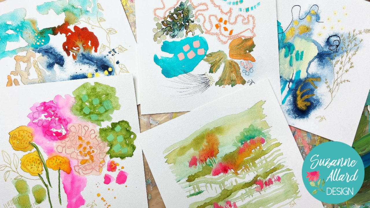
it looks, isn't it? This is a formula, I will share with you how we create this side of abstract. This is my margarita punched painting but we're
going to create in this class three beautiful
and different paintings. This one is called
Caribbean sunshine, you'll see the metallic
gold. It's so fun. This is one that we're
going to practice a limited color
palette with, and these can orient any way. But this one is a
limited color palette so we're going to challenge ourselves with not using
every color under the sun, only the colors we can make
with just a few colors, which as you can see
is plenty of color. Then a painting I called never give up because this little guy, [LAUGHTER] has been through
so many iterations that I'll show you, and who knows? I think it's done, but I always reserve the right
to change a painting. Anyway, we're going to have
such fun with this process, it's a great opportunity for self-expression,
it's colorful. It's about shape, pattern and
I have lots of inspiration. My other paintings in this
style that we've done to just encourage you and get you excited and give
you plenty of reference. You're not just starting with a blank page and have
no idea what to create. If you like other more
subdued color palette, you can do that. You can do one of
these, in fact, that's on my list
to do one of these and just a bunch of
different neutrals. You can create whatever style in this that you like and I
guarantee you, you'll have fun. If you've never painted before, you're going to learn a lot. I've set it up with
a good supply video and then another video
on what do supplies do so that beginners can learn about the various
media that I use as well. I hope you join me,
we're going to have so much fun in this
class. I can't wait.
2. All About Supplies: Okay. Let's have a chat
about supplies. Here's the thing about supplies. People always say, well,
what supplies do I need? It really comes down to what you want and what can you afford
and what you already have, so it's a hard
question to answer. I'll show you what I use. But just to understand, I have
acquired this over years. I didn't start out
with all this. I do try to make my classes
as accessible as possible. This whole series of abstracts
can be done with acrylic. I will be using acrylic and Agra gouache interchangeably and maybe a little bit
of matte acrylic, which I've just discovered
two different brands up. I like to do some supply reviews along with the class or at
least introduce you to things. Just to understand that this is not saying you need
to go buy all this. This is just saying
here are some options, here's how they work, and then you can pick
out what you like. Toward that end,
I thought I'd do a video here on the supplies, what they are, and then
another video on how to use them just to
cover all the basics. Let's talk about paper first. You can use any paper that
is a good size pound. Here we have £140
watercolor paper. It is an artist's grave. It's called the better,
it's not their best, which is perfectly fine. It's nice and thick, it has good tooth what they
call the texture, and works really well. You could also use
Bristol vellum surface. That's the one, Bristol comes in a smooth surface and
a vellum surface. The smooth is just too
sleek for this work, it doesn't have any
texture at all. Let's see what pound is this. I don't see it on here,
but I think it's £100. That's interesting that
it doesn't show it. I think it's a little bit thinner than the
watercolor paper. I remember this
being about a £100. Then for the heaviest paper, you could use a mixed media, and this is £184. I'll put more like
a heavy card stock. I use all of these
interchangeably and still this is
dellum surface again, has a little bit of texture. It doesn't need to
be Strathmore brand. I just grabbed these three. You can sense a
good brand and it's often on sale if you're
in the US at Michaels. There are other brands
you do not need a top-of-the-line paper
for these abstracts. Don't go spending
a lot on paper. Get a good paper, but you
don't need to get say, Arches watercolor paper
or anything like that. Now let's look at some of these
other supplies for paint. Let's talk about paint. You have acrylics and they
can be this quality, the liquid text-based
like it's fine. If you wanted to get
maybe the next step up, you could get some
Nova color paints which are available
on their website. They don't sell in
stores there in California and it is good
paint and it's a good price. I don't have an affiliation with them or really any paint maker. But I find that it's good. You would only need a few colors because we'll look
in color mixing. You can make most
of your colors. Don't want to buy too many. Let me pull out some
other acrylic options. This is probably a
little more expensive, the Liquitex soft body. The most expensive
would be the Golden and the Liquitex
which I don't really use for this process unless
at the very top there is a color that is really wonderful and I
want to grab some of it. I use these more for florals. Those are the acrylics. There are many
others, but my point is you can use a
mid-grade acrylic. Then I use from time to time. One of the things I really
love about gouache and why it's my favorite medium is that it has this nice
thick matte texture and I'll show you that
when we paint some of it. That's just my
particular preference. I like that chalky
matte texture. But gouache can be
a little pricey, especially if you're
doing bigger pieces. A little tube of gouache,
a little goes a long way, especially if you do most of the work in
acrylic and then come along on top with gouache and you can get a lot out
of these little tubes. But I started looking
around to see if there were some matte acrylics. I'd even experimented with
having a matte medium to an acrylic to get it
to be chalky and matt. The problem with that is it also made it more translucent. I feel like I didn't gain
because I like the opacity. But I did find these Jo Sonja
map flow acrylics there. The color, the pigment
in them is not great. But some of the colors
are pretty good. See the dot here, the solid dot that means
it's more opaque than one that has a half-circle. That's part of the opacity
there for the price. They're pretty good for
getting a matte consistency. They're just not
the top of the line for a matt acrylic that I've
found and these are pricey. But if you wanted to just
pick up a couple of colors, I might get the T0 or whatever
your favorite colors are. But this is relatively new. The golden so flat
matte acrylics. I'll show you what those look like. We've talked about paint. Now let's talk about
matt making tools. There are all kinds of pencils
that you can choose from. You can get stabilo. These are dry pastels. You can see it on
my finger even. Some of my other favorites are these super color too soft, this by a Caran d'Ashe. I'll have these brands
on the supply list. This is a water-soluble. I have just a variety
of other Prismacolor. I do use the neon
Prismacolor quite a bit. I've got two of those. Just a regular Prismacolor. I found all of these at various art supply
stores were online. When I go to an
art supply store, I'm always saying
what I haven't tried. The other thing that I use interchangeably are these woody three and once they're
also buying to below. By the way, I have a
supply link on my website, but if you have trouble
finding some of these, there's links to most of these, but these are three in ones and they're water-soluble also. I like them because
they'll go on top of just about everything. Speaking of things that'll go on top of just about everything, these are the oil pastels. I got this probably a year ago among artist's soft oil pastel. I'm finding these are really wonderful and
intense pigment. The price was pretty reasonable compared to a Sennelier brand. You can see my
favorite colors are getting worn down a little bit, but they look pretty
good for how much I've used them. Let's see. When I prepare a piece of paper, this is just a little
pasta sauce jar, but I have taken Gesso, I get it in a big tub like this. You do not need
to get a big tub. You can get a little container, you can get a mid-grade quality. But I often prepare a paper with Gesso because I like texture
and you don't need to. You could do it with just paint. Treat a color of a paint
as your first layer. You don't need to
put a Gesso before, but as I often do, and I've done it both ways here in the class so you can decide. Let's see, we've
talked about paint. I've got to mention a couple
of other little fun things. All kinds of pens, of course. Let's see, let's
get some of these. Basically, I like to try, if it as an obvious by now, I like to try all
different supplies but I end up going
to my go-to's. But for pens, you can use
anything from a jelly roll, which will make
interesting marks. These are my new
favorite gold marker. They are fine point
and medium point, and this is the
pilot gold marker, makes a really nice mark.
I'll show you that. These are something I picked up just at a visit to a store. Sennelier Abstract 3D liner. It actually makes a raised 3D
liner, I'll show you that. Then of course, Posca pens. Posca pens are paint pens. They come in different
thicknesses, different sizes. Let's see if I can get
a range here for you. From extra fine to fine point, and then there's a medium and large and I
think there's one bigger than this that
I don't have any of. But again, in terms
of what to buy, if you'd like to use black, you could use a black sharpie that you may have
around the house, or just a black pen, or even a dark pencil. As you go through
the class, you'll probably see me use
some things like, "Ooh, I really like
the way that looks, I want one of those." That's how I ended up
acquiring these things, just taking online classes and going to art
stores and saying, "I wonder what that does?" That's why it's hard to tell
you exactly what to buy, because it depends on obviously what you have and what you like. Occasionally I'll use ink. I think I used a little
bit on one of these. I love my indigo ink. Indigo is one of my
favorite go-to darks. When you need dark in a
painting for contrast, so I do like the indigo ink. Occasionally I'll use
metallic gold ink. This is almost gone.
I hear a little bit. This is Liquitex,
Iridescent Bright Gold, but any gold ink
will do and it just gives you that really
nice metallic filler if you like that. The last thing we need to
talk about are brushes. I'll also talk to you
about pallet paper. You can use all kinds
of things for pallets. You can use a plastic
disposable plate. Don't use paper because
the paint soaks into it. This is pallet paper
that I pick up at Michaels with a 40
percent off coupon, and it comes in a pad like this. There's gray, there's white. There's no random
reason to the gray, I just picked it up because I already had white, I
thought I'd try it. I just fold them in half and put them right next
to where I'm working and they're great because you just toss them out or if
they're particularly pretty, you can cut them out and
use them as collage. Brushes, again, you can go really
minimal brushes and just get a few that you can use in different ways or you can
go crazy with brushes. I'm going to do my best
here to give you a range. I don't use really nice
brushes for this technique. You don't want really
cheap brushes, but you're going to
be rough on them sometimes if you're scrubbing
at all or it's just, you don't need to use a
super high-quality brush. These are hardest loft which is the lower end
brand at Michaels. There's one of those here. I do have a Princeton Summit but I didn't take
good care of it, so it's not looking good. But let me talk about shape. These that are like this
are called brights. Not sure why.
That's what they're called, little square head. I do think it's nice
to have a bright, you should have at least one, and I'll show you how you can make different marks with them. In terms of size, this is a six. That's a good call around size unless you're
going to work bigger. I might get a six or an eight. That's an eight,
and here's the six. Then you'll need
something for details, so a round brush. You could get an
acrylic one like this. It has a nice point on it. Acrylic brushes compared
to, let me show you, compared to watercolor
brushes are much stiffer. This little bristles are thicker and stiffer than the watercolor, which is much more fine. I really try not to use my watercolor brushes
with my acrylics. If I do, I just make sure I
wash them out really well. That's what I have acrylic brushes that I
use more for the acrylic. But when it comes to
getting a really fine line, I need to get one, but I don't have a really
small Sanacrylic brush, so I do end up
using my watercolor one, which is like this. This is a Princeton Velvetouch and I can get a
finer line with it, or you can use a rigor, which is a really
long bristle brush. This one's by Winsor and Newton, and I do use this and then I just wash it really carefully. I did find, and I've been
playing with this almost like a acrylic version of
a rigor by Bristol, which is really
nice quality brush. It doesn't break the bank,
but it is a nice brush, and this is called
a Script Liner. I've been getting some
interesting things with this but doesn't really
give me that thin, thin line so I do end
up using maybe a one or a number two watercolor
brush for those finer marks, something like this, even. Something small. Let's play with what to do with
all the supplies. You don't need a palette knife. Sometimes you'll
see me use it to take scoop paint out and put it on the palette knife but you can do that with a brush as well, or even a plastic spoon or actually a plastic knife
would work better. Mark-making tools, oh my
gosh, the sky is the limit. Here's something. This came in some packaging, and
this is how I think. I can't remember
what it came in, and I said, "Ooh, that
can make a cool mark." I haven't used it
yet, it's cardboard, but I'll be able to
dab it in paint. Hopefully, I'll
remember to try that and make little circles. A chopstick is great
for scraping paint out. Of course, I use the back
of my brush usually. Really is your imagination, at that point, what do you want? What do you have? What do you
see that can make a mark? In one painting I did do
a background with this, but it's not necessary. I thought it was
cool and I tried it. It's called the Princeton
Catalyst and it's rubber, like a rubber spatula but you could just use your kitchen
spatula and wash it really well I guess or
get a kitchen spatula at the Dollar Store and it spreads paint for
backgrounds, kind of fun. Again, not necessary. I think that covers supplies and if there's anything else, I'll talk about it
when we use it.
3. What the Supplies Can Do: Now that we know about the
supplies a little bit, let's look at what
they can actually do. I'm going to have
a short version of this because it's like I could do an entire class on C suppliers and
what they can do. But, well, at least
explore them, and maybe it'll help
you decide which of these that you want to
buy. Let's get to it. Let's do pencils first, so I have three
types of pencils. I mentioned the Prismacolor, that's just a regular
colored pencil. It is not water-soluble, it doesn't do anything
with the water. Water solubles, which are nice if you're going
to draw a design, and then you just want
to use it as an outline, and then you want
to paint over it. These are good for
that, the Supracolors. I'll just color a little in so that you can see what
happens with the water, and then another pencil I have
is a Stabilo Carbothello. I love the pigment, but
it's really a dry pastel, so you can see that it even
flakes off the paper there. If I rub it, I'll get
it on my fingers, but I'll use this
as an upper layer sometimes for the
intense pigment. Let's see what each of
these do with water. The regular colored
pencil is not going to do anything because it's
not water-soluble. You'll see that I just
put water over it. This is a watercolor
paper sketchbook. This is the Supracolor II Soft, and it is water-soluble, so you can see that it
turns into a watercolor, and I've used these
for traveling. You take just a few of
these if you don't want to take paints, and so if you keep at it, you can get rid of
the mark completely. That's what that does.
Then the dry pastel, it doesn't really do
much of the water. It'll spread a little
bit, but not so much. Then the Woody's are
called three in ones because they claim a
colored pencil like that. They claim they
are a wax crayon, more like this, except
this is water-soluble. They claim it's a
watercolor, and it really is all three, and it also has a
really nice pigment. I'll show you some of this, and then I'll show you these
are the Neocolor II crayons. Let's see what they do
when you have water. Both have nice, intense pigment. They feel similarly, so you really don't
need them both. If you wanted to choose
one or the other, I probably go with
the Neocolors just because there's more
of a color range. But I do have to say the turquoise Woody is
very creamy and yummy. Let me show you what
happens with water. You can turn these
Woodys into watercolor. Here's the orange, and here's what the
Neocolors do, very similar. Maybe even more pigment,
it's hard to say. But I generally use these clears and the crayons
on top of paintings, and I don't mix them with water. Then the other
thing I use on top of and sometimes below
are the oil pastels. They're just really
creamy and intense, probably the most intense color. Of course, they're not water-soluble,
they're oil pastels. You [NOISE] would use them
for texture on top layers. Sometimes I put them
below my paint layers. We'll do it all different ways. [NOISE] Then the Posca pens, I just want to show you, you do have to prime shake. [NOISE] If you haven't
used it in a while, this one's fresh, but you'll have to prime it like
that, you pump it. You can get really
nice crisp lines to go over the painting, outline, things like that. With the Poscas, let's show you this. This is that 3D liner, you do have to squeeze
it fairly hard. You'll see me use this
in some paintings but take some practice, but I'm not trying to
be precise with it. Can you see that that's a 3D? It takes a while to dry. If I'm going to use this, I use it toward the end of that layer because I'm going to probably have to walk away
when I [NOISE] use that. Then, of course, the gold pens, this is the pilot, this is the medium point, and then the extra fine point. I think I messed up the
tip on one of these. By the way, quickly, I will tell you that
I've just learned this. Poscas, they're not inexpensive, that if you mess up your tip, let us say you got him
too much oil pastel, or it's just gotten a hold, you can pull it out. This was wonderful, and flip it over,
and put it back in. I've done that with one of
them; isn't that exciting? [NOISE] Very smart
of Posca to do that. I had to throw some out
before I knew that. Ink will look very intense. I often use it right from the dropper because it
helps get some good shapes. I don't want even use
a brush sometimes, unless I'm trying
to do, say, leaves. Then I'll usually use
a watercolor brush. But look how well this
dropper is working. Same with the gold, of course, I use it on the dropper a lot
because I just want marks. If I want a specific shape, I'll use a brush. This is on its last legs, and I have to order
some of that. I've covered the pencils, let's go and play with some
paint and [NOISE] brushes. [NOISE] Let me show you what regular acrylic is. Let's get a bright, remember that's
that square shape. This Naphthol Crimson is
a really pretty color, especially it doesn't look like much, it just
looks like red. But when you mix it with white, I'll show you, it
gets really pretty. Just a big thing of
white from Nova Color. What I like about the bright, this one might beat
up bright brush, so it's not going to
make the best line, but you can get those
nice square shapes. Then, if you lay it on its edge, you can get more of a line. This one, I guess, it is not. This is cutting off because
I've been too rough on it, so it doesn't give
me the best line, but I just want
to show you that. Then a [NOISE] round
brush like this, this is Size 4, allows you to do, let's say, some leaves more precisely. Then, if you want to, you can just work a little more. I think it's better
with angles is, I guess what I would say, but they just create
different marks. This was acrylic and it's
drying pretty matte. I just like that
the Nova Colors are not real
plasticky-looking paint, but let me show you some of these other paints too,
just so you can see. Here's the Jo Sonja
Matte Flow Acrylic, and it dries pretty matte. I have a dirty brush. That's got a half circle for opacity, so it's not going to be as
opaque as this turquoise. You can see the
paper through it, and I'll show you that
compare to the aqua gouache. We'll see if there's
much of a difference. Paper towel, and let's try
the aqua, more opaque one. You can see that you cannot
see the paper through there. [NOISE] Most likely, the painting people have the most on hand is either
acrylic or watercolor. Acrylic works just fine. I just thought I'd show you,
so here's the aqua gouache, very creamy, and
it will dry matte. You can see that it's
more opaque than that. [NOISE] Then all
kinds of acrylics, I think, you could do this
class also with watercolor, it would just have a much
more translucent look to it. It's really up to you to
figure out what you like. Let me show you this super flat. They call it SoFlat Golden. I don't expect most
of you guys are going to be as weirdly obsessed with opacity
and matte paint as I am, but what I will say
about this paint, even though it's pricey is, it is so pigmented. I would never use a color
straight out like that, but let's say, I
wanted a light blue. You'll see, it just takes a tiny bit of the blue
that was on my brush, and you get these lovely colors, and just a lot of
that intense pigment. I would say, if you'd like to experiment
with color mixing, and you really like
the intensity, you could get [NOISE] your three basic
primary colors in this, and a blue, a yellow, and a red. Then you could do a lot
of mixing, if you wanted. [NOISE] You will see me
use a variety of these, again, just to show
you how they work so that you can see what
you like and don't like. We'll put marks like
this on top of paint. As far as what goes
on top of what, oil pastel goes great
on top of everything. Let me get a color
that shows up. You can put oil pastel
on top of paint, just not wet paint
like I just did. [LAUGHTER] You can do the
Woodys on top of paint. You see how great that looks. You can do the Neocolors
on top of paint. Let me get something that'll
show. That's almost dry. You can even take the oil pastel that I've already done and put paint
on top of that. If I wanted to change a color, it just adds texture. If I had that oil pastel there, and then I want
to paint over it, that's not a problem, it'll add some texture
to the background. The key thing is to spray
it when you're done because you have all these different yummy things in there, and I will have a video
at the end on how I spray my paintings. Let's get creating.
4. How to Approach Creating: [MUSIC] I want to share my creative philosophy
with you because I just think it's so
important when we're creating to have
the right mindset. It is for whatever reason, lots of reasons, it's a scary process. I have had people say
literally they felt they sat down to paint
and their heart was pounding physically. I know that fear is what kept me from even trying for years. Rather than talk about why
it's scaring, which is, I thought we talk
about how to deal with that and how to manage it, and how to not keep
it most importantly, from letting you create, because my whole
passion is I visualize millions of people who
are feeling like I was wanting to create,
wanting to paint, but terrifying and
how much beauty there could be in the world if they follow their creative cravings
and begin creating. I think of creativity
or a creative spirit is like a scared little
kitten hiding under a porch. If you're trying to
coax that kit now, you're not going to yell at it. You're not going to
make a lot of noise. You're going to be very gentle. You might even just
sit there a while, and you're going to coax. You can use that metaphor or whatever metaphor works for you. But the whole idea is that, we have to love
ourselves into creating, especially at the
very beginning, where the voice wants to say, what are you doing? This is terrible. You don't know
what you're doing. You shouldn't even
try. All those things that we hear inside. At the beginning that
seems more pronounced. As you develop some skills and some intuition and confidence,
it does get better. I don't think it
goes away though, especially like I'll notice it comes up if I
try a new skill, let's say I decided I
wanted to learn portraits, faces; well, I would have some
of those thoughts. Now, at this point, I know how to deal with
them so they don't stop me. But boy, in the
beginning they did. Just remember that
this is about loving your creative spirit
into creation and that jump seller is better. They'll be time later if you
want to critique your art, if you want to look at it, if you want to ask people's
opinion and you want to get what's wrong with
this composition or; but that is way down the road. Right now it's about
self-expression, nurturing yourself,
seeing what's possible, seeing what you love. Really, it's about
discovery, experimenting. What colors do you love? What patterns and lines and shapes make your
heart go, put a pattern. What overall composition or what do you like to
say in your artwork? That's later on question 2, but I was painting a few years
and then then people said, wow, you're working so joyful. Well, I didn't really set out consciously to
create joyful paintings, but clearly I do,
and I love that. Now I know that what I'm
saying with my heart. What I hope I'm saying is that there's joy,
that there's hope, and that your self-expression does not need to be contained. If it's really
exuberant, in my case, I have a lot of
different types of styles because I
get bored easily, well, that's me. I just want you to remember
as you're learning to try to keep that harsh, judgy voice. You can even talk to it. I think Lisa talks about this. She's an artist and Oregon and this idea that you can even say, well, because people say that fear is trying to protect
you from getting hurt. You can see even save your fear, or something like;
thank you very much, I'm just going to
paint here, I'm fine. As far as I know, painting
hasn't killed anyone. Doesn't even really
hurt. [LAUGHTER] It's crazy that we're afraid, but there it is we are. Just know fear is at some level in some
aspects a constant. It's not about getting
rid of the fear, it's more about learning to dance with it.
Use it over there. I'm going to create
now, combining the idea of how your
relationship with the fear, not letting it stop you. It's that book, I think
it's from 70s called, 'Feel the fear and
do it anyway.' It is why in my email newsletter is called your
creative adventure, brave, joyful, and
a little scary. Probably shouldn't
say a lot scary. Manage the fear on the one hand. Be gentle with your creative spirit,
like the little kitten. The third thing I'd say is if
you really want to improve, then you just have
to put in the time. I can't tell you how many
people will say to me, "Oh my gosh, you have
so much talent." It always stops me in my
tracks because I mean, I should have pulled out to show you what I
started painting. They were blobs in
four or five years ago and there was nothing you would consider
talent, trust me. Whenever I see someone
that seems talented, I know they've put
in a ton of work, a ton of time, and they haven't given up. I would say that's more of the
answer than having talent. Are there painters
and composers, and athletes who have talent? Sure, absolutely. But they've still worked at it. There are plenty of people
who have talent and haven't worked at it and
haven't done much with it. All that to say, it's really about
putting in the time. They say if you want
to get good at tennis, you're going to hit 10,000
tennis balls, golf, violin, anything you point to, it is going to take a lot of practice.This is no different. I don't know why we would expect to sit down with some paints and some paper and produce something that we
love the first time. It's a paradox though, because if you want
to get better, so gentle with the creative
spirit, managing the fear. Then you've got to be
disciplined with the time. It's like, don't be disciplined with the
creative spirit. Don't judge in your terrible
and all that stuff. But do we discipline with the time if you want to improve? Now if you were doing
this for your relaxation, which is a wonderful
reason to do it, I don't mean to sound like you've got to take it
to the next level. We got too much of
them in their lives. You know what, up your
game [inaudible]. No you can, if you enjoy doing what you're doing at the level
where you are, you'll probably just
to keep doing it every day and get better anyway
because you love it. But the discipline piece comes into play when you're putting
it into practice every day. Maybe you can't paint every day, but maybe you can
for 15 minutes. Poking my sketchbook out. I can always usually
even if it's at night in front of the TV with
my husband watching, I'll get a few paints out
and I'll do an exercise. You can only use three
colors plus white. I'm going to do some shapes. I enjoy it. I'm
learning something. It's almost like just logging. There's part of this is
just literally logging the time, putting in the time. I hope that helps. Those are the messages that I give myself throughout
this journey. I hope they help
you because I know or I believe if you have a
strong craving to create, then you have the
capacity to create. You may not have the skill yet, but you have that
capacity, the capability. Because I don't
believe you'd have that strong craving
if you didn't. Pay attention to the craving
and put in the time, be gentle with your spirit and don't let the fear stop you.
5. Caribbean Sunshine 1 - Painting the Background: [MUSIC] I'm starting
with a piece of the Bristol paper vellum surface and I'm going to apply
just some darks. This one I thought it'd be
fun to try with a dark start. I've got some umber acrylic
here and then I picked up some black Gesso just
because I want to see what it does and it
is extremely black, so I'm not going
to use much of it. You could use anything
dark you have, you could use a dark blue. If you wanted to try to follow this particular idea of
starting with a dark, it can add depth. We're going to end up
covering up most of it but I know some artists start every painting with umber
as the bottom layer. I don't do that. Sometimes I start
with bright colors. You'll see what I thought for this one we'd see what
we thought about it, because that's the whole idea, is to experiment and
see what you like. Any old brush will do and not being fuzzy about how you get the
paint on the paper. If you don't have a big brush, you don't need to buy one
for something like this, you can use an old
house paintbrush or one of those sponge brushes, cheapies and I'm
just scrubbing it in hoping to create texture. I don't worry about evenly any even brushstrokes
because it's what I want. See I'm [LAUGHTER] struggling, I don't want the brown
paint all over my plastic, so I keep adjusting here and try not to paint
my hands completely. Just scrubbing it
into the paper. We could've gessoed the
paper first or not. I've done it both ways
and it's not necessary, but it can add
some more texture. I'm just rubbing all of this
humbrol and then getting a touch of the black Gesso. [MUSIC] I've got just some
lighter acrylic colors. I'm just putting
them across here and see what we think of that. You can use a brush, I got this little catalyst spreader. You can also use a
kitchen rubber spatula, one that you don't use for food. Let's see how that works. I'm also going to add a
little bit of half white. You could also
throw in some Gesso for texture and now
see what this does. [NOISE] Moving outwardly, maybe I'll do one center there. I'm going to have the darker
spots, something like that. It should have a mark and
then go out from those [NOISE] just trying really fast. Looking more geometric
than I want so I'm going to now get my brush, and mix it up a little bit. I will leave some of that
geometric stuff, it's cool. This adds a lot of texture too. Also has brush hairs [LAUGHTER]
which I have to remove. I like the juxtaposition of the geometric
with the brushes. A lot of paint on this. It's a good second layer.
6. Caribbean Sunshine 2 - Beginning Marks: This might look a
little different because I recorded my next step, the whole thing, and it didn't record. I don't know what
happened so I've painted another paper black, and umber, and on the same coverage, and so we're just
going to move forward. Everything else is recorded fine, so I don't
know what happened. What I'm doing here is like
that the three focal points, and I'm just starting to
take whatever you have, so I've got oil pastels, I got the neo colors, I could use some of these. If you have colored pencils, you could use that. You could use even
regular crayons. The whole idea is just to start laying down some interests. I am going to think about these three areas and go out
from them with my marks. I also am going to do my best to stay with
the color palette. The other tip is I'm going
to put the darker colors in the centers of the flower mostly so let's start with that. The dark here is really a plum, which is not the easiest
color to come up with. But I obviously I don't
have to stick to that, I can take a navy and plum
and just mix, and easy. I just use my left
hand because when we're trying not
to be too fussy, was mark making it can help to use your
non dominant hand. Then I will take a
couple of the darks, maybe out, again, radiating out of
these three areas. Then from there, I'm
taking these colors and different materials and
just either shapes, marks, lines are fine. Even they can look like a
leaf like that, scribbles. Sometimes I do these
little half circles, sometimes I just
color in a section, let's grab some of
this orange yellow. It's pretty. We've
got pinks in here, so maybe I'll switch
to a new color. I'm trying to make smaller
marks and larger ones, and a lot of this will probably end up
getting covered up. But it's a little
show and it just helps you get into the flow
of what you're doing here. It's almost like maybe it's
some form of a sketch, a corollary color here, so pretty, and then we add some darker red. Just being loose. If you're being too fussy, you could use your
non dominant hand. Then we have this pretty blue, it's a teal but also it's a [inaudible] what's this called light-blue
that's never very helpful. This looks like a cerulean blue. Maybe a bit more turquoise, you can even use, here, there's sharpie, why not? Then we can do this, this is not a must have, but it's fun, the 3D liner. I'm going to squeeze
some of that on here and make some squiggles. It'll probably get covered
up probably mostly too, but it's got a 3D, so it adds texture, just fun. Let's see. I think it's a good place. You can obviously take
it as far as you want, put the stage, but you'll see we start to add some
paint in the next stage. Maybe I'll just add a
little bit of this form or green and I just love the
intensity of oil pastels. That's good to move
on to the next stage. Let's see where we
want to go with this. The 3D fluorescent
pink has dried. I just made some ridges, I got the oil pastel here. At this point, you can
use acrylic paint, you can use aqua gouache. You can even use
regular gouache. It's just you're going to
have to make sure you don't disturb the next
layers too much. I frankly wouldn't waste too much gouache on
these lower layers because you're going
to be putting stuff on top and gouache is more
expensive than say, acrylic. This is the Nova Color acrylic. You can buy on their website, but any acrylic will do, and you don't need a really
great paint for this level, even though this
is a good paint. It's reasonably priced. It's not available in stores, it's only on their website, nova color.com, I guess. I've got a few colors here
just to build the mix. I got a dark, some blues, some yellows, and I
should grab some reds. I really try to challenge
myself to making my colors, like for example,
I'll show you a green that I bought from them. I really don't greens anymore, because greens, you can
make so beautifully. But I think I'm going to do
a class sometime on just how to make colors from
just a few paints. That allows you to
spend your money on better paints and just
buy fewer colors. What I'm thinking about now
is just taking some shapes and strokes that are going
out from these three, and just keeping it loose and really concentrating on
color because I love color. I'm using white adjust. So this is Liquitex. It comes in a big tub, but I just put it in here. You can use white
paint too, of course. Let's see, I've
got my water here, I'm still thinking of this
as the color palette. Since then I've painted something here that
I'm going to go over. But this is the color
palette we're thinking of. Let's see where we go. I think I'm going to start
with this holiday green. I was saying I
bought this green, and I don't even really like it. I shouldn't have bought
it because you can mix greens so much better than I have hardly used any of this. Sometimes I add it to
the green I've made. I might do that, but it's such a flat, boring green. Anyway. I'm going
to make a green. I'm afraid that I
left this up with the top on for too long and
there's not much left in it. It is not feeling well. I'm going to get some. This is their turquoise, but I don't find
it very turquoisy, so I usually add a
bright yellow to it. Look, I've mock-up
all of these because I don't do what I
should probably, which is to get a palette
knife and put my paint down on the palette. I want to knock this
green back a little bit, meaning that it's too bright, and the best way to knock back the green is to
have tiny bit of red. I don't use the color
wheel a lot, but for this, it really is helpful because if you want to tone a color down, you use the color on the
opposite of the color wheel. Green here would be red and that will take it
down in the intensity. I will, like I said, do you see how that
just brings it down? You have to be careful not to overdo it or you'll get brown. But it starts to take it down to the
green I was looking for, more like this green there. Actually, this green
is like that too, so we might add some
of that. We'll see. I'm thinking of shapes that
are like leaves maybe, but this is abstract, so they're really just
outwardly expressions of color. Maybe that's what we
should call them. In varying sizes, and where I want to like if I have some contrasting
things underneath, I can scrape through
the back of my brush. Make large marks, small marks. This will be a series of layers. I don't need to be too
fussy at this stage. I could add white along the way or yellow and continue
to change the color. I love mixing my colors as I go, which is probably why
my jars are marked up. A little bit of yellow and warm it up. Just going around, thinking
about what's reaching out, and obviously, these are
going to run into each other. That's perfectly okay. I like to do a few
stripy things too. We might come back
to that green, but that's enough for now. What next? By the way, this is a really beat up brush. I don't use my good
brushes for this painting. Look at it. My hairs are all coming up and that's perfectly
fine for this. I'm going to go in that
more turquoisy direction. Like I said, that turquoise
isn't very turquoisy. What I usually add
and by the way, I mix acrylic and aqua
gouache over time. It doesn't matter, so that color will help
make it a little more. This is a lemon yellow. Will help take it in a
more turquoise direction. Lemon yellow, this is
phthalo turquoise. That's pretty little too green. Now, here we go. Yeah like that. I don't know at this point what will end up being covered up, or what we'll be able to see. I'm just thinking
about shape and color and direction with these outward strokes and marks. I'm also thinking about
varying the shapes and marks. I can go around some other shapes like this. Just grabbing. They dry so fast I can hit it
with a second coat.
7. Caribbean Sunshine 3 - Adding Paint Layers: I am going to change
out my palette paper because I had flipped this over. But it's this palette pad and the other side basically
it's absorbing the paint. Let me just get a new sheet. I really like this. This is gray. Gray or white is fine. I love these when I travel too. I just fold the sheets
in half and put them in my sketchbook and I've
got palette ready to go. Actually it works better for me with my setup here to
fold them in half. Then sometimes the pallet paper
is really pretty and I'll use it for a collage. Sometimes. [NOISE] Let's see this through. Let's make a pink. I like this naphthol crimson
with some white mix. It's really pretty. It's sort because you wouldn't
think looking at it. That's the naphthol crimson and this is cadmium red medium. I mean, to the eye they
look almost identical, but you can tell I like the naphthol more because
it's more of used up. [NOISE] I'm going to really wash my brush thorough because
it's got green paint on it, and green and red make mud. [NOISE] It's helpful to
have two water jars going. So I'll take some of this. I have several different pinks
in the color palette here. I think what I'm
going to go for right now is this lighter pink. A little more white and maybe even a little bit
of my fluorescent pink. I'm going to have to
get some more of those. Yeah, that's pretty. Maybe
a little more white. I can do a little bit of
suggestion of flower, but mostly I'm going to end
up with some darks in there. [MUSIC] So I added some red to the
pink and some warm yellow. We have a dark
coral here and then we'll maybe lighten it up too. It's looking red, so
I'm going to lighten it up and add a little more yellow. Oops, not that much yellow. Well, [LAUGHTER] you could
either call it a happy accident or an unhappy accident, but I do get some
interesting colors that way because I have marked this up, there was some green in there. It's not a precise way, that's for sure, but I end up getting some
interesting colors. These are actually pretty
close to that base color. There you go. If I wanted
to be really precise, I would've put a little bit
of the color on the palette. Now I want to really warm
that up with some yellow, [NOISE] and some white. That's yummy. A
darksome of that color. We are almost done
with this layer. We'll let it dry. [MUSIC] Okay. I think we
will let this dry.
8. Caribbean Sunshine 4 - More Paint Layers: [MUSIC] We're starting to get some good
background stuff going. I think what I'm
going to do next is some larger shapes with paint. Then we'll let that dry and do some marks with pens
and pencil and stuff. Basically, I'm working
on covering up most of the background and probably
even most of what we see here. We shall see. I'm going to get some
of this turquoise out. I was looking at the color
palette and I want to get, so make this blue with
this turquoise and then this marigold
or sunflower yellow. Bring those two in.
Probably bring in some more of this really
vibrant rows. So fun to get paints
out and play. People ask me a lot, do you
mix gouache and acrylic, and gouache and acryl gouache? [LAUGHTER] The answer is yes. Because like right
now, I'm mixing this as some of this golden. These are matte acrylics, but if it's the color, they have super intense pigment. I've been having fun with those. A tiny bit goes a long way. They're not
inexpensive, but they might be once you factor in
how much you get out of them. I'm just making a
soft cerulean blue to take and to maybe make some
larger types of shapes. [MUSIC] It's just a process of layers
of color and shape and just continuing until
it's feels done. I'm also thinking
varying mark size, so do some small ones in this and maybe with a smaller brush. That is a bright shape
I was using there. Bright just means
basically a square shape, and then this is round. So taking the round because I
can get a better point with this to do some smaller
things with it. Let's make some marigold yellow. For that, I'm going
to use a warm yellow and a little bit of red. I'll do the same thing start
out with the bright to make the larger shapes. Just get a clean one with some yellow and the tiniest bit
of red because of one way. See, that was even too much red. One of the things about
acrylic that I don't like and you can fix it
with multiple layers, but you can see it right here as the translucency of it and
you just do another layer. But I really like opaque. If you look at the SoFlat
that I was talking about, the Golden SoFlat, this stuff, which
is a matte acrylic, which is basically like an
acryl gouache, same as this. You get that matte, so you can see that blue's
already dried, pretty opaque. I do have the SoFlat and
this and if I use it, I'll get that opaque pop. But since I've
already got this out, and most of you
are going to have acrylic, we'll
just go with this. You can get the same
thing by a couple of things increase the
opacity of acrylic. One is to add white with
a gesso or a white. Then the other is
just more coats. I have tried on matte medium, like this fluid matte medium. The problem is that
you're adding a medium so it thins it and makes it matte, so I don't find that it really
does what I'm looking for. You end up just doing
multiple coats if you want that matte look but
you may not care. Again, I'm thinking about some larger shapes to vary things because I have too much of the same thing going on. With a bright, you can
get a thinner line by just using the edge
of it like this, the corner of it really. These centers, I
keep mostly dark, but I'll put a little bit
of light in them sometimes. I think that's enough
of the yellow. We're going to let it dry
a little bit while we do some pink things and then maybe hit it with that second coat
I was talking about. Hopefully, the paint will
not dry in a couple minutes. Let's look at some
things we can do here, the neil colors, oil pastels. Some of this is like
a negative painting. Painting into the background
with a oil pastel. This is a super light pigment that probably really mostly
comes across as white. Some of those pretty greens. There's one green in
particular that I really love. This one, light olive. They give me that nice opacity
that I like into stripes. These crayons can go on top of paint if it's dry, of course. So I'm staying away
from the yellow. Time to go back into the
center with some of my navy. I just ordered, I've been looking for it since I
love indigo or navy. I'm always on the hunt
for navy or indigo pens. They're harder to come
by than you would think. I saw that posca, I
don't know if it's new because I've
never seen it before, but they have now a navy blue in one of the
sizes so I just ordered it. We'll see if it's
truly navy or just sometimes they say
that and it's just really a dark blue
that's not very navy. I'm just going to
keep messing around here and see where this goes. [MUSIC] I departed from
our color palette. [LAUGHTER] There's no navy or indigo on this but I
wanted more contrast, so we're allowed to do that. We'll see where it goes.
9. Caribbean Sunshine 5 - Mark Making Layer: [MUSIC] The good thing about acrylics as
they do dry fast, so does gouache and
Flashe as well. I've got my fluorescent
pink Posca marker and the coral one. Both of those colors are
in the color palette, so I thought I would bring those in and
see where this goes. [MUSIC] That was the gold markers, this is my new favorite,
a palette gold marker, I get it on Amazon. It comes [NOISE] in this size, which medium point and
then extra fine point, and so far they've been
pretty good at not drying up and clogging, which an issue with
oil paint markers, and I've got a link to these on the suppliers tab on my website. Now I'm just going to
do some finer lines with the fine tip one. [NOISE] You have to pump these, shake them, pump them. They can be fuzzy paint markers, but they're well-worth it. [NOISE] These are
a little details that you may not
even be able to see, but the details
make it come alive. [NOISE] [MUSIC] I'm at that point
where I feel like it needs some unification and a background
color to come forward. This is a process. Sometimes I do this multiple
times before I like it. Now, basically I'm going to make an ivory type color
and go through some aspects of the background
and see if it unifies it and brings it together in
a way that I wanted to. [MUSIC] What I did is I made an ivory. You can buy an off white, but to get the ivory read I like it's usually a mixture
of a tinny bit of blue, tinny bit of yellow,
tinny bit of red, so all the primary
colors and then white. I'm doing negative
space painting. I'm going around
keeping what I like, and going over
what I don't like. There may be, like I said, multiple passes at this, but this will be my first one and we'll
see where it goes. [MUSIC] Let's talk about a
couple of things. We're going to let this dry, but you saw me come through
and do the white space. Now why ivory? That's just personal preference. I've done one in fact, one of our inspiration ones, Margarita Punch, I did white. It was just different look. Now, you see me go through
and now coming back and doing a second coat to get
that opacity I like. Then when this dries, we'll come back in and
maybe add more color, maybe add more details, step away from it and
see what we think of it, after giving it some space, giving ourselves
a break from it. Sometimes at this stage and
I still feel like painting, I'll just grab another
one and work it forward and do multiple
paintings at once, especially in this style. I can grab [NOISE] several of these going
at different stages. I can grab one, and see what it needs
until I'm tired. This one in my sketchbook
it's gotten really vibrant, and I think I'll be toning
it down just a little bit. For now though, once I've finished playing
with this off-white, I will let this dry. [MUSIC]
10. Caribbean Sunshine 6 - Layering with Paint: [MUSIC] I'd let this
sit for a few days. What I do, is then I come
back and look at it, and I can look at some
others for inspiration, and I'll include
these two paintings. I'm sitting here looking
at these two drawings. These two are finished. They feel finished. I worked until I
felt I finished. This doesn't feel finished. Now that's personal preference. You might look at this
and say, yeah it's done. I like it, and then you stop. But for me, when I'm looking
at these compared to this, it just doesn't feel finished. I say, "Well, what
am I missing?" I did something a little
different in this one, and I went through
and did the white as a background,
which I like it. But now, I want to
come through and bring the colors
back up and push that background back in places, so I think that's one issue, and I'll do that with paint, just taking the colors and going over some of the areas
with the same colors. I'll do that. The other thing then, we'll see what
we think of it. But you can see that there are more little details
on these: some dots, and the pencil marks, and oil pastel, and just some general juiciness that we
haven't done that layer. Then same here, you got
little pencil marks and scribbles and just a
little bit more going on. I will start with
the color first. I'm going to really
work hard to stay in this color palette because I
do like the color palette. Then you'll see me
come through a color, and then I'll pause, and then we can look at mark making. [MUSIC] Let me pause there again to talk about a
couple of things. One is that from me, color, and color discovery, and color play is so
important to me that sometimes it's just discovering a color that makes
me go, "Oh yes." I had mixed the Turner
Acryl Gouache coral red with some of the orange and lights went off inside me because I
loved what I was doing, so I wanted to share that point, but also what I've
learned is sometimes when a painting is just like [NOISE] it's just not coming together or it's just
lacking something, it ends up being that
I needed to find a color to bring it to life. Just one color and bring it to life and
bring it together. Now, I'm not saying that
I'm done with this yet. But I think for me, it
dramatically improved. I still see somethings
that I want to do, but I'm starting to
get excited about it when I wasn't
particularly excited before. I took the mixture there, an orangey coral, and I used thinner brushes, thicker brushes, and I did cover up some edges
of the white parts. Now I think I'm going
to do the same thing with some of these greens, sort of this
olivey-green and come through and do the same thing. Let's make it green. I think
I've talked about this, but green is a great color
to make yourself make, [LAUGHTER] rather
than buying greens, you save money and you get
much more interesting colors. I do have some greens of course, but [NOISE] I always
try to make something. There are not many colors I
use straight from the tube. I think this coral red and maybe the Winsor Newton
turquoise gouache is one of the few. It's just that, I want
the color to be mine, and I want the
colors to be yours. Even if you just take a
tiny dab of something, then you've just made
that color yours. I grabbed too much
of that orange. If a green is too bright when you mix
your yellow and blue, you can take a dab
of anything in the red orange family
and tone it down. I may do that here. I will just keep
adding a little blue. Yeah, that's a little
too bright and it's also too light for what I want. I want an olivey-green. It's getting closer, yeah the touch of the coral. I don't waste much paint because even what's left
here on the paper, well, there isn't much. But if there were more, I would open up a sketch
book page and throw it on a blank background
and start building texture for my
next spread there. You can see I went
a little too far, and its a pretty color, but it's a little more
drab that I wanted. I grabbed a little
too much coral probably because I was talking. [LAUGHTER] Can't chew gum
and talk at the same time. I know I got to
bring it back with more yellow or more blue
or maybe even some white. If I want to
brighten it back up, so I've got a warm yellow here, but I could get a lemon
or a brighter yellow. I'm just going deep here
in the green color land, but that would bring up the
brightness. Let's try that. Now I'm just going to go
through like I did with the coral and see where I feel like this color should go over
this range of colors. I'll probably change the yellows throughout or the
green throughout. [MUSIC]
11. Caribbean Sunshine 7 - Finishing Touches: [MUSIC] Definitely
liking this more, is just so wow. [LAUGHTER] But I see a few
little things I want to do. I think I want to go
back in with the ivory, but I'm going to use
the Poscas and just do little bit of details, I'm not sure, but maybe go around some things. I definitely achieve
my objective of bringing the color forward, but make maybe a
little too much. There's definitely no
rest for the eye in this. I do have paintings where I
feel there's not much rest. [NOISE] I don't know, I'm going to do that. I love these little
pops of the hot pink, so I think I'm going
to go back into those. Maybe hit the blue and turquoise a little bit and maybe
even some more gold. Let's see what we can do. Start with the ivory, [NOISE] the Posca pens which
always have to be shaken, and then primed like this
until they're moving. I just feel I want some of these ivory bits to
be a little cleaner. Again, it's personal preference. [MUSIC] We're getting on
that homestretch where I'm liking
it more and more. Let's do a few more things. Just want to come through
with the hot pink and accent those areas that I had
done that have gotten lost. Because there's just not
enough going on in this, [LAUGHTER] just kidding. It's got plenty going on. Then for the first time, I just opened this
and primed it. I'm obsessed with
navy for my dark. I don't know if it's new, but that was new to me, this navy Posca marker. Probably just looks
like black to you [LAUGHTER] through the camera, but I don't know, we all have our little
things we like, and I just like the
way navy looks. I think it's called
the color navy, sometimes people call it indigo. I'm just going to play
with this a little bit. Right about now you
might be saying stop, Suzanne, it's done. The fun thing about
painting is you can always undo what you've done in a painting like this
and just decide that [NOISE] you want to even like something you tried
and paint over it. Right now I'm thinking
about the height of these little line
things going on here, here, and a little bit there. But they're not as
noticeable with the gold, so I'm going to do this. Really have three of those. I have an indigo pencil, but you can use
regular pencil and just decide that you
want some leafy marks. That's not showing up very well. You can use a darker pencil. It just allows to varying the lines and it'll scrape
through, which is interesting. I just like these
to have a lot of interest so that you
feel like you're in a candy store and
you have to look around at all of the fun parts and get lost in it. Let's see. I'm going gently here because
it is scraping through, which is fine, but I
want that navy mark. Then also, this is probably, we'll just see what
a little bit does. This is a fluorescent
Prismacolor. This was the indigo blue
Prismacolor pencil. This is orange neon, it's probably not going to
do much. It scrapes through. That's fun. Let's see. I don't want to do
anything with this. I don't think I want to do much. It's got so much
going on that I don't want to add too much of this. Another tool I use sometimes
is the jelly roll. I guess color is
not written on it, but it's some fluorescent
pinky-orange. You have to coax
these jelly rolls sometimes to go on top of
the paint, but they will. They're like those
little touches. [NOISE] If I can only get
one jelly roll, it would be this color. Let's see if I want to
do just a little tabs of some turquoise where
the turquoise already is. Say, this is going to
get too crazy if I start introducing a
completely new places. Where else? Sometimes I'll take it
and hold it away from me, and take a color
like this turquoise and have my eye follow around. Turquoise here, here, and a little bit there, and maybe do
something like that. But I think we both know that
this is pretty much done, although I always
reserve the right to look at it tomorrow. At this point, I'm just
adding texture by going over the same color with
the oil pastel. But it just adds some
dimension that I like and I don't do
it in all the places. I think at this point
I need to sign it. It's always tricky with these, what to sign with
and where to sign, especially because my gold pen which I would like to sign
with was misbehaving. I'm going to have
to open a new one, I have a whole bunch of these. Let's see if it's acting
any better today. I have a feeling this one's
headed for the list basket. Let's see here. I can always sign it in pencil, and I like to assign
either just my initials. On this one, I might
do that with a thicker gold one or my whole name and I'll sign it along one of these so that it's
incorporated into it. But I think on this
one, it's the thicker one since it'll just
be a gold mark anyway, and do my initial of course. The thing is this
painting could be oriented any which way, but it feels to me
like it's this way. What I like is this ended up in an abstract
way looking like almost a vase here and how
they're just moving out. I think I'll just sign over
here. I think we're done. Like I said, I reserve the right to look at it again tomorrow, maybe do a couple of
other little things, but I don't think I'll be doing much if I do
anything at all. Maybe coming through with a thinner gold pen
when I get it working. Anyway, I hope you loved this and I hope
you make lots and lots of them and fill
your house with color.
12. Limited Palette Abstract 1 - Beginning: For this one, let's try the mixed media paper. This is £184. Watercolor paper, as I've said, mixed media
paper, Bristol paper. You just want a good
heavy paper that can take water and whatever
we throw at it. This is heavier than
£140 watercolor paper. But watercolor paper has
more of that texture. Totally personal preference. With this one, I thought we would do a
limited color palette, meaning that I'm
just going to choose four colors and white and then whatever colors we
can make from these. This is a great exercise
because it forces you to discover new colors. In fact, see, I've got some
paintings that I just finished with this exact thing. I loved the colors I created and it brought out colors
that I never think of. These are the two
paintings and what I like is some of these rust
colors that came about. You can get so many
colors just from mixing these four plus white. You don't have to use
these four, obviously. I'm using a yellow green, an aqua, and an orange
and then a Payne's gray. You do need though, something that's dark,
so a dark of any kind. You can use a Payne's gray, you could use a little black. I tend to not use much black. I just would rather use a
navy or a plum or a dark purple or even a
dark blue will work. Then I just grabbed these
and liked the results, so you can pick any four colors you want as
long as one of them is dark, and then of course
you have some white. Now, let me just say
something about this paint. I like to show you guys different supplies
when I do classes. I'm not saying you need
to go get this paint. I'm actually been experimenting
with it myself because it is a matte acrylic, so you got paint
all over my hands. You know it's a good
day when you've got paint on your hands. Matte acrylic, meaning that it's not pure acrylic like this. When it dries, it's got
that shiny plasticy look. I don't like that look, which is why I usually
use aqua gouache. But you can use acrylic. You could use this, you
could use aqua gouache. You could try regular gouache. The only thing is that
since it is water-soluble, even after it's dry, you'll have to be careful not to disturb the under layers. For this, it's
probably easier to use something with
some acrylic in it. Regular acrylic paint
or an aqua gouache. What I'm going to do is
the same thing I did in the paintings
I just showed you is start the background
with just the turquoise. I'm going to throw in some
white so that there's some parts that are lighter and darker and that's it
for the background. That's all we're going to
do for this first stage. I'll mix it right on the paper. You'll see how easy this is. Just going to mix in some of the turquoise and
all I'm going for is that I've got lighter and darker areas on the page. I Intentionally what texture so I'm not going to try to
be smooth in my painting. Once again, if you don't
have a big brush you could use a house painting brush, if you have one around, or you could use a paper
towel, palette knife. Sponge, getting this covered. Some people wear
gloves when they paint and I probably should, but I don't like how it feels. I've got some dark areas, some light areas pretty well covered and we're
going to let that dry. Easy-peasy. While that dries, I wanted to talk to you
and show you a little bit about color mixing because
it is really fascinating. We talked about
these three colors. You're probably going
to choose, well, I guess four colors, but
you're going to choose your four colors plus white. We'll do this on the painting, but I want to show you
how amazing it is to just what a great exercise
in your sketch book or on a piece of
paper to do this, to say, okay, I'm artistic, three or four colors. Make sure there's
a dark in there. You'll find colors that you
like better than others. Sometimes you can look
at the color wheel and pick things that are opposite on the color
wheel if you want. I don't pay too much
attention to the color wheel, I refer to it sometimes. It's helpful for
making sure that colors pop if you're trying
to think about that, if you're trying to think about things being on
the opposite side. Like for example, well here we have orange and turquoise
or almost across. You could say these are and then the lime green is
on the same side. Then you could, if you
wanted to do a dark, a dark plum is really pretty too and it'll get you
some interesting colors. If you aren't sure
what colors to pick, start with three
or four you like, or grab a couple
that are opposite, and then a third one, and then your dark, so
maybe that helps you. Like I said, I know it's there, and I understand the concepts, some of it of the car wheel, but I don't use it a lot. Let me get my white out. Of course, we already know that you add white to all
these and you're going to get different colors. Let me be good and get
a palette knife and get my white out and not dip
my brush into the white, which I love to do. Then my white is not
so white anymore. Of course, if we add
white to any color, we're going to get a
whole range of colors. It also increases its
opacity, which is fun. We can change the color
that way with all of these, so we have, I've
already had a tiny bit of orange in that turquoise,
that already orange. I will tell you this about
complimentary colors. If you want to reduce the
intensity of a color, put a little bit of its
opposite on the wheel color. We're dealing with
the turquoise. Let's say we want
to tone it down. Let's say we just
think it's too bright. We're going to add tiny
bit of orange to it, which already did with my brush. You'll see that
it toned it down, it knocks it back and
the opposite is true. I'll show you what the turquoise
is with a clean brush. It's going to be brighter, see. That had a little
bit of white and a little bit of the
orange in my brush. Now that I've got some
turquoise in my brush, I'm not going to take too much. I don't have that much or it'll really put a tiny
bit of turquoise. If we thought the
orange was too bright, we'll not get back. See how that made
it a darker orange. Then is up here, of course, then you can add weight to that and you've got a
different color. Just by adding a tiny
bit of turquoise. It's really endless so
let's take the lime green. Now, I've got already on my brush a little bit of orange, tiny bit of turquoise, and we get this mustardy color. I can add a little more turquoise
and look at that green. I can add white, get a lovely color sage
green, isn't that pretty? I'm not just by not
cleaning my brush too much. Now, let's say I wanted
to take that back into a brighter green and I
grab some of my lime. These three greens
are beautiful. See I just love color. A lot of what I do in my work is just creating colors
in the painting. Then I added a little bit
turquoise and got that. I think that would look
pretty with some white in it, get a mint green. If you want to make
notes about how you achieved the colors with
your three or four, I haven't even started
with a dark yet, then you could do this exercise and make
little notes next to it. If this was the lime plus the little bit of turquoise
and some tiny bit of orange. Let's grab some orange
now and see what happens because we add that mint on our brush and we add
grape orange and we get this really pretty neutral. Neutrals are important part of any painting because
the bright colors can't all be the
star of the show. Let's start with some
of the dark now. Again, I've not
cleaned my brush. That's a really pretty
neutral as well. But if we wanted to take the lime and some of
the Payne's gray, you get a quite a dark green. What if we wanted
a dark turquoise? Take some turquoise,
a little Payne's. It's really pretty. Of course, we can make a dark orange. Let's see. You could
really go on forever. I think we should make at
least one more page of them. Let's see. I want to
keep this out though. Tear it off. Oh, it didn't tear pretty. That's okay. We'll
forgive the paper. I can put this in the
class downloads too, but I want to set that there
as we can see we've got, it's a fun exercise to see
how many colors can we make. I'll start with a clean
brush just to start over. It always helps to dry your brush out with a paper
towel or a rag so that you don't diluting the paint too much and getting
it too watery. Maybe this time we'll
start with the dark. Of course, we have
the Payne's gray. We can just add some
white with that. That's pretty, little
bit of orange. I bet I can make brown by
adding all three colors. No, it didn't. That's pretty. Getting into
the pretty greens again, that's a lot like that one. You can start to say, do I want this to
be more vibrant? Then I'm going to
add my lime green. Do I want it to be more dull? Then I'm going to bring it
back down with the orange. Can go in either direction. Turquoise, add
some dark in that. That's a pretty color. I add some of the
lime in my brush. Let's see how you end up making colors that are accidental
in the painting. That's why I don't really spend any time before a
painting picking out. I may pick out like I did
here the three main colors. But as far as what they end up being, I don't really know. They're going to come
out in the painting. I just wanted to show
you the amazing range of colors you could
get in just a few. When we add white to this, we almost get a pink
to this orange. I don't really like to use the colors straight
out of the tube. I usually don't because there's something else
already on my brush. The only ones that I'll use
sometimes like that are, I want like a bright bit
of turquoise like this, so then I'll use a clean brush. I'll mark it up too much. Well, I think that's a good sampling of
the colors that we can get from this. There's more. I
know there's more because I discovered
more in the painting. Hopefully, this helps you
with the idea of color play. I think it's a great
exercise to do. You may or may not use some of these colors
in your painting, but you could make notes, you could circle the
ones that you like, or you could just do this and then go into the painting
and see what colors show up. Let's get on to the next stage.
13. Limited Palette Abstract 2 - First Layer of Marks: [MUSIC] There are a couple
of composition rules; I don't really like the word
rule, guidelines maybe, that I wanted to
talk about that I do consider when I'm composing a painting or at least
in the back of my head. One is the rule of threes. You can google it too, there's a lot of great examples. I'm going to write
on our painting because this is all
going to get covered up. You divide the paper in three sections
horizontally and vertically, and so you end up with
these focal points. The idea is to put
the focal point along here, here, here, or here, so basically not in the center
and maybe not over here. I end up doing
something like this or this somewhere in here but I have seen floral paintings where the bouquet is right in the center and it looks fine, so I can take this
with a grain of salt. But for this
particular painting, I thought we would have
our focal point be here. That means that
this is going to be the center of the flower, and I'll just take some
pencil because I picked up some supplies that are the color palette
that we're using. Let's think about this and then it can radiate
out from there. This just helps. I'm just using a pencil to give you a structure to start with. There we go,
radiating like that. Now as we select marks, we could like before just start
with our pencils and pens and I'm wearing gloves this time [LAUGHTER].It's
getting really hard to clean off this stuff
and I'm pretty messy, but we could start
with oil pastels, and woodies, and
crayons, and whatever; all the mark making tools we
want to use and do those, but I also want to say you can also start with
paint at this point. You can do the paint part and then come back
in with the marks. It's really personal preference. I'm going to do a few marks with these and then we'll go with paint
and see where it goes. Now the other thing is, since we have these
lovely colors from when we did the color swatches now I
can look at them and say, "If I'm staying in
this color palette, I don't need to just pick these four colors which
[inaudible] colors of paint," turquoise, lime, I'm using a pencil for the
Payne's gray and then orange, but I realize of course we've got all these colors
that we know we can make with these
four plus white. That allows me to then look
at my crayons and pick out things that I see is
throughout here like this green, or this gray, and broaden that a little bit. Here's a Goldie color and
here's another pale gray. That's all I really
have of these. I have more color range
with my oil pastels. I can see here that there's a peachy color,
almost peachy tan. It does force you; look at this [inaudible] purple right there, to use colors that you don't
normally gravitate to. Here is our gray blue, that might be like
that. Let's see here. One of the advantages
to working like this with just a limited
number of colors and whatever you can mix from those colors is that it'll help your composition work because
the colors will blend. It'll hang together
in a way that can be sometimes a challenge if you use colors
all over the mat. I'm just grabbing. There's a tan there, there's a mustard here
I'd love to find. This is one of my favorite
colors, this green gold. I guess this is a mustard.
That's a good start. I can take all of these colors, and I'm still staying within
that limited color palette. It's going to be
really hard not to put in some hot fluorescent
pink in here, isn't it? [LAUGHTER] Well,
maybe not for you but for me it will be. Again, I could pick these up and work or I could
start with paint, but since I've got these out I'm going to go ahead
and just start making our marks and thinking about flowing out
from that center. On this painting,
I think I'll just work on larger shapes. Remember some of the
other paintings they're the three focal areas and they get pushed into each other. We have a lot more
room in this one, so we can go big. Go big or go home, they say. This is almost like sketching. I will probably paint
over most of this. Maybe I'll even paint it in the colors that I'm
using if I like them or maybe a different
color will go over it. We shall see how this
sunflowery color is yummy. I do talk about paint
like it's food. I don't know what that's about. Just paintings and
textures seem like they're delicious to me or yummy. Let's see, it doesn't make sense to put
much turquoise at this point because our
background is turquoise. Did I pull here? Is this a lighter gray? It's darker, so the
dark we'll put in here. Remember I usually put
some dark in the center, but other places too. This is pretty cream and
it's such a pretty color. I didn't look at the Woodies. Let's see, there's
limited colors here but we can put in some orange. [NOISE] We'll keep out the orange, and the turquoise,
and the lime green. With Woodies you can mix too. I don't know if you see that. I mean really with all these, I could take this Woodie
on top of the oil pastel. [NOISE] Now, we will leave this out
but transition to paint, and we'll go back
and forth with both.
14. Limited Palette Abstract 3 - First Layer with Paint - : I realized the other thing we're doing differently in
this one is this is vertical. We're painting it vertically, although you'll see
when it's done, it'll probably be able
to be any which way. Let's get some paint out. My table gets so crowded
with all the yumminess, but I did clean it
up once in awhile. Now, brush wise, you can use something like this. This is not a technique where you want to
use good brushes. I might use it later
for a liner Princeton, something like that but I'm not going to scrub
with a good brush. I'll use either
the Artist's Loft, just a brand that is
not a better brand. You don't really need that. In fact, here's one. Look how fray that is, just fine for this. I see this before
I started doing, if this was a decent
brush, but everyone did. Now I don't use my decent brushes like
this is a nice brush. Silver, and you can see
I've taken good care of it. I did get some brush
cleaner which helps. Let's play with our colors. Get some out of each
one and some white. Since we already practiced
the color mixing, we know what colors
we're going to get. The mystery of those are what I love about
a process like this. You don't really know. You get it on the paper because we have a
turquoise background, which is going to
change the colors compared to the white background
on our color swatches. Probably didn't need that much
of a gray put some white. This is ANOVA color white. Just a nice quality acrylic. Nice price point. These are those paints that are available only on their website. They don't sell them in stores.
But they're pretty good. For this kind of painting, you don't need high-quality
paints either. You don't want cheap paints because the pigment
won't be there. You do want some good, I would say at least
a middle-grade paint. All right, let's
just dig in here. It feel like starting
with something already. I don't think I made
this color look at that already I have made a color that we didn't make in this watch
and they're funny. Endless possibilities
that's what I love about it. We start making shapes, marks that are moving away. With a bright, which is
what this shape is called. You can hold it square. Then you can also
hold it on its edge and get a line like so. This is the one that's albedo doesn't give
you a real thin line. But if you had one that
was in better shape, you could definitely see
if I can be more careful, here, I can get a little
bit of a line there. That's a pretty pink. I just grabbed a little
bit of the orange. I like that color. Sometimes it's just fun to make these squarish marks like this with a bright-shaped brush. Let's see grab some of this line. Maybe we can go, please get some dark so I just added some paint gray to
what was on my brush. I have not washed my brush yet. It's getting some
neutrals that I wouldn't normally pick up. From this one I'm not going to cover up the background so much because I like the turquoise. Just adding some
turquoise to what's on my brush. Maybe now I'll change
shapes of brushes. I might go back and forth, but I'm going to take around. This was a bright number 6, this is around number 2. I can get more of a
line and I can do things like this. Lighten this up a
little contrast. Keep adding more white. You get just a nice pathway. The only trouble with
these rounds sometimes is they don't necessarily
turn corners real well, which can be a look on its own. I like this color. This is a pale minty color. I'm trying to, like I said, make larger
shapes in this one. If I want some finer lines
or smaller marks, I can get a smaller brush, which I probably will here shortly just to
get some variety, you can also do that
with pen, of course. These centers, I just
play in the center, and maybe, they loosely
resemble a flower center, but I try not to get
too hung up on that. I'm noticing that I've got a
lot of pastels going here, and that's because I
have not darkened much. I'm going to try and make
that brighter, darker orange. I will clean my brush
to get that white out. Actually, I'm going to use some of the orange and
darken it up a little bit. This particular brush, I'm liking for a straight line. I'm not liking it when I'm
trying to turn the corner, I think it's too rough. Came out as almost a
dark red, didn't it? Trying to make a really thin line, I think I'm going to have to
use another brush for that, just doesn't want to cooperate. This is where I can bring in, this is a liner brush. This one's by Winsor & Newton, but you can get,
there's different ones. This is also called a
rigger for some reason. But I've got a liner one
by Princeton & Newton, it's just that it's
a short handle and so it always hides in my brush jar. This is good for thinner lines as long as you
wet the paint quite a bit. Because the bristles
are so long, they hold quite a bit of paint so you can make a
longer mark with them. You can do the same
thing though with just a small round
brush like this, and a light touch. I like those marks, I'm going to put some
of them somewhere else. I can have a square front tomb, because of the way I'm
holding the brush. A great activity is to just take a piece of paper and play with brush strokes and things; holding the brush differently, holding it in your other hand. A lot of artists, instead of holding
it like a pencil, which makes you more precise, will hold it like this, if you want to just
not be too fussy. Just by changing how
you hold the brush, you will get some
slight variations and maybe a bit more freedom. What happens when we
mix turquoise and pink? We just get a pretty color, probably won't
show up much here. It's a pretty blue isn't it? I'm going to add a little
Payne's gray to it. You do need more water
when you use this brush. I like these, let's see, shapes that go
around other shapes. Let's see if we can do it here. I like to take the
stroke around, almost like lattice, and it ends up looking
pretty cool sometimes. Stripes are good too. This may look cool here. I think it's time to
let some things dry.
15. Limited Palette Abstract 4 - Next Layer of Paint: [MUSIC] Let's go to the next step on our limited
color palette painting. This is where we are. I let it sit for a while
and then I looked at it and I'm going to
keep adding things. But I definitely don't want to cover up all
of the turquoise, I want some of that
popping through. I've got some different
materials here. I've got the things
that we set aside, we're passed those, the crayons, and then I have these three tubes
that we started with with the Payne's
gray, but I thought, let me get out some of
those same colors and the aqua gouache and
just see if I get a little bit different
shades of the same color and then I also have these
which are the same colors. Just to have them out,
I might not use them, but just playing with
the idea and then I've got the poster
markers and the colors. It's close that we've
chosen. Let's see. I'm just going to start by this part of the process
is intuitive somewhat, I guess to a good extent, but I'm thinking about a
variety of shapes, sizes. Here is a larger shape, here's a larger one,
here's a larger one. Then some smaller marks that
I'm going to put throughout. Just going back and forth with colors and seeing how I
respond to the colors. I like that one
that I just made, so I'm going to do more of
it and so that's a process. Then I thought at
some point we can do some metallic gold
because, why not. I think I want to get maybe a bit smaller,
bright shape brush. This is a four. You can see I have
paint over it. This is the aqua gouache
I already got it out. Let's use those three colors. I have a feeling its pigment
is going to be more intense. We shall see. You can still use the acrylic. You can mix acrylic and
aqua gouache of course. I haven't found anything like
a mix that doesn't work. It just might change the
properties of how it works. The other thing that I
want to get out is some white and I really
like this minty color, so I'll probably make
something similar to that. Get some white out. You can also use white gesso
as your white. I've done that many, many a
time getting paper towel, but I've been really enjoying the creaminess of this novel
color of white lately. So I'm playing with that. All right, let's see here. We also need more contrast, so we're going to
have to come in with some darks at some point. Where do I want to start? Maybe with some orange and I'm going to knock it
back just a little bit. I don't really like using colors straight out of the tube, so I just add a little
something to it. It makes my color
nice and bright. I needed some contrasts so this is a bright that
is fitting that bill. I'm just adding some
white and green to it, that just gives maybe a
little bit different that's a really pretty peach salmon. See, this is why I
love this process, because you never know
what color you're going to come up with till you get
in here and start playing. I can use the bright because this one is not. I have taken care of
those ones so I can use it to get a nice edge. That amazing all the colors you can get just from this view. I really like that
light pink salmon that came out here and here. This is pretty close to it, but this is more yellow. You can see I'm being a
little more deliberate now than I was in the beginning. Little more thoughtful
about I'm looking for with the color I had as my eye flow so if I'm from
following this peak, this color here
that I just made, then I see it here
and comes across here and maybe put some here. It doesn't mean that every color needs to be in
every spot of a painting. That's just something I do to help me keep
the painting flowing. I've got a coming
that same color I can do another
coat of it here. You get purple a little more. Let me go in with some darks. Let's grab some of this and see if we can make
it darker if we like maybe this with
some turquoise. Probably I should clean
some of the peach out of my brush. Dark turquoise is
pretty, like that. I need to get some lighter turquoise and use the one that
we started with. We have to watch for
hairs in the studio, especially if you have a cat, I don't think this is a cat
hair, I think it's a bristle. You can always remove them
with a palette knife or a toothpick as they get in your painting, that's so pretty. Not so many here, but I don't want to cover up
all that turquoise. I'm being thoughtful there. This is a strong color, I do want to look at it in
terms of composition flow. I see it here, here maybe bring it down
here a little bit, some in here. Actually, I like the idea that it
almost looks like a stone to these peach things so
I'll go with that idea. I've got it there, centered in the middle, maybe a little more in there, and I could make some smaller marks
of it out here. Just a little bit different
texture and maybe out here. There are a lot of ways you
can use these bright brushes. We're going to pause
and let that dry.
16. Limited Palette Abstract 5 - Adding More Interest: Hello, back to creating. It's so great to
be able to create. Speaking of creating, I just want to say a couple of things about your mindset when
you sit down to create. I think of the
creative spirit as this either scared
child, timid child, or maybe like a
kitten hiding under a porch or maybe like my rescue dog when I first
got her scared of everything. With the creative spirit, you have to be gentle, I think. Because I have met people
who've gone to art school, which I didn't do, they put so much pressure and felt so much pressure that
they haven't painted since. Which I think is so sad so I just want to encourage you
to approach everything, the creating is play
and to recognize that when it comes to that creative spirit that you're nurturing in yourself, you just have to be really
gentle and loving with it. Now on the other side, if you want to get better,
you have to have discipline. You have to be firm with
your discipline side. I will paint today, I will spend just like
if somebody wants to be a writer and they write
30 minutes every day. This is painting. It's a commitment. Now if
you're just doing it for fun and which is nothing
wrong with that. I don't mean to discourage that, that's a great reason to paint. Maybe you want some more art
in your house, who knows, but I'm just the distinction between being gentle
with the spirit, gentle with yourself is
in your creative process. I think is really important
so that you keep going. I just felt like
saying that this morning we are going
to continue on our limited color palette
painting and I thought I would pull out this one that's done and we can look
at it for inspiration. Doesn't really matter I guess
I had it oriented this way. Anyway you can see it has
all the details in it, so we're going to
look at both of these and see where we want
to go next on this one. This one though we covered up, I covered most of the background and then
came through and painted. This one I definitely want
to keep some turquoise in the background but maybe not
as much as there is there. I also notice that I have some larger shapes going on
out here in the outer areas. Even inner in here, more circles and ovals and
just a variety of shapes. Got some metallic golden there, which will definitely add. There's ink and oil pastel here. They all the same things
that had been using here. I have not used ink yet
on this but we will. In course this was not really
a limited color palette, it was every color I
felt like putting in it. This is a different challenge, but this is good
inspiration for us. I will include that
in class resources and you can print it
out and have it next to you or just have it on one of your devices in front
of you if you like. Now to get into
the zone on this, get your coffee or your
tea or whatever it is you like and thinking about, given my color,
limited color palette, where am I going to
go next with this. I'm thinking I want
darker olive green, which we can make with
mixing yellow green, probably a bit of orange
will darken it, deep in it. Then we'll see if we want a little bit of turquoise on it. I'm going to get my few colors out or we can put some of
the payne's gray in it. We shall see here. We had a bunch of rain here
yesterday in Florida, which is not that common
and it was really nice. It always makes me
happy for the plants. I call rainy days, plant hydration days. But we don't know
that much rain here, so I can't get tired of it. I've lived in places where
I did get tired of it. I'm going to get a
medium-size brush. This is a Size 6. I could also grab a four, maybe a four will be better and I'm going to work on
making this olive green. Too much orange. I'm going to get some white on
my palette paper. You can see how little
paint it actually takes when you're creating
small like this on paper. It does not go through
the paint much. Let's see if I can add a
little turquoise to this. I'm getting a nice green there. I think I want it
to be a tad darker. When you are mixing
it's so easy to this is where you do
go through the paint. Like I just grabbed too much
of that payne's gray and so then it's too dark and then I got to add more stuff and pretty soon you end up with a big old pile of a color but what's great for
that is you can take it and use what you
like and then take the rest and put it as a
background in your sketchbook or background on another
piece of paper, I have stacks of backgrounds
that I have built. What's really nice
about that is I can grab them anytime
to do a painting. Now I'm going to think
about putting in some more bold and larger shapes and maybe something where
I want to large something. Remember, not to be too precious with this because you
can always paint over. I'm going to then
find a place to do some smaller
bits of this color. Bring out more of
that lime green. This is drying already, so I'm going to go through and do a second coat on some of it. I don't have to cover it
completely because it just now looks better if you have, I don't know, not super precise
at least for this style. I'm going to go back to
my oranges and pinks. There is another brush. Let's see what happens
if I add a tiny bit of turquoise to that. It knocks it back and makes
a really pretty pink. You can make pink with orange and a bit of
turquoise and white. This is why I love color. I really like that pink. With peach, which is pretty too, but until I added a touch of this turquoise to
just cool it down. I just got an idea.
It's not dry yet, but this pink would look
fabulous on that green that we just did in little dots, so it'll have to dry. I want some little bits of that, so I'm going to get
a little brush. This little tiny baby bright, it's a Size 1. If I do the dots there, I'm just thinking ahead, where else do I want
small little pink shapes? Maybe over here. I'll try to
make these things random, like they are in nature. I just saw my pencil here. I could do the dots with this
as the same shade of pink, I can do some other
details with it, or I could put them there. What I can do is grab a piece of scrap paper because I
want a really small, see if this brush
is going to do it. Yeah, that'll work. Using my brush I added a bit of water, I'm just going to
make some little. Even though it's not
quite dry, it's working. Pink and green, so pretty. I don't feel like I'm done with this pink yet. Usually, I'll use
the pencil for that. Lines are interesting. Maybe some lines over here. I'm going a little
lightly because I don't want it to scrape through. Sometimes I do want that. That's getting more interesting. I think it could benefit
from some half white. Take a little brush, maybe just put in some top
white details here and there. Let's try this. This
is number 4 round. Make my athlete with
a little bit of pink, a little bit of green, lots of white, just tiniest bit. I just got a pretty color. It's almost like a
really soft stone. I think we're going
to let that dry.
17. Limited Palette Abstract 6 - Finishing Touches: [MUSIC] We're on the home
stretch with this one. I get to a point
where I feel like I'm mostly down with paint, and I'm going to head now to the posca markers and some
oil pastels and some pencils, and add those details. But I always reserve the right
to go back to the paint. Let's get to this one. It's bothering me this
mark I made here, so I'll fix that
with oil pastels. But going again by
this inspiration, these little splashes
I made with a wetting a brush with paint and then
hitting it against my hand. We can do that probably toward the end because
once you do that, you don't want to
mess with those dots, so you want to do
that towards the end. Then you can see
here that we have a little line marks that texture that comes
from oil pastels. A little oil pastel,
thanks there. Some more pencil here and
here and posca marker here. Then we've got to sign it. This is the navy ink. But I feel like this
dark teal that we did, is dark enough. I do love how this
oil pastel textures peeking through
to here and here. It's okay that this
doesn't have a super dark, it does have a dark,
there is contrast. Now I'm going to
start playing with these other tools and
see where they take us. [MUSIC] Let's pause and
talk a little bit. Definitely getting there, I would say for me
it's 90 percent, maybe 95 percent there. I went around with
colored pencil, with a jelly roll, with some pastels
and posca markers. One of the things I
like to do is put the same color on top of the same color of a
different medium. What I mean by that is
this was pink paint, and then I took a pinkish pastel and did that on top of it, and just adds to meet
depth and dimension. The same thing with the posca, I have peach color here. There's a little
different peach colors, so same on same, I don't do that everywhere,
you can see why I put colors that are different, but there's some peach on peach in this subtle,
but I like it. I'm just going to continue with this thing until it
feels like it's done to me. [MUSIC] I am there grabbing more paint because I
didn't like that one, and then I've been playing
with the gold markers. As I said before,
they are finicky. This one, especially this 5.1, I ran it through too much oil pastel
[LAUGHTER] so they'll tip out a
little bit smashed. The thicker one does go
better on just less fuzzy. If you want to go over oil
pastel and that sort of thing, you want to use the thicker one. This is pretty much done. You're going to
laugh at me because I want to do just
a little bit more with some white something, some darks or something, I'm not sure yet, we'll get the posca's out
and we will see. I just like how I did the white real pastel
here and here, and so I want to paint
just a little bit of white throughout it,
because remember, I'm thinking about my
eye moving around. I don't want my eye to
get stuck anywhere, so I want right now my eyes
just getting stuck on these. It's probably mental illness. [LAUGHTER] My
mother, my daughter does this great imitation
because she visited, she was in London and I don't
know where she heard this, but she's like, "It's
mental illness in it." I always just crack up whenever we're doing
this weird stuff, we are like, that's
what we say. Here I go. Finally I got a white, and my white pens and markers
were all misbehaving. The jelly roll, my pentel, I think
this is a pentel. Now my only valid signal
which is normally, I think it's just I
haven't used in awhile and they needed some major work. But I finally get
this one going, just going to put in just
a couple touches of white. At this point, I
would put it aside, wait at least a day, and then the way I decide is something's done and
of course that's personal. You might have thought this
was done a long time ago. [LAUGHTER] But what I
do is I put it aside, and then I come back to it with fresh eyes and feel like I
am scanning for two things. First, what's bothering me? If I take my eye around this,
is anything bothering me? Is there anything I don't like? Even that, there might be a couple of small things here that I feel that way about it. I'm not sure I like this here, but I'm probably sitting
too close to it, because I'm here at
the table with you, so I would stand back and then I'd fix anything
that was bothering me, but then I'd also look
for any spots that seem just unfinished or flat or just something
that I don't like. It's definitely a
good place to rest. I really like, it's funny. The littlest things, just those little white
dots that I put there, I really like what that did, so that's making me say, do I want to put just a few
white dots anywhere else? I think I do. Then we will
stop and proclaim it done. But like I said, prior
to process is resting, walking away, coming back, and seeing if you want
to do anything else. Oh, I do need to sign it. I sign in paint or paint pen in one of the
colors that I've used. This is a painting that
could be oriented so many, really, any of the four ways. The signature I'll just
incorporate into it, and that way, whoever wants, however the person who
buys this wants to hang it, it'll work. I just put it within the design. Sometimes I spell
my whole name out. For something like this
it's already pretty busy, I'm just going to do
that mark, the essay. I hope you enjoy the
limited color palette , it's pretty amazing. The colors you can create with just a few colors.
Thanks for joining me.
18. Never Give Up, Part 1: [MUSIC] You're going to learn a little bit later why I call this painting
Never Give Up. [LAUGHTER] But I had already
painted this background, and so we're going
to start here. What this was was a painting
I didn't like, I think. I'd save a lot of beginnings, I call them, and
they're just like this, stuff, marks, looks like a little bit of
gesso and I just grab it when I want to paint
an abstract painting and I have my background done. I encourage you to
do the same thing. This one, being very
loose here and I've got my oil pastels and I'm going to be doing one focal point on this
one in the center. I threw in some black
to start with and then I'm going from paint to oil
pastels, I've got acrylics. I don't have a particular
plan color wise on this one, I just going to see what happens and working really intuitively
here which by the way, if you're just starting out, that skill, that intuitive
field develops with practice. I have literally stacks of practice sheets like this
that I've played with. There you see me using
that 3D liner again, radiating the marks in
general out from the center. I'm not really following
the rule of thirds here, I'm more just
playing intuitively and shapes got some
paint coming in here, I am using a combination of [inaudible]
gouache and acrylic. The only difference
really with them is that the [inaudible]
gouache is matte and has more coverage. It's more opaque and
with the acrylics, which I encourage
you to use because they're cheaper on the
background and under layers, the acrylics are more
translucent in general. So you don't want that effect or you just might have to paint
over them again. But when I want high opacity and sometimes I mix the two, there's nothing
wrong with that too. Now, I'm just taking a lighter
color for some contrast and putting it in and it looks like a
scribbled mess, doesn't it? [LAUGHTER] That's
what it is right now. But all that texture from
underneath and those marks, they do add to interest and depth as the
painting progresses. That's the reason
for doing them, plus it may get rid of that
blank page staring at you. At least now, I have something to work
with more than a blank page. I've heard an artist, I wish I could
remember who it was, say that making art is about creating problems
and solving them, and I so relate to that because I've created the beginnings. Basically, you can look
at this as a bunch of problems at this
point because it's a mess and then you go through thinking about
what you want to solve. Here, you can see me negative
space painting, meaning, painting the background around those oil pastel marks for now. I often, when I make a color, because like I said I
didn't have a color plan, you can tell by my palette, I do not have these
colors pre-made, I make them as I go. Here's a pale yellow. Then I take it all
around the painting and see where it feels like it should go and that inspires
me in itself, the color. Right now, I'm loving this
oil pastel in that magenta so it caused me to grab a neo-color crayon and a ruddy and it take some
of those same colors. Now, coming back through with some paint doing a second code, I love this blue when I
make it as a cerulean blue, but it's really just
a touch of lavender and some white in your blues. Just keep playing with the color until you get
what you like and then keep going back to
this minty green. You do see that some more
structure is emerging. Now I'm taking some yellow, I've got a small brush here, adding a few more, beginning to add
some smaller marks, and going back and forth trying to remember
to doing the large marks. The key to these pieces is, that there is a
variety that you have. The little stuff,
different shapes, just a lot of interest, and then you can always
just keep adding, you'll see I do on this one. [LAUGHTER] That's a hint as to why it's called
Never Give Up. I've made this green, I'm using some liquitex
of acrylic there, basically, I just
grab what I've got. For this kind of painting, you don't need a great
quality of paints. Well, I should say this, the higher your
quality of paint, the more intense the pigment is. I would not get cheap paint
except for on the background. The background is fine
because it doesn't matter how much coverage
you have and so forth. If you have some old craft
paints or anything like that, you could use those
on the background. But when you're at this stage, if your paint is too cheap, you just won't get the pigment, it'll just look watery
and it just does not give you that excitement
that comes with colors. Here, I'm making one
of my favorite darks, which is a plum. You can see my color mixing
habits are very organic. It's on this painting very much, let's add some of this to that, and then now I'm in
love with this color. I'm, this mauve color is lovely, let's see where we can put that. You can see I repeat
that over and over. I do look at the
painting and say, What is this need potentially? In terms of contrast, do we have enough
light and dark? Do I have a balance of
this size of the marks, the shape of the marks? Are there parts like right there where I'm just covering up something I don't like and
putting something else there? I'm just going around paying attention to
those questions, mixing colors, seeing how
beautiful that lavender is. The great thing
about this process is you just paint over
if you don't like, and you'll see me do
that plenty of times. Then I'm looking at this point, there'll be areas
that are just getting too crowded, too congested, I guess is a better way of
putting in and I can't tell in that particular area
where I want it to go. What I'll do then is do this, mix a neutral, which
is a pretty neutral, and then go in and just cover and clarify
right in there, some areas. You can see I'm doing
much smaller circles in the center just to
create that focal point, and then all these shapes and marks are directing
your eye to the middle. But then there's
so much interest outside that your eye goes
outs from there as well. Here I decided that I want to unify it a little bit and
see how that works on taking another color back to the light mint and going around spots throughout to see if
this brings it more together. Because it's a happy, disjointed mess at this point. Well, I guess it's not a mess, but it's disjointed and I bring things together often with color in terms of unifying it. I can go around and
you'll see I do this several more time with this painting,
changing the colors. I think it's a
really great example of never giving up and just how you just keep playing with something and how it
doesn't hurt anything, nobody gets hurt
in this process. Here, I'm doing against some negative space painting
with that new color. I'm taking it all the way around and now going back to that, and filling in some of those background
areas but loosely, not super, not trying
to cover everything. Just seeing if this brings it
together a little bit more. It's really just a
very creative process. It will teach you to
let go, it really will. Highly recommend it for that. Time to let this dry.
19. Never Give Up, Part 2: [MUSIC] Let's continue this. You can see that I
am coming back to it another time and thinking about I really fell in love with this blue and wanted to do
a little bit more detail. Then same with a minty
turquoise is what I call that. Looking for places to put
it as a unifying color, just going back and forth. Here I've picked
up a liner brush, so it really helps to make those thinner lines so when I'm doing
these paintings I'm always thinking about varying the marks and this is called either a script
liner or a rigger brush. This particular one is made
by Princeton velvet touch. They have really
long bristles so they hold the paint and
then allow you to take a line quite a ways whereas you can get a
small line from say, a Number 1 or two or zero brush. But if you want that long line, these longer bristles will hold more pain and
allow you to do that. But you don't need those
you can do it with just, you can even do it with the
Number 4 round and just be very light on your pressure. Here I'm taking one of my favorite [LAUGHTER]
little nibs left of a very pale
turquoise oil pastel and then grabbing my Prismacolor
colored pencil because I decided to put in some
fluorescent and then also my fluorescent Posca marker. I discovered started using fluorescence about a year ago, and I just love what
they do for a painting. Here is some pencil. This is STABILO/super color to by crown dash or Swiss made. But it's a water-soluble pencil. It doesn't need to be the water-soluble because
you'll see here I'm not adding water to it and so any colored pencil will do for that how I just used it and then I used some more oil pastel and here's the pencil
again just going back and forth thinking about
covering areas I don't like. You'll see sometimes
like that didn't really work that well that pencil there so I tried different
things and here I am trying a third thing
to see if I can get it to show up but I don't mind that because
it adds to the interest. I just keep going trying something else until
I get what I'm trying to do. This is back to the pencil, and when you try to put pencil or some of these
materials on top of oil pastel or you'll
see some things don't work and then find
out what does work. Oil pastel on top of oil
pastel works really well. Acrylic paint or gouache will go over oil pastel if you use enough of it and
that's what I just did there. I'm getting more to get that. What I really want,
that opacity and then just layers of
Marx and interests. This is a little tiny brush that has the what's
called the bright shape. It's basically square headed and then using the back of my brush to scrape through Marx. But you can use a variety of brushes or you can
just get creative with the brush that you have in creating the textures that you want and the effects
that you want. The colors in here I'm going over this again to
make it pop more. Then I let that dry and
came in with a micron pen, which it works okay on acrylic. You can see I've got
my paper to keep it going but I've switched
to the Sharpie then because the micron
is just too fine for going on top of all
the stuff that's on his painting [LAUGHTER]. I'm taking this navy Sharpie, which wholesale gotten
mocked up at some point. Here's my navy or indigo ink, which really looks black here, but I can see the
difference and I'm taking the script liner now or smaller, just a small round brush
and doing some marks with the navy indigo just for
some contrast and interest. This is personal preference. You could argue very easily that there's enough interest
in this and stop. It's funny because
when I look at where this painting ended up, I like it where it is right now more than where it ended up. I probably will, I don't know. We'll see what you think but I'm not sure I'm done with it. Even after calling
it never give up, you'll see how many times I
change it but I think right there is where I
should have left it. Or somewhere in here
you'll see I start. I get this idea of, and a lot of this is learning so here's
where I got the idea. I said I'm just going
to go in and do the indigo ink halls through the background and replace that other
lighter color. Because I haven't done that, I haven't used a dark
like that and one of these so I wanted to see
what I thought of it. I go through the whole painting which completely changes it. Again, personal preference
could come awake gland goo. That's really cool. I'm learning as I'm painting, and I know I can always go back over it so I don't
really worry about it. For this painting, I don't think you can quote ruin it because even whatever I paint over it will
just had to the texture. The fact that I have a picture
of it before I did this, which by the way I recommend you don't have to do a time-lapse
video like this [NOISE]. But you could do just pictures, add a layer take a picture. Because for a couple reasons, one is it shows the painting as it progresses and
you may decide to take it [LAUGHTER] Here then I decided another day to go over all the indigo in a neutral
Tanish ivory that I made. That's where I ended up, but anyway, back to the
value of taking pictures. One is you have a record of where it was land
so you can take it back to a certain stage
if you like that. The other reason is that
it really helps to take a picture of it
and look at it on your phone from a distance, and you can also
stand up and look away but there is
something that helps me evaluate a painting
by looking at it in the picture from a distance and evaluating
it as a whole, so I often do that to see what I'm
thinking of a painting. Yeah this was where this
ended up and it's so funny because now that I look
at it again I think, I don't know, maybe
you're not quite done yet because I'm just not in love with
that tan background. I may need to go over it with another coat or I
just bring back the lighter minty color more. We'll see, but the point
is to never give up. Just keep working a painting and you'll learn so
much from that process.
20. Varnishing and Final Thoughts: [MUSIC] I hope you had as
much fun taking this class as I had creating it. I want to show you a couple
of things on protecting your paintings and if there's
any buckling in the paper. Let's talk about
the buckling first. None of mine buckled. But what I do is as soon
as a painting is dry, I put it upside down on
a flat, clean surface, and then I put books or other pads of paper on
it and leave it overnight. That just keeps it from
buckling if it wants to. If I have some buckling and sometimes it just depends on the media you use, the paper. Sometimes you will.
In that case, what I do is I do
the same thing, place it upside down
on a clean surface. Then I take paper
towel and you want to take as much paper towel
as you would need to cover the entire surface. So I would probably use three on this one
just to make sure. What you do is you
wet the paper towel, but then you squeeze all the water out of
it so it's just damp. Then you open it back up. Remember you got your
painting upside down. You lay this damp paper towel on the opposite side
of the painting, not the front, and
you press on it. Then you put, I've got a cutting board that's really
big, so I like to use that. But you put something
that is at least as large as your painting and
then you add weight to that. I typically will take
my cutting board and then some books and you
leave that overnight. You will see that it is
flat in the morning. Now, you could varnish it before that or after
that. I've done both. When it comes to varnish, there are a couple of
things I like to use. Let's say, especially
in my sketch books, but I'll use workable fixative, but I
do use it anyway, especially when we
have this oil pastel and different media
on these paintings, I'll use the workable
fixative by Krylon, which means that it protects it, it keeps that pastel
stuff in place, but it allows you to
continue to work it. If you're not sure you're
done or even if you know, like I'm in here and they're
stacked on each other, I could spray this and
they're going to be fine. When I'm sure I'm
done, usually when I've sold a painting
and I'm shipping it, that's when I do the
final coat varnish. Now, I do love this
Liquitex matte varnish. By the way, all of these
you spray outside. I don't spray them inside and I don't like to
spray them in full sun. It depends. If it's not a
really hot day, it's fine. But I'm in Florida and
it's usually a hot day. The problem with the Liquitex
that I find is the nozzle, it gets clogged a lot. They tell you, after you use it to spray upside down,
kind of empty the nozzle. But I've even tried that. You can see right now there is no nozzle on here because
what I've done is I borrow a nozzle from
another can to use it up. I decided to start testing some new ones and I did
find this on Amazon, Rust-oleum, matte finish. As long as you're
using a product, I like a matte finish. I don't like a gloss
or semi-gloss, but that's personal preference. But as long as you're looking at something that
says it's for art, and then test it on something. Because the only
things that I had go wrong with
products like this is either it'll make
a cloudy finish on your painting and
that only happened when I think I sprayed
on a day that was a little cooler than I should have because I'll tell
you the temperature. I think it's 50 degrees
Fahrenheit and above. There's a range in
there. That happened. Then the other thing that I've heard, and I haven't
had this happen, but it can have a like
a yellowing look. You'd want to test it on
something that's not important. But this, I've had
good luck with, this Rust-oleum matte finish. Krylon also makes
matte finish as well. You can try those. That's how to flatten and
protect the paintings. I'm going to be doing
more classes like this, because, in fact
I've got one coming up, because these
paintings are so much fun. Look out for my next
abstract painting class and then also check
out my other classes. I have abstract garden classes and I have floral classes, all with the same
encouraging, nurturing style. Thank you for joining
me and keep creating. Do not stop. That is 90 percent of it. Just don't stop. You will get better, I promise.
 Suzanne Allard, Landscape, Floral, Abstract Painting Teacher