Transcripts
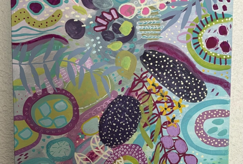
1. Garden Party Intro: Since we can't get enough color
and vibrancy in our work, we're just going to
do another painting that has colorful and I
called it garden party. And it is somewhat limited
color palette, right? There's not every color
under the sun here. Just a lot of them. And I did some different
elements here with leaves and inspiration,
botanical inspiration. So we're going to explore that and some different mediums
and really have fun creating something that people
will comment on and it'll get their
attention because there's so much interest in
something like this. So that's why I
invite you to join me in the garden party experience.
2. Garden Party Beginning: Alright, so for this painting, the garden party painting, which can be this way pretty
much anywhere you want. I signed it over here, but it literally can be
placed in any which way. So we're going to use this as our inspiration and
start with a piece of either watercolor or if
you have Bristol paper. The vellum surface,
I wouldn't use the smooth because it just doesn't
have any texture to it. Or you could use the acrylic
paper or mixed media. I'm just going to grab a
piece of watercolor paper. And we're going to
paint our background with just some of these
colors in sections. We're going to start that way with the background on this one. And we'll go out from there. So I'm going to pick sort
of a pale lime green, little bit of a
soft bluish-gray, a turquoise, and lavender and
kinda have them coming off. The focal point here
is right around here, not quite in the center. So we're going to
do the same thing. We're going to have it be, you
know, somewhere like that. You can actually draw it on
your page if it helps you. And we're going to paint
in sections off of here with some of these colors. Alright, so we'll put that, and this will be in
class downloads so you can print it off or have it in front of
you on your computer and, you know, be able to
see it if you like. While we work. I'm going
to set it right over here. I'm trying not to
get paint on it. All right. We'll take when we're just
painting the background here. So we're going to
be super fancy. We're going to grab
a large brush. This is a number eight. But anything, if you have a four that'll
just get you there. Little slower, doesn't matter. And we're going to start out
with our pale turquoise. So some white. And this
can be a pair like this can be acrylic gouache. And it could be also gouache. And I'm just going to make pale turquoise kind of come out here. I don't need to, for
it to be precise. You can see him. In fact, I'd rather not be, I'm pretty much mixing
right on the paper. I just want to cover the paper. So I'm variation is good. And you can go right
into your focal point. You can throw ingest
O2. If you wanted. Your way, you could use
white paint or Joseph, joseph kind of give you
a little more texture than just paint. Especially if you're just so is colored with paint co I would just look at my Joseph jar from from dipping my
brush with paint on it. So that gave me this lavender
color, which is fine. I like how just
sits on the paper. You have to do is
use dirty jokes. So when you get all kinds of interesting colors, I
do have a clean jar. So jar if I need, if I want the gel
so the nasty dirty. Okay, Let's make a green. Some yellow, some blue. Probably need a little
more yellow than that. Pretty good. I had some gel. So this is where some of the magic
happens when you don't, you know, I wasn't planning for my Joseph that will make
those colors, but it did. And this is kind of that
grayish we were talking about. So I'm going to take
a neutrally color, which we can make bye, bye. Making some different colors. I mean, by mixing colors. Or I can take a tiny
bit of my Payne's gray and adding gesso
and I can put the gel. So right on the page. And makes weighed on my paper. Be a tad more. And put some darker stuff
here in our focal 0.1 more just so it
dries really fast. So I'm, I'm dipping
into that jar. Mixing as I go. I just want to get
this first layer down. I just want the paper to soak
it up, which it's doing. Maybe I'll throw some
fluorescent in there. Okay, We can go over
here and pick up a Let's do a pale
pink eye gravity got the floor or something
on my, on my brush. And there's some green on
the palette Harrison and dip in, get some gesso. And it gets mixed
with whatever is in my brush and I'm HSL Jarrod, a little bit of
green isn't there? We've got a nice pink. And by the way, if you
don't like these colors, colors, use the
colors that you like. Sometimes you have
to really work the JSON to the
watercolor paper. I lost all my dark, so I'm just grabbing
a little bit of that. I'm back here. Kind of marketing that I can
put some blue in there to marking that focal point. Okay, background done. And we will let that dry. Okay, here we go. So when you let this dry, you'll see that it's
a little buckled, probably not to worry. I just gently do something like this without putting her
crease in the paper. It can be just careful like this and
get it straightened out. And as we add more paint,
it will get stiffer. Here we go, more or
less straightened out. So now we're going to add
some big chunks of color and start to build up layers that will give
us something like this. And as far as color, I'm going to stick with
this color palette. For the most part. We'll see maybe we'll
mainly we will modify. And I'm going to use, you can either use acrylic. I've got acrylics out here. I've also got gouache. I mentioned the Turner gouache might use some of those
colors, might use some. Some of the Liquitex gouache. But if all you have is acrylic, that's fine too. No worries. Let's start with, I do
like this fresh green, this lime green that you can, you can make if you have a
lemon yellow, light yellow, and a bit of green, and maybe some bit of blue. But since I've got this already, I'm going to do a
little bit of that and we'll mix like I always do. I'm going to put some
just so right on the palette for a change since I've made my
genitals so dirty. I'm gonna go ahead
and just get some out toward the end of this jar and I buy a big tub
of it and then I fill it. I put it in this jar, but this jar I'll
throw out because it's dried and get a new one, little pasta sauce jar. And let's also get some of this, some sort of magenta. Actually we can
try this Liquitex. This is a new color,
Medium, Magenta. And I'd like to make a lavender. So I'm going to put some blue down because I'll mix that with the magenta. And let's throw in some yellow
so we can get some warms. This is warmer yellow, a cadmium yellow deep. But any yellow. You can see we're not
being super precise here. And I need a dark. And I do like this dark plum. So I'm gonna get this magenta. This is quinacridone magenta, but any even blue
and red is fine. And then have some, either
some black or some Payne's gray to dark in it. Okay. And let's grab a
bright shaped brush, which as you remember
is the square. If you have a round and you want to use around, that's fine too. And then you could also
use one of these filbert. So if you have it kinda
rounded at the top. I'm going to grab
this one is just, I think I think I've just
its skeleton so stiff. So before I use to
clean brush as well, I would just rent
them in water and not take very good care of them. So what's happened is the
paint has collected here at the bottom and it's
made this stiff, which actually for
certain things I like if I want a stiffer feel, but I don't want that right now. Alright, let's
start putting down some watches and things. So I'm just thinking
about, you know, darks in the center and
then some shapes around. Hello, weight to them,
maybe susan more down here. That's a pretty
dark. You can vary. Obviously. How much Payne's
gray you put in it, how dark you want it to be. Now I will wash my brush
because that was my Derek and I I don't want to blend
too much with that. Would that plan on my brush? Little Plum on it. You
can see it's okay. It'll, it'll help to make these
other colors interesting. So because I want to knock this lime green back
a little bit anyway, it's well, I can
put some of it down as it is just as a
highlight color. And then we'll knock
it down as well. Meat. And when I say knock it
down, just subdue it. Was either the color opposite on the color
wheel can subdue a color. So that would look like let me get my color
wheel and show you. I don't reference it too often, but just so I'm gonna do a class on color because
it's just so fascinating. But if I wanted to
knock back this yellow, green and subdue it, I would use a tiny bit of
its complimentary color, which is the color
across the color wheel. If I have an orange and I want to just
subdue it a little bit, I would add some blue and just around the wheel like that. So I'll show you, Here's
our bright yellow green. And I'm going to add just
a touch of this magenta. You can just have to go really
light because you can see it really doesn't take much, but it has. I did
it a little bit. See that fascinating. Then I can add some white,
get a different shade. So I'm going to try
though to remind myself I wanna do larger shapes here. In the background. This layer, trying to stick
with larger shapes. And I wanted to green that is, so I have a green here
that's a little bit cooler. I'm going to take this same yellowy color and
I'm just a bit more blue. Hold it right down. Again. There's no real formula except to make shapes, sort of reaching out
from the center point. I like it not to be too obvious that they're
coming out from here. I mean, about it obviously is, but I can do one that is
a little bit wayward, like what would be
an example in here? Well, when I take stripes
going a different direction, but we could do something
like maybe going this way. Okay, And then I'm gonna
get some more turquoise. Just add that written,
not cleaning my brush. I can get some of the
paint off it like that because I've
got some purple in there and some other things. And then see what I
think of the color that I've gotten makes. And it's pretty. So sometimes, you know, this kinda was a happy accident and you'll find your own, Who's
your work in these? It's just going around
something and creates this sort of curvy mark. That's fine. Right off the paper.
That's pretty color loops. Some yellow got in there,
but I'm going to go with it and some more weight. I think that'd be
pretty over here. Still sticking with the
larger shapes at this stage, except for those small marks. I'm just letting you know the
process of creating colors. Mixed. Grabbed some yellow by
accident, but that's okay. Yeah, I like how this is shaping with the big
chunks of color. I think my dog is trying to
get into the studios on here. I think it's because we're
getting a thunderstorm. Alright, so let's let this dry and we'll come back
with the next layer.
3. Garden Party 2: Second Layer: Okay, It dragged quickly
and I want to move on before these
paints I got out dry. So I'm going to do more magenta and
just a little bit more, but maybe start to make
some smaller shapes too. I like the color palette though, so I'm going to grab a little bit smaller
bright brush and probably a round
brush at some point and see what we can do. I think I'm gonna
do some magenta. It's a warm magenta
because I that gel, so that has a little bit of
green and a nice pink here. And then I'll maybe
darken it as we go. Okay, So I want to talk
about this pretty color. So I had the magenta
going and I took, you know, again going up. So on the color wheel I have
kind of a color in here. Add a little bit of green
and it just toned it down to a really nice color. Like, Well, I want to use
that color somewhere else. Maybe had some weight to it. Tone it down a little more. I change my brush shape and
start going with around to get some different
shaped marks. And looking at colors. I don't have this strong
turquoise in this one. So let's go ahead and
make some of that. I'm going to take this turquoise
and add a bit of blue. That's pretty maybe a tiny bit of blue. Well, we got a weather
alert that said we should shelter in place because
there was a tornado nearby. So my husband came and got me. But I think that the
threat has passed. If you hear rumbling,
that's the vendor. Okay. What I did just so you know, because I wanted
these to be wet, not dry out as I
listed them with this MR. that I got on
Amazon that I think is like a facial MR.
And I just did that to keep them moist so they wouldn't dry because I knew we were going to come back
and keep painting. All right. Now, I was
doing this turquoise. Oh good. That worked still wet. And I wanted to use
a different brush. That's what I wanted
to do when you use a liner and grabbed my number one liner from Princeton and start playing
with some small lines. Remember you have to get used more water and get
this nice and wet. And where else would
we want to do this? Like how that looks? I'm
going to do it here to the liner is a great
thing to just get some paint on a
paper and practice. Controlling it. Got some magenta on myself. Don't even know how. Okay, Let's see what else. Maybe autism. I started making
small like dots. But I'm gonna go with
some levy outlines here. Maybe a bit over here, but I don't want the liner
and then something a little thicker, thicker line. And come over here. There it comes to rain. Let's go for a light turquoise. So I'm going to pull that over here
because it's mixing with the semi dry paint underneath
and giving me chunks, which I don't really
want right now. Sometimes chunks can I
have a good texture? I'm going for a light turquoise. Go. And I'm going to make some outlines around
these purple squares, but I've got so much pain in my brush that I'm trying
to just work some of it off so they can
make a decent line. And I'm going to really lightly, nothing like painting
of the storm, right? I think that turquoise
looks really pretty with the purple. Now I'm going to take some, let it be heavy on my brush
now and do some dots. Larger ducts. My mom was so funny. She's an artist
in her own right. And G, You know, sometimes she gives me
little pointers and she, she said one time he even you could use some
triangle shapes sometimes. So what's used some
triangles for Mom? Mom? I do like triangles. I just didn't think
of using them really. They certainly appear in nature. Leaf petals and flower petals. Gotta do my numbers About used up with this color and the tundra
is getting so loud. But I'm going to stop for now. I really like the direction
this is going though. It's definitely inspired
by this, but different. And we'll let it dry and come
back for the next layer.
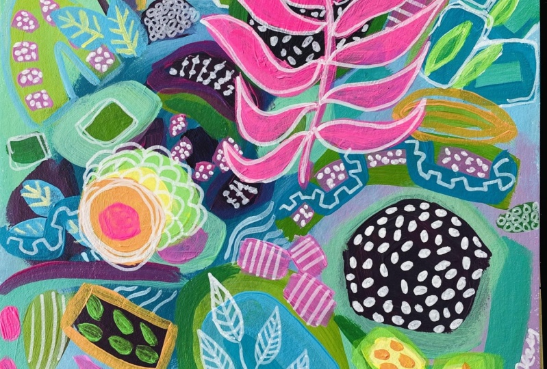
4. Garden Party 3: Finishing Up!: So I started thinking about a direction that I've
been wanting to try. And just to make it, I'll make this one
a little different. And I sketched out some
ideas for putting in a few more botanical
elements and pattern. So I've got this kind
of sort of leafy idea. Filling in dots and a shape. Some leaf outlines, maybe
some longer leaf and maybe even some little flowers along with the
other usual marks. So just kinda
thinking about that. And looking at this
now and wondering, do I need to add anymore
paint bets before? I'd go in this direction. I don't really think so. I think we can go play with these elements and
see what happens. So that's what I'm gonna do. I'm going to use Posca
marker and also, you know, paint where it makes
sense for where I don't have the right color, but I have a few colors. So I think we'll be able
to use Posca marker. I'm going to get a few
colors here that I like. And with the Posca markers,
you're shaking them. And then you are priming them. Chicken with the top on that one's doing what they call flow. There it goes. Like a leak. This one's a glitter. So first are the only glare
one I have. In the red color. It's just a really slight glare. But I thought it'd be fun since this is called the garden party. Alright, so let's make some marks and see
where this goes. Okay, So I just wanted to
mention a couple of things. When you're using
the paint markers, you want to just go lightly. Think of your depositing
the paint on top. Don't scrape hard, and then move slowly so that the paint, the ink can come out and heal. You'll get the hang of it.
They don't always perform, but that's okay in
this kind of thing. You're not being really precise. I'm going to let that dry. You probably saw
me get my fingers and one of these marks and
then I had to refresh it. But when there's too
much white on there, it's hard to get
in and do angles. So we'll come back in a
minute when it's dry. Alright, so let's continue
with some of these. Still want to do the
little flowers and maybe some leaves that are
kind of draping in somewhere. And I think I'll
pick up this sort of blue gray hair and
make some of that. So I'm going to try that first. I already have some
Payne's gray here. If it's still wet, you get a round brush. Be able to make those leaves.
This is a number two. So let me talk
about these leaves. I switched to a
number one, smaller. And when you're
making these leaves, you just, it's about
pressure with a round brush. So you start out with
not much pressure, then you press down
and then you lift. And I recommend doing
just pages of leaves with different brushes to see
what you can create. And would you like to make my paint a
little more fluid? Brushes, just not giving me the point I
wanted a new brush. It's not so master touch. But I'm thinking I'm
gonna switch because it's just not giving me when I'm looking for try this
Princeton number two. So that shows you
that you do have to switch brushes sometimes
to get the effect that you wanted her
to get more control? It was the first time
I was trying that one. I'm not really impressed.
Okay. What else do I wanna do with this
color now that I have it? Because I want to bring
it somewhere else. Just do some large
certainly things here. I think so small marks, but I don't want them around. So I'm going to make
them Let's see. Either a little flat
brush like this. This will work. I'm just
thinking I want to make little homeless,
little tiny squares. Most definitely
getting more exciting. Let's see what else I might want to do and with what color. I have pulled this pink. See if this is a hot pink. It's pretty it's not a it's
not a fluorescent paint, but it's definitely bright. So I'm going to do a
little bit with it. I think I'd like to put
some shapes in here. Maybe in this off-white. Maybe I will do
some small leaves. And we haven't
done any goal yet. I'm also feeling like
I want to pick up when the lime green maybe it
was a Korean migraine broke. Just scribbling limb on top of what I already
have to accentuate it. Give it a little more texture. And do I want it to
those little flowers? And if I do, what color
do I want to do them? And I kinda thinking yellow. So I have this fluorescence. Posca, basically. I think you could
get the same thing by using a highlighter. I wonder if it's
gonna be too bright. It's pretty darn bright.
Well, let's see. I can always go
over it with yellow if I do some little,
some little flowers. All right, let's pause and take a look at it
and come back to it.
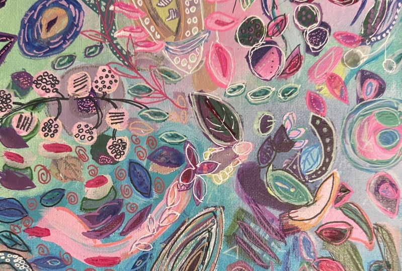
5. Bonus: Blooming Joy Part 1: Okay, So this is an example of a little bit
different approach. First, I want to
talk about how I did this base layer, the background. It was basically just SO
and then black paint. And then which kinda made some gray because the
jester was white. And then I randomly
put some pink, some things in the middle. And that's just
completely random. No real process here. So now that I've got
that background time, liberally throwing paint colors. And this one is definitely
not a limited color palette. I am grabbing whatever seems like it would be fun to have in there and pretty much
scribbling it on, taking the back of the brush
and making some marks. I'm using acrylic
here and I'm using the NOVAC color paints mostly. Those are pains that are good quality acrylic and you
have to buy them online. You can't get them in stores. But they're good price point. And I'm using JSR was
my white and mixing in practically on the
paper and making marks. And there's a palette knife. This is kinda what I call
a kitchen sink painting. Meaning I'm throwing
everything at it. And I like working like this. It's a little less
methodical than some of the other paintings we've
done in this class. And I love how this
painting turned out. So here I'm throwing
in some orange. I don't normally use
a color straight out of the out of the jar. Now I'm grabbing some white, but I know that I'm gonna
be over painting so much that this is gonna be altered. But having a little
bright pops in there, I'm using a big bright,
bright shape brush. It's a number ten and which
you can use anything. I'm scraping through. Hi, I'm intentionally
just at this stage not being very trying
not to overthink. That's what I'm trying
to work quickly. Obviously, this is a
time-lapse, this is sped up. I'm not working this quickly. Here is that wonderful 3D
liner that I love using. I used it in hot pink and
then the ivory color. And this is the stuff I recommend doing
this kind of process. Here's the other color only have three of these and
this is in silver. And I decided not to make it 3D there and scraped it down. Just to see what I
thought about that. I recommend for this kind of
thing to force yourself to not think too much is maybe
even put a timer and say, I'm going to just do this, what you see me doing
for ten minutes. So I'm not going to think. I'm just going to
grab colors I like, and Rome on there. There's some fluorescent pink. And I'm basically doing
some doodles with a black Posca really
spilled out there. Which happens so then
sometimes the Posca markers. So then I just
grabbed the brush, made some scribbles because I didn't want to wait that long
for all that ink to dry. So I do think if you can, if you, if you want to
improve as a painter, I think getting one of these arms from Amazon where
you can film yourself like this overhead is a great tool
because then you can watch what you do and especially
when you're moving quickly and how here I'm intentionally
using left hand, which it can't be precise because I don't
have him right handed. So that's another trick, is forcing yourself to be less precise with your left
hand or non-dominant hand. Here I'm blotting some of it up because I want to continue and I don't want that black to bleed. This one you don't
yet see any sort of emerging toward the
center like the others. Here, I'm taking an oil pastel and then this is just
a pencil eraser. Those mechanical pencil erasers, the white ones really
work well to smear out. Oil pastel. Course, your hand works well too and that kind of scenario. Talk about an ugly stage, right? This is, I'm pulling out
some Liquitex acrylic here, adding some weight to it. And I love how it pops
against the purple. So I'm just throwing it in random places and
literally thinking, okay, what color should
I throw into your next? Me get some green. I love using lime green. Definitely on my go-to favorites just like
you probably do, or if you don't yet you will. I love the effect of a
little bit of paint and then the oil pastel on top
of it in the same color. Same on the same, but
her a similar color. It just creates an
interesting effect. Now I've grabbed some
more white just so to just put in there and scrape through it and
my wipes and live it up. I love the process of discovering
colors on the painting. So I think I decided I didn't want all
that weight on there. Or maybe the texture underneath
was more interesting. I always say the
worst thing that can happen is that you end up with some great under
layers of stuff. Because even if I were
to at this point say, I don't think this is going anywhere and paint the
whole thing over something. You would see some of
that stuff underneath. So I'm just playing
with some blues and greens in random marks. Adding color in different
bits with different brushes. And trying not to
think too much. This is where I talk about
channeling your five-year-old. Because a five-year-old
can do this just fine. We're the ones that have
trouble and things, things like, where's this going? What am I doing? Why
am I doing this? You're doing it
because it's fun. But it's only fun
if you really free yourself and let yourself play. Here, I'm using a thinner
brush and I made, this happens to me all
the time as I've said, I made a color just by adding
some weight to that, red. And I really liked it. I'm like, Well, I'm going
to use some of this and then let's add a little
bit of yellow to it. And wow, I love that color. I just figured out where
I want to put that color. And you still don't
see any sort of particular direction to
this painting in terms of the kind of bursting out or moving
out from the center. I've let that dry and
I'll come back to it. And even though it's not
really a composition yet, I, I am liking the bright
fluorescent pink in the back with some
of the darks and I'm just finding it very exciting. So one of the colors
that I bring in that for some reason there's a few
colors that I've noticed that seemed to really
bring a painting to life. One is orange, and I'll have paintings that I
haven't used any orange on, and then I'll add orange
and it just, wow. Another is the lime green. And I would say there's four. And then another would
be the fluorescent pink, even if there's
just little bits of it. And then turquoise. I'm not saying you
have to use hall. Those are that I use all those, but those colors seem to
really help her painting. Pop. I've had paintings
just thinking ion now, this is just not
very interesting. And then I find a
color that really, for me it takes it
to another level. I think I'm in love with this
color here, this beautiful, warm green and you just
take a little paint color. I just added some
blue to it and then some white and just
keep changing. And that's why when
somebody says, what colors are you
using a black guy, I invent that I'm
in the process. I couldn't tell you.
I can tell you. I start with the basics
on orange or red or pink. And then from there
it's whatever shows up on the palette whenever
I mix the painting. And that's why I could never, I could never actually
recreate a painting. Which just kind of a cool thing. Now I'm eating a little
bit of dark something. Opening up a new liquid texts. I do. I like the Liquitex container because
it's once you open it, you can just call
it a teeny bit out. You don't get it all messy. Versus the novel color jar, which I tend to mess up.
6. Bonus: Blooming Joy Part 2: Alright, so here at
this stage in part two, you start to see me. Let the painting kind of guide
me to these focal points. I'm adding a dark hair. Plum is one of my
favorite darks. I would say. My favorite darks
are Navy or indigo. Payne's gray or dark plum. And so I'm just continuing
to grab colors. I am doing that dark in the center area and then
starting to go out from there with different marks
using a bright brush. The square shape, throwing in
some more fluorescent pink. But I don't yet know. At this stage of the painting, I'm seeing a focal plane, obviously to the right there. But there may be others. It's evolving. This one definitely did
not have much of a plan. It's more color inspired color in shape than anything else. The thing about acrylic is you, you, to get opacity, you have to add layers. So sometimes people ask me
what's the difference between acrylic and acrylic
wash or Apple Watch. And there isn't a whole
lot of difference, except the opacity of gouache is a more opaque paint with
more pigment and it has a chalky finish. Whereas acrylic, you
can get the opacity, but you are going to
have to layer it. And that's why you'll see me
sometimes going over colors. I'm looking at, I'm looking at a previous one for
inspiration there. But then I'm taking oil pastel. You saw me do some pink. They're like color
on top of lake. Then just kinda dotting
some here and there. There is a woody 31 CRAN
pencil, I guess they're called. And they also have very
nice intense colors and it will go over anything
just like oil pastel. You can wet it. I'm trying to get my
eraser cleaned off and to rub that in. And it had had a
previous color on it. That lime green that really
makes a painting pop. Not that this painting
needs anymore pops, right? But it's still feeling a
little discombobulated to me. So that's what I'm working on. Bringing in that beautiful know, it's not a baby blue, cerulean blue, just
such a pretty color. When you, when you
work this way you discover bits that you like
and don't like, you know, like I really like how those two fluorescent paint strokes on the right look with
the green and the orange. And I love how those lime green blobs in the left
lower corner look. It's a process of figuring out what are the
parts that I like. And while leave, leave alone versus the ones that I
want to cover or change. Messy hands make good art. Here I'm doing that same
thing with the yellow on top, a yellow but with
different mediums. It just creates. And now I'm getting some matte medium out and
playing around with that. I would have been
experimenting with. If I use a matte
medium with acrylic, will I get that nice
chalky finish that I like? Will it make it less
of a sheen pan? The conclusion I've
come to is it does, it does give it
more opacity work. Well, in a way it gives it more. It doesn't give it more opacity. It gives it, it
makes it more Mac, but it also thins the paint. So it didn't really
achieve what I wanted. The smaller brush out now
and doing some small shapes. But I really wanted to show
you this painting because my random free approach, I think, lead itself to a
really interesting painting. Unfortunately, I don't
normally do this. I don't sell class paintings because I like to reference them and I did sell this
original. If you bought it. I don't know. I've been thinking
about contacting the buyer and ask if
I can buy it back, but I'm sure she's happy
to have it anyway. It is. A print. My friends are just
amazing quality. So I'm coming in
with a light blue, a light blue and throwing in some turquoise and just being really bold with it. And now the thing is that the trip to a trick
that increases opacity, a lot is to add white, especially if you haven't
unpacked row or quash white. Highly pigment and white. Or Jericho is really
very thick and white, so I often just use
that and that will increase the opacity
of any color. I use. I use it
interchangeably with, depending on the
effect that I want. And use it as my white. Adding some bits
of pale turquoise. And I'm getting
close on this one. I'm looking at this other one, trying to get inspiration. But I'm liking it. So at this point I'm
saying to myself, okay. Do what you need to do, but don't overdo wanting mixing, missing some of my
lime green here. So I mixed made some. I've got my rigger
or script liner, that one look along
bristles and making some. I loved the way green
looks on orange because they're complimentary so they make each other pop. There. I'm doing the same
on the same green on green. That for me as a way to add
interest without adding too much different color because I'm putting the same
color on the same color. I think what I'm doing here
is basically saying, Okay, I want this lime green tab pops throughout so that when
the eye catches it, you can get through
the whole painting by following the lime green. I do have a bit of quiet space, which something
that's a challenge. Up in the left corner and
up in the right corner there's places for your
eye to rest as they say. So I'm conscious of that
not mocking up those spots. This point I'm feeling
pretty much done. I'm just scanning, going. Okay. Are there any parts that
I don't care for it? I want to enhance or decorate. Think of at this stage of
the painting is decorating. Maybe adding some
jewelry to your outfit. You know, doing a couple of things. Draw your eye to
the center here. And then the shapes that I have will naturally
pull your eye out. How oh, bring it in.
Because they're all kinda most of the shapes are
going toward the middle. But there was a
lot underneath on this one that I
didn't want to cover. So that's why I'm
preserving a lot of it. Pretty much done here. Really happy with it.
7. My favorite spray fixatives and varnish for artwork: Lovely. Okay, I've been getting
so many questions about fixatives that this is all about the
fixatives that I use. Basically used three. I will start with the
completely odor free, non-toxic, all-natural, whole
media de Gaulle fixative. I don't know what this
stuff is made out of. It just says kerosene and denatured grain,
alcohol, and water. So cosine must be the part
that actually is the fixative. But at first I was skeptical
because I thought, Let's work on everything
and how can it be completely non-toxic
and odor free. But I tested it. And the hardest thing
that I find defects are these soft pastels
because they're so powdery. So I've used this, they got all kinds of things. But if you don't
know how soft and powdery these are,
let me show you. They're just there
it is on my fingers. So, you know, they're incredibly beautiful in terms
of the intensity of the color, but quite messy. So I thought that
the toughest test would be to use
this fixative fact. That's what I've done. And in short, it works. It's just that you need to do multiple codes and it
doesn't dry super-fast. So here's the piece I did it on. There's a lot of the soft
pastels on this one. This is pretty much
all through here. This oranges soft pastel, the green, this is oil pastel. This is ink. Let's see what else
do I have on here? Ink, Gouache, pack or wash. I think it's all on here. But after several coats of this and what's nice
is I can do this inside, so I can just have it on
my table, give it a spray. Not too close though because it will I kinda dropped drops but don't panic, just leave it. Actually, I'll just go ahead and hit it with another color. So you can see. Maybe I've clogged it. That's the thing with
fixatives is you do have issues with clogging
and needing to use yeah. So you haven't used
this one in a while? I'll need to so close
and warm water. That's what I've done before. I just take this right off and soak this in warm water
and then it'll be fine. Let me do that now so
that I can show you. I'll be right back. I'm back. So what I did and
this is this just happens. It's if it's been awhile, I soaked the part and I ended up having to take this out
and soak the whole thing and hot water and
use a toothbrush. But probably if I had saved the little
top that came with, it, wouldn't have
to do that as much, but it out I noticed
that helps a lot. If you remember
after you use it to just wipe or rinse the nozzle. But anyway, it has a nice spray. So the other reason
I know if it's getting blocked up is they'll
start dropping big drops, but see there's a big drop
and don't worry about it. That's it In this doesn't have any odor and I can
do it right here. And you can see that
it's kinda wet, but I put it aside. And then you can
do another coat. So that's the advantage
of this stuff. And you can continue to work
on something after using it. I have and I just loved that it's not
that it doesn't smell. And it claims soft pastel, oil pastels, chalk,
colored pencil, graphite, charcoal on paper, UPA, Canvas, ceramic fabric, glass, leather, wood and stone. So I have not had
it fail me yet. Now because it takes a while to dry though
sometimes I want to do something more quickly
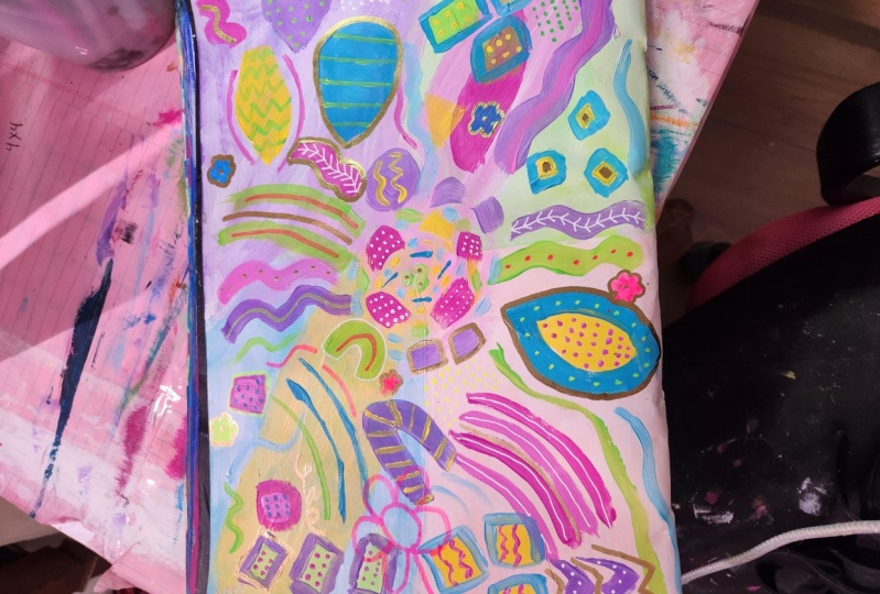
and I'll take it outside. And this is my favorite
workable fixative, meaning that you can spray it
on hand in the sketchbook. Show you, and then
you can keep working. So let's say I have, I remember one that
was, yeah, this one. This is a lot of oil pastel, which really doesn't
come off too much. But I think I've sprayed this and you can spray it and then I can
continue to work on it. Same with this one. It'll it'll hold things
enough for me to come back and continue
to work like this one. But I don't always use fixative. So like this one,
I've done this a couple of layers
and it's not done, but there's no
fixative on it yet. It just depends on what
material I'm using. If I'm using acrylic
gouache and ink, it really doesn't
need a fixative. But if there's oil pastel like this one has little bits of oil pastel here that if I
hadn't been fixative over time, would transfer to
the other side. So it just depends on
what you're using, but this is really easy. I do I do use it outside though. It's vapors may cause
I know it stinks, but it doesn't tell
I can spray outside and don't do what I do is set a timer on your phone
because I have left things outside for hours or the
rain starts something. But anyway, you can bring it
in within ten minutes and it doesn't smell too bad and I'm
pretty sensitive to smells. Alright, then for the
varnish that when I'm done, when I'm all done, highlight a matte finish. So I usually use
gouache or app or wash, but I can use sometimes I
use some acrylics which are shiny and I don't like
super shiny surface. I use this liquid techs, matte, varnish and low odor. I've went through a
few of these because I don't like the really
toxic smelling stuff. So it says low odor. It's it's still
smells. Of course. I still use it outside, but it's better than some
of them water-based. And however, my complaint with this one and you just
have to know that going in because I kind of
ignored the instructions. It tells you in
the teeniest print possible that when finished, bring turn them upside down
and push spray button for five seconds to prevent
clogging soap like that, right? Well, I didn't do that and
he got really clogged. So same thing. I just pulled this off and
soaked it in warm water, took a toothbrush to it
and got it working again. It actually came with
a different nozzle. I think I borrowed because
yeah, this one's missing it. I borrow the nozzle from
here, which you can do. Because this one,
the one that came with just stopped working
and got to clubs. So now I am sure the nozzles, depending on which
one I'm using until one of these runs out and
they get a new, new tube. Oh my God, so funny. Alright, so I think
that will answer most of the questions I've
been getting about fixative. You don t have to use
fixative unless you're using things that are
going to come off. And then I use them for if
I want to continue working, I use one of these two. Depending on how
quickly I want it done. If I don't mind waiting till the next
day or several hours, I'll hit it with this if I want to work on it and the next little while,
I'll hit it with this. And when I'm all
done, I'll use this. I will put links
to these three and the supplies tab of my website. And I'll put the link to that in the comments in the
description of the video. I'm also going to do, I
think my next class on this style of floral burst. I haven't figured
out what to call it. Laurel burst or
colorful abstract. I don't know what to call
it pelvic or something, but it's a lot of fine. Okay. Happy creating guys.
 Suzanne Allard, Landscape, Floral, Abstract Painting Teacher