Transcripts
1. Welcome Sketching in Venice: Sketching outside
is a challenge. Almost every artist I know
feels frustration and uncertainty with the
act of sketching outside and showing
his work. I do too. I worry about whether people
will like what I make. When passers by, have a
look at my sketchbook. I worry about whether you
will like this video, of course, and learn something, and I worry about the outcome of this class and my sketches
when I sketch outside. But my outside sketches
have something more spontaneous and
playful because of this. I like them more, and when I
look at them later at home, I remember all the smells
and sounds and feelings, but you don't need to go abroad. Sketching your
neighborhood is fun, as well. I do it often. Keeping a travel sketchbook is a rewarding way to document your journeys and capture memories in a unique
and personal way, and it makes you travel
more slowly and mindfully. Join me in this class
in beautiful Venice. Hello. I'm Barbara
Liwell, architect, author of several
travel sketchbooks and drawing teacher in the architecture faculty
in Brussels University. And in this class, I will take you
sketching in Venice, and I will sketch
in color pencil, watercolor and
watercolor pencil. And then in the last
video of this class, I will show you how
I add some texture and more deeper shadows in my sketch at home
in color pencil. And as a class project, I suggest you do some urban sketching
wherever you are at home or at the travel with the colors you like and
the subject that you like. Enjoy and don't forget to post your project in
the class project. The purpose is just to go
sketching and enjoy yourself.
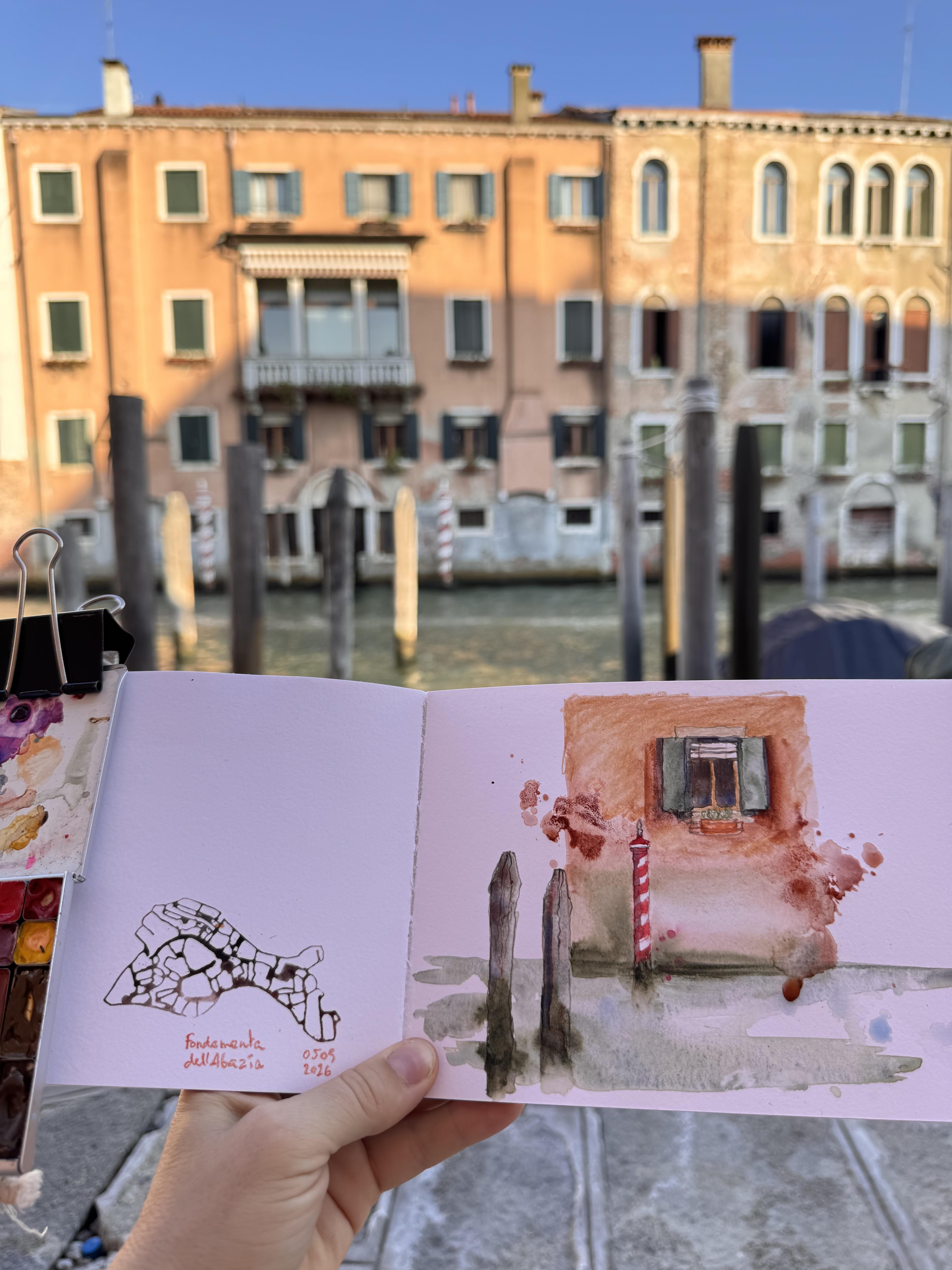
2. Old Venice Sketchbooks: So in this video, I want to show you some of
my sketchbooks from Venice. These are sketches from 2019 and 2024 and now 2026. And I want to show you now an older sketchbook
from ten years ago, and I started it in 2015. When I went almost
every year to Venice, and I wanted to show it to you, 2015 also so you can see the difference
when you exercise a lot. You can see quickly some
evolution, your sketches. This is again, 2015,
and as you see, there was not much
life in my sketches, not a lot of different values
and different contrasts. This is already a bit better. Here are some shadows, then there is quite weak. And the pencil sketches
I like quite much, but watercolors are quite
weak without lighting them. Here is an attempt
to go a bit darker. Still 2015. And 2015, this is quite the same. Looks like it. Oh, yes. Almost. And then 2016, where
I was experimenting with ink and this one I
like quite much 2016. This also, although it hasn't a lot of
different values in it. And here I started sketching in ballpoint pencil
and again in ink. And I show this to you to show you that if
you sketch a lot, you will make a lot of progress. This is 2019. You see, there's a lot
of light cloming now. And then here are
some other sketches, my cute Inocitado books. Very cute little book. And I use this stemp
to show where I am. And here also sketch. It's the other way
around like this. And then here so this is 2026
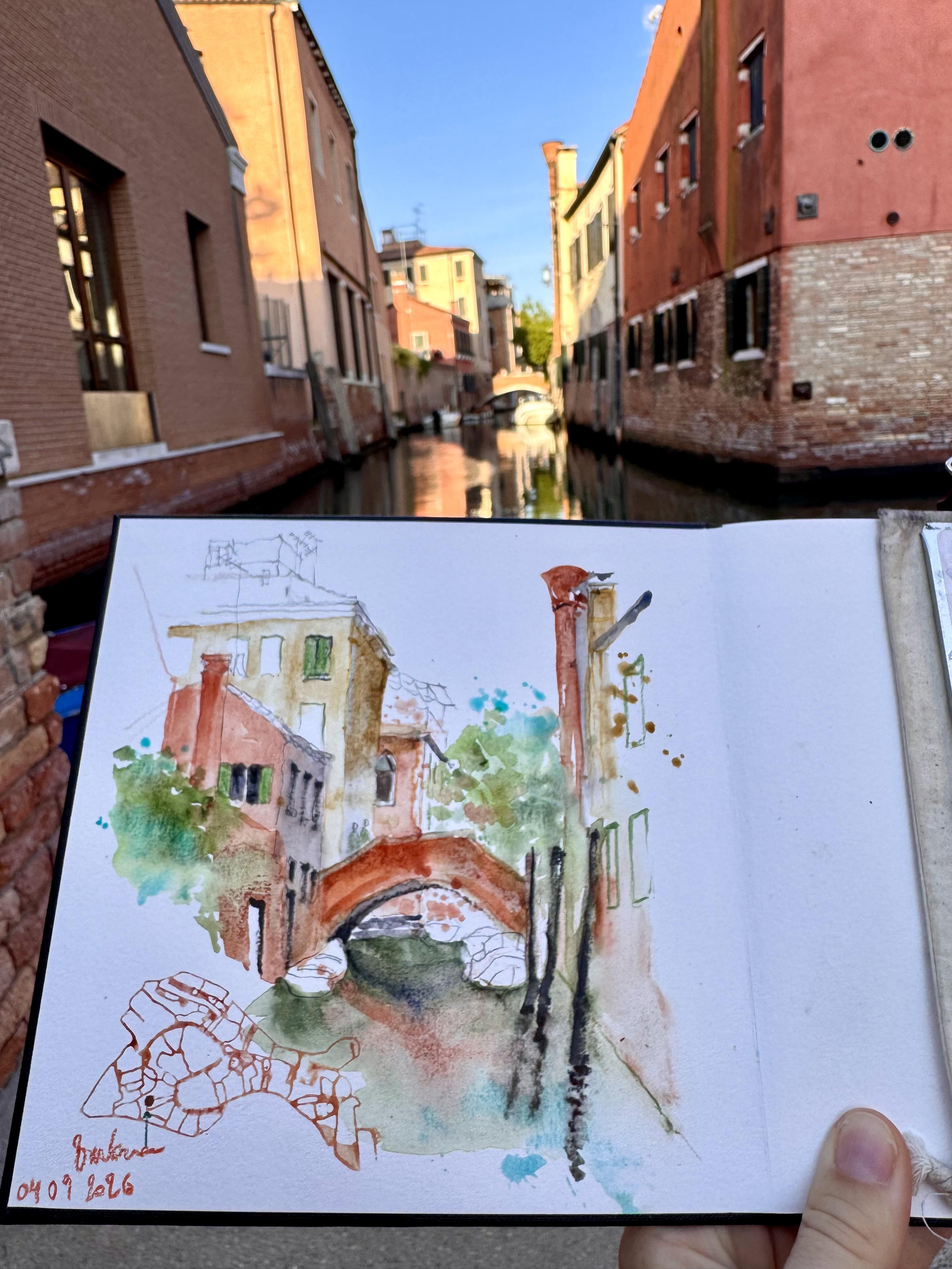
3. Sketching a Canal in Venice: I start the sketch with
watercolor pencil because I don't want to have dark graphite pencil lines in
the sketch for the moment. I just look in what direction
the lines are going. I don't really think
about perspective because we're in beautiful Venice and I want to
simplify the drawing. So just look in what directions
the lines are going. And if you don't
see it very well, what helps me is to close
one eye when I look at the building and to hold my pencil along the edge
which I want to draw. So let's say the roof, I close one eye to
flatten the image, and I hold a pencil along
the edge of the roof. The pencil is
parallel to my face, and then I bring it to my paper. And that way I see very well in what direction I have
to draw the line. For the red Earth
colors from the bricks, like the bridge and houses, I use different
colors of red Earth. I have by Windsor
Newton light red, and then I have very granulating colors by Daniel Smith, like
Phoenician red, transparent red oxide, Terre Hercolano and
English red Earth, and I mix them all together. And for the vegetation, I use green appetite
quinine by Daniel Smith and very granulating forest green by Schminke and I splash also. Of course, some toquas in it, which is cobbalteel
blue by Daniel Smith. And I let all these colors
flow into each other. As you see, I don't wait
until a wash is dry. I immediately put another
color next to it, and that way the
colors flow into each other and connect all the
objects of the sketch together. For the wooden poles, I use desert green by Schmincke, which is also a very
granulating color. It's a bit grayish with
a bit of green in it. And then I will detail some very important
objects of the houses like the window shutters and the windows with graphite pencil to make them more precise. The windows are very important. They like the eye
of the buildings, and they bring life
in the sketch. And when it's light
daylight outside, the inside of the
houses is very dark. So for the inside of the house, I use my shadow gray, which is a mixture of transparent orange
and ultramarine blue. Other important details of the houses are like
the chimneys and the antennas and the tiles because they also bring a
lot of life in the sketch. I will detail the house next to the bridge
more precisely. And the house on the right. In the foreground is less precise because
it's not so important. And then there are some
boats on the canal. For the boats, it's
quite tricky to draw sometimes look in what
direction the lines are going I also put some people
on the bridge because it gives a scale to the
building and to the bridge. Don't forget the shadows. I make the shadows quite dark because it brings
in a lot of light. The darker your shadows are, the more light you bring in. Mm. The objects which
are like in front, will have brighter colors
and darker shadows. And for the windows
and the openings in the house in the foreground, I use a very dark gray watercolor
pencil on a wet paper. And so the color dissolves a bit in the wet paint and
makes it really dark. The houses which are behind the bridge will
be less detailed. They're more like a
background of the bridge. As for the house
behind the bridge, I detail some important
architectural elements with a graphite pencil. They have some amazing
terraces on the roofs. If there are some small details, you might want to make
them in color pencil first instead of making
it with a small brush. Also, my different splashes connect all the elements
in the sketch together. Like I will splash some
green everywhere and some torquis on the left and on the right behind the bridge in front
of the bridge. And I use the same colors
all over the sketch. For the water, I
use green Earth and some darker pots with shadows. I use under a sea
green by the Nilsmith. And I also splash
some toquas in it, and I will also splash
some light red in it to suggest the reflection of the bridge and of the
buildings in the water. So sometimes it doesn't go
like you wish, of course. This building on the
right is really messy, and I'm thinking I
should have left it out. For the wooden bolls, I make them a bit darker with my dark gray watercolor pencil. And I add some of
the desert green. They are really
in the foreground and very typically Venice. So I find them important. Make sure to darken
and detail more what you find most important and what you want
people to watch. So the eyes will be attracted by what has
the most contrast, what has the darkest shadows
or the brightest colors. And to bring the house on the left in front of the
bridge more forward, I will darken the
shadows and I will also make the facade
of a brighter red. I add some light red
to bring it forward. So the objects which
are more detailed and with the best contrasts
will be brought forward. So I hope you like this sketch. Of course, it's
not so comfortable to make the movie
in Venice while I'm open sketching because I move a bit more than when it's on
my drawing table at home. But the sketches made on
location are really different. And when it's made at home, it's a bit more
messy but also more spontaneous and I prefer my
sketches made on location. So I hope you like it. And I wish you happy sketching. You don't need to go to Venice or travel abroad, of course. You can also go and sketch in your own neighborhood at
home or in your hometown. And I'd love to
see your sketches. So if you post them, please tag me on Instagram or wherever
you want to post them.
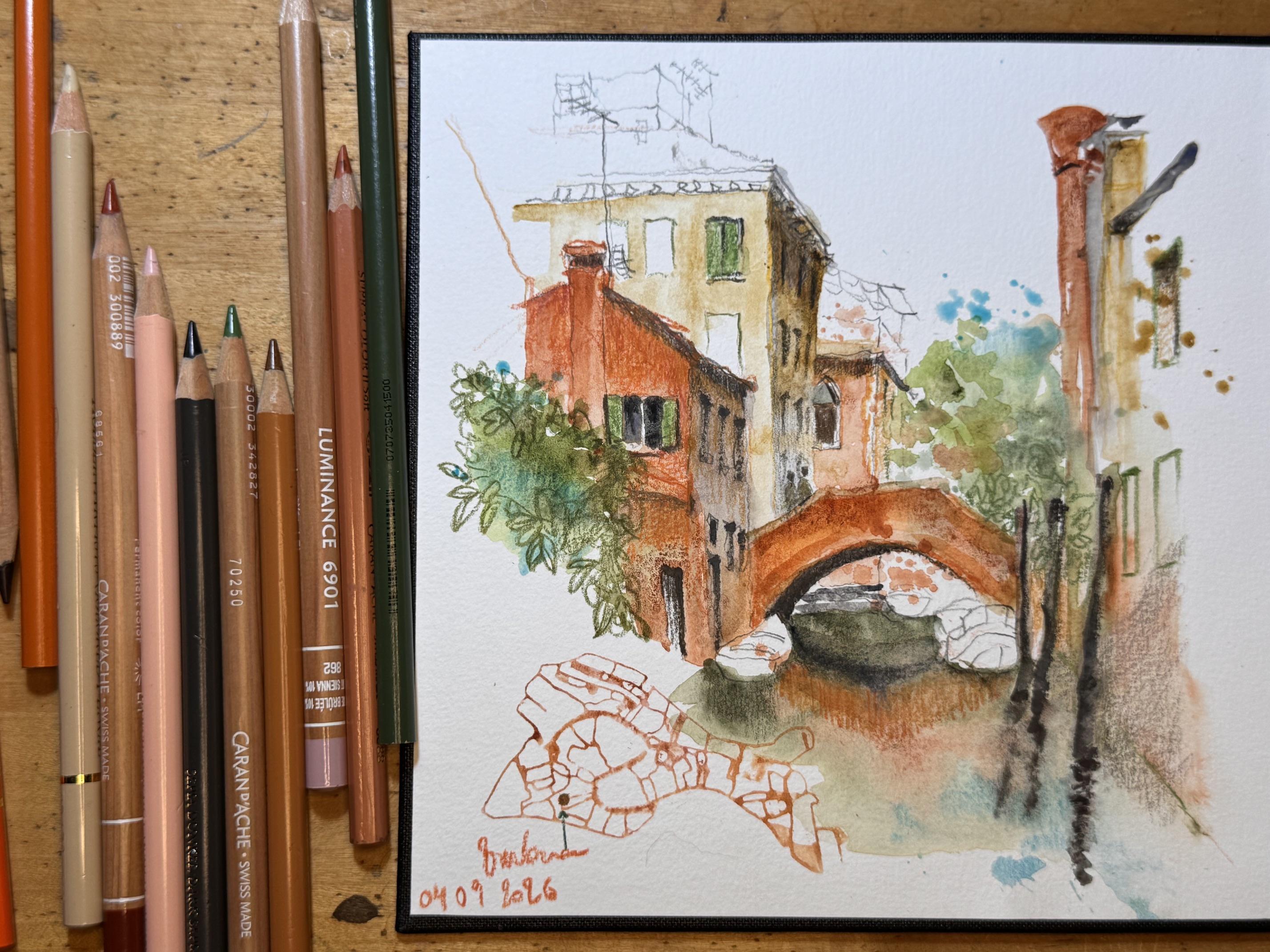
4. Adding Color Pencil to a Watercolor Sketch: H. So now I'm back from Venice back home, and I found my sketch
is a bit flat, so I like to add some
color pencil in. I add color pencil to the front houses to
add textures and deepen the shadows to bring more light and more
contrast in the foreground. And so the houses
which are lighter in the background will stay
more in the background. And also this house in the foreground will lead
the eye to the bridge. I also deepen the shadows. For that, I use
the O sepia pencil and I add shadows to the window shutters
and to the window sill. And I will also add some color pencil texture to the bridge and add some
shadows to the yellow house. And I add some
funky orange pencil to the foreground house. I do it on purpose to make messy hatching because
I find this is a good way to suggest
a very old house and a bit worn out facade. I also add some contrasts to the yellow house under the roof. And I like also to add some ornaments and details
with color pencil. I find it easier to
add some color pencil. Make sure to sharpen
your pencils before you start working
on your watercolor, so you will have sharp lines. And for the vegetation, I add some dark
green colour pencil. This is a grazyPrisma
color pencil and I suggest some
leaves of the trees. And to bring forward the
lovely shape of the bridge, I add some dark shadows
under the bridge, and I will also add some color pencil hatching
in the water to make the reflection on
the water a bit stronger because this will also lead the ice to the bridge. When you add some
colors and contrast, make sure to think
about what you want the people to
watch because the eyes of the people who watch
your sketch will always be drawn to places in your sketch where are
the biggest contrast, the finest details and
the brightest colors. So think carefully
where you want people to watch before
you make your sketch and before you add any contrasts and don't
detail everything in the same way because then the people just don't know
what to watch in your sketch. So here I want people to watch the bridge and the house
in the foreground. So those are the brightest
colors in my sketch. And if you want to add color
pencil to your watercolor, make sure to use quite smooth paper because if you use very rough
textured paper, the colors will be more
difficult to apply. So tell me if you'd like to add some color pencil to your
watercolor sketches. And if you give it a try,
show me your sketch. If you give it a try, I'm curious to see
your sketches. Thank you for watching.
5. Final Thoughts: Thank you for
participating in my class. I hope you enjoyed
your sketching, and I hope you enjoyed
your trip to Venice. Did you take time for
playing and experimenting? And did you manage to go
nicely dark in the shadows? And did you use your
favorite colors? And how did it go to
go and sketch outside or to add color pencil to
your watercolor sketch? Be sure to share your
finished project so that everyone can get inspired
by your unique creations. Every creation is unique and thank you again for
joining this class. Please consider also
leaving a review. Leaving a review is
truly helpful for the teacher and for the other students to find
classes that they love. And, of course, don't
hesitate to reach out with any questions or thoughts
in the class discussions. And I hope to see you in
one of my next classes.
 Barbara Luel, Architect, Author & Artist