Transcripts
1. Welcome to Norway: Mm. Hello. Are you struggling when you travel to choose what to draw and
there's overwhelming scenery? I do. I spent hours
checking what I will draw. So in the coming videos, I will show you these
two sketches I made. I'm in Lafoten in Norway, and I will try to explain you
how I chose what to draw. And this is made in color
pencil and watercolor. So I will show you how I
use these two mediums. I'm Bob really well,
and I'm here in Norway to make a new travel
sketch book about Norway. It's my sixth book. My previous books were about Japan and Brussels and Portugal. And I hope you enjoyed videos. I made in Norway. You can find more videos on
my YouTube channel. And if you want to read more about my sketching adventures, you can subscribe to my blog. It's pbar well.com, and you
will get about twice a month, an email with sketching tips
and other videos and IDs. And as a class project, I suggest that you make page divided in two
with two sketches, travel sketches or sketches from your surroundings at home. Enjoy and don't forget to share your work in
the class projects.
2. Norwegian Sketchbook Tour: Let me start with this beautiful Portuguese
tiny sketchbook. I didn't work a lot in it. I started this in Finland and I did only these
two pages in Norway. So the colors I used
in Norway in also my other sketchbook and
then this tiny house. I should have worked more in it. I also worked here
colors of Scotland, but I still have a lot of space to go back to.
This is very handy. You can just put
it in your pocket. And then there's this
one, it's fabriano. It's a very nice paper
and very handy size. Not too small, but
also not too big. You can put it in your pocket and make very long drawings. You have some trolls, and I like the paper a lot. I like to experiment
with different sizes, and I also like to experiment with
different kinds of paper, and this is a sketchbook I always come back
to and I use lots. You can sketch on both
sides of the paper. It's very good quality paper. Then I have this
one made by Will belly and it's very
lovely 300 grams paper. I also started it in Finland, but then I finished
it in Norway. This is Finland, and
then this is Norway. And it's very good paper, and I asked to make this with smooth paper because I like to add more and
more color pencil. So here I did a base on watercolor and I finished
it with color pencil. And so I prefer to have smooth paper to be able to make uninterrupted
pencil lines. So this is the countryside,
very lovely hotel. And I still have one page left
decided on a hiking trip. So you can make always vignettes
if the page is too big, but I tend to go bigger
and bigger because you can make you can have more freedom in your sketchbook
if you go bigger. This one is very big. It's extinto sketchbook. I started it in Portugal and
I like the big size of it. And it makes you go very free in your sketches because
the bigger you go, the bigger movements
you can have and also experiment
with different layouts. So for the very vast
Norwegian landscapes. This is in Low Foton. You can go really
big on two pages even to have impression of the
vastness of the landscape. Then if you want to make
smaller sizes of sketches, you can make vignettes or just a smaller
sketch on the big page. You don't have to
fill everything. It's even better not
to fill everything. This is also a very big sketch. And I experienced that I even found the page
to be too small. I wanted to make more. This is the last
sketch of Norway. So tell me if you
have questions, and I'm wondering if you
like to make big sketches or if you prefer smaller and
more intimate sketchbooks. So this is the sketchbook we will be working
in this class, and I started it in
my Portugal trip. It's built further on the class about urban
sketching in Portugal. These are my
Portuguese sketches. And then I took the
sketchbook also to France. This is a mixed media class for the teapot and the tickup, and we will be working
further on pencil. Color pencil and
watercolor in this class. And so we will also
be working on layout. So for these two sketches, I divided the page in two, and this is the first lesson, which is a seascape with a
lighthouse and two people. It's very small lighthouse and
the mountains in the back. This is a lesson about
herbal sketching houses. They're quick, not
very detailed. Sketches about Norwegian houses, two wooden houses,
on wooden poles, and then a more
industrial stone building in the back and in the
back some mountains. And here you see the
sea and some islands. So I hope you have fun. If you want to dive deeper
in the mixed media classes, you can follow my Tu
sketching class, Mixed Media. So Tyus sketching with
watercolor pencil, watercolor, and wax
pencil and gouache. I hope you have fun and
don't hesitate to ask questions in the discussions
or in your class projects. I'm there to help you.
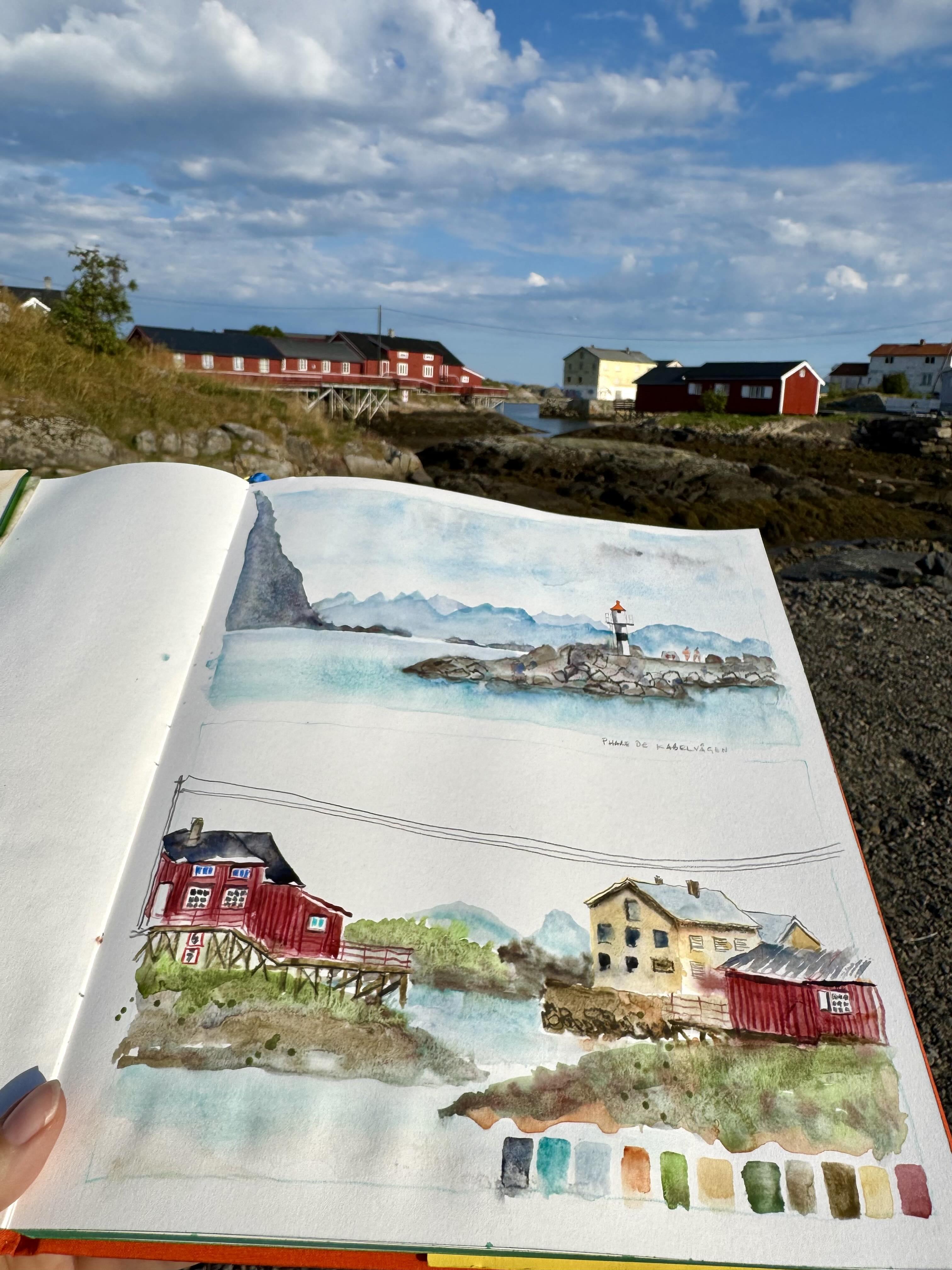
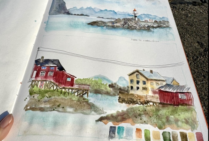
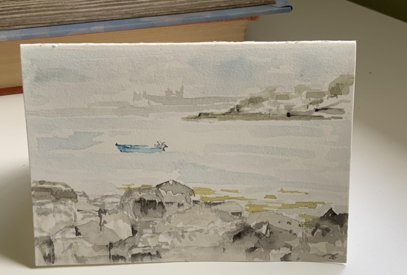
3. Sketching the Sea, Mountains and a Lighthouse: So welcome to this
first sketching video. We are on Cable ergon
Island in the Lo futon, and we will start by sketching this lighthouse with the
mountains in the back. This is a very typical
scenery in Law Foton Islands. So I show you my
sketching material, my sketching brush,
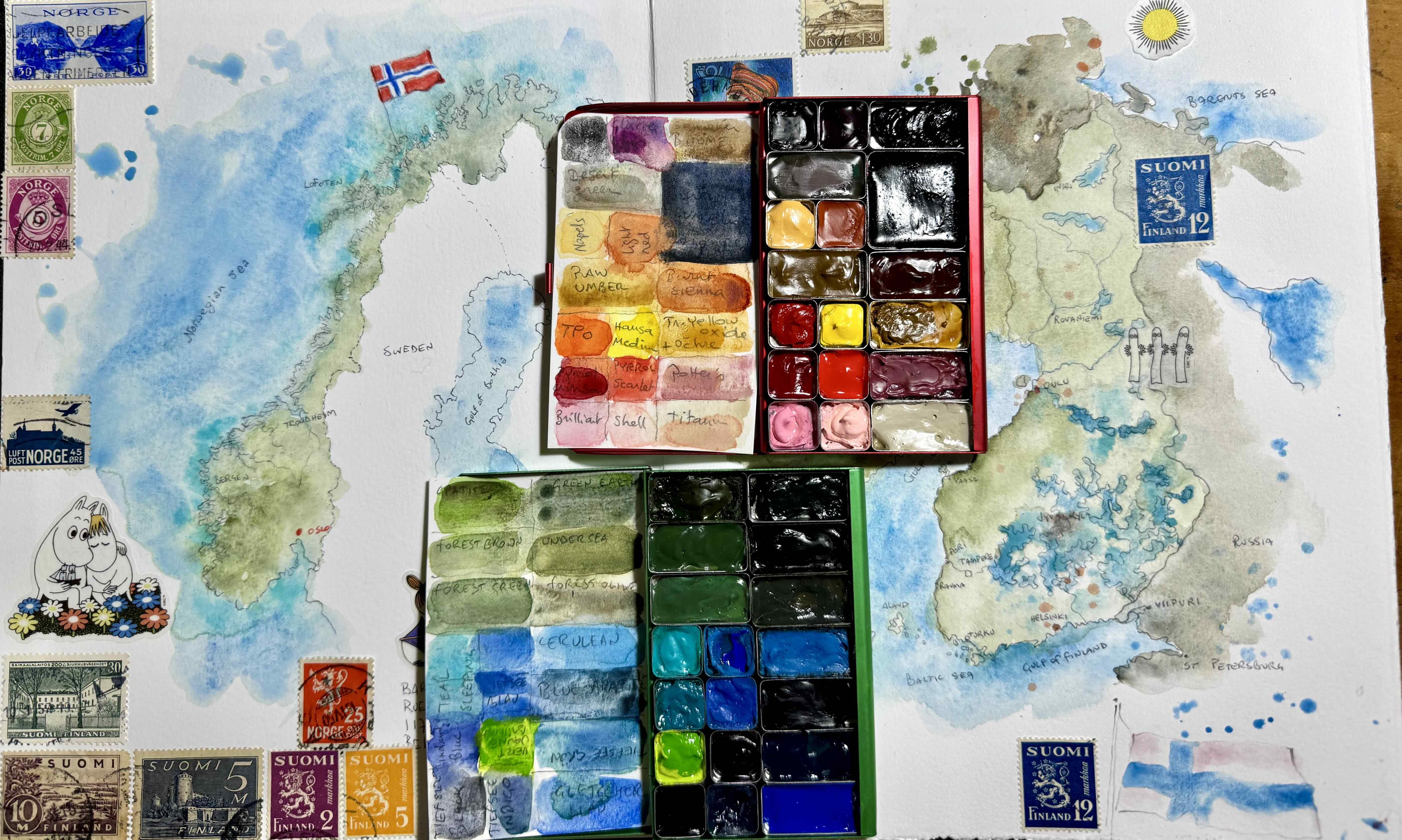
synthetic brush by Escoda, and my pocket palettes, which I filled with colors, I thought I would need in noway. So if you go to my sketching
video class in Portugal, you will see the colors are slightly different in Portugal. And I also always take my bamboo roll with
regular brushes, as I always like this most. I use this big sketchbook
that you already saw in my urban sketching
class in Portugal, and I will divide this
page in two thumbnails with a horizontal
format because I think that fits best
for loft and islands. I put the horizon
line on one third. That's the most
interesting view, I think, for layout, for a sketch on a
lower third or upper third. And because I want
these nice mountains, I put the horizon line
at the lower third. And I sketched the lighthouse
with a sharp pencil. Because I want it to stand
out in a more detailed way. It sees the foreground. It will be more
detailed and brightly colored with sharp shadows
to come to the front, and the scenery in the back, the mountains will have a
cooler and lighter blue color. So this is my
extinto sketchbook. It's 27 centimeters
to 32 centimeters, so it's nearly a tree size, and it has fabriano academia, 200 grams smooth paper, which is perfect
for mixed media. Especially if you want
to use color pencil, I advise you to take paper
which is not too textured. And if you want to
use mixed media, so watercolor paint,
gouache paint, or acrylic paint, be
careful to take paper which takes some water without
getting damaged. Let's start painting
the lighthouse, which is the most delicate. So I take a small sable
brush with a fine tip. A synthetic brush
will do as well as long as it has a fine tip, and I start with
the light red roof, which will nicely attract
attention as a focal point. If you use a flashy color
for your focal point, you will have a guarantee
to attract attention. And I make some
nice shadows also. So that will be the lighthouse. And then I will paint the rocks. For the rocks, I use super granulating desert green
watercolor by Schmincke, which is a granulating color, which means that it gets
some texture when it dries. For granulation. So the granulation means that the pigments get
separated a bit, which gives it a nice texture, and it's because it has these
natural pigments in it. So there's a bluish and pinkish
tint in the watercolor. You see here on the page, it separates already a bit, and it's nice for
rocks, I think, because I didn't
want to make them plainly brown or
green or whatever, gray and I want something
to happen there. And I draw the shadows
of the rocks and some rock sheps in the wet paint with a
watercolor pencil. So the watercolor pencil
dissolves a bit and becomes mushy and it gives some nice, breezy, strong lines. So that will also
attract attention and bring my rocky landscape
to the foreground. And I splash a bit. I like to splash for
those who know me. And then the rocks in the sea will be
another kind of blue. I use a dark blue, and I will add a bit of rock
colour in it for the rocks which are the less far away. So the rocks you see in a darker color or less
far than other rocks. So I use several shades of
blue from dark to light, which will give an
impression of distance. So I use a lighter blue for
mountains further away. But I also could
use light green, like green Earth, or
even purple or green, if you want, use any
colours you like. Oh And I try to suggest the very fine
moton tips of the La futon. So when I choose
something to sketch, I just think, what do I
like about this scene? What do I want to remember? What is most typical? Why did I come here? I only sketch things I like. So now I repeat a shade
of blue or the sea. And I will add some color of the rock
in the sea in front of the rocks to suggest some
reflection and to connect the rock to the paint of the sea to link all
elements together. And you can link
elements together by repeating the same color in
some parts of the painting. And if you want to
absorb excess paint, you can clean your
brush in the water and press it in a tissue to
take the water out of it, and then dip it on your paper in the water you want to absorb and the brush will absorb
by capillarity, the excess paint on your paper. And to do the sky, I first made the paper wet, and then I dipped some color
in the water on the paper. So there would be a
suggestion of clouds. I used some gray for a
suggestion of clouds and some blue for the blue sky
in between the clouds. And when I start to
like my painting, I forced myself to stop. Otherwise, it already
happened a lot that I overdo the painting and
that I ruin everything. So I hope you have fun, and I'm really curious to see your paintings and
your sketches, just sketch something
in your neighborhood. If you are not traveling, you really don't need to
go on a trip to sketch. And the more you do it,
the better it will get.
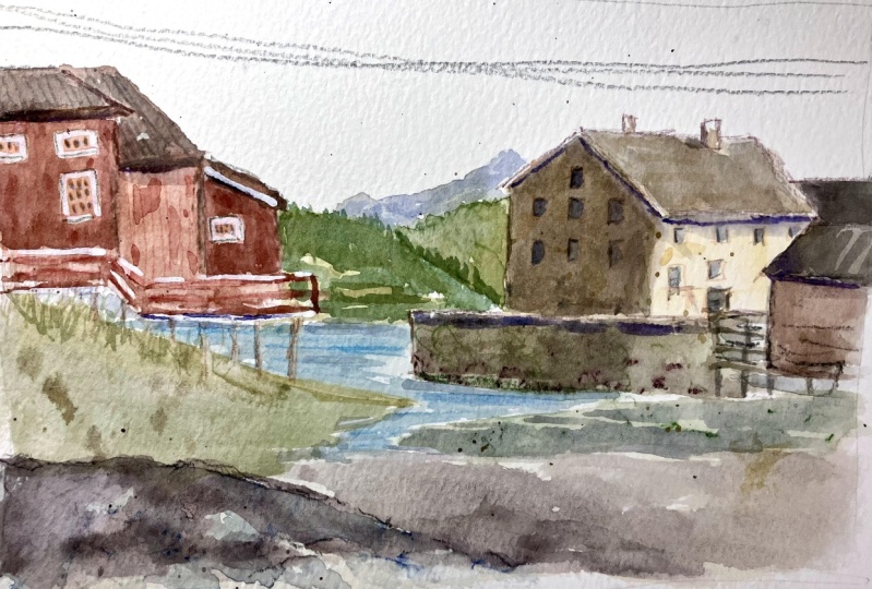
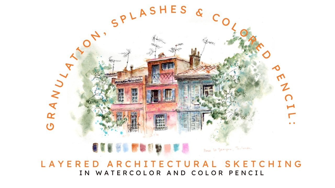
4. Sketching Colorful Houses in Lofoten Islands: Hello, again. Welcome to
this second class video. Let's start by sketching these beautiful houses
in Henningsfare. I think these colored houses are also very typical
of Low futon, and I just love to sketch them. It's my favorite subject. And to avoid to be like
coloring in a color book, I first start with watercolor. And the yellow house will be like my attraction
point of the sketch. I start with some naples yellow, and then I will sketch the red houses
with a red color pencil. And I want to mix a brown
red with Van **** brown and alizarin crimson to find more or less the typical red
of the Norwegian colors. And I will alternate sketching with color
pencil and watercolor. I also immediately
add some darkness, there were this shadow. And to choose what
I want to sketch, I have first made like imaginary sketch with
my finger on the page. So I think what is typical for me to ovo on Islands and to Norway was the seascape with mountains and disclored houses. So that's why I made two thumbnails to have
them both on one page. By making these smaller
vignette sketches, I have less overwhelmed
when I sketch a scene, and I feel less obliged to myself to
make like a masterpiece. So I alternate also drawing with watercolor
pencil in the wet watercolor. Oh So what colors do we have here? My mixture with azarin crimson and M Dak brown
and naples yellow. And then I use my mixture
with shadow gray. So it's ultramarine blue and transparent orange
to make the shadows. And I will colour
in the windows. They have these very tiny
glass pieces in the windows, and I color them with
the dark pencil. And for the yellow house, I suggest some windows
with watercolor. And I try not to make all the
windows the same to suggest that there's different things happening in the different
rooms of the buildings. And don't worry if things are not
photographically correct. It's not the purpose of urban sketching to make photographically
correct sketches. Some do it, of course, and I admire it very much
if they can do it. I try to show what I
feel about the scene when I choose the
colors which I sketch. So when I sketch
something, mountain, rock, a house, I just look in what direction
all the lines are going. I explain more of this technique of
observation in my classes. Drawing on the right
side of the brain. If you want to know more about this method
of Betty Edwards, drawing on the right
side of the brain, the principle is to make what
you sketch feel abstract. So just look in what
direction the lines are going instead of
telling yourself that, now I'm drawing that building, now I'm drawing the window, now I'm drawing the roof, you're just drawing a bunch of lines going in all
different directions. So these are some
signs for the boats. I don't navigate, so I
don't know what they mean, but it's very typical
of the islands. So I want to draw it. I find it graphically
interesting. So now I'm drawing
the other houses. They're also on pools, and there are some staircases and terraces around the houses. And it's graphically
very interesting. So I start by drawing that, and then I will draw a bunch of lines of
the houses above it. I hope you see everything well. I notice that now
the sun has turned, so I have a large
shadow on my hand, and it's really, like,
late in the evening. And this is the
beautiful midnight sun, and it gives a very
warm light. I love it. It's always challenging to make videos when sketching outside, but I find it interesting
to show you how I sketch outside instead of taking a picture
and drawing inside. It's totally different. And when I take a
picture and draw inside, it gives also a
different result, less spontaneous than
when I sketch outside. So I really want to
make these videos like for my Portugal sketchbook
while sketching outside. But I have to say that I made much more
videos than these two, and they were not good
enough to put on Skillshare. So I can only give you these
two videos, unfortunately, So as you see, I'm making the
washes of the red houses, and I try to make different
intensity in the wash. There were the shadow
under the roof and I make it a bit
darker with more paint. For the yellow house, I want to make some splashes
of different types of ochre and brownish to
show that it's old house. There's some water in
between these islands. I use toquis and some serelan blue And then there are some rocks
behind it of other islands. This is, I think, the most
beautiful part of La futon. So many small islands
and colorful houses. And usually with some
mountains in the background, I make them grayish blue
because they're far away. And I try to have more or less the shape of these mountains to suggest them. And I add finally
some shadow with a Sepia watercolor pencil
and add some small details. So I also use some Bncena just because
it's my favorite color, and the light now of this
midnight sun is very warm. And to finish the red
houses on the left, I add also some small
glasses in the windows. This is also very typical of
this Norwegian architecture. And I add some
different colors in different windows to
give some variation. And then I will finish
the houses with the wood boards in color
pencil on the dry watercolor. So this is a normal color
pencil Luminus by Karen dish, very greasy color pencil
with a lot of pigment. So the watercolor
has to be dry on the page and finish
with some shadows. The electric wires
are very typical. I will draw them, and
they link all the objects together and make
something happening in the sky and I will
leave the sky white. I don't want to add
extra colors in the sky. So I'm curious to
see what you make. Divide your page in two and sketch something
of your neighborhood or on a travel like you want and try to tell a story of
the place you're sketching. I look forward to see
all your sketches in the class projects. I will comment on all of them. Thank you and have fun. That
5. Now it's Your Turn !: You made it. Congratulations.
In this class, you've learned
valuable techniques to elevate your
watercolor sketches, how to confidently
combine watercolor with colored pencil for
vibrant bold lines, enhancing textures
and depth with watercolor pencils and adding crisp finishing touches
with color pencil, enjoying a playful
and relaxed approach to overcome creative logs
with your watercolors. And I hope this will help you. Be sure to share your
finished project so that everyone can get inspired
by your unique creations. Thank you so much for
joining me in this class, and I love sharing this
artistic journey with you. For more inspiration, you can follow my work on Instagram. And if you like to receive occasional free tips
and free tutorials, please subscribe to
my website and you can get my newsletter
with videos and tips. Please consider also
leaving a review. Leaving a review is truly
helpful for the teacher and to help other students discover classes that they love. And, of course, don't
hesitate to reach out with any questions or thoughts
in the class discussions. Happy sketching and thank you.
 Barbara Luel, Architect, Author & Artist