Transcripts
1. Intro Layered Architectural Sketching: Hello. Are you tired of observational drawing
feeling like homework? And are you looking for a
more fun way of sketching? How about adding
color pencil for vibrant bold details and that to elevate your work and have
more playful sketch feeling? I can show you how I lay on
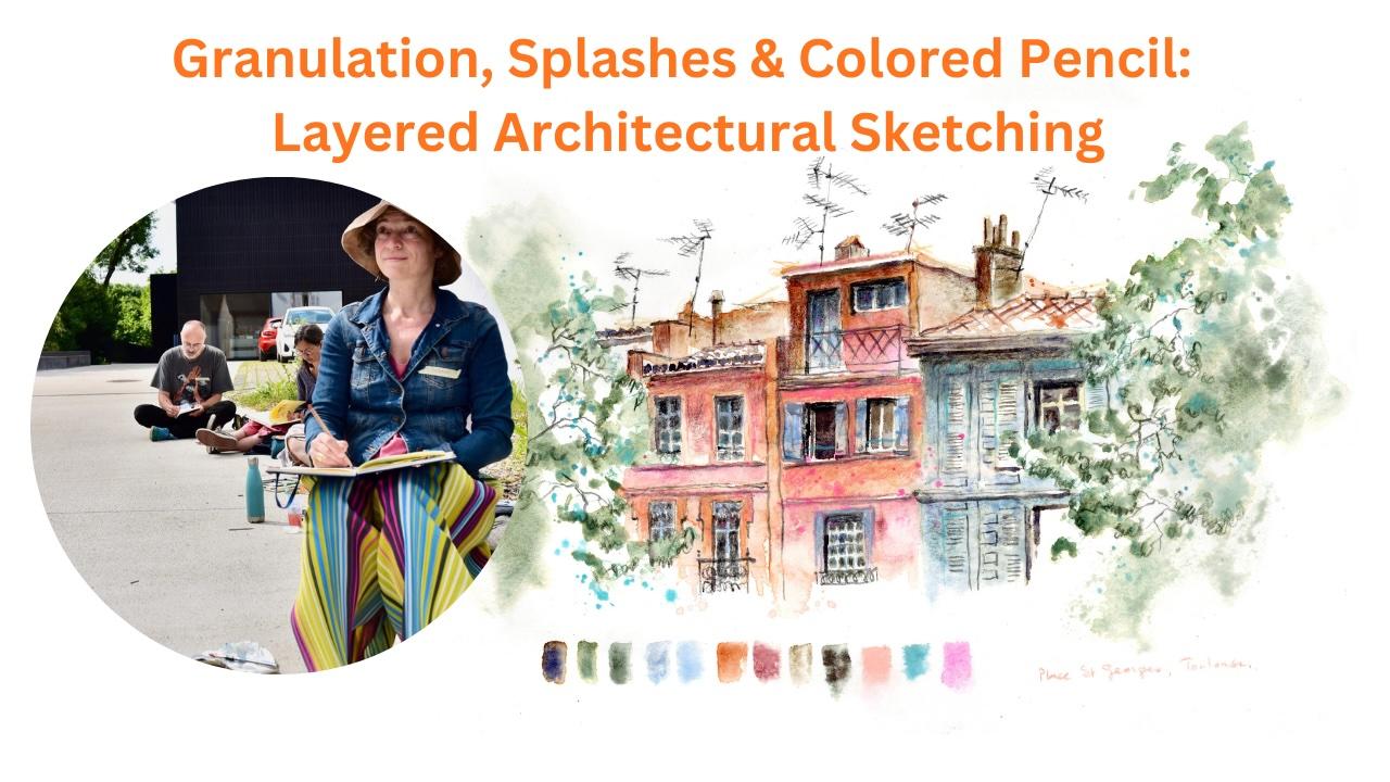
my sketches in a playful way. Hello, I'm Barbara
Aywll, architect, author of several
travel sketchbooks and drawing teacher in the architecture faculty
in Brussels University. And in this class, I will guide you step
by step in using mixed media techniques to
enhance your watercolors. Watch a celebration of watercolors fun site
with granulation, splashes, and placing
strong shadows and color pencil and
watercolor stick. That will make your
sketches much more playful and will help you find
your own sketching style. See how bold watercolor effects, followed by strategic
colored pencil work, create playful sketches
full of life and character. This is kind of a
controlled chaos approach to architectural sketching, playing no perspective rules
and no counting of windows. Some magic happens when
colored pencil details and layers are eddied. And as a class project, I suggest that you
sketch anything you like with the colors
that you like. I hope to see you in the class. Let's get started.
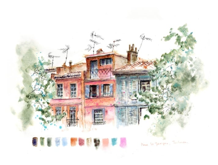
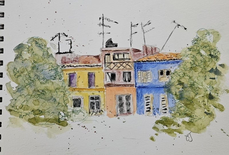
2. Layer 1: drawing: So welcome in this new class layered
Architectural sketching. So we will build up our
sketch in different layers. There's this first layer, which is the drawing layer, then there will be
the shadow layer, the watercolor washes layer, and finally a fun layer to add some very
bright colored pencil. I draw the fine
lines in graphite and the lines which are sunny
inter watercolor pencil. So it's not a water soluble colored pencil
because I want to see the lines when I put the
watercolor wash afterwards. Think well about
what you want to draw and what you want to
show with your sketch. This is a sketch. It's not observational drawing. So you draw what you want. I want to draw these
elegant, colorful houses, and we'll show you how I layer
my sketches to have fun. And what I like, especially in these houses is the
dancing antennas and chimneys on the roof. And I want to give a sunny feeling with
colors afterwards. Don't worry about
the perspective. Just look in what directions
the lines are going and pay attention to how long one line
is compared to the other. For the edges of the trees, I use a green watercolor pencil. So it's water soluble
color pencil, which means that
these lines will dissolve when I add
watercolor later. I want to suggest the leaves
by making curly lines. So again, don't worry if
your sketch is not correct. That's the difference between sketching and
observational drawing. Observational drawing
tries to describe reality as accurately as
possible, every window, every shadow, every
color, every proportion, and sketching what we are doing
here, interprets reality. It's a personal
response to what I see, filtered through
my eye and through the hand and the mood and
with my favorite colors. So one is a document and the other is a
conversation, actually. Neither is better, but I
prefer urban sketching, and I don't like to draw accurately like a
camera or copy machine. So don't worry if this is not totally correct, it's a sketch. And please just
draw what you like, and you can leave out
anything you don't like or anything you
find too difficult, and just use your
own color choice. So even if I'm an architect, I don't like prospective rules because it gives my
joy of sketching. I just look in what direction
the lines are going, and these houses are just a bunch of lines going
in all different direction. And then I will splash
colors on it with watercolor and move
on to color pencil. And just use the colors that you like because this will finally determine
your sketching style. It's your color choice. So in the next video, we will add shadows
to the sketch. I add shadows before I add
the colors because I want the colors to be on the shadows to make the shadows dissolve
a bit into the colors. And it's also a way of not
losing the drawing too much. So again, sketching is
not realistic painting, but it's an interpretation
of reality. I simplify the shapes, I will exaggerate the colors. I leave things out, but I don't like to bring forward to what
I find most interesting. You draw like you like and
with the colors you love. So I hope to see you in the next video to add the
shadows to our sketches.
3. Layer 2: Shadows: Welcome in this second video. So this is the
shadow layer video, and we need to add some dark shadows to
make it really sunny. If you want a lot of
sun in your sketch, you have to make dark shadows, which means use a lot of
pigment and not too much water. The more water you add
to your watercolor, the lighter the shadows will be. As a shadow gray, I use my mixture of ultramarine blue, and
transparent orange. Don't forget that the watercolor will become a bit
lighter when it dries. I use my dagger brush. It's a flat brush in the
shape of a triangle. And so when you use it on the
flat side, it's very thin. You can make some lines with it. I also add forest green Bismink to suggest the
shadows in the trees, and I do some splashing with it to suggest the
leaves of the trees. I like to make splashes because it makes a very
playful painting. In the next layers, I will add extra shadows
and shapes to the tree. But for this layer, this is enough to make the limits of the shapes of the trees that
touch the building. This forest green by Schmincke is a very
granulating green. So it will make a nice
texture when it dries. To make some fineer lines, I use a sable brush
with a very fine tip. I also add shadows in the windows because
when it's daytime, the insides of the
houses are dark, and I use the same gray, and I try not to make all
the windows the same. And when the window is open, it's even darker inside because then you don't have the
reflection in the glass, the reflection of the trees, and the reflection of the sky. So when the window is open, I make it really dark inside. And this gives some
animation in the sketch. Don't forget you have
artistic freedom. You can open all the
windows if you want. You can do whatever you want. You can also change the
shapes of your windows. To erase the watercolor line, I use a synthetic brush, and I have cleaned it in water, and I gently wrap the paper. I also add some shadows
under the tiles of the roof. And some shadows
on the moldings of the houses to give
some sunny impression. And there are also shadows
on the window shutters. I like to add the
shadows in the beginning before adding the colors
because in this way, I really see the
drawing very well, and I don't risk to lose any details when I
add colors later. And it's also a way to
blend the shadows in the watercolor
because the colors will come on top of the shadows. And otherwise, the
shadows are much more present when they are put
on top of the colors. But do whatever you like, and you can experiment
which way you like best. So let's go to the next video
to add the color layers.
4. Layer 3: Watercolor Layer: Let's add some color
washes with watercolor. Now that we have secured a
sketch with the shadows, we can add on top of
that some color washes. Sketching is not
realistic painting. Sketching interprets reality. You simplify shapes,
exaggerate colors, and leave things out and
decide what matters. You draw as you like and with
the colors that you love. And eventually, your
choice of colors will determine your style because everyone has a different
taste about colors. So don't worry if your
sketch is not correct, like it's in reality
because it's not the purpose to make a
photographically correct sketch. Mm. Let's add more warm colours and make it really
more sunny and joyful. If you want a lot of
sun in your sketch, you have to use warm colors. So in the pink houses, I use potters pink
and light red. By Winter Newton, I put the
light red on top of it. So the house will be light red in the front
and on the side, I use some tiger's Idine, which is a very earthy
granulating color to show the worn out
side of the chimneys. These pinkish, light red colors are typical
of houses in Toluse. And I love to add more
playful colors like shelpink. And I paint all these colors wet next to each other to make
them flow into each other. So don't hesitate to just add your favorite colors even if
they don't exist in reality. I leave the bottom of the
houses unfinished to suggest the white umbrella
without having a defined line and to suggest that there's
something happening. You don't need to
finish everything. You don't need to
paint everything. It's more interesting
for the people looking at your sketches to be
able to imagine the rest. I like to splash. The splashing gives some playfulness
to the sketch. For the tiles, I don't
sketch all the tiles. If you do, your sketch will look flat and the tiles will
attract all the attention. So in the next video, we will add some
playful color pencil.
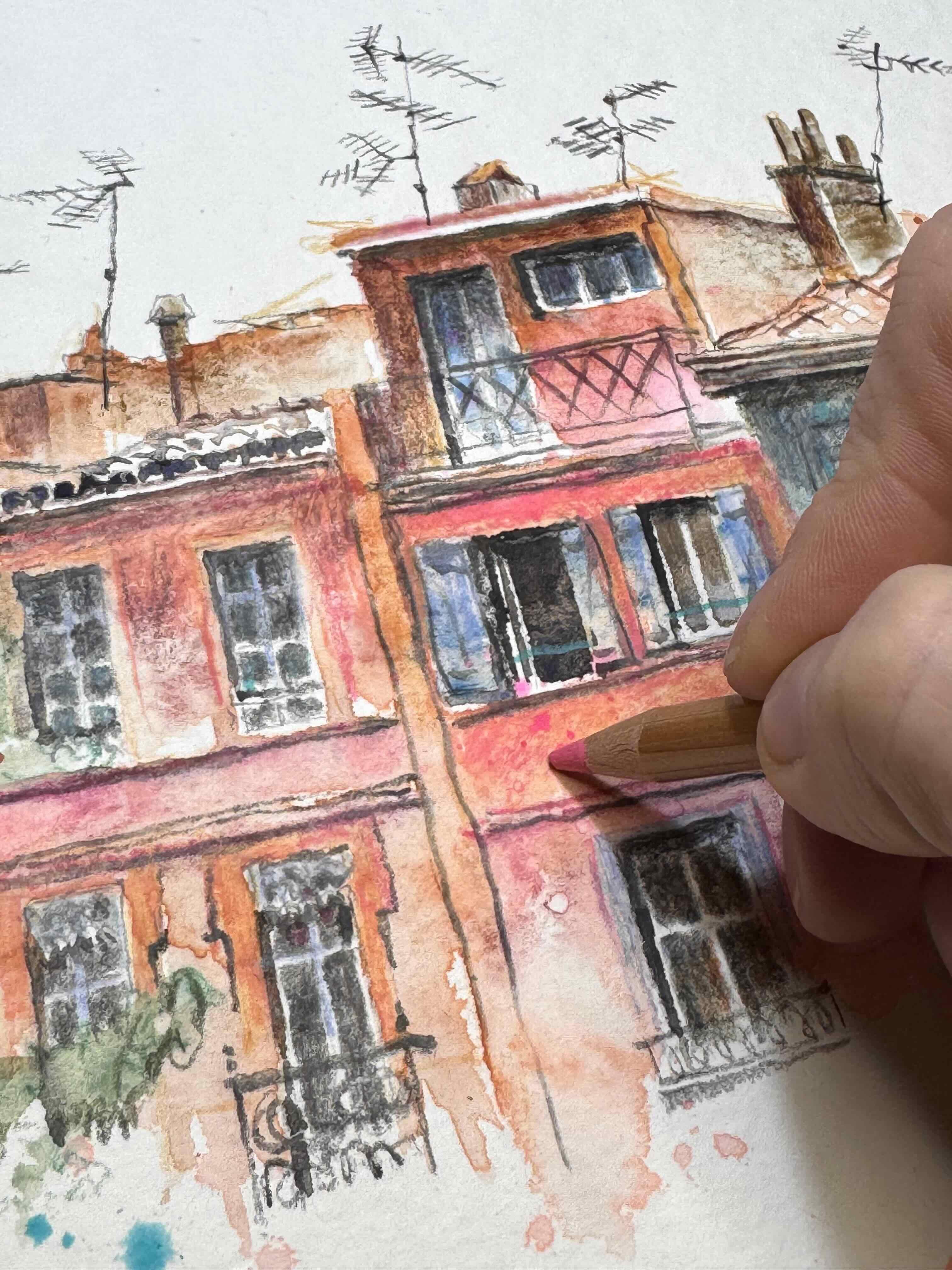
5. Layer 4: Color Pencil textures Layer: Let's add some extra
colors in this video. I'm going to give you
a permission slip. If you've been holding back from sketching because
you can't draw properly or because you find
colors boring in reality, I give you this permission slip to use all the
colors you like, all your favorite colors. Sketching isn't about
copying reality. It's about creation. So in this sketch, I'm going to use plenty
of colors I like, and you don't have to copy it. You just can use all the
colors that you like. So I want a sunny architecture because this is too loose
architecture and it's hot. So I use warm colors
and strong shadows. I'm making the shadows stronger with some black color pencil. This is a watercolor pencil, but it doesn't really matter if you use watercolor pencil
or normal color pencil. Just be careful if you
want to make it wet again afterwards because then the watercolor pencil
will dissolve. So I'm making the windows darker because when
it's sunny daytime, the windows are quite dark, like you see in the picture
inside the houses, it's dark. And I add some extra shadows and color lines with
luminance color pencil. It's a very strong pigmentted
color pencil by corn dash. And I also make some extra
black lines in the antennas. I like when they are wonky and going in all
different directions. But that's a bit
like in reality. Let's add some warm warm colors and make it more
sunny and joyful. So if you want a lot
of sun in your sketch, it's best to use warm colors. So it's typically pink
architecture of Toulouse. It's very warm pink, so I use a pink biluminans and I use some terra cotta
hatching over it. And I like when I see
the pencil lines. So I'm not trying to
make them disappear. I like to see pencil lines going in all
different directions. It gives playfulness
to my sketch. So how can you make
this sketch your own? Just use your own colors. I draw also what I
find beautiful or interesting and not
necessarily everything that is there in reality. Just draw what you like. Otherwise, you won't have fun. So if you like other
kinds of architecture, just draw what's in your
neighborhood and what you like. I use all my favorite colors, even if they're not
accurately, like in reality. So this right building on
my reference photo is gray, but I made it blue. Just look what's in your palette and put only your favorite
colors in your palette. So how can you make your
sketching more fun? Using different
media mixed media in your sketch makes
it also playful. So first, using watercolor wash and then adding pencil
and wax pencil, wax crayon or gouache whatever you like
on your watercolor. I make the shadows in
the windows darker with this fabricastle
polychroms paints gray to bring in more light in the sketch
and more contrast values. So if you want a variation
of light in your sketch, also, try not to make
everything the same intensity. So I try to leave
some lighter spots in the houses to bring a
variation in light. And I add some really strong
pink, some pink lines. And then I will add some of my other favorite
colors, which is toquas So when you add also some
bright colors in your sketch, you will attract attention to
where you put these colors. So think what you want
people to look at and then just add some really bright
colours on that spot. Now I add some shadow hatching
and branches in the tree. It's a dark purlin green
color pencil windage, and I like to always draw
the branches in the trees with pencil instead of
with watercolor brush. I find when I draw
the branches in the trees they
have more texture, and I can make them looking
more natural with pencil. And then I make some parts
of the branches strong, and then some extremities of the branches are very lightly drawn because they
are very fine. So you can make a variation in your branches and in your
shadows with color pencil. It's much easier, I think, than to make it with watercolor. So I add some toquid because
it's my favorite color. There's not really
torquie in reality, but just put your
favorite colors. And now I add some upper pink. It's a watercolor
stick by Daniel Smith. It's really strong pink. I just have it in a stick
because I don't use it a lot. But I think here it's nice to attract some attention to
that house in the middle. Again, I just add
some some pink spots. I don't make a pink wash over the whole because
it's really strong. So I don't want to
have it everywhere. And then I want to add
some extra green in the foreground with some
broad green brush strokes. It's this nicely
granulating Sminka green, the forest green by Sminke. I make the window still a bit darker to
bring in more light. And now it's time to stop
because it's getting really strong and if
you are not careful, it will become too heavy. I don't like this window in the middle with the very
small window panes. It doesn't fit the architecture. These class divisions are not fitting to this
neoclassical architecture. So feel free to change
anything you like in your sketch and to make
a different window. And what's in reality, be careful if you rub away so
you don't damage the paper. So I'm making a window with bigger class divisions because it looks better in
the architecture. And I found the small glass
divisions too distracting. So this is bringing in extra harmony in the
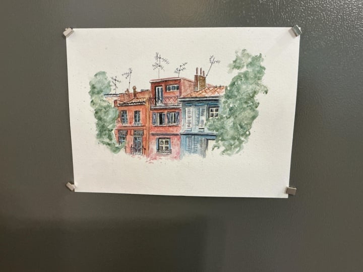
facade, I think. So now it's your turn. I'm very curious to what you will make and what
you will sketch. And please post your sketch in the class projects
on the platform. I'm very happy to
see what you make and tell me if you
have any questions.
6. Thank you: Thank you for
participating in my class. I hope you enjoyed
your sketching. Did you manage to go nicely
dark in the shadows? And did you use your
favorite colors? Did you take time for playing? And how did it go to add color pencil to your
watercolor sketch? Be sure to share your
finished project so that everyone can get inspired
by your unique creations. Thank you so much for
joining me in this class, and I've loved sharing this
artistic journey with you. Please consider also
leaving a review. Leaving a review is truly
helpful for the teacher and to help other students discover classes that they love. And, of course, don't
hesitate to reach out with any questions or thoughts
in the class discussions. And I hope to see you in
one of my next classes.
 Barbara Luel, Architect, Author & Artist