Transcripts
1. Welcome!: Have you ever wondered how to
keep a travel sketch book, how to travel more mindfully and record your souvenirs
during your travels? Hello, I'm Barbara Lull. I'm an architect
and urban sketcher, and author of already three
books with urban sketches, two in Japan and
one in Brussels. And now I'm making a book with urban sketches in Portugal. So this course will all be about sketching on
site ban sketching, and I will show you how I organize myself and how
I choose my subjects, and how I organize
myself also to travel light with my special
travel sketching equipment. I hope you enjoy it.
2. Class Project Travel Sketchbook: So as a class project, I invite you to grab
your sketchbook and your little seat and your materials and to
go and sketch outside. Of course, you don't
have to travel and go to any spectacular place. You can also just travel
outside in your neighborhood. So, that's the inconvenience of being in a great
very busy city, very nice to sketch,
but a lot of noise. So you don't need to
go to such a city. You can just travel around your neighborhood
and sketch outside and maybe with a
couple of friends that's the nicest when
you're with some friends, and just sketch
whatever you want. Like you see in the class, sometimes I sketch a tree, sometimes I sketch a building, sometimes I sketch tiles. It doesn't have to
be spectacular. Just sketch what you find
interesting and what you like. That's the most important one
because it's yours neews. So when you have a sketch ready, please create the project in the project a resources
tab on the platform, and don't hesitate to go and look at what other
people are making. It's always very inspiring. I look forward to
seeing your sketches.
3. Materials For Travel Sketching: Hello, welcome to
the materials video. In this video, I want
to show you what I take with me to
travel sketching. So I have two sizes of sketch
books that I take with me. Make sure if you want
to watercolor to take good watercolor paper sketchbook and think about which
size you like to take. So this is a quite small one, and then I take
also a bigger one, which has accordion format, so I can make long sketches. And then I take with me a light comfortable chair
because you want to sit, and it has to be
light and small. If you want to put
it in your bag, this fits in my backpack. But if you want to
sit more comfortably, you might want to take a
bigger chair with you. And then I have my
pocket palettes. So these are very small
palettes in aluminium, very small, and I put them
in a small pouch like this. And Then this is possible to wear as a
handbag on my shoulder. And it has room also
for my travel brushes here with rubber bands and for some pens and some
pencils and my clips. And then I have travel
brushes like this one. And I also have this pouch
to take normal brushes. I still find it any way more comfortable to sketch
with normal brushes. And this bamboo roller
protects my brushes, and I put also pencils in it. It's very handy and
also very light. And I take watercolor pencils with me and normal
color pencils also, because I want to add more and more color
pencil in my watercolors. Then I have normal
graphite pencil, and I also like to
use from time to time this RCo it's Portuguese. Water soluble graphite. I also have videos on my YouTube channel where
I show you how I use it. Of course, I have binder clips to keep my sketchbook open. And I have water spray. I like to use it
sometimes to wet my page, sometimes or to wet my palette, especially when it's very hot, and I have this
foldable water bucket. I went to empty it so I can
show you how I fold it. I can fold it like this
and becomes very flat. And then I have also this
to roll my pencils in it. It's full of colors I never use. But I like to take it with
me because I want to try it. Of course, if you want
to have normal pencils, you need a sharpener. So this is very handy. And what else do I have?
Yes, very important. Cloth to clean up if you make a mess or to dab your brushes, if you want to absorb
water or paint. I clean the brush, I press it hard, and I can absorb the paint. I showed you all the materials, and now I will show you
how I start my sketchbook. I have two sketchbooks, I take to Portugal, and I start a third one. And I will show you how
I start a sketchbook. In each front page of
a travel sketchbook, I will draw the map
of where I'm going. So this is Portugal, here is Spain, and I like
to collect some old stems. These are old stems
from Portugal. And then I like to
indicate where I'm going with the
cities, the rivers. And the sea, the ocean. And then I will sketch the materials
I use for the moment. So these are my pocket palettes. I use a green, blue one and some
black and gray I made. And then here is red, orange, yellow, brown one, and the
colors are written here. You can find it in the
attachments of the class. That's a foldable water
bucket, my chair. So this is not on scale. My chair is not that small, but it's small anyway. Then I take binder
clips. I take brushes. This is a new Korean
brush I bought. And this is my travel brush. And of course, all my
brushes are not there. But then I also draw
my sketching material. I like to use some
ballpoint pen. I like to use this micron
secura fine liner. Then I also like to
use color pencils. This is a watercolor pencil. This is a normal color pencil. Then this is a black
watercolor pencil. And this is my usual
graphite black win pencil. So, that's it. You can also find how I make these sketches
on my YouTube channel. Please subscribe if you want
to see more free tutorials. But let's dive into
the class now. I'm curious to see
what you sketch on your first pages of
the sketch books. Also, don't forget to put your name, your
telephone number. So if it gets lost, some nice person can
give it back to you.
4. Filling the First Page: L et me show you how I finish
this first sketchbook page. When I start a new sketchbook, I always draw on the first page, my art supplies that
I use at that moment. Here are most of the art supplies that I take
on a trip on this trip. I have the palettes, and I add the clips and my favorite travel
brush by Escoda, and then I will when I
finish the drawings, add some water color to them. This is my favorite black
aranas watercolor pencil, and I draw these in pencil. So this is my Sakura fine liner
that I like to draw with. And when you look
closely at the page, you see my lines
are very wobbly. So when you think you can't draw because you
can't draw a straight line, don't worry because wobbly
lines are fantastic as well, and there is room for all kinds of lines
in the art world. This Crisma pencil are
a series of pencils. I have left from
my student times. Unfortunately, this brand is not made anymore in
this configuration. There still exists some chrisma pencils
with another design, and I think it's Japanese and there are fantastic
pencils, I think. They have these
wooden colored ones, which are normal color pencil, and these blue colored ones
are watercolor pencils. So to finish this drawing, I add my foldable water bucket. This is very handy
when you're on a trip because it's totally
flat when it's folded. And then I will
also add my chair. It's a very small chair. And I add it in this corner because there's
not much page left. And of course, it's not scaled to the same size as the pencil. My chair is much
bigger than my pencil, but it's the freedom
of the artist. You draw the way you like, and you don't need
to justify yourself. So I add some watercolor
to the sketches and then we can leave for our trip because then my
sketchbook page is ready. So see you on our
trip and have fun. And of course, you can also travel in
your own neighborhood. You don't have to go
abroad to take this class, and also if you don't like to watercolor or draw on paper and you prefer
digital drawing. You can also do this
class with the iPad. Feel free to draw with
whatever materials you like. Oh. The map was done before already, and you can find on
my YouTube channel, you can find a video of me drawing the map and painting
the pocket palettes. You will find s book page
in the res of the class.
5. Sketching Lagos: On Choosing What to Sketch: So welcome to sketching
with me in Lagos, a beautiful haceranda tree. It's really an amazing tree with beautiful purple flowers, and I really thought, Oh, wow, I have to sketch that. And that's how I
mostly choose what I want to sketch is when I
have this wow feeling, and I think I must have this in my sketch So these flowers
are very important. Of course, it's the main
reason I want to sketch this. So I made the page wet with water spray and splash the purple flowers
on the wet page. As purple, I use
rows of ultramarine, and I add some shell pink to make it more
lively, but you can, of course, mix your
own purple with beautiful red and
ultramarine blue or another transparent blue. And then I will
paint the branches. Look very well in what direction the branches are going
and how thick they are, so you can make it look natural. For the branches, I use the beautifully
granulating brown tigers Ignine by Daniel Smith, and I will add some water
soluble graphite in it. It's a graphite paste made by Varco Portugal so
it's Portuguese. And this graphite paste
is very granulating. And if you add it in watercolor, it really adds a great
texture in the watercolor. So again, now I sketch
the tree trunk, and I look in what direction the trunk and the
branches are going. I use a long sable, regular brush, and it's
very long, natural hair. It holds up a lot
of water and paint, and I hold it quite
vertically so I can have a good control over the tip of the brush to make it
go where I want to go. To help you have control
over the tip of the brush. You can keep your pinky finger on the page while you hold
the brush over your page. And so you can control
the pressure better. Look well in what direction the branches are going and
how thin they are in the end. In the end, the branches
are really skinny and thin. If it's not possible to
do this with the brush, you can also, of, make them with a simple pencil, color pencil or a
graphite pencil. I force myself to keep
this quite simple and suggest a pavement and
some flowers on the ground, and then we will sketch
the house behind it. I finished the ends of the
thin branches in pencil. Look well in what direction. They are going they're going a bit down towards the ground. They're going a bit down towards the ground because
they're very skinny, and the graphite
pencil makes it much easier to draw skinny branches
than it is with the brush. Now, I paint the house. I draw first with the
brush because I wanted to stay in the background
and I use titanium buff. Titanium buff is a nice
base color by Daniel Smith. It's really sandy color, so it's perfect for the
natural stone of the house. So I first draw with the brush, and then I will add some textured lines with the pencil to make the
lines a bit stronger. But drawing with the brush makes me concentrate
much better, and it's much more fun for me. So now I draw with the
pencil in the wet paint. And I draw the balcony
with a graphite pencil. I tried to suggest the beautiful
ironwork of the balcony, but without really
detailing it too stiffly. I just want to suggest that it's a beautiful ironwork balcony. So I want to be careful
not to make the house go into the tree
too much because the house must stay on the
background behind the tree. And I will not detail
all the windows. I will detail only one
beautiful window on the first floor on the balcony because the other ones
are behind the tree. In reality, there are other
windows more visible, but I simplify this sketch. Again, we are not copy machines. We just want to have fun
and make a nice sketch. So it doesn't really matter
if it's not totally correct. The doors on the ground floor from the shop are not beautiful, so I won't detail them. I will only make a shadow in them for the shadow
in the windows. As it's daytime,
it's quite dark. I mean, it's dark
inside the house, and I use my shadow cray, which is my mixture of ultramarine blue and
transparent orange. Now, I will sketch the
tiles in the facade, and to suggest the
tiles in the facade. I will make the paper
a bit wet first, randomly wet, not totally wet. And then I will
suggest the tiles by thin blue lines in
the partially wet paper. They structure the facade. I use ultramarine
blue and seran blue, and I splash a bit also
different kinds of blue. When I splash, I hold my
finger over the window because I don't want any
splash tiles in the window. And I try not to go too
much over the flowers. I also add some quit blue, and I vary the intensity of the colors and of the
linework to make the sketch exciting and h. And I also draw a bit with watercolor pencil
in the wet paints. When you make a sketch with a foreground and a background, like here, the tree is in the foreground and building
is in the background. Be careful that the foreground
stays in the foreground. So I don't want to sketch over the branches and the
flowers with my building. Otherwise, the building
will mingle with the tree, and you won't see what
is in front of what. And at last, don't
forget your shadows.
6. Sketching Evora : On Storytelling: Sketching outside
is a challenge. Almost every artist I know
often feels frustration and uncertainty with the
act of sketching outside and showing his
work and making a book. I worry about whether people
will like what I make, and I worry about whether you will like the
videos and learn something, and also about the outcome
of my book, of course. But the more you do it, the better your
drawings will get, so please don't really
watch the videos, but grab your
sketchbook and do it. Draw, paint, play, and enjoy. You don't need to go abroad. Sketching your neighborhood is fun as well. I do it often. The first challenge is the
choice of what to draw. Of course, I think about
what story I want to tell, like what is typical
of the place, where I am now, and what do I like
about the place. Of course, if you
sketch outside, you have to think about sitting somewhere where you are safe. Here I sit next to a car. It's a bit smelly and not so
romantic the car park spot. But I'm safe and I
have a nice view. So please be careful
where you go and sit down so you don't
get any accidents. And then you choose
what story you want to tell on your page as you start
your travel sketch book. What's typical about the place you visit and what do you like? I only sketch things I like because when I try to sketch something I
don't really like, I don't have fun, and I
don't make a good sketch. Have fun. To avoid overwhelm and to force myself to concentrate
on the subject. I started this drawing with the brush and
with watercolor. And with the focal point, this is the very typical
arcade in yellow och color. And this is a very
typical color in vera. And also this type of arcade is a very typical
piece of architecture, which I loved very much
as soon as I saw it because it's a nice
impressive site, and it's also with
impressive shadows. So I started drawing
with the brush, and it forces myself to
concentrate because, of course, you can't erase it. And when I'm tired of painting, I will add some pencil lines
either in graphite pencil or in pencil with colors like watercolor pencil
or plain color pencil. So choose your subject
carefully and then observe carefully in what
directions the lines are going and put that
onto your paper. The mechanism of drawing
with the brush is similar. You just look in what direction, the lines are going without
worrying about perspective. So again, just look in what directions
the lines are going. I'm not drawing a building with the arcades, door, roof, window. I'm just drawing
a bunch of lines. So look at any subject
you want to draw, a building or a tree, just as a bunch of lines, and then it makes it more fun. Here, I'm working for a book, so I choose some quite
realistic colors. But again, we're
not a copy machine. It's okay if it's
not quite correct, and it's okay if it's
not the same colors. Just choose the colors you like, the colors you have
in your palette, and there's no police coming to check if everything
is correct. You're not a copy machine, you're just drawing
and having fun. All these lines are the edges of the different object that
compose the building. Start anywhere you like. I'm always starting with the part of the subject
that is my focal point, the part of the subject
that interests me most. Here it was the arcade. I start with the arcade. If it would have been the roof, I would have started
with the roof. Start anywhere you like. Look in what directions the
lines are going. So if you want to
draw with your brush, be sure to choose a
brush with a nice point, and if you want control over the thickness of
your brush lines, you hold your brush vertically, and if you want a broad line, you push a bit more on it. If you want a fine line, you hold your brush
vertically and just touch the paper with the
very tip of your brush. So let's recap. What's the key take
from this lesson? I try to keep it short
sweet and simple. Just the main things
which interest me in the sketch and leave out of the sketch what you
don't really like to draw or what you find too
difficult or complicated. Draw what you like. Observe
carefully in what directions the lines are going and how long is one line compared
to another line. Make fine lines, and
make thick lines, make a variation in lines. And look where is the light
and where is the shadow. Choose your favorite
colors you will use on the page and choose the
story you want to tell. And still when lasting, pay a lot of attention
to your shadows. It's so important to attract the eyes to your focal point
for your storytelling.
7. Sketching Mertola Thumbnail 1 : Simplify to Amplify: Today, I will sketch
in Mert in Alango. Mert is such a fine village. I think it's a perfect place to make some tum nail sketches. So I make a Tump Nail page to try to catch the atmosphere. It's a beautiful
and historic town located at the Gagliana River. If you want to make
a temnil page, like I explain in my other
class about temp nails, specifically, I try to choose the colors for all the tempnils
I will put on the page. I want to repeat some
of the colors in each tum nail to make
sure the page will look good and that
temp nails will fit together and will be connected
together by the cos. So in a tamp nail, it's best to simplify. If you simplify, you
amplify your subject. Otherwise, the eye
doesn't know where to look in that small image. So I challenge myself. I simplify as much as possible and draw and
paint at the same time, again to avoid overwhelm and to force myself to concentrate. So this is a very
beautiful yellow house. And in the background,
I see the natural area, the mountains with a village
behind and a lot of forest. And in the small tem Nail, I want, of course, people
to look at the house. So I start painting
the yellow house, and to create some depth. I paint the background
in quite cool green. Simplifying can be difficult. Try to find the essence of
the subject you want to draw. What do you like most
about the subject and start with what you like most to make sure you don't miss it. Also think where is the light. Try to capture it
with the shadows and shadows will attract the
eye to the main subject. In these thumbnails, I will draw and paint
at the same time. I try also to draw
with my brush. First I paint, then
I draw it pencil. And when you draw in the
fresh paint with the pencil, it takes some paint along the page and makes
nice colored lines, which can be very beautiful. I like to do this because
it also forces myself to focus and to be more mindful
in a more playful way. So I start with
the main shape of the sketch, my focus point, the yellow house, and it's
one of my favorite colors, yellow, and then
orange for the roof. The orange is burnt
sienna or light red. So the main subject, the small house is
brightly yellow ochre. The green background is cool, green earth color to push
it to the background, the warm and bright
colors, the orange, Pontiana red and yellow, yellow ochre, come
to the forefront. And the green vegetation of
the hills behind Myrt are important in the
sketch to give it atmosphere of this village
with all the nature around it, but I want to push it
to the backgrounds. To end this video, some tips. Don't make all the windows
the same in your sketch. Use enough paint
and water to have nice washes and let them flow into each
other if it's possible. If you want to try on
a separate page first, if you want to
exercise your washes. But in such a small, a wash will be
kept quite simple. Experiment with some
tees, by splashing. Make some splashes of color on your paper if you're
afraid to your paper, and don't be afraid.
It's just paper. And if the drawing doesn't
go the way you want and you find it ugly,
just continue anyway. Most of the time, we're the only ones to find
our drawing ugly, and other ones will
find it beautiful. Try to have fun. What also helps to bring a subject to the foreground,
your main subject, and to attract
attention to it is to add more details than in
other parts of the drawing. In this yellow house, I pay a lot of attention also to the windows and to detail
some tiles on the roof. And the windows
will to the house. I add some colors
to the windows, and I pay attention to add some details to
the window frames. The detailing and
the sharpness of your lines and of your shadows will the subject to
the foregrounds. So the background
will automatically be less detailed and cooler. One of the difficulties I have also is to
know when to stop. I think a lot of artists
share the difficulty because when you start to
like a sketch or painting, you just want to
continue because then it starts to be really fun. And the difficulties tend
to know when to stop. I have to force myself to stop when I really like
the sketch because it happened a lot of
times that I overdo it and that I end up ruining it and not
liking it anymore. And there's nothing
more frustrating. So know when to stop when
you really like your sketch, just stop and leave it as it is. We
8. Sketching Mertola Thumbnail 2 : Simplify to Amplify: Myrt Town hall is a
particular building. I like the details which make it look a bit like a palace, big windows and a
beautiful balcony. But I found it to be
a difficult building. When you sketch a very
difficult building, a good tip is to start
with the vertical lines and vertical lines will give you some structure to hold on to. The house on the right
is not the main subject, so I simplify it to attract attention to
the town hall building. Again, the main
subject should be a bit more detailed than the rest to attract
the attention. The roof line of
that house and also the pavement are leading
the eyes to the town hall. Pay attention to your layout. When you start sketching. Dividing your tumnil sketch in thirds will give you
an interesting layout. Don't place your main
subject right in the middle. Make a variation in intensity
in washes and in lines. So your lines look more and your painting
will look less flat. You can also repeat your favorite colors to
link the tumbnils together. Look what color you used
in your previous sketch. And mainly, let's not take
ourselves too seriously. Otherwise, it will get too stressful and you
won't have fun. And the main part of this sketching activity
is to have fun. O Some tips. If you make a mistake
in watercolor, you have several
possibilities of reaction. When the paint is still wet, you can absorb the paint
with the dried brush, clean the brush, press
it in the tissue, and absorb paint with the clean
dried hairs of the brush. You can also the wet paint with the tissue and
continue painting. If you notice the mistake
when the paint is dry, you can try to erase it
with a synthetic brush. A synthetic hair brush is
stronger to rub the paper. But make sure to test if your paper supports this
rubbing of the paper. You don't want to damage it. If you do this with
your sable brush, also, you will damage it. The sable brush is too
fragile and too soft. Be careful not to damage your
paper because afterwards, you have difficulties
to continue sketching. You can also just ignore the mistake and continue
painting over it. Usually, it will come out okay when your
painting is finished, and also very important, usually, you're the only
one to see that there is a mistake or to find
that it is a mistake. Most of people don't notice it. Some other tips to add some extra texture to your drawing like I
did with the balcony, draw with watercolor
pencil in the wet paint. O. One of the most
difficult parts of this sketch I find is the roof
of the townhall building. So Gutrick, if you find something difficult
is not to draw it, of course, but not drawing the roof of the building
is a bit weird. So I suggest the roof
of the building, and I will try not to
detail it too much. So I wouldn't attract
the attention to it. I want people to look at the balcony and that the
windows of the building, the window, which is open, will attract the eye. And I will detail the
balcony in a beautiful red. So I will attract the eye to
the window and the balcony. And I hope people will not
look too much at the roof. This diagonal sable brush I use here for the roof is
one of my favorite brushes. It's a sword shaped
brush, and it's flat. It's not round shaped. So what it does is that
when I tilt it sideways, it helps me to make a
quick straight line, like I did here with the roof. It gives me a thin straight line by holding it tilted
against the paper. And when I hold it flat
against the paper, It can make nice small washes. What I did here with the roof, with the edges of the
roof is to make them wet with the washes of the
sky and the trees next to it. I did that to make the roof fade away a bit against the sky. It would be less detailed and it would go
a bit to the background. That way, also I
link the roof and the building to the
background to the sky, the trees, and
everything around it. And again, like I said in
the previous stump nail, the worst mistake you can do
is to overdo your sketch. The most difficult part
is to stop on time. So just stop when you
start to like your sketch.
9. Sketching Mertola 3 : "Negative" Painting: On the page next to
these dump nails, I decide to use the
whole page to sketch this wonderful little chapel on the walls of Myrt because
it's a very impressive view. It's one of the most
impressive views in Myrt. It's a great building with a view from the
top of the streets. Myrt is very hilly. So it's a great view
from the top of the street with a
great contrast of this white building
against the river in the background and the hills in the background and houses
in the background. So in this sketch, I focus on
the perception of light and shadows and because
the building is white, the only way to paint it
is to paint the shadows. So it's also what we call
a negative painting, which means that the shape of the white
building will appear clearly when I paint the shadows and when I
paint the surroundings. So the places where the sun hits the building will
be totally white. This means that
it's the white of the paper and it's
not painted at all. I made the sketch in
watercolor pencil because I don't want to see
black lines for that building and the
house next to it. And the watercolor
pencil dissolves when I paint the
watercolor over it. After finishing the sketch, I immediately start
painting the background. For the background hills, I use different kinds of green. There's different
kinds of vegetation, different kinds of trees which have different
kinds of green. In general, the
background will be less detailed of course
than the foreground. So in this wash, I made the paper wet first, and then I put the green paint different kinds
of green on the wet page. So they will flow
into each other. In general, parts that
are further away, I tried to use color
green like green Earth, which has more blue
in it and trees that are closer by
and more dominant, we have warmer green
with more yellow in it. So I let the greens
flow into each other, and I also paint the roof
of the house on the right and let it touch the
still wet background, so it will flow a
bit into the green, so they will be linked together. I like to see different
colors flow into each other. I use synthetic brush. By Skoda, and this is a synthetic brush
with very fine tip, but it's anyway a
quite big brush, so it holds a lot
of water and paint. I can paint a nice
background wash. Thanks to the fine tip, I can paint carefully around the difficult shape
of of the building. And when I paint around
the roof of the building, the shapes of the roof will stand out because
they stay white. Oh. So the shape of the building appears by painting the vegetation
in the background, and that's what's meant by
negative painting really. Negative painting is a
technique in the painter focuses on painting the spaces around the subject
than the subject. This approach helps to define
the edges and the shapes of the subject by highlighting the contrast between the
background and the subject. Essentially, the negative space, which is the background
or the area around the subject is painted to
make the positive space, which is a subject stand out. Without shadow, our
drawing has no light, and the shapes of the
building will not be visible. As soon as I bring the
shadows in the sketch, the drawing starts to light up. A tip about shadows. If there's no sunlight, the shadows are harder to see, but the natural light anyway outside always comes
from above because the sun is still there
above the clouds. For the greenery, just next
to the walls of the chapel, I add some per green to make it even to make the
chapel stand out a bit more. So now I see that
watercolor pencil I used to make the sketch of the building is dissolving
with the watercolor. And I wanted this
effect because I didn't want to see the black lines of a pencil drawing
for this chapel. So if you want more
light in your painting, you should go darker
in your shadows. Forget that the painting becomes lighter when
the watercolor dries. For the river next
to the building, I just made the paper wet, and this made the
green of the trees dissolve a bit into the
wetness of the paper. So that gives an
impression of water, I think, with reflection
of the green inside. For the shadows of
the white chapel, I used different kinds of blue. If you put too much paint, you can absorb excess
paint by drying your brush in a tissue and by absorbing
with the dry hair, the excess paint and
water of your paper. Now, I will give you
some extra tips. You can add watercolor pencil, and if you use it in the
wet paint on the wet paper, you will get nicely
textured lines. To make the white
buildings stand out, you can make it surroundings. The background will be darker. The green trees can be darkened with darker green or with gray. And if you want to
mix colors together, it's best to use
transparent colors to mix together to avoid
a muddy water color. The transparency of the paint is indicated on the tubes
or on the pants. So don't be afraid to go dark
to make the shapes pop out. Make a variation in the
value in your shadows, observe what you see, some
are darker than others. Use enough paint
and water to have an ice wash. Don't be
afraid to experiment. It's just paper, so don't
be afraid to have fun. And if your watercolor sketch doesn't turn
out like you want, you can just start a new one.
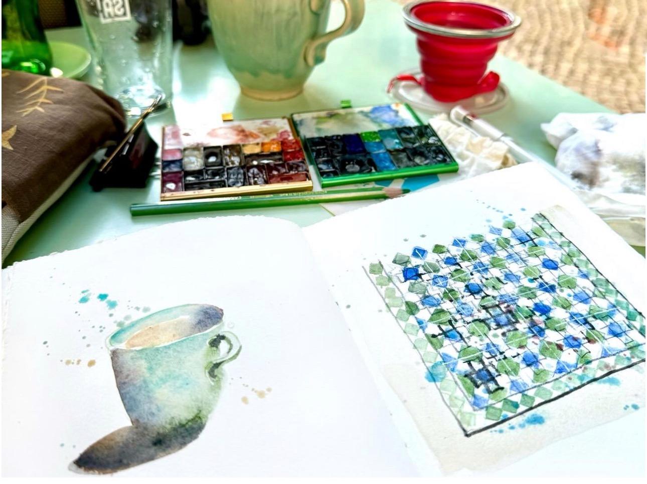
10. Sketching Lisbon Tiles: Now I'm in Lisbon and Lisbon is full of fantastic buildings
and impressive views. Of course, I want to try to
sketch something of that. But travel sketch book
doesn't need to be filled with all these impressive views and complicated buildings. You can also fill it with smaller objects like Lisbon
is full of fantastic tiles, the Azulos, and I want
to sketch some of them. So I want to sketch
one now in this video. And later, I want to sketch teacup because these
tiles I sketch now is facade of
beautiful coffee shop where they also have nice tea. And your travel sketch book can also be filled with all
these kinds of objects. Like if you don't want to
sketch a complicated building, you can just sketch a window or a door,
you find beautiful. And drawing smaller objects is also perfect for
a travel journal. It's more quick and easier. The main purpose of sketching in a travel sketch
book is to sketch what you like to see and
is to sketch what you find interesting and
what makes you happy. So what are your
travel memories? My travel memories are made
of these little pleasures, beautiful tiles or other details or these tea and coffee break. I love the Portuguese
styles everywhere. And as we're having this
coffee and tea break, I decided to sketch the tiles of this
beautiful coffee place. I thought it would be simple, but it took some time
for me to figure out the logic of the geometrical
composition of these tiles. So I had to go close
by to study them. So there's a little part
of a video missing. I hope you don't mind. So first, I drew a light pencil grade
of tiles on my page, and then I painted the
blue and green squares. And finally, I add
the black lines in watercolor pencil because I love how the watercolor pencil
dissolves in the wet paint. And of course, I add slashes. I added splashes from
the beginning because it takes away the fear of making my sketchbook page dirty. Splashes are fun, of course, but not only fun. They connect the different
elements of the painting together and add a playful
looseness to the sketches. When everything was, I add
the white lines with a pen. The next video, I show you how I painted the A
11. Sketching a Lisbon Tea Cup: Those of you who know me, know. I love to sketch tea cups, but also coffee cups. I did this cappuccino
cup last time, but I didn't film it and it's in color pencil because I want
to explore some color pencil. In one of the next videos, I will show you how I make
the color pencil cup. But now I will sketch this t and it will
be in watercolor. So I start with sketch, and then I add the shadows. And then afterwards, I add the color of the
mark and of the tea. Pay attention to the
proportions of the cup and pay attention to what
direction the lines are going and try to
sketch what you see. As a shadow color, I again a some gray mixture I made with ultramarine blue
and transparent orange, and look carefully where is
the shadow of your object, and pay attention also to attach the shadow
to your object. I'm not waiting until
the shadow is dry. I immediately add the color of the cup because I want the colors to flow
into each other. And I add different
kinds of colors plashes also to make a
variation in the color wash. So as the t is not dry either, I leave white space between
the color of the cup and the t because I don't want the t to flow into
the color of the cup. I just want the
shadow color to flow into the t and into
the color of the cup. Don't worry too much about
using very realistic colors. Of course, I use
the colors I like. Now I add some pink
in the t, why not? Anyway, use the colors you like, and these color choices will
also determine your style.
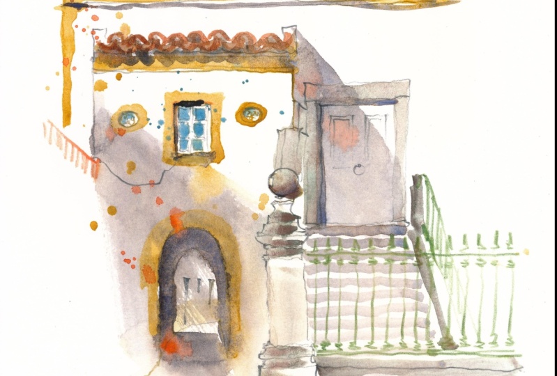
12. Sketching Lisbon Houses: Hello again. Welcome to Lisbon. So this is a great spot
I found in Lisbon. Lisbon is one of the oldest
cities in the world and second oldest European
capital city after Athens. And finding a nice, calm, safe sketch spot in Lisbon
is really not easy. So this is a safe spot
away from the cars. Be careful to sit anywhere you
don't disturb the traffic. So you don't endanger yourself. And also somewhere, not in the middle of a
pavement where you disturb the people passing by, so you can better
enjoy your sketch. This is a lovely view with a view to the river
in Hilly Lisbon, with lovely colored
houses, old houses, and a lovely house with tiles
and a wonderful old tree. So it has about everything
I like about Lisbon. I want it especially ours
with tiles to show you a way of simplifying tiles
in the architecture. So I first make some spots on the page
wet, not everything. And then I draw the lines
in the direction where are the joints of the tiles
with the color of the tiles, and I use different shades of blue, ultramarine
blue, turquoise, and different
intensities of blue to suggest the very ornamental
side of the tiles. I try also not to
make everything the same and not everything
of the same intensity. So it wouldn't look too flat. Also, don't forget your shadows. I use again my
shadow gray mixture of ultramarine blue and
transparent orange. Here I have different houses. So different windows,
and I also try to make different types of
windows with different colors. I suggest some different types of activity inside the house. A lot of artists start to paint immediately without
preliminary sketch, and I like to do that because it forces myself to
concentrate well. You can't erase it. If you make a mistake while
you sketch with your brush, the best way to correct it is to put immediately fresh water on it to try to
dissolve the paint. When you have a complex scene, the best thing you can do, I think, according to me, is to just start with what
you like most in the sketch. According if your
left or right handed, start to the left
or to the right, if you want to
sketching watercolor, so you don't sm the page. I add an open window also to suggest that
somebody's home. It makes the house more dynamic. Then what I liked. Also in this view is, of course, the fantastic old tree in
front of one of the houses. It's an amazing old tree. I use this soft graphite
pencil to make it quite rough, and then I splash
different kinds of green to suggest the leaves. I also always add
some torquis in my green because I find
it refreshing color. The tree is really huge. Actually, there
are several trees. When you make a complex sketch, try to look at it
in an abstract way. In what direction are the lines going and which line is
in front of the other. What is on the foreground, what is on the background, and, what is on the foreground, B what is on the foreground
is in front of the rest. The foreground here is a white building just on
the right of this scenery. But that's not really
the main subject, so I make it quite simple. And the tree is behind it. I disappears next to that line of the edge of that
building to the right. So by painting the tree and by painting the yellow
house behind the tree, that building will appear. When you draw a tree, look well in what direction the lines are going of the
branches and the tree trunks and try to follow
all the curves in the branches and try to have the proportion of
your tree correctly. So the tree would
be recognizable. Try also to make a
variation in intensity of your lines and a variation
in thickness of your lines, especially if you draw a tree, so that would look more
natural and more interesting. The yellow houses
behind the tree and the umbrella of
the little market are a bit to the
background of the tree. So I won't detail them too much. But they're really
lovely yellow. I love all the colors in Lisbon. But again, if you don't have these colors
in your palette, just use your favorite colors which you have in your palette. I add also some people, and then I will add the houses which are between
my scenery and the river. But I will leave them
simple with pencil lines. I won't color them
because otherwise, I think it will distract the view of what I
wanted to sketch. So what is important for me
in this sketch of the tree and the people and also these
beautiful colored houses, and then also the river
in the background. So I put a light blue
color for the river. I leave it quite light blue because it's
in the background, and I had some colored spots on the horizon line to suggest
the other side of the river. When you want to sketch
a complex scenery, try to see for yourself
what story you want to tell and what is
important for you in the sketch, and try to simplify that. And then I finish with some extra splashes and these splashes suggest
the activity of the c and also these splashes connect all
the different elements in the painting together. So one other way to
simplify these old houses, when you have these
beautiful balconies is, I think you noticed,
I just suggest some curls going anyway. I don't really draw
them correctly. There are p of ways
to simplify things. You can also draw just
a piece of a window. You don't have to
draw all the windows. And anyway, the eyes will correct and complete
the sketches. So I hope you like this sketch and tell me if
you have any questions. And also, of course, you don't need to sketch
the same things as me. You can just try to apply
this way of sketching to you like to sketch. The main part of
this sketch is to experiment and to and see
what you make out of it. H
13. Sketching a Natural Landscape: Algarve Beach Cliffs: Hello. This is Barbara ill.
We're in Algave, Portugal, and I will paint now
in my sketchbook, the Bagel sea cave here
behind me on the steel level. It's a wonderful sea cave, which is accessible by
Boat, if you want to. But for the moment, I
will sketch it from here. I'm not going down there. And behind, you see the other cliffs with Bena
gel in the background. So before we start, I want to give you some
attention points for the layout because this
is a very vast scenery, so you quickly get overwhelmed. So for the layout, I will put the sea level
on one third of the page. And then I have a lot of sea, and I have the cliffs
in the painting, and I put this wonderful
pine tree in the foreground. And maybe I move things around a bit because
this is my small sketchbook, so I squeeze a bit what I find interesting and what
doesn't fit on the page, doesn't fit on the page. You control everything. This natural scenery will
also be first drawn in watercolor pencil
because I don't want to see much black lines in
this natural sketch. In such an impressive scene, it's very challenging to create some depth and to have foreground middle
ground and background. It's good to plan
your composition. Sketch your composition lightly, plan where a ground middle
ground and background. Here I have a tree
in the foreground, and then I have these cliffs
and further away background, and the cave is
the middle ground. So then I start with the
washes with the background, I paint the sky and the sea and already some
green of the tree in the sky. And I give the sea the
same colors as the sky because the sky is
reflecting in the sea. Then I will add the
washes of the tips. This is a typically watercolor
where I will build up several layers and go in more and more detailed
for some elements. And the foreground elements will be much stronger than
the background elements. These several washes
will transition from very light in the background to darker
in the foreground. And in the foreground, I will use stronger
and warmer colors. I throw the branches of the great pine tree
in the wet paint in water soluble graphite pencil
to make it stand out in the foreground and to make it stand out
in the foreground, it should be strong and bold. So it's obvious that the tree is just
standing in front of me. And I tilt the pencil to
make thicker pencil lines. For the tree, look in what direction the
branches are going and the tree trunk and how thick the tree trunk is compared
to your branches. Obviously, the trunk
should be thicker and the branches become
the higher we go. So the extremities of the
branches should be thinner than branches which are
closer to the tree trunk. I paint the cliffs
with a mixture of iron from Daniel
Smith and raw amber. And I add several green
spots for the vegetation. I used the same tiger's
ignine for the tree trunk. It's a nicely granulating
brown cool brown from Daniel Smith. And then to make the
cliffs impressive, I will have to add some shadows. You see the water color
becomes lighter when it dries. The shadows of the
caves are very important to texture
the painting. I use my usual shadow mixture of ultramarine blue and
transparent orange. If you don't shadow the cave, you won't see it
in the painting, then it will look quite flat. O. So I slowly built up my
painting layer by layer. I look what
intensities the color have and where are the
shadows in the vegetation. And this building up
layer by layer is kind of a typical way
to work watercolor for these kind of
natural landscapes. And I add some color pencil
for the shapes of the cliffs. Otherwise, the shapes are
not visible very well. And these cliffs have
very typical shapes. So I want to make
them stand out. So this is a classic so this
is a classic color pencil, not a watercolor pencil, so the color doesn't
dissolve when it gets wet. The sea has very strong color because it's sunny
with blue sky. So it's kind of different
shades of blue. This turquoise blue
and ultramarine blue. And as the water
color has dried, it became less intense. So I had another layer of blue
to make it stronger again. It's time to add
some splashes and these splashes add
some extra texture. And then now as
the sky has dried, I add some details
in the pine tree, and I use a flat brush
to sketch these needles. I just tap with the side
of the brush on the paper, and that makes
small little lines. And now I add some finer branches with a
regular graphite pencil. These pine trees are very
typical for the area. So look in what direction. All the branches are going and try to render the tree
in a natural way. So the branches are quite
wiggly, as you might say. So I want to make them
like looking natural. So I try not to make
them too stiff. The tree has dried, and it became a bit too light. So I add another layer of
this tiger's eigine color. And also look how thick the
trunk and the branches are. And as you come on
top of the tree, the branches and the
trunk become less thick. I also splash some
grain in the tree to suggest there are more needles and to suggest some
more vegetation. So you see here different
ways to create depth. So you have atmospheric
perspective with color gradation
and value contrast. What is farther away is
less strong and cooler, and then you have
diminishing sizes. So linear perspective, so the houses and the trees which are further
away are smaller. Then you have
detail and texture. So what is closer by will be more textured
and more detailed. You have the foreground
detail of the tree. So the tree is stronger
and more textured and more detailed than
everything in the background. You can also play with edges, have hard edges and soft edges. So the tree has sharp defined edges with the needles and the
trunk and the branches, and what is behind
has softer edges. So that means that they
are not well defined and a bit diluted because
they are more in a distance. And then you have the
color temperature. So the cliffs in the
foreground are more yellow and warmer than the
cliffs in the background. So to enhance the sizes and
the greatness of the cliffs, I need to add some human
activity and human objects. So I will add now with a pencil, some people on the cliffs. And I will also add with
the graphite pencil, some people in boats on
the sea near the cliffs. And these human subjects will
give a size to the scenery. That's also very handy when
you draw a building to put people next to it to show
the size of what you draw. So I'm curious what you will
make in your sketchbook. You can also tag me on
Instagram at Barbara Well, so I can share your artwork, and it's always very inspiring to see what
everyone is making. Enjoy and have fun.
14. Sketching a Windmill and an Old Tree: On Vegetation: Hello. So now we're in Algara in the beautiful
village of Otis. I hope I pronounce it correctly. And this is the Windmill I
will sketch with the houses, and I will also take this beautiful cork oak
tree with it in my sketch. It's very windy, so I hope that the camera
doesn't move too much. Enjoy. Etching outside
is really a challenge. Here, I have a
comfortable bench to sit, but it's really terribly windy. I think you see
everything moving a lot. But the view is amazing, and this beautiful windmill
is very typically Portuguese, I think, so it will
definitely end up in my book. I made first quick
watercolor sketch. I mean, with watercolor pencil because the windmill is
so beautifully white. So I don't want any black lines, and I start with the grass. I make the greens of the
grass flow on the page. I leave everything freely
flowing underneath. So this is again a
negative painting to paint the white building, I paint around the building. And the white of the building
is the white of the paper. I will shadows later
to make it look round. So for this blue sky, it's really amazing today. I use cerlian blue and
french turmarine blue, and I try to make not the whole sky of
the same intensity. Otherwise, it will
look quite flat. So I make the blue a bit darker around the windmill
and on top of the pitch, and I will let the blues
flow into each other. So they're quite granulating. It will add some nice effects. There are some houses in the background of the
village on top of the hill, and I make a suggestive
sketch for these houses, and they're also white
with tiled roofs. So I will suggest some
night terracotta roofs. Let's sketch the tree. It's a very old tree fantastic. Look well in what direction the trunks and the
branches are going. The tree is tilted from
standing so long in the wind. So I throw a tilted tree trunk with a soft graphite pencil. And I wet page a bit to paint the leaves of the
tree on the wet paper. So the greens will
flow into each other. So I first paint the
leaves of the tree, and not all the branches are visible because there
are a lot of leaves, and I splash the green
around it in the leaves, and splashes are a great
way to suggest leaves. Look well also for the shadows in the tree to give
it some volume. Add green and gray to suggest the shadows
and the darker leaves. Otherwise, it will
look quite flat. So underneath is darker
because, of course, the sun is coming from
above in the sky. For the tree trunk, I use my gray mixture of ultramarine blue and
transparent orange. I almost never paint
my tree trunks brown. I see that often brown
tree trunks in paintings, and I don't like it so because I think it doesn't
look very natural. Most of the time tree
trunk looks more grayish. Now I add the shadow
on the windmill, and this will make
the building look. If you don't add shadow, your building will
look quite flat and you might think it's
a square building. When the green is a bit dry, I add some extra shadows
also in the tree. I make it in layers, and I really fell in
love with this tree. I think I will overdo it a bit. So I really think I will
remember this windmill forever because making sketch books is the best way to remember
your travel afterwards. When you draw a place, instead of taking a picture, you're really
mindful and present. And I will remember when I
look at my drawing afterwards, I will remember the
feeling and the sound of the wind and of co,
the wonderful sun. So now I add some
details in the roof and the shadows in the windows. The shadows in the
windows are really dark because the
walls are very thick, and then there's this
beautiful blue line around the windows and on
the building itself. Apparently, these blue lines are Mostly for
fisherman's houses, and the yellow lines on the
houses are for farmers. I heard. I add some grass, and also the grass is tilted, and that will make
the impression of a windy scene more lively. I make dry brush strokes for the grass to
suggest the wind. And now I try to draw the
rest of the windmill. And I will start
in pencil first, and that's a bit tricky. Look in what direction
the lines are going. I use colored pencil, and the direction of the lines for this meal are a
bit tricky actually. But anyway, again, we are not a copy machine and it doesn't really matter if
it's not totally correct, but I want of that people
see it's windmill. And I add some old branches
with a hard black pencil. It's a Pier noir
pencil by Conte, and it's really
quite hard pencil, which gives very
dark black lines. So to give you some
steps to paint the tree. Study the tree,
look at the shape, the leaves, the
branches, the colors. Trees have different
kinds of colors, and note how the light and
shadow play on the tree. This is a co tree. It's very important
tree in Portugal. So look at how high and
white the trunk is, in what direction it's growing, and note the proportions of the trunk and the green crown. At some shadow also
under the tree. So the grass under
the tree is a bit darker because you have the shadow from the
tree on the ground. So don't detail the
background too much. Otherwise, it will come to
the fronts of the painting. And I made the roof with butters
pink and with light red. And I also added some butters pink splashes on the windmill to
connect them together. And of coquis slashes in the tree and around the
windmill. I love toquas. Use the colors
that you like mot. There's not pink
here in reality, but I think butters
pink fits everything. A black, I like lunar black
because it's very textured. Of course, you don't have
to sketch this windmill. Just sketch something
typical from where you are at the moment
in your sketch book.
15. Sketching Big Format : Ponte De Lima: Today, I will sketch here in Ponte Dima in the
north of Portugal. Ponte Dima is one of the most characterful
and charming towns of Northern Portugal. What we see here
is the Lima river, and it has been the primary river crossing since the Romans constructed
a bridge here, and that's what we will what I see here is the Gothic
part of the bridge. Ponte Dima is also one of the
oldest towns in Portugal, and there are great
medieval houses, pretty plazas, and ancient religious
buildings in the town. What we see here
is a great mix of historical sites with the bridge and the houses behind it, and then further on is natural
site on the mountains. This great bridge, it's an ancient stone bridge
over the river Lima. Originally, it was
constructed by the Romans, what we see here is
the medieval period, the Gothic period, and it
was the only crossing point in a pilgrimage route from Braga to Santiago to
Compostela in Spain. So I started a
pencil sketch with watercolor pencils to set out the shape of the
bridge and the arches. The arches are a bit difficult. So again, just look in what direction
the lines are going. So I set out the lines
in watercolor pencil because I don't want to see the lines really in
my watercolor sketch. But the finer lines like the
chimneys and the windows, I make in graphite pencil
because they're very fine. And after setting
out the great lines, I start sketching with
the brush and the paint, and I will alternate the
painting and the drawing. So this is a very
special sketchbook, a different sketch book
than in my previous videos. It's a big a t sides sketchbook
with multimedia paper. So it's not specific
watercolor paper. It's very smooth thick paper, and it allows me to
experiment a bit more by adding color pencil and by coloring parts
in color pencil. But it also allows great
washes in watercolor. And it's also special because it's much bigger than
what I'm used to. So I want to challenge you here, also to try some new formats and to try some
different kinds of paper to experiment different ways of sketching and also to
see what you like best. So here I mix drawing with painting and drawing with pencil and with color pencil
and drawing with the brush. And I will also color a
bit with color pencil. And that way, you can experience different kinds
of textures in your sketch. Oh, M
16. Final Thoughts: Congratulations, we're at
the end of this class. We're back from Portugal, where we sketched a bit. Well, I'm between
two Portugal trips. I'm leaving for other ones. Maybe I add some
classes, by the way. And I hope you enjoyed
travel sketching. Also, if you don't have the opportunity to
travel, don't worry. You can also sketch
your hometown. I made this in Brussels. And as you see, there's some
sceneries from Brussels, but also beer bottles. Travel sketching
can be very large. And I hope you enjoyed
documenting your life with me. Tell me if you have
any questions. In the class discussions, I can answer any
questions you have. I enjoy a lot keeping
a travel sketchbook. By keeping a travel sketch book, you will be able
to enjoy more of your travel or
your life at home, by looking again
at your sketches, you remember it better because you're really present
in the moment. You remember the
places you sketched, what weather it was, and the sound, the smells. I promise that the
more you sketch, the better your drawings
and paintings will become. It's not about talents or gifts. It's about skills
you can learn and get better at and don't stress. It's just paper. It's
just a sketch book. You just play
around, try things, enjoy yourself, and have a
great book full of souvenirs. This way, this way. So be sure to post your class project and your
sketches in the class. And I will always enjoy
watching all your sketches. I look at all the sketches. And you can also tag me
on Instagram so I can share your beauty and
your art with the world, and we can connect in other
ways as well more directly. And if you're in Brussels, please contact me so we
can go sketch together. And if you like to
see more examples, you can also subscribe to my YouTube channel
where I share free tutorial videos
and where I also can answer you questions and
subscribe to my website. If you want free tips and
also tutorial videos, I send e mail with new
discoveries from time to time, like every two weeks. And so Thank you again so
much for taking my class, because without you, this
wouldn't be possible. And please leave a review. Leaving a review is
very helpful for a teacher because we know
what we can improve, and also it helps other people to find
classes that they like. So again, don't hesitate
to reach out if you have any questions.
See you later.
 Barbara Luel, Architect, Author & Artist