Transcripts
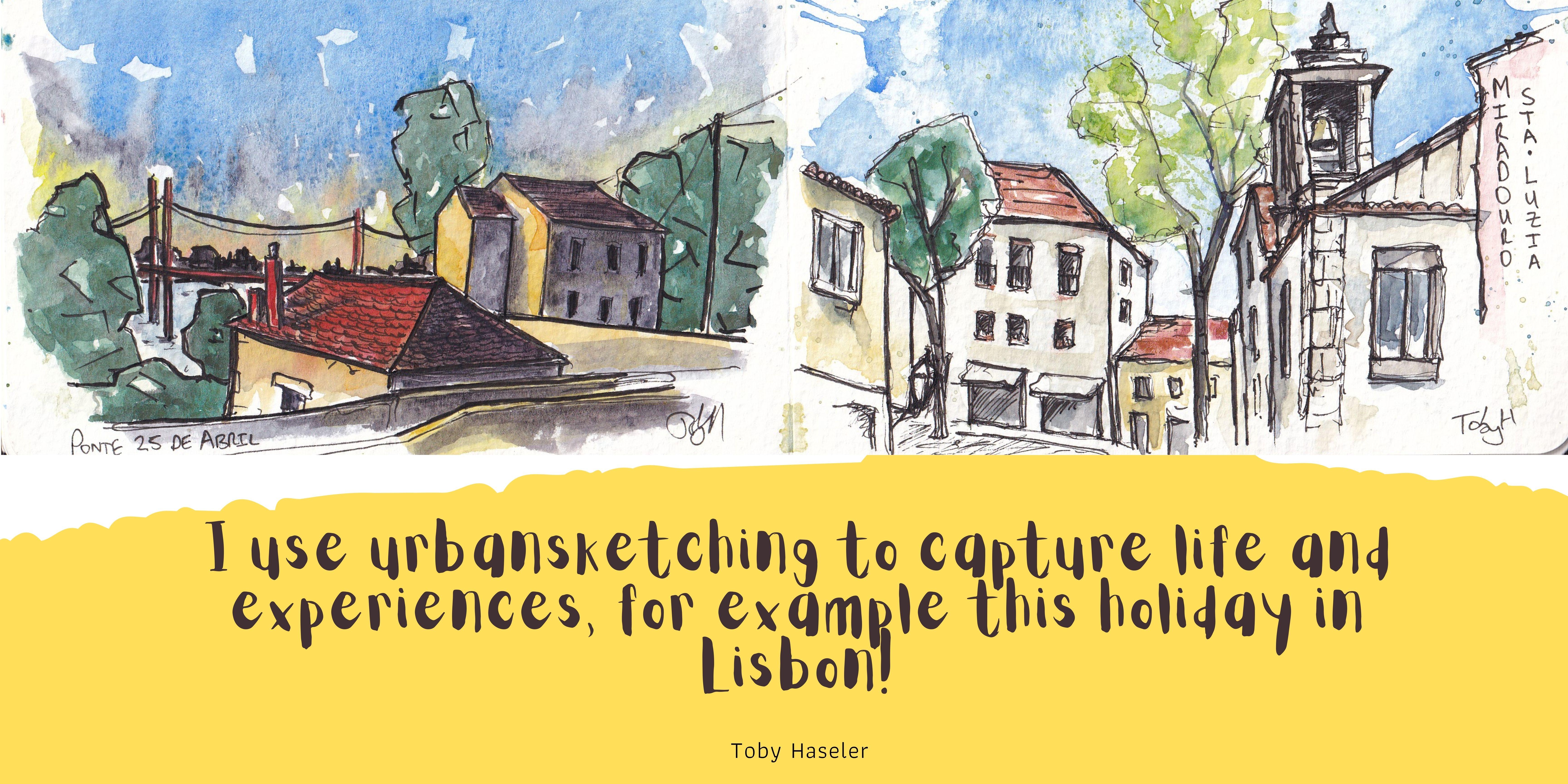
1. Introduction: Hi there. Have you always wanted to
get into urban sketching but aren't quite sure how? You want a simple way of getting character in the essence
of a scene onto your page, but it all seems so complicated
when you start sketching. You just don't know what to do. If so this is the class for you. My name is Toby, known as
Tobyurbansketch on Instagram, Skillshare, and YouTube. Continuous line drawing is
a vital part of my process. I love using continuous line
drawing and continuous line sketching to simplify my scenes to capture that energy in there but also get my personality
and my feelings on the page. My success with this
style has brought me commissions all
over the world from a chocolate factory in New
Zealand to a bakery in London. In truth, nothing
makes me happier than to be out and
about sketching or to be sharing my
process with other people. I get so much joy from
seeing other people get into sketching to start recognizing
that anyone can do this. There isn't any barrier to just developing your
own style and having fun, and that's what I want you
to get from this class. In this class we'll be
talking all things, continuous line sketching
and urban sketching. We will start off
with the basics looking at doing our first
continuous line sketch. How little do we need to
put on the page to actually get something which is
recognizable as our image. From there we'll work through
lessons where we look at things like shapes and
building up our scene, adding character
to our line work which I see is a really key
part of this technique, and of course little things
like how do we add people? How do we add trees? All those little details which buildup to create
something special on the page. The final project will of
course be an urban sketch. I'll provide you
a reference photo but of course you're
welcome to use your own. I'll be taking you with
this reference photo step-by-step through
my whole process. We'll talk about composition, the rules of composition, but also more practically, more interestingly how I
build up my composition. We'll then work
through several stages : creating a continuous
line sketch, finessing our sketch before adding some beautiful colors on, and then those final details which bring it to life which add a [inaudible] and that wonderful
energy to our scene. If you'd like to
connect with me you can also find me on my socials, @tobyurbansketch and
the links are up here for you to have a look at. But without further ado, most importantly
let's get sketching.
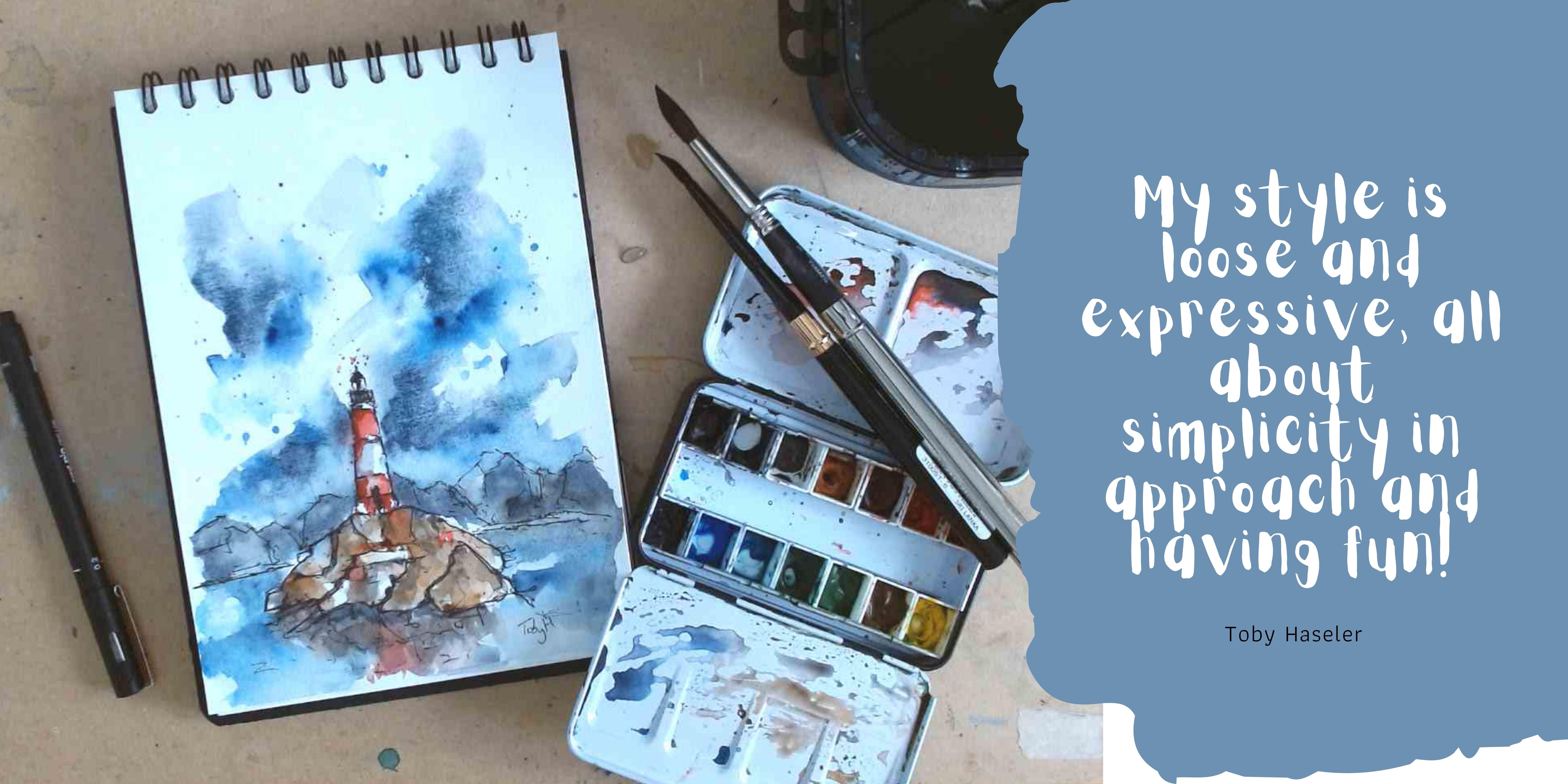
2. Suggested Supplies: The equipment, what do you need? Or more like, what
could you use? Because it's flexible
and people have different things which
they prefer using. These are just
guidelines and ideas, but feel free to flex them. For me, number 1, I use a fountain pen for
most of my sketching. This is a LAMY AL-star. I also love LAMY
Safari fountain pens. Inside I use something called
platinum X carbon ink, it's a black and waterproof ink. That bit is important for the
process that is waterproof. But you could just
as happily use a fine liner or another
waterproof pen, even some biros are waterproof and a perfectly
adequate for producing a really interesting sketch. Next, we'll be using watercolors and my watercolors are
in this little palette. It's just got 14 colors in and you can see it's
very well used. We won't be using 14 colors, we'll only be using a few. I'll write them down in
the project resources, the exact colors I use. But if I let you know now, we will be using
the cobalt blue. We'll be using Hansa
yellow medium. I'll be using a
bit of moon glow, and a bit of quinacridone, sienna, and lastly, a little
bit of cascade green. These are all funny
colors, I know. You don't have to
stick with those. In the Lesson 1, I
used the colors. I'll be explaining the
alternatives to these colors. Don't worry about
the specific colors. Just a little selection, any normal selection of
watercolors will be grand. For me, I've got a Size 2,
medium-sized Chinese brush. It's basically the same
as using a 10 or 12 and round watercolor brush. You could also use a mop, anything which just carries
enough water and pigment. Then for the end, a little Size 6 round brush. You don't really
need to use both, you could just use one. I just like having
a little brush, those punchier colors
and details at the end. Of course, we need to
think about paper. Now, for most of the
exercises, I'll be using this, which is a very cheap
own brand sketchbook. It's A4, it's got some
paper in which is absolutely fine for
sketching and practicing on. For the watercolors, I'll be using this. This is A4 Aquafine, cold pressed watercolor paper. It's got a slight texture to it, which is nice for our colors. Again, it's student grade,
it's not expensive. We don't need expensive
paper to have fun, experiment and develop an
interesting sketching style. There's always a few little bits and pieces that we might
use on top of that. I'll be using my little towel, which I always use
with my watercolors. It's a little bit more eco-friendly than
using kitchen towel. I've used this for years now. I'll be using some masking tape. I guess the eco-friendly
version of that, which I often do is a
couple of crocodile clips which just hold the
watercolor paper down. I think perhaps
most importantly, we're using a really
big tub of water. I encourage you to have a really big tub
of water as well. If you can mind a liter pour, it just makes your
colors clearer. It makes your water clearer, it makes things flow better. But that's all I can imagine you needing
for your sketching. Let's actually get
to the fun bit and do some sketching.
3. Class Project Explained: [MUSIC] The final project
will of course be an urban sketch using a continuous line
drawing as the basis. I guess we should
just briefly talk about what those two things are. Urban sketching.
Urban sketching is a beautiful way of
capturing our scene. It's not about getting a full lifelike photorealistic
sketch down on the paper, it's about putting more
than that down and less, so in less detail, less accuracy perhaps,
but more love, more feeling, and
more of yourself. The sketch will focus on the bit you found interesting
and why you chose to sit there or use that
reference and why you wanted to sketch that
scene on that day. You might sketch the same place several times and each
time it might look completely different
because you were feeling differently about
it or you chose to focus on a different element. Urban sketching is about
getting those scenes all around you, whether
you're outside, inside, sketching in
real life and planner or at your desk in your studio. Continuous line drawing
is what we'll be focusing on in most of these
lessons. What are those? Really simply is putting
your pen on the page, drawing a whole image, be that's something
really simple, perhaps some fruit, perhaps some penguins, perhaps a full urban scene. But either way,
you basically take the pen off the page only
when you're finished. Now, we'll be
talking about that. You don't have to obviously
strictly spend an hour doing one continuous line sketch without
having the pen off, it's more about the feel and the intention and
getting a connected, simplified, fascinating
look to your sketch. Using these principles,
we'll be doing our own continuous
line urban sketch. I'll take you through the various steps that I
worked through from setting up the composition through to
doing the initial line work, the finessing of the line
work, the splashy colors, and then those
final details where we draw it all together and
create something beautiful. At the end, obviously,
I'm going to share mine. I would love you to share yours as well in
the class gallery. If you do, I will of course, give you some feedback, which is just aim to be encouraging and inspiring
and also to ask you a few questions and
see how you found the process and just a couple of things to
reflect on and see, well, often because
I'm interested, it looks interesting, did you enjoy the process? And how are you going
to fit this into your normal style,
your normal sketching? Anyway, without
further ado let's move on to the first lesson. We'll first have a
look at equipment and then we'll be doing
some sketching. [MUSIC]
4. Simplifying our Linework: [MUSIC] The first lesson. Now this is our first
continuous line sketch, and what I really
want you to get from this is that continuous
line sketching isn't hard, it can be super simple, it can be as simple as
drawing a couple of fruit, but it can also be really
interesting and stay simple. In this lesson, let's work
out how we simplify seeing. Firstly, taking a silhouette before building
and a few details, but leaving out the
things which are just not super important. With that, we can of
course start sketching. We've got our little
reference up here. What we can see is quite a complicated scene
with lots going on. But let's break it down. Let's do this as a first continuous line
sketch and see how much we can simplify things.
How are we going to start? Well, the way that I
most commonly enjoy starting is to grab a
silhouette of the scene. Let's start with that
and let's see how a silhouette and how little information we need to get this whole scene
really on the page. Now if I start off at the right. The silhouette is really this gorgeous roof line, isn't it? If we come across
and we just grab these little areas
which undulate, they go up and down and
we've got a few chimneys, and we're not being clever here. We're not being clever at all. We're just getting the
really simple shapes. We'll talk about shapes of course more in the next lesson. But for now, just
focus on being simple. Not being clever, but just grabbing those
most important areas. It really doesn't matter
if you miss something out. It really, really doesn't matter if you miss
something out, we'll get something
wrong because we can come back and we can
always change things. But what we're trying to do
is get that magic feeling, this continuous line feeling where everything's joined up and just simplified and relaxed. You can see in very few steps, we can even grab a
tree, like this, really simple looping,
fill in very few steps. I would say that already
feels like a tall building. What have we done? Not very much really, when
you think about it. We haven't done
very much at all, just a little line
with some wobbles. Now, what's the next step? Well, the next step is to
get a bit more detail, a bit more feel for that. What I like to do is
work back the other way. We don't need to get
the whole bottom. We don't have to
get every detail. Let's pretend we've
continued this lines. We're going to across,
we ended here. Let's then grab that line. We can come back. What I find is strong
vertical lines like this. They immediately show you the perspective of
what's going on. As we bring up these
vertical lines, these vertical lines are
showing us where the different houses,
buildings overlap. As we bring them up, we can move off that line and start applying
some window shapes. The windows didn't
have to be perfect. They don't have to be
in the right place. We're trying to get a
feel for what's going on. We're trying to force
ourselves to be a little bit uncomfortable and have
to really simplify. We can cross back on ourselves. Let's say we want to put
in this railed fence, we can go back and
then come over here. Just because you've left
this side of the page doesn't mean you have
to leave it forever. You can come back. If we come along, we can grab
those really key details. Let's have a look at what makes
this cafe so interesting. Well, I would argue, these beautiful frontages here, these lovely, what will be green and beautiful
awnings coming down. We can get the door and
make it feel welcoming, and then we can come across and we can grab
this other owning. Let's say I stopped there, even with this amount
of information, now we know what's
going on, don't we? A stack lot of buildings
and then some cafe. The door and these two awnings, they tell you there
is a cafe going on. But let's just keep
going anyway, because, let's explore and experiment
with what we're doing. We can get a little more detail, we can get some of these windows and the neighboring buildings. We can come back, like I said, you don't have to stick with
you first level of detail. We can just add stuff and
add details in bit's. Important principle
in simplifying urban sketching is that you don't have to get every detail and you don't have to be right. The thing I like to say, you don't have to
count the windows. You can leave out a window. Let's do that. Let's
leave out a window here. You know what, It's still fine. It's still feels to me fine, even if I do the right number
of windows next to it. I peter off over here with my pen lines and just disappear. Get really loose
with the detail. Perhaps do something fun with the foreground that
in that road sign, which is just sneaking
into the view, even with the wrong number of windows with leaving loads out, we know what's going on. That is what I love about
this style of sketching, is that you can be so
loose and so abstract, but you still capture it. That's taken five minutes with loads of me littering
on about nonsense. We've got a beautiful
little scene. Let's move on to
the next lesson, where we're going to be
having a think about shapes and how
shapes can make it easier to grab this
complicated scene. [MUSIC]
5. Seeing Shapes: [MUSIC] I'm a little bit
obsessed with shapes. Why do I like shapes? Because, well, when we had
a look at simplifying, that's all well and good. But when something's
hugely complex to look at, it can be really hard to actually work out
how to simplify it. Well, shapes are the answer. When I say shapes, I mean, what it sounds like,
circles, squares, triangles. Everything is made of shapes. Be that people, buildings, trees, we can break
them all down. In this little scene, we'll just have a look at that principle and work
out how we can break down a street into shapes and still create an
interesting image. We've got this complicated
scene that we did here, but how could we
have made it easier? Instead of having to think about all these
little things a little bit, how could we have made
our life a bit easier? Well, let's move to another
page and have a think. We've got a different
reference now up here. I've got my same pan out. Let's just see what happens
if we think about shapes. Now, I'm going to do
this scene very quickly once and then a bit
slower a second time. Let's take the top
corner of my page. We'll do a tiny little thumbnail
sketch and we'll get to thumbnail sketches
in another lesson as well when we talk
about composition. With this scene that
we've got now, it is, again, maybe not as
complicated as last one, but there's a lot
going on still. But we can simplify
it so we can find each house and break
it into elements. You've got this
little white house. That's a rectangle. The house next to it
that's a longer rectangle with a short rectangle
next to it. Next house. Pretty much a square, isn't it? If we draw a square, and it's got its own little
rectangle next to it. Then this wall that's
edging its way in. Well, that's basically a
rectangle and a rectangle. Then the roofs, well, you could even just call them a long rectangle coming across. Then you can just find
the dividing lines. Got a triangle which comes up here with another rectangle, or perhaps it's a parallelogram, but we can think of it
in the simplest terms, a rectangle with bent edges. Then simple things, chimneys. Chimneys, even if we want to get both sides, just a square, and a rectangle, some some
little bubbles on top. What else have we got? Well, we've got a long dividing
line for the pavement, and we got loads of
windows and doors, and what are windows and doors? They are squares, rectangles. They got squares and
rectangles inside them. It's really easy to just break
it down into these shapes. Now let's do another
similar thing here, but we'll do it as a continuous
line drawing and workout. Again, how can we get these shapes and then
build in the detail? Same as before,
let's start thinking about horizon lines
silhouette to start with. It start on this side of
the page and come across. We can get that sort in
the top of the wall. But then we can
immediately think, well, let's just
grab that shape. Let's finish that shape off, and there we go. Now we've got both an element of the texture of what's going on, these natural
widths of greenery. But we've also got a
continuous line wall. Then we can find this next silhouette and
that comes across and let's skip out the chimney and we can finish
off that shape. Now we've got that shape done, we can come back and we can
now make the next shape. We can also come
back and we can add this shape on top with
its little shapes. If we want, we're
going to talk about texture and character in a bit. If you want, you can
stop building up all the other shapes
under your horizon line. We're thinking about this
horizon line silhouette. But then under that,
we think shape. That's how one can very easily, very quickly build up a scene. We just move around and think about all the little constituent shapes that we've got and how we can build
them up bit by bit. As if by magic, even
what I'm wishing away, we can create a nice
scene which is a more, well, certainly very
representative of the scene but also full of
character, full of interests. All just by breaking
it down into shapes and shapes within shapes. There you go. That is my
little guide to shape. Remember, when you
look at something, no matter how complicated it is you'll always be
able to find shapes. Shapes, simple things,
triangles, squares, circles. Just break down your
scenes into that. And start thinking about your sketching in
shapes. [MUSIC]
6. Adding character: Now we have the fundamentals, we can simplify, we can continuous line sketch, we can do shapes. But what about making
it fun, characterful? We're going to have a look at two things in this
little lesson. Firstly, a really simple exercise where we
break down a house. How do we make a house look like more than just a
collection of shapes? How do we make it
display its age, or its features, or just
be really interesting? Then we'll take those
same principles onto a whole scene and
do little sketch. This is where we're thinking
from the first point that our pen touches the page, how do we make our
lines characterful? Hopefully, from this lesson, you'll find out a
little bit more and get a bit more confident
with that idea. What do we mean by
character in our line work? Well, let's do a
really simple example, and then we'll work
through reference image as well to do more work to example and build
up some character. The example I love using
is if we draw a house. If we just draw a house
with bold hard lines, and we can do little windows, another window down
here and a door. There we go. We've definitely
got a house, haven't we? It's very clear, very bold.
Definitely got a house. We don't know much
about the house, and with some very
simple changes to our line work and
how we approach it, our immediate line work
can tell us so much more and make this collection of shapes into something far more interesting
and informative. Let's take our house again. Let's say this is a
rickety old house. Let's imagine that witch's house from a little fairy tale. I'm going to draw
these same shapes, but I'm going to do
the continuous line and I'm going to add
character to my line work. Now first thing
I'm going to do is flip my pen upside down. The reason for
that, just look at the difference in
boldness of line. Upside down, I've got
a much thinner line, and immediately that allows
me to be much more flexible and add more texture
and go up and down and change my lines a lot. What I'm going do, I'm immediately thinking
about the character. I'm doing this same shape, but look at this
wibbly-wobbly line. By doing that
wibbly-wobbly line, it makes the house feel like it's a bit run-down
and decrepit. When we come down the bottom, our line can again
go up and down, and look now there's weeds
growing inside this shape. Our door perhaps is slightly wonky and we can even do
an interior to that shape. We've got a wooden slatted door. That's where our texture
is now coming in. Here, we could just make
our shape break apart. We still got this shape, but look at the
difference already. A lovely way of portraying
age is in the roof as well. So if we just bring
that roof across, then what happens if we just sag that roof and look at that, that is now a character
for old roof. We can continue with the
windows if we come across. If we just don't even
finish that window, I would say that now looks like a smashed and broken
window. What have we done? Exactly the same shapes, but we've added character
to our line works. Through character, we
can portray all sorts. We can do houses,
we could do bricks. If we wanted to make it a new
build but with character, well, we can do a firm line, but we could step those little brick marks in and then come back
and make it firm. We can make it really
bold, firm eaves, and we can just make
these same shapes. But we're all ready
just adding a bit more just feel and its
texture, its character. It tells us a lot more. I would say this house
feels a bit more like a military, doesn't it? It feels like it's definitely firm, hard-wearing, and we can see that it's
made of something strong. Let's take a scene and
use these principles, and we'll work out how
we can apply character to a scene and get some
lovely feel to it. Let's move over now to the
other side of my sketchbook. Now, I'm going to start
again with my pen upside down and we're going to start doing the same thing
we did before. We've also got bushes and trees, which are another
texture, something else that we can bring out. Pen upside down and start
a cross on this side, and we can just start
thinking about how we get some character into our
first off silhouette and then our shapes.
This house in the front, I would say, is
quite domineering, it's quite bold and big. So it's got quite
straight lines, again go up and down then to give them a
bit more clarity. In the background, we've got these houses much more distant. They're much smaller,
they're harder to see, and they're more silhouetted. We can provide them with
a more gentle outline. We don't go up and down
as much and they're much more faint and
not as certain. We can protrude these
little things above our silhouette as well to
get those lovely details in. Then we can move on, and
we've got these other houses. Now let's say this is
a much older house. It's very hard to see, but let's say it's
an older house. Now we can be even more gentle. We can be more rickety, give a bend to the roof, and then disappear
that off because we can't see the other
house much at all. So we're just getting a
really faint outline really. Now we've got these
quite different houses, but they're still
not standing out a huge amount of one another. But don't worry, we can
go back and fix that. We can change that. What I want to show
you before, though, is how we can get our trees and apply
different character. So we've got all
these angular lines for everything else,
for our geometry. A really simple
way of displaying trees or greenery is just
leaves. Simple leaves. It's is just the opposite of what we've done for the
geometric man-made things. I think you can immediately
tell that that is a tree, and we can apply that to the other little
trees going on as well. As we're doing that, we can
build in those verticals and those shapes within shapes in the background of our sketch, and we can come across. Again, we've got these
shapes within shapes, the windows, the doorway. We've got another bush here, which are but our main house. Then let's just do
something slightly different for this
bush at the front. Another way that we can
apply a bit of texture, a bit of interest and
character to align is by doing almost leaf shapes. We come up and down and
we do these leaf shapes. We can do suggestions of
shadow and movement as well, coming up and down. Just like that, we've
got something which is obviously very,
very different. Now we can just build in
those last couple of shapes. Again, look, I made a
little mistake there, but it doesn't matter
because we're being loose and sketchy and it's fine. Now how can we make this
other house really stand out? We said the character
wasn't super different. Well, let's turn our
pen over and give it a really bold punch. Keep that character, so keep that little
wobble in your line. But now we've got something
which feels very different. We got other little things. We could keep going for ages. We've got a pavement
across here. I'm not going to bore you by doing that for
a long time there because we'll talk about
composition and flow, which is where pavements and
things like that come in in one of the next lessons. But for now, just have a
think about how you can change your lines so they're
not just firm and uniform. Create some variety in your
line work, and by doing so, create some lovely, interesting, and characterful sketches.
7. How to Sketch People: [MUSIC] So couple of things
which I think are really important in sketches are
those little details. Those little details
include people. Let's just have a quick
look at how we can add people to our sketches. It's not something which is
featured in my final project, but it might be
featured in yours. A really simple way
of adding people to those continuous line
sketches coming your way. This one is about people. Can you do people as a
continuous line sketch? The simple answer is
yes. Of course, you can. I'm just going to
do a really quick demonstration to show you that. Let's just do an
imaginary corner. We can base it on
what we had before, that lovely big cafe
from the first lesson. If we just give a
nice street corner, get a toy in, and then make it fade
off into the background. There's all really simple
continuous line sketch. How can we add people to that? Well, we can break them apart, make them not part
of the continuous line sketch, and that's fine, and a really simple way is just to break
them into shapes, then everything comes
down to shapes. We got to circle, we
got another circle, and we can get, I
don't know what to call that, but
basically a rectangle, but made a wobbly rectangle. We could do a circle
and a triangle, an upside down triangle. These things work really
well, really effectively. If we were to put
that into a sketch, we'd have something
like this or this. You see these people just stay fit, they're absolutely fine, but we can also make them
part of the continuous line. Let's pick up our line here, do a bit of detail
work on the door, and then we can just
add a person in and add another
person next to them and another person here, and actually these
people will work. They will work as part
of a continuous line. Just keep them simple, but there is no problem
adding people in, a simple shapes, and the
continuous line drawing either doing them as separate to your big continuous line or just putting
them as part of it. This density of line makes a really interesting
grabbing area to look at. [MUSIC]
8. How to Sketch Trees: [MUSIC] Trees, bushes, greenery, those things are also really
important in sketches. They are in my final scene and they may well be in
your final scene as well. Here's a couple of
really simple ways, two of my favorite ways
of grabbing trees, greenery and making them
effective, interesting, and of course, full of
character on our page. The next really quick little
lesson which does come into our project, and if you choose a
different reference, it will probably come into
your project as well, that is trees and bushes. The two ways I like
to sketch them. I did cover this a little
bit in the character lesson, but just to reaffirm it, I just wanted to do really quick sketches
of a scene with a tree. Just to show you my two ways of adding trees to
continuous line sketch. Remember, it's all
about simplification. If we add in a little
house on the corner here, and perhaps this house has, in its back garden,
a couple of trees. Way Number 1 that
I like having them is as something which is very much different to that line work we
used for our house. Simply finding the
shapes of the tree but making them loopy. We've got this circle which just is very different to
these squares and angles. Then we can simply add in a branching little
trunk and branches. I think this is
really effective. When we add a loose color to it, it just becomes so
obvious what it is. I think it's already
quite obvious even if we just add in a little roof. We know what's going on. Now, way Number 2, if we do the same again,
nice little house. This time, instead of focusing on making the tree different, so instead of focusing
on making it something which isn't angular, we can focus on the
texture of the tree. We can use lots of tiny, little very angular lines. It's almost going the
totally opposite way. We can build up these ideas of leaves that builds up a
lot of shadow as well. Then before you know it, we've got this lovely
scene with a tree. Again, it's very
obvious what it is, it's very different from this. This time we've
displayed the texture, the character of the
tree in a different way. So there's my two
really simple ways to add trees or bushes. It works the same for bushes if we were just to do something. Just the bush now
sits on the ground, it doesn't have a trunk, but it's still exactly the
same idea for the line work. There you go. Couple of really simple
ways to get your trees, your bushes into
your urban sketches. [MUSIC]
9. Composition and Thumbnails: [MUSIC] Thumbnailing. You probably know about thumbnails or you've seen
them or heard about them. I think they are
really underused. Thumbnails are brilliant for
making sure that our sketch is going to start off on
the best-fitting possible. They don't have to take long. In fact, they
shouldn't take long, they should be really quick. In this set of thumbnails, we're also going to be
talking about composition, the main rules of
composition that I like to follow and the idea of just
flow through the image. We'll work in these
thumbnails on getting the composition ready
for our final sketch and I will just talk you through
my thoughts and how I come to the composition I
use for my final project. Thumbnail sketches,
what are they, what's the point and how do
they inform our composition? Well, what I'll do, I'm going to show you
thumbnail sketch, but I'm going to do it as a compositional exercise and then we can learn
about both at once. Now thumbnail is a small
but a useful sketch. It's called a thumbnail because it's supposed
to be very small, perhaps not the size
of your thumbnail. But certainly, if we were
to break down our page, we should be able to
get at least a couple of simple sketches in like this. I could obviously have got four, five, couldn't I? But for making it
clear and simple, let's just do a
couple on this side. How do they inform composition? Well, because they're a
really quick exercise, it means that we can
do a few of them. We really don't want
to spend very long, but we can certainly
do a few sketches, and by doing so, we can see just which
one looks best, which one has the best
flow and composition. Now the important
rules of composition, the really simplest rules
are the rule of thirds. We divide our sketch
or paper into three. We do that vertically
and horizontally. What we want is for our area of focal point or most
interesting parts of the sketch to be situated on one of these
intersecting points. Then there's this idea
of the Fibonacci spiral. That is a spiral which
looks something like this, comes around, and that is
the flow of the image. That could be any way round. You could flip it over, you could flip it here. But here, it means
the most detail. You see where these lines
are tightest together? That's where your
most detail is. First, we're going to use
for the final project. Perhaps you want our pub to sit here because
then the pub is now situated almost entirely within this tight
area of spiral. Then the flow of the image. It's not that
everything is here, we want something over here
which pull this along. I will naturally
follow the flow. A really lovely way of introducing that flow is
simple things like pavement. If we draw in our pavement, look how it brings
the image round. It flows like this. Similarly, we've
got a few bits and bobs in the background
here, haven't we? We can get absolutely
pea tree in the back and we can just get a little bit of detail
in these other houses. Before you know it, we've sorted out
our composition. By doing the rule of thirds
and splitting things apart, we can work out how to compose our image
to the best effect. We can still have a play, we can still move things around. Why don't we try making
it smaller within that? As if we do another
thumbnail sketch. Let's just try if we
make our pub much smaller and that will do
something very different. We're still sticking it to
the right-hand side because we're a little bit constrained
by the reference photo. Not that we can't change things, but we're bit constrained. What I'm doing is
very loose sketch. By doing this, I'm getting
to practice as well what details I think are important and what perhaps
are less important. I might forget to add
something and then realize I don't need to add it
or I might forget to add something and realize
just how vital it was. Now we've got a much
smaller pub and we've got a flowing pavement, and then we can just bring
in our other things. You know what, when
we now look at this, I would say it's not as engaging as if we just
make this a bit bolder. There's so much empty space that the eye doesn't really
have anywhere to look. What it does do is
it opens up the sky so we could have some
amazing colors flowing down. But we've left too
much at the front. The final option then would
be, if we just flop over here, we do one more little sketch. Why don't we try
popping up our pub? I got there, eventually. It's
popping up our pub a bit lower down in the middle size. We can have it just sitting
at the very edge here. Got our little shapes. Again, just practicing like, how much do we really need? I've got lovely bush and
things pitching off over here. Then now we've got
this really big sky, but we've also got a big area of interest and actually it's
sitting really nicely. If we draw our shapes, it's sitting really nicely in our spiral and in
this rule of thirds. I got there, eventually. I think this is what
we're going for. We'll go for quite
a nice big sky because you look at those
colors in the reference and you can see it's something which could be
really interesting just to make a feature of, but we can also make
the pub interesting. I love these chimneys. I always love chimneys. I didn't learn anything there, but I love these chimneys. I think this is
really important, this pavement, because
otherwise there's a lot of empty space. We'll see how everything
else flows just as we start doing our sketch. [MUSIC]
10. Step 1 - Continuous Line Sketch: Brilliant. We are onto
our final project. Now, the first step for me is grabbing a
continuous line sketch. Making it interesting,
we're thinking from the beginning about simplifying
with that silhouette, but also about how we are
going to just think about the character of our building
and the feel that we want. The flow we want in
our image as well with that composition
that we worked on in our thumbnail sketching. It's now time to
start our project. I've got my A4 bit
of paper this time. This is cold-press
watercolor paper, my same LAMY safari pen,
and I've taped it down, and that's just because when
we add some watercolor, tape can give a really
nice edge to the image. But you don't have
to tape it down. If not, a couple of
clips or something just to keep the
watercolor paper in place. You also don't have to
have watercolor paper. I most often sketch in
my Moleskine sketchbook, which uses normal
cartridge paper, and if we're being
light and loose with our watercolors,
that's absolutely fine. What we want to do is
remember our composition that we've built up enough
thumbnail sketches. I'm going to remember to
start my pub over here, keep it quite big, but give me lots of nice sky, and then we'll see how
the sketch develops. I'm going to start
off to this side, pen upside down, and let's just go for it. All I'm doing remember, is finding, initially,
that silhouette. That, I always think
is the easiest and most fun way to
do this sketching. Get that silhouette in first
and build down from there. Build across and then
come back and build down. It does it matter if the
silhouette is not accurate. No, it doesn't. We're after the
feel of the place. We're after, having some fun, and the general feel, not a perfect sketch. We can already be thinking about the character of our sketching. We've got these trees
coming in at the edge. We can already be
building them in with different line work. Does it matter if we take
our pen off the page? No, of course not, because we want the feel of
a continuous line drawing. We're not here to
do rigid rules, we're here to get a
really interesting image. To get the feel, if
you've come off the page because of whatever reason or just because you
needed a break, just come back and grab
the line and start again. That's absolutely fine. Then we will come
across and we'll start building up with building
these shapes within shapes. This is where things aren't
going to be perfect. It's a continuous line sketch, not a super careful
illustrations, so we can have made mistakes
which we didn't realize. We are going to
have mismeasured, we're going to have got the wrong number of
windows, and things like that. To be honest, I love that. I think that's what
makes it a piece of art, and takes us away
from being someone just proudly trying to copy out something that they've seen, and to someone who's
confident enough to make their own decisions and have fun and produce
art in their style. We can start thinking again or keep thinking
about the character, how we're displaying textures. The pub itself is made of
quite white brick, isn't it? But it's also got a
definite old feel to it. Getting these lines to be nice and wobbly as we build them up, I think is really important. We can do that gradually. We can do that by
overlapping lines. We can do that just by being
really loose and free. That's, again, why I'm sketching with my pen upside down. Again, I think it's
reasonably accurate. I'm actually quite
impressed with myself. This is reasonably accurate. I've got the right
number of windows and the proportion
seem about right, and that's all I could
ever ask myself, especially with this style. Just coming around
grabbing these key shapes. Now, a really important
principle in art is to just take a step back
sometimes and have a look. Are we happy with how
this is progressing? No we're at risk of
overdoing it somewhere because that's the
biggest problem. It's when we spend too
long doing one thing. I think we should leave this
area now, take a step back, and let's move over
and see what happens if we just start adding a bit
more detail coming down here. What we want to do
is keep the details. As we disappear off the edge
away from the focal point, we want to keep the details much more abstract and minimal. We've got this
distant set of hills and things somewhere over here. Instead of sketching the hills, we'll keep them
abstract and loose. That could just be
another point of color, which is just something
else to add in later. We've also got
interesting details. Now, I'm going to start
turning my pen over, and just getting some of those little details
in before finally, just thinking about that flow, that pavement is a real
point of flow for our image. Let's just get that feel
of flow through the image and then come back and
get those last few lines. Remember, just really loosely cutting those details off which aren't in our focal point. Now that is what I'll
call the end of Step 1. In the next step, which will
be a little bit shorter, we'll look at how to refine some of these shapes to give us a real scaffold for applying some really interesting
loose colors on top.
11. Step 2 - Finessing our Ink Sketch: Having got that
first sketch done, we can now go back
and have a look, take some space, literally
look away from a distance, so take a photo of it and
then look at the photo. All of these things
just help you identify bits which are missing, bits which need moving, or where there's not
enough detail or too much, and then this is our opportunity
just to work on that, correcting it a tiny little bit. Here we go, Step 1 complete. What we have is a really
interesting image already which has built up a couple of details and
lots of the key shapes. But what we want
to do is refine it and just make our key
areas really stand out. How are we going to do that? Well, we're going
to be a bit bolder. I'm going to turn my pen
back to the right way round and start back on our pub. This time, we're finding
those key lines, what feels like it's
a bit too faint, and we're going to come
and just embolden them, and we get the bottom of
the pub in a little more and some of these
lines which make it really interesting
and really clear. Remember, we're not trying
to press really hard, we're not trying to
lose that wobble. If anything, we're
trying to give a texture by having
overlapping lines here. Don't now lose that
lovely looseness, just enhance it and find little details and things which we can add a bit
more texture to. So we've now got this fun
connecting line going through which just fills out
this blank space. By taking a step
back and looking, we can see where it looks a
bit plank and a bit empty. We can look where it
looks a bit faint again and we can just go over
some of our lines. We can pick them up, we can connect them, or we can just do it as a new, just bold line on its own. Now, a couple of points that we can start adding in now, I'd encourage you
to have a look at little interesting bits like. Street signs are always fun. In this case, we've got
the name of the street, which I believe is Church Road but we can just get
that [inaudible] in. Then we've got the
name of the pub. Now, I'm definitely
adding that in. Am I going to do it? Of course, as a continuous line. That doesn't have to
be amazingly legible, it just has to get the
feel of the pub in. There we go, and
before you know it, we really built this pub
up a lot more, haven't we? Those things missing,
so we haven't got this sign and we haven't
got a sign here. Maybe we can add this sign in just to see what
it feels like, and we can make
it quite dark and bold just by getting up
and down with a pen. Then we got a little other
extra touches and details. We've got the nice chimney tops, you've got the,
what's this called? A TV aeriel. There we go. Then the last bit is to add
a little bit of shapes. The pavement we got
here is a 3D structure, so let's get it 3D. It's also, this pavement
itself has got perspectives. If we just try mapping, imagine it's got paving stones, what would the lines of those
paving stones look like? Now, another bit of
flow which I'd like. So we'll look at this image. Do we see, it's still a
bit empty here, isn't it? It's still a bit empty. Let's get this pavement in
that we just got the edge of. We can invent the pavement
over here, why not? There is got to be another
side of the street. Suddenly, we've
got these two pits pushing us up here, pushing us. We should fix the composition. Now the little, what
they call bollard. I've lost all my words,
haven't I today? I think at that point, we could keep touching bits and doing bits here and there, but we just risk overdoing it. We risk turning what is a
lovely simplified image into just too much.
We'll stop there. We can always add more later, but next we're
going to move on to splashing some
gorgeous colors on and just having a heap of fun making this image pop
out, come to life.
12. Step 3 - Watercolour Sky and Shadows: [MUSIC] Now, for the colors. I know we haven't covered colors a lot in the previous lessons, but don't worry, this is
definitely a step-by-step guide, we'll be using some
very simple colors. In this first section, we're just looking
at the shadows and the sky and how we can
join things together, keep that continuous line
feel even through our colors. It's time for the colors. This is Step 1 where
we will be focusing on the sky and shadows. How are we going to do that? Well, simple colors. I've got one brush here. This is a Chinese
medium-sized brush, which is about the same as a Size 10 or 12 round
watercolor brush or Size 2 mop
brush, for example. It doesn't matter
exactly what brush, what matters is
just that it's got plenty of water-carrying
capacity. Because for me, that's what
this style is all about. What I'm going to
start by doing, I've got my big
liter of water here, getting quite a lot
of water on my page. Because what you'll find
with watercolors is they're perfectly content to
paint themselves. So having filled this
page with water, what happens if I take my blue, some cobalt blue and
just touch it in? Just by magic. Well, not magic, but via, I guess,
physics or chemistry, the pigment paints itself. We get this beautiful sky, which gives us the impression
it's not a flat sky. It's got all those lovely
clouds and things. Already, just by letting the
colors paint themselves, we get that really loose
and wonderful feel. Now, how can we extend this to create shadows and to enhance
a continuous line drawing? Well, it's a technique. I don't know what the
real term for it is, but what I always
call water bridges. I'm going to take
some more water and I'm going to find areas
which have shadow. I'm going to bring my sky down. That's what I mean by
water bridge, it's water which is just
bridging the gap. You can see the shadow is
on this side of the image. We can connect everything. So like the continuous line
sketches are connecting, we can connect all of our painting and create a
lovely flow through it. I like having one
big area which is nicely connected, in that
case, that's over here. Sometimes if the image is big, it feels like it just needs somewhere else to
connect and flow. Then we can add in
some shadow colors. So you could use Payne's gray, you could use ultramarine
or dark brown. I'm going to use moon glow, which is a really
lovely shadow color. I'm going to drop that
in and let things move and flow around. We want to keep plenty
of water involved and we want to keep this flowing feel. Again, we've got shadows
which are coming down here. So bring the shadow
down and you see how these colors are just
painting themselves. Now, as that sky is
doing its thing, I'm going to add a couple
of complimentary colors, which is going to be our green. I've got a nice deep green. This is a cool cascade green, but you could just
as happy to use any green or mix a green, a sap green, something simple, not something which is grabbing too much of the limelight. Then we can start
moving things around. We can splash some
water and we can soften up some edges
of our watercolor. Let's get some more intensity
and really go for it. You see how, again, we use so much water. That is not a problem. Now we've got the sky, we've got the shadows, you've got the painting
doing its thing. I'm just going to extend
some of the sky out. I want to fill some
of this space. Another way of doing
that is little splashes. A couple of splashes really implies fullness to your sketch. There you go, that is really
quick and really simple. What's that taken?
Almost four minutes, but not even four minutes. We've started to get the
shadows and the greens in. One extra little area for these shadows to really
come out are these windows. Again, we can connect
them or we can leave them as single entities. Let's just see what happens
if we connect a couple, leave a couple of just little
entities on their own. There we go, that is
the end of Step 1. Now, I'm going to move straight onto Step 2 while it's still wet because using
these wet colors and letting us add some bold, bright touches in is where this sketching really
comes to life. [MUSIC]
13. Step 4 - Adding Bold Watercolours: I've moved ahead quickly now. My page is still wet and we're going to add
some of those lights, some of these beautiful
bits of warm color. Without further ado, so that
your page stays wet too, let's move into the lesson. Here we are, Step
4 now, I suppose, Step 2 of the watercolors. You can see I've
moved straight on so most of this page
is still nice and wet. This is where we're thinking
about how do we get those beautiful highlights and that at the moment, we've got
lots of nice cool colors. We've got a cool shadow, we've got coolish green, we've got bright but still blue, which is a cool color. So let's find some warm colors. A lovely warm color is yellow, and we've got lots of yellows
in this image, haven't we? Let's take a nice yellow. I've got actually
a Hansa yellow, but you could use
any normal yellow. Let's find these yellow objects. We've got these bollards, we've got this railing. I'm touching it in and it's
moving and that's amazing. That's exactly what I'm after. We can use this same
yellow in these trees. Remember we used
just a inconspicuous green to start with? Well, now we can pop
in a little bit of our yellow and produce
some highlights. Now these trees suddenly
got shape because they've got these shadowy blues, they've got these
interesting muted greens, and then they've got this punch of yellow, which is moving. We can also add in a
lovely little bit of yellow along the front to
get that road marking end. Again, that's all
adding to our flow, it's connecting everything up. We can find some
more warm colors. They don't have
to be necessarily true to the image either. We're trying to represent
the image here, not be a slave to
exactly what's going on. Let's try a nice warm brown. I've got a quinacridone sienna. You could similarly
use a burnt sienna or something along those lines. Let's use that to just get a touch of warmth
in some of these walls. Now we want these
walls to be white, so I'm not going to overdo it, but I am just going to get that idea and that
idea is all we need to start getting that interesting character while things are still wet on wet. Then we can build more of
that yellow in and that yellow on top will
give the idea, even with a few splashes, of that light streaming across. Whilst things are still wet, I'm just going to do a
couple more touches of my old shadow colors to just
get that texture working, let things paint
themselves and get a bit more variety
into the sketching, and to just get a little more intensity
into these windows. Then I'm going to leave it. I'm going to let this dry and we'll come back to that final stage and see what we need to do to just apply
those finishing touches.
14. Step 5 - Finishing Touches: Well done. We are so close to
finished, almost there. Just the finishing touches. I'm going to get a
small brush out, a size-six round brush
and my fountain pen. We're going to just
add these little bits, make it a little bit neater, a little bit more punchy, add a little bit more of
our fun colors in there, and see how we can just
take our image from here to here and be
really proud of it. We are back and we
are pretty much dry. Now, you can see tiny bits
of damp in a few places, but mostly we are
lovely and dry. This is our opportunity
to neat enough if we want to add
some more details, to invent some
things or to provide a bit more boldness of the color because you can see
the color fades, and that's what watercolors do. When they dry, they become
a lot less intense. But you can also
see, as they dry, they develop these
amazing textures, and that is what I absolutely
love about watercolors. But let's see what we can do
just to get a bit more fun and vibe and a little bit of
extra punch to our image. I'm going to start with my pen. What we can do first is
we can find these areas where our color has not
quite met our shapes and we can enhance them. We can add those
extra little textures which provide a lot of fun and understanding to our sketch. For example, we can make
this roof line clear, clear that there's
a step in the roof. We can start adding a
few little textures. This is part of the
character of the building. We're using characterful, not straight but characterful
interesting lines to imply that, to show that. We can do the same in
the building itself, we can add some little bricks, we can build up that
density of line-work to now match the color. Where we've got
really dark areas, we can even come in and perhaps in a couple
of windows we can hatch and produce that very
obvious dark area. In these distant houses, we can just apply a
tiny bit more shape if we want to bring them a
little more into the image. The same with these trees, perhaps we want to give them more clear trunks to
make it more clear these are trees not bushes and to just capture
some more of that shape and more of that, what's the word I'm looking for? Well, character, I suppose, is the word I'm looking for. Then we've also got some of
these interesting details in the front like this mesh-work. We can now give that a
real punchy outline. We can decide, are we happy with this ghosted out building? I think I am. I think I'd like to bring
out the chimney a bit more, but I think maybe I just like
chimneys a bit too much. But I think I'm happy
actually with it sitting so far in
the background. Then I quite like
this frame we've got, where the color ends. Then it contrasts here with
where the color doesn't end. But we can make these
edges clear and more bold. Just work around and just
do these tiny little bits of extra touches
and things to add. Here, I'm just going to capture
this little white area, we can just build
up our chimney. You see how that
captures that white, where we didn't bring the
color all the way down. That is all the extra pen
work I think I'm going to do. I can always come back
later and add more. Just don't overdo it. Just leave it nice and
loose and do it bit by bit. Now I'm going to use
a Size 6 round brush, a small brush,
because you've done this big loose colors
and that's about having that bold bit of fun. Now often I'm not using
a nice red for chimneys, but since we've been using
this lovely warm brown, I'm using quinacridone sienna, you might want to
use a burnt sienna, a quinacridone gold. It doesn't really matter,
just a nice warm color. What I love doing is adding a touch of color
onto my chimneys. Now not all of these chimneys
have these chimney stack accessible, the
chimney cylinders. But I'm going to add a little bit of this warmth
to all of them anyway. I just think that's a really
lovely way of bringing out just these chimneys as
a point of interest. Again, I feel like I'm going to honor my chimneys'
new flow here. We can also enhance
areas of shadow just by adding an
extra layer of color. This is where we are
turning into more painters and being a bit more careful. I can do that shadow either
with in the areas of light, that shadow that
I've designated, I've done with the warm
colors already used or we can use shadow color, so I can use my moon glow just to create that
neater area of shadow. I can do that in a couple
of places as well. I could even use it in
some of these trees. Again, we can come
back into some windows and just create a slightly
firmer, darker shadow. This is just the
process of watercolors, it's all about layering up. It's just in this instance
we're doing a loose sketch, so the watercolors on are
suppose to take over that space to enhance our sketch and the
fun we had with our sketch. I'm going to just
get a little shadow onto each of these chimneys because that shows the plane. It shows that they're
all facing this way, with this wall, the same
with these chimneys. Really loose, a little
splash, do you see? I just touched them, I've not filled it up because I think that
would take over too much. Then the yellow, so look, the yellow moved and blended and we lost a bit of
the punch from it. Let's come back. We'll use some bolder
yellow this time we're using a smaller
brush, less water. We can create firmer lines and we can get that yellow back, really singing across our page. We can do it in
our trees as well. We can do it in a
couple of these trees to go against this
darkness we added. We can even decide
we're going to add some lines on both
sides of the road. Because, why not? That again, it just
aids the composition. This is all about connecting and producing that lovely flow. Now, for me, and I know this is always a
little bit controversial, I think most people
like a splash, but I think there's a sensible and minority who
don't like a splash. I love a splash though. I think if you don't
like it, don't add it. Some people feel it
looks like mistakes. For me. I think it's a lovely way
of filling in the gaps, we're applying a bit of texture and implying without
sketching things. I'm going to take
my normal colors. In the shadows, I've got some moon
gold splashed in. In the bricks, I've got some quinacridone
sienna in my warm brown. In the sky, we already
did some blues, but we can fill in a
few more areas with these lovely blue
splashes as well. There you go. I'm going to call that done. What we'll do in the final
lesson where I say thank you, we'll have a look at
how this dried as well. I'll have unpeeled
this lovely frame and we'll see just
exactly how that looks.
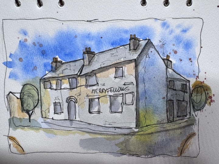
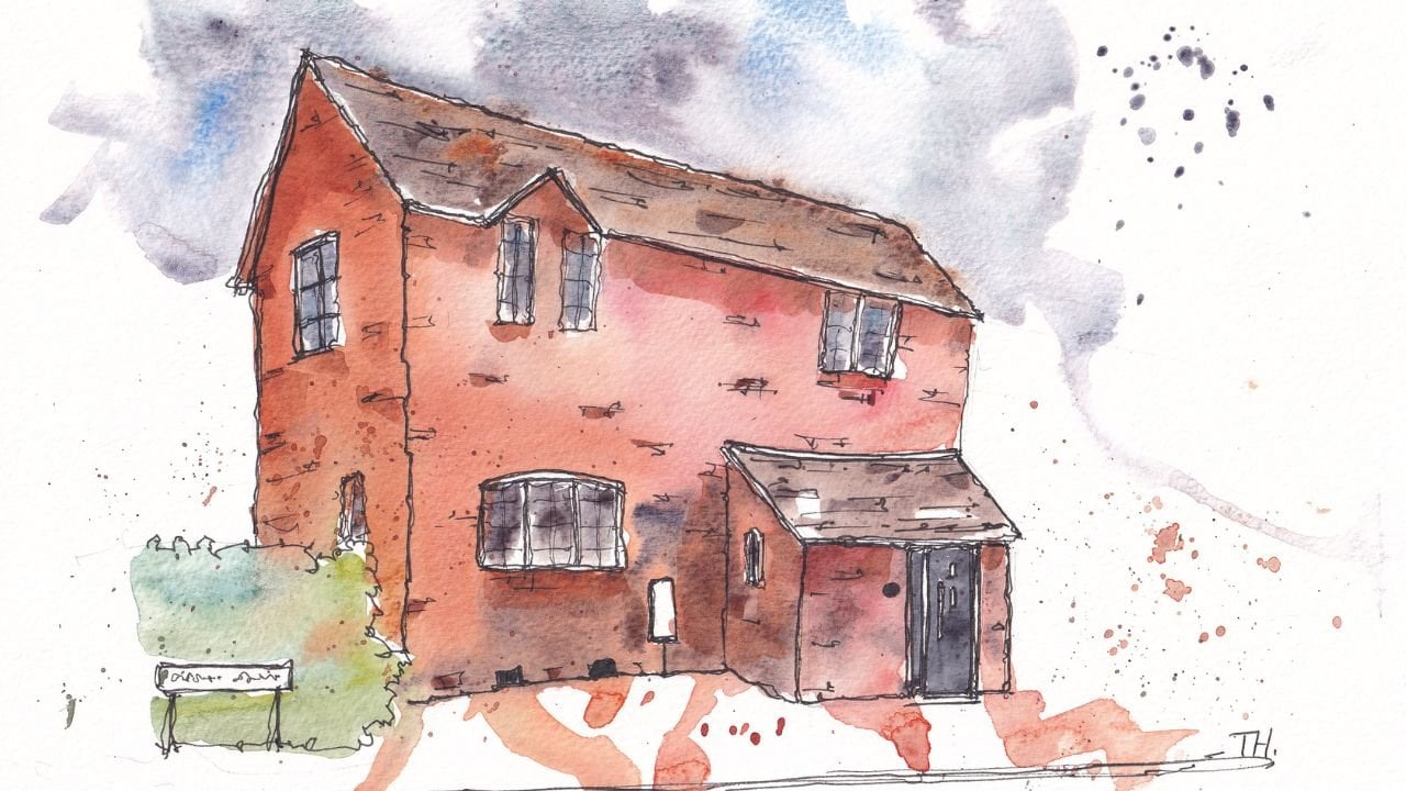
15. Continuous Line Thanks: Thank you, everyone. We are done. It has been a brilliant
experience for me, at least. I hope that you've enjoyed it. As promised here is the
unveiling of my sketch. What we're left with
is of course this. My final project, I hope
that you enjoyed yours. I'm very proud of mine. I really like the colors, the boldness, the
fun that it's got. I think it's got a
really lovely feel. Of course, it's one of my
favorite scenes to sketch, it's one of my local pubs, so it has a special
place in my heart. Anyway. If you want to share
yours, that'd be amazing. I'd also love if you
could leave a review if you've enjoyed the class
and you have some time, it means the world to hear what people think of the class. It also helps spread the word and get continuous
line sketching hopefully out there even more. Also, if you'd
like to reach out, show your images with me at Toby Urbansketch on Instagram
or follow me on YouTube. Please do, I love to
meet up with you there. But most importantly, have
fun and happy sketching.
 Toby Haseler, Urban Sketcher, Continuous Lines