Transcripts
1. Introduction: Hi, there. Are you
looking to get started in urban sketching
with your ink, your pens, and your watercolors. But you're not quite
sure where to start. You want a simple
process that will let your creativity run wild so you can focus on producing
a beautiful image, but know that your
foundations are solid, giving you the freedom
to be expressive. If so, then this may well be the class for you.
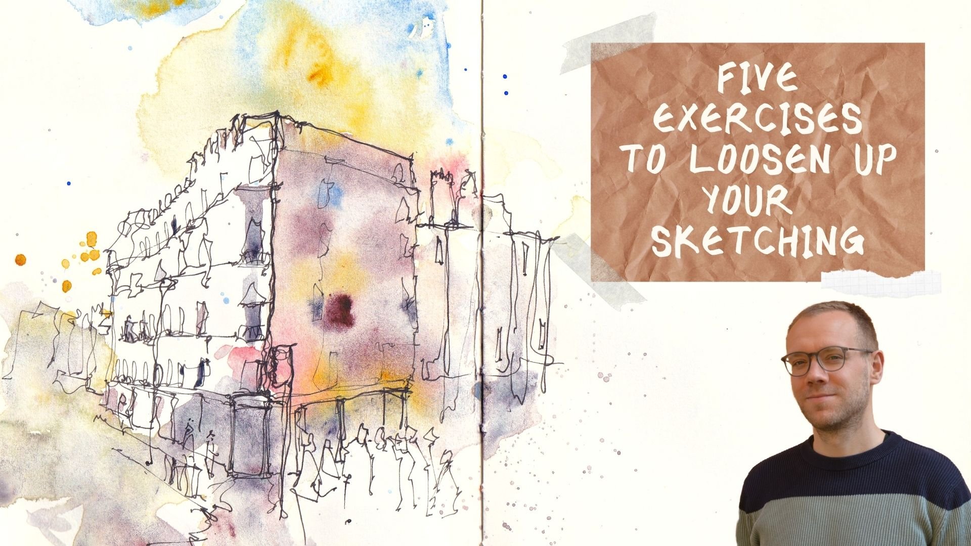
My name is Toby. I'm an urban sketcher, known as Toby urban
sketch on Instagram, YouTube, and of
course on Skillshare. My style is loose
and expressive. It's all about being
playful, having fun. I splashed my colors around. I produce some interesting
and quirky line work. But it's all based
in a simple process. Because I have my
simple process. I don't have to think
about it anymore. I just do. The thinking comes into how can I
make this more fun? How can I make this
more interesting? And I get to really enjoy
the process and I get to be proud of all the
sketches I produce. In this class. I
want to show you my processes and give you all the tools
you need to go out, start creating wonderful art. In the first step will be using a pencil to lay down
our composition. We'll talk about the rules of composition, the
Fibonacci spiral, the rule of thirds, but we'll make it relatable, easy, something that you can just put into practice
straightaway. Next, we use our pens. We grabbed some
beautiful line work. We start creating these
textures and character. After that, we add some paint
on a little bit of color. We can be a bit
splashy and loose, but we're also using some pretty simple
principles to make sure that our colors work and everything feels dynamic
and interesting. Finally, we add those
finishing touches, those beautiful little elements that just make
everything come to life. I'm sure by the end, you'll have a really clear
idea of how you too can start urban sketching,
picking your scenes, producing them in
beautiful little sketches in your notebook,
your sketch book, or on some lovely
watercolor paper, if you'd like to connect, please do follow me on Skillshare. I start a discussion,
share your project, or you can find me at Toby
urban sketch on YouTube, Instagram, or on my website. And with that, let's
get sketching.
2. Supplies: What supplies do
I typically use? Well, if you have a look here, you'll see everything that I typically use for my
sketching and it's not a lot. And also it's very flexible. Now, let's just break that down and have a look at
the individual elements. I'll explain why I've chosen these specific things and
why and through the years, I've narrowed down
exactly what I use. So firstly, there's
the pencil and pen. Now I tend to use a
mechanical pencil. If I use pencil at all, often I just go straight
into the sketch. But a mechanical pencil
fits really nicely in my pocket in a small
sketching box, whatever. And it doesn't
need extra things. So it's got the
rubber and the top. It doesn't need
sharpening and it produces a reliable
and small faint line. Perfect going over in pen
and watercolor later. My pen is a Lamy
Safari fountain pen. This one's an extra fine nib. I also use a fine nib and
sometimes a median nib. I do have fine liners and other things with
other types of inking. But I just find a fountain pen more
flexible and to be honest, bit more joyful to use. It's just really nice having
something which is going to last you forever, that is yours. And you can really get
to know inside the pan, I use something called
Platinum Carbon Black Ink. This ink is waterproof and
having waterproof ink is important whether you want
to use a fountain pen, a fine line or another
time kind of pen. It doesn't matter as long
as the ink is waterproof. When it comes to brushes, there are loads of options. If you look above my head
and behind my shoulder, you can see I have loads
and loads of brushes, but I often just
use a couple of. My favorite brushes are
having a small round brush. This is a size six round brush. And having a couple of more Chinese style brushes which just hold water in a different way and apply pigment
in a different way. So I've got a size two
MOP, which is this one. And I've got a medium-sized
Chinese brush, which is this one. You don't need a
load of brushes. You can explore the kind of brushes which worked
best for you. But these are the ones
that I'll be using. Of course, no urban sketch is complete without
a head of color. I'm most commonly, I used
my watercolors here. So inside I have 14 colors. I've got a nice and messy
palette. As you can see. I love sketching messily
sketching loose niches. What I call a happy palette and messy palette is
a happy palette. In the project description, I've listed all the
colors I've got here. And as we go through
the process, I'll explain as I use them, which colors I'm
using in terms of the paper that I use on my soft and actually
use a sketchbook. But if I'm producing
something finished, a nice finished piece, I'll often use some
paper as well. Today we'll be using this. This is watercolor paper. It's, it's cold pressed. It comes in a really big pad. It's just using grade. It's nothing special, it's
nothing super expensive. I think that when
we're sketching, it can be very easy to get focused on buying
expensive supplies. But actually, the art
is in the artist. We need supplies
which are good enough that we don't need to go
out and break the bank. And last but not least, there's
a couple of little things which is easy to
forget to mention. I use a bit of masking tape sometimes to pop around
the edge of my paper, and that's what I'm doing today, produces a lovely border. When we take it off. I have a really big jugs when I'm sketching at home
or in my studio, I sketch with a liter of water. What I'm out and about I
make do with less because it's not easy to carry
that much more to round. I have a nice towel, a towel which I can use
instead of a kitchen roll. It's a little bit
more eco-friendly. That's why I like
using the towel. But again, if I have
tissues, if I'm in a cafe, I'll often just use the tissues
that come with my coffee. And that is everything
I can imagine us needing and probably
a whole lot more. So without further ado, I think we can move on and
start looking at our process. The first step of which
we'll be examining the idea of composition with our pencil sketch and looking at those rules of composition.
3. The Class Project: So the final project, well, what I'd love for
you to do is produce your own urban sketch
based on these five steps. Have a think about
the composition than pop down your pen lines a
couple of layers of watercolor. And then you're finishing
little ball touches. Don't get too stuck
in the process to be creative, have fun. You can choose my scene. I've supplied a reference
photo in the class resources. Or you can of course, choose one of your own new
neighborhood, your house, something in town
that's been catching your eye recently
when you're done, I'd love for you to share
it in the class gallery. That means that we
can all have a look. We can compare contrast and see that everyone following
the same process will produce something
remarkably different, but equally interesting. I also go around and I make sure to provide feedback and ask a few questions whenever someone posts something in my classes. So if you'd like to have the interaction and
I'd certainly love to please do share
your finished project.
4. Rules of Composition - Practical Guide: So composition, composition
is one of those things which often we don't think
about, it just happens. But if we do think about it, we give ourselves a
much higher chance of success or image will instantly be better
just for those few minutes, thinking, moving things around. And how can we do that? Well, use the rule of thirds
and the Fibonacci spiral. And I'm going to show you with a couple of thumbnail sketches, how we use those for this image and how it
informs our composition. So now we're on to step
one of our process. In step one starts with
little pencil sketch. We work out our composition. Now for the composition, we can rethinking about two important rules of composition. So I'm just going
to start showing you these in my sketchbook here. So if I just make myself a nice little
landscape box here, this is our thumbnail sketch. You may have heard of
the rule of thirds if I just write up here. And what does that mean? Well, it means we divide our
canvas or paper into thirds, so three vertically,
horizontally. And that leaves
us with this grid and also these
crossing over points. The idea is that
your focal point will sit on one or two of these. And perhaps there'll
be a secondary focal point on another. And this is the easiest way
to start thinking about your focal point and
the flow through the image and how that guides the viewer
around the image. If we take e.g. our factor here,
we can see that, well, look this kind
of horizon line, this silhouette of grassland flows nicely along
this line of thirds. And then that will mean
that our lighthouse can go along here and the little
house can go here. And what we can do,
we can just work out with a little
sketch all these shapes and where
are they going to fit and how are we going
to manipulate things? I say manipulate things because
we don't have to stick. We've got a reference or
a scene in front of us. But were the artists
were allowed to move things and change things. And one thing I'd like
to think about e.g. with what we might
change in this is if we think about
the flow of the image. So this this horizon line
is quite high actually, if we look at the actual limit, it's probably more like up
here and it's quite flat. If we think about a different
compositional technique. So here we got this
rule of thirds. Well, let's think about
the Fibonacci spiral. So the Fibonacci spiral is a literally a snail
shell like shape, which curves around like this. And what we want when
we've got this shape, because we want the
focal point to be where the tightest
lines or we also one. So if we put a lighthouse here, we want the image to flow. We want this, this is sort of natural way the ion
will flow around the image. So we want things to bring
us towards our focal point. So perhaps actually,
if we look at this, what we want is
for our landscape, two more Come down
and then come up. So instead of having
really flat landscape, we're going to manipulate it. We're going to just
slightly change it. We can also just pick out, we can see that this landscapes, when it comes towards us, some very foreground landscapes. So we can pick out here a bit more detail which also follows this flow, this loan. We can create a two
layered background. We've got the distant background and they're closer background. Now we're much
better at following this flow of the
image and we're still following that rule of thirds
works on both these fronts. Now with this Fibonacci spiral, this could be any way round. So it can be like this. It could be flipped over, it could be the other
way round of course. So it's just, it fits in
one of these corners. And it enables you to just
think about the flow of your image the closer
the lines are together. So as these lines spiral in more detail and boldness
you want in your image. The further out, the further
apart these lines are, the less detail what we want. So this is a
compositional techniques. And what we'll do now, we'll
go into the next video. We'll use what we've
learned about composition. We'll use our thumbnails. We will transfer that
onto our piece of paper.
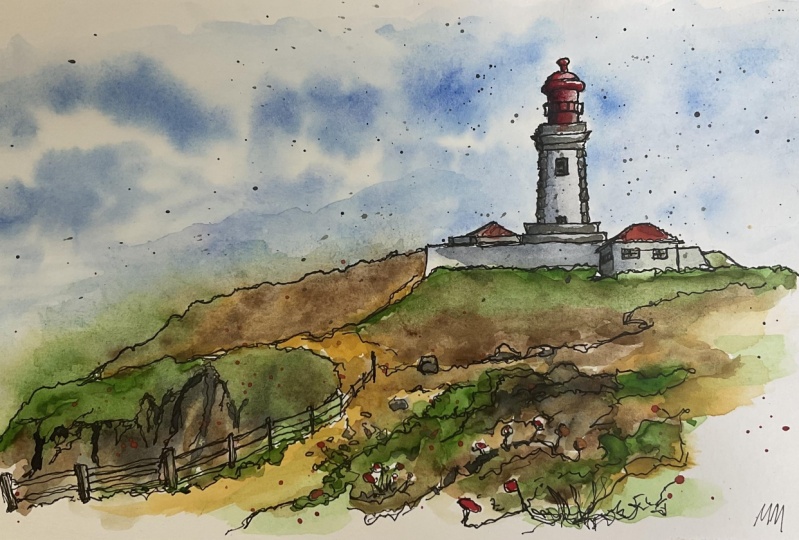
5. Step One - Pencil Sketch: Now step one, we've
done a little fun now so we know what we
want to put on a page, or at least we know where we
want to put it on the page. Step one is about
taking a pencil and our final piece of
paper or final best TO of surface that we're
gonna be creating our image on and
applying the shapes. So we're thinking about
arsine in shapes. Simplify it, get it done. Don't worry if it's not perfect because when we come
back in step two, we can always shift and move things around a little
bit with our Pen. So we've done this
first half of step one, which is working out
our composition. We've got those
fundamentals in our mind. We've worked out
the rule of thirds. We've worked out the
flow of the image. Now, we've got our paper here, our final piece of
paper, the same pencil. And we're going to apply the major shapes of the
image onto this page. And this is a quick process, is not a slow long process. This should be nice
and quick process. We can move things,
we can edit things. When we come in at the
pen, we can change things. So what we're gonna do, we're just going to take our basic elements
and pop them down. Let's start with this foreground so that we can start
thinking about that flame. We wanted it to sweep up instead of being
flat, didn't we? Then we've got this other
foreground which we're going to come in like this. And we can have that
climbing through the image. Then if we just mark in very
gently our rule of thirds, we can check where should
our lighthouse be? Should be about here. So we're going to keep it in the right place or not image. And the lighthouse
is just a series of shapes at the bottom, it's got like a rectangle. Then it is a, basically a
triangle or a cone, isn't it? But the top has been cut off, so we can sketch that in. I'm just going to be fairly dark with my lines so you
can see what I'm doing. But I advise you to be quite gentle so that you don't have to
do too much rubbing out. On top, we've got
another rectangle. And this rectangle and then a, basically a square
with a little bubble. And then we can just mark in a couple of these
other slight detail. So we're going to have
the the railing come out. We can move to our house. What's our house? Our house is, it's got a rectangle at the
front with a triangle on top with a parallelogram
coming off here. This grasslands
nudges up against it. Got a couple of little chimneys. And then if we go here, we've got these little
bottle add sticking out, which will probably make
a feature of at the end. Is there anything
else? Well, let's just do a couple of reminders
for ourselves. So it'd be nice to have some
middle flowers poking up. This can be a foreground. So we've got more than
just this wash of green in when we do
the watercolors. You can also have these
flowers coming in and providing little
punches of color. Other than that, I think this is pretty much all
we need to do. We've got these sort of framework marked in
nice and neatly. And so I think we can
safely move on to step two, where we will apply
a little bit of ink.
6. Step Two - Pen Sketch: So we've got that pencil
framework down and it's trying now to have firming up and I'm going to use
my fountain pen, but feel free to use another pen as long as it's waterproof. What we're going to
do, we're going to use that sort of skeleton,
that framework. And we're going to
apply our pen work in a loose and expressive way. Don't press too hard, don't
create too bold a firm edge. What we want is some
fun, some expression, some wonky lines to
really make this, this image feel alive. Okay, so now it's time
for our pen work. You can see the only bit
I've done off cameras, I've rubbed out some of
these compositional lines, everything else I'm leaving in. And even if you
don't rub them out or you never had
them, It's fine. Pencil has a way of disappearing behind everything else
we're going to do. I'm going to start
around my focal point. I'm going to hold my
pen really loose. And we're going to
wiggle and mobile. We're not going to be doing
straight lines is it's very tempting to think. The only way to get a sketch
good is to press hard, make sure that lines
really bold and perfect. For me. That does the opposite. For me. Wobbling, going up and down lines that starts to
generate texture. So what we're doing now is
we're going up and down our lovely lines that we
found with our pencil. And we're producing a texture
filled interesting sketch. So these kind of
wobbly lines are suggesting it's a bit older. They're suggesting
it's made of brick. They're suggesting that it's a little bit grubby and
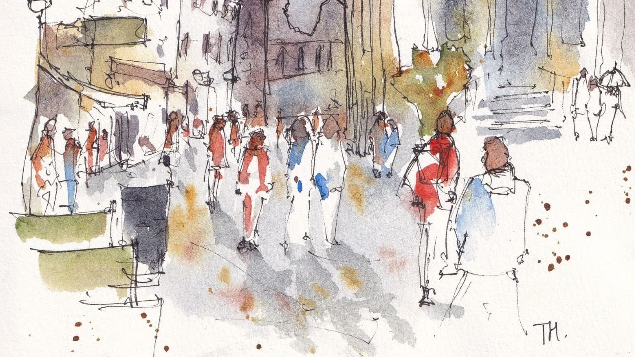
you can see all of those things are true from the reference photo as sketches. We're not here to sketch or draw or paint
every tiny detail. That's what the photos for. We're here to get the impression of the image down the
impression of the place. So you just continue these
little wiggly wobbly lines, getting these important shapes and then we can move
and correct things. So I've moved the
top, this ellipse, I've moved it
slightly to the right because it's on reflection. That's where it
should have been. Get this lighting. And there's this complex and
meshwork here isn't there. But what I'll do, I'm going
to just really gently sketch that kind of
idea of a meshwork. But it's very loose,
it's very delicate. And I probably won't do any
more than that because we don't want it to overpower.
You can barely see. It kind of looks until
you look closely. It looks like there's
nothing there. So don't over-invest,
don't overdo it. Get down to this window. And we're just trying to
make it feel free days. So 3D means drawing more
than just a square. It needs extra lines, that needs extra planes. So you can see I've
drawn a square and then I've drawn the inner edge. And I can even lacking
the window a bit. Now it's got a really
deep shadow inside. Now we can move down
to our lovely house. And again, let's
keep this lovely. We will wobble going. You can see in the
pencil sketch, I didn't Jordan the chimneys, but that's no problem. I've noticed them now
and I can add them in. This is where the pencil sketch doesn't have to be perfect. It's just really quick. And it's just some
of these marks are there to remind us of things. And then to provide a scaffold. And now we're really looking, we're really sort of
checking what's going on. And we can go round
out the window. And again, do you
see couple of lines, instead of just doing a square? Adding that extra
line makes it 3D, but lacking in the window,
it gives it that shadow. We can do the same here. You can block in and
give it a frame. So black it in, give it a frame. Again. All of that
and more is in the house portrait essence. If you want to know more about real details like
this, check that out. This, this class is more about the general feeling and
going through our process. So continuing just
to work around. Now you can see we have taken our shape all the way
to this foreground. The foreground,
I'm going to work out in to out because I want
to get that flow right. I want to feel that
Fibonacci flow. You don't have to
get the exact line that has suggested
by reference photo. We can do our own thing. So again, Weebly
wobbly in this time. My wobbles are aiming to
pretend to be grass or these little textures which
are popping up above the, above the horizon or above
the lip of this graph anyway. But as we get further away, these little marks
would be less and less because they want to
be less and less obtrusive. We want to be drawing
the flow this way. So gentle lines, sketchy
lines lead to bolder lines. And that brought, brings our
eye up to our focal point. And that again, that's
our composition. Then we've got this other
layer that we decided on. Why not add in some
of these flowers? There are hundreds and
hundreds, probably uncountably hundreds of
flowers in the reference. But we can add a few. And we can use those as a
reminder for ourselves. Later in the color that
we're going to add simple punches of
lovely flowers. The flowers can be above
and they can be below. We just get again that flow. We're getting that flow.
We were sort of moving the line as we feel it should
with the reference in mind. But the reference isn't
ruling what we do. Equally, we can get an
extra layer of foreground. So we can bring in just a
couple more extra flowers, just sort of poking their head, or even just a few
scratchy little lines to come and be passive graph. We can also create just a bit more shaped by just bringing down some lines which
kind of break up this, this big blank space. And when we come to a color, we can use these lines to make
the colors float as well. You can do the same over here. Again, getting more
loose and scratchy in the distance because you see
now how this flow works. If you imagine the spiral
coming around like this and leading here, as you get closer and
closer to this point, there's more and more line. There's more and more
bringing your eye in. And is there anything else
we really need to do? Well, the last thing I'm
gonna do is I'm just going to come up and down
these lines a bit more. I'm not pressing hard. I'm doing the same loose line up and down to make it bolder. And then we can just provide
a little bit more texture as well as get some nice smudgy
bricks that you can see. We can mark them in as
textures on our lighthouse. Then I really do
think we're done. So how long was that? Just about 6 min of sketching. To go from a pencil sketch with pencil framework to really
interesting bit of pen work. And then next week
we'll be doing, is getting our watercolors
out using a couple of brushes to create some
loose and dreamy colors. On top.
7. Interlude - Getting Set Up to Paint: So a brief interlude about
how I set up for my colors. Firstly, what I've got
under my drawing board, a little bit of masking
tape and I pop it down. And that means my
drawing board is at an angle. So it's like this. If this is the desk, my drawing boards like that, that means my colors
will flow down. I've got a really
big pot of water, and I got my watercolors. And you can see my
watercolors are messy. And the reason they're
messy is because I like knowing which colors here a rich I can take some red and
put it on the page. Also, I can go all, let's put some red with this
blue and make a purple. I can find things
which have happened in my palette and make use of them. And we'll do a bit
of that, especially for the sky and the greens. We'll be taking a bit of
fun from the palette, putting it straight down here. But that is essentially at, that is how I get set up. So get set up yourself, give yourself plenty of space, a little bit of an elevation, even just using an old roll
of masking tape or whatever. We're just holding it, holding up your sketchbook
with your hand. And then we can start
our beautiful colors.
8. Skillshare 5 Steps Step Three: So step three now we are
getting on colors out. Now, I love using a reasonably big brush for this first layer
with a lot of water, really loose, really
happy colors. Let those colors
paint themselves. And if you don't know
what that means, don't worry, I will be
showing you in this class. So we're going to start
with our colors. Now. I'm going to use my
biggest brush first. And I, I like starting
with the sky. I like starting with
water for this guy. So I opened with
getting my water. I'm going to say neatly,
but it's not really neatly, but getting it splashed
around that lighthouse. And why do I like doing this? Why am I putting
so much water on the page without
any watercolors? And I think the answer is so
beautifully demonstrated. I'm going to take
some moon glow. And that's because if
you see this moody sky, there's this big
cloud at the top. I'm mingling will be
perfect for that. You could use a different
color of Payne's gray or mixing neutral color with say, a burnt umber and ultramarine. Now with my moon glow, which I've taken quite wet, quite a lot of water, but
also lots of pigment. If I just put that in my water, I get cloud shapes. I get this dreamy spreading sky. What I like to say is, Why would I paint? When my watercolors are
happy to paint for me? Look at that sky coming down, it's giving that effect. It's almost like rain, isn't it? But it's giving you
these effects which we can't necessarily do ourselves. Maybe we can, but they take
an awful lot of effort. And actually watercolors are more than happy
as I like to say, as I just said, to
paint themselves. So let them, let your
watercolors paint themselves. This is the unique
magic of watercolors. No other medium,
no other kind of pain will happily move and
paint itself like this. As you can see, we
can move things around so we can
respond to them. So we can soften the top. Maybe we want to fill
up a page with color. I'll leave a few
little white gaps because I think that's important as well with watercolors having a bit of light in the page. We can push the pigment around, we can come in and we can
drop more if we think it needs to be a bit more
intense somewhere, we can splash in and that will
create different textures. Underneath all of that. Very moody, interesting sky is kinda sliver of
hope, isn't it? We've got this, this blue, so I'm going to
use a cobalt blue, any sort of nice bright
blue we'll do though. So don't worry about all
these specific colors. I'm just letting
you know because people often want to know, but use what you've got and use. Cerulean blue would also
create a nice cool, crisply and is
often in those sort of watercolor sets
you, you can find. And you see how just by popping in and giving it a little
flick, it's painting itself. It will even paint
itself up a bit. It won't be as
dramatically going up because it's not got
gravity on its side, but it's gonna go
up a little bit. Then we've got this interesting
cloud in the middle. I'm going to touch in
a few bits of blue to make us feel sort
of more unified. But we've already got, I mean, that's a fun,
dramatic skies in it. There's no arguing that that's, that's watercolor
has done its job. It's done what I paid it to do. And what's next. So now we're gonna move
into our foreground. And I'm going to be adding
these lovely greens. Now I've got a agreeing I
like called cascade green. You can see it in
my palette here. And I'm going to use that
as a nice mellow green. You could equally use a, just a simple green that you mix with a blue and
yellow and you can change the green by adding
more blue or yellow, or even adding earthy tones
like browns and things. For me, I love this
because my cheek green and it creates
a nice texture. What I'm doing is I'm
doing the reverse process. I'm getting this green in, in a few places. I'm trying to paint around
my pockets of light, which are these little
flowers we're going to have. And then I'm going to
come in with some yellow. Because yellow and green. Green is made of
yellow and blue. So adding yellow will
lighten our green. This yellow I'm using
is quinacridone, kind of like a golden color, like the light is coming down. I'm going to bring
that up to our sky, where our sky is going to bleed in a little bit in places. And it can feel scary. This it can feel like, oh, I'm not in control. But you aren't, to be
honest, but you sort of, are you still the one
who's guiding watercolors? He's responding to them. But again, by letting these
colors meet, not everywhere, but in a few places, you'll be giving
them the opportunity to paint themselves into
these wonderful texture. Just by doing that, by
popping in two colors. A third one by meeting
the sky and the greenery, we get this really
beautiful varied wash and we can do the same
process as the sky. We can come in and we can touch in other pigments that
we want to be there. We can plop in water
or we can even dry our brush off and come back
and scoop out pigment. Do you see how I can e.g. if we wanted to, I could
scoop out a lot of the pigment in this back layer. Now will the intensity is
sitting in the foreground. And that again fits
with this flow. We've now got this line, this line of less pigment, which brings our eyes
up to our focal point. A couple more touches
of yellow just to start these ideas of flowers, and we'll finish
off those ideas of flowers in the next stage. Then the last little bit, the last bit for this
really loose stage of watercolors or with our sketching is to add a
little shadow down here. And how are we going
to do the shadow? Well, let's use colors
we've already used. So let's take our moon glow. Let's mix it with a bit of blue, so we've got a slightly
different tone. So I'm just gradually
mixing the two together. And then I can choose from
my palette, which I prefer. I prefer the slightly
more blue tone. Then we can bring that slightly
different shadow tone all the way down or
lighthouse here. And we can find
the other shadows, which is this roof. And then here do
you see how that's blending with the sky? For me, that is
absolutely wonderful. Now if you don't
like that effect, what you're going
to need to do is either wait while
so that things are dryer or you can leave a little white
gap between the two. For me, I loved the
blending effect, so that's part of my sketching aims normally as to blend
and bleed things together. I'm just going to
soften this edge a bit. So I'm just taking
some water and you see how they're touching
a little bit of water in. Instead of having
this hard shadow, we now have this gradual
shadow coming across. And we can reintroduce the
holidays later if we want. Because that is step three done. So now we need to let this dry and we can come back
again with our watercolors. Next, it'll be with
a smaller brush, my size six round brush. So get yourself ready with
a smaller brush if you've got your watercolors and
a dry piece of paper, and we'll be moving onto step for creating those
bold, punchy colors.
9. Step Four - Bold colours: So step four now in step four is all about bringing out a little
bit more boldness, bit more shaped with our colors. We want our page
to be mostly dry. Doesn't have to be entirely
dry, but mostly dry. So if you just move
on from step three, perhaps have a
five-minute pause, go make a coffee or a decaf
drinkers, It's the evening. And then we will get started
with this little step, building up our colors
and having a bit of fun. Okay, so we're back
and we're mostly dry. So here's my little
size six brush. And let's just move on to the next interesting
lines of color. I'm going to start
now in my lighthouse, because a lighthouse
is what's going to set the tone really, isn't it? The intensity of
color or shade or value in the lighthouse is what will inform us about
the rest of our sketch, how much color and
punchy can give it. So a lot of this is
just about shadow. So I've got my moon glow and we're gonna be a little
more careful this time. Still a bit loose, but
also nice and careful. And we can bring down this
time perhaps a hard shadow. Let's try just a
nice firm shadow. We can bring it into these other places as well
that we identified before. We can make that shadow
a bit more varied so we can take a bit of
that blue again. We can drop it in,
in a few places, perhaps using more of a
blue shadow to separate the roof and the
building as well. We don't want it all
totally hard edge. So I'm going to also just come in in a few places,
often at this time. So instead of
softening everywhere, this time it's just gonna
meet in a few places. And the other way that we
can make it feel software is by just bringing some
of these texts as across. And we've got these sort of
grubby lines, haven't we? So we can bring those
grubby lines across. Then if we go up
the top as well, all of this is rather dark
and we can bring that out. We can surround our light
with a bit of darkness. Since we know that's a light, we can also have good, have fun. So why don't we just take, I'll take the same
yellow, the quinacridone. Why don't we give for
light, a little glow, just a gentle glob
inside the lighthouse. Then underneath we're back to
having rather dark colors. So Here we go. No problem all done. And we can also just
bring down some of this meshwork as well if
we want with our brush. Just in a couple of places, it makes things feel
a bit more unified. Now, I love, as I said before
teen some splashes said in the intro belief and unsafe
for me, a few splashes. Just again, it breaks up those shapes and
it draws the eye. And it gives us a bit
of information about how much splashy color
we can do elsewhere. And that is basically
our lighthouse done. We might do few other touches, but we'll wait and see on that. And we are of course
going to come back some finishing touches. Perhaps a bit of pen perhaps, and punchy color in
the last section. Now this foreground. Okay, so what have we got? Well, let's take our
green and this time, again, using our small brush. And remember how I
said we could use these lines to shape
our color a bit. Well, we can literally pops
in color under those lines. We can put some water on
our brush, make it clean, and we can soften that, move it around, blend it in. Now we've got these bumpy areas and it's suggesting lumps
and sort of real movement. We can touch him some of our, our yellow again and move
it around and again, whilst this is all wet paint, we can splash and this time
I'm just splashing water and that water will create
very real textures. Feel free to experiment as well. We're just moving your
brush in and out of that. You see how that creates these lovely texture
in the background. You can use circles and the water and pigment
will flow along. I'm just have a go at
doing these little, funny little
movements and flicks. And you could try this, this kind of thing as well in a, in a thumbnail sketch
if you wanted. There we go. And we've now got these lovely layers separating themselves out into
the foreground. We want that intense color. So we're going for green. And we using these shapes again to direct where
our colors going. This time we could split our color between
different shapes. So we've got this sort
of shape of green. This shape which is more of our quinacridone,
more of a yellow. This shapes greening n. Then perhaps you want to
leave some of them like, so we'll leave this
as a nice bold bit of light and work our way across. We still managed to leave these lovely little
flicks of freedom. The lovely flowers,
which we can add a punch of color to
at the end as well. It can be nice to add a
little bit of shadow in. So if I just kept my nice shadow color my moon glow again, and drop it in a few places. It just a bit more realistic
because in reality, there are loads and loads
of shadows going on in here as well. There we go. So we've got this kind of
more real punchy lighthouse. We've got this nice
layer of color, a bit more sort of
going on there. Now, before we go,
before we finish, I'm going to do some
splashes in here, some yellow this time. And that yellow is starting off those effects of having flowers because it's
still wet on wet hair. Do you see how they're
already bleeding out, these little bits of yellow
already bleeding out. We can also touch it in if
we want to be more careful, we could just really
gently touch. You see how as we touch it in the brush leaves a tiny
bit of pigment behind. And we're getting this effect
of flowers in our scene. Now, I'm going to let that dry. So that is our step four done. We're almost there. And
step five will be on this. Now nice and dry, adding in some
really intense color and bringing things
together with some line work which just
pulls in those shapes. Do you see where
we're not quite met the line and the color will
be fixing that in a moment.
10. Step Five - Finishing touches: All my stair step five. Step five is where everything
just comes together. We can take our pen back, we can create a few
more interesting marks. We can capture some shapes which maybe has gone a bit skew. If when we did our
original panel with our colors spreading in
places we weren't expecting. And then with our colors, we
can add some really bold, bold highlights or
deep shadows or perhaps bright colors
and a few splashes because I always
love a few splashes. So we're back and how do
you think it is looking? I think it's looking alright. I quite like it. It's important
when we're judging our own art to take a step back, look from further away, even take a photo and
look at the photo. A bit of space
away from the art, takes your attention away from all the tiny imperfections
that you know are there. And actually, if you saw someone else's version
rather than your own, I bet you'd think the little
imperfections were on purpose rather than
little happy accidents. And when they look like
they're on purpose, they look like artistic
genius rather than mistakes. So now I'm going to take my pen and we're gonna be doing a sort of redo
some of our lines. So some of these key lines
just go back along them. Don't lose that texture. Don't lose that lovely, we believe wobbly line. In fact, if anything, make it even more
wiggly, wobbly. And now what we can
do, we can find where these colors escaped or missed. So where we've got these
little white areas, we can go round it and look. That makes that white area
looked like it was on purpose. In a sense, it was, I try and leave these
lovely white areas because I know the
effect they will bring and I know the effect
when I come back with my pen that will be left
by encapsulating them. So it's not a lie. It's just
a bit of creative freedom. That's why I tell
myself all the time. Anyway, we're just
continuing along. So we recapturing this line. Again, all up here, we've got a little bit of light, which doesn't work because that edge is supposed
to be shadow. But if we capture that
light with a pen, suddenly it's the light. Glancing off the
top of our graphs. We can come down these textural
lines we added as well, and we could do the same thing, just capture those areas
of light and shadow. You see how this just brings
things together and it, it makes everything just work. It creates more
noise on the page, but noise, which is the textures
you've been building up. So don't worry, any
of the other stages. If it's not yet
looking finished, it's really not supposed to. It's only now for me, at least it's only
now when this kind of starts looking really
good and I started thinking, Oh wow, this is, this is
actually working well done me. Even our flowers in the front. We can capture
again, these leaves. We can capture, we can start giving them some real
contrast as well. This is the
foreground, remember, so we can give it a silhouette
by really blocking in some of those colors
here as well. And maybe a couple more
leaves blocked in here, and there isn't much left
to do in the foreground. Now let's, let's leave
it because there's a real risk sometimes
overdoing it, going too far and you can't take back with pen or
with watercolors. So stop, move elsewhere. Come back if you need to. We can do the same thing
now with our lighthouse. We're going to go up and down. I'm not pressing harder. And you see how my life
has gone very wobbly there because it caught on
the paper, that's fine. It just adds to that wobbly,
interesting aesthetic. If you don't like that, Well, it's happening now. And it's part of
all my sketches, these kind of wobbly lines
which go a bit wrong. And if you'd gone really wrong, if we'd gone way off, well, I just introduce another one
so I could even do that. I could just introduce
these kind of flux coming off elsewhere. And suddenly that first one was on purpose because
I've done it elsewhere. How could I have done
it wrong so many times? And it's adding sort of
aesthetic qualities, adding that interesting
expressive idea that loose urban sketching
style do the same with these little lines where we've got our chimneys, we can block in an edge and then It's got some nice
light shining off it. Same over here. And we can come and
now we can finally add the little things
we said we were at the beginning and
we can do the same. We can turn them into a 3D object by giving
them a deep shadow. There we go, and isn't
much else left to do? Well, probably not with the
pen is that I think we've, we've achieved what we set out
to with our pen work here. So what can we do
with our brush? Just my last few touches. Well, let's take
quinacridone again. We're going to do a little
bit in these flowers. And I'm using the
quinacridone now, there's an almost
toothpaste consistency. I want to leave a
bit of white because I want these flowers
to stand out. So by having them have this
toothpaste consistency, really dark quinacridone
with a whiteout line. It's obviously very different
to what's happening before. Now, I'm going to make an
argument, argument here. And I shouldn't
argue, but I'm going to that you could invent colors. So for the sake of argument, I'm going to take a nice bit
of scarlet lake, a nice red. I'm going to introduce
some red flowers as well. And that's going to
really contrast and pull the eye along this line. Then we're going
to see in a moment one of the problems with that. And then we can work out how
we can fix that problem. So the problem now, do you see it, your
eyes drawn down here? Because that's the only
place with that color. There's only one little area which has got this one color. And using one color
is a bit dangerous. We can fix that with
a couple of splashes. So now it's in a few places and also these red flowers
or in a few places. But we also can fix
it more effectively by just inventing a couple
of red areas elsewhere. So why not make these
chimneys where it might not make one of these just
standing up bread and wine, not even pop a little bit of
red around the lighthouse, give it a splash as well. There we go. So now the eye is no longer drawn
specifically to this red. It's now got this warmth which pulls it all around the image. And that's it. That's
it, it's done. So we've done some really
interesting stuff here. I hope you've enjoyed the key, the most important vet about all of this is to be proud and part of being proud for me
is popping my signature on. And I can of course
now unveil it. So let's just take
off that paper, the masking tape, off the paper and see
what we're left with. And you can see as I remove it, you get that
beautiful, crisp edge. It's a page full of
life, full of color. And when you suddenly have
that little whitespace around, That's another way of getting space from your image and going, Oh wow, It's alright. So I'm really happy
with this one. I hope you're happy with yours. I hope you've learned a few
interesting bits and pieces. Let's just move on to
the next lesson now, which is a little wrap
up little thank you. And a consideration
of the next steps.
11. Thanks and Summary!: So thank you. We are
done. Amazing work. I'm really looking forward
to seeing what you guys have done and please share your
project in the class gallery. I will, of course, put mine up and I'll keep you
updated if you want to. Just follow me on Skillshare. And I'll use some regular posts and sending out little
newsletters as well. I'd also love for
you to find me on my other socials at Toby urban sketch on
Instagram and YouTube. If you want to tag me there. If you produce a
nice class project that you are proud
of, please do. I'd love to see it. I love you
to reach out. Most of all. I hope you enjoyed this class
and if you're looking for your next steps in
urban sketching, check out my
Skillshare profile for loads more full length
in-depth classes.
 Toby Haseler, Urban Sketcher, Continuous Lines