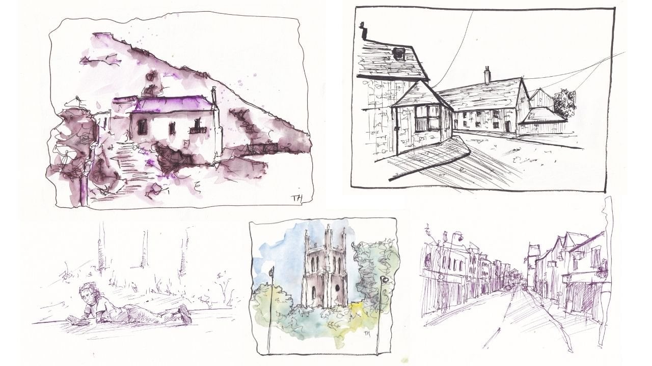
Transcripts
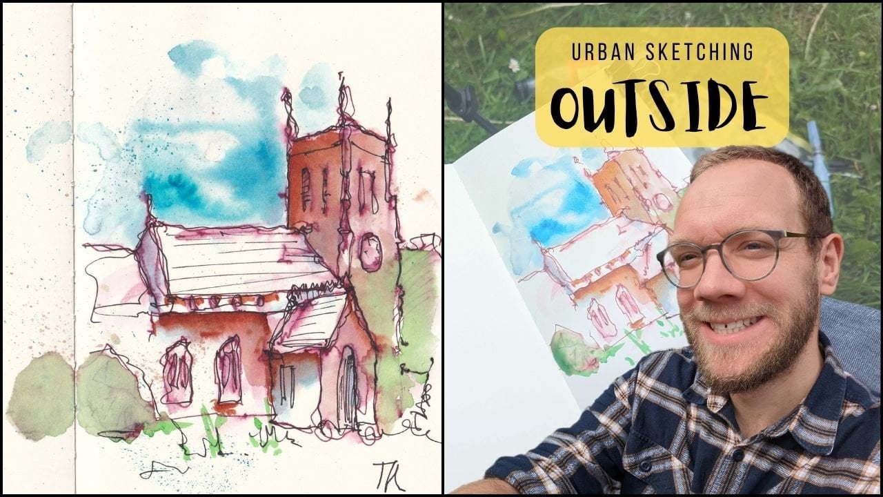
1. Introduction: Hi, there. Are you a sketcher
or urban sketcher? He wants to get more confident
adding people into scenes. Do you find when you get to sketching and those
humans as figures, that you're worried everything's going to go wrong with it, you're going to ruin the scene. It just feels like hard work and everything gets overworked. If so, then this is
the class for you. My name is Toby, known
as Toby urban sketch, an Instagram, YouTube, and
of course on Skillshare. I'm an ink and
watercolor artist, primarily doing loose and
lively urban sketches of the scenes and the
people around me. In this class, I want to show
you that sort of benefit of my experience and my
previous trials and error. I'm just showing you some
really simple ways that I love adding people
to my scenes. With these techniques, I can sit outside my local cafe and sketch a scene in ten or 15 min and really
be happy with it. Enjoy the experience
and get that busy-ness that life on the
page without the stress. If you'd like to learn more and see the
kind of techniques I love using for these quick
and simple urban sketches. Then join in with me
through these lessons, we'll be covering a
few different ways to capture people on
your, on your scene. We'll be looking at
how to add colors. We'll be looking at as common mistakes and how to avoid them. And of course, we'll be working
towards a final project. If you enjoyed the class, please do leave a review, asked me some questions, and of course, upload your class project into
the class gallery. Anyway, without further ado, let's get sketching and
start with the first lesson.
2. Supplies: The supplies for this
class, what we'll be using? Well, the answer is not
much and there's no rules. So firstly, I'll be using
this one sketch book. It's just an A4 sketchbook
from a budget art retailer. And it's got normal
cartridge paper in it. You could get away with
using pretty much any paper. With the watercolors
I'm using at the end, I'll show you these quickly, just my normal palette
and I'll let you know all the colors
as I use them. There's also a list
of all the colors in this palette in the class
project description. But because I'm
using watercolors, I'm using cartridge paper
rather than normal paper. You could even use watercolor paper or
something like that if you want to be more finesse
with your watercolors. With my colors, I'm
just using one brush. This is a small Chinese-style
brush for a flexible nib. Good fun to sketch with. Again, this is probably the equivalent of a
size eight round brush, which is a nice do it all size for an A4 size
piece of paper. In terms of implement,
writing implements. Through the lessons,
I'll be using a couple of different pens. I've got a couple of fountain
pens and a fine liner. Now in the fountain pens, one, I've got some permanent ink, and this is a platinum
carbon black ink. That's the same effect
as a fine liner, which is also permanent ink. In my other fountain
pen that I'll be using is soluble ink. This doesn't matter when we're
just doing our linework. I went talk about it in a linewidth lessons
when I change pens. But when we come to
the color lesson, you'll see that when
we add a bit of water to the soluble ink, it changes how we
manipulate our colors, add more murkiness or add some more readily
available shadow. If I was just using one, I'd probably go for
eight permanent. Unless you have experienced
with using a soluble pen. In which case you could have
a go with that as well. It just makes a little bit more planning needed when it
comes to your final project. When you have a whole scene
and you're trying to add color on top of soluble
ink that's moving. But both are perfectly valid. And that's literally
all I'm using. Just a pen, a way
of applying color, and a piece of paper.
3. Two Common Mistakes (and how to avoid them!): Hello everyone. In this, the first
lesson demonstration, all I wanted to show you is to really simple
things, not to do. The things I used to do myself and got
really frustrated by or that I see people doing
and asking me questions like, why is it too busy? Why is this so hard? And really it's just
because of trying too hard over planning
and overdrawing. If you just watch the
next couple of minutes, we'll talk through exactly
what I mean by that. Okay, so this is a
really short one. It's all about how not to do it, or at least how I think
we shouldn't do it. And the common mistakes I see. And this really just a couple of key points I want to cover here. Now the first thing
that I see a lot is that people over
plan their figures. What I mean by that is
I've spent ages drawing all the figures and what they feel is
exactly the right place. I'll get that person
here, the person there. And then they will try
and draw the rest of the scene around that. And there's nothing
wrong with that per se. But people move,
they have energy. And if you try and sketch them first as part
of a busy scene, what you'll find is that you'll never
quite get them right. You will leave the perspective. They won't be quite
in the right place. And drawing your scene around
them and try not to cross your lines over
will take forever. And it just, for me, it's not as satisfying. So e.g. I've got
this little doodle. And I would argue
that it's fine to now just put my people on top. What I'm trying to get is
the idea of a busy scene. I'm not trying to get that this is a series
of perfect people. I'm not trying to
show the people off for sketch them as
portraits were figures. If you want to sketch portrait, you take a whole
page and use catch that person and you
blur the background. This is a scene
with people in it. And the people are that add
some character movement life. So actually just popping them
on top of lines is okay. In fact, it's great and it
shows how busy things are. There's a hybrid. So what you can
do is you can get your scene and you can leave some gaps under
and in those gaps, you know that you're going
to LET with people and that does work if you
notice a really busy scene. And so you're not
gonna get any of this shop under here anyway, this is all going to
be filled people. But either way, just don't
overplan, don't overthink it. Be prepared to sketch
your scene and then fill in the people later. Because then you'll be able to put them in
the right place. You'll get the essence and the busy-ness without
the challenge, without the boredom and without
this sort of frustration. Now the next point
I want to cover, I sort of said already, but I want to make
it really clear. I think these people are fine. Death so quick. Yeah, sometimes I put it in
a bit more effort and make them a bit clearer or make
a bit more feature of them. And we'll look in the
next few lessons about exactly how I, I do people. But one of the biggest
problems I see people having is they'll have
that lovely scene. And then in the background, they'll try and
sketch this person. They'll try and draw
their nose and their hat. And they'll try and
get every detail, get their exact hand placement. In fact, they're
holding a phone. And then you might
really like that. But now he's too big. He's standing in the road. He's overbearing
the whole scene. And imagine if we
try and fill up our whole scene with these
over sketched figures. And it gets frustrating
because now I'm trying to make this figure perfect. But every time I do that, the inks to bold, it's too bold compared to
everything else. And again, this guy
has gotten too big, is too big for the scene because
I'm trying to catch him. I'm trying to draw details. Even if we look at this chap, his nose is enormous. In reality, people's
noses are barely visible even if we draw someone
in the front and we tried to draw every detail. So let's turn this person to bit more of a
detailed person. Bit more sort of realistic. If we try and draw their eyes, we can't memorize
it or too small. If I try and draw
their nose, again, it is becoming a,
it's just a mess. It's a caricature. Ish, mass is not stylized. For me, at least it
is just overdone. So point number one, don't overplan and point
number two, don't overdraw, except that people
in a scene are just people and seeing
that their shapes, they're simple, they're
easy, they're stylized. Addition. What are you trying to draw? You trying to draw the
scene where you're trying to figure, draw people. If you're trying to
figure drop people, we've probably done too much
of a scene because we need to focus more in on this person. We need to give them more space. So that's my how not to do it. And it also gives you a flavor
for how I enjoy sketching. And in the next few lessons
we can have a look, a closer look at my processes
for sketching people, for simplifying them,
keeping it light and quick, and looking at things like
perspective in color as well.
4. Simple Perspective Rules: Now, when we capturing
loads of people, especially when we're
putting them in a scene. Some concept of perspective
is really important. Perspective being
the idea of getting a 3D object onto a 2D page. And we're always on a
2D pay to my sketching. And perspective can sound really scary,
really complicated. But this is the
absolute bare bones simple rule to learn
and understand, which will get you really far. And most importantly, get
your sketches feeling realistic and feeling
easy and fun to do. So putting people
into perspective, there's just some very simple
rules which are really useful to know when we aren't dealing with
people in a scene. And this is gonna be
really short lesson, but it's just something to think about when you're
sketching your scene. So the first thing is there's always a horizon
line in your image, not horizon line is
a straight line, normally horizontal
with the ground and at your eye level. So here's our eyes. What does that mean at
our eye level on a flat seen it means every one die level is going
to be about there. It doesn't matter how far away, if they're about your height
is going to be there. If we do our shape-based people, we can draw all sorts of
different sizes of people, all with their
hands on this line. And what does that show us? What it shows us that these
people are all the same size, but they're at
different distances. So their heads are
all the same height, but they're on different
scales so their bodies are smaller and their feet are
higher up or lower down. Where their feet are is telling
us how far away they are. Um, which also corresponds to the scale, the size of them. But whether head is
telling us how tool there to display that. If we do a really
tall person and we keep them the
scale of this person. We finished their feet there to see how this
person looks like. They're at the same
position as this person, despite being big and perhaps this person towards
the front as a child. So we give them a child here, perhaps, or even holding hands. Or their feet are that is showing us that
they are together, but their heads are
showing us the height. So being aware of the
horizon line is the really, really keep it for putting
people into perspective. Then positioning their feet in the correct place to give her the height and the
size of the person, as well as the position
of them in our scene. And if you just understand
that and if you just start with understanding
the horizon line, That's really the major
thing which will get you so far with sketching people and popping them
into your scenes.
5. The Simplest People - Shapes!: So in these first few lessons,
are we gonna be doing, is drawing some really
simple people will be trying a few different
styles and looking at how they work
and why they work. And if you were to do a bit more detail,
how can we do that? You could consider
this the first part of your class
project if you want. Just try falling along and
filling a couple of pages of your sketchbook or a
couple of pages of paper with some simple people. This first lesson,
we're going to break it right the way down. You may have heard
me in other places, lessons talking about shapes and how everything is shapes. People are shapes too. And we can really make it simple without
losing the idea of an affected person
by breaking them down into quick, simple shapes. So let's start by
breaking down our people. Now I've got my just
normal sketchbook. And then these
first few lessons, like I said, we can just
fill up a couple of pages. We're going to fill them
up with different types of quite simple figures, but figures which work. And hopefully when you put all these figures
together and you look at them in
your sketch book, what you appreciate is even though they're
simple, they work. We're not worried about
specific details. Who wrote about capturing
the essence of a person. So what is a person? What shapes make up a person? And this is where I think
people as shape-based people. So there's a really simple
concept that I like using. I like teaching, which is a person can be split
into three shapes. So we can start off with a
circle, that's their head. Then we can just go, they've got an upper body and that
is just a triangle. And then they've
got a lower body. And that can be
another triangle. Equally, we could
change it slightly. So still having a, a circle, we can have a more muscular man by having more of a rectangle. With a triangle underneath. We could give someone a hat by giving their head
an extra shape. Suddenly they've got a
square with a square. And then we will
turn this person again into the normal triangle. But maybe their legs,
the square this time. Each of these
people, very simple. Put in context in
the idea of a scene. Without a doubt,
live there people. And we can quickly
just fill up a page by joining up our shapes. And once we get a bit looser, we can start playing
with the shapes. The shapes no longer
have to be circles. You can suggest a little nose. We can suggest an arm
going into a pocket. We can just little arm
here coming out the side. And then perhaps just a
little bit of movement. Just going to change pen because that one has
decided to run out. There we go a little
bit of movement. Just by putting the
foot forward equally, we can taper off the legs
if we do another person. The top nice and simple again, the legs didn't have to finish. The legs can, can float. B. B sort of suggested and we're leaving these
people is very simple. So there's no reason we have to totally bring out
all of these shapes. Another couple of ideas when people are next to each other. So we can work out
their interaction. We don't have to draw the lines, but we could split them up
so we could do a line here. Then we can overlap the lines. We can create that
confusion that we see when you see two people in the distance
next to each other. Often the following similar
colors they blend together. And what we're trying to get is the idea of a few people
next to each other. If you want to extend this
idea of drawing a bit further, you can give people a dog. So what's a dog? It's a series of shapes. So what we've got,
we've got a circle, we got a rectangle or an oval. Let me just suggest some
legs and a tail suit. All of these figures,
all of these ideas of things moving humans, animals. We can just break them down
into really simple concepts. And we just think of them
as three-step figure. And before you know
it, you've got something which is
a perfectly good, interesting, stylized
triggered to put a new scene. Now, the last bit
I want to cover in this is adding a tiny
bit of character. And what do I mean by
that? Well, simple things like we gave
this person I hat, we can give her. So again, really simplifying it. Perhaps a punk hairstyle. That's all you need. Perhaps someone's
got some glasses. You're just trying to pick out a hand in the pocket,
which we did here. Perhaps the reason
this person's hand in is in their pocket is because they've got a
bag leapt over them. So just find simple shapes,
simple, simple shapes. And you can add them
like a walking stick. You can add shoes as a real key part of
this person's look. Start with the
simple three shapes. I'd suggest the starting point is a circle into triangles. But then build on that, keeping it really simple. Working up to dogs and
cats and other animals. Then adding in a tiny
touches which really suggest these people have got
a little bit more going on. They've got some
kind of character and an interest as well.
6. Loopy People - Quick and Sketchy: Now, if shape-based people aren't simple and
quick enough for you, then these next
ones certainly will be loopy people because
they're really quick, short expression, all forms
of getting people on a page. This is probably actually more, most common way of
sketching people, especially if I'm out and about. But what I want to do is
show you that this is a busy scene without spending hours trying to capture
every individual detail. So just another
really simple idea, a simple way of getting
people from your image, from your world onto your page. So we've done our sort of shape-based people,
broken them down. What I want to show you next
to the slightly quicker, if it's possible to
be quicker than this, But even quicker, more abstract and loose way
of displaying people. And this is one of my
favorites and I call it loopy based people. And the reason is
similar to this. We just breaking them down
into real essence of a person. So what do I do? Well, I literally just find a person with a series of loops. So we've got circles. And that is all it is. And you can create
different sizes. And it's just
caricaturing are people. But they're very effective, especially in a scene which
isn't about the people, it's about the business. So if we just sketch in
a little street here, we can sketch in a sort of one-point perspective
sketch where we're going off down
into the distance. Maybe a shopping streets. Let's pop in these
kind of shop fronts. And what it can
be tempting to do is draw every little
detail and you end up with overcrowding the image and not getting the
idea of business. But instead of just
getting these warped, scary-looking people,
well, instead, why not just try it
with a nice thin line? Just adding these loops. And loops can
overlap each other. They can be in the wrong size, it can be the right
size. It doesn't matter. What we're trying to do is
get the idea that it's busy. And if you actually
take the time to look at it, a
reference photo, find a photo, or you can just go to your local High Street
and see how busy it is. And see. Can you look and
count the people? Can you look immediately
and actually work out exactly how
many people going on or is what you're
really seeing. More like this. You're just seeing
that it's busy. You're seeing there's
a number of people in an arrange of
different places. And I would argue this very simple way of
displaying figures. It's a really wonderful way of sketching them really quick. You could do this. Well, what's
this taking me a minute. So I could spend a
bit longer and I can make my buildings
a bit more important. Maybe that's what
this scene is really about is this street I love. And I want to show
how loved it is by getting lots of people in. But I don't need to spend
ages and ages drawing them. I can just create these
little quick stylized people. This is really quick method, but it's one of my favorites. And you will see many artists,
especially urban sketches, doing simple figures like
this because it's a quick, effective and stylized but interesting way of
capturing our people.
7. Gestural People - Energy and Detail: So sometimes you want a
little bit more detail, e.g. if someone's just walking across our scene or
right at the front, we don't want just
a big loop because it just feels too empty in like we haven't really
tried to capture that person. So when I want to add
a bit more detail, this is the technique I use a bit more of a
gestural technique, but also looking at capturing
those important details. Remember this class is not about portrait drawing or
drawing the human figure. This is about, I've
been sketching, but also getting effective
people into urban sketches. As such, we still want
to be loose and light. We want to be able to use our techniques in any situation, including when we sat outside and people are literally
walking across in front of us and we have
20 s to get them on our page and to capture the bit which made them
interesting to us. So hopefully this
little technique will help to just that. This class isn't about
capturing every little detail, but I do want to
show you how I would quickly find a bit more detail, a bit of extra detail
whilst keeping it loose. And the way I do that is normally by doing
a continuous line. The idea here is maybe I'm
sketching for reference, but maybe I'm sketching as
someone who is walking past. If we move over to here. And let's say that
we're just trying to capture people as
they come across us. And that's why continuous
line just getting a gestural feel of that person. But also picking out details which are why
they caught our eye. We could do that for
reference photos as well. But it's a technique which is great for being out and about and just capturing the
looseness of, of that moment. So what do I do? I normally start with the head. So let's say we've got
someone walking past, got some big headphones
on and a beanie hat. So we can capture the
head first with it. Just a gestural line
which really first finds those big shapes.
And now we found them. We can just solidify them, keep it as a
continuous line or you can come off and added
a bit more detail. Then we can keep that
gestural idea going. So we finished their head. Maybe we keep it as
a continuous line. Maybe we, again, we come
off and take another look. And then we're
going to be finding the movement and the
movement, the energy. So again, that's a big line coming down and just
capturing where, where are their limbs,
where their major lines. And we can then start building
up a bit more detail. So maybe he's got this down
here outside is trousers. I'm just doing lots of
tiny little movements and none of these
movements has to be right. And especially like I say, if we sketching outside, well, we have a split second. It's not going to stay here for more than half a second unless we are capturing someone
sat down or not moving. So we're just trying to pick
out these little details. They kind of shapes the movement
that I think is enough, enough to suggest a details. So what have we done? What
have we really done here? We focused on the bit which was important with built-in
energy, that movement. Then we've probably, well, this is from imagination anyway, but in reality we've probably picked out
the gene pockets and the shoe and the
exact position of the foot from memory or
from the imagination. Because we can't just
catch someone walking past us without doing a bit
from the imagination. If, if we want to
capture still pose, we could do the same thing with, let's do an elderly gentlemen, say this time is going
to be a bit stooped, so we actually use our first strokes to
really capture that steep. There might be another key bit. There might be something
like he's got a weed mentioned walking stick
over on our other page. Maybe he's got a
walking stick and that's a really
key part of why we found this person an
interesting subject. Having got that key energy
that flow, that shape, and we can come back and start just suggesting a
little bit more detail. So maybe we want to get just
the positioning of the hand. There. We want to get maybe
he's got a nice tie on and we want to get that as
part of our sketch. The other hand here. But now he's, he's moved past us and we don't want
to invent too much. So we can, again, we
can leave it as that. And the idea for these figures, these are going to be
people in the foreground. If we try too hard in a scene like this to capture
people with detail, even as this has
got some detail, it's not hugely detailed, but even as much detail as
this in a scene like this. Well, what's going to happen is nothing is gonna make sense. You can't have this much detail, this many lines when you buildings are only
this big on your page. So these sketches are great if people who
are in the foreground. So perhaps someone is walking across the front of your scene and you just want to capture, perhaps even you just
wanted to capture their, their head is it crops in. And so it's sort of
going for the nose, the mouth, for a low-lying hat. And that's what you're
trying to get at the idea of this person as they walked past. And they just, you
can imagine this is a scene where you've actually
got a building back here. Someone's just
stepped in a cross u. And so the head is in the very front of
your field of vision. So that's my sort of
simple ways of catching, capturing people, shapes, loops. I love doing these. And then just occasionally building more detail
with these kind of gestures and continuous lines and just picking out
a few key details. In the next couple of lessons, we're going to look at how
we understand perspective, how we understand color. Before moving on to
our final scene.
8. Easy Colour Ideas: Now, loads of us will love sketching with just
a pen and inks. And to be honest, I love
doing that as well, but I also love adding
a punch of color. Again, this isn't a lesson
about how to sketch and paint people who are
super realistic way. This is about getting
effective people and making them autistic and
careful and not paid. And that's the approach I
take with color as well. Now, in this lesson, we're gonna be looking at
how to add a bit of color, a bit of tone to our people
in a few different ways. I'm using watercolors. I'm also some of the
sketches I've been doing. I've been with soluble ink. So in this lesson you'll
see how color can just add. An interested people, will see how abstract
colors or keeping unified colors can be different ways of making
people stand out. And I've seen, but
we'll also look at, in a couple of the
sketches I've used, soluble ink will see how applying water
to soluble ink can itself provide that little punch of shape would tone
or even color. So this is a really
quick lesson on color. And all I'm going to be using as a small Chinese-style brush. I've got my normal set of
watercolor paints here. And if you see my style before, or even just listened
and watched and drawn on when the
previous lessons, you'll know that I'm not too fast about being super accurate. And for me it's catching
people in the scene. The same rules apply. So I would argue, especially if we take
these really loose people, that actually just picking a warm or interesting color is plenty enough of an
accent for your people. So what do I mean, e.g. if I take some, this is
quinacridone, deep gold. I could just add these kind
of loose flecks of color, which are kinda keeping
that loopy feel. Now that is highlighting
our people, it's making them interesting. Without throwing away from
the rest of the scene. I could do the same
with a nice red. So I've got here scarlet lake. We could just touch
in little bits of red, highlighting
the movement, highlighting the figures
could splash around them, bringing life energy that
will even work in this scene. So this is using just
here is soluble. So I know that if I wash it, I'm going to get a nice
shadow in the background. Now we've got this
shadowed background and we've got the
people standing out. So one concept
actually is we could, we could leave that
without soluble ink. What we could do is we
could take a nice bit of moon glow or another
dark color, Payne's gray. You see how this
creates a nice shadow. We can use that shadow color and instead of washing our ink. So up here I've used
non-soluble think. You might remember
that my, my pen ran out in one of the previous
lessons and that's why i've, I've got two different inks. Well, I could equally just
use this lovely shadow color. I can make a shadow for
the background and then the people can just stand out by virtue of being bright and
white, then negative space. But if we want, again, if we want to make
them different and I want to make them pop, we could add touches of color, so we can add little flecks of, say here some cobalt, this is nice cobalt blue.
We could have done this. Yellow, will this red? Now, if we go to
our people up here, we could take a slightly
different approach. So another thing that I
quite like doing with my people is unifying them. So if we come back here, you see a unified
them all by having the same color
representing them. But if we go up here, what
I could do is I could unify them by giving all their
heads the same color. So now their heads are nice. Bright pulls. Quinacridone, so the
same kind of used here. But I can also make
them individually. So someone's got a green top, maybe some green trousers
because, why not? Couple of people
maybe if you just got something really dark, maybe dark trousers here, dark, I just can be hacked or
maybe it's hair either way. And maybe someone else has
got a nice warm and red top. Maybe this bike is red. And this way we're giving
them some individuality, but we're not overdoing it. We're not over
stretching ourselves. We're not. Again, if we go back to that first lesson
about overdrawing, you can certainly
over paint as well. In the foreground,
not in the foreground staring at their feet,
adding a shadow. It's also lovely way of
just grounding people. We did it in the
scene down here. And it works for
animals, humans. Suddenly they're all grounded. And it helps when we're. Looking at perspective as
well, it really helps. Here actually we haven't
drawn in the legs, have we see with our
color we can bring a, a wash down and
then ground them. So we don't have to draw
everything we can still apply that shadow process with more detail comes either
more or less color is really up to you. So again, we focused on desktop because
of his headphones. So maybe we just
want to highlight is headphones and his shoes
because they're the same color. And again, give
him a nice shadow. Perhaps there's also something
else interesting going on like a, a red pocket, or we want to highlight
their hands as red with this chap. So stooped and old, we could maybe ignore
the colors he is, but focus on the emotions that. So if we take more of a
murky colors, this is a CPR. Well, just by giving him
this almost monochrome feel, you're exaggerating the age, exaggerating the
mood of this figure. But we're not
focusing on details. We're focusing on what's
important for us, perhaps in our champions
in the foreground, we want to take a
more mellow approach. Again, this could be a lovely
bit of negative space, but if you wanted to add color, you could pay a bit
more realistic. So we said that he's got a
beanie hat on so we can get a, just an idea of the skin color. We could touch in a little
bit of red Phillips and also just to highlight the
nose and around the eyes. Having a little bit of
red with Quinacridone does create quite a
good skin shadow. Then he'd been in a
has been either blue, so we can add that in. And now we've got a more mellow, certainly more
realistic approach, which is really showing
that this is a figure. We could take a bit
of our shadow color and just emphasize the
eye as well if we wanted, but without really overdoing it. So again, we're taking a mellow loose suggested approach because we're just
adding people to a scene. We're not drawing portraits, were not doing a figure study. So that is my really
simple ideas for color. Don't feel you have to stick
with watercolor either. You could easily do these kind
of touches with felt pens, with ink, with pencils. The colors in your scene don't
have to be in watercolor. Just experiment
and just let go of the idea that a head has
to be an exact skin color, or that the height has
to be exactly right, or that the shape of
the bodies has to be exactly each of the
individual person's shape.
9. My Scene - The Ink Work: So it's time to start
my final project. In this first half, we're gonna be focusing
on the linework using a fine liner this time. No different from an I
used my fountain pen. But I just want to show you that it really doesn't
matter what tools, what equipment you
have, everything goes. You could even do this with a pencil or a buyer or
something like that. We're going to be moving
from once one aspect of this getting the scene on
the page through to the other aspect,
getting the people. And we'll talk about
how we combine the two. So in some places I'm going
to leave a little gap. So my people in other places, I'm going to put my
people on top of the scene are mostly be doing the loopy quick people that in a couple of
places will be using other techniques
where we're getting a little bit more suggestion
of who that person is. So let's have a little look
at our reference photo. You can find in the
class resources. Then we can start
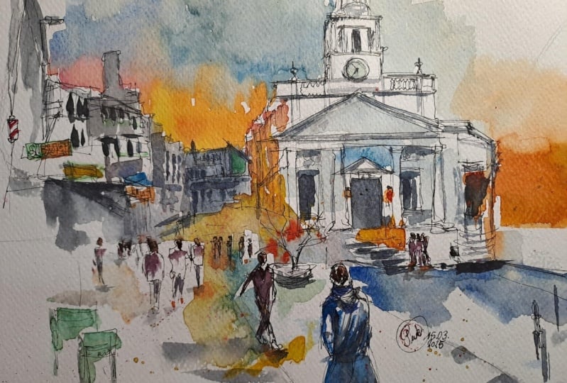
sketching our same in ink. So we are on to our final scene and you can
see the reference photo here made it quite big so that we can really easily
follow along. What we can see is a,
an evening seen it. So this is in Norwich, a town in the East of England. And what we've got is a lovely
big building on the side. It's an interesting
perspective coming down the other side. And then lots of people
and because it's evening, It's a little bit
sort of backlit. What that is good for is because when we are
starting as we are now, what we've got is
a scene where we can over-focus on the people. The features are
difficult to see and now really just shapes
and silhouettes. So what we're gonna do, we're gonna do this in
two stages, two videos. The first is going
to be the line work, and the second is going
to be the colors. Now, I have got my same
sketch brick here, cartridge, sketchbook, and I'm
going to just use a fine liner this time. And the reason I'm
using a fine liner is just to demonstrate that the same techniques work no
matter what pen you're using. This is a waterproof,
fine liner. The techniques that
we're using with the watercolors will be to wash the colors
rather than the ink. So in some of the last lesson, when we looked at
color specifically, we'd use some water soluble ink, which meant we can
wash the Inca bit. This time. All the tone is going to
come from our lovely colors. Now, without further
ado, let's get started. So it's basically a
portrait oriented seem. So we're going to start, I'd like to start towards the
middle of our focal point. And our focal point is
this lovely church. It doesn't matter
if your mistakes, so you already have
gotten a bit wonky, but you see I just correct it. Come up and up and down, back and correct my line. I'm going to come
and I'm going to find this kind of
silhouette of the building. Until I've captured
this side of it. I can come down and I can start picking out fetus like
there's this lovely tree. I like doing it. Not necessarily strictly as
a continuous line drawing, but I like joining
up blue stuff, which is why I've done
this all basically so far as one big line. But don't feel the
need to do that. This is about getting, you
will see now you want it. Then adding simple people. Coming down here, we can get
some of these other shapes, this so stacked columns of this building and
just adjust them. All I'm doing getting suggestion of these different
stacks shapes. Same here. I'm not going to draw
all of them, just a few. This is a sketch. Remember, we could be
doing this outside, so we need to sort of
imagine if we were outside. How long can we really
spend getting every detail? Now, moving around? Just quickly capture
some of these shapes. And we're kind of moving away from the middle of
the image here. So I'm starting
with less detail. We can with build up
the detail later. But literally finding
like with our people, we find the simple shapes in the scene, the
triangles, squares, the rectangles, pop those in, and then the scene sort of
really just builds itself. So instead of trying to
sketch a whole building, just try breaking it down. And when we get to
sketch the people, instead of trying
to sketch a whole person, break it down, sketch their shapes, and
then you discover that you've accidentally
already drawn your person. Okay, Now, couple more
little shapes down here. We've got this cylindrical
building and it's doorway. We've got the columns
of this building. Just going to find
little horizontal shapes before adding in some of these
vertical shapes as well. Central columns. And I'd go away. We've got steps and steps often come with
people that nice. It's good to know how to, how to simplify them and look what happens if we
just draw a series of. Horizontal lines and
all I'm doing is two horizontal lines quite close to each other
with a little gap. And that just suggest
very easily to the eye. It really suggests that
there's a staircase. We could do the bannister. Just not over-complicate things. Now we can start thinking about the people and what
I've not done. I have not finished off the
bottom of the building. And this is one of the
mistakes I talked at the beginning is over planning. But equally, we can
leave things loose. So now I could say, well, you know, I've not
finished off the bottom. So why not just
captured couple of these people IN D minors? So the idea of
shape-based people, because that's what they
are in this scene now. Just silhouettes, they're
just simple shapes. And I thought this person
was holding an umbrella, so start drawing an umbrella. Then not that as my
eyes deceiving me, but they can now have
an umbrella, it's fine. You can invent scenes. It was a bit of a rainy day
when I took this photo. That's that's my excuse and
I'm going to stick with it. Now we can move forward as well. We can keep adding these people. And you can see this chap, we must be on a bit of a slope because this chap's
head is a little bit lower than everyone else's
head. And he's closer to us. Either he's shorter
or there is shorter. Or instead of it being
a totally flat thin, there must be a bit of a slope. Either way, let's just pop his head about where it appears in an image which is that level with the bottom of this tree. Hopefully he's a bald gentleman which is easier to sketch. This is where we can do that
gestural style of touring. So I'm just, I've got his head. I'm picking out
the key features, getting the shape energy of his arms and his legs are quite key on and look at
him striding forward. Get the same on the other side. That's kinda handed
a pocket there. Now, it's probably enough to illustrate the idea
of this gentleman. If we wanted, we could pop a
little suggestion or an ear, even a little nugget
of a nose there. But don't go too far. This is just gentle touches going to move away from the
people again for a second. And this is one of
the keys I think, is to know what over-focus
on the people in your scene. Because when you
do that, you get lost in the detail and you never quite see the flow of
the rest of the image. So I'm gonna go back and
I'm going to start back on capturing our scene, the rest of the scene. And getting it as a sort of
silhouette to start with. Just like people, this is
all about simplifying, say, just capturing the
simple vertical lines, horizontal lines, simple
shapes like we've got this chimney or just like a rectangle with a
rectangle on top. And then these windows, again, simple shapes, node is
building towards something. Now instead of leaving the
bottom unfinished this time, what I'm gonna do just to prove, maybe even just proved myself. It doesn't matter if you sketch a scene and then
add people on top. That's what I'm gonna
do. I'm gonna get the bottom of these
buildings in. We've got the next one here. The windows opening up
a little bit because it's coming closer and the
angles are less steep. Call these sort of fun signs coming in with a
subway sign over the two here we've got a
warning coming in here as well, and another one underneath it. And then right in the front, a nice little detail. Is this this bothers sign. So I'm not sure
if it's something unique to the UK or not, but these stripy
red and white signs you see there sort of a traditional barbers
barbershop signs. And if amending it
cuts, basically, we can bring in this very, very steep perspective here as a cutoff for negative space, which is going to
frame our scene. And if you look on the
other side of the image, we've got that same cutoff coming in here,
this looming shape. So now we've got a scene framed. We can add a few more details in here that there's
another building coming across a couple
of little windows. We can see these
openings actually disappeared behind this
looming, looming shape. A couple of little people here, a couple of more lines
just to suggest that busy-ness of lots of doorways. And we gotta kinda rooftop
coming across there. Now we've got our
scene finished. Not completely, but,
but getting there, we've got these couple of
people and now I'm going to work my way across
and add a few more. So you talked about how this
chapter is a bit lower, probably because there's
a bit of a slope. But everyone else
is, has a pretty much along this line to, this must be our horizon line. So if we focus on that, we get our heads in
the right location. We can now sketch our
people. We can sketch them. On top of our previous scene. Now this front Chap I'm going
to be a bit gestural with as well striving towards us. He's got a lot of
movement is quite close. So I've got that, hopefully got that
feel of movement, little bit of extra detail. But I've not overdone it. You can see a man in you can because he's ghosted out
because you can see behind him, at least for me,
that implies he's moving and he's
part of the scene, but he's not a fixed part of it. We've got a couple
of people back here, much smaller now,
much, much smaller. So we can see that their legs probably finished
level with his elbow. So we can mark that in and
to start getting our people. This is an example of where
I'm not finishing them off. I could do lines
around all of them, but they're next to each other and it's
hard to tell where one begins and the
other finishes, so we don't have to
make the distinction. Got a few people here
who are a bit closer. Their legs are finishing
about here level these needs. So just make a little note
of that and we can now start to move more towards
our shape-based people. And I'm basing the
shapes a little bit on what the people are
actually looking like. This person has
got a big hood on, their head becomes a big oval. This person is a
little bit shorter, a little bit more fluffy, had a narrow shouldered, so we kept that in. Um, where else can we go Then? There's just loads of people at negative loads and loads
of people came back. And this is where we can
start just tucking in these little shape-based people and really just making it busy. But because we are working
on the horizon line, because we're
keeping them simple. It's relatively easy to avoid overdrawing that
we don't want to do. As you come forward, we
could start popping in. So we've got this chair or it's actually it's a
notice board, isn't it? In a nutshell, why
food it was chair. There's a notice board in the foreground
that we can add in these kind of subways, little cues or something. We can put them in. And again, that's framing the scene. It's stopping us having
to finish everything. We can. Fill in a few more gaps with
people as well if we want. Just puffing people in, keeping their heads
at the right height. And then working out
where we need to just finish off our
buildings around them. But now we're not spending ages finishing off
the buildings. So just a few little bits, bits and pieces
that we can add in. What you could do,
you could use this as a framework and
you can build and build and really
carefully neaten it up. And if you start with a pencil, you could imagine how you
could take this sketch to fully fledged painting
or something. But for me that the spontaneity, the looseness of the sketch, is where the magic lies. So I'm going to do my
last couple of lines just trying to get things feeling a little
bit more balanced, bit more detail in line work where perhaps it
feels a bit empty. And you can see how it's
quite gentle up here. And actually, with all
this alignment going on, I think we could do
with just a little bit more of a depth of line, a bit more of a weight of line. And these are just
personal feeling for how there's not a huge
amount of science to it. But you can just look and decide where you need a
little bit more, a little bit, a little
bit of rebalancing. There we go. So that's
my line work done. And it takes a little while. But that's because we've done so much in terms of
talking about it. In terms of all these
people look at this. We've got to at least what
20 people in I've seen. And it's also not perfect, but relatively accurate
and enjoyable to sketch. The next thing we're
gonna be doing is of course, adding
our watercolors. And I'm just gonna
be using this one small Chinese brush again. So get your watercolors or
whatever you want to use, your pencils, your patterns. And the next lesson, we'll just bring this to life with
a splash of color.
10. My Scene - Adding Colour: And finally we are
onto the color. So I'm using my
watercolors again, just one simple brush. And we're going to be
playing some loose colors all over the scene. Or two keyframes. The
decisions I make, I'll tell you all the colors
I'm using as I use them. This can be a nice, loose light wash of color. But we're also going to
make this people stand out. We're going to make this obvious that this is a busy scene. And we'll talk through
the decisions we can make along the way to
help achieve that. So here we go, time to splash on eye color. Now I'm not using
watercolor paper today, so you can see what a few
other things in here, It's still NT fine
to put colors on. But what you've got
to be careful with is that if you're not
using watercolor paper, It's going to buckle a bit more. So we need to be
a little bit more delicate with how we apply it. And often a little
bit less water. But still I say less water, we can still use plenty. So let's just start. Now. I'm going to start with
again with my scene. And I'm going to
start, I love starting with the sky most often, say with some water,
quite a bit of water, just not, not pools
and pools for it. I'm going to get this guy going. Now this is a cobalt blue, lovely primary blue,
relatively cool primary blue. And I'm going to add a
tiny bit of fallow blue. And now you can see
the fallow blue, electric bit more alive. And that just
creates this ovary. Chris, feeling. We've got this glow
haven't been coming up. So if I just drop a
little bit of red, this is a scarlet lake, little bit of red in there. I know it's not a orange glow, but I'm just simulating
what's going on the scene. It doesn't have to be exactly
the same with my blue. I'm going to continue that down. The reason is blue can be
the start of a nice shadow. And we can use that blue to just start introducing that
shade where we sit. And we see shade really in the back of this
image, don't we? And then coming around the
front here of our, our church. And just gentle blue, so not really bold, but a nice gentle wash. And
we can keep that coming in. Can you see what I'm
trying to do here? I'm trying to sketch or
pain around the people now, not going to worry if it goes
over some of the people. But I'm trying to just keep
it slightly apart from them. Now a couple of
nice touches here. We've got this lovely
golden gloves Coming up. So it's like sum up lights
isn't there and the church. So whilst it's
still nice and wet, if I just dropped a little
bit of gold in there. And I can do the same. And some of these
buildings where we see there's the lights on and in the subway sign
and things like that. So we're getting that reflection or reflection with the contrast of lovely glow and this sort
of more moody sky back here. Going to bring a little bit
more mood in now as well. So I'm going to pick
indigo, a nice dark color. You could use any
other dark color, even an ultramarine mixed
with piano or a CPR, or dark brown or Payne's gray. Anything a nice murky color. Now I'm going to
deepen the shadow. We started this shadow
with cobalt blue. Now we can deepen. And you see things are still, even though I'm not using
a huge amount of water, things are still nice and wet, nice and loose and the
colors are flowing. We can use these
shadows to add shadow and light to our steps as well. And we can bring
the shadow around, not just the people that
are around this tree. The tree is a nice
sort of construct. It. We can bring a bit of light in, just like the people are lovely little constructs
to highlight our image. So it's the tree. Now once this shadow, I've brought it around here, I bought it around
all the people, the people and are
largely negative spaces standing out this. But the shadows also
got some reflections. I'm going to take
some of this gold. I'm just going to drop it in. Having dropped it in, we can
move it around a bit if we want or we can just touch it. And what things are, what that's gonna do, it's thing, It's, watercolors have
this lovely habit of painting themselves. It's only when we tried
to over control them and get frustrated with them
that things get overworked. If we just let them
to repeat themselves and you've plenty of water, you will find that
watercolors will produce lovely effects all of
their own volition. A few little lines here just
to suggest a bit of shape. Now we're going to move
straight onto the people. And this is where we
have a choice to make. We had a lot of ideas about
color in the last lesson. Before this project. We could leave them blank. You can see what that
would look like. I think there'll be a bit
boring for me to just say, well, I'm not going
to leave them blank. You can see that silhouetted, so we could silhouette them. Again. I think that's not as exciting. Um, it would be very effective and it'd be really
lovely, totally summit. In reality, it's not what
I might choose to do, be very classy,
but I want to show you that loose and
abstract can also work. So what I'm gonna do
is I'm going to pick a color and that's going
to be their head color. And I'm going to pick a CPS. I am going for a dark brown. Got the wrong one in my
dark brown for their heads. And let's see what
happens with that. So just by touching
this dark brown in on every head will get this idea of busy-ness
flowing through the image. But also it makes it really
easy for the viewer to pick out all the people and to recognize all
the people as people. We can make it busier by
splashing some of that in. Now they're not standing out
a huge amount, are they? So what I'm gonna do is take a warm color this time
of quinacridone sienna. And I'm going to touch
that in as well, just over the top
of my dark color. By doing that, I can
stop bringing it down. I can I'm warming them up and I'm giving
them more of a kick. And now it's not just dark color that our
eyes are looking for. It's this idea of dark onto life that is
representing our people. And again, I think this is
already quite effective. All I'm gonna do
now is just start adding tiny touches
of punchier colour. So a little bit of blue here. And probably that's enough blue, maybe a little bit of a
blue on our front man. Then let's go in with a
little bit of a nice red. So that can be here. Coming down. Let's just giving our eye a way of picking out
all these people. And they're totally abstract, only, not totally abstract, they are based on people, but you can see they're
quite effective. There are obvious
that let people, it's obvious that
this is a busy scene. But we haven't spent for ever trying to create and craft them. Having done that, I'm going
to just stop for a sec again. I don't want to get
to over-involved with the people and risk running into one
of my sort of what I describe as the
common challenges. I'm going to just go
back to my buildings. And this is where we can start introducing a few more
details with the colors. So just finding
some shadows, e.g. in these colors, maybe get
a bit of indigo back again and deepen some of the
shadows of the doorways. Maybe deepen here. Now that's a bit less wet. We'll be able to just
create the shadows and make them a bit darker and
they weren't sort of drift away like
they have already. And that's what happens
with watercolors. They diffuse out,
which is why you can be loose and relatively confident that actually
even being really loose is gonna be fine and produce
something really interesting. Bit more depth for
this building, which is nice and dark
in the reference. And we can find
some reflections of the sky with a little bit of
blue in some of our Windows. Of course, our subway sign
is a green, isn't it? So that was a bit murky because I hadn't cleaned
my brush off for a while. That's fine. So just come in with another
green on the other side. Now we've got our subway sign. And it can be nice and abstract. So this is not neat, but I can just pull
it, loosen it, and have these colors
flowing over the page. One thing I haven't talked about is using these, these frames. So obviously on this side, the colors sort of stopping
at this looming object. Here we can introduce
a little bit of shade. So that we can also show that we've got this, this
framing object. Now, we've got the
green in one place. And what's a good idea is if you've got a
color in one place, introduce it in at least one
other to balance it out. So I can pop this green
into this building. I can use bit of
the gold as well. Notice building into this tree, introducing gold as well. Introduce a few splashes to
fill up some of the space. Some of these signs, these sort of subway
areas are green as well. I know that this sign is
actually quite light, but let's make it dark, Let's make it bold
and stand out. Another decision
that we can make. What haven't we done? Well,
the last bit that we haven't done is what we talked about
in the color lesson as well. Adding shadows to people so
we can just find our people. We can ground the more the
shadows show the people interacting with the ground and thus showing where they are. Highlighting, improving
sent to position. We can make the
shadows a bit more complicated if we want,
especially in closer. So the shadows will get broader and then they'll
get narrower again. So now we've got
shadows which are really representing the people. We could add shadows
within them, but we don't have to overdo it. We're just creating
representations of people in the end of me. I'm going to call that done. So I'm going to
add my initials at the coordinate because
it's always good to just be proud of
what you've done, what you've done, and be happy. It's not a perfect piece of art, but it's, it's fun,
it's interesting. I've had an experience doing it. And it's also giving me a bit of practice
and a bit of joy. Now, I hope you've
enjoyed watching it. I hope that you
enjoy these kind of loose techniques and
it just gives you a bit more confident to move forward and
just get out there, sketch some people
don't be worried, they're going to ruin your
scene and don't overthink it. If you overthink it
and try too hard, then they might ruin your scene. He got loose and gentle. Then you get something
fun like this. The last bit in this,
in this course, in this class will be a sort of summary and a
description of what you might want to
try in your project. So let's move across and I'll show you how this looks
when it's dried as well.
11. Your Final Project and Summary: Hello everyone. I'm well done for getting
through all of the lessons. Thank you for joining in. And I'd encourage you now to have a go at your own project. This is mine, this is the finished image and
I hope you like it. I certainly think
it's really fun, lively sketch can tell
it's full of people, but it also isn't
full of stress. In fact, it was fun,
it was interesting, was relaxing to do. And that's really what I
personally want from my, from my experience
and my creativity. What I'd encourage you
to do is have a go. You might want to
use my, my scene, which you can find the reference
for the class resources. There's a couple of other
references in there as well. If you want to try something
a bit different, browser, go ahead, use your own town, you're on holiday or
something like that. Just don't focus on the people. Build your scene and then
at your people on topple, do a tiny bit of planning. Keep your people loose,
make them simple. Add a few little touches
to some of them. Don't stress. And when
it comes to the color, don't worry about
being too realistic. Just think, how do you want
to portray your people? Do you want them silhouettes?
Do you want them to Moody? Do you want them
alive and punchy, or do you want them to stand
out as negative space? Make this artistic decisions, make me aren't your
own and have fun. What I'd love you to
do when you're done, share your project with
me in the class gallery. I'll make sure to come back and comment on anyone who leaves a project and also feel free
to connect with me outside. You can find me at Toby
urban sketch on Instagram, YouTube, or on my website. Thank you very much
again for joining. And if you've enjoyed,
please leave a review. If you've got the time and
you're welcome. Of course. In fact, I love you, of course, to come and join him with
some of my other classes. Thank you very much.
 Toby Haseler, Urban Sketcher, Continuous Lines