Transcripts
1. Introduction: You're looking to loosen up your sketching and
urban sketching, develop characters or line work. And there's expressive,
beautiful colors. If so, then you are
in the right place. My name is Toby, known as Toby
admin sketch on Instagram, YouTube, and of
course on Skillshare. If there's one thing
I'm known for, its my loose style of
sketching an urban sketches. My focus always being
on the process, having fun, forgiving mistakes, and creating
interesting character for linework with beautiful, expressive watercolors will look at things like
continuous line drawing, which is one of my absolute
favorite techniques. And I use elements of continuous line drawing in
pretty much all of my art. Be that an architectural
seen a landscape, a still-life, or portraits
will look at colors to both. How we get that beautiful
flow of watercolor around the page and how we
can experiment with textures, textures which are unique, of course, to watercolors. And we'll look at how we can
leave big areas of space, be really bold and brave. And by doing so, really enhance our
focal point or enhanced elements of
what we have sketched, what we have painted by the end, I hope you'll have lots of
ideas to go forward and, and practice and
develop your own style. Loosen up whatever you're doing and produce expressive,
interesting. Thank you very much
for joining me. You can find me as well
on Instagram and YouTube. And please do. If you enjoyed this class, take the time to
send me a message on Instagram or leave me a
review on Skillshare. All these little bits
of contact really mean the world to me because
it's amazing to see that people are enjoying and developing from things
which, which I say.
2. Supplies I'm Using: In this lesson, I just want to quickly show
you a few bits and bobs I'll be using
for my sketches. It's all about the loose
sketching and nothing here is a must have. This is all about your style and just a few ideas to
broaden your style, to listen up to. Perhaps get less on the page. And by doing so, create more. I'm using a couple
of sketchbooks. The most important one for me
is my mole skin sketchbook. And this is actually just
one of their art range. And you can see lots of
things in there already. It's A5, it's portrait
because I love how that composition works when instead
of a landscape sketch. And I've got a couple of crocodile clips which
keep the pages open. It's not watercolor paper, It's normal cartridge paper. So you can do lots of lovely watercolors
without fancy paper. I'd also just be using
a very cheap sketchbook for a few little
exercises along the way. For my sketching, I'll
primarily be using this guy, my Lamy Safari fountain pen. I use an extra fine nib, which just produces for me
a nicer quality of line. I like scratchy little lines
to the big bold lines. I'll also be using a guest
implement in lesson five. I won't give the,
give the game away, but I'm sure you've got one, so you don't need to
go and find one yet. You could use any
pen, fine liner, anything with waterproof
ink and ready. So you don't need
to go out and buy a special fountain pen,
anything like that. My watercolors are here. Tiny little palette. I love it because I carry
it everywhere with me. I've got 14 colors
in there and I'll list those in the
project resources. Which colors I have
one I use them. I'll talk you through exactly
which ones I'm using. Of course, for painting, you need some brushes. So here are my size six, round and a medium-sized
Chinese brush didn't really have sizes. This is about the same
as a size 12 to 14. Round brush, give or take. Having a nice big brush is
great for watercolor painting, especially loose
painting, because we'll talk about loads of water. Big brush makes for expressive,
interesting paints. Apart from that, there's
really not much else. I've got a big liter of water, I've got a little towel I
use to clean my brushes off. All the references I've popped
up in the class resources. Like I said in the last lesson, which is all about
experimenting, trying different
media or just do a little demonstration sketch using not those pens and colors. So that you can see
how one can approach your own style in a slightly different way and
experiment in that sense, be loose in that sense. But that's everything you need. So without further ado, let's pop over and get
into the first lesson.
3. The Class Project: So the project, well, of course this is a loose
urban sketching class, so we can only have
a loose project. And there's certainly no onus on you to go out and have to do something wide encourage you to do is go out and have a play. If you enjoyed any
element of this class, then try it out. Try it, develop it, see where it takes you. And when you've done that. If you want to
share in the class projects your images and your thoughts about
how the process went, what you did differently
and what you thought you would have
done differently. If you've had another guy. Of course, if you
do share something into the class projects, I will give you some feedback. It's amazing to have that
sort of interaction in to see what your thoughts were about in the class as well. Anyway, without further ado, let's get to the bulk of
the class where we'll have a look at the kind of sketches
and fun that we can have.
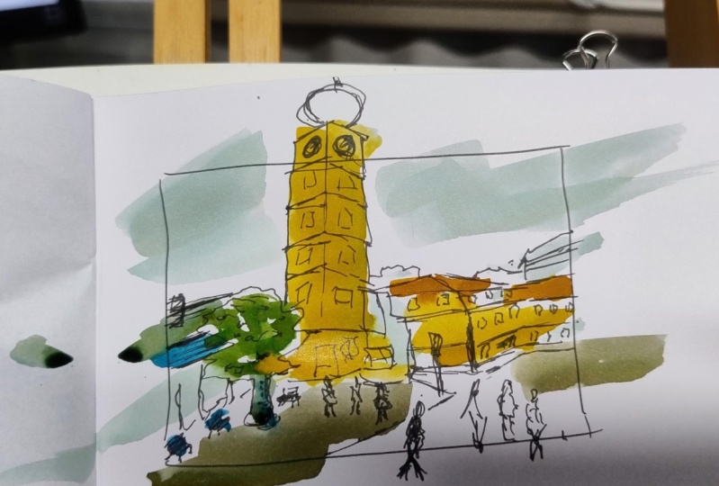
4. Idea 1 - Continuous Line Drawing: So it's time now to get our sketch books
out and our pens. I'm gonna be using a Lamy Safari fountain pen and
a combination of just a normal bit of cartridge paper and my
mole skin A5 sketchbook. And what are we doing? A bit of continuous line sketching. So in this example you can
see I'm touring some fruit. Hopefully you can
see that that free. What I'm doing is I'm
doing it all in one line, not taking my pen off the page. And that is what continuous
line sketching is. I say, Do you see what I see? Because it does make you make creative decision
that makes you simplify. It makes you reduce what you
see in front of you in turn, in something
artistic, interesting and loose. We can
do other things. Here's my little penguins. I love doing portraits like
this and you can do all sorts just with these simple
continuous line sketches. But what about loosening
up our urban sketching? Well, let's have a look
at this scene and think, how can we approach it. What I'd encourage
you to do is firstly, try a couple of
really simple things. Some fruit, dog, that kind of every day thing that you see. Then move on and take these same principles
to architecture. Now my first step in this kind of drawing is
normally to get a silhouette. So let's just watch as I grabbed those simple shapes across
the top of this silhouette. Now what hopefully
you've noticed is that I'm not
focusing on details. There's a little bit
of texture there. I've got one of the chimneys in, but not a huge amount of detail. And Tito can come
later or not at all depending on how we feel and how we want to
develop our sketch. Having got that silhouette, we can come back across and
we can grab little details or even things like the people
that people in front of the street with a
continuous line drawing. What we're doing is we're
tuning everything up with simplifying and we're having
to make artistic decisions. And we can always come back and add more and more details. Indeed, what, what we're
doing now is adding some details and we can
keep going back-and-forth, adding more details underneath
very simple silhouette. But we don't want to overdo it. We want to keep
this as a simple, loose interpretation
of a scene which we've sort of made
artistic choices about. Let's have a little
watch how I take some shapes and gradually build them up on the
front of this church. So hopefully you can
see that what I've been doing is
grabbing one shape. Then within that, we
can find another shape. So if we look at the top here, we've already got the silhouette and we've got the rectangles forming these restaurants
or the balconies. And then we can come
back and we can add all the little shapes
inside they silhouettes. So we can keep going like this, adding more textures, more
people, more details. But remember, this is supposed
to be loose and simple. So forgive yourself. Let yourself have a few details where There's just
not much there, where you've left something out, where you've edited
and had a bit of fun. And always let yourself
add things on top as well. Look at this little chap on top is heads clearly in
front of the building. But for me, this kind of thing
still works really well. There we go. That is the end of my line work for this
continuous line sketch. So hopefully you've seen, It's a wonderful
way of loosening, simplifying and
interpreting and seen. What would be really
great now is if you could have a go yourself, try the scene or try something else that
you've got in mind. Of course, keep this sketch handy or one
of the other ones you do. Because the next bit
is really exciting all about adding flowing colors to your scenes and how lots of water can produce
amazing effect.
5. Idea 2 - Let Your Colours Flow: Time to find our colors,
get our palette out, and add some flowing beautiful
colors to our sketch. Now before we jump
into the big sketch, let's again do a little
simple exercise. So here you can see a
couple of patches of water. And look at those
amazing patterns. If we just touch our color into there's a bit
of cobalt blue. And luckily just push its way
round or a patch of water. This is some indigo
and see how that has a slightly different response
in a different interaction. It works with all our colors. This is scarlet lake. And on top of it a bit if
something go cascade green. What I find fascinating is how
even just flicks of color, flicks of pigment can really
create amazing effects. Effects we can
purposefully produce, but can control and influence. We can experiment as well. If we create a patch of color, we can add more
color within that. And notice how the blue kind of pushes the rent out the way. So not just interacting with the water or pigments will
interact with each other. And we can reverse
the whole process. We can add water
on top of pigment, and the water will then
push the pigment away. Through this, we can create all sorts of really
fascinating techniques. And these techniques, these textures are totally
unique to watercolor. Only with watercolor, can
we get this kind of look? And that's what I love celebrating
in my loose sketching. I love celebrating the unique
qualities of watercolor. So how are we going to do that? Wow. Like I say, I like celebrating the unique qualities
of watercolor. But I want it to be
representative within the image. Not necessarily
exactly the image, but taking hints from the image, but also from my Moodle high felt or what the
weather was like. Perhaps even just what
my favorite color was. Here. What I've done is I've
filled the page with water, but I've kept me
lots of it blank and we'll have a look at
the importance of that in one of the next lessons all about being bold negative space. I think there's quite
a nice blue sky, but there's also some
glows in this image. So let's start with a
cool blue, cobalt blue. And let's layer in a
little bit of orange this time transparent
pyrrole orange. But in the back
it's quite murky. So let's see what
happens if we add green, which will form a
neutral brown color with all these in the mix. Then these colors
will just move. They'll do their own thing. But I can push them around to create some of
those lovely swells. Having seen the move for awhile, we kind of get an idea
of why they've ended up. And we can then a bit more
make things a bit bolder, push them out the way. I had a bit more water to
create areas of light. Up at the top, I added a bit of indigo just to create a
bit of drama in the sky. And then I'm going to
use this same indigo in these little spots where I want some deep shadows and you can see
squinting your eyes, look at the reference,
you'll find the darkest areas and the
lightest areas quickly emerge. And sometimes you
want to show you that can create a fun idea of, you know, using
our bold colors to also highlight certain
areas of interest. Again, this is something
you could keep going and touching and moving. And sometimes I spend
half an hour doing this, sometimes I spend three
or 5 min doing it. Put the idea is
just to explore how that watercolor can be
representative of your scene. How different splashes
and splashes, how different areas of color and space can create something
really beautiful, which represents
the scene but isn't a tight, perfect sketch. For me, this kind of
catching is really fun and really lovely. What would be correct as
if you hadn't noticed, try a still life even in an apple done in slightly
different colors, or perhaps take the
actual urban sketch you might have tried
from the last lesson. Splash some color on. Be brave with water and
gentle with the pigment. And you'll find, you
can very quickly create something really pretty. We'll have a little look in
one of the upcoming lessons about being bold
with negative space. For now, just remember,
leave a bit of white. You don't want to necessarily
cover the whole page. We can always come back
and cover it later. But most of all have
a bit of fun and let your colors painting themselves.
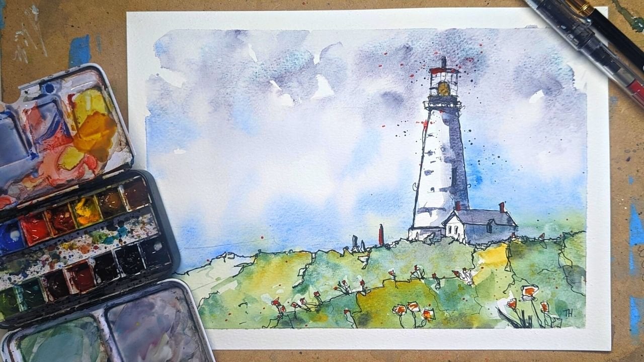
6. Idea 3 - Be Brave with Negative Space: So time to be brave. And what takes bravery in
painting and sketching, for me is not painting or sketching
an aspect of our scene, but leaving it out, being
confident in our composition. So what I thought I'd do is show you this classic
lighthouse scene, which is Portland
had lighthouse. And show you how. Actually just sketching a few
bits of it and just adding a few bits of color can make for really punchy image using similar principles to
the continuous line sketching I showed you. For. I'm just grabbing
the key shapes. And by grabbing these key sort of silhouette of the scene, the Cliff House, the lighthouse. And I do go back and add
the lighthouse soon. We can start to get
an idea of what, what's really important
in this scene. So let's just watch as I
grab these key shapes and then see how I start to think about the details that
we might want as well. So you can see already that
almost all the line work is focused on that key focal area, the house, lighthouse, and
rocks just underneath it. But I wanted to go back
and add just enough shape into those rocks below
the cliff below. But then having done that, we can come back to the
lighthouse and find those other key details. And having completed the image, in a sense, completed
this sketch, we can come back again and
find those key outlines. Make them bolder and boldness will bring
things towards you. It makes it come
out of the image, meaning that you sort
of highlight it. You're highlighting whether you add color or negative space, you're highlighting, making
it feel more present. Now we can start
thinking about color. So negative space can be
used in a couple of ways. I'm like, I'm using, I imagined hundreds of ways, but in two ways I like to think of either you can
leave something blank, which will really highlight it and push it into the image. Or you can add color to something whilst
everything else is blank. And that will make
the color pop out. So in this image, let's add
some color to our lighthouse. I started with some
scarlet lake to some red to represent those roofs. Added some moon glow
toward present shadow and some quinacridone
gold to represent that. So light going off
the Lighthouse. I then choosing just a
segment of our cliffs to add a little bit of natural color is green and
I know it's actually rocks, but there is green
within that cliff area. So I thought, well,
you know what, I'm going to use green to
represent these areas. And then I'm going to match
that with some nice blue C. Then we can actually already take a step
back and go, You know what? Yeah, we've left a loads and
loads of negative space, but do we really
need anything else? Well, I thought I wanted to make this punch out
a little bit more. I want that idea of a
glow to really hit home. So adding more shadow
and more light, then we can blend between the two and allow things
to soft and, and move. And as I've said, pillow look how the amount of whitespace emphasizes the color, creates an expressive
representation of our scene. And that's what we want, we want to make are not a
totally figurative photo. We have the photo. We're trying to create something different. Just to enhance the shape, using some very gently
mixed pigment to create little bits of shadow which don't detract from
the negative space, but just add to the
idea of something 3D. And again, like the
end of our sketch, can now add some bold pen
work around that color. I hope you can see
what I mean now when I say this kind of
brings things forward. So now this bold color being pushed forward
by the bullpen work. And I've seen his sound
suddenly so much closer to her, so much more in our face. And with this, we can create
wonderful scenes rather quickly and certainly
very expressively and having been very loose
and made lots of decisions. I think when I talk about
are, and when I say, I think that was really
lovely and artistic, what I mean is someone's made laser decisions about how they
want to portray the scene. And one of those big decisions
is what details to add, what color to add,
what not to add. This is why the
negative space is such a fantastic
skill to practice and learn whatever
your preferred medium. Especially in watercolors,
because watercolors is all about leaving that light
and negative space. So have a go. I'd try this scene,
try something else. Perhaps even just in
your next few sketches. Just imagine what happens
if I don't paint this bit, I don't sketch this bit and see where it
leads you and see how it loosens up your
image and lets you focus more on those parts of the image which matter
more to you and matter more to the viewer as well.
7. Idea 4 - Limited Palette (and Interior Sketching): So we've done lined, we've done color, we've done
limiting way you color. So if we limit the
number of colors we use, how does that impact
our sketching? In this, I also wanted
to just sort of talk about the fact that
urban sketching doesn't have to just
be architecture. In fact, urban sketching is, is more about sketching the environments around
us, around people. That's often architecture,
but includes people. It includes cafes,
food, still lives. And the classic
one is of course, to sketch your, you'll breakfast or
your branch in a cafe. So here's my little crunch, a croissant, and of
course, a coffee. We can do these still lives and things in the same principles
of loose sketching, the same ideas of
grabbing little shapes of joining things
up and simplifying. I'm just going to move around
the scene a little bit, adding a few extra details here. And now, unlike some fruit, got an apple or banana. So let's just watch and see how these same continuous
line principles that we were using before can come into
play in a still life. Now this is a really
key principle. If you look at this scene, you will see all sort of just floating in the air, isn't it? Now, in architectural
scenes, landscapes, we naturally have a horizon
line of some kind or a grounding line
be that the sun, the sky meets the land or
the bottom of a building. In a still life, we
don't necessarily just automatically have that, so we need to make
sure we add it in. And that could just be a line, a horizontal line going
cross the Blackboard page. Or it can be finding
the edge of the table, finding the edge of the room. And you see how just by getting
those simple shapes and suddenly this whole array of
things as landed on a table. Just a really important
principle to bear in mind. On the same note, just having a little suggestion
of a background can be quite important to
setting the scene of the scene. So here just suggesting a little window in
the background. Again, this is really
nice way of being loose. Now, how we can do these colors, I'm just going to
use my scarlet lake. A nice primary red and
cobalt blue are very nice. Primary blue for a contrasting
colors, of course as well. And I specifically
chose a nice colors because neither of them bet
any relevance to the scene, to the cross on the
banana, the coffee. They're not blue,
they're not bright red. But we can still use these
two colors and we can interchange them to pull
different objects apart. So a croissant read a phonon, cup of coffee obliques, and now they're very
separate objects and they're also because we've chosen
where to put the color. We sort of push them towards us. We've made it a feature
of the much like we were discussing in the
negative space exercise. We can also mix the colors and create something more neutral. And use that as a
shadow or dark color. And thus we get
our coffee and we get this little
starts of shadows under and behind
the little shadows on the croissant, e.g. notice how the layering, building up these shadows is
what makes things feel real. The actual color
isn't important, but the feeling of free D is, and that's where just being a little inventive
with your colors, being loose with the
choice of colors, but more smart with how you apply those
colors is important. And just moving around
gradually, little by little. You'll notice this time I'm
using a much smaller brush. So before I've been using rather large that a
Chinese-style brush, It's probably about
a size 14 round, give or take versus this which
is a size six round brush. And that lets me be really careful with where
I'm popping my color. And that's where we
can start layering and bring, bringing out shapes. But still being least, because we are still choosing
where to put the color, we're still using non
representative colors. We still got this
fascinating image where we've made
lots and lots of fun decisions and created a piece of art
rather than a photo, rather than something literal of the scene in front of us. As before, celebrating
watercolors, what they are, a few splashes can
really lift the image and it kind of implies you haven't left
it blank in a sense. You, you now have the splashes in the
windows which are just suggesting enough color
that it fills the image. And means we don't have
to paint everything. We don't have to fill
the page with paint. We can just make choices about where we use are
very, very limited palette. And there you go. This is
another little sketch done. I hope you enjoy the sort
of the double lesson away, isn't it about the
importance of using still lives and horizon lines
to ground things. And the fact that still
lives is still just shapes. They're still the same, really. Just the shapes of representing
something different. Similarly, we could take a scene outside and
just use two colors. And you could use
to random colors or you could use a
bit of color theory. I've made it simple here and
chosen two primary colors, which are always going to work quite well together
because they're always going to still mix
into another favorite color. Another interesting
idea to try to use a primary color and it's
opposing secondary color, e.g. blue is opposite. Orange. What that means is that if you mix the two colors together, you'll get something
every great. So you've got very good shadow. And how do you know which
colors are opposite? Well, there's two ways. One, you can buy a color
wheel if you like. Or a primary color will
always be opposite. The secondary color,
which is a mix of the other two primary colors. So orange is red and yellow, so it's opposite blue. If you mix red and blue, you've got purple, which
must be opposite yellow. So you can work it out. Well, you can Google it,
or you can just have a little play yourself and
explore how your colors work.
8. Idea 5 - Switch Up Your Supplies: So now I'm going to say, why not try something
totally different? Okay, then. So as you can see, I've decided to choose a pirate, not just
going to use a buyer. I'm mostly going to
use some marker pens, which is very different
to mine, normal style. But that's really fun. It makes you learn things and how would I
suggest using that? A thumbnail sketch. Thumbnail sketches, just a small sketch on
your page where you don't have to feel that you
have totally committed. You don't feel like you're
going to waste hours and produce something you really
don't like and didn't enjoy. Because all you've committed
to is this loose sketch on a page that in itself
can be a work of art. In fact, around my room, I have lots of sketchbooks with thumbnail
sketches hung in, in nice frames because
they can be amazing. They can be really wonderful. So how are we going
to do this one? Well, I've got my little thumbnail sketch,
I've got my reference. And again, all the references
are in the class resources. I started exploring the tree. And the buyer is very different. For my normal
fountain pen marks, it's making a very different. You'll notice just
now broken out with that thumbnail frame
and that's okay. In fact, you don't have to
stick within the thumbnail. You can have fun. You can break
outside and produces really interesting
composition which you'll see especially when we go and
add some color to this. As I was saying, the marks and producing with a
pirate very different. So the feeling I have
an enduring with it, feel much more involved
with the page is much more scratchy and tactile. My fountain pens are
lovely and smooth, which creates beautiful lines, beautiful quality of line
very easily creates a nice, solid, dark line. Now with the pyro, it's
much more scratchy, but I can feel my way
pushing across the page. And it much easier to make
sharp geometric lines, which led to me having
fun with that tree, e.g. and the same with my people
are a bit more angular. Normal nuts just come about because the pyro
feels different. And have a go and just have a
play with different things. If it wasn't a pyro
that I was using, perhaps I could really
use a pencil or watercolor pencil or Use the DP pan or used it really bold fountain
pen loads and loads of options of ways you
could sketch and draw. And paint, of course,
oriented color. So continuing to
just move around the scene and just
find different ways of using the panas
is nothing crazy, but even small things
feel different. So even the hatching
feels very different. It feels much more
subtle because the lines are more sort
of gray and loose. My fountain pen. So it's just finding
that she, the, the amount of shadows
producing was less, but the amount of texture
and the pace would have felt, felt more somehow. Now in a normal way,
I love sketching, so moving back into my shapes and I've got
on the page and I'm now adding some boldness or
adding specific details. Again, each of these details
is an opportunity to just discover something
different about your experiment, about the different
implement you're using and how it interacts. You can, you can increasingly see I think
that these funny shaped, so much more scratchy, much geometric even than my
normal sketching style. And I think that that's something I've found with
a buyer and I was very, very happy with the sketch. I think it's really nice. Now the next state, so here's my little pot
of Pitt Artist Pen. They've got an awesome
boldly colored India ink. So basically marker pens, but they're also waterproof. I have them for sometimes adding on top of my watercolors, e.g. but if I rarely just
sketch with them. So let's try
something different, something I can't achieve
with my watercolors. Here, I'm just going
for a really flat sky. And initially my head this we can make beautiful
perfectly flat sky. Then I discovered that
as you cover over, Can you see you actually
get a little texture, a lot of layering of the colors. So had to go back and forward and add a bit more
layering here and there. But also had to accept
some of that texture. Normally I love texture and actually quite
like this texture. But it wasn't expected. It was something I had
to work with them. I got me thinking about, um, about how maybe I could
produce something like this with some
watercolors underneath. So again, an opportunity
to experiment and explore, just because we've decided to do a little sketch with
different pens. So this just want a nice
pop of a nice orangey red. And here I'm just doing what
I might normally to eat, but using a different medium, going round, picking
out some highlights, creating a little bit
of structure with my little color
as well as really pushing out some other areas. Going back to the sky, just trying to neaten things up. And as I added in these little
pits and thought about it, I thought, Yeah,
let's see if I can just use this blue
elsewhere as well. See what happens if I just
touch it around the image. Does that help? Does it not? Then I've got one more color than I thought it'd be good just to to try and look for something a bit
more neutral, bit darker. This is sort of on Monday, on Monday brown, just
to create that shadow. Because talking earlier about
how the shadows went as dark as I expected from
my normal hatching. I would get a much
darker shadow I feel. But this time I didn't. So just going back and trying something different,
exploring, experimenting. And despite how
everything's different, Everything's still
sort of the same. It's still, to me very much
looks like my sketch and I'm still doing the same kind of process is going back
with that pen at the end, neaten things up
and grab shapes. So I'm thinking lose
something experimental, but I'm still paying me. And that's what I'd encourage you guys to have a go at doing. You don't need to
copy someone's style, although that in itself can be an interesting learning
experience and it can lead you to developing your own style by finding bits that you
like from other people. But what you can do certainly is take your
style and push it, stretch it by trying
something different. Perhaps you'll do
something in series, may just pick up a bio, the most common pen that you may not actually have tried
sketching within the past. But maybe you do
something even more out that you'll pick up some
oils and see what happens. And pick up some
sponges and paint. A big acrylic painting just using sponges
instead of brushes. These kind of things
can lead to sort of, let's call them
creative revelations. But they can be really fun. They can be really enjoyable
and really change how you perceive yourself and your
art processes going forward.
9. Thanks!: So you made it. Thank you very much for
joining me in my whole class. I hope you had some fun. I hope more than anything
that's giving you a bit of inspiration to go out
and try some things out. I'd love to hear from you what
you thought of this class. Leaving a review on Skillshare
is hugely valuable to me both in terms of getting
more people to see my class, but also because it's
really great to know that people have seen
the class, enjoyed it. And I want to tell
other people about it. I also love hearing from you
on Instagram and YouTube, but I have loads of other
tutorials and things going on, releasing videos
regularly there. So if you want to
connect, please just do. But most of all, I hope you enjoyed the class. I hope you're enjoying
your sketching. I hope you can go
have a bit of fun doing some loose,
expressive urban sketching.
 Toby Haseler, Urban Sketcher, Continuous Lines