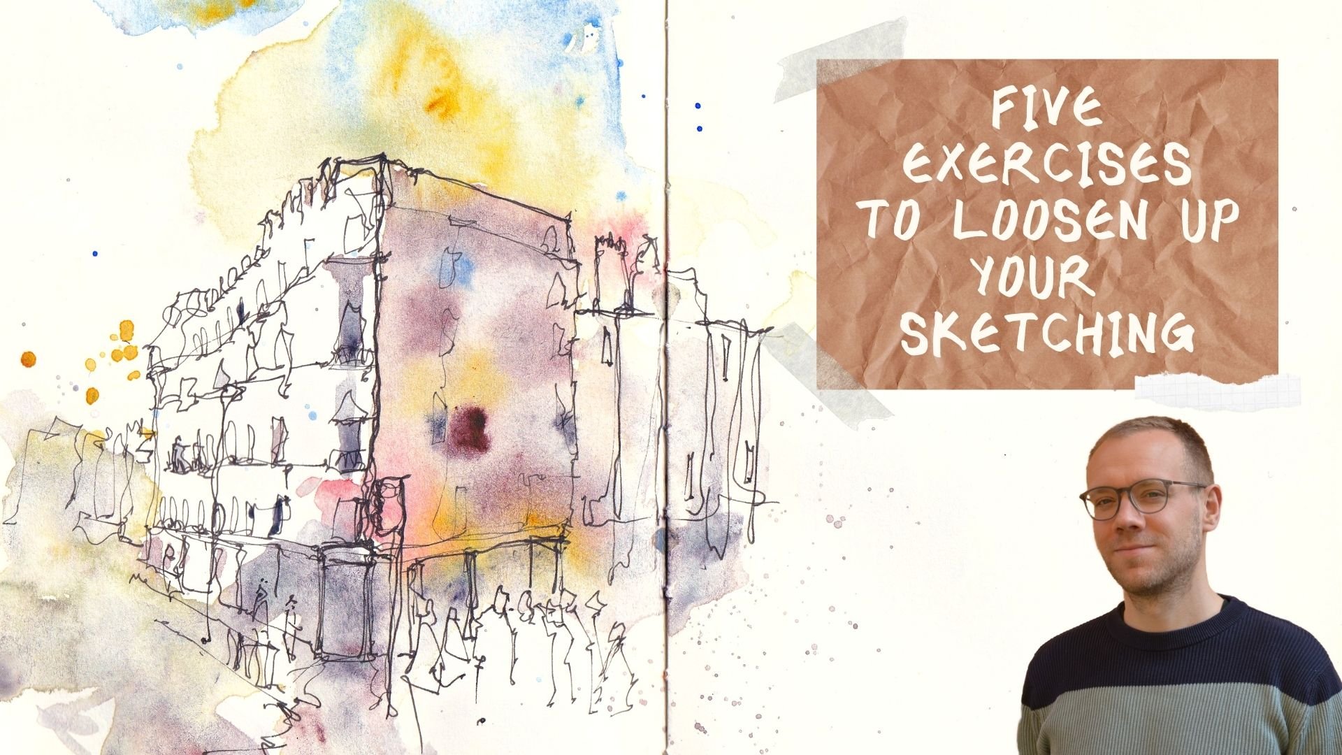
Transcripts
1. Introduction: Do you ever get to
a beautiful scene or find a perfect reference
that you want to sketch from, that you open your
sketch book or you put your paper on the table
and you just get stuck. Perhaps you can start, okay, but halfway through your sketch, things get messy and
you're just thinking, where do I go from here? How do I actually get control of what's
happening on my bade? Well, that's naturally
happens to all of us. And if that is what's
happening to you, this may well be
the class for you. I've known as toby sketch
Leeson, It's drown YouTube. And of course here
on Skillshare. In today's class, what
I wanna do is break down my five-step
sketching process for you. Through these five steps, you can understand not
just what you might do, but while you might do it. And that's key because
in talking you through all the
reasons behind each of the steps and
by practicing each of the steps in a couple
of different ways. We'll learn together to
feel more confident, to have more direction
and to be able to adapt when things aren't
going the right way. These five steps are
exactly what I use day in, day out in my Art career to
produce different scenes. Now, Austin, I produce landscapes often I
produce Urban scenes, but I also do portraits. I also do pet portraits
and I do totally abstract. It doesn't matter what I'm doing because I'm using my ink, if I'm using my watercolors, this is how I'm thinking. So if you are wanting
to get more direction, be able to adapt
different scenes to your style and enjoy
your Art more. Let's just get going. Let's start sketching and
let's get on with this class
2. Supplies: The first thing we
gotta do is have a look at the kind of supplies, tools, equipment that you might
use for these techniques. Now, there aren't many. The thing about having a flexible technique or
flexible way of thinking for your sketching
is that you can make do with a small
number of paints, couple of brushes,
maybe just one pen. So let's have a look
at what we might need. And I'll also explain as we
talked through the supplies, at what point you
might need them. So which bits are
going to be for which part of the process? Today we're talking about
Five Steps. Five Steps. Any sketch which
can be summarized really just this really
small amount of equipment. So what have we got? We've got a pen. Now this helps us simplify. It gives us structure and Contrast really important
concepts that we're going to cover when we talk through the
five steps inside the pen, I have some Waterproof ink. At the moment. I've got some sketch ink,
rural and Klinger. There. This is a Waterproof
fountain pen, safe ink. Now this is also important for our steps because
if we're going to start with pen and
then at Watercolours, of course, we need our
ink to be Waterproof. Or we're going to
run into problems. It's going to and everywhere
and disappear off our page. So finds nice Waterproof ink. Or instead of using
a fountain pen, you could use a fine liner. I've got one by Winsor
and Newton here, another by univariant,
another by state law. There are lots of other
brands. I like to use. One which is about a
0.8 millimeter and something else which is
between 0.1 and 0.3. The variation in line you get there similar to using
a fountain pen where you could press hard and soft and get a flexible
line with a fountain pen. We can pop up pen
to one side and move on to our
brushes and colors. So you'll notice I
have to Brushes. The reason I've
got two brushes is because they do very
different things. One is much bigger. This holds more water
and more pigment. When we're applying a
Loose Wash of Colours, a key part of our
step-by-step process. Having a big brush
will make it much easier to get that Loose
and clear and lovely glaze. However, when we then come back and we
want to add details, punches of Color, bold tones, we need something smaller. So in this case, I've got a size six round
brush as my smaller brush. Now this is a
Chinese-style brush. You could equally use a
mop and medium-sized mop. Or you could use
something around a size ten or 12 round brush. It doesn't really matter
the exact type of brush. It's just the principle of
having two different sizes. One small, one medium, large, to get these two different
strengths of watercolor. And there's two
different types of Wash popping nice to one side. We can have a look
at my Watercolours. Now here I have 14 colors
in my little palette. But you don't need 14 colors. I just happen to carry
these around because this little palette throughout the small convenient
is pocket-sized. I've put a number
of colors in there which keeps me
amazingly flexible. But my minimal palette, my minimal part, would
be four or five colors. Those four or five colors,
what we're using today. And they are a nice blue. I've got Cobalt Blue and
that's this blue here. I've got a sort of
medium, punchy Yellow. This is Hansa Yellow Medium, that's this yellow here. I then suggest having a
nice bright warm red. I've got Scarlet Lake
that is this red here. And then the other colors, I would suggest
getting something warm and brown for me today. That's gonna be a
Quinacridone Sienna, just this color here. And then something deep and murky that might
be a Payne's gray. It might be a neutral tint for me today and it's
gonna be Indigo, which is this color here. Although I'm gonna be
Painting out of this palette, because that is
convenient for me. You could equally
use these colors. I'm perhaps just have a little palette on
the side that you put the colors in and mix instead of having them all poured
out like I have them. Now, just shuffling
everything over. We have two more
things to talk about. Firstly, we've got our paper. Now, paper is a lot more important than
people often realize. It's very FUN to go out
and buys fancy Colours, these lovely pens and brushes. But if you get some good-quality,
not super expensive, but good-quality
paper, your Art, we'll take a leap forward and everything will
be so much easier. I like using hand morula. And this is 100% cotton paper, 300 g/m squared or 140
pounds in America. This is a nice way to paper. Nice and thick, quite absorbent, and 100% cotton is very easy and hard wearing
to work with. It likes you. Take a few
liberties with your brush. And perhaps that was also something that
we'll talk about later. The fact that this kind of
paper lets us easily layer up. And let's Colours wash over. If you can't get
something exactly that, that, that doesn't matter. It's just important to get
something specifically made for Watercolours rather than
normal sketching paper. That is the biggest lesson you could learn
about paper today. Just that tiny extra expense will make everything
so much easier. Lastly, we've got my
little pot of water. So it's nice to have
a good size pot. This is a good sort
of copying and half or two cups
amount of water. That just lets you keep
painting for awhile without oil Colours going murky.
And that is everything. This is everything
you could need for any sketch using a simple
five-step process, which is what we're gonna
learn in this class
3. The Project: With every great
Skillshare class comes in even better Project. And today's project is to use the five steps that
we're going to be talking about in the next ten lessons and apply them to your project. I've supplied you a
reference photo which you can download in the
Class Resources tab. You can use that
reference to join in with me as I produce my project. Or you can take your
own scene if you like, and whatever you choose to do, pop it up in the class
gallery when you're done, again, just clicking on the resources and projects gallery. Click Create Project. I love seeing projects
out of commenting, giving feedback, and
answering questions. I do that. And we can connect beyond just watching
these videos
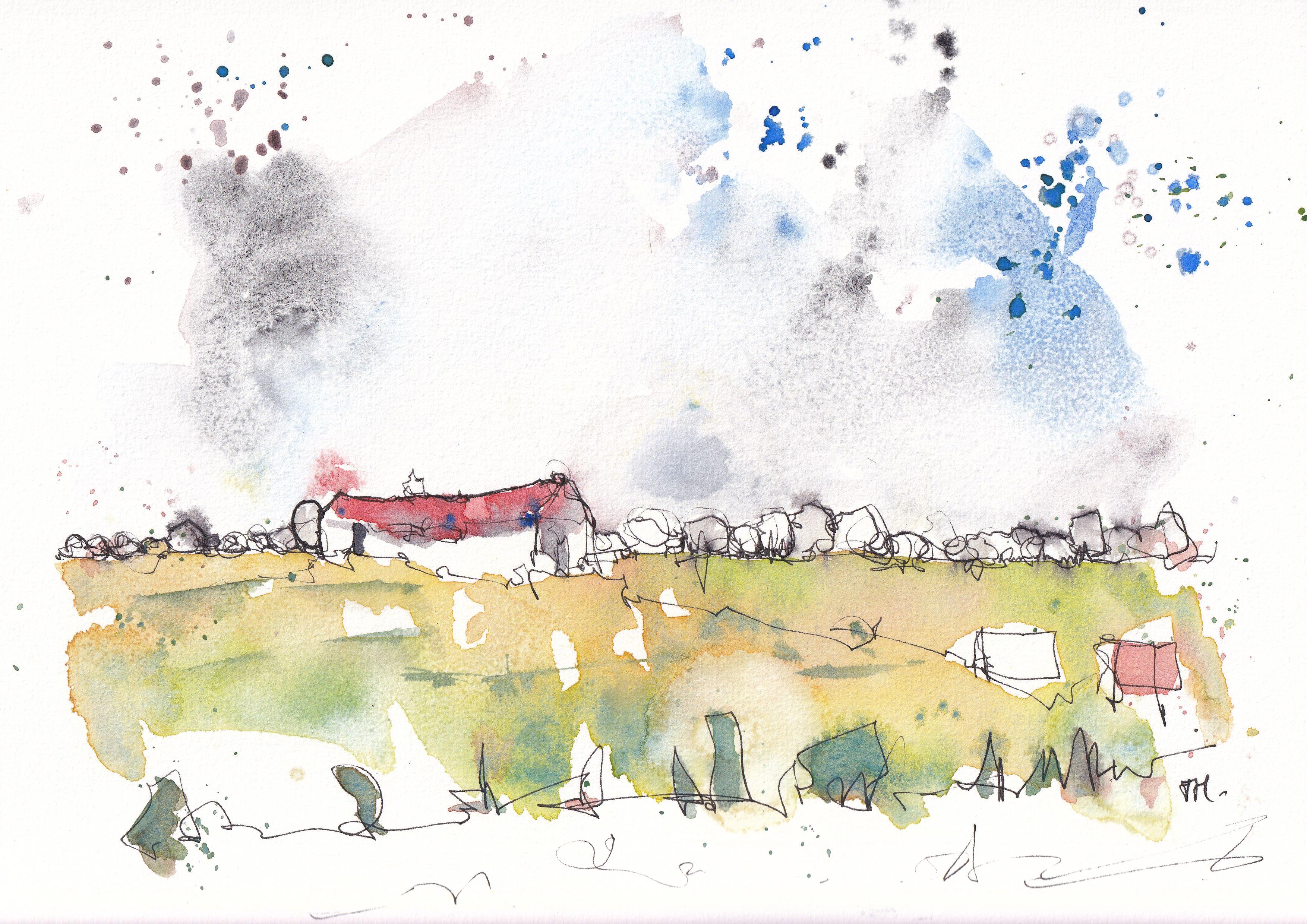
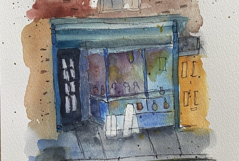
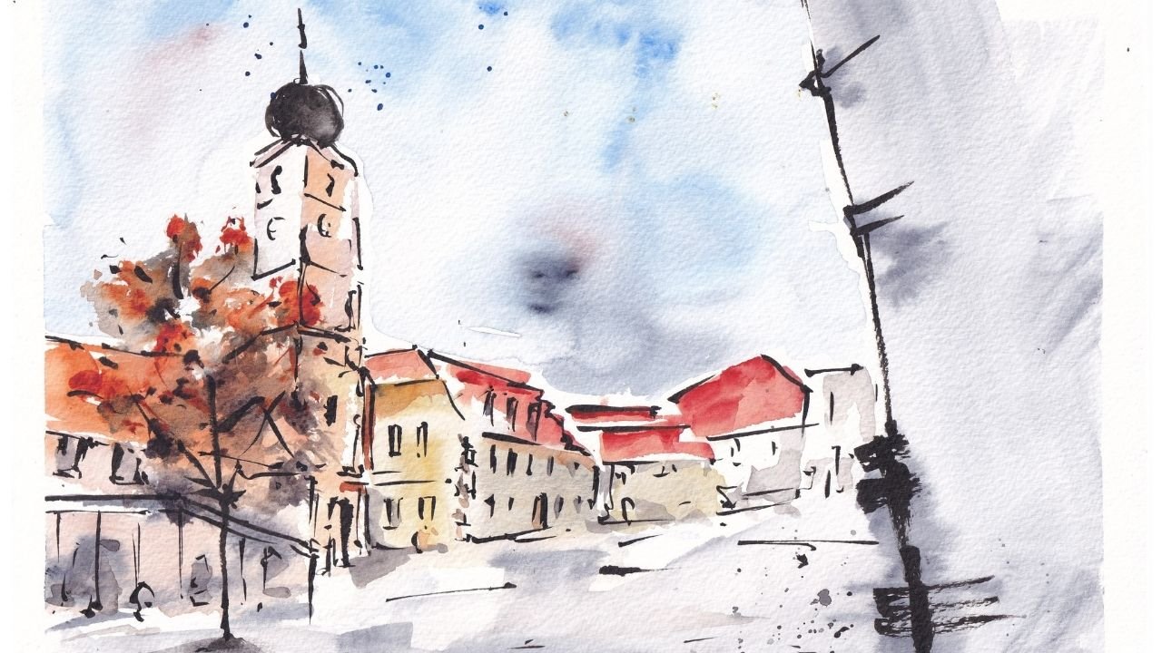
4. Examples From My Sketchbooks: Now the charms have a
little peek inside one of My Sketchbooks as
well as look at a few recent sketches I've done. And I'll show you the style that we can produce using
this technique. Remember, this is my style, and Europe is for you. So you can adapt these processes to what
makes you feel good, what makes your Art look good, and how you want to use it. So just take these
ideas, take my style. But BU, in this lesson, I just wanted to
take the opportunity to show you examples of how I use the five steps I'm about
to talk you through. So I'm just going to
show you a couple of things in my sketchbook and I'll show you what I mean and how I built up
these sketches. So you can see in
these sketches, we got various different scenes
from buildings to a seal. And they're all based on
these five different steps. You can see how I built
up with simple shapes. You can see I've started with very simple light lines
in the background. On top of these light lines, I then add some loose color. So you can see these
light washes of color which are very varied
throughout the scene. And actually these washes tend to connect everything together. What I then do is I add
some bolder colors. So here you can see there's a light wash
of green everywhere. But these trees
are standing out. Now. These trees is simply
standing out because I added another Bolder layer
of green on top, giving you more value, more saturation, and thus bringing things
out into the prominence. The same in all these stones. Or if we look at these simply adding
shadows, same in this. And if we go back to our seal, you can see there's actually
three different layers. We've got light,
medium, and dark. And as we layer up, we are producing shadow,
we're producing Contrast. These same steps have been used here to build up this sunflower, which is from another
Skillshare class. And after these layers of color, we then come back and we collect our shapes with
these bolder lines. So again, you can see
fine lines, bold lines. This way we allow ourselves the freedom to do whatever
the Watercolours want to do. But we can also collect them. We can bring back back structure and create a really
great image at the end. The final step, step
five is all about those Finishing Touches,
those bits of PFK-1. And you can see
that here they are, things like these splashes in some other more abstract
or Loose scenes. The same splashes
have come through in that final stage as have these little Touches
where these oldest, oldest Colours,
this touch of blue. These tiny little
bits which we just decide to add at the
end elevate on scene. Can see these same ideas running through all
of my sketches. In this one, I made the
Cobalt turquoise at the end, just a little touch and then added some
splashes of turquoise. I'm assigned to
balance that out. If we move three, you
see similar ideas here. These little blue windows. These are the tiny Touches which finishing off your sketch, along with a few splashes
if you'd like them. And of course, popping
your initials on. It's really important,
I think just to sign euro so that you have
this sense of ownership, their sense of pride, and you remember it in the
future and you feel proud. It just means that you take this shift in
your mentality from, I'm going to get rid of this. It didn't go well to I've
got to put my name on this. I'll find something that I
did like or learn from it. And with that, hopefully
you've understood the style that you can produce with
this sketching technique. And you can produce a whole, whole range, More Styles
and what I do as well. But this is my style, these
are my ideas, my techniques. And I'd love to see how
you adapt them to you
5. Discover Simplicity - Shapes: Now from this class, but I don't want you to do
is just have to copy people, to have to copy what
I do to reduce Art. So these first five lessons, we're gonna be looking
at the processes. But we're going to be
more looking at why. So that you can understand
when you understand the reasons for doing
processes in certain ways. Then that lets you either
adopt them or adapt them. Adopt them to make
them your own or adapt them to make them fit in
with what you want to do. But rather than just learning
to copy from these lessons, I hope you learned to
develop your own style. Now this first lesson is
one that I love talking about and it is the basis
for, I believe all are. But suddenly all my Art is
the idea of simplifying, creating shapes and just getting that first suggestion of
our scene on the page. The first step in
any sketch is really understanding our
scene or our subject. And that means
drawing what we see, not what we think we see. And I'm just going to
illustrate this with a common example
of something that we get wrong if we're not
thinking hard enough. So the example is
a person's face. By the age of even a few weeks, we've probably seen
hundreds of faces, but we learn to quickly
recognize them, not to really analyze them. We look at the eyes and
nose and the mouth. We don't look at that much
else to recognize our people. So if we draw what
we think we see will end up making big eyes. The nose will be
the right shape, but way too big for
the head as the head eventually gets fitted around these nose and
mouth and features. And we end up with something
which resembles a human. But definitely isn't a human. It looks like a Halloween mask or something from a caricature, doesn't that, but it
doesn't look like a human. That is because I'm drawing
that what I think I see, I'm drawing what my brain has been evolved to
quickly interpret. The same works for
houses, for trees. We might over-focus on getting the bricks and then suddenly
the bricks look like this. And the windows,
where do they fit in? The windows are the same
size of the bricks or the door becomes way too big. So if we don't focus on
what we actually see, if we don't just simplify to enable us to work out
what we actually see. We end up with these
weird objects. The other thing, the other common
pitfall would be unnatural objects in things
which are very challenging, busy, say a tree, we know what a tree looks like. We know if we go up to
an oak leaves which looks something like
something like this, lots of little
Phoenix the edges. So we think when we draw a tree, even if our tree is 50 m, 100 m away, that to
get an accurate, we need to start by drawing
all of these leaves. And suddenly we end up
with this tree which is absolutely chock-a-block
full of ink. No light, not realistic. And actually, if
this tree is 100 m away in this leaf is this big, look, this leaf is the size
of this giant oak trunk. It's just not possible, it's not practical to
set up drawing this way. This is what I think. To put a fine point on it. This is what I think, not what I actually see. What I actually see can be simplified into
clear, simple shapes. This face suddenly, if
we find the forehead, that's like an oval. And then if we just
find the shape that the eyes are making, the eye sockets, then we
find the shape of the nose, triangle sitting in the middle. We find the shape of the chin. We join things together. Then now we have the
framework on which we can build something which I know it's not gonna be perfect. But at least it will look
reminiscent of a human. Instead of looking like this horrifying mask or
maybe not horrifying, It's called a jolly
mask, isn't it? But nonetheless, it, it isn't
looking like a real human. It's not looking like something that you would have
sketch them a real person. Whereas perhaps you'll agree, perhaps you weren't, but
perhaps you'll agree. The overhear at least got
a resemblance of a person, and that's just true. Identifying simple shapes
and a set of triangles. Another little
triangle, the bottom, and then it joins up and we
end up creating a person. The same works for
dogs and cats, for any animal and for the
rest of the person's body. Similarly with the house, which is something
you will see me do very often if you see
my other classes, we've got basically a
parallelogram up here. Then we've got a square. And now as we move on, we can start finding
the small shapes, the rectangles, the
squares which are windows. And then we move on and we find the shapes
within the Shapes. Maybe we put the
little window panes. May we've got the little tumors. Maybe then, only then we start finding
the smallest shapes. This way. Having worked
away from big to little, we have got the right degree
of emphasis on everything. The proportions are right in each of these little objects. And the degree of boldness, the presence of each of these things is
correct instead of here where the bricks are
as bold as the wolves, too big in the wrong place, we can just simplify
and buildup. Let's do all lost on lost correct version.
We've got our tree. A tree in essence can just be founded a series of circles. Once we've got those
circles which are forming shape with a tree, we can make them
a little bolder. We can find that texture, which is the leaves we think we're seeing, but
we're not really. And then we can just add
a little bit of shadow. And then suddenly our tree
emerges. Just like that. Instead of having this
hyper unrealistic thing, we've got this lovely, simple, realistic representation
of a tree. No, it's not a photo of a tree. It's far more
actually realistic. Actually, what we're seeing, a much easier way of
getting some which just doesn't look like a
joke or a caricature. Than if we try so hard to
capture all of these details. Then you go, that is step one. That is why we Simplify and
why we think in shapes, or at least why I
do these things. In the next lesson, we're going to take
this concept on one more level and think
about how we can go beyond just simple shapes
to add something else to those shapes,
to offer step
6. Advancing Simplicity - Textures: We're back on the
same little sheet of paper and we're
going to think about how we can just elevate
this a tiny bit more. So here we talked
about simple shapes. We talked about basically getting the right
approximate shape, an outline of our
objects on the scene. There was a couple of things
I was doing which you may or may not have
noticed that I was doing. So firstly, I sketch
very lightly. My first shapes with very
light here look very gentle. And now we can come back
and we can be bolder. So keeping those
first shapes really gentle will allow you to
have some flexibility to get things wrong and then
to come back and basically get them right and suddenly have something
more effective as a result. So the first thing is when you're thinking shapes
and you're simplifying, be gentle, gentle on yourself. You're gonna make mistakes. Of course there's
gonna be mistakes, but also gentle on the paper to allow these mistakes to
be things you can edit. We'll call it a rule, gentle at first, and that
lets you be flexible. So the next thing,
the next thing, is to think a little bit more, a little bit more
about the Textures. So we've got this house here. This see how it's basically
quiet, smooth, hard line. And that makes me
feel like this is a new house in the UK, let's say it looks
like it's been built in the 1970s, 80s. Nice red bricks, clear still Windows and just
a very neat house. What if it's a much older house? What if it's got a
little bit of texture? Well, that's something to think about when you're
doing that shapes. Instead of doing that
first clear shape, you just add some texture. And I'm exaggerating it here, but you get the idea. You add that texture
and now you're showing it's just a
little bit to crop it. It's not quite as
new as it could be. Similarly here, look, we've got this hard line at the
bottom that's telling you that this house is
basically going onto a haven. It can have a hard line if it's got a big
lawn in front of it. We think about the texture.
Maybe there is alone, maybe there's even
really overgrown loan. So now we need to be thinking
about the Textures that, that lawn is creating as
you go along this shape. So now we've got this
lawn light shape instead of something coming
out onto the pavement. At the top we've got
a roof and heavy old bending willow or wouldn't be rooves instead
of a slate roof? Well, that's going to have
that little too, isn't it? Instead of up here, we've got this hard line on
this roof, we've got append. Instead of just thinking clearly
about the actual shapes, the exact shape will
try to be too specific. You can start adding to your
shape, changing the shapes, the texture, making them flow differently to give
more information. And suddenly basically the same thing is
totally different. And we've just applied texture
and character. T1 lines. Nothing more clever than that. Just texture and character, a little bit of thought as
we were sketching them out. So yes, it's all about simplification and
the first thing to master simplification. But as you're doing your simplification,
just start thinking, how can I take this up a
notch just to get something else about the object on the page with that
really simple line, that really simple shape
7. Adding Colours - Avoid Overworking: Now in step two, what we do is we Apply
a Loose Colours. Now with Loose Colours, we talk about things like painting the light,
leaving them flow. And in this class will explain exactly why these ideas
are so important. So in step two, it's where we are
Watercolours out. We've got a simple sketch and
we play a Loose Wash. Now, in the supplies lesson, I talked about how
using a paintbrush is ideal for a Loose Wash
compared to a small brush. And in this lesson, I just want to show you
exactly why that is. So if we take our small brush, I can do exactly the same
thing with a small brush. Then the pig brush,
protect the small brush. We dip it in the water, dry off that excess water. Then we go to our
paint and let's make a nice little greenwashing. We take a little bit of the green part of in the palette and then
come down and paint. How far can we get
until this line stops, until this brush goes
crackly, dries out. And about their, that's all very drawing
that last bit, isn't it? And that's because this brush doesn't hold very much water. Well, this brush is great
for his later when we want to add real punch. Say we want a really bold
punchy bit of green, brilliant. We can do that. We can bring loads of
pigment on the page, not much water and create
fine little details. Normally draw with
it if we want. If we're creating a
Loose Wash, not so easy. If I take my big brush, dip it in the water, dry off
the excess exactly same way. I'll use exactly the same green. And then we come and do
the same little exercise. Well look, it will just go
on and on and on and on. So suddenly we can do this lovely smooth pig Wash
which just goes on forever. Can do some details but
nowhere near as much. And the amount of
water in that Brushes always going to mean that
if we do a little square, It's just not as intense. There's not going
to be as punchy, but it's gonna be much
looser, much happier. And that will mean also, we don't overwork our sketch. And we'll talk about
that in just a second. So we've got our big brush, we're happy we're doing our
Loose Wash will big brush. How else do we make
sure our wash days Loose instead of becoming
dry and over work? Well, we need to think about the kind of brush
strokes we're doing. So if we wanted, that's used are red this time one of the colors we'll
be using in our project. If we wanted to draw a red area. And we came in and
we've dabbed here, tap the little tab. We creating a lovely texture. But with every tab we make, we are disrupting the
integrity of the paper. With every tab we make, we're introducing
another blob of water. So these blobs of
water, when they dry, we'll create a really
different texture. A texture which is very
busy, a bit like this. All these little dry
areas are very busy. Instead of this nice
and smooth outline. Well, that all leads
to an overworked feel. And it prevents the Wash
feeding Loose and prevents the Wash being something
we can build on top of. Alternatively, we could come in, we can minimize
our brushstrokes. So instead of doing 20
dabs, we just do one. Wash. Doesn't mean we can't move back and forward to create
a little bit of texture. That texture will be smooth.
It wouldn't be lumpy. We're not gonna be scrubbing
the paper and damaging it. That's one of the
other pitfalls. So if we take this same red and we were to just scrubbing,
scrubbing, scrubbing, scrub. Then eventually what you end up doing is damaging the paper. Now it's quite hard to
deal with a big long brush because these fibers
are so long and smooth. If I was to try to do
all this Loose Wash with this smaller brush
and I came in, I was really like going for
it and moving it about. You can see already the
intensity of pigment in this area is really high. And that's because all these little lumps,
all this texture. That's not clever
watercolor effect. That's the paper
haven't been damaged. Not only took a few seconds,
it didn't take forever. It just took a few seconds. Now, I'm going to let this dry so that I can show you why. This ends up looking clear
and doesn't feel overworked. Whereas these two
just don't produce that same nice sort of
timeless and Loose effect. So now that we're
pretty much dry, you can see this is
really nice and clear. Let other things stand out. If we had some other lines going on underneath here, maybe We had a little, maybe this is an outline of a
house, for example. This watercolor wash isn't
fighting with these lines. Here. This is so busy. All these lines are
fighting with one another. So it's really
difficult to pick out what's important and what's not. And if we had something
else going on here, Let's say again, this was supposed to be the
wall of a house. Can you just see how
much less clear that is? I know this isn't
extreme example. But as we build up
layers of watercolor, which is what are
steps involved, what our next step
will be looking at is adding another
layer of watercolor. All of these lines
will still be visible. So anything we do wrong now, overwork the page
will be doubled down with as we go forward. So let's say I added a bit
of blue to my sketches here. Here I'm just trying to
create a nice blue shadow. Blue in a window,
blue door perhaps. And actually, that
works quite nicely. Actually. I know it's
a very simple example. Please not feeling overworked, I could add even a
little bit more red and create some texture
and things going on. But we still have that clear
quality to the Watercolours. It's still just flowing
really nicely over here. If I proceeded with
the same thing, using the same colors, reds, and please, do you
see how it's murky? It's just challenging because
water is a transparent. You can see through them. And underneath this blue, you can see these red lines. And now this blue is going
to form another line. And so before long, you've just got this
patchwork of hundreds of lines and nothing is clear,
everything is Monday. Similarly, if we look at this, what we scrubbed the paper, it doesn't look so bad. Now, we want to go over it. You'll see the blue will rarely get taken up
in this area here. It really just gets absorbed
and that crummy texture, that busy texture of the
paper is doubled down. On. On one hand we've got a nice Loose Wash
that we can build on. We can Enhance, we can
keep working on the other. We did lots of dibs and
arms. We overworked. You've got hard lines and
it just doesn't work. It doesn't work for the process. The last thing to think about, this is a short bit
really quick idea, is the idea of how
much water to use. So you mentioned this
has got a lot of water, big water carrying capacity. So already if you're
using a big brush, you are on the right lines. But there's also the idea
of adding extra water, add water to the page
first, and then paint. Now we can dab because he's colors are going
to blend and move together. Now we can even mix colors at the beginning and let
them sort of push around. And because we've got
water there, it's soft. It's when we dab in, it's dry to see how we
create these edges. But when I dab in, it's
where you get a soft blend. You can do all sorts of different brushstrokes
if you want. As long as you've got
water on that page number, that page of water is wet. I can even come back into
this and I can deepen tab. And we're going to have
nice and soft Colours, something more like this. And lastly, this, just by applying water
in different ways. That is the key concepts to think about when you're
doing your Loose Wash is thinking about
your brush size which impacts the water. Thinking about how
you're using your brush, which impacts the busy-ness, the number of lines you
end up with in your scene. I'm just putting
it all together, creating these smooth
light washes which you can build on, build forward on. Instead of trying to finish
your sketch straight away, by doing all of these little
details. At the beginning.
8. Bold Colours and Layers: Having done all Loose Colours, we might notice when they
drive it there rather, not necessarily flat that
pale Watercolours dry, they lose that saturation. But with watercolors, you
can layer up and layer up. With each layer, you get
more and more intensity, more darks, more bolder,
more brightness. And so when we are
thinking about watercolor, it's always important to have more than one step in
a Watercolour process. That's exactly what step
three is Bold Colours. This is where we apply
simple watercolor layers to create these
really FUN effects. After the Loose
Colours have gone on, we move on to adding some
hold punchier Colors. And we talked already a little
bit about how to do that. So instead of using
our big watery brush, which will give us a
nice and Loose Wash. Instead of doing that, we
use our smaller brush. And I smaller brush is
great at picking up a lot of pigment and less water. So immediately we can get these much brighter, bolder, punchier. I'm more specific colors. When we're talking
about Bold Colours, we're talking about adding that punchy, bright,
interesting color. And we're also talking about starting to think a bit
more about details. So instead of just painting a big square or big Loose Wash, we might at this point start adding little colors
to create people. For example, if our
scenes got people and this might be
where we stopped. Just finding the simple people
is more specific shapes. The shapes which need
a little bit more care and a bit more tension
with something small, which can then produce
all of these sort of fine lines, these
little details. Now, an important
question, of course, is, why, why don't we just
start with Bold Colours? Well, the reason is when we
look back at Overworking and making things too punchy too soon and
Creating hard lines. If we start, if we try and
make our Bold Colours just by producing these
really bold areas, then we're introducing
thick paint, lots of extra lines and
very little fluidity. It also fixes us very early. It means if we make a mistake, just like with our
simplification, our linework. If we make a mistake
with a color that bold, it's there forever
in Watercolour. All of these lines
of that forever. Because as we layer up, you can always see the
underneath layers. Instead with watercolors, what we try to achieve
is a layering up. So we don't actually
need to come in now with really bold color. Instead, we can come in
with fairly bold color. If we have a perhaps like
this of blue parts like this or read at a perhaps
like this or Yellow. And we just let that dry. We can then layer up. So we'll see what
I mean by that. In 2 s, when this has dried. And here we are, We are dry. And that means I
can just show you what I mean by layering. So here we've got dry Yellow. What we can do just add
another layer of yellow. And hopefully you can see
that makes it more intense. It doubles up on the amount of yellow
pigment on that page. And so suddenly the
color is bolder. So what we're trying
to do now is not just sort of paint with
really thick paint. We're actually
trying to build on the work we did previously. We tried to build
up that intensity. And that's when we need to put these two different
steps together. Start thinking about why
we do them differently. Why we do light and dark colors? Well, it's because Watercolours
builds up layer by layer. And that first light and Loose Wash is
painting the light. It's Painting the lightest
tone on the page. That is why we don't do
bold straightaway as well. Because we want those
lightest tones now, even if almost
everything is dark, what we do in our next
layer is we leave just little areas of
light coming through. That first light and Loose Wash is one peeking
out in a few places. But it's creating
those reflections, it's creating that light. So the ego, that is a number of reasons why we do
the bulk Colours, why we do it in layers, and why we bother with
that Loose Wash first. Now, the other key thing to
think about here is shadows. So shadows is another use of
this sort of second stage. And shadows is where
we build up the value. The value is darkness. So if we take something
like the Indigo that I'm using and we take a
very light wash of it. So very light, not much
pigment, lots of water. Then we go a little
more pigment. And then we go way more pigment. What you can see is
we're going from white paper here up and up and up until we could in theory get almost black with
this dark indigo paint, we could get really
thick, almost black This is what we're doing. We're
building up the darkness, we're building up the shadows. Actually, every
pigment has value, so we can still do a
light wash of blue. We can do the next
level up of blue. We can do the next
level up of blue. And then the same way here, we are building up the value part from adding
punchy bold bright colors. Building up Bold
Colours are Layers. Lets us build a shadow. I'm with shadow comes shape. So if we have a house, and what we want is have a
house with shape has to be 3D. We start off with two
little shapes like this, nice and loose. We
let them blend. We make them bit varied
with other colors and maybe we had a
roof on as well. But what we don't have yet is any shadow to give this
a source of light? We can try and add it now. We could try now to add shadow. But because everything is wet, all that's going to
happen is these colors are going to flow around, move around, spread around. We're not going to
end up with a very bold or convincing shadow. A subtle shadow, yes. But at bold and really
convincing shadow, know what we
actually need to do. He's wait for things to try and treat the shadows
or the second step. So we've done step two, we've done our
Loose Wash. We wait for it to dry and
we do step three. And in step three we
can make that shadow. Now we could make it
with just adding red. Because look, that appears
as a shadow because the color has more value, because it's gone from
a light wash of red to a layer darker wash equally, we could add a shadow color. And that's where these browns and murky colors I
suggested come in. Because just using the Indigo creates a deeper, darker shadow. Could put that under
the eaves here. Start using it to
suggest details on the other side of
the house as well. Even little bits of foliage coming off in
an abstract Color. Equally. We can mix
these blues and browns and create nice
deep neutral shadows. If we take our Indigo
and I Quinacridone, Sienna, and we mix
them together. What will end up with
is somewhere in-between that somewhere in-between an
orangey red and deep blue, you'll end up with a fairly
neutral shadow color. If I add more blue,
it gets deeper. If I add more of
our orangey brown, it gets browner and warmer. We have these Indigo and
Quinacridone Sienna mix. And it goes through all sorts
of different shadowy mixes, which we can also use, say up here, roof in the layer of our Painting where we're
doing our bolder colors. Just like that, is really everything that you need
to know about how and why. We apply bold shadows,
bold Colours, and how to think about your
bold colors and shadows. In your third step of
your painting process.
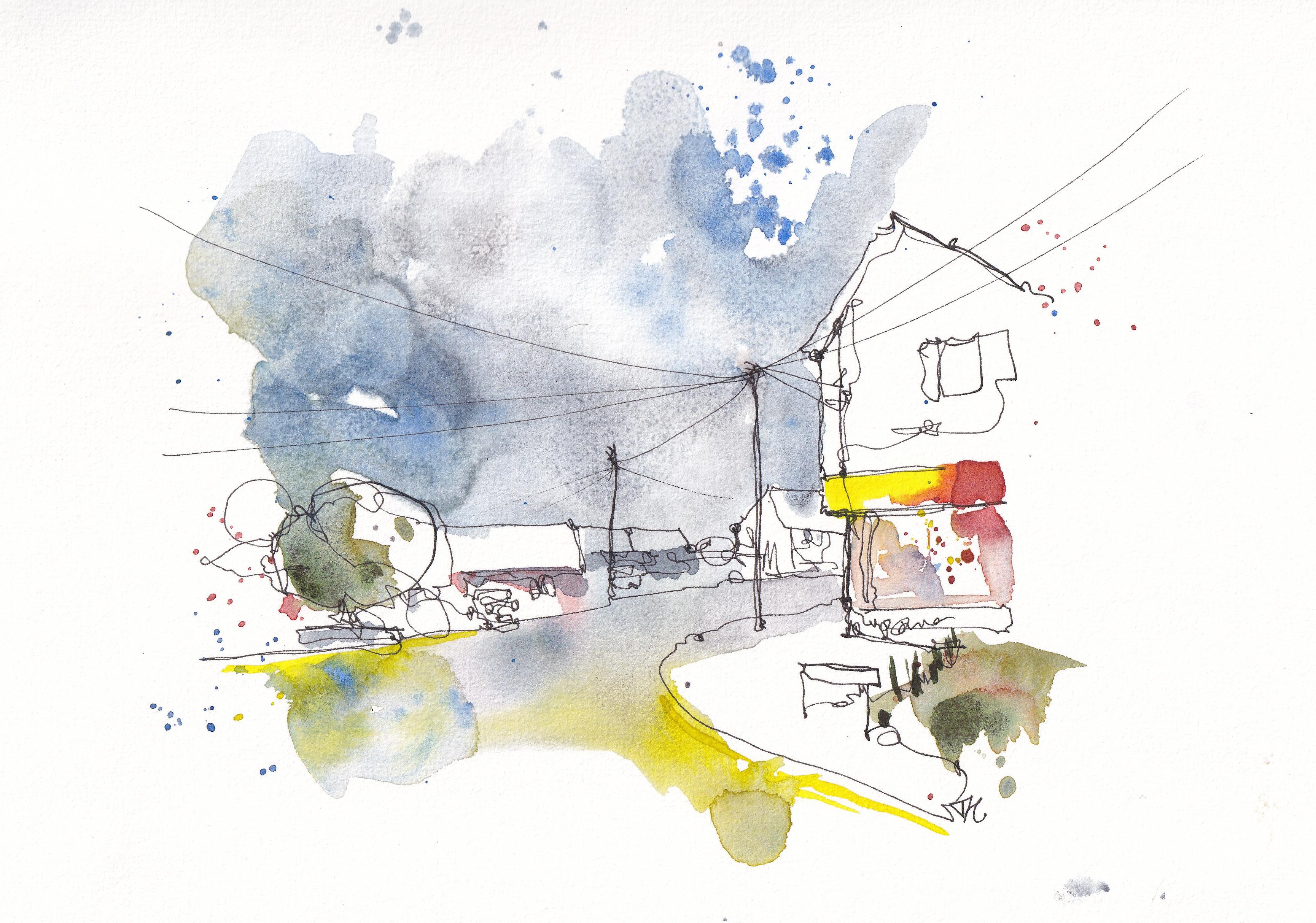
9. A Little More Ink: Now we're onto step
for restructuring. Restructuring for me is
about re-introducing shapes, but also adapting, finding those shapes which the
Watercolours have made. We may not have
intended them to make, but they have made
and they look great. And we go, Yes. I'm
going to pinch you. I'm going to have
you as my shape. I didn't doing so we
can just use our pen. We can Restructure what's happened on our page and produce suddenly an image
which really pops and really has all
the right fields, the right depth, and the
right details in it. Now step four is where we
come back again with our pen. So I'm gonna do
really quick sketch with you now where we
look at steps 12.3 and see why step four
becomes perhaps necessary. In step four is Restructure and in restructuring we are
finding the Key Shapes. Again, we're finding
with our ink, with finding the key important lines and
bringing them out. So let's just take a little
imaginary street corner. We can have a Little House sort of looming in on this side, which were really quickly
and really loose. Couple of windows maybe. Know what I'm doing
is just focusing very quickly on shapes. So we got this shape, this shape, this shape, the window shapes and
the shapes of tests. It's become a shop
front now, hasn't it? So let's just put some
tiny little bits in the window here as well.
In the background. Let's just have some houses sort of disappearing off to the, off to the edge here. And then we'll come to a tree. Again, a very simple, very loose sketch, all based
in very simple shapes. But shapes which led
us get us scene on the page really quickly,
pretty efficiently. Use this laser time
to create from this, From this, we then of
course, go into step two. We had a Loose Wash of Color. So here, using our
very simple selection of colors will have
some red houses. Maybe a little bit of a murky
bluey gray in the front. Learning things blended, merge. This front house can be Yellow. Just for something different, make it stand out. Then of course, a nice blue sky because everyone wants
a lovely blue sky. Don't have to paint everything. In fact, it's great to
leave areas unpainted, so let things go there
and it's very loose. No firm decisions made, lots of Colours
pooling everyone. We let that dry, we come back. We use similar colors, but this time focusing on giving certain areas a
nice bright punch. So here the houses become, become red and maybe some of the houses at the back
you've got more shadow on. So we just use a shadow
color back there. Maybe we want to make
these roofs stand out with a little bit Indigo and
blue mixed together. We get these dark, dark roofs. Similarly, maybe
these windows want a little bit of
darkness in them, but maybe they also have a
nice reflection of the sky, a little bit of blue
going on as well. This Yellow is all a
bit more monotonic, one tone of color coming through so we can come in and
add some little details, little ideas of bricks
and things going on. Then in the foreground that's just regained some
of that murky color, which might suggest a more
realistic bit of time on. So what is going on now where we started off with
really Loose Wash? We started off with Colours which weren't really
impacting our lines, but because we have now added Bolder Colors and
we introduce some lines, we've introduced a
lot more busy nurse. Do you see what's
happened to our ink? It sort of disappeared, not completely, but
it's lost its clarity. Its lost that really
clear shape we had. We've got Colours coming
outside the lines as well, which is fine, is what
we're aiming for. But that means we've
got this line of Yellow competing with
this line of ink. All of this competition which
leads that overworked feel, it loses that easy simplicity. So what we can do is
we can Restructure. So here we take those important shapes
and we find them again with a slightly
bolder line. For me, that means
using a fountain pen and pressing a little
bit harder. For you. It might be using a fine
liner and using a bold, like a 0.7, 0.8
mille fine liner, instead of a much, much thinner fine,
unlike a 0.1, 0.3, what I'm doing is I'm finding not just my original shapes, but also what's the Watercolour? Don't let the Watercolours
gone off over here. So let's find that edge. Then just pretend that's
what we always meant to do. And we can just start
finding little shapes here. These little brick
shapes which are formed from all little
Touches a Watercolour, these shapes in the window, we can find the Key Shapes
which you've gone back a bit. And if begin to push
back by that bold color, we can find those again as well. So all we're doing is
not going every line, but the key lines, the ones which are important to tell the story of our image. We're finding the ones which
we didn't have before, but perhaps there's areas which just need something extra. Or the watercolor
has done something interesting where we
can highlight those. We can highlight them
and we're providing this kind of easy Contrast, which really just kinds of viewer a random image where
we want them to be guided, not not where they might
naturally be gone, but instead we're creating
the scene in our own image. Similarly up here, we've got this tree which is formed
with the sky coming over. You can see my page
isn't completely dry so the ink is running up
there. Now for me. That's okay.
Sometimes it's okay. Sometimes it's not for me today. It's okay because it's
a really quick sketch. But it is important
to note that if you don't let your page
try and completely, you might get a little bit
of ink leading over here. I've got loads of ink bleeding. That might often actually be
something you want to avoid. Sometimes it might be
something you actually really want to play with and how
Fun with. And that's it. That's why we restructured
to bring things forward, to find our Shapes and to
respond to our Watercolours. And in all of that, to prevent dizziness
and keep it simple. Those are the three reasons that we are
restructuring our image, coming back in with our pen just to create
a bit more clarity.
10. Those Finishing Touches: Last but certainly not least, are those final touches. Now the Final Touches or just
where we look at our image, we think what are little
extras we could add, what is missing or what
could enhance this. We really don't
wanna do too much. This is a quick step and it's the one which maybe
takes the most experienced, most confidence not to overdo, but with a little
bit of practice and a few clear things
to think about, you'll be nailing it in no time. Now, this is the final lesson. The final step. I'm just got my previous page out because it's most simple, most sensible to build on this, to show you what
the final step is, which is Finishing Touches. So what we have here is quite interesting
and dynamic sketch. We've got some contrast, but light and dark. We've got negative space. When we get to the final steps, what we're trying to think of, what are the small
touches we can make to elevate
this even further? There are a few really
good things to think about which you can guarantee will make
your life a bit easier, just having that
structure in your mind. Now the first thing
to think about is Contrast and boldness. So here we've got a
nice range of Contrast. You might decide, you know, what these windows and the black take could just
do with an extra lift. And now we're using our
pen or brush rather to very gently just produce
really small areas, basically producing those last few details
which you wanted to add in. Maybe, maybe what
you wanna do is add some more ideas, brickwork. Or you think the
shadows that you reproducing earlier
on quite dark enough, so you just double down on them and you create even
more intense shadows. In this final area. What I would encourage
you not to do is feel you need to fill
the page with paint. This is about little Touches, so these trees are white and it might be
tempting to go one, I'll just paint them now. That is a risk in several ways. Number one, because
you haven't had the time to layer it up. A number two, because it's really nice having
some space to breathe. Having this white paper just
simplifies the whole image, not just for you, but
also for the viewer. And leaves that really lovely, just space and gap and
flow through the image. Now the next thing you
might think about, this overlaps with Contrast. He's bringing in a bit more ink. So perhaps you want
some darkness in there. That might be little things
in the window and you might just now use this
inked lot that in. It might be last-minute details. So something which is
really fund adding might be a little telephone wires
going up to a telephone pole. Nodding these and at the
end just lets you add these last few little details with those finest
lines, darkest lines. So have a think about
other little details. Little birds in the sky, a little extra
plots of darkness, which you weren't sure
about in the beginning. But now you can really choose, pick and choose.
Don't do them all. Again, this is about
minimizing if I go. There's also a lamppost
here and one here. There's actually
five birds up here. I want it. Suddenly
I've added load. It's going to lose its clarity. But for me, a few
little details in these tiny Touches of
Contrast, already great. Now last but not least, a few splashes, a
bit of randomness. So for me, this is an
integral part of my style. It really adds a
bit of suggestion. It fills up the page without
filling up the page, a bit of a nonsensical
statement, but I hope you
understand what I mean. Well, we need to do with flashes is take our brush and tap. I know that so much
easier said than done. So what I suggest is you
actually get a bit of paper at the side and you Practice
different kinds of tap. What I mean by that
is number one, the way I just showed you, which is my favorite way. You hold the brush, you tap it. Now where you hold the brush and where you tap will change how big the splashes are noticing I hold it really close.
They're much harder to get. Then if I hold it far back, but then they become really big. Somebody, if I have
loads of water, look how big the
splashes become. And if it's really dry. Just about get really
tiny splashes on my page just about. Now. The other thing to think
about then is the brush you're using. Use a small brush. I get small splashes. I use a big brush where you
know what's gonna happen. I'm gonna get big harder
to control splashes. That's great for some things, less good for others. The last thing I'm going to
suggest you ever think about, like I said, the type of tap. So you can also use your brush against something so you can tap it on something
else like so. That can be a bit easier. Or you can tap
somebody else on it. And then you can get
different slashes like that. When you're using your flashes. These can be great just
to produce texture. So if we want to suggest some
tarmac going up this road, I can do some last
blushes at the end. Softened a little bit. So there's not too many. And then you go. Now we have
this texture Field Road, little bit of suggestion up here and a son finished image. Like that. We are ready to put everything into
practice and really create our own scene using
these five simple steps.
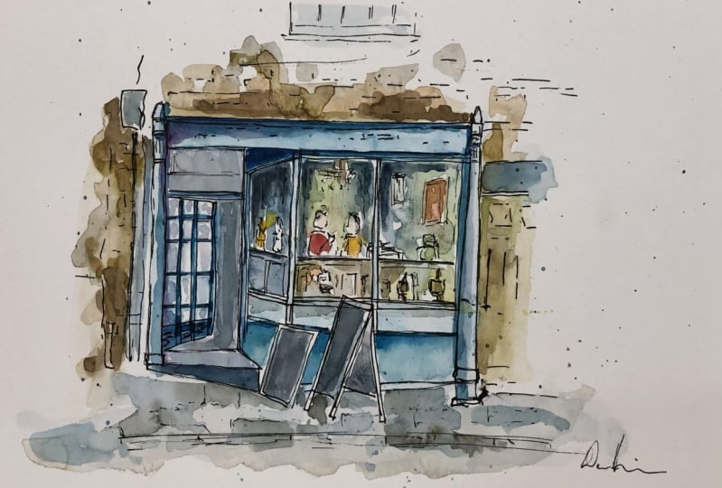
11. Step One - Shapes: So we've done the fear and it's now time to jump
into our project. In the next five lessons,
including this one, I'll be going step-by-step
through my whole process, putting everything we've
talked about into practice. Don't forget to grab the
reference photo from the Resources tab
and join in as well. So in this first step, all we're doing is finding shapes are going to
start with big Shapes, medium shake little Shapes. And before you know,
it will have our thin on the page time. Now, to put this
all into practice, we have this really
funny little shop front. This cafe has got
shapes, colors. It's got people
even in the window. And we're going to be
able to capture using our five-step process
to restart without pen. And we're just taking these
simple ideas from our image. We're not trying to
be clever. We're not trying to do too
much too quickly. And all we're doing is looking
to start with the shapes. So what do we have? Well, first, we can have a look at either
side of the shop. We've got these long rectangles. Or you might even just
think of these as lines, one on this side. And then if we jumped
to the other side, we have another within that. It's quite a bit of texture. It's like a wooden, slightly old feeling beam. So we give it a bit
of a wobble to get that idea and we make sure we're making our lines nice
and gentle so we can always change them
later if we need to. And we find the little shapes. We've got these
little rectangles and triangles at the top. Then we can start
connecting things. We've got the shop front
sine coming across, just, just a rectangle. Then coming down,
we've got a few sort of squares or rectangles
again, haven't we? So we can just mark those. And again, being
nice and gentle. Then as a Little, little extra line across here which is
dividing this big shape. And the same at the
bottom here we've got this little line which
lets us form this shape, this rectangle at the bottom. We've got these signs in front. We're going to leave
them for a second. You'll see that if
you're nice and gentle, you might want to pre-plan. You might want to leave a gap
where you're signing goes, or you can do it this way. You can just build the
scene up and then you can draw things on
top of other things. Good. Back, we've got
another rectangle, or it's more of a parallelogram because it's in perspective. Notice how this slopes
up here, down here. Just as you're
getting that shape, just check if it's really
strictly a rectangle or does it have something
else going on because of the angle or because it's, it's true shapes, which just
once a slightly tricky. So you observing
carefully though, these things have really trick while, though
sometimes tricky. But they weren't, they
weren't trip you up too much. Long as you're being
observant and not just sketching what
you think you see. I try to sketch what
you do actually see. Now we've got an
incomplete image oven. We're not even a reference. It doesn't finish. So we've got to decide how do we suggest the outside
of this building. And that's just through
finding a few more shapes. We don't have to invent stuff, we can just let it fade
out as we go out wide. We find this door
and we can just show it's a rectangle that we don't have to finish
that rectangle. Soon. He's got a little
window above it. Then we get up to here. And then these shapes to
connect across journey. So we can figure connecting rectangle
coming across behind this. On the other side, we've
got a little white box. I'm kind of electronics of
ink probably going in there, which has a little
line going up. And then we got a
load of bricks. Well, we said we need to wait till later
to do the bricks. This is a bit later, so we
can actually just do some of these breaks and then bring the bottom magic
cross, come up here. Then look, we just got a
tiny little extra shop. We could suggest that the lines going across to you don't
have to do much there. This is just showing
this little extra bit going off to the side
is just showing that there's something else
beyond this little bit. There's more to this
world with creating, but we don't have to
finish it off. Up here. We've got this window and again, if we just get the
underside of it, we can just half do it, make it go halfway up, like so. A Little bit of these little
shapes inside if we want a nice having much more delicate with my marks when I'm
doing these little shapes. So that they're
just suggestions. They're not fully fleshed
out ideas and not things which I can go wrong
with as long as I'm being nice and gentle. And then we've done some of
these little brick shapes. Let's do some more up
here because that again, just connects things
doesn't show. All of this is the same idea
seems that an old brick, There's also bricks in this, this little white area. Fabrics don't do too many, so just a few here and they're scattered them
around and move on. We can always come back and add a few more bricks if it
seems like a good idea Down here and let's just finish off the underside of this. And then I'm going
to invent one bit. One bit I'm going to invent is the idea of the pavement
edge in the front. Because I think that just gives
us a nice frame for this, is sort of pushes everything and we've
got this nice square. All focus around this
lovely bright shop front. Going to add a little bit of assertive shape
into this as well. So I'm suggesting that these
a little rectangular slabs just by adding these
tiny little marks, then we've got the kind of
detail shapes only so we can now look in the door. How do we pick out
some of these? Let's do details.
How do we pick out these windows like
we have up here. Just a few gentle marks
to suggest some of these windows can always
do more if we want later. And then we can pick out little things like we've got
this kind of desk inside. I say desk table inside here. We got this, even this
picture on the wall inside. We can get that. We've got a little lamp hanging
down underneath that. We've got these people. What are people that
are just shapes? So we just do a little
circle and kind of a triangle underneath. If we want, we can add in
Hammond's little shapes. We can add in what
are they eating. Maybe we can even
invent this time until a cut or something
else going on. But if busy-ness on the table, another lamp here, just
really gentle lift to shapes. The very foreground
we've got more of his lumps actually haven't
ways that quite fund adding the and just treat them as simple shapes
like little ovals, circles, triangles, just
suggestions of what's going on. Same here we've got another
lump and we've got like a chalkboard here inside
with all of these lines. Hope you notice I'm being
very gentle because that enables them to feel like
they're behind something, in this case behind the
window coming forward. Let's just get the edge of this table and just check
how does this angle go. I think it slopes up a tiny bit of a tiny bit
and then comes down. We can just show that it's a different side of
this same structure. Putting a tiny bit of hatching, then if we just reinvigorate
couple of bits the front of this table and just get a little bit of that
texture coming down. Anything else to
add? We can just add some suggestions
and these windows, few little lines really delicately don't do too much because we can always
come back and add more. We really cannot take anything
away in Watercolours. Just like that. One more person. I'm going to call this done. Now the last thing
we talked about, these top bought at the front. Look, we can just add
them with bold lines. Now we can add them in front. And when we come to the colors, we can decide are
we going to have these ghosting and they're
going to be see-through. Are we going to apply
some bold colors to make them really sort of punch and come to the very
front just like this punchy bold line work is bringing things to the front. And we can add in some
really punchy colors to come to the front as well. I always say that's
the last thing, but just looking
at this pavement, if we add a feudal lines
to suggest paving slabs, I think that really does
complete our sketch. What we've done here,
we've simplified, we have approached this
Francine by finding, let's do big Shapes
then Little Shapes and smaller shapes and building
up just like that. Nothing complicated, nothing
scary, all very FUN. Next, we're going to move straight onto adding watercolor. So I'm going to
clean my palette. I'm going to wait a few
minutes and my ink Stephanie dry and we'll be coming
back with a Loose Wash. So a nice big brush
12. Step Two - Loose Colours: Got our shapes, we've got our
scene already taking shape, not to, to repeat myself. And now we add our
Loose Colours. Remember, even with this, even with this
image where we have these really specific
areas of specific color, we still start with
a really Loose Wash, because in the next few steps, we'll bring it altogether. And just like that, we are ready to go. So step two, remember,
Loose Colours. So here we are
painting the light. If you don't need to worry, if our Colours go wild, we don't need to
worry if they're not perfect because
we can come back. We're adding bold Colours
with layering up that, that tone and value later, I'm going to start
with this lovely blue. So remember we just
using a few colors here, we're using a blue or yellow, using a red, and maybe a dark, dark brown and
dark blue as well. That means we're
never going to get our colors absolutely perfect. What we have here is a sky blue. See what we might be able to do to get slightly
towards the turquoise. It's just add the tiniest
bit of yellow into our blue. And you see how it
tiniest bit of yellow. It just moves it a
little bit towards green and then you end up with this lighter turquoise fail. If we have lots of water, that will also give
us a lighter blue. And with that color, we can come in and actually
look fast, not about match. So all I needed to do was think about a
little bit of color mixing to try and get myself a little closer to
the blue I wanted. And we could do, even with a very limited number of colors. You can normally find what you, what you want in your palette just with
a tiny bit of mixing. We could come in and
just change that, wash a tiny bit, little
bit more blue in places. And let that move around. And then bring down
this last little line. There we go to that is already the blue shop front bit done. What we want is to get this feeling of something
glazing in front. We can see all sorts of
colors going on in there. I'm going to start actually with a darker color with my Indigo. Just to get the very loosely
the feel of this desk. I keep calling a desk,
this table at the front. And then once that's there, we can drop in things like touches me Yellow
to find these look, we've got these lamps, remember, touch of yellow
and some of those maybe a little touch of red into a couple
of them as well. This is sort of taking ideas
from a scene, making my own. But doing it any quick, quick manner with
a limited palette. Up the top, we've
got another lump, nice red and yellow
glow, hasn't it? So let's do the same here. And we've got our light wall, so I'm just going to use
a tiny bit of blue to get that shadowy feel without
actually adding shadow. Then bit more Indigo just
come in and cross the rest of these places and just letting all these colors are similar
together, glow move around. Might want to just react
in couple of places. If things have Mu too much, you've lost that glow, you've lost that fund going through. Just come in rehab
some as you colors, maybe even a touch
more blue and a couple of places
maybe on these people they can have blue
shirts and all. We're currently has
everything to blend and merge with that idea. We can come into the pavement. I'm now using a mix
of blue and indigo, lot of water just to get
something a bit more gray. And I'm gonna pull this color all the way through
the pavement. The shadows as we go, dark shadows back here. This is gonna be the,
the light coming through from those
shadows. Up here. We've got these kind
of ready brick colors. Now this is where having
a nice orangey brown comes in handy because we
can use an orangey brown, that little bit of
something dark. And we'll end up with a
nice ready brick color. Just got my Indigo,
my Quinacridone, Sienna, the orangey
brown I'm using. Now we can add this kind of look that just with a couple
of little mixes, we get a very simple
suggestion of bricks. Again, we can just
make it around a bit. We can add a bit of red here.
But you ever read that? Just little touches of red to bring it to life a bit more, add a bit more variation. Notice how as we get
further up top here, I'm not finishing it off. I'm not painting every area. We might add some brick marks but leave the rest of it white. This window maybe we just
touching a little tiny bit, tiny, tiny bit of gray blue. But what we want is
to move away from all focal point or center
suggested less and less. So we don't want it to keep going and going on
it just sort of fade out to keep the
interests in the middle here. Same in the tarmac at the front. We haven't got to put it in a picture, but we
know what's there. We know it's a street. So I'm just going to use again
tiny bit of this Indigo, touch it in little,
a little marks. Let it be. Alright. I think actually that is our
Loose Colours done. All we've done a
little bit of mixing, allowing our colors
to move around. And we'll see what
happens when they're dry. And we can move on to
adding a Bold Colours
13. Step Three - Bold Colours: Loose Colours offload
wonderfully overall page, we need them to dry. Now, when you're ready, jump into the rest
of this lesson. We're adding old
Touches, Bold Colours, more specific areas of color to bring a bit more life,
shape and shadow. So we're mostly dry. And I've got my little brush, my size six brush out. And it's time to have a bit more from without Bold Colours. Haven't washed my palette out
this time because sometimes it's useful to have
this mix here, this mix here, this things
we've already used. So that when we come
back to our scene, we can just pick out
the same kind of tones, the same values without
having to start from scratch, without having to
match the colors we've mixed because we didn't have
to do that already here. In this case, what
we're gonna do is take a bit more
of that blue first, we're going to start in the
same place we started before. We got a bit of blue, yellow. And this time we want more
pigment and less water. So just trying to get
that nice turquoise, blue, we're just going
to pick out a few areas. Now if you have a look at
the reference closely, you'll see it's
not just one blue. In fact, he's got
lots of variation. The biggest variations
is in the shadows. So we can find, where do
we find those shadows? We can come along with
this more intense blue. And we can just create
little lines now that blue to create the shadows. And sometimes there's lots of
light and we can leave that underneath Blue that we painted the light with our first layer. In other places as
much darker blues. And that's what this second, this follow-up there is four. I got difficult to just change and vary that
blue a little bit. And you can go back in
and double down on, on some of these shadows, especially when it's still
nice and wet like this. You'll find that your, your Colours, you're adding them in. Now be nice and soft,
nice and lovely. Few little bits. Just finding all the,
the key shadows. Not all the shadows,
but the bits which you feel a key like
underneath here, just the bits which
provides some shape. Similarly, we can then come
forward onto our pavement. When we let everything flow
together with our Loose Wash. This is where we're starting
to introduce lines. We're starting to introduce
a bit more busy-ness, which pull things apart. So this is flowing together. But as soon as we add in this
line here with this Indigo, notice how it suddenly
breaks the scene apart. That's exactly what
we want to do now. We want to start
pulling scene apart. We want to be creating that visual interests
these details. In some places the shadows
do still flow together. So going up into
the main building, this shadow does flow together, so we'll let it flow together. We're not going
to adjust purpose three separate things
when they're not. Similarly, these windows
will use the same shadow. And in places they're
going to flow together. So we're going to just let this shadow flow
together a little bit. Can even say that in
this window here, on this side, some of
the shadow sort of flow. In fact, can I say
we'll also do the same that at least that's my
version of this scene. And you can make
your own decisions about do you agree
with you disagree. Do you think it would look better in a slightly
different way? That's all valid. Absolutely. Okay to do. As we come up here, we now gonna be looking
at are the shadows. We've painted the light, we've got painted
the Bold Colours that we've painted the light. Now we're trying to
look in this coffee. There's loads of
shadows going on. If we paint the shadows, if we go round the
areas of light, suddenly there's
areas of light will become light instead
of just becoming. Mastering. The key with
this is you create light in Watercolours by
having a light area contrasting alongside
a dark area. So until you've created
those dark areas, you don't really have lunch. So you do need this phase. You do need to be brave with your darks to really
get your scene. Having some punch to it. We can be a bit abstract
with our darks as well. So we could create some purples and just drop those in and look. Without looseness. That purple will blend out and lender just another quality to the shadows that
we're creating. And we don't want it too busy. So again, I said,
we've done the light, we haven't done
the punchy colors. So this is where we
can start adding in some more of
those punchy colors, leaving some of the light and make sure you leave
some of that light. But also we can add in
some punchy colors, which will then let
things move and blend. Now something we
don't wanna do is over-focus on just one
area of our sketch. I'm gonna do a couple more
little Touches in here. Just a couple more
bits of nice warm red to just give it a
bit more variation, bit more of something else
going on in these windows. And then I need to move on. Because if I overdo it here
forever doing this one area, it will be overworked,
which is something we're trying really
hard to avoid. Instead, I'm going to
jump back to our walls. Now you remember we've
made this nice mix. Nice warm, orangey brown
for me, Quinacridone, Sienna, little bit of a
dark color for me, Indigo. Now, we can just add that in
and we can find that deeper, more moody feel that those
wolves actually have. We painted a nice
light underpainting. So what we have is this kind of variation is
buildup of tones. We leave some of that
variation shining through. We cover some of
it up. That way. We through layering and Watercolours for using
light then bolder tones, we end up with a much more interesting,
fascinating image. Hopefully you'll agree. Hopefully you'll see
that this is suddenly just taking on a lot more life just through this
simple process. There's a couple of
key areas we need to add as well, isn't there? So we've got this window here. Now we want to make sense
of that as we just apply a nice bold area of dark. As I was doing that, I looked up at reference and realized I
put it in the wrong place. That's fine. We can make
it up a bit if we want. I didn't mean to do that,
but I'm not going to panic. I can just add something
else in this one. Now we have two dark
areas. It's fine. It doesn't really
matter if things aren't perfectly exactly
what they should be. Similarly, this window is
a nice orangey yellow, so I'm going to add
a bit of yellow, little bit of brown
just to mellow it out. And I'm going to not finish it. I'm not going to paint it all. I'm just going to add
it's a little drop there. And I'm going to do some of that softening that we talked about. Softening is kinda suggested. It suggests that
there's more going on. It's sort of naturally
spreading out each way. Now this is the advantage
of Painting nice and wet. It means I can
still move around. I can soften all the areas pretty much that
I've been painting. And that's also a
big advantage of using good quality paper, or at least quite
good quality paper. It gives you the
flexibility because it will allow you to do
this for much longer. Going back still, still, we're thinking about bold
touches here and shadows. Just finding those
deepest shadows. There's absolutely
deepest shadows. And just enhancing them a tiny bit more of a few more Touches. Don't want to overdo it on really nice touch in deep shadows to add a
little bit of blue. That blue just lifts. It, just makes it seem a little bit more alive,
bit more interesting. There we go. We can do few more little light
touches like that as well. That is Bold Colours done. You'll notice that
these these chaps have stayed nice and white. And that's not a conscious
decision I made at any point. No point did I feel I
needed to paint them. And actually, having the
confidence to leave things white can be really
liberating in your app. And here I think having them as these white things
in the middle of this otherwise very painted scene. It's actually quite FUN. Feel free to paint them or
feel free to leave them all. Feel free to make them
for some abstract, unreal Color which add to whatever you'd
like to your scene. With that, I'm going to let
this dry and we're going to come back with a pen and do a
little bit of restructuring
14. Step Four - Restructure: How you look in your
image thinking, well, that's, that's Gone Wild. I don't know what's
happening. That's okay. That is basically
part of the process. And that's why we have this
step, step for restructuring. So grab your pen back, make sure again, your
page is nice and dry. And let's see how restructuring brings back that clarity
develops our focal point, and makes all seem really, really look like it's
on the way there. Okay, We are back
and we are dry. And that's important
because your pen, your ink, wind. Thank you. If you try and
draw on a webpage, the end of the world,
but it's not ideal. So what we're going
to do on a dry page, we come back with your pen. We Restructure. So now we are finding the shapes again,
the important shapes. And we're adapting
to our colors. For example, important
shapes down here. These three pillars only. But we can also adapt that pillar shape to where the watercolor
has ended up going, come up the other side
of it and do the same. And this way we're
finding our shape, but also celebrating what
the Watercolours have done. By finding these Key Shapes, you'll find that your
image comes forward so you don't want to make
things which should be in the back really bold. Here, we don't have that issue, but what we do have is extra details which
aren't as important. So we don't want to make this
window really bold because then it would come
forward and our vision in front of this, the bit that we care about. So instead, what we're gonna do, it's going to focus on
making the key outline, outlines of this actual cafe
shop front. Gonna be bold. The bits which
show us the shape, show us the structure of our
cafe. They're gonna be bold. But the other bits which
are less important, we might not even touch. We might not touch at all. We just come round and here's another example where we can adapt added in these
kind of shadowy blues. So now I can add in an extra lines you see here
added in a shadowy Blue. I can add in an extra line just to capture that shadowy Blue. And where we've been a bit
more certain with our table, we can add in those,
those lines where these Watercolours have
created lovely shapes for us. We can reinforce them again. Now, we don't want to be too
bold here because we want these lamps or whatever these
details are suggesting. We want them to feel
like they're back in the window, not upfront. They don't want to feel
like they're on the street. So we make them a
little bolder to end capture that watercolour, but we're careful not
to make it to bold, not too much, just enough. Which can be a
difficult balance. With a little bit of just being gentle on yourself,
gentle on the page. You'll definitely
learn something and you'll probably manage it. Because I say probably manage it because a lot of the time we all just don't quite get it exactly what we're
imagining. But that's fine. Because if you manage
it all, don't. You'll still be able, if you're kind to
yourself and your page, you'll still be able to
adapt to whatever happens. And then we go, you see how all these little gentle lines just gently still
hopefully feel to you? They feel to me, but
hopefully also feel to you like that behind, like that in the distance. We could add something
extra here if we wanted. So if we do just some
really simple lines coming down these windows, just where there's shadows are. That will, again, that
will push things back. Now we don't want
to overdo this, so I'm being quite quick
with my lines and quite a gentle little sort
of scratchy lines, but that will
increase the shadow. It just suggests
reflections or something just pushes the
contents of this back, get a rarely in bold in there. So this is what we
call negative space. So a white area, we're not, we haven't actually described
what's in this area. This area is of described
by what's around it. If we make it really bold, that really just shows
he did this on purpose. Few, these landmarks
can go bolder. This pavement can get
a little bit more of a bold edge and that frames
are seen. Anything else? Maybe this door, maybe let's just some of these
little windows, this to door, door furniture, the left of books. And over here, as I was adding
color hair or thinking, why did we suggest
the left box that just tells us a tiny
bit more, doesn't it? We could even put the
bell on the side here, just little touches
but not too much. Because otherwise it's
going to draw the eye. A couple more breaks
can get bold. And then we go, we
have restructured. And with that, we can move on to the final step, the final bit, anything goes the Final Touches where we will look at
the Fun Techniques, the splashes, really
bold punches of Color to see how we can
finish off any sketch.
15. Step Five - Final Touches: Finally, whether onto
the finishing touches, this is anything goes. I'm going to show you
what I liked doing. But I think yourself, what do you think your image needs instead of just
necessarily copying me? So we are back, like I said, the ink
is completely dry. We're just going
to do those Final, final little touches here. We're looking with
our small brush. Firstly, are there
little elements we want to really enliven? Now an example might be that you want some more detailed
brickwork song. I could come back and I could just do this in
a couple of bricks. So I can now add
this same brand, but it's a third layer, it's an even thicker layer. We can add a little bit
of yellow or even just to make some of the bricks
feel a bit different. The key is not to do too much. So we do a little bit, we
stopped, we have a look. Similarly if we wanted, this might be a
time when you go, some of these shadows
need to be darker. So we come along and we just
reinvigorate these shadows. We don't wanna do too much. But a little bit might be exactly what you
think you'll see Need maybe the darkest shadows we just want to get even darker. Remember, don't want to
leave too many lines. They're still
thinking about making these edges a little bit soft, letting things blend
and merged together. We're not roaring, we are brush, we are still painting with it, which involves applying paint to an area rather than
paint in a line. Maybe you want a tiny punch of color coming in.
Some of these lumps. We could Richie really brought bold bit of yellow and
just a couple of places. Again, this time I
am almost drawing with an untimed just
touching that color down. Maybe having done that, just the bright
touches of red might suggest reflections jumping
off the page. That's fine. Then these colors
aren't really there or they, but that's okay. We're creating our
version of this scene. Having done that,
we can move on to the really fundamental
splashes which I really love. Now, it's worth thinking and
practicing your splashes. So I'm going to practice
them based on this corner. There's a couple of
things to think about. One is the height. If I
really close to the paper, I get this really close
collection of splashes. If I come further away, they'll be much more spread out. The other thing is the amount of water or indeed the
size of the brush. So if I get loads and loads of water or if I used a big brush, look at those splashes,
there's so much bigger angle. Your splashing as well will
affect if I splash like this, I'll get these long splashes from splashing straight down. I get dots. A few little things to think about into practice. Nothing too hard and
don't overthink. It just takes a bit of practice and at a time to find what
you're comfortable with. With that, I'm going to
take my Reddy brown, just do a couple of
little splashes. Again. This is hopefully to me what this is doing
and hopefully to you, this is suggesting
there's more going on. It's saying I haven't
finished what I have. No, no. Not being silly, but i've I've finished doing
what I'm doing, but really just imagine
the rest of this world. That's what I'm trying to say
with these little splashes. Take some this
nice blue and just touch a few bits into the cafe. And that's probably enough. We could do a bit more
pen work if we wanted. The kind of things you might do might be to create
real areas of contrast. So maybe you really want to create a deep shadow
on a couple of these. So this might be
where you do that. I don't think it's super
appropriate to do a lot with this in this sketcher. I think it's already
looking quite, quite good. But another example, if
I just use this corner, if you've done a nice
sort of complex series of houses and you had
lots of little windows. A nice thing to do
sometimes might be you apply Contrast those windows at
this stage you can, she just black them
in with some ink. And that's a really
quick and convenient way of creating a little
bit of interest. But unlike the splashes,
but it's creating contrast. Kicking areas of light
and dark through just a simple Touches.
Just like that. And then the last and probably the most
important thing to do, pop your initials where your
signature on the sketch. What I liked doing is initially
there and then somewhere, I'll just hide my
signature, then I'm ready. I'm really happy. I know that. I've got a little secret in
there which makes it mine, even if I gave it away
or sell it to someone. It's still got my little
secret hiding in there, which I think is really
FUN touch. And we're done. We've been through
all five stages. I'm, I'm sure that
you've managed to produce something really
FUN yourself as well. Don't forget, you could
do any scene with this with these ideas as
long as you're Loose, can do yourself kind to your, your instruments and
don't overthink. You produce something
you already proud of. With that, let's move into the final lesson and have a
think about the Next Steps.
16. Thanks and Next Steps: I needed it. Well then you
got through all five steps. I really hope you're feeling
proud of what you produced. Even if it doesn't go exactly as it was planned in your head, exactly what you've pictured. I'm certain that there's
something to love inside your sketch and something that you
learned along the way. I'd love you to do if you're
feeling confident is create a project in the class
resources and projects tab. You can do that
by clicking below the video for clicking the
projects and resources. Then on the right-hand
side of the page you'll see a button saying
Create, Project. Take a quick photo,
upload it, right, your thoughts, how did
it go? Any questions? I'll come back and onto them. If you've enjoyed this class, if you've enjoyed
learning these processes, do join me in my other
Skillshare classes. There are loads
for you to enjoy. Something about perspective. More things about simple
sketching learning to use continuous line drawing to
create fascinating things. There is loads of my
profile had over there. Check it out and I would love
to connect with you there. Also, if you want to find more of what I do
off Skillshare, check out my Instagram or my YouTube at toby sketch Loose, or my website, sketch
Loose, dot code UK. Or I have some super
in-depth courses as well. With that, most importantly, how often Creating
don't judge yourself to hardly just seek to learn and
develop with every sketch. And I'll see you in the
next one. Happy sketching
 Toby Haseler, Urban Sketcher, Continuous Lines