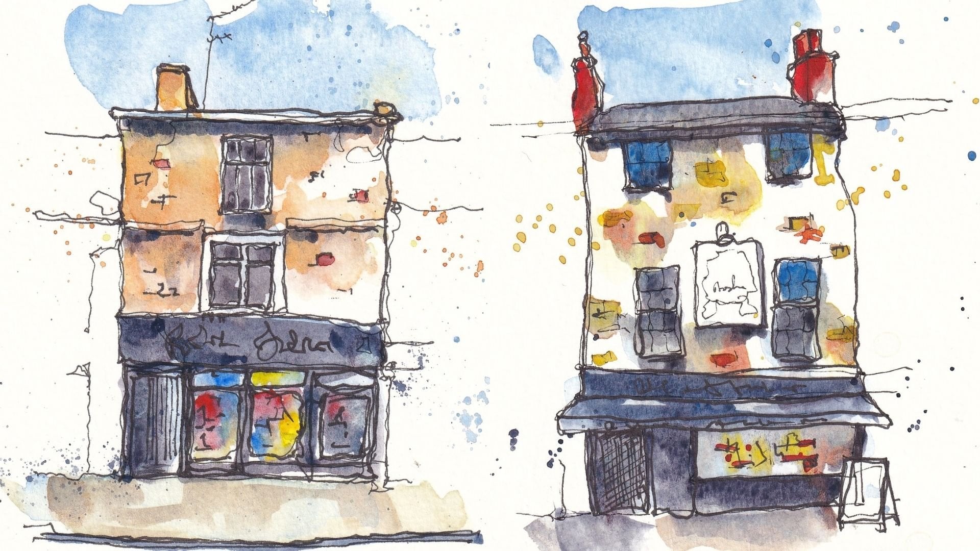
Transcripts
1. Introduction: Textures are a really
key part of art. Textures fill the
natural world around us, they fill the manmade
world around us. And they can be fiddly, they can be challenging, and they can mean that we
get lost in our scenes. You might spend hours
just drawing every brick on a house and then wonder why
you never finish your art. I wonder why it looks busy, overworked, and why
it wasn't enjoyable. If that sounds like
you, if you're looking for easier ways, simpler ways to create effective beautiful textures
to enrich your image, then this may well be
the class for you. My name is Toby and known as Toby Sketch Loose here on
Skillshare as well as in Scram, Youtube and on my website, Sketch Looks.com to UK. I'm a loose ink and
watercolor sketch and I absolutely love
celebrating the textures, not just of the world around me, but also of my paint, my paper, and what my ink and fountain pens
can produce for me. Today we'll be looking
at these ideas and I'm going to give you some
really key learning points. We'll look at key
concepts in texture. We'll look at four
key skills for our ink pens or
our fountain pens. We'll look at four key
skills for our watercolors, which will lead you to
being able to produce textures more reliably
and with less stress. And to produce a more fun, vibrant, and interesting
effect on your page. I'll then take you
through my project. So my project is
going to be producing a mood board of textures. This mood board is
going to include all, it's going to include robes, water with reflections, trees, gravel, you name it,
we've got it in there. The idea behind the
mood board is to learn in a risk free way about all sorts of
different textures. And along with that, you will develop your style, you will develop
your preferences, you'll learn what your
materials can do. And crucially, you'll
encounter tricky things. But in a way where you're relaxed and suddenly
able to do them. That means as you move forward, you've already
seen these things. When you come to a
tricky beach scene, you can think, oh,
I've practiced that, I know how to do that and
you'll be able to do it, You won't have that
stress in the future. Today we have a
stress free practice, loosening up, having loads
of fun with textures. Tomorrow you'll have some
stress free painting, creating amazing
scenes, using the ideas from today for the rest of
your sketching practice. And as you continue and
continue to develop your style, if all that sounds fun,
let's get stuck in. We'll start looking at
those key concepts. We'll start practicing those key skills and
before you know it, you'll have filled a
beautiful page with beautiful textures and be feeling great and proud
of yourself as well.
2. Supplies: This is a really short video
just to open the class. It's just to tell
you the supplies I'm using which are all
listed in the project. Resources also show
you how I prepare my sheet of paper to create
my texture mood board, which is the class project. To prepare for this class, all I'm going to
suggest you do is gather your normal
sketching equipment for me. I've got two fine liners, a 0.1 and a 0.3 mill fine liner. I've got two brushes,
a size two mop, and a size ten angled
brush, sword liner. My normal water colors, all listed down below. This is a block of coal pressed etcher watercolor
paper, a four and size. The last thing I'm going
to do is divide my page up into three rows
and four columns, just with simple
lines going across. What this is going to mean
is by the end of this class, we'll fill this page with all sorts of wonderful textures. Is it? That is all the
preparation you need. You can now find in
the class resources, various mood boards of
different textures to download. And that's what I'll be
using to fill this page up.
3. The Project Idea!: Our project is going to be to create our
texture mood board. I'm going to just talk you
through in this video, what I'm going to be doing
also give you another option, a slightly more guided option. And talk you through
what's available for you in the class
resources to enhance your ability to take on this project and to get
something really great out of the final project is going to be to complete a lovely
page full of textures. This is what I'm going to be doing alongside you
today step by step, all the way, you don't have to choose the
same pictures as me, but I provided you a huge range of resources on mood board for you to be able to pick and
choose the textures that you think will be most
useful to practice, most enjoyable to practice. Also, maybe pick some which
are more challenging in this risk free environment where you can get it
wrong and learn from it. There's another
thing I've popped up in the class resources, which is a couple of pages
I've done of other textures. These are going to be
high quality scans, two pages like this, full 24 textures
looking at windows, water trees of the ground
walls to go alongside this. To give you ideas of how I would approach different things
here we've got bark, We've got our old
terminal trees. We've got different seas, We've got how to
get reflections in windows if you'd like
to use this as well. I'll upload a blank
sheet of this with just the printed areas which you can print for
yourself if you want to. Instead of doing a page
like I've done here, you want to do a page like this. You'll be able to
print for yourself a little textures
moodboard to fill out. I've printed this on
watercolor paper, 200 grams/square meter. So do check that your printer is able to print on
slightly thicker paper. Before you do it,
also be aware that these printer ink
won't be waterproof, so you need to be a
little bit careful to paint within the
lines and not go too far over them or you'll lose lots of the ink and
you'll get a bit smudgy. But you can see
it's worked for me. This is another
option if you want a little bit more guidance on your textures and how to
organize them on your page, this is just another
option that you could use. Of course, we, whether
you've done two textures, four textures, maybe
you've done 12, 16, 100. Be amazing to see a photo of them in the class
project gallery. And if you could say for example your biggest
learning point, I'm sure that would really help everyone else following
behind you in this class to learn
something as well as cementing your learning
for yourself as well.
4. What is texture?: Texture is a really
interesting subject. It's something we
see all around us. We love seeing all around us and makes a really
key part of our art. In this lesson though, we're going to think
about what is texture. Sounds like a
really silly thing, but actually when
we look at our, when we think about
texture in art, it is something worth thinking
about a little harder. And we might recognize the
first thing to cover in this textures class
is what is texture? And I'm going to argue there's two separate definitions ever. Art being both wonderfully complicated and
wonderfully flexible. The first definition is the tactile visual quality of the surfaces or
objects in your scene. When we look at, for example, a tree, we have both a visual quality of all those rippling
rough leaves, if we feel it, we also get
another sense of the texture. I could also say the same
for the things on my desk. Can look at this jar. I smooth, I can see it smooth. I can feel the top is rough, and I can see it's rough. One element of our art is to
reproduce those textures. And we'll be doing
this in detail. But an example, a
very quick example, might be to say, look, this tree has a
rough bark trunk. Here we go, we get
that rough bark trunk. What we're doing here
is representative work. We're representing the natural
qualities of the tree. Similarly, we might
come round and get the qualities of a quality
of those leaves in the tree. Again, this is something
we'll be covering in much more detail in one
of the upcoming classes. This is option one. Now the other thing in art is we have the
natural qualities, not just of what
we're representing, but of the materials
we're using. My pen here provides texture. If I was to do some quick marks, I can get rough edges. I can get smooth black, I can get loopy lines. I can get rough lines if I
swapped to something else. If I swap, say, to
one of these pencils, I can get a different
quality of rough line. I can get a different
blocked in area, I can't get the
same smooth black, but I can get something else. If I then went and made
things even more varied, could attach some water to this. This is a water soluble
graphite pencil and we get even more texture along with the natural qualities of
the objects in our scene. We also have the option to add in textures which
celebrate our materials. Both of these things are
vital parts of creating art, not just recreating a
scene, but creating art.
5. Three Key Concepts: Now as we talked about
when we define textures, textures in art aren't
just about the texture, it's also about the materials and it's also about the art. How can we use textures in our art to really celebrate
what we're doing, celebrate our materials, and
also to refine our image, enhance our focal point. For example, this little lesson has some really key concepts to think about all
the way through, as well as the most
important one, which is less is more. Having discussed
what texture is, I want to bring
your attention to three key ideas to think about when we are
doing textures, when we are creating
our textures now. The first is contours. Contours being the outline
of an object or a scene. If we were to draw a
contour drawing of a muk, we would come around
the outside and we would just capture
that outer edge. That contour drawing tells
us a lot about the scene. It's like a silhouette, but it can tell us more
than just the simple shape. It can tell us the texture. If we were to draw a wall, instead of drawing a rectangle, which might be the temptation when you're setting
out your shapes, what you need to
do, what you can do is already think
about the texture. What wall is this? Is this a wall with
regular bricks, in which case that contour
is going to show you that on top maybe it's
got much smoother. Larger slabs be even slabs
of concrete, for example. This other side
though, the contour again has those steps of
those regular bricks. Then at the bottom, the texture might actually be related
to what the wall is on, maybe it's on some grass. Suddenly the texture becomes
all about that grass, instead of being about the wall. Tip number one, going
in reverse here today is that the contours are
the key starting point, not just for the shapes
but also for the textures. Now we're going to jump
all the way to the left now and say that less is more. I could go on for a long time drawing all the
bricks in this wall. I've done the nice contour and I can fill out that contour now with bricks which really fit and explain every
part of the image. Actually, this isn't wrong. I must say, actually
this isn't wrong. This is a certain
style, it's a very ink, heavy, and busy style. But actually there's
something magical about leaving more
to the viewer. Instead of completing
this very heavy ink work, what I could do is use just
a few selective bricks. A few selective
bricks which will explain what's going
on be much quicker. Leave the imagination open to the viewer can finish off
this wall themselves. Less is more is also important when we come
to our final point. That is, thinking about the
focal point of our scene. The more ink we
have in one area, the more I will be
drawn to that area. If I look at this wall, where do you immediately
look immediately look probably at this bold
area of all that ink. I have a few different
things in a scene. Let's say I have
a little church, a front chapel to it, Big tower. This perhaps is my focal point, This is what I want
you to look at. But I have next to it
wall pouring wall. I fill that wall with ink. It is very difficult for the
viewer to look anywhere, at least initially than
at all this bold ink. Instead, I should
be focusing most of my texture over here
on my church tower. I don't want to fill it all
in as I discussed over here. I want to do some suggestions, but enough suggestions that outweigh a lighter wall
on the other side. We do the same idea of the wall. This time the wall will just
have a couple of bricks. We now know that this is
a wall made of bricks. But my church will get
more and more textures. There'll be more
on here, more dark in more details, more going on. Now, if I cover this wall, what do you look at for
me? You look over here. If I cover this wall, what do you look at for me? You look at the tower. That is what textures can do. They can move your eye around. They can explain the scene
in really simple terms, but they can also
draw the eye to the focal point and make your
scene way more interesting.
6. Four Key Ink Techniques: Now that we know
what texture is, we can start thinking
about how we use texture. This lesson has four, just four key skills that
I think are really vital, really useful in
creating textures when thinking about ink pens, fine liners, fountain pens to create those amazing
textures on our page. Moving on what I'm going to call key skills in developing
different ink textures. These four skills are
really simple ideas which get you started in developing any texture as
long as you're willing to simplify and apply an
artistic touch to it. These skills are hatching, stippling or pointers,
Naturalistic hatching, or advanced hatching
and line quality. Let's just go through
these quickly. Hatching is a simple
process where you go from light to dark through an increasing
density of hatched lines. Here we have white,
very dark in between. We can just vary the
amount of hatching. We do vary the
number of times that we cross over
ourselves to produce this ever increasing density of line and therefore
density of black. This is actually creating shadow going from left
to right, isn't it? But that shadow has texture. This is potentially an example of representational texture. This could be
representing, for example, the texture of a fence could very well be produced
with a bit of hatching, but it's also an example of celebrating on
material hatching. This technique provides a
certain texture to our art, It provides interest,
it draws the eye. But it is a certain technique that you only really see in ink, sometimes in digital art, and in things like etching. It's a artistic touch that you can decide when
to use and how to apply. You can do it in different ways to apply different styles. This is traditional
cross hatching. For me, I enjoy vertical
hatching just building up lines. They can be in
different densities. You can go over them.
You can do bold. You can do light just using different amounts of vertical hatching to produce
this same effect. Now, stifling or pointer ism, is another slightly more
time consuming thing which prizes the same idea. It gets more ink in one
area to provide a shadow. We go from nothing to a really dense block of lots
of these dots in between, we have just a few dots, or we have more dots. Through this technique, you can produce the most
incredible pieces of art. But you can see it's a
very different texture. It's a texture which
is celebrating the ink or as we'll see in one of our later texture
demonstrations. You could also produce, for example, the effect
of some autumnal leaves. You could easily imagine this is producing the idea of
some distant flowers, or some tarmac or gravel. It's a representational and
celebratory texture again. Now, naturalistic hatching
is hatching or stippling, which aims to move slightly more towards being
representational. If we take a tree as a
very convenient example, again, we start remember with our conto gets the
texture going. That was from the
last lesson we did. We've got our
contour then instead of just doing traditional
hatching like so. Instead you can see that
is building up shadow. But what we do is we take
what is the texture? The texture is going
to be the leaf shapes. We use these leaf shapes to
build up our hatched areas. Suddenly, instead of
having we do one side, we build up the light
and shadow and provide this texture of
ink on the other. We build up the light
and shadow by providing the more representational
texture of the leaves. Again, this is something
we'll look at later. Just because I call it
naturalistic hatching, that doesn't mean
it's only for nature. The same would apply for bricks. If you have a shadow
at the top of a wall where you do more little bricks and then there's
light down here, we have fewer bricks. It's just natural
because it's taking the natural qualities of your object and imparting
them into texture. Lastly, really key
skill in all art, which uses any line work, is the quality of the line. This crosses over with
contours and things like that. But if we take a really simple example and we want to really
simplify textures, perhaps we have an
urban rural scene. We have a, what is a house? It's manmade, it's angular. Then next to it we
have a tree and we have the swooping natural lines. Yes, super simplified, but you can imagine ways that just simplifying
your lines, making certain objects
hard and bold, others light and loose can really change the
feel of the texture. Classic example would be saying, look, this is a
bowling ball here. This is a tennis ball just by changing the quality
of the line, slightly, adding
a bit of texture. We've gone from a hard
and heavy object, we can explain it even more, just tiny little
touches like so. But a hard and heavy
object suddenly just gets fully explained by tiny
changes in line quality. There you go, Four really
key but very simple ideas to get your head round for developing
textures with ink.
7. Four Key Watercolour Skills: The missing ingredient so far, of course, is watercolors. So we've talked about
what textures are, we've talked about
how to make them with ink and wood colors bring such a fantastic
array of textures, I'd be remiss so silly not to
mention it in this lesson. We have four, again, four key skills for watercolors to introduce
amazing textures to our scenes. Now we have four key
things to think about. Four key skills of
knowledge to be aware of when creating textures
with watercolors. Firstly is how much water
and how to use that water. If for example, we take a mop brush like this and
we make it really wet, I'll use a nice bright
red color here. We'll get a soft texture. If I dry that brush off,
make it nice and dry. And I take the same pigment and I bring it across
the page, Look at that. A totally different
rough texture emerges. There are also ways to use water like to come in and
soften edge it. See if I come in around this, I've got a hard line, I can soften it look just like. So we're creating
yet another texture. That's just by adding water. Could do the same over here. Just soften this up
by adding water. Being aware of how water impacts your colors
is really important. Next we have the idea of
being aware of your pigments. There are lots of
ways that pigments can provide different textures. A key one is granulation. In my palette, I have a couple of heavily granulating colors. These are part of the lunar
range by Daniel Smith, but other brands
have similar ranges of hyper granulating colors. If I paint this lunar
black across the page, it will, as it dries, settle to be a far more granulating,
granular, sandy texture. You can see that even more.
If I just make this richer, you'll see this pigment
settles gradually over the next few minutes
to be very granular. That's why they
call granulating. Compare that to my
hands, a yellow, which provides basically a
totally flat and smooth wash, just like the scarlet
lake up here. Then you have colors
in the middle of this, like cobalt blues. Generally most brands a
moderately granulating color. You can see it's got
some granulation, but as it settles it's not going to quite
do the same as up here. Now, I've been doing
all of this with a mop, and if you've seen me before, I tend to use travel
brushes like this because I like sketching out
and about as much as I can. But the type of brush
we use can have a dramatic impact if we
compare these mop washes to, say, this tiny size one brush. If I try and achieve
the same thing, well, I'm not going to, I'm
going to get lots of lines. It's going to quickly
become a dry brush as well that is having that impact because of
the amount of water, because of the
amount of pigment. Changing the size of the
brush is going to change your ability to create
certain textures equally. You have some specialist
brushes, for example, this is called a
foliage or foliage, and the reason it's
called that is because it's got a special
texture to the bristles. What I can do is come in and do a little bit of
stipling like this. Look, you can imagine in a lovely watercolor
painting that you could build up the
idea of foliage, a bit like the stippling
we did with our ink just a minute ago can build up the idea of foliage very easily. Using this, then maybe we come back and we
get the textures that are more readily apparent in a trunk by using
our small brush. Our small brush now can provide that certainty of
line that gives you these linking branches in
this loosely textured tree. Thinking about what
brush you're using, really important in
watercolor textures. Now here I've written, wow, wow. Of course, stands to wet on wet. This is really where
we're celebrating the idea of watercolors. Full stop. I just put some water on there I
can drop in my colors. And this will provide us with some really lovely
blooming out textures, simply delightfully, something you can
achieve with watercolor. It works in reverse as well. If I nice, big wash of blue, I can put in some red. Let that move around. I can splash in some water and
get something different. Another inverse texture. As a little bonus, don't forget we do this in some of
the upcoming classes. Little splashes of
pigment on your page. That is yet another
special watercolor effect, which provides just so
much wonderful texture.
8. Project 1 - Roof Textures: Now we're on to finally
creating our amazing textures. This first lesson, we're
going to start at the top, we're going to
start the rooftops. So a couple of roof textures, two very different textures which I find really interesting. Let's see how I go about it, how I use the techniques, the concepts to create what I think are going to be
really fun textures. Now of course, it's
the exciting diamond. It's time to start
creating our textures. Before you know, this page will be full and your
page will be full, and it will be a work of
art in its own right. That's what's great about doing little
thumbnails like this. They really do become a real
work of art on their own. Now I'm going to
start with a 0.1 mil pen and you'll find my
references popping up here. But if you go into the
class products resources, find all the mood
boards I've created with tons and tons of
different references. You can do your own textures, the ones which you
think the most interesting or most challenging. With this, we have this old fairly
symmetrically vertical, but horizontally wobbly, if
that makes sense pattern. How we can capture that. I'm going to start with a small, small pen to get
that finer detail. What I was trying to describe
was that a key part of this texture are not quite
nearly vertical lines. We can start by just
capturing those. What we want to do is not
explain every bit less is more. Remember across this roof
there are a hundreds of lines, but we don't need to draw every little bit
all the way around. The next key bit are these horizontals which
are loosely aligned. They're loosely aligned
but looping over. What we can do is we can show that loose alignment by
joining a couple up, leaving some gaps, and
coming and finding the next one we don't need
to do is copy the reference. We're just taking ideas, suggestions from
the reference and producing our version of it. We can alternate
which of these areas gets are horizontal
looping lines. By doing that, we just build up a suggestion of what's going
on before you know it, we're ready to move on to finding some of the
smaller bits of textures. We've got all these
scratchy marks, haven't we? We've got shadow. Let's get that with a bit of
a light hatch going along, some of the edges that
just immediately, I hope you agree, builds up a sense of shadow. A sense that this is
a three D loop that we're looking at and also
shows mucky texture. We can even just start
using maybe some stippling, some random naturalistic
hatching to get that rough texture that is all
over the top of this roof. Last but not least, we've been using 0.1 mil pen, we can move on to a bolder pen, that boulder pen can find us some of these
deeper shadows. And those deeper shadows are an important part
of this texture, an important part of what's
going on in the scene. We don't want to overdo it. We don't want to
go over every bit, but we just find some
of those key areas and really make them a bit more punchy that will
build up our texture. Having turned our move
on to our water color, can you use my
little dagger brush? And I'm going to come in
with the orange tones. Light orange tones. I'm going to keep my
wash nice and varied. A key part of water colors is getting that variation
in your wash early. A little bit of crack there, then a little bit of indigo
just to mix in and start getting that varied
feel to the roof. And the variation in
color, hopefully, will impart a lovely bit of texture just drying
off my brush. Now that will give us another bit of texture
that will let us soften, it'll let us dry brush
ins and textures, let us move things all around. Now remember,
working in layers is important for color textures. For water colors, I've
let this dry and I'm going to jump now in
with a second layer, we can actually achieve
all the texture we need, probably with the
same two colors. Just a little bit of racon, little bit of indigo,
little touches of these different colors. Now we're trying
to get that more. What's the word speckled feel? I guess we can get that a lot just through using
these simple textures. A slightly dryer brush, building up the colors, building up those shadows
where we've done the hatching. But also, don't forget
we talked about. Splashing as a bonus technique. Well, that's going to
immediately impart that speckled feel you
can do the splashes. And then you can actually
come back dry off your brush again
and change some of those splash textures
to make them feel a little more soft, a little more in keeping
with the rest of your image, that for me, that is how I
would achieve this texture. I might be tempted, if I'm trying to do a
more complete drawing, might be tempted to introduce
a couple more colors, a little bit of these
red tiles popping through in my actual image. But there you go. That
is one texture done. Let's move on to the next one. Now we have these much
smaller tiles, don't we? Much smaller tiles
spreading out everywhere. Again, I'm going to
start by finding what's the key part
of this texture here, instead of vertical lines, the key part, these
almost horizontal lines. And they're much closer together and much more certain as well. I'm going to do that again, and remember less is more. So I'm not making them complete. I can actually just
go really quickly and that will bring a nice
rough texture to my lines. Next we have a few
vertical lines. Again, these don't
have too much of a pattern and part of that
texture is how random. So some of these tunnels
are really long, some of them are really
almost square or even smaller than
squares, they rectangles. Going down this way, we just
find a few of these lines, we can just sketch in a few, not too many, just like before. We can then jump
to our bigger pen and find the key dark areas. We've got variation in
this horizontal line, that's the line weight
we were talking about. We can come and vary
that line a little bit, get that sense of fairy
texture of it being neat, but not got a bit of a
higgledy piggledy field to it. Hasn't it coming along here? Keep this idea going,
keep the ink flowing. And we can start
building up some of the shadows around these tiles. Again, just leaving it a
lot to the imagination, to the viewer to work out. This actually has a soft flow of colors going
across that texture. What we could do to emulate
that is some wet on wet, We could take some indigo. Just drop that in.
That's going to give us a nice gentle color. There's a lot of
light coming through. We can leave a lot of it white. We can drop in some
lighter suggestive colors, like some cobalt,
cobalt blue there, just to mellow with that indigo. And it may be you don't even need to do more
than that for me. I'm going to add
some granulation in there just in a few places. Tiny bit of Lunar. Those granulating
pigments will just settle and amp up that
texture just in a few places. Because of that, because of how soft the colors are in this, I don't think we need another
layer, just goes to show, you might want to, you might feel there is another
layer needed. But I'm going to leave
my rouse done just here.
9. Project 2 - Wall Textures: Now there's a bit of a
logical progression here, because we've gone
from the roof and now we're going to be
doing the walls. We've got more than
two, we've got three different
wall textures here, and we're going to get
a bit more complex. We're going to be actually
enhancing our textures through co locating
them through having more than one texture
in our scene at once. And we'll see how
we adapt and also how that actually really
helps enhance our textures. With that, we're going
to move on to walls. What you'll find in
many textures and many scenes is
actually an object, doesn't have one texture. This is a great example
of this reference. Here we have that plaster. We've got those red bricks, we've maybe concrete or
something stuck on top of it. How are we going to get all
that complexity across? Again, it's through suggestions. I'm going to start
with my contour. My contour comes across and
it describes the surface. I'm not sure if it's
concrete or plaster on the bricks within that area. And that area, we've
got the texture, I've stippled areas, we've
got some little bricks. We're using the
marks our pen can naturally make to
just get the idea. The suggestion contrasting
that against our bricks, where we can start bringing in just some simple
suggestions of bricks. A key way of separating out different textures is to
have them about each other. So if my bricks come
out from behind here, and if we find some of
these other concrete areas, they've got a slightly
different texture again. But then we have
the bricks come out peeking out from underneath
and around this. Well, you know what will just show that these
are different things, they're related different.
Just like that. That's probably enough
with my little pen. Can we come back like before
we find some of the shadows, some of the deeper marks
with a boulder pen. Often I use a fountain pen because you could
achieve the same effect, but just by using the one pen, pressing a little harder,
we'll give you a bolder line. With a fountain pen,
it is less easy. With a fine liner
like I'm using today. With a fine line, you
get that control. So it can be really nice for fine textures coming in now with our water colors.
But what have we got? We've got obvious differences,
haven't we, in here? We've got a general
wash of reddy orange. So I'm going to go with a
little bit of hands of yellow, a little bit of Scarlet lake, and we'll get quite
a bright orange. And we'll start with that. We don't want to just
paint a totally flat wash, we want a bit of
variation in that I'm going to leave areas
white going to come in, maybe something more
murky bit of indigo into the mix and just get
that idea in as well. These colors are not
totally realistic, but they are representing what I think I see
going on in here. And you might feel you
see something different, are going to murky
it up a little bit more, get more variation. And to let that wet
on wet approach, see if we drop in
these colors here we get that wet on wet approach, providing even more texture
within our concrete. It's quite a rough
texture dry brush, just take some murky
stuff from our palette and we could dry
brush, look at that. Dry brushing creates that
immediate sense of texture. It highlights the roughness on our page and we get to an immediate feel
of that concrete. I'm now going to just let this dry by magic. We're
back in, it's dry. And it's quite evident
here that the texture of the bricks especially involves having these bricks stand
out from the background. So we can come in, we can use some of the
same colors we were using before and just vary
them a little bit. By doing so, we'll just
enhance that texture. Some of these bricks we can
just water color as well, they don't have to
have ink around them. And we can even do a
few little splashes just to provide that element of water color randomness to celebrate not just the
texture in front of us, but also the texture qualities
of what we're using. Our water colors, the water, the brushes with that. That's another texture done. Now we'll do something which
is a little different. We'll do this
stippled wall here. Again, same processes, we
can draw the bottom in. Remember that
contour that's about the grass which is coming
to the bottom of our wall. Isn't it above that, We've got a concrete. That's almost a
straight, smooth line. Not quite, but very almost. It's got another
little line above it and then we get to a wall. It's going to add in our window here just as a
marker of posterity. Also, remember the contour of the window is
formed by the wall. We start to get that simple
stippled effect already. We could do the other
window as well, which is just a little
bit above, isn't it? I remember the contra of the
wall is forming the window, so we get that little
stippled effect here. We can find where is it,
a bit darker and murkier, maybe it's darker here and here, do a bit more stippling. Other places we need it, nice, nice and loose and
we can come in. Let's use our mop number because we're going
to do it again. A bit of wet, wet. What is this? Well, it's a very
subtle, peachy yellow. Let's start with a
bit of wet on wet, yellow, tiny touches in there. Again, to further
that stippled effect, I'm going to use a lunar color, one which will
heavily granulate, drop that in around it will just soften out and provide
its own texture. If we wanted to
double down on that, we could even add some of that lunar black in
our darkest areas. With that, we just let
things mellow move. We don't need much more texture to go on this wall at all. We probably don't need again, another leg because of how
soft the textures are. Because these was so quick, we've got time to do
another lovely wall. This one is like a dry brick
wall. Like a dry stone wall. One of my favorite things
to draw because they're so full of character
formed by those shadows, let's just pop it underneath through all our walls together. We got, now we've got fairly
regular horizontal lines, or at least they're fairly parallel, but
they're going up and down. That is our first thing to find that contour
of these lines, contour of these bricks needs to capture that
texture straight away. Then in between, we have very irregular
randomly intervals, if you like, horizontal. Some of them are
very close together, some are very far apart. We can get that they don't
need to be all the way across. They can just be suggestions
like here and here. The shadows are really key
part of this, aren't they? Key part of the texture is all these areas of
really high contrast. We're going to do quite a bit of introducing that contrast
here with our ink. That will really start to get us understanding that this
wall has a deep texture. It's not just something shallow and
superficial like this, it's a deep texture
going all the way back. Jumping on from there, we can bring in our brush. Again, I'll go back to my sword liner because
we're going to be doing specific areas here. We might focus on actually
individual bricks. They're very separated
by the line. We could actually doing
an under painting, you might even want
to just come through and find a few bricks. The question then
becomes how many bricks? That's can be a personal journey for you, personal decision. But I'm going to suggest that we can do not that many bricks. We just show the variation by doing a few bricks and
leaving our texture there, a few different techniques for different things
to think about. And before you know it,
you'll have a page full of amazing textures
filled with walls.
10. Project 3 - Ground Textures: You'll be relieved to hear the logical
progression continues. We've gone roof,
we've gone walls, and now we're onto the floor looking at ground textures,
road textures, cobbles. That thing, again, this is something a little
bit more complicated, but only because it's not
something we often focus on. That's fine, because actually
it's often not important. In this lesson, we're going to be thinking
about how we can make those textures effective but
not take over our scene and not reduce the emphasis which is normally
on somewhere else. Normally on another part of
our scene as the focal point. Now, every good wall needs some ground to stand
on, doesn't it? Here we've got some lovely
simple paving slabs, which actually are
often forgotten, but quite an important texture. Again, we're going to start here with our normal fine liner. Our finest fine liner. What have we got this time? We've got very regimented lines, but they're lines in
perspective as well. That means as they
come out towards us, they are getting wider and wider as they come
over this side, they're spreading out that way. Then coming across we've got quite regimented
horizontal lines again, because they're in perspective
as they come towards us, they actually separate
out more and more. Now, I'm exaggerating this
compared to the reference. Hopefully you can see what
I'm getting at and you can believe me that this is what's
happening along the side. I'm just going to add in our, what they call bollards
to give us a bit of context for our ground. And then jump in again, find what else is there
about this texture. Well, we've got variable shadow, but again, quite subtle compared to what we've
been doing before. The shadows are probably more
intense as we come closer. That's a key part of the texture and also the perspective, so we can get bolder
shadows close and more wispy shadows
in the background. The other thing we've
got are some puddles. Puddles actually because they're reflecting the light sky, they're reflecting buildings,
they're already dark. We can actually just
hatch in very gently these areas which are not
reflecting any light. They are dark and giving
us that sudden break. There's a few of them coming
off from this side as well. Here we go, just very
simple hatching, another valuable part
of our technique. Just like before up here, this is a very soft texture. All I'm going to do is take some nice soft brown and almost form a gray with
my Nacen and my indigo. I can form a neutralish gray. Just wash that gently over paying attention to where
there's reflected light. Then coming back in with
our wet on wet ideas, dropping in some darker color. This is more indigo and
letting that move around. For me, that is probably, again, enough of our texture. Unless we were doing a really
zoomed in view and it was all about the funny viewpoint looking up from the ground
or something like that. What we need is just
this gentle texture. There are ways you can enliven it and celebrate our medium. One, I like for dark
moody areas like this is taking a touch of cobalt blue and just
dropping that in. That could suggest
some of these puddles, it could suggest some shadow. It provides extra texture. It's not real, but it is celebrating textures
from our colors. That is another option
you can take on board. Next up, we'll tackle
some gravely landscape. This is different, this is our gravel has this moving
sloping road going through it. But that road, again, it's
formed actually by shadow. And that shadow is formed
by these textures. If we simplify
scene a little bit, we can get the idea that this road has these
textured areas of gravel. It's got the tire tracks
in the middle and then at either side it's the textures Either side of the wheel tracks, it's got the basically
stipple textures. In some places
there's bigger rocks, you start to get
little bolder textures and then in the background
there's very little. You could even again, we
could celebrate our medium, We could use a little hatching. It's not a real
texture in the scene, but it does demonstrate
the shadow. It does demonstrate
a rough texture. It's semi representative. Bit more stippling. Closer to us then remember we have more
than one way of stippling. We can use a bigger pen to
get bolder stippling in the foreground to
get bigger rocks to form those bigger shadows. Just like that, we have a
lovely, very subtle, lovely. Texture, just building up a little bit more
on the foreground. And there we go. How are
we going to achieve this? Well, this is another
brilliant place where we can try some wet and wet a little bit of water
over the areas we want. Our pigment get some
granulating colors. I'm doubling down on
the wet and wet effect, we also using highly
granulating colors And just drop that in
then where we want it, Boulder, we drop a bit more in places it's
going to be dry. That's great, because
that means we can stile with our brush as well. We can stip to form even more of our
interesting textures. We could take something a
little lighter just to provide a slightly different feel that pigment will also
spread in a different way, forming even more textures
celebrating our medium, not just the actual
image in front of us. Spread that light to simulate the light
of the tire tracks. There we go, we could even feel our area do some light
splashes in the background, different texture
showing something about the distant hills. Without over explaining
overdoing it, a few splashes in the
foreground because, why not? Then last but not least for our roads and ground surfaces, we should definitely tackle
grass, shouldn't we? Now, grass is all
about those contours. If we take this grassy hill, what are we seeing at the back? I'm exaggerating the
size of the grass, but we're seeing
this contour line of grass coming forward. We have these wavy areas of
shadow and light, all green. With shadow and
light, we can form those wavy shadows with
naturalistic hatching. That's hatching,
which is suggesting areas of grass then
in the foreground, not in this photo but in others. Often we get big textures. We get actual blades of grass we can
individually pick out, they can form part of that center perspective
as well as the texture. Then there'd be
more and more here, we're using a bigger pen to more easily get that feel for me. I love juicing graphs again, in a nice loose fashion. I'll come in with, I've
got a green appetite, genuine here, Bold green. That's going to provide me a loose undercoat under painting, this bright painting,
which then lets us find the areas
of light and dark. More bold paint can get dropped in around where we've
decided with our pen, these dark shadows are even
more in the foreground. This is going to spread and
provide a lovely texture. Then we could use
something different. We could use a light
yellow, for example, to find some of
the lighter areas to suggest that
lovely variation. We could use a like
an indigo to come in the front and provide that
relief of detailed texture. There we go, three, road and ground surface
is done next to. No time really loose. With that, we'll move on
to some natural scenes. A bit of water and
a bit of tree.
11. Project 4 - Trees: And next, maybe the
logic has ended. We've gone roofs, we've gone
walls, we've gone ground. Now we're going to move a
shift away into nature. Going to be looking
at trees and that, I suppose, links into the
grass we've just done. And thinking about how we
can use different techniques to enhance the effectiveness of our trees without any fuss. Textures of trees are one of my absolute favorite things
to find in my scene. We cover this a little bit
in one of the lessons. At the beginning, we mentioned a couple of ways of doing trees. I'm going to start
by just showing you my two favorite techniques for trees based on
these references. First, we have this tree
which has this lovely shape. We start with that shape,
we get that contour. And I'm going to
have to squish it in a little bit to
fit it within my, with my little box here.
My little fun there. But you can still get the idea. The contour line with
these irregular, scratchy shapes is what is building up the
sense of this tree. Down below, we have
the bark that has a different texture, doesn't it? Has a different texture, which is more like
scratchy and linear. Then at the bottom, the texture is actually more
about the grass. So we've got the contour
of the grass. Here we go. So we've got three
textures already. Now we can build up that tree
with really loose, simple, light, naturalistic catching
that can be really quick. It doesn't have to be a
painstaking process here. I'm just basically scribbling really loose repetitive
scribbles which build, build up that texture. Before you know it, you have built up that light and shadow. But also be giving an
idea more about the tree, more knowledge about the tree. What are the leaves like,
how randomly have dense, that kind of thing is
built up really simply. We can use bolder
pen if we want, so we could emphasize shadows, emphasize particularly
dark areas. We could use it to bring
out some branches. Or we could actually,
in a sketch like this where we've built up a lot
of complex stuff already, we can leave it pen light
and just say, yeah, actually that's working
really well for us, has just different ideas. You don't have to fill the
whole tree with color. We could use our same green appetite we've
been using here. Green appetite genuine. Actually, we could almost just choose a few areas,
darkest areas, to get those greens, and that's an option which keeps your image
really specific. It's all about these
amazing ink textures. We're not overdoing it with extra complexity and extra fuss. A nice thing to add on top of that might be a little
bit of randomness. We haven't left
it totally blank. Instead, just adding
some splashes to show that within this white, there's plenty of
other stuff going on. Maybe we can give ourselves some nice autumnal grass
underneath as well. Now we'll move on. We'll do something a little
bit different. We'll do a little autumnal
tree overhanging. What have we got? Again, in this little seem, the texture of this
grass coming across got the texture of actually
the seats got texture. These planks are made of wood. They've got like the
horizontal quite flat, but a little bit of horizontal
grain coming across them. Then the tree coming across. Well, what's its texture? For this might not
be the same for you, but for me the texture is
about actually these branches. That's a key part
of the texture. We get those, then the texture
is about the leaves here, we just stipple in the leaves, we don't need to find the
contour of the trees. That's why this is so different. We're not finding the contour. This tree almost feels
like it's breaking apart. It's autumnal, it's the
leaves falling off it. We can use two different
thicknesses of pen to be able to build up the
sense of light and shadow. Build up how dense the
leaves are feeling. But we don't need to overdo
it. We can still leave it. Very simple coming in. Well, let's get a little bit of slightly green autumnal
grass coming across here, then just a little flick or blot of paint might
be all you need. Or contrary to this,
you might even feel, because I've been so
gentle with my ink, I can be a lot more fluid
and loose with my color. So I can actually bring a lot
more color into this tree, let it glow beyond the
outline of the leaves. I've drawn celebrating
different aspects, not over focusing on one bit, but celebrating
different aspects of what we're using
and what we're doing. What we're trying to achieve pop across here some little
just gentle textures, tones for our bench. And that is a couple of fun tree scenes done
in no time again.
12. Project 5 - Water: And last but not least, possibly most
challenging of all, we're going to be
looking at water. Water has reflections, ripples, it's got loose colors, it's got specific shadows, it's got all sorts going on. And how can we
actually achieve that without getting too stressed, without going mad,
without having a really bad day at
the sketching office. Well, you'll be relieved to him. It's actually not
that hard if we look at it in the same way we've been looking at everything else. You'll be sketching
seas in no time. Last but not least, we
have some water scenes. And these are textures which people often find challenging. I know I personally find
them challenging. For sure. I'm going to choose a couple
of interesting ones for you. First, we have this
amazing sunset scene. It's actually quite
a flat, isn't it? We have a clear horizon line. Then coming across we have
a couple of dark lines. We also have some gentle
ripples in the middle. We have the lightest area. The ripples that we
introduce will mostly be what we'll call
naturalistic hatching to suggest darkness already. But with a soft scene like this, we don't want to do too much in. What we want to do is make
it all about those colors. Let's actually for this,
we're talking about the sea, but let's start with that sky. The sky, we got a
touch of blue in it. We'll do that blue just
pushing that color around, going up, going down. Then above that it's
got this soft pink. Pink of course is white and red. If we just take a nice bit
of red, plenty of water, that means the red of the paint mixes with the
white of the page, which shines through and we
get this gentle pink color. Here we got to
tackle reflections. Now the reflections
are coming towards us. To draw reflection or
to paint a reflection, we need vertical lines. That's the way that
light travels. So we need vertical lines. I
know what you're thinking. Look, but the texture is
all horizontal, isn't it? You're quite right. The
texture is horizontal. But if we draw
horizontal lines to get the reflection, that's
not going to look right. We're a bit of a catch 22. What we do is we celebrate
our watercolors. The fact that we can
paint wet and wet. The fact that we can
keep them nice and wet. Having done that initial
soft wash towards us, we can come in with a dry brush, we can feather across
some horizontal lines. Now we can introduce horizontal
texture to this very gentle flat C. That is all you need to do to start
creating those textures. What you can also do is come
in with a bit more paint, a much thicker paint,
a little bit of paint on a dry brush
using a really fine top. We can then even more
emphasize those areas of horizontal texture could do the same with some of our red. This way you are
enhancing the texture. Enhancing it makes
it a bit busy, but makes it much more
of a focal point going back to what we talked about all the way
at the beginning. Now another type of, another type of C is that moody, scary, smashing bashi
with loads of waves. So here in this
version, well look, we've got a much less clear
horizon line, haven't we? We can make that less
clear by showing, oh well look loads jumping up, going on up and down here. It's almost like we've
drawn some grass. You come forward,
we've got a few lines, but a lot of this page is white. Then we've got this big
wave coming across. We actually, that's
got its own contour. We can find that contour. Then within it, it's white, but it's also got creams. It's darks, It's got a surprising amount
of shadow in there. We can just get that,
we can celebrate again, this is our ink
providing a texture which is fairly
unique to our ink, but it is also explaining bit about what is going on
in the darkest area. We do the most hatching
at the bottom of this, do the most hatching
in coming forward, we just show the randomness
of the wave patterns in here. We might want to introduce
some darker lines. Just darker lines, just
see how that copes. But just like over here, be gentle with your lines
just in case you can always add more
hard to take away. Just to make this stand up, we need to leave lots of
white, lots of that froth. We'll start with some
very gentle colors. Going to mix a bit of cobalt
blue with cobalt turquoise, and hopefully end
up with something a bit murky in the middle. Yeah, that's working
rather nicely for me. Often es are actually got a
bit of a green tinge mixing in a blue and a light
green or deep green even, or a sea green is a nice way
to get that feel down here. We need to leave
again, lots of white, dark areas are
going to be within these shadows and a
few splashes aside. Then we're focusing our
color just on our lines. Now I'm going to introduce
a bit more tone, bring in deeper mix
of the two colors. We got our cobalt blue, cobalt turquoise, a
little bit of indigo. Then I can start a little
bit of wet on wet. Just touching in some more drama into where I see
the darkest areas. There was something like a,
something that's complex. This is another one
where I think will benefit actually from layers. I'm going to let this
dry and we'll see what we can do to enhance
it a little bit more. Here we are, we are dry. Now what we can do is we
can come back in here. We talked at the
beginning, didn't we? About how getting
really specific things is a different textual,
different tool. Maybe what I should
do is pop away my big brush for
our final touches. Bring out my small brush. And all that means is I can
use actually the same colors, but when I lay them down, they have a different
texture and they'll be more intense.
Yes, higher value. But also look, the texture
is going to be different. It's not as loose, it's moving around, it's
got more certain edges. We can use that to
provide that certainty, that randomness, that
point ism effect. Again if we want with
our brush rather than just using it with our pen. Adding a little bit more
green in just to provide more murky feel coming
back and just look, layering up with horizontal
marks to show like the ink, that horizontal
feel to the waves. And there we go, little
touches in here. Now what we can do,
some little splashes, which with a small brush, are going to be
very small, indeed, much easier to control. For a bit of fun, Let's just have a little bit
of fun with the sky in our last one to make
this really stand out. What if we give it a
slightly apocalyptic sky to show the mood of
the whole scene? A flat sky, but I'm hoping
with just a gentle flat sky, maybe we touch in tiny bit
of pink, tiny bit of pink. But otherwise a nice flat sky will enhance the
texture going on below, we have this flat wash, that contrast with an
absolutely not flat sea, again, enhancing the texture working on our focal point by
contrast or textures. There you go. That is a full
page of textures complete. Let's move on to
the next lesson. We, we'll think about the
next steps and what we might do to complete our own textures and to follow up on this class.
13. Round Up and Thanks!: There we are. We are done. All of our textures completed
and our projects made. It doesn't matter if
you've done 23 textures. Doesn't matter if you've
done ten textures and they're all
focused on walls. What is amazing is that you've taken part and you've had to go, and I'm sure that you've learned
something along the way. What would be amazing
is if you could, having completed your project, pop a picture of it up into the class resources
and project gallery. If you enjoy the class as well, please do leave me a review. Means the world and it really
helps me improve as well. And know that what
I'm producing is something of value to you guys. Now, this is a tricky subject. It's a challenging subject. It takes a while to get
our heads around it and develop our own style,
our own preferences. If you have specific
questions, please ask them. You can ask them in
your class project. You can ask them
in the discussion. I'll be very happy to help
answer your questions, give you a bit of guidance
on what I would do. Most importantly though,
remember this is all about you. This is your style.
And developing what you want to develop. Just because I say
something or you see something else, don't
have to believe it. You don't have to like
it. Just think about it. Try it out, experiment, have some fun, and
keep creating.
 Toby Haseler, Urban Sketcher, Continuous Lines