Transcripts
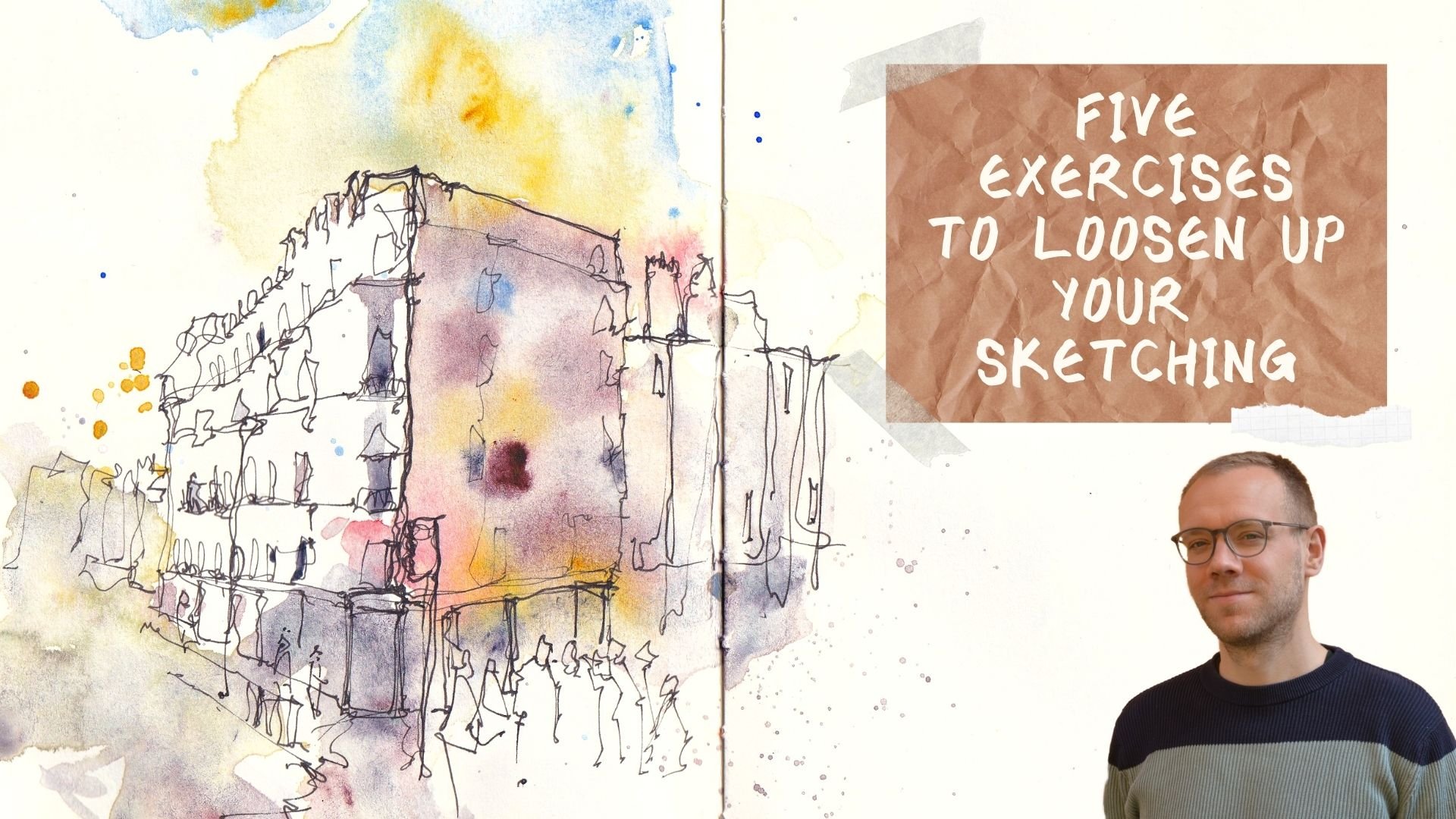
1. Introduction: Are you looking to get into ink and watercolor urban sketching using direct watercolors
to produce light-filled, airy, and dramatic
urban sketches? If so, this may well
be the class for you. My name is Toby, known as Toby
Urbansketch on Instagram, YouTube, and of
course on Skillshare. I like to use my ink and
watercolors in different ways. Often apply my watercolors
first before coming back and bringing some structure to those beautiful colors, those amazing textures
that only watercolor can produce by applying
my ink second. In this step-by-step
and in-depth class, that's exactly what we'll
be looking at doing. We'll look at simple concepts which are actually so vital to
direct watercolor sketching, like thinking in
shapes and painting and capturing those shapes
directly on our page. We'll also look at how we can
vary our watercolor wash, how we can create real
interest by celebrating what watercolors are,
a beautiful medium. Of course, we need to understand how to bring a bit of
structure to that. That's where the
ink lesson comes in and we'll look at how a
few ink touches can work magic to this loose and
wonderful painting. We'll then do a full
step-by-step demonstration where I'd encourage you
to have a paint along. Of course, there is
always a class project where I'd love for
you to find a scene or to use my reference to create something beautiful yourself. If this sounds like
the class for you, let's go ahead,
let's get sketching. If you do enjoy it, please do feel free
to leave a review. It means the world
to me, of course. Feel free to connect
outside either through Skillshare's discussions or on my Instagram
or YouTube channels.
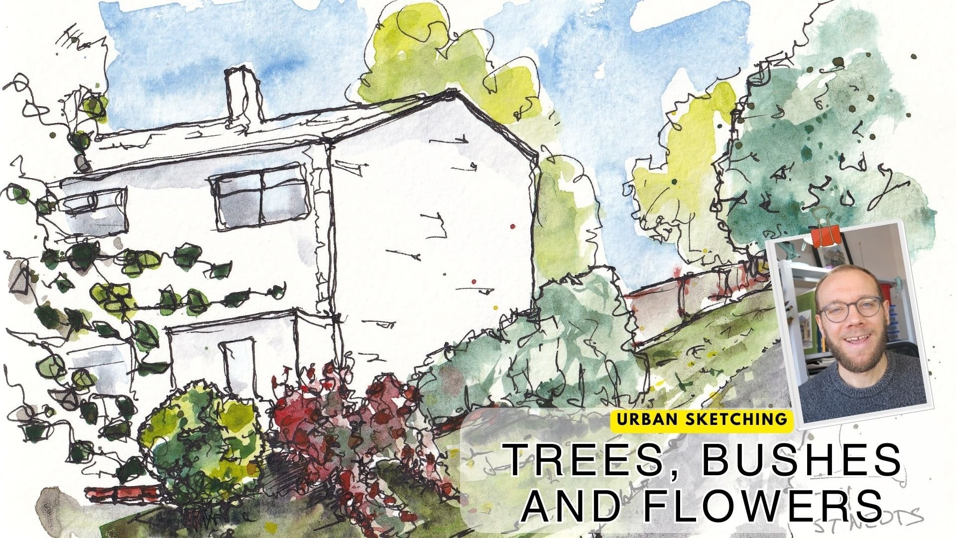
2. Gallery of Example Sketches: The first thing I want
to do is just show you a little gallery of
examples of the thing that we're aiming today and also talk about
when I painted these, the equipment I was using, and how it slightly changes
but doesn't dramatically change the impact of
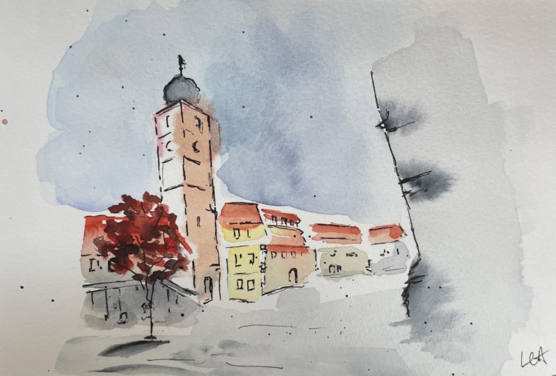
what we're doing. In these first two examples, which you might be
able to tell actually, we've got this church
here in that church is what's sat behind this image. In both of these, I'm
using watercolors and all I'm doing is I'm
painting in these shapes, these broad shapes, and here the same, just
painting in these shapes and using a wet-on-wet approach. You see how these
colors glow and blend. The color behind the spire and in these roofs is
actually the same as the sky, this tree so it glows outwards. So using the same watercolors
as glowing effect, we're using this compositional
trick here as well, which is something we'll
cover in our lessons later. Then, with those
loose colors done, we come and we add some
ink, in this case, using a brush pen to produce these varied and dark marks which just bring
everything together. In this next style, I'm doing exactly the
same with my watercolors. I've got a few of these,
quite a few, as it turns out. In all of these, if we just have a look
at these first two, I'm just painting
the shapes again, exactly the same and this
time using a fountain pen. You can see the fountain
pen has the same effect. It brings these shapes together and you end up with
a really fun sketch. This is exactly the same. I'm just using Brutus colors, a little bit of fountain pen. This time sketching
a few people in and then adding a bit
of color to them on top just to push them forward until
they feel like they're in a separate plane to these
loose colors at the back. This last one is
slightly different in what I've done with the ink is just a continuous
line drawing. I've done my leaf shapes
and then I've come back in and done a loose continuous line drawing all over until I've
captured the detail I wanted. The last style I
wanted to show you. This is all on cold press paper. Now this is actually a hot press paper and
it's very smooth, and you can see exactly
the same effect, but the colors just provide
different textures. Loose shapes, lots of
white on the page, ink bringing it all together. If we just keep
flicking through, you can see, can do it
with even less color, and even the next one
has yet no color at all. You can also do portraits. You can see here my ink
lines, which are outside, some very loose color, but by building up ink
just in a few places, the mouth, the eyes around
the nose as an outline. You can bring real structure
to what could otherwise just be loose manic
application of color. The same thing continues. I think I've got
another portrait and other portrait here, which is the same idea. You just can produce really
lovely simple effects. This is a very simple example, really loose colors where
we've just then brought it together with a
tiny touch of ink. This is the thing that we'll
be looking at doing today. Producing some lovely
loose watercolor using a bit of wet-on-wet, leaving white on the
page, fairing and washes. I'm just being
brave and competent both with our watercolors, but also with some ink. Hopefully, by just showing you all these different pens, different colors, different
papers, you'll see, it doesn't matter what
equipment you have exactly, it's just about
the application of a certain style of technique to produce this
interesting loose sketch. Without further ado,
let's have a little chat about the equipment that you
might use and I am using, and then we can finally
get to the sketching.
3. Supplies you might need: Hello everyone. This is the equipment lesson. If you've seen any
of my other classes, you know I like to
keep things flexible. There's no things you need, just things I will discuss, things I'll use and I'll give
you alternatives as well. Obviously, I'm using
my watercolors inside. I've got 14 colors and a
couple of little mixing areas. The important colors and I'll talk you through
all the colors and also list them in the
project and description. But the important colors
that I love are warm brown, I use quinacridone sienna, a warm yellow like
quinacridone gold. You could replace the
quinacridone sienna with a burnt sienna
or burnt umber, which are more common colors. Then dark colors. I love indigo, moon glow paint, gray is great instead, and a nice blue is also really valuable
like a cobalt blue. But whatever colors you have, you'll be able to do the same things and adapt
and get similar effects. In terms of brushes, I'm going to be discussing the pros and cons of
roundness is flat. The brushes, I'll be showing you are one inch flat brush,
a Size 2 quill brush, and a Size 6 pointed
round brush. I make a lot of use
of my flat brush, but again, you'll be able
to use other brushes if you don't have
these exact sizes. I'm mostly going to be
using little spray bottles. This is a handy pain spray, so it fits in a normal pen
holder or in your pocket. You don't need that,
but you could also use just water and
brush to wet your page. Then I'm going to be
using this, a brush pen. It's a lovely little pen with
a brush nib, very flexible. You can create
lovely fine lines, but also deep dark
shadows and things. No worries if you
don't have that. You could also use just a normal fountain pen
like my LAMY safari here, I suggest a dark black or
brown ink for a fine liner. It doesn't really matter
which pen you have you just need a pen at some
point for this lesson. The extra things, of course,
we've got our paper. I'm not using
anything clever here. This is a student grade
Daler Rowney paper. You can get fifty parts
for not that much money. Which is why I love using
it for my little sketches. Then obviously,
I've got my towel and a giant pot of water. This is a good liter of water to make sure that our
color stay clear. That is everything that you
might need for this lesson. The last thing I haven't
mentioned is my masking tape, which we'll talk about as
well as we go through. Let's move on to
the next lessons and we can actually
get into doing.
4. Which Brush is Best? - A practical guide: Hello, everyone. This is the first lesson that
we're going to be doing in our direct little watercolor
and ink sketching. In this lesson, we're
going to just have a think about which brush is best, which brush is really going
to get us the effect, the control that we want. In the next lessons, we've got one coming up about how to use this brush
to create our shapes and then another about how to vary the washes
using a bit of wet-on-wet. But it all comes down
initially to which brush? I've just got a couple of
brushes here as examples. We'll just try out, we'll try and use, and see which one
produces the best effect. I'll tell you which is my
favorite and then you work out which is yours as well because it is going
to be a bit personal. Now, the first is, this
is a pointed mop brush. It's got a nice point. It holds lots of color and water because it's got a
big belly as well. Many people might think
this is the best brush. If we take a nice
bit of pigment here, doesn't really matter the color, and what we're trying to do initially is grab those shapes just like when we're sketching, we sketch shapes, so we pick out
squares and circles and things which build
up into our scene. For some people,
you'll find you enjoy using a pointed brush
like this the most. The only thing I'll say
is it's a bit limited in what can you do with it. Well, in terms of being
neat making shapes, you can pretty much use the
point or having drawn a line, you can come down the side and create some nice
blocks as well. I find my control with this if I'm trying to be quick and wishy-washy and
have a bit of fun. Sometimes I can lose control
and I can end up with these fat lines when I
really wanted something quite thin and gentle. This is one option. Certainly if we just do a
couple more simple shapes, you'll see it's very capable of grabbing these shapes for us, it's very capable of
building up a scene. We could very easily build up our scene before blocking in those shapes and producing those varied washes
that we'll be talking about in one
of the next lessons. This is Option 1, which is our pointed brush. It could be a round
brush, a quill brush. What you do need is
not something so small that you can't
produce a big line because you want to be producing big fluid
strides of thickening. If we leave lots of hard lines, so let's say I use this small, this is a pointed Size 6. If I went round sketching
my scene with this, I can produce very
lovely delicate lines. But by the time I've gone
over here and moved up here, some of these would've tried, and instead of being able to
wash into this lovely shape and get these varied washes, what's going to happen
is you're going to have lots of hard lines. It's going to look very
busy and overworked. I would suggest
something bigger, which is why I showed
you the quill brush. But as I've been suggesting, as I've been talking it,
that's not what I like to use. My preference is actually
a big flat brush. I use a one-inch flat brush. This is for sketching
on an A4 or an A5 or probably even an
A3 bit of paper. Sometimes for an A3, I use something even bigger. Now, surely this is
less easy to control. It's huge. Maybe for some
people, but for me and for the way I
sketch and paint, actually what it
means is you can get these lines immediately,
straight lines. If you want to
draw a tiny thing, you can use the corner. Say we draw a scene
like this, you can go, there's one roof line,
there's another. This is where the tower
goes, angles like this. Then before you know it, you can come in and you
can get these shapes made. You can easily leave whitespace, which is something
we'll be talking about in the next
lesson as well. You can very easily create very neat but interesting
and expressive shapes. Hopefully, you can
see with this brush, it might sound
counter-intuitive, but actually, we can build up even quite detailed things like a lighthouse or some rocks. We can build up the shapes
so quickly, so easily, and we can use these
variations and very easily just get our
sketch on the paper. We can be remarkably controlled and find careful when we're
using something like this. There are your two options. I think you can probably
tell between these two, how much more crisp this is. All these shapes are
just lovely crisp, lots of lovely textures. These have got
different quality. This isn't what I aim for. Other people would
just be better at controlling this
brush than me. Have a go with different
types of brushes and see what's best for you
for grabbing those shapes, making those initial
marks on your page. Next, as I've been saying, we're going to talk about what
I mean by grabbing shapes. A little bit more about
building up your image and leaving space. The next lesson
after that will be about how we produce
varied washes, how we make simple shapes, pretty interesting using
the natural watercolors.
5. Thinking in Shapes: So this little
lesson is all about what I've been talking
about grabbing shapes. What do I mean by that? Well, if we take a
simple thing like this, it looks complicated. It's got lots and lots going on. But trust me, it's simple. Why do I say that? Well, if I just start
by using my pen, this is a brush pen, then we can really simply
show that we can build up any architectural scene or
any scene at all really. Even people and birds, animals, are made of shapes. We can go look if we
got a square here and then next to it
we've got a rectangle and then another rectangle
and then another square. Then on top of these things
you've got a triangle, and then we've got a
rhomboid or parallelogram. Then we've got
another one there, and then we go to another
one which is smaller here. Just all I've done is go
around and draw shapes. We can even draw
the rectangle here, the parallelogram next
to it, put a circle, and then a rectangle
and a triangle, and then we join
these things up. Look, we've drawn this
busy street scene. Sorry, not seat scene. We could extend
that to our statue. Circle, a couple of triangles
next to each other, another parallelogram,
a couple of rectangles, and it's all sat on a cube. There you go. Look, we've drawn the scene. We've got our trees. They could be one big circle or they could be lots of
little circles joined up with triangles, rectangles;
whatever you see. Whatever shapes you find. Then windows, they
are, of course, a series of just squares and
rectangles, aren't they? There's nothing clever
about finding shapes. In fact, it's about being
really, really simple. About making your scene as simple as you
can to start with. That is the first
stage to our painting. Now I've been doing this
obviously with this pen. So what if we take
these principles and we apply them
with our watercolors without direct sketching. I'm going to get
another piece of paper. Here is a new piece of paper. We're going to do
this same scene, but we're going to get
these shapes without brush. There's two things I want
to think about here. What is the shapes? Two is leaving
space, leaving white and what's enough white, what's too much white. We'll work that out
as we do this scene. So I'm not going to worry
too much about the colors. I'm going to just
use a mix of brownie red just because they look
nice and warm on the paint. But we're going to do
exactly the same thing. We go find these shapes. We've already drawn them before. We can then immediately go. We've got that one. We can leave some gaps in there. These gaps can be random. Let's start with a
random gap there. Then we can move on
to the next shape. Maybe this is where we can just start to think
about varying the wash. This isn't exactly what I mean, but each shape can
be a different color because the houses are
a different color. That's not very
convincingly different. Let's use a blue just
to highlight the idea. Keep them separate and clean. We can start by just leaving that little line;
leaving little gap. That's another way we can
leave white on our page. Then we can move on and we
can go to the next one. Let's make this one
a nice dark color. This is, again, a
nice rectangle. This time we can leave the
white as our internal shapes. These can now be the windows; these little gaps
into the street. We might want to start, I think, for the other
shapes at this point and drawing in the roof. What we can do, we can leave, again, little gap of
white just above. It can join in a few places, and then we can immediately get the top of that
roof in as well. All the way, we're experimenting with leaving our page
some white areas so that we're not
confusing things; we're not joining things
up when we don't mean to. It leaves us free and fluid. An important aspect of this is painting with enough water. Because when we talk
about the wet-on-wet side and varying your
wash in a minute, we'll see that having a wet page means that you can
move things around. Do you see how there
was white there but now I can join
these edges together, even though I'm doing a
wet paint on dry paper because I'm using enough water. I haven't made any
firm decisions, so if I think these windows need to just have a
little bit of tone, I can now wash my washing. Initially, I would say focus
on leaving these nice gaps. But then as you develop, you will learn to use some of these whites and
move them together, blend and merge and have a
nice fluid image on your page. We could keep going, so
we could just quickly if we drop in a couple
more of these shapes. So let's do our last
building over here. Bring our roof in. We can pop in our
rectangles here. We've got our circles. Let's just make
them a bit darker because that's what they are. Coming up, we got this other
buildings looming out. Then again, nice and wet. We can now move things around,
but we can leave white. We can leave this whole building almost white to show it's
on a different plane. What we've done is just
grump some different shapes. We can move things around, but it's all based on
just simple shapes. Just like this, we've done the shapes but
without the hard lines. Now with this style
of sketching, what we'll then do, and we'll come to this at
the end of our lessons, but we'll come in with some ink, either a fountain
pen or a brush pen, and we'll overlay so
we can start providing some more structure to
all of these things. It won't matter that you've
not drawn in your windows because you'll be
able to grab them with ink on the page after. Initially, practice task
number one is pick an image. You can use a reference
that I'll put up for you, and I'll call it Grabbing Shapes so you know
which one to look for, or just pick any street. Take something
simple or something without too much perspective so you can just practice
popping shapes on the page, making them neat. Not too neat but neat, but also leaving some
nice whitespaces. Experiment with where you
want this whitespace is and how they feel to you
as you do the sketching. In the next lesson, we're going to be looking
at a bit more about how we create these variations and how we move and blend things together whilst using
a wet-on-wet approach, which is just a
slightly different way of controlling
colors on the page.
6. Wet on Wet and Varied Watercolours: In this lesson, we're going to be looking at doing some wet-on-wet painting. We're going to be looking
at how we can create lovely variation in our
washes by doing this. All we're going to be
doing is simple shapes. We've done the shapes already. We've done the shapes,
turning into a scene. Now we're just going
to simplify even more. We'll do some squares
and triangles. We'll look at
varying those washes to make interesting
effects on the page and to leave gaps which suggests windows
or suggest details. Now as I was editing
this together, I realized I didn't explain what wet-on-wet painting is
for those who don't know. Wet-on-wet painting
is simply where you make your page wet. Your paper is wet first and
we're just about to have a little look at a
few different ways we can do that as well
as my preferred method. Then you use wet
colors on top of that, so you've got wet
colors on a wet page. That's all it means. We'll have a look
through this lesson about how that
changes the painting, how it makes it more fluid and just changes the textures, and how things develop. Now there's lots of
ways to do wet-on-wet. I'm going to use a spray bottle. I've got a little spray bottle. I do maybe that
far off the page. I spray. If my spray works. There we go. I spray until I've got a
fine mist on that page. Now, it's not hugely wet, it's not totally soaked through. It's just enough that
there's water on the page, which is going to help
move my colors around. You can see already the page starts to
bend as you do that. You can pop a bit of
tape down either end or even all the way
round if you want. That's what I'll do
for the final project. Another way of doing wet-on-wet is actually turn the page over, coat the back of the page with water and then turn
it back around. What you'll end up with is
not a wet front of the page, but the wetness coming
through the page means that you can actually move the colors for a long time. The last way is to actually
coat the front with water and then just dab away
with a tissue or a towel, the excess water so
it's not too wet. My favorite way is
this little spray and it lasts for a
couple of minutes. I'm still okay, I can still see. If I look at an angle, I can see the reflections
of the water. Now, let's get to doing
our varied washes. Just like before, we're
going to use our big brush and we're going to
create some shapes. We'll do really simple ideas
of squares, rectangles and we can turn
them into houses. There are lots of
ways to vary washes. The advantage of doing
it wet-on-wet is because things flow together
in a sort of natural way. You'll even get this variation
outside of your wash. Now experiment with how much of that you're comfortable with. I personally love it and
I know that in a scene, I can see this is spreading. But there's going
to be a sky above, there's going to be a building
or something to the side, so these colors are just
going to merge and blend. We can control that spreading
by taking our brush, cleaning it off, and
just gently removing it. Or if we want a much harder, crisper edge, we can even
come in with a tissue. Just got to grab my tissue. Very stubborn tissue today. We can just put that away. Then that will dry
the page so the stuff pretty much won't run
over there anymore. The first part, wet-on-wet, it's going to vary
the wash by giving it that speculating pattern. The next bit of wet-on-wet is actually being able to apply different colors
to the same shape and have the move together. If I just put some blue in here, and I can just change
the amount of blue. This is just a cobalt blue. We can suggest a
nice sharp front quickly and easily by
just bringing that down. We talked in the last
lesson about leaving white. I've left white for the windows. I've left white in
a couple of places. We can bring a line across
and leave more white, which is suggesting some signs. We can also come in and
if I take something dark, I've got a moon glow here. We just drop that
in and we can move that around and we can do other lines within our wash. Maybe you want to suggest
some shadow at the top. Because we're wet-on-wet, this is going to
just blend and merge and create a lovely soft shadow. We can use for example
a smaller brush. If I go back to my
quill brush here, we can take some of our
dark color, our moon glow. We can pop in the initial
perhaps reflection or shadows which are
in the window as well. Now we can do that, leaving
this white initially. But if we want, again, just create varied, soft,
gentle things happening. We can join up some
of these edges. Now instead of drawing
a really over-detailed, overworked image, what we've got is
suggestions of detail. Those little white areas are
suggesting areas of detail. But we haven't
explicitly drawn them and we didn't have to. This is the first wash. In this first wash, we're
just trying to get the light. We're trying to get a
lovely drawing at the back that we can build on later. We can bring our roof now, so if we make a roof out of
just a simple shape again, just a nice sort of
parallelogram or rhomboid. I think my geometry is gone. Do you see how with this brush, I find it a lot more
difficult to just get a nice, crisp straight line? This is why I suggest
using a big flat brush. But we can still get these
lovely variations in. We can come in, we can drop in bits of color. There we go. Just simple shapes and we've got all this
variation in our wash going on. This is what watercolors
are amazing for. We've got oils and acrylics for putting precise
blobs of color. We've got gouache,
if we want to use a watercolor light paint, for doing precise
blobs of color. Nothing can replicate what
watercolors can do in creating these beautiful patterns and
essentially painting itself. I want to just show you
one more thing in this, which is creating a nice sky. If we're to stick with
our sort of area here, the paper has gone dry, so I'm just going to wet it
first and you could spray. I'm just going to
show you this effect. If you were to spray
again, of course, you need to cover the
bits we will paint on if you don't want them to spread and create
new textures. I often want them to spread, so often I will spray again. But here we're just going
to apply some water. What you can hopefully see
is I've left a white gap, no water next to the roof. Now what we're going
to do? We can come in and I can put all my
pigment up in one corner. There's some cobalt blue, here's some phthalo blue. Then let's even put
something moody and a bit of moon glow. You see, I put it all here
and it's already spreading. It's already creating
its own varied wash. Now to help it on its way, clean your brush,
dry it a little bit. So it's wet to touch, but it's not going to drip. Now we can come in and we can move
these colors almost like I talked about
oil painting earlier. This is almost like oil painting where you move and blend things. That's what wet-on-wet
lets you do. You can come in, you
can add more pigment. You can bring that wash
all the way to the edge. If you want, you can
join up the edges. You don't have to
leave a white gap. Now the reason a
white gap is nice initially is because it lets
you make these decisions. It lets you see
this crisp object and decide where you want
that blending to happen and perhaps where you don't, where you want it to be crisp. Remember, we're going to be adding a bit of ink at the end. Or if you're just
doing watercolors, you come in at the end
with a small brush, dark paint and you can bring
order back to this page. If you want, I'll just
show you what happens if I was to apply
some spray now. If you've gone too far, if
there's too much going on or you want some more texture, you can just spray again. You see how suddenly
the structure of everything starts to break down. You get lots of cauliflowers, like tiny little cauliflower. Then this will
gradually merge and blend and we'll lose a
lot of this definition. That's a lovely effect, let's say for if
we want a pavement or something in the foreground, we can apply some dark colors. Then it's not that
exciting, is it? Just like that. We can take a spray, we can just spray it. Now suddenly we've
got a pavement filled with dapples, textures. There's a few things to try in terms of varying your washes. We've got white space leaving
that white space initially. We've got wet-on-wet, both at the start. Also re-introducing water in terms of a flat wash
or in terms of a spray. We've got mixing,
blending colors on the page in a couple of ways. There's loads and loads and
loads of things to try. What it comes down
to you really is having a try at these things,
seeing what you like, and also understanding the
process of watercolor, which is a gentle
wash to start with. Then when that's dried, we can impart a lot
of structure onto it by applying some suggestions
of detail later. Anyway, we've got one
more quick lesson to go, where I'm just going to show you from these past two
little sketches we've been doing that actually, if I apply a little bit of ink, this thing will come to life. You will get structure so
that you have a bit of faith that I'm not just
talking nonsense, that actually these
loose techniques can produce a wonderful image.
7. Add Ink for Structure: Hopefully you recognize this. This is our first little scene where we were just
practicing shapes and then I did some
blending and things. At the moment it looks
bit abstract, doesn't it? But in a couple of minutes, I just want to show you using a brush pen or using
a fountain pen, or even a fine liner, you can impart some control in and just retake some of
the structure of this, and actually what happens
with these loose colors is you get such a
wonderful warm image. I'm going to use a brush
pen, but the techniques, if you're using a different kind they're very much the same, the brush pen just gives
me a bit more flexibility. All I want to start by doing is just picking out
a few key areas. I'm not drawing hard lines everywhere, I'm
suggesting details. We call these
lovely white areas. Now these white areas,
are lovely to leave, or we can just turn
them into shadows, so we've got this ink that
we can now use to shadow. If you're using a fountain pen, you might want to hatch, for example, to create
shadows in these white areas. We can separate shapes
that we blend it together. We can also just separate shapes which is already
got that separation or we can leave
these white lines. Here we've got this building is actually on a
different plane, it's on a different street. Producing a line which shows that is a really effective way of easily communicating what's happening to your
reader through breaking apart these loose shapes with bold
and confident line work. In windows and things, we can just do a
little suggestions. We don't need to
do more even then. Sometimes just a couple
of broken lines. Sometimes we might
want to do a bit more, we might want to even
produce a fully blocked in window and doing it a range
of different things here. It's not going to look
joined up at the end. Normally I would stick with one style for the whole image. But you'll see that even
with being a bit wild and trying all sorts
of different shapes and ways of drawing in my lines, it still works, suddenly
there's structure coming out of all this beautiful
random watercolor effects that we've encouraged
on our paint. We can just use the boldness
of ink as well to recapture, let's say where things have gone differently to
what we intended. We can choose to
either go with that, so let's say here,
we could choose, well, why don't we turn this
funny shape into a tree? We can make up a tree which is why we did the
watercolors like this. Or you can ignore it. You can just sketch within
the line so we could even go, well, I didn't mean for
the roof to go that high. I'm actually going to
just bring the roof down and it just implies the
colors are glowing out with things like tower is
going up into the sky. Just allowing them to have some white within them can be
really lovely effect. We don't need to fully
create our shapes when we first sketch. You can see already
just a few lines, we're importing a
lot of structure and control onto
these loose colors. We can do the same with
this even looser thing, and we can see again, these things have bloomed
out, because it bloomed. But again, just by
taking cues from where our colors have gone, we can create our image again. We can bring back
that structure. It doesn't matter that the
colors have bloomed out. Look here, these colors
definitely bloomed into the sky. Well, for me that just
joins things together. I love joining things together, trained classes on here about
continuous line drawing. It's all about joining
and how joining makes things simple and more
visually interesting. To see how all these windows are just slightly
different colors, but because of the variation, we can tell they're different, and if we capture that
difference with our pen, suddenly it just works,
it just comes together. We can find our solute. We suggested perhaps
it'd be a sign here, didn't we? We can find that as well
with just some little lines. You'll notice in both of these, I haven't felt the need to necessarily produce the
bottom of any of these. We can do little suggestions. We can bring vertical lines down so that we're suggesting this
is where the ground starts. We don't have to fully
explain our shapes. We've done the shapes
already with our color. Now we can leave something
to the imagination. This is just doing
enough, not too much, but just enough to get our scene as we want to suggest
it to a viewer. Even with something like this, we could impart something
interesting onto it. We could decide actually this
is no longer the tarmac, this is abstract
monochrome flower scene. I can find these white
gaps, these white bits, obviously, I intended
them to be flowers. Up here we've got this edge, which is obviously some leaves from another plant in the
background, isn't it? We can find within
these funny shapes and textures we've created, we can take our reference
or the scene in front of us and we can bring that back, or we can find new things and novel things
and use a bit of creative license to
introduce a tree, some flowers or
whatever else it is. Essentially what I'm saying is, don't do too much,
just do enough. Use a nice bit of bold
and confident pen work, but always take a step
back and have a look. Check if you need more, if you want more, try
not to go too far, and if you suspect
you're going too far, just stop and give yourself
a break before coming back. Anyway, that's enough of
the theory and practice. What we're going to do next in the next couple of lessons
is a fully worked-out scene. We'll do watercolor in
a couple of layers, and also these lovely ink lines and we'll produce
a fun urban scene, which is fully made
out in a way that you could easily do
sketching out and about or sat at home in your
studio, in your office.
8. Step one - Direct Watercolours: We are ready to start
with our the full scene. In this first of the
parts of the scene, we're going to be just
getting those shapes. Going to be doing a
little bit of joining up, and we're going to
be making sure that our shapes have nice
variation in their color and in the wash that we've used. Now, I'm going to start as before with a
wet-on-wet approach. A little bit of spray. A couple of times it
doesn't want to spray, but there we go. Nice little glaze of water, and that just keeps
everything fluid as we practiced in
the previous lessons. I'm using my one-inch brush and I'm not using pencil lines. This is why we've been
practicing getting our shapes without lines
because we don't need them, believe it or not, and you
don't need them either; just need a bit of confidence. I'm going to start bringing things across, and
perhaps actually, we'll start with this
fascinating shape in the middle, which is the tower. It's helpful just to start
thinking of things as just shapes because this tower
could be complicated, but it's not, it's just a shape. The reason I'm going
to start with it is because I want to position it in an interesting place, in some where it feels
like the focal point. The middle isn't the best
place for a focal point. We truncate things down one
of the lines of thirds. When it come slightly
to the side, I'm just going to start
with the upper edge, and I'm using a little
perylene violet here, which is a nice gentle color. It's one we could use to just sketch in
these shapes without being too worried at the end because it's a white
building, isn't it? We don't want at the
end to have overdone these marks and to have
this really dark line because we can do ink for that. Now, it's also got
a bit of warmth but it's a bit grubby, isn't it? It's got some browns going on, and we can take a bit
of artistic lines. I'm going to actually
going to use some quinacridone gold
and quinacridone sienna, so a warm brown and yellow. Just to start mapping in
some of these other areas, and just see how it's
broken up into squares. We can start suggesting
that already, and we can bring it
all the way down because it pretty much reaches
the bottom of our scene. The other side is lighter, so I'm actually going to
initially just by variation in the wash is actually just
going to be to bring that one line down
with a clean brush. Bring it all the way down and
just blend things together. Now we've got this very
loose light shape, but that's what it is,
it's a white building. It's actually got higher
value than the sky behind it. If you squint, you'll see
that it seems darker, but it's still a
very white shape compared to the other buildings. That's that building
done for now. That's all we need to do. Really simple cup of lines and then just blocking
in some shapes. By leaving them fluid, we're leaving ourselves
flexible for what's coming up. Now I'm going to go to the
left and do this roof line. You see how it merges here
with the tree, doesn't it? This is where this
lovely wetness comes in. We don't want a heart shape; there isn't one to see. There's a tree which is blending
and blurring everything. Using a little bit of
quinacridone sienna, a warm brown and also scarlet lake to make this nice
reddy-brown color. That's all we need to
do to get our shape in. Now for a little
bit of variation, I'll take just some
connection sienna and pop it in the edge here. But I've also left
these white gaps, so that's more of this
variation that we're after. Where this color
is just spreading and doing its own
thing it's already painting our tree for
us, which is fantastic. Underneath we've got
a shadowy yellow. I'm going to use my license go, I'm going to go
back to my perylene and just suggest shadow here. We bring the shadow down, but then what we've got is
this rather domineering shape, this black line coming through, then under it some more shadows. We've got this
rectangular shadow, another rectangular shadow. Again, this section just blending and blurring
together, which is great. Exactly what I want. Now with moon glow and indigo or you could use a Payne's gray, just a dark color. I'm just going to get that
initial dark area end, and then again, over here, the dark, but it's going to
blend, it's going to blur. The same here, you can see
lots of little shapes. Just difficult to
see, aren't they? They're difficult to make out, and this is where a
wet-on-wet is great because if something is
difficult to make out, well, you can just let
it flow and blend. We've now got this section all working nicely and gradually
building itself up. Going to move along now and
take some quinacridone gold. The quinacridone
gold is going to be these next little buildings. We got a rectangle with
a triangle on the side. Underneath it, a
rectangle, simple as that. Next to it here, got a rectangle as well. Now, for that variation, remember this side is in shadow. If you squint, you'll
see that this side of the building is in a
nice bit of shadow, so we can immediately
get that shadow in. Then we can move on to the
next building which is, again, a nice bit
of the same yellow. There we go. What's happened is we've run
out of image, haven't we? We've run out reference image, and that's because
we've manipulated things and move things around. We've got a couple of choices
where we could go, no, we need to start again or we need to re-frame or
reference or whatever. But actually, this is
the joy of watercolors, and luckily, I've
planned for this. We'll come back to what
we're going to do here in a moment but, first, we need to finish
off these shapes, get these other
lovely colors in. Again, just varying
our colors using this time the same
red and brown mix, we can get in these
shapes to suggest our roof and to
suggest these roofs. Then you can see
another roof just shooting off here as well. Having done that, we want
to take away some of these harsh edges by just blending things
together a little bit. Then we can bring in a little
bit of our foreground. I'm going to use
some moon glow and just wash that into that
foreground and then come back. This is where we can do a
lovely bit of blending again. You see how now we can start
blending that shadow around. A very effective way in
watercolors to creating a nice frame is to suggest something looming over the top. We can get this idea, this shadow, they
can blend round, it can loom over. We can manipulate
a reference photo with some interesting
shapes in it. Then we can just
use that along with a compositional trick to introduce a perspective-laden
foreground. We can start adding a little bit more just
suggestions of detail here, so perhaps we've got a
overhanging window too. Then towards the bottom here, well, perhaps we just got a little bit more suggestion
of shape going on. But just like that, we can fix something which if you're painting or
sketching really so strictly, you might not have the
bravery or whatever to do, but because we're doing
such loose stuff, we can just use
compositional tricks to capture these
interesting scenes, but also prepare them in
a lovely composition. Anyway, that's all we need to do for our first wash
for the buildings. The one last thing to do, of course, is to get our sky in. Now, as before, it's going to dry, it hasn't it? I want to just get a
little bit of water in there only enough
to make it all wet, because with enough water, we can then move
that water around. It's quite moody sky, but I want to offset the
moodiness a little bit. Let's start with a nice
bit of cobalt blue. I'm going to add in
some indigo this time, and even a little bit
of that perylene, so we've got the same colors running through the whole image. Then these colors
we can just merge and blend and bring down. In places, we can even
bring them across. We bring them across
into a tower, will make that tower feel
like it's joined up. Now above this tower, I'm aware that we've
got this dark pool, but we can do that darkness
on top of light colors, so that's not a problem. Then over here, we've got
this blooming structure. Let's just bring this
all neatly down. I know it's looking very
incomplete, isn't it? This is what I said in one
of the previous lessons is you've just got to have faith
with loose watercolors. You start loose and then you impart a little
bit of structure, and it all comes together and
looks brilliant at the end. This is the first wash. Next, we're going to add
a little bit of ink, and then we'll see
what else we need at the end to bring it altogether.
9. Step two - Ink Structure: Here we are. We're mostly dry. You can see a few slightly damp patches maps in
the sky and up here, but that's okay because
we're going to be working around the rest of
the image first. What I'm going to
do is use my pen. Now, that might be
a fountain pen, might be bold fine liner. I'm going to use a brush pen. We're going to grab
some of these shapes like we did in the practice. Actually what I'm
going to do is start left to right this time. The reason is, I want to just
get a little bit of ink, just the barest essentials
in the size of my image. I can then work out how much
is going in the main parts and in this looming
compositional trick at the side. We've got big bold
structures and we like this, that we've added
this lovely shadow. Now, you can see how
this white works. Just by leaving the white, implies order structure which
we can grab with our pen. We can bring down these
lovely verticals, we can come back to these areas we saw it suggested
something is going on. We weren't quite sure what,
we're still not sure what, but that doesn't mean we can't just touch in this
suggestion of detail. We can bring this roof
line across a bit, but don't forget we've got
this tree coming up as well. I'm going to leave the tree
for now and we'll move on. So here we are just suggesting
the biggest shapes, so we don't need to
draw every detail. We just move around. How do you see how in places
underlining the color? But we can also overlap it. We can go over it. There's lots of
things we can do. We don't need to draw
every line there. Just discontinuous little
bits of line work. Pay a little bit of attention
to the perspective here, it should gradually flatten out as we come down these shapes. I would say, don't worry
about counting them, do what feels right. For me, I've got one
too few, have a night, but that's the number which
feels right to sketch. I think any more, and they're going to
be too close together, too cramped for
the image I want. You might worry about
not being accurate, but I would say that even someone who lived
in this village isn't going to know exactly
how many segments of the church that there are. Don't worry about
being too precise. Can they come across? We can suggest things
we haven't drawn in, it's got this little
out-pouching. We can suggest that even though we've not added a shape for it, then we just cut them and gradually build in
these shapes again. We can suggest textures
where perhaps just because of how we've done
the colors they've existed. This quirky line at the edge, we can overlap or we could have just done a straight
line and ignored it. Here, we got lovely
bricks, haven't we? So we can again suggest those. We can just put on
a straight line. A couple of windows. These are actually signs, but signs I find don't
make much sense. We just sketched a little signs
like that again as windows and they'll look great. Here we go. Just suggestions. Again, we've got this art, so we just suggest a
more looping structure. Coming off towards the
edge of our reference, we're getting away, very much away from our
focal point which is here. We suggest less and less detail. We can just build
this white space into some shapes again. We can suggest some windows, we can suggest vertical lines. Now we've just got this
street which is featuring out because that's what's happened, the reference has run out. This is our area of interest. Now, that we've done all that, we can just see what does
our little looming structure need to not overpower our image, but to provide a contrast. That point to here. So that all this is doing
is pointing us towards the main part of our image. We're almost there. We've almost basically done all the line work we need to do. You see all these lines, you really could have
done all of these with a fountain pen or a
normal, fine liner. But suggest just
in the foreground just adding a little
bit of texture. We've already got some
nice textures through how we've moved
this color around. We can add a few more
and we can now find those other details
like this archway. We can black in some details. We can add a few more
textual suggestions in our focal point, and we can come to
the crux of our tower and decide how much dark it
needs and how much light. Now, I'm using soluble ink here. The advantage of that, and
it's not super important, the advantage is I can
actually move that color now, so I can create this
black structure, make it varied with
my pen and a brush. I didn't have to come back in with watercolors to do that, but if you don't have that luxury of using
or having soluble ink, just do an outline
or gentle outline and use some watercolors
to come back in. Now, we've got one
really important feature that we've not done yet and
that's this tree, isn't it? The tree, we need
to give it a base. Now, I'm going to use my
finger to just soften that. You should be able
to do that with a fountain pen as well. Now we've got a soft base
for our tree to sit in. We can just bring it up and just start creating
these little branches. This tree is very
important, just like this. This tree is providing
us with offset, a hard object, a strong object, which is pointing us towards
the rest of the image. It's also hiding a
lot of this detail that's making it easier
for us to sketch. That's all we need to do. That is the end of this
part of the lesson. In the next lesson, we'll see how tiny bit
more color will just bring the rest of this image together and really make it
a finished item.
10. Step three - Final Touches: In this last lesson, we're going to bring
our lovely loose sketch to a finished. Apply a bit more detail with our color and perhaps
a touch more ink. We'll see how we feel
about that as we progress. Now, the first thing
I want to do is get these bold colors into the tree. It's an autumnal tree, isn't it? I'm going to use
autumnal colors. Going to start off with a warm brown and that is
connecting sienna. What I'm going to do, is take my brush and
I always call this a bit of brush abuse but I've
had these brushes for years and they still
work so it's okay. What we'll do, we stab it down, I'm using quite thick paint, not quite, but almost
two pasty paint. That means the paint doesn't
move or run too far. By stabbing it down like that, you create these lovely shapes. Next thing, I take a dark color, I'm using Indigo, you could use Payne's
gray or something. I'm going to stab
in again same way, and I'm going to create shadows. I'm going to do the same
again and move down a tree and here we get more
and more shadows. Now, before we've overdone it, we stop, we take our brush, clean it off, and we come in and scrubbing and
soften these edges. Again, we're using
this almost stabby, pushy motion of the brush,
to move things around, to create little fun patterns but also to create a
lovely bit of variation to suggest those leaves. I'm very simply build this lovely tree full of
leaf-like structures, full of lovely soft edges as
well and also full of detail but very quick and
easy way of doing it. What we can do on top of that, we can come in and add a few more really pulled
touches of the same colors. This is the quinacridone, Sienna for me, warm brown. Touch those in and
then a bit of Indigo can come and touch in. What we're trying to do is
get these variations going. Now we're going to let
that tree do its thing. I want to move around
the rest of the image. Remember, we're trying to
keep things harmonious. Using the colors
we've been using, a bit of crackling
gold in places, a bit of red, bit of burnt sienna and others, a few suggestions of shadows. We can bring shadows in, we can bring little brick
details in as well. We don't want to overdo this, we don't want to create
too many hard edges, too much noise going on, which clouds over this
lovely simple linework and simple shapes that
we've already produced. But producing a few
extra bit of structure and interests around the
image can be really valuable, really helps finish things off. We gradually move around, finding places which might
have color non-reference or we might think will benefit from a little bit
of color interests. Perhaps even applying a shadow to some areas of
this white building, that's an example of
something to try. There's no great
science to this, it's very much about looking, feeling, thinking,
stepping back, and having another look. To finish, I'm very
almost finished, a few splashes I love
adding a bit of texture and you may not
love the texture. When I do this, some people say, why did you do that? It looks like a mistake. For me, is all about textures, is all about those watercolors
painting themselves. I don't want do the
work, I'm a leader. I'm going to lead my watercolors down the path and they
can do the work for me. A few more shadows
here and there. We could even get our brush, get some nice texture
on it by again, a bit of brush reviews and do a few more touches
in the foreground. I didn't actually
like that too much but I think I'd round on there. No problem with
painting nice and wet. We come in, we tap it out, and everything works great. Last thing I'm going to try, for little punch of color. Get a little bit this blue and splash it around
the top of that tower. I think to be honest, that's me pretty much done. I want to do one more
touch with my pen, I want to make these windows a bit bolder to stand
out behind that tree. I wanted to make the
bottom of this tower a little bit more busy. Again, is our frequent point so we want people to look at it, we want people to admire
our lovely tower, that lovely color in it by
applying a few extra lines, suggesting a bit more bus. Now, I will draw
the eye in there. But other than
that, we have done. The most important bit, put your initials or
your signature on it. Be proud of what you've done, and we are done. I am proud of this image,
I think it's really fun. Lovely, loose sketch,
taking simple shapes, simple lines, little
punch of color, and we can produce some magic. Let's go into the next lesson where we will be talking
about the final project and also wrapping up
everything we've done so far.
11. Your Project Explained and Thanks: Well done. We've made it. We got through all those
lessons and hopefully, you found them
interesting, valuable, perhaps learned something and got a little bit of
inspiration for your next project. What I'd love you to do, if you're feeling up to it, is create your own
direct watercolor and ink Urban Sketch. Now the options are
endless as ever. There's a reference in
the Class Resources, that's the one I've
been sketching from and I'd love
you to use that. Equally, if you want
to go out and do some outside Urban Sketching, that would be amazing. Or if you have your
own reference photo, your own pictures that
you want to work from. When you've worked
through the processes, you're happy to share,
that would be brilliant. You can pop something up
in the class projects and I always try to come around and give some
personalized feedback, ask a couple of questions
about how it went. When you're working
through, just remember to trust the process. It can feel quite scary
at the beginning. You get this very loose image. But just remember, you're
going to work step-by-step. You're going to start
with those loose shapes, you're going to get
a bit of structure, and then at the end, you're going to get that
finishing extra bit of something else, [FOREIGN], which brings
it all together. It's not supposed to look
amazing at the beginning, but it does gradually
come together. Just trust the process
is my number 1 tip. Now if you enjoyed the class and you're happy
to leave a review, that would be
absolutely amazing. It means a world
equally connecting, and hear free discussions or if you want to reach out
on Instagram or [inaudible] and subscribers on
my YouTube channel where I publish lots
of videos as well, that would be amazing. But most of all, I hope
you've enjoyed the class and I hope that you
have fun sketching, get a little bit of inspiration. Thank you very much.
 Toby Haseler, Urban Sketcher, Continuous Lines