Transcripts
1. Introduction: In this class you're going
to learn how to capture the essence of charming scenes
using watercolor and ink. Urban sketching process
is the aim is to create quick and fun sketches, but without any stress and not being tied
down to perfectionism. But instead, considering some really simple
principles which let us get our sketch on the page quickly and in a relaxed
and enjoyable process. My name is Toby, otherwise
known as Toby sketch lease. And I'm bringing
you today one of my absolute favorite topics, vibrant ink and watercolor
sketches done with simple processes and just heaps of fun Getting off
cells on the page, not worrying about getting
the exact reference, exact image in front of us. But being able to develop techniques which allow
us to express ourselves, to relax, have fun, and just enjoy being creative. Through this class, what
I want to do is break down the mystique
behind quick sketching. Quick sketching isn't hurrying, it's not rushing,
it's not stressful. Quick sketching is
making decisions. It's taking what we see in deciding what we want to
make it fit on the page is leaving things out so that we focus on those key
important bits, the bits which make the
essence of our scene. What I love about these
techniques is that they are great for sketching inside at
home in your studio. Also, if you're taking
out and about with you, they're so simple and
so easy that I call them the ultimate
form of relaxation. And this is called
it quick sketching. But in reality, this is
how I sketch all the time. It's just my most favorite, most enjoyable way
of creating art. And it's really
the passion I have that I want to share
with you guys today. That sounds like something
that you're going to enjoy. You're in the right place. If you want to see more
of this kind of teaching, you can find me on Toby
sketches loose as my tag on various social media and also on sketches loose TopCoder
UK, one of my websites. But also of course you're
here on Skillshare. So check out my
Skillshare profile might have tons and tons
of other classes, all using the same ideas, the same teaching
style to get quick, fun, loose ink and watercolor
sketches on the page. Now with that, I suppose it's time that we just
started sketching. So let's get into
the first lesson.
2. Getting Started - Proportions: First thing we gotta do is
look at how to get started. And a really common
question I hear people asking something
people tell me they often struggle
with is how to really get your proportions right
at the beginning so that your sketch doesn't spill over. And when we're trying
to sketch quickly, what we don't want to
do is have to restart, restart because we
never quite get those first proportions right. With a couple of really
simple techniques, we can be so much more
confident just to get going. That's what this
lesson is all about. The first thing we need to
do is how to get started. We have this blank
page in front of us. We've got our pen and suddenly
we need to fill it up. And what I hear really often from people is that
they first lines go too big or the wrong proportions or something
just doesn't quite work. Well. This is a really simple way of getting around that when
we're sketching quickly, what we can do is take
a couple of other pens. And instead of the first thing we do on our page being
marking our page, we can use our pens to outline
two really big shapes, the really key
factors in our scene. So for example, in
this photo we've got this sort of triangle
coming down, all these houses coming down. Then on the other side we've
got this house has got one side and then another side. And now we can start to get an appreciation without
doing anything else. We can start to get
an appreciation for exactly the different
shapes and things that are going to be
happening in our scene. This means we can jump straight in with a much better idea of the size of things to scale the positions and how we
might approach our scene. Having done this, if you're
still not super competent, then the next thing to do
is try a really simple fun. Now, what we're gonna do in
the next lesson is look at thumbnails and look
at how they help us with simplifying
the scene as well.
3. Thumbnails - How to Use Them: Now a key part of sketching and sketching quickly
is simplification. Now, we looked at every
quick simplification just then with the idea of
these pens lining or page. Now we're going to look at
simplification on our page, taking shapes and finding them in our scene and applying
them to really quick, easy from now, having started our scene
by visualizing it. The next thing we can do to help our quick sketching process,
a thumbnail sketch. Now this here, this is a letter or A4 size piece of paper. My thumbnail sketch will be a quarter of that
at the biggest. So like a postcard size. From this little postcard, we can start finding
the big shapes. And we can start really big. So if we make this
really simple, so that we are also working on the proportions of
scale of the scene. We can just take those
ideas we had before. So we can do are basically a triangle that
comes out like this. That's that whole side of
the ship, the street done. Then we can do We had these rectangles coming
out here, didn't we? So we've got this one. And then this one here. Then on top bits got a little triangle on
another rectangle. Then you can kind of
see another one here. If we wanted, we could just pop in the cars little
squares if we want. Just as ideas. Never, never
mandatory, of course, to draw things like cars, they're very much something we can add in if we
really feel like it. But if we want to put
in details already, we can just use them
as simple shapes. Now, this is looking
about right, but not necessarily perfect. And it's certainly very simple. But hopefully from
this you started get the idea of simplification. Now if we take it to the next
level of simplification, we still stick with shapes, but let's start resolving a few more shapes from
this, this same scene. I'm going to do
another from now. Now having done this
very quick thumbnail, we have an idea even
better in our head, we have an idea of the scale and we can start resolving a
few more of the shapes. Now having done this,
maybe it's easier to start on this
building on the left, because the shapes are
much more obvious. So we can do rectangle again. This time we can just
continue up into the reef. We don't need to draw this triangle because
we know it's there. Then we can come along and we can start
finding other shapes. Look, got here a triangle, which comes down to
sort of rectangle. That's our window at the top. Bring that had long. Maybe we want to add in these
chimneys which are squares. This is basically a square
root little square on top. And I've added a
little chimney because I wasn't wasn't focusing, but that's what these
thumbnails around. There isn't really
a chimney there, but we can have it if we want that little chimney
pots and the windows where they're just squares on the wheel squared or square, and a bigger one at the bottom. Thank coming on here. We've got these little
squares and in the arches. So we can draw that as a shape. One more little square here. And let's even not in the road sign which is
up here on the building. Now we can move over to the
other side of our image. Now that we've got the
feeling of scale, right, we can just start and pick apart this into its
constituent shapes. So what have we got? Well, we've got the triangular
truncated, isn't it? And actually these
houses that are closer are much bigger. So we can split that apart
into its constituent shapes. On top it's got a roof. And again, this is split
into different shapes. So we can just add those and then we can go off
into the distance. And if we wanted, we
could keep it really simple or we could
go, you know what? The bottoms quite simple.
So let's do that. And then all of these, while they're basically just
a series of ever enlarge running rectangles just by adding them in and then
little rectangles on top. We've suggested this tree. Now we haven't
copied this strict, and it's not exactly right. There's a lot more houses
there then I've drawn, but we've got the idea by drawing the essence
of the street. And the essence is what is
something we're going to talk about in one of the
upcoming lessons as well. It's a really important concept for what I think
about in sketching. Again, we could keep going. We could start adding
in that little shapes. Or we can leave our
thumbnail sketch for what it is a little practice study. Before we are able to
feel really confident, move on and just create our biggest sketch
on a whole A4 sheet.
4. Don't Rush: It can be tempting to
think that sketching quickly means rushing, hurrying. That isn't the case. When we sketch quickly, there
is only so much we can do. That's why simplification
and so important. I just want to show you
what I mean by don't rush is not about getting to the finish line as
fast as possible. It's about stripping back our sketch so that we
get the key parts of the scene down in a short time and still create something
really fascinating, really, pretty, really fun. I really don't like
doing negative lessons, but this is one important negative that I think
is worth talking about. So these are the thumbnails
we've just done. And they were very quick. But I wasn't hurrying
and I wasn't brushing. My pace. And everyone's paste
is going to be different. What can happen to me
sometimes is I can rush, I can feel stressed, and I don't find things go very well when I start rushing
and feeling stressed. What happens? Well, if I was to just
brush these shapes. If I do a little one here,
another little thumbnail, if I start just rushing, I'll end up with a
really busy page. I'll, I'll make mistakes. I didn't mean to make
things will be too bold. And instead of having a
nice sort of flow and energy which you can get through being quick and simplify. Actually, what happens is
you end up with a mess on your page which just
doesn't feel very good. It feels too stressful. It, it's lost that clarity, it's lost the essence
of the place. Although we're working quickly. Remember there's a
difference between quick, which is because
we are still being careful and removing
lots of detail. Focusing on the essence
and clear shapes versus rushing
where we're trying to do everything all at once. So when we talk about
quick sketching, just try and remember. Quick sketching can't
be a total finished, amazing every brick
is drawn image. But it can be a really
quick, amazing, beautiful, expressive essence of our image.
5. Watercolours - How to Use Them: When we're sketching quickly, watercolors are an amazing tool. Watercolors can
really quickly create fascinating and beautiful and
vivid colors on our page. But what we need to do is that the
watercolors do the work. And I want to show
you exactly what I mean by that in this video. The first thing I'm
gonna do is make two really quick thumbnails. I'm just doing this by replicating really simple
shapes in our scene. And what I want to practice a couple of
times just to make the thumbnail really easy
so that I can do it once. And then basically just
copy out the exact same from now on the
other side of my page. And this shouldn't take more
than a couple of minutes. We don't want to get
stuck in this stage because we want to get on, Start with those colors. Now that we've got the idea of our simple shapes on the scene, we've got a basis for R
are seen on the page. You can start bringing
it to life with a little splash of color. Now, I love to use
watercolors because they are light, quick and vibrant. And because they can
paint themselves, they can be so quick
and easy to create. Very quick, interest-free,
quick sketches. Now, again, if we, if we take watercolors
and we try and paint every
bit of the scene, what we'll end up
with is a challenge, something which is really
hard to get right, which ends up a little
bit overworked. Just never quite feels happy
in a short amount of time. If I take an example, if I come and I tried to paint every little
shape we've got, I tried to paint gently
in-between the lines. Then already perhaps you can
feel I'm getting frustrated. And although this is a perfectly
acceptable way to paint, it takes a long time
to paint neatly, to paint every bit, to paint it, all the matches so that the colors are
about all these things. It's a lot to think about. Instead, when we are
sketching quickly, my suggestion is to harness the power of
watercolor and to allow your colors to glaze
over the sketch and to quickly create
fascinating event. Now, the key to that
for me is to use water. If we put water on our page, then I take just a little
bit of this cobalt blue. Suddenly we get this lovely
light coloring in the sky. The sky has practically
colored itself. We can then get just a
nice quinacridone color. So go to quinacridone
sienna here. And we could use
that to glaze over our buildings and just gently suggest what's going on without this kind of rigid
painting process over here. Shadows we can equally just glaze on to perhaps I'll
take a little bit of a Moody shadows with
some indigo and violet. And I can just suggest in a couple of places some
really simple shadows. But what I don't need to do
is paint the whole scene. I don't need to lethal these
white gaps between paint, lots of white on the page. But I can let the colors
blend and flow together. And just like that,
instead of having a flat wash in a flat scene, which takes a long
time to build up. We have these natural
blooming colors, which really immediately become
interesting immediately. For me, at least capture
the interest of our scene. We can paint in a couple of
layers so we can always let things dry and then add
a little bit more later. But equally, if we just do
one quick and bold layer, letting things run together, letting things have
fun on the page. Well, that's just as good
in many ways is it's quicker and it just
immediately comes to life. In the next lesson, we're going to take this idea
and just look at a couple of other watercolor
effects which can immediately create life on your page and just make texture and blooms and life
just suddenly emerge
6. Watercolour Effects - A New Way to Paint: We can doubled down on those watercolor
effects, so as well, when we start to be brave
and our colors flow, use lots of water. There's also extra things, splashes, randomness that
we can get on our page. Just by having rid of fun, understanding of colors
and being brave. For this lesson, we're just going to step away
from doing a scene. I just wanted to show you a couple of things which I
love doing with watercolors. The first is what
I showed you in our little thumbnail
to stand wet on wet. So if we take a little
patch of water, we could take any color, any watercolor, we
can touch that in. Watercolor will start to spread. Blue merger rounded
paint itself. Now we could do the same with watercolor patch
of wet watercolors. This is my speed, a
quinacridone, gold. We could add in another
watercolor, so I take some, this is gold green, and now we can blend and merge these
two colors together. The idea of painting wet on wet, instead of having a flat and lovely but not
immediately interesting wash, we have this blooming blending,
merging color equally. Instead of mixing these
two colors together, if I mix them at the side
and did a flat wash, we have, again, it's
perfectly lovely, but it's not immediately
interesting. So on one side we have flat, takes a long time, and on the other side,
we have immediate, quick, fascinating
colors and textures. Other effects which
we can use to, to really show for watercolors are simple things which I'm sure
you've tried before, like Dean little splashes. You can do that
with your finger. You can do that by tapping
the brush on your brush. And it's important to be aware that the more water you take. If I take a really watery brush, I get bigger splashes. If I take much less water, dry off my brush, I get
these much smaller splashes. They're not totally
uncontrolled. They are things which
we can influence. But also you're
going to just create a huge amount of
fun on the page. The other thing which I love using or cauliflower and blooms. So if we take a simple wash of color this time,
I'll do a nice blue. This is a simple fallow blue. Make it quite nice and
rich and flat on the page. Now what we can do is we can splash in some water and we get these lovely color
flowering effects where the water comes out and pushes away
at the watercolors, leaving really
interesting textures. Now the opposite to that
effect as if we take our watercolor and it's
basically what we've already done up here.
We call them blooms. If we take watercolor and we
touch other watercolor in, we get this blooming out effect. This time the watercolor is pushing the blue out of the way. And we're left with these
fascinating effect. Again. I can put some blooms or qualifies and
these washes as well. And it's all about having
that wet on wet approach. So take these ideas
into your sketches. So we've got our very
simple thumbnail. You can see here I've been
fluid and that things flow. But I could have even more
with some of these effects. Touching in more colors,
letting them blend, letting these colorful
Nancy's blooms and merge on perhaps adding some splashes
to create some texture
7. The Essence of a Scene: Now through all of these
different lessons, I've been using the word essence and what do I mean by that? Well, the essence
of a scene is how we capture the key details. Not every detail, but
how we take someone from looking at seem to feeling
like they are in our scene, but they can recognize
I've seen that scene. The scene in front of
us calls out to them. If we look at a couple
of reference photos, we can start to get an idea. I hope with what I mean by this, if we take this first one, for example, What's the
essence of this scene? Well, we've got these
different layers of greenery in the background. We've got these distant
hills in the middle. We've got this kind of line
of trees than the front. We've got this kind of
pagan stand out trees. The other thing
that's pretty obvious about this is that
beautiful light. So perhaps the essence of this scene isn't so complicated. So much as just getting
those three layers, foreground, midground,
and background. And that beautiful golden light. If we come back to
our scene from stone, the world are caught sorting. What's the essence of this? Well, it's kinda that feel of the perspective vanishing
into the distance. Then we've got these lovely brick textures and this lovely sort of well cuts old stone
from a coastal village. Maybe there's a couple
of other details that we can pick out which
really make us think, again, this, this right there. That's our scene,
but we don't have to draw every little bit. Now, what we're gonna do, some really simple example of doodled house and how we can think about colors and ink details and getting
the essence of our scene. If we take that practically, how can we think about
it when we're sketching? If I just invented house and he's convinced a
little detached house, we could just give
it simple shapes. At the moment. We've got the
essence of a house. This is a house
because it's a square, the triangle, the
clear little windows. But the essence might also be in a couple of
lovely brushes. Now we don't have to get
those bushes real details. We can get these bushes
as simple shapes, these little looping structures. Perhaps it's got a particular
tree in the background. Maybe that is the essence we don't need to do
is start drawing every bit of grass, every file. We don't need to draw
every brick certainly, but maybe it's
made of sandstone. So just thinking, how do we get those really big
field of bricks? And if it was made
of something else, maybe a little red brick. You have the really small
and uniform bricks, just a few of them to
really show off the scene. And that's how when we're
doing the pen work, we just find a few things. We find the things which we find important about that scene. I'm going to a chimney here, and then we can move on and think about how the essence
also applies to color. I've talked about
it briefly with other photos I was showing. But again, it's about not being
tied down to being exact. So perhaps the essence of this house is, we
said sandstone. So it's having some really
nice, lightly colored bricks, but not covering the
whole scene with pink, just touching it
around and remembering a little watercolor
effects which would make that little touch of
paint really interesting. We've already talked
about these trees. So maybe these trees
really need a punch of green so that it's really
clear that this is important. And the one in the background, we can make it a
bit bolder so it pushes the house
forward as well. Maybe the last thing
which is really important as a punch of color, we talked about the, the tariff and walk through
one of these other seasons. Maybe the red chimney is something which
drew you to the scene. Just by controlling our colors. I can take that down
a little bit with some tissue that we've
got a definite house. And we've got the bits. I talked about the little bits which are the essence
of the scene. I'm sure we could keep going. So if I wanted, I could have
started drawing in Windows. So we could have
all the windows. We could get more
details in the house. The tool. We could have the telephone wires
carrying loads and loads. I'm sure that we
can keep adding. But when we're thinking about
creating a quick sketch, a sketch which gets the scene but doesn't fast
and doesn't overdo it. We just need to
find the essence. There's clear little bits which for us make
the scene the scene. And we also need
to remember that those bits are very subjective. So you're not going
to be right or wrong. But you might learn
how to do it more effectively, little by little
8. The Project: The project in this class is
to create a quick sketch or maybe several quick sketches using the ideas of
simplification. And really narrowing
down what the key, what's the most important
part of your scene? I'm going to take you through it, my version step-by-step. And it's just gonna be a
lovely character field seeing which we'll
get in no stress in about ten to 15 min to join him with my sketches just done at my
reference photos. They are in the class
resources in the Projects tab. I would love you too. Sketch along with me. Or if you don't want to use one of my references
because you have something you'd
love to do even in your own town or
a recent holiday, please feel free to do that. When you've done it, just upload your image into
the class gallery. You can do that by clicking
projects and resources. Then on the right-hand side
of the page, Create Project. When you've uploaded your photo, I'll get a notification, I'll come back and have a
look, give you some feedback. And also I just love seeing everyone's projects
altogether like that.
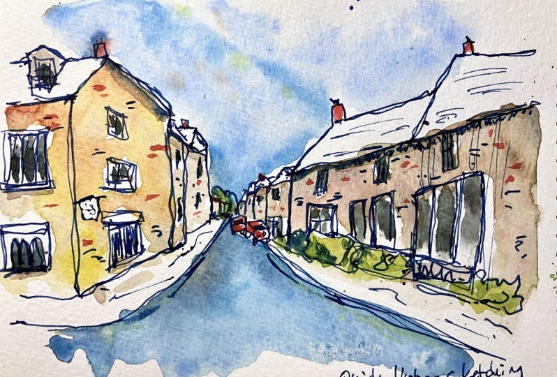
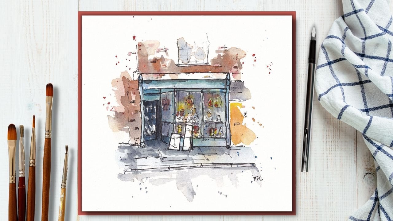
9. Urban Project - Steps one and two: Time now to start
my final project. Now I say started, we've been building
up to this hallway. And all these things
we've been looking at have been those kinds of thought processes that I
use for my quick sketches. What we're going to do
now is a quick sketch. There's actually
two final projects yet and are doing the first one, we'll look at the
same scene that we've been doing the whole time. The second one will
be a different scene, one that you have seen before. But we haven't
focused on so much for these classes,
for this lesson. Now it's key to remember that
we're looking at shapes, at getting the essence. I'm being light and loose
with our lines and colors. If you can remember that, you can be happy leaving out
lots of unimportant details than U2 will be sketching
happily and quickly in no time. So it's time to put
this all together. Now, I'm just going to start. This is the scene we've
already been looking at. We didn't not so
little practices of and so I feel confident
just going through. But remember, you can
always pop your pencils out and regather the shapes and just work things out a little bit more
before you start. If you're not feeling
super confident. Now, I'm using a letter size, A4 size piece of paper. This is watercolor. Paper is just student
grade quite cheap. So it doesn't need
to be special, but watercolor paper
does help with those loose colors
we're gonna be using. I'm using waterproof
ink in my pen. And let's just see what happens. Now for me. I'm going to
start in the background. I'm going to keep
things nice and small. The reason I'm starting
in the background is because we know
the shapes back here. We know there are just lots
of stacked rectangles, but we also know that this is what's going to
set the scale of the image. Because if this is too big, everything else will get
bigger and bigger and bigger and suddenly it won't
fit in my page anymore. Now if I start with
this bit in mind, I just get these shapes first. So I've got all these
rectangles coming forward. Then I can certainly come
to this bigger rectangle, the one that leads up to
the edge of our image. And we can fit it. So that's another technique
having practiced that, we know the sort of the
pitfalls of our scene. And suddenly with another
technique, again, we can make sure that the
scale of our image fits in. And all I'm doing now is
finding those shapes. I find it easiest not to finish off the bottom of the
shapes until later. And I'll show you why
when we get there. And it just keeps
things flexible. It means we can decide about adding the car's
not in the cars. How much detail, how
much we leave out. What I can do instead
is I'm going to come back here and I'm going to find the next set of shapes. This is where we move
into these closer houses. So we can see this little
rectangle that pokes out. If we measure across, we can see the top
of it is just below this and the bottom of
it level with that. So now we can get that
tiny little bit of house. Before we move on
to the main house, we've been talking about
this taco coming forward, little ball out in front of it. Then comes up to here
with a triangle, the other side of the triangle. And then now we've just by a
tiny bit of measuring across another simple quick way of getting our scene sort
of right on a page. Can come and find that
square of the window. Got the chimney. And we can finish off what is basically a rectangle
for the roof. Week, a little chimney
appear, little square. Now we can come down and we can start finding these
other shapes. So we got the
rectangle of the sine, the square for the window
with the arches in it. We can come across, I'm
going to ignore this. Read through construction
work going on. I'm going to leave at
about the same not about the stuff happening
within the scene. Here we got a little tree, so I'm just going to give a
little swirl for that tree. And I'm going to bring
our pavement edge round of sidewalk around. We can pop the base of
our bolt onto that. I'm going to shorten
my Barnard as well. This is another thing
about sketching quickly. We will make mistakes. So this Pollard was
in the wrong place. I'm sketching lightly so that I can move things so that
things are flexible, so that mistakes
aren't mistakes. Mistakes are things
which I can just change, note and change
later if I want to. Now going into the back, this is why I've left
this unfinished. Because now we've got
a decision moment. Do we want the cars, do we not? I'm gonna go Actually, it's feeling like the
cars will work for me. So little rectangle
for the windscreen, little rectangle underneath with tiny little squares
for the lights. And that's all you
need to do for a car when you doing
a quick sketch. Do the same here we've got a rectangle for the windscreen, got a bonnet, little lights. And then that's all
you need to do. Tiny little shapes. Having done that, we can clarify the bottom of
all these buildings. We can find these, these little sort of
gardens at the front. I would say there are
certainly part of the essence of what I
like about this scene. And we can then
start finding like the windows here and here. They are just shapes than a Windows or just simple shapes. Got a sign here with a
soda shop front window. There's a door which
is hiding behind this. I'm a little bit of greenery. And another door which is
just out of shot here. You'll notice I
kept things small. Like I said, this is part
of sketching quickly. It's much easier
to sketch things within yourself rather than
trying to fill a whole page. And it leaves you
so much more space and room to maneuver. Now, going back, we need
to just grab these roofs. And again, what are
they that basically a series of shapes, just very repetitive shapes. Little chimneys on top. We don't need to be
cleverer than that really. Not for a quick sketch. Let's do a few of the windows, but we don't need
to do them all. And then this pavement
is important again, the pavement just shows the flow of the sea and
the movement of the scene. And it just makes things make a lot more sense. Maybe
haven't done that. We want to just find little doors and things
in this buildings, this most forward building. And I suppose at a window
here I'd like to add. Now we can think about a
few other bits and pieces. So maybe this is the
moment where having done our windows
are bigger details. We can start thinking
about texture. What are those little things which are the essence
of the scene? Now, we talked about sandstone actually already didn't
really one of the lessons, well, this is a nice example of, this is actually
from the Catullus. So it's not sandstone, it's that Sandy, sandy color of stone is what
I should really say, is that classic cuts
old stone look, which if you have been
to live in the UK, you'll certainly know by site. And it's got this Hegel
D pig or de Lubac is sort of gray yellow browns and produces a lovely textures. So you can just
get a few of those scattered around the pavement. We could just imply some big
like paving slab type field. And although it's
not really there, That's a nice way of just
showing the age of the area. And then maybe, maybe let's just do a couple
of these windows. Just a couple of little
suggestions, not, not trying to be clever, just trying to do a
little bit of suggestion. And we could do
even just some very simple hatching, very
simple hatching. We'll just show that
this is something dark. Dark contrast all these windows. And while certain hatching look, there's some shadows
coming down here and actually behave shadows
coming down this whole house. We can just really quickly
simply suggest those. And then I should stop because if I get
going, I'll ruin it. I'll overdo. It won't be
a quick sketch anymore. It'll be an overworked sketch. So after about six to
7 min of sketching, we can get our watercolors out. Now, what's the
essence of the day? Look at that lovely sky. So I think that's a
really important part. So we're going to
start with loads of water and we'll get that
blooming out effect of this guy. We don't need to do
is finish the sky, fill the page because again, we are bringing it down with
sketching within ourselves. And we can just suggest this ever ongoing blue sky by having it pull outwards and push outwards
from the middle. During that lovely
blue and I'm using cobalt blue and a
bit of phthalo blue. Just to get that, you can see my inks run a little bit here. That's fine. If I'd been more patient and
the ink would have dried, but we can move it around, we can just soften it. We can just accept
it, and it's fine. I'm happy for
things like that to happen even if I
don't mean them. Now I'm going to
bring this blue down. This is where we're mixing and letting
things blend and look. Down here, we got this gap and then all
this dark Tormach. So blue is often a nice
way of implying darkness. On top of that light
blue, that cobalt, I might just add some
indigo and let that to those two colors
work together to some of those watercolor
effects we talked about, which will give us
the texture and suggests that tarmac already. Now back to the essence of
the scene. What have we got? We've got a lovely, I keep mentioning at this
kind of yellowy Brixton, me. So I'm going to get
different mixes of Hansa, yellow, quinacridone, gold,
quinacridone, sienna. And then especially in
this foreground building, I'm going to just touch that in a bit of Hansa yellow here, a little bit of quinacridone
here and there. Let's do some splashes and
just see what happens. And let these colors look. They're going to blend
out, but that's fine. That's what I want. I want this to feel connected. If it's going too far, you can just clean your brush
and come and just sweep it back in or you
can add some more blue which will push it back in. So as long as you're painting
nice and wet will have loads of opportunity to just respond to what these
colors are doing and bring it back to what
you want them to do. So what else do we want
in the front here? Well, maybe a little
bit more richness, bit more of this
connected and sienna. Just to blend. I want lots of
whitespace as well. And then over the other side, I want to maybe leave it
as nice negative space, but just get the
idea of the shadow. So I'm mixing this blue
in with the Quinacridone. Sienna gives a kind
of dark moody feel. Because, because the blue, if I just mix it the side here, if you see this is
the criterion sienna, this is my cobalt blue mixed in. And it neutralizes
because blue and orange are complimentary colors. So we know by having all these colors on
the page which are all blue, orangey, gold. Well, we're going to
end up in the middle somewhere with nice
neutral tones as well. You could argue actually, you could argue
already that this is enough color and enough
texture and enough going on. For nice and simple sketch. What I'm going to do is just add a little bit more texture, some splashes of water to
create this color flowers. We talked about. Some touches, blue to create some
blooms in the sky. And what else? One more touch, maybe some
more quinacridone, sienna, that rich color just in
a few of these bricks. Then I'm going to let that dry and we will
see what happens. And if we wanted, this
could be our sketch done. It's quick, it's vibrant, it's fun, it's easy. We don't need to do
anymore than this, but let's see what
happens when it's dry. If there are extra
things we can add in?
10. Urban Project - Steps three and four: So the first layer of
that color is done and it's looking for,
it's looking great. What we can do now, as we've all watercolors,
is we can layer up. When we layer
suddenly the oldest, the tone of value intensifies
and things come to life. And this is where
we really need to focus on doing the
important bits, not every bet, but
what is that essence? What are the key bits we
want to find in our scene? So here we are mostly, not entirely but mostly dry. This is where we can see what our sketches really
looking like. We can always find, always fantastic couple of
things that we want to go. You know what? I'm fine, Let's just
bring that forward. So for example, remember we put a little
bit of effort into these greens, didn't we? But they're not
green at the moment. And we did say they were part of the essence of the scene. So I'm going to take
some green gold, try not in a distance. And in the foreground here, there's a little
bit of suggestion alone we can make as well, just make up some greens because they're part
of the essence, doesn't have to be exempt. Having done that, I'm taking a different green so
green apatite, genuine. I'm going to put that
into the bottom. And that's where you get this
lovely watercolor effects with these two different
greens are going to blend and merged together and just do their own
thing effectively. We can add some splashes
and what we could do, we can actually just say
segment of the page. Then we can get
this splashes not going everywhere,
going somewhere, but not going everywhere
just by using our fingers, maybe read a paper
to make sure that the splashes are contained. In other bit, we went
to great lengths talking about the
cars, didn't we? So maybe what we want, It's just a nice punch
of red in the car. We can then use that red
just on the chimneys. Now know the chimneys
aren't all red. But we are suggesting
things here. We are creating our
version of the scene so we can make things the
wrong color if we want. Another nice include
watercolors. It led them up. If
we just take some of these same nice warm colors,
the quinacridone, red. We start finding our bricks. He's lovely. Breaks. We've gotten just popping
another layer of color on. Suddenly these bricks
will feel more 3D. We can just do that. We could do it whether
we haven't drawn Brex, we can do it in the background, even just be really
gentle marks. We can make some of
them much older. We can make some of
them blast bold. We can change how much
quinacridone and how much yellow or red we're using. And so I've already, this is coming much more
to life, isn't it? I think the last thing I'm
gonna do with my watercolors, I'm going to take a
bit of my cobalt blue, which is the main
color in the sky. I'm going to find some
reflections in windows. And this is also
going to increase the value and contrast. And it suddenly going
to hopefully provide a lot more sort of shape
or feeling of being 3D in these windows
and then these houses in the background again, just little suggestions
also in the car windows, of course, don't forget those. And over here where we've
sketched in a few windows, we can just do that as well. Just like that. Hopefully
we're starting to get something which is even
more punchy than before. Few little splashes. Always do this. I always
say, that's the last thing, but actually I think maybe some shadows
would be nice as well, wouldn't they say, just take it to neutral mix
from my palette. This isn't any particular color. This is basically just
look in my palette and mixing up and seeing,
does that look neutral? That looks neutral, so that
will do as a nice shadow. Then we can use that same
chateau in a few places. Under the eaves, under
the edge of the roof, on the side of the chimneys, all those kind of places. Just again, for that extra
little bit of shape. My favorite thing
to do at the end of the watercolor in a
street like this is just add some little
suggestion to road markings. The little yellows just reflect that careless
somewhere else, maybe in a sign and a window. Few touches of that yellow
just to make it balance. There you go. Now it's come forward.
It's much more punchy. We had a quick sketch,
a really quick sketch. We still want a quick sketch, but we focused on those
important bits of the essence and brought it
to life a little bit more. I'm now just going to do
a few touches in my pen. And notice how this pen
now going on the page, the page which has now
had some watercolor on. Now my pen is going
down, IS much bold. And what happens when you apply bold line is at
line comes forward. So suddenly we're
able to elevate certain parts of
our scene equally. That means we need
to be careful. We need to not overdo this. Because we overdo it will end up with a confused sea and it will lose all the depth and it
will just feel overworked. But if we just find a few key areas that we want
to make more impressive, more forward, more
punchy. We can do that. Now you might have
noticed that ink when in a patch of water. That was again example
of one of the foibles, one of the problems
with sketching quickly. There's often little
bit of water on the page when you come
and bring your income. That's not problem. The water is going to stay
there for a little while. So I'm just going
to keep working around my image,
see what happens. And I'm going to finish
working my way around the image and adding the
little touches I want to add. We'll have a look at that and see if it's adding something fun or if we want to correct
it and take it away. I think that's probably all
I need to do with Make. So now we can have
a look up there. I could leave it. I could happily leave that.
Actually. It's looking like a sort of
spontaneous plaster, which is no bad thing. But equally, we can lift it
up just a little touch of a paper and we'll get
almost all of that stuff. And all we're left with now is kinda fun watercolor texture. There you go. That is my little seam. Complete. Very quick
sketching, not hurried, not rush, just quick,
making things simple. Getting the essence, not
worrying about the details, but wearing them out. The important thing
then I'll see how go yourself share it with
me in the class project. And if you want, there's a couple of bonus project photos that
you could use. All of course, please
do use one of urine
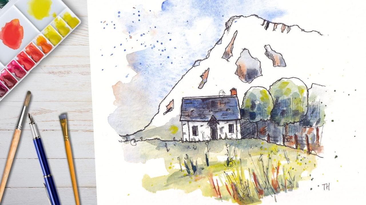
11. Landscape Project: Here we go. It's time for the bonus project. This project is more
about the greenery. I really wanted to
show you that these, what I call urban
sketching skills aren't really urban
sketching skills at all. They, they are loose
sketching skills. Their skills which
you can use any scene and adapt and maybe
slightly change, but certainly use to really get any scene
quickly onto your page. Now here's a little
bonus project. If you want to try
something a bit more natural and see if the same techniques
can't just be applied to the natural scenes. And what we've got here,
we've got this lovely sort of field, different trees, different greens,
different greens in the background at a
few little houses dotted around as well. We can start if I just take a brush I've got lying
around, we can start. We can find the key element is as a straight line
in the background. Then in the foreground we
kinda got a little wedge here. The wedge, something like this. Then above that, we've got these hills which kind of rolling up and down either side. Now just by doing that, I
have it in my mind's eye. I'm able to proceed
more confidently. I could if I wanted to do a thumbnail sketch or
something like that. But you know what? Today I'm
just going to go for this. Let's just see what happens. So using my same fountain pen, I'm going to start with
some of these key shapes. So the key is this
straight line here. There's not just
a straight line, it's a straight
line with lots of blooming little circles
coming above it. Let's get those. And it doesn't matter if they're exactly matching the same. What I'm going to try and do is approximately track across and we come to a little
house and then we get a gap. There's dark area. Then we've got this
dark green tree. Behind that. We've got a light green tree. And then we've got
a little lamppost. Then we've got this closer
tree and this is where we get to that wedge that's coming forward for this closer
tree, basically a circle. And then they'll tree here. I might just add my
scene that again. So we sketch within
ourselves so we don't overextend for
a nice quick sketch. Off to this side, we've actually got
a little house, just little house that's
kind of a little set of rectangles, but
like this house. Then we got this really
sort of Hague tree up at the front, haven't we? So that big tree has
a real presence. And again, it's this edge now of something different
coming down. I've overdone the, the idea of the way I want to say stem the trunk of the
tree, but it's fine. We'll just leave it
and see what happens as we build up a few other bits. Are other trees
coming forward again, just kind of wedge
that we talked about. And again, I'm just
going to leave it there. So we've got this kind of
frame within our scene. Maybe to balance it out. What I'll do, I'll just put one more suggestion
of a tree here. And we could in the background then we've
got these rolling hills. We talked about tweaking, roll them all the way down and then roll them up and down. And then up again. They kind of disappear behind these taller trees.
In the front. We've just got some big shadows, so we should just suggest those with very simple hatching. I would say that probably there, this is the essence
of the scene. This wedge, this wedge, this line and these
background trees. Now, there's a lot of contrast and things that go
on here as well. So I'm actually going to do a little bit of hatching
to stop picking that out. So we can find that the light, we know it's going strongly
this way, isn't it? Actually took this photo
very early in the morning. I was taking my dog for a
walk after she decided to wake up at five in the morning. This is very early sort
of sunlight in the UK. So we've got these
strong shadows on the right-hand side of
basically everything. Again, that is really, it's part of the
essence of this scene. Just coming in and getting these strong shadows with
some very simple hatching. And notice how I'm doing the hatching order one direction, I'm doing it in the
direction that I'm imagining the light streaming across. For me, that's what
works for you. It might not be what works. So the experiment, but
don't feel you have to complicate things with
all different directions of hatching, for example. Now another thing which I think is the essence of this scene is that this drop your grade out. It's not as saturated, it feels quite sort of blue. We can actually simplify
even more by doing some really simple just
linear vertical hatching. And what that will do is it will immediately
tell the viewer everything that has this
hatching is all in one place. It's all in the background. Or if it was right up here, it's all in the foreground. Now, when we come to our colors, we're not necessarily
going to have to add any color to that lovely
sort of silhouette. This very simple hatching. We'll deal with that
silhouette for us. With that in mind, let's jump straight into
those lovely colors. Now the key here is obviously
there's greens, isn't it? So let's start with a
very yellowy green. So I'm gonna take my gold green. I'm going to take
some Hansa Yellow, going to mix them together. And I'm going to apply that
to the left-hand side, the light side of all these
trees with plenty of water. Because what we want to
be able to do is then come back straight away and start getting those
watercolor effect. Now what I might
do actually is I'm going to mix some
blue and green. So I've just added some cobalt. Instead of using a
different green, we're using a mix. So we're hopefully
getting something which feels really joined up. It's not like mixing
two different pigments. This time. We're not mixing
two different greens. It's mixing the same kind
of green which has just had its hue shifted rather than
something totally different. A bit more of this here, I've got this lovely
spilling effect happening between our pigments. What we might want to do is just promote some
of these textures. So let me just come in and
we can drop that green and look how it's blooming
and pushing and moving. We could come back in with
some of this blue Bakery. Do the same in the darker areas. And just see what happens because we can't
control this fully, so we just have to allow
the effect to develop. In the foreground. I'm
going to go much yellow, going to take basically yellow. And I'm just going to be really, really light wash,
pushing across. Again, my brushstrokes
are just me imagining how this
light is flowing, of course, doesn't flow, but it does push across. I'm going to see how
it's joined up there. I'm going to join it
up in a few places. Now everything is connected
and this kinda feels like shadows or reflections
coming down from the trees. And for me, I absolutely
love this kind of effect. We can add some more
variation now, some splashes. We could even add some
darker green in there. Remember at this point we've
only used three colors. You've used handy yellow, gold, green, and cobalt blue. And yet so much variation
going on everywhere. Now into the sky. I think as my next thing, this guy is actually
quite delicate because it's the morning. I'm going to start
with some splashes, just gently splashing. And then I'm going
to come back in with a clean brush,
lots of water. I'm going to join up
some, perhaps all, but probably just
some of these flushes by joining them up with water. Again, where we're allowing the watercolors to make a
lot of the decisions for us. And we can see what's
happening and then decide if we want to keep going. Maybe we want to add a bit more. These watercolor
effect is blooms. And maybe, maybe
actually for me, that's already
enough in the sky. Perhaps just a couple
of other touches, couple of other little touches. Going to use the same blue
in a couple of places down here to really
emphasize the shadow. And I think this is gonna be really quick sketch
because I think all I want to do is add some tiny, tiny little touches in to these buildings
to pull them apart. So just a touch of this red. Now red and green
we talked about are orange and blue are
opposite each other. They're complimentary. It's the same with
red and green. So if I did mix up here
red to mix my green, and then we blend them together, we end up with something
quite neutral. So I know that by
popping in this red, it's not going to overwhelm
things because it's actually going to
neutralize quite nicely. Can even do a couple
of touches of this more neutral color into
these kind of shadowy areas. And what we'll end up with is a rather
lovely little sketch, a very quick sketch which
just capture the essence, I hope you agree, captures the essence of this
lovely little thing. Without any first, just
focusing on shapes, key features, not overworking
it, not overdoing it. And again, I just
hope you can see that this kind of technique
is really versatile. This is essentially
natural landscape. It's only got two
little buildings in. And so you can really use your same lovely
urban sketching, watercolor and ink techniques on anything to create really
fun, loose, simple sketches.
12. Thank You: Hi guys. Thank you so
much for joining me. It's been a pleasure sketching
along with you as ever. I would absolutely
love you to share your project with me
in the class gallery. You can do that by
going below the video. You'll see a little button which says Projects and Resources. Click on that. Click on Create, Project and just pop
a little photo up. I love seeing them and
I love commenting and giving feedback and honoring any questions that you've got. If you've enjoyed it as well, please leave a
review again below the video little
button says reviews. It takes a minute or two at most to just leave
a nicer of units, the most heartwarming things
or receive as a review, it helps me you know what, to improve and it helps me
know if I'm doing a good job. With that, you can find
me as well elsewhere. Toby sketch looser on www dot
scheduling stop Carrier UK. I'd love to connect
with you here. Check out the rest of
my Skillshare profile, but most importantly, have fun, keep sketching
and enjoy your creativity
 Toby Haseler, Urban Sketcher, Continuous Lines