Transcripts
1. Introduction: [MUSIC] Hi, there. Are
you an urban sketcher who enjoys using
your ink, your pens, perhaps using a line and wash, your pen and
watercolor technique, to capture your urban scenes? Are you looking for
different ways to finesse your line work, perhaps to experiment with
different inks or bring a different character or
texture to your sketches? If so, this may well be the class for you.
My name is Toby. I'm known as Toby Urbansketch
here on Skillshare as well as on Instagram
and on YouTube. I specialize in unique, quirky character
field sketches using my pens and often
my watercolors. One of my favorite tools
is my fountain pen. I can use it to create all sorts of textures
and interests. I'm just as happy using
it to create a tight, neat sketch with lots of beautiful hatching as I am creating very loose
semi-abstract, soluble ink sketch
that comes to life, or splashing on some
beautiful colors to create that different
more characterful, more pretty and
beautiful, happy feel. In this class, I want to give
you a really deep diver; a fundamental look at all the different techniques
that I enjoy using. We'll start by looking at
different kinds of pens. That might sound really basic, but actually when
we start to explore our pens and see how
they work for us, the different marks
they can make, it can lead us to be a
bit inspired to think, what if I did this scene using this pen
instead of this one? We'll also have a look at different inks that you
might use in fountain pens. How can we use soluble
inks to create texture? Perhaps even using our pen with a brush and taking ink
straight out of it. There's other really
important techniques to think about with
ink sketching, and one of those is hatching. We'll do a couple of different
lessons on hatching. A basic primer looking at ways to create different
amounts of value, different tone for different
types of hatching, and then one that I've
called advanced hatching, where we can actually
use textures; the natural textures of a
tree or a brick wall to build up both realism and
shape at the same time. Of course, I'll also do
a few demonstrations. We'll take all of
these techniques, everything we're talking about, we'll put it into
practice with a number of different projects from myself. What would be amazing
is if you could take some of these things
that we talked about, some of the things
I've demonstrated, then you sketch along with me and create your
own class project. There's a number
of references that I've supplied that
you could use. But equally, you could
use one of your own. Be amazing if you could share that project or connect
with me on Skillshare by following me or opening a discussion and
asking me some questions. Equally, you can find me
on Instagram or YouTube, and I'd love to connect
with you there as well. If you have the time,
please do leave a review. It means the world and
it really helps spread the word about urban sketching and all the classes I've got. Without further ado though, let's get sketching. [MUSIC]
2. My Supplies: What equipment I'm I going
to suggest for this class? Well, number 1, we're going to be
talking about a few different kinds of pens. So if you flick onto
the next lesson, you will see we discussed
pens in a lot of detail. Obviously, we will need a pen, but I'm not going to talk
about that right now. In one of the scenes at the end, I'm just going to use a
couple of watercolors. The exact watercolors
aren't important. You could use anything
really to add color because it's more about
adding a little glaze, something interesting
to highlight our work. I do use a few pens with water soluble
ink in these classes. Just to move that ink around, I use a couple of brushes. The brushes aren't
super important, but they are
equivalent to a Size 8 and Size 10 or 12 brush, but they're interchangeable and just any brush to go next, you could probably even get away with just
using a little bit of water on your finger
and things like that, and experimenting
with how other ways you can move
water-soluble ink around. The last thing to mention, because I'm just using
a normal sketchbook. Often with urban sketching
and things like that, you might use watercolor
paper because watercolors and things like
that feature very heavily. In this, it's all about the
ink sketching the line work. I'm just using a simple A4
cartridge paper and sketchbook, which is 160 grams
per square meter. Normal watercolor paper being pretty much double
that 300 at GSM. Nothing clever,
nothing crazy being used in this class
it's all about having fun with simple equipment and getting out there
and having a sketch.
3. The Class Project: The class project. Well, through these lessons, I'm going to show you all
sorts of different techniques. I'm going to combine
them in the end with three different
demonstrations. These demonstrations come with three different
reference photos. You're welcome to use those reference photos
for your class project. I'd love you to do
that or to just copy your take ideas from
the things that I do. Equally, I'd also love
you to do your own scene, go sit somewhere
outside, go to a cafe, or perhaps if it's cold outside, go and sketch inside
with reference photos, something which means
something to you, and explore techniques which means something
to you as well, the things that you
see in this class which most inspire you or make you want to
sketch or other things that you've tried out in the
past or want to try today. When you're done,
if you could share your project in the class
gallery, that'd be amazing. I'll make sure to come around and comment, ask
a few questions, and give some feedback on
anyone who wants that, who pops their project up. Without further ado though, let's get into these lessons, and then we can start, as we watch them, thinking about what we might want to
do for our project.
4. Pens in Depth: First thing we need
to think about is the kind of pens
that we might use. There are lots and lots
of different varieties. I've just broken it down
into these four types. I've got fountain pens, I've got fudepens, and brush pen, which I'm
actually going to join together. Then you've got fine liners. Let's have a little look at how these work on a
fresh bit of paper. Let's start with
the fountain pens. I've got three here
called LAMY Safari pen. I've got one which is
called a Platinum Preppy. Both of them great
brands of pen. The Platinum Preppy,
a little bit cheaper, the LAMY Safari a little
bit more premium. They come in various
thicknesses and whips of nib. If I start with my
extra fine nib, you can see we can
draw with it the right way round or upside down. We get two thicknesses
of a thin wall and are slightly thicker. But we can also apply
different amounts of pressure. Our nibs are quite
flexible so you can get a really large bold line
even from an extra fine nib. Going up, this is a fine nib. You can see the upside
down line is a bit bolder. The right way up is also
a little bit bolder. Again, we can probably make it probably similar
actually, isn't it? Similar maximum boldness. But the ability to get
a really thin line is best shown by
the extra fine pen. The advantage of
fountain pen is you can change the inks inside. I'm going to do a
whole lesson, well, a whole little segment of
this class on different inks. Just for now, I'll just I'd
say if we look at this, we got a nice brown. If I look at this one, I've
got a fun purply pink. Then you can use different inks to cause
different effects. These are all waterproof. But if I wash this over, look at how these inks
move with the water. Fountain pen's a
wonderful flexible tool. I'm going to do a
little lesson on different fountain pen inks. If you skip on to that,
if you're interested. Otherwise, let's move on
to my other kinds of pen. Next we've got fudepen
and brush pens. These come in all varieties. My favorite is
probably the fudepen. A fudepen is just another
kind of fountain pen. If you can see here
it's got a bent nib. If I just sketch the nib here
it looks a bit like that. We've got a nib which has
a real band at the end. That means you could
be touching the paper and cause really fine
lines, medium lines, or incredibly bold lines. Again, we can use the same principles
of ink with a fudepen because we can change
the type of ink inside. The advantage of this
over a fountain pen is the huge range of
lines that you can use. The disadvantage is
it's much harder to hold and sketch loosely. You have to have much
more of a writers grip. That's not as what for me, not as fun and flexible. Doesn't feel as free. The next is a brush pen. You can get these refillable or you can have them like this, which is a
nonrefillable version. They can cause a similar
effect to a fudepen. Obviously, a wide range in line thicknesses
and quality of line, how the flow comes out
if you go quickly. You can co-create all these interesting textures and things. Well worth having a
play with in sketching. A really lovely way of creating bold, vivid,
illustrative outlines. Last are fineliners. There is just hundreds
of these to choose from. I've previously gone through various fineliners in
one of my other classes about continuous line sketching
called urban sketching, learn to use continuous line
drawing and watercolors. If you want to check that out, there's this fairly in-depth
lesson about these. Again, I think the principles here are that they come
in all sorts of types. You can have fairly thin ones. You can press a bit harder
and get a bit bolder line. You can have different colors. I've got here a gray. This is another gray which
is just a bit thinner. This is quite thick, actually it's a 0.5 millimeter. This is creating that bold
line without pressing and with pressing and
even bolder line. Again, you can create
fairly fine lines even just with a quite a thick
fine line like this. Then similar brands can have
things like chisel pens, which somewhere in-between
fine liner and fudepen and you can produce
different qualities of line. These are all the pens that
are worth thinking about. Now with fineliners, the brands which we use for sketching tend to be waterproof. You can see, they don't
flow with the water at all. This is important because it means that we can
apply watercolors, we can apply marker pens, all sorts of things on top, but our lines are going
to stay nice and crisp. What do I use? Mostly I use fountain pens. Fountain pens and fine liners produce very similar
quality of line, but fountain pens, I
find more flexible. I just get a bit more joy
to end up using them. It's more fun holding a
bright red interesting pen which feels like your thing, rather than a disposable
little piece of plastic. Maybe that's one of
the bigger reasons actually that I like
the fountain pens. Emotionally, I enjoy them all. But I do think they're
more flexible. I love being able to change things up and things like that. In the next lesson, like I said, we're going to be looking
at fountain pen inks, different types of ink
that you might use, and think about the effects
we can produce with those.
5. Fountain Pens and Ink: Let's have a think about the types of ink that we
can use inside our pens. Now, my go-to, if I use this, this is a fine nib LAMY Safari. If I just draw a
nice little house, you can see we get a nice
range of line quality. You could do fine lines. I can come and do
nice and thick lines and the ink I'm using for this, this is pretty nice black ink. It's called Platinum
Carbon Ink, black. Now, this has got granules
in it which settle and stain and don't move
with waters or watercolor. Now what that means
is if we come on top and let's say I just take
a tiny bit of watercolor from my palette
on the side here, I can go over that and I
get very little running. You can see where
I've gone really dark though and really bold, some of the ink does run. Now if I waited five, 10 minutes and that wouldn't be the case, that ink would stay
completely still. But the bolder you go, the longer you have to wait
for the ink to fully dry. The other ink that you can use. Well, there's hundreds kinds of ink that you can
use, to be honest. In this fountain pen, I've got some simple
LAMY cartridges, so this is just their own
brand cartridges of ink. Well, I'm going to take one out. Just a normal cartridge filled with normal
fountain pen ink. What happens if we
do the same thing, will we get the
same flow of ink? Obviously, this one
is a different color, but the same flow. This is still a fine nib. You can still get the same
variation in line quality. Now, what can be fun with
these things though, is that if we take
a bit of water, suddenly we can really
activate our ink and it will flow and move
and we can create tone and we can even create shadows. We can even pick up
some of that ink and use it elsewhere on our page to perhaps maybe to draw a little apple,
you get the idea. You can use these things as both line-work and
to create tone. I like to use a couple
of different inks. I've got this nice pink one. Probably my favorite
is this brown. It's like a nutty brown. This is an ink by [inaudible]. I'll show you the cartridge
in it in a second. We'll see again, it creates this lovely wash. When you wash it, it really enlivened, it becomes super interesting. Obviously, you can do the same with black inks and all sorts. As I said, the brown ink I'm using here is Waterman
Absolute Brown Ink and they do a full range of
different watercolor inks and not waterproof but inks which will be
soluble with water. There are loads and loads
of inks you could try. These are some of the
ones that I have. But this comes with a
little word of warning. There are all sorts of
things like India ink, so the Winsor & Newton inks
are a good example of that. They come in all crazy colors. Now, India inks will probably
block up your fountain pen. You can use them with a
dippy pen, for example, where you get a nib
doesn't have a cartridge, but you dip the pen in and you can produce exactly the same line work from any ink. They're very flexible. The obvious disadvantage
is you always have to have that pot to dip from. Then the other thing to have a little think
about with our inks is cutting in a converter. This is a converter for a LAMY and what it means is
that you can fill it up. You may well probably
have seen one before. It means you can
fill up your ink. You just dip it
into the ink pot, fill up your pen, and away you go with some lovely ink work
of whatever ink color, whatever you want to try.
6. Line Quality in Three Tips: Firstly, I guess,
what is line quality? Well, line quality is
actually simple things. Is it a sweeping quick line? Is it a firm bold line? Is it random moving around? Is it continuous, discontinuous? Line quality is describing the type of mark
that we're making. The type that mark
that we're making might depend a little bit
on the pen we're using, but also how we use the pen. The pen we're using goes back to the lesson we talked
about before, where you can use all different pens for different things. But at the same time, all pens can be used for lots
of different things. There's flexibility
even in a single pen. Now to demonstrate
quality of line, I always think the
best exercise, the best bit of practice
is a simple still-life. What I'm going to do,
we'll do two things, a bad one and a good one. If we start with a bad one, our still life is
going to be a pear, and an apple, and a banana. They're sort of together.
They're on the page. You can tell banana
is probably behind, but only because it's
lines are cut out. But they could be floating. We could be looking
at them top down. It's really hard to tell exactly what is
going on with this. And they all look the same. There's no interest,
there's no variation. Now in reality, what happens when you look at
things further away, they're fainter because
they're fainter, the textures are fainter. When you look at things
closer they're bolder. That's one of the first
things to think about. Then the other is to think about just introducing variation. Let's take it step-by-step. The first thing I suggest thinking about when you
do your quality line is as you start, start loose. Start with a faint and
easy quality of line. That means if you
make a mistake, you do completely random
to the lines here, obviously, my pen is wrong. Well maybe let's make it
less obvious. There you go. Pear is not bad right, but let's just keep
sketching anyway. Maybe our apple takes a few
goes to get right as well. Then the banana, we're not sure if it's
in front or behind, so we just sketch over the top. The quality of line
here is really loose. This gives us an
interesting image. Loose, it gives us one which is flexible and let's us
add variation on top. Number 1, start loose. Number 2, think about
variation between objects. We can start off by
reaffirming our pen. Now that we've got the whole
image, we can work out. This is where the pear goes. Then we can find the banana. It's actually behind and the apple is in front
of that as well. But we still didn't
have much variation. How are we going to introduce
some variation and what variation or what's the
variation going to do for us? Well, variation, in this case, can be the texture of the line. Let's say, in the pear, what we want is to
get a bit more like it's a bit bruised,
bit of an old pear. Now we can introduce lines which are applying some texture. The apple perhaps also
has got a bruise on it. Whereas the banana
is going to be very smooth and very new banana. It's got also this other
side too, also very smooth. Now we've got some variation
and that's implying texture. Variation could
also imply depth. At the beginning,
remember I said texture, depth, and relationships. If we take one sheet, let's use the same
pen just to show you that one pen is flexible. You'll find that if
you make something nice and bold in the foreground, that thing comes forward. If we just go around this, we can still use a loose line, but not so loose, and bold line. See how it lifts forward. Same if we just
make the apple nice and bold, it lifts forward. Now notice how I've only made the apple
bold on one side, and it's still lifting forward. The reason for that
is the boldness is relative to the banana here. Because it's bolder
than the banana, less force it explains the relationship that explained
the apple is in front. We can also use that for the weight at the bottom by making the lines
where the apple, the banana, and the
pear touch the ground, heavier or heaviest even. That shows the weight
of the object. It shows the relationship of
that object with the ground. They're my simple tips on how to think about
your line-work. Start loose, use variation
to show texture, but also use variation to show depth and relationships between objects and between the
objects themselves and the general atmosphere and environment that
they're in. [MUSIC]
7. Hatching - Basics of Tone and Value: The next thing we're going
to have a think about is value and tone in online work. Again, we're going
to keep this simple, and it's more of an exercise. It lets us just play
with some concepts. I'm going to draw the
same shape three times. Then we'll have a think
about how we can use our pen to really simply
employ value and tone. Why is value and tone important? Because it shows shadow and shadow shows,
shape, and volume. We don't know. We might presume that this
is a box facing like this, but other people might presume it's a box facing like this. We just don't know until
we've got a full human shape. That comes, as I said,
through shadow tone. A simple way of
demonstrating tone, the simplest way
that I know overall that I use regularly is
for just simple hatching. This can be just
a vertical line. We don't need to be any
cleverer than that. A nice way to vary that is, if we've got a shadow here, so we've got the light
source coming this way. This is light, this is shadow. There should also be a
shadow on the ground. Instead of vertically hatching, we can separate out plane. We can separate out this
plane from plane of the floor by changing the angle
of the hatching. Now we've got hatching
which is basically going at 90 degrees or almost
90 degrees to this. But what it's doing
is it's following the perspective of this plane that's showing that it's flat. Another thing we can
do with our hatching is we can provide a
multi-directional hatching. This way we can apply tone
very easily to multiple sides, but vary more easily. We could go that, gee, none of this box is
perfectly white. We've still got this
shadow cast over here. Because we still got our
light source coming from here and going down. Then what we can do is go to this must be
darker than this. Now we just apply a crosshatch. If we think actually it's
even darker down the bottom, we can apply a
further crosshatch. Maybe the dark is point
is the very bottom. We can do yet
another crosshatch. In this way, you can build
up different values, and it's worth
having a play even just with simple squares. Draw out five squares. This will be one, this is five. This is your lightest, then this is the next lightest, then this is your next lightest. Now this is getting
towards being very dark, and just see how actually side-by-side you can immediately tell that just by applying
different layers of hatching, you can really build up. You could even do six, and six in this
instance will probably be just blocking it in. You could even separate
these things out more. You could do 1.5, which is just a few
vertical lines. So 2.5, which would be just
a couple of crosshatches. In this way you can
get really granular, really careful with
the amount of shadow that you've got, the
amount of value. I'm just using really
simple technique. I'm just going to finish
off my light shadow there. You can see that we've got
lovely variation going on. In a minute. I'm going to show you
this one more technique, but then I'm also
going to show you in another class different
kinds of hatching. If you just flick
onto the next lesson, different kinds of hatching for different kinds of objects. This is the simplest form of hatching lines,
crosshatching. But there are other
ways we can do it for other kinds of things
like trees, for example. Now the last thing I
want to think about in terms of ink and tone is actually just using
a different ink. Instead of using
our waterproof ink, we could have used a
non-waterproofing. For sake of argument. I'm going to say we used a
nice brown ink to do our box. You go on a brown outline. What we could then do is just do some really loose hatching. To know this is
going to be dark. Little bit very loose hatching, and then a little bit of fairly loose hatching
here as well. Then we can come in
with some water. Now we can use the water to
create a more gradual time, all just from our ink work. Even just by varying
the amount of water, we can vary the darkness. We could come back in and
touch back in even more tone. If we want some dark areas, then we can use water
to move some more of that ink around and
create these textures, but also these
variations in ink tone and things like that. That's the techniques I
use for images like this. Where you can see we can
just do an ink sketch but get a really lovely shape and sense of place without even needing to bring
out our watercolors or pens or anything else. There you go. There's three simple way is to use ink sketching to
develop tone, shape, shadow and really take
your ink sketch to something beyond
a simple outline.
8. Hatching - Advanced: [MUSIC] I mentioned
in the last lesson that there are other
ways to hatch. So we've got a nice
vertical hatching, very simple, very
easy, very quick. Now if we just draw a couple of really simple trees
and another one here, we can see that, well, a tree's got lots of different bits of light and shadow, hasn't it? We can start sketching in
clumps of leaves like this. If we use our vertical hatching, it can provide really lovely, perfectly good graphics sense of all these shadows and we
can use that very easily, very quickly to produce
a tree which is now developing shape and really
provide some crosshatching. Quickly, this shape will
build up and we can add in little branches and
actually we've got a very; I'm going to call it
very serviceable, very nice little tree, not much far still using the same lovely
style of hatching. There's another way
you can do it as well. We chose a bit more
natural, to me at least. What we can do is, we can start drawing basically leaves, so little random shapes. If I make this bigger,
all I'm doing is quite random natural
feeling kind of squiggles, fairly random little leaf shapes which are
suggestive to me, at least of these kind of
leaves and things like that. We can move around the image and come back to the same
areas or current side. What we're doing is,
like the hatching, we're building up ink
lines this time with a texture to them which is suggestive of the texture of
the tree, suggesting leaves. We can extend this to the trunk. We can use some lines which
are representing the bark and then we can come
back and we can start building in to our tone. We can stop building in those
same branch-like patterns and again, we've got a tree
building up very nicely. This one feels a
bit more natural, a bit less rigid, a bit less illustrative, and more towards a
naturalistic sketch. We use those same principles so the idea here is that we're using lines representing
something to build up, not just the tone, but also
a feel of the texture. So a good example of that
would be to have a field. We can do the same with
little grass so we can find shadow is in
the grass by doing little lines which build up the shadows and we have a
little tuft of grass elsewhere. Why is the shadow in that grass? Well, maybe that's because
there's a big wall here and actually that
wall has a shadow on this side as well
so we can now show that shadow if we're drawing little brick or
stone-like patterns. Then before you know it,
you've got texture and tone. You can still do a couple of little bricks on
other places and you can bring in maybe a little fence post beside
it and things like that. There's plenty of other detail
you can bring in without overcoming the value of the
important shadowed side. So hatching mark to the advanced version of hatching
is to start integrating your hatching with your
textures so that you don't just produce a
flat object with shape, you produce a object with shape and texture to that shape, like in these examples here.
9. Create Ink Washes from Fountain Pens: It's time to have a think
about how we can use soluble ink to create
interesting effects on a page. Now, what I'm going to do, I'm going to use some
brown ink first. Again, we'll draw a
really simple box. This time we'll be looking solely down on the
top of the box. With this, we can just apply a really quick and easy wash and we can move the ink
wherever we want really. It can move around
left, right, down. It can generally
create some tone. That's not really control, its not really, we haven't
thought about it very hard. How can we think about it a bit more to create something which
is a bit more controlled? Well, if we do the
same square again, this time, what we need
to think about is, where are we going
to want the tone? Let's say the light is
coming this way now, so this is going to
be the darkest areas. If we load up this
shape with a bit of ink and we load up bottom as well
so we can cast a shadow. Now we've created a
bigger reservoir roofing. We can take our same brush and this time we can
gently wash the ink. Where we've loaded up
the lines with more ink, we can immediately create
a much darker wash, much more variation, and we
can bring that wash out. We are also thinking
about how we're using the water and
the direction of the brushing the water
in to create this, to wash in the right places rather than getting it
everywhere like this. It's no good just
throwing water on because we're not going to
create a controlled effect. This is of course, rescuable. What we could do is
load up the page now. We could come and give ourselves
more ink to work with. We don't need to be stuck with just the first stuff
that we put on the page. We can give ourselves
more room to work with and we can build
a tone that way. Equally, this is still wet and we can drop ink in and we can get
interesting patterns. Do you see how this bloom out and you can use that ink to create these
patterns over there, just move it up, move
it around, or leave it. As these interesting textures, which might be snow, it might be a mountain, it might be flowers. Depends on the color of the
ink, depends on the scene. But how else could
we use our ink well, create another square. This time we'll leave
the lines alone. We've got our pink pen here, so we can show the
different ink on here. What we can do, we can just
use it as a little reservoir. Not sure we can use it almost like a little watercolor pen. We can just move it around. We can pick up bits of ink and we can use it
in that manner. We can even splash just by
flicking the ink pen alone. We can combine ink, so if we've got a pink there, we could put some brown in there and start creating
varied washes. If you have number
of colors even, you can imagine how you could very easily build up a scene, to have all interesting
things going on. When everything's nice and dry, you could come back
in with the same ink, and use it as a hard line or
just for sake of argument, you could use a permanent ink, so water fast ink
which doesn't spread. Then you could come and maybe you want to
add little details that you meant to make
the lines bolder. Thinking about quality of line, which is in one of
the next lesson. You just want to create some firm outlines on top of this washes
you've already made. You can do that and then safely
wash over this ink again because we know it's dry fast. Those are a few techniques that you can use to
just use an ink pen, with normal soluble ink in it and to wash that around
and move it around and let it flow
all over the page. That's by creating
simple shapes. Thinking about where
you use your brush, letting yourself redraw and load up the shapes with
the right amount of ink. Or even taking the ink
straight from the pen like it's a watercolor pen
and then combining ink. Speed up two soluble inks or
soluble and insoluble ink, which lets you create
different effects on the page. Anyway, that's my very simple
tips for different ways that you can use
ink to create tone. Other than, of course, hatching, which we will talk about in
one of the other lessons. I know we'll be
using this in one of the demonstration pieces
at the end of the class.
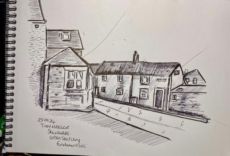
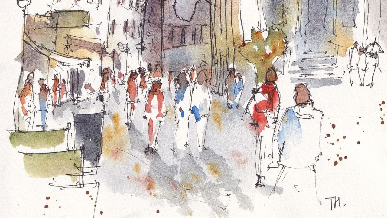
10. Scene 1 - Fountain Pen and Fude Pen: For our first scene, what we're going to do is
just use a couple of pens, we'll have a fudepen
or a brush pen or really bold fineliner. We'll use a fine or
extra fine fountain pen or again, a fineliner. I'm going to do this
little image up here. I'm going to do it
just an ink using hatching to create an
interesting image. Nothing more clever than that. This is a really lovely, quick technique for
capturing your scene when you're out and about and you don't need
to carry much, you could even just carry
one pen and some paper. Let's start by just
capturing these big shapes. I didn't always work
left to right or middle. Now, just how I feel
about a given image. What I want to
experiment with today, we'll go from left to right and just pick out these
obvious big shapes. As you want to know more about what I mean by picking
out shapes again, if you check out
my previous class, which is learning to use continuous line drawing
for urban sketching, that's on my profile. You'll see some
nice lessons there about picking out shapes
and things like that. What I'm looking for basically
is, here's a triangle, here is a I wanted to
say a parallelogram or we don't have this end. We're not quite sure exactly, but it's a rhomboid of some kind and we're just
simplifying everything down into its
constituent shapes. This window can be a square and then we can just provide
some other squares inside it. That way we don't have
to draw the window, we just have to draw a really
simple geometric shapes. This wall can be
made into a square and it continues off here
behind this drain pipe, but still essentially
a simple square. Next we got just some
little vertical lines, really nothing more
complex than that, which are outlining this window. We can pin that
side down as well. Then we just got a
tiny bit of roof that we can see they're
a little bit older. Already we are with these really loose lines
building things up. Because they're loose it means we can change things if we
decide things are wrong, we need to move something. That's no problem. Going to pop in this little
window roof as well. Then I'm going to introduce
this lovely wire, which is flicking up
through our image. Across here we've got a
long, refined Hemingway. At some point there's a chimney, but keep it loose. You don't need to
sketch that chimney. Now I'm going to do is just check the relative
height of this roof. You can see this corner actually is where
the roof emerges. That's a really useful
so comparative measure to get our sketch in approximately
correct proportions. Again this wall, join as at the point where
if you continue drawing, this line, is where that meets. Again, we can use these
simple comparisons to get not just our shape, but also the size of
our shape correct. Here, the roof could
be complicated, but if we just cut it into
a square and a triangle, suddenly it's quite an
easy shape together. Same with this set of
overlapping shapes, got the different things
in the background. There's a little tree we
can just grab here as well. We can make a bit
more of that tree and that lets us practice some of those alternative
hatching styles. Then coming around,
we've got this pavement. If you just follow
that lovely flow, it will just connect everything and give everything a nice. Feel free. Now I think this is a bit low, so what I'm going to do
is lift up my building. We can do that because our
lines are nice and loose and you'll see that this
actually all comes together as we build up our
lines are not hatching, doesn't matter that
we made a mistake or that we've changed things. You can keep things loose
and things will work out. Same up here, we've
got our chimney which we can now put
in relatively easily. We can just overlap it. Pop in a couple of
little chimneys. There you go. Now what do we need to do? We need to just move around and start adding these
textures, these details. Let's start up here. We've got our lovely roof, and again this is all in shadow. Let's do this idea
that we're building up tone while also
building up texture. We can do these
toll-like hatching. Form is touching, because
it's repetitive line work, which is certainly
going to build up the values of what's in there. Under here is very dark. Let's apply this nice
simple vertical lines. Now the vertical lines
don't have to be uniform. They can be if you want, but they certainly
don't have to be. They don't have
to be super neat. They can start earlier or
end earlier or even overlap. All these things are
absolutely fine. These windows a little bit
more complicated they've got different shadows and
shapes going on inside. But just simplify things. Just find that there's
a little half, whole half in a little
bits of window covered. This is also in shadow, so we just bring down some simple lines
all the way across. Then we can start finding the shadows that
are on the street. I'll just change the plane. What we can even do is just going to move this
to make life easier. We can do some extra hatching from underneath this curve line. What that does is it
shows that this step, because the quality of
this hatching changes and then we can introduce more hatching above
the curve lines. Again it's just suddenly introducing this idea
of a step in our scene. This back house is
relatively light here and I'm going to
provide it sunlight shining on it across here, to light up this whole street. I'm going to do that
by first hatching just a little bit
and then coming in and using my pen upside down to get the finest line, I can. Just apply some simple shapes, squares and rectangles
for windows, doors. It doesn't need to be
anything cleverer than that. Then we've got these
same ideas on this roof and if we squint
there's a probably similar level of
tone and darkness, isn't it, to this roof up here. We'll just do the same
idea of hatching, but also texture getting a few of these vertical
squiggles going up. The same in this roof, which is probably a little bit lighter than
both of those roofs, so it's going to get
a little bit less of our hatching/texture
marks down here. Well, it's lighter, but I think it's
just the shadow. The reason it's lighter
is because it's not gray. We're going to
just apply a nice, simple set of hatching there about the same
as we move along here. A little window as well, and then we can build in some
of these little brick marks and a little roof here, a little window in the back. Now because this is
definitely background, what I quite like doing is
just applying a uniform, straight hatch to that and
that just pushes it back; it shows it's got some tone. The colors fade. The further away something is, the less intense the
color, less saturated, and we can show
that really simply by just applying less tone, doing a simple, uniform,
non-eye-catching hatch. Now this tree, we'll do some of our different hatching on. We'll just apply
some random levels of squiggling to get this
lovely little hatch here. How are we doing? Well, we're gradually building
up a bit of an image, aren't we? I've left this road blank
because I want it to have this idea of
light pulling along, and so we're changing the
reference a little bit to fit with the artistic idea. That doesn't mean we have to
leave it without texture. We'll just put some of these
little marks on there. We can give some little slabs
on the pavement as well. Now it's time to just
introduce some of the line quality considerations we had from one of
our classes as well. With a fudepen, a
bold fineliner, or just pressing really hard with your
current fineliner, we can find those darkest darks to create these darkest shadows, but also think about how
bold something is and how much that will lift it forward if I put it next
to another object. This is in the front, this whole image in the front, so we're going to go around, and just give it a
nice, thick outline, and that has the advantage of also giving us some
of these shadows, which we can enlarge, no problem, and it
has the advantage of just neatening up some of our old pen work if
that's what we want to do. Again, it can come all
the way round like this. We can even block in
a lot of this roof, but leaving little touches of light to show that it's
not a flat object. I got this drain pipe, and we can just
give a little shape to that drain pipe
so that it's clear. Despite being a flat, black thing, it has got
its own shape and feel. Then we can do the same
with these other lines. Always just thinking
about the outline; perhaps I'm making
a bit bolder than these internal lines because I want the outline to be
what's pushed forward, not a random segment
of the building. With the windows, I want
the frames to feel 3D, so I want some little
lights and reflections coming through my otherwise
quite bold line work. Then this, the curb,
we will pop in nice, bold shadow; less bold here because we haven't got a shadow, but I do want it to come
forward towards us. As we work back, we'll
try to just do less bold, but still nice and
graphic quality, but overall, less bold work. I was just about
feeling what you feel about the lines
and experimenting and just getting to know
how your pen works, how your mind works, how you like an image
to feel because not everyone will like
such super bold lines, and not everyone will
like really thin lines, so just know what you
want and experiment, and find out what your style is. We can use our fudepen, just like the brush
pen I showed you, it can produce
different qualities of line and different textures. By doing little fast marks, we can do the same thing. We can introduce
different textures which are giving us a different
idea of what's going on here. Really dark shadow for there. I don't want to cover up too
much of our texture here, but we can apply little
intensely dark areas, especially around these
connecting points. Lastly, this little curve
as we come forward. There we go. Pretty much, I could call
that a complete sketch and be perfectly happy with it. We could continue going around with some more
hatching and things and just getting out a
little bit more character and just pulling out a
few more bits of detail and things like that
if we want as well. For example, we got
our bold lines, so where do we start adding in some little bits of brickwork. What we don't want to do with that lovely ink sketch
is overwork it, and make it too busy, but we have got this freedom and flexibility to keep
playing if we want as well. Nifty little bricks on
the back here as well, keeping the ideas the same, and that means that
the viewer, the eye, the brain immediately connected these bricks to
these little marks, and then it understands
that we're looking at the same thing in a
different place further away. It's all these shortcuts. We're just trying to help
whoever is viewing get the idea that we want
them to from our image without them having
to work too hard. We can add a little
wire coming off here. Little things like that just give a bit of
flow through the image. I'll just put a lovely chimney
at the top corner there, which perhaps would be
a nice framing point with some bold pen work. There we go. The last thing I'm going to do, and this is controversial in
that some people love it, some people hate it, but I like providing sometimes, in sketches like
this, a nice frame. That frame could underlap, so it can come inside
some of our line work. It can overlap some
of our line work, but I think suddenly, when
it's got a frame, for me, that just gives even something which has an unfinished
feel like a sketch, which isn't supposed to have a totally finished
feel necessarily. It gives it a
lovely final touch, which is really
interesting to look at, really interesting
to just imagine how the artist came
to create this image. There you go. There is my ink-only sketch using just normal black
ink, which is waterproof. We could put water on this, we could splash some
colors on this, or we can leave it as it is. The next one we'll be doing, we'll be using some colored
and water-soluble ink to create different
kinds of tone.
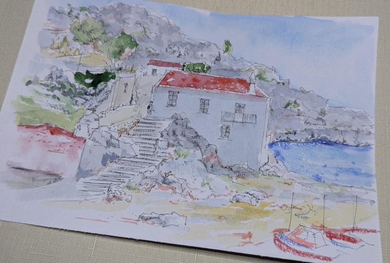
11. Scene 2 - Soluble Ink: Now we're going to do
this scene up here, and we're going to be
using some browning little bit of pink ink. These are going to be washed
with a tiny bit of water, just using any old process. This is a Size 8 round brush. I'm also might use a little
bit of fine liner at the end just to capture some of those shapes
in a more rigid way, but we'll see how
things progress because sketching is all
about being flexible as well. I'm going to start this
time in the middle with this house and just really
gently capture these shapes. Remember, as well these
shapes they're going to move. When we put water on, we're not going to have
all the details that we've to painfully
sketch in at this point. There's not much point
in trying too hard to get this sketch perfect. It's going to move. It's going to wobble around and I think it's going
to get pushed around and thrust places we didn't
necessarily intended, but that's okay because then
we can respond to that. This is where it becomes
art rather than a photo. We can learn as well to control that ink to greater extent just with a little
bit of practice. Just getting in the
important shapes. These rocks, for example, and then the stairs, which provide a lot of the
the flow of the image, I don't know they commonly freeing a nice curve
into the image. We then got this
interesting wall. This is where shapes
are important because look at how awkward, it is really for short and
it's going up the slope. But if we just break down the actual wall itself
into a series of squares and the squares just really simply
relate to each other, then actually we can build
up very easily rather an effective idea of
this wall without having to work out really
any of that perspective. It just flows together and happens after we joined
up these squares. Part of that is just confidence
and not overthinking it, not looking at what
you've done and judging it is terrible because
it's probably not right. I'm happy that it looks
good enough in effort, to me it does look good enough. Another important part of
the flow of this image, I think it's this coastline, this ridge coming
down, joining up here. An interesting thing
to think about with when we know we're
going to wash the ink, we know we're going
to meet is that we need enough of a reservoir
of ink for our shadows. For example here this shadow, and in these trees
there's lots of shadow. What we want to do is leave enough linework that
when we wash the ink, when we move the
ink with a brush, we can actually be able
to create new shadow because there's enough of an ink reservoir
sat on our page. There we go. A very loose sketch starts catch my brown ink. Then I'm just going to pick out some nice warm highlights
with my purple link. These rooftops can be
surrounded with pink. Again, I'm going over
the top few times because I know I'm going
to wash this ink down and I want there to be enough ink at the
top to wash down. We've also got some little bits
of warmth going on in here where there's sunshine. Planning this interesting wall we've got some nice
opportunities, I think for lovely bits
of color to come through. Lastly, is just do a few
touches along our richland. Next we come in with our water, and I'm going to just control the amount of
water on the brush so that we can not lose
control of our image. But do you see how
immediately this activate that ink and produce
this lovely wash. This brown will then form this nice, slightly warm, ready, interesting color as well, which I think compliments this vivid saturated
purple pink. What we're not doing is
flooding page with water. What we're doing
is applying water in a controlled manner and using these patches of color as little reservoirs
to create tone. We can go a bit more random
if we want in a few places, but mostly we're
trying to actually do it in quite controlled way. I want this really shiny side of the building to stay bright. I'm not going to randomly do
water around too much there. Same here. I want these trees to
have a bit of shape. Although they're very
loosely sketch trees, but we can still
apply that shape. Same these. Remember we drew these shapes. The shapes facing us are dark, the ones facing up the lighter. We could just use a
little bit of water and control where our
sketched ink goes. In the stairs, just continue these horizontal
suggestions with some horizontal linework. Then these lovely bits of pink, so I must confess, I had
already forgotten about, but they activate lovely. Don't mean they just pop
into your face and go, look at what we did earlier. There we go. That's line and Wash 1 done. What I like to do is
just go back over things so we can now just pull out
some of these darker lines. Where we think we
need a bit more tone, maybe in some windows, we can now in our
second lot of penwork, we can actually introduce
even more linework. We can see where things may
not have fully worked or fully formed a shadow and we can give
them more shadow. Notice I'm drawing while the page is still
a little bit wet. Things are moving. That's one. We're going to move them anyway. It's all about just playing, experimenting with what you got, what the water and the ink
has wanted to do for you, and therefore, what
you can do with that. Someone gave me a quote, very interesting
quote the other day, which I think is
just as relevant to watercolors as it
is to your ink. They said the pigments are
having a party on the page and that's basically
what we're trying to do. We're trying to facilitate
this ink to do this thing and create lovely shapes
and interest for us. Then maybe a few more
touches in here. There's quite a lot
of tone in here. Then we can come back in again and really simply just in line, again, few of these touches and start to introduce
more specific shadows. What's wonderful about this
is that you don't have to carry anything really, is that even just
the one brush in a single fountain pen would be enough to create really
interesting tonal art. It's using our watercolor
skills or our shading skills. You can get a real depth and interest building
up remarkably quickly. They might wonder if we can do classic things like little
splashes, and you can. So if you just pick up some ink, you can easily do similar interesting
effects like this brushes. We could vary these brushes, bring in a little bit
of our brown ink. You can also just use the
pen as a single reservoir if you really wanted to
get bits of deep tone building up somewhere. I wanted to just amp up
the tone in this cliff. I just come in and use my pen as a little
pink pop almost. I'd play with a little
bit of black ink as well. Let's just do a tiny bit. I don't want to do too much. But just to show you how
you can then contrast these warm tones against
something a bit colder, which is black, very cold feeling
tone, isn't it? Something which isn't
going to wash and move. We could just use it to facilitate some of these
outlines a little bit more to outline some of
these shapes we've created. We don't need to do
much to actually create a lot of interesting effects. Again, feel free to find
this controversial. But I'm going to come around
with my brown pen this time. I'm going to use some
of these outlines and I'm going to create
a nice little frame. This frame is just, see
how we can touch in an outline some of these
nice little areas. We can even come around
these little flips. We can come into some of
these trees and then out. Suddenly we've got this
lovely scene framed, creating this interesting
effect to us. There you go. A little ink sketch using soluble ink this
time, no hatching, but using different
techniques to build up tone and interest in our
ink sketching that we can use as an urban
sketching technique.
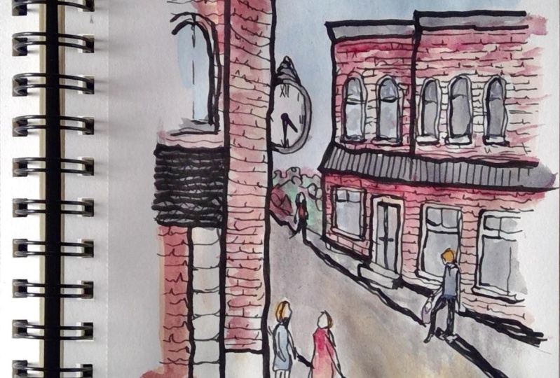
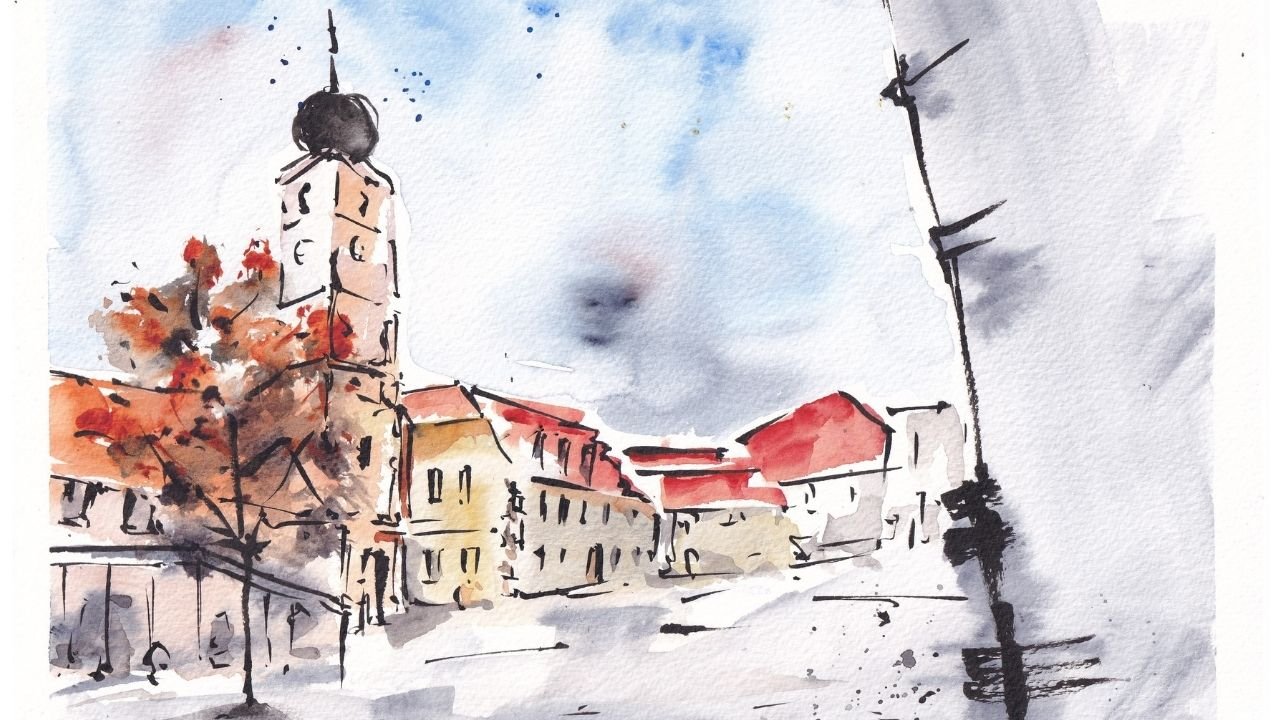
12. Scene 3 - Ink and Watercolour: Last scene is an
interesting one, which we're going to just
use our linework this time. Back to the waterproof
ink, simple linework. This time is glaze of watercolor to produce a scene which is all about that ink, all about that linework, but has that vivid loose
watercolor feel to it as well. The reference is up here. We can start. The focal point is
this church, isn't it? We're going to just
start therefore by cutting it, gradual outlining. This is where shapes and really loose sketching are
really important. This is that so first
principle we talked about in the first class. These lines don't
have to be right. In fact, I could
draw one over here, and one over here,
maybe more like this. That doesn't matter because
what we're going to do is gradually pull
this image together, as we find the shapes. Any mistakes you
make at this point, anything which you
feel is wrong, we'll, either we can just
fit them later or it will disappear as we
find these shapes. I'm just starting by
trying to work out, where do these spires go? Where do these little things? They're basically
rectangles aren't they? They've got their box as well so there's a line down the
middle aside here, aside there. Same here. Because of the angle we're
looking at this side is smaller to see than
it is on this one. They've also just got these
little patterns underneath, which is just a series of lines, really series of
horizontal lines. This comes down. You can see this
doesn't fully line up. That's fine too. Let's just line it up again. We can move it because
the lines are so loose. They'll move, they'll flex and bend to where
you need them to be. Now if I come in and
draw really hard, fixed, heavy lines, that
wouldn't be as possible. There's no real sense
of brickwork to this. There are large bricks. Because there's no sense of
brickwork we can produce these long lines so the outline is very definite
for the church, isn't it? It's not like some old buildings where you'd be doing these
little wobbly lines. We think about the character, we're thinking about how
to make it feel what it is and even from the outside with these lines
we're doing now. Got these little
windows to bring in and you can just start
with loose shapes and mirrors them
on the other side because they are the same. We've got the clock, which is just another
shape, isn't it? Under we got some little
window like objects as well. Then what's going on here? Another window which is disappearing off
behind our tree line. Now, as we've built
this up quite nicely, I'm going to decide
how we're framing it. What we're doing is we're using these trees as a simple framing
mechanism for our church. This is another example
of how we use linework, quality and linework to show something is different or to
provide a visual shortcut. These trees as we see are
different to the church, but they're obviously
different to church because they look different, they have different texture and that's what we
can immediately simulate by doing these
little squiggly lines here. We then have a decision to make, how much we want to
introduce the lobe, because we could just make
this a really simple wash, but couldn't we? But we could introduce some of these other little features. We've got a couple of
lamp posts for example, so we could move the
lamp post maybe. Why don't we move a lamp post and make an artistic decision
that we want to have it poking out above the tree line and then going down and disappearing off
the edge of our image. That way we could also
put in another over here. We could just change its orientation and
totally changing. We're taking a feature
from the scene and moving it around. This is okay. These are all totally
legitimate things to do. Who knows which angle we're
looking at this church from. Now, I'm going to just use
that hatching technique, the random hatching to build up a little bit
of tone in our trees, especially on the
side here which is much more in shadow
than over here. That's just preventing variation
to flock to our scene. Variation in tone,
variation in quality. I want these lines to be behind, but actually I'm going to
start by crossing over because we can always
re-introduce forward lines which bring things forward. Now in our church there
isn't too much shadow, but we can find a few shadows, so we can use some nice
hatching just to find where the shadows are and where there's bold edges
and very slight shadows. We can exaggerate them.
Where there's windows we can use hatching to
show you that shadow. The same for our clock, and for this one here. Then we just make a little
more of this shadow. We can introduce a
few shadows just on the size of things. It's okay. At least for me, it's
absolutely okay to be inventive and find shadows which
explain the shape. Even if the shadow isn't
strictly there in the image, the shape is there
and it's okay to then use a shadow to make that
shape more discernible, more obvious and
more interesting. This way we can build up
quite interesting sketch. It's full of character,
full of interests. All we've done so
far is linework. I'm not going to
do some super bold linework at the moment. We will have to think at the end if we want to add some
in but what I'm going to go for now is
our watercolors. I'm going to keep
it really simple. I'm going to do a bit of a sky, and that's going to be some
cobalt blue or primary blue. That's just going to
frame our church. Remember how I call this a glaze or a layer of watercolor. That for me that
means light colors which doesn't have to
be super realistic, but trying to basically make the lines appear interesting
and add a bit of life, but it doesn't
have to be perfect or need to be
brilliant or anything. It's just providing a
bit of extra interests. All of that was just
an excuse to explain why I'm going to let all
my colors run together. I'm using a bit of a, this is called cascade green, this green and a bit
of hansa yellow. That just gives us a nice, do you see that
nice fairied wash? Now as we get more
on to this side, I'll use more of the green because remember it's
got a higher value, it's more shadowed. I'm just going to let that lamppost be an outline as well. In our building itself, we can leave it as
a negative space so we could apply some
nice light tone to it. It got a little bit
of perylene violet, which is a nice file it, but it's actually rather a neutral color for
something called violet. With that, we can just apply
really gentle shadows. Just enhancing
again that linework that we've already done. We can soften it a bit
and move it around, so we get a more interesting
gradual wash rather than aggressive or broken
up wash like we had before. Already you can see
just with a little bit of touches of color
on a simple sketch, we're building up a
really interesting scene. We could keep going with this. We could go for
ages if we wanted. Often it's very tempting to keep going and going, isn't it? But I'll tell you what,
why don't we stop there? Let it dry and just
see if we want to touch up these
colors a little bit. There we go. I'm not sure, I think the colors are
looking nice on there. They're glazing,
they're providing shape and little bit of interest. What we could do is come back. Again, if we use our offline
line we could come back and we can use these principles
to pull things forward, or to highlight
things in our scene. We could make our lamppost
just a little bolder and then it's evident that they are in front
of the greenery. We could use this
slightly bolder penwork to turn around the outline
of our trees and things. Suddenly that definitely
providing a visual frame, is a different quality and
it's allowing the church just be there in the
middle and not joined. It's providing that
visual difference between the church
and the greenery. Equally, we could just embolden some of these lines
at the bottom where the church
and the trees meet. Just bolding those lines
again pulls it apart. Whereas these lines which
are fading pulls the top, allow it to be something in the distance at the same time. The last bit perhaps
I would do is just bringing out a
little more boldness in the edges of these
windows and that really allows them
to pop as a feature. These are now a feature
not just a texture, they're not another shadow. They actually got
their own shape. There is my little sketch done. Again, as another point
of contention or debate, I'm going to give this
church be a nice frame and then do let me know in the discussion what you
think of these frames. Is this something that you
think works for your work? I think for simple sketches and simple glazed
watercolor sketches, often this little outline just provides a
really nice touch. Doesn't always work and it's definitely
not everyone's taste. But for me, it's a
really fun way to finish off a sketchbook
image like this. Anyway, that's all from
me for this scene. If you joined me
in the last lesson we'll have a little talk about what I'm going to suggest
for your final project.
13. Summary and Thanks: So we are done and
well done everyone. Thank you for sticking with me. I hope you've enjoyed that. I hope you've learned something. Most of all, I hope you've taken a
little bit of inspiration, even if it's just one idea. Have a think about
what that idea is and how you can use it
for your class project or in the other projects; the other things that you enjoy creating and making in life. If you've enjoyed it, please
do leave me a review. It means the world and it
really helps spread the word and I let people know
what they're in for when they click on my classes. I'd also love for you to
connect with me here. Either follow me, ask me some questions, or find me on my other
socials like Instagram, YouTube or on my website and all of those are listed
up here on the screen now. Anyway, thank you so
much for clicking, for following, for watching and I hope you've enjoyed
and happy sketching.
 Toby Haseler, Urban Sketcher, Continuous Lines