Transcripts
1. Introduction: There's so many interesting
things out there to sketch, but sometimes they feel
far too complicated. Take a classic cityscape,
high-rise buildings, hundreds of Windows,
people walking all around cause trees. There's so much going on, but it can feel
totally intimidating. Where do we even start? How do we even begin
to sketch something so fascinating and get it on our
page and feel proud of it. Well, that's exactly
what I wanted to show you in today's class. This course is all about
the idea of simplifying. Not the idea of making
a simple sketch, but the idea of simplifying
a complex scene, which enables us to create a
sketch quickly and easily, and then build up the detail. Create something full of life, full of that city,
hustle and bustle. But without any of
that internal stress or challenge for us. By the end of this class, I really hope that you'll
feel ten times more confident in the idea of taking a complex
scene and simplifying it, you'll understand more about
what simplification means. You'll be ready to
not just simplify, but also build up the
complexity buildup the details on top of
that initial sketch. And you'll also
understand how to splash on some colors,
have some fun, bring some life, but also
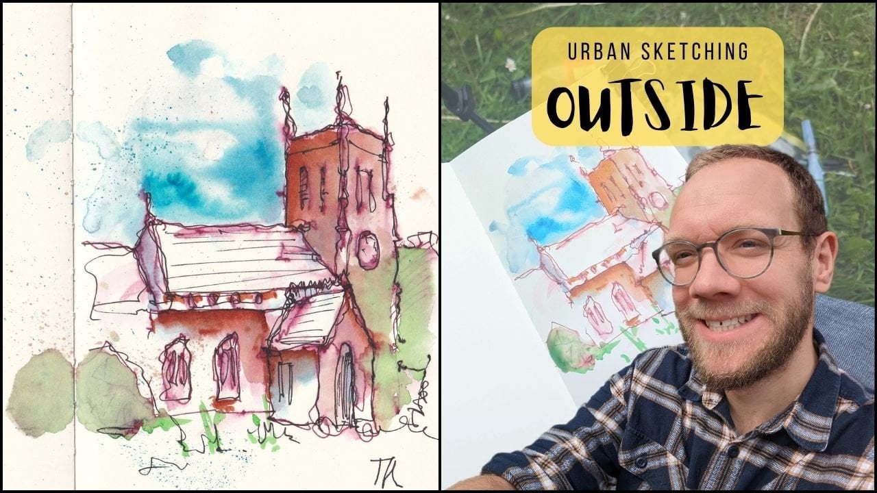
maintain that structure, maintain that clear image. My name is Toby and I'm known as Toby urban sketch on Skillshare or Instagram
and on YouTube. My style of art is loose and
expressive and my style of teaching is to get across
my fundamental mantra in R, which is enjoy the process. Don't worry about mistakes. Don't worry about being perfect. Just learn, develop, and
have fun along the way. That's exactly what
we'll be doing today. The idea of
simplification, of course, being absolutely key to our interpretation of
the world around us. I'd ask that you may even
leave this class suddenly seeing the world like an artist seeing the world in
these simple shapes. And just suddenly being
full of inspiration and motivation to go out
into a busy town, a busy street, and capture
the scenes onto your page. Instead of perhaps being scared and worried and not
knowing where to start. In this class, we'll talk a
lot about simplification, not just the buildings, but also with people. Understanding how to get them quickly onto our page as well, will then produce a
wonderful project. We'll go through five
different stages from ink, two colors, and back to income. Those final bright
punchy touches. When you're done, I'd love you to share your project with me, which you can do by clicking on the project resources and gallery below and
clicking Create Project. I do. So if you do the class, love you to leave a review which you can do really simply if I just go into the Review tab
and clicking Create Review. Um, and of course, I'd love to connect
with you about this class on Skillshare
by leaving discussions, asking me questions, and also on social media where you can
share whatever projects, whatever you do from this
class with me directly. So without further ado, let's have a bit of fun. Let's settle in. Have a little think
about simplification, simplicity from a complex scene, and get confident in
purchasing you already fun, vibrant and interesting sketch.
2. Supplies: Of course, for
every great sketch, we need some supplies and that's what we're looking
at in this lesson. Remember that the supplies in my lessons are always loose. They're always
guidelines, not rules. So I love using pen
and watercolor. That's what I'm using,
but you can always adapt the exact pen, the exact watercolors, to
what you have at home. Also, I'm using today
some cardi paper, some sort of rank paper
that produces a fun, interesting, vibrant,
and textural sketch. But any watercolor
paper would be amazing. And of course, just
normal sketching paper will also suffice and
you'll be able to do everything in this lesson if that's what you've got and if that's what you want to use. Now let's have a
little look at some specific that I'm using today. So the first thing to look at is our supplies and this is
everything that you'll need. And if you've seen any
of my classes before, you know, I like to keep things really simple
and flexible. So what have we got? Well, firstly, we've
got some paper. Now today I happen to be using what's called
cardiac rag papers. This is cotton waterproof paper. It's got these funky edges
have a nice texture. And it's a, A5 size or a half letter size
and American sizes. And what is it? It's just really lovely, fun paper to use, which really tolerate and plays a dark colors really well. I would recommend watercolor
paper if you have it. But if not some good-quality
sketching paper will be good enough to get a nice effect with your
watercolors and your inks. Next we can move along
and we'll be using a pen. Now the exact pen
doesn't matter. You can see I've got a
Lamy Safari and this has got a carbon black ink in it, which is a waterproof ink. Equally, you could
use a fine liner, which is waterproof,
something like a unit pen as a classic
brand that you could use. I just happen to be using my
fountain pen today though. Next to a couple of brushes, I've got a size ten and
a size six round brush. Even just having one brush size, something in-between
size 6.10 would, would be enough for
what we're doing. And then my watercolors. So in here I've got 14 colors. I'll list them all in
the project description. So you can see along
with all these things, you can have a reference
that you can read and look at what I'm using and the
alternatives I suggest. We're not going to use all of
these colors as we use it, because I will talk to you, tell you which exact
colors I'm using and why. But it's not something. I have these 14 colors, but normally only use 567 in any given sketch and today
will be exactly the same. There's always little things
that we need to remember to add on top of the really
big pot of water here. And off to the side, I always have a little tau. This tau means I didn't
have to use kitchen roll, but I can still control the
amount of water on my brush and make sure I'm controlling
my sketching very nicely. That's everything you need. So without further ado, let's move into the lessons.
3. Project Explained: Now, with every great
Skillshare class comes a project and say, Let me tell you about
our project today. In our project,
we will be taking a scene which feels
complex, which feels busy. He's got hundreds of Windows, people, cars, trees, and
everything else going on. We'll be breaking it
down over five steps. We're looking at the
idea of simplification, looking at the idea
of loose colors, and then building up the detail, building up the boldness
to fund and the clarity of the image will
produce our sketch. And we will, at the end, feel super confident and super happy with ourselves.
What we've achieved. The, the project lessons
are actually split into six lessons because that
first step of simplification, I want to give you
really clear guidance and advice about
how to approach it. So we'll be looking
first at big shapes and then a little shapes and how the two interact on the page. To reduce something magical. When you've done your project, I would love you
to share it with me in the class gallery. You can do that by
clicking below on the projects and resources tab. And on the right you'll
find the crepe project. Just take a quick snap on your phone and
upload that picture. Maybe a couple of sentences
about how you found it. And we'll be sure to come back, give you a response and
feedback onto your questions. Perhaps even ask you
a question in return. We've all explained it's time to jump back
into the sketching.
4. Simplifying Architecture - Shapes: So simplification, that's what
this lesson is all about. What is simplification? Simplification is the idea of taking something complicated, breaking it down in a way
that makes it quick, easy, and accurate to
get onto our page instead of trying to sketch
the Taj Mahal all at once, instead, we can split it into squares,
triangles, circles. And by splitting it into
these different ideas, we can easily get it
onto our page quickly and without first and without
over complicating things. When we've got that on our page, we can then build up the detail. And that's what we'll be
doing in our final project. Getting something simple onto a page and then
building up the detail, building up the complexity. So we end up with
a lively, busy, complicated scene, but
without any stress, without any first
simplification. Therefore, it is important
to all art because all upstart simply on the
page as a basic outline. So let's take that idea
of simplification. Look at how practically to
do at how practically do we use simplification
on our page? So the idea is simplification is what I wanted to talk to
you about here and show you, especially when we start
thinking about these really big, complicated
city buildings. And what can be
challenging when we look at these giant buildings is looking at how my word look, all that detail that
we need to add. Look how much complexity
there is that we need to add. But what's important is to step back and stop trying
to draw the building. Instead of drawing a building,
identify the shapes. And that's what simplification
is at its heart. What do I mean by that? Well, let's just build up a building from
our imagination. And we'll build it
up using shapes. And then what we're
gonna do and on final project is this
exact same process. But instead of just doing
it from imagination, we're going to be
finding the shapes and the image and translating
them into our page. So when I say shapes,
what do I mean? I mean squares, triangles, circles, rectangles,
nothing clever. Okay? So using these
basic building blocks, we can really quickly, easily build up very
complicated teams, but without the fast. So let's take the idea of
a shop front will have a corner building with
a cafe on the bottom. And it'll be three
stories high or grandfather and three
stories above that already? Or doesn't this
sound complicated? So we're going to
start with the idea of the shop front
that's facing us. So that's a rectangle. And that rectangle
has its on a corner. So it's going to have
two parallelograms, or basically wonky rectangle
is coming off the side. And we can change the angle
to change perspectives. And it looks like it's
sloping away from us. And this sounds a bit longer, but that's just different. Size of the shape is
nothing clever beyond that, we've got a roof on top
of the roof is kinda, it's like another parallelogram. Then at the top, instead
of being a parallelogram, It's kind of like a square. And then another
parallelogram here. Then we go to a curve which gives us context
for the scene. And that's just a
line or you can think of it as rectangles. Okay, we're getting there. Now, how do we divide this up? Well, we divide it
up into its flaws. And so what we're
going to have is a kind of shop sign here. And then a load of openings are canopy is going along here. Same going this way, but then it's like, hey, we just split into houses maybe. But basically what we've done, a rectangle, rectangle
and a rectangle. Then the floors
above on divided. So we've just got lots of windows and
things to think about. So already this is most
of the big shapes. Maybe there's a couple of other big shapes we can think of. Maybe we get another
rhomboid in here. What's this rhomboid? It's turning into an
morning, isn't it? Sending it to the
morning we were thinking about we could do the same here. One more here before
we decided by k will be no longer shops
and back into houses. So big shapes and
already we've got a pretty clear understanding
of what the scene is. Always done is everything
that we've drawn. We can talk about as a shape, a rectangle, a square
rhomboid parallelogram. Effectively, they're
all wonky Squires on me. And what do we do next? So we've got the big shapes.
We go for the distal shapes. So let's start
finding leafy shapes. So let's do a adore that can be a rectangle with an
ellipse on top of it. And it can have little windows, doors circle to the side of it. And then maybe we got our floors up here so we can have a window. Window and the window, what do they can just
basically rectangles going off to the
side where we got just a ton of rectangles. This is where it
starts to matter. So much less we get
further and further away. And it's not about
getting the details in, it's about just suggesting them. So even if I am really loose and make nonsensical
marks over here, Let's just take two wiggles. Actually, because of the context of this clear simplification, you will, if I leave
all this plant. The context of all of this clear simplification
means these wiggles, our brain goes, oh yeah, look, loads of Windows. So we don't need to
draw everything we can simplify into shapes and
vice implying and districts. We get to leave loads of stuff that really leaves look at
how loose these windows are. You. Yeah, I'm sure that your
brains are going yet. Look all those windows. That's certainly
how my brain works. Down here at the bottom
is no different. So we can get, really easily, get ideas of bigger windows in. We could even suggest by lots of little circles look as those
of bread in the window. Not drawn, Brad, I've
drawn lots of circles. Maybe there's cakes, cakes, kinda like rectangles
aren't there. Maybe a rectangle
with a rectangle on. By just drawing
these little shapes, we are gradually building up what could be a
really complex thing. Because imagine the other
way we could have done this. We could have started here, drawn this window and then drawn all these individual
bits of bread, then come up to here and drawn
this morning are canopy. But instead we are
going to shapes, shapes, shapes, shapes. And before you
know it, we've got a building emerging
chest from shapes. This is exactly what we're gonna be doing in our final project. And we'll be looking at how
just suggesting shapes is all you need to do to create something that
appears complex, but it's really easy to do. Now, in the next little video, we're gonna be doing people. And don't forget as little
sneak preview people, their head level,
which is just below doorways and people are shaped. So look if you can see what
shapes I've drawn here. You already heard of the
game for our next lesson.
5. Simplifying People: Now I know it sounds
easy, it doesn't it? Now we've been
through architecture, really easy to apply, but it's obvious
they're all dressed. Triangles and squares. What about people? People? They are everywhere. They, they make us seem
so much more complicated. They also make our scene
so much more interesting, but often will feel put off. But in the main, in
case we make mistake, in case we run our sketch. Well, actually, when we think about what
our sketches about, about getting the
essence of the scene, will realize we didn't need to sketch people realistically. In fact, if we think about it for you and look
at our reference photos, we'll look at the
people in it and we realize they're only shapes. We can't actually
see facial features. We can actually see
very much detail. So now we know that
surely we can just catch these people quickly simply
as these constituent shapes. That's exactly what we'll be
looking at in this video. How to break people down into simple shapes so
that we feel really confident and happy
sketching them. People are scary because we think we know exactly
what they look like. When we try and draw them, we try and draw their features. It gets overbearing, it gets
messy and it all goes wrong. But what's the solution? Well, the solution, as
with so many things, that sketching is
simplification. So let's draw a very
loose stool scene. And we'll have like a house. Here, will have a big church
just right next to it. My clock in front church
got a giant door. This It's got a normal door
and a couple of windows. You get the idea. So we've got this very
least it will seem maybe a little tree alongside know, to add people to the same. Gotta remember, first the
scale. Look at these doors. We know people's heads are
going to be about here. This is our horizon line
coming across here. The horizon line is at
head level or eye level, 11, head level being
the same thing. So here's my little reminder
to myself, head level. Now we want to add the people and it's tempting to try
and draw their hair, their heart, their exact
movement and body shape. But what are people? Well, I'm going to argue that you can make
a person out of a circle, a triangle. And the triangle. That is a person, it might not be the world's most
finite person. But remember, I've drawn
this the size of the church. What happens if we draw this? The size of a person? So you draw a little circle, a little triangle there, triangle until you
are, actually, isn't I quite effective
if I do say so myself. So we can keep building up these people and they can
be anywhere in the scene. They could be really far back. So this person is back in
the park land somewhere. This person is a bit
further forward. This person's right
beside the tree. So how do we tell how
far away they are? Well, that's where
their feet and their heads are
all on this line. But where your feet are, so the higher-up your feet, the smaller you are
and look because the feet are above the
bottom of the church. Looks like they're behind
the church because the feet are way below the bottom
of the buildings. They're really close to us. So now we've got three really simple rules
for creating people. And I haven't seen one. The head level which
we can reference from door frames is
on the horizon line, and they're all about
on the horizon line. Two, people are simple shapes. And three, popping
the feet down in the right place tells you where that person
is in the scene. Now, I know we're all very
keen to color them in. Of course, I certainly, I'm feeling a bit cheeky there because it's really me who is keen to add some color. And I'm going to argue that
the colors not important. So actually I was
going to do yellow, but let's do
something different. Let's do something
completely nonsensical, and let's do green people. And what's important
is we simplified them. And what we want to
do is tell our eye that all these objects
which look a bit similar, are definitely similar.
They're all the same thing. They're not I and our brain will immediately go there people. Even if we make it
totally abstract to look, if we make all
their heads green, it doesn't matter
if they're black or white or young or old. They are all people were
making them all the same. Or we could have
gone green and blue. We could have gone
to different colors. But the idea is to
simplify things so that our visual cortex can immediately
understand the scene. Then we can make them fully green or we could do
something different. We could add different
tone color to come down. So let's make them red. So we can add little
suggestions of red coming down. Again, this is going to
outline your visual cortex. Look at all these
things which look a bit like people
and all the same. In the context of this image
which looks like a church, they must all be people. So all we need to do is apply simple color schemes
to simple people. And suddenly we have a
really effective sketch. And we'll do a bit
more of this in the final step of
our final project. So don't worry if this hasn't covered
everything you could imagine would do more in our
final step of your project. But this is a great
starting point. To stop practicing. You'll loose and easy people.
6. Focus on the Focal Point: So this is a little bonus video. So, um, I had a lovely bit of feedback or a question from
someone taking this class. And they said that
they found the shapes really great and actually really helpful and
it did open doors. But when faced with a
really tricky scene, often we want to
leave things out. A little bit of guidance on how to decide what to leave in, what to leave out, and would
be really helpful, so forth. You had that that probably
would be helpful, wouldn't it? And that's what we're
gonna do today. So we're going to look at how
do you take a complicated, a scary image which is
a bit overwhelming. Then go, You know what, This is, how I'm going to feel
better about it. Here's how I'm going
to choose what to include and what to leave out. So I've got this scene here. This is a castle in Romania. Very complicated and all
sorts of odd perspective and different shapes
and lots of challenges. But how do we decide what to
leave in, what to leave out? Well, tip number one
is what we have seen. Remember that we can literally
always just zoom in on it. As we zoom in, the shapes get bigger, the details get bigger, and we cut out a lot. So one option is instead
of just going, well, I've got this photo, I've got this view
in front of me. I have to sketch it all. Why not just try zooming in? Why not try just removing
some things like that? Now, that's all well and good. But if we don't want to
cut out any of our scene, what, what else can we do? So the key about what detail to include is what is important
to us in this image. So if we just do a really quick
little thumbnail of this, we can start just sketching. Let's say we don't
cut anything out. We just do really simple shapes. We've got these trees
which are like triangles. Then at the back we've
got this kind of a set of shapes forming a small building and we've got this
big shape here. And already actually
already, yeah, I agree. I've already gone a bit wrong
with that shape up there. And there's another shape
here which is a challenge. Another shape where
we've gone wrong and actually trying to apply equal importance to everything. So what we need to do is
take a step back and decide before we start
drawing in our shapes, what is going to be the
most important bit? And what we mean by that is what is going to
be the focal point. And that could be
obvious in the image. It could be a person you
try to get to personally. They are the focal point. It can be less obvious
than it can be very personal about what you
find most interesting. Now for me, I find most interesting this time when
we started sketching, but in everything else
we've got a bit lost. So we can now decide, we're going to start
with the shapes there. That's our focal point. That's where we'll expand
our effort and our energy. Getting overwhelmed
by everything. We're going to extend our
effort in a small area. Then do less and less as
we move away from it. So let's start now
with the focal point. So we've got a
triangle at the top. And then underneath
that we've got basically another triangle
here, triangle shape. And then we've got
a rectangle and a rectangle coming
down to another much longer rectangle
or longer rectangle. And that kind of, I would say you probably call it another one at the
bottom here as well. Now if we want, we
could keep going. We could go, we're gonna do our small shapes here as well. So we've got a
circle and a circle, a rectangle, triangle,
rectangle, triangle. And then this is kind of
this little cylinder here. Or just think of it as a
rectangle with rounded edges. Again, that's kind of part of this focal point for me as well. Now notice how just
by simplifying this scene down to just the
bits, which is interesting. This is already so much
more manageable than this. We also moved it across, so it's now fitting. We've got our rule of thirds. So if we draw a child and
divide it like this into three, we want our focal point
sitting along one of these lines here are, what are these
intersecting points? So that's what we've done. We've got it along these
intersecting points. Now. We've also reduced all
these little shapes. So although it's
really complicated, we kind of turned the
entire detail into just a circle instead of the pillars and
everything going on, we're already able
to just commonly approach just our focal point. So having done that, we can move on and start
doing giant shapes elsewhere, but basing off our focal point. So e.g. we've got this rectangle
coming out here and here, and another one there. Then this is a giant
rectangle here. And it's kinda got a series
of rectangles because it's basically a hexagonal
tower, this one isn't it? So we got a series of
rectangles coming down with a basically
a circle on top. And then off to the side. Well, why not just
really simplifying this? We just turn it
into a rectangle. We now have recognized
this isn't that important. We've actually completely
cut out some elements. We basically cut out a lot of
these trees because they're really not important to
the field of this scene. And if we want, we
could start adding in a couple of small shapes here. But remembering that we're really, really simplifying now, we can leave this
whole bit blank and just empty and happy
and leave it like that. Then you go. That is how to approach a scene which you feeling overwhelmed
by how to approach it, to think about how are we
going to cut things out? How are we going to
consider a focal point and how we're going to
use our focal point to reduce that anxiety and worry
that it's not possible. It's impossible to
get this scene on our page in the next video,
another bonus video. We're going to continue this, but we're going to think about
color in a way that again, uses negative space, too. Reduce the complexity
in just to be able to enjoy sketching a little bit
more without that worry.
7. Simplify your Colours: So in this short bonus video, we're going to look at
negative space and how to use negative space in our
painting to simplify, remove that overwhelming
feeling from sketching, just as I promised
in the last video. So this follows directly on from when we're
talking about how to simplify our linework and how to just choose
what to leave out. What I've done here is I've basically replicated
our simplified, our sort of good version
of our thumbnail. And I've done it twice, twice so that I can
show you a good way. And before that, a complex way and a complex way
isn't necessarily bad, but it's more overwhelming
is takes much longer. And for me, it's not how I
usually choose to paint. What is the complex way
than the complex ways where we decide we're
going to paint everything. We would come
around our sky blue and we'd make sure to fill
the whole sky with blue, because the whole sky
in the image is blue. So what we're doing is we're being accurate, which is great. There's definitely
a place, of course for accurate sketching. And then what we do we find on our walls and obviously I'm
simplifying the colors here. But it's the idea that we
would add color to all of our walls and make sure
that we've got them all like approximately accurate in the choice of color as well. And then a roofs as well, quite dark, so you just
apply a nice dark color. Then around the side I've got these trees and in the front we actually got a few
bushes and things. And then we've
also got a kind of shadow in this lower part
of the tire as well. So it's very simple, but it's still getting there
towards painting everything. Now, what's the problem here?
There's no problem per se. This is a great way of painting. If you've got loads of time. If you're feeling very
confident about your subject, if everything in your subject
is of value important, that you're happy to spend a while painting every
little bit and ensuring that we kept that different value right here, different
value right there. And it ends up looking amazing after a long time and with a lot of thought and
a lot of energy. The problem now is
that everything is equal as the eye
doesn't know where to go, it's kind of become
complex for me. The decision of
where to paint next, where do I now add color? What colored where it
becomes much harder. So how do we reduce
that feeling? How do we feel happier
when I'm sketching? It's all the same stuff. It's all starting to think
about that focal point. We start with our sky again using the same color,
but this time, instead of printing
the sky everywhere, we focus it around our lovely focal point and
we can nice and loose, but we bring it around. So now we've produced a
sort of pushing out effect. Our focal point is now basically a negative space in the sky. We can leave it like that. We could actually
paint everything except our focal point. Thus, our focal point
would jump out at us. Now, if a perfectly
good way of doing it, I'm going to suggest doing it
the other way around there. I'm going to suggest actually focusing on colors
on the focal point whilst being careful to leave some negative space in
our focal point as well. What do I mean by that? Well, we can add some nice
dark color to this roof again. And we can let that blend and float because as it
blends and flows, it will be lovely and leaves. It takes away the pressure
trying to be perfect. And also because
we've already painted a small area where they're able to react and respond and make sure that the textures
which happened now, what we want to happen, when thinking about
negative space, we will jump down and we'll just paint this section of the wall. And so we've got this kind
of pushed out bit here. Now this is total negative stays really jumping forward at us. And then below we said
we've got a bit of a shadow so we can
put that shadow in. And maybe you just want to
apply a little bit of tone. Some of these windows. Perhaps we revalue the brushes just below a little bit as well. So now we've painted
our focal point. And this is just a
very quick sketch. But you can imagine if
you've done a bigger, maybe it's your final projects. You've done a bigger sketch, you put more effort
into the pen work. You could just apply colors
really simply like this, just your focal point. And you produce something pretty cool, pretty interesting. Without the stress
of feeling the need to color match or get
stressed elsewhere. The next level, of course, is to start adding a couple
of bits of color as well. So we just look
around and think, how do we feel about a
little bit of color here? And we're just
choosing simple shapes and applying a little color. Stepping back and having a look that directs
your eye doesn't it catches the eye and
then the eye follows these negative spaces
again into a focal point. So maybe what we want to do is keep the
idea of going just a couple of shapes which can have some
really simple cone, tone, color or value. And by doing that
will get me, I drawn. But then it will follow
these other negative spaces. Then we can start
amping things up so we can come back in and go. This is working. Let's get bold with our color. Drop in some really
intense pigment in a couple of places. Now, we now have an
image which is bold, punchy, focal point,
but not blank. What's the next level that
we could very easily do? The next little step we
can very easily take, well, instead of
painting everything, but if we don't want
everything to go to your bank, we can apply some simple
splashes and simple splashes. Fill up an area
whilst leaving it. Not too much drawing out it
makes the image field busy. But without making the image feel overworked or complicate. Just gentle splashes
in a few places where he doesn't
matter if they go everywhere and then
******* in the sky, those with gentle and
careful when it will end up with something which
again, just draw the eye. Far more simple to
think about and to enact and leaves us flexible to keep gradually
building up if we want to. But also flexible to just
do something super simple, super quick, if
that's what we want. That is my video
about negative space. I hope that one is
really helpful as well. Do think about this when you're
doing your final project, especially if you look at
that image and you think, Oh my word, what is going on? Remember the principle is focusing that color
on their focal point, allowing the negative space
around it to push in. Well, sullen and negative
space within it to jump out. At least. That is the
feeling I get from this kind of composition
of negative space.
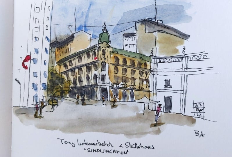
8. Step One Part ONE - Big shapes: Okay, So this is step one
of our final project, and here's step one, part one. So step one as a whole is
the idea of simplification. And in step one, part one, we're being really simple. We are just looking at
those giant shapes. So let's jump in and see exactly what that
means in practice. I always find it very useful to break down sketches into steps because then we
can understand at each stage what we're
trying to achieve. So this is step one and
I'm calling it big shapes. Why am I calling it big shapes? Because all we're
going to try and achieve with our pen and paper is finding
the big shapes and our image will be amazing in complicated
cityscapes like this. It feels like there was an overwhelming amount
of detail to find. But actually we'll come together so easily when we just
find those big shapes. We don't have to think about it like city block, tower block. Now we can just think
about circle and square and it will magically
just come together. So let's do just that. Now I'm going to start
with our focal point because it is going to set the scale for the rest of the image and the
front of it facing us. What is it? I would argue that it's just a
big old rectangle. So there you go.
There's our rectangle. Notice how I'm wobbling,
wiggling, That's fine. We're gonna be doing lines
and color and lines and it's any mistakes or wobbles will just be part of the character
of the image by the end. Now above that, what do we have? We've got a semicircle
with a rectangle, with a kind of
elongated semicircle. Along the side. We've got an angled rectangle. Another one, another
one, and another one. Then coming up here off
to the edge of our paper, we've got a big rectangle. And then we've got another
one, a little one on top of me, something like that. Then we can keep just
finding more shapes. Here. We've got a square. Well, I'll miss
something I haven't. I so up here we often
start the roof, which is yet another rectangle. Then you go, always good
to be on your toes because you will easily miss
shapes if you're like me, not concentrating because
you're trying to with full, more full and talk to you much. But now we can come
back to sketching. So what's going on here? We've got a square which
is sort of cut off here, but we can still think about
it in the simplest term, it's a square with a rectangle. That rectangle kinda comes down. We don't need to draw that line. We can just draw it
adjoining rectangle. And then we can
draw this rectangle coming down and this
one coming down. And there's another one on top and then another one
just coming down over here. Do you see how we've
built up this half of the scene just
by finding shapes. So we can continue to
do the same thing. On the other side, will find the mirror or most of
these lines, isn't it? And we can just grab those
really quickly and loosely. We can't see this shape very well, but we
know it's there, so we can either choose to leave it or we could
choose to invent it. I'm just going to
invent it a bit. You can't really see it. So
it's a bit of an invention. Come down and got this shape. This is split into lots
of rectangles again. But again, if we just
find these rectangles, what we build it up
without a problem. And on top it's
called a triangle. And then these rectangles
all angled down. So we can just find
these angled lines. Again as if by magic, we completed that set of shapes. Same little thing
falling off here, another couple of rectangles. Then we've got this dry and
rectangle coming in here. Just have a look where it ends, where the bottom is, it's
just in front of this. So come down a bit
lower than here. Then we can bring
in that edge of the rectangle and then finish off the bottom of this really,
really giant rectangle. And then you go most
of the shapes found. There's a couple of other
things we can find. Look in the back, we've got
this kind of, these trees. Basically circles, don't know. So let's put those in. There you go. That is it doesn't
look like much. I fully agree with
you right now. This doesn't look like much, but give us time, give us a couple of more
steps of our drawing. And this is gonna be looking
like a huge amount of fun.
9. Step One Part TWO - Little shapes: After step one, part one, of course comes
step one, part two. So what are we doing here? Well, we've got our giant shapes now it's all small shapes. Small shapes are those details, those little bits
which just fit neatly. And now that we've got that
big structure of our image, what are the small shapes? The small shapes are all
those little details that we didn't want
to draw in last time. But we're going to
keep it as shapes. They're not going
to draw windows. We're going to draw rectangles, circles and then kind of thing. We're going to draw them
all either we're going to find some, see how we feel. Keep going until it feels full. We can always add
more later, remember, so let's grab our Pentagon and we'll start in the same
place to start in the middle, we're going to just start
grabbing small shapes. We've got a rectangle, then
we've got one which is like an ellipsis semicircle
with a rectangle. In case you sort of go mad from me saying the word
rectangle too many times. I'm not going to keep repeating the word you'll be
pleased to hear. But just talk about
how I'm simplifying. And so e.g. we can take this row here of shapes and I can't see them all. I'm, but what I can
see is a general idea. I don't have to count
exactly getting them right. We just trying to get the idea of these
windows going alone. The general idea is
plenty enough detail. So again, we can just match
what we've done down here. And look, I'm
overlapping this line. This, this was a
dodgy shape here. It's angled in the
wrong direction. Whatever, ignore it just had
your own new shape on top. And look. We filled it up just by thinking
about all these windows in terms of simplest
things possible. We filled up this
complicated area by just repeating a little
pattern over and over. And we just do the
same thing over here that we can't really see the windows that
were here, can we? Because they are in shadow. So what we can do is make these ones at the front
a little more obvious, pretend we can see them. Then as we go back, we just make things
that suggests windows which there aren't
really that we can see, that we can just
simply suggest them. And we can just create
little vertical lines. See how it's very
dark and shadowy. So these lines are a
little bit like hatching, but they're suggesting
detail at the same time. Somebody look it up here. We've got this kind of
complicated extra bit of detail and we can just bring that in by
finding its shapes. And we can sketch on top of our previous lines to see how they dissolve
into the background. So there's no drama, no, no fuss about whether we are trying to correct or
change our previous things. We can just layer up online
so that one's weight gentle, it will, it will look
interesting or look fun. This flag is just a couple
of shapes and look, we can move the flag
to the side so it's more obvious what it
is and so it doesn't interfere too much with
our previous lines. Similarly, all these
details that we sort of filigree type balconies, we can just bring them in with really simple suggestions
of line work. Back here. Look at these tiny
little windows. I'm not counting
them or their phone. Now there's five in the image. I can fit for him. And if someone wants to
complain and say that our team is supposed to be
five, well, that's fine. But I doubt anyone
will ever notice, so don't you worry about getting it
slightly wrong either. Again, we can find, look
this really dark bit on top. So when we add these dark
details with a bit of hatching, then a couple of windows here. And then going down here
we can get these windows. And again, just real
suggestions or Windows, nothing clever and
nothing really challenging to draw,
just quick suggestions. And what's happening
is if we focus on every single window
will be here forever. It will look too busy. But the madness, the detail, the beauty of these
scenes where there's, I don't even know
how many windows, at least 100 I imagine
that we can see is that each of these windows builds
up an effect of detail. So even if we are just doodling
in a load of rectangles, even if they get wonky. Let's just make this
make no sense at all. As I stuck up the windows look, even if I just do to
live in like that. The effect of all
of these windows, effect of us putting all this data is that it
looks busy, it looks correct. It, It's such a busy,
complicated image anyway. It doesn't matter if we
go a little bit wrong. So when we think about
lifting, shapes, just really do simplify it. Don't worry about
getting it exact and don't worry if
it's not perfect, because no one else will
notice if it's not perfect. These trees, I'm going
to just bring in a little bit as
sort of hatching. This is like hatching is
increasingly the value. I'm just replicating
the same marks that were initially used
to suggest the trees. We could bring in some of these
other things in the back. We've got like a taxi. We can bring that in
and it's again, a taxi, a car shapes, what does it, it's like a parallelogram. We rectangle with a
rectangle and then it's got suggestions of
wheels like that. We've got the
suggestion of a taxi. Then we've got some
people, haven't we? The people, what are they? They are circle triangle. Triangle says circle, a
triangle the right way up and then a
triangle upside down. We can just sketch a
few of these people and we can see them
all over this scene. And the key is, as well as
their heads at all on about the same level because they're all at eye level that
all on the horizon line. We could add a person in
really close up here. The head is still going to be level with
everyone else's head. It doesn't matter if we
go a bit wonky with that. So let's put someone
a bit too low here. Again, it doesn't matter. You can't really tell in the busy-ness of
everything going on. If we pop a couple of people who are just
not quite right, another one here, just
all of these people aren't there right next to each other and they're
not quite right. But it doesn't ruin the image. It, it adds the busy-ness and it adds to the overall effect. As artists, we're prone to noticing the details of our own art and missing
the overall effect. So just try if you can put
on someone else's glasses, walk in someone else's shoes when you're
looking at your own. And just see the
overall effect without noticing every bit that
you know you got wrong. Because no one else, so very
few other people will know, or if they see those bits. So what else can we do? Let's get some of these
windows in up here. Again. Look, are we going
to count them? Are we going to
just go for it and suggest some busy-ness
the same as you go along. If we just match
these windows here. Get looser and looser as we
get off the edge of the page, I know what it's
gonna look great. It's going to look fine,
especially as we build stuff up. We can get this flagging. You can get the edge
of this big window just really loosely coming off. And we can suggest like a
pavement coming around because that suggests it tells us
what's going on with the image. It tells us there isn't
just this big blank space. There you go. Lift two shapes done. So what have we done? We've done rectangles, we've done circles, triangles, we've done some
dual half or semi-circles. We have a sketch which
really does represent a busy tools
skyscraper each city. Next, we're going to be
working out our colors, having a bit of fun
and play with them. And seeing how we can
develop our sketch further.
10. Step Two - Loose Colour: Now that we have built up that ink work with our
lovely little shapes, we can start splashing
on some color. So here we're gonna be using
a bigger brush if we're using two brushes or if
you've just got one brush, of course, just be
using your one brush. Loads of water, some
lovely loose colors, and seeing what happens with
painting the light here. Not worrying too much
about other things. What we're trying to do is get
this varied wash of color, which blends and merges lots of negative space as well,
leaving places unpainted. And not worrying too much that this won't feel structured. But what we're doing is we're proofing ourselves
to come back and reapply bit of structure
a bit later on with a pen or some more
concentrated color. So I'm going to start here.
I've got my size ten brush, my bigger brush. For this stage. What I'm doing is that look
where, where this shadow, we've got this blue sky
shining down this side, we got shadow going all the
way through onto this road. So I'm going to link
that whole area to start with by touching
in some blue. This is cobalt blue, okay, touching up blue and
then bringing it down. So already we've
linked everything up. Now the next key color is
this yellowy orange color. We've got lots of options. We could use agonistic
with a nice simple option, one which a lot of
people will have, which is quinacridone gold. If you don't have
quinacridone gold, just use another yellow. Or you could even make an
orange with a yellow and a red, of course, for what
this is going to do, just give that glow
to this yellow, orange sandstone e feel. We can just pop it in. Again. Look, let it
blend and it moves. We can even be really loose. If I tilt my page, I can drop it on and I can encourage the water
to flow move. And now we get this effect that there's light pooling
down our image. We can come in, we can add a bit more variation by
touching in these colors. And it's blending
up into the sky. That's fine. Just
let it do its thing. Going to bring it all the
way across the edge here. And we talked about
negative space will look by bringing it across
and having a neat edge. Do you see how now
these two bigger, closer buildings are
providing a kind of frame, this negative space frame, pushing in and pointing us towards the really
interesting but image. What are the tones or colors
or hues or they're in there? Well, there's a nice red which
is coming from this flag. Let's just touch that in
and let that do its thing. Then, having used the
red in one place, Let's show He's in a couple
of other places just to it's not really there and elsewhere
is it's not really, they're not pretending it is, but we're making decisions which make the image feel
more together. We're gonna be able
to use this read later as well when we
add in some details, particularly if we look
around at the people, e.g. that people are crying out
to be punches of color. We've got this red
in a few places. We can come back later
and find a few more. Now one more color. So what we've got at the moment is kind of like a
primary color scheme. We've got primary
blue, primary red, and we've got
something which isn't quite a primary yellow, but it's a nice yellow. We don't want to
over-complicate things. So what I'm gonna do, just take a nice green
as simple green. This is our fourth color. That green has got
two nice purposes. So one, these trees, each loopy trees that
we added in earlier. And to look at this lovely roof, it's got a greenie turquoise. Easy. But we can, again make a decision
to simplify, simplify it, to keep the greens consistent
throughout our sketch. And here we go. Lovely green roof. We can always touch
this gradient and a couple of other
places as well. But let's not overdo it. So let's just stop there. Last thing I'm gonna do, a little bit more
blue in the sky. Just fill up that sky. Maybe bring it down here to
give a kind of reflection. Little joined up fill. And we're done really
quick, really loose. The trick with this step is to just have a bit of faith that it's going to be alright. Yes, it looks mad. Yes, it looks leaves. But before long we'll have
come back a bolder colors, added some more ink. And the structure we'll come
back and these loose colors, we'll add so much complexity
and depth to our image, which we can achieve without just letting
go for a little bit.
11. Step Three - Bold Colour: Now without page nicely dry, we can move on to step three. Step three, big bold colors. Now we're thinking
a bit more about the shadows were thinking about what are those highlights and what are we trying
to make a feature of? This is where I've seen really
starts to come to life. So let's settle it, enjoy, and produce a bit of
magic on our page. Okay, so we're back now. What do we need? We
need the same colors. We need a mostly dry page, so mine is mostly dry. There's little bits.
You can probably see it a bit damp,
but that's okay. It's mostly dry. Now we're gonna be using
my smaller size six brush. And it's okay if you only
have one brush, but if so, just be careful to
use the point because what we want to do now is apply some more dense elements of color to suggest shadow to get a bit more
shape into a sketch. How do we do that? How do we get shadow
in watercolors? Well, there's a couple of ways. So 11 very effective
way is to layer up colors to look if we layer up
our quinacridone gold here, the effect is to enrich
the tone of that gold. Suggest a lovely shadow. So we can actually use that in quite a few places because
it's a more subtle shadow. We can come basically
everywhere where we see shadow. We can come, we can add an
enriched layer of our gold. We can do the same with e.g. these greens. So
coming in down here. And we can just apply the green shadow to the
lower edge of our trees. We've got these three tree-like shapes that
I've sketched in. Maybe we can add
a fourth in there that is applying a
greater challenge. So now it looks like
there's light and shadow. So suddenly these very
two-dimensional trees have this wait to them. They have this punch, they
are producing F shape. Similarly, this
green, Let's go and just get a much
more defined roof. Again, we can imply
shadow by leaving some of our previous lovely
light green coming through. So we're not trying to
cover up the previous line. What we're trying
to do is create variation in the previous layer. Now where else is the shadow? Well, there's a few
very dark triad is on there with these
very dark shadows. What can be quite effective
is to use a shadow color. So instead of using
darkening, the yellow, darkening the red,
whatever it is, we can take a
naturally dark color, like I've got indigo
or I've got moon glow. So I'm actually going to take
indigo and I'm going to mix the indigo with a lid
to get the wrong one. Next, I'm going to mix my
indigo with a little bit of quinacridone sienna and actually give us a nice neutral dark. A similar thing would be
to mix a burnt sienna with an ultramarine
or any dark blue with any sort of warm and
relatively brownish color. Basically, we're
looking at a dark blue and a warm but deep orange, deep dark orange, which
is of course Brown. Anyway. What we
should then end up with is a lovely
neutral dark color. So what we're gonna
do with that, well, look, there's some
really dark shadows. And whilst our
page is still wet, if we apply this dark, dark color and we'll get
some lovely soft shadows, will get shadows which blend and flow wheel to even deepen
some of the tree shadows. And then especially down
here around these people, we can get a really
effective deep dark shadows. As we come around
to the other side. It's not so much
in shadow, is it? Instead we just have neat shadows within
someone that windows e.g. and we can do that as well. So leaves but it's
flowing and it's continue to evolve even whilst
I've moved away from it, it's going to continue
to evolve and change. So we don't need to
rush and try and put in Pro can make it perfect if what we need to be
delicate with it in the first place and then let it do its own thing for a bit. Could do the same. And
these buildings back here, just a little bit of a
dark corner coming across to suggest that shadow and it will continue
to move and flow. If we're not happy
it's moving enough. Come back with a clean brush, a little bit of water, and we can just hook it into moving a little
bit more for us. Now, the moment we've left a
big load of negative space, we can just apply a
little bit of tone if we want to this
negative space it perhaps these dark areas we
wanted to just prove a dark, perhaps wanted to
take a lighter wash our shadow color and just gently suggests some of
these shadows in here. Whilst also leaving
it essentially is negative space in terms of
there being no color to it. So it's still got that
pushing effect coming across. But it just proves that we meant to sketch this bit in.
This is very optional. This is all about
experimenting and seeing what you enjoy the most and what you feel adds
value to your sketching. We could come in and use some of this dark color as well just to show that there's a tarmac and a texture
in this foreground. Maybe, maybe that takes away too much of the light so
we can come back in, just poke some of our
warm colors back in and let them blend and
move and do their thing. So that is this step done. And still you might be thinking, Oh my word, this looks chaotic. But don't worry, we're still not finished and just have that
faith that if we follow these processes will come up with a really fun,
interesting image. Next, we need to let this dry and windy stood it
dried pretty well. So we can come back
in with our pentagon.
12. Step Four - Restructuring: Now, with all that, color comes a little bit
of a mess, doesn't it? Not a mess, but something which is lacking a bit
of that structure. So in this lesson we
are restructuring, we're refining the
shapes with our ink. And before you know
it, what we'll have is a vibrant and
fascinating image which really is starting to
make a lot of sense. So we're ready for
our next step, step four is to regain some
structure with our ink. The first thing you
might notice is look where it looks
totally mad, really. Sort of loose and a lot of
very dark darks before. Actually, as things are dry, they become more transparent
as watercolors do. That sort of abrasive quality, that high contrast has faded. So we're actually,
we've got plenty of room to play with
without dark ink. What are we going
to do? Well, we're going to start again, just recapturing those shapes. And we might add more details. We might refine some shapes. And a good example of what we're doing is look around this. We can now come and see
wherever watercolors gone. You can see there's this
little strip of light. So we can grab that
strip of light. Now that is suggesting
even better is suggesting the
shape that we can see in the references
suggesting that you got that strip of light
going down the side. Similarly, we've got
this statue on the top. We can actually just hatch
that in with our pen. Now we've got, again, that's just a higher contrast, but we've seen love watercolors are doing, responded to them. Down here we can recapture
some of my shapes. You've got these lovely
windows and now we can use how the
watercolors have given us light and dark and
the different sides of the window and we can capture those different shapes again. Then there's this lovely roof. And all we're gonna be doing is repeating ourselves
all around the image, grabbing these different shapes, seeing what's happened, responding to what's
happened in it, using our reference or
the scene in front of us. But we're also using the natural qualities
of the watercolor. How they created lightened, dark, how they've
gone where they want. And let we might
move our windows, we might enlarge
some of our Windows. We might sort of make
some windows smaller. We can redo some of these lines wherever this
line was really wonky. Well look, we can just redo it, re-capture that, that original sort of feeling that
we were aiming for. We count down just repeating the same
process as we did before. But now instead of just paying
attention to the scene, we're also responding to
what we've already done. This is a nice bold line. Push and push out our colors and to move
on vision across. But we've also added
a bit of tone. So this tone is another thing
that we can respond to. We can outline it with a pen and make it a definite feature. This doorway here
that we can hatch and provide a sort of contrast between that and
our man at the very front. Like this. We are building
up our scene again, we're building up the structure. And hopefully you can see this part of the scene
is outputting forward, back in front of those colors. So you can probably start
to imagine what's going to happen as we move around
the rest of the scene. And it's just all going to
gradually move forward. Those colors are
going to fade back. And we're going
to regain some of that structure that lets us have a really clear
vision of our scene. Let's now move on to this side. Again, just finding the shapes where they've perhaps
been lost a little bit, being a little firmer
with our pen to create slightly bolder lines if necessary or not
even if necessary. But if we just feel that's what the image would like or
what would help our image. I'm gonna do this
bold line next. Just say that we have an understanding of what
a bold line looks like, because we don't want
to go bolder than this line is right in the front of our image
and the bolder line, the further forward it is. What we want is these, these little lines
that were running for Windows to be that
kind of visual noise. Remember how I made these
windows will purposely wonky. Well, just as long as
they are uniform enough, that visual noise is
what we'll just create the effect rather than
having to be perfect. Absolutely are really neat. Same here. If we just create enough
correct suggestions of Windows, we're not going to have to be
precise about the numbers, the size, or anything
else about those windows. Came back. Same thing here. Maybe Actually now
that we've got more tone and value on the page, just hatching in these
areas is going to be nice, effective little touch of pen work to again
enhance the contrast. These trees, we can, again remember how we hatched, but we can do a similar thing. Now. We've got this taxi again. We can just re-invested bit of pen work into that to make
it stand forward of it. Are people now we got to decide are they going
to be features or not? And I think because we've talked about adding some
fun colors to them, well we can do, let's
make them features. So to make them
features, what do we do? We bring them forward
with some old pen. We can add some more as well. It doesn't matter that we add lines in front of other
lines so we can come in, we could add some
people here, here. Couple of just going
round the corner. I've already got one in
the foreground here. Could add another just behind
them in the foreground. Maybe a couple more
just by this taxi, e.g. and now we've got this scene
just filled with people, but hopefully you can see
the key parts of this snap. We have now regained
a bit of structure. Can you just come
round, regained, remember these curved lines? They sort of just, again,
they frame the image. They show us what's going on. This shows the flow
of the streets. So that for me, quite key part to
get in. There we go. So that is our restructuring
of the sketch done. It's time now to move
on to our final step. We're gonna get our
colors out and add those really bold and
interesting touches.
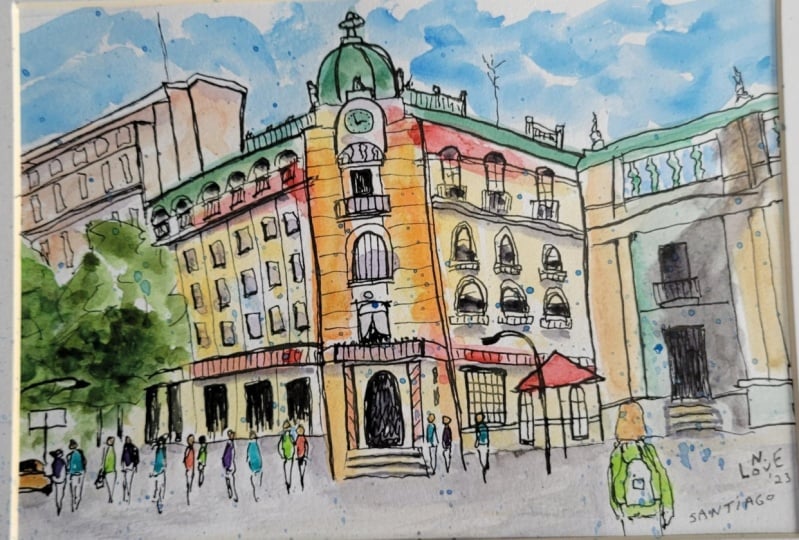
13. Step Five - Finishing Touches: Here we go, almost there, time for the final touches. Now just a few little bits
and bobs of ink or color. Let's see what we want to do to really bring out
those highlights. Make features of the
important parts of our scene, and not overdo it, but make sure we've
got something really punchy, happy and fun. The final steps here, the final steps, those bold, interesting touches
that we've been looking forward to an ordering. I was going to pick some
really punchy colors to make features of
different things. And the key feature I think
that we want to pull out, we talked about it a few
times, is these people. So what I'm gonna do to
make them stand out, we've used, we use this red, we've used a quinacridone gold, we've used a cobalt
blue user shadow color, and we use a nice green. What we're gonna
do is we're gonna choose something different. So are people really stand out? So let's start with a yellow. Now. The yellow I'm looking at
popping on our taxi first. Now, do you see that this
yellow really jumps forward. And the reason it
jumps forward is because there's no other
yellow like it in the scene. Now if we just leave
that there and we don't use this yellow elsewhere, it at least to me, this looks like a mistake. But what we could do is we can make yellow a
feature of our people. Look, we can find all
the heads of our people. Give them a dotted yellow. And suddenly the
yellow makes sense. It's not a mistake. It's
kind of suggesting look, all these important features
going on at eye level. To double down on that, we can get a bit of a yellow. We can just literally
apply some splashes, especially into this
negative space here. So now, I hope you agree that a yellow no longer
looks like a mistake. It no longer stands out
so much except to draw your eye to what we're
calling the feature, the, the exciting
part of the sketch. Now, what else can we do? Well, I don't think
we want to introduce too many new colors. So what we could try now is
to pick one of the colors. We've not used that much and make it a feature
down here as well. And to go nicely with that, yellow, why don't
we use are red. So now these people, we can just add suggestions of red two, we'd have
to do with all of them. Let's do a few takes,
step back and look. And actually I think
if we did more, it'd be too much. So now we've got
another decision. Do we want a different color or do we leave the other ones? Why? Wow, what an I take the
risk so that you can decide what you want to do
with a beautiful wanting. So I'm going to try and blue. And let's just see what happens. But you have a look at what happens and then
decide if you prefer yours with the color or without. And then we go, there's a few more bits
of color touched in. I think at that point is probably most sensible
to leave the others. Why we've taken a risk. For me that's worked. It's providing a really
interesting, punchy touch. I'm going to again just
double down on these, these funny colors, adding
these blue splashes. Know if there's any
red splashes because I think it's working
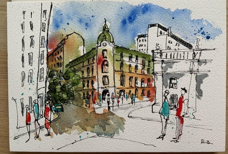
quite nicely as it is. And I'm going to call that done. So the most important part is to be proud of what you
don't pop your initials on. This is Santiago, Chile. Santiago in the corner. And you can plot the data
as well if you'd like, but just be proud of what
whatever has happened. We've done some loose
experimental touches. It may be techniques that you're not familiar with it maybe, maybe sort of things you're
not experienced with. And for me, I never know
what's going to happen. These things are
loose and it's about responding to what
happens with our colors. So mistakes will happen, but mistakes are often
very beautiful as well. So didn't worry if
there's mistakes, just be proud, enjoy it. Reflect on what went well, reflect on what you enjoyed, and take that into
your next sketch. And with that, we can move into the roundup where we'll have a think about
what we've done, what we've achieved, and what we can do next to develop
our sketching further.
14. Thank you and Next Steps :): And thank you everyone, well done for making it through. I really hope that you've gained a huge amount
of confidence. I hope you understand
the principles of simplification and are ready to take this out into
the big wide world. Creating your own teams, taking things which
previously worried you. You just thought there's
no way I can do that. But now you are
happy jumping in, being able to just simplify, get it on your page and
then build up the detail, build up the color,
fill up the life. I'd love to see your image. So do click below on
the class projects and resources tab and create
a project shared with me. And I'll be sure to come back
and give you some feedback. If you've enjoyed the class, It's your chance you've
made some feedback, so please do leave
me a review. Again. Just go on the Review
tab below this and just leave a review takes a couple
of minutes or even less. I'd love to connect with
you outside as well. So follow me, please. On Skillshare, there's loads of classes that I've produced here and I'd love you to
join in lots of things. From the fundamental
starting classes of urban sketching down to
more specialists classes and my favorite things like continuous lines and loosen abstract
sketching techniques, if any of that sounds fun, I'll see you in another class
or you can come and find me at Toby urban
sketch on YouTube, on Instagram, or on
my websites where I host and describe all of my
other classes and courses. So thank you so much and
I hope you've enjoyed it. Most importantly, I hope that you are proud of
what you produced. Nothing goes perfectly ever, especially not in sketching,
especially not an art. But there's always
something to love as well. So have a little positive
outlook on Europe. I hope you've enjoyed
it and keep creating.
 Toby Haseler, Urban Sketcher, Continuous Lines