Transcripts
1. Introduction: The hustle and bustle
of modern life. Creating art can get
lost, can get forgotten, or put at the very bottom of our priority list simply because we don't
have enough time or headspace to actually
create to take our reference photo
and produce something really lovely on our page
or in our sketch book. Well, that's until today. In this class, I'm going
to show you that we can effortlessly evolve doodling
into doodle sketching, where we take scenes either from our imagination or
from around us, from reference photos
from our holidays. We create beautiful little doodle sketches
from urban scenes, from rural scenes from
anything around you, adding pen, adding watercolor, Focusing on enhancing
the simplicity but still telling
the whole story. My name is Toby, known
as Toby Sketch Loose, and my art focuses on
simplicity, focuses on shapes. And that is why I love this style of sketching that
we're looking at today. By doing this, we can bring our world into
our sketch book. We can fill a page
with magical doodles, but just have to put aside a couple of minutes
to achieve each one. We can illustrate a holiday, create a travel journal again
without having to expand our energy and overdo it and overstress about
what we're creating. Through this class, we're
going to look at simple ideas, break down key concepts of ink, of texture, of watercolor. By the end, I'm
confident that you will be confident to fill
up your sketchbook, creating beautiful sketches,
focusing on that simplicity, but capturing the
world around you.
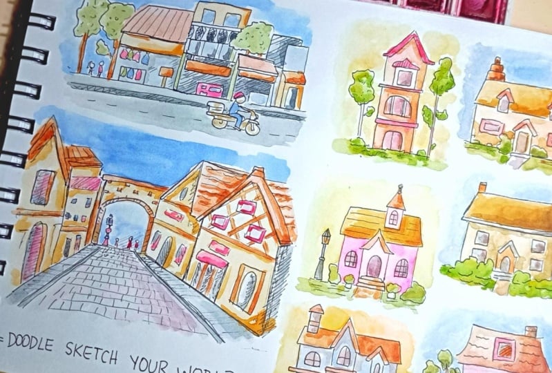
2. Section One - Background: This class is split
into three sections. This is the first section, the introduction, and those key skills
we'll be looking at, supplies, the project, and the basic ideas that we're
covering in this class.
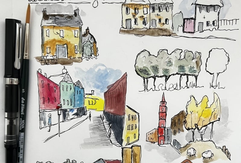
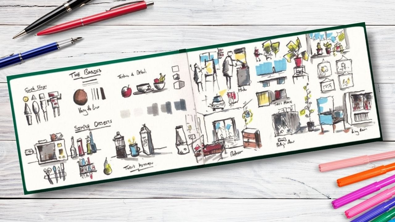
3. Supplies: The first thing we're
going to do is have a look at the supplies
we might use. Now for me, I'm using
pen and water color, but you could equally
use pencil and marker, or pencil and colored pencil. The idea is just to have
something to make lines with and something to add
those little touches of color which bring
those lines to life. Here is everything you might possibly need for
this lesson and more. So the first thing that
you'll need is some pen. I'll be using front and pens. And in my fronting pens
I have waterproof ink. That's important because with my fountain pens I'm
adding watercolors. You can see the exact ink
and all the water colors I'm using listed in the class
project and resources. Well, I'll also tell you other
supplies that I'm using. If you don't have a fountain
pen, waterproof ink, you could use a ballpoint pen, a fine liner, or I've got
other things like this, a food and sockeye pen. You could also even use pencil. There's nothing wrong
with using pencils and things like that when
it comes to color. I've mentioned I'm
using watercolors, but you could use pencil,
watercolor pencil. I've got examples in my little sketch book of things I've done
using marker pens. So you can do these same ideas, create really fun
doodles of all sorts of different things just by using a small number of
marker pens instead. That brings us to the paper
you might want to use. Here. I'm using
watercolor paper. If you're not using watercolors, and of course you could
use different paper. I happen to be doing this today on a couple of sheets of four. It's slightly
larger than four or slightly larger than
letter sized paper. But again, a sketch book
would be a great idea. I've shown you this
sketch book already where I've got lots of these
kind of doodles in. And I've got another
one that I've been doing recently where I'm doing all scratchy
little doodles, some continuous line doodles, some Christmas doodles,
all sorts of things. All taking the same
ideas from this class. Lose of options
for things to use don't be tied down to
exactly what I'm using. The principles of simplicity is all that we're after today.
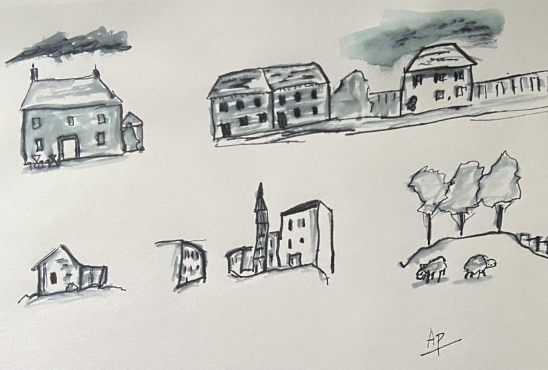
4. Pen Work Concepts: Now we're going to
consider how to create those shapes
with our pen. And we're also going
to think about what the aim is when we're
making those shapes. The aim is to find the simplest possible shape
that can explain our scene. Not all the little details, not all the weird and
wonderful shapes. Instead, the simplest
possible shape that still explains our scene. Our aim is to be able to create little dual
sketches like this. We can see a range of
scenes from a village, perhaps to more of a city, totally rural scene na barn
in perhaps a Swedish forest. There are simple ways that
we can approach these things to be able to draw this really
wide variety of scenes. It's all about keeping things simple,
keeping things easy. To do that what we need to do is stop focusing on details. I'm going to give
you an example. We have maybe got a
lovely pub in front of us that pubs got all
sort ornate brickwork. Perhaps we start by drawing Pub, but then we go in and we start trying to draw
every brick like so then we move on and we
start finding the windows. We get the windows and then
we see the window frame. Then within the windows, there are perhaps all these little panes,
and it doesn't take long. Well, firstly, this image
is actually going to take a very long time before
it builds up in complexity. But also, perhaps we lose that effortless doodle like feel instead of being able to just quickly doodle scenes around us. Because we're focusing
on all sorts of details. Because we're getting
too stuck in, it might start
going a bit wrong. Although this isn't the
wrong way to do something, it's not what we're going
to try and achieve today. Instead, we're going for
this effortless simplicity, which means that
we can do a page, a sketch book full of things, and then perhaps develop some of those scenes into more
complete sketches. Instead of focusing on
all of this complexity, instead of building it
up over a long time, what I'm going to suggesting is we take our pub
and we go, right. What is the key shape? What defines our little?
It's a rectangle. Great, We've got our rectangle, then it's a few windows and
we can just avoid making them too complicated
by just making them all nice and simple rectangles. At the bottom, it's got a door. This door does have
a big archway. Perhaps we'll pop in the door as two shapes
instead of just one. But everything is
kept nice and simple. The windows are about the same. In front, maybe we've
got lots of benches. And here we might have tried to draw every part of the bench. We might have tried to put
the bench in perspective. We might have tried to
put people on the bench. Now, there's nothing
wrong with doing that, but today we're trying
to make things easy. Instead of putting the
bench in perspective, where we have to
work everything out, we'll make it simple. The bench actually the
bench can be one of those picnic benches and you
just get the line of it, you get the little cross,
and then you get the seats. Now we've got a picnic bench, and it's a pretty
irrefutable picnic bench. It's just what a
classic picnic bench looks like from the side. We can still add our people
or we can just keep them nice and simple, incomplete shape. That's just a circle
and half an oval. All we're doing,
all we're trying to achieve is as we move
around our scene, we're trying to identify the minimal effort
that we need to put in to create an effective
little theme, not detail. This isn't as necessarily
easy sometimes as it looks. Actually, it's not a
lesser form of art. It takes an awful
amount of confidence, an awful amount of
concentration sometimes. But when you have
that confidence, when you have that
concentration, suddenly you'll find yourself able to just sketch anything. You'll be able to
distill it into its constituent parts
and then just simply sketch anything that is the principles of
what we're trying to achieve with our pen work today.
5. Colour Concepts: So hopefully you're feeling confident with your shapes now, whether you're using pen like me or pencil or
something else entirely. Now we're going to have
a look at the color. Now, I'm going to be
showing you how and why to apply color
in two layers. Now I think two
layers is important. Whatever medium you're using, pencil, watercolor
like me, markers. Having these two layers
of color really adds an extra dimension to your very simple but
lively sketches. Now, alongside simple shapes, we also want to identify the
colors that we want to add. The colors which are going
to make our seem just that, a little bit more interesting. The colors are going to
come in two simple phases. Again, I'm going to
encourage you to be really simple again, this pub, that we could have lots of
different colored bricks. It could have lots
of different colors. Maybe it's got some mold on it, maybe it's got something
growing on it. But we're going to keep
things really simple. I'm going to say, what's
the main color of our pub? Well, the main color perhaps is a okaryange golden
sandstone brick perhaps. Or perhaps it's orange because it's got sunlight
pooling off it. I'm in this case
this is Mars yellow, which is very similar
color to yellow ochre. Just applying it, you
see how thinly I'm applying it to see how it's
such a transparent wash, I don't want to apply it
as a totally flat wash. So it's not going to be a
totally boring, monotonic wash. But it needs to be nice and light that it keeps that
effortless doodly feel. It doesn't need to be perfect. It doesn't need
to be super neat. But just neat enough
to make it feel complete and purposeful can just use that same color on
this distant house as well. Then we can move up, what can we identify as the key
part of the roof? But it's a deep blue, isn't it? So I'm going to take a bit of ultramarine blue and then
mix it with a brown. In this case, I've got
some burn umber in my palette that will
just neutralize down that blue and make
it a little bit more gray and a little bit
more of a deeper feel. Then we can just use that again, just gently color it in. We can use that same color
to keep things simple. Using that same color
just to get a little bit of tone in those windows, suggest that dark reflections the same in this background, just to keep things
nice and consistent. That is step one done. Step one of our colors is a light and gentle wash.
You can see that here, you can see these light
colors coming through. That's all you
need to do then we just wait a minute or
two for this to dry. When it's dry, like it now is we can come back and we can do a
couple of different things. Firstly, if we want, we can find those more
detailed interesting bits. Perhaps we said there were
some blue bricks on the side. Maybe now we just suggest
those blue bricks by doing a darker
layer on the top. So I've got a, just a bit of my ultramarine blue
coming across. These are those blue details. Maybe we use that same blue on this arch around the
front door as well. Option one is we
can start adding in those details with a little
bit of a darker color. The other thing is to
find some shadows. We can do shadows two ways. Shadows can either be
with a shadow color or we can enhance the tone or the value of this color by
doing another layer. We'll do both as we
proceed with this class. But just to prove
that we can just by adding another layer of the same color, we
can get a shadow. That's one we're going
to do first look. If we just come down,
we add a darker, thicker layer on top of
this is my Mars yellow. Hopefully you'll agree that
we're getting the idea. Now that we've got a shadow
gradient going down our pub, we can use that underneath
here as well to get that shadow coming
under the eaves, for example, on top, we can use our same ultramarine
mix with a little bit of our burnt umber and just
create the same shadow. What we don't want to do is lose that lovely light
coming through. We just want a little
suggestion of shadow, a little bit to make
this little doodle a tiny bit more
interesting, maybe as well. In this sketch,
what we want to do is we've got that fund, little shape of a bush here. Maybe we just want
a touch of green in there to make it a
little more interesting. I'm just going to come in
and move that paint around, that light and dark
feel, there we go. That we could call
is our doodle done. What I'm going to
do, just lift away a tiny bit of this
paint to bring our people back into the scene so you can now see
them from that paint. There's always little
touches you can do. If we wanted, we could do
little shadow in front here. This is the point as
well. If you wanted that, you could go what life would be more interesting
in our scene here? If there was a
little bit of a sky, I'll just find a nice blue
and do just a really gentle, nothing more than a gentle
touch to suggest a little sky. In our doodled scene, now we have all the principles we
need to start analyzing, going through different
kinds of scenes. So we're going to spend the
next few lessons looking at a few ideas for shapes in
different classic urban scenes, classic rural scenes, Before
of course having a look at some references where we can put our theory into practice.
6. Your Project: As we go through this class, we'll be doing loads
of doodling together, trying out all sorts of
different pen ideas, different color ideas,
looking at urban scenes, rural scenes, and
everything in between. Your project really
comes in two parts and you can submit one both
either. It doesn't matter. The idea is just to
get you joining in. The first part will be to
join in with these concepts. Creating all scenes
from our imagination, breaking down our
scenes into shapes, breaking down our scenes into a couple of
layers of color. In doing this, we're
going to fill up a page with all sorts of
different miniature scenes. The second part of the project
is to take some photos. Now for you, I've got some reference photos
which you can download. And I'll be going through each
of those reference photos. Having a bit of fun creating my doodle sketch
version of that scene. You could submit those again. You could submit 12
or three of them. They only take a few minutes.
That's the beauty of this. Or I'd also love to see you
choosing your own scenes, something from your recent
life, your holiday, your house, and creating your doodle sketch world around you when you have
done your scenes. When you have done
your sketches, your doodles filled
up your page. Don't forget to
submit your project. You can do that by clicking the Classes and Resources tab and then going to
Create Project. Just uploading either
your favorite photo or several different photos to show the range of what
you've achieved today.
7. Section Two - Practice Makes Perfect: Now we're intersection two. You have a basic understanding, I hope, of what we're trying
to achieve in this class. You've probably
chosen your supplies, the things you might try and
use and experiment with. Now we're going to break down these concepts into
a number of steps. Looking at simple shapes, bold lines, different ways of creating texture
and adding color.
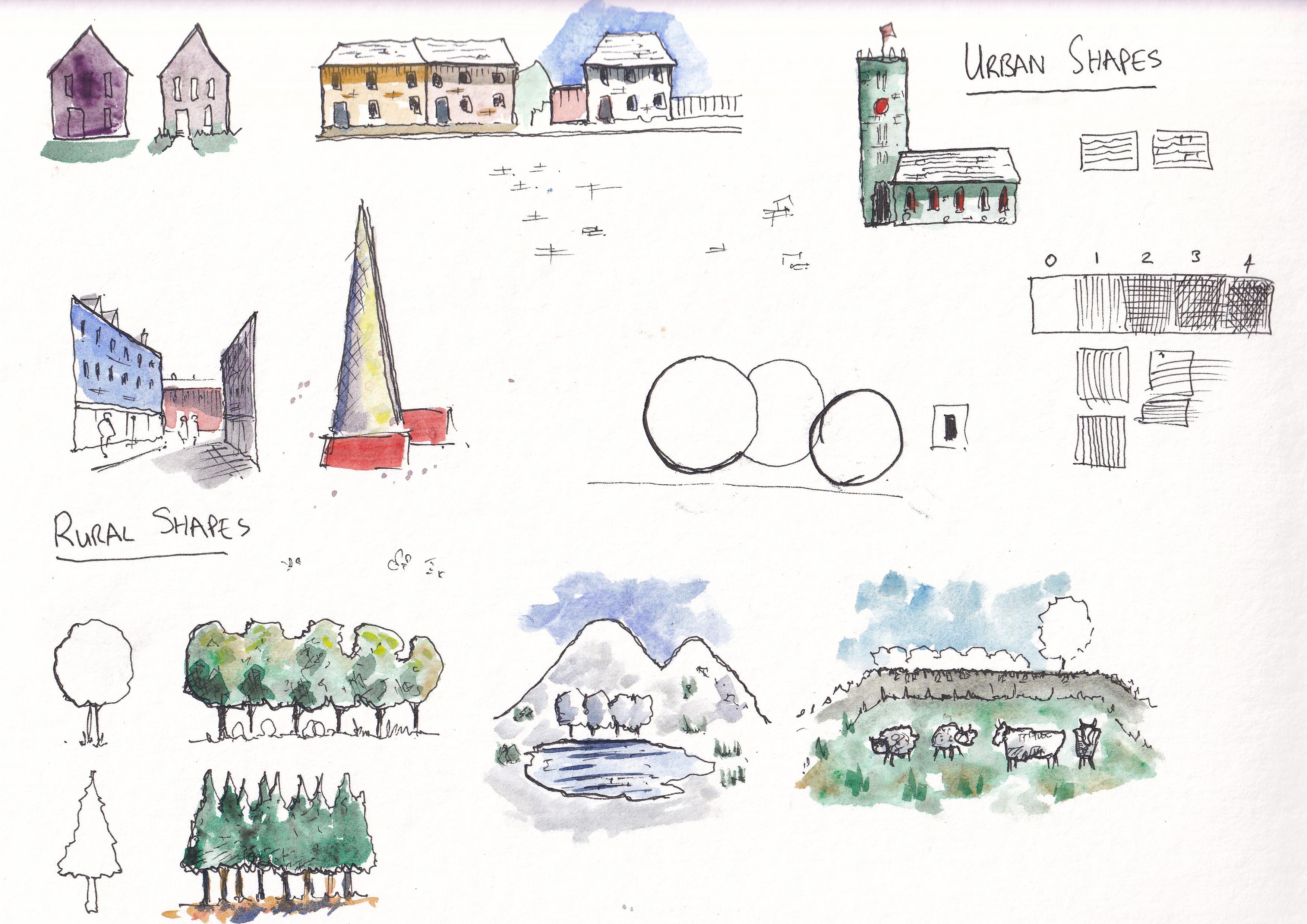
8. Urban Shapes: It's time to break down our
scenes and the first thing we're going to look
at is urban shapes. And we're going to
focus on a couple of things which are
common pitfalls. Things which simplify too much and just don't
make it feel real. And then we're going to look at the great things you can do, A few ideas from me
about urban shapes. So we're going to
start with looking at just some urban shapes. This is the definite
starting point for our exploration of doodling
our scene, doodling our life. Urban shapes are easy in a sense because as children
we know how to do them. I imagine all of us at some point have drawn
a house like this. It's a triangle and a square. Actually, that's
the brilliant thing about children's art. They can see the simplicity, they can see the key features. They'll draw a circle with
some arms and the legs, and that's a person.
And we lose that. As adults, we lose the ability
just to see something for its simplicity and make it recognizable without
dressing ourselves out. The key is then to keep
everything simple, even if this house has
four different windows. To make it a nice simple doodle, why don't we just make
them all the same? We're just trying to
represent a scene here, we're just doodling
a house underneath. One key thing to bear
in mind is as soon as I draw a flat line at
the bottom of my shape, it loses that sense of realism. It loses that sense that this house is actually
standing on something. Instead, what I would suggest we do is we do our same house. And if we just
repeat our shapes, get our nice bottom
of the house, then we give our
ground some texture. What's in front of this house, perhaps in front of this house, is a little lawn
with a little path. So there's our path,
there's the lawn. Now, this house doesn't feel like a child's
doodle anymore. It feels like a lovely, simple bit of art. Now, I know what you're saying. Yes, it's very simple. And it is, and that's
what's brilliant about it. But we can build that up. It looks very simple because
it's just one of it. What happens if we
do similar things, but we have several,
We link them up. So let's draw a longer
rectangular house. Keep this idea of
windows the same. Remember at the moment we're
focusing just on the shapes, not the textures,
shadows, nothing else. We're just focusing
on shapes again. Maybe this time we put
a pavement in front. We'll do, we'll do a
little pavement line, and then we just do a
slightly wobbly line to suggest that slightly
decrepit tarmac, which often comes in
front of buildings, it's never quite
perfectly neat, is it? Which is why this
doesn't quite work. Then we continue it, perhaps add another house, the same. There we go. Then we change something up. Perhaps now there's a gap
and we've got a little tree. Perhaps the next house along has a garage that's
more of a square, which then comes to a
different shape of house. Again, keeping things all
very simple and we'll have this idea that this whole
scene just makes sense. Maybe this house
now has a fence. What we're doing, we are
identifying the key shapes. Rectangle. We're just a couple of lines coming down
because it's split, isn't it, into those
simple things. There we go. Suddenly by identifying really
simple shapes, we've built up quite
a fun little street. These simple ideas can
then be expanded for those more complicated
structures. Perhaps let's take something taller. So let's take a church. Well, instead of focusing and worrying about all the
crenelations at the top, a church might just
be a big tower, and then underneath
it's got this shape which overlaps into it, and that's the church hall. We come down, there we go, And I've made the mistake of making my line a bit
straight, but that's okay. We can actually come and add little suggestions
of plants in there, and that undoes that
excessive strictness. Then just add in our
door, for example. Now we have slightly
different shapes. Probably going up here,
maybe there's a circle for a clock halfway up. Tiny little windows, now we have big archy windows in
the church wall itself. There we go, another
simple scene done. We can even pop a little flag
on top of the little flag, we can the tiny shapes. Now for a little crenelation, we are building up the detail
despite keeping it simple. Another one which is a
little more challenging than this would be
to take a street, which is in perspective
that can get confusing. Because we've got shapes
which are no longer square, they're no longer
just facing us. But if we just look at what a sheet is going
on with the shape, what we'll find is it's just a rectangle with
the wonky edges. We'll be able to identify that. We can draw our street. Suddenly we've got
a whole street. Then we were the flat line. Normally the flat line is
just at the top of doors. That's what we call
the horizon line. The horizon line will also be, if this is a flat scene, the horizon line will be about where
everyone's heads are. So if we wanted to
start adding in people, that's where we would
add our people. It doesn't matter
where they are, that's where our
people would come in. Then we again, just to
identify those simple shapes going back those simple little windows going
into the distance, we've got this street
in perspective, we can add details to
create more shapes. In the front of, presumably
these are shops. The way we've drawn a
shop front if we want it, there could be a roof up here, there could be little
chimney shapes, there could be
little triangles to get these roofs which stack up. All the while, we're just identifying within our
urban scene clear shapes, even the pavement we can
think of as a shape, just a rectangle going back. We might have another
side to our street. It might be in the
same perspective or it might be an even sharper
or less sharp perspective. Let's make this one
a little sharper. Our rectangle will just be
walked a little bit more, but we'll still have this
flat line going across, that's where the
shop fronts are, that's where people's heads are. Then instead of having the
shapes here spaced out, they'll just be quite together. Because we're looking at
more of an angle along this. We don't need to worry about drawing in the structural lines. We don't need to worry about
where's our vanishing point. We can just go right. How do we make this simple? How do we find the shape? If we had something in the
back which was facing us, then that would go
back to just being a really simple shape again, maybe with a chimney on top, maybe with these little windows. Now we've doodled the
delightful little scam. We could add in all sorts. We could add in the shard
in London. What's that? A big triangle, isn't it? Hence, it's called
the shard underneath. You can't really see much
because it's normally got loads of other
buildings in front of it. So we can find those other
shapes, put them in. Then on the shard, we
don't really see windows, we can just add a
little bit of texture, which is something we're
coming to very soon. Just by finding key shapes, we can go from really simple, less simple because
there's more of them. Less simple because the
shapes are different. And finding perspective which normally scares us
but doesn't need to.
9. Rural Shapes: Now that we've done
our urban shapes, of course, let's have a
look at rural shapes. We're going to be looking
at things like trees, mountains, and
farm yard animals. And just a few ideas again about how I might approach
these kind of scenes. With that we can move
to rural shapes. Rural shapes being
easier, sometimes harder. It just depends on
really yourself and how easy you find it to
see shapes more abstract way. A great place to start with rural shapes is of
course, things like trees. When we see a tree often, or we think we see
1 million leaves, but really the tree has a shape. The tree shape could
be just a circle, simple circle with a simple
little twig at the bottom. Now look, we've got
our doodled tree. Can just remember, add a
little bit of texture to the bottom so that we don't get this flat childlike doodle. We get adult like
doodle something, which is a little
bit more cultured. If we have a bunch of trees, we might be tempted to
start separating them out. But what can we often see? How do we make this
simple thing more complicated without
it being challenging? Well, what we
actually often see is just a silhouette of all
these trees together. And there may be ups and downs. There may be little bits
where they go round about. But really we're just
seeing all these shapes. What you're trying
to do, instead of identify lows and
lows and lows of shapes, identifying the big shape. This big shape is an oval or a rectangle
with some wobbles. As simple as that, it
might sound silly, but once you start
deciding you're going to identify the world with
these simple shapes, suddenly it becomes much easier, much more identifiable
look just like that. Pop those little twigs
underneath little twigs and we can bring
in a little field. Perhaps hedges might
be underneath, there might be little
plants, big grass. And we've got something just
a bit more interesting. There's lots of shapes
of trees, aren't there? The world is your oyster. You can think of these
evergreen Lelande type trees, pine trees, they're
just big triangles. Again, if they're all
stacked together, you're just going to get
this effect where you've got a rectangle with those of triangles
poking out the top. That's what you might see
in a really dense forest. You don't need any
more than that. I don't think at least you
need any more than that to create quite an effective
doodle of a forest. You can of course,
move on and start breaking the trees apart
a little bit if you want, but the key is going
to be stressing over doing things Then what other
rural shapes do we have? Well, obvious things
to think about are things like
hills and mountains. We do those, we just
find the big outline. And there'll often be a triangle just with a slightly soft edge. Then they'll often be a couple of triangles stacked together. Again, we don't need to
split those triangles apart. We find the overall shape
of what's going on. Perhaps there's a
lake in front again. What's that shape? The lakes going to have a very
naturalistic shape, isn't it? But I'm sure that you'll
be able to identify that. Maybe it's basically a circle in perspective and suddenly
you can get that lake in. Maybe the lake has some
trees around it and now you know how to get your
trees around it as well. Suddenly got the ability to start putting together
these rural scenes. And you'll see what
we're doing is we are flattening it. We're
making it a doodle. We're not trying to suggest a huge amount of
depth to a scene that can come later with colors and hatching things we're
going cover later, but it doesn't have to. We can just create these
really simple sketches which just give us a
mindful break into, well out of reality. Now, many rural scenes
won't be complete without perhaps a field full
of cattle or sheep. There's a couple more
things that we can think about when we think
about a field often, Maybe we don't
recognize that actually fields are just
other shapes here. Our field might have,
for example, a wall. The wall will just be, I'm
going to draw dry stone wall. The thing we find in particularly the
North of England and well across the UK, really. What is a wall? It's just
a rectangle, isn't it? But underneath we are just remembering that we're
not drawing a flat line, we're drawing the
texture of what's in front of the field, the grass. That is all we need to
do to doodle our wall. Then the field is going to form like basically a
rectangle, isn't it? So we can bring that
texture around and if we want bring the wall round. The wall again is going to
have a bit of perspective. It's going to grow towards us. We just identifying
that by saying what is the actual shape that
we're trying to create? The shape is
probably going to be a rectangle coming towards us. We don't have to finish
off the shape they do, We can just do little
bit. This is a doodle. We're just trying
to get the idea of this field opening
out in front of us. There might be hedges. So we can just draw our
hedge ideas again as well. These shapes which are overlapping and coming together
perhaps in the distance, or even a single tree just billowing in
the wind back there. And then we can start adding our lovely little
cattle or our sheep. Again, we just need to
simplify. What's a sheep? It's a cloud, isn't it? Got a big cloud. We're the head. If you want, you can add
little horns just to show. It's an animal that gives an idea of it being a
sheep. Little stubby legs. And there you go,
that's your sheep. You can move those
shapes around. Now our little sheep
can be facing that way. You've got one facing
towards us, one facing away. Let's say a cow, that's
another good example. A cow in profile, We'll get the cow
facing that way this time to the cows out there. It's a rectangle, isn't it? It's just a big rectangle. Its heads also got a
fairly classic shape, which is basically
another rectangle. Again, we can give
it to the horns give touch in an eye if we want they got quite
funny, stubby legs. If we wanted to point
the cow towards us, we got that same rectangle. Now we can make
more of the horns, and then we got that same
rectangle coming towards us. We've got two cows, we've got two sheep. And you can imagine doing
the same with horses, with dogs, with all sorts. So there we go, really simple ways of portraying
common things, which you might find
in rural scenes. And we're going to do way
more of those when we come to thinking about our
reference sketching.
10. Bold and Fine: Having done the basic shapes, I want to delve more into
more advanced techniques. They're still simple, but it just adds that life
and that shape. In this case, we're
going to be looking at bold lines and how that can add an extra element
to your sketches. Now the next thing
to move onto is the idea of using bold
lines and fine lines. These might all look a bit
boring, and that's okay. That is because they
are all quite uniform. If we start to actually take these slightly boring things and define a little bit of the
shadow with bold lines, we might find they're
far more interesting. Just to give a simple example, if we come here and
we draw a circle, we just looks like a circle. But if we draw a bold
edge coming round, we're already starting to get the idea that this circle
has a bit more shape to it. It's suggesting a shadow. If we then had a circle in the distance and we
made it even finer, we can tell it's
in the distance. But if we had one in front
and we make it nice and bold, we can tell that this one, because it's bold, is in front. By having varied lines. We're telling a few things. We're telling you where is it? We're telling you
how heavy it is. Perhaps this one looks
heavier because it's bolder. We're also telling you
something about the shape. We can stop playing with
these ideas Now if we start, perhaps what we want to
do is just show that there's light coming straight
down on top of these, we do just a nice bold
line and all I'm doing, pressing a little harder
under each of the roofs. Brilliant, nice and easy. Perhaps you want to divide
the houses up as well, we just make these lines
a little bit bolder, they become a bit
more important. What we don't want to do
is make them overly rigid, so we don't want to press too hard and make it
really straight. We want to keep that idea from the fine line and just
elevate it a little bit. We can then move on
from bold lines to bold areas of contrast
blocking in areas. Suddenly you get something
interesting just by having a bit of extra contrast that works really
well in Windows. If we just block
in these Windows, suddenly our little
doodle is just taking on a little
bit more atmosphere. Now we're working on contrast, Boldness of line contrast
to having black and white. That should hopefully start elevating certain
aspects of our scene. We can bring this
garage in front of that tree just by making
the line nice and bold. We can make these houses
more interesting just by having tiny touches of
contrast throughout them. We can make this
less important by leaving it fine, the same here. But we can make our
church town more important by making it bold. But we can also bring this roof forward
by making it bold, suggesting a bit of shadow. We can make this set of windows in the door more domineering
and more contrasting, more interesting, three
simple touches of darkness. We can continue these ideas through the rest of our scene. Don't need to overthink it. Just playing with
really simple ideas, see what works,
see what doesn't. It is important
not to overdo it. Of course, once we overdo bold lines, we can't
take them away. To do sensible
little touches and then move away and have a
look again in our trees. What you might want
to do is just to find an area of
light and dark by having some bold lines perhaps at the bottom where
there's lots of shadow. And also around here, we've got the light
suddenly coming from one side showering down just by virtue of having some bold
lines on one side. The same will work
over here, of course. Little bit bald
line, there we go, blotting in again can work in our trees just by
having dark stems. I don't know why I keep
calling them stems or twigs. Obviously what I mean
is trunks of the trees, a nice dark line here. Hopefully you are. Again,
what we're doing is simply moving around and
increasing the interest. Increasing the intelligence
to our very simple doodle. A bald line here might
suggest a bit of a shadow. The bald line then at the front might suggest that
it's closer to us. The same variation can
have multiple meanings, if we're careful about it here. We might want bold
lines just to suggest a shadow which is going to be
at the bottom of our wall. Again, we might actually
want really bold lines for our sheep and cow because our sheep
and our cow are what I'm making our field
shape interesting. I do notice now of course, our cow is not in
proportion with our sheep, but I think that's okay. For the purposes of a
hot little doodle here, what I would ideally
have done is probably make my cow
significantly bigger, and that's something to
recognize for a future doodle, but not to get fixated on today. There we go. We've gone around, we've added bold lines and contrast in
quite a few places. Now what we can do is
think about texture.
11. Texture With Hatching: Having created that shape
through bold lines. We can also look at textures, the first of which
is simple hatching, which can imply just not texture but also
it can add shadow. Everything has an enormous
amount of texture. Texture is very easy to overdo, especially if we
are simply doodling and there are lots of different
ways to create texture. The first thing
that we're going to work on is simple hatching. Simple hatching is actually
well worth practicing. What we can do, we can come
to one side and create a little rectangle here
just to divide it up. So perhaps we have five different squares
within that rectangle, One of them is
going to be white. And then we just practice
our hatching coming down. What we want to achieve
is a nice and linear, nice and simple bit of hatching,
which isn't too messy. Challenges that we might find are that if we're not
drawing with a whole arm, if we just draw
with our fingers, I repeat this and I
just draw my fingers. Do you notice how all my lines curve and they're very
difficult to control. If I come here and I really
focus on it and I draw with my whole arm I'm doing is I'm actually
moving at the shoulder. We end up with much more
controllable straight hatching. It's well worth just practicing this then when
you've practiced it, you'll find you can quickly build up relatively
neat straight hatching. This hatching, the idea is to imply texture but
also imply shadow. Having practiced it
in that direction, we then got a value
scale, this is zero. So the value is zero because
it's line, this is one. We're leaving that alone.
Then in two onwards, we're going to try our
horizontal hatching. Horizontal hatching, here,
here, and here again. Make sure you're not curving
by using only the fingers. Using your whole arm moving at the shoulder will
give you a much more straight rather than this curved.
Difficult to control. Hatching number three, we
do some diagonal hatching. Number four, we do some
diagonal hatching. Then number four, we
do diagonal hatching. The other way, what
you'll find for me, I always do this one last
because it's the most awkward. It's really difficult
to move your arm. There's going to be a way which is more challenging for you, which just doesn't work
with how you like to move. That's okay. Look here we've
got texture and shadow. We can now start identifying in our scenes where we want to, a little bit of
extra texture and shadow and how dark
we want it to be. On this street
perhaps, for example, we have light coming
from one side, that means we're
going to have shadow. We can now use that
simple hatching and it just instantly makes
the seam feel free D. We can then come down and create some of that
same hatching to cast the shadow onto the road if we wanted to make
it twice as dark at the top we remember we just
cross over our hatching maybe in the background because it's strictly in darkness. We just have some really
gentle hatching as well. We could do the
same in the shard. The shard perhaps has some
light coming from this side. Now we can just do
a little bit of hatching and remember
to move the whole arm, maybe we just cross that over. Now we've got texture, which might even start to suggest all those
windows on the shard, but we've also got
shadow and light, because we only have light if
the whole page isn't white. We only have light if it's got something to
contrast against. We can do really simple touches back here as well if we want. Just tiny, tiny bits of
hatching can often be enough to lift your
scene, so we can do that. We're going to move on
to the next lesson now, where we will look at other
ways to imply texture that we can apply to other doodles and some of
these doodles up here as well.
12. Advancing on Textures: Beyond our simple hatching
from the previous lesson, we can do more
advanced techniques. Again, I say advanced, but we're still keeping things
really simple, enjoyable. Which is what
sketching should be. But let's have a look at
a few other things we can do to mix and match with
our simple hatching. Here we've looked at a bit of shadow using simple
texture, simple hatching. Now what we're going
to do is move on and start finding other
ways to show texture. This hatching can imply texture like it could
imply here, windows. Equally, we can use something
a bit like hatching to imply texture and
shadow on roofs. Here we could do simple
horizontal marks. This time we make them
a little more wobbly. On purpose, what
we're doing is we are hatching but also
suggesting tiles. What we could do to double that down if we've got
this at the moment, we've just got little
wobbly wavy lines. What we could do in a
extra tiny little bit of doodle detail is we could start joining
up a couple of them. We just join up little lines. We need to be really gentle, but now we're
suggesting look tiles. It's not just horizontal lines, it's also little tiles.
We can do the same here. It doesn't have to be complete. It can be these little touches, little waves coming in with
a few little suggestions of tiles really simple and so
much more interesting already. With those tiny extra
bits of mark making, perhaps something we want
to do is add bricks. We can do the same, but instead of focusing on
lots and lots of marks, we just do these tiny
things we're doing, basically lit a couple
of bricks crossing over. There's lots of ways
you could do it. You could focus on
drawing the bricks out, but for me, I prefer doing
it like a simple cross. Then you find the brick and
you find another brick. Then we just do a
couple of those. Just simple marks, very
simple little doodle, scratches, tiny little marks. And look, all these houses are
made of bricks. Same here. If we wanted, we just got to remember what's the
flow of our shape. The perspective is
flying down here. Suddenly these shapes
that we're doing, these little bricks,
have to flow down here. Perhaps the bricks
are a bit different. They're a bit bigger. The classic old
school giant bricks that you find in churches. Then we just do them a
little bit bigger this time. Instead of doing
little tiny scratches, we're drawing big squares and having them next
to little rectangles. Very simple. Just need to be
delicate and not overdo it. There we go. We've built up
some ideas of urban textures. What about rural? Well, they're very similar,
aren't they? In the idea of not overdoing it and just
creating little shapes? Do our little tree shapes. So here we're doing just
little leaves, little leaves. Just to create a
tiny bit of texture. Don't want to overdo it, we just want to represent
what might be there. You can combine this
with hatching if you want. You can double down. And now we've got
not just texture, but also a real sense
of light and dark. And it's a doodle, so it's taken next to no time. Do the same here. This time we've got a pine
tree, haven't we? We got more like pokey shapes
instead of little circles. We got little scratches,
pine needles there. We just build up tiny scratches. Again, if you want, we
could do some hatching. Little bits of hatching
would just build up a little bit more shadow
going on in the water. Simple little lines
showing those waves. As they get further back, they get closer together and more faint as they come forward, they get a little bit older, a little bit more interesting. We could start getting the textures of the grass,
which might be around here. Textures of bushes,
textures of rocks. It's all about tiny suggestions. Tiny suggestions,
not overdoing it. Even our sheep little swirls, there's our little
clouds and our cows, perhaps just little
bits of hatching underneath to show that
they're big, aren't they? They're going to have a
lot of shadow underneath. Even the sheep we could hatch. Love. These dry stone walls are great places to practice
our textures as well. Just like that,
we've moved around our whole page of practice. Our whole page of practice is now leveled up
from those simple, slightly boring sketches into actually little doodles
which have come to life, which have real shape that
without adding color.
13. Colours - Layer One: Next we add some color. Of course, the color we've already looked at
comes in two layers. But here we're going to apply
lots of different colors. We're going to
talk more in depth about the kinds of colors you might use and how to apply
them in that first layer. Now we have the fun of
playing with some colors. I'm going to show you
first what not to do. There are many things not to do, but one key thing is not
to thicken your colors. If I take, let's say, this purple, I apply it in a
really thick layer of paint. If the paint is almost
like toothpaste, what's going to happen is we're going to just muddy
everything up. We're not going to be able
to come back and keep that lovely translucency
of water color. We're just going to have
a mud difficult image and all that lovely simple
line work is already covered. The key, key thing is to
keep your color really, especially in this first layer. Then just gently apply it. If we just gently apply
it with lots of water, we can even clean our
brush off and just move some of that pigment
around to keep it really light. What we end up with
is much neater, easier to apply colors which the glow almost.
They're transparent. They let the lines and the space and the
white come through. Another thing is to not worry
too much of your colors. Mix and blend. One thing we
can fall into the trap of doing is leaving a little
white line between everything, just so that we don't
join our colors together. But what I prefer doing is, especially this first wash, just plying them
lightly and loosely. If it's really important
the colors don't merge, we just wait for them to dry. But otherwise, if I just pop a little bit
of green into my house, actually quite a nice soft watercolor effect,
it's not a problem. And it can be something
really magical, something really beautiful,
bear these things in mind. These are my two tips
that we'll concentrate on as we just fill up a few of these little
doodles with some color. Now we can move onto
our urban colors. This is where we're
thinking about how do we get brick like colors? How do we get the
accurate feel of walls? One thing I'm going
to suggest is that it doesn't matter too much if
it's super accurate or not. I don't tend to do a lot
of mixing of my colors. I tend to do a little bit, but really I focus on
getting a nice match which suits my
mood, which I like. For example, we could just use something simple
like an okary color. This is a Mars yellow, very similar to yellow ochre. We can just pop that
on nice and gently. That is for me, quite a
nice simple prick color. Equally, we can
use other colors, like I've got Indian red here, which is a lovely
brick tone as well. And plying that nice and gently, we'll just give us the feel of bricks or the feel of the
underlying glow of bricks. If a wall is white,
maybe this one's white, that's great, we
can leave it white. And actually the
way we then paint the wall without painting the
wall is we paint around it. We now have this wall
as a negative space. But we can tell it's supposed
to be white because around it we have this lovely
blue sky jumping up. When we're focusing on
simple colors like balls, don't over focus on over mixing
or matching exact colors. Just a nice simple was a light wash is all
we need at the start. Now we can take that
to the extreme. Things do not even have to
be even vaguely plausible. We could have a green church, and if we keep the
colors nice and light, then the church will still work. It will be not realistic because I've never
seen a green church. Maybe there is one out
there, we've never seen one. But it doesn't matter because what we've
got is a light wash. It's a doodle that's almost
a cartoon simply down here. We can start playing with
different types of colors. Let's take something,
we've used the sky before. A little bit of
ultramarine blue. We can have that be our main color of this
side of the street. We can then just go,
even if this is supposed to be the same color,
maybe we change it. Maybe we take our purple this
time and didn't get any, just take our purple and we change the other side
of the street to be something a bit different
just to enhance our image. Rather than focusing on exactly
what's really going on. We can also keep things simple. Notice how there's
white gaps for me, that's okay for me. In fact, leaving white
is a really bold, brave decision to make. Which can actually make your little doodle so much more interesting rather
than trying to fill in. Every bit of information could pop a little red
building in the back. And notice how little time all these little touches take when things are
starting to dry. We can focus on slightly
smaller areas of paint. So perhaps we want some blue to reflect into
some of these windows. We can just touch that in there. Maybe over here, we just want to deepen a little bit of the blue before it dries completely. So we can touch that in there. Now, last in our urban scenes, we've got the shard coming here. This is where let's imply some light can be done two ways. It can be by leaving
things white, or we can imply light by
having the sun shining on. So I've got here a light
with lemon yellow. If I pop that on one side, then on the other side
I use a darker color. This is a bit of a funny color. It's called Sodalight genuine, but it's a neutralish
purple color. Now what we've got is an
implied shadow against implied light through that
lovely, shining yellow. Again, they're going
to blend and merge as things for our urban scenes. That is basically it. That is our first layer. Done. I'm going to jump
straight on though. Let's have a look
at our rural ideas. Again, we need to keep
things light and loose, but sometimes it
can also be nice to vary things around here. What I'm going to do
is a really light wash of initially a deep green. This is jade genuine for
those who are interested. Then I can pop a
different green. So I've got a cobalt green here. I can just use that
and mix on the page, and things will soften
and move around. If I want to imply
even more light, I could use, say, this Mars
yellow or a bit of ochre. Let that mix and
blend on the page. Now, we haven't
just got one color, we've actually got three colors. Blending, moving around,
mixing similar to this. We can leave even
more bold pigment perhaps in our fir
trees down here. Get that real sense of shadow. What I'm trying to
do is work nice and quickly because this is
looking a bit bold, isn't it? A bit like this, which I said was probably not
the way to do it. But if we put bold down and then we come in with a bit of water, we can end up with a
really varied wash of one color instead of all
these lovely flat washes. Hopefully what we can achieve
is a nice varied was, leaving a little bit of
white coming through. If it's gone too far, bits are a little bit too bold. We just dry off our brush
a little bit of water. You can hear my brush
stinging against my water. There, you can lift things out. Do you see how just by working these things around in a
really gentle fashion, we end up with this varied, interesting wash. Let's
try another scene here. Sometimes you might not want
to paint the scene at all. Here, I'm going to
do some lavender. And this is just a lovely, soft lavender blue in the sky. Instead of painting the scene, we can just reflect that
sky down into the water. And perhaps because it's water, it's got a little bit of a
deeper shadow in places. We'll do some of
this mixing here, a little bit of ultramarine
in with our lavender. Now we've got our simple
doodle just enhanced a little bit by not
painting it at all. We've not painted any of
the features we could. We talked about adding details. We could add touches just
to imply here we've got these little bushes
and things we drew and we could just
add touches of green. We don't have to here. We could do something similar. Our sheep are basically white. Remember up here, we left
the house white here. Maybe what we want to do
is paint around them. Paint around them just to
get them popping forward. If we have our nice
green field, initially, I'm using the jade genuine, a deep green, little
touches around them. Then we can come in with
our other green again. We can touch that
in here and there, little touches of cobalt green. We can even say this is
a bit more autumnal. We can start touching some of those other colors
like we use here. A little bit of
Mars yellow here. Then in the background, perhaps we want to bring
out a little bit more of that deep shadow
in the brickwork. We can mix up a
bit of a blue and a brown that ends up with
something quite neutral. We can just add that
into the distance. And then again, soften
it, wash it around. Now we have our sheeps
and our camels. Not quite the right
scale standing up. Again, I know maybe what you're thinking
at the moment is you look around and you
think that's nice. But it's not fully there, is it? And you're quite
right. Remember at the beginning we said we can
do things in two layers. In the next video,
we're going to be adding another layer and seeing why that's
important and how much a simple extra layer of color can add to
our little doodles.
14. Colours - Layer Two: Finally, we come to the
second layer of color. Again, we've covered
this earlier on in a really quick format. Now we're just going
to have a look at lots of different ideas. For example, different ways
to apply simple shadows. Everything here is
now nice and dry. That means that we
can come in with another layer on top
and things won't move. That'll be quite fixed because watercolors
are waterproof. They have tried. All we're going to do is start by saying, what simple things
are we trying to apply with our second layer? Now one of the first
things will be shadow. We can shadow by
applying a second layer, we talked about that
at the beginning. We can also show by
applying a shadow color. I've got this neutral mix here. If I do that neutral
mix in this house, notice how both these houses
now have a simple shadow. Just through means
different methods. We also talked about details. Well, now might
be a nice time to add details that could
be through contrast. By adding a bit of shadow, we can do a bit of shadow on
our white wall here as well, that will still leave
it feeling white. We might also add details through some really
bold touches. Perhaps we take some
of our mass yellow. This time we do make
it really thick, but we apply it really gently just to these little
details on our wall. That way we're just
highlighting a feature of our scene rather than risking
too much overdoing it. Same here, just little
touches of extra color. Similarly, we might
start finding like, do we want to add something
else to complete our scene? Something else
might, for example, be a little bit of
tone into a pavement or adding a little bit of green
into the background tree. But keeping it, this is for
this tree, a soft layer. We're thinking about
how to enhance these contrasts by gentle
colors in the background. With that, we can
move on. So let's go back to our abstract church, for example. We've
got our nice green. What we can do is we
can do the same thing. Again, I'll get my strong bit of green this time we just
find some simple shadows. Maybe there's a shadow that we're running
down the side here. Now notice what I've
done is it's a bit of a hard edged shadow, isn't it? That means you can
draw a line down. It's similar to here, but
it doesn't make sense. Sometimes we'll make that
mistake and it's fine. We come back tiny bit
of water in our brush, just take off the
excess. And look. If I run my brush
down that line, we end up with this soft shadow, which makes a lot more sense. Then we can bring the shadow
to the edge of that roof. Now, all the light is
casting its way along. But there isn't a hard shadow. This is a hard shadow.
That makes sense. Because the roof is casting
it. This wouldn't make sense. There's nothing casting
a shadow onto there. This church could be
a really lovely one, just to add a pop of punchy
color. Ty couldn't it? Because look, we've
got this flag, maybe we want even
another brighter red. So I'm going to take a car
mine and just go what? Our abstract church has a little car mine
in its clock there. Maybe the windows have a
little carmine frame to them. These are the little
touches we can do by coming in with
a second layer. If we tried to do this
in the first layer, these bold touches
would just seep out. They would leak and blend, which is very nice like here. But they wouldn't form hard
details. What else can we do? Well, in this scene, what we might want
to focus on almost completely is
getting that shadow. So if I just get a
nice shadow color and I can use my stite genuine, you can mix more of the neutral mix we were
playing with earlier. You can use colors like
moonglow or pains gray. I can just bring down, I'm actually going to make
it a little bit darker with a little bit of
ultramarine blue as well. What we can do is we can come down and just apply
that simple shadow. Remember we did that hatching, And we can apply that
simple shadow overall. That hatching, we can apply
to some of these roofs. Now our simple scene
has so much more shape, we might want to do something
similar in our spire this time just enhancing this shadow
work we've already done. Maybe even just adding really simple tiny
highlights of bright yellow. If we do that,
hopefully what we're going to get suggestions of reflections of
something behind us. We also have these
little scratchy roofs that we inked in earlier. Maybe here's another time to have some fun
with bold color, which will, what am I
calling it, The shard. It will really make it stand out amongst these other things, amongst these other colors. Maybe we've got a little room for some little
splashes as well. These are really effective parts of any watercolor painting. There's no reason you can't use them on
little doodles as well. Let's move on. Let's
move into our natural, and it's very much
the same idea. We take our same color, this time we are applying
a layer of darkness, layer of extra shadow. We could take some
bright yellows and we can add them in as
thick highlights, suggesting maybe even more of an autumnal leaf somewhere
floating in around there. Sometimes I would say
this is enough already. But what we could do instead
to play with this image, is we could come in and we
could find perhaps some of the woody colors in
the grass underneath. Maybe this is a proper
autumnal field underneath. Is that working? I'm not sure. Is it perfect? Certainly not. We can just come and play
with something else. Just add a little extra touch
or something warm in there, maybe in places you just
want to deepen it again, a little bit of ultramarine
mixed in with a brown will always
make it much darker. And there you go, now we have
a more interesting shadow underneath all our fir trees. Sometimes you might not
want to touch much, but simple touches onto these lines might be
all you need to do. Or you might decide
what actually in this layer we are going to
do something interesting. We could just take our blues and start adding
bits of texture, little touches of
watercolor texture, where before we left black, I notice we don't have to
stick with realistic colors. I'm using blue on my trees, I'm using blue on my mountains. And creating a bit
of interest there just through these
slightly abstract colors, which are focusing
more on the value, more in the shadow than
anything else with our sheep. What else could we do?
Well, similar ideas. Again, it's a bit repetitive
because it's just simple. There's just really simple
ideas which work really well, just create little highlights with some slightly
thicker paint. Then our cows and our sheep
can have a little shadow. If we get that shadow which
we already hatched in, suddenly they're a little
bit more realistic. A little bit more free D,
May we haven't done skies, Maybe here we can use a little bit of cerulean
blue. First time. Use this color in these scenes. Look, we can just produce a fun little bright sky in front of our little farm
yard scene. There you go. Page full of interesting
simple, easy doodles. This is a warm up. I think you need to start
applying these ideas to scenes. That's what we're going to do in the next part of this class. We're going to pick some scenes. I've got a few ideas.
We'll see how we take a complex image and distill it into a five or ten minute
doodle sketch instead.
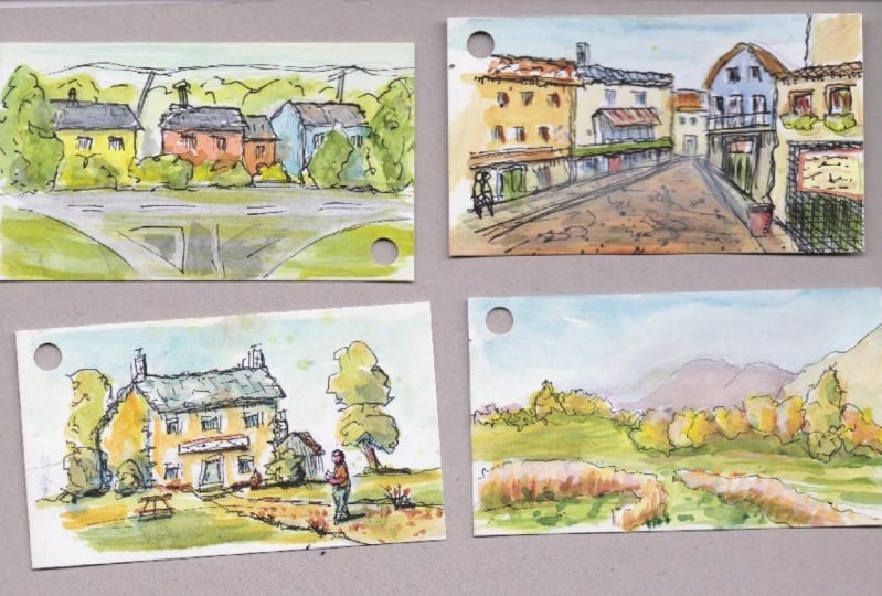
15. Section Three - Making Art: Now that we've gone
through all of the theory, we've put it all into practice. It's time to take that practice and apply it
to some reference photos. I'm going to show you three different scenes,
one after another, where I take
reference photos from a recent holla mine and create
a little doodle sketches.
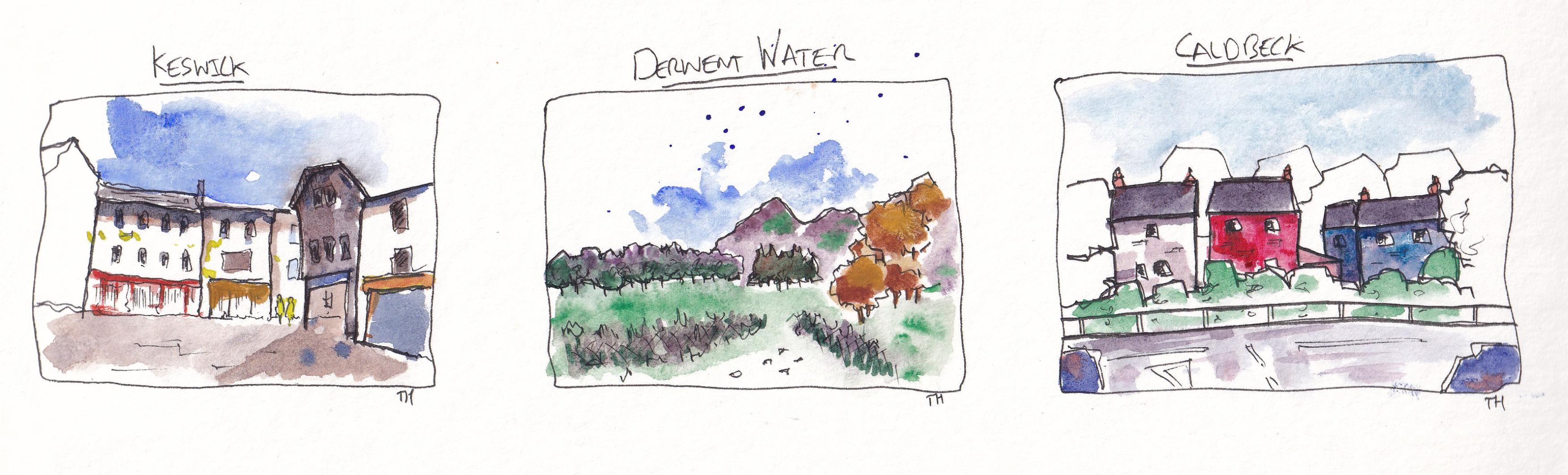
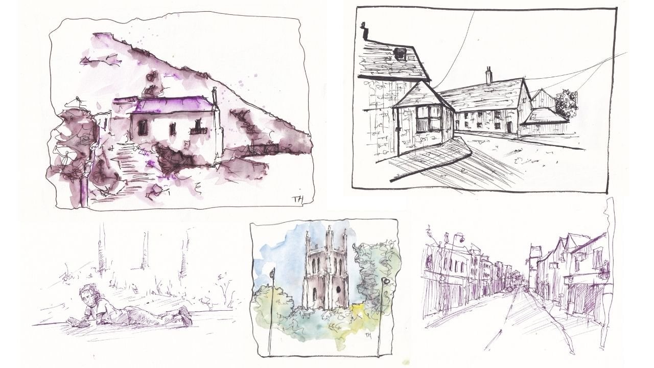
16. Scene One - Urban, Step One: Our first scene is from Kezitk. This is more of a urban scene. We've got people and buildings and let's see how we can apply
everything we've learned, everything we've been practicing
to a real life picture. Now we are on to our final
little part of the class. We're going to be
producing three different scenes from
reference photos. I'm going to provide
you reference photos, but you are of course,
welcome to also use your own. I'm going to try and split
these into a more rural scene, a more urban scene, and something in
between as well. With that, let's just jump in, and I'm going to start on the left with a
more urban scene. This one is actually
from Keswick, which is a town in the north or east part of
the lake district in the UK. Notice how I prepped
my page with these three small doodle spaces. This would be great If you had an six sketchbook or
an A five sketch book, you could do a couple of these. I've got a really
big sheet of paper, so I'm going to do a
little line of them. And if I wanted I could chop my paper and be left with
an amazing bit of art. With that, we just need to remember our simple principles. We've got this scene for
all sorts of shapes. We've got some
funny perspective, but we've got shapes and
that means we can do it. If we start, I'll grab
the house in the middle. That's just a rectangle. I'm going to finish it with a little bit of a
textured bottom. Remember key part of getting it feeling like an adult sketch. Then we've got the next
house coming along. We actually can't see the bottom of it because of some people. So I'm going to leave
that little space, that gap, for now. Then we've got another building. It's quite complicated, but if we just distill it
into its parts, we've got a square, then we've got a
slightly bigger square which ends in a half hexagon. I suppose it doesn't matter if you can't
name the actual shape. It's more about recognizing
that the shape is simple. The shape is something
that you can do. Then we bring that
side down and you notice how just by
thinking about that shape, we've naturally got the
perspective just about right. Then we can move on, we can find this next one that's
just a rectangle which is already going
to fill itself in a little bit of texture
to the bottom to make it an adult feeling sketch, we can start adding in a
couple of the internal shapes. So we've got this sine, which is a rectangle, and
we've got these windows. Let's keep our windows
all nice and the same. We can just keep them
all the same shape. That makes it easier
for us and easier for the viewer to understand
what our simplification, what our doodle really means. Now going over here, we've got one more big shape. One problem we might run into
something I've done here, which is why we haven't quite
got the proportions right. My shape probably runs
out there, doesn't it? If I'm getting the
proportions to be the same as the photo, I'm not going to
fully fill my page. That's okay. Because we
can do one of two things. We can either extend our shape, because it's a doodle, we can invent something for that gap. So let's just pop in a
little interesting house with a roof which is a triangle,
and we can come there. Now one thing which is more frustrating is when
you go too big, always try and start
nice and small. If you're not sure, what I could have done is
just underneath here. I could have just
gone and quickly, just sketched in
my shapes really quickly to work out the
proportions I'm dealing with. Then I would have
worked out that, look, I have this gap
learning point for me, fail are really useful.
But there you go. We can also just have
fun invent things. Now there are some other shapes. We've got these
people, people we can just do is very
simple little shapes, a circle, a couple of triangles. If I do them a bit bigger, what I'm doing is a circle, a triangle, and a triangle
that is a person. There are other ways of
doing them, of course, but in simple scenes like
this, that's all you need. Then we can find
there's a window, you can see through here. There's a window here. I think there's one here,
which we can't see, but there's a gap. So
I'm going to add one in. There's a door, but
we can't see there, so I'm going to
leave it back here. We've got this other shop front, just a rectangle with
some squares underneath. And then I can start
on these windows. I make this window nice
and big because it be silly to make it just
a square back here. A few more windows, It doesn't matter if I get the
number of windows wrong. I'm just trying to make it feel connected, the whole scene. Then we go, we don't
step one, simple lines, now we can come
back and we can do that bold line work if we want maybe a little bit of texture in some of the
roofs that we can see. We can't see all the roofs, so some of them just
get left alone. But this simple bit of bold line just solidifies the key shapes. It leaves the details in the background and
solidifies those key shapes. This is in front of
everything else. I'm just going to make
these shapes even bolder. Hopefully now we get a sense
of depth to our sketches. Well, not just a lovely sense of simplicity,
but a sense of depth. We got some shadows,
very dark under here, a bit dark under there. Then we can just add
some textures as well. If we want, we can imply
a little bit brickwork. We can blacken some of
these windows as well, again, just enhancing
the contrast. What's a middle step
between blacking and the windows is perhaps something which would be useful here. What we can do is
a bit of hatching to show that these are windows, but also leave them not totally dark so that there's
not too much going on. Then in here we've got
a big empty space. Actually, it can be
quite nice just to do very simple textural marks. There we go. I think that is my linework here to
do, isn't there? That's my line work
though now. Complete.
17. Scene One - Urban, Step Two: Now we have our line work done. We're going to
jump straight into the colors for scene one. We can really quickly jump on in our scene to
adding our colors. Now here we've got a
lot of white walls. Let's see how we
can cope with that. This time we're trying to
keep it relatively similar. Now what I'm going to
do is mix a tiny bit of blue and red
to try and create a darkish purple red
basically for this house. There we go. For me,
that's good enough. It's not a perfect
match by any means. You can spend days trying to mix colors and things
like that if you want. But for a simple doodle, that's the color I was aiming for. We can just use that color in
a few other places as well. Perhaps we can use
that color to keep the image simple on this
roof that we can see. Maybe we can just see a
slither of this roof as well. We'll see why not
on this chimney. Now we've got some
other little details. Maybe I'm just going to change, add a bit more blue, then we can find little
bits of blue trim here. We've got this blue sign, we've got little blue
reflections in the windows. And since we're going
to leave this white, we can start adding
those details already. Then maybe we just want to
make it more interesting. Maybe I'll take some
red and use that for a couple of these windows and just let it soak
down a little bit. Then we've got a nice orange okary area in the back as well. You might notice that in places perhaps you haven't
finished off blacking in the windows and you
can now just do that with water
color instead if you want no reason that the blacking in and contrast has to
be added with your pen. So we can just do that. Now we're still missing
something in this scene. Let's try just adding, because we're leaving
the walls white. Let's try adding something else. We leave the walls
a negative space. We're still going
to be leaving lots of nice space in our scene. Just a bit more negative
space can be found just by coloring in,
say, the pavement. And then we can do a
nice soft sky as well. Pop a little blue up in the sky. Don't let it dry and then
move it around quickly. Doesn't need to fill the
painting necessarily, doesn't need to fill
the doodle just enough to show the contrast
from top to bottom. Diddle. Window, here
we is. Window there. Now we can let this dry and move on to the stage
two of our colors. We are pretty much dry. Now I'm going to
come in and this time I'm using a
different brush. This is a size six round brush. What that's going to
let me do instead of the flatbrush I've been
using a lot of time, is going to let me be a lot
more specific with my colors. I can come in and just find a few extra lines,
you can almost draw. Keeping that simple idea,
we can always draw. And that's just going to add a little bit more intensity and a bit more interest to what we've got
going on on the page, I want to introduce
many new colors. I just want to use the same colors in a
slightly richer way. Again, we've got
our Mars yellow, yellow ochre in that space. We can use the same
thing to start introducing a little bit
more shadow for the moment. These big white walls, they
feel a bit flat as soon as we add a shadow under
here that's a bit dark. But don't worry. Remember,
you paint nice and wet. You can always lift it up. Hopefully we can agree and feel free to disagree, but
hopefully we can agree. Simple shadow like that suddenly just adds
a lot of shape. We can actually apply shadows
perhaps down here as well, to just show the separation
between the houses. Also, we can cast a shadow
coming down in this gap. If we take our same
little shadow mix, what we want to do is get
this shadow coming down the house and just
layering on top there. If we layer on top, we keep the consistent
shadow direction. We'll also be able to get that
bit in shadow in the back. Maybe what I quite like taking a bit of fun is when we
have a lot of shadow, just dropping little bits
of blue into that shadow. I always think that
lifts it makes it a bit more interesting, a bit less monotonic, I think in that we've
done pretty well to gather a bit more of
an interesting scene, but maybe it's feeling a
bit bit bland in places. I might change some of this
shadow to be a little darker. Bit of contrast might
make it more interesting. What we haven't done is apply those little punches of color. We could just take a yellow. There isn't much
yellow in this scene, But we can introduce colors into our little doles
as and when we want, maybe these people
can become yellow. And we can just
get yellow bricks. Maybe in some other houses,
little yellow marks. Maybe here something
bright as well that could be a bit of
yellow and a bit of red. And we'll get an orange
mixing together. Maybe last bit of contrast to add is just some of
these windows which, because we've cast
a shadow over them, we've just lost a little bit of that punchy contrast like that. I think that could be a pretty successful little doodle
that we finished. And we're going to move on in the next lesson to do
a more rural scene.
18. Scene Two - Rural: Now we're going to move
across from Kezwick, just a little bit
south to doan water. Here we're actually painting
a forest on a mountain. This of course, is
our urban scene. Here is another scene
actually near kick, I actually got to call it doan water because I'm taking it from very close to
the lake by Kezik. What we've got is a
lovely mountain scene. There is actually
a little hut in the middle of it, but we're
going to ignore that. For the purposes of today, that's our right as an artist. We can do what we
want with our scene. What we've got is some
shapes again, haven't we? We've got a triangle
in the middle, that's our mountain shape. Then we've got basically a
long set of connected trees. We can actually just draw
the overall shape of these. Doesn't have to be split apart. We can, of course,
decide arbitrarily, maybe we split apart
this set of trees. That's going to increase the
complexity a little bit. We'll split apart this set, then we'll add
another set which is the more like fir
tree like shapes. Then we will split them apart
from these other ones which are a little bit
closer at the front. They come all the way
up and they cover up a lot of mountain
in the foreground. Then we've got some
shapes of grass. We didn't do that before, but we can just do that with a little bit of simple texture, just suggesting what's
going on there. We've also got this
path coming towards us, we can just some other
simple textures. Here we go, little textures
of grass in the right shape, you can see it's
forming a triangle. We're ready to move on to
adding a bit of baldness. Now that we're more certain, we can start getting
that bald line, a little bit of baldness to suggest where the area is dark. And adding in these little
trunks underneath as well, we got our trunks. I finally call them
trunks instead of stones, little trunks down here as well. Here we've got a more
significant trunk. Because it's a bit closer,
we might want to just split apart some of this shape and
imply some other trunks. It makes a bit more
sense of climbing, set of trees going
up this mountain. Be nice to have a
little bit of texture in a little bit of
texture already to imply those shadows which we
can also do with our pen, of course just increase
some of those board lines. Then maybe even here
we just want to hatch. Simple bit of hatching to show again that we've got
these different areas. It's not just flat grass, we've got different
areas going through our little doodle
scene, our mountain. Well, for now we can
just leave that as a simple shape and we can decide later if
we're adding color, If we're leaving it white or
how we want to play this, I think that's enough. That's enough for our colors already. I'm going
to jump back in. Of course, I got a choice
of two brushes now after we unveiled the round
brush in the last one. But I'm going to use
the flat brush again. To start with, what I'm
going to focus on are these lovely purple greens running through these distant
trees here on the left. Start with just some green. Remember we can just
add in colors on top. So let's take a
little bit of purple, making sure it's nice and light don't want
to take too much. Then that purple
can just layer in. It's a little bit
abstract, isn't it? But it's the colors I'm feeling that I can see doesn't have to be true. Doesn't
have to be accurate. Then if we go all the
way to the right, we've got much more of a
golden field to these trees. They can have a
little bit of gold, maybe just a little bit of
a burnt umber in that gold. That's going to start
implying a bit of shadow. We can come back and do some
proper shadows in a bit. We got something in between. So I'm actually going to
mix those two together. We'll probably end up with
a neutral, deep green. Now we need to decide where else are adding a bit of color. Now I think it'd be fun to use
a bit of a brighter green. We've got this
lovely green coming forward here, I'm
going to pop that in. That's a cobalt
green that we could actually wash that
all the way down. Getting it from under the trees, all the way into the foreground. Those are nice and
nice and gentle. We can then find again, some soft changes when we did soft changes before we
could do some soft changes. And maybe again,
this purple color, that's what I see. Colors can be a bit subjective, but for me, it's a
nice soft purple. In these areas we hatched, we can do a bit of
mixing on the page with a little bit of cobalt purple. There we go, our scene
is coming together. Now, this could be
another one where we want to add a sky. Or maybe because
we've got a sky here, we should try
something different. Let's try actually just extending our colors
up into this mountain. So I'm going to
take this purple, gently add it, And it is a
little too dark, isn't it? But we've already seen
that. That's okay. As long as we come back
and we soften it out, then that purple
can sit and fill up the under part of our sketch. Maybe just a last touch, little varied bits of
green up in here as well. And we can see what happens.
We can let that dry, and we can see what happens, and then we can apply our
second stage of color. We are here we are,
nice and dry now. Not totally dry, but I like
it to be very slightly wet in places to add a little bit more
unpredictability to my colors, what we can see is we've got these separated
out areas and what we want to do is enhance
the areas we care about. Now for me, it's mostly about those trees we
spent time on, isn't it? So just like bold
lines will enhance, something bit of bold
color will do the same. We'll start with a
bit of that Mars yellow, and then just again, we're enriching it with
the same burnt umber. Now, taking care
not to do too much. We don't want to lose that
transparency too much, but we do want it
to sit forward. We can use that
same color for some of the trunks of
the trees as well. Then we can move across
and repeat the same thing, really in these trees. Little touch of
that burnt umber. And then we'll go back to
using this murky green. And hopefully what we'll get is just a set of trees which pop forward just a
little bit more, just a little bit more
interesting and a little bit more obvious than
they would otherwise be. Then over here we have that light green wash
with some purples. Now I'm just going to
apply that green into the bottom side trying to
get the idea of shadow. And then this rich purple
can come along the top. There we go. Almost done. Now we can do some real textures of grass here because this is the last a lot of different area that I
think would be fun. We can almost draw again
with a little brush. I'm just holding it like a pen, using a little bit thicker paint and just coming up and down, drawing brush marks which
fit with that grassy feel. Then come in with a bit of
green and do the same thing. We get this varied patch of grass in the
front of our scene. On the other side, I do
it the other way round. I'll use my green first, then I'll grab a little
bit of my purple, a little bit more, and
do the same thing. There we go. Does
it feel finished? Perhaps there's too much
empty space up there. Another nice idea that
we talked about before. You could do a couple of
gentle splashes into that. If you want to finish
off even more than that, just come in with
a bit of water. You can soften up some of
those splashes that will just create a gently textured
sky, Not the same as this. Instead it's more soft. It's more suggested, hopefully, in the way that often this is more interesting than if we
just did a flat blue sky.
19. Scene Three - Village: Finally, our final little scene of the final scene I'm going to do with you today is from a little village called Calbeck. Calbeck has these
beautiful colorful houses surrounded by trees. This is our semi rural
or semi urban scene. Here we are. It's time for
something in between scene. This is actually just
a little village. It's called Calbeck again
in the lake district, which brings our
thematic lake district doodling to a finish,
which is great. I think what we've got, if we look at the full photo, we've got odd perspective. We've got lots of challenges. We've got a lovely colorful
house in the background, a couple of the matching and all sorts of trees and things. That's where we've got this
natural and urban scene. Since we're doodling,
let's make it simple. Instead of focusing
on the whole photo, let's focus on the really
fun, interesting bit. Now for me that's these houses in the background
we're going to do, we're going to find
those shapes first. They're the easy,
solid shapes that we can just identify
without any fuss. You've got a square
and a rectangle, a little triangle
coming off the side. Then if we go on
to the next one, what we're going to
do, we're just going to remove the perspective. Instead of having the side of the blue building visible,
We're doing a little doodle. Let's just get the roof, Ignore this side,
this perspective, and then we can get
the next side in. We're simplifying which is part of our right as an artist. It's great fun way of
just doodling away. Just making life much easier,
much more accomplishable. Get the roof line
in here as well. It's a little bit
lower than that one. Then we've got one
more house over here. Much closer, isn't it? Again, we'll just get
the roof line in, get these little chimneys in. This time we don't
actually have to take the edges all the way, but I'll show you
something we can do to just complete our image. Bear with me first
though, we just need to add in a
few little details. I've got these windows, more windows down here, little window up here,
little window here, little edge of a window. Finding all of our
little windows. And if we want, we can
invent some windows as well. Then we can just invent some little bushes to finish
off the rest of this scene. We can see the bushes coming
along the front as well. We'll just do our contour of all these bushes going along, finishing off the
edge of our scene. Nice little tree
like this as well. That's quite a fan shape
to get in more trees and bushes up to
the side like that. Last bit to pop in for me, we've got this simple fence that runs across the
front of the scene. I'm just going to show that a simple shape and then just bring along some marks to make
it more of a fence. Last but not least, if we want, we could even add in just
this little pavement edge shows the shape of the
scene in front of us. Why not do these little
road markings as well that instantly
recognizable? It shows you again what
you're looking at, little road marking there. Our scene is basically done. I guess there's a couple of bits always important to
look around, isn't it? Because what I've done is I've missed out these
trees back here. Second time of asking our
scene is basically done. It's time just to add
these bold lines. What we can do now, we
can solidify some bits. We can make these shadows more evident if we wanted
at this stage. We could add in the sides
of the buildings if we felt it was important to our sketch to get the perspective
in for me, I'm not going to do
that, I'm just going to add these little
slightly bolder lines. Then also the same for these
trees which are in front. Let's make them feel
like they're in front. Nice and bold, press quite hard. Nice and bold. There we go. This tree is also sitting
in front of the house. We'll make that
one nice and bold. We can do some tree textures adding a little bit of fun
to some of these marks. We've already made a little
bit of tree texture there, maybe just a little bricks. This wall doesn't actually have bricks, but again,
we're doodling. We can add a little bit of, a little bit of
invention, don't forget, a bit of contrast often just brings immediate drama
to what we've got. There isn't much shadow going
on in this scene really. Perhaps in this one
we'll leave it. We won't invent too much shadow. We can just keep it as a nice, bold, fun feeling image. Do you want to just
get this fence? Do you see how it feels distant? But if we make it bold, it suddenly comes to the
front of our doodle. That's our last bit
of line work done. Now we can jump in, do
our last bit of painting. I'm going to start
with a bright red, keeping it quite thin so we can always come back and
add our second layer. But to start with, let's get that nice transparent
watercolor feel. Then we've got a
nice light blue. Perhaps this time
we can use a bit of that cerulean blue we used in our sky in one of our
previous paintings. And that can come in
on this house as well. We got a little bit of
purple on my brush there, that's gone now with another
layer of color Again, you can see that purple
coming through actually makes quite nice, nice feel. Having these varied colors
probably was because I didn't clean my brush off
very well between doing those two washes, which is why that happened. Just remember this bit of pink just coming out here as well. And this bits actually
pink as well. This house is gray. But what I'm going to do, this
gray, this house is white. What I'm going to do is
I'm just going to give it a little bit of tone with a
tiny bit of my sugar light, which is a nice tonal color. Then I will add some
interesting rooftops. Maybe make them blue
with just a touch of red in just to neutralize that. Give it this is Indian red, it's quite deep red,
almost a brown. That will just give us a nice contrasting feel to these roofs. Don't want it to fix,
I'm coming in now with a cleaner brush and just
spreading that over, giving it quite a flat wash. Then I think what we could do is perhaps a little bit of that same color just
into the road here. Just fills up the page, makes it a little bit
more interesting. We can do a little bit, maybe
the Serilian blue again, just into our sky up here. Just move that around, keep
it nice and soft, and gentle. We can have a look in our second layer if we
want to add any green. Or if actually we're
happy leaving all this green as negative space for now. We're going to let this
dry and we'll come in and do our second
little layer of colors. Here, we're nice and dry. What we can do is we
can just come back and enrich some of these
rather lovely bold colors. Here we can start suggesting
a bit more texture, a bit more shadow, just by using much
thicker paint. With our blue, we can
do the same again, just in a couple of places. Perhaps we want to
suggest a little bit of shadow on this more
distant building, just by making the
blue a little deeper. Again, using these shadows underneath the
eaves of the house. Even in our white house, we can get a little
bit of shadow underneath the eaves there. Then anything else
do we want to add, for example, a bit more
texture into the road? That's an option, isn't it?
Just a few little marks. Perhaps we even want to bring out the pavement as another
little tone in the front. Again, all we've done is
just add a little bit more blue to that purple
neutral wash. To just change it
up a little bit, then we can decide, do
we want some greens? Maybe what we can do
as a, a middle option. We'll take our greens and we'll just do them in
a couple of places. We can just choose a couple of our shapes to get a nice touch of green just in maybe a
handful of places like so. Then get some water and soften and move
those bits of green. We've got lots of
negative space, but we've also got definite
tinges of green running around and explaining some of this negative space
a little bit more. Now, last but not least, we remember we can use this second layer to
introduce nice details. Now for me, a red chimney
is a really fun detail. They're not red in reality, but it's a really nice
detail just to bring in like so little
bit of that red. Just somewhere else as well. A bit of fun there we are. Our little themes
are all complete. Now that they're all
done, I'm going to put my initials and
that each of them, a really important part
of owning your art, being proud of it,
is just to put your initials or your name. I'd love to see your versions, your Ses or my themes. Have some fun simplify. Create your little
doodle Landscapes.
20. Thank You: Well then Everon, thank you
so much for joining here. I've really enjoyed
creating this class. I really enjoy the doodle,
Sketching Ideas projects. It's a great way to fill a page, Fill a sketch book. Just relax drawer and have fun. If you also enjoy this class, you enjoy these kind ideas, please do, leave me
a review to do so, just click the Reviews
tab and create review. Just take a minute and
it means the world. If you enjoy the idea of
doodle sketching and then check out my other
classes on skillshare. I've got a specific one
on sketching people, which really links well with
this class and could build your little doodle repertoire to fill even more sketch books. Most importantly, they have fun, enjoy your sketching
and be creative.
 Toby Haseler, Urban Sketcher, Continuous Lines