Transcripts
1. Welcome to class!: [MUSIC] There's something extra magical about painting
water with watercolor. It just works. One of the things that
makes this happen is that watercolor has this
beautiful transparency that is see-through if we add more water and we
can use that to our benefit while
painting something that is essentially transparent. Hello there friends
and welcome to class. I'm Elisa and I'm a self-taught watercolor
artist from Norway. I love lowering the
threshold of getting started so that we
don't overwhelm ourselves with perfectionism
and that we have to get it right and perfect
the first time around, which is a terrible tactic of
getting to learn anything. In case you're anything
like me and you will, in any book that you're reading, use an old receipt or a blade of grass or something else
that you found, a napkin, it actually feels
really nice to use an actual bookmark in a book, especially if it's something
that you made yourself. Today, we'll be picking some beautiful underwater
scene bookmarks so that we can keep practicing transparency
both in the wet-on-wet technique and the
wet-on-dry and that way, we can start
building our toolkit of getting to know our
watercolor paints better, getting to know our
brushes better, getting to know our paper. You can get all of
this information while also creating something
that's finished, which is my whole philosophy
with these classes. For this class, you
don't need a lot of experience with watercolor. You will only need to bring
one paint if you want, as I always encourage you to start with a
monochrome painting. That way, you don't have
to mix your colors, you don't have to
worry about anything being muddy or your colors not working well together because we're only be using one. Play with that range
from the darkest to lightest depending on how
much water we're using. That being said, I love
using sparkly paints. I think they work really, really well for an
underwater scene when you get that light bouncing off. I'll also be using
some metallic paints. They're not obligatory at all. But if you have them, you can
bring those along as well. Or if you have sparkly, shimmery ink, those could
also work really well. For the sake of efficiency, I'll also show you how
to tape your paper down, whether you using loose
sheets of paper or a block, and how you can take them
so you can paint two at the same time without putting
your hand into wet paint, which I will demonstrate
that I did anyways, but I didn't put
it on the paper. I'm really happy you've
taken some time out of your day to be creative
and in the next video, I'll be talking all about
our class project. Let's go.
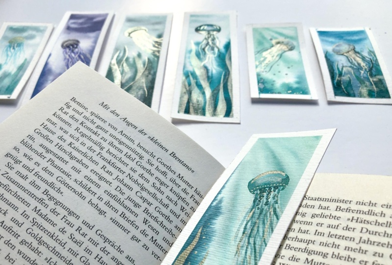
2. Class project: This might not come
as a shock to you, but we are going to make
bookmarks in this class. That is what we're going to do. I say bookmarks because
most papers are in the A4 size postcard shape, and that shape makes two
excellent bookmarks. The ones I've made
today are these two, they're made from one postcard, and I also have these two
that are slightly larger, and they're made from a block
of 12 times 18 centimeters. Whatever paper you have, you might need to
cut them down to make an appropriate
bookmark shape. Although of course you can
make half on an A4 page, which is you'll just be
reading very large books. These two from the postcard are using classic watercolor paints, so these don't have a shimmer, but these two do. I've been using handmade paints for the sparkles in this one, but more and more
brands are making sparkly versions of their
watercolor paints as well. You might already have that, or you can add details with a golden marker or
ink or a Dell pen, whatever you have
lying around if you'd like to add those
sparkles as well. Then, when you're done, I would love to see a
photo of your bookmarks. As I'm ambitious, I'm
going to say bookmarks as in you were going to
paint more than one, in the project gallery below so that we
can all see them, and we can start sharing ideas. Maybe you'll see someone else's, you'd be like that's
a beautiful version, I would also like to paint the Titanic in the background, so that we can keep
inspiring each other, and you always
inspire me as well. I keep going through the
project galleries like that's a much better
idea than mine. It just keeps confirming that what you bring to the table, nobody else is bringing. Even if you're baking a lemon cake and I'm
baking a lemon cake, it's going to be a
little bit different, and we need all the
lemon cakes we can, so please bring your version. I also prompt you if you can, can you take a photo
of this bookmark being used in an actual book? Because I know for a very long
time I painted bookmarks, and then I put them
in a box somewhere. Then I continued to use
receipts and blades of grass, and whatever else
[LAUGHTER] I could find to mark the pages of my book. I hereby give you
permission to use your own bookmark in an
actual physical book, unless you use a Kindle, in which case a bookmark
is [inaudible]. Are you ready to get started? I will see you in the next video where I'll be talking
about our supplies, why I've chosen the
ones I've chosen. Because I don't want you to
fight with your supplies, it's so frustrating when your
supplies work against you. I'll be giving my best tips for avoiding that. I'll see
you in the next one.
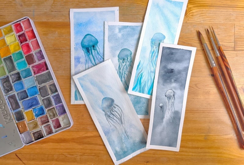
3. Supplies: These are the supplies we'll
be using for today's class. I'm just going to
go through them and talk about why
I've chosen them. Let's start with these brushes, and I have two different ones. These bigger ones, these are for our clean water.
They're a bit fluffier. They'll hold a bit more. Then
we'll have these smaller, springier ones,
with a pointed tip. Those are great for details. We're doing all of our
paintwork with those. You can have some medium ones, if you like, to put paint
into our wet-on-wet. Then the smaller detailed ones, depending on the
size of your paper, to get those finer
details as well. You can actually get away
with just two brushes, but you can bring a
couple of different ones. Over to our paper, I both have a block like this, which is glued on the sides. That means, it will
dry flat on its own. I'll just tape it to
get that border around the edges and down the middle
to split our bookmarks. But if you don't have this to make two bookmarks
on the same block, you can also use
something like this, which is a loose sheet. These are all 100
percent cotton, and they're all cold-pressed. This also has a
print on the back. If you wanted to make
postcards without that, you can also glue them
onto something afterwards or use paper that doesn't
have print on the back, even if they're postcard-sized. Then I brought this
backing board. This is just what I'm
going to tape my postcard onto so that when it dries, it will dry flat and not buckled because we're putting
lots of water down on it. Something nice and flat,
and then I have my tape. You can use masking
tape or washi tape, but something that's quite narrow. This one's really nice. It's 11 millimeters, [LAUGHTER] which means about half-a-centimeter
will be our border. Because we're cutting
down the middle of that, the borders will
be the same size, if we use half of the
size of the tape. I'm going to show
you what I mean. If we have a really wide tape, that's going to use a
lot of our space for painting so that we'll
have much thicker border. I recommend having a
tape that's not too wide since we're using
such a small format. Something like this or
something like a washi tape. Then as far as paper goes, I'll also bring a sketchbook. This is the exact same
paper as those postcards. They're also called pressed-in. They are also cotton. See that little llama there. That means it's the Etchr brand. That means that
the information I get from trying this
out in a sketchbook first is really
transferable because the same thing will
happen on the paper. You don't try it out with a cellulose hot-pressed paper
with a different texture. Then you think you've practiced something that'll be useful
on a cold-pressed paper, when the information might
be really different. It's not essential, but
at least having something that's the same texture
and the same material. Cotton paper, if
you're planning on painting on cotton paper later, which I absolutely recommend. It will stay wonderful longer so it's easier to do those
wet-on-wet techniques. Then we have our
watercolor paints. I'm using full pans like these. These are from two
different brands. We have some White Nights
and some Roman Szmal. They're not very expensive, but they have a
really nice and rich pigmented colorful
painting range. Each of the colors have a
lot of pigment in them. They're easy to get and
find. Nice and vibrant. Also, a water out
and water down to those nice transparent shades. You're free to use
any colors you want. I'll be using some of these
turquoises over here, and also one dark
stormy blue one. Then I'd like to bring
two jars of water. That way, one is for clean water and one is for
rinsing off my brush. One keeps getting dirtier. Then I can pick up almost clean
water from the other one. That way, I don't have to
swap them out as often. Don't forget to bring something
to wipe your brush on. This is just a piece
of an old t-shirt. It's nice that it's white so I can see, if my brush is clean. If you want to, you can
use a mixing palette. This is just the lid
from one of the jars. Often, a paint palette
will also have a space for mixing
inside the lid. But if you want a pallet, bring it, and something
to wipe your brush. Now we're ready. Let's talk about some watercolor
techniques.
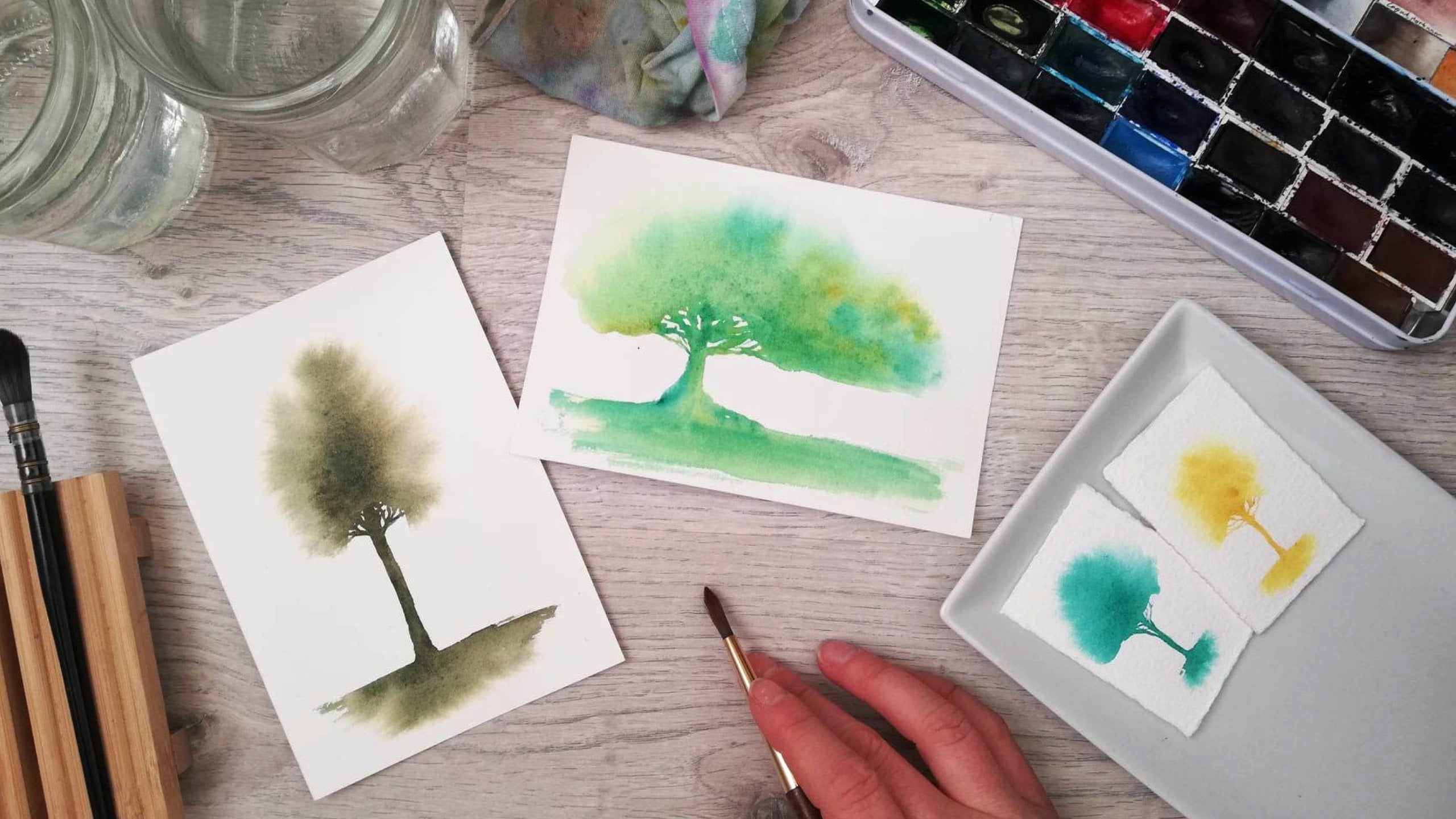
4. Useful brushstrokes - Wet-on-dry: We've got sketchbook ready
and this is just to practice a couple of other
techniques that we'll be using in class. I wanted to show you the
wet-in-wet technique and the wet-on-dry just to show the difference between those two and a little bit
about how I hold my brushes just to
make it easier for us to do the right thing, but let our supplies
work for us. This is the same
sketchbook as before. It's just a bigger
size, but this one is exactly the same paper
as those postcards. If you had the chance to use
the paper that's similar or at least the same texture as the one you
will be using in class, that's a really great help so that the practicing that you do corresponds with what you'll experience
on the paper later. In my experience,
the wet-on-dry is probably the most natural one we just get paint on our brush
and then we start painting on paper. Let's do that one. Let's got our water here, getting some paint on my brush. With this kind of thing because we're not working
from a reference, I don't need to know exactly
what darkness my paint is. By darkness, I mean, how much water to
paint ratio there is. As you can see from
my swatches here, I made gradient when
I swatch up my paints so that you can see
which color is which because they're so
rich in starch. I can see that this one, this turquoise one
goes from really, really dark turquoise
to a light turquoise. The only thing that matters is how much water is in my paint. The same over here, whereas something like a
light yellow won't have that big contrast from
the darkest to lightest. There's a smaller range
from dark to light. That's something we
can play with today. Because we want to
use that transparent, beautiful effect, we can also use quite a bit
of water in this class. Let's start with
our turquoise blue. Let's go in with that turquoise and we'll see what
that looks like. This one's not dry. But the moment I put
my paintbrush into it, it'll start activating and
start getting onto my brush. Some paints take longer
to activate than others, but this one will immediately give us
that rich blue color. As I'm going downward, I'm starting to
lose pigment from my brush. It'll get lighter. It gets lighter because
there's more water higher up in the brush because here
there's only clean water, here there's paint, but I'm also losing amount of
that mixed water. You see how I'm starting to
skip parts of the paper. After a while, we get into
what we call dry brushing, especially if we have a
textured paper like this, but also even if you have
a non-textured paper, like a hot press paper, we will get this effect
of dry brushing. For me, I love that
effect for making textures on houses
and mountains, but I don't really want it
in an underwater scene. Maybe I would on rocks or maybe if
you're painting corals. But for these bookmarks, I really wanted to
be super smooth. I want that seaweed
to just flow. If I want to avoid this, I need to find that balance
between having too wet brush, which gives me no
control and having a too dry brush. Let me
show you what I mean. Now I just dip my brush
in and it's quite wet. If I wanted to make a
seaweed one, for this one, I was holding my brush quite
flat towards the paper, dragging it this way. If I want to make
something super precise, I want to use only
the tip of my brush. I'll paint like this
and not like this. Using the tip of my brush
with a brush that's too wet give me that
precision that I need. If I'm trying to
make a thin line, I got a little bit more water released from my brush
than I wanted to. For this not to happen, I have my rag here
and I can dab that, shape my brush back into that
nice point it had earlier, and then it's easier for me to get those thin
lines if that's what I want. For these jellyfish, we
do want those thin lines. It's getting a little bit
more on my brush to show you how those thin lines. Now I only added paint and now
skip to my papers for now. This is a balance that will come with time and
practice as well, like how wet is wet
enough to get thin, precise lines but not so dry
that it skips the paper. Playing back and forth with that can be something
to practice. Or you can always call
back in and like this one, this skipped the paper.
Let me show you. See how that's skipped over some of that texture
on the paper. You can also go in
with your brush again and go over with a sturdy hand. Same paint activated again. You can save it. This is also why I wanted to do this class in the way
that I'm doing it, keeping all my
mistakes in so that way I can also show
you how I fix them. Not if they haven't because
most of the time they will. But when they have it, how do I deal with them? Instead of trying to avoid
mistakes at all costs, try to find new ways of dealing with them
when they occur. This is something to practice, and then since we're doing
our seaweed motions, I want it to be thick at one
end and thin at the other, so just getting that
nice pointy brush. Usually, a flicking
motion is nice to do. I'm starting actually
on the outside of the tape and you can
start there if you want. If I start with my brush
a little bit too dry, it'll skip the texture
of the paper like this. I'm going to show you
it closer afterward. If I do it again, starting pressing, dragging back up again so
that I've got a darker one. They seem to want to need
more water still like that. Depending on how you hold
your brush and angle it, you can get those
seaweed flicks. You can always go back in
and adjust at the bottom. You need to make
that thicker if you want that grass shape. What if it's too dry? You'll get some skipping.
If it's too wet, if I just take my brush
and go back in again, I will leave a lot
of water on there. See how that's now
blobby and wet, which is fun, but it will
also give us less precision. This is just something
to practice as well. As you can see that those first two skipped
that paper a bit, and that doesn't look as
smooth and flowing in my mind for seaweed
as those next two. This is our wet-on-dry. One of the techniques
you'll see me do for one of the jellyfish as
well is going in with my brush first with quite a bit of
pigment and using that pigment afterward, rinsing off my brush,
going back and fixing it. If I put down a line like this, quite a bit of pigment, let's say this is
our jellyfish top there and I want to blend it out because I
think this is quite dark. I'm going to rinse off my brush, and then I'm just going to wipe it a little bit on the edge of my jar or I can
wipe it on my shoe. Then I'm just going
into the very, very tip of my brush is going into the
very edge of that, and I'm dragging it
along the paper. See how that starts bleeding into the water I'm putting down. I can move back into the pigment because that pigment
will go wherever is wet. I'll talk about that in a
minute or wet-in-wet technique. We can soften the edges. We can start moving that
pigment around while it's still wet because that gives
us more time to work. The wetter it is, the more
time we have to work. I'm kidding it to behave
the way we wanted to. They can even start
mixing of pigments. This is something in watercolor, which we've talked
about a lot or again, maybe here people talk about
a lot how they work from light to dark, and we do. But there's also a couple of tricks on how to go
from dark to light. Say you went in with
something that was too dark, which I will also
say this line there. Let's just make a
comparison line over here. This is how dark it
was to begin with. Soften brush in clean water. We can start with mixing it and then I'm
just dabbing away. Some of that can start
lifting them back up again. What I'm using is a damp brush. Not too wet, but I want some water to mix into that pigment. It almost works as an eraser. Just lift some of that pigment
back up again. The edges. Then this is of course much easier to do while
it's still wet. It hasn't settled on
the paper in this, and this is a turquoise. Turquoise is our famous
leaflet staining, which means they'll be difficult to lift off
from the paper again, so I will never get
this paperclip. Let's look at the difference
between those two. I can make it a lot
lighter and you can fix my mistakes and
little bit like that, especially since we're not
working from a reference. It doesn't matter as much how
super precise, for example, those tentacles are, those
jellyfish tentacles. Practice a little bit of
this wet-on-wet technique. Also just for the end here. Tentacles find a different order at the bottom of the jellyfish. There's also like a
lumped-up little thing. For that, I just push my
brush into the paper, staying connected, but just moving it around,
pushing it down. It's not super precise. But I just drag my
brush downward, blobbing it out to one side, blobbing it onto the
other like that. In the resources, there'll be some reference photos for this as well just to
show you what I mean. I'll show it on the
screen here as well. This is also a way to
seaweed if you wanted to. For all of these techniques, it's the same kind of thing
when we were working with metallic sheets,
metallic watercolors. You just might need to activate them for a little bit longer. You need some time and
some of the love to get started because they
activate in a different way. The pigments are
dice loosely packed. Because those glitter
pigments are more difficult to activate and
get mixed into that water. We'll be playing
with those later. Finding the balance
between too wet and too dry and knowing that you can lighten if you want to mix in more pigment if you need
that while it's still wet, it's easier to fix mistakes.
5. Technique practice - Wet in wet : Getting into our
wet-on-wet technique. For wet-on-wet, it's nice
to use a larger brush. This was not super large, but it's a little bit bigger
and a little bit fluffier. [NOISE] I have some other
suggestions here as well. For these ones, I paint
on my thumb already, I'm going into my
clean water and then I'll be putting
painting after. This is a less intuitive way
of painting in my opinion. I'm getting my brush filled
with [NOISE] clean water, I'm mixing in there, pushing it against the side. Because it's dripping
you're going to wipe it on the
edge of the glass. Then I want it wet, but not super wet. [NOISE] I want it to
be absolutely soaking. Just making a little area here, we'll be covering our
entire piece with this, with that background layer. But you can see how that
now has that texture, you can still see the
texture of the paper, but there's no water
pooling up anywhere. Your paper might behave
differently than mine, this is always a challenge of finding the balance
between your brush and your paper and the temperature of your house and everything. The only way of getting to know how your paints and
sprays work is to try it, but I will give you
my best tips anyways. Getting that nice and wet, so the texture is still there. This is a controlled wet-on-wet. With that same brush
as earlier because I already know there's
some paint on it, we're going into our turquoise and then we can start
dripping that in, and this is our wet-on-wet. Just adding some
pigment in there, you can see how that starts
flowing around already. Say we wanted to do like a dark top bit and more
of a [inaudible] bottom, I can also go [NOISE] back into this with my clean brush
and start moving it around. Dragging some pigments
around, making this downward. I don't want to manipulate
it too much because I really like the way it
just spreads on its own. But see how you can manipulate
and move it around, it's like, I didn't
want that to be there. I can move it away, so putting in water and push
things around in there. Then I just want to
show you what happens if we have way too much water. Say I don't really
empty my brush, and then the paint
doesn't go everywhere. [NOISE] Let's say we do
something like this. See how that water
is pooling up, flowing, makes this big
blob over on the side here. [NOISE] Putting my
pigment into that, it won't spread into
those tendrils. [NOISE] It's going to
flow around everywhere, which actually for underwater, it might not be a terrible idea. But if you want to make
those rays of light, it might be difficult to
control and it'd also go more everywhere and can create blooms as it dries where the water start pushing
the pigment around. Let's just do one
more over here. Let's try and get
those sun rays. We use that thirsty brush again, that damp little brush. We try not to get too much
pigment from the brush. Since this is out of frame, I'm just making
three diagonals and what my brush does when I
lift it off from the paper, it releases a bit of pigment. If you don't want that,
you can also be even cleverer than me and
start on the other side, so start with the
end of the ray. That way that release of pigment will be
up in the corner, but you can also fix it by going in with a
damp clean brush, also known as a thirsty brush, which works as an eraser
and a blending tool. It's one of my favorite ways to manipulate paints in the
wet-on-wet technique, you'll see me use this a
lot throughout our class. It's where I'll use
probably a lot as well. Moving that pigment around like, let's make a little
drag out this way. Now I wonder what
we're going to gather in the same point. Again, because we're not
working with a reference, we do need to get super
precise mixing in the water and the pigment because we're covering
in afterwards, we're adding other elements, it doesn't need to be perfect. In fact, that should
never be the aim. Softening that
wet-on-wet like so. We'll just get that
effective, that gloomy light. Anyways, practice a little bit, see how far you get
with all of this keeping some of that white
magical part of the painting. Getting these a little
more precise elements on top of this when
it's completely dry. Let's try these with our paints.
6. Taping the borders: Let's tape our paper. I usually start on one
of the short sides first. Let's put
that in the frame. Because this tape
is see-through, I can see the edge of the paper and then I aim to have half of the tape as my border because the middle part will be cut
in the middle of the tape. That dictates the border at
about half a centimeter. It's half a centimeter
all the way around both of the bookmarks. I usually keep a hold
of my roll of tape, so I pull off a
piece and then I put it down and then I tear it off afterwards trying to
get that seamless line. Tearing it off and then
running my finger over it. That way, I will make it flat and tight and
then there's no space for that sneaky
wet paint to sneak underneath and mess up
our nice clean lines. It will sneak underneath
if you let it. On the long side, still
doing the exact same thing. What we want is for
the borders to be the same width all
the way around and that little square where the tape overlaps
is proof of that. So this rectangular
little corner here, see how that's not
a perfect little square whereas that one is. This one is showing
me that on one of the sides I didn't make it wide enough so they
didn't match up. I'm just carefully
going to tear this off again and then we can
use this one more time, just moving it
slightly further up. That way the border
will be equal. Like that and sometimes it twists so it might
be nice to just push it in the middle
first to see that end. It's more or less
the same width. There we go and then running
my fingers across it, making sure especially in the corners that
there's no space. We're going to do the
middle one to mark off the two bookmark sides. You can mark the middle
with a ruler if you want. For this one, I'm just
going to eyeball it, trying to go for the middle
with a nice straight line, and then we're going to
measure it for the other one. Down the middle
trying to aim for the same size on both
sides and a straight line, checking the top and the
bottom and the middle, making sure they're
the same width. Sometimes my tape kind of
bends a little bit like this. Just making sure that both
sides are equal, like so. There we have it, two spaces, and then the trick is we
paint on this side first, I'm right-handed
so I will paint on the right side and when I
want to paint the other side, we're just going
to turn it around. When that one dries on this
left side now, upside down. We'll paint to the right
side. Two things happen. I don't put my hand into wet
paint and also the oils on our skin can block
our paint if we put our hand on the paper
before we paint on it. So that's just an extra tiny tip there to keep our
hands off our paper. Let's do this other one, the block doing the
exact same thing. Since the sides are all glued, this tape is just to get
those nice neat borders. Just a small extra trick, if you are using a washi
tape with a pattern, then that can be used
as your guide too. Don't you say you have a
snowman washi tape, I do. Then you can easily see if the patterns are matching
up with the edge all the way along the edge of the
paper on all four sides. I'm just smoothing this down
with my fingers as well, making sure all the corners are little squares and of course, just a little reminder, make sure your hands
are dry and clean and don't have oil
or paint on them. I'm just speeding up this
last little bit here, a tiny smitch, because you've seen me do it
on the other one as well. Checking the corners
are squares and then for this one
we're going to use a ruler to mark the middle. Grab a ruler and a pencil. This was the pencil I found. It's very nice. I found this fun ruler and
it has 0 in the middle. This block actually
says how wide it is. It's 12.5. I'm just going to measure 6.2 and a little bit on both sides. I'll just mark on the
tape in the middle. I'm not even drawing
on the paper, even though afterwards
we are going to make a line down
the middle to cut our bookmarks and separate them. But for this one, I'm
just going to make those little marks and we'll make that line
at the very end. But if you want to,
you can make it now. I'm just going to make it after
we've done the bookmarks. At 6.2 at the bottom
there as well. Getting my tape out, matching
it up with that top mark. Stretching it making sure
it's nice and straight all the way down to
that bottom mark, getting that in the
middle of my tape. Even though it's quite
light, I can still see it through this tape. Running my finger over, making sure it's nice and tight. As you can see, it's easy to
see that little mark through even though it's just
a light pencil mark. There we have it. We are ready to go. I'm going to start on
the postcard-sized one, but grab the one you have
and let's get started.
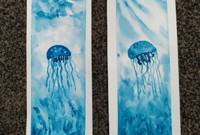
7. Painting the ocean: When we're doing our
wet-in-wet technique, yes, we lose control by being wet. But there's a difference between having it
sopping wet and having controlled
amount of water. Just to start,
just going in with clean water over this paper. Make sure you get all the
way down into the edges. I'm allowing a
little bit of time for the paper, just soak it up. Then I do want to go in with the same brush into
this ocean blue, which is a perfect
color for the ocean. Because it's dry, I'm just
putting my brush tip into it. It won't be super pigmented. Starting up in this corner, just mapping out lightly. This is ish where I
wanted something like sun rays to come in just
to give myself a guide. Maybe I'll just staple in very soft and wavy patterns
here at the bottom. Try not being very
precise with this at all. Almost like painting the sky. What I want to do is keep
some of the white paper. Even that's already looking
a bit under watery. If we want, we can
add some more water. Now what happens is these
are matched up here, giving us not a lot
of white space. I would like some white space. What I'm going to do is,
[NOISE] I'm going to stuff my brush, I'm going to wipe it. I'm just wiping it on
the edge of the glass. Then I'm going to curl out, pick back up again, getting my rag out
to dry my brush off. Then with a damp clean brush, just going to pick up a bit more revealing some more
of that white paper. See how that gives us a
bit more play up here. Like the sun rays
interrupt it down here. Just going to help
move that pigment around and while the
paper is still wet, you see how that's
all shiny like we talked about earlier with
the wet and wet technique. While it's still wet, I can still manipulate
it a little and create that movement [inaudible]
darker down here. Let's see how that works. Wonderful. Because
it's not sopping wet, it's not completely drenched. I believe that I
can still safely now turn this around the
same on the other side. This is not the top,
this is the bottom. [NOISE] I'm going to do
almost the same thing, but I'm going in with
this turquoise blue, which is just a different
version of an ocean color. This ocean blue actually splits into a little
bit of green, but the turquoise blue is
just one pigment so that will be more smoother shade. Before adding water, not too crazy much, you don't want it to be
sopping wet and pull up and interrupt our flow. But we do want it
to have that shine. You can see how that works. Then you can see it's bleeding a little
bit under this tape here. But because we're doing the same color on
the other side, that's not a huge emergency, if you want to you
can take it back and squeeze it that way. Pick up a bit of that paint
just so it doesn't sneak underneath into the white space that we will have when
we take the tape off. Just making sure,
especially those corners are not too dry to
not let it flow. Then for this one, let me
start here at the bottom. I can help with gravity
and I can tilt my paper. Starting all the way up here, making this patterns upward. [inaudible] letting it flow upwards and then
maybe just some like light strokes up there. [NOISE] More of a smoother waviness, and like I mentioned
before we're going to keep this space. [inaudible] jellyfish
or other fish you want. I can keep the bottom of it darker because
I don't need it to be light to have space
for the jellyfish. That's some more pigment so that the value isn't too dark for the
jellyfish to show up, whereas it has space
here in the middle [NOISE] to shine on its own. Because we're adding wet
paint onto the wet paper, if I see anywhere
that it's pulling up, which makes me worry that
it might create a bloom. Just not a huge emergency, but I would just
like to avoid it. I think it looks
really beautiful. It's just super smooth. You can still play around
with it while it's wet. What you can also do if you want to is take a smaller brush, [inaudible] paint and
then just flick it off. That can create the
feeling of bubbles. If your paint isn't so wet that it just goes back
into where it was, a bit of water sparkle there. Now in just eight minutes, we have two beautiful
backgrounds. One with a bit of a
soft blurry sky effect, one with those rays of light. That's it for our first one, we're going to let that dry. You can use a heat
gun if you wanted to speed up the
process a little bit. I'll see you in the next
one to add our jellyfish.
8. Painting jellyfish: Here we have our
dried bookmark basis. As you can see, it
is completely flat, which is lovely, and
they're not shiny anymore. If you turn them in the
light, you can't see any reflection because there's
no water left on the page. Going in with the
exact same color, [NOISE] put this over here. We're going to get our ocean
blue right afterwards, but I'm going to make this
little jellyfish shape first. I want to make it with
just clean water. That way, when I
drip in my paint, it's not a solid form. It'll move and leave
within that shape. You can sketch this out
first, if you want to, with a really light
colored pencil, or if you have
watercolor pencils, choosing a color that will
match with your paint color. A turquoise or a light-blue
one would work perfectly. I'm just going to do
without for this one. Let me get my pencil
for the second one. I wanted to get it just
above the middle here so I have space with
tentacles, strings. Just making a bit of a softly-rounded
pile of a triangle. I want them to just
float up towards the sunlight. We see a layer. Then with the same brush, just going into that ocean
blue starting on a side. We're painting that paint
making it flow and spread. I don't want to add too much too quickly because it
will get quite dark. You want them to be this see-through glassy
jelly creature. If I do make mistakes, I would like to adjust this shape. I can't because we're not
going for hyperrealism. Because the sunshine is
coming from this side, you can also add a
little bit more darkness down here at the bottom. Where the light is coming from will be the lightest part, and then it darkens
here at the back. Then depending on
how much you want to move this paint around, you can get some
more water in there, letting it flow and spread, trying to keep this
top part quite light. It doesn't really matter that it's light because it will still show up because the background
that we made it so light. Then what I'd like to do, let's add a bit more paint, I'm going to make those thick
tentacles in the middle. It's on the reference photo. Just dotting in my brush. I'm just going to pushing
it into the paper, and moving it a little
bit back and forth. [NOISE] That's what
that feels like. Just trying not to
make it perfect. Some longer ones and some shorter ones like
that around the middle, and then I can start
with my tentacles. I also want to make
those different lengths in different waves so they don't all wave
in the same way. Starting from the top and
just dragging them down, trying to flick towards the end. Only using the tip of my brush like we did in the
demonstration. You can also have
some very thin ones. As my brush is losing its
pigment and it's paint, I'm getting thinner,
lighter strokes. They're getting very nice and transparent, and see-through. It looks tangled and wild. If you feel like anything
needs to be adjusted or added, you could do that
as well like so. There we have them.
If you want to, you can also add some rocks
down here at the bottom. They look like doing that, and it seems like he's
floated out of something. Also just with quite a light
touch just at the bottom. Then adding a little
bit of extra paint, just letting it flow
into those little cliff, rock shapes at the bottom layer. That way, [NOISE] it looks like he's coming from something. You can even do the same as earlier. I'm just
splattering water. Tiny little splatters
around there as well. There we have our first
jelly fish bookmark. Make sure to wash off your
little finger up in the air. I'm just going to let him dry, but we don't have to wait to
paint more while he dries. We could just move over
to the other side. Just to show the difference,
I'm going to make this one with the paint that [inaudible] instead of
with the water first. I'm just getting some
paint on my brush, and then I'm going to make him in more or
less the same place. Just having quite a wet, but quite dark value.
I'm going to rinse off. It doesn't have to
be perfectly rinsed, but then putting cleanish
water in the middle, working my way outward
to get that paint to blend in towards the
middle of our jellyfish. Because then I have
all the pigment that I need on my paper, but since I want it to
be different colors, I don't want to paint
the whole thing with the same darkness. I want him to be glowy, and I get that by keeping
the middle lighter. We have more water than most of the paint along the outside. We can adjust the
shape like that. Then moving out from there, going back with some more paint, getting those thick tentacles
in the middle first. [NOISE] I don't know why this is the sound
of this, but it is. [NOISE] Then making sure there's some air in between them, some more light in-between them so they're not all bunched together because then it
will just look like a bunch. Then same as before, making my way down. Some longer ones. Something was trying to
hit my hand to swoop. Most tentacles down and out. If I need more paint,
a little bit more, but I'll try not to
make it too wet because then I won't have that
control like we talked about, getting those thin
strokes so it can get some more darker ones
in-between the lighter ones. If you do like I did there,
and start in the middle, trying to connect it back up to the jellyfish or it doesn't just have like that, random dark tentacles
starting from nowhere. [NOISE] If it's too wet, we don't have enough control. If it's too dry, we run out of paint, and your brush will start
skipping the paper. Then you can just keep adding. I would just recommend
to not add so much that there's no air. You can't see any of the white darkness
behind him like so. [NOISE] This one tentacle,
a little bit dark. What I can do then is
just rinse off my brush, and then just go over it a
little bit to wash it out. Moving it in and out, we can get a little
less stark like so. [NOISE] Suddenly,
without a lot of effort, we've made two beautiful
jellyfish bookmarks. I am going to do almost the exact same thing
around this one. For this one, we're going to bring
out our sparkly paints because, why not? Because we love sparkly paints, [NOISE] and sparkly paints work really well for underwater
scenes like this. Grab those, if you
have them, and I'll meet you in the next lesson. We'll also be making
some seaweeds, and we'll be making one with two little jellyfish.
We'll see you then.
9. Tape peel and cutting: Since this one is dry and ready, and this one, we're
just going to keep mat. We could have added sparkles
or bubbles or something, but I also want to show you that they're really beautiful
just the way they are. When I'm peeling off my tape, I like to start with
tearing them on diagonal as flat as I can, so I'm not hearing it upward. I'm tearing it
alongside my paper, and that way it's
not going to ripping upwards to side there and
same here either way is fine, but on a diagonal, see those nice lines. Well, that's open please. You see beautiful? Beautiful crisp white
paper and here as well making a nice
correlated attributed. Usually the most sensitive parts is where the edge of the paper is because the
fibers are stacked, this is very zoomed
in your paper. You're tape start
[NOISE] tearing off these edges
because they're cut, they're more likely to frame. Just be really
careful at the edges, what I like to do is
going to tear it downward because then it's following
the grain of the paper this way and then keep going. I see here we have a little
accident, that's okay. We'll accident, it's. It's just wet under the
tape and I have a trick to fix it with something you
might already have in your house. Let's
do the last one. Beautiful corner there, tiny dot there, and
nothing on the other side. look at that, it's lovely. Now, if you have a postcard
like this, suppress press, you could fold it
and then you have a thicker, more solid,
double-sided, like it'll look like this
and they'll have to flip it because that's where
this size will be. But you can also make
a bookmark like that or cut it off and
tape it on two side, black piece of paper or
a glittery paper backing board situation
and then you could have both of them and that
also makes them a bit stiffer. Why is my head full of paint? What's this? Why did I put that? Where that come from?
Ah, maybe this. What I would do if I
was going to cut it is to make a line down the middle. Remember from earlier, we the figure it out
but this was zero. No, we didn't have
figured out this, this is 10.5 because
this is a postcode. Two and half so that's
5.2ish and same on side. It will give 5.2ish, and it will just make a little
pencil lines between those two and then we're just going
to cut along this line. Before we do that, I'm going
to show you how to remove that little stain there.
This isn't magic eraser. This is literally just
to that magic eraser thing little sponge that you can use to get stains
off your walls. This also works for watercolor. What I like to do is
take a tiny piece, I'll dip it in water and then I don't want
it super wet so I'm just going to soak on back up
to over my wreck put this, will act as a magic eraser. Feel a little dot that we had earlier so what
I'd like you to do is to tear it up
into tiny pieces, and then use them to
remove the unwanted marks. It doesn't always work and if
this doesn't work for you, dot on here, there are a couple of reasons
why it might not. One is a turquoise
colors are famously very staining and means they stain on the paper
for very long time, and hard to lift off again. This is a very light stain. It'll sink into cotton paper
and stain it, press "Okay." However, I also have a white gouache which I can
fix this with afterwards. I'm not going to let that ruin my day,
don't let it run yours. I'm not going to let
it ruin mine or yours, so I'm just going to cut along this lovely
line that we made. You can also cut this
without the pencil line. I just don't trust myself to do that externally going rogue. Look at our little Bookmarks. I think so cute so I think these look
really beautiful just all on their own. I would love for you
to sign them just because you're not a seaside your work of course
you've done your work. I just had my pencil here, and you can also sign it, will depend on will send
the other ones with a pen, but full signature. Here we are, wonderful.
10. Bigger background: Round 2. Let's start with, our clean water first. My water is not clean, and the brush isn't clean
but it's all right. We're going to go
with the same color. It's okay, let's
see how little it takes for this
color to be tinted. Strong turquoise color in there. That's all right. Spreading
the water around. It's actually slightly tinted
but it's almost invisible. Were going to let
it go also style. But then, because
that was in it. Let's actually make
this the darkest one. Let's do an indigo one. Indigo is my favorite color. Hey everyone indigo
is my favorite color. Let's do fluffy dark, mysterious strokes up there. It's good. Get some extra water in there
so that indigo to flow. It's kind of similar
to the other one. But then we'll go in with our sparkly seaweed afterwards. I'm just going to, creating
a bit of interest. I'm not going to lie, it's very similar
to painting clouds. Just creating that flow, cause of using my thirsty brush, which just clean
damp brush again. Soak up a bit of that
pooling at the bottom. Because I don't
want it to bloom. I don't want it
to flow back into the paint. Into the painting. Create a hard edge that looks really dramatic.
Let me just put it in. Now, it's a bit lighter and sneak it out because
that's also tape, which, like we saw before, line to itself and
something onto the paper. Not a huge deal, but
let's draw it if we can. Again, just putting this over. A little bit water to flow, going back and forth picking
up some of that excess. This is a bit of a stormy. Stormy waters. This just shows the versatility of
watercolor because this also looks like if I did a forest here and some
birds, this could have been. Bright sky in the woods. But it's not
underwater, I promise. Then for this one,
we've got to go back to our classic turquoise blue ones. We're going to go back to that. Let's work on that shine on it. Let's try those rays again. I'm going to go back
and pick those up, and then here at the bottom. Just going to filling
in a little bit. We're going to cover
it afterwards. Placing flowy that there is one source of sunlight
which is spreading. So it would be
unnatural for it to be one line here and then
one line here because then they wouldn't match
up if that makes sense. Kind of a perspective trick. Just making sure that we
let them come from this.
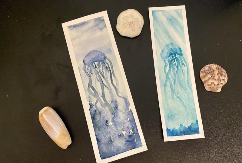
11. Seaweed and sparkles: This one has now dried and unfortunately there is a small
mishap up in this corner. See how that indigo has bled over into our turquoise here. It's not huge problem. But what we can do with that
is after we've cut them, we can cut this into a new size. It's only on this corner, so I only need about half
a centimeter in here. Then cut off the
top and then I can cut off the white edges. Then just have a color that goes all the way to the
sides and that way we can rescue this
without too much trouble. Then there's another
example down here. Here you can see it didn't go
all the way to the corner. I didn't feel it all the
way out but since we're doing this little kind of
seaweed here at the bottom, I'm able to cover this up. But I didn't really want
to paint anything up here because of
those rays of light. Let's cut this one
after and then this stormy sea indigo one, looks like it's been
behaving very nicely and stayed within it's lane so
down here at the bottom. But it didn't invite any of the turquoise
in on it's tuft. For this one, I just wanted
to show you how you could do a little sketch
to begin with. Here I have some
watercolor pencils. This is just a kit
from fabric pastel. This is a nice turquoise color, so this would
disappear completely when we put that other. If you would like to, just like a little bit
above the middle there. Just going to make
that jellyfish shape. I'm holding it very lightly. That way I'm just going to be leaving pigment on the paper. I'm not pushing into the texture of the
paper so I don't want to leave any marks. I can only write too hard
and it goes into the paper. Just making this little
marshmallow shape [LAUGHTER] up here. That's all I want to do
because we're going to go just three stripes downward. If you want to be mixing the
guidelines for yourself, I think I would like three of those thick ones,
you can also do that. But I'm keeping it very light. You can see that doesn't
disturb the paper, doesn't push into
the paper texture. Let's put that one away. Then just using my brush from now on because
we're not necessarily going in with clean water. It doesn't matter
that this clean water now is a little bit tinted. You can see there's
still a big difference between my dirty water, rinsing water, and
my clean water. Going with this and then
just going along the edges. As you can see, this
already activating that colored pencil going along the edges of
that jellyfish shape. I would like to activate the whole thing
so I don't really have those pencil looking lines. Just really carefully. It's
almost like a coloring book. Just coloring
within those lines. Then going back
into our turquoise. Giving it some more color. Letting it bleed into there. Like we said before,
if you want to keep this top part where the sun
hits little bit lighter. [NOISE] You can always go back in rinse my brush a little
bit and then make sure that that didn't become
a very dark value like a higher contrast and to dark up there. I'm going in with more color. I still have these
little guidelines, so I'm just going to
follow those down here. I'm just balancing my
brush back and forth, making those blobby
ones in the middle. If you feel unsure of
these, make one extra. You can also look at
a reference photo. Then while that's still wet, remember how we were going to do a little bit of
glitter as well. I want to go into this
beautiful turquoise. Usually I would
recommend activating them before but since I didn't do that and we don't need to be a
solid color yet. While this is still
wet we can drip in some of that color and then with just
a clean damp brush, I have move it, blend it around. Let it float around within
the jellyfish shape. This one dried a little
bit too much. That's okay. That's going to have a bit of
a glittery effect in these. Putting in some extra ones, putting in a little
bit of sparkle. Now, we can also
use that sparkle. We can activate it
quite easily to reinforce those blobby parts. I really should do my research and I figure out
what they're called, but I don't know. Then using the same brush, not too wet to start
making some literary. Let me say tentacles, but they're not, are
they? These strings. As you can imagine,
glitter paints, sparkly paints don't dilute in the same way as normal paint. I also do want to add some I think normal
turquoise paint as well. You need some lighter, shorter
ones out on the sides. Then filling it until
think it's nice and thick. Then let's go down to
the bottom and fill in those seaweeds down there. I'm using the same technique, I'm just dragging upwards, as we showed you in our training. Starting at the bottom and the more pressure I
have at the bottom, the thicker the line will be and then I'll swoop upward. Just like that. I
tried to cover up this little corner where some of the paper wasn't
covered with paint already. You can always go
back in if you need to little paint around. I'm just trying to flick my
brush to get those thin ends. Then the more water and paint at least my brush, the
paint gets lighter. Also going from the side here. The pink it's lighter
but we can also end up with a brush that
doesn't have enough water to cover the paper, which means we can get these dry brushing
textured strokes. When that happens,
usually it just needs a little more time so it
doesn't skip the paper. Because I love the
dry brushing effect, but for an underwater
situation like this, dry brushing is a bit dry. As the word implies, which isn't necessarily
what we want for something that's supposed to be
fluid and underwater, which is also why the
techniques I like to use are the wetting metallics and
the solid, wets and dry. Then another one. Another round of that
with our sparkly paints. Let's get it nice
and thick and I'm just working my brush
around and activating. Sometimes the metallic paints takes a bit more
time to activate. Just do it like this. We're
doing the exact same thing, getting some more seaweeds. You can find out, just
explore what works the best for you if you
prefer starting at the top and then
swooping downward. Maybe starting at the bottom and swooping your grass
or seaweed upwards. If you need to go in to fix the tip of your seaweed,
you always can. This is also all right and that sparkly paint,
nice, and shiny. You can see now that
jellyfish is starting to dry. We're getting that kind of
magical underwater glitter or sparkle. Some short grass at
the bottom as well. [NOISE] Beautiful. Then if you want to, you
can always draw and make some bubbles or some splatters I could do before with the
glittery paint as well. Let's leave that one for now
and go to our Indigo one. [NOISE].
12. Indigo: With this one, I'm going to do the same technique as before with the painting first I'm
going in with clean water. Getting a bit of
indigo in that brush. Going in with that shape. Have quite a bit of
water on my brush so, it's actually got wet. I'll just dry some of that off. I'll just move this around. My brush is already ready. This is not a super light one. Because we're here,
because we haven't done that yet Let's make a little baby one. Same shape, same technique, just a smaller one down here. We'll sway their mom or dad. For this one that's
going with this disk. [inaudible] Just put that downward, this kind of mixing
in with the indigo. Don't mind. We'll get some
of the glittery ones, and then we'll get some more. That's just the ink, as well. [BACKGROUND] Some of these could. These won't show up as much, but when you turn
your painting light well in that just some small
ones will hit the bottom and then it's going
to do some splatters [BACKGROUND] bottom
here looks like apples. Like so. Just wiping that off, going back into our indigo. Actually, because we're
working with such a small, also working with a small
and it's going with a smaller brush indigo. It looks like this
is going in a lot. I'm just going to go over. See that seemed to way too dark. Let's go in and
dilute that a little. Another layer. Kind of exaggerate in
darking the color a little bit to get a strong Jellyfish that's
only light on the top. These ones. It makes sense that these are
a little bit darker. It's taking tiny it's just
the tip of the brush. Also actually you
are done this yet, but they could also disappear. Off the page like that. I do want to go in
and get some of that. We don't part this
[inaudible] with a darker, darker indigo, add some and then just tapping
my brush a little bit. Time to get those little
tentacles for our baby one. I'm just tapping my brush
to get it too pigmented. I still want the shape of
the jellyfish to be the same where we storm they jellyfish this one [LAUGHTER]. Like so. We can
always go back in. I know we always say
that or we can only go from light to dark with
watercolor paints, but there are tricks to lighten if you have gone too dark like
I did for this one. You know I'd rather
show you this than show you how to fix
it than to tell you that I will perfectly
make this every single time. You will never make mistakes. Now we have a bubble
party down here in the corner and beautiful sparkly couple of
friendly jellyfish, and then we have this one with our seaweed
down at the bottom. We're just going to wait for
these to dry and then we'll come back and tear off the tape.
13. Tape peel and cutting - Part II: Of course, with sparkly
paints, we can use completely the same
thing as earlier, which is it's dry when it's not shining [LAUGHTER] because this will keep shining. But you can see that
there's no wetness. So same as before. Tearing off our tip on diagonal. Because I trust this tape
and I trust this paper, I'm tearing it off
quite quickly. [NOISE]. I actually don't mind it. It's not that dark. Then this one has bled
a little bit as well. Let's try this one again.
You use clean one on it. [NOISE]. As you can see that
is removing it, it's working a lot better
than on the other one. However, it is also staining
and dragging it around. This might be nice and
light enough when it dries. Let's double check it. If not, we also always
have the option of either going in with some white gouache
or white gel pen. That's already
quite a bit better. Now it's a little bit
wet, but that's okay. Then we want to remove this from the block so that
we can take it off, and also you'd like to do that middle part, eyeballing it. That's why we're
lessening the middle. [NOISE]. Then the spirit of using
the tools that we have. Here's an earring. This will find the opening which for
this block is in the corner. Anything goes. [NOISE]. Just drying that along
splitting off the edges, loosening the glue
on that side and I love that this glue is white, so that it doesn't show. Cut off the block. Then just using our provided
thin scissors. Cutting along this
and of course, there's going to
be a little bit of residue of the pencil on the sides of these
bookmarks so feel free to erase that. That's
what I usually do. Just a normal eraser, any eraser will work. There we have another
couple of bookmarks.
14. Final touches! : This is the final lesson of the class and this is
just to show you how I would fix those
tiny little mistakes like when the paint has
snack under the tape. If it doesn't go away with that little spongy
magic eraser thing that I already demonstrated. First things first and
this is just always a nice thing to check
after you're done, that if there's any pencil
lines along where we cut. For example, let me try to make that pencil like quite light so that it's easy to remove afterwards and it's not like I don't think you know how to erase so this was just
to demonstrate that. This is also something that might be nice to do
at the very end. Remember how we had a couple of places where the paint had snack underneath the tape and there are a couple
of ways to fix this. I've brought a
couple of options. One is a very easy one. These are just two
different gel pens, and not all gel pens
are created equal. Some are more opaque
than others so depending on how
dark the stain is, you might need to do a couple
of layers, for example. The technique is usually to get more ink out of
it, to push down. Let's just start with
this one. Let me get this little one up
here in the corner. I'm not a gel pen expert, but I do find that if
could've I push that down more than can drag across, I do find that pushing, manipulating a bit of
that gel coming out. That usually helps me
with more gel, I guess. I guess that's what this means, gel pens is gel. I'm just going to leave it
like this and then we'll see how it goes after when it's dry to see if it's
still a little bit see-through or if it
needs another layer. I'm just going to do
the same thing on this one with this other one. Maybe this will work better
or it will be the same thing. I'm just going to
roll in to activate. It's not like it makes
a huge difference, but it makes it better
a bit of a difference. Then you have this one which is a great option for anything
you need white for. This is the Dr. Ph. Martin's bleed proof white and it's a really thick gouache. It is water-soluble, so
we mix it with water. It's really nice for making
snow or splatters of stars. This also works because it's so opaque so it'll cover up
whatever is underneath. My best tip for this is
to make sure you have designated brush for it or you make sure your brush is
really clean so that if you put your brush in and it has
a bit of turquoise on it, you don't contaminate
the entire pot. What I usually do is
I use whatever is in the lid with a very clean brush. This one is clean, and
you add clean water. You don't need a lot because
you want it to stay thick. I'm just activating. We can have a bit
of a pasty paint. This one just add
a tiny bit here in the corner because this is where the magic
eraser did work. Let's do that final
tiny little part. Just to neaten up that corner. It wasn't really necessary. There is a tiny
dot there as well. Do you see it? I'm super nit-picky because actually this one didn't
have a lot of bleeding, but see that corner as well? Just going to get that
just to demonstrate, this is completely necessary. But now you know how
to use that as well. Actually, looking
back at this one, that gel pen has dried
a little bit gray. I don't know why. I feel like
this one never dries gray, it dries really nice in white. I'm actually going
to go top of that. Just a thin layer to
whiten up where I felt like that gel pen
didn't actually work as well as I wanted it to. It has worked before. Maybe it was just contaminated
a little bit, but I feel like that looks
nicer and brighter and whiter. Because of course you want
the white to be invisible. Remember to always put your lead back on your lid proof white. If not, it will dry out. If I decided that I
wanted to fix this, if this was atrocious
or maybe it wasn't a nice matching
color like this indigo. I don't mind this indigo
with the turquoise. But say it had been
something like a bright pink or something that didn't work together at
all and really stood out. See how this metallic paint
here is really opaque. It's really covering
what's underneath. An option would be
to use that paint, do that tape one more
time, tape it again, tape off that corner to keep that nice sharp border and then use that sparkly
paint in the corner, maybe drag it out. There was a sparkly
sunshine situation. Alternatively would
be to either cut it here and then maybe also cut off this
border at the bottom. Then it will just
have white borders on the side or I cut
off all the borders. Maybe cut in a tiny bit here, a tiny bit there. Then you would lose a little bit of this side
and a tiny bit of the top. Then just the borders from
the top and the bottom. You would get a full bleed of this entire jellyfish
painting instead. There are just options and solutions everywhere.
Isn't that fun? Then these two are
already signed. Our final thing which
I always like to do is to sign these
other two as well. Just at the bottom,
I usually sign it with my initials and you can sign either on the white
or up into the bookmark. Let's do one of
each, I'm going to sign on the white for this one. Then for this one, I'm
just going to sign up into the paint right Right at
the bottom right corner. You can, of course,
sign wherever you like. But I do encourage you to sign, it's the final touch. It's like the dots
above the ice. We have our signatures
for all of them and they are ready to be put
into your favorite book. I'll see you in the next video for some final thoughts
before we say goodbye.
15. Before you go <3: Just like that, you've
finished the whole class, or maybe you skipped
back and forth and maybe you've chosen the
ones that you needed to see and maybe you skipped the metallic parts because you
don't have sparkly paints. I don't mind. I'm really
glad you're here and I'm so proud of you for having taken time out of your
day to be creative, which is really hard to prioritize in a
world that's like, "You have to do something
productive and you have to work," and then all
these things we have to do. Give yourself a little pat
on the back for having taken some time to just play
with your paints. I would love to see
your version of this underwater jellyfish
magical scene bookmark in the project gallery below, and also share it on
Instagram and tag me in it. In that way, I can
share it on my Stories. I usually save all of
my student projects in Highlights on Instagram
as well, and that way, you can go back and you can
slide your own project, maybe see other
people's projects and get inspired
by those as well. If you enjoyed this class, you might enjoy my other
classes here on Skillshare. They're usually the same kind of low-threshold
monochrome class, just using one paint
so that we can get started quickly so that we feel like we've created
something finished while also practicing an essential
watercolor technique. You can find them here
or in my profile. If you click "Follow",
you'll get updates for any future classes and if
you follow me on Instagram, I'll also be sharing
some behind the scenes there and maybe bloopers. Who knows this tends to happen? I don't take it for granted that you're here
because I do feel like there was a tendency
that we have to do something productive and we have to do something
that makes money, or we have our
obligations everywhere, so just taking the time
to do something like this creates something that
maybe is just for you. How nice is that? I hope you appreciate time that you've
given yourself to do a watercolor class today and I'm proud of you
and I hope you are too. I want to see you
again very soon. [MUSIC]
 Elise Aabakken, Voice Coach - Teacher - Performer