Transcripts
1. Welcome to class!: I want you to have the
satisfaction of crossing something off your
list, so you don't have to make one layer, then come back to it and then another layer and do lots of details, which you can also do
that, That's also a choice, but I want you to
have the opportunity to choose something different, just like the body
that you walk off your yoga mat with and you go into the world
with that body. You go into the world
with the brain, with the body, with
the hands that create art, with your creativity, with your inspiration,
with your, "I didn't know I could do this, but what if I can?!"
optimism, opportunity... I think you also bring that
into the world with you. You take it with you, it affects you, outside of just
the creative practice. Hello there friends,
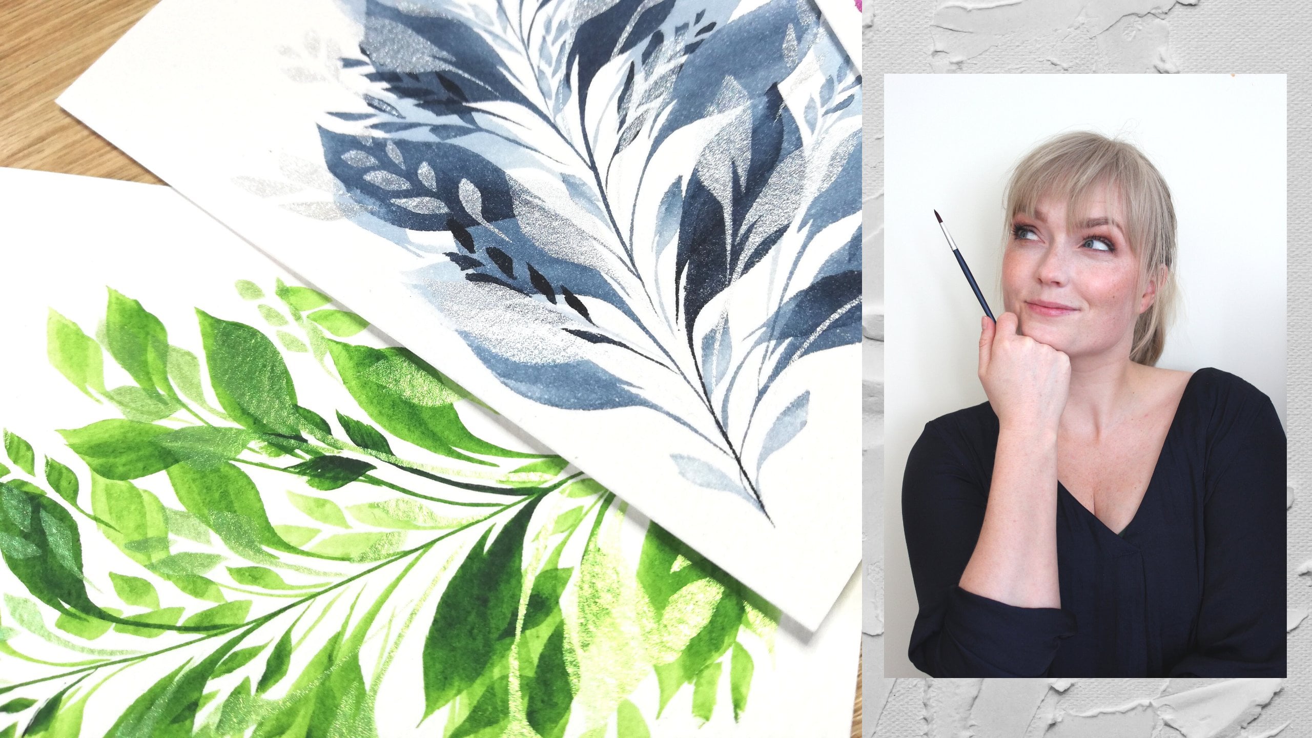
and welcome to class. I'm Elise. I'm a
watercolor artist, teacher, painter, coach, performer, danser, actress, and first aid course
instructor and makeup artist... And all of my watercolor classes are mainly about how to lower the threshold
to get started. Make it as easy as possible for you to get into a
creative habit, creative practice,
playing with your paints, not taking it so
seriously, and not for creativity and
exploration and play to only be some kind of special event that you
only do when things are perfectly lined up and
you have 2 hours free time. Most of my classes are with
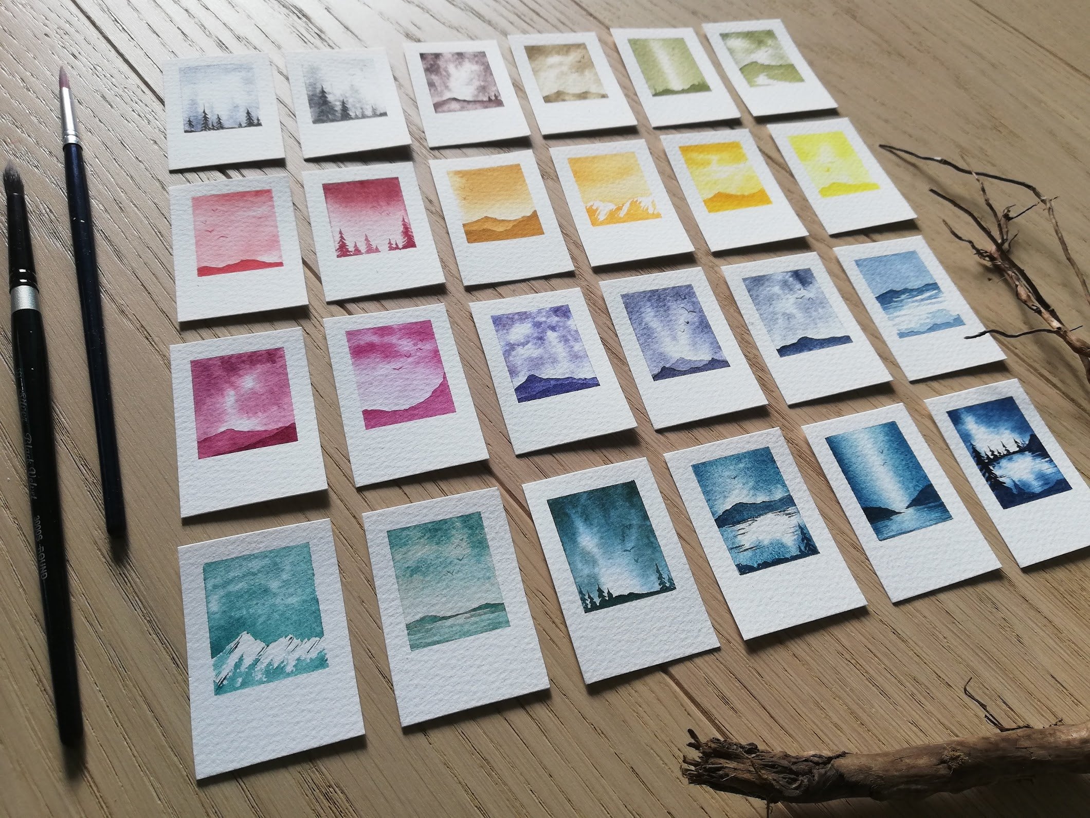
projects that take you 10-15 min to finish. Some of them are
even less than that! And this one is no exception, At the end of the
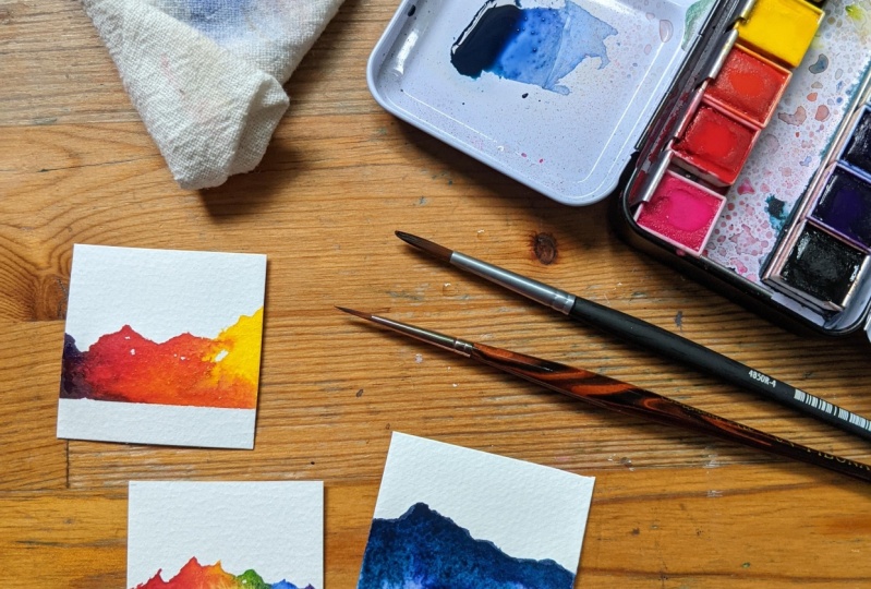
class you'll end up with, probably more than one. If you're anything like
me, of rainbow mountains. If you've taken any
of my other classes, you will know that about 98% of the Art that
I make is monochrome. And with watercolor, which is a beautiful medium for
working with transparency, adding more water, making it
lighter, making it darker. You can do a lot
with just one color. But this one, I know it's wild! we're going to be mixing colors. My favorite lazy way of mixing colors directly
onto the paper and create these beautiful
mountain range rainbow mixing artworks. So you'll get some
color practice theory. You'll get some jumping
straight in-bravery. Deliberately being
an imperfectionist, deliberately working to
lower the threshold to get started and kind of work
with whatever happens. Watercolor is not a
very controllable medium, which means you being flexible, you being able to move what
kind of whatever happens. while still have some tools,
have some techniques, have some tips to not
tear all of your hair out while you're painting,
is what we'll be doing in class. In this class, you will
need watercolor, paper, Watercolors, some water, a brush and Something
to wipe that brush on. You don't need tape, don't
need a board to tape it on. There's gonna be
painting directly onto the paper if you
have a block, great. If you have
sketchbook, fantastic. I love loose sheets of paper
and that way it's already finished so that you have
an artwork that is ready. It feels a little bit
different. To me. Sounds good?
Let's get started!
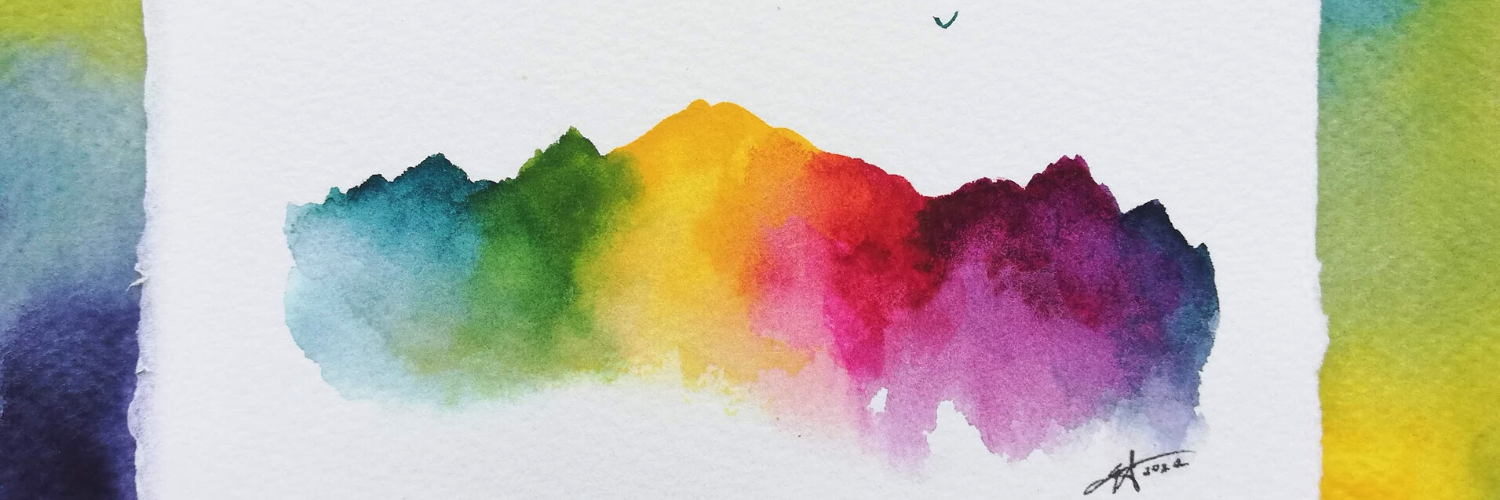
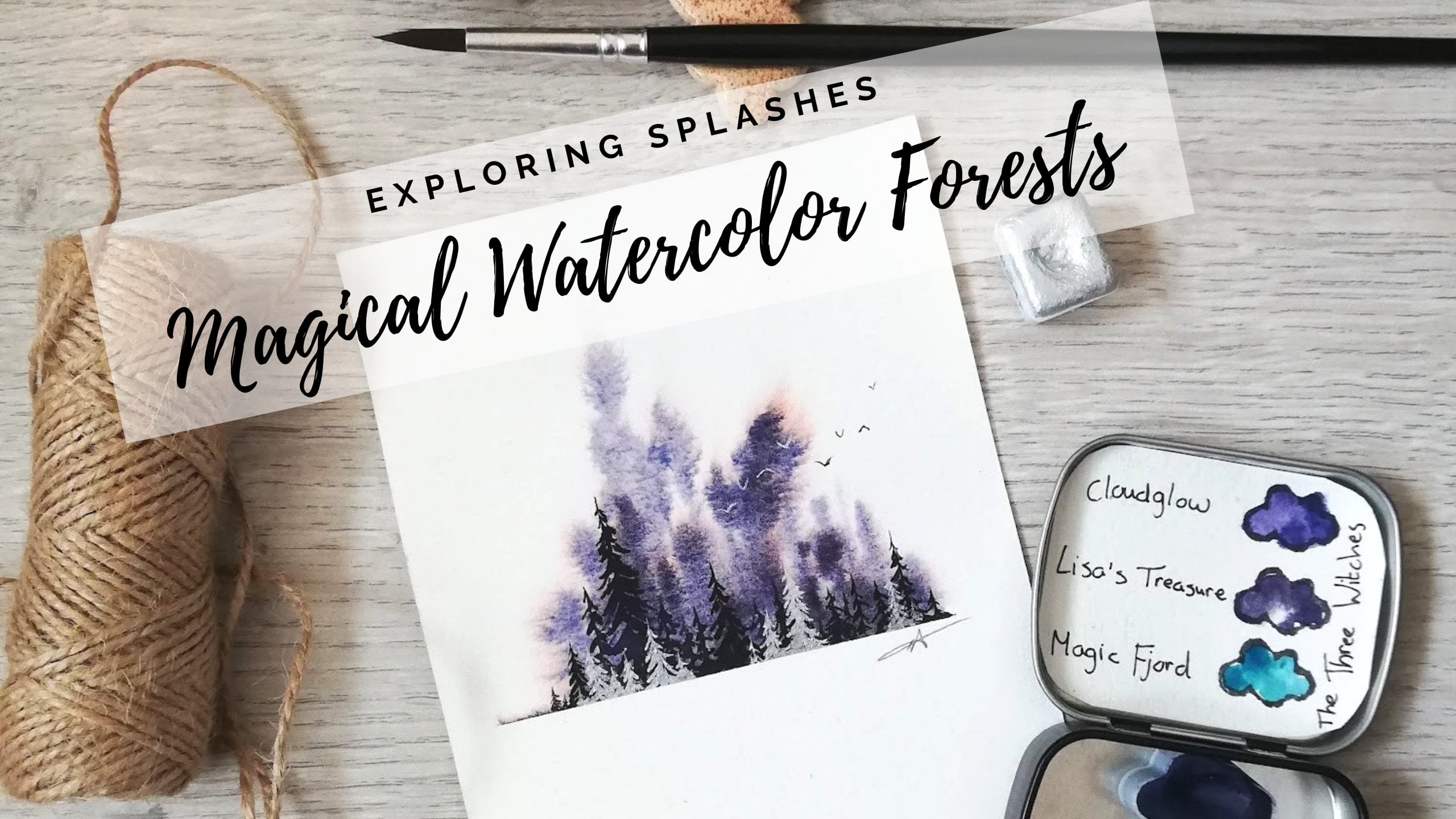
2. Class project: Welcome to your class project. So the artwork that inspired
this entire class, is this one, this little rainbow
that I made last year. And I love it. I think this was only
made with three colors. And I love me even though it's the wrong
order of the colors. I love how simple it is, and how about we just lots
of white space which I enjoy. It's really easy. It's just one layer. I don't have the patience
for lots of layers. So I love it when something
is finished immediately, you don't have to make
rainbow mountain. I'll be showing you how to make a monochrome mountain as well. And this is what started
the whole thing. One of the reasons this works so well in the color
stay so clear and separate is because we're just mixing two colors at a time. We make it way too wet. All of the colors
that mixing into each other and they'll start
neutralizing each other. So there'll be a little bit
of Color Theory in this. Not very much, but
as you can see, this one's a very
different looking, very different from this one. Just based on the
primaries that you choose. If they lean towards warm or cooler tones usually
lean towards each other. That might not make any sense. I'm going to talk about it
in our Swatch video as well. In the next lesson,
I'll be talking about the supplies I'll be
using for this class. You don't need that. You can skip that lesson
if you want to know why I've chosen the
work that I've chosen, because the reasoning behind it, and you don't need
the same as me, but might be helpful to watch. If you're fairly
new to watercolor. I'll see you in the next lesson.
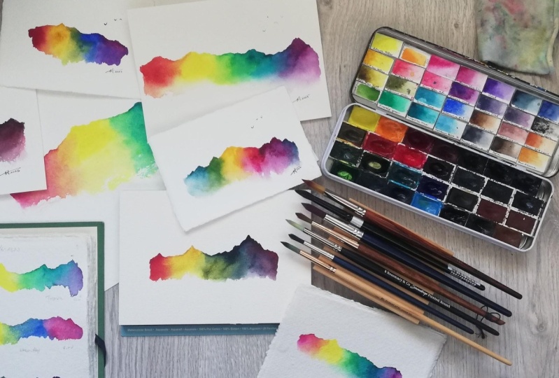
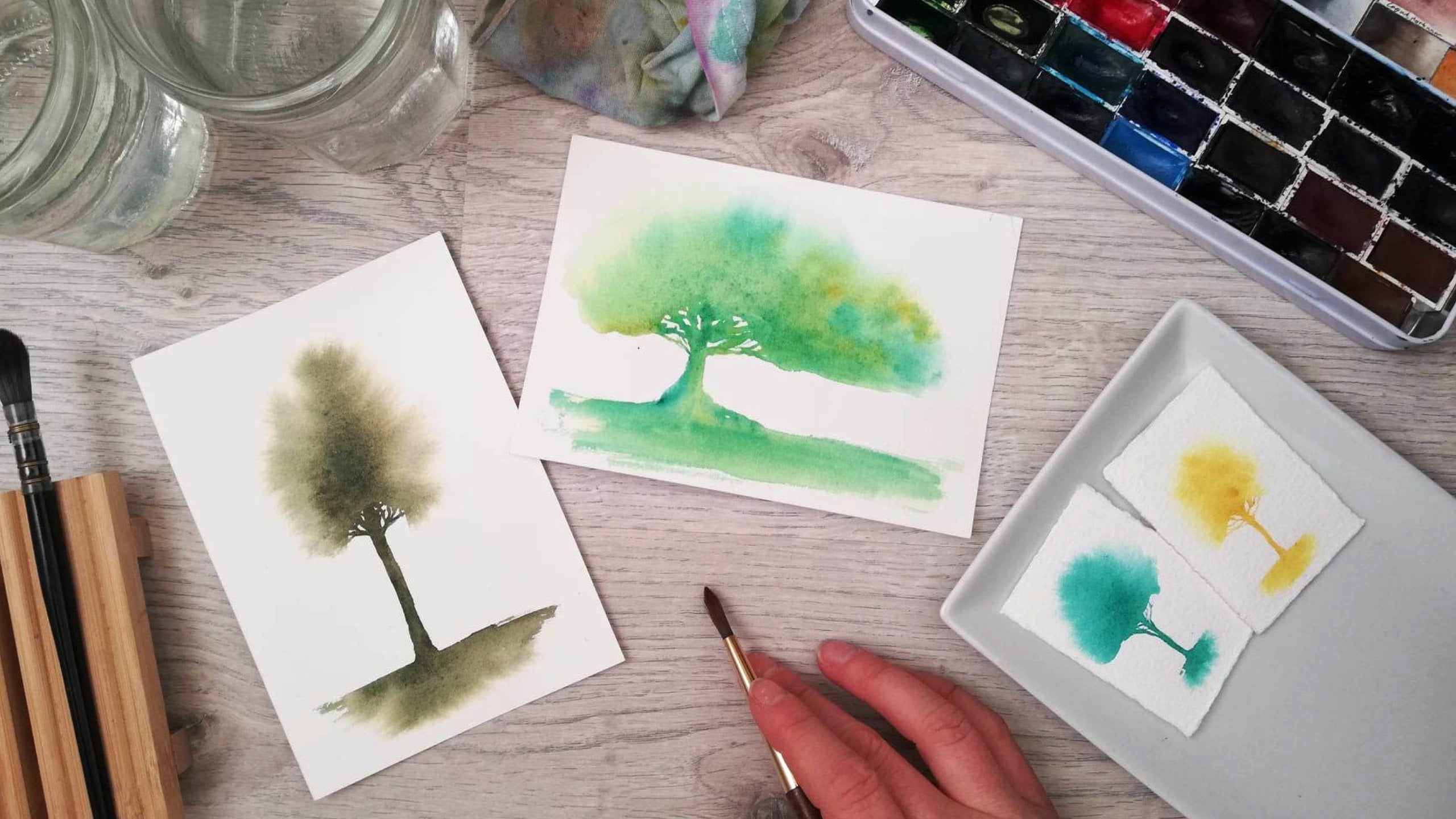
3. Supplies and Tips: For our supplies, I'll be using my classic favorite
watercolor supplies. Nothing too spectacular
and special. You can get away with
just using three colors. One brush gets a
water gets on paper, and that's it and Something
to wipe your brush. I'll just be going through
to talk about why I've chosen the ones that are chosen and give some tips and tricks. Along the way that this will be an easier project
for you to do. I just, I only want you to
have easy Fun Art projects. Why are we making Art
practices so difficult and typically stay
in competition with the people around us and people that
we see perhaps on social media of what are
supposed to be like. So this is a permission
slip to make it easy. First off, one of my
favorite pellets. This is a palette
that I put together myself from a couple
of different brands. These top and bottom
ones are white knights, and the ones in the
middle are the Roman, small, and which has beautiful
color range as well. From mixing colors today will only be using the
three primaries. So it's kind of a sneaky way of learning how to mix primaries, as well as kind of
going straight in most paint palettes have
both warm and cool. Yellow are warm and
cool red and warm and cool blue, which is
what we'll be using. The ones I'll be
using the most are our yellows up here and lemon yellow and the
nickel as a yellow, which is a bit of a
brighter, warmer yellow. And then I'll be going
in with either one of these more red reds
or this really, really pink, magenta red. And the blues. I'll be going through our, and with the turquoise
is down here, this purplish, bluish,
really beautiful. And then we can also use the integrals and the
Indian thrown blue up here. You don't have to go out and buy extra fancy ones are
new ones or anything. Just play with the
ones you have. See if you find a new
favorite combination. Then just for ease, I always bring Two
jars of water. These are well-loved, little bit stained
there at the bottom. France has a lot of
coffee in the water. This is why these
look like this. But just to keep
one jar of clean, getting in our clean water, especially when we
were going into light colors like yellow. Whereas in the other one will be dirty jar and that's worry. I'll rinse my brush first time. You'll see me going
into the dirty jar with my paint on my brush. Rinse that off in
the double rinse it, pick up clean water from
my clean water jar. Then I just brought
some little rags. And I love using cotton. I love using fabric. And this piece of
an old t-shirt, and this is a cut up sock. So this one is actually
life hack for you. If you are painting on the go
to have this on your hand. Actually this will be that
would be the wrong hand. If you put it around your arm like this and you hold
your sketch book, can you can do brush and wipe
your brush on your wreck. Fancy have these are washed,
they're just stained. So if you can use
something that doesn't accumulate more trash,
that'd be lovely. So bring something
like this if you have a piece of cloth
that also regulates how much water is in your
brush so that you control the amount of water
you mixing into your paints and how much
water is on your paper. Paper wise, I've brought a
couple of different ones. So I have these blocks. I really enjoy using these. They're glued on the side, which means they'll stay flat no matter how much
water we put on them, they'll still flat
when they dry because when we add water onto paper, famously water and
paper and France, they will expand
the paper fibers. You might see you
kind of buckling up. And then since it's glued on
the sides, when it dries, it'll drive back
into its flatness. Whereas if you paint on
the loose sheet of paper, like one of these,
completely loose. And then it might, when it puffs up, when it expands and opens, it might dry in the weird
kind of buckled way. So if you want to give
your paper super flat, can recommend a block like this. I have brought both a rough one. Then I also have cold pressed, which is not as textured, but it is textured. And an easier way to
remember this is that cold pressed is if you were ironing something with a cold iron, you wouldn't get it as flat
and smooth as you guessed it, a hot pressed paper in both of these are 100%
cotton, my favorite. They stay wetter for longer. They have smoother,
easier blends. They dry really evenly. And there 300 g/m², 140 pounds. That means they're
thick enough to handle the amount of water that
we're going in with. Get some nice paper. You don't have to have it, please feel free to practice with the paper that you have. But if you're splurging and enjoying exploring new
types of watercolor paper. You can also go to your favorite occupies store
and they might have samples that you can try out so that you can get
your favorite paper. I also brought just to show, I have a piece of a
torn off paper here. This is also backwards. Watermark, Saunders, Waterford, beautiful
cold pressed paper. And then I also, just for Fun, brought
this qadi paper. This is handmade paper
and it's 640 g/m². It is so thick, it is, It is very, very solid. And especially when we're
not going to use tape, we're not using
anything to hold it down to make it dry flat. The thicker paper
is almost actually, it is a little bit bottled
already, but that's okay. It will stay flat. Even though he put a
lot of water on it. Then you'd want to, if you want to, lay, can also bring a sketchbook. In. This sketchbook is made from the same paper as
this CATI paper. Handmade paper. And it's very lovely handmade. And we have some
different examples here. This is where I
tried out some of my combinations of
rainbow colors. This was before I did
this first-class. So just wrote down the name of the colors that
I was using here. As you can see that example of this granulating
ultramarine deep. This is a way to keep track
of your explorations. Keep track of what colors
you like the most. Like, Oh my gosh, this almost
looks like blood over here, but yeah, it doesn't
turn into like a purple, like these ones when there's different types of blues and reds
that using to mix. So getting to know
your mixing colors, getting to know your paints, and how they show up on
different types of paper. So you can bring a sketchbook if you want to try them out first. And you can also
skip a sketchbook, couldn't go directly
onto your paper. Last but not least,
we have our brushes. I love round synthetic brushes. And I'll probably just be
using one for this whole class around synthetic pointed brush that kind of springs
back into shape, will get you those
crisp lines at the edge of the mountain when we're trying
to get that edge and it still hold enough
water to blend out your colors and to work a bit back-and-forth with the
paints that you're using, the bigger your paper is. It might be a good idea to grab a bigger brush when you're
doing small pieces, postcard size pieces,
which I love. You can use a small
brush like this. If you're going on going into something bigger
like an A4 page, I would go with a bigger brush. They can hold more water, more paint so that when
the paper absorbs it, it's not going to just release
and be super dry and go into dry brushing texture
immediately. That makes sense. Perfect. That's it. I'll see you in the next one.
4. Bravery time! First rainbow mountain exploration: Depending on where in the online Art community
world you are, you might've heard about
something called sheet booking. You might've heard of
someone talking about writing a ****** first draft. That's what we're doing today. We're going to jump straight
and I'm not going to explain any techniques
before we jump in. I want you to jump straight in. I want you to try. I want you to put your
brush to paper immediately. This first lesson is
about going straight in, trying it out as you go, adjusting as you go, and you'll actually see me. Hope all mistakes. I will be explaining them along the way and seeing
how I fix that and how I practicing not judging myself too harshly when unexpected things happen would happen all the time
with watercolor, because watercolor is famously
an uncontrollable medium. I'll be talking about
some of the techniques, some of the things
that we can look out for to make it easier
for ourselves to correct mistakes and acceptance, and patience and practice
and trying things out. I would love for you to grab
your paints for right now. I mean, join me right away. Or you're, of course
welcome to watch this end. Paint along later. We ready. Let's go. I'll go to start with
one of these really thick papers as I
showed earlier. And because we're
going to go in with the lightest color first, I'm going to put
down some yellow. Now, Norwegian, I don't
know if it's the same. We have a little anagram for
the colors of the rainbow. Roygbiv, red, orange, yellow, green, blue, indigo, violet. I just wanted to show
you this one here. We have this kind of read going into orange,
going into who? Yellow, green degree. There's a turquoise, blue, blue, indigo maybe
here somewhere, and then some purple at the end. So the trick here is to
put down the yellow first. So kinda where the
yellow would start, which is a bit off to the side, can realms thirst
the first, third? And then because yellow
is our weakest color, It's our lightest color. I want to go in
with that one first because if you go in
with a lot of blue, I would need to hello or on
the yellow to neutralize it, but to mix it into enough of a green so there was
still beat yellow, that would be enough space
to mixing that green. I hope that makes sense for
putting this one first. I'm going to mix it outward
into some pink over here to make this red and
then outward out this way. So actually the yellow kinda needs to extend all
the way over here. I'm getting a big
amount of yellow first, putting that down here, and then there'll be mixing
into the other colors. After. I'm going with
this lemon yellow first, I'm thinking some
clean water right now both of my jars are clean. And because my paints
are dry right now, I'm going to mix, make a nice thick, pasty, thick paint here. Because some Watercolors need more time to soften and
release their pigment. I'm going to go
into, this is not a gigantic papers or make it a small little section
here of yellow. And I know I'll be blending
outward both ways to make the red on the left
side and make the green on the right side. Because I know I can
always go further down. I can always suggest
just to kinda putting my brush flat towards the paper. Then that way,
blending it upward. The tip of my brushes with Mexican at the top
of the mountain. And then the further
down we brush goes. As you can see, it's just
water to bottom of the brush. Here, there's just
water and there's paint at the very edge. So putting down a
lot of that yellow. Now, this will become
my dirty water jar. As you can see.
Yellow. Because I feel like the pink
will be less tinting, less staining, less aggressive
color than the blue. Going in with my pink. This is a Quinacridone Rose.
The same kind of thing. Don't need to activate
it for super long. Also types of the essence here because when it starts to dry, we much more difficult to blend. To begin with. I'm just
going to put it right next to the yellow. Already. See it kinda starting
to mix to become a red. Don't want to bring
it all the way in. Remember this yellow is also the yellow are
using for the blue. And I'm gonna go rinse off this. I don't want my brush to be too wet because the more
water I have in my brush, the lighter the colors will become my brushes just
a little bit damp. Just going into kind of marry
these two colors together. From the yellow into the pink. Going a little bit
back-and-forth. What I would love for it to blend seamlessly, it stay wet. And this is quite an
absorbent papers. I'm adding quite a bit of water because if you
turn it to the site, you can see that's still shiny, that's still wet, starting
to dry in the edges. So I'm actually going to make sure that that yellow stays wet. Adding a bit more
just to clean water around the edges to keep it wet while I'm
blending this pick, then blend it out. Here at the bottom.
I love it when it flows downward into nothing See how that starts
blending to have this orange part
heading into that red? Yes, don't know why
the lightest blue, but here it is. Then going to put our turquoise, going to go in with
this turquoise, blue is there are
modern primaries, yellow and cyan and magenta. I'm gonna put it quite far
over here because we're going to make sure we have space
for that green to blend. So let's make that
a little bit lower. This is also being blended
into some pink on that side. I know so many things to keep
in mind at the same time, kind of laying that down, making sure I'm grabbing a little
bit of dirty water. Thank you. Sure. That's wet enough. And then rinsing off because
when I go back into the yellow to marry them over here, I don't want them to I
don't want the blue ***. All of the okay. That might have been a
little bit too far away. That's okay. Go in with a little
bit more of that blue. Rinse off my brush and rinse it because I'm going
into yellow now. Rinse it in the clean water jar, picking up some
of that yellow to start marrying into that. Too much sun off again. And this is just, this is just pull a time. See how that now
starting to turn green. As I'm playing, as I'm blending, see me going back and forth. What I'm trying to do is drag all the blue into the yellow.
Want to keep this yellow? Hey, say if from this
extremely tinting, very powerful blue color, which will turn all of
my yellow to green. If I pull it from the
blue to the yellow, I'm pulling from the yellow
into the blue instead. Make this smooth
water at the bottom. Trying to make the
transition from the yellow into the
green, into the blue. Smooth and seems every now
and then we'll just call it like some of that soft
bottom edge as well. Alright, we have
our green or yellow into a green, into our blue. It is still wet. That Chion there. While it's still wet. The final part is
getting some of that purple at the variance and
going in with my pink again, like Chrome rows in this starting little
bit over to the side, but I want to blend it
with a lot of This blue, some kind of dragging that into. I don't need a pink
part over here. So it can immediately start mixing with the
blue with internal. Oh my goodness, mixing verbals is just the
most satisfying thing. So I don't want all of
it to be purple though. So this is where
they're like this where the frustrate comes in. See how, if I'm
not careful here, I'll mix it too far into the blue is like
turquoise part here. And I'll get just a connection between just a connection else. My accident. Sorry about that. Pick up something that
back into our turquoise. I don't want it to be rescued. It, I don't want it to be
from the green to the purple. And I also don't
want any purple. So I'm just going to go in with my brush to kind of keep blending
these two together, blending this purple
outward and keeping, trying to keep as many of
these beautiful shades through mixing here now, visible, as many as
possible, visible for us. Then we can see how
all of these colors are blending and
mixing together. We don't want to lose that blue. I don't want it to jump
from green to purple. Then blending modes to go in now, actually have our
soft rainbow mountain in my perfectionist self. Perfectionist, pardon me? Like this isn't good enough. This isn't going to get a
tiny bit turquoise just here. Just to reinforce
some of that pool. In the transition, they're going to just there. So let's move. Feels like it has its spot. Just playing with
it. There is no There is an idea of a plan. There's no very strict plan. So looking at this now, just like you might do, and you'll find that some of your red balls have more
focused on one color. I feel like this is not the most interesting mountain
shape perhaps. That was also focusing
on explaining along the way and talking to you. My feedback for myself
on this one is kind of being too shy over here with
the red and orange part. And then this kind of came
a very large purple blob, which is why she doesn't, I mean, to be fair. So it's this one. But something about this
doesn't feel entirely balanced. So I'd like to have
some more over here for the next one
is perfectly fine. I don't mind it going in
after it starts to dry. My just cause more havoc. Having as you can see now, only the purple
part is still wet. Could have been
in with some were there when it starts drying, it's going to be really
hard to, to edit anything. It's going to be difficult
to keep blending. And this paper, it's not super
forgiving because it is. So whereas over here and
see how that is getting. Yeah. Still beautiful color-mixing. We still learn
something. Still learn something about my supplies. I hope you did too. So now that we've done this, once, we have a lot
more information, I just wanted you
to see how even me, even though I've
done many of these, I still don't do it perfectly. I still don't do it in a
seamless, super quick way. We still managed to get something
that is extra of color. We've made a piece of Art, work Art that wouldn't have
existed if we didn't make it. Which is all I want. And if that can
happen in 15 min, imagine if you practice
a little bit more. Imagine if you get
to know your colors better and you adjust
it along the way. And you learned from
the things that you see, that your preference, the things that you notice
about your own artwork, that you've guessed it, that is where the practices. And to let this dry, also, more water you mix in the
lighter the paint will become and it will
also dry lighter. So when this dries will probably
be a little bit lighter, not as intensely colored. So that's also something
to keep in mind. If you like really,
really bright colors or like pastel colors, you can adjust that width, the amount of water that
you put into your paint. Okay, cool. So in
the next one will be going in with some
different colors. I'll be going in with
different paper to show you how I would adjust as
like a round two of this, while also explaining
more about the colors. In the meantime, how Melinda too much purple back
into light green habits. This was, this is
why we practice. This is why we get to know our paints better,
how we improve. So I'll see you in the next one.
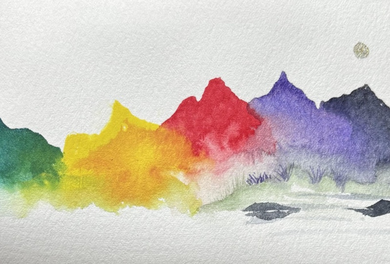
5. Monochrome mountain and making it yours: Now I know I said this
would be a class about color-mixing and I wouldn't
be painting monochrome, but to demonstrate
how I make mountains, how I make this like raggedy, random shape and how
I use my own life or my favorites are
something that matters to me to make that mountain. This is what we'll be
doing in this lesson. Let's jump into
the second version where we'll make it an
outlet for the mountain. First, we'll go in with different primaries and
allergist from the way I made the first mountain to
see how I can make it a mountain that
I like even more. Let's see. I've bought you just fold this. My favorite way of making
parked your watercolor paper. I'm just going to hold
it and we decrease. The edge. Technique is also, I
got it from YouTube. I don't remember the name
of who I learned this from. And it's also in
my forest class. I have a whole
lesson on how to do this Technique or
well-explained. So now that this is completely
creased, has an ad spend. I'm just going to
open open corner. Written your finger,
not my ring finger. That is my middle finger. On the middle of this bowl. Push this, the floor. Split it, tear it apart. Magic. Want to make one rainbow
and one classic mountain. This will be Art pipeline. So you know how partitions of music and away the
notes go up and down. With ONE to be using that, I would like you to pick
your favorite song. And this might sound silly, and it is, and that's
the whole point. So either your favorite song, a favorite quote,
the way someone says something like if your mom, your best friend, or someone
you love someone in a movie has a quote and
movement of that quote. So when we talk, we move our voice up and down. It was weird to say down
and up at same time. But say it's something like, I know the example that
I used last time was from the Disney
movie in Canto and I think we don't talk
about no, no, no, no. And then it kinda, well, this is a mountain that looks and it reminds me of a song
that I really like. So that's an option for how to make your mountain look
a little bit more random, little bit more uniquely you. And putting an extra layer of this is why this
matters to me. This artwork means
something to me. If you're giving it to someone, maybe something they
say all the time, a quote that they say, an inside joke that
you have something that adds that extra
layer into your artwork. It doesn't have to
be, but you can, you can also, which
I really enjoyed, take either last week
or today or last year, and make a timeline of how you felt or
how your energy felt, or how it's going into
Art Therapy mode. But something that helps you make something that
matters to you, make something that reminds
you of something else. So for example, Energy
yesterday was like, Oh, it's kinda low
in the morning. And then I had a really nice
phone call with a friend and something doesn't
have to be the whole day. It could be just a
portion of the day. You're like, Oh
yeah, that was sent mountain that reminded
me of the song or this friend or this
moment with this vacation, whatever it might be, cells or anything else
you can think of. I would love to
know your examples when you share your project and the project gallery or on Instagram, you want
to tag me if you like. This is actually the height
of the members of my family. Whatever it might be. When I'm making my mountains, I hold my brush
somewhat flat towards the paper that way the
tip of my brushes was makes the gain of
mountain peaks. Just wanted monochrome one. And then I'll show
you the other ones. Because we love indigo. I love indigo. Let's go into that one. Then you don't have to
tell me what it is. By the way, you can make
your own mountain with something that
matters to you and I don't have to know what it is. You can keep it a
secret if you want. Okay? Just to give an example, I'm going to make something
that is a secret. That is something
that only I know. That means something to me. That means I'm wanting
to someone I love. Okay. Starting at the bottom here, kinda wiggling my brush so that I can make these
mountain tops a bit raggedy. Would like to stop
at the same edge. Neither side. I don't rinse off my brush.
While this is still wet, it doesn't need to
be completely clean, so I don't need to go
into the clean water. Welcome to touch the
edge of my brush. This is how to blend out. Extra droplet there
too, blend out, just touching edge of
my brush going in, starting to move
that pigment around. Some more water, this
super absorbent. Some of that around. If you need to slash, want to add more pigment to, to. Actually, this was
a good example. Paper that has lost size. It doesn't really matter. Lovely anyway. This paper has actually expired. It seems, which is why payments aren't blending as
they usually do. I kind of landing on
the paper enough. Which is fine. Improvise.
Just doing some dry brushing, which is when my
brushes almost dry. Exactly what it sounds
like. Now, this mountain reminds me of
someone that I know. I've just used my brush
like a minute to create something that is uniquely
me, uniquely my life. Can see it's still wet. That whole thing, however, did absorb my entire brush. It absorbed and slipped up. So this is a thing that's got to know so many extra bonus
lessons in this class. This paper has lost its sizing, which is a way that
watercolor paper is treated so that the water
doesn't absorb immediately. Say you were painting on
something like a cotton T-shirt. It's made from the same thing. A cotton T-shirt won't let
you blend out the colors. So the sizing is what it's
treated with to make it stay on the surface
for a longer so that you can blend it like
you saw with the other one. So actually instead
of using this one, because with the rainbow, we do need more time to blend that out and blend
those colors together. So they don't do kinda like
nerve up into the paper, then we cannot blend
them out again. So let's put these to the side. I'm going to try to recreate this mountain. What was rainbow? And we'll put that
as my reference to the side with my
watercolor block instead
6. Second exploration - Muted rainbow: Now that you have your mountain is do our rainbow instead. You some different colors
this time to not make it as bright as this first
one that we made. And learning from
my first steps. Learning that I need to be a little bit braver
over here with the red. And I would like to not
have as much purple. I would like to not
make up the sake of dropping purple
into my green. And let's see how that works. Going to try this time also, it's an experiment to start
whittling down the pink, blending my orange with the yellow and then
adding more yellow after. This is just going
back-and-forth. See what we like, seeing the
techniques that you'd like. Maybe you like starting in
a completely different end. That's perfectly fine. I want you to
experience, alright. My dirty water is
getting a bit dirty and into the clean water. Make sure I don't
contaminate my paints. I don't like that very much if you can clean it out
again afterwards. But for the sake of efficiency, I'm going to keep them
as clean as I can. Now, going in with more
of a classic fire truck, red, just started on the side. I really liked the
way this is placed on this paper format. So translating that to here, I don't want to go further
out than about I want to say this is like they're
me three-fifths, the middle of the
papers or fifth on either side and some
sunshine coming in. So I'm going to start a
little bit of red over here. Then that first little peach. That mountain. Just take, lay down
some of that red, have quite a bit of red. They're then going
in with this other, my other yellow, the warm
yellow, nickel azole yellow. And starting that in a
little bit out to the side so that I know that I
have space to blend that afterwards into
both the blue for the green and back into this red. And this will be that second
peak of this mountain. Know this looks like
a mustard color and it is it a bit of that clean water just to make
it really, but then double. It doesn't really matter if it's completely the same as
this other mountain. Kind of see how I'm kinda matching the tops
of that mountain. Linking them together, making them a little bit of mountain peak there
as well, match that. Making them here in the middle, creating that orange
blend in-between them. Without the red losing its red and without going
completely into the yellow and making
it a little bit, Voltron wasn't
really quickly as we don't want to wait too long for this to
settle on the paper. Going in with my
green can quickly see how that's blended. Wanted to keep it wet. You have time to quit. Now going in with more
muted blue as well. Actually going to go in. I
mean, this was integral. Let's go ahead with the indigo, see how that works
with our green. In the indigo will be
kind of our top over mountain and down on
the left side and then the purple will
be on the backside. That might be much indigo. And if that happens,
that's perfectly fine. I'm just going to
grab a bit more. Yellow. That way. Anywhere you muddy here now. See rich blend of colors. Just going in with
my damp brush, I'll get that color
blending like lightning bolts going into
the yellow, into the blue. Just sit there and watch
the colors blending play. So dragging it downward, you can see how that's
blending into the blue. Helping some of the blue
go back to where it, back to where it belongs. And if at anytime you feel
like about it too much paints, I've added, like you got it. Way too much paint and
it's just flowing around, creating havoc in chaos. Always have the technique
of the thirsty brush, which is a damp brush,
is pretty clean. And you just works as a sponge. You can just kinda slurp up. That kind of removes some of
that pigment, picks it up. I'll we don't have
that much pain to work with on your painting. Blend it up here. The bottom. You can show me get some
of that indigo down here without any of the
yellow mixed into it. So we have that
blue part as well. I don't want it all to be green. Remember creating that
contrast, that flow. I feel like this part. It's getting very
greenery quickly. Adding some more water in there. You see it with
some more of that ELLs so that the contrast isn't. So starting doesn't really matter if we blend
sneaking a perfect line. I don't want that back into our red here
and the other side, making sure that I
don't want it further out into the rest
of that integral. Now, as you can see, kind of matching that
original mountain top. And because we've got so much of that green into the integral, I've got a little bit more
indigo to make sure that this becomes this like
weird dark purple color. Because I don't want to just be want us to see
those blends of color. Wanting to see the blue
there as well doesn't go directly into purple
and playing around, picking up when that
paint is too much. See how some of that herbal
starting to peek out as well. Blending. If you want to hear
at the bottom. Again going in with
that In brush, touching just the tip of the
brush up towards that paint. Blending it down
into clean water. Dirty, which are clean jar, making some more
soft blurred edges. This part is already dried. I'm not going to go
blending over there, but they like the way this
looks kind of stormy, dramatic part right here. So soft blends at the bottom. And the spirit of learning
from my mistakes. I'm not going to go in and
mess with this anymore. This is what I usually do. That way we still have this hard edge will not
lending and out into nothing like this one's kind of blended into a soft nothing. Now, this one's a very
dramatic hard edge down here. No hard edges where
you can see very clearly where the
paint has stopped. Whereas the soft edge kinda
got a little bit of here, but even more on this one
where it doesn't really show where the paint ends
and where the paper starts. The hard edge on the top, the soft edge at the bottom. Here we have hard
edges, top and bottom. But even more contrast up here because it's a lighter
color down here. It's still a hard edge, which
is a lighter color range. And it was inspired
by our first melting. You can be too old mountain
and see what it means to you. And can you tell this is this is what I like to
do, is this one for me? And I, dirty water has
become very dirty. Even a little bit of
tinting or clean water, but still big difference
between or clean or dirty, which is why use
two different ones. And we've got some dry
brushing on this one where the texture of the paper and
makes your dry brush skip. As also what happened here
at some of those skips. This is also one of those more traumatic, Muted
rainbow varieties. This one is kind
of a different mix where we have started
with these Muted ones, but since we have
this ultramarine, we're getting a much
brighter purple. And here we have harder edges
almost all the way around. This beautiful
contrast over here. And you'll find some real
favorite color combinations. Maybe. You can also do it in
different silhouettes. Beautiful. Alright. Try it out. See for
yourself, see what you like. Mix your colors
together, and that's it.
7. Primaries and Peptalk <3: Welcome to color-mixing, pink mixing primaries,
one-on-one. I just wanted to say something
very quickly about how to get to know your
colors better by going straight
into your artwork, instead of going through making color wheel
mixing your colors in advance in this kind
of hailed exploration. However, if you
love color wheels, I look color wheels, I think
there's super fascinating. I can recommend. Let me show you
Swatch Library that I love very much to show how
colors mixed together. At the back of this, I
have made some kind of classic primary
mixing wheels and some with very specialized
strange versions of usually versions
of either the red, the pink, or versions
of the blue, granting leading
blues for example. There's this know,
this primary wheel. This is a split color. Primary wheels, this leans into the colors that are in
the best of friends. So when you mix a warm
red with a warm yellow, you get the brightest
type of orange. The orange is the
only one that doesn't mix in exactly the same way. However, if you have
magenta, a cold pink, and you mix it with a yellow, you will get a fire truck red. You will see me mixing this. You saw me mixing this
at the very beginning. It's super cool and fascinating
and a good thing to know. If you have a fire truck revenue mix it with a warm yellow, that's when you
get the brightest. That's the ones that
want to be an orange. The warm yellow is
leaning towards orange and a warm red
is leaning towards red. What we call a cool
red, magenta red, pink. Leaning towards purple,
really plays really well. Along with a warm blue. A warm blue is leaning
towards purple. It's leaning towards that
pink on the other side. So those two together makes this beautiful, bright purple, right? And it's not that we
wouldn't get it purple if we fix the pink with the
turquoise as you saw, we've got a beautiful
purple from that as well. But this is the classic
and we're like royal, regal purple and colors
will make different ones. There are even some greens
that make fantastic Purple's the phthalo green one for
like a turquoise green. Fascinating. And then we have a cool blue, a turquoise blue with
a lemon, cool yellow. Lemon yellow is also
leaning towards green and a cool blue. The turquoise blue is leaning
towards green as well. There are some classes here on Skillshare and holding them below my fellow
fantastic teacher who explains this even
better than I do. But I wanted to mention
it just so you know, if you're mixing colors
and you don't get the same colors as
me or you don't get the colors that you want. That might be white. Then you will get more
Muted colors when you mix the ones that are kind of leaning in
opposite directions, which could be super cool. I have some beautiful Muted
here where there's like a warm yellow in a warm blue and they
make these beautiful, mossy, dark nature green. I have some neon ones. This neon one, because a granulating blue has a
granulating like light. Turquoise, makes these
really cool neon mixes. You'll see how different that is from something that's
mixed with indigo. For example, indigo mix beautiful purples
with a cool pink. There's so much
Fun to play with. And instead of making
these color wheels, instead of measuring them
up and mixing them in advance and mixing them
to certain extent. And like 25% of this and
50% of this missingness. Guess what? You could just go straight it starting to mix your rainbows. So that's why I've done this
class the way that I have, because I want you
to skip this part. I don't want this to be like a big block in front of you is. And then I need to
find distinct to make a circle and use them
into different parts. Letting trying to
color-mixing thing. I don't get to paint. I don't get to paint properly until I've done all of this. You can go straight in. You don't need it. It's just all Peptalk. You can. Of course you can. If you find this thing super fascinating and Fun, you can. But it's not a requisite
for starting to paint. I don't want you to think that
you have to do the all of these things in
jump through all of these hoops to start painting. Okay? We agree. You're allowed. You don't have to. You'll get to decide. You get to decide
what's Fun for you. And honestly, it
could be anything. When we get started, when we get started
with our creativity, with our practice, that's when we start learning
what we'd like. Maybe you loved
this, maybe this is your favorite thing
in the world and this is all you'll ever do. That's also perfectly fine. This, however, does take more time and a
little bit more prep. Instead of just jumping in
to your rainbow mountains. That's why I wanted
to start with the things we're starting
with in this class. This is why I wanted to
start with the deliberate, imperfect mountain
at the beginning, I want you to get over the fear of your supplies
for you're wasting supplies. It's not wasted. If you're painting with
them, they are fulfilling their destiny to
be painted with. That's all they want. All your supplies want. It's what they want
from their life? Yes, personifying
is something that I your paints want to be
painted with your paper, want to be used, your
paper will expire. I've had expired paper. It's not great. It
makes me very sad. It didn't get to
fulfill its destiny of being painted on by someone. Doesn't matter. And imagine, if you
told a kid, like, be careful that you only
paint things that you will make sure that they
look beautiful. Make sure that you only paint things that you
know how to paint. No, it doesn't make any sense. Okay, great. Cool. You can, if you
want to, there Fun, And you don't have to. But this is a little bit
about those color wheels, just so you know why the
primaries mix different things. Where are they leaning? That's the information
that you want to start exploring and start trying to
treat it as an experiment. I wonder what happens if I use this pink without having
to save this red. Oh my gosh, this is
a super powerful, really, really spreading and
it's mixing into everything. Oh my gosh, that's just one
gigantic green mountain. I don't have space
for anything else. This is how you learn. This is how we get
to know them better. Play, go play, go play. Have been in the next
8. Before you go!: And just like that, you
finished the entire class. And I'm so glad
you're still here. If you're still here, if
not, how would I know? I'm so glad that you took some
time to be creative today. I hope you've ended
up with a couple of rainbow mountains, some ideas. I hope you have a
better understanding of how your colors
work together. How you'd like to
use your brush, how much water your paper needs, how warm it's in your house and how quickly your paper dries. All of this information
that you can gather from just a small
painting like this, from just playing with your
paints, mixing them together, figuring out what you like, and finding out a way
to make it yours. It wouldn't exist if
you didn't make it. And I'm so proud of you. And of course, I would love
to see what you've made. I would love for you to share
it either in the gallery, the project gallery below, upload it there and
feel free to share anything that you
discovered about yourself, discovered about how you
like to approach painting. This is a way you've never
approached painting before. I just really wanted you
to have the experience of jumping straight
into something, maybe a little bit unknown
and learning as you go. Either share it here or share
it over and Instagram tag me in it, @elise.aabakken
would love to see, I'm always amazed at what you, the student, the artist, what you create and what you take from it, how you
make it your own. I don't know what you're
going to put into it. I'm so excited to see. And if you put it in the project
gallery or on Instagram, I'll re-share, I'll comment. Other people will see it
and be inspired by you. You have inspired me right back. There are things that I see in my project galleries
for my classes where I'm like "That's
a fantastic idea, that's so much nicer than mine!" I'll see color combinations
that I didn't think cover. I'll see ways that someone
has created something that I might want
to try that now. And it keeps this kind of
inspiration, enthusiasm, sharing community,
artist community alive. And it's a really
beautiful thing. And I would love for
you to be a part of it. Okay. I'm going to stop
rambling. Thank you for being here. I'll see you in another class, another time. Oh! One last thing before you go
to sign your artwork, oh, it just feels so different. It feels so different
when you sign it. And if signalling to the
world that you made this, this is yours, this
is your artwork. You made it, it wouldn't
exist without you. And I don't know, There's something about this
little ownership thing. And it makes me at least like more of an artist
when I signed my work. I would love for you
to sign yours as well. And yeah. Until next time. Happy painting
9. 90 seconds of rainbow non-sense: Doing this already. So Watercolor, know,
what are some color? Am I trying to say, Oh my gosh, look and say that
the whole time. All right, so going more
into the techniques, a color-mixing should be fine, right? Stuff stuck to my leg to
what I would put extra. How would I write it all down? With watercolor,
which is a beautiful. Someone comes. So
sound. I heard a sound. Hello there, friend. I made my first one. This is going great. It's okay. I only
said not that many. What? I forgot to put my
phone or flight mode. I hope there's no vibrating. My leg isn't even less keep
might gain except for me, you know what, love for you to share it
on Instagram as well. It's at Elise Aabakken.
I'll put it on the screen. So very fancy technology that we'll talk
to you very soon.
 Elise Aabakken, Voice Coach - Teacher - Performer