Transcripts
1. Welcome to class!: Perhaps you're one
of those people who have all of your Christmas
presents figured out by the end of August and
they're all wrapped in color coordinated and you have
your ribbons in your tags, in your cards, and
everything's ready and in that case, applause to you. If you're not or
would like to be really ready for next year and you want to make
some beautiful, unique Christmas holiday
festive, winter, flowy, splashy forest cards this
is the class for you. Hello dear friends
and welcome to class. I'm Elise and I'm a watercolor artist and
a teacher from Norway. I don't know if it's
because it's cold outside and cozy
to be indoors and create something that
I always feel more motivated to paint during
the winter season. For this festive holiday card we'll be doing a beautiful soft, flowy, wet-on-wet
background splash. Then we'll also be using the other most important
technique of watercolor medium, which is our wet
on dry when we're using our wet paints
on dry paper. That gives us a lot more
control and place the details exactly where we want them and they won't move
and flow around. If you've taken any of my other classes here
on Skillshare, you might already
have noticed how I love working in monochrome, just using one color
for an entire painting. That way I know it's going to be beautiful color coordinated. Also because watercolor
is a transparent medium, you get a full range of colors
from darkest to lightest, just by varying the amount of water that you
put in your paint. Now personally, I use glittery and sparkly
paints all year, but if you want to be extra festive for the holiday season I can recommend bringing in your sparkly watercolor
paints as well. That's what I'll be using. But if you have a gel pen that has a sparkly glittery effect, or even inks
sometimes have that, you can use those as well. Even though you might
love someone very much and you wouldn't like to
make them a card this size. I will also show you
how to tear this up into smaller pieces so they're a bit more manageable and they also won't
take us long to dry. I hope you're excited
and that you'll go get your
watercolors supplies, ready to paint these
beautiful Christmas-y, wintry, splashy cards. I will see you in
the next video.
2. Class Project : Now, I'm sure you're not
shocked that your class project will be to make a
splashy forest. I like this Christmas card
or a festive holiday, birthday greeting for
someone whose birthday is in the winter or
any time of the year. It's just that I made
Christmas cards like these last year when my mom asked me if I had any
Christmas cards lying around and it was
really easy to then color-coordinate it
with the wrapping paper that she bought or the ribbons that she had because you can choose any color and it will
work perfectly for these. Honestly, I've made brown
ones and black ones and gold ones and red
ones and blue ones and [inaudible] ones
and purple ones. The thing is that even if you
do exactly what I do even if you buy the same
paper and the same paint and the same brushes and use
the same amount of water, it will never look the same. That's the beauty
with watercolor as well and painting
and creativity in general that because you're
the one painting it, it becomes yours. I think that's a
really beautiful thing and I'm really happy that
you're here and you've chosen to practice your
art and that you're getting something unique to
someone that you care about. Before you send it off
where you attach it to that person and ship
it off into the world, please take a photo and share it in the
project gallery below. Now you can choose if you
make one or multiple or all the same color or
sparkly or non-sparkly I'm just really excited to see your version and I
hope you'll share it with me and everyone
else here on Skillshare in the
project gallery below. In the next lesson,
we'll be talking about our supplies so
I'll see you there.
3. Supplies : These are the supplies
that we'll be using for today's class. I'm just going to go
through them and show you why I've chosen
the ones I've chosen. First of all, we'll
need our water for our watercolor class. I usually like to
use two that way, one is with clean water
and that stays as clean as possible throughout
my painting session. The other one is for rinsing off my brush because we want
that seamless splash. It's important that
our water is clean. I like having jars, that way I could just close
them up when I'm done. I can also use the
inside of the lid as a mixing space in case I want to put my paint
down on a palette first. Then we have our
watercolor paints. I have this little
palette here that I put together myself with
watercolor tubes. But if you have ready-made
pens or a palette like this, then you can also use anything
that you have at home. Because we will be
working in monochrome, you actually only
need one paint. So you can also choose one tube of paint
or one pen and just use that for the
entire class getting to know that paint really well. Because watercolor is so
densely packed with pigment, a lot of these look exactly the same in the pen like this. So I would always
recommend having something like this
to go with it, with swatches of all
the paint so that you know which one's which and you
know which ones to choose. You don't accidentally
go in with a purple when you really
wanted a dark green. So whatever paints that
you would like to use. Because we're being
extra fancy and festive for the holiday season, I'm also bringing some
of my metallic paints. This is a really
nice small palette. This one both has some
normal metallic shades and some iridescent
colors that show up better when they're on
top of something dark. If these are on top of
the trees that will make, these will show up
as these colors, even though they look quite
similar to this pearly one. Because I usually don't
use a lot of metallic, I sometimes put them into
a smaller tin like this. I'll be using both
of these today. They behave a little bit
differently than watercolors. We'll be talking
about that later. Then I'm bringing some
watercolor brushes. I'm using one to stay completely clean for
the entire session. This was a bit of a softer one. This one holds a bit
more water because we're putting clean
water on the paper. Then I have a
smaller detail brush that comes to a
really fine point. This one we'll be using with
all of our paints today. We'll both use it
for the splash, putting in that big amount of
paint at the beginning and then we'll be using
it for our trees and our details and
our birds later. Depending on the size of your
paper that you're using, you can go bigger or
smaller than this as well. But these are a
good pair to have, one clean brush for water and one smaller for your details. Then I just have
this brush rest. This is from H&M
it's a soap holder and it's just to
keep my brushes off the floor or off the
table when they have paint on them so that they
don't stain anything. Then I want to bring something
to wipe my brushes on. This one has been truly loved. This is a piece of an old t-shirt and I recommend
having something white, and that way when you're
cleaning off your brush, you can see if there's
anything left in your brush and double-check
that it's clean. Especially if you're
changing between colors, making different splashes, or moving from paint to
your metallic sheets, making sure that it's clean when you go into another color. Today we won't be taping
our paper onto something, but we're going to take
that straight line at the bottom to get that
clean edge of our painting. I'll be bringing both a washi
tape and a masking tape. Sometimes you'll found that a specific tape tears
a specific paper. So just make sure that you're really careful when
you torn it off, especially if it's the
first time using it. You might be able
to use a heat gun or a hairdryer to warm it up and soften the glue so
it's easier to peel off so that you don't
damage your paper. Then our final and maybe
most important supply is our watercolor paper. I'm using cold-pressed
cotton paper and these are 300 GSM, which means they're
thick enough to hold the amount of water we are
going to put down on them. Cold press just means it has a bit of texture on the surface, which is really nice for
this kind of splash. I have these that I've torn myself from a bigger
sheet of paper. I'm going show you
how to do that. You can make them foldable
ones so you can write on the inside or you can
use something like this. These are pre-made
postcards and they have that postcard print
on the back as well. This one's a little bit thinner, but I've tried it out before. Again, it's all about
testing your supply, seeing which ones work. So you can also use that if
you have those available. Then if you want to
for the exercises at the beginning of the class bringing something
like a sketchbook or a scrap piece of paper. Although I would
recommend just to get the most information out of
it in a realistic practice, to bring something that
has the same type of paper as the paper you'll
be using for your cards. This sketchbook is
the exact same paper as these postcards. That gives me a lot of important
information for when I'm going in with the same type
of technique afterwards. Those are all the supplies. Take a minute or two to go
gather everything you need. I'll see you in the next lesson where I'll
be going through some essential
watercolor techniques and some vocabulary as well, just so we know
we're talking about the same thing.
We'll see you then.
4. Watercolor Techniques 101: When working with watercolor, we normally use one
of two techniques. It's either the wet and wet, which means the surface
is wet and we put wet paint onto wet paper, or we'll use the wet
on dry technique, which is a wet paint
put down on dry paper, whether or not the
paint on it has dried or it's a clean
sheet of paper. What we'll be doing
today is using those techniques to get this
splashy background effect, and the details in front. That contrast is
really beautiful. I just wanted to share
with you some of my favorite tips for doing that, and making sure that we have the same vocabulary when we're talking about our
watercolor paints. I feel like most of
us will automatically go in with the
wet-on-dry technique, which is getting
water on our brush, getting that into our paints. Let's use this nice
dark green for that. Just mixing it up, and then we have our
wet paint on our brush, putting it down on paper. We have our wet
on dry technique. Now this is a very
absorbent paper, and as you can see
my paint has skipped over part of that
texture, so this paper. [NOISE] This actually
automatically gave us something that we often
referred to as dry brushing. Then we can get some
beautiful effects, we'll be doing that later for
one of our trees as well. I'll be dedicating this jar
now to be my dirty jar. Since I have paint on my brush, I'll go into this one, and then I can go
back into that paint, so a little bit more water
and see if I can get a wet on dry technique which
doesn't skip the paper. Like that. Then we
can keep going. As we're going downward, when my brush gets
drier and it's releasing a lot of that
pigment onto the paper, I'm also getting
a lighter color, so the value decreases. When we talk about
value in watercolor, we talk about the range
from darkest to lightest. If I keep going, if I
just keep adding water, you'll see that my paint
gets lighter and lighter as I go as I'm releasing
that paint onto the paper. Then I also get that dry brush effect when my paintbrush is starting
to run out of paint. [NOISE] This is a great way of testing out your paint
as well so you can get everything from this light past Delhi almost minty color. This really dark forest green. Then the wetter your paint is, the longer it's going
to take for it to dry, which is good to know
for our painting later. You can keep going with this. Get all of these
different values, and then you'll see
what I'm swooping now. I'm going to be holding
my brush and run it flat angle towards the paper. That means I'm dragging and I'm painting with a
side of my brush. Now if I want to paint
something really specific and really
small in detail, I'll use the tip of my brush. If this is my paper, I'll need to move
downward towards the paper using
just the very tip, should give me a
lot more control. That's what we'll be
doing for our trees. Whereas with our splash, we need more paint on the paper, and we'll be using this angle
towards our paper instead. Details working it as a pencil, and I'll be showing you how
to keep that water control, keeping that really
nice pointed tip of the brush as well when we
go into painting our trees. This is now our brush
with paint on it. Now there's a really
wet consistency [NOISE] of that
paint on this brush. Then I'll be going into
our wet in wet technique. The wet on wet is really interesting and is
really unique for watercolor because
we'll be using water just in our paper first, and then we put
our paint into it, it starts flowing around, and watercolor will
go wherever it's wet. Whether you put down
a layer of paint first and then you put
more paint into that, or if you put down water first, it will continue
to spread and run around in that water
for as long as it can. That also means that if
we want the soft edges, we need to give the paint
enough space to play in. Say if this is my
amount of water, and then I put paint in here, it might spread all
the way to the edge. Depending on how
wet my paint is, if it has more water
in, it spreads further. If it's creamier and denser,
it won't spread as far. This is also something
that we can control, and when we talk about water
control in watercolor, we both talk about the water on our paper and the
water in our brush, and the water in our paint, the paint is mixed with. We're talking about the
ratio of paint to water. This has a high ratio of paint to the water and this has
a low ratio of paint. With that dry brushing, the amount of wet paint in
the paintbrush is much lower. Let's go into our clean water. With the same paint, let's
make two different spaces. Let's make a space that's small, just making a square over here. What we're looking for when
we're working wet in wet, what we want as our amount of
water on paper is a sheen. We don't want it really wet. When I'll be pooling up, I'll show you what that
looks like as well. But what we're looking for, a Goldilocks zone is when we can see a
sheen on the paper. You can see a bit of texture, but there's no water
pooling up anywhere. If there is water, you can
keep blending it around. Or you can use a
technique called a thirsty brush where
you take your brush, you wipe it a little bit
over on your rag or tissue, and you can soak up if you see those extra water
pooling anywhere. A damp clean brush will work as a sponge and soak up that
excess water or excess paint. There we have a little square. Putting our paint into that, you can see that
it starts flowing around wherever it's water. That was quite a creamy
consistency of paint. You can let that loan plane. We can also use gravity, moving our paper back and forth. [NOISE] This will hopefully give us a soft edge and it won't
go all the way to the sides. Going into our clean
water. Say we're given this a lot less
space to play it. It will just give it
a tiny little square. Then making our painting
slightly wetter. Then putting that same
amount of painting. Because it's going to
continue to travel outward, it's going to reach the
edges of that water, and that's going to create
what we call a hard edge which is a really
clear line like here. These are hard edges. There's a clear line between the white of the
paper and the color. Some pigments flow
further than others. Some are really flowy
and they go really far. This is something
that you need to try out on your paper as well. Your paper might not behave
exactly the same as mine. Let's do another little square, and let's make this super wet. What we're doing now is
we're making this very wet. Do you see that
water pooling up on the side there and blogs around? We put paint into that, we won't get the
same effect at all. Then the water doesn't
know where to go and it is floating around
on the surface. Very fascinating to watch. But it doesn't give us that splash effect that
we're looking for. Also this will take
incredibly long to dry. The paint follows the water. You can see now as well, this is starting
to reach the edges of that little square there, and it's giving us
that hard edge. More so than this one, which has space to spread out, go as far as it wants. If something like this happens on your
splash and you end up putting way too much
water on your paper, you can also use a
thirsty brush technique we showed at the
very beginning here, rinsing off your brush, dabbing it on your
little rag or tissue, and then it works as a sponge, and we'll soak
that backup again. I'll be demonstrating
that later as well. Now, if you get a
hard edge like this, and you would like to
soften it like this, depending on how much space
you have in your paper, you have the option to blend it out all the way to the edge. What I mean by that is, so saying we put down a little space for
our splashy here, and then we're splashing
from the bottom, you can also have that
clean line at the bottom. Just letting it splash upward, but then my paint
splashing fine upward. That has enough space
for it to flow. But see how outward on the sides here it's not
getting that soft effect. What we can do then is, I'll use my paintbrush because
I'll be touching paint. I don't want to use my
clean brush for that. [NOISE] Rinsing that off, trying to get it as
clean as possible. checking again on
my white rag that that one is in fact clean now, getting some clean water, and then wiping it
again, and it's the same wetness as
that thirsty brush. I'll just use it on
the side quite dry, putting the tip of it into
that edge of the paint, and then I give it
more water to clean, some brushing it inward, rinsing it in between, not getting too wet. This can only be done while the rest of this is still wet, giving it more space basically. I'll keep going back and
forth wiping off my brush, wiping it on the rag,
crushing it outward. [NOISE] As you can see, that has now been given enough clean water
to flow outward in, whereas on this side it has reached and made
that sharp edge. This is something you can do. If you see that your
water has reached the very end like
this before it's dry, is now that it's
dry, there's not as much that I can do to fix it. There is this one now, I could extend the end of
it and then making sure you don't add too much water so
it starts flowing everywhere, just leaving it wet enough, clean water space to get that seamless edge and that seamless end for our
wet-in-wet technique. I'm going to leave this for
about two hours to dry. Then if you want to, if you
see that it continues to flow outward and starting to
make those tiny hard edges, you can also use an
even drier brush, and just bring those
edges tiny bit, and scrubbing little bit, pushing inward, trying to
get that seamless effect. The way to avoid
that as well is to make sure that you give your
paint enough space to flow. You put water on your
entire sheet of paper and then it will maybe flow
all the way to the edge. But it will look soft
because there's nowhere to make a hard edge because
there's nowhere that's dry. Then I just wanted to
mention about transparency. Because watercolor is
a transparent medium, so instead of acrylic
where if you put on some black and you put
a white on top of that, it will show up because it's dense and it's opaque and
it covers it completely. Watercolors don't
behave like that. Because I only have the
same paint to work with, if I put the same
paint on top of this, it won't really show up as
much on this dark value, because this is already
almost maximum value, maximum darkness of this paint. What happens when we splash
is that where we put our brush down first will
be the darkest portion, and then when it
splashes outward, it'll be softer and lighter because it's mixing
itself with more water. That's why we make our trees and our details on top so
dark so that it'll show up on top of our layers
of dry paint underneath.
5. What is this granulation thing?: Another really unique trait with some watercolors is
how they granulate. Which means that the particles that watercolors are
made out of have different sizes and they settle on the paper
at different rates, especially visible if
you're working wet in wet, making your paper wet first, and then putting that
paint in and letting it separate a bit before it
settles on the paper, which is more difficult to
get if you're working wet on dry with a tighter packed paint, and it doesn't have as
much time to dry and to flow around and
separate on the paper. Some paints are mixed with a granulating pigment and
a non granulating pigment, just really flowy and smooth, and when they get to play
around in that wet water, they separate and really
beautiful effects of different colors within
just that same one paint, and that's why I really
love working with watercolors that I can both play within the wet
in wet technique, getting that separation or
granulation that texture, and then also using the same paint with a
wet on dry technique, putting those fine
details on top, getting that crisp line, getting those tiny details
as well and then it's really cohesive because you've
just use the same paint. As you can see some of them
have a really fine texture, and this is called granulation, and ultramarine is a
very famous concreting leading paint where
the pigment particles, watercolors made out
of pigment and binder, which keeps it together and
keeps it stuck on your page, and when you mix it with water, some of those pigments float around and settle
quicker than others. That will be very visible
because I'm going to use one of these granulating
paints in my painting, not to worry if you don't
have that in your palette, because you can
also mix your own. If you mix this ultramarine
blue with a pink for example, you can get granulating
purple-y shade, if you mix it with the yellow, you can get granulating green, and it's really fun to
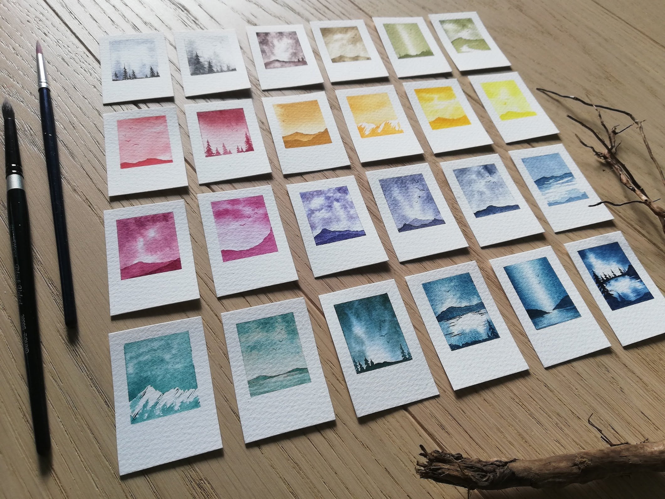
just play around with. This is my swatch library
where I have swatched out all of my handmade paints, and some of them I've
swatched like this. I've made that tape line at the bottom and then added
clean water and let it spread out and upward and nowhere I can see how
they're behaving. You can see that these have
that fun granulating texture, which is hard to see if you're making a normal
swatch like this. I can highly
recommend testing out these splashes on
a page like this, I add a tape down the sides, and then I splashed
these colors around. What we would ideally
like to happen is that they have this smooth, seamless effect like this
minual violet does here, at the very top of this, I don't know
if you can see it, has a hard edge. What we want is a
seamless soft edges where it blends into nothing, it's a matter of water
control and brush control, having enough water on your paper to for it flow
freely but not having so much that it
flows all the way to the edge like has here, and also has here
at the side here. Then it seamless
here at the top. Testing out your paints like this can be a really nice
way to get to know them, or you can obviously go directly in and I'll
show you how to troubleshoot if you end up
putting too much water down, or you have a super
flowy crazy paint that wants to go everywhere. Then this is a continuation of getting to know your
paints even better. Then remember how I said you'd mix your own granulating paints. This is a perfect example, and this splash swatch really shows off the
way that you can see that burnt sienna
pigment that's flowing further and it has
more running space, whereas the blue will settle earlier and go into
the paper if I let it have enough time
on the paper to do so. This is a really nice way
of testing up your paint, see if we have anymore in here. A lot of handmade
paints as well which I love very much from
around the world, and those often have that beautiful separating
sector as well. This one I've taped
on both sides, you can see that granulation
stopping at the pink line, just letting them flow
and play in water such a beautiful effect and I'd love for
you to try it out.
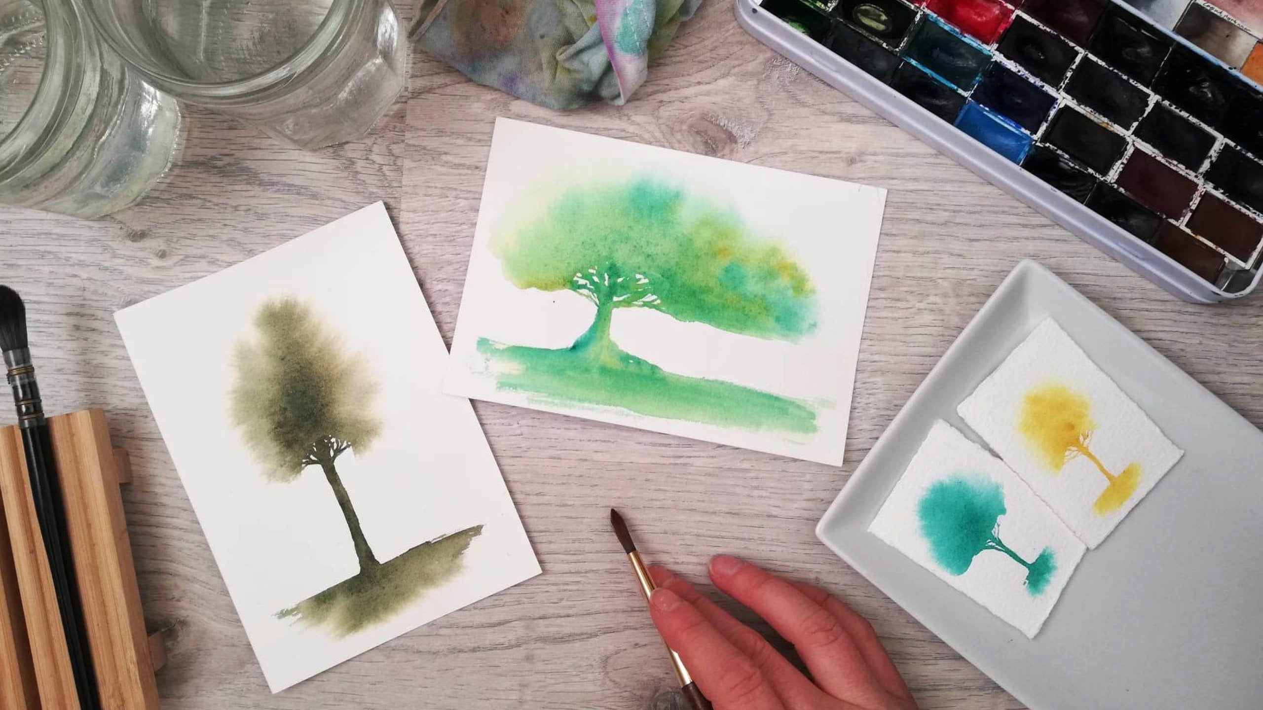
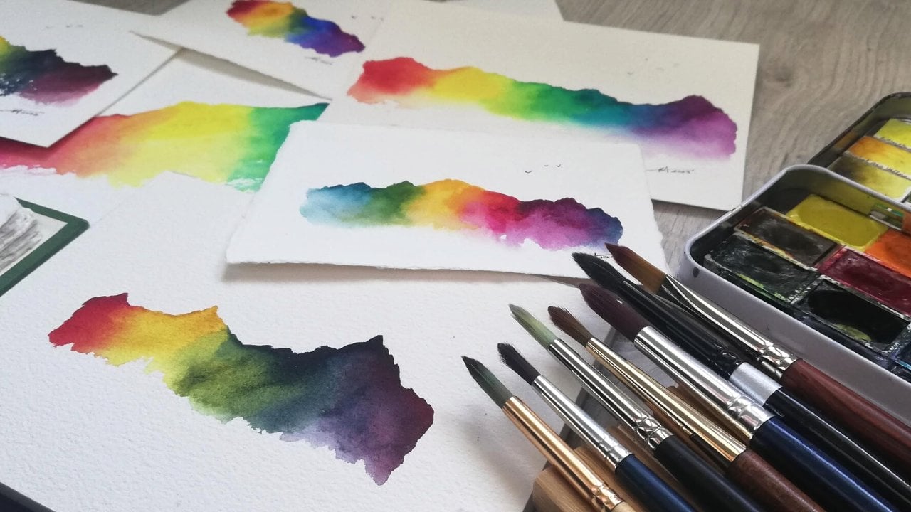
6. Wet in wet - How to paint the splash: What are we going to
start with first? Just going to tape this down. See, this is not super important
that it's very straight. I think you can more
or less see that it's, no, it's good, I
think it's straight. Here we go. A little bump there. What I want to do
is I just want to smooth my finger over the top, making sure my finger
isn't dirty or very oily. I don't want that on our paper. Then just tear it
off at the end. Because we're not making
very large splashes, we're just going to
make them in section. So I'm just going to use
this smallish brush. Going to make clean water. Actually let's
dedicate this one. Well, this will be
my clean water and this will be my
dirty rinsing water. Let's first go in
with too much water. I'm not going to
wipe off my brush. Usually, I wipe it off the side, getting some of the water off
or I can wipe it on a rag. Let's put that there and
get some of the water off. But if I'm using too much water, see how that's
just dripping off. If I'm not doing
anything with it, just put all of that
water on the paper. Blending that upward,
making a nice area for our splash because
water will go wherever it's wet and it will continue to travel wherever it's wet. This amount of water
is a bit too much. It doesn't actually need to
be this wet to be too wet. You can see that this
is flowing around. I hope you can see
that this is flowing around being too wet and
pooling up at the edges. What happens if I go in with this paint brush that
is now full of paint? Actually, that turned
out not to be too wet. It turns out that my paint was creamy enough to
not go super far, so it's thick enough
to not go too far, putting that one back
in the brush rest, keeping this brush
always just clean. I want to show you how to
pick up that excess water. It's pooling up. You see how that's
pooling here on the side? I don't want that, my brush is clean and damp
and it works as a sponge. Just putting that into. Hope you enjoy
that sound effect. I'm just going to wipe that clean water that I'm picking up. Let's do that one
more time, just picking up wherever that
water is pooling so that we just have this nice
sheen on the paper instead. You see that sheen? Do you
see the texture of the paper? But there's no water
pooling up anywhere. Actually, that turned out to be a nice amount of water . That gave us a nice
blurred out effect. If I had a really flowy, paint that might have
flowed all the way to the end even with
this amount of water. Really it's all
about experimenting. It's all about making your
paints and your paper and your water amount work for you. We want the water area to be big enough for our paints to
be able to flow freely. But we don't want
it to so big and so wet that our paint is flowing
all the way to the end. Now, again, we can see
that sheen on the paper. That's what we want. No water pooling up anywhere. To go in with a wetter version of that indigo. Let's
see what happens then. If I try to make just
adding a lot of water. This one we started, let it flow to the end. Also, this is just super
satisfying too much. As you can now, see how that's pooling up and then it'll try to go
where there's water. No, it can't go any further than the edge of the water here, which means it'll
start trying to go elsewhere and to flow
around in our water. This is what can happen. Then we can, if we want to, use that
thirsty brush effect again, so we're just going to
rinse off this one. But I'm actually going to use the smaller brush
that I have paint on so I don't soak up with my clean water brush
water that has paint it. Soaking up a bit of that, rinsing again, tapping my brush. This is why it's
called a thirsty brush because it drinks up, soaks up that excess water. What's happening now is
if this dries like this, you get that straight
edge at the top, you don't get the seamless
blend into nothing. What we can do
instead, if you don't want this, that edge, while it's still wet, you can try to blend that out
with a damp, clean brush. Smooth out those edges a bit, and then blend it up
and off the page. Then you still get more
of that flowy effect, I'm going to do that
on this side as well, I need to get that flow
to go to the edge. What we're doing now
is we're actually just giving the paint more
water to flow into. As it spreads, it leaves
pigment on the paper. Imagine that the particles are tightly packed at the beginning, and then they get more and
more water in between them. The more water is
in between them, the lighter it gets, the more of that white paper we
can see through. Then it spreads and spreads and spreads and spreads
into nothing and then space between the
particles is so large that you see a lot of the paper in-between because it's
a transparent medium. At the very edge here you left all of your
pigments behind it. You can see from this
one, this is more intense even though it's
the same exact paint. This one has more pigment here. I gave it less water
to travel in because I had a lot of paint on my brush and it really tightly
packed on the brush. They wanted to stick
together and they didn't have enough water
to spread them all out. But here, there's more water. I went back and forth
dipping my water in, and that gave them
more time to spread, more space to spread and more
water to mix itself with so that we get this more
soft blurred out effect. Let's do another one
with not enough water. Not enough water can both
mean not enough space, which is what we
fixed here by adding more clean water at the edge and then
letting it blend out. What we want to do
on this one is, the paint is quite clean and
it's quiet dry on my brush, so I got to put that in here. It doesn't really
spread that much. I'm going put it
there at the bottom. It does spread a bit and
I'm also tilting my paper, but this amount of
paint is more than enough paint to both get
this effect and this effect. So what I would like to do
on this very last one is how I would try to do it perfectly. There's no such thing
in watercolor illusion. Aim for perfection and
perfection is an illusion, but to get that flowy splash
that I was aiming for, sorry that it wasn't
really aiming for, over in this one, but
that's what happened. Let's get our nice
sheen on our paper. If you have a very flowy
paper or if you're nervous that your paint
might reach the end, feel free to do the water
all the way to the edge. Some papers are really absorbent and you
might need to add more water because it
absorbs it really fast. Just keep an eye on it, turn it in the light
so that you can see that it has that
nice sheen on it. Wonderful. Then get a
semi wet amount of paint. I just want to drip
that in starting from the middle to see
how much it spreads. Then I can taut
it upwards to get that fun forest effect. Yeah. Put the brush there. Look at those like 10
rows spreading out. I can see they have
enough water for that to be a safe amount of spreading. While it's still wet,
I can add in more. Say you want it to taper
off on the sides here. This is our wet in wet
where our paper is wet and we put wet
paint into wet paper. What we're going to do
next is our details. We're going to move
on to our wet on dry, which is exactly
what it sounds like. It is wet paint on dry paper. We're going to use our
small brush for that to get those little trees and tiny birds. We'll see you then.
7. Wet on dry - How to paint trees and birds: We're practicing
taping. I'm going to do a tape here as well
for our little trees. Trying to stretch that out
nicely so that it doesn't have any new waves and bubbles where the paint
can sneak underneath. The paint is super sneaky
and we don't want it to sneak underneath our tape. Then for this, I will be using this small brush and a
round pointed brush. Round pointed brushes
are my favorite. They can do just about anything. Let's keep this one for today. Lets add in a tiny
bit more paint. What do we want to do is with our brush that's
now not too wet, we want to go in and we want
to make tiny little trees. What I'm doing is I'm
using a very tip of my brush and I'm trying to get it quite like straight
down onto the page. That way, the smallest point possible is touching the
paper and using it quite dry. I like starting with the stem, and then I'm just with the
tip of the brush rushing outward and I'm going back and forth over the sides of the brush all the way
down to that tape. There is a tiny, what a cutesy little tree. What's nice with
brush control is it doesn't really matter
how big our brush is. I could make it
quite large trees with this brush and
I can make very small and the only
thing it depends on is how much water I
have in my brush. I can also make tiny tree. Just make three
little branches out, very small one right there. You're making a bigger splash, allow your brush to
dance back and forth, going a bit back and forth, going a bit up and down brushing outward not like a
super precise way. Now, I wanted to start
with quite a dry brush. Just want to show you what
happens when my brush is running out of paint. See that? It's getting this
skipping of the paper. Let me show you, it doesn't have enough paint to go
into the paper. Because this is a bigger
tree I can use this side of my brush more than I
would on a smaller tree. Oh yeah, see that.
Gives more texture. I see small ones,
they're more filled out. That's essentially our trees. I want to fill out all the way down to the
bottom of that tape. If I'm doing this
on top of a splash, it will already be tight towards the tape there
just to make sure that smooth line at the bottom
the clean tape peeled end. Then we can make smaller
and bigger trees. What I like to do sometimes as well is to not make the
stem all the way down. You make the stem and
then we're just going to make the top of the
tree like that. These are all really
cute especially if you're making
maybe a higher card, making it a vertical card instead of horizontal
landscape card. These trees can be
really be cute as well. Then I just wanted to
show you because I was talking about brush
control and water control. Water control is basically just controlling the amount of
paint that's in your brush. Like we did earlier, like
I was going back and forth you can see it
dripping off my brush. We wanted to go back to
this tight point for the details that's what
gives us that control. I'm just going to show
you that close up again. Up in to the sun. If I dip this brush in my
water and I don't wipe it, it has a lot of water in it. This is the enemy of precision and that sounds dramatic
just because it is. Even though I put the
very tip of my brush on the paper and I'm trying to
be as precise as possible, it leaves a lot
of water and then I try to do my little
rushes outward, spreading that water around. You can see how wet
and blobby that is? Although in the sunshine right
now it looks super pretty. let's just look at
that for a moment. But it will not give us that precision that
we're looking for, if we want those detailed trees. Obviously, you're free to do whatever you want.
This is your painting. You can make blobby trees, if you think those look nicer. I mean I've made
my fair share of blobby trees. I don't judge. But yeah, there we have
our very wet tree. You can make it even
wetter of course. Also, the more water
we have in our brush, like we mentioned before, the
lighter the value will be. What we could do then if we
realize that it's too wet, we can use the same technique as before, the thirsty brush. Even just wiping
off the same one, it doesn't need to be
clean brush for this. It can also have good color in it because we're just
going back into the color that we have picking up with our thirsty
brush, wiping that. You can pick some of
that paint back up. You see how light that
tree has now gotten. But now you can see how
much lighter that tree is because it has
a lot more space between the particles
of the pigment and the paper is
visible through it. This is something you can
do to try out your paints, test out your brushes, figure out which
one works for you. Then I like to do, I always had liked to do. If you've done the
[inaudible] any of my other classes, you
might already know this. I love adding tiny birds. Something just happens
when the sky with, in this case the swash,
also has a couple of birds, it just brings a
little bit of life literally to your painting because birds are
famously alive. For tiny birds, again, it's really important
that we have a very controlled amount of water and paint in
our brush and just carefully dipping the tip
of my brush over there. Then just making tiny v shapes or m shapes like that
McDonald's bird. This will just make it so
that it looks like the birds are in flight because birds, they flap their
wings down and they flap their wings up and any point in this journey of flapping wings,
you can paint them. The perfect demonstration,
holding it like a pencil. Again, using the very
tip of my brush straight down to the paper
making tiny check marks or tiny m's or u's
or little a's. You can also add a tiny dot in the middle where
the body of the bird. Let's bring that closer.
There we have the tiny birds. Again, just wanting to do
tiny little birds like that. That's how I make my tiny birds. I just scattered them around. I like doing three or five. You can see those tiny birds
out on the side there. Then there's also secret
metallic birds into the splash. This is what we're going to
end up with for our project. Wonderful. You ready for the sparkly party part? Now, you could be
done with this. If you don't have
metallic paints, you can always just
skip directly to our project and do your
beautiful background splash. Some lovely trees and some birds in the foreground and be done. But if you have
metallic paints and you would like to know more
about how to use them, either join me in that one
or you can skip right onto our class project if you
so wish. See you then.
8. Metallic paints - Sparkle time!: Are you're ready
for our metallics? These are the metallics
that I'm using today. Some lovely shimmery
metallic shapes are quite opaque
when you put them on paper and I made a
little swatch map here in the back just to see what
colors I had to work with. You can see that where
I have a lot of paint, it covers up that black
paper completely, and then you can blend
it out with water into a more transparent version. What do we want to
do today is use that most opaque version of them so I'll be using
this gold and this pearl on top of my
paintings for later. Usually what happens with
metallic shades is that they need a bit more time to activate than normal
watercolor paints. Instead of just
putting our brush in and going right into paint we will usually need to
work them a bit longer. What you can do if you know
you're going to use them, is to add a drop of water. Using my clean brush, let's
do that version over here. Red one just adding
a drop of water, or if you have a spray bottle or something to spritz
them with and they can start softening up
that binder and activate so that
you are prepped and ready to go and softened so that we can get that metallic shine. Otherwise, let's go in
with our normal brush, let's get some clean
water on that one. Double-checking that is clean. It's contaminated by gold. Then I'm just going
to use not straight into the pen because I want
my tips to be nice and safe. It's going on the side
during that water around starting to
mix in pigment, mixing up those little flakes, just going to leave that
little water droplet alone to do something. That gives me a nice opaque
amount of paint on my brush. Then what I'm doing
is just the exact same as I was doing
with the trees earlier. To make that line first and
then going to my branches, just brushing upward and downward and then also the
same thing with the birds. Just using that pencil, going upward and downward. If I see that it's
getting very symmetrical, I do try to flap my
brush around a bit trying to make it less
perfect if that makes sense, because I don't want all
my trees to look the same. Usually, if I load up my brush as much as
you saw me do now, I'll have enough paint
on my brush to go for quite a few trees and I can
do a little cluster of trees, which is what I want to do and not to make them the same shape, not the same height because not all Christmas trees
are of the same height or a perfect tic-tac-toe and
just tiny, tiny ones. Again before or trying
to get that transition from the paint onto the
tape without any holes. Just nice and seamless. Let's check this out,
a little closer. Super sparkly beautiful
metallic paints and they still show up when I hold it like this
then turning it in the light. You can see all that
sparkly, sparkly metallics. These go beautifully on top
of a dark splash like this. I love golden spruce, I'll love golden green. I also love pearl. They go with any
color. Let's check on that red one, shall we? Usually, I'll add
metallics at the very, very end of my painting process. That way I won't go into metallic paints and
then put that back into my palette because like we know, metallic
never goes away. After I've painted
with sparkly paint, I usually try to rinse
it in a different jar, but I'm going to clean
this one out before. This one will rinse that off, and then say I did this at the beginning of our
session and then this would have activated ready and see how that immediately gives me a
lot of paint on my brush. These are the paints that
will show up on their own. This reddish bronzy
color and this gold, whereas these ones won't show
up as well on their own. They show up better on top of
paint or on colored paper. Just keep that in mind depending on what kind of
splash you're doing, that these might not work
as well on their own. They'll work really nicely
on top of something else. Just taking this peak here, let's do our birds
with this one. If you're going to see me wipe
it a bit on the edge here, just getting that nice fine
point and that water control. Then I'm just doing the same
kind of birds as before. If I need to, I'll twist my
brush if that helps me have more of a point or a more
controlled bird stroke. Bird stroke sounds like
a terrible disease. We have our little
metallic birds as well. There we have it. We have all the elements we need to get started
on our project. I'll just show you how to tear that paper and then
we can get started. I'll see you in the
next lesson for some paper tearing magic.
9. Safe tape removal tips: Before we get our paper ready, I just wanted to show you
how I tear off the tape. These are now dry. You can see how
there's no sheen, there's no shine on these,
except on the metallics. It's supposed to be shinny, but the paint isn't wet anymore, so it's safe for us
to tear off our tape. What I do is, I'll start at
the corner towards the edge, peeling that off, and then
carefully peeling at an angle, peeling it as flat as possible. I don't want to tear it upward. I want to tear it on
a diagonal sideways, downward motion, and then if you feel at any point that the
paper is tearing, please go find a hairdryer
or a heat gun. This tape works quite
well with this paper, but if at any point I
feel like it's tearing, which is why I'm
doing it so slowly, I have an embossing heat gun that can help soften the glue. You get that beautiful
straight line, and if I had trees
on top of this, and then metallic trees on top, they would all be seamed
out by that tape. This was a small test tree one, which is why I didn't
pay as much attention, but this one has a
tiny, tiny skip. It's not a huge deal but
you can see that that's visible if we don't
get the paint all the way down to that tape. I just wanted to show you so you see what that looks like. Otherwise, you see that the clean paper edge
up towards that paint, and I just really marks off, and then it's easy for us to
write something underneath, for example, if you want
to write a greeting, I usually do my signature at the right-hand side at the
bottom of the corner there. Let's start from the
other side, this one. Again just tearing down and out, getting our edge easy, getting that clean edge. There we are. Then if you
wanted to remember how we wrote something
on the tape earlier, this was too wet, this was
not all the way to the edge. Remember the thirsty brush. If you would like to
put that back in again, if you want to leave hints for yourself to make it easier to remember tips and
tricks from this class, feel free to do so. Then you can refer back to it, next time you want
to make these cards.
10. How to easily tear watercolor paper : Let's talk watercolor paper, which is one of our
most important supplies because it needs to be able to hold the amount of water
we're going to put on it. Usually water and paper are not friends so what we need
is watercolor paper. There are different
types. You can buy them ready-made in
different sizes. You can buy loose
sheets or blocks, or you can buy them
in full sheets, which is this size, which is gigantic and huge. I'll show you how to tear
those up into smaller pieces. You can get a lot of
tiny Christmas cards, you'll probably make all
the Christmas cards you need from one gigantic
sheet of paper, if you so wish. You can make them
any size you want. Big ones, foldable ones, or tiny ones, you can make holes in them
and make them into gift tags. But because this is a gigantic
piece of paper, hello, I've already folded
this once and I'm just making sure
that it's really flat. I also really struggle
to unfold this. But I make sure that my
hands are clean and I don't have any oil, or food, or any paint on my hands, they don't get any of my paper. I like to fold it back
and forth at least twice, usually three times,
and really smooth over. That way I start tearing
those fibers in the fold. Then it's slightly out of frame, but what I'm doing is I'm
just holding both sides of the fold and I'm just tearing a bit of an
opening at the bottom, we're putting that down towards the floor
and then putting my thumb into the fold and
my other fingers on top, my middle finger is
pressing down on the fold, and my other hand
is helping pulling them apart as I push
into the floor. Look at this magic.
It's so easy like that. Then suddenly we have two still rather large
pieces of paper, but now we can start folding them down
into smaller pieces. This specific paper
has a watermark, which marks which side
is the front and back. This paper is 100
percent cotton and it has quite a similar texture
on the front and back, but not all papers do. For this one, it doesn't really matter if you paint
front or back, but for some papers, it does really make a
difference because of the sizing and the way the
paper has been treated. I usually grab a pencil
and then I just mark very lightly on the corner on
the backside of the paper. Just in the corner there. Because I know I'm going
to tear it in two, I'm going to mark both corners. That way I can keep track of
what's front and back when I start tearing the sheet up
into smaller pieces of paper. Then I'm just repeating
the same process. I'm going to speed this
up a little because I am doing the exact same thing. When it comes down
to about this size, it's also possible to use a
ruler to tear your paper. I like using a metal ruler, that way the edges
will be sharp. I just do the exact same thing. I fold my paper back
and forth to tear those fibers so the tear
knows where it needs to go, then I put my ruler up against that fold and I tear
straight upward. I fold it and then tear backwards as if I'm
trying to fold it again. This takes a little
bit of practice. You might tear your
paper is a bit roughly the first times. Not to worry, that happens. But if you want to practice
on a smaller piece of paper, it does give you more control
the smaller your paper is. Then we have this tiny card. You can also write on
the inside of that, just demonstrating
that one more time. Then for our last
little piece here, getting down to a
very small size, you can also just fold it and tear it with your
fingers like this. There we have our whole stack. This was all made from
that one sheet of paper. You can either get
two of this size, four of this size, eight of this size, 16 of this size, 32 of that size, 64 of this size, or a 128 tiny Christmas
cards if you want to, from a single sheet
of watercolor paper. Try that out, see if you like one technique
more than the other. When you have your paper ready, we'll move into
our class project and I'll be demonstrating one
on a small piece of paper like this with the
torn edges and also on a premade postcard-sized
paper. Now I'll see you then.
11. Project - Background layer: First things first,
I'm going to tape my paper and what I
usually do is I tape one tape line across the bottom
where I want my splash to start and then I don't usually
tape it down on anything. I like to keep it so
that I can turn it. Because I don't put water
on the whole thing, it doesn't really matter that I don't tape it down onto a paper. It usually dries quite flat. But if you would prefer
to tape it down, you can also tape it with double-sided tape
or a teacher's, we call it teacher's gum
tachette, Blue tach, or a kneaded eraser to
attach it from the back. That way you have all this
space for your splash. If you tape it to a board, it's nice to pick
it up and then be able to see that
sheen on the paper so that you can
judge how wet it is and how much water
is on your paper. But I usually just tape it as a straight line in the
middle of this one, trying to keep it semi-straight. I don't really measure it, but you can do that
if you would like to. Then at the very bottom
of this landscape one, that way I have some
space to splash. Then for this one, I mean, you can also write
at the bottom of this, but here you have some
more space to write whatever greeting you would
like to add to your cards. This one first, a
Christmassy green, and then we'll do this
Christmassy red afterwards. Starting with this
lovely paper here, this is still my clean brush. I swapped out my sparkly water. Just going in,
dragging it downward. This is brush technique wise. For this one, we were
adding lots of water. We don't want to put
our brush straight down to the papers so I;m
dragging it sideways. You always want to
drag instead of push to keep your
brushes safe and happy. Just checking that in the light, going back over if any air are looking like
they are drying, getting too dry,
and then keeping that one dry, not dry but clean. Clean with the other one. It's next to our yellow
there so it's easy to find. Getting a nice juicy
amount of paint, and then I'm tilting my paper
letting that paint flow. Let's get a little
bit more water in there just to get that flow. You see I'm going back into some paint and then going
back into some water. It can also start higher up. Then drag downwards
if you want to, while it's still wet, we have time to move and play, ensure that bottom is covered. You can also, if you
would like to make a treeish shape somewhere
here at the top, or you just let the paint flow wild and beautiful
and do its own thing just manipulating it
around a bit and I try to make it go out on the
sides equally on both sides. I'm just rinsing that a
little making sure that that one has some space to flow. I felt like that one was
in the edge like that. I like it when it's
little bit unsymmetrical, one side goes up
higher than the other. Then I don't want to
mess with it too much. Just want it to be a wild
flowy forest like this. That is our first
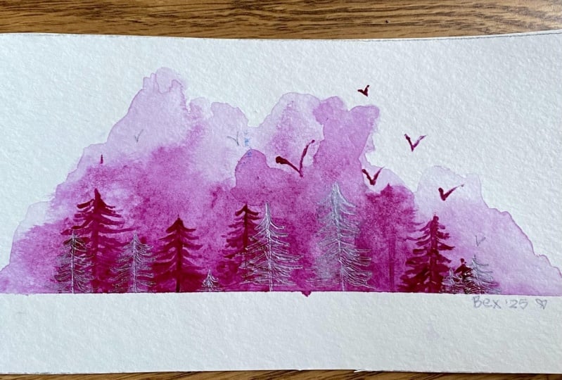
Christmas background, [inaudible] background. It's not a snowy background,
it's a forest background. Getting started on our next one, I put some red on this brush, water first and this
is a different paper, it will behave a
bit differently. It'll teach us something else. It'll flow differently. The texture might be different. It's all fun and games. Putting it back in its
rest and then going with this juicy Christmas red and
already, such a fun flow. Then because this
is a new paper, new in a sense that
it's not the same as the other one I'm
just being a little bit extra attentive to
see how far it flows, to ensure that I don't let
it flow all the way to the edge for the
look that I want. You can do that if
you would like to. I'm keeping it very, very pigmented here
at the bottom. It's really, really,
really bright. This is pyrrol read
from Daniel Smith. I don't know about you, but that makes me feel super Christmassy. There we have our two
background slashes, just going to wait
for these to dry completely and then we'll go back in for our trees
and our little birds. Now what you can do if you're worried that while it's drying, it's going to go all
the way to the edge. We see that the edge of
the water is here now, I don't think it
will necessarily but I can see where the
edge of that water is. That's going to give it space
all the way to the edge. The only thing I'm adding is
a tiny bit of clean water. It's all I'm adding just to give it all the space that
it needs to go upwards, so I don't get that ghost line of sneaky pigment
going all the way to the edge which I did actually get on this one so I'm
going to do the exact same thing like so. There they are, our beautiful
splashy backgrounds. Stay tuned for the next one. Just going to wait
for this to dry and then we'll go in with our trees.
12. Project - Foreground details: We're ready for round 2. We're ready to go
in with our trees. This one is completely dry, carefully touch it, and you can also turn it in the light and
sunshine if you have it. I'm just going to go in
with my smaller brush and just pick up a bit
of that sap green. We're not putting too
much water into the well either because that will
activate too much paint, and like I mentioned, I want it to be quite pigmented, that way it will show up
nicely on our painting. Starting with the
stem and then moving my way down dangling
in those trees. This is a nice value, a nice dark shade for that, see how that shows up nicely as a tree in that background. Even though it's quite dark, I can add some more paint, it doesn't have to be
perfectly balanced. It doesn't have to be perfectly symmetrical forest
like I mentioned, and I do like when it's
a cluster of trees, and then maybe a small tree, I'll draw one of the
sides, for example. Then some trees
that stretch into, not necessarily white
part of the paper but stretches into
a lighter part. Then for the front,
insert a tiny tree. I'm sorry, it looks
way too lonely, tiny, tiny tree
friend like that. Then for me, that grounds it on both edges. Of course, you can make
really big trees as well, and then this will be
the background trees. I really like the
way this looks with just some small trees then I'm going to add
some birds up here. Up into where the
sky is quite light. Tiny, tiny birds and
some into that green. I've also tried to space this out perfectly spaced
from each other. I usually make the bottom one
feel like the closest one. That way it feels like
they're flying towards us. The hand that's closer is bigger because the other
one is further away. That makes it look
that there's a bit of depth and balance in the picture
as well in our painting. We're just going to let
that dry completely, so that we can add some
tiny little pearly trees upfront on this one as well. While we wait for that to dry, checking in our red one, it's a little bit thicker
than the postcards. This one is actually
not dry yet. I'm just going to cheat and use my heat gun to heat this up a tiny bit, and
I'll be right back. Now, using that heat gun made
it completely bone dry. That's much better for
painting because the trick with the wet and dry is
that it has to be dry. If the background is
a little bit wet, then that means our trees that we put down afterwards
won't be as precise because they'll
start bleeding into that paper that's not completely
dry in the background. Just a reminder to
always make sure that your paper is super
dry before going in with the precision
of wet on dry, so that we know that we
have the control that we need to put those in. Just because we've put our
paint first on this one, we'll put our metallic after. For this one, I'm
actually going to put our metallic first, and then we're going to
add some tiny red trees on top of the metallic
gold ones afterwards. This will have splash
paint metallic. This will have splash metallic, and then the normal paint. Let's go into our gold. Remember like before, just giving it that time to activate, during that aggravate
my brush too much. Getting some gold on my brush, just making those tiny trees. What I'm going to do
is I'm going to add red trees on top of this. I'm making this a
tiny bit bigger. Then maybe I would for
painting at the sides, just keeping it trimmy
but not too super thick. Your metallic paints, might
paint differently than mine. It's also a nice way to
get to know them. Like so. I'm going to add in some
tiny birds as well. Now, we have our
shiny trees on top of our red Christmas background. We're going to head back to our pearly color and put that on the green
while that dries. This is why it's so efficient
because you can move back and forth between
your paintings. I don't want to overlap them perfectly into
trees [inaudible]. We just want to stick them in between the trees
that are already there. You want to add
those tiny birds. I feel like this one is a
bit of a strange shape. I might add some green trees
on top of these other trees. That some tiny sparkly
birds up there. Now, that our metallic
color should have dried, we can add in a bit of red trees on top of
our metallic trees. Some more of that red paint. This one is quite thick. They're nicely on top
of the gold. Like that. That adds to the layering, adds to a little bit of
that interesting texture of that painting. Then because I'm being extra, I'm going to add some trees in front of that parallel as well, but I'm not thrilled
about in this, friends, I just realized this is what happen, sometimes we paint things
that we don't really like, or if something happens
and we're like, that's not how I wanted
that to turn out. Sometimes we can't fix it, but sometimes we can adjust it. We can go with the flow and just try to make the best of it, turning it into something new. It's not exactly how
I wanted this to go, but it's going to end up being a good Christmas card
anyway. Yeah, yes it is. I promised here on
this video that I will give this card to someone, it will be a Christmas
card of 2021. Like so. Then you have those
nice layers of paint. I would love to see your
[inaudible] of this, whenever you try it out. Very carefully, especially
edges can be quite tricky. Just making sure you're really
careful because obviously here the fibers are open
if that makes sense. Make sure those are tearing outside there, those
at the very bottom. That's okay. See how that tore off
a piece of my paper because the edge is open, and frayed, and that is easy for the teeth to grab a hold of. Then like this, just tearing it very flat
on the side like that, giving us a beautiful
clean line on that card. Lets do the same
thing here. Again, being really careful
on the side. There we have it, we have
our Christmas cards ready. I would love for you
to sign your work. You can sign with
pen or a pencil. I quite like the look of pencil, but then it's also nice, crisp, and clean with a pen,
so I'll do both. I actually signed with my initials down
there at the bottom. There we have it.
There are our cards.
13. Travel kit - Splashing on the go: I thought maybe some of
you are like me and you need to travel somewhere
to go home for Christmas. If you are and you
would like tips on how to pack a travel kit, this is the one I usually think. It's not very large. It's just a little bit
bigger than a postcard so that I can put those
postcard size papers in, but it fits everything
that I need. This one opens here on the side. Here I have my water brushes
and a mechanical pencil, and then in here are
my art supplies, my papers and I
like to have them in a little cellophane bag, and that way I know
that they won't get wet if something
spills in my bag. Then I have a little rag
to wipe my brushes on. Clearly, I've been using purple. This is the same
palette as before. This palette actually has
a mixing space as well. I have my paints here, my
swatch, and my palette. These are the small tin
of metallic paints. It's not essential to put in your travel kit but I have it. Then I have a little
roll of washi tape. Just getting out my brushes. Rubbing our water brushes. I'm going to keep this one as my clean water brush because
this one is the biggest one. This one is just a bit stained, but this water is
completely clean, I can double check that
on our white rag as well, and these will be
my detail brushes. This one is going to go into that
indigo that we used before, just activating that a tiny bit. Cleaning at the outside, and then just using my
clean water brush. Then when I squeeze, the water comes
through the barrel and comes out on the upside. I just drip some water
on my paper and then I'm turning it in the
light to see that it gets that sheen that we want. These water brushes, I
find it quite tight which is nice because then it doesn't leak any
unnecessary water. Like that, see that sheen. Then I can just add
the paint directly, then more color, and
just totting them in. I see that it's going
towards the edge, I just flip my paper downward
again so it doesn't fall. Then gravity helps us keep
it there in the bottom. Then we can also use water
brushes as thirsty brushes. How to clean them is
to squeeze our brush. Squeeze more water into
that and then wipe it. Then I can use this
brush and pick up all that paint that's
pouring at the bottom. That would be too
wet. That's okay. Then I want to go fix that
edge over in that corner, you see that there's no
water here at the bottom. I'm just going to
extend it to the edge, and then pick that
excess water back up that way it has
that smooth line. Got a bit of a windswept
feel over here. Then it's still soft
at the top even though it has reached that end. While it's still wet, you can keep
manipulating as well. Then that one stays clean.
We have our splash. Now I'm going to use
a heat gun on this just because I'm here and I can. But usually I'll just let this dry or you can make
another one at same time. Then we'll go back in with our details with the same one, and also I'm going to
show you how to make sparkly snow on the
branches of the trees, we'll do that in just a moment. Now we have dry
paper to work on. Like before, since
we want to go in with a rich color of that paint, not actually putting it
down on the palette. I think just going back in with that same brush using
our wet and dry. I'm just doing the
same thing as before. This really hold the
point very nicely. We have our little
clustered trees. Then let's use our smaller
detail brush for this. Just making sure
that that's clean and then going into this beautiful icy sparkly
snow clean palette. Then just wiping it
off to the edge. This is how I shape it
back into that point, getting a lot of that beautiful sparkly color on my brush. Then what I want to
do is I want to make little outward strokes almost
the same as the branches, but to put snow on
top of those trees because I know there's
a lot of my brush down. I'm going to start at the
bottom going outward. Took it two more or less go on top of the branches
that are already painted. It doesn't need to be super precise because snow
doesn't land perfectly, some actually fall on trees. As you can see that
gives it a bit of extra life and sparkle. You can absolutely be
done with it like this. I'm just going to show
you one final trick, which is add a little bit
more water into your brush. Then I'm just going
to add tiny bit of color. Then I'm
going to use that. I'm going to splatter it
onto my painting right here. You may need to add more
water into your paint. Since we have our rag here, you can wipe my finger on that and also clean off my brush. Squeezing out more
clean water just make sure that this one
is completely clean. Even though it
doesn't look clean because it's been stained, and I always make sure to clean my bush up before putting
them back in the kit. There it is. We got some
nice sparkles on there. Just going to tear off that tape like before
starting on the edge. Then we have beautiful wintry splashy forest made with only a very
small travel set.
14. Before you go!: [MUSIC] Here we are at the
very end of the class, and I'm really
happy that you took some time out of
your busy schedule. I know we all have lots of things to do all
the time and it's easy to not prioritize
making art. Of course it is, but I think it's so important
and I'm really proud of you for having taken some time out of your day to be creative, to use your paints. Your paints are so
happy to have been taken out of the
cupboard or out of the closet and being used
for what their destiny is, which is to be used by an artist like you
to create something lovely that will spread some some and some joy to
whoever receives it, even if that person is you. For me, the most
important thing is that, we enjoy what we do. If you find something that you
enjoy this class, keep it. If there's something you don't
enjoy, leave that behind, and then you can combine when
you do different classes, you just pick and mix
from all the teachers, and all the people, and all
the supplies that you have. You are like, oh, these are my favorites and maybe
you narrow back in on what brings you the most joy and the most fulfillment when
it comes to your artistry. If you would like to share
your work on Instagram, I would love for you to
tag me there as well. I've put my handle somewhere on the screen so you can see it. If you enjoyed this class, you might enjoy some of
my other classes as well. They're mostly based around
painting in monochrome, just to keep working on that painting with
just one color and enjoying bringing
that creativity and that art back
into our lives. Until next time, happy splashing,
and I'll see you soon.
15. Jingle bloops : Take 2, the second version. But now, we've warmed up, so now we're feeling better because I don't live alone.
Why am I not breathing? This always happens.
I don't want it to be just a seasonal class. Can be painted all year round. Last time I checked, forests
exists also in summer. Exactly. Hello, right this way. Not saying sentences. Am I? Swim in the water. I think we have established
that water is wet. How about we also
sit on this sweater? You like my Christmas Eve
shirt? Texture interests. What is my point? Are we tearing up? Are
we're tearing down? Outer space, inner space. Is my throat so dry? There's no water in the bottle. No kicking the bed, the camera's on the bed. Have you tried making items? No. Then what? Very at the end. Don't do it at the beginning, do it at the end.
Does it matter? Is this shadow
distracting you all? These are my gestures. Fake plant, real plant. What is this gesture? Hello, dear friends. What? That was not where we
were going to start today. Do we though? It's in wraps and
wraps, wrapping paper. What was that? Human working with
100 percent cotton. I think we'll call
it a day, guys. Yes, I will. Hello, lamp. You know what I mean? This?
 Elise Aabakken, Voice Coach - Teacher - Performer