Transcripts
1. Course Introduction: Welcome everyone to
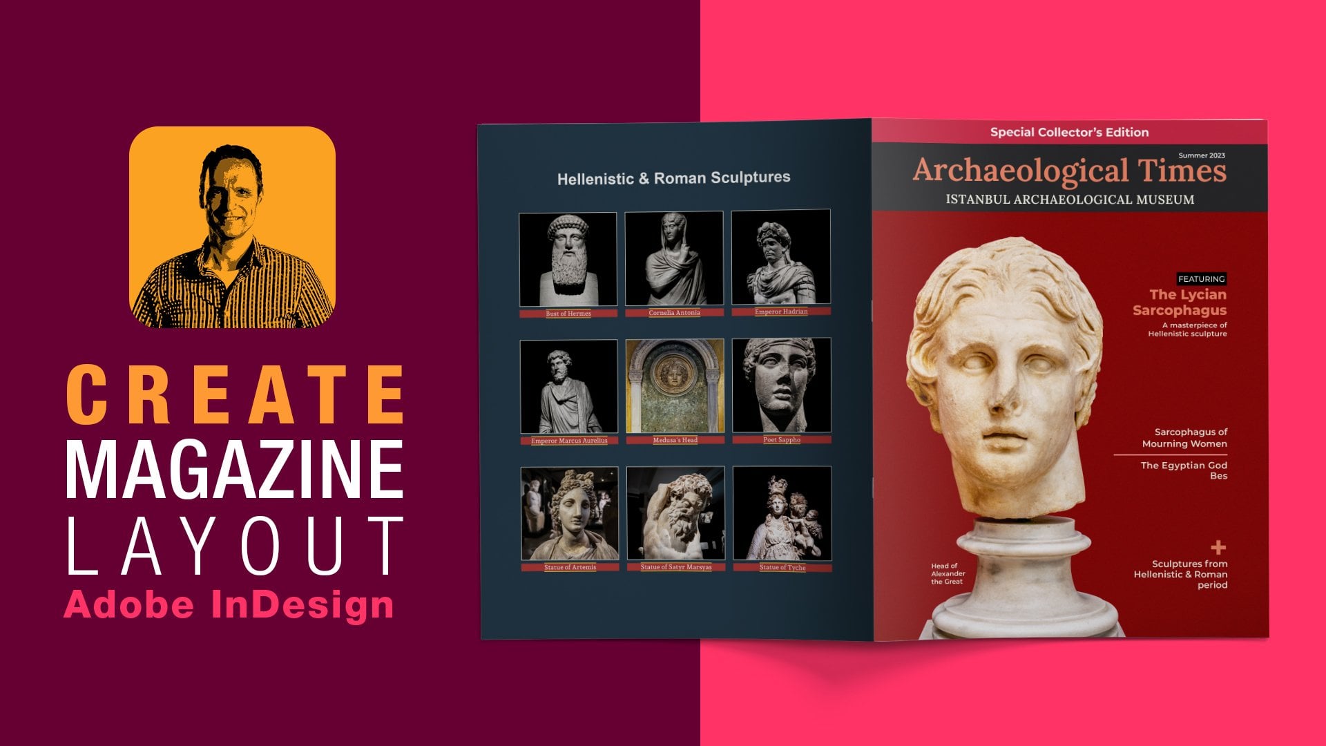
understanding in design with practical projects to amplify your portfolio and the workflow. This course actually expands from the introductory course, creating a magazine
layouts in Adobin design. It dives deeper into
individual projects, offering a variety of techniques and
instructional guides. By the end of the course, you will improve the quality
of your magazine layouts and become more efficient
working inside Adobin design. The techniques covered
in this course, which are evident
in all sorts of professional magazines can be applied to your portfolio work. It can be a school project or
a project for your clients. I am your host, Elias Anapols, and I've been an educator over the past 30 years
teaching paid layout, Vector design, and animation. A award winning author
of the Church of ora, an Interactive Museum guide, featuring some of the oldest
surviving Byzantine Mosics and Frescoes in Istanbul. This course, I'll
cover topics such as converting fake fractions
into real fractions, using a grip style, paragraph bullets and numbering based on character styles, creating a custom fund based on SVG icons and bringing those
as glyphs into in design. Adding a grid of photos
with sequence of numbers, shaping vector frames to
disrupt the grid flow, Paragraph pull quotes to break the monotony
of large sections, image wraps based on transparency and working
inside adobe photoshop. Mate captions to draw viewers
attention to articles, a side bar as a standalone element and
the very popular drop cap. The course is designed to
improve the quality of your magazine layouts for
users that are getting started or have some experience
with a DOB in design. I thank you in advance and look forward to
seeing you in class.
2. Creating Real Fractions: All right, so inside do been designing with
the document open, I'll start this off by
adding custom bullets. Now, in recipe layouts as
the one that I'm working on, one will find fractions
in the ingredients. That's what I have here
is this first column. Fake fractions
which need to turn into real fractions.
Quick note here. The font of my choice, which is Andra P does
contain built in fractions. So it is highly recommended to find a phone family
supporting that. Double click to get
into the paragraph. Then select this fake fraction and inside the character panel, I will click on this flat menu, choose open type and then fractions. All
right, that's great. But what happens when
throughout your document, you have multiple
of these fractions. As I do here in this
paragraph text. Well, that's where a grip
style comes in handy. So I'm going to build
one into this paragraph. So under the edit
menu, I will do that. And the first I'm going to do is create a fraction
character style. With nothing selected, I will click on the
character styles panel. I'll click to create
one. I'll double click to get into the
character size options. I'll give it a name of fractions and under the
open type features, I will enable fractions, which is the same as clicking
on the character panel, fled menu and
choosing open type. I'll click, and I need to create the grip code for
finding a fraction. Grab stands for global
regular expression print, which finds patterns of texts, and let's you manipulate
that text automatically. We double click to get into the paragraph and look inside
the Paragraph Styles panel, this paragraph is based
on my body texts, which I have already defined. So I'll click on the plus
second to create one. I'll double click on that. I'll give you a name of bullets, and I need to create a new grip style to
create a new rule. So we'll click on
new grip style. In this case, we're
looking for a fraction which will apply
the character style that I created earlier. Apply style. Click on that, click on the Doc menu. And select the
fraction cared style. Now, I need to create the grip code for
finding that fraction. So I will click two texts
to highlight it and type. Actually, this has
been typed from me, the backslas d plus follow by forward slas then
again, Backslas d plus. So all these grip code means
is find one or more digits. Followed by four slash, followed by one or more digits. I'll click. I will double click to get
into the paragraph. I will select all the
paragraph and then apply the bullets
paragraph style. As you can see now,
every fraction, this paragraph text turn
into two real fraction.
3. Adding Custom Bullets: With the fractions all in place, I'll go ahead and add a custom bullets
for this paragraph. Inside the paragraph So panel, I'll double click on the
bullets paragraph sts options, and under the bullets
and numbering, for the list type,
I'll choose bullets. Now, here I can choose one of these characters or add
one from another font, and that's why I have all of these empty boxes for
my own custom bullets. I click the add
button and inside the add bullets option
for the font family, instead of Data pro, I'll search four windings, and then press the tap
key on the keyboard. The Wingdings fun family renders letters as a variety of symbols. It's a great fun to use. I'm just going to score down till I find this
little star here. I'll click to add
this to the lists, click, and here it is. In order for me to just apply the custom bullet
character to the paragraph, or I have to just just click ones and then click. All right. Now, this paragraph has
more than one line, which is not indenting properly. For example, the
word peppercorns, diced, is not
indenting properly. What I need to do is to
create a hanging indent with a positive left intent and a
negative first line indent. I'll double click on the
bullets spark of style. Back on the bullets numbering. First, I will address the space between the
bullet and the text. This is right here
with a text after. This here is the default which the tab. I
would delete that. From the flat menu, I'll add a thin space, another thin space and
another thin space. Now, for the left indent, I'll set this one to 33 points. I will offset the
first line indent with a negative value of -33 points. Again, with a space
that I'm using, I like what I say so I'm
just going to click. Okay. What else can I do? Well, a couple of
things I would like to change, and that is, I would like to
change the color of the custom bullets and also
change the font weight. With nothing selected, I'll click on the
character styles panel. Click on the plus second to
create a new character style. I'll double click on it. I'll give it a name of color. I'll make sure this is based on none since we are creating a
brand new character style. For the character color here, I'll score down and actually, I'm missing the color
from the swatches. I'm going to click Okay, and
then inside my libraries. All of these the colors
that are of my choice. I'm going to add this one. Relick add color to swatches. Back on the color
character style. And all the way at the bottom, here's the color of my
choice. I'll click. In order for me to apply the character color to
the custom bullets. I'll click on it back on the paragraph
styles, the bullets. For the bullets
and numbering and the character style from the drop down menu,
I'll choose color. That looks great and also inside the basic
character formats. For the phone style, I'll choose the semi bolts and then click.
4. More Custom Bullets: For the third column,
the Tips column. I'm also going to add
a custom bullets. In this case, I'll click on the plus c to create
a new part of style. I'll double click on it to get into the part
of styles options. I'll give it a name of
tips and under the bullets and numbering in the list
type, I'll choose bullets. I'll click on the Add button, and for the phone family, I'll search for the wing dings and then press the tab key. For the character, my choice, this is the one
I'm going to add. I'll click to add that and
then click and to apply this custom bullets to the paragraph I have
to just click ones, and that gets applied to
match the document layouts, I'll set the
character style from the drop down menu to
color and then click.
5. Adding a Numeric List: For the second column paragraph, I'll go ahead and add
a numbered lists. So click on the Plask to create a new paragraph style, clients. I'll give it a name of numbers and under the
bullets numbering, I'll set the list
type two numbers. That lex couple of changes here. I can change, for example, the behavior between what comes before or after the number. For example, right now, this one read inserts
a current number, followed by periods,
follow by the tab, tab being the space between
the number and the texts. If I click on the
drop down menu, I can change this behavior. For example, I'll choose
this one right here which reads inserts
the current number. Followed by a parenthesis, followed by the tab space. So go ahead and remove the tab space and insert
my own custom space. I click on the arrow to
insert a special character, that would be a thin space, and I will do this twice, and then click Okay. All right. Now, in
order to be able to differentiate between the
numbers and the texts, I'll add an extra bolt font
weight just to the numbers. With nothing selected, I'll click on the
character styles panel. I'll make sure that I click, and then click on
the plus second to create a new character style. I'll give it a name
of Extra Bold. And then under the basic
character formats, for the font style, I'll set this one two extra bolt which means this
character style, we'll work with any
type phase that has an extra bold font
attached to it. So we'll click. In order for this take effect inside
this paragraph here. Back on the paragraph styles, I'll double click to get into the numbers parg styles options. Inside the bullets and number, I'll set the
character style from the topmin menu to extra
bold then click Okay.
6. Custom Glyphs - Setting Up Artboards: Another idea is to create a custom fund based
on vector icons and use them as glyphs to enrich the recipe page
layouts even further. So inside a DB streer
have already opened the fond icons
documents that I'm sharing with you inside
the exercise folder. To do the ground work, first, I need to create a new document with five separate boards, each with a specific name. When I export the icons
as SPT file format, it will have the
appropriate naming. Under the file menu, I'll
create a new document. Now, the document
for the units of measurements will be
set to pixel since the phone icons also
will be measured in pixels, and then click Okay. Also inside the layers panel and under the panels options. I'm going to increase
the thumbnail view to 50 pixels just for better
visibility and then click. So the first artboards, go ahead and create that. We already have one by default. So I will double click
on the Artboard two, and rename this two gluten free. And set the width and height to 300 by 300
pixels, and then click. This is the first art board. I'm also going to double click. Also rename this to gluten
free to keep things organized. To create a new art boards. All I'm going to do is use the keyboard shortcut,
shift option shifts. The second art board will
be the gu click on that. Rename, click Okay,
create a new layer, Rename Tan as well. Create another artboard, again, using the keyboard shortcuts, I'll shift option shift. The next one is the servings. I'll double click on
that. R two servings. I'll copy this,
create a new layer, double click and rename
this two servings as well. Another artboard, I believe
that is the stopwatch. I'll copy this.
Create new layer, double click and also
rename stopwatch. I've got one more to go. And
that will be the baking. All right. And also, create a new layer, and
that will be the baking. Again, just to keep
things organized. So with the Artboard two, I'll click Shift
click Shift click, select all of them, and
inside the align panel, just going to distribute them horizontally
into the center. Again, just to keep
things organized. All right. So I've
got the artboards. Now I'm ready to go to the
next step and start importing, copying and pasting
the vector icons. Let's not forget
to save this as, that will be phone icons. Let's call this expanded. Then click to save.
7. Custom Glyphs - Copying & Pasting Icons: The first icon is going to
be the gluten free icon. B on the font icons document. I'll make sure nothing's
locked in sms panel. With a selection tool, I will mark you select everything and under
the edit menu. I'll cap this into
the clipboard, head back to the
font icons expanded. I will target the
gluten free layer, and then under the edit menu. I'll paste that in
and just move it into the arp the very first one. Here it is the gluten free. The second icon is the vegan. I'll mark select that. I'll copy this into
the clipboards, target the vegan layer, and then past into
the second artboards, this one right here. All right. The third
is the servings. Mark select that, copy
this into the clipboard. Target the servings
layer, and then pasta. I'll continue this with
the stopwatch, copy this. Target the stopwatch
layer and paste that in, and I believe we
have one more to go. And that will be the baking. So marks like that. Target the baking layer,
and then paste that in. All right. All right. So we've got all of the
artboards with the icons inside. So the next step is to convert the fills and strokes
of these paths into compound paths to be treated as one path and be able to
create the custom fonts.
8. Custom Glyphs Icons - Compound Paths: To convert the paths
into compound paths. Some of these layers
like the gluten free layer consists both of field paths and stroke
paths like this one. So in this case, I'll target
the stroke path Shift click and Shift click to target all of
these stroke paths. Under the Object menu, I'll expand the stroke
and then click. Then I'm going to use the very powerful shape
builder tool and create a cut off removing those
two shapes from the circle. Back on the layers panel, I'll target this group. Shift click and Shift click. I grab the shape builder tool, and I'm going to enter the race mode by pressing
the alky of the option key. And all I have to do is just
click and drag to remove this region from
the selected shape and do the same here. Great. Then with the selection tool, I'll mark you select
the entire layer, and under the object menu, I'll create a compound path. Here it is, I looks great. I'm also going to make
sure that I sent to this horizontally and cly
into the boards. Another thing is,
I'll size this up, and I'm going to use
the keyboard shortcuts, I'll shift option shifts. Let's say around here. I'll release that. To make sure that the rest of the shapes
also have the same heights. Under the view menu, I'll
bring up the rulers. Then I will click and drag
a couple of guides here, like so. All right. Here are the guides. I'm
also going to lock them, so don't accent and move them. And then Mark select the vegan layer under
the object menu. I convert this ste
compound path. I'll center it into
the artboards, and then use the keyboard
shortcut to scale this up. I like so, and always
double check my work. There you go, here's
the compound path. Mark select the
servings icon here. Also convert compound path, center it, then
I'll scale this up. I'll shift option shifts. Like. For this one here. I'm also going to use
again the Shaul tool. Basically, all I'm
going to do is create this as one shape. All I'm going to do is grab
the shape ul tool click and drag to add all of these regions and make sure
this is just one shape. Then under the object menu. I'm also going to convert
this two compound path. I'll center it, and then I'll shift option shifts
to scale this up. Again, I'm double checking my work inside the layers panel, I believe the last one is
already a compound path. So I'll mark selects. I'll make sure
it's centered into the outboards and
then scale this up like Let's not forget
to unlock the guides, and then shift select
to remove them, and I'm ready to go to
the next step and export all of these icons as
an SVG file format.
9. Custom Glyphs Icons - Exporting Icons: To exports all the
compound paths, The Window menu, I will bring up the asset export panel.
At the very bottom. I'll click on the
icon where it says, The launch the Export for Screens dialogue.
I'll click on that. I'll make sure inside
the rpart stab. All of the art ports
have been selected. Back on the asset stab. Right here, I'm going to define the folder where
export files would be placed. I'll click on that and inside my folder in
progress. Here it is. I'm going to target
the icons folder. I'll click to select the folder. Back on the arch port step. For the ffmattargets, the SPC Palfmat Now SPC stands for scalable
vector graphics. I'll click to ports
all the artboards. And look inside the SPC folder. Here they are all the SPC icons, and I'm ready to go
to the next step and create the custom funds.
10. Fontello Icon Font Generator: Now, for the fund parts, I'm going to create the custom
funds based on the SVGs. For that, I'm going to use
the free service named Fonte, which is an icon funds
generator. It's quite easy. All we have to do is just
click select all the SVGs, and then click and
drag them inside the customs icons
field. Here they are. Now, the event that you're going to clear one of these icons, you can just click
on the edit mode and you can delete
the glyph. All right. So in this case, I will mark you select all of these
icons, the glyphs, and it is very important
to give the font a relevant name since this font will be installed
in your local system, thus will be easier
to search for it. In this case, I'm going
to name this health, all I have to do is just
download the web font. Pues has been downloaded
to my Daniel's folder. Okay.
11. Creating the Glyph Set: So returning back to
the Ad being design. The first thing I'm going
to do under the Tapanu I will bring up the very
powerful glyphs panel. Right now, it shows
the entire fonts. But in this case,
I want to target this to the health font. I'm going to press the
tap you on the keyboards, and these are the glyphs and the custom fonts
that I created earlier. So I always get into the habit to click and creates
a new glyph set. I'll give it a name of health, and that will come handy for any of my projects. I'll click. Click to Targets
right click and add this slip to the new glyph set, and I'll do this for the
remaining of this glyphs. Okay. Click and add them to
the health glyph sets. All right. Let's say we
are back on another font. I'm going to close the spanel I want to show you the
event that you want to find your custom fonts inside the glyph spanel
Back on the top menu, I'll bring up the glyph spanel then here on the drop down menu, I'll click to show that will
be above the separate line. Here it is my health glyph sets. Now, all I have to do is insert glyphs inside
the layout in progress.
12. Inserting Icons onto Layout: Now looking inside
the layout I'll switch between the prev
modes and the modes. I grab the type tool, and then click and to create a text frame.
I'll release that. I've already got
some notes here, so I'm going to copy this. Paste that in,
select everything, and then inside the
paragraph styles panel. I'll make sure that I
have the body texts. Now, I do get this placer
which means I need to re click and
clear overwrites. All right. The x skits
can zoom in a bit. I'll make sure that I have
the health glyph set. I'll double click to
get into the paragraph, and the first glyph
will be right here, this one, the stopwatch.
I'll double click on that. Then in between here, I'm going to add
some white space. Under the type menu, I will insert a hair space. I'll click right
here. For the vegan, that will be this
clip click on that, B of the tap menu, insert another hair space, and for the gluten, that
will be the icon right here. And then adds another hair
space. Now what else can I do? I can actually go to this
paragraph right here. I'll double click to
get into the paragraph, and I'll press the space
bar a couple of times. I have already some notes. Now, this recipe
serves four people. So right here, I'm
going to use this icon. Insert a white
space, hair space. Then right here, it will
take 40 minutes to be baked and that will be the icon. Once again, I'll add hair space. All right. Okay. So
there you have it. Here's an idea how to
create a custom fund and make your page layouts more
interesting for the end user. Okay.
13. Photo Grid - Placing Photos: A photo grid can be
quite useful when images are in a numeric sequence
as the page layout. So let's see how that works. With the grite
photos started file open and look inside
the photos layer, I have four empty
rectangles in which I will place
corresponding photos. With a selection
tool, I will mark you select to be able to see
those empty four frames. Under the file menu, I
use the place command. I will double click
inside the photos folder, and I will click to select
each photo by order. This is the first photo,
I'm going to press the control key of the command
key to select the second, the third and the fourth,
and then click to open. And all I have to do now
is just click one to place each photo inside
the empty rectangle shape. Great. Now, to be efficient
and do things automated, will create an object style to fill any photo inside the
frame, proportionally. With nothing selected and inside the object styles
panel at the very bottom, I'll click on the Plasc to
create a new object style. I double click on it. I'll
give it a name of Phil photos, and I'll click on the
frame fitting options. I'll check on the fit option. And for the content fitting, I'm going to use the fill
frame proportionally. In addition, inside the
text wrap and other, I'm going to use the wrap
around bounding box. What is important here is to
use the right offset value, which is actually
going to be equal to the letting value
of the body text. So whatever letting value
you have on your end, that's the one you're
going to use here. So mining value for
the body text is set to 36 points,
and then click. Now, in order to apply this object style to each of this photo with the
selection rule, I'll click just once, and then click to apply
the object style. I'll click away to diselect, click again, apply
the object style. Click away, diselect click once, and do the same for the
remaining of the photos. I'm also going to
markeselect all of these photos and notice that
the wraparound body box, and with the right offset value, the photos fit
exactly to the grid. I can also see that
when I switch from the previous modes to the mate modes with all the
reds and guides visible. All right. Now, nothing I
would like to do is actually reposition some of these
photos within the frame. So with the selection tool, I will have it over the photo
until I get the hand icon. I'll click ones, that
activates the content grabber. I'm going to use
the keyboard cut the shift de arrow to
reposition this photo. I'll do the same for this photo. I will have it over until
I see the hand icon. I'll click one to activate
the content grabber, and then use the shift dn arrow to repos the
photo within the frame.
14. Photo Grid - Numbering: To identify the photos
inside the grids, I will add a number to each with a corresponding
text on the side bar. I'm just going to
zoom in a bit here. Grab the type tool, and then click and
drag and as I am, I'm going to press the
ST on the keyboard to constraint, and then release. I'll grab the selection tool and inside the properties
and transformation, I'll set the swam to 50 points. For the fill color, I'm going to apply this
color of my choice. I'm going to place this right here at the bottom right corner. Now, this text
frame should ignore the text wrap coming from the
object style of the image. Under the object menu, I'll bring up the
text frames options. I will align this to the center the ignore the text
wrap, then click Okay. Now I'm going to create
a paragraph style. I will double click to
get into the text frame. I'll click on the
paragraph styles panel at the very bottom, I'll click on the plus scon to create a new paragraph style. I'll double click on it. I'll give it a name
of photo numbers. For the basic character formats, I'll set this one to aerial
phone style to black, and I'll set mine 2206 points. As for the bullets
and numbering, for the list type, I would
like to have a number. And for the number here, you see this is the number
followed by periods, followed by tab space. So I will remove
both the tab space and the period coming
after the number, and then click Okay. Now, the number
one will not show up until I populate a
character within this frame. Under the type menu,
insert special character, other, and I'm going to choose
the end esta style here. That means this character
ends at that point, regardless of the sta
style definition. Now, I need to center this back on the paragraph
styles options. Under the interest in spacing, I will align this to the
center and then click. Go ahead and assume a bit. I can actually sent
this even more. So back on the paragraph style. Bullets and numbering.
I'm going to set the left intent to perhaps six or seven
points and then click.
15. Photo Grid - Duplicating Numbers: The next step is to duplicate this text frame
for the remaining photos. But what is important is
that I duplicate those in sequence since this
is a numeric sequence. So with the selection tool, I'll click to select
the text frame. I'm going to use the alt
option on the keyboards to dubricate this across and
position it to the boom rights. I'll continue with Alt option, position this to
the boom rights, and position this text frame
to the boom rights as well. So back on the photo
numbers paragraph style, and then under the
bullets and numbering. When we create a paragraph
style for numbering, as we have here for
the photo numbers, we can assign that style
to a defined list. And so the paragraphs
will be numbered in that style according
to where they appear. In this case, for the lists, I will create a new list. You can give it
any name you like. But what is important here
is for the options to have the continued numbers
across stories checked. Click and click Okay, we can see that the numbers
update automatically. Okay.
16. Photo Grid - Changing Order: There is one important point here that I would like
to mention, and that is, in the event that you want
to rearrange those photos, you need to cut and paste
the text frames one by one in the order in which you would like
them to be listed. Now looking inside
the layers panel and inside the photos layer, the first I'm going to do
is with the selection tool, select both the photo
and the text frame. I'll do that, Mark select two under the object
menu, I group those. Here's the first group. Stier with the selection
tool selected. I'll mark you select the
photo and the text frame, and then group that
do the same for that, group that as well, and
group that as well. Look inside the photos layer, I have four groups grades. Let's go ahead and test
that with the selection to. I'll click one and under the
edit menu. I'll cut this. Now that goes into
the clipboard. I'm going to position
this to the other side. I'll del, I'll click away to
delect under the edit menu, I'll paste that, here it is. Now, this became first, and this is the fourth. Let's strike with this with the selection tool.
I'll click one. I'll cut this using the
keyboard shortcuts. I position this to
the other side. I'll click to the select, and then paste that right here. See the numbers change
and the orders changed. All you have to do is just
cut paste text frames one by one in the order you
want them to be listed.
17. Sidebar - Headings: We've got the text frames in a numeric order
that looks great. Now I'm going to go ahead
and work on the side bar, creating a couple of paragraph
styles and style this. So I'll go ahead and zoom
in quite a bit here. I'll bring this
to the side here, and double click to get
into the paragraph. I will select this text here, that will be the description heading inside my
par of styles panel. I will click on the
plus cc to create a new paragraph style.
Double click on it. I'll give it a name of
description heading. This is not going to be based
on any paragraph style. I'm also going to reset two base to make sure that
I start from scratch. Under the basic
character formats, I'll set the phone
family to aerial, font style to black, I'll up the phone size to 22
points and have all caps. For the bullets and number inces we need
to have some numbers that correspond to
the photo grades. I'll set this two numbers.
I like what I see. I just want to
remove the period, which is this one right here. I'm going to press
the back space or the delete key
on the keyboard. For the paragraph border,
I'll activate this. First, I will zero out all the borders and then
disable the chain icon. I'll set the left border two 30 points and change
the color to yellow, the same color I used
for the text frames. Now for the offsets, I will disable the
chain icon I'll set the left offset two -15, and I'm looking at the preview
here since the previous checked on for the top offset, I'll set this one to
five or six points. Back on the bullets
and numbering. I'm going to have a
bit of left intent. I'll set mind to seven points. What is important
here is to go to the ins and spacing and
I'll align this two, the first line only on the
grids, and then click. That looks great. When I bring up the grids with an
mode, we can see that. I'll do the same for this
Ipply the description heading. This one, two, and this one. All right. That looks great. So now I'm ready to go to
the next step and create a narrow paragraph style for
the paragraph text. Okay.
18. Sidebar - Paragraph Text: The last step for
the grid photos page layout is to create another paragraph style for
the remaining of the text, double click to get
into the paragraph. I will highlight this text. And then inside the
paragraph Spano, and all the way at the bottom, I'll click to create
a new paragraph style Dublic I'll give it a
name of description text. This is not going to be based
on any paragraph style. I'll reset this to base, so I'll start from scratch. Under the basic
character formats, I'll set the phone family into aerial, phone style regular, I'll up the size 22 points and set the letting
value two 30 points. What is important here
is inside the incense spacing to align this to the first language,
and then click. I'll apply the same
paragraph style to the remaining of the text. I'll click on the description
text paragraph style, and I see this plus gon which means I might have
some overrides, I will click and clear overts
I'll do the same one here. Right click, clear verts,
and this one, two, apply description
text part of style, and then clear any overrides. That looks great. I do see some hanging
words with hyphens, in this case, just
stop a click on that. I'll select the words. And inside the character panel, one idea here is to apply
break. Okay. There you go. You can do the same
for the remaining. There you go, here's an idea
for your design page layout, how to create grid photos with corresponding numbers
and text. Okay.
19. Shaping Text Frames: Another way to present
the body text in your page layout is by changing rectangle text frames
to another shape. Let's not forget text frames
are vector shapes after all. So with the shaping
frames document open, I'll switch between the
preview mode and then modes, I grab the type click drag to create the first text frame. I'll release that and click drag to creates one more text frame
and release that as well. With the selection tool,
I will mark you select those two text frames to
double check my work, and I can also see that
inside the layers panel. I grab the direct
selection tool. And once I click on one
of these text frames, I can see the qui
point all around, which I can click on
and change the shape. So in this case, I'll click
on this ci point right there, click drag and position
it right here and click this text frame and position this ci
point right there. Okay. How about this text frame? I'll do the same.
I'll click and drag, bring the same right there. And then this one right here. All right. So I'll grab the selection tool and Mark select this to to
double check my work. Things look great. I've
got some notes here. I'm going to copy this text, which I'm going to place
inside those two text frames. Double click to get
into the paragraph, and under the edit menu.
I'll paste that in. Then I grab the selection tool. As you can see at the
very bottom here, I've got this red plus sign indicating that there is more text in the
story to be placed. This is what we call
threading text. I'll click on this
red plus icon, and I'll position the loaded text icon
to this text frame, and I'll click one
for more text. This is one example. How
about this text frame? Well, in this one,
I'm going to use the pentel and select
the text frame. I'll click and hold
the control key of the command key and click once. Then I will have her
over this right side here, nice slow. And as I do, you can see, now the tool has changed
to the add anchor point, which means I can click once and add an
additional anchor points. I'll have her over
here. Till I get the 0.2 and click once again
to add another k points. Then I will have it over at the very bottom
here anchor points. As I do, you can see now
I get the delete C 0.2, which means I can delete this achy points and I do
this one right here too. I can click to delete
this Cpoint as well. There you have it, text
frames with different shapes.
20. Text Wrap Through Letter Paths: Now, let's explore the very
popular text wrap function in sat in design. When you apply a text wrap
to an object in design creates a boundary around the object that
repels the texts. For example, here, I've got
the letter G and the letter r. I will target the letter
G. Under the type menu, I'm going to use the
create outlines command, and that results in the creation of a path or compound path. I will target the letter r B on the type menu and also create outlines for this text layer, and I've got a compound path. I'll take it this path here. I'll scale this up by pressing the shift
on the keyboards. I'll release that bring
this to the center here and do the same
for this compound path, pressing the shift on the
keyboards, I'll scale this up. And I el center this
as well to the page. Now, with nothing locked inside the layers panel and
with the selection tool, I will mark it selects
all of these layers here. Under the window menu, I will bring up the
text wrap panel. I've got some choices here, so I'm going to use the
wrap around object shape, I'll click, and then
click to inverts. Actually this works, but
because we have the fill color, we cannot see the text. Back on the layers panel, I target the path And I'll make sure
there's no fill to that. I'll click on the paragraph and just bring us close
to the path here, Alexo I'll do the same
for this compound path. No feel to this. I'll targets the paragraph texts There we go. There you go. Now, another thing I can do for
this compound path. I'll target it and under the object menu paths then
release compound path. I've got two of these paths. I will target, let's
say, this one, and the stroke size
to ten points. I'll do the same
for this path here, the stroke size, let's
say to 20 points. As for this one, I
can also go back and change the color
of the stroke.
21. Text Wrap Though Transparency (A): Another example of a
text wrap is to place transparent photos
into the page spreads. So let's see how that works. Inside the photoshop, I have
already opened an image. The plan here is to create a
selecture around this part, and the rest to be transparent. So inside the toolbar. I grab the elliptical
my key tool. Let's see around here, I'm
going to start dragging and press shift option
shift on the keyboard. As I do that, I'm also going to press the space
bar on the keyboards. Reposition this.
Release the space bar, still holding all
shift option shifts. Scale this up. Till I get a nice and circular
selection and release. And at the very bottom
of the lar s panel, I'll add a lay mask. The under the image menu. I'll trim this based on
the transparent pixels, and then click, under the
fun menu, I'll save this as. Here we've got some choices. PNG is a great choice.
I'm just going to. Save this as as a foreshore
document, and then click. So back inside n design. From the toolbar, I grab
the ellipse frame tool, and then click dragon asm going to proceed
on the keyboards. To constrain this, and
then under the font menu, I place the photos document, and then click to open. I can also scale this up by pressing the shift
key on the keyboard. Just a t. Click till I
see the content grabber. I can reposition
this, let's say here, it that let's see, I'm going to make sure this
is a line to the page, center this, and then mark select both of these
with a selection tool. Back on the text wrap panel. Again, I'm going to use the
wrap around object shape. That looks great. I'm just going to target the frame here. Then I've got some conorptions. For type, I'm going to
use the alpha channel, and that's where the
transparency comes from. In design, we'll read
everything that is transparent and the rest
is going to be opaque. Great. Nothing I can do actually adjust the
distance between the text. And the objects, and I can
do this inside the offsets. So I'm going to up this,
let's say to ten points like.
22. Text Wrap Though Transparency (B): Now, here's another example
of a photoshop document but this time around with a path
saved and named accordingly. I'll click on the path
inside the path spanel. As you can see, I
use the pen tool to trace the statue quite
close and carefully, since I want the background
to be transparent. To create a transparency, Right here, right on
top of the path Anil. I will control click or command click to load the
path as a selection. And at the very bottom of the layer spanel I click
to create a layer mask. I will save that. I will
head back to design. I grab the rectangular frame and just click and to
create a octangar shape. And under the fun menu, I will place the
photoshop document xo. I can also size this up, pressing the shift key, and then under the
frame fitting options, I'll choose fill
frame proportionally. I can also double
click to get to the content grabber and adjust the photo
within the frame. Lexo. So with the selection two, I will mark you select both
the paragraph and the frame. And inside the text
wrap, once again, I'm going to use the wrap
around object shape. I'll click on that and
then just click on the frame since we
need the transparency. So for the contro options and from the drop down
menu this time around, I'm going to choose
the foreshore path. Here it is, here's
the name Hermes, and that's why I
named it so I can see it inside in design. All right. So we've got that, I'll go ahead and add a bit of a offset that will be ten point. I'll zoom in a bit. Since
I use a custom path here, what I can do is I can grab the direct selection
tool and adjust the path that is coming
from for shop and affect how close or how
far the tax wraps around.
23. Pull Quote: Pull quotes add
visual interest to text heavy pages to
hook readers attention. A pull quote is a key phrase, a quotation or an
excerpt that has been pulled from an article usually
by a different typeface. Inside being designed and
with a pull document open, I'll start this off by toggling between the privy
modes and the non modes, and on a separate text frame. I do have the quotation. I will be inserting
inside the body text. With the selection tool, I'm just going to
click and drag this and place it inside
the body text, and I make sure that
lines up to the grids. Now inside the
paragraph style panel, and all the way at the bottom, I'll click on the plus secon to create a new paragraph style, I'll double click on it. I'll give it a name
of pull quote. This is not going to be based on anything, no paragraph style. I'm also going to reset this two base to start
from the beginning. Under the basic
character formats, I'll set the form
family to aerial. P style will be set to black. I will up the size to 24 points, and I'll set the
letting to 36 points, which is the letting for
the entire body text. And then under the
incent spacing, I will align this to the baseline grades,
and then click Okay. All right. That looks good. I just we need to move the
body text out of the way. Under the window menu, I'll
bring up the text wrap panel. And for the rap shape, I'm going to use this one, the second choice, the
wrap around boding box. I'll make sure that
the chain icon is not pressed because I want to have different offset values. So for the top offset, I'll set this one
to ten points and the bottom also to
ten points as well. I'm just going to
bring this close. Like so. Back on the
paragraph Spanel. I'll double click to edit the pull quote for
the paragraph rules, I will turn on the rule
below and the rule above. I'll set the fun
weight to ten points. And for the offset, I'll set this one to 36 points. And since I have the
preview checked on, I can see the changes
taking place. For the rule below, I'll set the weight
also to ten points. And for the offset, 20
points works for me. And then click. That
looks pretty good. Now another thing I would
like to do is to have the quote to hang to the
left of the paragraph here. I'm just going to double
click to get into the paragraph between the
quotation and the first letter, and then under the type menu. I will insert a
special character, other than intent here. As you can see, the quote hangs to the left
of the paragraph. Now, to be efficient with
my work in the event, I'll use the same pull
quote on another page. I'll catch this text frames properties
as an object style. Next time I apply
this to any texts, it will take on the
paragraph style. So with the pull quote
selected under the menu, I'll bring up the
bc style panel. I create a new object style Dabo cliont I'll give
it a name of BG. I'll check on the
paragraph styles, and for paragraph style. I'll make sure that
the pull quotes would be applied to the content of
any frame. I apply this two. I'll click to test my work, I'll switch between
the preview modes and the no my modes. Here's another text frame. I'm just going to place
this to the grids. All I have to do is just click one on the pull Object style.
24. Pull Quote with Anchored Character: For this next example, I'll anchor text characters
next to a pull quote. I'll do that by creating
outlines of text which will convert its character to
in line anchored object. Here's the quotation. I'm just going to
create a duplicate. Just in case I need to
refer back to the regional, so that will be option, and then under the type
menu, I'll create outlines. I'm just going to
position this right here because I'm going
to scale this up, occupies six lines of text. I will be shift and drag. L. I'll move this
out of the way, and I'm going to anchor
this right next to the paragraph by dragging
on this blue box. Click and drag this. As you can see, I
get this y symbol, and that indicates the
positioning of the hidden object. I can see that because
under the type menu, I have show hidden characters. In addition, I can go to the view menu extras and
then show text reds. That indicates what the
graphic is actually anchors. So we've got some options here when it comes
to positioning. So when I hover over here, it's going to give
me a message of At click to open dialogue. So I'm going to click. Here's the anchored
object options. And for the position,
I'll choose in line and then click Okay. So I got the quotation. Now, here's the pull quotes. I'm just going to position
it right next to it. This is going to span two
columns and six lines of text. I create a new paragraph style. I click on the plus
C and to do so, double click on it, give
it a name of pull quotes. Anchors. This is not going
to be based on anything, so no part of style. I'm also going three
set to base to start from scratch for the
basic character formats. I set the phone
family to aerial, phone style to block. I lab the size to 37 points, and letting will be
set to 44 points. And that's because
inside its spacing, I'm only going to align the first line to
the baseline grid, and I'm also going to have
all caps and then click. I actually want to have a
specific color for the text. So with nothing selected
inside my CC libraries. This is the color of my choice. I'll click to add this
to the color swatches. Back on the park of style,
double click on it, and inside the character color and all the way at the bottom, here's the color that I
just added to the swatches, and then click Okay. All right. Now, I
need to get the body texts away from the pull quotes. I'll click on that.
Inside the tetra panel. I'll click on the wrap
around boding box. I'll make sure that I zero
out all the offsets. Like so. That goods, but
another thing I can do is I can click on
the quotation here, and then shifts and skills down, a tad it lines up to the
top of the pull Unlike. Here's an idea of
anchored characters. Next to pull.
25. Caption Over Image: Captions are short sentences or phrases describing
a photos contents, or they can provide contrast. Inside open design with the
captions document open. The first example will
be caption over image. So we toggle between the
previous modes, then my modes. I've got some notes here, so I'm just going
to double click to get into the paragraph. I will select everything. Cap this to the clipboards, and then click to
creates a text frame. I like so, and then past. With the text frame selected, I'll bring up the
paragraph styles panel. I'll click on the Plascon to create a new paragraph style, I'll double click on it to get inside the paragraph
styles options. I'll give it a name of
caption Over image. And for the basic
character formats, I'll set mine on my end
to aerial, PontyleRgular. I'll up the size to 24 points. I'll set the letting
to 30 points, and for the interes in spacing, I'll set the alignment
to the right. And let's see, I'm looking here the preview since the
previous checked on. I do see some hyponation.
No need for that. I'm just going to
remove this altogether. Click Okay. I'm also going to add a field color
to this text frame. Like so. All right. Now, I can also add some breathing space
for the entire program, so it doesn't include
two of the sites. So with the TextM selected, and under the object menu, text options for the
instant spacing, and for all the sites the
top bottom left and right, I'll set mine to 20
points and then click. Just going to bring
this in just a tad. Like so. All right.
What else can we do? Well, I can actually add a
stroke to this text frame, and I can do this inside
the stroke panel. Now, design comes with a variety of predefined
strokes that you can apply to or you
can be creative and create your own
custom stroke style. I can do this, the flight
menu, select strokes styles. I create a new stroke style. I'll give it a
name of my stroke. And here I have
three choices for the type, dotted or stripe. I'll go for the stripe, and then here we have
the measurement marker. For example, with
these blue triangles, I can set the top
line to be thin, and I can see the pure right
here at the bottom line ther or I can just click ones to create an
additional line in between, or I can just click
and drag this to the left and remove it. I'll set the top line to
let's say have this kind of a thickness and the
bottom one to this. Again, I'm looking
inside the preview here. I'll click and then
click. All right. So to apply this custom stroke, first, for the type, I'll set this to my stroke. I need to have a color here, and I'm also going to up the stroke weight to ten
points. That looks good. Just going to move this out
of the way, just a tad. And since I get this
plus icon here, that means there is
more text to come. There we go. Now, in addition, I would like to
have a gap color, but this color right now doesn't exist in the swatches panel. With nothing selected
inside my CC libraries, this is the color of my choice. All I click to add this
color to the swatches. Back on the stroke panel, I select the text frame and set the gap color to this
color of my choice like so. To be efficient with my work in the event
of using the same type of caption over image is
to create an object style. First, I would like
to have a bit of transparency over
the contents of the text frame rather than using a solid white background. For that, first,
I'll click to select the text frame and
under the window menu, I'll bring up the effects panel. Here, I would not reduce the opacity of the
entire object, since that would reduce the
opacity of the type as well. Instead, I reduce the
opacity just for the fill. I'll click on that and
set the opacity on my end to something like
70 something percent. Now I can see some of the image beneath and
at the same time, the caption is readable. So I'm ready to create
an object style. So with the text frame selected, I'll bring up the
object style spanel. I'll click the plus con to
create a new object style. I'll double click on it to
get into the option spanel. I'll give it a name of
caption transparency. Under the basic attributes, it picks up all the settings for the selected caption frame. But in addition, I'll check
to include the part of styles and make sure it's using the caption
Over image style, which it does, and then click. All I have to do is
just test my work. Here's the text frame. Just go to move this into place. Spa bit all I have to do is to supply the caption
transparency object style.
26. Bottom Caption: I. Another example of a
caption is the one to line, the last line of a paragraph to the last line of
the base line grades. Let's see how that
works. I'm going to tugle off between the privy
modes and the um modes. I do have some notes here. I'm just going to double click
to get into the paragraph. I'll select everything, this to the clipboards then
click to create a new text frame and then p. With the text frame selected, create a new part of style by
clicking on the plus icon. I double click to get
into the options. I'll give it a name
of bottom caption. For the basic character formats, I'll set this one on my
end, aerial, regular. I up the size to 22 points. Set the leading to 26 points, and for the intenten spacing, I'm also going to check balance
cord lines and in design basically Automatically balances the lines
within the frame. In addition, I do have some hyphenation.
No need for that. I'm just going to disable
that and then click Okay. Now, in order to align the
last line of the paragraph, which is this one right here, to the best line ad, which is this one right here, I select the text frame, and then under the object menu, I bring up the text
frames options. Now, you're going to
see a change very soon. For the auto sizing,
I'll turn this on for the height
only. Here we go. But in this case,
I want to do it height only from the bottom. There you go. That's
the alignment. That way, the text for the caption will grow from
the bottom as I type into it. I'll go ahead and do
a test drive here. Go to select that.
I'll copy this, press space bar, and
then paste that in. As you can see, as
I type into it, the text grows from the bottom. Okay. All right, styles good, but I can get this even further. For example, I can create
a nested style and apply a character style to the first words of the paragraph, which
is the word right. So let's see how that works. With nothing selected. I'll click on the
character style spanel. Click on the pla
second to create one, double click to get
into the options. I'll give it a name of Black. Under the basic
character formats, I'll set the phone style so
to black and then click Okay. I'll click to select
the text frame back on the para su panel, I double click to into
the options here. And then under the drop
caps and esta styles, I'll create a new est
style. Here it is. Is going to click once. And that esta style will go through one word, which
is the word right, and we'll apply the black character style,
and then click Okay. Here it is, that looks great. Now, to be efficient
with my work, the event of using
the same type of bottom caption is to
create an object style. With the text frame selected, I'll click on the
object style panel. Click on the plus sc to
create one, double click. I'll give it a name,
let's say of bottom. Okay. And under the
basic attributes, it picks up all the settings for the selected caption frame. But in addition, I'm also
going to include the park of styles and make sure that it's using the bottom caption
and then click Okay. I'll test that out.
Here's the text frame. Just going to bring this
into the document here, and all I have to do is just apply the bottom object style.
27. Caption with Custom Bullet: Another example of a caption can be using a custom fond icon, a character style
and a side border. Inside the layouts in progress. Here is the caption
text for the for Bola I'm also going to tuggle between the previous modes
and the normal modes. I creates a new part of style. I'll click on the
Blasc to create one. I'll double click to
gets into the options. I'll give it a name of arrow caption for the
basic character formats, on my end, I'll set
the phone family to aerial, phone style bolt. I'll opt the size to 22 points
with letting of 26 points. No need to have any
hyponation just in case. For the incident spacing, I will align only the first
line to the baseline grid. Then click. All right. Now, continuing adding
to the paragraph style. Next to the caption,
I'll add a dan ROK indicating that this caption
belongs to the photo below. Now, I created the icon using Fontelo the icon font generator, which is the same process as covered on a previous lecture. So back on the arrow
caption paragraph style, inside bullets and numbering for the list type,
I'll choose bullets. And I click to add
the custom bullets. I am the custom bullet arrows. So for the font family, our search for arrows. I press the Tapi
on the keyboards, and the icons populate and
I'll choose the first one. Click Okay. Click to select. Here's the icon and click Okay. All right. Now, things that I
need to change and improve. First, the bullet since it's
coming from another font, does not align with the text and can also
be smaller in size. Okay. In addition, I would
like for this danara bullet to have separation to the left axis of the text and
hang outside of it. And lastly, apply a
custom color. Okay. All right. So first, I'll start coloring
the custom bullet. And since I want to have a specific color
inside my S libraries. Here's the color of my choice. I'll re click to add the
color to the swatches, and I need to create a
new character style. So I'll click on the
character style panel, and all the way at the bottom, I'll click on the plus
second to create one. I'll double click and
give it a name of blue. And I'll set the character
color all the way at the bottom of the list to the color of my choice,
and then click Okay. So in order to apply this
color to the custom bullet, back on the paragraph styles, I'll double click to bring up the arrow caption
paragraph style, and inside the
bullets numbering, I'll set the character style
to the blue character style. Here it is the blue color. All right. So this is one thing. Another thing that I mentioned
earlier is to separate the dinar bullet to the left axis of the text
and hang it outside. This is going to
require indenting the bullet the same amount as the body text of
the magazine layout, which is set to 26 points. For the bullet positioning, I'll set the left
indent to 26 points, and the first line
indent two -26 points. Now, for the text
after which is set by default to the tab space, I'll remove that, by the way, the text after this is the space between the text
and the custom bullets. From the flared menu, I'll add a hair space and another hair
space and then click. In addition, I'm going to size down the custom
bullet just a tad. Back on the character styles, back on the blue
character style, and inside the advanced
character formats, I'll set the horizontal
scale to 85%. The vertical scale to also 85%. I will adjust the bullet to the cap height
of the caption. I'll set mine to two
points and then click. The last adjustment for this caption is to
add a left border. Back on the arrow
caption paragraph style, and inside the paragraph border, I'll turn on the border, and first, zero out
or the stroke values. I will disable the chain icon and set the left
border to two points. Cut of black is okay. I'm just going to
reduce the tint to 50%. I have this kind of gray color. For the cap, instead
of a butt cap, I have a round cap, so I can see here that I
have round corners. For the offset, I will
disable the chain icon and set the left offset to eight
points and then click. All I have to do is just resize that and position it into place. Lx good. Here's another idea of a caption inside a
magazine layout.
28. Highlighted Text: Highlighting text
can add emphasis and draw attention to specific
parts of your magazine layout. So inside the highlighted
text document. Here's the paragraph I
will be adding the effect. So inside the
paragraph als panel. I'll click on the
plus second to create a new paragraph style and double click on to get
into the options. I'll give you a name
of highlighted text for the basic character formats, and on my end, I'll set the phone family to
aerial, regular. Font size, I will up this to 26 points and set the
letting to 36 points, which is actually
the same values for the body text and the letting
of the magazine layout. For case, I use all caps
and it is in spacing, I will align the whole paragraph two the base language,
and then click. All right. So for
this effect to work, I need to have part of breaks every line of
text gets highlighted. Under the type menu, first, our turn on show
hidden characters, and I'm also going
to toggle between the privy modes and then modes. I'll zoom a bit here. And then double click to get
into the paragraph, and then press enter return on the keyboard to create
the first part of break, indicated by the Pilcro symbol. Now, right here, I
do have some space, so I will remove that by pressing the backspace
on the keyboards. After the word kingdom, backspace, press enter return. After the word greatest
backspace to remove the space, and then press enter return. And the same thing
here, B space, and then press enter return. Here I got four breaks indicated again by the Pilcro symbol. Now, since I want to
have specific colors for the highlights and the underline
with nothing selected. Inside my CC libraries, this is going to be the color of choice
for the highlight. Right click to add the
color to the swatches, and this is going to be the
color for the underline. Right click and add that
to the color swatches. Then back on the
paragraph style panel right here and the
highlighted text, And for the paragraph rules, I'll turn the rule above on. I'll set the weight to 26 points and the color
to this color my choice. I actually want this
to stretch not to the entire column rather
than to the text, Alex I'm also going to have
a bit of an offset here. I'll set mine to minus four, for the underlying options,
I'll turn that on. I'll set a way to two
points and the offset to five points and also change the highlight color
to this color of my choice. Then click Okay. All right. Now go ahead and zoom in a bit here to double
check my work. I do see that I have a
bit of an offset here. So back on the highlighted texts inside the paragraph rules. For the left dent, this is the left dent. I'll set this 12.5
points. I'll click. Then on the other end here, which is going to
be the right dent. Back on the paragraph rules, I'll set the right dent to a negative 0.5 points
and then click. So here is a design idea, highlighting text
inside a Don't be design for your
magazine layouts. Okay.
29. Sidebar: A side bar is a block
of supplement and text separated from
the main text flow, but also related
to the main idea, often with different number
of columns to the body text. Working inside the
side bar document. I toggle between the privy
mode and the L mode. Here is the text
for the side bar. I'm just going to bring
the sin this is going to occupy ten lines of texts and it's going to stretch to
the width of the type area. I'm also going too just to make sure this lines up
perfectly fine. Okay. To the ten slides
of text and it does. Now, the first I'm
going to do is remove the body texts
from the side bar. So inside the text wrap panel for the wrap I'll
use the wrap around banding box I'm
just going to set only the top offset 2306 points, which is the same as the
ga space of the body text. Now, under the object menu, I'll bring up the
text frames options. The side bar will span
two three columns, and the gotta space, since the side bar will have limited space and
condensed type phase, the gutta space will be smaller in comparison to the gutta
space of the body text. So I'll set this
one to 30 points for inset spacing which is
the space within the frame. First, I'll set all the
values to 36 points. I will disable the chain icon
and zero out the top inset. For the base line options, I use the custom baseline grid. Again, since things
are limited in space, and we will have
condensed typeface. So I'll set this one
Increment every 30 points, which is the same as the
go space, and then click. Now I'll go ahead and
create a new par g of style inside the
pargftyles panel. I'll click on the plus
second to create one. I'll double click on it. I'll
give it a name of side bar. For the basic character formats, the phone family will
stay on minium P. For the phone style I use condensed, I'll up the size to 24 points. Set the letting
value to 30 points, which is the same
as the one I set inside the text frames options. For the inters spacing, I will align everything to
the custom baseline grid. And since we have, again, limited space and
condensed typeface, no need to have any high
fination I'm just going to disable that and
then click Okay. The next paragraph style to create is about the
side bar heading. I will double click to
get into the paragraph. I will select this line of texts and inside the
paragraph style panel. I'll click on the plus sac to create a new paragraph style. I'll double click on
it. I'll give you a name of sidebar heading. For the basic character formats, and on my end, I'll set the
phone family to aerial. Phone style will
be set to black. I'll up the phone size
two three points. The letting value
will remain the same. Case will be all caps, I would like to
have this heading here to span to three columns. Under the span columns
for the paragraph layout, span columns and set this three. Let's not forget that
we do need some space between the heading and the
body text of the side bar. I'll set the space after
span two 30 points, which is the same as the
baseline. I'm going to click. And since I would like to have some custom colors for the side bar inside
my SC libraries, I re click to add this
color to the swatches, this one, two, and this one two. With the side bar selected
for the fill color, I will assign this
color of my choice. Then back on the
paragraph styles panel, back on the side bar heading. First, for the paragraph rules, I will have a role
below and a rule above. For the rule above, I'll set the stroke weight
two ten points, this column my choice, and to make sure that the rule does not
go outside the frame. I'll check the keep in frame. Then I'll adjust the offset, which is this one here to move the rule up relative
to the text. I'll click to get
into the field and then use the shifting
aaroky to go with increments of ten points
and set mine two 50 points. Now, the left and
right indent values are relative to
the inset spacing. As we set up earlier insight, the tech spum options all set the left indent here
two -36 points, and the right indent
also two -36 points. For the rob below
for the weight, I'll set this one to five
points. Tex color black. But since I want to
have something lighter, I'll change the
tint to 50 points. Now, I need to move this all the way at
the bottom right here. For the offsets, shift
and then up arrow, till I read this 290 something. I'll release that and just use the paro key to
go to 296 points. Let's not forget to
set the left dent to negative 36 and
negative 36 as well. As for the character color, I'll assign this color my choice for the
heading. Now then click. The last step of the
side bar is to create a grab style to be applied
to specific words or phrases within the body text and apply character
style automatically and not do it manually. So inside the
character style spanel I'll click on the plc and to create a new character style. I'll double click on it. I'll give it a
name of color bolt For the basic character formats, I'll set the phone
style to bold. And for the character color, this is the color of my
choice, and then click Okay. So back on the paragraph styles and inside the side bar options. Since I will be targeting
specific phrases, I'll go ahead and
create a new grab style by clicking on the new
grabs style button. Now, the two text field
bifult select any digits, one or more times, which is not going to be
useful for me here, so I'm just going
to remove that. And the text, I will apply
the character style to. First is going to be this one, the toms and Agamemnon, which is this one right here. I'm just going to paste that in. And to expand the definition
of this grab style. I'll go ahead and add the
meta character. Follow that. I'll target the Artemis and heracles and add
another meta character, and that will be the
Artemis and action. All the way at the
end, I'll paste that in the style to apply is going to be the color
bolt the moment I click, you're going to see the changes
taking place here, click. All right. Here it is
with one grab style, I apply the character style on multiple words using
the meta character.
30. Dropcap: Drop caps at Floris and enhance the visual pal of text
inside your magazine layout. So working with the
drop cap documents and for the drop cap, I will assign a variable funds. Now, design supports
variable fonts, which is an open type
font format that supports custom attributes such as
weight width or slant, depending on what is supported
by the font developer. Click to select
the body text and looking at the character panel, I'll click to expand
the font family, which is the data
pro serif type font, and indeed a variable font, highlighted by the VR icon. But in this case,
for the drop cap, I'll use Sans font. The Acumin variable concept, which is a great choice for me. Now, the drop cap will affect only the first character
letter of the paragraph, which means first it
creates a character style. So inside the character
style s panel, and all the way at the
bottom, I'll click on the plus second to create
a new character style. I'll double clicon I'll
give it a name of drop cap. The basic character formats, and for the font
family and on my ends. I'm going to use the
Acumin variable concepts. For the font style, since
this is a variable font, I can click on the
convenient slider controls, and here I can set the weight, the width or the slants. For no, I'm just going
to keep this as is, but I am going to
circle back on that. For the car color, this is the color of my
choice, and then click. I'll go ahead and
zoom in a bit here. Double click to get
into the paragraph. Just highlight the
very first character inside the part of style panel. I'll click on the pac to create a new part of style,
double click on it. I'll give you a name
of first letter. Now this is going to be
based on the body text, so the rest of the
paragraph is not affected by a different fonts. Under the drop caps and styles, I need to specify
how many lines of text the drop cap would take up. We'll take up one, two,
three lines of text. One character and
the character style will be the drop
cap, and then click. All right. So let's see what we can do to improve on that. So I would double click back on the character style panel
on the drop cap for the basic character
formats and back on the font style and the slider controls
of the variable font. Here I can adjust the weight. I'll set mine to 800. For the width, I'll
up mine two and four, here's a slin slan basically skews the character.
No need for that. Now, under the underlying
options, I'll turn it on. For the weight, I'll
start with 100 points. I'll change the color to
a color of my choice. As you can see, this is way below the baseline of the text. So what I need to
do is I need to offset this to a negative value. So I'm going to start
with negative 40. I'm going to up the weight.
And for the offset, -45 or 46 on my end. That looks okay and
then click. All right. Now, I need to align the drop cap to the left
edge of the paragraph. Back on the paragraph S panel, back on the first letter. First, inside the
intercen spacing, I need to zero out
the first line index. Now, this comes
from the body text, since the first letter
is based on that, I will zero this out, and then under the drop caps styles, I would disable the align
left edge, and then click. The last thing to do is to give some brilling space between the drop cap and the paragraph. B on the character styles panel and back on the drop cap, Okay. And under the basic
character formats, I'll up the tracking 2705
and then click all. Okay.
31. Thank you!: Thank you very much for
spending time with me, understanding and design with a range of techniques and
instructional guides. Reach out if you have any questions or feedback
about the course, and I welcome your input for additional recommendations
of tips and tricks.
 Elias Sarantopoulos, Helping You Develop