Transcripts
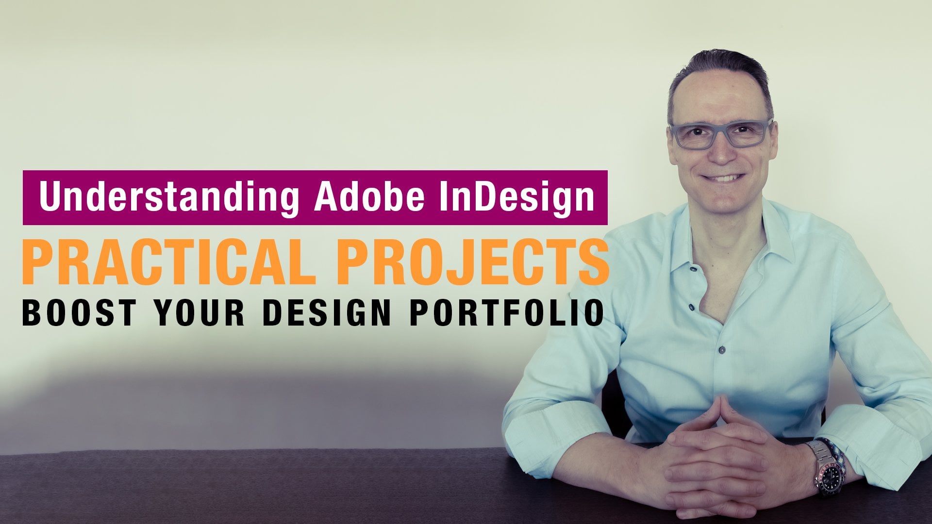
1. Introduction the Course: Hi, everyone. I am
your instructor Elias Sarantopoulos and
thank you for stopping by. So if you are here, chances are you're ready
to learn how to create a professional magazine
layout using a doomi design, and I'm thrilled to guide you
through the entire process. Whether you're working on
a research publication, a school assignment
or a client project, this course is designed
to help you build a creative magazine
from the ground up. From developing paragraph
and character styles to visual hierarchy
and page structure, you will gain practical
skills from concept to completion guided by
design principles that help your
magazine stand out. This course doesn't just
teach you in design. I guides you to create a polished magazine layout that reflects your creativity
and design thinking.
2. Document Set Up: All right, everyone inside
our doping Design CC. I'll go ahead and start this off by creating a new document. Inside the document dialog box. I'll click on the print presets
from the list of presets, I'll choose the letter size, which is the most common
size in the United States. I'll give it a name
of digital magazine. I'll change the units of
measurements from picas 2 ", and that gives me a
page width of 8.5 " and a page height of 11 ". I'm going to set the
number of pages using the Aparok for now
to four pages. I'll make sure that the
facing pages option is checked on as
it is by default, which means the magazine will be laid out as a two page spread. Now, margins define the content, which may include text images,
another content design. Typically, we set the
margins here, but for now, I will zero them out, and I'll set the margins
in a different step. Bleed is the area extending
past the edge of the page, and it's used to avoid strips of white paper showing on
the edges of your prints. So I'll set the
bleed to an eighth of an inch and I'll click to
create the new documents.
3. Document Grid Calculations: Grids provide rhythm
to your designs. They help give your
page balance structure and readability. I'll go ahead and
create a document grid with rows and columns
separated by gutters. To calculate this, we are
looking at the page size of 8.5 " by 11 " or 612 points by 792 points since this is
the unit of measurement we will use as the letting size is always measured in points. Now, the letter size
of this document has an aspect ratio of one to 1.3. And to maintain
that aspect ratio, our document grid will have
13 rows and ten columns. That will give us the most
square grid for the layout. The height of its row needs to be as big as one line of text, two lines of text or three
lines of text, and so on. So for this print magazine, I'll set the height of it row
with three lines of text, so that will be 13 times three, and that equals 39. Now, let's not forget the space in between
each of these rows. That will be the gutters space. In this case, we will have
a total of 12 gutters, 39 plus 12 gutters
that equals to 51 lines from the top margin
down to the bottom margin. Here, we need to make one important design
decision that is to set the letting value
of the magazine, which is the distance
between two lines of text. On my end, I'm making
the design decision to set the letting size 213 points. 51 lines times 13. This is going to give me
a height of 663 points. Where most of the content
will be contained. So to determine the amount of space for the top
and bottom margins, I'll take the page height of 792 points and subtract
the 663 points. That leaves me with 129 points, which is the top and
bottom margins combined. Now, it is a personal choice, how to distribute the 129
points between those margins. For this print magazine, I'll make the top
margin smaller. Since the bottom margin will
include the folio referring, for example, to
the page numbers, the name of the magazine, and the publication date. As for the inside and
outside margin space, I will divide the
129 points by half, so I can center the
entire magazine.
4. Margins and Guides: Now that I've done
the calculations figuring out the
margins and grid sizes, al goheds and set those up. What is important here
is that we work inside the pages window and specifically
with the A parent page. Since every time we need to have the margins
and guides visible, both will appear throughout
the entire magazine. Schohad and double click on the a parent to
work on both pages, and then under the laud menu, I'll bring up the
margins and columns. As you can see the unit
of measurement is set 2 " since that's the way we
set up the new document. But the calculations were done using the points as
a unit of measurement. I'm going to cancel this out. Then right here in this
corner where the rulers intersect a right click
and switched points. B on the lad menu,
March and columns, set the top margin 259 points. I press the tab key
on the keyboard, set the bottom 270 points. Continue pressing the tab key. The inside margin will be
set 64.5 and the same for the outside margin 64.5 to center the entire magazine
into the page spreads. As for the go space, that correlates with the
size of the body text, letting value, as
mentioned previously, I've made the design
decision to set that to 13 points
and then click. For setting up the guides
back on the lad menu, I'll bring up the create
guide dialog box. I'll set the number
of rows to 13. The number of columns
to ten, and once again, the garrospace will be the same as the body
texlating value, which set to 13 points. I'll make sure the fit guys is set to margins, and
then click Okay. So, whichever page
I navigate to, both the margins and
guides are visible, so I can place the text and
images following the layout. Now, this visibility comes
from switching screen modes. Right now, the screen
mode is set to the nom mode where all visible grades and
guides are showing. I can also switch screen modes
and choose the privy mode, which is how the end
design will look, or we can use the
keyboard shortcut to switch between those
two screen modes.
5. Magazine Cover - Part (A): The first page of a
magazine is the cover page. In this case, I'm just
going to double click to get into the very
first page spread. And look inside the layers
panel, here's layer one. So I'm just going
to click one and rename this two photos, and that's what I'm
going to put the photos. I'll click on the PSC
to create a new layer, then I click one and
rename layer two text, and that's what the
text will reside. So I'm going to lock this one temporarily and just work
on the photos layer. So from the tool bar,
I'll go ahead and grab the can tool. And then from bleed to bleed, I'm just going to click andr
to create a rectangle shape. And for a fill color,
and symsis libraries, I'm just going to apply
this color of my choice, and then click on to
rename this two BG. I lock this one, so
don't accidentally move it and continue working with the rectangle tool from bleed to bleed once again, click and drag to create
a rectangle shape acts. I'll release that and apply
this fill color of my choice, and then click once to
rename this two top box, and then hit enter
return and then lock this don't
accidentally move it. Continue using the
rectangle tool. Once again, from
bleed to bleeds. I'll click and drag to
sat another rectangle. Frame here. Perhaps around here, I'm going to release that and apply this color of my choice. Let's say that will
be the title box. Once again, lock the sons
don't accidentally move it. Now I'm going to go ahead and place the photo of
the cover this case, I'll use the
rectangle frame tool. Once again, from
bleed to bleeds. I'll draw this rectangle
shape with a frame tool, and under the file menu, going to place
inside my PS folder. Here it is the psb document, the head of the Alexander, and then click to
open. All right. Now looking inside Photoshop, here is the head
of the Alexander. Now, this document has the same dimensions
as the magazine here. If I go under the image menu, image size and switch the
unis measurements to inches. Here it is with 8.5 b 11. This is just the side notes. Back on the magazine cover
here, that looks good. It's just what I can
do is I can just double click to get
into the photo and then just bring this down just a tad because I
need to have a bit of a space breathing
space breathing room between the title and
whatever comes here. So the frame is still there. One thing is a double click to get into the contents
of the frame. I'm just going to lock this one, and the next step is to add the corresponding text for
the magazine cover. Okay.
6. Magazine Cover - Part (B): To add the corresponding text to the magazine cover first
inside the layers panel, I will lock the photos layers so don't accidentally
move its contents. Unlock the text layer, just click on it to make sure that all contents go
inside that layer. So I've got some notes here. And the first I'm going
to add to insert as a corresponding text will be the special collector's edition. I'll to the clipboards. Grab the type to
form a tool bar, and then click and drag
to create a text frame, release that and
then past that in. I'll double click, and
then select everything, and I'll set the phone
family to aerial. Phone weights to bolts, I'll up the phone
size to 18 points. The text will be white and to center this first
with the selection tool, I'll double click
in any handle right here to quickly fit the
frame to its contents. Now I can center this right here with the
horizontal center. But first, I need to make sure from the
options that I'm going to in this to the page and
then click to center. Now, with the darrow key, I'm just going to
not this a bit. And no center this
here. I like that. I'm going to lock sod
on extent move it. Continue. The next will be
the archaeological times. That is the name
of the magazine. I'm going to cap this.
Grab the type tru, click and drag to
create a text frame. I'll paste that in, double
click select everything. The form family will be
set to the data pro, and that will be bold and
I will up the size 246. I'll give it a color. Let's
see this color of my choice. Once again, I'll go ahead
and fit the frame to its contents by
double clicking on this handle here. Center this. And maybe bring this up just
to Tad, and then continue. That would be the
tmchological Museum. That's like a by line
here. I'll copy this. Grab the type tool, click drag, I'll past, double click,
select everything. Once again, I'm going to
use a P. That would be extra bolts The size will
be set to 18 points. I will be all caps, and this is the
call of my choice. Once again, double click to fit the frame to its contents,
and then center this. I like what I see. I'm
going to lock this both. Next I'm going to add more
text to this negative space.
7. Magazine Cover - Part (C): Continuing adding more
corresponding text. I've got some notes here. The first article would be
the lysian sarcophagus. Actually, this is going to be the main article. I'm
going to copy this. I'll grab the type tool from the toolbar and then
click and to text frame. I'll release that I'll double click to get
into the paragraph. I will select everything, and this is going to be
a line to the right. For the phone family, I'll set the son to aerial. Area black is okay, but the phone size
will be set to 19 point verleting of 21 point, that will be all caps, and this is the
color of my choice. Now, let's make sure that this actually lines up to the
boundaries of the margin. I'm going to switch between the preview mode
to the any modes. I'm going to bring
this right here inside the boundaries of the magazine, and I'm going to resize
the text frame like so. I'm going to bring this up. There we go. We've got that. Let's continue with
the masterpiece of Hellenistic sculpture.
I'll copy this. Grab the type tool, click
and, I'll paste that in. And I make sure again
this lines to the right. This is the color of my choice. Fun fan will it
be set to aerial, regular font size to 13 points
of a letting of 15 points. And I'm going to resize that. No need to add any break Lex. Going to bring this close
since this actually is part of the lysian
sarcophagus. All right. S lex kits. I'll continue this. Next, we got the sarcophagus
of the morning women. That's another article here. I'm going to copy this to the
clipboards and then click Andra create a text frame.
I'll paste that in. I'll select everything here. This is going to be again
aligned to the right. The phone family will be set to aerial black over 14 points
and 18 points of letting. The color my choice will
be this color here. Let's make sure we are within the boundaries of
the margin and we are going to bring this close. Alex we'll continue this with
the Alexander the great. I'll cap this and create another text
frame, paste that in. And what I'm going
to do is actually is double click to get
into the paragraph. I will select everything
from the tool bar, I grab the eye dropper tool,
and I'm just coin two. Let me a bit here to just
sample the properties of this text and this will be
applied to this text here. L? Nice and easy. All right. And I'm going to
bring this close and perhaps I can resize the
text frame just a tad, something along those lines. We've got, I believe,
Omer text to go, the sculptures of Hellenist
Roman period. I'll copy this. Do the same pretty
much Paste that, select all this, grab
the eye dropper, sample this text properties. Of course, now I need to resize the text frame so
things fit correctly. Maybe resized it this way. There you go. The crit. Of course, adjusting the
position will be necessary, but for now this scrit we've got a couple of more things to add and the magazine cover
will be ready to go.
8. Magazine Cover - Part (D): All right. So a
couple of things to finish off the magazine cover. And that is with
the selection tool. I will make you select
all of these text frames. And pressing the shift key. Just going to bring this
down to Tad like so. Maybe I can bring
this up just a bit. Now I would like to
have some separation between the two articles here. For that, I grab the pen
tool for a tool bar. Click one, press Shift key, and click again to create
a straight segment. Now I want the straight line to have two points of thickness, and then this color
for straw color. Zoom in a bit here. Maybe
bring this up just to Tad and bring two to kind of split the distance between
those two. All right? For this one here, maybe I can bring this
down just a little bit. And then I've got some notes that will be the
plus C one here. That will be area Bolt 48. So I'll click reg, I'll type the plus icon, I'll select that a a
color of my choice. That would be aerial
bold set to 48 points, and then double click
to fit the frame to its contents and just bring
the scene right there. There you have it, we just
finished the magazine cover.
9. Magazine Folio - Left Side: Magazine folos can
have page numbers, names, issue dates or months. And so in our magazine progress, I'll add page numbers and names. Now, for the folder to appear
throughout the magazine. That means we need to work inside the a parent
page spreads. Double click to get into that. I'm also going to switch
between the previous modes and on my mode to be able to
see the margins and guides. In addition, inside
the layers panel, I'll block the text layer, and then I'll click
on the plus sag to create a new layer. I'll click one, rename
this two folio. I'll grab the type tool, and then click drag to
create a text frame. Okay. Release that. And
the first element that I'm going to insert
is the page number. So under the type menu, insert special character markers
and current page number. Now of the bat, we get the letter A, and that's because we are inside the A par
and page spread, but that will change
once we start navigating throughout
the magazine pages. All right. After that, I will insert a white space. So instead of using the
space par for that, Design can do this for us. Under the type menu, insert white space and
insert and space. After that, I'll insert a vertical line or what
we call the pipe symbol. We can do that with the help of the glyph spanel
Under the type menu, I'll bring up the glyph panel, and I'll do a search
for vertical. Here it is. When
you have it over, you can see the
name vertical line. All you have to do is just
double click to insert that. Great. After this, I need
another white space. I do the type menu again, insert white space, and
then insert an n space. After that, we're going to
have the name of the magazine. That would be the
archaeological times. I'll paste that
select everything, and I'm going to assign
a pago of style. I'll click on the
Parag of style panel. Then click on the plus
I' going to create one. I double click to get into
the paro styles options. I'll give you a name of folio left spreads for the
basic character formats, for the phone family,
I will assign aerial. For the phone style
bolts and I set the size to 7.5 points and then click. Now, the event that you
see this plus icon, that means we have
some mixed overrides. All we have to do is just right click and then apply
fool your left spreads, and then clear overrides.
10. Magazine Folio - Right Side: So we've got the
folio left spread. Now we need to work on the opposite side for
the folio right spread, since after all, this is a
special edition magazine. We are still inside
the A parent P spreads and also inside
the folio layer. And once again, I
grab the type tool. And then click rag to create
a text frame. Release that. Now, the mouse is black in here, which means we need to actually be on the other side on
the right side to start. So up in the control
bar, right here, I'm going to align
this to the right, and the first element to add to insert will
be the page number. Under the type menu,
insert special character, markers, and then
current page number. Now, to move past
the page number, I use the left RO
key on the keyboard, and then under the type menu, I will insert an n space. Again, to move past the n space. I'll use the left RO
key on the keyboard. Then back on the type menu, I'll bring up the glyphs panel. I'll double click to
insert the pipe symbol. Then again, to move
past the pipe symbol. Use the left arrow
key on the keyboard, and then back on the type menu, insert an otherwise space, and space. And to pass that. Again, I use the left
arrow key on the keyboard. Now, this is going to be
the special addition, so I'm going to capy this, and then paste that in. I will select everything and create another
part of style. Inside the par of styles panel, I'll click on the plausc to create one, double click on it, and give it a name of
folio, right spreads. For the basic character formats, font famer will
be set to aerial, P style to bolts and
the size will be 7.5 points us to double check my
work inside the in spacing, the alignment is to the
right and then click.
11. Magazine Folio - Positioning Text Frame: All right. Looking at these
two foliar text frames, they are glued to the
bottom margin of the pages. We need to add some
breathing space in between. I'll click to select
the text frame and then right here
at the center, I will double click to fit the text frame
to the contents. I'll do the same on here. I'll double click right here to the center to fit the text
frame to the contents. Now to add the breathing space, I'm actually going to
do this numerically. I'll click to select
the text frame. Then on the wide location, I'll add 25 points, and then press enter return, and that moved 25 points. I'll do the same one here. I'll add 25 points, press enter return, you can see, both volar text
frames have equal spacing at the bottom
of each pay spread. And navigating, for example, to the second and
third page spread, we can see the page numbers, as well as the names, the archaeological times,
and the special edition. I.
12. Magazine Folio - Removing from Cover: Okay. There is one more point I would like to bring
to your attention, that is, folio page numbers do not appear on the
magazine covers. So in this case, I'll
double click to get in to the first page. Looking at the very bottom
of the magazine cover, here is the folio, special edition and
the page number one. So in this case, we
need to ommit this. From the flat menu, I'll click one and then choose
apply parent two pages. We are on page one.
So apply parents, none, and then click, and now you can see
the folio has been omitted from the cover page, but it does appear to the rest of the
magazine page spreads.
13. Body Text - Paragraph Style: What follows the magazine cover are the articles and
the page spreads. That means we need to lay down the foundation of the
magazines reading text. Inside the magazine progress, I'll double click to get
into the pages 2 and 3. I'm also going to switch from the preview modes
to the m modes, from the toolbar, I'll grab the type tool and then click and drag to
create a text frame. I'll release that.
Under the type menu, I'll fill this with
placeholder text. Now, to be efficient with my work and make sure
throughout the magazine, reading text is the same
for every paragraph. I'll create a paragraph style, so I don't have to repeat the process over and over again. I will double click to
get into the paragraph. I will select everything
inside the par styles panel. I'll click on the plus icon to create a new paragraph style. I'll double click on it, inside the styles options. I'll give it a
name of body text. Under the basic character
formats for the phone family, I'll assign the data P. Phone style will
be set to regular. Size will be set to ten points, and the letting value 213
points, and then click. So to demonstrate this on
this next page spreads. Once again, I'll grab the type rule and just
create a text frame. I'll release that, and then fill this with placeholder text. So to apply the same style as this paragraph to this
paragraph reading text. All I have to do is just
click on the paragraph, and then apply the body
text paragraph style.
14. Two Column Paragraph: To showcase the next steps
and before I move forward, I will temporarily transition
from a single column to a two column format and
provide a visual reference to see how paragraph text
appears across spreads. With the selection
two, I'll click to select the text frame and under the object menu and
inside the text frames options, I will increase the
number of columns two and set the go
space to 13 points, which is the same as
the letting value of the body text then clicker.
15. Body Text - Hyphenation: Continuing with our magazine in progress and to improve
the reading text, I'll make some adjustments
to the words that get hyphenated inside the paragraph. You see these words
gets hyphenated, this word, the words and so on. In this case, I'll double click inside the body text
paragraph style. Under the hyphenation
and the options, first, we have the
words with at least. Here we can control how long a words need to be
to get hyphenated. I'll set this one,
two, seven letters. There will be four characters kept at the end of each line, and three characters carried
down to the next line. It will be only one
hyphen for every row. I'm also going to move
the slider all the way to the left for
better spacing, and no need to have
any options for capital words across column and last words, and then click.
16. Body Text - Justification: I. Word spacing plays a big role in determining
the density of the type, and the place to go is the
justification settings. I would double click
on the body takes paragraph style and inside the paragraph style options and under the justification settings for variation in word
spacing on its minimum, I'll set this one to 85%. I'll press the tab key twice, and to balance that, I'll set its maximum 250%. For the desired I'll use the uparoky on the keyboard
to increase the space between words and
adjust it slightly to an increase of just
10%, and then click. This is just a
personal preference, and what suits the typeface. When these settings are applied to a large
amount of reading text, they can have a big impact.
17. Body Text - Baseline Gird: A baseline grid is a grid
of horizontal lines evenly spaced across the document
for aligning columns of text, and that's what we're
going to create here horizontal guidelines
that keep lines of text consistent
from page to page. I'll spits between the preview
modes and the m modes. To make the baseline ride
visible under the view menu, grids and guides
show baseline grids. And to customize
the baseline grid, according to the type, I'll bring up designed
preferences panel. Inside the grids, we've
got some options. I'll change the preview
color to a light color. The starts will be set to zero, and it will be relative
to the top margin. You see, this is the top margin. Increment e very refers to the space in
between grid lines, which corresponds to the
letting value of the body text, which is set to 13 points. Finally, I'll check
off the grids in back. The baseline grid
stays in front of any object like a photo or a solid filled object on the page, and
then click Okay. Now, let's not forget to set the body text to be locked
to the baseline grid. I'll double click on
the body text part of style, and inside, it is in spacing for
our align to grids, I'll click on the
OPT menu and then choose all lines and then click. So whatever I move the body
text around the page spread, it always snaps to
the baseline grid.
18. Body Text - No Indent: Continuing improving upon the
body text paragraph style is to indicate to the readers the start of the new paragraph by
creating an indentation. I would double click on the
body text paragraph style, and then inside the
inds in spacing. I'll set the first line indent to be equal to the point
size of the body text, which is set to ten
points and then click. Now we have indentations when paragraphs begin
throughout the text. Here's a new paragraph, another one, another one, another one, and so on. Now, one thing to be mindful is first line indents
are not necessary at the start of a new paragraph or when the body text follows
a heading or a subheading. In this case, I will
make a variant of the body text by pressing and holding the
k of the option key, and then click and drag
this right on top of the plus icon to create a new paragraph style,
double click on it. I'll give it a name of no intent And inside
the incident spacing, I will zero out the first
line indent and then click. Now to remove the indentation from the beginning
of the paragraph. All I have to do is
double click to get into the paragraph and apply the
no indent paragraph style.
19. Body Text - No Break: On many occasions, even
if previously have set the hyphenation
settings for the body text, some single letter words
still get hyphenated. So it's a good idea
to prevent that. Here's an example of
a single letter word that gets hyphenated. I double to get
into the paragraph. I select the single
letter words. And then inside the
character panel. I'll click on it, and then
click on the flat menu, and then choose no break. Now, to be efficient
with my work, I would create a
character style and apply that anytime a singular
word gets hafinated. Inside the character
style spanel and all the way at the bottom, I'll click on the plus second. The creates a new character
style, double click on it. I'll give it a name of
no break and then click. Whenever I come across a single letter word
that gets half an edit, all I have to do is apply the
no break character style. Here's another example,
double click on it and just apply the no
break character style, and that continues throughout
the entire magazine.
20. TOC - Setting Up: The table of contents serves as an outline and it is a central reference for
the content in a magazine, and that's what we're
going to set up here. No need to have those
two text frames. That was just for us to set
up the magazines body text. I'll go ahead and
press the delete key on the keyboard to remove that. I am inside the page
spread two and three, inside the text layer. I'm also going to switch between the privy modes and the modes. I grab the rectangle
tool from the toolbar. And from bleed to bleed and some right here at the center of the
spine of the magazine. I create this rectangular
frame. I'll release that. I'll make sure that I'm right
here on the fill option. And then inside
mysisa libraries, this is the color of my
choice for the fill color. I'll rename this two frame, and I'm also going to look it. So I don't accidentally
move it. All right. The first thing I'm
going to have is the contents heading. So I'll grab the type
tool from the toolbar, and then click and drag
to create a text frame, I'll release that, and then
paste the word contents. I'll double click
select the words, and then inside the
paragraph style spanel. I'll click on the plus icon to create a new paragraph style. A double clickon and give
it a name of contents. This is not going to be based on anything, no paragraph style. I'm also going to remove all
of these style settings. Click to reset to base. For the basic character formats, I'll set the phone
family to aerial. For the phone style, that will be set to black, and the point size will
be set to 24 points. For the paragraph shading,
I'll turn this on. The color will be set to yellow. No need to have any transparency so that will be set to 100%. As you can see this occupies, the shading occupies
the entire column. In this case, I want on
this to affect the text. So the width will
be set to text. I'm also going to disable the chain icon and
set the top of set separately to a negative value of nine points and then click. All right. Now, to
center this to the page, first, I'll double click to
fit the text to its contents. I'll make sure that
align this to the page. I'll go ahead and center
this horizontally center. That looks good. The placement
seems to be good like so.
21. TOC - Vertical Line: Another element to
add to the table of contents is a separator
between text. For that, I'll grab the pencil, and then click one to
create the first C point and then press the shift key to create the straight segment. I'll use a two point stroke. I'll make sure that
I have the stroke as an option here on the top. And then inside my libraries. This is the color of my
choice for this stroke color. Now, go ahead and zoom
in quite a bit here. You can see this is
just a straight end. When I select that, I can go to the window menu and bring
up this stroke panel. And for the cap option, instead of a butt cap, I can have a round cap and
now have rounded corners. All right. So the lex kit. I'm also going to select
that at the center to the page and also lock those two layers so I
don't accidentally move them.
22. TOC - Heading: Okay. All right. Now it's time to create
the headings and paragraphs for the corresponding articles
inside the magazine. I've got some notes here. This is going to be
the first heading, the si and sarcophagus, once again, this is going to be the man article. I copy this. Grab the type tool, and
then click text frame and then past to get
into the paragraph. I will select everything and then create a
paragraph style by clicking on the
paragraph style spanel All the way
at the bottom, I'll click to creates a new paragraph style,
double click on it. I'll give it a name
of TOC heading. This is not going to be based
on any paragraph style. I'm also going to remove any style settings by
clicking on reset to base. For the basic character formats, I'll set the phone family to pro phone style to bold I
will apt size 214 points, and then change the
color of the character. I'm going to scroll down up and down and see that actually, the color of my choice does not populate inside
the swatches here. I'm going to click for now. Diselect everything and then
inside my CC libraries. This is the color of my choice. So right click to add that particular color
to the swatches. Back on the TOC heading.
I'll double click on that. For the color of the character and all the way
down on the list, this is the color of my
choice, and then click. I'm also going to
double click to fit the text to its contents. Then just bring
this to the side. Perhaps use the D arrow
key on the keyboard. Place it on.
23. TOC - Description Text: I. The lysian
sarcophagus heading does come with a
short description. So back on my notes. Here's the short paragraph. I'll copy this to the
clipboards, grab the type tool, and then click and drag
to create a text frame, and then P. I'll double click
to get into the paragraph. I will select everything and inside the
pagas style panel, and all the way at the bottom, I'll click on the pec to
create a new paragraph style. I'll double click on it. I'll give it a name of TOC left. Now, this paragraph style, for the most part, is going
to be based on the body text, but inside instance spacing, the alignment would change
from left to right, No need to have any
first line indentation, so I'm going to zero this out. I'm also not going
to align this to the grid as for the
color of the character, and look inside,
the swatches list, once again, the color
does not populate. I'm going to click here,
Diselect everything. Back on the CC libraries, this is the color of my choice. All click to add the
color to the swatches. And then double click
on the TOC left, and for the color
of the character and all the way down the list. Here's the color of my choice. And then click.
That looks great. Go ahead and zoom in a bit here. First of all, I'll
bring this up close to the heading and resize the tad. All right. That
looks good, perhaps. But I do have a hyphen in here. I will double click to
get into the paragraph. Double click again to select the words that gets hyphenated the incite the
character style spanel I will apply the no break. I've got another one here. No break like so. Bring this close, and this
one to Is going to zoom out, and I like the spacing.
24. TOC - Remaining Left Side: The left side of the table
of contents does have another corresponding
article for the magazine. Once again, back on my notes, that will be the morning
women. I'm going to copy this. Grab the type tool,
and then click Ara to create a text
frame, and I'll. That also comes with a
short description text. I'll copy this two. Grab a type tool,
and then click to create a text frame,
and I'll past. Now, to apply the
same paragraph style to this text frame as this one. All I have to do inside the paragraph style spanel
to click ones on the TOC heading and then double click to fit the text
frame into the content, and perhaps just right there, align it to the right. This one here actually already has the correct
paragraph style assigned to it. I just need to resize its frame. I'm going to bring this close and make sure that it lines up. A close and resize
the text frame. Let's zoom out. I'm
also going to select both of these text frames and just bring them down
to the tad like so.
25. TOC - Styling the Right Side: The right side of the table of contents does come
with headings and paragraphs as well for the corresponding articles
inside the magazine. Back on my notes here, the first heading on the right will be the Alexander
the grades. I'll this, grab the type tool, and then click to create a
text frame, and then paste. This also comes with a
description text. I'll copy this. Grab the type tool, and then click rack to create
a text frame, and then paste that in as well. For this text frame, all I
have to do is assign the TOC heading and then double click to fit its contents to the frame. Align this right there
perhaps for this one, well, this one, I'm going to create
a new paragraph style, very similar to the TOC left. The difference is that this paragraph right now
aligns to the right, but it's supposed to
align to the left. The easiest thing to
do is to click and drag this right on top of the plus icon to
create a duplicate, double click on it,
change the name two. To right. Inside
inches in spacing, I would align this to
the left and then click. Let's go ahead and position
this quite close to that. I can bring the frame just
a tad inwards. Like so. Perhaps just bring this up. There you go. All
right. We've got that. I believe I have one
more to go here, and that will be the
gallery of sculptures. Grab the ta tool,
create the text frame, paste that in that also comes
with corresponding text. Copy this past that in as well. For this, I will assign the TOC heading,
double click on it. Perhaps more right there. For this, I will apply the TOC. Now we've got that. There we go. I like everything right here. And the only thing I
would like to change is actually position the
entire contents here, just like in the
center of the page. So inside the layer spanel, first, I would unlock
the line layer. And with the selection to,
I mark select everything. Bring this down to the center. L
26. About the Archaeological Museum: Moving forward with the
magazine in progress. Now it's time to work inside
the third page spreads. Looking inside the layers panel, I'll go head and lock all
of these text layers. I don't accidentally move them. Unlock the photos
layer and select it since I will be
placing a photo here. So for that, I'll switch between the preview mode
and the non modes. I grab the rectangle
frame to and then creates a rectangle frame
from here to let's say there, and release inside here,
I'll place a photo. Under the f menu, I use the place command. Here's the photo of my choice, the front view of the
archaeological museum, which is inside the photos
folder, and then click. As you can see, this is
a quite large photo. So with the photo selected, I'll click right
here where it says, fill frame proportionally, and that looks so much
better. All right. Now, let's go ahead and add
some corresponding text, text, which is about the museum. So for that, I've
got some notes. I'll copy this to
the clipboards. Grab the type tool, and then click Andrag
to create a text frame. I'll release that and
then paste that in. As you can see,
this text now has a paragraph style probably
from this page right here. Inside the paragraph
styles panel, first, I'll assign
the basic paragraph. Then under the object menu and inside the text
frames options, I would like to
have two columns. I also need to change
the ga space which is equal to the letting
value of the body text, which sets to 13 points,
and then click Okay. In addition, I do have a
forced paragraph here. I will double kick to get
into the paragraph and then press the backspace on the keyboard to remove
the extra space. Since we are working
with a body text, all I have to do is apply the
body text paragraph style.
27. First Letter Drop Cap: To make things more interesting with this
paragraph is to create a drop cap affecting only
the very first letter, which means we need to create
a new character style. That will affect just that. Inside the character
style panel, and all the way at the bottom, I'll click on the plac create
a new character style. I'll double click on it. I'll give it a name of drop cap inside the basic
character formats. I'll set the font
family to aerial. Font style to black since I
want to have something heavy, and the size will
be set ten points, which is the same size as the
body text, and then click. So to apply this character style to the very first letter. First, I'll zoom I'll double click to get
into the paragraph. I will just select
this first character, and then incite the paragraph
style spanel I'll click on the plus ac to create a new paragraph style,
I double click on it. I'll give it a name
of first letter, this is indeed going to be
based on the body text, and then inside the drop
caps and nested styles, the drop cap will occupy one, two, three lines of text. Here we go. One, two,
three, one character, here's one character,
and will be based on the drop
cap character style. All looks great, but we
do have this extra space. Now, this comes from
the body text since the first letter is based on the body text and
inside its in spacing, here it is, we've
got the indentation. I'm going to zero this
out and then click. That looks great, but there
is room for improvement. For example, I can have space between this character
and the body text, as well as I can change
the color of the drop cap. With nothing selected
in some CC libraries, I'll click to add this
color to the swatches. Back on the drop cap and
double click on this. Under the basic
character formats, I'll increase the
tracking to 75. Here's the breathing
room between the two. And for the color
of the character, this is the one that
I would like to assign, and then click. The last remaining thing is
to find the words that get hyphenated and remove
that hyphenation with the no break
character style. Here's another one. Here's
another one, and so on.
28. Feature Article - Placing Photos: I Moving forward to the next page spreads
in our magazine in progress for the
feature article. I would double click to get
to the fourth page spreads. Also going to switch between the previous mode and
the normal modes. The first I'm going to
do is place some photos. Inside the layer
spanel I need to make sure that I'm working
inside the photos layer. And from the toolbar, I'll grab the rectangle
frame tool and then click rag to creates
the first rectangle frame. I'll release that then
under the file menu. I click to place the can
sarcophagus, I click to open. I'm also going to click on the film frame
proportionally option, which resizes content to fill the entire frame while preserving the
contents proportions. Still with the
rectangle frame tool, I'll click and drag sheets,
another rectangular frame. I'll release that and then place another photo that will be the detailed view
of the sarcophagus. Click to open, and once again, use the film frame
proportionally option, like so.
29. Feature Article - Headline: The article headline is
the first thing that grabs the reader's attention and leads us to reading more
about the article. And that's what I'm going to add following the
placement of the photos, which means inside
the layers panel. I need to make sure that I
work inside the text layer. So I'll grab the type tool from the toolbar and then click Andra to create a text
frame. I'll release that. And for the texts. I got some notes here. This is all about the
lysin sarcophagus. I'll copy this to the clipboard, and all I have to do
is paste that in. As you can see, I
need to clear up any paragraph styles
and character styles. Inside the paragraph
styles panel, I'll apply the basic paragraph, and then click and clear any character styles and
starts from the beginning. All right. Now, we're
going to create a new paragraph style for
the article headline. Double click to get
into the paragraph, we select everything and
then click on the plus I' going to create a
new paragraph style, double click on it. I'll give it a name of the article headline.
I'll copy this. I'll paste that in for the basic character format
for the phone family, I'll assign the era P.
Phone style will be set to bolts and I will up the point size to 30 points
and then click Okay. All I have to do is
just double click to fit the text frame
to its contents. The nicen slow by
pressing the shift key. I'll send this to the page.
30. Feature Article - Strapline: A strap line is another headline written
in a smaller font and gives the reader
further teaser information about the article. I'll grab the type two and then click Andra to create
another text frame. I'll release that
back in my notes. This is going to be the
corresponding text. I'll cap this and then paste. Once again, I need to clear up any paragraph or
character styles. I will apply the basic
paragraph style, and then click to clear
any character styles, and then start from scratch. I'll double click to
get into the paragraph. I will select everything
and then click on the Plas Sg to create
a new paragraph style. I'll double click on it. I'll give it a name of
Article strap line. I'm going to cap this and then pace in and then inside the
basic character formats. I'll set the form
family to aerial, P star regular spine. I will up the point size to 13 and set the leading
value to 15 points, which is different
than the body text. The key thing here is to go
inside the ints in spacing and align only the first
line to the base line grids. Let me go ahead and demonstrate the effect of the
first line only. Double click to go back to the strap line and inside
the base character formats. The more I increase
the letting value, the more a distance the remaining lines
from the first line independently from
the baseline grid by using a different letting value
other than the body text. I'm going to set mine
back to 15 points, and then click Okay. Now I'm also going to
resize the text frame. I do have some hyphenation. I'm also going to center this. So back on the strap line, and inside it is the spacing, I'll set the
alignment to center, and I will remove any
hyphenation, and then click Okay.
31. Feature Article - Reading Text: Now, since this is
an article that means we need to have
some reading text. Background nodes,
this is going to be the corresponding
text. I'll copy this. Before I create the text frame
inside the layers panel, I'll make sure that I'm
working inside the text layer. I'm also going to switch between the pre modes and the ma modes. I'll grab the type, and then click Andra to
create a text frame. Release that and
then past that in. Now, this text frame here, this paragraph has the right paragraph
style assigned to it, which is the body text, and then under the object
menu and text frames options, I would like to have two
columns of texts and set the gutta space to be equal to the letting value
of the body text, which is 13 points,
and then click. Now, looking at this paragraph
here, this text frame. I do have some forced
paragraph spaces which I need to remove. I will double click to get
into the paragraph and then press the back space on
the keyboard to remove that, remove this extra space and
this extra space as well. I also get this plus icon. This plus icon indicates there is more text
into the text frame, so I will create some
additional space. So I'll bring this up a bit. In this one, two, and increase the size
of the text frame, and now the plus
scon disappears. I'll remove the first
line indentation by double clicking and
assign the non dent, whatever I find words
that get hyphenated, apply the no break
character style. Here two, and this
one, two as well.
32. Feature Article - Kicker: The kicker will
indicate this page spread is the feature
article of the magazine. It is an additional headline helping to draw
readers in and it is usually displayed at the very top and differently styled. To start this some working site, the text layer I'm also
going to switch between the privy med and then meds. I'll zoom in a bit,
grab the type tool and create a text frame that bleeds to the top
edge of the page. I will click rag to create a
text frame. I release that. Since this is all about
the feature article, this is what we're
going to have here, I'm going to copy this
to the clipboards, click one, and then
paste that in. I'm also going to make sure that this text frame lines
up to the guides. Also you can see that I have this plus icon as an indicator. That means that I have
some formatting issues. Inside the part of style panel, I have to do is apply
the basic part of style. Here is the feature article. Now inside my S libraries. This is the color
of my choice for the background color
of the text frame. I double click to get
into the paragraph. I will select everything. Then I will click
on the plus I'm going to create a
new park of style. I double click on it and
give it a name of kicker. Under the basic
character formats, I'll set the phone
family to aerial, phone style to black, I'll up the size to 14 points, and that will be all caps. Under the intent spacing. I will align this to the center. For the color of the character,
and all the way down, I'm just going to select this color of my choice,
and then click Okay. All right. That looks great. Let's continue on that. So under the object menu, I'll bring up the
text moms options. And for the vertical
justification, I will align this to the center. We also have to take
into consideration and count the magazines bleed space, which is set 29 points. For just for the
top inset space, I'll set this one, 29
points. Then click Okay. Perhaps this can stretch out
just a bit on the height. So right here, I'm going to
this 250 points like so. Another thing I can do is inside the property s panel is to have a couple of corners to the bottom left
and the bottom right. I'm going to click on that. Inside the cerptonsFirst,
I will enable the chain icon and zero
out all the corner sizes. And then disable the chain icon and set the bottom
left to six points, and the bottom right
also to six points. Now, the shape is set to none, so I'm going to set that
round and round it like so.
33. Lycian Sarcophagus - Placing Photo: I Moving on to the
next page spread, the fifth page of
the magazine inside the pages panel, all
the way at the bottom, I will click on the
plus icon to create a new page and make sure that I'm working inside the
photos layer since, I will be placing a
background photo. For that, I'll switch between the prev mode and the modes, and from the tool bar, I grab the rectangular
frame tool, and from the very center
right here on the spine, I'll click and reg to creates a rectangular frame to the bleeds and all the
way at the bottom. I'll release that
and since I will be placing a photo,
under the file menu, I'll use the place
command to click select the corresponding
photo of the article, and then click to open. All right. I've got the photo, now I just need to fit the photo within the
frame proportionally. So with the selection tool, I'll click one to select the photo and then inside
the property s panel. Under the frame fitting options, I'll click on the fill frame proportionally xo.
That looks great. I just want to reposition
the photo within the frame slightly to the right and
reveal more of the photo. I would double click
to get into the frame. Then nice and slow. I'm just going to click drag. I'm also pressing
the shift key on the keyboard to
constrain the movement. Like so, I'll click off to the select and inside
the layers panel. I'll make sure that.
I lock the photos don't accidentally
move it. Okay.
34. Lycian Sarcophagus - Faded Gradient: For the next step, I create a side bar
for the head line, strap line, and reading
text of the article. I'll make sure that I'm
working inside the text layer. I'm also going to switch between the privy modes and the modes. From a tool bar, I grab
the rectangle tool. And from the top leads our clicking rag to create
a frame that stretches out, let's say up to here and there, I least that grab the selection tool and
make sure this frame lines up with the guides of the page spread from
the control bar, so coin to fill this with a
black solid color like so. Now, I would like
to actually soften up the solid color
with a faded gradient. First, I select a frame
and then from the two bar, I grab the gradient
feather toil. And that will create the feted
gradient from the area of the frame to be solid to the area of the frame
to be transparent. I'll click on that.
Let's see around here. I'm going to click and to
create the feted gradients. Now, that actual is a bit high. I'll tweak this again to
move the transparency towards the bottom and be
able to see the reading text. Let's see around
here. I'll click and to creates another feted
gradients and release. We also have the
option to get into the effect and change
certain things. So inside the property
spanel under the appearance, here is the gradient
feather effect. I'll click on it, and look
inside the gradient stops, this is the midpoint, which I'm going to click
and drag this to the right. Now, the gradient fades out towards the bottom,
and then click. Now, I can still continue
refining this fda gradient. But this time, I'll
draw it outside the boundaries of the frame since the midpoint has
already been defined. So let's say around here, I'm going to click rag pressing the shifting
on the keyboard as well and go outside the boundaries of the
frame. And release. I can continue this till I
find something that I like. I think it looks good. Inside the text layer. I'm also going to
an is two frame, and also it so don't
accidentally move it.
35. Lycian Sarcophagus - Headline & Strapline: Since this is another
article entry, first, I create the head
line and strap line. I'll make sure that I work
inside the text layer, and I've got some nodes here. This is the text for
the side bar headlines. I'm going to copy this
Grab the type tool, and then click and drag
to create a text frame. I'll release that,
I'll paste that in. I'll double click to
get into the paragraph. I will select everything inside the paragraph
styles panel, first, I'll apply the basic park of style to remove
any kind of formats. Then click on the Placo to
create a new park style, double click on it, and I'll give it a name
of sidebar headlines. I'm going to copy
this. Paste that in under the basic
parketer formats. I'll set the font family to
aerial font style to black, I'll up the point
size to 15 points and change the color of the character to white,
and then click Okay. All right. I'll click off
and then zoom in a bit. Click to select the text frame, and then double click
to fit the text into the frame and make
sure this sits right here on the top and
right here at the center in relation to the
rectangle frame. So I'm going to zoom
out a bit here. And work on the strap line. So I've got some
notes here again. I'm going to copy this text. I'll grab the type tool. Click Andro to
create a text frame. I'll release that.
I'll paste that in. I'll double click to
get into the paragraph. I will select everything. Once again, apply the
basic paragraph style, Tremove any kind of format. I'll click on the plus second to create a new paragraph style. I'll double click on it, and I'll give a name of
sidebar strap line. I'll copy this. Past Under
the basic character formats, I'll set the phone
family to aerial. Phone style will remain regular. I reduce the point
size to ten points. I'm going to have all caps. Inside is in spacing. I will align this to
the center and change the color of the character
to wit and then click. I'm going to click off
here for a second. Zoom and resize the text frame. Right there and right there and then just bring this
in and then bring this up closer to the
headline, like so. Okay.
36. Lycian Sarcophagus - Sidebar Body Text: To close up the space spread, a couple of more things to add, and that will be the
reading paragraph with an additional drop cap. I'll make sure that I'm
working inside the text layer. Looking at my notes,
this is going to be the corresponding
text. I'll this. Grab the type and then click
and to create a text frame. I'll release that, and
then paste that in. I'll double click to
get into the paragraph. I will select everything, and inside the paragraph
style s panel. I'll click to apply the
basic paragraph style to remove any kind of formats. Now, the corresponding
paragraph text has indeed an additional
paragraph space, which I need to remove. But this is not visible
here in this text frame. That is because I need to
go under the tap menu, and then turn on the
show hidden characters, and now we can see the
paragraph symbols. For example, here's
one, one, and one. This is the additional one
that creates the forced space. Double click to get
into the paragraph. I select that, and then press the backspace on the
keyboards to remove that. Now, initially, I will apply the body texts for
this paragraph here. But now I need to create a
new paragraph style that has most of the formic controls of the body text
without being based on. In this case, I need to
duplicate this paragraph style, so we click and drag this
on top of the plus icon. Here is, here's the duplicate, Apoc I'll give it a
name of gradient text. This is not going to
be based on anything. I'm just going to
change the color of the character to
whites, and then click. That looks great
and now we're ready to create the
additional drop cap.
37. Lycian Sarcophagus - Sidebar Drop Cap: For the creation
of a new drop cap, I will need to create
a new character style. Inside the character
styles panel, I'll click on the plus second to create a new character style, double click on it and give it a name of
side bar drop cap. Under the basic
character formats, I'll set the phone
family to aerial. The phone style will be set too narrow, and then click Okay. Now, what is
important here is to not have any character
style selected for the upcoming paragraph style that will be hosting
the drop cap. So we select none. I'll click back on the
paragraph styles panel. I'll click on the PLS
Sac and to create a new paragraph style,
double click on it, and give it a name of
sidebar First letter. Now, this part of style will be based on the gradient text, since that's the style we
applied for this text frame. And then inside the drop
caps and esta styles, the draw cap will occupy one, two, three, four,
five lines of text. One character and the
character style would be set to side bar drop cap.
And then click Okay. All right, so to apply this side bar first
letter to this paragraph. I'll double click to
get into the paragraph and just select the
very first letter, and then just click
on the side bar, first letter, like so. So here's the drop cap. But now, I need to remove
the first line indentation, as well as to add
extra space between the letter and the paragraph. So I will double click to get
into the paragraph options, and inside incent spacing. I will zero out the first
line intent then click Ok as for the extra space between the drop cap
and the paragraph. Back on the character styles, I'll double click to get
into the side by drop cap, and inside the basic
character formats, I will increase the
tracking to 100, then click Ok. Now, I do see a couple
of words that get hyphenated, this
one and this one. Double click to get
into the paragraph, double click to select just the word that
gets hyphenated, and then apply the no break
character style right here to apply the no break
character style, like so.
38. Alexander the Great - Placing Photo: Moving forward with
a magazine progress inside the pages panel, and all the way at the bottom, I'll click on the plus
second to create a new page. I'll make sure that
I'm working inside the photos layer since
I will be placing one. I'll switch from
the prev modes to the animal modes and
from the tool bar, I grab the rectangular
frame tool, and from the bleed area, I click and drag creates a rectangular frame that
stretches out up to here. I'll switch the selection
tool and make sure that this rectangular frame lines up
with the baseline grades. So to place the photo
under the file menu, I use a place
command to click and select the photo of the
Alexander the grates. I'll click to open,
and I'm also going to make sure that I fill this
frame proportionally. Alex grades I just want to move the photo within the frame
slightly to the left. Double click to get
into the frame. The nice and slow by pressing the shift on the keyboard
to constrain the movement, I'll move the photo within the frame slightly to the left. And I'm also going
to make sure that I lock this photo so don't
accidentally move it. Okay.
39. Alexander the Great - Headline: Since this is another
article entry this time about the
Alexander the Great, I'll start creating
the headline, which means I need to make
sure that I'm working site the text layer. So from a tool bar, I
grab the type tool, and from site sites, I create a text frame. I release that inside
my notes, here it is. I'll copy this. Then past. I'll grab the selection tool. And inside the par
gap styles panel. First, I will apply the
basic par g of style, then click to clear any character styles and
avoid any formatting issues. I'll double click to
get into the paragraph. I will select everything. Then click on the plan second to create a new paragraph style. I'll double click on it and give it a name of headline
border. I'll cap this. I'll paste that in inside
the basic character formats, I'll set the phone
family to aerial, phone style to black. I the point size to 30 and use all caps
and then click Okay. All right, so the legs cut, but I will continue
refining the style. I will double click to
get into the Parag of options and inside
the park of border, I'll turn the borders on. The first thing you
need to do is zero out all the stroke sizes. Here we go. Now I will disable the chain icon and set
the top stroke 23 points. The bottom stroke
also to three points. And looking here, the
top stalk is axially glued to the cap
height of the text. So I need to offset that a bit. Looking inside the
offsets, first, I will disable the chain icon
and then up the top offset. 7-8 points x skirt, and also want to
have the stroke only affect the text rather
than the entire column. I'll set the width
to text and then click select the text and then double click to fit
the text into the frame. I'll make sure that I
line this to the page, and then I will sent
to this horizontally. I'll z bit here, and then use the dark
on the keyboard to position this to the very
top of the page spreads.
40. Alexander the Great - Highlighted Text: Highlighting text
can add emphasis and draw attention to specific
parts of your magazine, and that's what I'm
going to create. Still working inside
the text layer and looking aside my notes, this is going to be
the corresponding text for the paragraph that
gets highlighted. I'll copy this. Grab the title, and then click Andra to create the text frame and release
that and then paste that in. As you can see, I do have some formatting issues coming from the previous
paragraph style. I'll click on the
basic paragraph style, and I do get this plus icon. When I have a over in design notifies me that
I have some overrides and specifically mixed
overrides. I will right click. Instead of clearing
the overwrites separately and the
character styles, I'm just going to
clear everything and starts from the beginning. Now for this effect to work, I need to have paragraph breaks every line of text
gets highlighted. In order for me
to be able to see those paragraph breaks
under the type menu, I need to turn on, show
hidden characters. I will double click to get into the paragraph and then
press the backspace on the keyboard to remove
the space between the two words and
then press er return. Here is the first
paragraph break. I'll do the same right here. I'll press the back space on the keyboard to remove
the space between the stewards and then
press enter return for the second paragraph break. Here they are. I'm ready to
create the paragraph style. With the text frame selected, I'll click on the plus second to create a new paragraph style, double click on its I'll give it a name of
highlighted text. I'll cap this. I'll paste that in and inside basic
character formats, I'll set the phone family
to aerial, regular spine. The point size will
be set to ten points, and the letting value
will be set to 13 points, which is the same
as the body text. For the case, I'll
set the spine to small caps and
inside and spacing, I will align everything
to the baseline grids. All right. Now, how about
the highlight effects? I can do that inside
the parka rules. I'll turn the rule on. That would be the rule above. I'll set the weight
to ten points. Now I need to change
the highlight color to another color so I will
be able to read the text, so I'll set mine to
this column of choice. Because I would like to
have the highlight affect only the text and not
the entire column, I'll set the width to the text. In addition, I'm also going
to have an underline. Click on that, I'll
turn the underline on. I'll set the way to one and the offset 22 points and change the color of the text to this column of choice,
and then click. That looks great, but I
still need to refine this a bit because the
highlight needs to get glued to the underline. I will double click to get
to the paragraph style, and then back on the
paragraph rules, I'll have a negative offset of minus two points,
and then click. All I have to do now is resize the text frame, like so. Okay.
41. Alexander the Great - All Caps Line: Articles do come with
some description text, and so my notes. This is a brief history about
the Alexander the grades. I'm going to copy
the clip parts. I'll make sure that I'm
working inside the text layer. I'm also going to switch between
the privy mode on modes. From the tool bar, I'll grab the type tool and then click track to
create a text frame. I'll release that and
then as you can see. I do have some
formatting issues. Coming from the paragraph style. In this case, first, I will apply the basic
paragraph style, and then right click and
then clear everything since I will be creating a
new paragraph style for this paragraph here. Now, this paragraph will
be based on the body text. First, I'll click to select the paragraph and
apply the body text. Then I will click
off to deselect. Now, the plan here is to have only the first line of
text with all caps, a heavier font weight, and a different character color. Inside the character
styles panel, I'll click on the plac to
create a new character style, double cricon and give
it a name of all caps. This is not going to be based on anything inside the basic
character formats, set, the font family to data P, font style extra bolts, no need for any tracking. Case will be all caps as for
the size of the letting. No need to set those since this paragraph will be
based on the body text. But I'm going to
change the color of the character to this color
of my choice, and then click. Now, before creating a
brand new paragraph style for this reading text, I'll make sure that no
character stars are selected, and then back on the
paragraph styles panel. I'll click on the plus second to create a new part of style, double click on it, and
give it a name of all caps. Line. Now, this is going to be based on the body text and
inside drop caps and styles. Since we only want the first
line of text to be affected, then we need to create
a new line style. I'll click on that. The line style will be based on the caps character
style and will only affect the first line,
this one right here. Click Okay. Okay. Now, to apply the lines cap
to this paragraph, I will double click toes
into the paragraph, and then just click once to
apply the all caps line, like so. All right. So things are looking great. I do have a couple of issues. First, I need to remove the
first line intentation, as well, I can see that I have some words that get hyphenated. I would double click to get into the all caps line
paragraph style. Inside, it is in spacing. I will zero out the
first line intent, which comes from the body text since this is based on the
body text, and then click. As for the singular words
that get hyphenated, I will double click to
get into the paragraph, double click to select the words and apply the no break
character style. I believe I have one more here, double click on that and
apply the no break as well. Last thing remaining is to
select the text frame and resize it and position it
at the bottom, like so.
42. New Parent Page - B Parent: Moving forward to
the last page of the magazine progress
inside the pages panel, and all the way at the bottom, I'll click on the blast
secon to create one. For this page, I would
like to cover it with a solid background color as I did with the
table of contents. However, I'll take a
different approach by creating a new parent page, and that will give me
flexibility towards having a more visible folio since this spread will have
a dark background. So go ahead and then
click to duplicate the A parents and I have the B parent page with
a folio as needed. I will be working on
the photos layer, I'll switch between the
privy mode and the mode. From the tool bar, I grab the rectangle tool and from bleed to bleed in
the middle of the page, I create the rectangle shape. I release that from
the CC libraries, this is the color of my choice. I'm also going to
make sure that I lock this layer so I don't
accidentally move it. Now, for the folio on the right side,
the special addition, I need to change this color from black to a lighter color, and I can do that by duplicating its style which just
a small modification. Inside the paragraph
style panel, The fo right spread is the style that is
assigned to this text frame, click and drag this
run on top of this plus icon to duplicate, double click dates to
the styles options. Then rename this two fo spread, W W is the abbreviation for
the color weight and then inside the character color just contrasign the white
color and then click. To apply this new style to
this text frame, first, inside the layers panel, I need to unlock the photo layer since that's where we added
the fool text frames. I'll click to select
the text frame and just click to apply the
new style like so. Back inside the layer spanel
I will lock the photo layer, and to apply the B parent page to the seventh page spread, all I have to do
is click and then choose apply parent two
pages from the list, I'll choose the B
parents, and then click. I'll double click to gets
to both page spreads. Looking at the photo of
the Alexander the Great, I can see that it
extends past the spine. I will unlock click to select the frame and just
resize it just a tad, and then lock it back again.
43. Sculptures - Headline: This page spread is all about the Hellenistic
and Roma sculptures. The first element to add
will be the headline. I'll make sure that I'm
working inside the text layer. I'm also going to switch between the prev modes and
the nom modes. I'll grab the type from a toolbar and then click
Andra to create text frame. I'll release that and
look inside my notes. This is the corresponding
text for the headline. I'm going to this, and
then paste that in. As you can see, I do have some formatting issues
coming from another style. Inside the paragraph
styles panel, I'll click to apply the
basic paragraph style, and I'm ready to create a
new style for this headline. All the way at the bottom, I'll click on the pla cc to create one Apoccon I'll give it a name of gallery headings,
so I'm going to cap this. I'll paste that in Inside
the basic character formats. I'll set the font
family to aerial, font style to bolts. I'll up the point
size to 24 points. I'm also going to
change the color of the character to
whites, and then click. Now with this text me selected, I'll double click to fit
the texts into the frame. I'll center it, and then slightly position it
around there like.
44. Photo Gallery - Gridify: For the photo gallery, I'll use the powerful
grittifi feature in student design to create a layout of photos and captions combining paragraph
styles and object styles. The gritty fi feature works
with any of the shape tools. So in this case,
form a tool bar. I grab the rectangle
frame tool and click and drag out and draw a
large rectangular frame, and with a mouse
still held down, I'll tap one the
right arrow key on the keyboard to divide the
frame into two columns. By keep tapping the
right arrow key, it splits the rectangular
frame into more divisions. Tapping the up arrow
key that will add rows and the opposite
using the de arrow key, and the left arrow key will
remove rows and columns. When I let go, it's going to draw as many shapes as I want. Now, the default gap space
between those frames, the space between those frames, also known as the gato space can be found inside the
marges and columns, which is set to 13 points as it has been configured
from the very beginning. So to demonstrate that
and change the gap space. I remove that and click
and drag out and create another large rectangular
frame with columns and rows. With the mouse still held down and pressing the
control commands, and the right arochy that
increases the vertical spacing. Similarly, pressing the
control commands and the up arochy increases the
horizontal spacing, like so.
45. Adobe Bridge - Asset Manager: Adobe Bridge is an asset
manager that lets you preview, organize, edit meta data, add keywords, labels, and so on. So to generate my captions, I'm using Adobe Bridge to add meta data descriptions to my images before I import
them inside design. So, for example, with the statue of Artemis
photo selected, and under the IPT
C core section. I have already added the corresponding
description meta data, and the same thing applies
for the rest of the photos. So I highly recommend you spend a few minutes since
this is going to play such an important role for generating live captions
insights, adb design.
46. Photo Gallery - Placing Photos: To create the photo
gallery, first, Spitz from the preview mode to the mode to see the grids
for lining the frames. I'll make sure that I'm
creating the content inside the photos layer
and from a tool bar. I will grab the
rectangular frame tool to create a large
rectangular frame. And with the mouse
still held done. I'm also going to
tap on the keyboard, the right arrow key twice to create those three column
frames and release. Now, since I will have
nine photos altogether, that means I need
some duplicates. I'll use the keyboard
scuds I'll shift option shift to create
the first lubricate, then one more duplicate to go. And release. I will mark you select with the selection
to all of these frames and double check my work to
make sure that I have equal spacing between rows as I do. And I'm ready to place some
photos inside those frames. So under the file menu, I use the place
command to click and then shift click to select
all the nine photos, click to open, and now the loaded cursor
indicates the number nine. So nine images are ready to be placed inside
those frames. All I have to do is just click one to place the photo inside the frame and keep doing that for the remaining
on these boxes. Now, in the event that
you missed as I did here, all you have to do is just under that, and then try again. There we go. Now, nine
photos have been placed.
47. Photo Gallery - Object Style: The gallery photos,
as you can see, they do not fit proportionally
into these frames, and to address that, I will create an psi style and automate the
task for future use. Okay. So under the window menu, I'll bring up the bzxtylepanel, and with nothing selected, I'll click on the
plus icon to create a new object style,
double click on it. I'll give it a
name of fit photos and inside the basic attributes. I'll click on the
frame fitting options. I'll turn on the to fit, and for the content fitting, I'll choose fill
frame proportionally. In addition, I
would like to have a stroke on each
of these frames. So I'll scroll up and
inside the stroke options. I'll set the strong weight 2.75 points and use this color of choice for the stroke
color and then click. To apply the object style, all I have to do is
with a selection tool, mark and select all of
these frames and just click ones to apply the
object style like so.
48. Static vs Live Captions: Now that each photo has a description metadata
attached to it, I first need to set up the captions and in design
gives us a couple of options. A study caption pulls
a caption one time, and if the image or
description changes, the caption will not update. With the live caption option, when an image is replaced, the caption gets updated.
49. Captions Set Up - Live Captions: To generate the
description metadata or the photos
inside the gallery. First, I need to set up the
options for the captions. Under the object menu, I'll bring up the caption setup. I would not have anything before or after the
description text. I'm going to set up the meta
data to the description since every photo inside the Dobe bridge has the description metadata
attached to it. For the alignments, I'll set
this one to below image, and a positive offset will give a breathing space between
the image and the caption. I'm going to set the
offset to five points. As for the paragraph style, I'll set this one up on a little step and
then click Okay. So to generate those captions
with the selection rule, I will mark select
all of these frames, and under the object menu, captions then generate
live captions, and here they are
all the captions coming from Adobe Bridge. Now looking inside
the layers panel inside the force layer, I can also see
those text frames. In this case, I would like
to have those separate. I will shift select
those text frames and then click drag
and bring them in inside the text
layer, like so.
50. Captions - Paragraph Style: So to create a new
paragraph style, and I assign it to
the text frames. I'll go has as a bit. I'll click to select
the text frame, and inside the
paragraph Sal panel, I'll click on the plusec to
create a new paragraph style, double click on it and give
it a name of captions. This is not going to be based on anything.
So this is correct. Inside the basic
character formats, I'll set the phone family to data P the font style to medium, point size will be
set to ten points. Inside, it is in spacing, I'll set the alignment
to the center. I'm also going to
change the color of the character to
whites, and then click. Now, design gives us this
indication that there is more text inside this text
frame by the plus icon. All I have to do is
just double click to fit the text into the frame. We'll click off D select and continue proving upon the style. Double click on that. First,
I'll add some border. I'll turn the
border on. And zero out all the stroke values, disable the chain icon, set the top border to one
and the bottom as well. Here they are. Also going
to change the color of the stroke to this
column of choice, and for the border actually, I would like only to affect the text rather than
the entire column. I set the width, To
texts, and then click. Not bad. But I can actually continue improving on
this paragraph style. I double click on
that. This time, add a background color
with the shading on, I'll set this one to
this color, my choice. No need to have any
transparency and click. Let's go ahead and zoom in a bit and see how's
that working out. Not bad. I just
want to have border a bit outside the background. I double click back to this. Back on the paragraph border, I will disable the chain icon and set the top let's
strike with 0.5, st and the bottom to 0.5. That also looks skits
and then click. All I have to do now is
basically select each of these text frames and apply
the captions paragraph style, and also double click to fit
the texts into the frame. I'll do this for the remaining
of these text frames.
51. Exporting the Print Magazine: Now that the magazine
layout is complete, I'll export the design
document as a PDF file format. Under the file menu
export and for Sava type, I'll choose Adobe PDF print. Inside the PDF dialog box, we can choose predefined presets
from the drop down menu, which is a group
of settings that affect the process creating a PDF and are designed to
balance file size with quality, depending on how
the PDF is used. We can adjust the
comparability when we create PDFs and which version to use by choosing an option
from the drop down menu. Under pages, we can select all pages and range
of pages or spreads. Compression specifies if artwork should be compressed
and down sampled, and if so, which method
and settings to use. Marks and bleeds
specify printers marks, bleeds and slug areas. We can have crop
marks, bleed marks, or use documents,
bleed settings, which is quite useful. In the outputs, we can
have a color conversion, some advanced options, and security like
password protection. And lastly, the
summary of everything. So I'll go ahead to
export as pages. Then head back to the file
menu and export the magazine layout Aprets Inside
the Adobe reader, the one exported as pages is ideal for professional
printing purposes, and the one exported as spread. The left and right pages
are nicely glued together, which is ideal for screens.
52. Thank you: Thank you very much for spending time with me
and learning how to effectively use and design
for your own projects. Reach out. If you
have any questions or feedback about the course, it would be very helpful
to hear from you.
 Elias Sarantopoulos, Helping You Develop