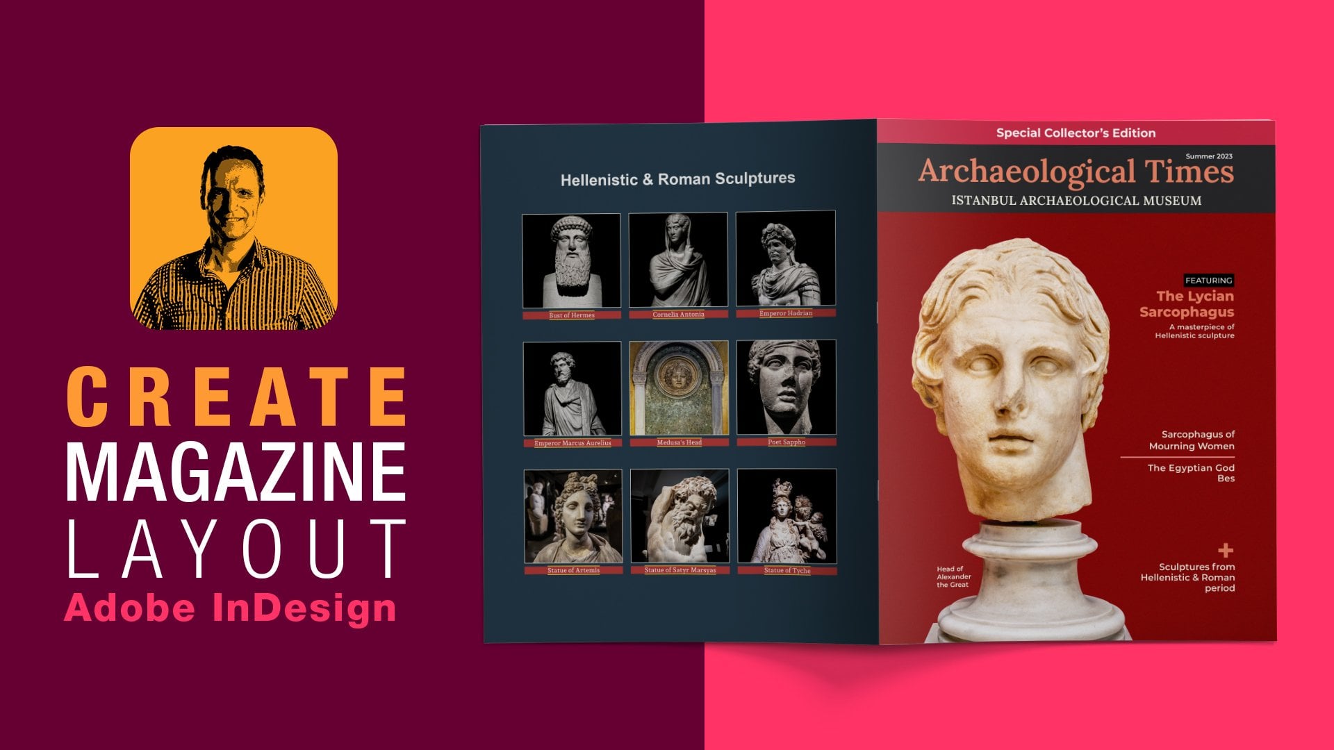
Transcripts
1. Introduction: Navigating today's
marketing landscape can feel overwhelming, especially for small businesses. Try to keep up with
channels like social media, websites, emails,
and video content. So let's not overlook print. Even as digital channels
continue to expand, print remains a very
powerful medium. A well crafted and
design brochure becomes more than a
tool for communication. It actually creates
a brand experience. Hi, everyone. I am your
host, Elias topless, an educator over 30 years of experience teaching
digital print media, designing magazines,
and helping students understand the technology
through practical projects. Now, brochures pack a lot into a small format with
six panels to work with. It's easy to organize and
highlight your products. So designing a professional trifle brochure
involves several steps. We'll start by setting the correct margins
using the typeface, leading value, and placing guides on each of
the parent pages. We'll format the body text, adjust hyphenation
justification settings, and align everything to the baseline grid for a
clean and readable layout. Once the foundational
elements are in place will populate
each panel content, applying paragraph and
character styles to keep everything polished with
consistent design throughout.
2. New Document Set Up: For a trifle brochure, the most efficient and print
friendly method in design is to use a single page layout with custom guides to
define the three panels. This approach ensures
precise alignment across folds and simplifies
experts for print. In Adobe Design see, I'll go ahead and start this
off by creating a new file. Inside the document
setup dialog box, and from the presets, I'll click on the prime preset and then choose the
letter size preset. Under the preset details, I'll give it a name
of trifle brochure. For the units of measurements, we're going to use inches. So I'll set the
width to 11 " and the height to 8.5 " with
orientation landscape. The next step is
important referring to the facing pages because trifle brochures are printed on a single landscape page
and folded into thirds. Forming one continuous spread and not separate facing pages. Nabling facing pages in in
design can disrupt alignment, margins, and bleeds
across panels. In this case, I would
disable the facing pages. We're going to have two pages. Moving forward, margins
define the content, which may include text, images, and other
content design. Typically, we define
the margins within the new dialog box,
but for the setup, I will zero them
out and configure the margin spacing later
in a separate step. Bleed is the area beyond the page edge that prevents
white borders after trimming. So I'll set the bleed
on my end to enth of a niche and then click
to create the new file. And under the file menu, I'll go ahead and save the new design document to my locker directory
as a trifle brochure, and then click to Save.
3. Margin Calculations: Although we will not be using InDesign building document grid, for this trifle brochure is essential to understand
the logic behind the layout. The conceptual grid we'll talk about will set the stage for a consistent typographic rhythm offering a clear structure for precise margin calculations
and content alignment. So to calculate this, we are looking at the overall
pate size of 11 by 8.5 " or 792 points by 612 points, since this is the unit of
measurement we'll be using as the leading size of the
type is measured in points. The letter size of
this document has an aspect ratio of
one to 1.3 if we divide 11 " by 8.5 " to
reflect that proportion, we divide the page into
a conceptual grades of 13 rows and ten columns for a balanced near
square layout. The height of each
row needs to be as big as one lines of text, two lines of text, or three lines of
texts and so on. For this trifle brochure, we'll set the height of each
row to three lines of texts, and that will be 13 rows times three
lines that equals 39. Let's not forget the space in
between each of these rows, and that will be
the gutter space. In this case, we're going to
have a total of 12 gutters. That would be 39 plus
12 gutters equals 51 lines from top to bottom. Moving forward, we need to make a very important design decision
for the trifle brochure, and that is to set
the leading value, which is the space
between lines of text. Using my chosen Breeding funds, which is the Open
Sans font family, I've set the leading value
to 15 points for the layout. With 51 lines from top to bottom times 15 points
of leading value, the total content
height comes to 765 points that defines the main vertical
space of the brochure. To determine the margin space will take the page heights of 792 points and subtract 765
points of vertical space, leaving us with 27 points
for the total margin. So we're going to
distribute the margin of 27 points equally around
the trifle brochure. So for the top and
bottl margin, 27/2, that equals 13.5 points
and the same for the left and right margin for consistency
across all panels.
4. A-Parent, B-Parent Page Margins: A trifold brochure
typically has six panels, three on the front and
three on the back. Because the folds and panel order are different
between two sides, we'll set two separate
parent pages to help us set accurate guides
for each fold and panel, maintain consistent margins and avoid layout confusion when placing content to set up the margins for
the two page spreads, we're going to use two
separate page parents. Look inside the pages winter, and by the way, in
case you're wondering, the letter H indicates the
horizontal orientation, we originally set the
document to landscape. So to get into the parent page at Abuclkont and it's
at the last panel. I'm also going through
name, the layer one, two, templates then
press Enter return. That will help me distinguish structural elements
from content layers. Content layers are text
and images, for example. The purpose of the template
layer is to only contain non printing elements like margins and guides in our case. So to set up the margin for
the first space spreads, under the layout menu, I bring up the margins
and columns. Now, since we calculated the margin space on
a previous step, using points as the units
of measurements right here, we can see we have inches. I coals on the so and then right here at the
corner where the rulers intersect our eclick
and switch to points. And then back on
the layout menu, I'll bring up the
margin columns. I'll make sure that the chain
icon is pressed to make all the settings
the same and set all the margins to 13.5 points. And they got a space 20,
and then click Okay. So this is the aparent page. We need to create another
one, a separate one. So relick to create
a new parent page. That will be the B parent page is going to be based on nothing. And then click Okay. So
for the B parent page, and under the layer
menu, I'll bring up the marches columns and set
the marches to 13.5 points. And the Gao space to
zero, then click Okay. So for the second pay spreads to have the B parent
page applied to it, all I have to do is click
Andrag this run on top, and now we have two
separate apparent pages with two separate pay spreads. A parent for the
first pay spreads, and B parent for the
second pay spreads.
5. A-Parent Page Dimensions: A trifle brochure consists
of three vertical panels. To ensure smooth folding
without overlapping, the leftmost panel is slightly narrower
than the other two. The inside left panel
has a size of 3.625 ". This is the narrow flap that falls in and appears
first when open. The back cover, which
is the middle panel, has a size of 3.687 5 ". And the front cover, which is the right panel, has a size of also 3.687 5 ". Adding those up equals
to 11 " altogether.
6. Guides for A-Parent Page: To set the guides for the first page spread
inside the page panel, we need to make sure
that we are working inside the a parent page
or double click on that. We need to have the
rulers visible, and we can do that using
the keyboard socket or under the view
menu, show rulers. For accurate
placement of guides, I'll switch back to inches
as a unit of measurement, since that's the
way we initially created the new design document. So right here on the corner, what the rulers intersect, click to switch to inches. So to set the first panel, this one, the left one, the one that is narrow
flap that falls in I'll click and drag
to create a guide. I'll release the mouse
and set the location to 3.6 to 5 " and then press the tab key to position
this into the canvas. That is the left one. The center panel starts from this number here and has
a width of 3.687 5 ". So when we add those
two numbers up, that will give us 7.31, two 5 ". So once again, from
the left side, I'll click and drag a guide. I'll release that.
And for the location, I'll set this 17.31, two 5 ", and then press the
tap on the keyboard to place it into the canvas. That is the center panel. The right panel begins from here and actually has the same
width as the center one. Just go ahead and do
our tests by grabbing the rectangle tool and click and drag to create
a rectangle shape, and we can see that the
dimensions are correct. Let's do the same for
the center panel. That is also correct, 3.68 75. And for the right panel, it's equal to the center one, and that is also correct. So no need to have those rectangular
shapes. We delete them. Just make sure that you
save your work because these are the guides for
the first page spreads.
7. B-Parent Dimensions: On a double sided
trifle brochure, the outside and inside spreads
need to mirror each other. That means the narrow panel, which is 3.6 to 5 "
becomes the last two fold. And so it swap sides, depending on which spreads
you are designing.
8. Guides for B-Parent Page: For setting up the guides
for the second page spread, we also need to make
sure that we are work inside the B parent. I
double click on that. And as you can see, we don't
have any guides set up. Once again, we are
swapping sides. So the narrow panel is going
to be the last two folding. That means the first panel at the left one is going to
have a width of 3.687 5 ". So I will click and drag to
create the first guides and set the X location to 3.687 5 ", and then press the tab key. The second panel,
the center one will begin from here and have
exactly the same width. So if we add those up, that equals to 7.375 ". So click and drag creates
another guide and set the X location to 7.3 75 ", and then press the top
here on a keyboard. The right panel, which is
the one, the narrow one, since we're swapping sides, that should have a
width of 3.625 ". So let's go ahead and
test that work by grabbing the rectangle two. Click and drag.
Here it is 3.68 75. The center one should be
exactly the same, and it is. And the third one that
is narrow that folds in is also the correct
dimensions of 3.625 ". No need to hold this anymore. We can just remove those
rectangular shapes. Just make sure that you save your work because
these are the guides for the second page spreads.
9. Setting Up Margins: So we've got the guides, but we also need to set up the margin space for
each panel to protect content from folding and trimming and to maintain a
clean, a professional look. Now, we're going
to use exactly the same margin space
with a setup earlier, and that is 13.5 points
across both page spreads. That means we're going to
work inside the parent pages. So start with the A parent
at the Bklck on that. And the easiest thing
to do is click on the rectangle tool and just click once to set the
width and height. As you can see here, the unison measurement
is set to inches. So I'll cancel this out, and then right click to
switch the points. Click once and set the width to 13.5 and the height
to 13.5 points. And then click Okay. Alright so right here, I'm going
to zoom in a bit. I'll grab the selection
tool and make sure that this rectangle shape snaps
to the fault line o. And then I'm going
to click and drag a guide that snaps
to the outside edge. I'll move this rectangle
shape to the other side. Make sure that it
snaps and then click and drag another guides that
snaps to the outside edge. Let's do the same for
these two panels here. Make sure that this shape
snaps to the fault line. Click and drag a guide that
snaps to the outside edge, moves to the other side. Then click and
drag another guide that snaps to the outside edge. All right, so that's good. That's for the A parent. For the B parent, add a click on that and repeat
the same process. I click once. Click Okay. Grab the selection tool, snap the shape into
the fold line. Create a guide that
snaps to the right edge, moves right across,
create another guide. Move this right
here. Make sure it snaps credit guides
on the outside edge, and other guides to
the outside edge. No need for this
rectangular shape. Let's double check our work. A parents, B parents, first spread, second
spread all looks great. Now, one thing that
you have to be mindful is to not accidentally
move those guides. So I recommend under
the view menu, grids and guides to lock the guides. That's
one thing you can do. You can also lock
the template layer because as you can see, all the guides and
margins have been set up inside the template layer as they are structural elements, so it's easy to tog off
and on the visibility. In this case, I'm just
going to lock them for now and save my work.
10. Body Text: I Now that the margins
and guides are in place, it's time to establish the brochures body
text or reading text. To ensure consistency
across all paragraphs, we're going to create a
dedicated paragraph style saving us from having
to manually format. It's time we're using body text. Now, before I start typing
anything into the Canvas, it's a good idea to
separate text from images. I'm inside the
first space spread. I will lock the template
layer at the very bottom, I'll click on the plus icon
to create a new layer. I'll click once and
rename these two photos, and that's where the
images will reside. I will log this one now and then click on the plus second
to create another layer, and then click on to rename the two text that's where
all the paragraphs, body texts, subheadings
and headings will reside. All right. So to
demonstrate this, we're going to insert a
temporary paragraph using placeholder text and
create a paragraph style. So from the tools panel, I'll click on the Type
tool and then click and drag to create an
nippy paragraph. And under the type menu, I'll fill this with
placeholder text. For the font of choice
for the reading text, I'll be using the Open Sans. Now Open Sans font
family is a free font. And we can find this
inside the Google Fonts. Here's the official website. I'll click on that and search
for Open Sans. Here it is. I'll click on that. And all you have to do is
click to get the font, and then download it and install it into your local machine. I have already done that. So
I'm going to bring this to the site and then click
on the PagostaPanel. And right here at the
bottom, I'll click on the plus con to create
a new para of style. A Dabo click on it to bring up these styles options and
give it a name of body text. For the basic character formats, and the font famine I set
to spa two Open Sans, fun style sets regular, the size 211, and the
leading size 215. Now, this is not complete yet. We have a lot of
steps to continue, especially eventually
we're going to talk about aligning the whole paragraph to be locked to
the Bedin grades. But for now, I'm just
going to click Okay, and continue making
adjustments to the body text.
11. Hyphenation Settings: To improve reading experience, avoid hyphenated words and awkward breaks at
the end of a line, we'll make some adjustments
to the hyphenation settings. With the text selected, taboclcon the body
text paragraph style. And for the stars options
and on the left column, I clicon the
hyphenesen settings, beginning with a
word with at least, and that's where we
control how long a word needs to be
to get hyphenated. I'll set mind seven letters. The after first refers
to the minimum number of characters that must
appear before the hyphen. Asset mind to four letters. The before last refers to the minimum number
of characters that must appear after the hyphen. Asset mine to three letters. For the hyphen limits, we only need one
hyphenated words in a row. So that will be just one hyphen. And I'll move the slider all
the way for better spacing. No need to have any
hyphenated captor words. So proper nouns won't
get hyphenated. I'll disable that. No
hyphenation last words. That is going to
prevent hyphenation of the last words
in a paragraph. I'll disable that as well. And no hyphenate across columns, and that is going to prevent
words from being split across column and also disable
that. And then click Okay.
12. Justification Settings: Word spacing plays a big role in determining the
density of the type, and so we need to
make some adjustments to the justification settings. Once again, tapo clic on the
body text park of style, and inside the stars
options on the left column, I click on the
justification settings, beginning with the word spacing. So I set the minimum
value to be 85%, and I'm using the upper
archy on the keyboards, and then press the tap
key twice to get to the maximum field and set that to 150% using
the Dane arrow key. Now, these two values
offer flexibility without creating awkward gaps
for the desired amount. I'll set this one to 110%, and that is going to give
some breathing room, which is useful in
narrow columns. I'll press the tape
to go into the letter spacing and set the
minimum value to -2%, and that slide negative
value will prevent lines from appearing uneven. For the maximum, I'll set this one 2% to keep the text
tight, but also readable. In case you're using
some glyphs, on my end, I'm going to set
the minimum value 98% and the maximum 102%. These subtle adjustments will
preserve the integrity of Carsans geometric shapes while improving
the justification. So all of these settings reflect a personal preference and what suits the type space of choice. They can definitely
make epic impacts. So I'll click okay and
also save my work.
13. Baseline Grid: A baseline grid ensures that lines of text
across columns and pages align perfectly
establishing a consistent rhythm, improving readability
and visual coherence. And that's what we're
going to set here. To make the baseline grid
visible under the view menu, grids and guides
show baseline grid, or you can also use the
keyboard shortcuts. And to customize
the baseline grid according to the typeface, I'll bring up in designs
preferences panel. On the left column,
I'll click on the grids and first change the color of the grid to a light gray which is
a non intrusive color. For the start position, we don't want the grid to
go outside the type area, so I will set that to zero, and this is going to be
relative to the top margin. The increment every refers
to the spacing between grid lines which corresponds to the leading value
of the body text, which is 15 points as we had
set that in an earlier step. And finally, I'll check off
the grids in the back option. So the baseline grid stays
in front of any object like a photo or a solid fill object on the brochure, and
then click Okay.
14. Align All Lines to Grid: A There is a crucial step for achieving typographic
precision and visual harmony, especially in a trifle
brochure where alignment across folds and
panels is the key. And that is to set the body text to be locked to
the baseline grid. So inside the park of Sspano, I'll tapo click on the
body text pack of style. And on the left column for indecent spacing
and align to grids, I'll set that to all lines
and then click Okay. By doing so, the body text will consistently snap to the grid, no matter what it is placed
onto the page spreads.
15. Grid Visibility: I there is a chance you're not seeing the baseline grid
on your monitor and that's because the grid visibility
is tied to your Zoom level. The default visibility
threshold is set to 75%. And if you are below
that 75% threshold, it simply won't show up. To change the visibility
threshold back in InDesign preferences
panel and on the grids, I'll set, for example, the view threshold on my end to 40% to be visible at
lower Zoom level.
16. No Break Rule: I even with hyphenation settings properly configured
for body text, Adobe design might still
hyphenate single letter words, which can disrupt readability
and aesthetic flow. To address this, we can apply the no break attribute to
prevent wanted hyphenation. So, for example, here's one single letter word
that gets half enated, another one here and so on. So in this case, I'll double click to get into the paragraph. I will select the single
letter word that gets half nated Inside the
character panel, I'll click on the flat menu, and all the way at the bottom, I'll apply the no
break attribute to prevent unwanted hyphenation. Now, to be efficient
with my work, I create a character
style and apply that anytime a single letter
word gets hyphenated. That means inside the
characters panel, I'll click on the
plus second to create a new character style
and d click on it. I'll give it a name of
nobeak and then click, Okay. So whenever we come across a singular words that gets
hyphenated in the body text, we'll apply the no
break character style to remove the extra hyphenation. Here's one example,
double click on that. Apply the no break. You might have to do this multiple times. Double click on this
singular words, apply the no break, and
perhaps on this one, too, to apply the no break.
17. Andada Pro Font Family: Now that we have
everything in place, let's begin adding content
to the trifold brochure. This spark of text
served its purpose, at least, for the most part. No need to keep it, so
I press it delete on the keyboard to remove it,
and then save my work. To elevate the visual
tone of the brochure, and for setting up the topography of
headings and subheadings, I'll be using a different
font family, the Andea Pro. Andea Pro can also
be downloaded from CukoFont so I do a
search for the font. Andea Pro, indeed, is a beautifully crafted Serifont designed by Huerta Typographica. It is visually compelling
and typographic rich. Click to get the font
and download it. I have already installed the Andada pro to
my local system, and now we are ready to
create the first heading.
18. Background Shape: To streamline my workflow and ensure consistency
across the brochure, I have already created my own color palettes
using these CC libraries. The front cover, which is the
panel right here will have a background color using a rectangular shape
filled with color. Now, before I start adding
the shape for the background, and for the viso hierarchy, I'll make sure that I'm working
inside the photos layer, which means I lock the text layer and
unlock the photos layer to ensure visibility of all
text and graphic elements. So I grab the rectangle to
and from bleed to bleed, I create the rectanal
shape and make sure that the shape is run
on top the fault line. That looks good. And I'm also going to add the background
color of my choice. And then click one to
rename this TBG front, and then press Enter inter and make sure that
I lock the layer, I don't accidentally move it.
19. Type Logo Header: For the front cover panel, and for the main header, I've got some notes here. This is going to be the
corresponding text. I will lock the photos layer and make sure that I'm working
inside the text layer. I'll zoom in a bit here
and grab the tie through, and then click and
jack to create a text frame and then paste
the corresponding text. So for this header
here, I'm going to create a unique bag of style. So click on the Styles panel. Click on the plus con to
create a new park of style, add a Bclkont and
give it a name, let's say, to Logo header. This is not going to
be based on anything, so there will be
no park of style. But in design, remembers the previous setting coming
from the body texts. So it's very important that
we reset this to base. So we start from the very beginning with
a new park of style. For the basic character formats, a set the phone family
two and Data Pro, phone style extra boats, size 24 points, and
leading 26 points. Inc spacing and aligned to
the grids, a mole line. The very first line
to the baseline grid. And that is going to allow
the rest of the heading, since this is a multi line heading to flow naturally
based on its leading size. And the leading
size is 26 points. Also going to
change the color of the text and then click Okay. So let's see what
we've got here. We've got two words that get hypnated let me focus
on the first one. Add a click to get
into the paragraph, select the word that
gets half in in it, the archaeological and
inside the character panel, I click to apply
the no break rule. L Excute As for the second one, I can just bring
in the text frame, and the word automatically
follows below. All right, so execute.
What else can we do? Well, first thing, I
would like to visually, at least remove
the baseline grid, and I can do that switching from normal mode to the preview mode using the keyboard shortcut. And back on the logo header. I'll use a bag of border. I'll turn this on,
and by default, of course, you have
border oround. So first, I will zero
out all the values, break the chain, and set the left to two
points, here it is. What change is to white. And as you can see,
this is glued. The border, the left border
is glued to the text. So we can address that from the offset. I would
disable the chain. I would break the chain and
set the left 28 points. That looks good, and
then click Okay. So I would toggle
on and off again from the preview to Dynamamde and make sure that
this here sits right inside the margin space here. I think that looks good. I like what I see and save my work.
20. Placing Cover Photo: The front cover of
the brochure will feature a photo
that encapsulates the essence of the
archaeological museum and set the tone for
the entire brochure. That means I lock the text layer and work
inside the photos layer. I'm also going to switch between the previous mode
and the name modes. For the cover photo,
I'll jump into Photoshop and here I have
an Asian statue of Hermes, which I want to place
inside the brochure, but with a transparent
background. Now looking inside
the Paths panel, I've already created two
paths using the Pentool. And just to show you when selecting the Pentool
from the toolbar, to draw those paths up in the
tool option bar right here. Make sure for the tool mode, you select the path option. So I've got two paths, the outside and the inside. And what we need to do is
to load those paths as a selection and then add a layer mask to
remove the background. A couple of ways
how to do that is to shift select those two paths. And at the very bottom of
the path paler, right here, click on the icon to load the path as selection.
That is one way to do it. I'll go ahead and deselect that. Another way is to shift select, right click Make Selection, keep everything as is,
and then click Okay. Either Away is going
to work just the same. So inside the layers panel, I click to select
the Hermes layer. And at the very bottom
of the layers panel, I click to add the layer mask. Photoshop now uses the
selection to reveal the portion of the statue
and hide everything else. So from the very beginning, this is a Photoshop document. The only thing I'm
going to do is save that to accept all
these changes. At the insights Adobe design. And from a toolbar, I grab
the rectangle frame to or use the keeper socket and from
the fold line to the bleeds, I'll create a rectangular frame. I'll release that and then
use the keyboard circuit to place the photoshop
document, then click, Okay. Before I go ahead and fit
this image into the frame, I'm also going to double check
my work and make sure that the rectangular frame snaps right on top of the
fault line, and it does. So to fit this photo
proportional into the frame, inside the property s
panel at the very bottom, under the fitting options, clicon the first icon to fill
the frame proportionally. That looks great. I just want
to have a small adjustment, and that is to kind of center the ancient statue to the middle because
this is going to fold. In this case, I'll
double click on image, and that will allow
me to directly select the content rather
than the frame, and we can see here the
frame of the image. So by pressing the shift key, I will slightly move this
to the center. Like so. I like what I see, so I'm
just going to keep that.
21. Front General Info: The front cover of the brochure will also
have introductory text, and that means I'm going
to lock the statue Hermes, so don't accidentally move it. I'm also going to switch between the preview mode
and the nam mode. The introductory text will
be positioned around here, but it's going to
be hard to read. So in this case, I'm going
to add a background color. And the way I'm going to do
this is I zoom in a bit. Grab the rectangle
tool and let's say around this area
here from the fold line, I'll create a rectangle shape. I'm not sure about its height. Let's see around here
and a little bit before the edge of the panel, I'll create a rectangle shape. I'll release that. And in some as abraries I'll apply a
fill color of my choice. But I need to be
mindful and make sure that the fill color is on top, and then apply this
color of my choice. Okay, so that looks decent. And by that, I mean, I can actually change the corner radius for the top rights and
the bottom right. And I can do this inside the property spanel
under the appearance, and the corner options.
I'll click on that. I'll make sure that
the chain icon is pressed and then zero out
all the corner sizes. I'll disable the chain icon and set the top
right to 60 points, and the bottom right
also 260 points. Even if the previous checked on, we do not see any changes, and that's because when you
change the type of shape. So click on the dropdown menu. And choose rounded and rounded for both the top and the
bottom corner radius. All right. Now, these
settings work on my end for this type of
shape, and then click Okay. I'm also going to click
one, two name is two, let's say, to box and lock it, so I don't accidentally move it. For the text that is
the reading text, this is the corresponding text. I'll make sure that I'm
working inside the text layer. Grab the type role, and then click and drag to
create a text frame, and then paste the
corresponding text. This paragraph style shows up because the logohader
is applied to it. And since this is going
to be reading text, we're going to apply
the body text. And as you can see
here, we've got an issue with the color, and that is because that's how we set it up
in the beginning. But throughout the brochure, the body text will
have white color. That means back
on the body text, paragraphs as options and on the left column and
the character color, I'll choose paper or white,
and then click Okay. That looks good. But we also have here a single letter word that
gets hyphenation. So I would double click to
get into the paragraph. Select the words and apply
the no break rule, like so. Okay, so let's look at
the overall picture here. Let's look at the size of
the rectangular shape. It seems that I have a
little bit more space here, so I would unlock the intra box, and I'm going to eyeball this and just bring
this down just a tad. I think it looks good,
maybe a little bit more, just a tad, like so. So I will lock it
and keep it like.
22. Nested Style: I nested style in design provide an efficient
method for applying targeted character formatting within
structured text sequences. And that's our next step
within this short paragraph. So the goal here is
to have Hellenic, national archaeological,
those three words, those seconds words, to have
extra bold style to it. And the way we're going
to do this first, we need to create a
new character style. So click on the Plaskon to create one and tab click on it. I'll give it a name
of Extra Bold. Under the basic character
formats for the font family, a set is 12 Open Sans and the font style to Extra
Board then click Okay. Alright. Now, I'll make sure that non character
styles are selected. Back inside the park of Star
panel, I need to do is, I need to create a
new paragraph style that basically is based on the body text because the body text is going
to be part of it, since this is a paragraph. So the easiest thing to
do is to click and drag this run on top of the plus
second to create duplicates, double click on it,
and give it a name of intro Extra bold texts. We've got the same
style settings, but the magic happens inside the drop caps
and NSA styles. So the very first words, the word the will
have no effect. So click on the nested style, non nested style through
the first words. Then the sequence
of three words, Hellenic national
archaeological, we have a newness style. Based on the extra bots, it will affect three words,
and then click Okay. So for this to take effect, we'll click on the paragraph and apply the Iraextable text
paragraph style to it. All right, so the
issue here is that the word archaeological falls
under the word national. So the quick fix here is to just extend the text frame
slightly. There we go. And since this is
actually glued very close to the shape back
on the layer panel, I will unlock the
intra box and then slightly extend this just a bit. I'm still within the
edge of the frame. I like what I see. I will lock this again and
keep that and save my work.
23. Back Cover Placing Photo: The next panel we're going
to work on is going to be the back cover,
which is right here. So I switch between the preview mode and
the anonymous mode. And since I would be placing a photo right
here on the very top, I will lock the text layer and work inside
the photos layer. I grab the rectangle frame
through and from bleed, fodlineTFd line, let's
say around here, I create the frame. I release that, and then
use the keyboard shortcut to place the for my
choice, click to open. And before I fit
this into the frame, I'll zoom in to
double check that everything snaps to the
fold line and it does. And inside the property s panel, at the very bottom on the
frame fitting options, I'll click on the first choice to fill the frame
proportionally. Alright, so that looks good. I don't think I need
to do anything. Maybe I can double
click to get into the frame and bring this up
just a tad, release that. I'm also going to lock this one, so I then accidentally
move it and save my work.
24. Placing Background Shape: Below the photo, we
are going to have general information
about the museum and for the text to be readable, once again, we'll draw a rectangular shape
filled with color. I'm still working
inside the photos layer from the toolbar. I grab the rectangle tool and I will start slightly inside the photo to avoid a white gap between
those two elements. Let's say right
here, we click and drag from fold line to fold line and the bleed m I create
the rectangle shape, and inside my libraries, I'll apply the field color. So before anything,
let's go ahead and zoom in to make sure
everything looks great, everything lines
up, and it doesn't. Right here, I need
to bring this right there on top of the fault line. And looking inside
the photos layer, we're just going
to click and drag this and position it under
all of these photos. I'll click one to rename
this two BG back, cover, and at the
same time going to lock the layer so I
don't accidentally move it.
25. Headings: Next up will include some general information
regarding the museum, beginning with some text. That means I'm going to log the photos layer and work
inside the text layer. I've got some notes
here. This is going to be the
corresponding text. I grab the tie tool, and between the marging spaces, I create a text frame and then paste the
corresponding text. Now, this is going to be
basically the heading, one of the headings
of the brochure. And since I'm going to be using the same headings
throughout the brochure, that means I need to create
a dedicated paragraph style. So inside the style panel, first, I'll apply
the basic paragraph. So we start from
the very beginning. I'll click on the plus second to create a new paragraph style, and double click on it, and
give it a name of headings. This is not going to
be based on anything. For the basic character formats, font family would be set
to Andada Pro, font style, extra boat, size, 15 points, and leading doesn't really
matter since all of the headings would
be a single line. For indecent spacing, I would not align anything to the grid, so that will stay none. And for the character color, I'm going to use white,
and then click, Okay. Alright. That looks decent, but we can actually be a
little bit more creative here and bring some
attention to these headings. So I'll double click on the
heading spark of style. And on the left column and for the park of
shading, I'll turn this on. For the color, this is
the color of choice. It's the same color that I'm
using for the front cover. There's not going to
be any transparency. It's gonna be 100%. But the magic begins right
here on the offsets. So first, I would disable the chain icon and set
those values separately. So for the top of sets, I'll use a negative
value of 11 points. For the bottom, because
I would like to cover the typeface dissenter, this descender, and
this is a descender, I'll bring this up to
let's say, one or two. This is going to
affect not the column, but only the text, and we can see it from here and perhaps for
the right of sets, one point and then click Okay. I like that. I like
the heading style, so I'll go ahead and keep
it and save my work.
26. Hours Information: I the opening hours also
have some information text. So let's grab that.
I'll copy this. Take the type tool, and then click and drag to
create a text frame, release that and paste. Since this information
is about reading text, we are going to apply the
body text paragraph style. Now let's go ahead and look
at the big picture here. And as you can see,
there's a lot of gap between those two between the heading
and the reading text. So click ones to
activate the heading. Then at the bottom here
at the bottom center, I'll double click the
handle of the text frame to automatically resize its
height to fit the content. And then I can use
the Dana archy on my keyboard and get it
closer to the reading text. That's why we didn't align the headings to
the best language, so we have the flexibility to adjust the gap
between those two. So let's look at the
overall picture here. I believe that
looks good for now. I like it, so I'll keep it.
27. SVG Icons: For the next step, we're
going to use a few SVG icons. Now SVG stands for
scalable vector graphics, and we're going to get
those from Bootstrap, which is a front end framework. Gtbootstrap.com is
the official website, and at the top of
the navigation bar, I'll click on the icons Link. The advantages of
using bootstrap icons are because they are SVG based, so they scale beautifully
without losing sharpness, and they are perfect for high resolution print
like the brochures. They also have no
licensing restrictions, make them ideal for educational materials
and promotional content. Inside my notes, which I'm sharing with you
in the ES folder, I've got a list of
those SVG icons. So let's search the
official website for a couple of them. So on the search,
I'll type ticket. And that would yield
these results. I'm looking for the
ticket detail fill. All you have to do
is click on that and then click to download the SVG. Another one is the train, and I'll be using the train
front, click on that. And once again, click
to download the SVG. Now I have already download
them in my folder, so let's open one of them from
the list and have a look. With Adobe Illustrator Open as a vector
application of choice, click to Open and
open, for example, the bus front SVG icon
and then click to Open. As you can see, this
is a quite small icon, but it doesn't really matter because this is a vector icon. But as you can see, it has a
black color assigned to it. And to be able to match the
body text of the brochure, which is white, was going to change and apply a
white colored twit. So with the selection to, I would mark you
select everything, and then double click to assign a white colored
twit. I'll save it. And the same process
applies to the rest of the SVG icon coming
from bootstrap.
28. General Info Heading: Below the opening hours, we got the general information. So I'll copy the texts. Grab the tie tool and then click and drag to create
a textFrame and payt And inside
the Pgp Sa Spano, since once again, this is
going to be a heading, I'm just going to click on
the heading pack of style. And right here at the very
bottom of the center handle, add a book click of the
text frame to automatically size its height to
fit the content. I believe that looks good. I'll keep that for
now and continue.
29. Admission Fee: For placing the first SVG icon, I will lock the text layer and work inside
the photos layer. From a toolbar, I grab
the rectangle frame tool, and from the very
beginning of the margin, I will click and
drag and as I am, I'm also going to press shift on the keyboard to create
the perfect square shape. Not before I release the mouse, nor is that the button
height is set to 30 points. And that's because
the leading value has been set to 15 points, 15 points and 15 points for two lines of texts
equals 30 points. So to place the SVG
icon inside the frame, I'm going to use the
keyboard shortcut. And from the folder, I'll select the ticket detailed, fill icon, and then
click to Open. I like the size of it, so
I'm not going to change it. I'm just going to lock this
inside the layers panel. I would also like to have the SVG icon inside
a runat shape. That means from a tool bar, I grab the ellipsthro then click and drag and as I am I'm also going to press
Shiftk on the keyboard, she creates the perfect circle. Inside as labraris, that's
the fill color of my choice. But inside the layers panel, I will click and drag this circle shape
under the SVG icon. I'll click one and rename this two circle and
then leave this as. Okay, so for the
corresponding text. We've got that text here.
I'm going to copy that. Grab the tie tool, and then click and track to
create text frame, release that and
paste. All right. So this year is almost correct. And that's because
this text frame has the body text paragraph
Style assigned to it. So looking inside
the stars options for the body text
inside is spacing, all lines of text aligned
to the baseline grid, and that creates an issue try to align those elements in
relation to each other. So I'm going to
cancel this out and create a new paragraph
style a Bclkont. I'll give it a name of SVG info. This is not going to
be based on anything, so no paragraph style, which means it keeps
those settings. So we need to clear
those styles. I'll click to Reset
base and start from the very beginning with the
fun family of Open Sans. Fun style regular size 11, leading set to 15. Once again, it's spacing. We're not going to align
this to the baseline grid. So none stays. I'm only going to change the character color to
white, and then click Okay. So to apply this new
paragraph style, click on the text frame
and apply the SVG info. All right, so to sent this in
relation to the circle and the icon right here at the very bottom at the center
handle of the text frame, double click T size its
height to fit the content. So the selection tool, I will mark select as two, and it's at the property s
panel, and the alignment, here's the icon to align, two vertical centers Lzo. I like what I see,
so I'm just going to keep that and save my work.
30. More Information: I The process of placing the rest of
the SVG icons with the corresponding text is
pretty much exactly the same, replacing the icons
and the text. Before I continue, I would
like to minimize a space between the text
frame and the circle. So click and drag this
pressing the shift key, and that is going to snap
right next to the circle. And using the keyboard
shortcut on the keyboard, I press the shift key and then tap the right arrow
key just once. That create a space
of ten points. So to continue with this, I would unlock all the layers. With a selection tool, I'll mark select all of these layers, and then use a keyboard circuit, I'll shift option shift to
create the first duplicate. Let's zoom in.
Everything looks great. So the second icon is going
to be about the address. So I will click on that.
Use a keyboard circuit to place to replace the icon. And for the corresponding
text, this is the one. I'll double click to
get into the paragraph. I'll select everything and then paste the
corresponding text. I'll continue. Mark select the selection to all
of these layers. Use the keyboard circut, I'll shift option shift to
create another duplicate. The other icon is going to
be about the telephone. So I use a keyboard circuit to replace with the telephone. And we got th
corresponding text. I double click on that to
get into the paragraph. We select everything, and then paste a th corresponding text. I believe we have one way to go. Market select all
of these layers. I'll shift option shift to
create another duplicate. I'll click on this icon. Let's see if we've
got the email. So this is the envelope.
And that's the one. And for the info, we got actually just
one line of text. I'll copy that. Double click
to get into the paragraph. I will select
everything and paste. So here, in order for us to be able to center this in
relation to each other, we're going to double click at the bottom center
handle right here of the text frame to
automatically resize this height to fit the content. I'm just going to click and drag this and to double check, which I know this
is not correct. Our markets select these and it's at the property
spatern and of the alignment, I'll use the align
vertical centers. I like what I see, so
I'm just going to keep it and save my work.
31. Accessing the Museum: Below the general formation, we've got warm section
with some icons and text, and that is accessing
the museum. So I go ahead and create another text frame.
And pay starts. This is a heading, so I will apply the heading spark style, and then double click to fit
the text into the frame. Continuing with the SVG icons. We've got icon for the
Metro bus and the train. So let's create the first one. And that will be the
train front SVG icon. I'll create another
one, click and drag, press the Shift key. That
will be for the bus. And then one more to go. And that will be for the train, and that's the SVG icon. All right. Now we need
the corresponding texts. So I grab the Type two, and
then click and drag and type Metro. Let's double check. This correct. This
is the SVG info. A double click on that
to fit the text into its content and perhaps
place it right there. Create another text
frame, click and drag. That will be the bus. A double click to
fit the text into the frame and place
it right there. We've got one more to go. Click and Drag,
and that would be the train Double click to fit the text into the frame and then
place it right there. All right. So let's
double check our work. I need to make sure that these are centered in
relation to each other. So with the selection two,
I market selects two, and then it's at the property
span of the alignment I use this icon to align
horizontal centers. There was a slight shift,
Marke selects two. Once again, align
horizontal center that was correct and horizontal center. And that was correct, as well. Alright, so this is how
it looks right now, we just have to work
on it a little bit more to make sure that things line up properly before
we get to the next panel.
32. Aligning Elements: Alright, so the
information looks great, which I have to do
a little bit of house cleaning in
terms of alignment. So I'll start with
the very bottom here. I'm just going to
Mark selecto two, and then use the left archy just to bring
this to the left a bit. Mark select two with
a selection tool. And actually click and
drag this and make it glued right on top of the other. That's because I'm going to use precisely the shift key and the right arrow
key twice to have a space between
them of 20 pixels. Our markets select those two. And this is going to snap. Perfect. Let's see how it looks. It looks okay. I like that. We don't have to make this
one glued to the left. We can actually
market select all of these and kind of bring them
a little bit to the right, something along those lines. Okay. How about the rest?
Okay, so let's see. First we need to
unlock everything and market select those,
and then bring them up. Perfect. How about the
general information? I'll do this all of these
layers using the upper okay. I believe that looks good. Let's look at the
overall picture here, and this one actually can just nudge it a little
bit to the bottom. So we kind of create a similar space between
those elements. Definitely, this needs
to go a little higher up using the upper okay. And once again,
let's take a look. I think it looks
good. I like it, so I'll keep that.
33. Left Panel Background Heading: The next panel to work on is
the inside the left panel. The one that is more narrow
than the other two panels, the one that folds in and
appears first when opens. We're going to do
something similar. We're going to have a background color for
all the information, and that means I will lock the text layer and I will be working inside the photos layer. I'll switch between the
preview mode and the Nam mode. And from the toolbar, I
grab the rectangle tool and from bleed to the fold line, I create a rectangle shape and then add a
color of my choice. I'm also going to
zoom in to make sure that I did a good
job, and I did. Alright, Because this is to snap right on top
of the fold line. Okay, so inside
the photos layer, I will click and drag this and bring this down just a tad. Let's say around there
and actually even more, I bring it right here,
and almame is BG left. And I will lock this layer so I don't accidentally move it. Next up, we have some text
that means I will lock the photos layer and work
inside the text layer. So here we're going to have a brief information
about the museum. So for the heading, I grab the type through, and then click and drag
to create a text frame. I'll release that paste the text from the clipboards and inside the park of Saspano, I will apply the logo
header paragraph style. I'll zoo many bits and click once and then use
the right arroky on the keyboard to position this inside the panel here
and right on the edge. So let's switch between the normal modes and
the preview mode. Things are looking
good. I'll keep that and continue
to the next step.
34. Brief History: For the brief history
of the museum, we're going to have a
very similar treatment as we did here on the front cover, the front panel, but
with a slight change, that means we're going
to need this shape here. I lock the text layer, I lock the photos layer, and I believe this
is the intra box. So I would unlock it, target it, and then click and
drag this on top of the plus second to
create a duplicate. I will lock the
original, click once, and rename this two
Left box A targeted, and then click and drag
this to the other side. I'm also going to switch between the preview mode and then mode. And here we need to zoom in
quite a bit and make sure we place this right
here on the bleed. That means I need to
zoom in even more, and I believe that
looks good. All right? I'm not so sure
about the placement because now we're going
to add some text. So temporarily,
I'm going to lock this one and work
inside the text layer. This is the corresponding text. I'll copy that,
grab the type tool, and then click D to
create a text frame. Maybe up to here.
I'm not sure yet. Let's try here, and
then paste that. Okay. Since this is going to be body text
for the most part, for now, we're going to apply the body text paragraph style. I'll bring this in and now for the placement of the
rectangle shape. I'll switch between the normal
modes and the privy mode. I lock the text layer and unlock the left box and use the
apparl key to notch this. And I'm eyeballing here the space between the space and the space to
be kind of equal. So I like that. I'll keep it. And I'm also going to lock the photos layer and
back on the text layer. And that's because I
would like to have almost the same treatment as
we did with the front cover, but with a slight change. The slight change
is I would like the number 11,000 to
have a different color. So we need to create two things, a new character style and a new paragraph style that
is based on the body text. So for the character style, I need to make sure that I have the color that I'm going
to be using for the number 11,000 inside the Swatches
panel, and I don't have that. This is the color of my choice. I'll right click to add
the color to the swatches. Here it is. And I can create
a new character style. Add a buck click on it,
give it a name of color. And for the character color, and all the way at the
bottom of the list, this is the color of my
choice, and then click Okay. With no character size selected, and back on the Pagosa panel, I'll click to select
this paragraph here. And since I need to base
everything on the body text, but with a small change, I will click and drag this
body text to create duplicate, double click on it,
and give it a name, let's say, about texts. The style settings
remain the same, but the magic happens inside the drop caps and nested style. So for the nested style, I'll create a new nested style, and we're not going to have
any character styles here. And this is going to go
through the first six words. So I'll change the
number to six. So the words are one,
two, three, four, five, six, for the one that follows, we're going to have a new
nested style. So click on that. And for the dropdown menu, I'll use the color character
style through one words. And here it is, we can
see that and then click, Okay, I like what I see,
and I'll keep that.
35. Heading: I following the museum
and its brief history, let's see, we've got the
permanent collections. So I'll copy the text, switch between the preview
mode and the anonymous modes. I'm still working
inside the text layer. So from a toolbar, I'll
grab the type tool, and let's say from
here to there, I'm just going to create a text frame least
that and paste. And since this is going to
be one of the headings, I'll apply the
headings pago style. I'll bring this in
and this one, too. I like what I see, so I'll
keep it and save my work.
36. Bullet List: The first permanent collection,
according to the list, is this one right
here, so I'm going to copy the corresponding text. We're still working
inside the text layer. I grab the type two
and click and Drag to create a text frame that
occupies one line of text. I'll release that and
paste. All right. So technically, this
here looks correct. Meaning that this
is part of the, let's say, body text. But we're not going to be
creating paragraphs here. We're going to be
creating bullet points, and bullet points will occupy
only one line of text. That means we need to create
a new paragraph style. First, I will apply the basic
park of style to eliminate everything and then creates a new park of style,
double glcone. Let's give it a name
of bullet points. This is not going to
be based on anything. For the basic character formats, font family will be set to Open Sans font style regular
size 11, leading to 15. For incident spacing,
we're going to align this to the best on grid, and then change
the color and then click Okay. So that looks good. Now let's go ahead and
apply a bullet points. So back on the bullet points, spike of style, the magic happens inside the
bullets and numbering. For the list type,
I'll choose bullets, and here's the first bullets. As you can see here,
we've got a lot of space between the
bullets and the text, and that comes from
the text after. This is the default,
which is the tab space. When I click on the
right arrow key, you can see those choices here. So by default, this
is set to tab. First, I will remove that by pressing the delete key and then press the tab
key on the keyboard, and we can see that we limitate the space
between the two. So for the text after back on the right arrow key
and all the list here, Feel free to experiment
with your own settings. I will go with the
punctuation space twice, once and twice. I lack that space.
I'll click Okay, and next we're going to work on replacing this bullet
with a custom bullet.
37. Custom Bullet: I replacing the current bullets with a custom one back
on the bullet points paragraph styles and
bullets and numbering. For the bullet character, we can add one from
the list or we can add a custom bullet coming from
a specific font family. So click on the Ad button and inside the AD
bullets dialog box. And for the font family, I'll search for the
Wingdings font family and then press the tap
key on the keyboard. The Wingdings fun family
basically renders letters as a variety of
symbols, which is great. For example, four bullet points. From the list, I score down a bit till I come across
the bullet of my choice, which is going to
be this one right here. I'll click on that. Click to ads, and
then click Okay. So to apply the
new custom bullet to this single line of space, all we have to do is just click once to add it, and
then click Okay. I'm also going to switch between the dynam modes and
the preview mode. I like the spacing.
I like the heights. I'll keep it and save my work.
38. Remaining Bullet List: There are more collections under the permanent
collection list. I believe we have
four more to go. So the easiest thing
to do is to create a bunch of duplicates using
the keyboard shortcut. So with the selection tool, I'll click Select the text frame and then use the keyboard circut to create the
first duplicate. Just make sure that it
snaps to the baseline grid. Another one another
one and another one. So we've got all
these duplicates and here we have the
corresponding text. So I'll copy that, double click to get into the paragraph. I'll select everything and then paste the corresponding text. And the process is exactly the same for the remaining ones. I believe this is the fourth but for the fifth collection, since we have more text, let's see how InDesign
is going to react. And as I predicted
in design shows us indication that we have hidden text indicated by
this plus icon. That means we to expand the text frame to occupy
two lines of text. So in this example, the
text is fully left aligned. And when the line
wraps as it does here, the second line begins
flush with the left margin. This is simply text wrapping
without indentation. So to address sissie we need a positive indentation value and a negative
first line intense. So back on the
bullets points under the bullets and numbering,
and for the position, I'll set the left indent
to a positive 15 points, and the first line indent to a negative 15 points,
and then click Okay.
39. Circled Photo: The left panel of the brochure is all about
the history of the museum. And so a photo representation
will be a great addition. Now, before I go on
and place a photo, I'm going to reduce the gap between the heading
and the bullet list. So I'll click on that and
use a keyboard socket, the Dane arrow key to
notch this just a tad. Let's zoom out let's look at the space with the
rest of the headings. Perhaps I can notch even more. Like. So I that space. I will lock the text layer and unlock the photos layer since we're going to be
placing a photo. I'm also going to switch between the preview mode and
the anonymo modes. And from a toolbar,
I'll click and hold to get to the ellipse frame tool. And from the outside, I'll click and drag
to create a circle. And specifically, I'll pressure shift on the keyboard to
create a perfect circle. I'll release that and then
use the keyboard socket to place a photo of the museum
and then click to open. Actually, this is a
quite large photo. So when I click to
get into the frame, we can see that, which means
we need to scale this down. So I'm going to use the keyboard circut to scale this
down from the center, perhaps a little bit more. Then I'll bring this up
using the aparKa keyboards. Perhaps I can scale
this down even more, just a tad, something
along those lines. I like what I see,
so I'll keep that.
40. Inside: Following the first page, now we've got the second page with the B parent applied to it. So I will double click to
get into the second page, and from left to right, all of these are going
to be the inside pages. I'll switch between the preview
mode and the line mode. And I'll make sure
that I'm working inside the photos layer because here we're going to
have three different photos, which means three
different frames. Software toolbar,
I click hold to get to the rectangle frame tool, and from bleed to the fold line, let's say around this height. That will be the first frame. And then I use the
keyboard showct to place the first photo. I will lock this photo here and continue with the second frame, from the fold line
to the fold line. And right there, that will
be the second frame and use the keyboard shocka to place the second photo and
lock this one as well. And we've got one
more to go from the bleed to the fault
line and the bleed. Right there, that will
be the third frame. And once again, use a
keyboard shockat to place the third photo
and then click to open and also lock
this one as well. So I've got these three photos. Next up, I'm going
to resize those.
41. Centering Photos: All three photos
are placed within the panel boundaries that also need to be
carefully centered. That means we need
to resize each of these photos without losing
key visual elements. So I starts with the
first one. I click once. As you can see, this is quite large image
looking at its frame. So inside the proper s panel, and under the frame
fitting options, I click on the first button, which is the fill
frame proportionally. Okay, so I like that. Now, I am already inside
the photo itself, and if you're not,
let's say you're not, I'm just going to click aside, and then double click to get
into the photo and then use the right arrow
key to just notch this to the right because I'm looking at
the negative space, this negative space in comparison
of this negative space. I like that. I'll keep it
and work on the second one. This is quite large. Again, I'm going to
use the first button to fill the frame
proportionally. I actually like everything here. I don't think I need to change anything because the
negative space is great. So going to the third one, that's even larger photo. I use the first button to fill
this frame proportionally and use the left arrow key
to nudge this to the left. So the statue centered. I'm looking at the negative
space here and there. I like what I see. I'll keep it. I'll lock these photos
and save my work. O.
42. Adding Shapes: Next, we've got headings and corresponding text for
each of the collections. But first, we'll add a field color shape and a horizontal line going
across the folds. Still working inside
the photos layer, and from the toolbar, I grab the rectangle tool and let's start slightly
drawing this inside the photo to avoid a white gap
between those elements. Let's say around this height, and from bleed to bleed, I create this shape
here. I'll release that. And some as labris I'll apply
a different fill color. But before I do
that, I also need to make sure that the
fill option is on top, and then add this
color of my choice. Now, inside the photos layer
and this rectangle shape, I'll click and position this at the very bottom
of the layer stack. And then click ones to rename
this to BG Inside since we are in the inside pages and lock this out don't
accidentally move it. Still working inside
the photos layer, I grab the pantrl and from the bleed all across
to the other side, I press shift key to
create a straight line. And for the height, I'll have this three points, and I need to change the
color of the stroke, so I make sure the
stroke sits on the top, and then use this
color of my choice. Here's the line. I'm also
going to lock this one, so I don't accidentally move it. I like what I see,
so I'll keep that.
43. Text Frames Info: Next step involves
the description text for each of these collections. That means I'm going to log
the photos layer and work inside the text layer.
I've got some notes here. This is the
corresponding text for the first collection.
I grab a type two. And from this height, I'll
click and drag to create a text frame from marging space to marging
space. Let's say around here. I'll release that and paste, and temporarily, I'm going
to apply the body text. We've got two more
text frames to go. So the easiest thing
to do is to create Dubuqt using the
keyboard shortcut. I'll release that. Here is
a th corresponding text. I'll double click to
get into the paragraph. I'll select
everything and paste. We've got one more to go. Once again, I'm going to
use a keyboard circut, but let's not forget this panel here is a bit more narrow
than the other two. So I will bring the sent to Tad and copy a th
corresponding text, double click to get
into the paragraph, select everything and
paste and save my work. I.
44. Nested Style: As noted earlier, the body
text on these paragraphs is transitional since I will be integrating a character
style into them. That means when it creates a new character and
paragrap style. Alright, so with
nothing selected first for the character style. I'll click inside
the SWAT spanel and here I need to
add the new color. So inside my libraries, that's the color of my choice. I click to add the
color to the swatches and inside the
character style spanel and with nothing selected, I'll click on the Plaseco to create a new character style. Add click on it, give it
a name of bold and color. For the basic character formats and to be on the safe side, I will apply the Open
Sans font family. Font style will be set to bots and the color and all the way at the
bottom of the list. This is the color my choice,
and then click Okay. With no character stay selected and back on
the paragraphs panel, I will click and drag the body text right on top
of the plus second to create a duplicate since this paragraph is going to be based
on the body text. So I'll double click
on that given a name of nested body text. And for the NES styles, we're going to create
two Nesta styles. The very first words, the word there is not
going to be affected, but the next two will be
affected with a character style. So click on the new Ns styles no styles through
the first words, and the next one, bold and color
through two words, prehistoric collection,
and then click Okay. So let's go ahead and test our work by Shift select all of these paragraphs and apply
the nested body texts. As you can see, the net
style has been integrated. Things looks great, so I'll go ahead and save my work like so.
45. Rectangle Shapes: I Moving forward to the headings for each
of these collections, we're going to have some text, and each of the headings
will have a background shape filled with color to be
able to see the topography. All right, so still working
inside the text layer. I'll grab the rectangle tool and then just click and drag to
create a rectangle shape. I'll make sure that
the chain icon is not pressed and set the width to 200 points and the
height to 45 points. I'll switch between the
stroke and the fill color. Inside, my labrisT
the calmer choice, which I'm going to center this. And I center this
horizontally and vertically, and I'm looking at
the line right here. Maybe I can nudge
this up to Tad. I mean, it's pretty
good. All right. So this is the first one. I create an duplicate using
the keyboard shortcut. And another duplicate. Now, let's not
forget that this is slightly smaller since
the panel is smaller. So we can just bring this in the tad and kind of center it. Like. All right? Okay, so let's work on
the first one right here, and the other ones
will be similar. We have the same visual effect. So for the shape,
I'll click on that. Inside the property
spanelUnder the appearance, I'll change the corner options. So I make sure that the
chain icon is pressed, and first, I will zero
out all the corner sizes. I would disable
the chain icon and set the bottom left 220 points, and the top right
also 220 points. Even if the previous checked on, we do not see a change, and that's because we need
to change the shape of the corner here to
rounded and rounded. And then click Okay. So
I like what I see here. Now I want to have the exact same visual properties
as this one. So one way to do it since we already have the duplicates
is to select that, and then under the view menu, bring up the object styles. Since this is selected,
I'll click on the plus second to create
a new object style. Ad click on it, and let's
call this rounded corners. All right. And nothing as
twit, and then click Okay. So click on the shape at the
rounded corner object style, and the same thing
for the third one. As you can see, you
can do certain things automated using
the object styles.
46. Headings: For placing the headings for
each of these collections, first, I will lock
these rectangle shapes, so don't accidentally move them. I switch between the preview
mode and the alarma mode. I've got some corresponding texts for the first collection. I'll grab the Type tool
and then click Jack create a two line
text frame and paste. Okay, so the first thing
I'm going to do is create a dedicated paragraph
style for these headings. So inside the park
of Saspano, first, I will apply the
basic paragraph style to start from very beginning. I'll click on the bla icon to create a new paragraph style, duple click on it, and give
it a name of collections. This is not going to be based on anything for the basic
character format. I did a pro fun style bolt, size 14, and letting it to 16. Instance of spacing,
we're going to have a center alignment and white
color, and then click Okay. Alright, so this
almost looks perfect. Actually it does. I like what
the text fits in the frame. So for the first rectangle shape,
I believe that's the one. I'll mark you select this
two with the selection tool, and then inside the
properly spanel and at the bottom
of the alignment, I'll send this horizontally
and vertically. Alright, so that looks good. Let's move on to the next one. We need to change the text, double click to get
into the paragraph, select everything
and paste the text. Okay, so I'm going
to actually resize the frame here as
much as possible. Market selectors two, actually, I need to unlock this. Mark selectors two, Align them horizontally
and vertically. And let's lock this one. We've got one more to go. And this is the last collection. Taboclkont and base that. Now we need to stretch
out the frame. I'll bring this in to fit
the text into the frame, and I will unlock the
third rectangle shape, Mark you select
this two, all them horizontally and vertically. All right. So let's
look at the big picture and believe also that the
headings look fantastic.
 Elias Sarantopoulos, Helping You Develop