Transcripts
1. UI Bootcamp Introduction: Welcome to the user
interface design Bootcamp. You'll be learning to make your user interface designs
aesthetically beautiful. The biggest factor influencing the user's experience if your application is
how good it looks. So let's get that right. 95 percent of your
application is topography. So we'll be looking at
getting that right first, we'll expose a few of the common myths you
hear about readability. You'll learn about the
history of typefaces, how they are often interpreted, and then you'll create your
own typographic system. You'll be given activities to improve your intuitive
use of color. Then you'll follow
practical exercises to develop a color palette
for your application. Aligning your elements to a grid is the fastest way I've seen for a junior designer to instantly improve
their creations. You will again follow
exercises to train your eye and intuitively improve
your composition skills. And you'll follow
exercises to create a grid that works on modern
component-based web development. By understanding of bits
about how websites are built, you'll create grids
which work in the real world scenarios, often overlooked by
user-interface design elements. This course has a ton of theory, but it's mostly practical
and encourages you to put your learning into practice. You'll have a better eye and intuition for UI design to make. Bets are aesthetic decisions in your user interface designs. And you'll have a better
understanding and vocabulary to be able to communicate those decisions with
your team or client. This first week is all
about composition. Each video will
build on the last, teaching you the elements that make a composition of beautiful your class project
will be to upload a very simple scribble
from each video. It's really important
to do these because these scribbles build your intuition to
make you better at seeing and working
with compositions. It's great to do this
before you start worrying about all the
elements of the webpage. If you want to get
started creating beautiful user
interface designs, this is the step that
you'd need to get started. So let's get scribbling.
2. Composition: When we're talking
about designing an application or a website, a large parts of
what we're talking about is designing
a composition. And really, we can take a lot of inspiration from the art
world to start off with. Here is a painting from John Constable about
200 years ago. John Constable was quite famous because he was one
of the first people to do something where he would go out into the field and
he would draw a cow, and he would draw a tree, and he would draw a bridge. But then he would take all
these drawings back to the studio and work out how to fit them
together on the page. What's the most visually
pleasing way too? Arrange them on this canvas. So in reality, maybe these
cows weren't in this position. Maybe this building was, and God knows what
else in this painting wasn't really in
this exact place. These are simply
the positions that John Constable belief
they would look good in. In my opinion, the
most dominant thing in that painting was this cow. In the bottom left
of the picture. Was this cow? Why was this a good
place to put this cow? We definitely want there to
be one thing in the picture. That's the first thing people notice that draws
their attention first. And this cow was what
John comfortable decided. But wouldn't it
grab more attention if it was in the middle? And wouldn't that
have more impact if the cow was bigger in
case you can't tell. Those were rhetorical questions. I don't know the answer. And the answer is also
going to be largely dependent upon what
else is in the picture. Throughout this first module, I'm going to give you lots of
very, very short exercises. You can do them with a
pencil and a piece of paper. You can do them whilst you're on the phone call to someone. You could probably do them
whilst you're watching TV. These exercises are to help train and build our
mental muscles to identify what's going to be a good composition when we come to start adding topography, adding colors, and adding
images to our website, if we want to be able to intuitively creates
a good composition, when we're creating a website, we need to be able to do it
quite well before we have a 1000 other thoughts
in our head about what typeface we're using
and what color something is. So during this module we
won't be talking about buttons and a heading
texts and illustrations. We also won't even be talking about cows and
buildings and rivers. We'll just be talking about
shapes and lines and marks. And we're going to
build it up slowly. We're going to build
it up very slowly, one step at a time and gradually improve
our compositions. But that does not
mean you need to spend a long time
on each exercise. In fact, I urge you to resist that nagging
need for perfectionism. It doesn't matter if
they're a bit ugly, if they're just
scribbles on the back of a napkin is absolutely fine. We're going to be training
our eyes and our intuition, so it's there when
we need it later. So ensure that you actually do these exercises before we
add anything to this page, I at least want you to appreciate this is
genuinely a composition. This plain white page
is a good composition. And actually, plenty
of artists over the years have created pieces of artwork that are just
a plain white canvas and salt them for
pretty good money. This composition is absolutely
never going to fill the requirements of your website
or your web application. But just be mindful of the
fact that if you don't need to add something
to your composition, you probably should not add something to
your composition. The next simplest composition we could possibly create if we just added a single straight line
down the middle of our page. This is also undoubtedly
a composition. I did say We would take it slow. Now, probably having
this line straight down the middle is a little
bit too boring. Let's move it to
the side somewhere. It might make our composition
more interesting, like how we wouldn't just put the cow in the middle
of the picture. Now, although we don't want
things to be too boring, we don't want this to
be too crazy either. If we move the line far
too close to the edge, it might feel uncomfortable. There might be some feeling
like it's going to fall off or it was printed
wrong or something. Maybe this doesn't
feel completely comfortable and maybe at
times That's what we want. Maybe it feels different if the lightness on one side of the page rather than the other, without giving too
much thought yet as to what each of these
compositions will do, we can acknowledge that there's a slightly different
feeling we get from each of these compositions
when it's literally just a line down the
middle of a square. Now currently this is a
bit too simplistic for you to worry about getting
your pencil out just yet. There is one variable
and that is the x-axis, how far across this line is. But you can just see
from these examples I've put on the
screen that they do change how the composition
feels for your first task, what I want you to do
is frame a square. See how many different
ways you can do this very, very simple exercise of
position a square inside a box. Think of this as if you
are framing a photograph. Now a common trick that people do when framing is
they actually leave a little bit of extra space at the bottom than at the top. Maybe there's more space at
one side than the other side. Maybe R-square is just
really, really small. So just simply use
size and position here and see how many different
compositions you can create. I think this is interesting
because you can have a single element on
a single webpage. And there's a 100
thousand different ways that you could
potentially do that. So for your very first exercise, I want you to frame
some squares. You're going to spend two
minutes grab a piece of paper, draw as many squares
as you can fit on it. These will be your frames and then you're going to
draw a square inside. There can be different sizes. They can be different
distances from the edges and see how many variations
you can get. Imagine it's a webpage that
has one element on it. Where does the element
go and how big is it? They don't have to look good. This is just to get us started. It's just to get our brain
working a little bit. See how many
different squares you can frame in two minutes.
3. Expression: In the next module,
we're going to start talking about typography. But for now, I want you to
just look at these two A's. Now, they don't speak in
the same voice, do they? They have very, very
different feelings and emotions and their convey
very different things. Sometimes people will
just try and find letters which don't seem
to communicate that much, that look very standard and think that that
doesn't say anything. But if of course it does, you're always
conveying some kind of message with these decisions. There's all kinds of subtle
details in the letter. The contrast between
thick and thin lines, the angles the
spaces are occupies, all adds to the
letters personality. But before we worry
about all those things, we're going to build
this up slowly. Let's see if we can build some emotion with just R-square. This composition I've
created here on the left and this composition on
the right's have a very different feel to them. Something about how much
spaces around them, how much variation
in size there is. There's all kinds of
things that we now have control over that
change how they feel. If you had to look at these two images and
say what they made you feel or what kind of personality
you think they have. You'd probably come up with slightly different
answers to me, but you probably come up with
something vaguely similar. Now in a moment, I'm
going to ask you to do this exercise to create a composition just using squares that conveys an
emotion or a feeling. And you're not all going to
create the same composition. There isn't a right
or wrong answer. We're going to create very
different looking compositions from the same words Lu, real purpose of the
exercise is to get you to think of compositions as
expressing an emotion. So that with thinking
about what each shape, its position, and its angle
convey what they communicate. And we want to think
about this very simply on its own before we start
thinking about anything else, so that it's intuitively available when we are
creating our compositions, that we're always
thinking about it on some conscious or
unconscious level when we start building up
the rest of the stuff. For this first example, I gave myself the word drunk. I quite liked the idea of
having a lot of weight on one side of the page and
the other having non, it makes it feel
uncomfortable and adds to that feeling that
it's going to fall over as does of course, having the heaviest
shapes towards the top and the lighter shapes
towards the bottom, it makes it feel top-heavy. It gives it that
unstable feeling, like it might fall over. And the angles and different sizes give it a
certain feeling of energy. It feels a bit energetic. We would very rarely use an
angle in a webpage design, but currently we're just
thinking about how to express a meaning
with the shapes. Secondly, I gave myself
the word claustrophobic. And there was something I found quite anxiety inducing about having a very orderly
line of blocks. And there was something
that many also feel a bit uncomfortable about having something that was so
weird labor with a little bit incomplete
in the middle. And then of course, that trapped whitespace
in the middle is very small and it makes you feel very closed in just looking at it. And now you might not
agree with my rationale at all on either of those
compositions, but that's fine. Actually parts of having
to explain why you think something
conveys an emotion is quite an important
part of this Task 2, because that is always
a conversation that you may end up having with a
client or a team member. And if you're quite a
logical minded person, you never went to art
school or studied. This probably all feels
a bit wishy-washy, but just stick with me for the moment and give this a bash. So your exercise when thinking about expression is to just very quickly creates a
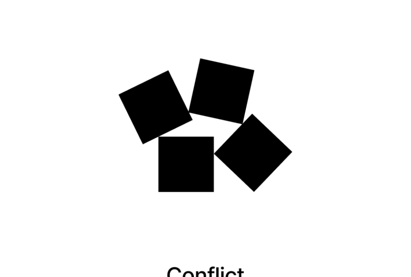
few compositions using describing words. What about conflict or ecstasy? You can choose your
own words or you could choose these two
examples I've given. And just very, very quickly
scribbled down some squares on a composition that you
feel conveys that message. And full bonus points. See if you can justify why
you made those choices. See if you can explain why your arrangement of
shapes means ecstasy. There is absolutely no right
or wrong answer to these. So feel free to go crazy. And of course, the more times
you try this experiment, and like I said
earlier, you could just do it whilst you're
on a telephone call. The better, the best
you're going to get at it.
4. Balance: One emotion we're almost always going to want to
convey is stability. Our brand, our, our application
might have an emotion, have been a bit wild and
liberal and creative. Or maybe it has a
feeling of being very sensible, conservative,
and secure. But either of these
polar opposites still wants to feel stable. Let's stick with the art
world for little bit longer. Imagine you're painting a tree. Now if you painted the tree, so all the branches
were on one side, it would give the viewer an uncomfortable feeling because on some unconscious level, they might think that
they're looking at something that's about
to fall over or, and this is an important
theory that will underpin a lot of the stuff we'll
talk about in this course. They'll feel what
they're looking at, something that's not natural and that gives us an
uncomfortable feeling. We'd like to understand
the world around us. So to be kind to our viewers, whatever characteristics
are tree has, we're still going
to want it to have an equal amount of branches
on one side to the other. Or if we have one big
heavy branch on one side, maybe we have a few lighter
branches on the other. Creating Balance
doesn't necessarily mean making it conservative. It doesn't mean
making a look boring, and it certainly doesn't mean we have to make it symmetrical. It simply means making it
look like it exists in the real world and obeys
the laws of physics. If we started by creating this
really simple composition, it just has a big, heavy box on the left-hand side. And we want to now
counter this because it's making our page to
weighted on one side. So we could, for example, put a smaller box on the right-hand side if it
was further from the center. Imagine for a second that
the pages on a seesaw, if a smaller shape is
further from the center, It's going to nicely
balanced the larger shape. So maybe this small
box on the right is converted to this
composition into something a little
bit more balanced. We could alternatively have even smaller boxes on
the right-hand side, but then perhaps
just more of them. So this is going to create additional weight on that side. And for the sake of
this next exercise, I'm going to suggest
you can play with how light or dark the
boxes are as well. Because if we make the box
on the left, for example, a little bit less dark, it has less contrast
with the background, and this gives it
less weight as well. And finally, we can of course, balance our composition by
simply making it symmetrical. Of course, in the real
world of making a website, you will very rarely given the opportunity to make
a composition that simply symmetrical balance in creating a composition means there should be an
equal amount of visual signal on both sides. And it's really worth
us practicing this now, because when we get more
elements into our composition, all different colors and
shapes and densities, it's going to become very, very hard to get
this balance right. So the more we practice it now, the more our intuition is going to be able to work
with it later. So your exercise for this
video is dead simple. We're going to create some
compositions using squares, using at least two
or three squares where the composition
feels balanced. We can play with the shape, we can play with
how dark they are. We can play with a couple
of different things to try and create a balance on the page and just see how many you can create in a
couple of minutes.
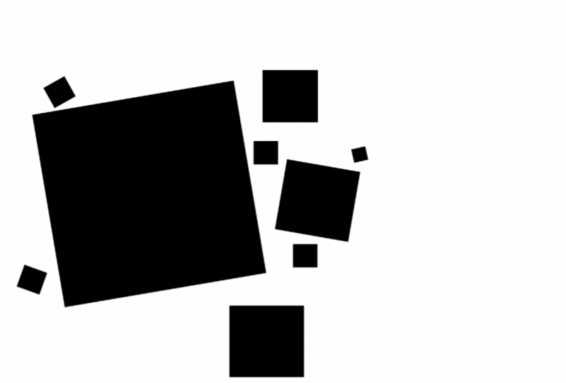
5. Contrast: If you're a little bit too
clever for your own girth, you've probably realized you can create a balanced composition by just drawing absolutely
nothing on the pay, well done. But your marketing team
probably isn't going to be very happy with
this as a design, but they probably
wouldn't be super happy with that completely
symmetrical one. Either. People naturally like
Benin environments and looking at designs
that don't confuse them, but are very low
visual complexity, very limited color palette, very limited amount of
shapes on the page. But we also don't
notice these things. We don't really pay
too much attention. We don't remember
them and we don't really engage with them so much. We find them relaxing
and pleasant. So even when we're
just designing a simple input
form on a webpage, we want that to be
some contrast to. We want the tree
to look balanced, but not completely balanced. There needs to be a little bit of tension and little bits of uncomfort that keeps our
users awake and interested. To do this, we always make sure our designs have some
elements of chaos, some element of contrasts between what's in
the composition. So for example, if we do have a square on one
side of the page, maybe we balance it with
the shape which is so large it doesn't even
fit on the page. And a shape which has very different visual
attributes to the square. Now we have something that
keeps people looking at it. It keeps their brain stimulated more than if we just
have the two boxes. And we could use any of the techniques we used when
we talked about balance, but maybe play with
them a little. These circles are now
arranged in a way which makes them quite
different to a square, but the page still has a
reasonable amount of balance. Contrasting a square with a
circle is quite nice because a square is very rigid and a
circle feels very organic, but we can be far more
organic than a circle. What about if I contrasted
with this leaf? We'll talk much more about
contrasting colors later, but this leaf is green. Maybe we make the box a
very different color. Maybe we make it red. I think this looks pretty good. But at some point, especially if we had more elements
on our page, we're going to get to
the point where we just have too much contrast. We only want a little
bit of contrast. We want it to mostly feel quite
conformed, uncomfortable. So how about we
limit the amount of attributes that vary
between these two shapes. Now that we've included
a image as well, we can toy with the
idea that maybe we keep the same
shape as the square, but we use the texture
from the image. So already we can see
things like shape, color, and texture can all
be used to create some contrast in our composition to make them more
visually interesting. We could also
potentially arrange some of the shapes into
a kind of pattern. If we wanted, we could play with the quality of these lines. These look very rigid, but there could be
a little rough. They could be curved, could look hand-drawn,
similar with our leaf. If we created a
composition like this, it would be very easy for us to create too much contrast for the two areas of the page to look like they belong
to different worlds. And remember, we want our user on an unconscious level
to feel comfortable, to feel like it's a natural
real thing that they're looking at and that they understand it and they
see patterns in it. So we don't want to just limit the amount of
attributes we have contrast, then we might want to create
other restrictions to, if we're just trying to
create contrast on the page, we're very quickly
going to make something that's almost
repulsive to look at, that people feel uncomfortable
even looking at it. So in this exact example, I've only used lines
of the same thickness, the same length,
and only vertical, horizontal or one
specific angle. We also have contrast in this
exact composition because the left-hand side still has a lot of whitespace around it. It's very clean. And the more clutter we get, the more we want to
make sure we have a lot of space or round thing. As you try to create some
contrast in your composition, try to keep that
sense of balance. And what you'll notice is, as you start adding shapes, by the time you've added three or four shapes
to the composition, It's going to start looking
a little bit more chaotic. And it's going to help
if you then start to create some kind of rules, like maybe only use
a certain number of shapes or only use a
certain number of colors. Or of course, it might be
good to start thinking about how they line up inside
the composition. At this point, don't
worry too much about creating these guidelines
or anything like this. Just acknowledge that as you add more shapes to
the composition, you start creating
mental rules about what sizes they can be and
what colors are allowed. You tend to start
creating rules to keep that feeling of conformity
in your composition. But what you'll do
is you'll start with a composition with
one element in it, and then try with two, and then try and create
another composition with three elements and make sure they have some
element of contrast, but makes sure that it doesn't
start looking crazy too. This was a reasonably
short video, but it is a very important
topic for you to practice. So make sure you spend
a little bit longer on this one than
the previous ones. I want you to create
lots and lots of different compositions
where there is an element of contrast. Contrasting shapes,
contrasting colors, contrasting sizes,
big and small, soft and hard textures, patterns create some
form of contrast. Start small, three shapes. And then for shapes and build up and make them more complex. As you make them more complex, you don't have to
intentionally create rules, but just acknowledge that
to make them look good, you start to create some
kind of rules to keep a sense of conformity
in these compositions.
6. Form: This is an exercise created by Kandinsky where he
asked his students to try and match the
characteristics of colors with the
characteristics of shapes. I'll put a link in the resources so you
can have a go yourself. I won't click Submit, so I don't spoil the surprise
if you get it right or not. I'm not sure if I
necessarily agree with his ideas about what
shapes personalities are, what colors personalities are. But we can probably agree that different shapes
might communicate different things and
might be better for different brands or
different emotions, different situations. Let's take the
triangle, for example. Now the triangle has a very
precise points on the edges. And I believe that communicates a very good branding
message if you are creating an application for an engineering
company perhaps, but that would completely
change its meaning if we then rounded off the
edges of this triangle. Now it feels totally different. It actually communicates a
totally different message. Or if we hand drew the edges, it could have slightly
more rough edges and then it definitely wouldn't work
for an engineering company. What we think of when we say the word triangle
could potentially mean very different things which communicate very
different things. They have very different
personalities. The form of a simple shape
can change quite a lot. But what about when
we get into something even more complicated like these patterns or textures we looked at a little
in the last video. I've downloaded these textures of the Internet somewhere
and they have a lot of chaos and a lot of rough
textural feels to them. But if I just bring this back to the real world of designing
an application again, I would probably use
something more like this, a little bit more subtle. Let's say I was creating a mobile application to help
musicians find each other. Now, music's very visceral. It's very kind of flowing
natural type thing. So I wouldn't want something so angular and so boring
with so little contrast. But I could very easily make this tiny change and actually
improve the application. I'm using these fluid, natural, organic feeling lines as a texture in the
background very subtly. And I feel like that
works quite well to communicate music and community. We've also obviously just
talked about contrast to, and we probably
want to think about the form of our shapes and
we're looking at contrast. The form of this box is
really angular and rigid. And the form of these flowing lines
contrasts perfectly with that box in a way where my previous example of a full circle perhaps
didn't as well. Let's say if instead
of having a box here, we have some texts
that just said form. Now this like contrasts very, very nicely because
the text here is very geometric and angular, similar to the box we just had. If I tried to do the same text, the same letters, but with
a slightly different form. It looks more flowing
and natural and perhaps rather than contrasting with the shapes on the right, it kind of clashes with them. So this video was
a little bit of a recap of what we've
talked about so far, but we've also looked a bit at form and how you can
have a triangle it, and appear very
different just by adjusting the lines and
the edges a little. And just like in
our first exercise, we talked about how
we wanted to express emotion and some characteristics
with our composition, with the very exact shapes
in the composition, we can communicate
some of that too. So I want you to go back to that very first
exercise where we created a couple of compositions that expressed a specific word or you could create
some new ones from scratch if you wish. And this time, I want you to take what we've
learned since then. I want you to recreate
them so they have a certain element of
balance in there, but also a certain
element of contrast. And you can use contrasting forms now
two different shapes, but also different textures
and patterns that help communicate the thing that
you're trying to express. If you did want to
create two new ones, maybe try and
express a feeling of security with a composition, and then try and
express a feeling of freedom with a composition.
7. Hierarchy: So far we've looked at
balance and contrast, which are going
to make sure that our compositions look good. We've looked at
expression and form, which makes sure
they communicate or speak in the right
tone of voice. Now let's build on that with some techniques
that are going to make our compositions
a little bit more useful. We're not going to create art. Eventually we will be creating designs and they will have a US think back to that John Constable painting
with the cow on it. Now, there was another object, I think maybe a building
on the other side of the river and another tree, perhaps there was an obvious hierarchy
within this composition. It made it easy to know what to look out first and what
to look at second, most artists will have some
kind of hierarchy within their composition in forming the viewer what to
look at first, second, sometimes even
using actual lines or even arrows
within patterns to guide the eye around
the composition and keep it within the
boundaries of that picture. If we, for example, take the composition again. They'd just been two cows of equal size in my composition. We already know
this doesn't create particularly nice contrast
in our composition, although it does create
very nice balance, it also leaves the viewer
wondering which of these two is the more important which they should look at first. And there's a certain
amount of conflict and uncomfort within
their subconscious. The artist or designer who
creates the composition has much more information
to decide what someone should perhaps
look at first, the person glancing at it can't decide within a
fraction of a second, which is the more important
thing to be looking at. I've created an
example News homepage that I might create
if I ever had a blog. And there is a relatively
obvious routes that you might
look at this page. You would first of all, notice
this story on the rights. It has the bigger text. It looks different to
all the other stories, um, and it's quite
high up the page. And then there's perhaps
two different areas you might look next because one is a bit larger
and uses up more space, but the other has
a slightly more unique layouts over here. So this potentially two things you might look at after that. News websites are great sources for looking at how people use visual hierarchy
because they normally have quite a lot of information. They're trying to get into a
very small amount of space. But first let's look
at something where most non-disease enters would start thinking about hierarchy. If you've ever written an
essay in a Word document, you've no doubt had a large
title at the top with some texts in and smaller
text under in paragraphs. In this case, maybe a bullet
points for a contents page because this is
the background we all have in creating
a hierarchy. New designers always think about text size when trying to make
something more important. And potentially think
about moving things up the page when trying to
make it more important to. If we look at this
document, I have here, There's one heading and five
links to articles below. The heading. Latest news isn't
hugely informative, especially for someone who
saw this page a lot of times. Therefore, we don't really
want this to be really big. We probably want it to be
higher up the hierarchy though. So maybe we could make
this a different color. So it stands out but actually
make it a lot smaller. So it's out of the
way after that. Having five headings is
actually a bit too much. It's very difficult for
people to make a decision between five things or
certainly any more than five. So we perhaps want to guide them towards one to at
least get them to start reading headlines
rather than being daunted by indecision and
never actually reading them. So we'd want to avoid
having five things of the exact same importance
and maybe just move one out. If we could just pick one at
random or we could decide what we think's the most
important and drag it out, make the text much larger, making this the
highest hierarchy. And we could make this
more important still by moving it out of the list. It's currently in. Take a look back at this design. I just created this news
homepage and see if you can identify what's the most
important thing on the page. What's the thing
you notice first? Maybe order them
starting from 1, 2, 3, 4 in order of how
you notice them, see if you can identify what it is that makes
something on the page. The first thing you notice or the second thing you notice, it probably isn't just size. And then when you're
done looking at this, go and look at your
favorite newspaper that you normally look at and see what techniques
they've used. And maybe even look
at some compositions by artists and see what pits of hierarchy they've used
to make you look at one path composition first
and look at one part second. Now, let's get back to
creating our compositions. As a starting point for this, feel free to look at
any of the ones you've created for the
previous exercises. And I want you to add shapes, thinking about the
contrast and the balance. But this time, started
thinking about the hierarchy. Make sure there's
one thing and the composition that is the
most important thing. And then a second thing, which is the second
most important thing. As we work further
down the hierarchy, it's okay to have a few
things on the same level, but higher up, that should only be one most important thing. Try using some of the techniques that you've identified
when looking at newspapers and other art
pieces and see if you can use them to create different compositions with
different hierarchies, maybe get one that
you're happy with hair. I've used color
contrast quite a lot. The lighter grays
are less prominent. But maybe if I make one
darker and suddenly makes that piece actually a lot more important in the composition. Or if indeed I changed its
color and change this shape, it's gonna make it vastly more important in that competition. Then try creating
some compositions that have no hierarchy. The obvious thing would be just a list of
squares like this and then see if you can play with it to make one
thing stand out, to make it more important. As with all our
previous exercises, there is no right or wrong way. And you're not trying
to necessarily make them look
amazing right now. What you're trying to do is train your intuition
so that when you're dealing with more elements are more things you need to
think about on the page. You can just naturally create this hierarchy in your designs. So sorry, that was a
bit of a long one. But just to recap
your exercise for this is to create a composition. You can use different
colors, shapes, and everything
we've used so far. But ensure that there is a visual hierarchy
for the first one, just create three elements in your composition and then
try with four and keep adding them and see
if you can have a coherent hierarchy
in your compositions.
8. Relations: So in our previous video, we were talking about hierarchy, which is largely about making something stand out
from the crowd. What makes something
the most important, most obvious thing on the page. But the reverse of that
is how do we group things together to show
that they belong together? If we look back at
this design here, we can see that these
three articles on the left are obviously
related in some way. They have a similar
level of importance. They probably have some kind
of relation to each other. Likewise, these
articles in the bottom left or these articles
in the bottom right, by having more
articles following the exact same pattern
in the bottom right, it says they're less important so they don't grab our
attention as quickly. But it also tells us when
we start looking at them, that there is something
similar about them, that they belong together
for some reason. So if you look back at this
design or any newspaper, or even if you like
an art composition, you can try and identify how certain elements
have been made to look like they're part of the same pattern that
they belong together. And then try and create our own compositions
using those techniques. So for example, if I had
a circle and I wanted to balance that out on the right-hand side
of the composition. I could similar to those news
articles on the webpage, use something like three squares
stacked equally a parts. It has the same kind of
weight as the circle, but they look less important
because they follow the same pattern and they look like they relate
to each other. We know they have
something in common. We could have two
shapes that don't fit as much into a
pattern as each other, but perhaps they are contained
within another shape. This is another
way that we could say that these two
shapes are related. And even if these shapes
became circles, for example, It's still appears that the
shapes on the right are more related to each other
than the one on the left. Because there are similar size and they're relatively
close to each other. They perhaps look
like they belong together more than
the one on the left. Anyway, let's try and make
them look more related. They could simply be
connected by having an actual line connecting
the shapes that works. Or maybe there's some kind of abstract shape that they both overlap that makes them feel like they belong
to a third shape. Or of course, there
could be all kinds of qualities that
the shapes have differently that make it obvious that they are
related in some way. So you've probably guessed it. I want you to do the
exact same thing you did in the last exercise. Create a composition
with hierarchy. But now let's try
and relate some of the less important
elements on the page. And of course, maybe
relate some of the very important elements with some of the less
important elements. Because of course, when we
start to create designs, you might have a very
important heading with some slightly less important
elements under it.
9. Alignment: As we mentioned a
little bit earlier, once you have too many
elements on your page, things are going to start
getting a little bit chaotic. And so we will naturally
start to create some rules to add
some conformity. So there's only a small area
of room for creative chaos. For example, we may limit the amount of
colors we can use. Maybe we'll say there's only
three specific colors that we can use for these
shapes in our composition. We will be talking more about
colors later in the course. But for now, let's talk about
our composition layout. Now, earlier, I said you might start creating a kind of grid in your mind or making
sure that things are aligned to try and
reduce that chaos. We will also talk about grids later on in
the course as well. But for now, you're starting
to create some compositions. And some of them have
a lot of elements. They're starting to look
a little bit chaotic. We want to make sure that we are keeping things aligned
with one another. And so I wanted to
suggest some things that may help these
alignments look good. So on the screen I have three
equally sized boxes are the same color and they fit neatly into this imaginary grid. I've put over it. If I added
a fourth box, ideally, I don't want it to not
aligned to this same grid by limiting the positions they're elements can appear
in my composition. I'm giving it a
feeling of conformity, which gives it a nice
satisfying pattern for the user to look at. However, maybe I want to create some visual interests and
I might want some chaos, in which case maybe
one element doesn't appear aligned to the
rest of the grid. But even then, I would
want to rule saying only one element in my composition can be
aligned to the grid. But these rules are
going to change depending upon the
composition we are creating. An often depending upon
the kind of feeling we want the composition to instill in the person
looking at it. We could create something
like this where it's got a nice balanced
to the composition, but also has a bit of contrast
between left and right, and simply making
the largest shape aligned two different lines inside the grid so it's larger. Where this is going to start
getting a little bit more complicated is when we start introducing
different shapes, but want to apply them to
the same alignment grid. If for example, we want
the composition like this, where we're balancing a square and a slightly lighter circle. The circle isn't going to appear like it fits
into this grid, the same as the square did, because it doesn't have the corners filled
in like a square. The circle doesn't
have a nice flat edge to sit flush with
the alignment grid. So for our circle to fit within
this same alignment grid, we actually want to expand
it ever so slightly. We want to push its
weight outwards slightly. And now maybe this feels
a little bit more like it is aligned to the same
grid as the square does. In the last video, we were talking about
forming relations with shapes if they
belong together or there's some kind
of relationship between what those
shapes mean to the page. If we, for example, wanted this square
and the circle to be aligned and also
relate in some way. Maybe we'd actually
align them based on the center point
of the two shapes. Now, let's say we
wanted for some reason to align the circle to the baseline of the square rather than the
center of the square, as we just said about sizing it, we're going to push it a
little bit over that line. I like to imagine
it like these lines have a little bit of
spongy genus to them. Now let's just do
the same thing with a slightly different
shape with a triangle. If we had the
triangle this way up, it would probably sit on
kind of the same baseline. But if we turned it around, then it's on a very, very sharp point which is
probably going to push down a little bit because of the
central weighting of that. And if we wanted to centrally align the
square and the triangle, the triangle has most of its waiting on the larger
side, obviously. So we're actually going
to push that down a little and treat this as though the central points
of the triangle is a little bit further
away from the pointier. And think about where the
center of the weight of the shape is rather
than the actual center. And finally, if we
stop thinking about grid lines or alignment
lines for a second and we think about a
bunch of shapes in a sequence spaced out equally. You can see I've actually
made the circle a little larger and the triangle
a little larger to, to push over those baselines
and that top line. But I want to talk
about how they are horizontally spaced
out across the screen. Well, right now, what I've done similar to the
grid lines earlier, is I've put an
equal space between the very edge of each
of these shapes. Now the problem here, again is that the squares
have a very flat edge. They're sitting flush
against this gap. Whereas the triangle
and the circle have a very precise points that are touching on
the edge of the gap. Instead to space
these shapes out, I'm far more concerned with the area of the space
between each shape. If I instead look at the three
spaces between the shapes, I'll quickly realize that this space on the left
is much, much smaller. So I want to push that circle
over and that the space on the right is a tiny bit smaller. So I just want to squish that triangle over to
the left a little bit. And now if I color
those shapes back in, I'm much more happy with how
well spaced out they are. Of course, you're still
working with pen and paper. So you'll be imagining
the grid lines or imagining these
areas between them. And I would urge you to continue working with pen and
paper because we are training our eyes
and we're training our intuition by creating
each of these compositions. Take the compositions
you created for the last two sections
and recreate them, but take a bit more time over them now maybe
do them a little bit larger and spend time to
think about the alignment, exactly how close each
shape is from each other, and why the composition as we creates in this
exercise are going to look almost exactly the
same as the previous two. But believe me,
it's going to make a huge, huge difference. Whenever I see a beginner, graphic designer or
a web designer start using a grid and thinking
about alignment. It's honestly the
number one thing that makes these
compositions just look a lot more professional.
10. Sequence & Pace: With all the stuff we've
just been talking about, hierarchy, relations
and then alignment. We're very much
talking about creating a sense of order on the page. We still creates a
lot of chaos with the expression and the contrast. And then we just create
quite a of order. Order is about the
function of the page, but the pace is a little bit
more about the fiddling. We're going to talk about
pace a bit more now. If you imagine music, of course music has a pace. Look at these boxes
on the screen. They're nicely spaced out
in a very specific pace. Imagine a song which just
has a repetitive beats. This composition is
very similar to a song which just has a continuous repetitive beats
throughout the song. Now a song with a
continuous repetitive beats can be quite satisfying. We might quite like it, but we're gonna
get bored quickly. It's going to get monotonous. And where we're
going to turn it off for our brain is
going to go to sleep. It actually might be
quite good for sleeping. What we will do with
a composition is very similar to what
we'll do with music. Maybe we just remove
some of these beats. Maybe one of them is
offbeats or syncopated. Maybe we elongate
some of these beats, or maybe we make it have a different sound
or in this context, of course, it would
be a different color. Of course, if we did add a
grid over our composition, we unnaturally creating
a form of rhythm. We are naturally creating beats where certain elements
sits in our design. What we're thinking
about a little bit more in this video is, does the position of those beats create an interesting rhythm? Is there a nice
pace to the page? And that's pretty much impossible
to do if we're talking about this horizontal pace
going from left to right. And that's because, of course, we know we use our mobile
phones sometimes in our iPad. And the width of the design, the composition is
going to change drastically and lots of bits
are going to move place, and therefore it's
pretty much going to ruin this horizontal pace. Also, if you are looking
on a mobile phone, There's not a lot of
difference from left to right. So if we start returning to
the world of web design, we really want to think
of our pace from top to bottom, the vertical pace. For the last exercise
in this module, I want you to work with
a vertical Canvas, something that looks like a white area on the screen here, whether you draw it out
in boxes on a piece of paper or whatever else
is absolutely fine. Now first of all, imagine it has this repetitive beat due
to going down the page. Or you could draw it on lightly in pencil over your composition. And then we're going to build up a composition where
we add elements that only a line to
these initial beats. Now, obviously, we could just have them all the
same size lined up, going down the page like this. But this is going
to be really boring and it's going to make
our user fall asleep. So instead, let's
try and build up these shapes of
different sizes and slightly different colors
to try and give it an interesting piece
down the page, but still aligning to
these underlying beats. Try a few different versions. Try different
shapes if you like. But try and notice
when something's working better and when
it isn't, for example, this orange, it doesn't
take up too much space, but if we had a
large orange shape, it might be a bit too much. It might take over the
whole composition, a pace you're happy with, and then try adding a couple of other elements to
the composition. Thinking about all
the other stuff we talked about in this course. Thinking about how things relate to each other and whether the composition is nicely balanced and whether
there's some contrast. Take a bit of time to build
on these final compositions to incorporate everything we've learned throughout the module. So spend a little bit more
time on this one and feel free to use a graphics
program at this point. If you feel more
comfortable doing that, I want you to make
sure that your canvas, the shape that you are creating, the composition inside
of is vertical. It's portraits. It's, it's higher
than it is long. Lightly draw some
lines across it with a consistent gap between, imagine this is your
underlying beat of your page, the pace. And then use these beats to create different sized
boxes which will be the background of your
composition and make them different colors and
different heights. Lastly, use everything else we've learned in the
whole rest of this module to add three or four other
elements to the composition. And this might be your last opportunity to create something
where you haven't got any other goal in mind is just about play and
having a bit of fun and trying to identify what you
think might look good. So make sure you have a
bit of fun with this one.
11. Summary: Through these first few videos, we've worked on several quick but very practical exercises that each build on the last and train our
eyes and train our intuition to create
better conversations. Returned to these as many
times as you'd like. Get the composition looking
good before you start to think about the content or the
branding or anything else. When we work with positioning actual content on
the page later, we'll be thinking of
a 100 other things and it will then become really hard for us to identify if the overall composition
is well-balanced, well visually
interesting, or even if the composition
itself communicates the right message by working on these exercises independent
of the content of the page. It's now second nature to us. It comes to us naturally
when we need it, and we don't need to
consciously think of it for our compositions
to work well.
 Rob Sutcliffe, UI Designer / Developer