Transcripts
1. Intro: This week we are going to
be building a grid system. First, we will look
at historic grids, looking back at old books, etc. And then look at how
some of these rules might apply to websites. Especially how the vertical grid is going to dictate everything, especially with
responsive design. Without worrying about coding, we are going to talk a
little bit about how the box model works in CSS and how this applies to
CSS Flexbox and CSS grid. Again, don't worry, we won't
be looking at any code. We will use this
knowledge to build a basic nice-looking grid for a simple article on a webpage. And then finally, we will create a slightly more complicated
grid that can be used for a modern component-based
UI web application. We'll look at how the
grid would work for the individual components which would be added to this site. Using grid systems for UI
design has changed a lot in recent years now that we build individual components
for our user interfaces. So it's really
useful to know how to build this style of grid. So let's get started.
2. Geometry: In many countries around the
start of the 20th century, people moved into cities
because of industrialization, there was more jobs and
cities and they abandoned the old aristocratic
or feudal systems that existed in many countries. Along with this, we abandoned
the old classical arts and design forms and looked
more at things like cubism, constructivism,
and futurism. We started creating art forms and designs which
were a bit more geometric and a bit more orderly than the
previous generations. Of course, in Persia, Arabia, and Central Asia, they've been using
geometric designs for thousands of years already. Sometimes these styles
are attributed to the fact that some
Islamic sets don't allow the drawing of humans or animals because they don't want
to idolize anything. But actually, a lot of
these aren't designed forms predate Islam and a much more likely to be relevant because these are the
areas where people worshiped maths and science and engineering long before
the rest of the world, we already talked
about geometry a little bit when we
talked about typography, we talked about at the
start of the 20th century, lots of geometric typefaces
became more popular. And people use the excuse that they were easier
to read as if it was more rational or logical
to have these typefaces. And actually we now know
that they're just about the hardest to read because the
shapes look so similar. Likewise, when we add geometric grids to the
rest of our design, It's actually a little bit more about current
trends that amount, how usable they are. We'd like to say that it looks cleaner and therefore
it's easier to use. But really it's just
because this is what people expect designs to
currently looked like. When we look at these
art trends like cubism, futurism from the
early 20th century, we realize the ones
that are actually quite eye-catching
and we like to look at do have an
element of chaos in them. When we tried creating our compositions in
the first module, a big takeaway was that we wanted to create
a sense of order, but we need to mess it up with
a little bit of chaos to, we can create something
reasonably visually pleasing using nothing
but geometrical shapes. And we'll talk more
about creating imagery for our website's
a little bit later. But if we were to use this
for part of our website, we'd want to make sure
that this grid is based on the grid we already created
for our typography. And notice that by
the very act of having typography on this page, we've already
inadvertently created a horizontal rhythm with all these vertical
lines in the text. If this design used a wider typeface or even
a monospaced typeface, it's going to give a
very different feel to the horizontal
rhythm of the page. And at the grid that we create should follow that feeling. If our page just had a
block of text on it, it would naturally
already have a grid with the horizontal and vertical
lines created from the text. And the rest of our page
should follow that grid. Perhaps these
geometric shapes on the left might look
quite different. If we had a wider typeface, maybe it would look better
with wider lines to the grid. I'm reasonably happy
with this design I've created here just
using a very simple grid, some geometric shapes based
on these typographic choices. But similar to how those revolutionary artists who came up with Cubism
and futurism, the best art pieces actually had an element of chaos
and similar to how the compositions
you created in the first module
had an element of chaos that made them
more interesting. Our design isn't
really complete tear. This design looks a
little bit too uniform. Let me try adding in
some organic shapes. You can see I've added
in an actual photograph, I've put some lines in which don't quite aligned to the grid. And in the very
bottom left there's a shape that's almost like a strange flower type shape with the exception
of the photograph, these shapes don't fit in to that original grid that the rest of these
geometric shapes do. They break through the
lines of that grid, but they give it a more real organic feel and it catches our
attention a bit better. Now this feels more like
a complete composition. If you look at your typographic systems you created in the earlier modules, you'll notice that two
different typographic systems have a very different
it feel to them just because of the horizontal
and vertical rhythms created by the natural grids
from different typefaces. You've also made decisions
about Berline heights or lading and the tracking
or letter spacing. This was mainly to make it
easy and comfortable to read. But notice how if I take this
typographic system and I'm massively change the
tracking and line heights. It completely changes
the feel of the page and it will therefore change any grids I created around it. If I did a similar exercise
to the one I did earlier, where I added some
geometric shapes to this. I would add some which
are perhaps a lot taller and thinner,
a lot skinnier. Remember in the
first module when we created all those
wacky compositions, try that now with one of
your typographic systems. Just add some
random wacky shapes and notice how
they're going to feel or appear quite
different depending on the natural grid already
created by your typeface. This one I've created here on the screen, it's
completely unreadable. But if you had something
with this high line-height, maybe it's going to look bad. So with some high shapes
and some quite thin lines, It's been very fashionable over the last 100 or so years to have very geometric arts
and design work. Through the rest of this module, we're going to talk about
creating a grid for all the elements in your
design to fit neatly in. You already have a
natural grid from the typographic system
that you've created. So we're going to follow this natural grid when we create the grid for our website, we never want everything
in our webpage to fit perfectly into this grid and
be perfectly geometrical, we're always going
to want to add some organic forms
and some stuff that just doesn't fit the grid to make it more
visually interesting.
3. Types of Grid: Before we look at any grids on web pages or web applications, let's start by looking at the first grids ever and start
building it up from there. The very first
books ever did have a kind of grid and it's
called a manuscript grip. It looks like this. All of the letters
on the page fit comfortably in this
nice, neat little box. Now you'll notice
there's lots of decoration around a house, lots of organic forms. It is very classical. But there is still
this designated area where the letters go, the actual grid for this page, it just looks like this, like these red lines here. Now, earlier at the very
start when we framed the box, when we were learning
about our compositions, we learned that
actually just with a simple shape
like a box framed, there's all kinds of variations. You can still have
some fun with this, and you'll notice that this grid is off
centered as a big, much bigger margin at the
bottom and the right-hand side. And it is still
creative even before we add all those organic forms
and all the letters in, just with this simple
manuscript grid, we could make it central. We could have a whole load
more margin at the bottom, or we can have a much
more dramatic margin on one of the sides. For example, after this
came the column grid where we may have more than one
box of text on the page. If we were to
continue to think of this just in terms
of the composition, this gives us one new
measurement to think about the space between
these two boxes, we call this the gutter. This obviously needs
to be big enough to differentiate between
these two boxes of text. And small enough
that we don't end up using up too much page space. But it's also going to
affect how the page feels. This in particular page has an extra box at the top and
another box at the bottom. These are of course
headers and footers. But now you'll notice
there's actually a gutter between these as well. We probably want to
keep this kind of uniform with that space we already have between
the other boxes, or at least they're, fits
into a comfortable ratio. Here is a more modern page. These two columns are
the exact same width. It's much more obvious that you read the one on the left
and then the monomer right? It is definitely clearer. It looks more modern. But hold on a second. There is actually
this extra little bit of text on the left. So we actually have
a third column here which is a completely
different width. And this makes it look
a bit more interesting. Remember from our
compositions when we were talking about making
things relatable, this narrower column also tells us that it's not the same thing. We can tell straight away that this other column serves a
slightly different purpose. As we want our
columns and gutters to always feel like
they belong together. It might look strange to
have one a different width, but actually there's
another possibility this might not be three columns, it might actually be five, with some of the elements
spanning more than one column. You see, when we create
our underlying grid, we're not saying that
everything on it is going to be one column wide. Let's assume this grid
was used for a magazine. Now in other parts
of the magazine, the same grid can be used, but there can be different areas that span different columns. We can even use
elements that span all of the columns or
none of the columns. We could have an area
which has just left open. And it just to make
you think about grids in a slightly
different way, It's also possible that
this is five columns, but they actually
aren't the same width, but just not how we
originally thought. This would make no difference
to this exact page, but it would make some
interesting differences to other pages throughout
the same magazine. And we can have
some slightly more interesting creative
layouts because of this. And the next kind
of grid I want to talk about is a modular grid. This is more like a table. It has rows as well as columns from what we've
already spoken about. You can probably
already tell that this lends itself
better to websites and web applications
because we are dealing with something which you may scroll
down for many, many pages. It's much longer
than it is wide. Splitting things up vertically suddenly makes a lot more sense. A webpage may have different sections as you
scroll down the page. And by having a modular grid, we're ensuring that
there's some uniformity in the height of these and some
kind of vertical rhythm. As you come down the page. You may have noticed on
the original page layout, this image and texts
on the bottom left of the page actually doesn't separate on this
modular grid though. This section has its
own grid inside of it. And this is totally okay. We quite often we'll embed
one grid inside of another. In fact, as we'll see
in the next video, once we get to start
working on websites, we very rarely just have
one grid for everything. In fact, if I show you this last example of a slightly more modern
looking magazine, it perhaps even looks like a magazine you might
still pick up today, you'll see an image that
spans the whole width, some headings that
are centrally aligned and use the same module
on the left and right, these columns of text, and then some modules with
some footnotes at the bottom. These pages are
clearly trying to fit a lot of different kinds
of information in there. And there's lots of
different kinds of modules coming down the page. But there is some uniformity, not just from one
page to the next, but also in some of the guts are widths and things like this that give a sense of uniformity as you come
down the page still. I know the examples
in this video are all to do with print design. And obviously until
this last one are all quite old
fashioned looking. But hopefully this gets us setup ready for
the next video. When we are designing a web
application or a web page, we generally use some form of a modular grid where it
has rows and columns, a vertical and a
horizontal grid. Each element on the page can crossover multiple
columns or rows. They just give it more of
a uniform look afterwards. And normally, especially
with website design, we can embed one
grid inside another.
4. Importance of Grids: Here we have a nice
simple design for maybe a homepage or a
hero banner on a website. Now these elements, I haven't
just put them anywhere. I've made sure they line up a little bit to each
other in some way. If I was to move
everything a little bit out of this underlying grid
that I've just shown you, you will notice that it
instantly looks a lot worse. It instantly looks a
lot less professional. You trust it less, you feel a bit anxious
just looking at it. Yet it's the same colors,
the same typefaces, everything's the same ratio, the same illustration,
it's the same bottom. They just simply don't
align to each other. In my personal opinion,
the absolute best, most important thing
a designer can do to instantly improve
their designs. Make them look more
professional and more trustworthy is to just make sure they line
these things up. If we just look
at the topography first because we're
already experts at this, we've already created a vertical
grid for our typefaces. This stuff all looks
good over here already because it fits nicely
into this vertical grid. Now we know most of the stuff on our webpage is gonna
be topography, and this is already based
on this one vertical grid. So we should use the
vertical grid from our typography to
dictate everything else. If we add this grid back
in now and we want to make this header have
a background color. We want to make
sure that this area aligns to that same
vertical grid. And so I've just split
this page up into three vertical sections with slightly different
colored backgrounds. And these three sections align to that initial
vertical grid. Now I'll just populate
this page with some other little elements I've found and fit them
onto this grid to, and then let's take a look at where we think this
grid might be. This top section up here looks like maybe there's two columns, one with the text
on the left and one with this image
on the right. But then if I scroll down
and you see this section, you might say, well,
actually this is a three-column grid
because look at this area. So maybe he's used
a three-column grid for this whole page. Now of course I'm stating
the obvious specifically wanted something where we could use this top and bottom section. We could have this
six column grid. And these elements
at the top could just span three of the columns. Well, actually, originally with web design back when
I very first started, everyone would just have
this kind of 12 column grid, which we would put on
everything and make all the elements aligned
somehow to these 12 columns. And actually some older
CSS frameworks used to force you to think
like this as well. One of the downsides
of just having this one standard 12 column grid for everything is as
you start using it, you realize to
make it versatile, you need very large gutters
and that doesn't always work. So you end up sort of hacking
it and having something's not really aligned to it
because of advances in CSS, we can now work on a
webpage more like we would work on a modern
magazine layout. This top area, maybe it's
just a two column grid, and then this bottom area is just a completely separate
three column grid. We are going to have
to understand some of the underlying CSS theory so that we can design our grids. But you can already see the
advantages of having a grid that's just two
columns and then a completely separate grid
that's three columns. Because now we have
control over the gutter. We can make this
gutter be relative to our vertical grid and the style that we're
creating on our page. And it will be
uniform as we look on mobile desktop and all the
responsiveness is in-between. We have control over this width. We can make it fit into
our nice uniform design. Making sure the elements on our page aligned to
some kind of grid is the single most important
thing we can do to make our designs
feel comfortable, professional, and make
them look trustworthy. Our topography is going to dictate the initial
vertical grid, giving some uniformity and some rhythm to the
heights of each section. But each section is
going to actually have a different horizontal grid. Webpages going to occasionally
vary in width depending on what device we're
looking at it and for occasionally other
reasons as well. So the one measurement
we have control over is actually the gutter
between the columns. And we can make this uniform
throughout our site.
5. Box Modal: If you don't know anything
about CSS at all, you will need to know a few concepts to be
able to create grids. But if you're already well aware of what the
CSS box model is, feel free to skip this video. Every single element on a
webpage potentially has. These three things are
border, padding and margins. Don't worry if this
doesn't make any sense. Let's look at an example from the last design
I showed you. Let's look at this area
of content here that I'm currently showing
as a purple box. This box has padding. Now that's what I'm
currently showing as green on the screen here. It has a border that I'm
currently showing as yellow, but it wasn't navy blue. A moment to go. Now the border is
the part which you actually can see on the screen. And it has a margin. That's the area I'm
currently showing in orange, the padding, the border and the margin can all
be different sizes. All they can be 0. They cannot exist. For example, if there was no border, and I've just made
the background here black to make
it a little bit obvious where the difference between the padding
and margin is. We might have something
that looks like this. The content is shown in purple, the padding is shown in green, and the margin is
still shown in orange. Just to help you visualize
exactly how that would work, Let's look at another example. But this time we
have no padding. With no padding, it
would look like this. Instead, the content
area is purple. We have the border
showing now in yellow and the margin
again in orange. And why not just finish
the set by showing you how this part of the
design would look if there were no margins. Again, let me just highlight the content area in purple and the padding is green and
the border is yellow. So hopefully that's all
incredibly clear by now, but feel free to go back and
have another quick look. If you're still a
little confused. It's also entirely possible that the size of
the top, bottom, left, or right border, margin or padding can all
be completely different. For example, right here, I've made it the right border thicker than the other three. Every single element on every single webpage
has these three things, padding, border, and margin. Although of course
they may be set to 0, so you can't see them. Each of these four
sections in here, the image and the text, and maybe this is a
button at the bottom. They each have their own boxes with padding,
margins and borders. These four elements that
we have a name for text and images of all wrapped
inside this one box. Now you might hear
developers use the word div quite a lot. It's short for the word divider. This is called a div. It groups together this image and this text content
inside of it. And as we saw earlier, this has its own padding,
border and margins. And we can have as many of these invisible divs as we like, dividing up our webpage
into convenient groups. Now we will get back to
talking about design shortly. But first of all, you
need to make sure you're aware that every
element on a page, including the Invisible divs
that group stuff together, have borders,
margins, and padding. Now there's a couple
of really good techniques we can use. So these dividers
separate the page, how we want it separated. One of them is called Flexbox and one of them is called grid. And we're going to look at
them in the next two videos. So there will be a
little bit more CSS. So really simply,
every element on a webpage has padding,
border, and margin. These can be different widths
on different sizes and they can even be zeros so
they don't show at all. We can group elements
into divs and they will also have padding,
borders and margins. To conveniently control
the sizes of these divs, we can use flexbox and grid, which are two CSS
rules that we'll look at in the next two videos.
6. Flex Box: If we were to start
creating a website, we maybe we'll create something first that looks very
simple like this. Let's assume that this box
in the top left is a logo. And these two boxes in the
top right, awesome buttons, these elements themselves are always gonna be the same width, regardless of the width
of the browser window. It's gonna make sense to us to just group these together in one of these invisible elements
I mentioned called a div. This would make sense here
because we want that to be a maximum width that
this div can be. If we looked at it on a
very, very large monitor, we don't want the logo right
at the very top left of the monitor and at the bottom right at the very top right, we'd want this div
to be constrained by a maximum width
and for it to sit relatively central in the page. If I were to now add a
second section to the page, like perhaps some heading texts. It can appear nicely aligned
to the logo simply because the surrounding div is the same maximum width and has the same padding
and margins. I've shown the
border of the div in yellow here just so you
can see it more clearly, but it also has some padding. The buttons don't fit quite
to the edge of the dev. And it also has some margin. The div doesn't touch the very top of the screen
or the element below. If we looked at this webpage, for example, on an iPad, this means that the
logo isn't touching the side of the screen and
neither are the buttons. If we simplify this
now and look just inside this heading bar at
the elements inside it, we've got two buttons on one side and a logo
on the other side. And we could simplify
this by saying the two buttons are
simply in another group. Now, these two boxes that we now have on the
left and the right, these two groups or elements are always going
to be the same size. This means that the space
in-between is going to grow and shrink as the browser
size grows and shrinks. And this is where we may
choose to use Flexbox. This is quite a simple rule, but it's very important to understand as a designer
because you quickly realize that the
measurements that are important to us to
create a feeling of uniformity and
to ensure things are cleanly aligned
in our design is probably not an underlying
grid and probably more the widths of these paddings and margins around these
different elements. When we add the flexbox
rule to a div or a group, we can make it so the space is equal around each elements. We could stretch any
one of the elements inside and we can align it so all the elements are
squashed in the center, to the left or to the right. Then of course, all
of these rules can work horizontally as
well as vertically. Let's look back at
that simple design I created a couple
of videos ago. And let's look at how we would do the menu at the top here, we have a logo on the left, we have a button on the right, and we have a small
menu in the middle. We can't control the exact
positioning of these things. It's going to depend on
the width of the browser. And it may potentially
depend on how the user has set their default text
size in their browser. When we develop this or we
hand this over to a developer, they will probably use a flexbox to make sure that
this menu is in the center. And these two other
elements are at the far left and the far right. The sizing that we are a
designer have control over is the pattern of this button and the spacing between
these menu items. We could create some
uniform style and make it feel aligned by making
these all the same size. By which I mean we could say the padding on
this button and the spacing between
these menu items is the exact same amount of pixels. Now that's not going
to work everywhere. And I don't think that
even really works in this situation where probably the menu items need a little
bit more space around them. Similar to how we already
have a typographic scale. And there are only
a finite number of font sizes we use
throughout our design, we're only going to
have a finite amount of padding and margin
sizes as well. So it's okay for the space
between these menu items and the padding on this
button to be different sizes. But ideally we want them to
fit into the same ratio. In the example on this screen, I've made them fit
into the golden ratio. As typography is
almost always going to make up the bulk of
what is in your design. It makes complete sense for
this ratio to be based on the line-height
ratio you already have in the design example
I'm showing on my screen, the padding for the button is the exact same size as the
paragraph line-height. And for the menu items where
there's a bit more space, I've used the line heights
of one of my headings. This means overall, the design still has that element
of conformity, despite the fact that the grid can change quite dramatically. Flexbox gives us control
over how the elements inside a group or a DIV are justified,
spaced, and aligned. This leaves us with the fixed width elements
inside that div, as well as the patterns
on the margins which are inside of our control. And really we want to
take extra advantage of this so that we
can still creates a sense of uniformity
in our designs, even though they
can be responsive. And there's all kinds of
things that can change.
7. Css Grid: Css grid gives us a lot
less control than Flexbox, but it allows us to apply some
rules over multiple rows. If you imagine an, a table like an
Excel or something, you have columns and rows, and that's what you
have in CSS grid. If you imagine this slightly, faculty penalty mess of boxes I currently have on the
screen with CSS grid, we can force them to have the same width
and same heights. This is going to
quickly become more useful where you
realize that you could then set one element
to be two rows, for example. This makes the CSS grid much
more useful for the layouts over whole module or component
of our web application. As we saw earlier, a design like the one on
the screen right now, could maybe be a sixth
column or 12 column grid with different elements spanning different number of columns. But actually it would make
much more sense for each of these components to simply
be different CSS grids, with the middle section simply
being a two column grid and the top and bottom sections being a three-column grid. Each element in the grid
will have a uniform width, which may change as the browser size changes had all kinds of
different things. So again, the thing
that we have control over as the padding and margin. So this is what we
are going to use to create a sense of
conformity in our designs. This is not only very useful
to realize as a designer, but it can actually make
your lives a lot easier. The way that a lot of
web designers think. And the way that we used to traditionally think is by having a standard six or 12 column
grid over everything. And to make it versatile, we would actually
have to give it a much bigger gutter than the one shown on the screen here, which as we know, is going to take away the one variable that we care about to make
our designs look uniform or make us add such a large padding
to every element that actually doesn't give us
that much space to play with the white area here inside
each of these elements, for example, these
were all based on the original modular grid that we used to have in print design. And just to remind
you of an example, here's one right here. One thing you'll notice with this magazine design is not all. The sections are filled in. Some sections or
just plain white and some just have a heading
in a top corner somewhere. We're using the grid
to help us align elements and make things
feel uniform afterwards. But no one has to ever see
the grid or know it's there. And we certainly
don't want to force ourselves to fill
every part of it. The CSS grid also
makes it much nicer to work with the mobile
view or the tablet view. We simply just have to say
that at specific widths, one thing is going to
span all the columns, whereas previously it just
spanned half of the columns. This means we no longer
have to think of our designs as a mobile
view or a desktop view. But rather we can think of an individual
component as splitting into a single column at a specific width or being two
columns at another width. If we look back
again at a section of that simple page I created, perhaps this isn't
working on a single grid. Maybe they are two different
components which each have their own list of columns and their own margins
and paddings. Then the thing that
makes them more uniform, that makes them feel like they belong together is the paddings, margins, the spacing,
and the max widths. Now, as we reduce the overall
width of the browser, or maybe we look
at it in an iPad. Perhaps the bottom component just snaps into just
having one column, whilst the top component
is in two columns. And then as we get
a bit more narrower or we look on a mobile phone, perhaps the top component is
also just a single column. The exact width at
which these changes happen is now completely
within our control. And they can happen at
completely different widths. We don't necessarily
want to think about a grid as being something we
create at the very start. We create a grid for every single components and they don't necessarily
have to be the same. What we want to
create right now is possibly some uniform
rules about what these margins and
paddings can be and possibly a scale for
different sizes. Css grid allows us to position some elements into a table
with rows and columns. They will now all have
a uniform width and the rows can potentially have
a uniform height as well. We can add rules so
the number of rows wide and element is can change at different
browser width. And there's no longer any
logical reason for us to have a set number of columns
for our whole webpage. Every component can work completely separate
to each other. Similar to the flexbox, we can again create a uniform
feeling of conformity by having a scale for our
margins and padding widths. If you have no experience
of development, these last few videos may have been a little bit confusing, but we're going to bring
it altogether next.
8. Responsive vs Fluid: Over the years, there's been various different ways to make your websites adapt to
different sized device screens. Originally, people would do what they called adaptive design, where you would try and identify what the device
was and then load a different CSS style
sheet so that an iPhone and a desktop computer would
have two different websites. This was quite a lot of work, and it also became absolutely
impossible as we got more devices with all kinds
of different sized screens. The two that we still
talk about today are fluid and responsive. We touched on fluid
design earlier. We talked about how you
could use the VW unit, the viewport width to make the typeface size adjust as
the browser size adjusts. This means as the width
of your browser changes from 999 pixels wide
to one hundred, ten hundred pixels wide, your design is going to
adjust ever so slightly. For every adjustment in
the width of the viewport, the design is going to
be slightly different. And as we increase the width, we increase the font size, we increase the line height and we increase the
line length as we create our designs and we create the code to
implement those designs, we always want to be aware of where we're
making trade-offs. Now with something
like topography, there's actually
multiple things. We always want our
site to look good. In my personal opinion, the most important part
of user experiences, having a good-looking site has the biggest effect on a
user's experience of it. We of course want the
user to be able to read the text quickly
and effectively. And to some extent, we care about the
reading experience because people may feel like they're progressing with texts more in texts that they
actually read slower. We talked about this earlier in our module on readability. Now for all three
of these things, how good it looks, the reading experience
and the readability. We're gonna be making trade-offs at different points
in our design. However, with this
idea of fluid design, it doesn't benefit
any of them to make text that is easy
for someone to read. The only variable
we care about is how far is the text
from their face? We've already worked out
the perfect font size, that perfect line length, and the perfect line height
for people to read text or the exact font that we've used
from different distances. And so we have
responsive design. This is where we essentially have three different designs of slightly different
alterations to our CSS for slightly
different device widths. All we need to do
is decide what is the biggest width that a
mobile phone might be, the biggest width that
an iPad might be. And we can set some CSS
rules using those numbers. There's a problem here
though, isn't there? Because at some point
someone might just create a really big phone or a
really small desktop monitor. People might start using
their TVs to view websites. However, it is the
technique that is generally considered good practice
by many people, including Google and Google
use this to decide if it should rank a website as good
or not in its SEO ranking. So even if you don't
think responsive is a good system to make a website
work on a mobile phone. You might want to consider
how it's going to affect your site's ranking
in search engines. What we can do is we can
create responsive code. So it changes between a phone, an iPad, and a desktop. But we can allow some
level of fluidity between perhaps a large iPad
and a small iPad. We never want to do this
with our paragraph text, but for something like our heading texts
display text or even images and other
parts of the site like that where perhaps
it's not important how easy to read it is or
even how good it looks, but maybe how well it grabs
people's attention is more important than actually that can be quite a good technique. Fluid design is where the design adjusts as the width of
the browser changes. This isn't too much use to us in typography because it doesn't
help with readability. All how good the site looks. Responsive is where we have specific points in
the changing of the width where the CSS rules updates and it will change
the styling of the site. This is far more useful as we just try and get
our site to look good and work well on three different designs for
some elements in our CSS, we might want to use a
bit of both of these. We might want to have the responsive design where it changes between
mobile and desktop, but with a certain
level of fluidity. So it adjusts slightly depending on the
size of the phone. We'll look at all three
of these techniques across the next three videos.
9. Anatomy of a Grid - Part 1: Our grid, once created, won't be showing on
our completed sites. We create the grid to help
lay things out on the page. And we never show them on
the actual finished site. But it does make a
huge difference. As we saw when we created
our compositions, we can make things feel more
conformed and connected. If we have rules about where
they can appear on the page. Because this is all about rules that we have
within a team. We're going to end up
talking about this a lot. And therefore, we need
to know the terminology around a grid and what all the different
things are called. We already have
our vertical grid showing here on the screen. And remember, we probably
don't want to call this a baseline grid because that is something used
in print design and that is where the topography
sits on the line, something we can't do with CSS. So let's call this
the vertical grid. It's quite typical
to have these lines split in increments
of four pixels. But if you do have a specifically
text heavy website and you are very concerned
with readability. You may want to adjust
this slightly based on the typeface you're using as we talked about in earlier modules, just like working with
an Excel spreadsheet, columns are the things that separates our page horizontally. This space between each
column is called a gutter, or sometimes a gap or an alley, but I would use the word gutter. And we don't want to call
this padding because we're going to use the word
padding later on, but we do always want to
have some space here. The area at the site of our
grid here is called a margin. And we're not necessarily going to make this the
size of the gutter. In fact, we'd normally
make it a bit larger, perhaps twice the
width of the gutter. We are going to use the margin for other areas of our grid. But that's fine because
we essentially mean the same thing when
we do use that word. If you imagine this
white box is a websites, but we look at it on a
much bigger screen at some point there's
just going to be space at the two sides. These outer margins shown in red here are flexible margins. They're just going to
grow to fill the space once we hit the maximum width
of our website, of course, also like Excel,
the sections that split it up vertically
are called columns. And if we are going to use these two separates
out our designs, we probably want
these columns to be a multiple of that
vertical grid. We already created these boxes that you get where the
row and column intersect. We call these modules. We saw earlier the modular grid. It's not a great name
because developers use the word module to mean
something quite different, but we rarely have to
worry about naming these. These sometimes are called units and this is probably
an even worse name. You may hear people
say a twelv unit grid, in which case they mean columns, but the word unit can
also mean Rho or module. So just be aware of
those two words, but I'd probably avoid
using them really. A field is a group of rows
because this is used to break up the visual
monotony would ideally want it not to be
the same number of rows, but we do want to make sure
it fits onto our grid. I don't like the name field, particularly when we're
talking about web design, because obviously a field is something that an
input form also has. You could instead
call this a group of rows or a vertical region. The word vertical region
is quite good because a collection of columns is sometimes referred
to as a region. Again, I'd avoid
making these regions the same number of
columns wide because it's kinda make things
look monotonous. Finally, this is
called a spatial zone, but we rarely talk
about breaking things up this way
in web design. So I wouldn't worry too much
about remembering that one. You just might hear it from a print designer at some point. There was quite a bit of
terminology in this video, but the few you should definitely remember because
you will be using them, is the vertical grid. We already know the columns and rows which are similar to what you would have
in a spreadsheet. The gutters, the space
between the columns. The margin being the
space at the side. The variable margin for when the page is too
large or too small. Your vertical and
horizontal regions that are a collection
of rows or columns.
10. Anatomy of a Grid - Part 2: I have a vertical grid, a sixth column grid, and I've got some
horizontal regions, or also called fields. And I've got this vertical grid. Now I can hide these independently so they don't
get super distracting. And obviously I want to regularly switch
some of these on and off so I can see how
my whole design looks. As we'll see in a moment. A graphics program like sketch, InVision Studio or
Figma will allow us to create some of these grids
so we can switch them on and off really quickly with hotkeys. But for some of them
like the regions we're going to have to
create our own layers. It makes sense to add each
of them to a different layer so we can switch
them on and off to help us see our design better. It's very confusing if we have all our grids turned
on at the same time. Let's start to look at some
of the parts of the grid which you can visually
see in some way. A hang line is almost
something you can see. This is something that a
magazine designer used to use where a specific line on the vertical grid shown here in a slightly darker red is always used to
put the heading on. Even if the design of one-page
is completely different, we always put the heading
on this one hang line. Now in a magazine it's sometimes used for a bit of visual effect, a bit of punch genus, if one page has a particularly
important heading for it to not be
on the hang line. And then it will break
convention and make that stand out more with our
web application. It's good to not do that because people are
browsing around quite randomly and they always need something somewhere on the page. They always know where
they are in the website. So I would encourage having a specific line on
the vertical grid, which is a hanging line
for our heading texts. We already have our
vertical regions and sometimes will
separate these, break up the visual
monotony a little bit by giving them a different
background color. And this draws
attention to and helps us keep our vertical rhythm. But we could instead separate our sections using
flow lines like this. Just a black line on
the page actually physically showing one of the lines and our vertical grid. Flow lines can often
be used to draw people's attention and
very much to something just above or below the line. They are quite attention
demanding and add a lot of visual complexity to
a design very easily. So I would say unless
you really need something like one
of these flow lines, I wouldn't really
put them into often. We normally want to have a lot of whitespace in our design, especially as we aren't limited
to how much paper we use, like print designers are. Why not make use
of all that white? This does mean that our grid that we took
all that care to create might not be
obvious and might make the site look
a little brand. Well, we already balanced our compositions
and offers modules. So maybe sometimes we can
use a little bit of that. We could add a little
cross or a dots in the bottom corner
to help try and balance the elements
on the page. When we do, we probably
want to put that somewhere on one of the
corners of our grid. Really when we're putting
our grids together, we want to think
of it like we're designing where our
whitespace goes. Think of it more like a way
to ensure breathing room than a way to cram as much content
onto the page as possible. Not every region of our page is going to
have something in it. Quite a lot of them are
going to just be empty. And really that's
how we want it. If we have a colored
box around one of our regions and we want
to add text inside it, will need to make sure it
has some inner padding. We don't want the
texts sits in rights against the edge of
this boundary box. But now unfortunately
our heading texts doesn't align nicely
with our body text. Of course, we could align the heading texts
to this body text. Or another option could
simply be that there's colored box doesn't actually
fit perfectly into the grid. Maybe it sits slightly
outside of IT. Problem with this technique
can be maybe we have into boxes down here and then
they're gonna look very, very close to each other. There's not a lot of space
between these two boxes. There isn't really a perfect
solution to this problem. But for this exact example, I would say you want the
colored boxes to span to the edges of the regions and
each region to have padding. Then we have a design
where everything feels aligned but nothing is too close to the edge of
feeling too uncomfortable. For examples like this one, you might have created these specific regions that you're using for your designs. And you might want to
just add the padding on there directly to make
it easier to work with. Your graphics program
will probably have a way to switch on
and off the grids, but you probably want to put your vertical and
horizontal regions in a separate layer so you can easily switch them on and off. A hang line is one of the
lines in your vertical grid that you will always put your
heading for your page on. Flow line will be
where you show one of the lines in your
vertical grid to help draw attention
to something. And when you do create horizontal and vertical regions and put them in a
separate layer, you may want to add some
padding there as well, especially if you're
going to have a border or a background color.
11. Summary: With typography, color,
and composition or grids, we need to develop our eye to identify when
it's working well. We need to be able
to intuitively see when the design looks
good and when it doesn't, and what needs to be done. We did our intuition
building exercises at the start of this course when we played with compositions. Now, we've developed our
vocabulary to speak about grids. Were almost always working
in a team or with a client. And in a team we need
to communicate well. We need a shared vocabulary. We can now talk about all the
anatomy and types of grids. With modern web development, components are built
as individual pieces of code that can be re-used in different parts across an
application and can be maintained and swapped
out independently. For this reason, every
component on our page, we'll actually
have its own grid.
12. Align to Grid: As a practical example to some of the things we've
just been talking about. I've created a sixth
column grid here, and I'm going to use it
for some designs based on the six columns I've created
three vertical regions. Now each region is actually
a different width. I'm going to try and avoid using the original columns as much as possible because these regions are much more
interesting to work with their variable
widths while still feeling uniform because they're based on that same
column structure. And I know it's
going to work with CSS for that same reason. I know I'm going to need some padding for these
vertical regions later, so I'm just going
to add that in. Now. I'm adding ten pixels of
padding on each of these, which we'll use a
little bit later. Here is some of the text
I created for one of my typographic systems in
one of the earlier modules, I've made it span two
vertical regions, which has actually three
of the original columns. And this is totally okay to do. Now I'm going to add
just a box of color. Maybe I think this helps
balance my design or something. It's looking quite
empty right now. This I can not do. What I've done here is
I've aligned the box to the outside of my
vertical regions. I can't do this. I can only align
it to the inside. For example, positioning it here instead would be totally okay. Realistically, I'm not
going to put it down here. A good place to put it would obviously be behind the text. And then that is where this padding is going
to come in handy. Now I have a bit of padding
on the left and right, so the text isn't flushed
with the edge of the box, which as we saw earlier, is perfectly fine to do as
long as we ensure that we use that same padding for any subsequent texts in
other parts of the page. Now currently, I think this
is looking pretty nice, but it's not really
utilizing our grid too much. I've actually used two of the
vertical regions together, meaning we might as well
just have a two column grid. For example, I could just put a picture on the right here. And this is quite a
nicely laid out page, but it's not really
that interesting. We could make the grid work to our advantage
slightly better. Perhaps. One thing we could
do to instantly make it more interesting is to actually align the image to the grid. And this is quite a commonly used technique and web design, but it can be quite
hard to technically to achieve in this example here I've made it the boats from
this picture fit comfortably into the gutter between
my two regions. This is a designer's
student of mine showed me recently and I thought it was really, really
impressive actually, what you might not
notice it first is that the image
on the left and the text on the right uses
almost the exact same grid. They're both centrally aligned. There's a kind of boundary
box within both sides. And the image actually has some lines at the
top and the bottom roughly where the
padding between some of the text
starts and ends. This page is almost completely
symmetrical because the exact same grid is used
for the image and the text, it can be very, very hard to find or edit images to
fit this perfectly. Though, back to my design, I'm pretty happy with the size and the
positioning of the image, but it's going to make
it quite hard to fit that text back in,
especially the heading. Let's assume for a moment I'm quite happy to make
the background dark and the texts lights and
let's switch that around. This is another technique
which is totally fine, but you don't always see
too often because you do need to check your images
are going to work fine, but you can absolutely
overlay text over an image. Here my body text is spanning
one of my vertical regions. My heading text is spanning two, and my image is spanning. It's completely different
vertical regions. It's the same content, but it's visually a lot
more interesting than that where I just separated
it from left to right. Now let's imagine I wanted to
drop all this down and fit a weird icon of a yacht or
something at the top here. Because an icon is on its own
and it's an obscure shape, it can often be a
little bit harder to align the text or images similar to what we
saw when we were looking at compositions
right at the start. We don't want the point
at the very top of this yacht to touch the
edge of this grid line. It's a very, very tiny
little bit of the icon. It can overlap a little. So we might want to just push
that over the boundary box. Or as it is a bit of a
tricky shape to work with. Maybe if I did want
to add an icon here, it would be better
to sort of centrally align it within that
vertical region a little. Let's instead assume
we actually don't have an image on this
design and we are using the text to span the two vertical regions on the left like we
originally had here. Now maybe we would
want to add the icon. We might want to
use it to sort of anchor are designed to try and balance the weight from top to bottom and left to
right a little bit. We could position
this icon dead center on the boundary line of our grid so
that the master of the fault is right
on that line there. Because this icon is
just used as a way to an anchor our
composition a little bit. This is totally okay if it's not sitting exactly
inside the grid. And also when we add
typographic punctuation, as we talked about in
an earlier module, we want the punctuation to hang outside of
our grid, like so. Unfortunately, this isn't that easy to do with
programming either. And you may want to just indent something like
bullet points so that you don't have
the problem of trying to figure out
what to do with this. Before we talk any more
in depth about grids, have a go at this exercise. Create a simple six column grid. Make sure they are equal
lengths and have equal gutters. Group some of them together
into vertical regions. Add some padding to the
sides of each of them, and then on a separate layer and your graphics program and some texts from your typographic system you already created. Try adding some images, icons, and anything else that
you might see on a page. And try aligning them inside
of this grid you've created. And let's see how that looks. For an extra challenge, try and keep the vertical
grid you already created. When you create it, the
typographic system.
13. Embedded Grid: I hope that exercise was
relatively productive. I'm shortly going to
ask you to create a grid and layouts
an entire page. But before we do that, let's look at some slightly
more complete examples. And then I'll show you how to actually create
the grid properly. This time I'm going to start
with a 12 column grid, but I'm again going
to simplify it down into slightly less
vertical regions, five vertical regions of
slightly varying sizes. Now this is where
potential elements like text or images could sit. They could spend
one vertical region two or three as follows. As you can see, this
does potentially give us quite a few layout options to where our different
elements could sit. This gives us lots
of different ways we can position things on our page. I'm gonna take this
typographic system I created in an earlier module, and I'm gonna try and turn
this into a blog post page. I'm gonna do this by just adding some images and maybe
some colored shapes. Later on. I intend to use these five vertical
regions I've just created, but I'm going to add that
text and those images to it. And this is what
I've come up with. Well, the first thing
to know is that I've actually used a
different grid for this heading section with a dark blue background
and one of the images, I'm actually only using this five region grid for
the text area further down. The heading of
this page is based on that same 12 column grid, but it's actually using two
different vertical regions, which is obviously six on the
left and six on the right. We'll talk about this a
little more in just a moment. But first of all, let's
look at the actual text that is based on
these five regions. As you can see, it has
a feeling of conformity because there is only these
five regions it's based on, but it does still have some
visual interest because different elements are
spanning different regions. And as you can see, I've used to the grid to allow
for areas of whitespace, particularly in the
top-left of the white area. And I have attempted to have
some visual balance with the way the images are
positioned around the text. Let's assume we decided
the line length of this text was just
a little bit too long. Here is another layout with a slightly more
limited line length. And then it allows a bit more
whitespace around the text. For the sake of the upcoming
exercises we're about to do, I recommend having a play
around and seeing what different options are
actually available to you. Maybe try creating a
few versions of each. Next, I'll take this
typographic system I created in an earlier video. And this time I'll try and
apply this to more of like a UI dashboard with some data charts and
things like that. Something a bit more complex. This time I'm actually
going to have less columns. I'm going to stick with six. And there's a good
reason for this, which we'll see shortly, is that I'm going to actually
embed different grids. I'm going to separate
this out into just three vertical regions and give them a certain
amount of padding. And let's stick our
content in there. For the time being, I'm just
using boxes and lines to represent text and images rather than adding
loads of stuff in. Let's assume we now actually wanted to add some more
stuff to this page. It's not complicated enough. We want some more things on it. Well, this is where
we're going to embed a grid rather than relying upon the grid we had for the whole page which decides
where these components go and trying to work with
those vertical regions, I'm going to create a
whole new grids in here. This gives us a
bit more control, means we can do more stuff, but it's also far easier
to develop laser and works far better with the way that we currently developed websites. Also, just because I can, and I think it works better with the contents I'm
about to put in. I've made it a
seven column grid, does absolutely
nothing wrong with making it a odd
number like this. I've separated this out into five-sevenths
and two-sevenths. And now I can add my new content in here
next to the text. This new content and these new vertical
regions don't necessarily relate in any way to that main body grid we
created in the first place. But it has a sense of uniformity because we used the
same gutter width. And if we had margins on this, we used similar margins. Remember with responsive design, those are the areas
we have control over. Now I'm sure you'll
raring to go. We've been talking
about grids for ages and you're
probably desperate to open up a design program
and start creating something. But just hold on and watch
the next couple of videos. I'm going to talk
a little bit about the technicalities of using some design software to
create something like this. We just saw two examples
in the blog post example, the heading of the blog
posts used a different set of vertical regions to the
body of the blog post. And in the more dashboard
kind of layout, we saw how you might just embed a separate grid into
parts of the design. We're almost always
these days going to create our design as
individual components. And those components are going to work on different grids. The area that will
give them a sense of unity and conformity will be that they have the
same gutter width or similar gutter
width and margins. Let's open up our
design software and start creating this now.
14. Building our Grid - Part 1: When you look round some of the inspiration
galleries or you see some really amazing design work. A lot of it sadly just doesn't actually work in the real world. So when we are laying
this out in Figma, we want to make sure
we're creating something that when the
developer picks it up, they can actually
create something real with it and it's
actually going to work. The developer is always going to make some
design decisions. There's always
gonna be changes at that stage because
you can't create a design that works completely in all
responsiveness and everything. There's always some decisions
made by the developer. We're going to try and
reduce the amount of decisions we forced
them to make. And I will be working in Figma. I do again recommend using this as your software of choice. And there are various
reasons, again, that I won't get into, but don't worry too much. I'm not, this isn't going to
explain how to use Figma, just explaining
the things which I switch on and use to
help create a grid. So for our topography, we've already created a
vertical grid kind of like this right here I have a four
pixel vertical grid. If we're particularly
concerned with readability, we're probably not going
to have something that's exactly four pixels
for our vertical grid, because it's gonna be based
on the line height of our ideal body text height, as we've already talked
about in some length. However, because some design
software just isn't going to let us work with three-point five pixels
or something like that. Sometimes it can make sense
to just make it four pixels whilst we're doing the design and then explains the
developer afterwards, the, all the numbers need adjusting a little bit
when they create it, because it's not going to look massively different
if you're not reading a large body of
text in your design. But it is going to make a
big difference when you're, a user comes to read the text. So if in the topography module
for a certain typeface, you decided the best
line height was actually going to
give you a grid of 5.7 pixels or something
a bit obscure like that. Maybe just make it six
for the design and tell the developer afterwards
that you've adjusted it. If we're not super concerned
about readability, people do tend to
like working with something like four
pixels because it's quite easy to half it to 2.5
it to one should they need to and double it and work
with it in that way. Because this four
pixel layout grid is for very, very
granular things. I'm going to turn
it to a grid as in full rows and columns. Now I'm using Figma. So if I select an art
board or a component, I can come over to where
it says layout grid. I can add one and I can switch between rows, columns, and grit. I'm going to have this
full pixel as a grid. Now, we can add a more
prominent vertical grid for larger multiples, let's say 16 pixels, it's four times four. Now most elements
are going to align to this new 16 pixel grid. But when we do need to do
something like workout the topography line height and make sure smaller things
like that fit in place. We have this four pixel grid
that we can switch back on for the design I'm about
to create using this grid, all the margins,
all the patterns, they're all going to
be multiples of four, but ideally multiples of 16, and that's going to make
it even more uniform. Now, let's start looking
at some columns. So our example we just did, we had a column grid like this. Now historically we make these 12 just because that
was the restriction of CSS frameworks like Twitter
Bootstrap set we should, but from my experience it's 12, some pretty good number. Now as we saw in
our last example, we're going to embed
smaller grids into this. We're actually just going to use this Main 12 column grid to position where our
major components go. They won't realistically
be any text or any images or anything like that aligned directly to this grid. This is quite
important to remember because if you ever speak
to a print designer, they'll think, well
you just have plus 12 column grid and you
put everything on there. And actually if you speak to a web designer from more
than a few years ago, they might think the same thing. But the way we develop
websites and applications now means the components actually don't have
access to this grid. They actually have their
own independent grids, as we saw in the last video. One last point at this
stage before we move on is that you're gonna
get quite a lot of grids. Clearly, you're going to have grids in different components. You've got this vertical grid, you've got this granular grid, the four pixel one. And now you've got
these columns. There's grids everywhere. Now I'm using Figma. If I hold Control G, it's gonna switch
all the grids off. And if I hold Control G again, it's going to
switch them all on. If you're using some
different designs software, there's probably a
different key to just really quickly switch
the grid on and off. It's probably the same thing. I can also of course, hide each grid
independently with the little eye icon next to the grid where it says
layout grids on the side. Dead simple. First step here, take one of the typographic systems
you've already created it. Take the vertical grid
that you used for it, then multiply it by say, four to create a larger
vertical grid which are going to align most of your
items to on the page. And then also create
this horizontal grid. This is commonly 12 columns, but it doesn't need to be. And also you can come
back and change this later if you find out it
didn't really work at 12. Once you start
translate the page out, your exercise is simply creates a larger vertical grid and create the initial
horizontal grid, potentially about 12 columns.
15. Building our Grid - Part 2: What I have here is a page
with a 12-column grid, which has a margin of 48 pixels
at the sides, 32 gutters. And that's because it has
a 16 pixel vertical grid. This is only going to be used to position these two
major components. This belt on the left, which is obviously going to be some kind of menu or something. And there's bear on the right, which is obviously going to have some dashboard charts
in and stuff like that. There's occasionally maybe
some smaller components we might align directly
to this 12-column grid. For example, I've put a logo
and a page heading here. Let's put those in. For the other two components. The thing which is
obviously you're going to be a menu on the left. And the thing which is
obviously you're going to have the page content on the right. I've made them components. I've drawn two boxes which aligned to the original
12 column grid. I've selected one of them, and I've clicked on the
Component button at the top. And this now gives
me the option to add my own layout grids to each of these
individual components. We could get the same effect
in Figma using artboards. But the advantage of a component is that actually we
probably aren't going to be reusing some of these bits on other pages when we build
out the rest of our designs. Now for these two
new components, they've got their
own columns and rows and margins and gutters. And remember of course, the margins and gutters
are all multiples of four and ideally multiples of 16 because that is the
thing we have control over. So that's what's going
to make it feel uniform. At this current stage, this could be a template. This could be a
template that we use on multiple pages to ensure
they have a similar layout. I could put this to one side and make a copy of it and just call this the master
template for my app. Now I'm going to split
this right section into different components. And again, I'll make them
Figma components so I can give them their own
margins and gutters. The number of columns
here could be different. It doesn't need to be
three at the top here. It could be four, it
could be anything. It doesn't need to
relate in any way to the original columns
we had on the page. In this example, I've
made it three to help illustrate one very
important point to you, which is that we have a space
between the components at the bottom and we have a gutter at the
components in the top. And these don't
perfectly aligned. We can't get them to
always perfectly aligned. This is just one
of the casualties of having a responsive grid. There isn't the same amount of rigid space and fluid space. And so we're never gonna
be able to get these to perfectly match up. Now I can add some actual
stuff in my menu on the left, make sure it aligns
nicely to my grid, some texts, some icons. I can align some stuff in this top component and the right one and in the bottom one. And I'm going to put another sub-component In this
bottom one here as well. So what we've got now is there's another box inside this box, which is also going to
have its own margins. It's its own component. Now the content of
the sub-components doesn't really align with
anything else on the page, but it still feels uniform
and it still feels conformed because we've used
similar margins around this margin is
still a multiple of four. And so there are quite a few
things that don't line up. But I feel overall
like the design does have that sense
of conformity, but it also has this
area of wiggle room. There's areas of fluidity. If I just grab the right-hand
side of the whole design, I can stretch it,
I can shrink it, and they're all still works. But notice I can only
stretch it and shrink it within a small
confined space here, which is why I've put this
purple box behind the design. For this second stage
in creating your grid, you're going to create
some a component grids. Position that some
components in the grids, you create it in the last video, your vertical and your
main horizontal grid. And give each of these
components their own grid with their own margins
and their own gutters. And try and use universal
measurements for these gutters and
margins that you've already used throughout
your design. Ideally multiples of that vertical grid you
originally created. Try experimenting
a little with how these components fit on the page and how
they're grids work, and then add some content to it. You could go back to the
original Wikipedia article you use to get your text from. Or you could just open up an application you use
quite regularly and just copy the text than images and symbols and stuff
like that out of it. Don't worry too much if the content doesn't
make any sense. At this stage,
we're learning how to align things into our grid. And we are also learning to use those skills we created
in the first module, creating a good-looking
composition which is balanced and all
of those other things. So please, please feel free to have some fun and
experiment with this.
16. Building our Grid - Part 3: Let's take a look at how
we can make our grid more responsive to simplify this a little bit and make it
easier to understand. I've just made this a six
column grid this time. But what I'm also going
to do is I'm gonna say when it's on a tablet, it's actually going
to be three columns. And when it's on a mobile, it's going to be one column. We can't ever really say
for sure if someone's on a mobile phone or a
tablet or a desktop, and also it's not really
the most important thing. We're actually
just talking about the width of the browser window. These three designs are
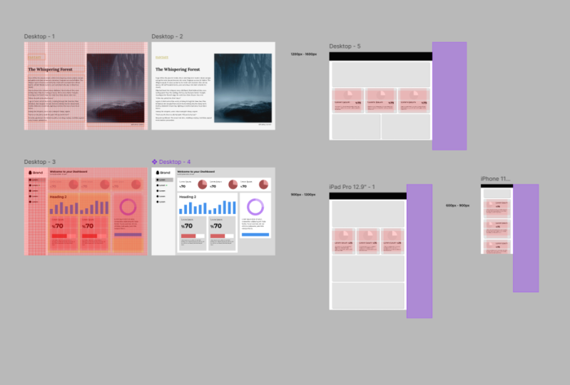
actually 600 to 900 pixels, nine hundred and one hundred, one hundred, ten hundred
and two hundred pixels, and 1201 to 1600 pixels. For everything below 600 pixels, there will be no change. And for everything above 1600, we'll just have larger
variable margins at the left and right-hand side. So below 600 or above 1600, nothing is fluid,
everything is static. And then between each
of these sections, this is where we have the canal lock system.
We talked about. There is a certain element of fluid design between six hundred and
nine hundred, for example, we don't want our
typography to grow and shrink as the
browser window grows and shrinks because we've
already painstakingly worked out good numbers
for readability. But certain things on our page are going to stretch and squash. To make this a little
bit easier to see, I've added a purple box
behind the right side of each of these
designs so we can see the room it has to move in. So for example, on
the largest design, which would obviously be for a desktop screen
from where about the 1201 pixel markers to where the 1600 pixel
March it markers. There is this purple box. This way I can easily stretch and shrink my art board between these two breakpoints and see how these columns are
going to look different. And once I add
contents of the page, I can see how they will look different at slightly
different widths. For each of the boxes I've added to each of these three layouts. I have selected the constraints
to be left and right. Which means these
components will stay to the constraints of where
that column grid was. These breakpoints I've added to the master grid at 900
pixels where it changes between 13 columns and at 1200 pixels where it changes
from three to six columns. These are relatively
standard positions for the brakes to occur for the
number of columns to change. If it makes more
sense on your design for them to break at
a different point, feel free to not put them
in those exact possessions. And of course, potentially
different pages on your site might have breakpoints in
slightly different places too, if that makes sense. But be aware this
is going to add more complications to
the development work and it will need to
be communicated and understood by the rest
of the design team. If we look at the
layout of components across these three
different width views, then we can see that some of the components have
snapped from being half the grid to
the whole width of the grid and stuff like that
at various different widths. Let's take a look at
one specific component. Here we have a
component that spans half the width of the design. And it's going to
have its own grid. I've switched on
a single row and a single column with a
margin of 16 pixels. 16 pixels being quite uniform throughout the
design I'm creating. Now everything in this component has to work within this grid. This component could also have multiple rows or
multiple columns. And if so, it would have
a uniform gutter width, which would be a
multiple of four pixels. I've left aligned
some text and I have rights aligned a pie chart. And in Figma in the constraints, the text is all set
to constraint left and the pie chart is set
to constraint, right? This means I can now see
how this component looks within the fluid restrictions
of this current design. The large design is fluid for 400 pixels and this
is half the width. So therefore it is
fluid for 200 pixels. I just want to check
that works within that 200 pixel range. Now let's say that
when our page snaps to being just three
columns wide, this component is then
just one of those columns, so it's a third of the page. This will make the width of the component
dramatically smaller. So perhaps the layout changes, perhaps now just all the
content is on top of each other and it's
centrally aligned. However, it is of course, still working
within the margins. And then let's say when the browser width is
below 900 pixels, maybe this component
snaps to be in full width because there is at that point
just one column, as we already know. Now, this does
actually mean that the layout for this
component will be identical on mobile
and desktop walls actually been slightly
different on tablets, or I should say
slightly different, between nine hundred
and one hundred, ten hundred, two hundred pixels. But the actual position it snaps is somewhere between
here and here. Now, it could be that the point where the
layout of this component changes is actually somewhere
in-between 901,200 pixels, by which I mean the
point where it's snaps from being
six columns into three columns for the page
layout isn't necessarily the exact position
where the layout of this individual
component changes. However, again, to
make things easier for development and also easier to communicate with
other designers, I would normally try
and avoid doing this. Also note that I have made
the topography smaller for the mobile version
of the component than for the desktop
version of the component. Because as we already know, I'm working in a design
program on my computer screen. Meaning I'm working with the reference pixels
of my desktop screen. I'm not viewing the designers
on my mobile phone, which will of course have
smaller reference pixels. This is a slightly more
advanced topic and not something you're always
going to do often in accompany the developer will
make some judgment calls at development time about exactly how it works on various widths. So everything can fit in. However, we want to help as
much as we can as designers. So let's make sure we create
at least one other version. Take the design you
created in the last video, and this time create a new one, but a much more narrow view. Maybe it has two columns
rather than the original 12. Now, add the same components you hand in the last video
to this new view. So they're going to be
much narrower components. And you might want to
think about constraining everything in these
components to IVR left, right, or left, right, so that you can adjust the artboard slightly
and see how it looks on, for example, a slightly wider phone or a slightly
narrower phone. If you have all the time and
all the budget in the world, you can do what I did with single components in this video where I checked that it works on every single width possible.
17. Summary: A uniform grid will
instantly give our designs a sense
of conformity. By aligning our
elements to a grid. We're not only making our
developer's life easier, we're making one of
the simplest changes at designer can make to drastically improve the
overall aesthetic of a design. We're about to create our own grid to use
with our design. But first, we need to understand a few things about
how modern CSS works. And in the next section we'll
learn a little more about how modern component-based
development will affect how we
use grids in design. In my opinion, the world of
design and development have both become too complicated
for anyone to master both. But to design using grids, we need to understand
CSS Flexbox and CSS grid that we've looked
at in this section. Now you're ready to stop
creating a grid for your design.
 Rob Sutcliffe, UI Designer / Developer