Transcripts
1. Intro: Hello, everyone might go here, aka hugs yachts. And I've just got a class for you today on how to turn your, your grayscale black and white paintings into color is really something I've learned myself recently play and about. Didn't find much information on it on various sources on the Internet each, ETC. So that's why I thought it'd be a good idea to get this class. I also, when I was sharing it on my Instagram, there was a lot of comments. So how do you paint straight over black and white? What, what layers, what capacities to use? So I'm going to be going over all that. There's a few different layer modes that we're going to be used to achieve. Flawless look. Otherwise it can look a bit shallow. And obviously if you just use a normal layer, you'll just be painting directly straight over your, your values which you've laid down. So this is sort of idea of what I mean. I'll start off before I add any color. Obviously, first off with my sketch and then I'll be adenine all my values is one of the trickiest things about painting in general, not just digitally as getting the right colors. And then you get lost in the colors and you start to forget the values. So things can really lose that. But by doing this, you're ensuring that you guarantee that you've got your values and your depth nailed on, which makes everything look seven times, but it's not all of it. So if I put depth, if you pictures, you're giving things 3D forms and making things look a lot more eye-catching. So once I've done this, sort of add in some lights and I'll color it. Looks a bit plasticky a bit. Not very good, no, no depth in the color. So then we'll be doing, I'll be showing you the, the other methods to really get that depth and get your picture burst. And we'll contrast. If anything, you're going to suffer with. The opposite problem. You're gonna, you're painting is going to be burst to be contrast. Too much contrast, if anything, you're going to need the dollar down. So I'm going to show you how to get the right balance. Some key things are obviously a lot of experienced artists know that when you're painting, if your light is more than your shadows will be cool and vice versa. So we're going to still bear things like that in mind when we come to do this. Going from our rough for every reference we use. When, when I, when it's all warm, yeah, looks great, well drawn. But the colors can really see a painting off. They can really fire off to the next level. So I'll be showing you how I just just, I suppose just blend in some different hues just to really fire them off. And then I'm going to be doing that from scratch with you. This is my little practice. Go there I had is just this is what we are going to be doing. So I'm going to put a link for the reference picture that I'm using. If you draw along, if you like. Now this is what we're going to be doing. This was just very rough. I wasn't probably look a bit better than this one. Just I was just sort of getting things in order, ready to show you guys. Just look at the layers here. It all looks a bit daunting. But it's just because I was play it about not that bad. So, yeah, join me back in lesson one. When we get started. This is probably going to be four or five parts. I'm not trying to paint a masterpiece. I just want to get the process over to you guys so that you can play around with it. Get back out and you can create your own masterpieces. You can go as far as you want with it. So I'm just trying to teach you the process of Hawaii do it. I've seen a few, there's not many on the internet. I see a couple of methods of doing it. And they really lose the value. And it all looks a bit. The colors look false. Like this Cognitive, just one shade of peach or one shade of blue that you lose a lot. So I'm gonna be showing you how to work around that. So yeah, join me in part 19. Guys will get to Canvas, go reference up and we'll get going.
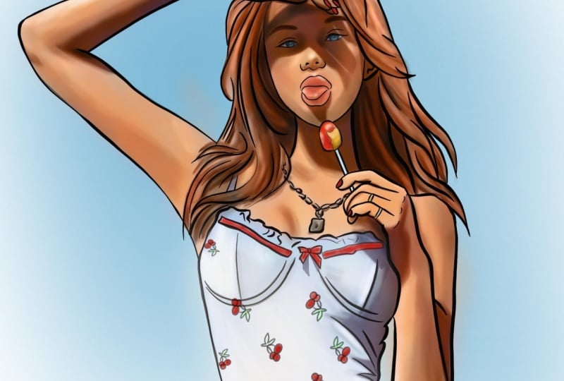
2. Sketch & lines: Okay guys, Welcome to part 1 of how to turn your gray scale where it's colored finished pieces. It's kind of a niche class, I understand that, but there's also thousands of people out there. Would just like to know. So hopefully this will help you. So first off, we're going to want to Canvas and we're going to need a few layers for this one. I think I got 11 layers. So I'm going to be working on, uh, we're going on to Canvas, which is 37, 79 pixels by 4734. So if you want to copy that, then you will know exactly where I am. Gives us, gives us 11 layers, which is ample, ample whilst keeping a nice sized canvas. Obviously some of you, you with your big fancy iPad Pros and the brand new iPads you could probably, you could probably have much bigger canvas is much more layers. So it might not be a problem to you, but those of you, old school year old, crunchy iPads like myself. Thus the canvas I'm using. So layer one is going to be, I will reference straight onto the canvas. So I'm not going to paint the whole lady when all you had to paint the masterpiece or just want to show you the process. I'm just gonna to say the top half of the maybe like so. Yeah, we're not, we're not really not going for accuracy here. Just showing you the process. So just bear that in mind if you think God, that looks a bit terrible. Yeah, trust me, when you try it yourself, you can make it. So place your photograph. By the way, I'll put the link in the resources for you to download this reference if you wish to use it. Okay, So there's our first layer. More we wanna do is duplicate that straight away and switch it off. So it's nice to have a backup open and layer directly above. Turn the opacity down on our photograph. Because the first things first what we're going to be doing is we are going to be sketching out our outlines. So remember for the first few parts of this whole tutorial or class, we are sticking to just grayscale, so we're just up and down the left-hand side. Forget color. Forget color. So never use full digital black almost a bit too much. But you want to go pretty dark with the line work as you don't want values to be darker than Daniel line work in some parts, so it gives you a nice little contrast boost. So it goes dark. Back there. Three dark as we're willing to go. So let's just crack on and sketch this in. You can use any brushes you like. Preach at Eric, I'm gonna be using some from my pack. I'm going to use my Digi sketch. And he whatever brush you use for sketching is fine. Just whatever you're comfortable with. Subtle. Scope is smaller, lighter values. And when I'm tracing of do not hang on every single detail that I see kind of in my mind, I'm doing it from there, if you will, from memory so of how I see faces. So we'll start with the eyes. Okay. As you can see, I'm not really following every single detail we see. This is more about, This is how are you sketch? Everybody's different. You may prefer to just draw with your photo clipped over there, but it's just for tutorial purposes. So it's a lot quicker to get it done. Okay, Little only pop As the bottom and moist shin and I'm just gonna say like so. Like so. Okay. Lollipop stick, I probably phosphors some of this guy's whilst idea. Get the sketch down. No, not yet. It's going to waffle on a bit more about what we're going to be do. And I always wonder, is that a brilliant way? You can colorize your grayscale pictures? Because I thought if it is, then I could start to incent proper stuff because I always struggled with value. I get lost in the colors. It all a bit wishy-washy. You become so a colorblind when you have spent so long on a piece. And you really lose the depth and it's doing it this way. It's done is out the way it will always be there. Then you can focus on your colors. So yeah, it's really, I'm over the moon with this method. Hello, We'll bring their little ring. They're not really sure what's going on. This, we'll just do that loosely sketch and around. And this is a good idea for you guys when you're tracing or if you enjoy tracing. If you're not yet moved on to the drawing from a reference pinned over there, then you don't want to trace so directly every level move You see because if you just trace in a photograph, then it's a bit boring. He would just learns a big confidence strokes. You can still make her catch him work. Is you haven't gone to go exact as long as you're not doing nothing to MATLAB given her a big giant head when she's got a little tiny heads and stuff like that. So just switch them. Okay. I'm probably yes, as far as I'm probably going to go down to prefer. Right. Let's just put a little bit of a draw the bow in which I forgot in my practice, go earlier. When I'm drawing clothing. I mean, I don't know what your sketch pens like. Mine's quite it's a little bit fat and thin and also very flowy. So pressure sensitive, sensitized. So when I am doing clothing bits like this are sort of oppressing all on, press it off. It just makes it a bit easier. I find this increases. I did tell myself that I was only going to roughly two S just to give you the idea, you're probably already thinking, oh, come on, cattle appoint, all in good time. Wobbling, good time. Trust me, it's worth it. The big long strokes, confident strokes. Really give you a work visa, authentic look. By the way, I've got no paper like No nothing on my screen. I rip that off. I did enjoy it when I first heard it. Got to a point where I couldn't see what I was drawing. It got scratched and marked up. Kinda like just the smoothness of the just the original glass screen, like the way I can just glide over it. Okay, So we're not gonna go too overboard with details like say the d, right? A strap going up. Yeah, we'll give it a necklace, even though it's a bit extra time consuming. As you can see, guys, I'm not trying to copy what I'm seeing here. I'm just kind of bug can see that it's kind of a square looking chain in alkalis. So that's what I'm doing and that's how we do with all my tracing. It's all based on the same The same thing. So okay. For this, open up a new layer if you get any patterns on tops. This is how I'm going to be approaching them. Okay? So there you go. Duplicate. Move it around and resize. If you must. Have legibly duplicate, move it around a bit in, spin it a bit. Duplicate that, move it over. This is just our loved ones. Obviously, if there was hundreds of them, we'd have to do something slightly different, but along these lines. Duplicate, move it around, and even not even go into and that fast. So squashing up over here in the corner, I'll do get the idea. Merge them. Merge down. Step. Okay, I'm moves down again. No layers lost. So we've done a face. We've done all the details so far. Just got a hair which is going to come in here, and our eyebrows, which we'll do next. Just going to call an items apart when we're this part though. Remember you can stop, pause and re-watch any point. I kind of know the process. So I might shoot off a little quick field or apologize for that. But you can always just pause, rewind, and watch again. So join me in part 2. We're just going to sketch out this hair. And then we'll be going straight from the hair, straight into the values. The most important part, choose guys.
3. Darkest values: Hi guys, Welcome to part 2. So just a quick recap. We have sketched out the main body and features and we have just got so and I sketch in her hair and her eyebrows before make it a star on the values. So obviously our apostasy is still quite don't open up a new layer above your sketch layer. Again, just normal, normal Blend Modes, nothing fancy. And using my same brush that I used to sketch the whole original piece. So just go into now, sketch in some hair. We just get our finger, which I appeal to administer it because it's playing on my mind. Okay. Back to the hair and not p and two. I mean, I find it hard to sort of draw quick and draw bad. So even though I am trying to rush it along to get to the main points, I find it quite hard to just draw bad. I'm sure many of you can relate. So this may or may not stay at the end, are usually designed at the end of the piece. This is why I've done it on a separate layer. Sometimes I just remove it completely once the hair is painted as the hairs. Plenty of contrast anyway, so they barely noticeable. So I'll leave that up to you. I usually decide sometimes they do sometimes they don't. So just know. Roughly lying in the hair. Like so. Roughly low in the Hebrew choose k. So this is where we are. So we have a sketched out, Our Lady, the top half anyway. And I want to show you how I add the value. So above this layer, open up first things first, what I'd like to do is block in is a slightly tedious part, but it's really important and saves so much time in the long run. What I wanna do is I want to just fill all the inside of our loans. So grab your on a new layer. Remember, underneath our sketch layers, use your selection tool, freehand. And we're gonna do it the tedious way. We're going to follow our lines. You haven't got to be perfect. You can get it later. But I just think you take it Solomon to get it done. Then it's done then for the whole piece and it makes life so much easier. So I'll just kind of pushing through for the purpose of this video, I will solve. Yeah, I move on. I'm going to do a hair. We don't always don't always blocked the hair and just keep it all separate but unwell. Obviously, this is where the hip. There was that. Very good. So go to a noise source of light, grades home and fill all the way. A 100 percent and fill job done. Back to selection tool, just cut out the bit that you know, needs to be cut out. Three fingers swipe down, clear layer. Okay, so now she's colored in and I will base is there will be used in this so that we can't shoot off all over the place. And we got a nice solid foreground for any background we want to put into. So we'll always have that. Next thing we wanna do. We wanna saw our photograph out. This is why we got to. So click back on your photograph layer. Take the opacity up to about 1989. Now we're going to be copying these values. A little tricky to see because you've got lost in the color. First things first. Let's take the saturation of. So we're not distracted by colors because we don't want nothing to. Colors at this point. Go to Curves. Layer. And let's just press in the middle to create a little pen dot. I'm just gonna go down slightly. Let's mix it a little easier to see where the light and the dark is, darks are. So we can use this for our dark stacks. And I would like to slides play around with the opacity to when you're comfortable. Quite happy with it to be fair. 92. Okay, so we're going to want to layer above our solo at which we cut out. What we want to do. We want to select this. So click on it. Hit Select. No, that's locked him. There's no paint and off the edges anymore. Turn it off. Go back to the layer we just created, which is normal. And now we're going to start painting in these dark, dark bits. So go, go fairly dark. Don't go all the way to the bottom, but go fairly dark. It's easier to go bring it back lighter than it is to go back to occur. I mean, to be honest, they're both very doable, but just get it right first time he saves a bit of time. So just go down fairly dark. Let's go. I'm going to be using my skin shade brush for this part. I mean, you can use anything, anything you want really. I haven't used what had sketch brush before as well. You can use any brush you like. Normal writing brush will do the job. And here we are just, I mean, this is why I chose this reference because she has such strong shadows. Can't really see. So it's going to take the opacity down a touch. 79. So prescient, fairly firm there. Just to get this a lot. In fact, I am going to use my brush because it's going to make life easier. I'm just going to fill it, be quicker. And you can see what I'm doing already or just mimicking the darkest darks has always see them. Just look so we don't want to hold up. It just won't. Not much. Okay. I've got another DAG bit here. Slightly darker than our shortest, as dark, slightly dark here as well. So we'll get this in. This is all in the shade, top of the head and we got some more starting there. Let me get another big shadow under the chin. Again, I'm trying to be rough with it. For speed purposes to get to the actual points, you probably all think we know how to color in black and white mate yet, but let me just try and explain it right. All I'm looking for the stage is the darkest darks. I'm going to do all that. You see, I can't go off, can't cough because of our selected. That's why we do the silhouette makes life so much easier. Don't want to pull it up in, just fancy to change. So okay. Shuttle was up there. And even though these are had had shadows, had cast shadows which I always had edged will still be softened it because they're not this hard. You just remember that folks that cast shadows who was a lot sharper edged than your general shading and shadows. So bit of a shadow under there were the jewelry. To really mess with it without too much. We'll put some chateaus and then I will bow. And shadow was about obviously one Color Fill fairly hard. And all the way around like that. Very much in the shuttle, that finger. And there's always going to be a bit of a cast shadow over the edges of the fingers. Pretty dark gray, but it's not quite as dark. A tone is what I'm looking for at the moment. Looking for the darkest darks. Yeah, I suppose we could just call that pretty doc. So that's the beauty of using a harder brush for this is of course you've got the you could just fit it straight in effort to effortlessly, you know. Okay. Okay. I think that's I think that's our darkest darks in for now. I mean, we're not going to tackle, I don't think today. We might see Heracles is a different animal, but work in ozone along exactly the same principles. So we've, we've managed to block in our big main had shadows. They are now probably you think, Wow, that looks rubbish, but we're not going to be peeping out of that opacity. We're going to be playing with it. And we're going to be judging is it cool shadow is a warm shadow. I think. Actually it's going to be a cool bit of a cool shadow. Pretty warm under the arms. Pretty cool. That's a fairly cool shadow. Bit of blue on outliers pose. Yeah, it's a fairly core shadow and quite warm light. So we'll go with that. We'll go with that. You're probably thinking, why is he saying That's why does he say, and the brain is cool. If you look at the hue here, we are going to be in the reds, but it was still have cool reds. You know, I mean that's more unless a warm, right? And if we add a little bit of gray to it, it's not so read anymore if you think about it, what I think great to it. So it's getting cooler. So that's a cool color. See colors just blow my mind. I mean, I don't even know. This is why this is so helpful for me. Anyway, where was I? Sorry guys. So we've sketched in we blocked in our darkest dark shadows, which will work. I've done. We want at some point. Next we are going to be blocking in all the lighter shades, which is a little bit easier not so they're not cast shadow survey. I'm going to be so dramatic as the ones we see in here. Where I have chosen.
4. Mid tones & highlights : Hi guys, welcome back. Quick recap then. So we go barons where we are, we've traced or some of you may have drawn your picture. Yellow lines we've sketched in, we blocked in a nice silhouette. So it's going to be really helpful for us. We've blocked in our darkest cast shadows. So well on the way, pictures already got some value. Whereas if we just went straight into the color side of things, we may have lost. Is there now, it's there and there's nothing we can do about it. So great. Now, what I know essays, if you look at this picture, is there's a lot of soft, slight transitioning from the darks to lights, even in the darkest areas. So we'll have a little go up. Just for extra, I'm just going to, if you haven't got to do this, this is just for extra effect. So if we say go to a brush, just check. Okay, that looks exactly the same. Okay? Okay. Okay. Okay. It's because I will thing is so what we'll do, we'll do it on a separate layer, bring them together. But anyway, all I want to be doing is we're not doing anything too precise. Just glazing. Glazing some darker. Just glaze. And so please, please, please. I mean, we're going to be doing the hair and a visa. It just adds a little bit more dimension, again, even more dimension. So we'll be burst in with, with value and contrast. Which was a lot of people struggle with. Until I saw solar wanted to do. Alright, so that's done. Let's bring that down with that. Now. We want to get in, so open up a new layer and we want to be bring it in now. Lower so a mid shadows. So if we select our silhouette again so that we're not painting outside. Back to our new layer. We just opened up on the cube, say, I mean, obviously we could change it so we don't want the logo to light. We could change the capacity C and make it louder. Let's just go with that for now. And I'll be using my shade brush. And there'll be fair. So I use and I'm just going to, this is again is pressure sensitive. So if I just show you guess, a nice transitions with this with having to do what we just did. So take that Dana touch again. So you see what I'm drawing like? So similarly, just subtle shadows there. Back of a hand is just shuttle. I'm going to be smudge in a bit of that in okie dokie. Think that might have a little bit more tone in I'm going to be pulling a bit of smudge through this one to get more coverage. News. And what you find when you're doing this is your pictures are just automatically there, just automatically look better anyway, even until he was kinda muster it. Because you're given everything more depth and more Humph humph wherever that is. The pitchers who just looked at anyway street from the get-go. All pretty much shuts with it on a tablet. Right here. This is one of them funny brushes which sort of gets dark at every time I stroke it so I can kind of match my previous layer. Dark areas. Kind of some S and the K we look in, we done not a million miles off. We not a million miles off. I'm just going to smudge some of that in the circle. My silky soft blend. Use whatever blender you do use. Just going to be just share it out a bit really and soften in, in some, some transitions which are a bit harsh. Not on the original hard layer. Remember, we all know our mid-tone layer. Just like. So you can also kind of you can call it the reshape. Some lines that you don't agree with this method and you can also share a bit, a bit of value. So, so not so flat. Cup. Let's stick with just smooth. So I'll add in some smooth some of this in. We will also go in and smooth some of the cast shadows because even though, even though they're definitely sharp, edged is still not as sharp as what we've done here. Digitally shop, still going to be a bit of wobble. So we will we will saw that. Okay, this is where we're at. Let's just go back in and smooth off some of our edges on our cast shadows. And this is just a capacity though, because we don't want to take you don't want to lose the sharpness into blur. We're just soften it. With just soften. It goes Yum blur for this to be fair, but I would imagine it be a bit too much. Rather just do it myself. We're only taking the edges off certain parts. Literally with a brush. Nib SRI, with a brush stroke, stroke, stroke, stroke, stroke. Just zoom in. Just so. So it's not so severe. Obviously, if you keep smudge and you will lose your depth. D, just soften in the shadow. Soften in this path. There we go. So I'm done. The neck as a good example of the neck is kind of a shop jaggedy line. We can straighten it and soften it at the same time whilst keeping that sharp edge. Okay. Okay. I think I forgot it. I think I forgot this bit first time around, so I've got an I in fact, I definitely forgot it. Anyway, folks, this is where we're at. Now. Let's take our selection of a sudden zoom-out. So there you go. Let's look at the time. 51 minutes in. But we've got a decent looking piece already just because we've confidently got value. And it's not rocket science. You've seen I was done. It's not rocket science, so we got there. It's kind of an easily, easy, repeatable process, which told you I was gonna do it rough and lucky me fiddling drug. So yeah, it's a repeatable process which you could do time and time again. And what I wanted to do was I wanted to join me in the next part. Because the next part is when we add color. So this looks like a great little picture at the moment, yes, Brilliant. We need to add color to it now. Let me just show you something. So I was just going to paint some skin on. You get this a luminous orange peach. She's not real kind of look. And I've just put some just know as soon as I got to do man's gotta do what a man's gotta do. Was there any value on the lollipop? Yes, there was. So grab bar grab the value on the lollipop. There's also quite a lot of value on the train as well, which I missed. Which is just a little bit annoyed to say the least. So I'm just going to wing it. And that's how I wing it. So I wing it, folks. So for the next part, we're going to need to add some light to it. So we're just going to add some light which takes no time at all. Then we'll run straight into color that guys. So in the next part, liked and then color. Now we'll decide what we're doing with the hair.
5. Adding colour p1: Hi guys, welcome back. So this is the part now where we get to the actual trickery and mastery of it all, we get color onto our black and white pictures. There's one thing I've done since you've ever, since I was last here with you, I've added a screen layer. Just added some lights so you can see this is where we were. And I've just saw of added a screen layer using a fairly white-collar normal right into brush. And I've just painted in some lights. Like so. Nothing nothing too heavy. Pressure sensitive. Yeah. So that's that's what I've done there. But it's up there as well. So right. Let's get into it. So make sure that you've got your silhouette selected. Click above your screen layer, which is what you will be doing next, which is just your highlights. I see a lot of people on the internet said, Oh, color and start over with a multiply layer. Okay, let's try the other. Who was a very gloomy, it's a bit dark and gloomy. I suppose you could work a million other things to make that work, but no, not for us. So go down to a layer mode, which you're probably not familiar with. Color. Okay? So this is where we will keep our values untouched whilst in our color onto the thing. Watch this. Actually pick them like color as well. So just normal right brush. I've just sort of add in my color. Not be too careful at this point because I'll be painting over snowing, going over with whatever else is on our edges are covered so cannot go inside the lines. This is a color mode folks. Job done. And they've got skin is as simple as that. Values are beautiful still. She's wearing a white top. Let's go white top where it was used like an off blue, really light blue for for white, especially in the sun. So now we can be a bit neater. Then the edges. You could sort of use a hard pan and just fill if you wanted. Whatever. Same outcome. Let us say are not creating a masterpiece. You guys to show you the method. Well, try it, and I do get carried away. It's such an enjoyable process to work with as well. It's really enjoyable because it kind of pops a life before your eyes is great. When you start out in pop and contrast to your drawings, well, the world is your lobster, as they say and do Boyne. So I always use like an off blue for white because it gives a nice a nice shadow we contrast when you add your true white to the highlights. So yeah. What color was a ellipse? You'll pick a nice light pink for now. This will not be final part of the process. New color was a lollipop. I think it was red. But just look how this keeps EV three-bit value flawlessly and touched the leaf. Lovely, bubbly. Just do it. It's just going to come up gray is, but they are going to be pretty gray and the shade anyway. Okay, folks. We we're at SRI I give her some pink. Color was a like a like a red. More red than that. Let's go with a cherry red. A school with a cherry red. There was quite a muted, funny sort of filter relook at the moment. But we're not done with it yet. We got become more wizardry to work. Okay, so red, the red, I'm not going to be two neon trying to rush through it a bit narrow. Because if this is not the last part, then the next certainly will be still got a couple more tricks up my sleeve. Just slap up in a green. Okay, So it looks good, it looks but Alice get rid of her. Still looks a bit false, doesn't it? Looks a bit false. Should we do a hair setup? I'm going to do that. Let's just put a bit of base color honestly, just so it doesn't look so destructive. Purely to stop our RUs being destructed guys are. So I didn't want to fluff about with the hair because it's a bit of a different ballgame really, when it comes to adding color to here. This should stop the destruction and the opposite. Okay, So we gotta watch this now, wrote this out a bit of background in. So we've got a blue sky. Let's add underneath our silhouette as add a bit of a blue sky background. Okay. Now this is where your skin tones or start to just look a bit shallow and a bit pale. Which is why I will show you the next bit. O is always flip the hues. Always keep it in trusted. Stay still. No way. Case and Angus see now, but once we plump it onto a blue background, it really does stand out that her skin is quite a funny color. So what we need to do is first off, just up the saturation just a bit. The other thing was throwing me off here Is she got very warm shadows. We need to give a cool shadows, don't we? Kinda warm light and warm shadows. Everything's a bit too warm, you warm them. So you need to go back to our shadow layer, which was this one. I need two other tinker with it. So let's pop everything off a minute so we know where we are. Pop it all off. So we just got our shadow layer and our sketch layer. We need to get this to a like a war machine. So if we go to color balance layer, um, we wanna get a cool, sorry if I said more. A bit of blue, bit of red shadows, bit of blue or red or magenta. Obviously, if you're going for warm shadows, Bob's your uncle because it's already done that already warm. Once you add the pig skin. Only do this if you need tools, shadows, and just really just slightly touch in that. Just add in a little bit of color to it. And the mid-tones, blue, little bit of red. Okay. Now we're going to hue saturation and brightness and we can just go down and the saturation slightly will go up. Make sure we're in the right color. We want a so of the chancery of magenta retold color and then off the saturation. Yeah, that's quite cool. And we just go down on the saturation a bit. Chaos will give a better effect now should now be WARMI, warm. Looks at them all believable. Now. She's still got slightly yellow skin, which I mean, it's kinda my fault really I suppose, or colored or in the wrong color. You cannot change. That can't be just redo it. I suppose. Just redo it. Kinda mess it up my weakness now, but I'd rather it be the right color just to show you that it's achievable. Yes. A bad color. You went a bit too yellow. Yellow. Bit Hill. She's got more of a warm glow. Okay. And let me just get our red lollipop in because it's getting on my nerves now. And we're just crack on. And some very pale lips. She had pinky red. And the course are always no brainer.
6. Adding colour p2: So you start to get something that looks a bit like this. Then. Now we know that the light is warm, the shadows are cool, but we can enhance it even more. Again. Open a new layer up. Keep it on normal. Pick a nice warm skin, skin color. Pick your skin color. Warm it up a little bit. Okay, warm it up, just add a bit of saturation. And this will cover the values so-called careful. I'm using just a round brush. Cool, careful with this bit. We're just Glaser and so we just glazing over certain areas just to add a bit of saturation. Just Glaser has kindly given you that glow between the lights and the darks. And you don't need much. Just a little bit. We'll set it all off. And on the cheeks. Member, this will go straight over your values. So just like this is really light pressure Glaser, we can add a bit of red mist pigments to her cheeks as well. We're not 0 or more life that maybe a bit deeper. Bit of redness on unknowns as well. We can add a bit of redness to a max. Remember we're losing value when we use this though. So go easy. Glaze and is your best option. So we've glazed over so of our midpoints and now we've got more believable skin. We can also glaze over some of the shadows, which we know are kinda cool. So, so a color. We can just select that so don't go outside the lines. You can just glaze over some of these shadows in some areas so they're not so warm. And it just makes it look a lot more interested. Glaze, glaze, glaze, nothing major. Until we're still not done there. Obviously, we got a color or ease in, so let's call it, give us some samadhi races. Okay, let's give a blue eyes. Well, started, remember it otherwise shouldn't have any colors. Give us a blue eyes there. We can corner with normal lightness there. And I've been a dot and that's it. Let's hop. Obviously we didn't touch the eyes to be with the values, so kinda miss stop it. Sewer, just do them ourselves. Okay. So she's looking at her. She's looking back. We know she's supposed to be wearing a white top aside, a bit of white at the moment it looks very blue. Let's just glaze and a bit of white, which should give the impression of it being a top and not a blue top. And I was or more blend mode that we're going to need. Open it up. Oops, max delivery. Okay. Let's merge data. Final blend mode, we're going to need his overlay. This is potent for I didn't saturation us exactly what we want to do at this moment in time is odd saturation. So just again, just glazed, just glaze it on the light areas. I'm really trying to warm it up with a really saturated orange. Succinctly what it will do, it'll warn me right up. And it'll also cool our shadows. Select that again because I forgot. Pool our shadows down because I'm rushing. So I know I want to make this one last fit. For the last part. Cool the shadows. What we could do is just select the shadows like so. Click back on overlay. We get just cool. I'm this way. Can I get much cooler than that? Now we're cool. Yeah, cool. And I only start in a little bit more thing There's overlay mode is super powerful, just go easy with it. Turn out a bit of redness. Ulama had a bit of pink redness to the subsurface scattering effect. The shadows. Make it look like she bleeds. She's living human. And of course we can make the lips really explode to life. I make anything explodes my even lollipops. Okay, so I'm not going to get into the nitty-gritties of this necklace and this, and that. But this adds a little bit of throw a TCO painted. Like so. I would usually take a sharp had pen for things like jewelry and I would just I would just add some some of my own glossy style thing. I mean, maybe that's a bit too hard, is it? We'll see you again. But yet well, that's some lights highlights in whenever you want to know the hairs thrown a bit, making it look a bit funny color because she's got like strawberry gray hair. But hey, we're not messing with that. Overlay layer. White Rembrandt. Sketch some of this buck, select the color layer first. So we got the silhouette, us all less white than this up a bit. I'm going to call it ran to this part because we're going to need one more part just to complete the job. And then we're going to be done. But you can see how it's progressing. All ready. Join me in the final part when we'll sort the color of that skin out, I'll show you, I'll get rid of that.
7. Details and refinements : Hi guys, welcome back to the final part. So for this part is just all about neaten it up, making sure we're happy with the colors. So first thing I'm going to go straight in and do here is I'm going to draw some white ramus because I forgot. So Let's get a bit of a brown color. That's just get a round brush. And that's just painter in some way, Braves go to overlay layer, color them in a bit more. Darker. You go. Now she got eyebrows. I want to just kind of add some depth to them always. So still our dark color. And I'm just going to just glaze with my overlay layer. Glaze over, glaze over there. Here's my sketch layer, sketch brush, actually. Just good for adding details to certain areas. So I'm just on overlay on a dark color and just add in a little bit at contrast to certain areas just for detail. As you know, is not polished job. Moreover, just show you the method. Okay? So at this point, skin is still looking a bit of a funny color. So this is our goal about fixing that. Number one, you can fiddle the right color skin, which could, could take a while to be fair. Number two, you could play with your hue. Saturation filter. Tried to get it right up the saturation a bit. Maybe. Play with the hue slider slightly. As you see by adding more saturation is kind of bringing it to life a little bit. Add a bit more white. It's this top. Yeah, it's looking good. Looking good. I'm happy with it. So this is how you turn black and white to color painting straight over the top. Obviously you still got your options. You were still lower the opacity if you wish, or strengthen it even more, you could duplicate the layer if you want an even stronger. So I'm going to be lower in mind slightly. The one thing I like to do, I like to duplicate my, okay. So I'm going to have to duplicate my screen layer. Maybe make it an odd layer, or even a hard light. Just like the plunk it on top. On top of everything. Looks so and I just wasn't going to be full opacity just to give it a bit more light. So I think that's pretty much it guys for adding color. And so I was done or not a % million happy with the color I chose for skin and the beginning, to be perfectly honest. You thought to read? Probably would have been. Maybe. It's not a boil off. You can always switch things up with the overlay layer and just add some more blues if you want more. Cool shadows again. Like so. I mean, you could fiddle away, the hay is thrown it slowly if she got nice dark Hey, what she's supposed to have wouldn't she wouldn't look so pale. This hey, would make anyone look a bit of a funny color. Silhouette that. And let's just color over here and quickly. Just to prove my point. So already you don't have it. But with the dogs. Again, it was never about creating a masterpiece. This one guy is just about creating a nice picture. So what I like to do at the very end is going for the details. Solo, the eyelashes, things like that. See what brush. And I'll just say if you, if you want the eyelashes and is just little details really painted some Hebrews if you wanted. Yeah. So I was doing the hair, going to look for things like this, which I enjoyed it too. So I saw of data showing and I'll smudge it off. Some hair strokes. The sort of thing you do it, you know, just to bring it to life. I usually go in with my sketch brush and just and just polish incident details. If you're looking for a polished piece, you can add depth directly to the dark is pointing. So again, skin is touch in. Going to be very dark underneath here because absolutely 0 shadow. But you've got the idea guys. That's the method. A bit of a play at the end, saturation and stuff. That's all good in the end. And that's what we've created. Pretty simple looking chlorine, which was colorless until we change the hue. Of course, if I was chateaus, we create a vibrant looking lady with a fairly sunny, warm, blue sky background. And you've got options. Once you have colors in, you can kind of go to whatever level you want them, can't you? I think we would definitely be getting more more shadow in the eyes. No way they'd be that dark. Light. That would be darker. So over the overlay layer just giving even more to it. Forget the hair. So yeah, I have a play with the saturation and stuff and get it so the way you want it and you'll be good to go. It looks a bit nicer like on a multiply mode. And he goes, Oh, all preference with the last bit of the methods for putting on your black and white photos or pictures. Choose guys.
8. Final quick tip : Guys, just one more thing that I forgot. Apologies. You remember we did that silhouette of a figure in the very beginning. So I still carry on a gray and the tone, what we're gonna do is we're just going to select it and we're going to fill in with a nice warm color. Like so. You can see as an effect on the final picture. So pick a color that's not too dominant like so. And you can see the big differences you get. The final piece. So again, it'll just give you more, more of a genuine colored luck with that. So to start, I mentioned it guys.
 HugsyArts, Aspire to inspire