Transcripts
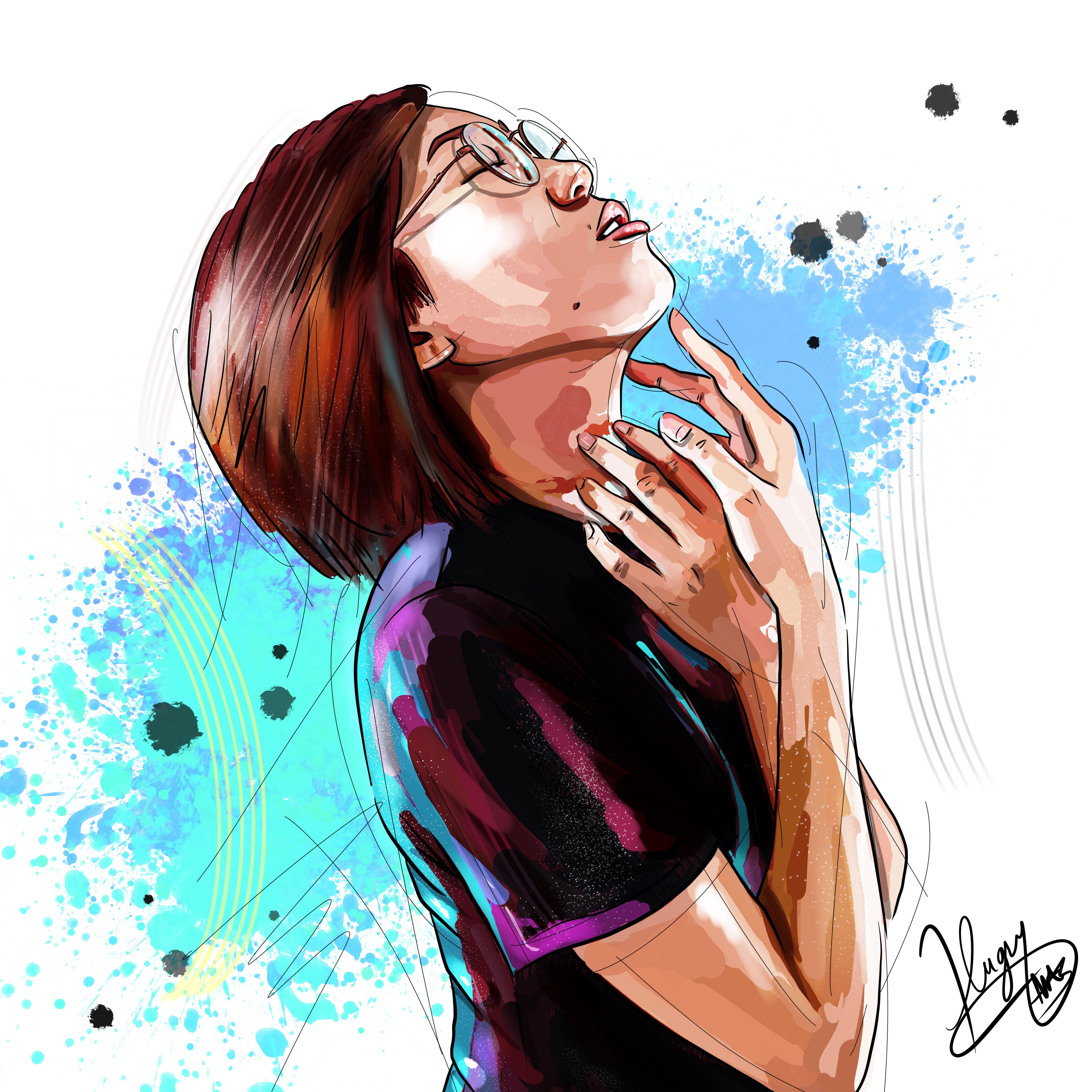
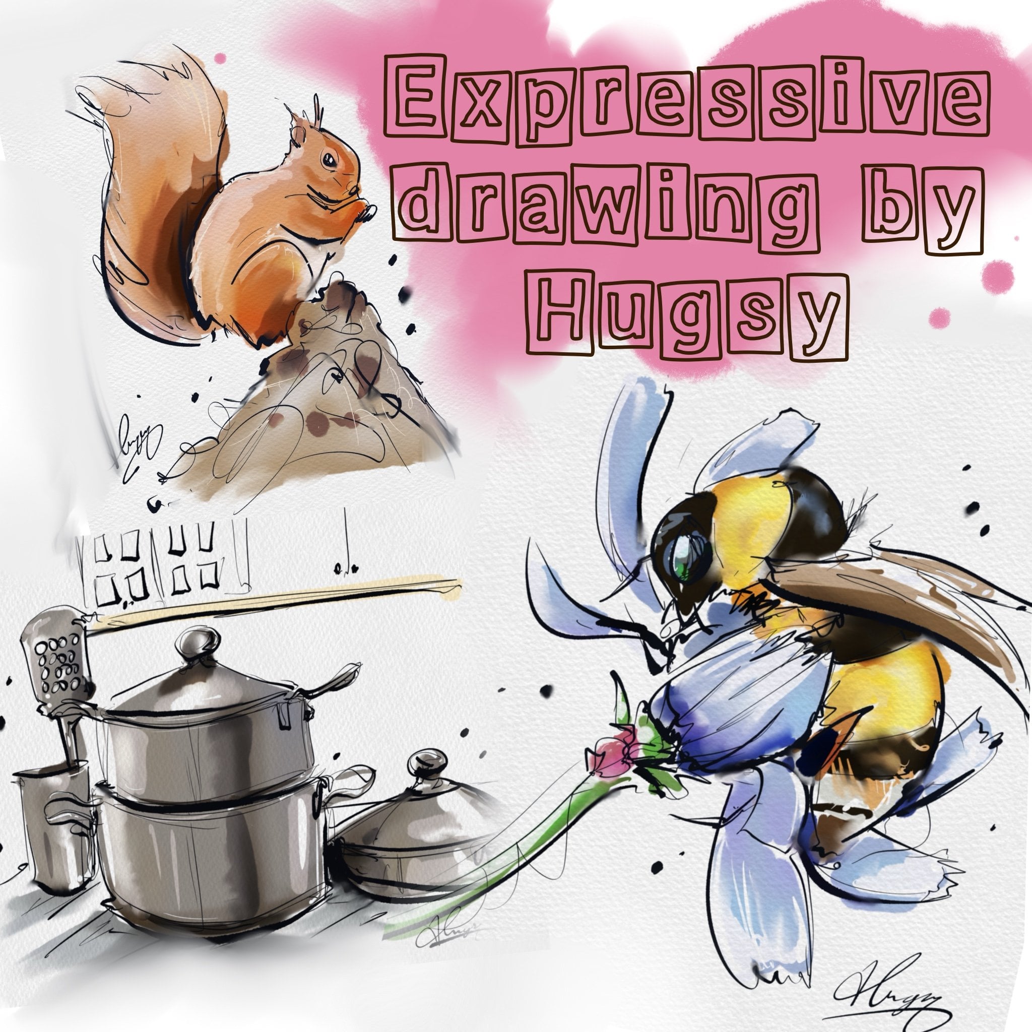
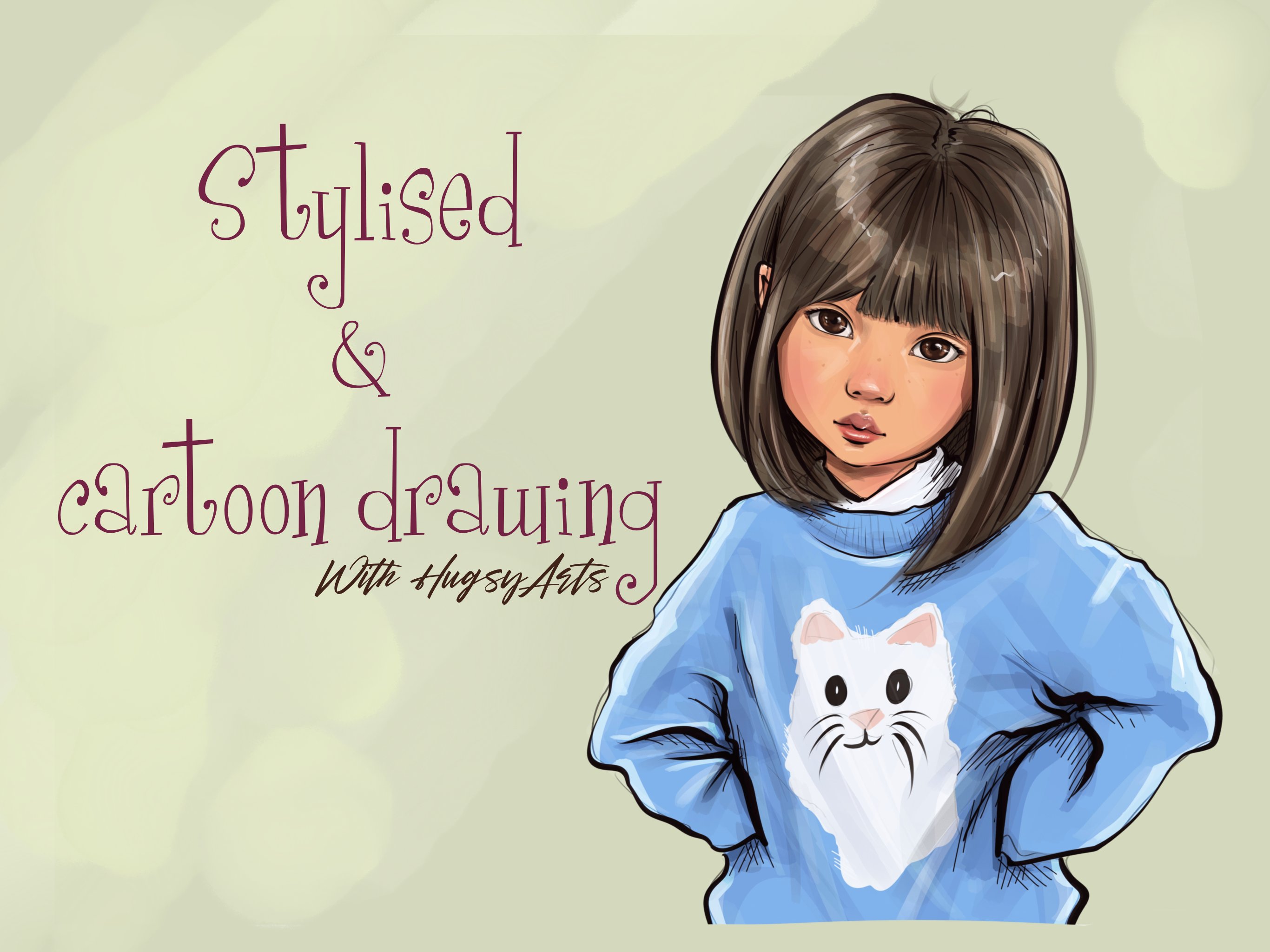
1. INTRODUCTION : Hello everyone. I'm Michael Hughes, aka hugs. Yeah. I've been out now for the last six months full-time. Mainly using Procreate. I used to do commissions the traditional way where you just pick them from scratch. And I found it wasn't working out so well for me. I didn't really have 56 I was spare for every commission piece. So I had to come up with a different way to make it more efficient for myself. So I developed this way where I manipulate photographs, make them look like genuine paintings or digital drawings. By the end of this class, you'll have a great understanding of how it's done. You'll feel confident in yourselves to give it a go. And it's just the start. The cartoon method is the fundamentals. Once you learn how we pull them, manipulate the colors, rather than wash colors away, you'll, you'll soon get a good idea and feel confident and ready for future classes, which I'll be doing if I just quickly skim through some finished work, you can see that this was actually three photographs which are merged together. So it was the guys had put them on the body of an office guy's side of the desk. And I've added his little logo. So that's just three photographs merge together. And using my techniques which you're about to learn, absorbed landed up to look like a genuine cartoon. Was a commission job. Is another one here. Again looks pretty lively, vibrant. Looks like a cartoon. It's just a photograph. This one. Same thing. Just a photograph which are manipulated using my specifically designed brushes, which you will get if you click over and the resource is button, go and grab them, they'll upload straight to your Procreate is called the cartoons pack and all the brushes I use for this class right there for you. So go and grab them and we'll get started.
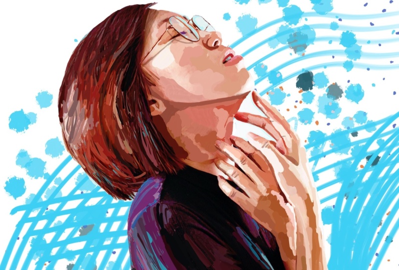
2. LINEWORK & PREP: Hey guys, So this is part 1. And I'm going to be taking you through carefully different steps in different parts. So it's easily digestible. You can see that what I've done here is I've added the photograph of this lady. I've got it off the app called Pexels, which has thousands of free photography, which is a free to use and free to do what you like with good for practicing until you start taking your own commissions in. So I've got this lady here and I've added either in. And I've also edited her slightly at the vibrancy and saturation, which is an important step as before we even begin. So you can see the original photograph. And my one where I've just up to the vibrancy, which has brought out some rather funky colors. And it's much better to start off this base on that one. You can see a dollar photo looks when compared. So the first thing we're gonna do is we're going to do our line work strict from the beginning. So we can open up a layer street in the middle. This top layer here. Just forget about that. That is only there for reference purposes. We'll just click it on if we ever need to have a look at something like the orange leaks in the hair, maybe the freckle on a cheek, things like that, which we can add in at the end. So just forget about that layer completely. We've got two layers which are actively using. So we're going to click on the middle one. Straight to a blacking, strict to the cartoons brush pack, which you hopefully have downloaded. So I'm going to use my ultimate hugs the lines 12 brush, which is the full opacity. And I'm going to use it 8, 9% just because I'm going to start on the face. So I make sure I get the details in. These brushes are all carefully manipulated. This is a pressure sensitive brush, so how the press, the thicker the line. Similarly, it's really great for adding life, a movement to your drawings. I know there's a lot of artists who just started out. They'd like to use the brush mono line, which gives you just one pressure, one size. I prefer to have a better life to my line work. Thus, what I've created this brush, which is very sensitive. So Let's get going. So 19 percent. And I'm just going to go around the features and the details as you normally would if you were sort of sketch note from a normal photograph. The one thing I want to make clear is, don't worry too much about capturing the exact lines or things exactly as you see on the photograph. Thus, not what this is about. This is you want it to look original and cartoony. So change features if you want, because when it comes to the Smudge impart will bring the colors up dweller lines. So we'll create our own features. Okay, so we just get going there. You can see are not carefully. This is, by the way, what you shouldn't do. Not carefully going around and everything and join enlightens backup right there. I would do line work. A lot of people do prefer not to. So last time I don't do it. I prefer long single swishes and lines and I prefer never to touch and have a line. And so I said I'd like to do my line work. So let's just go ahead and if you find some photographs, I mean, this one's not too bad. We might find in some photographs that are a bit dark. You can always just drop the opacity down a touch, 60 percent, 70 percent, whatever's best for you to, so long as you can see where you draw it. See the double-tap will become your best friend. Nothing wrong with that. I'm just loosely picking up as much as I can without overdoing it. For this, I would usually have a light pressure and I don't want it to be too far to just hold down, snap it into place. Again like pressure, light pressure. Stick out the curves of the class, is there. Like pressure. So the one thing I will say is the confidence of your lines will show you through at the end. If you, if you've got new movie lines which look like you had terrible trouble with. It'll shine through at the end. You will see, be confident with your strokes. Like so. Be confident it's your glory. Don't worry too much about exact things like that. We wanted to look fun and CO2. So that's pretty much the trickiest part. And that's a face covered. Just going to push them the hands. It was a bit tricky. So we're just, as you can see, loosely sketch in the shapes that we see, everything. You draw and see it as shapes on the screen there. Okay. You see a very loosely almost sketch like because that is exactly what we're looking for. We want a cartoon when you look in pitcher, just going to go up but only up to nine. So just going up 1%, that's all. Then. See the hair. Now you can see all know, sort of going around. It's blocking the hair off. Just insinuate and the lines just to suggest where our head is flowing. Okay. So once we think we've completed the sketch layer, pop it off and just make sure you've got everything. And then you'll see what you're missing. So you can see they're completely missed off her t-shirt top around their neck. Should be done. Just going to add a little touch of a tail on. Not too much. Don't go mad to the black because it could throw it off. No, Just remember that we got our photograph underneath. Right. Okay. I'm happy with that. So that's the sketch layer done. So join me in part two, where we begin blending and smudge in this photograph without actually damaging or washing away the color. See you there.
3. HOW TO BLEND THE FACE : Hi guys, Welcome to part 2 of my photos to cartoons class on Skillshare. Now, for this part, we've got our sketch done. We're good to go. We're happy with our sketch. And it's now time to start blending up the photograph. Now as you can see, we've got like a gray background. You can have all sorts of backgrounds on, on the photos that you're going to be doing. So we need to cut this lady out away from this background. So click on the photograph layer. Click on your selection tool, the little s. Okay, we are going to be going freehand. We're just going to very loosely cuts around the lady trying to stay inside. I have a black line work. So we just try and stay inside our black line work. We will be working back up to our line work. Don't worry if you go too far off. Okay. I haven't got to be too, too precious at this point. And we're going to go straight to the bottom there. I'm going to click on this dot, close it up. So now all our background is isolated and Our Lady is selected. But we want to remove the background so we're clicking bit. Okay, so now we have a lady is protected from the background, so three fingers swipe down and click Clear Layer. The goes that background. We're just going to bring the opacity back up to max and we're good to go. Sweetie, stop blending. So on this photograph layer, straight to the Smudge tool. Let's grab our cartoon brush 1.1, full opacity and give it a go. We'll start like, Yeah, that will do so by 22 percent. So I'm gonna start on the face is always the trickiest area. This is a super powerful weapon. This, this brush which I created is kind of designed to pull a color. It'll pull one color all the way to the other side of the screen if you want it to. It's perfect for not washing away. For you certain brushes you'll wash colors away. We don't want that. We want to keep it vibrant. So a sway, this brush is perfect. So I'm just going to start and I'm just picking up colors. So I'm going to be doing like a tab. Present that motion to really pull the colors boy, did not erase. Okay. Funny thing. This iPad. Yeah. So a precedent that motion just to try and maintain where the colors are because this is not so much about color. It's more about keeping the tonal values of the original photograph. So pressing Tab, pressing tab. The one most important thing we're trying to also do is eliminate that photo. Fas, which every single photograph has. Just pick up colors present up a little bit dark and around the edge of the nose there. Which will have I'm just going to pull up at a color then over to this other nostril. There we go. Now you can see what I mean earlier, but when we cut it out, it doesn't matter if we're too far away from the loins. We can pull colors. Straight back to the lightens, adds even more cartoony effect. And this is the start of the process where we are at the moment more interested in keeping the tonal value whilst eliminate in the full first coyly. Now you can sort of click a really basic if you want it. You know, you've got your Simpsons style and yeah. Well, you've got the Futurama style where there's really limited share. I'm sure you didn't have tonal values and things like that. You could just pull one color all over if you really wanted to. And it'll be a really quick process. But don't worry too much about details. Pick them up right at the end. It's not hard to just draw a little freckle back in. See, I'm moving to my line work, not the photo now. So even though I'm pulling colors and we're into my lines, don't sweat colors too much at this stage, we can always 0s and the ultimate colors. At the end. Bit of a shadow, this will have a bit of a shadow there. And I'm just gonna go around and smudge in. The rest of this face is just dab in and pull in. It's certainly not being too precious with any of it. Goes on a colon at the end of Part 2, we've pretty much done interface nearly. We are going to come back, finish off their face, do a hair and body in part 3. Choose guys.
4. HOW TO BLEND THE BODY: Hello guys, welcome back to Part 3. So we've just blended in her face, which is usually the most tricky part or most most pictures that we do. Obviously, you always got to two people. You can do Pat's cause, landscape, scenery. While I have you wish this method will work for pretty much anything. We are, the possibilities are analysts with this method. So we're just going to go ahead, get stuck back in, still blend in in this layer. And it's gonna have a quick time check to see where we are. All right. So it's 26 minutes and we're going, all right, We're going okay. So same brush hogs, the cartoon Brush 101, still the same. And we're just going to blend in the rest. So it's going to double-check that I got every little detail there on the face. I know I didn't get the forehead. Again, you can see these teeth are quite blue and quite dark. You'll find that photos will give you all sorts of funny colors, especially when you play with a saturations. So we're not worried about the colors at the moment. We're only asked to them tonal values and eliminate in the phys, okay? Okay, so let's just quickly do an area which is a little bit tricky with the glasses. But as you can see, I'm just dabbing and drag in the colors that I see, the colors that's there. So it's a pretty much a full proof method. Once you get used to it, obviously you've got a lot quicker. I'm not so much used to these tutorials, pretty new to it. So kind of a little bit nervous, which is slowing me down a little bit. But I'm hoping it's pretty easy to understand for your case. You see that neighbor, see this, this class over here. It's got a bit of blue. We're just going to keep it. We're just going to blend in as normal. Keep the blue tinge or tent that has got down there. Okay. Because this brush is so powerful if you quite sorry, the lines, just pull it back. Pull it back is gone. So you can sort of Benito whilst to work. The top of the class. Like I said earlier, the possibilities that unless you can take this process to weather extremes, it doesn't always gotta be cartoony everything your job. You'll find that a lot of traditional digital artists, I mean, they basically start their methods like this anyway, just blocking in the appropriate colors before they start blending and smudge in it all in smooth. So just a bit of a shortcut, meaning, I've done hundreds of commissions this way. People love them. They brought invaluable if they print off lovely, I don't lose no color, so, yeah, people do like them and you'll soon find out when you're fully booked. That is the way forward was for me anyway. I still like to draw. Don't get me wrong. This is purely just to make my life easier. It's also quite addictive and quite enjoyable because you can sort of take it wherever you want. So we've got a bit of a dark shadow, the top of the RU, their bill that blended. And you can see a careful ambient. Not very just pick colors and smudging over the first. Okay, So we done we done on the face, I think we are. Okay, let's delve straight in to another level. Potentially tricky area, the hair. Same method, just picking colors and trying to pick the darks and the lights. Don't want to wash them away. And I'm just trying to leave them where they are. While sticking to my new lines my new hair lines because yeah. It's going to look like it's been drawn authentically like an original CO2. So just picking colors, like so, try to get some darks in. And I'll be going over the hair again. So not too concerned at this point. With three little bit photo. I keep banging on about. I'm just more concerned about just making a start on it. Get a bit of most of that foes, That's all. Keep it there. Tonal contrasts and the highlights in place. So it just looks so debate and Poland. Going to use my sketch lines as the guide. You can see that just pretty fearlessly just pulling colors all over the canvas as the best way to do it. I think for me, it works for me. Okay. Happy with that. We'll be on another look at our hair. Anyhow. We've got most of the local colors, the white clothes. Let's just go ahead and just make sure all about black fuzzers gone. Try to keep some of these purples and blues. Like so. Lost a bit too much there. We'll double-tap. Just going to go a touch bigger for the clothes. Don't really need to mess around too much with the clothes for this simple cartoon method. Try and pick up that blue highlight the office and allow the edge. Just vary it up. Some colors. I'm going to continue with this blue all the way down. So we just got the arms and the hands to do. So. Same process. Don't be scared about those highlights. Join, maintain the shadows. We will be adding our own shadows. But this will help you for that process or for that step. If you could just kinda keep them in place. Main process or main goal, keep the tonal value. So what I'm going to shut up for a bit, I'm just going to let you watch. I'm not going to lie. Normal circumstances. I'd probably take a little bit longer than this in certain areas. You know, just to be a little bit neater. But I'm just showing you that you really don't need to be. You can still achieve wonderful results by working fast and free if you want to. Some people were fast and free. Purposely leave in a few edges over few galleries. And I'm gonna show you how I sort that out. I was the weather where you are anyway, it's really hot and sunny here in the UK. Kind of finally out in a little bit of a summer. Do anything still, but at least the sun's out, which makes everything not seem so bad. I suppose. Debate on Poland. Poland. Beauty of this method is that it's suitable for everyone. I still consider myself a bit of an intermediate and i o on Procreate, pretty experienced with it. It's my chosen method for conditions is what I do. I find it quickest and easiest. So anyway guys, I'm just going to call a halt there and call out. Pretty much done. We've pretty much blended her up. She no longer looks like a photograph. She now looks like a bit of a cartoon. There's the photograph. That's where we are. Okay. So that's pretty good. Now, let's sort these edges. I'm still on smudge tool and I'm still on the same brush, still on the same layer. I'm just going to go around and make sure my edges tally up to the edges of my line work, not the photograph. You can also use this part to call random polish up any areas that you may see like so, like so. Call this the polar, the polishing step if you will. So just do right, Good, Sorry, J mole for the outside loins. Like so. I want that white. So I'm going to drag some white street through. Like so. Show that is some of the drugs. So just for some light. Oops. I mean, you haven't got to be too neat. You know, you will sort of develop your own style. Maybe you want to purposely go outside the lines. Everyone has their own quirks. That's what makes art so great and mix all these new methods. So, so inspirational, I suppose you could say you see some, some days and it's just like wow. And that's what keeps us all going. As pretty much it for the edges I think, except for this. And there's a lot of PFAS that I've just seen. Walls. Okay. That wraps up Part 3. And she's pretty much finished now. So tell me apart for where we're going to add some definition and some contrast, some shadows. I will sort that hair out. All right, See you guys.
5. HOW TO ADD CONTRAST WITH SHADOWS: Hello everyone, welcome to part four. So we pretty much got the base of our cartoon down. We managed to pretty much turn this lady from a boring, dull photograph into a pretty colorful looking cartoon. And we'd be put any effort into it whatsoever. You've seen the effort I've been put in N where my strokes and stuff, that's just kinda prove to you how easy this is done. If you want to go super neat, you can go super neat. You could take it as far as you want. So for this step, we're going to add some depth and contrast, which will give it even more of a cartoony pop. And it'll give you a good drawn finished. So there are going to be some parts where we are going to need some drawing skills. And this is one of them moments. We're also going to sort that hair a little bit with some brushes that I provided. So let's go straight in and crack open a new layer above our original photo layer. We're going to make this a multiply blend mode, like so. And you can use whatever color you want. I always go for a dark brown, maroon color. And I'll use that for the whole thing. So that's my shadows, if you will. I'm going to use ultimate loans brush, which you own. And you can see where we've been around now, the darkest areas or obviously the shadowed areas. So we're going to run with that. And we're going to start filling in and create in some shadows. You'll see there's going to be a shadow under the nose that always is in the nostril. And you'll find that the more you do, you kind of learn, the same shadow is in the same places for everybody. Shadow. A little bit of a shadow under the jaw lines. So we're going to run with that. Like so. Now we're going to fill that in. Now you'll see that it's not looking great at the moment, but we're not going to be keeping this opacity. So there's going to be shadows under our fingers. Like so just a bit of darkness there. Okay. See that's a bit darker, bit of a shadow there. So I'm going to use the colors that you've kept in place from step 2 there to help guide you, to remind you where those shadows were. Okay. I see you've got a that's why we kept the darks rather than just washing in one part in one color. If he was going to go for that method. And then he probably wouldn't be needing shadows. Bit of a shadow behind the ear. Looks like under the ear. Maybe just a touch it with the hair. I'm going to give a sort of glass is shadow. Bill nail you bro, bit darker. The eyelids there. And that's obviously a shadow. Chateau de just join up. Accentuate those dark parts of the hair, which will clearly in shadow. Okay. It's going to be shadows on it. Shit. Just going to lower the opacity a set. Just so I know where I'm going. You could do the same if you like. For dark areas, like dark black t-shirts and things, can be a little tricky to see where you go in. This will help. Actually showing up a lot now that I've messed, isn't it? So I'm going to get it well, I'm here, smudgy smudge. Gone. Back to my blended sorry, my shadowing. We know she had a crease there because it's dark. You aren't going to go too nuts guys, just a little bit of definition and it goes along way. Does it goes along way. And always keep in mind for all of the facts which are going to create a cartoony effect. We're going to go too crazy. Just gonna put a little shadow at the bottom of these glass, is there? Just because okay. So we've got some shadows in. So we'll lower the opacity of that. I usually take it to about 50 percent. Yes. Right. Obviously, once we bring our picture backup, you can see this. Looks about right. I'm going to stick a stick a 44 percent. Okay. So first things first, we just added a lot of clumpy shadow color like so a blend that I am going to blend that straight out 90 with Sufi room. Or in this instance, we actually do want a wash away a little bit. There we go. Like so. Now I'm just going to try and calm down this hairy little touch. But just using the hugs, the swoosh. And I'm just Troy. So it just blended in a little bit more. So it looks a little bit softer. Plugs, so okay. All right. So that's where we are now. Join me in part 5. I'm going to show you how we can make the colors pop x2 and guys.
6. HOW TO POP COLOUR WITH OVERLAY: Hello guys, welcome to Part 5. I'm just going to really make these colors pop out now. So we're going to need a new layer. So in total, we got four layers open now. And we're going to have an overlay layer. Okay. So this is where we're at. But was there a photograph of our young lady? This is our cartoon version at the point where hot. So with the overlay layer is going to really make darks, darker. Lights lighter is quite a good, clever, clever layer to use. This brings anything over 50 percent. Brightness is gonna make brighter. And even under 50 percent is going to make it darker and richer. It's going to really bring colors more vibrant. So we're just going to use that freely and wash over certain areas. So I'm going to use the soft, soft round brush. And I'm going to just turn the opacity down on the original layer, see where I go in. Just gonna try and make the darks darker, which would be all this area is going to be very dark. So all in shadow. But if I just show you now, see makes the darks darker, like so. So that's not going to stay. It's great for hair. You get that contrast in contrast in the hair. So and we can add some vibrant colors. So you know, I've got the blue here. So I'm gonna go for a very light blue and I'm just going to pop out some of this blue. Then I'm going to pop out some of the purples. See, if you go to complete white. Local, much lighter again, really powerful. Blend mode to overlay. Not a bit a dark red so ellipses. And he had such a contrast. And then a bit of really light pink to white to a teeth. We can add a bit a vibrant color to a hair, even a bit of a deep red. Maybe. Notice that she did have some orange, didn't she? And there are some orange tones. Just bring that in touch with it. We want it to look rich and colorful and vibrant. That's what we want. Okay. So we need a blend. Soda, Hey, overlaying. The rest is okay, is soft. But we're just going to blend some of this overlaid hair color into the rest. So I'm going to add a bit of light. So I'm going to stick to my overlay layer. I'm just going to add a bit of a, a bit of a shine, a bit of a shine that fs. And then a blend in the same way. Just brushing up and down, just a bit of a shine that so okay. So I think that's pretty much it for that. So tell me in the final part galleries way, I'm just going to be jazz it up with some extra line work, expression marks, strokes. I'm going to do a bit of a background and then I will sign it. She has guys.
7. DETAILS & BACKGROUND: I have folks welcome back to the final part of my photos to cartoons tutorial. I hope by this stage, you've got a pretty good understanding of how it works and how my brushes pull the colors, et cetera, et cetera. I mean, you can see where we're up already. That's the photograph. She already looks like a cartoon for this final part. Now, it's going to be mainly about details. Just add in some little Joe has maybe some light shines also gloss or glitter and the background. So I mean, you could add whatever background you want. I'm just going to show you my sort of conventional way which I use. These look really pretty cool with any sort of color backgrounds. Obviously, if you pick up a colored background or put colors beyond, just be mindful of the fact that your overlay layer we'll run over. So you may need to just erase a bit of that. Obviously between our fingers, they would need to be cut out. I'm not going to bother with that at the moment because multi-part crime is going to be white. So, right, so for this part, I always like to add expression, sketchy lines to create some sort of life and movement. Rather than just a boar and drawing or boring cartoon is just my personal thing. So I'm going to show you how I do it and why do I do it. This is not really essential, as you can see, is pretty much done. Just check the time. A 59 minutes in. Pretty much done anyway. But I'm just going to show you how I add some jazz to my pictures. So I'm going to go to find tapes still in the cartoons pack. Hugs the fine tips. Make sure not to sec. And I'm just going to swooshing. So of sketch Mac, sketch lines if you will, just to create some movement and some life that you put, you put a bit of work into this and it just really makes, makes characters pop. And really it does, it creates what I just said, movement. So by just doing this, you'll get exactly the same effect. So there's no right or wrong way to do what I'm doing here now. This is freestyle. Every picture will be different. That's another beauty of this technique. Just throw in lines all over the place. Maybe you can put a little squiggly, some zigzags, you know, whatever, just create some movement, some life. All right. So I mean, that's pretty much done. I would leave that there now. So packers and we're going to need another layer underneath our subject photograph. I mean, I've provided you with a great low pressure, the crazy splatter brush, which I'm going to show you here. It'll spit out colors wherever sort of saturation you choose. So like you have a nice soft pastel color. It's not going to be purple. And it's pressure sensitive so it'll spit out harder. You press. The bigger it'll spit. Okay. So you just when you're happy, you just keep it. So no happy. Now I'm happy. But now I'm going to need to get rid of that bit in our fingers. Pure laziness that I didn't anyway. Okay. Make sure I'm on the photograph. Free fingers down, clear. Okay. Done. That was just pure laziness. It was out there like some spots, some some artistic dots, Control dots, I think they call them. We can add some gloss, sprinkles we can add. So we got our subject. Now, if we select it, we sort of can't draw anywhere else except for our Lady now, so we're good to start some sprinkles. Obviously that's way too big. Just gives a nice little glimmer. Just all the things you might have, your own glitter pens and glitter brushes, which you could use for this part. I've actually got some really good at Halftone. Just going to show you some halftone brushes in my brush pack, which I've been using a lot lately. But for this instance I won't be using them. So let's maybe add some whites. Glossy shines in the arteries and things like that. It's good for the opacity down because some shines on the nails. Just take a color. It's all about color for me. And finally, I'm going to add some switches. So seven over this overlay layer nodes Outlook. Do love a smoke. So see how this looks. Okay. But again, I'm just playing. You could do the same. It's all freestyle. You'll never get two pictures the same. Thus the beauty of it. Sushi is here and smashes the dots and splits lines. Just all adds movement. So we're pretty much done guys. I'm gonna throw a signature on to this now. Like so. And we're done. And just to recap, that was ever photograph. Okay. And it no longer looks like a photograph. It looks like a really cool modern cats who need draw it. And it's taken us and I will. Thanks for watching guys. Please post your attempts and your your efforts into the projects part of the page, please. I really appreciate that. I don't I'd love it if you leave me a review. Good all bought. Thanks for watching guys. Cheers. Bye. Hi.
 HugsyArts, Aspire to inspire