Transcripts
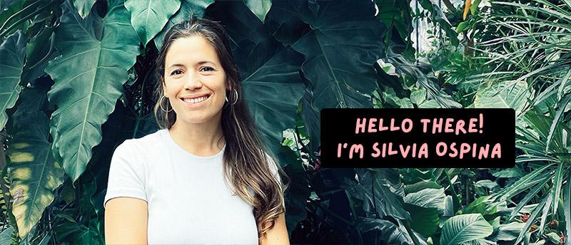
1. Introduction: Hi there. Have you ever heard about gouache? Gouache is an amazing type of paint which sits in the middle between watercolor and acrylics, having the best of both worlds. In this class, I will teach you how to draw and paint four different tropical leaves, and with each one, you will learn all the ways in which you can use these truly wonderful and versatile technique. You can use this collection of leaves to decorate your home, and bring some tropical vibes to it, you can give them to someone you love, or they can be digitized and used to create designs and patterns which are always on-trend. Hi, my name is Sylvia, and I'm a professional artist, designer, and illustrator. Painting is definitely my happy place, and nature is one of my biggest sources of inspiration. I have been working in the visual industry for 10-15 years now and started heavily painting botanicals when I started working for the textile industry about eight years ago. I have designed botanical patterns for global clients including Zara, Zara Home, Mango, and Primark. A lot of my paintings murals are full of foliage, like the one you see on the back. Having good painting skills is what has made my career as an artist and surface pattern designer so successful. In this class, you will gain the skills too. This class welcomes every level, whether you're a beginner who wants to learn how to paint, you're a hobby artist who wants to improve your painting skills, or you are a professional illustrator or designer who's looking to introduce hand painting as it's interior digital work, this class will be great for you. I hope that you can join me painting. I can't wait to see you in class.
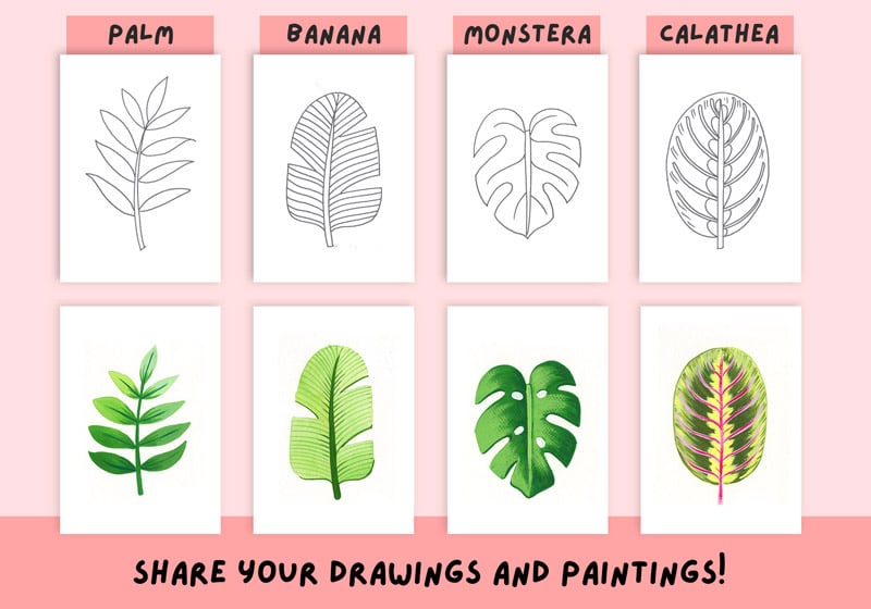
2. Your Project: Thank you so much for joining me in this class. I am very excited to have you here. Your project is to do four drawings and four brush paintings of different tropical leaves. We will start by drawing each leaf on a regular paper using a pencil and an eraser. Using regular printing paper will allow us to draw each leaf more than once, if necessary, without the stress of having to get it right from the first time. You will have a chance to fully analyze and understand each leaf and hopefully, this will make it fun and easy to draw them from memory in the future. Once you're drawing is defined, I will ask you to trace it with a black marker. You can do a lot with these drawings. You can use them as coloring pages, or you can turn them into repeating patterns with the help of my class, Repeat Patterns in Adobe Photoshop, incorporating hand drawn elements into Digital Design. I will talk more about this towards the end of the class. Please do publish these drawings into the project gallery as well as your paintings. Before we start painting, I will talk about what makes gouache so special and some challenges that you might find along the way. I will also dedicate a single lesson to prepare different shades of green using primary colors. Feel free to use a ready-made green if you prefer. Finally, we will start painting our leaves and with each one, we will see how to use gouache differently. We will paint some leaves using the gouache as if it was watercolor. In others, we will see the difference in between lighting up colors with white instead of water, and in others, we will use the dry brush technique to paint texture. You will see how versatile and wonderful this technique can be. Once you finish your drawing some paintings, please take a picture or scan them, if you prefer and upload them to the project under resources gallery. If you hang them on your wall or use them to make botanical themes or patterns, please share them as well as I would love to see how they look. To publish your project, you will need to do the following. Under the Project and Resources tab on the right, you will see a green button that says Create Project. Click on it and once you're there, you can select a cover photo and a title. In the project description, you can add some texts sharing about your process, something about yourself, or what did you enjoy about the class if you want. To upload your artwork, click on "Image", and then you'll be able to upload various images at the same time. You can also return to your project and add more later. Once you have finished, press "Publish" and your project will be shared. You can also scroll down the gallery and see what other students have done. You can leave them a like and leave a comment if you like what they did. Share some love. If you share your project on Instagram, you can tag me @silviaospina.art and tag Skillshare as well. I get super excited every time I see a project on social media and I promise to share it with my followers as well. If you share your project in stories, don't forget to tag me as well as I will re-share it with my audience too. If you have any questions, doubts, or need extra guidance along the way, don't hesitate to reach out to me using the discussion panel below. I can't wait to see your drawings and your paintings.
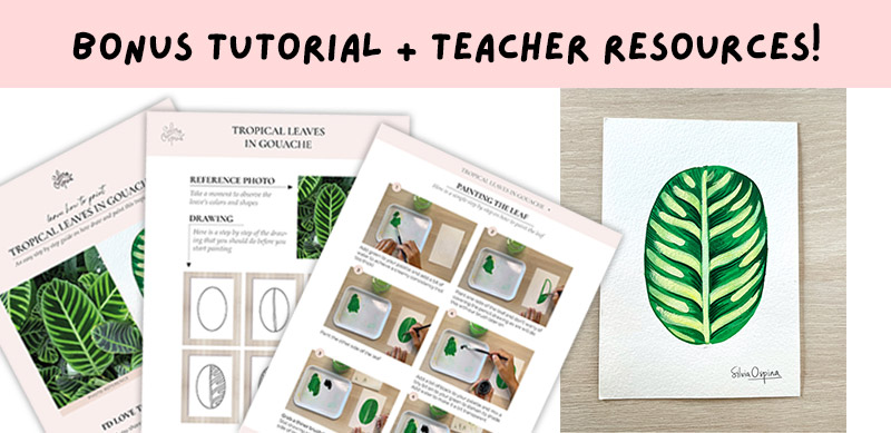
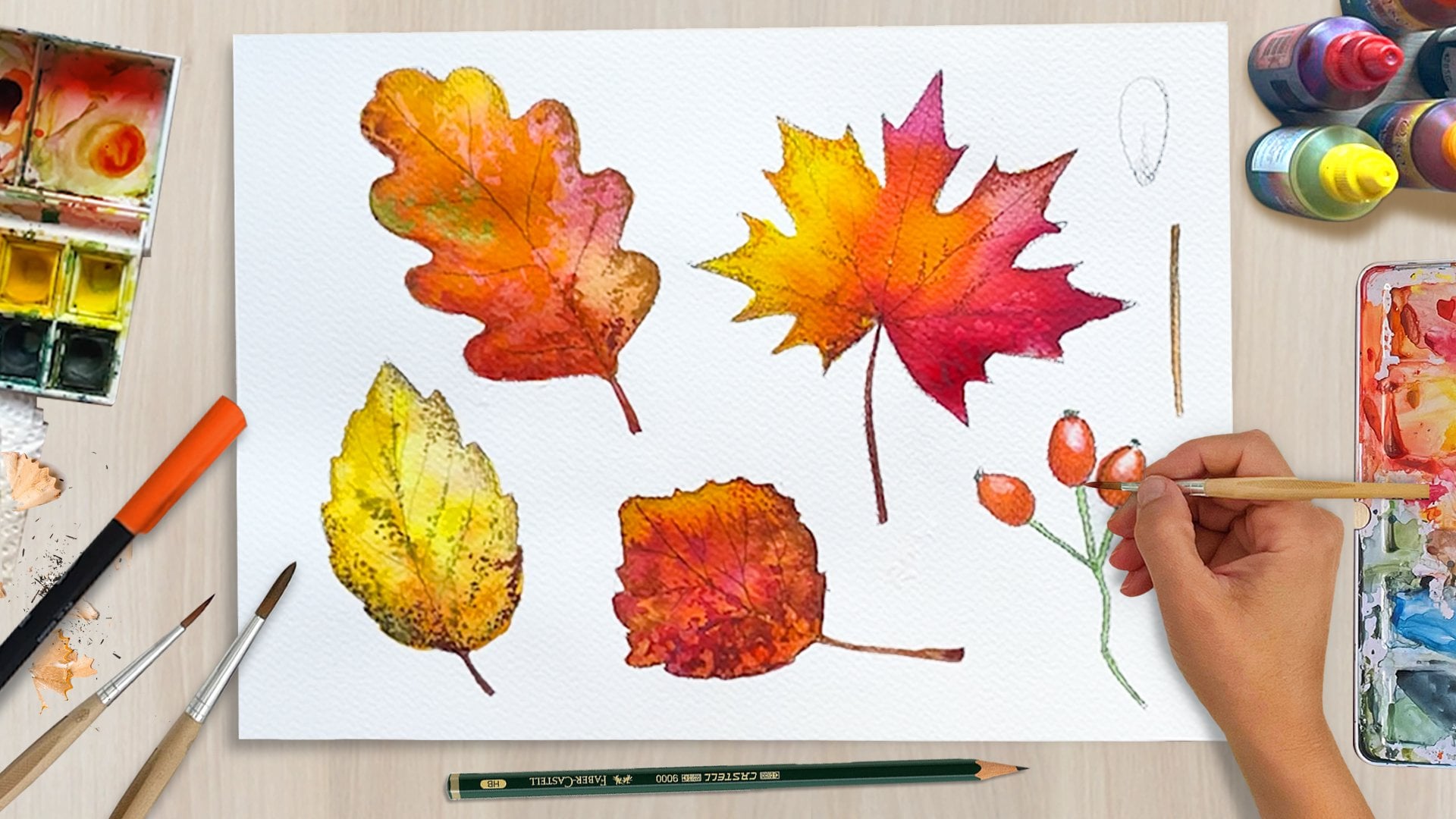
3. Tools and Materials: Let's talk about the materials that you will need for this class. To draw each leaf, you will need to have a pencil and eraser with you. You will also need some regular printing paper, and I would suggest having a few sheets for each drawing lesson. This will give you some room to experiment with different shapes, and practice them until you feel comfortable. To paint our leaves, we're going to be using gouache. I will be making a whole lesson about this technique. Let's talk about the colors that we're going to use. I'll be using this primary color set, which I found to be super popular in Barcelona. It's very affordable and really good quality. The brand is Royal Talens and it's actually the set that I learned color theory in school with. The pack comes with yellow, blue, and magenta, and then black and white. We will mainly be using yellow and blue, but I'll show you how to make different types of green when adding other colors. Knowing how to mix your colors can bring your artistic skills to a whole new level. Having said this, please feel free to use any premix green if you prefer. It's totally fine. When it comes to brands that I know and recommend, I've used Royal Talens, and Winsor & Newton. There are other brands like Schmincke, I don't know how to pronounce it. Designer Gouache or Schmincke Akademie. They are all good in quality and some are more expensive than others. For this class, we're going to use a round brush, which is one of my favorites because of how versatile it is. They're great for both painting bigger surfaces and details. You can use a number 6 or 8 for bigger surfaces, and 3-1 for painting thin details in a more comfortable way. When it comes to choosing paper, I always advice my students to use a 300 grams cold pressed paper to start with. This type of paper is very thick, and so it will allow you to use gouache in a similar way to watercolor. It will receive a higher quantity of water before bubbling. This paper has a medium grain, and it's good for both painting details and painting bigger surfaces. For this class, you can use any palette that you have or want. I have this plastic ones, but when I'm at home, I actually like to use any type of transparent or white ceramic plate. If you're going to use a plate, have in mind that green gouache might stain it, so either try it first or use one that you don't care so much about. As funny as it sounds, this is one of the most important things to have in hand when we paint. The amount of water or paint that our brush holds can vary from technique to technique, and having this paper to hand will give you more control over what you are painting. Two glasses of water. It's good to have in hand two glasses of water when you paint. One should be used to clean your brushes and you will see how the water gets muddy quite quickly, and we will use the glass which contains the clean water as a medium to make our paints more transparent or achieve lighter colors. This is one of the greatest tricks in gouache. Every now and then, spray a bit of water on your palette to prevent it from getting dry too quickly. One of the keys to painting in gouache successfully, is to let the first layers dry before applying the next ones. Sometimes having a hairdryer on hand can be helpful to dry your paintings faster, especially when you're feeling impatient. In the next lesson, I will show you where to gather inspiration from. I will provide a downloadable PDF with some reference images, but I will also show you how to get your own if you prefer. See you in the next lesson.
4. Gathering References: In this lesson, I'm going to show you how and from where I gather my inspiration. I will provide a downloadable PDF with some reference images that you can use to follow this class. My main three ways of getting inspired are walks. First and foremost, inspiration can be in the most unexpected places and all around us. Nowadays, pretty much every phone comes with a decent camera and so it's effortless to stop in any corner to photograph something that inspires, especially when it comes to botanicals. It's just a matter of keeping our eyes open and staying alert for the things that we're looking for. All these photos that you see in the screen have been taken with my phone. Books. One of my favorite places to find inspiration are often bookshops. There is nothing like being able to flip the pages and have time to stare at images on paper. Over the years, I have been gathering several books that I love to use as reference for different projects. Internet. Probably the most practical way of searching for a reference images is browsing through the web. My go-to Internet sites are Pinterest. This is a site that I visit the most when it comes to getting inspired. You can pin the images into boards and start creating your own collections. Getty Images. When looking for a good animal reference or plant references. I love sites with high-quality professional photos made by professional photographers. Since I am only going to use them as reference, I don't have to pay to download them. I can open them on my computer screen or download them to my computer with the watermark whilst I get my drawings right. Google Images. Google images gather all type of images and show me similar ones. It's an excellent site to get inspiration. I like to take the photos to inform myself rather than copying them exactly. Sometimes I've made photo-realistic drawings and paintings, but I really like the freedom of reinventing or redesigning the subjects myself. When I look for a reference, there are two main things that I'm aware of. The first one is the shape. The same type of leaves can vary in shape. Symptoms observing more than one photo can really help me to have a broader understanding of the features that make a leaf special. Colors and textures. The same way in which reference can vary in shape. They can also vary in inner texture and colors. That is why I also like to see various photos or see the plant firsthand to really understand and decide how to represent its color and texture. For this class, I have provided a couple of reference images that we can use together to draw and paint our assets. I have left a PDF in the project and resources gallery for you to download. You can also watch my screen and copy them from here if you prefer. In the next lesson, we're going to start drawing. Get a couple of regular printing paper sheets ready, your pencil and eraser, and meet me in the next lesson.
5. Design Your Class: Before we start our drawing and paintings, I want to explain how you can take the rest of this class. You can keep taking the lessons in a linear way. You will do all the drawings first on a regular paper. I will ask you to pass them onto your watercolor paper at the end of each lesson and leave it aside so that they are ready to paint. After hearing me talk about what makes gouache unique and learning how to prepare your green using primary colors, you will start painting the leaves one by one. If you rather do each leaf from the initial drawing to the final painting one at a time, feel free to alter the order of the lessons. I will suggest watching the lessons "Let's Talk About Gouache" and "Prepare Your Green" first as they will give you a good foundation for when you start your paintings. Then find the lessons which start with the same name. Once you finish one leaf, you can start with the next one. I will suggest sticking to the leaves' order, palm, banana, Monstera, and Calathea. As in the painting stage, the level of difficulty increases from lesson to lesson. I hope that this is not confusing you but rather giving you the freedom to design the class your way.
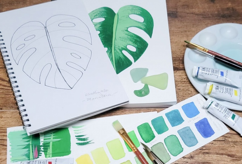
6. Palm Leaf: Drawing: Watercolor paper tends to be quite expensive, and it's very delicate and that is why I'm going to teach you how to draw each leaf in a piece of regular printing paper first, this will allow you to draw your shapes and erase them if necessary as many times as you want. Once you feel competent, you can transfer the drawing onto the watercolor paper using very soft lines. As I said in the previous lesson, you can download the reference image PDF from the resources gallery, where you can just look at my screen and follow what I'm drawing. Because we're going to be painting our leaves in an A5 size. We're going to practice our drawings in the same size. That is why I'm going to fold my paper into. This will also allow you to do your drawing more than once and practice your shapes until you feel comfortable. We want to draw our leaf big enough so that it looks well-placed in our paper, but also leave an imaginary frame around it so that it feels well composed. Palm leaves are composed of a central vein and then many thin lateral leaves. We will be simplifying it and roll less leaves on each side. The reason for this is because when it comes to painting it, I want to use each of these lateral ones to practice the different ways of using wash. I will start with a central vein, making it thinner at the top and wider at the bottom. Then I will draw four lateral leaves on each side of the stem, making sure that they are not too thin. Remember that I will use each of them to show you a different way of using wash. You can vary the shape in each one if you want. Finally, I will make a leaf on the top so that the palm leaf is complete. As you can see this is an interpretation of these, I'm not making exactly these bone leaves, but then that's the reason I like to do my drawing spaced on a different piece of paper. Because second, think about how to represent them in my own way. Towards the end of the class, I will show you how you can use your drawings and paintings in a fun and creative way. That is why I'm going to ask you to trace your drawing with a black marker or pen and erase the pencil marks that are left behind. Once you've learn and practice the palm leaf drawing, you should pass it onto your watercolor paper to transfer your drawings, you have two options. You can either draw your leaf again or trace the palm leaf that you have already done. I'm going to draw it again because the shape is very easy. This way I get to practice it once more. This time, I'll make the lateral leaves even broader and thicker so that there is more area to paint. If you want to use the same drawing that you have already done, you can trace it easily. Here's how you can use either the window or a screen like an iPad to trace your drawing onto the watercolor paper. Place your watercolor paper on top of your drawing, and then use a window so that the lines become visible. You can also use an iPad screen to do this, and it will do the trick. Just make sure that the iPad screen is brighter than the room that you're in. To see the drawing, clearly, make sure to draw very subtly with your pencil to avoid leaving any marks on your paper. I will use a 2H pencil because it's very soft. If you only have a B1 or an HB is totally fine, but you will have to draw even softer to avoid leaving any marks. When you finish passing your drawing onto the watercolor paper, put it aside with your drawing and get another piece of paper ready for the next lesson.
7. Banana Leaf: Drawing: Now we're going to draw a banana palm leaf. I love this plant and I use it quite a lot when I want my paintings or design to look very tropical. I want to share with you how to paint one in an easy way. Banana leaves can vary a lot in shape. Some of them are longer and have divisions on them and some of them like the one on the photo I took are a bit wider. In this lesson, we're going to take these photo as inspiration and add some leaves divisions to it. I will start by drawing the central vein in the center of the paper. Like the one in the palm leaf, is thinner at the top and wider at the bottom. Now I'm going to draw the silhouette. I will start by drawing the top, is like an inverted U, more or less. It's rounded at the top, and then it has this curve in here. It goes flat and then it has another level curve. It has a curve and then it ends up front. Remember that it doesn't has to look exactly the same. We're just looking at the main characteristics to guide us to create the banana palm leaf. One of the features that I love more about these plants is these divisions. The easiest way of doing these divisions is by drawing horizontal or a bit angle triangles on each side. I'm going to start by making one here for example. You can also curve them a little bit so the plant looks a little bit more dynamic. I'm going to create another one on this side and maybe just one on the other side. Once the triangles are made, I will erase the silhouette part within to create the divisions. Now we have our silhouette ready. Another characteristic of this plant is the inner texture. We're going to draw some inner lines in here. I will make mine a bit rounded at the beginning and then straight. I think that these triangles help you create in good direction of the inner texture. For example, this first triangle, I did it straight, so it doesn't make much sense to curve the inner texture a lot. If you're not sure about what to do with this part of the inner texture, you can leave it there or you can just add a little line to connect it with this central vein. That's it. That's the banana palm leaf ready. Remember that you can use this other half to try and make one again if you're not happy with your drawing. I'm going to quickly show you how to draw this palm leaf from the side. I'm not even going to have the photo as a reference. It's really easy. It's grateful when you want to create a composition with more than one leaf and make it look a little bit more dynamic. It's basically only drawing half of it but then curving it a little bit. Remember that the stem or central vein is thinner at the top and wider at the bottom. You can follow these initial curve, second curve, and then top part, and then you will get the main silhouette ready. Then you can draw these triangles starting and ending from the outside part of the silhouette and erasing the line in between, and lastly, at the inner texture. That's it. You have the palm leaf from the side. Now we're going to transfer the drawing that we have just practiced, this one, onto the watercolor paper. Remember that we can draw it again or trace the drawing that you have already done. Also remember to draw very softly with your pencil onto the watercolor paper. Again, I'm going to grab my [inaudible] pencil and start drawing. I'm not going to draw the inner texture lines as we'll do this later with the brush. If you feel uneasy and don't have much experience using brushes, it might be a good idea for you to draw these lines, even software to serve you as a guide later. Remember to trace the drawing that you did on the regular paper with a black pen or marker as well. Leave these drawings aside with the ones from the previous lesson and grab another piece of paper. In the next lesson, we will draw the Monstera leaf.
8. Monstera Leaf: Drawing: Now we're going to draw the monstera leaf, another one of my favorites. This plant will make everything look tropical. When designing this class I decided to give myself a treat and decorate my room with one of them. I just really loved them. A couple of years ago, I designed this print for [inaudible] with some of them and so I'm really excited to teach you how to paint one in an easy way. To draw this leaf, we will use the same method as we use for the banana leaf. Before we start, let's see what's the best way to compose this drawing within our paper. This plant is not so elongated, but rather a bit more squared. It's just good to have that in mind when we do our drawing. I'll make these two little marks as guides so that my drawing has a similar distance on the top and bottom of the paper. Normally, these plants are very heavy, which causes them to look down. To create the central vein, we're going to draw it wider at the top and thinner at the bottom. I'm not starting my central vein too high because as you can see, where the central vein ends is not the top of the leaf so just have that in mind. This plant has a bit of a narrow heart shape. Or at least that's the way I see it. I'm going to create these two marks to make sure that I don't surpass them. I'll start by making a half circle on the top and then draw the bottom part. I'm going to erase the silhouette and redraw it until I feel happy with how it looks. Take your time drawing and enjoying the process. Now that this silhouette is ready, we can start creating the leaf divisions which are much softer than the ones in the banana leaf. You can think of them as very long inverted U's. Sometimes I like to relate different features to things that I already know so that I can remember how to draw them in the future. I'm going to create two on this side and three on the other side. Once you like how the divisions look, you can start erasing the part within. Lastly, I will make these lines in between the leaf divisions that I see in the photo. I don't think that I'll paint them, but I like how they look into drawing. When you want to create these plant on the side, you can use the same trick that we used when painting the banana leaf. You can paint only half of it and curve the main vein so it looks like it's falling. I will start by drawing the central vein curved, looking down wider at the top and thinner at the bottom. Then I will draw half a heart, then the inverted leaf divisions, which look like U's, and then the secondary veins. Great. Monstera leaf ready. You will have to transfer the drawing onto your watercolor paper. Again, you can do this as you wish. You can trace it with a black pen and then use an iPad or a glass to help the drawing see-through or draw it again and practice once more. Once you have your drawing ready put it aside and have another piece of paper ready for when we start the next lesson.
9. Calathea Leaf: Drawing: Now we're going to draw the Calathea leaf. Unlike the previous two plants, these one has a very simple oval as a silhouette. The interest of this leaf is in its inner colors and textures. When it comes to painting our leaf, we will make these textures and colors using our paints and our brushes. But in order to feel more confidence, we're going to analyze and learn how to draw these characteristics first. As always, try to leave a bit of a similar distance in between the top and the bottom. I'll do my central vein and then draw an oval around it. I will also make one mark on both sides to make sure that I don't go over them. The sidebands are basically pronounced diagonal curves. They are curved, they go from the bottom to the top, and they also have a bit of a similar distance in between them. With that in mind, I can give myself the freedom to do them as I want and also experimental little bit with them. Even if I have to erase afterwards. Then we can find these bright yellow areas towards each side of the center. We will create these with our own brush, but for now, I'll draw them as little curves. Some of them look like little hearts. Lastly, I will add some lines towards the end of the leaf to simulate this texture that it has towards the end. Once you finish, pass your drawing onto the watercolor paper and trace your initial drawing with a black marker. Here we have finalized our drawings. I would love if you can share your drawings in the project and resources gallery. In the next lesson, before we start painting, I will talk about what makes gouache so special.
10. Let's Talk About Gouache: Our leaves are ready to paint, but before doing so, we're going to talk about gouache. It's always good to know the paints that we're using in order to understand it and make a better use of it. Gouache is an amazing type of paint which sits in the middle between watercolor and acrylics, having the best of both worlds. The main characteristics of the gouache technique are first, it's consistency. Both watercolor and gouache mix pigments with gum Arabic. If you add more water to your gouache, it will look more like watercolor, and if you add less water, then your consistency will look and feel more like the acrylics or oils. When you use gouache with less water in a more thick and dense way, gouache becomes opaque. This allows you to superpose colors in different layers, uncover the colors that were previously painted. Gouache dries quickly. This makes the painting easier to handle, but it also means that your palate will get dry very quickly. To avoid this from happening, it's great to have a spray bottle to hand and gave a spray to your palate once and again. This will maintain your colors moist and they will last longer before drying out. Gouache is water soluble even when it's dry. For example, this palette is dry. If I apply water to it or even dipping my brush in water, I can use this paint again, which is awesome. But this same thing can also happen with your artwork. If you apply a very watery layer to a thick layer that has been painted previously, you might find that your brush starts picking up the paint that has previously layered. The trick to avoiding this is to plan your painting well and apply the top layers thicker than the ones below, unless you want them to dissolve. When gouache dries, it has a beautiful velvety opaque finish. When it comes to digitizing your paintings using your phone camera, for example, it makes it much easier as they are not glossy. Acrylics, for example, they're glossy and sometimes it can be difficult to just take a photo and get it right. When gouache dries, the colors can vary a lot. Some of the colors dry darker and some lighter. A good way to handle this is having a secondary piece of paper and try your colors before you paint in your artwork. I will use every leaf to teach you a different way of using gouache and you will get to experience and make the most out of these challenges. In the next lesson, we're going to prepare the main green that we're going to use. If you want to prepare the green with me, have your yellow and primary blue gouache ready and meet me in the next lesson.
11. Preparing Your Green: This lesson is specially made for those students who have a set of three primary colors, glass, black, and white and want to learn a bit of color theory. You're welcome to watch it if you have a ready-made green as well of course. Learning how to prepare your own colors can really push your artistic intuition and skills into a higher level. To prepare a green, we're going to mix lemon yellow, and light blue or cyan. If you look at this color wheel with these two colors, you can achieve a variety of green shades. These are the best yellows and blues to make green. Your green will probably vary depending on the ones that you use, but they're all great to achieve bright and vibrant greens. I'm going to use these plastic spoons that I once recycled after having an ice cream. This type of glass jars is very affordable and its quality in relation to the price is great. The inconvenience is that when you're painting and you run out of paint on your palette, it is very easy to feel tempted to take more out of the jars using your dirty brush, staining the paint that remains inside. If you're using jars as well, I will suggest that you find some spatula or spoon and keep it near so that you can use it whenever you need to extract some more paint from your jars. I usually use a spoon for each color. To prepare my green, I will start by adding some yellow and blue to my palette, leaving a good amount of space in between the colors. Gouache goes along way. You don't need to use a high amount of it to create this exercise. The quantity of yellow will be higher than the quantity of blue. You only need a tiny bit of blue to achieve lighter shades of green. You'll see what I mean in a minute. I will expand the yellow along the palette and stop before getting to the blue, leaving a bit of space. We will use this yellow striped to prepare four or six shades of green in-between the primary colors. I'm going to use my paper in an horizontal way so that I have more space to paint more swatches. I will start by adding a bit of water to the yellow and paint a yellow gouache on a piece of paper. The consistency of your paint should be creamy so that you get bright and opaque colors. For the second swatch, I will add a tiny bit of blue to the yellow stripe, leaving the first part of it clean. Before touching the yellow with a blue, check the amount that the brush is holding and if it's necessary, clean it to take out any excess with kitchen paper. If you add too much glue, your green will instantly get dark and it will get a good amount of yellow to make it light again. Add a bit more blue to the third part of this stripe. Once your yellow is looking like a medium light green paint a third swatch. The aim is to darken the green very gradually and try to control as much as you can, the amount of blue that you use, especially when it comes to preparing the very light green yellow shades. Keep on painting squares until you achieve a scale of greens that go gradually from yellow to blue. You will see that the amount of blue needed will be higher every time. At the end, the amount of yellow dye you will need is almost nothing until you get to the blue. In this lesson, you can start experimenting with the consistency of your paint. Now that you have seen how to prepare a bright sets of greens, I'm going to show you how to achieve a more earthy and olive tone. For these, I will introduce the third primary color, magenta to my palette. If you don't have magenta, you can also use red or orange to complete this exercise. With each color, I will drag the paint down my palette so that you can see how the color changes when you add the third primary color to it. The same way that I was being careful with the amount of blue that I was using to darken my green, I'll have to do the same with the magenta if not more. If you use too much magenta, you will get a very muddy brown color, which is not very nice. If this is a case, don't be afraid to use a bit of absorbent paper to remove it from your palette and try making the mix again. To start a second row, I will paint a yellow swatch below the first one. I will add a tiny bit of magenta to the second light green until I achieve a khaki or very light olive tone. Then I will keep mixing magenta to the rest of the row to alter their tones gradually. If you see that after a painting a swatch, this one looks too similar to the one in the row above. Try adding a bit more of magenta, blue, or yellow to the mix and paint a second layer to the swatch. After all, gouache is opaque, so why not do it? If you feel that you are running out of paint, don't be afraid of adding more primary colors to your palette. Remember to add a couple of drops of water to your mix if you feel that it's drying out. See how when picking up magenta, I paint a couple of dots in the bottom to extract some paint out of the brush before touching the green. The idea of this exercise is for you to experiment with colors and start understanding how much of each primary color you need to achieve each tone of green. When mixing colors with your brush, this one tends to hold a lot of paint. By rolling the brush and making some pressure to it, you'll be able to take the excess out of it. You can add a third row of swatches and forth if you want. You can see that the difference in between the two rows is very subtle but still noticeable. When painting leaves with one or another, the result can vary a lot. I hope that this exercise can help you to make mindful decisions about your green color and how to use it. I've also prepared a higher quantity of green and I've kept it in this jar to prevent it from drying too quickly. I did it because I was finding difficult to keep on taking paint out of these two yellow and blue jars. I was making myself and my brushes a mess. The idea is to prepare a neutral green. You can take one of the swatches of the middle as a guide for achieving the mid-green tone. It's better to add the yellow first to your jar and then start adding the blue gradually. In the next lesson, we're going to start painting. Prepare the palm leaf that you did in the watercolor paper, your palette, your brushes, two glasses of water, and a couple of pieces of kitchen absorbent paper. You should also have a separate piece of watercolor papers to try your colors out. You can also prepare a hairdryer as it's a good trick to make your paintings dry before adding the next layers to it. See you in the next lesson.
12. Palm: Lighten with Water: I decided to start with the palm leaf as I thought that it would be a great way to start learning this wonderful technique. This palm is divided into two sections with small lateral leaves and I thought that we could use each of them to try a different way of using wash. In one half, we will use water as a medium to lighten up our colors. In the other half, we will add white to our green to create lighter shades and you will see and understand the difference of working both ways. I have two glasses of water. One will be to clean my brushes and the other one will be to make my colors lighter. I'm going to use a brush number 6 to paint the leaves. I will add a bit of the neutral green that I prepared in the previous lesson to my palette. I will clean my brush as this time I didn't use a spoon, and start adding clean water to the palette until I create a small pattern. As we saw when preparing our green, it is much easier to make a color darker gradually, than to lighten it up. To achieve a very pale green, it's better to add the green to the water and not the other way round. When you see that you achieve a very watery light color, try the color on a separate piece of paper and paint the first lateral leaf when you like how it looks. It's easier if you start from one side and move the water droplet until you reach the other side. If you're finding it hard to paint the borders of your leaves, it might be because your brush is holding too much water or paint. If this is the case, simply grab your absorbing paper, and take the excess out of it. Add a bit more of green to the mix, and when it looks darker than the first one, paint the second leaf. With this side of the palm, the idea is to achieve four different tonal values of the green that we already mixed only using water. It's a good practice to test your colors before applying them to your painting to avoid surprises. Add more green to the water and paint the other two. The darker the green gets the thicker the consistency becomes. As you can see colors can be made lighter when using water. More water, less pigment equals lighter colors, a thinner consistency, and then being more transparent. If you have less water and more pigment, the darker the colors will be, the thicker the consistency and the mix will become opaque. As you saw, we didn't have to add any white to our mix to achieve light colors and yet the range of lightness that you can achieve this way, is very rich. In the next lesson, we're going to paint the other side of our palm leave, but we're going to add white to make our leaves lighter, so you can see the difference.
13. Palm: Lighten with White: For these other half of the pound leaf, we're going to try to achieve similar shades, but instead of using water as a medium to lighten up our colors, we're going to use white. The difference between these two ways of using gouache is quite remarkable, and I'll talk about it once we've finished this lesson. I'm going to add some white to my palette and use the green left from the previous lesson. Remember that a real gouache goes a long way. I will start by adding some water to the white gouache to achieve a creamy consistency and start adding a bit of green to it gradually until I achieve a tone that looks very similar to the first lateral leaf painted on the other side. When mixing the paint with my brush, this one tends to hold a lot of paint. By rolling and making pressure to it, I can take the excess out of this, and this weight the borders of my leaves will be easier to control. Paint the first lateral leaf and let it dry. see what happens to the color. I don't know about you, but I feel that the mix that I prepare was looking lighter and more similar to the leaf on the other side, and now that the paint has dried, the color looks darker. When you use white to lighten up colors, they tend to dry darker, that is why it's good to test the colors on a second piece of paper and check how the color looks once they're dry. When I started painting in gouache, I found these quality challenging as my colors were difficult to control. But once I understood that it was normal, I could manage it better and feel more confident. Seeing that the color got darker, I will add more white to my mix and paint the top leaf. Paint the other three lateral leaves trying to achieve a similar tone to the ones on the left. The consistency, opacity, and color change when using gouache with water or gouache with white. They can vary a lot. The good thing is that when you know and understand and control the differences, you can make mindful decisions about how to manage your paintings regardless of the way that you're painting. You can take advantage of these challenges and avoid surprises which could lead to feeling frustrated because of having unexpected results. Lastly, I will grab some neutral green and paint the central vein in an opaque way. See how I have to stop gradually to grab more paint with a brush. The key takeaways of these lessons are; if you use water, your paint is transparent and when you use white, your paint becomes opaque. This is great for when we use layers and want to cover dark areas with light areas. When we use white to lighten up colors, the color changes when it dries. So getting used to trying out your colors on the second piece of paper before adding them to your painting can avoid surprises. In the next lesson, we're going to add the central vein and then add a couple of details so our leaf gains volume.
14. Palm: Final Touches: Now we're going to add some details to our leaves. First, I will add a bit of shadow towards the center of the leaf, and then I will paint a theme being in the center of each lateral one. Once more, we're going to be invariant our green, and it's good to test how it looks or how it dries in another piece of paper first. To paint these thin lines, I'm going to use a brush number 1 or 3. But if you don't have one, you can use the same round brush that you use to paint the big areas. It will take a little bit more of control, but it's totally possible. I will grab a bit of neutral green and add a bit of water to it so that it's not too thick. With this mix, I will add some strokes towards the inner part of each leaf. If you feel uneasy, you can always create this exercise on a different piece of paper first. If the position of your hand is feeling uncomfortable, try rotating your paper. The idea is to create two or three marks in each leaf so that you start seeing how to use layers in gouache. This time, I'm using my mix in a watery, transparent way so that it's not too strong and contrast it. Normally the top layers should have less water to not dissolve the layer below. But because these details are very thin and delicate, I like it more this way. As I'm using the same green tone that I used for the opaque bottom leaves, I will add a bit of blue to my palette to create a darker shade. This way the ones on the bottom will gain a bit of contrast. Lastly, I will grab a thicker mix of green and create an inner vein in each leaf. I will apply more pressure at the start of the leaf and then lift my brush completely before reaching the end of it. If you feel that your paint is not running and disappearing halfway, add a tiny bit more water to your mix or if you prefer to keep this raw beautiful texture, go for it. These details are completely optional and you can decorate your leaf with your brush as you want. Gouache is awesome for drawing, and so if you want to put dots, stripes, or more than one vein, that's cool as well. You might be getting this beautiful texture when using a thicker and more opaque paint. This happens when your brush is getting dry and we'll be using this resource a lot in the Monstera and [inaudible]. Nice, we have finished the palm we're painting. I hope that with this exercise you have started to understand the different ways in which you can use gouache. For the next lesson, we're going to start painting our banana leaves and use gouache as if it was watercolor only. I'm going to ask you a couple of things before we start. Clean your palette, at least the one in which you're mixing your colors. We don't want to have any white in the palate, and so it's better to start the lesson with it being cleaned. Check that you have one of the two glasses with clean water. We're going to be using it as a medium to lighten up our colors and having it dirty might make your colors look muddy.
15. Banana: Gouache as Watercolor: In this lesson, we're going to use the gouache technique in a very similar way to watercolor. Going from light to dark, we will be using the white of the paper to lighten up our colors. For our first layer, we're going to apply the paint in a very watery lightweight. I found this photo on the Internet and I really love the bright yellow lemon tone of these pumps. I also like how in some of them the background color is lighter, and then the texture lines are a bit darker. Thinking about what you want to achieve can help you to plan your painting. Add a bit of yellow to one side of your palate and a bit of green to the other. Clean your brush and add some clean water to the center of your palate. Now mix a tiny bit of yellow to it and only a tiny bit of green afterwards. Remember that it's easier to darken our colors than to lighten them up again, so by applying the water onto your palette first and then mixing some pigment to it, we can start to darken our green and test it on a different piece of paper until we like how it looks. Colors don't change when we don't add white to it, so in this lesson, we don't have to worry about that. We're going to do section by section and try to vary the yellow tone a bit on each one. I will start by the top-left and go down. Don't worry if you go over the central vein as we're going to cover this area with a darker and more opaque tone. Remember that if you're struggling to paint the borders, it might be because your brush is holding too much water, and it will be more difficult to control. Take the excess of water out of it and keep painting. Don't worry if there are any stains on your leaf there. Learn to embrace texture, particularly when you are painting botanicals as nature is full of it. Once inside of your leaf is ready paint the other one. Try to keep varying your green slightly as these will make your palm richer in tones, you can create the gradients on your palette and then add those tones of greens into your palette. As we did this layer very thin. This layer should be dry by now. But if it hasn't, let it dry completely before you start the next lesson, we're going to draw some thin lines with a number three or one brush inside our palm and exercise our precision skills this way.
16. Banana: Adding the Inner Texture: For the inner texture, I'm going to add a bit more of pigment to the water mix and try it on a second piece of paper to see its opacity. I want this color to be a bit darker but not completely opaque. We're going to use our brush as if it was a pencil and draw the inner lines. I'll be using our brush number 3. But if you don't have one, you can also create a texture using the same thick round brush that you were using. The trick to get a thin line with a bigger brush is to take the excess of water out of it. You will see that this way the lines are easier to control. If you feel uneasy drawing these lines, you can practice on a different piece of paper first and move on to your plant once you feel comfortable. To gain line precision, make sure that your hand is lying on the table when you draw with your brush. If you still feel uncomfortable with the idea of drawing the lines directly on your palm, you can draw them subtlety with your pencil and then paint over them. Another trick is to rotate your paper until you find a position that feels comfortable to your hand. I'm going to place my drawing by my side to have as reference to draw the lines. I will start from the top and move down to the bottom. The consistency of my paint is very watery. The tone of the green is darker, but as I want the lines to blend and look natural, I'd rather keep using my paint in a transparent and delicate way. Don't worry if you go over the central vein as we're going to cover this area in the next lesson using some opaque paint. You can vary the tones of the lines every time that you have to stop to grab more paint. Once you've finished one side, you can start with the other. If you're struggling, check the way in which you're holding your brush. Remember that you can use the line divisions as a guide to how curved your lines should be. This is a really good exercise to practice your line precision. In the next lesson, we're going to add the central vein and then add a couple of details, so our leaf gains volume.
17. Banana: Final Touches: Now we're going to make some final touches to our leaf. In my reference photo, I can see that the central vein is light, but the background of my leaf is already light yellow. I'd like to make mine a bit darker. I like to give myself the freedom to paint things as I want to, and not to copy them exactly from the photo. To darken my green, this time, I'm going to use a tiny bit of magenta. Adding the third primary color to my green will make it look a bit more neutral and give it an earthy tone to it. If you want to follow me on this one, you will have to be super careful to not add too much magenta to it. Otherwise, you will get a not very nice brown, muddy color. If this happens, simply add a bit of green or yellow to your mix and try your color on a different piece of paper until you like it. If you don't like this color at all, you can also discard it and mix a new green that you like using only green and yellow. I'll paint my central vein with this darker shade of green. If you prefer, you can also paint your central vein with a lighter color. There's no rules in here. I am doing these exercises for you to get to play and experiment with different ways of using gouache and colors. But you're free to do whatever you want to your own paintings. I'd like to give my leaf a bit of volume and I think that I can achieve this by darkening only the initial parts of the texture lines. I will add water to my darker green and layer some paint in the initial parts of each line. If you're following me at home, don't worry if there is a hard difference between the darker and the green that was applied before. In real life, you have hard shadows and these can look very natural. Lastly, I will draw a line in the bottom part of each leaf division. These will give even a bit more volume to it, making it look as if it had the light coming from above. I hope that you've enjoyed using gouache as if it was watercolor and have seen the benefits that it can have. The style of this painting is usually very delicate, and the success lies in being patient when applying your layers. In the next lesson, we're going to paint them on steadily using gouache in a darker and more opaque way. You don't necessarily have to clean your palette this time unless it is too covered in paint, and you feel more comfortable starting fresh. Get your ones that are leaf drawing ready and meet me in the next lesson.
18. Monstera: Uniform Background: Now, we're going to start painting our Monstera leaf. This time, we're going to thicken up our gouache so that the consistency of our paint is more opaque and dark. I'm going to spray my palette to activate the paint from the previous lesson. I'm going to get rid of this magenta around the corner as this time, I want my green to be bright. I will add a bit of neutral green to my palette and add water to it until I achieve a creamy consistency which is not too watery but it's not too opaque either. I'm going to ask you to paint two rectangles on a different piece of paper. This will help you see if you like the consistency of your paint, and we will use them to try the dry brush technique in the next lesson. When you get a runny and opaque consistency, paint the whole background of the Monstera leaf in a fairly uniform way. Paint from the top part to the bottom, starting from the top left, if you're right-handed, and do it the other way round if you're left-handed. If you paint each section separately, moving from the outside to the inside, the whole painting will be easier to handle. In some sections, you can try moving your brush from the outside part to the inside part, and in other sections, you can try drawing the border with your brush and then filling up the inside part. You don't have to leave your central vein uncovered as we will paint these last thing. If you're getting marks or stains, don't worry too much. It's better not to overwork your layers and do them in a fairly organized way, plus, we will be covering this layer with more paint on the next lesson so the marks won't be too noticeable when the painting is finalized. Once you're finished, let your painting dry completely. It should be completely dry before you start the next lesson. If you're feeling impatient, you can dry it quicker using a hairdryer or make yourself a cup of tea or coffee.
19. Monstera: Dry Brush Technique: Now that our background has dried completely, we can start adding lights and shadows to our leaf. In this lesson, I'm going to teach you how to use the dry brush technique. This technique is truly wonderful and it's one of my favorite ways of keeping texture to my paintings when I'm using brush, we will use these techniques to give shadows and lights to our leaf and practice both using a lighter and a darker shade of our previously mixed green. First, we will focus on painting the light parts of our leaf where the light is reflected. I will add a bit of yellow to my palette and create a good amount of lighter green. The consistency of your paint should be thick and creamy. When you mix your paint with your brush, it's good to roll your brush, applying a bit of pressure to get the excess of paint off. Grab the piece of paper where you painted the squares and draw a stripe with pale green over one of them. Let it dry and check how the color dries. If you don't see enough contrast between the two, add more white to your mix until your color looks lighter and paint another stripe. Remember that when you lighten up your colors with white, they tend to dry darker. See that in my palette, I cannot see any white marks as in the green part as the word dry brush technique describes both your paper and brush should be dry. I'm happy with the opacity on contrast of this third stripe. Now I'll show you how to paint with a dry brush technique. I will grab some paint with my brush and dry it a bit with my absorbent paper. When painting these stripes I'm pressing the brush at the beginning and then lifting it towards the end of this square. If you're doing this exercise at home, you should see these squares gets full of texture. If you're struggling to achieve this texture, you might be because your brush is holding too much paint or water. Try to dry your brush with absorbent paper and paint some stripes until you get it. Keep playing with your paint consistency, and try changing your brush for another if you're still struggling to achieve it. Once you're familiarized with the texture, grab your monstera leaf. On each leaf division, start from the outer part, pressing your brush at the beginning and lifting it whilst moving towards the inside. You should not surpass the center of each leaf section or cover the green applied in the previous lesson completely. If you use very little pressure on the brush, the texture of the paper appears beautifully. Not every division has to be the same. You can apply more paint and create a stronger gradient to some of the lip divisions and leave others with less light. For me, this technique was the one that made me fall in love with gouache. I feel that it's what makes it different from watercolor and acrylic. If you're using hot press paper with no texture in it, this effect might be much smoother but equally beautiful. Once you finish the sides, start with the center. If you lost your middle mark completely, you can grab your pencil and draw it again, as these will serve you as a guide. Make some brush strokes from the central part of your leaf, moving to the outside part of it. You can try curving your brush a bit and follow each lead division. Remember to press your brush at the start and lift it as you move through the plant. Once you have applied the lights to your leaf, we're going to move on to the darker areas. First, we are going to darken our green by adding some blue to the initial green mix. If you're curious to get other types of green, remember that you can use a tiny bit of magenta, black, or blue to the mix. We're going to repeat the process that we did in the light green, but with these darker one. First try the color and the consistency of the paint in the second square. Check that you like the contrast and that you are getting the dry brush effect when painting your stripes. This first brushstrokes look too dark. I'll balance the color with a initial green until I get a less contrasting color. Once you're happy with both the consistency and the color, you can move to the leaf. Start painting the leaves divisions from the outside to the inside part and ensure that you don't surpass the middle areas. You can rotate your paper until you find a position that feels comfortable to your hand. If your brush is holding too much paint after creating the mix, take the excess of color out of it using absorbent paper instead of water. Remember that your brush needs to be dry. We'll do the same process that we did with the light areas, but the other way round, start with the leaf divisions moving from the outside to the inside and make sure that you don't surpass the middle area. You don't want to cover you initial layer completely. If you ever feel that you're not getting the texture, paint some brushstrokes on the second piece of paper until you get it and then move back to your leaf. Once you've finish moving to the inner area. As you can see it, this way of painting lights and darks has brought a lot of volume to our leaf. In the next lesson, we're going to add a couple of final touches to our leaf, which are completely optional. Let your leaf dry completely, and see you in the next lesson.
20. Monstera: Final Touches: Now we're going to paint the central vein and this time you can use a neutral green that you prefer. For this next step, your leaf should be completely dry. I'm going to mix a very opaque and light green for the central vein. The consistency should be very thick to prevent peaking the layers below with the brush. Trier paint in a second piece of paper to see its coverage. It's better to stop regularly to pick up more paint than applying too much pressure to your brush. This is the third layer, so we should be mindful about our paint and brush to prevent picking up the color below. I'm done with the central vein and I feel that it is blending with the light area. I will grab a tiny bit of darker green and draw a very thin line with my brush on its side. I am adding water to my mix so that the line isn't too opaque, but rather looks like a shadow. Some of these leaves have these holes on them. I was not planning to paint them, but now that my plant is finished, I'd like to paint a few. I would suggest that you look at what I'm doing first and don't follow me until you see the final result. I will draw the circles first with a pencil and then paint them grabbing white directly from the jar. The coverage of white gouache is incredibly higher than the one of acrylics. Covering a dark area completely with pure white would have been very difficult in any other technique. This is one of the things that I love about gouache. I'm using my brush very softly and not applying pretty much any pressure to it. White is easily stained. If my brush picks the green below, it will look dirty. As always, you can try painting these areas on another piece of paper until you feel confident. As I wasn't planning to paint these ovals, I felt that the green left in between them and the end of the plant might be too thin. I can fix this easily by thickening them using the neutral green that I used to paint the first layer. Lastly, I will paint some very thin lines on the bottom of each leaf division to add some volume to the paint. If you like the final result, you can go ahead and paint the ovals and shadows to your leaf. In the next lesson, we will start painting color barely and bring our layers to the next level.
21. Calathea: Gradients In Situ: In this lesson, we're going to start painting our calathea leaf. This leaf might seem more challenging to paint because of the inner level of detail, color, and texture. But by planning the painting well and using layers, the painting becomes more manageable and the final result is beautiful. I also bet that at this point, you're feeling more competent using wax than when you started this class. This time, I'm going to have the reference photo by my side as I want to paint its features in a realistic way. Before we start, why don't you grab the green page of swatches and decide which green tones do you want to paint with? Thinking about this beforehand can help you to plan your palette in a better way. As I want to stick to how my reference looks, I think I'm going to go for the row below. I will add white, my premix green, yellow, and as I want to achieve an olive green for this leaf, I will add a tiny bit of magenta to my palette. In this lesson, I will paint the background and forget about the bright yellow central areas and the pink veins. It will be easier to paint them as layers once our background is dry. It's generally easier to cover light areas with dark colors. I will start by painting the outer part of the leaf. I'll take my time to mix a light olive green and check that I like the consistency of the paint. I don't want it to be too thick as we're going to be layering colors on top of this one. You can manage your paint in whichever way it feels easier for you. I find it easier to draw with my brush, the border of the elbow first and then do some curved brush strokes starting from the outside and moving inwards. For the center of my leaf, I will make some very dark green so that when we paint the yellow central areas and the bright pink veins, they will look contrasted. I will paint my brushstrokes following the direction of the pink veins starting from below and ending higher. After finishing the second half of the leaf, I realized that I like its contrast more than the one on the other side. In the first half, I feel that I overdid the border and covered the initial color too much. It is better to work on the first layer and be happy with how it looks before moving on with the rest of the painting. I'm going to paint on top with a bright light green again and with the help of a flat brush. I won't overdo it as I can always add a couple of lighter touches in the end, if I feel like I need to. I find it difficult not to be too perfectionist or get too attached to how I want my leaf to look. I have learned to allow the painting to evolve and trust that it will look great once it has been finished. Having said this, I sometimes get frustrated and have left paintings halfway because of that. If you feel something similar, then know that these things can happen even after years of experience. In the next lesson, we're going to paint the central bright yellow areas. I find it much easier and enjoyable to layer them on top of the dark green background instead of painting them simultaneously and stick to my drawing too much.
22. Calathea: Layering Colors: In this lesson, we're going to paint the bright yellow central areas using an opaque mix of white and yellow. The consistency of the paint should be creamy and thick and contain a small amount of water just enough to allow your colors to mix well. Remember that gouache is water-soluble and if your mix is too watery, you might start picking up the color you painted below. I will start by adding a good quantity of white to my pallet. In this lesson, you should remember to test your colors over a second piece of paper. When you lighten up your colors with white to make them more opaque, they tend to dry darker. When we paint a second layer of gouache, the consistency needs to be thicker and contain less water. It's also key not to apply too much pressure to your brush so that it doesn't pick the dark green below. I'm going to start from the top and move down to the bottom gradually. I will also do one side first, and once I'm done, I will start with the other one. I'm painting very softly with my brush without any pressure. You can paint the central area as you wish. You can paint it in our round defined way as we did with the drawing or in a more loose way as I'm doing. See how varying the length of my brush strokes to simulate what I see in the photo. Always let your first layer dry completely before applying a second one. If you don't want to use a hairdryer, you can move your paper as I'm doing to dry it quicker. This will also allow you to check how your color dries and modify it a bit before applying a second layer of paint to it. I'm going to add some more yellow to the mix to brighten the color and make this area looks saturated and contrasted. See how in this second layer the color is coming to life. See how with the second layer of paint, the color is gaining a lot of contrast and is now looking very bright. As I've shown you before, when you paint with a thick mix like this one, the brush tends to hold a lot of paint in its upper part. I often roll it applying some pressure to it to take the excess out and then I grab it again with the tip to keep on painting. I'm going to make the most out of this light mix to recover the texture that I lost in the previous lesson. With a thinner brush and using the dry brush technique, I will apply some light lines to bring the contrast back to life. Let your painting dry completely and we'll meet in the next lesson, we will add the pink veins and last touches to our leaf.
23. Calathea: Final Details: In this lesson, we're going to add the final touches to our leaf. Once more, the paint that you use to other layers should be thick. You might feel that your paint is not running properly, but it's better to stop often and take more paint when you feel that your brush is getting dry. Then applying pressure to it, and start picking up the color below. To paint the veins, I'm going to be using a brush Number 3. Remember that you can practice your lines on a separate piece of paper if you don't feel confident. You can also use a pencil and draw soft lines to use as guides. It really doesn't matter as the mix that we're going to use is going to be opaque anyway. I'm going to add clean white to my palette and make sure that I have a clean space to mix the new color. I want to achieve a bright light pink, and having some green in the mix would instantly turn its opacity down. Now, add some magenta to your pallet, away from the white. With your brush, mix a tiny bit of magenta to your white to achieve a very light pink. If you want to see how this mix of colors dry, draw a stroke over the green on your second piece of paper and let it dry. If it's too dark, add more white to the mix. Paint the central vein first. If your paint is way too thick add a couple of drops of water to your mix to make it more runny. I'll start from the bottom and move to the top slowly. As we already painted a thick layer below, we want to manage these new one carefully. For the light pink took over the yellow below, the mix should be very thick. It is better to stop and take more paint constantly than to apply pressure to your brush. Once you've finished the inner vein, start painting the curved lateral ones. As we analyze when doing our drawing, the veins start low and make a curve going up. If you feel uneasy drawing these thin strokes with your brush, try on a second piece of paper. You can even draw some thin marks with your pencil very softly to serve you as a guide. After all the paint that we're applying is super thick and opaque, so it will cover these pencil marks completely. Once you paint the first layer, you can add a second one to gain contrast and brightness. I'm going to grab a thinner brush and add a line of pure magenta to them so that they look more saturated and pink. The idea is not to cover the light pink completely, but to paint over it using the dry brush technique. When you finish, feel free to add some details if you want to. I will paint a super thin border to the leaf, which is not necessary at all, but will help define its border. Great. We have finished our color telly, and I hope that you have understood the importance of working with layers. Some key takeaways of this class are, plan your painting when possible and use layers. Always let the layers beneath dry completely before applying the next ones. Apply the colors on top on a thicker way than the ones below. These will help you prevent picking up the colors that have been painted underneath. One piece of advice that I have for you is to be patient when painting. There have been many times where I've discarded paintings halfway because I don't like how they're looking. I know that by working them slowly and having patience they can be turned into beautiful paintings. In the next lesson, I'm going to give you some ideas in which you can use your drawings and your paintings.
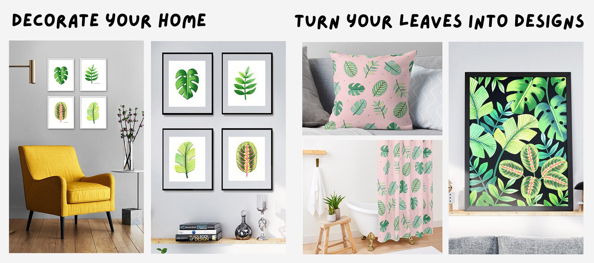
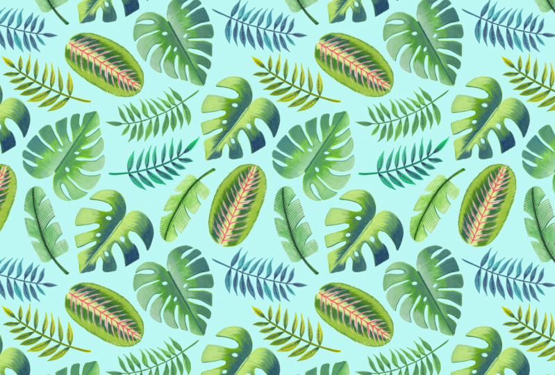
24. Turn Your Artworks into Designs!: I like to make the most out of every painting and drawing I do. After all, the success in my career as a designer has relied on their ability to combine analog techniques, such as drawing and painting with digital programs such as Adobe Illustrator and Adobe Photoshop. In this lesson, I'm going to show you a couple of ways in which you can make the most out of your drawings and your paintings. Let's start with what you can do with your drawings. I find coloring relaxes me a lot. I often used coloring books that I had bought, so I started making my own coloring pages which was a lot of fun. If you scan these images and keep them on your computer, you can print them as many times as you want. You can color them yourself or you give them two kids if you have any. I'm a big fan of making gifts myself and I have given several drawings to various friends and kids and they have always loved them. Another way in which you can use these drawings is to create repeating patterns with them. I have a classical repeat patterns in Photoshop incorporating hand-drawn elements into digital design, where I will teach you how to make beautiful patterns with your drawings. If you want to take that class using your leaf drawings, take the class from lesson 8 until the end. You can draw a couple of geometric shapes to use them as small elements to fill gaps in your pattern. You will know what I'm talking about once you start the class. I will teach you how to digitize your drawings, color them in Photoshop, and create whole collections out of them. Patterns cell well commercially and they can be used across a vast number of products. It can take years to discover those methods and you will learn them all in that class. I will also show you a couple of sites where you can upload your patterns to start selling them. Paintings. First of all, you can use these paintings to decorate your home. Botanicals have always been a trend and they look beautiful in any room of the house. In traditional botanical art, the technical name of each specimen is named at the bottom of the leaf. You can play with this concept and name them or put your name as a signature, or use a quote, or simply leave them empty. You can find frames to hang these paintings or use some colored tape to frame them and paste them on your wall. You can also keep painting different types of leaves to expand your collection. If you want to use your leaf paintings to create designs, I recommend taking my first Skillshare class called Botanical Scenes in Adobe Photoshop. You can take the class from lesson 11 and learn how to digitize your assets, clean them in Photoshop, create foliage out of a single leaf on one stem. If you're up for the challenge, you can paint a couple of petals in watercolor or gouache and create a complex botanical theme that will leave you designing like a pro. Soon I'm planning to give design lessons techniques, analog techniques with Adobe Photoshop and all the shortcuts tools, concepts that I teach in these two classes will serve as building blocks to the more complex ones to come. If you're interested in surface pattern design, I really recommend taking these classes. You will learn techniques and the industry's secrets to take your skills to a whole new level, and they will also leave you prepared for my future classes. If you decide to create repeating patterns or botanical scenes with a tropical leaves made in this class, share your project in the gallery of the class that you take, but also you can upload one or two images into this one. I'm sure that other students will be inspired and feel encouraged to expand their design skills as well. In the next lesson, I will share some final thoughts with you and say goodbye.
25. Final Thoughts: Thank you so much for joining me and well done for getting this far. I hope that you leave this class feeling relaxed, happy, and empowered to keep using gouache. Take some photos of your paintings and publish them into the project and resources section so we can take a look at what you did. I can't wait to see your paintings, how they look on your walls if you decide to hang them, and the designs that you make with them if you take my other classes. Please leave a review if you found this class helpful, enjoyed watching it, and learned a new skill. Let me know if this class met your expectations, what you enjoy the most, and what can be improved. All of your comments will be very valuable for when I make my future classes. If you want to get notified about my upcoming classes, don't forget to press that little button up there that says "Follow" and you will get modified for when my new class is out. You can follow me on Instagram and see what other type of artworks and projects I'm working on. If you share your project on Instagram, you can tag me @silviaospina.art and tag Skillshare as well. I get super excited every time I see a project on social media, and I promise to share it with my followers as well. If you share your project in Stories, don't forget to tag me as well as I will reshare it with my audience too. I hope that you enjoyed this class as much as I enjoyed recording it. Hope to see you soon and keep exploring your creativity.
 Silvia Ospina, Artist and Graphic Designer